
Windows Phone 8.1 Complete Solution by Rahat Yasir & Shariful Islam Nibir(Pradyutvam2)
220
-
Upload
arpit-sharma -
Category
Documents
-
view
26 -
download
0
description
Windows Phone app developer book
Transcript of Windows Phone 8.1 Complete Solution by Rahat Yasir & Shariful Islam Nibir(Pradyutvam2)


©2014 C# CORNER.
SHARE THIS DOCUMENT AS IT IS. PLEASE DO NOT REPRODUCE, REPUBLISH, CHANGE OR COPY.
Windows Phone 8.1
Complete Solution This free book is provided by courtesy of C# Corner and Mindcracker Network and its
authors. Feel free to share this book with your friends and co-workers. Please do not
reproduce, republish, edit or copy this book.
Rahat Yasir
Shariful Islam Nibir
Sam Hobbs
Editor, C# Corner
Windows Phone 8.1 Complete Solution

©2014 C# CORNER.
SHARE THIS DOCUMENT AS IT IS. PLEASE DO NOT REPRODUCE, REPUBLISH, CHANGE OR COPY.
Copyright © 2014 by,
Rahat | [email protected]
Nibir | [email protected]
All rights reserved. No part of this book may be used or reproduced in any manner
whatsoever without written permission except in the case of brief quotations em-bodied in
critical articles or reviews.
This book is written for the beginners who are thinking to start developing Windows
Phone Application and it would be a gentle introduction of learning Windows Phone App
developing to others. Also to help the Bangladeshi MSPs (Microsoft Student Partners) to
give them proper guideline about Windows Phone Application. All the MSPs are taking
help from our blog site and published articles.
This book is dedicated to all the members of .Net Community in Bangladesh.
First Edition: December 2014
About the Authors
Rahat Yasir | @anind0
He has 3+ years of experience in developing windows phone apps.
Ex Microsoft Student Partner and Current Youth Spark Advocate.
Team Leader of BD Devs and they develop local Windows Phone apps for free.
Runner up of Microsoft Imagine Cup 2012, Bangladesh.
One of the top 10 image processing app developer of Nokia Future Capture Hackathon,
Lund, Sweden.
Microsoft Student Partner Summit participant, Washington, USA, 2014.
Shariful Islam Nibir | @nibirsharif
He is 3+ years experienced Windows Phone app developer.

©2014 C# CORNER.
SHARE THIS DOCUMENT AS IT IS. PLEASE DO NOT REPRODUCE, REPUBLISH, CHANGE OR COPY.
Microsoft Student Partner Lead of North South University.
Senior Member of BD Devs (BD Devs - A pioneer windows phone app development team
in Bangladesh)
3 times Windows Phone National App-a-thon winner.
Reviewers Comment
I have had the privilege and pleasure to read this book and I think this is a perfect place to
start for those coders who are starting their app development career. The authors are well
reputed and easily among some of the top Windows Phone app developers in Bangladesh.
They covered a wide variety of topics on the subject matter deep enough to get anyone
started in the world of Windows Phone. What I like about the book is that they started out
with IDE and necessary tools setup all the way to the Hybrid app development and
publishing to the Store – a complete solution approach; the name justifies it very nicely.
That is to say this is not a reference book; rather it’s a neat journey that you may take to
learn Windows Phone app development by reading cover to cover filled with step-by-step
nice and easy examples.
We have a lot of give back to the community.
This book is certainly a great work, and contributes value to the community. I believe it is
going to serve as a handbook for aspirant Windows Phone app developers.
Congratulations to the authors for getting their first book out. I wish all the best.
Tanzim Saqib
Technical Evangelist, Microsoft Bangladesh

©2014 C# CORNER.
SHARE THIS DOCUMENT AS IT IS. PLEASE DO NOT REPRODUCE, REPUBLISH, CHANGE OR COPY.
CONTENTS
INTRODUCTION………………………………………………………………………… 5
IDE INSTALLATION ……………………………………………………………………. 6
HELLO WORLD…………………………………………………………………………. 16
WP CONTROL PART 1…………………………………………………………………. 24
WP CONTROL PART 2…………………………………………………………………..51
WP CONTROL PART 3…………………………………………………………………..59
XAML STYLING………………………………………………………………………….67
APPXMANIFEST…………………………………………………………………………78
SPLASH SCREEN………………………………………………………………………...84
PAGE NAVIGATION …………………………………………………………….………90
WORKING WITH EMULATOR………………………………….……………………..97
COMMAND BAR…………………………………………………………………………109
DATA BINDING…………………………………………………………………………..117
MVVM……………………………………………………………………………………..127
HUB APP WITH JSON DATA…………………………………………………………..137
MAP………………………………………………………………………………………..151
PHONEGAP PART 1……………………………………………………………………..166
PHONEGAP PART 2……………………………………………………………………..176
APP STUDIO……………………………………………………………………………...192
SUBMITTING APP IN WINDOWS PHONE STORE………………………………...205
APPENDIX………………………………………………………………………………..219

©2014 C# CORNER.
SHARE THIS DOCUMENT AS IT IS. PLEASE DO NOT REPRODUCE, REPUBLISH, CHANGE OR COPY.
Introduction
Windows Phone 8.1 Complete Solution is the first complete book on windows phone 8.1.
Authors of this book is Rahat Yasir and Shariful Islam Nibir. Both of this authors are
experienced windows phone app developers and have 3 + years of experience in this field.
Windows Phone 8.1 Complete Solution book is for those developers who are willing to
develop windows phone 8.1 apps. Pre-requisite of this book is object oriented
programming in C#.
New windows phone developers can also start their app developing career with this book.
This book covers both basic and intermediate level windows phone 8.1 app development
topics.
This book has mentioned all possible ways of windows phone app development, like,
developing simple but beautiful windows phone apps using app studio and this chapter is
for newbies, beautiful, efficient and advanced windows phone app using visual studio and
this is for beginners and intermediate level developers, and then, windows phone app
development using cross platform technology like PhoneGap (Cordova) this is for cross
platform app developers and web developers who are willing to develop non-native
windows phone apps.
You can read articles of this book from this site,
http://www.c-sharpcorner.com/Authors/020f8f/Articles/
You can also follow the blog site of authors,
http://learnwithbddevs.wordpress.com/

©2014 C# CORNER.
SHARE THIS DOCUMENT AS IT IS. PLEASE DO NOT REPRODUCE, REPUBLISH, CHANGE OR COPY.
IDE Installation
Visual Studio 2013.3 IDE Installation Process
Introduction
In this chapter I’ll explain how to install Visual Studio 2013 with Update 3 step by step.
It’s pretty much straight forward, and I’ll show you all the steps one by one, so that you
can have the idea what’s going on when you’ll install it in your own personal computer.
So let’s get crack in Visual Studio 2013.3 IDE Installation process.
Downloading the Visual Studio 2013.3 from DreamSpark
First of all download Visual Studio 2013 with Update 3. If you have DreamSpark,
BizSpark or MSDN account, you can download it from it. Here, I’ve downloaded it from
my DreamSpark account. After login in your account, you can find all software in Catalog
section and choose your flavor from there.
Figure 1
After downloading the .iso file, go to the destination folder and open the folder. Inside the
folder you can see these files.
Figure 2

©2014 C# CORNER.
SHARE THIS DOCUMENT AS IT IS. PLEASE DO NOT REPRODUCE, REPUBLISH, CHANGE OR COPY.
If you don’t have any DreamSpark, BizSpark of MSDN account, you can download it
from online Microsoft community for free.
http://www.visualstudio.com/en-us/downloads/visual-studio-2015-downloads-vs
Start Installation Process
Open the “vs_professional” application file and you will see the windows below one by
one.
Figure 3
Figure 4

©2014 C# CORNER.
SHARE THIS DOCUMENT AS IT IS. PLEASE DO NOT REPRODUCE, REPUBLISH, CHANGE OR COPY.
Select the “I agree …” check box and hit “Next”. Then you can see installation features of
VS.
Figure 5
Select all the options and hit “Install”. Then the installation process will start. It’ll take
some time based on your computer configuration. High configuration PCs take average
twenty to half an hour.
©2014 C# CORNER.
SHARE THIS DOCUMENT AS IT IS. PLEASE DO NOT REPRODUCE, REPUBLISH, CHANGE OR COPY.
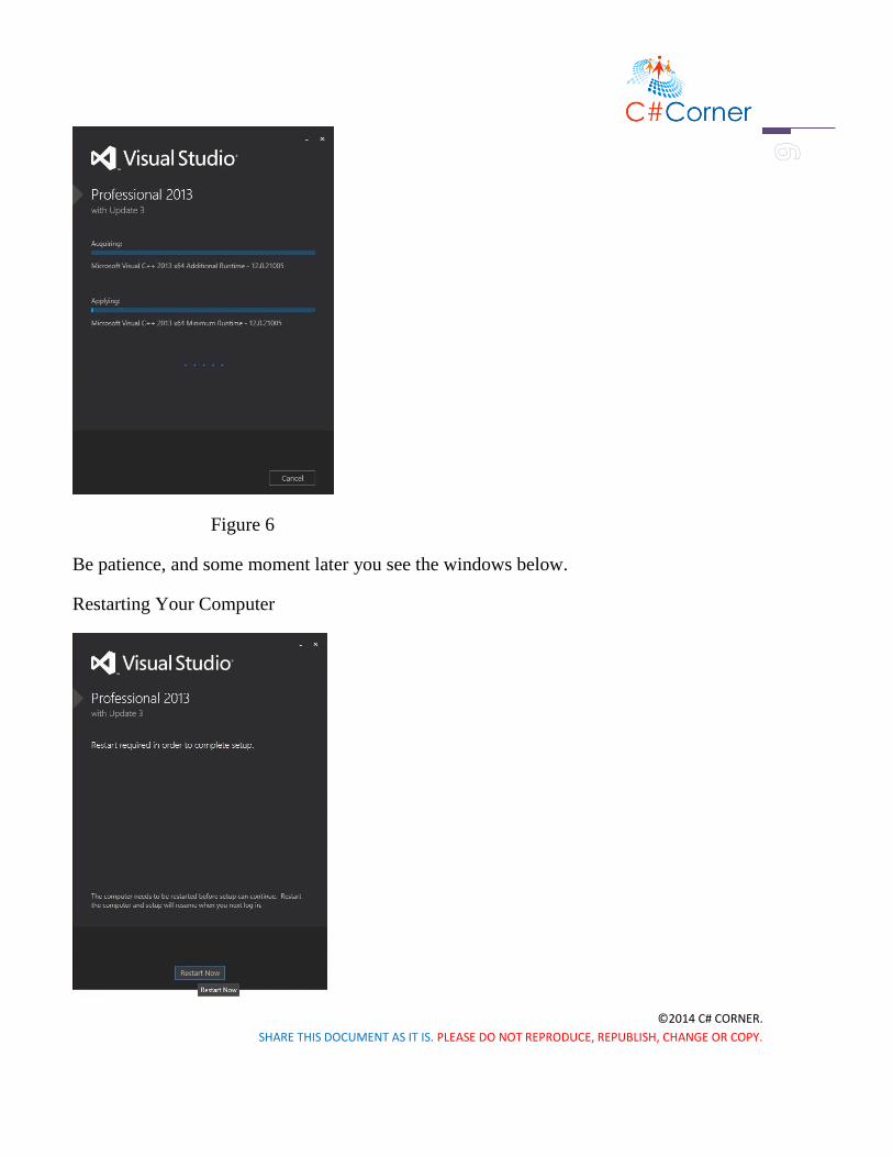
Figure 6
Be patience, and some moment later you see the windows below.
Restarting Your Computer

©2014 C# CORNER.
SHARE THIS DOCUMENT AS IT IS. PLEASE DO NOT REPRODUCE, REPUBLISH, CHANGE OR COPY.
Figure 7
Hit the “Restart Now” button. It’ll restart your computer and after restarting your VS
setup will be resumed.
Figure 8
After some moment your installation process will be done and you’ll get this message
window.
Launching Visual Studio 2013.3

©2014 C# CORNER.
SHARE THIS DOCUMENT AS IT IS. PLEASE DO NOT REPRODUCE, REPUBLISH, CHANGE OR COPY.
Figure 9
Then you’ll be asked to “Sign in” with your Microsoft account, you can do so or just click
“Not now, may be later”.
Figure 10

©2014 C# CORNER.
SHARE THIS DOCUMENT AS IT IS. PLEASE DO NOT REPRODUCE, REPUBLISH, CHANGE OR COPY.
Then you can see the windows below, here you can choose your Development settings
and VS Theme. I’ve set my development settings to C#.
Figure 11
Hit the “Start Visual Studio” button and you all set now. Your Visual Studio 2013.3 is
ready to use.
Figure 12
Activating Visual Studio

©2014 C# CORNER.
SHARE THIS DOCUMENT AS IT IS. PLEASE DO NOT REPRODUCE, REPUBLISH, CHANGE OR COPY.
Now one more thing to do, is activate your Visual Studio with the product id which
you’ve got from your DreamSpark account. Go to Help >> Register Product Key.
Figure 13
Hit the Register Product Key and you’ll see this window like below. Click the “Licence
with a Product Key” and enter your product key like below.
Figure 14
Hit “Apply” and you’re ready to go.

©2014 C# CORNER.
SHARE THIS DOCUMENT AS IT IS. PLEASE DO NOT REPRODUCE, REPUBLISH, CHANGE OR COPY.
Figure 15
Get Ready to Use Visual Studio
Now you can make your favorite Windows Phone 8.1 application. Just Click the “New
Project”, select your template and rock on.
Figure 16

©2014 C# CORNER.
SHARE THIS DOCUMENT AS IT IS. PLEASE DO NOT REPRODUCE, REPUBLISH, CHANGE OR COPY.
Summary
So, that’s it. Start developing awesome application with the greatest tool of Microsoft. In
next chapter we’ll create our first application “Hello world”. If you’ve done till this,
you’re ready to go.

©2014 C# CORNER.
SHARE THIS DOCUMENT AS IT IS. PLEASE DO NOT REPRODUCE, REPUBLISH, CHANGE OR COPY.
Hello world!
Windows Phone - Hello world!
Introduction
Welcome to Windows Phone App Development. Those who are thinking to start
Windows Phone App developing, but can’t understand where to start, by thinking about
them I’ve written this book. I hope, at least, you can come in handy.
Programming language or software development whatever you say, everything starts with
a "Hello world" application. Which means, you are declaring your existence to the world.
Creating your first project
At first, you have to open Visual Studio, then you can see the picture below in Figure 1.
Figure 1
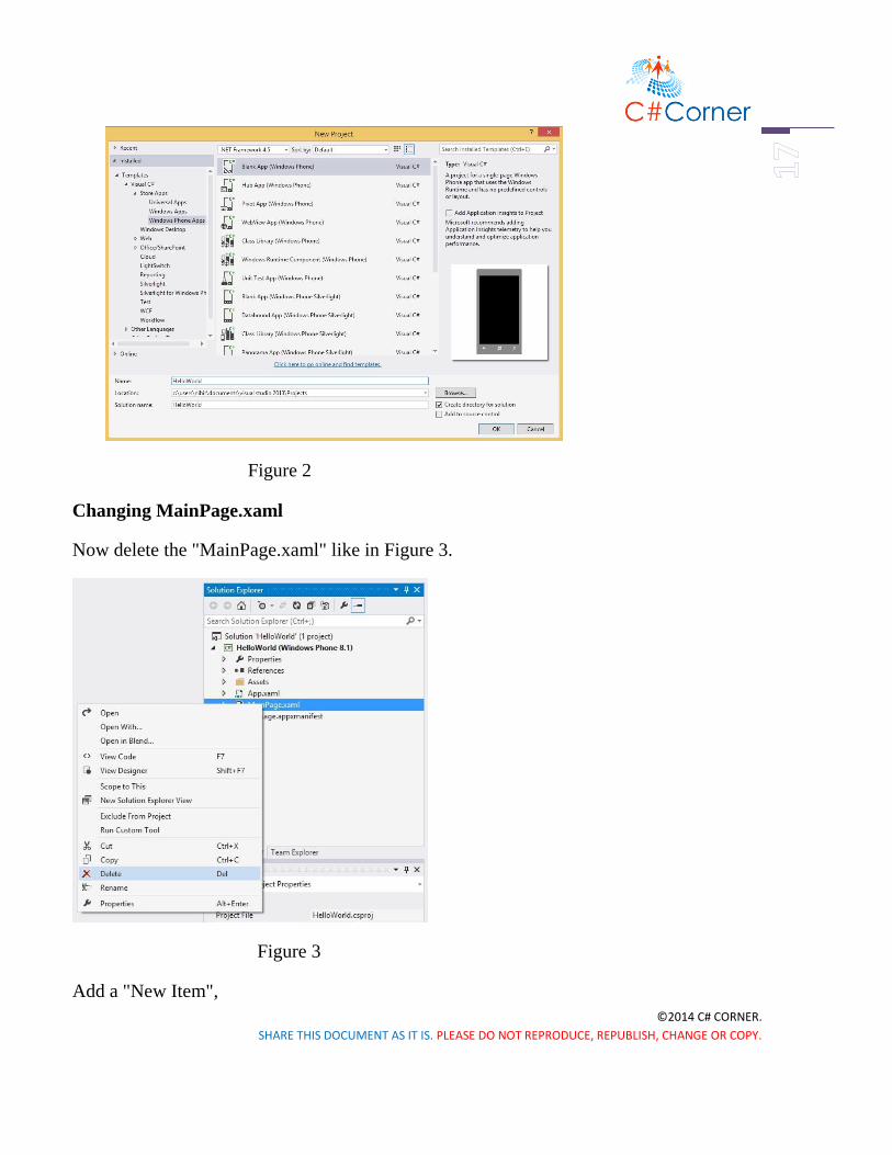
Select "New Project", choose "Blank App" and give it a name "HelloWorld" and hit
"OK".
©2014 C# CORNER.
SHARE THIS DOCUMENT AS IT IS. PLEASE DO NOT REPRODUCE, REPUBLISH, CHANGE OR COPY.
Figure 2
Changing MainPage.xaml
Now delete the "MainPage.xaml" like in Figure 3.
Figure 3
Add a "New Item",

©2014 C# CORNER.
SHARE THIS DOCUMENT AS IT IS. PLEASE DO NOT REPRODUCE, REPUBLISH, CHANGE OR COPY.
Figure 4
And now you can see the picture below. Select a "Basic Page" template and give it name
"MainPage.xaml".
Figure 5
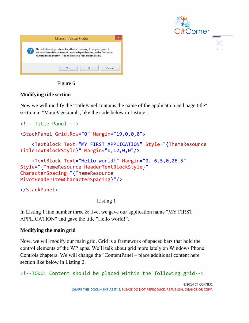
If you see a popup window, hit "Yes".
©2014 C# CORNER.
SHARE THIS DOCUMENT AS IT IS. PLEASE DO NOT REPRODUCE, REPUBLISH, CHANGE OR COPY.
Figure 6
Modifying title section
Now we will modify the "TitlePanel contains the name of the application and page title"
section in "MainPage.xaml", like the code below in Listing 1.
<!-- Title Panel -->
<StackPanel Grid.Row="0" Margin="19,0,0,0">
<TextBlock Text="MY FIRST APPLICATION" Style="{ThemeResource TitleTextBlockStyle}" Margin="0,12,0,0"/>
<TextBlock Text="Hello world!" Margin="0,-6.5,0,26.5" Style="{ThemeResource HeaderTextBlockStyle}" CharacterSpacing="{ThemeResource PivotHeaderItemCharacterSpacing}"/>
</StackPanel>
Listing 1
In Listing 1 line number three & five, we gave our application name "MY FIRST
APPLICATION" and gave the title "Hello world!”.
Modifying the main grid
Now, we will modify our main grid. Grid is a framework of spaced bars that hold the
control elements of the WP apps. We’ll talk about grid more lately on Windows Phone
Controls chapters. We will change the "ContentPanel – place additional content here"
section like below in Listing 2.
<!--TODO: Content should be placed within the following grid-->

©2014 C# CORNER.
SHARE THIS DOCUMENT AS IT IS. PLEASE DO NOT REPRODUCE, REPUBLISH, CHANGE OR COPY.
<Grid Grid.Row="1" x:Name="ContentRoot" Margin="19,9.5,19,0">
<Button Content="Click Me"
HorizontalAlignment="Left"
VerticalAlignment="Top"
Click="Button_Click_Me"
Margin="10,0,0,0">
</Button>
<TextBox x:Name="TextBox_HelloWorld"
HorizontalAlignment="Left"
Height="40"
Margin="10,75,0,0"
TextWrapping="Wrap"
VerticalAlignment="Top"
Width="342">
</TextBox>
</Grid>
Listing 2
Here in Listing 2, we take a button control, whose content is "Click Me", which will show
in the surface of the button, and gave an event controller, which will handle the
background work if someone click the button. Also we have taken a TextBox control,
which will show the text for us, and its name is "TextBox_HelloWorld". Our design will
look like this in Figure 7,

©2014 C# CORNER.
SHARE THIS DOCUMENT AS IT IS. PLEASE DO NOT REPRODUCE, REPUBLISH, CHANGE OR COPY.
Figure 7
Creating the button event handler
We have come to an end of our application. Till now, we have design our app. Now we
will code behind with C#. We will double click the "MaingPage.xaml.cs" in the Solution
Explorer, and modify the code inside like this in Listing 3,
private void Button_Click_Me(object sender, RoutedEventArgs e)
{
TextBox_HelloWorld.Text = "Rock the world!";
}
Listing 3
Here in Listing 3, line number three, "TextBox_HelloWorld" is our TextBox’s name. We
will call it by name, and it will show us the text "Rock the world!". So our TextBox’s
showing text will be "Rock the world!".

©2014 C# CORNER.
SHARE THIS DOCUMENT AS IT IS. PLEASE DO NOT REPRODUCE, REPUBLISH, CHANGE OR COPY.
Run your application
Now we will run the application, for that reason you have to click the play button or press
F5 like below,
Figure 8
And the application will look like this in Figure 9.
Figure 9
Now, if we click the "Click Me" button, it will show the text "Rock the world!" in the
TextBox below.

©2014 C# CORNER.
SHARE THIS DOCUMENT AS IT IS. PLEASE DO NOT REPRODUCE, REPUBLISH, CHANGE OR COPY.
Summary
We’ve successfully created our very own Windows Phone 8.1 application. You’ve
introduced some terms like, Solution Explorer, you’ll learn more about Visual Studio’s
features and functionality more in the upcoming chapters. You’ll be familiar with
Properties Window, Toolbox and lots more. We’ll discuss about them later, but here
we’ve shown only their uses. I hope that, everyone can do this. So that’s it, in next chapter
we’ll learn about windows phone controls and their uses.

©2014 C# CORNER.
SHARE THIS DOCUMENT AS IT IS. PLEASE DO NOT REPRODUCE, REPUBLISH, CHANGE OR COPY.
WP Control Part 1
Windows Phone Controls – Part 1
Introduction
In this chapter, I will talk about some basic controls of Windows Phone, and XAML is the
main design language of Windows Phone. I think it will help you to understand the basic
principle of XAML and how it works. Its attribute and uses. So let’s get crack it, the
essential XAML controls for Windows Phone.
XAML makes your life much easier. Back then, you have to design a lot of pages with
same alignment and it hectic & frustrating, also not that easy task. But XAML brings you
the flexibility to make your design portable and easy to arrange. You can copy paste your
design and reuse wherever you want. It’s not all, you can shape your design whatever you
like to do, and the power is now in your hand. Now let’s see what kind of simple controls
you can use in your Windows Phone Application.
Creating a new project
First of all, we will create a project. Open Visual Studio, and open a “New Project”. Select
“Blank App” and name it “WindowsPhoneControls”.

©2014 C# CORNER.
SHARE THIS DOCUMENT AS IT IS. PLEASE DO NOT REPRODUCE, REPUBLISH, CHANGE OR COPY.
Figure 1
Click OK and you can see Visual Studio like below.

©2014 C# CORNER.
SHARE THIS DOCUMENT AS IT IS. PLEASE DO NOT REPRODUCE, REPUBLISH, CHANGE OR COPY.
Figure 2
Working with HyperlinkButton
Previously, we’ve worked with simple Button controls in our “Hello world” application.
Now, we’ll work with another Button like control called “HeyperLinkButton”. It’s used to
link a URL or some other things you like.
To do that, you can see Toolbox in the left side of the Visual Studio and you can find it in
“All XAML Controls” section. Click on this control and drag it to you design. Like this,
Figure 3
Now, to make sure it works, we need another TextBlock control. To do so, drag it from
the Toolbox and put it below the Hyperlink button. The designing code is given below.
<!--Hyperlink Button-->

©2014 C# CORNER.
SHARE THIS DOCUMENT AS IT IS. PLEASE DO NOT REPRODUCE, REPUBLISH, CHANGE OR COPY.
<HyperlinkButton x:Name="HyperlinkButton_1"
Content="HyperlinkButton"
HorizontalAlignment="Left"
VerticalAlignment="Top"
Margin="10,10,0,0"
Click="HyperlinkButton_1_Click"/>
<TextBlock x:Name="HB_TextBlock"
HorizontalAlignment="Left"
VerticalAlignment="Top"
Margin="10,10,0,0"
TextWrapping="Wrap"
Height="40"
Width="140"
FontSize="24" Grid.Column="1"/>
Listing 1
Here, in HyperlinkButton we have an event controller named HyperlinkButton_1_Click, it
creates a code block which will handle the background task, when you will click in the
hyper link Button and we will show a confirmation message in the TextBlock named
“HB_TextBlock”.
Making Grid
We’ve made some Grids in our main Grid, to arrange the controls in these Grids like Grid
1, 2 and so on.

©2014 C# CORNER.
SHARE THIS DOCUMENT AS IT IS. PLEASE DO NOT REPRODUCE, REPUBLISH, CHANGE OR COPY.
You can make Grids wherever you want, you can customize the Grid as your needs.
Figure 4
Like above the picture, just take your mouse courser on these points and just click above
the Main Grid, and it will create Grids automagically, also generate codes of making Grids
in XAML.
Now, open “MainPage.xaml.cs” and put the code below the constructor.
private void HyperlinkButton_1_Click(object sender, RoutedEventArgs e)
{
HB_TextBlock.Text = "OK";
}
Listing 2

©2014 C# CORNER.
SHARE THIS DOCUMENT AS IT IS. PLEASE DO NOT REPRODUCE, REPUBLISH, CHANGE OR COPY.
Now run the application, and it will look like the picture below, after you will click in the
HyperlinkButton.
Figure 5
Working with RadioButton
Well if you can do that, then you are on move. Now, we take another control name
RadioButton, and drag it from TextBlock and put it in another Grid and also a TextBlock
in Row 1. The customized code will look like this, or you can simply drag a control and
test separately, it’s up to you. I suggest you to do as like I do.
So, our design will look like this,
Figure 6
And the designing code is given below.
<!--Radio Button-->

©2014 C# CORNER.
SHARE THIS DOCUMENT AS IT IS. PLEASE DO NOT REPRODUCE, REPUBLISH, CHANGE OR COPY.
<RadioButton x:Name="RadioButton_1"
Content="RadioButton"
HorizontalAlignment="Left"
Margin="10,10,0,0"
Grid.Row="1"
VerticalAlignment="Top"
Checked="RadioButton_1_Checked"/>
<TextBlock x:Name="RB_TextBlock"
HorizontalAlignment="Left"
VerticalAlignment="Top"
Margin="10,10,0,0"
TextWrapping="Wrap"
Height="40"
Width="140"
FontSize="24"
Grid.Column="1"
Grid.Row="1"/>
Listing 3
Here, like HyperlinkButton, in our RadioButton we have also an event handler named
“RadioButton_1_Checked”, and in our event handler we will show the confirmation
message whether it’s checked or unchecked.
private void RadioButton_1_Checked(object sender, RoutedEventArgs e)
{
if (RadioButton_1.IsChecked == true)

©2014 C# CORNER.
SHARE THIS DOCUMENT AS IT IS. PLEASE DO NOT REPRODUCE, REPUBLISH, CHANGE OR COPY.
{
RB_TextBlock.Text = "Checked";
}
else
{
RB_TextBlock.Text = "Not checked";
}
}
Listing 4
Here, we’re checking whether our RadioButton is checked or not, if it’s checked (true),
the TextBlock will show “Checked”
Or if it’s unchecked (false), the TextBox will show “Not checked”.
After you run your application, it’ll look exactly like this.
Figure 7

©2014 C# CORNER.
SHARE THIS DOCUMENT AS IT IS. PLEASE DO NOT REPRODUCE, REPUBLISH, CHANGE OR COPY.
Working with TextBlock
Another control, we rapidly use in our every application is TextBlock. We’ve used it in
our previous controls also. We will show static data in our TextBlock e.x., “Hello world”.
The design will look like this.
Figure 8
Designing code is given below.
<!--Text Block-->
<TextBlock Text="Hello world"
HorizontalAlignment="Left"
Margin="10,10,0,0"
Grid.Row="2"
TextWrapping="Wrap"
VerticalAlignment="Top"
Height="40"
Width="380"
FontSize="24" Grid.ColumnSpan="2"/>
Listing 5
We don’t need any Button or event handler in this case, cause the text is given statically in
the design (Text=“Hello world”).

©2014 C# CORNER.
SHARE THIS DOCUMENT AS IT IS. PLEASE DO NOT REPRODUCE, REPUBLISH, CHANGE OR COPY.
After you run your application, it’ll look exactly like this.
Figure 9
Working with ToggleSwitch
Another control, we’ll talk about is ToggleSwitch. It’s really a beautiful control that will
make your application cooler than before. I think you know, how to use a control now, we
have done it before. So, just take this control and take another TextBlock, and the design
will look like this.
Figure 10

©2014 C# CORNER.
SHARE THIS DOCUMENT AS IT IS. PLEASE DO NOT REPRODUCE, REPUBLISH, CHANGE OR COPY.
The designing code is given below,
<!--Toggle Switch-->
<ToggleSwitch x:Name="ToggleSwitch_1"
Header="ToggleSwitch"
Margin="10,9.5,6,0"
Grid.Row="3"
VerticalAlignment="Top"
Toggled="ToggleSwitch_1_Toggled"/>
<TextBlock x:Name="TS_TextBlock"
HorizontalAlignment="Left"
VerticalAlignment="Top"
Margin="10,9.5,0,0"
TextWrapping="Wrap"
Height="40"
Width="140"
FontSize="24"
Grid.Column="1"
Grid.Row="3"/>
Listing 6
We have an event handler here, so the C# code will be like this.
private void ToggleSwitch_1_Toggled(object sender, RoutedEventArgs e)
{

©2014 C# CORNER.
SHARE THIS DOCUMENT AS IT IS. PLEASE DO NOT REPRODUCE, REPUBLISH, CHANGE OR COPY.
if (ToggleSwitch_1.IsOn == true)
{
TS_TextBlock.Text = "This is On";
}
else
{
TS_TextBlock.Text = "This is Off";
}
}
Listing 7
We did the same logic here like the RadioButton.
After you run your application, it’ll look exactly like this.
Figure 11
Working with ListBox

©2014 C# CORNER.
SHARE THIS DOCUMENT AS IT IS. PLEASE DO NOT REPRODUCE, REPUBLISH, CHANGE OR COPY.
Our fifth control will be ListBox, its data binding control. It’s an important control which
has some complicated structure. So let’s see how, we can use it in our application.
Like other controls drag it from Toolbox and put in the Grid. Here, we need a Button and
TextBlock controls.
The design will look like this,
Figure 12
The designing code is given below,
<!--List Box-->
<ListBox x:Name="ListBox_1"
HorizontalAlignment="Left"
Height="120"
Margin="10,10.167,0,0"
Grid.Row="4"
VerticalAlignment="Top"
Width="220"
ScrollViewer.VerticalScrollBarVisibility="Visible">
<ListBoxItem Content="January"/>
<ListBoxItem Content="February"/>
<ListBoxItem Content="March"/>
<ListBoxItem Content="April"/>
<ListBoxItem Content="May"/>

©2014 C# CORNER.
SHARE THIS DOCUMENT AS IT IS. PLEASE DO NOT REPRODUCE, REPUBLISH, CHANGE OR COPY.
<ListBoxItem Content="June"/>
<ListBoxItem Content="July"/>
<ListBoxItem Content="August"/>
<ListBoxItem Content="September"/>
<ListBoxItem Content="October"/>
<ListBoxItem Content="November"/>
<ListBoxItem Content="December"/>
</ListBox>
<Button Content="Ok"
x:Name="Ok"
Grid.Column="1"
HorizontalAlignment="Left"
Margin="10,0.167,0,0"
Grid.Row="4"
VerticalAlignment="Top"
Width="125"
Click="Ok_Click"/>
<TextBlock x:Name="LB_TextBlock"
HorizontalAlignment="Left"
VerticalAlignment="Top"
Margin="10,53.167,0,0"
TextWrapping="Wrap"

©2014 C# CORNER.
SHARE THIS DOCUMENT AS IT IS. PLEASE DO NOT REPRODUCE, REPUBLISH, CHANGE OR COPY.
Height="77"
Width="140"
FontSize="24"
Grid.Column="1"
Grid.Row="4"/>
Listing 8
Here, we have an event handler named “Ok_Click”, and we have bound some months
name inside the ListBox starting and closing tags. TextBlock’s name is “LB_TextBlock”.
So, the C# code will look like this.
private void Ok_Click(object sender, RoutedEventArgs e)
{
string[] month = { "January", "February", "March", "April", "May", "June", "July", "August", "September", "October", "November", "December" };
if (ListBox_1.SelectedValue != null)
{
LB_TextBlock.Text = month[ListBox_1.SelectedIndex];
}
else
{
LB_TextBlock.Text = "Select a item from list.";
}
}
Listing 9

©2014 C# CORNER.
SHARE THIS DOCUMENT AS IT IS. PLEASE DO NOT REPRODUCE, REPUBLISH, CHANGE OR COPY.
Here, we have created a string Array named “month”, and the array index’s values are the
month’s name. In If decision statement, first we’re checking if the ListBlock is selected or
Not, if an item is selected we’re matching the SelectedIndex’s value with our array
Index’s value, and if no item’s selected then a alert message will be shown in the
TextBlock.
If we run the application, it will look exactly like this,
Figure 13
Working with ComboBox
Now, we’ll talk about a similar control and it’s really awesome than ListBox, just works
likely same as ListBox, but it depend on your application which will be more appropriate
in case of your needs. It’s called ComboBox. Take it from ToolBox or you can just write
XAML on your
Own, like or something like that. So, the design will look like this,

©2014 C# CORNER.
SHARE THIS DOCUMENT AS IT IS. PLEASE DO NOT REPRODUCE, REPUBLISH, CHANGE OR COPY.
Figure 14
The designing code is given below,
<ComboBox x:Name="ComboBox_1"
HorizontalAlignment="Left"
Margin="10,0.167,0,0"
Grid.Row="5"
VerticalAlignment="Top"
Width="220">
<ComboBoxItem Content="January"/>
<ComboBoxItem Content="February"/>
<ComboBoxItem Content="March"/>
<ComboBoxItem Content="April"/>
<ComboBoxItem Content="May"/>
<ComboBoxItem Content="June"/>
<ComboBoxItem Content="July"/>
<ComboBoxItem Content="August"/>
<ComboBoxItem Content="September"/>
<ComboBoxItem Content="October"/>
<ComboBoxItem Content="November"/>

©2014 C# CORNER.
SHARE THIS DOCUMENT AS IT IS. PLEASE DO NOT REPRODUCE, REPUBLISH, CHANGE OR COPY.
<ComboBoxItem Content="December"/>
</ComboBox>
<TextBlock x:Name="CB_TextBlock"
HorizontalAlignment="Left"
VerticalAlignment="Top"
Margin="10,65.167,0,0"
TextWrapping="Wrap"
Height="40"
Width="380"
FontSize="24"
Grid.Row="5" Grid.ColumnSpan="2"/>
<Button Content="Ok"
x:Name="Ok_1"
Grid.Column="1"
HorizontalAlignment="Left"
Margin="10,0.167,0,0"
Grid.Row="5"
VerticalAlignment="Top"
Width="125"
Click="Ok_1_Click"/>
Listing 10

©2014 C# CORNER.
SHARE THIS DOCUMENT AS IT IS. PLEASE DO NOT REPRODUCE, REPUBLISH, CHANGE OR COPY.
And the C# code is here.
private void Ok_1_Click(object sender, RoutedEventArgs e)
{
string[] month = { "January", "February", "March", "April", "May", "June", "July", "August", "September", "October", "November", "December" };
if (ComboBox_1.SelectedValue != null)
{
CB_TextBlock.Text = month[ComboBox_1.SelectedIndex];
}
else
{
CB_TextBlock.Text = "Select a item from list.";
}
}
Listing 11
If we run the application, it’ll look exactly like this.

©2014 C# CORNER.
SHARE THIS DOCUMENT AS IT IS. PLEASE DO NOT REPRODUCE, REPUBLISH, CHANGE OR COPY.
Figure 15.1 Figure 15.2
Adding a User Control
And lastly, we’ll talk about Popup Box with a Button control, and it will show some
messages. For this, we need a User Control. Go to the Solution Explorer, and Add >> New
Item.

©2014 C# CORNER.
SHARE THIS DOCUMENT AS IT IS. PLEASE DO NOT REPRODUCE, REPUBLISH, CHANGE OR COPY.
Figure 16
Now you’ve to select User Control and give it a name called “PopupPanel”.
Figure 17

©2014 C# CORNER.
SHARE THIS DOCUMENT AS IT IS. PLEASE DO NOT REPRODUCE, REPUBLISH, CHANGE OR COPY.
Customize the XAML code, mainly the Grid section.
<Grid>
<Border BorderBrush="{StaticResource ApplicationForegroundThemeBrush}" BorderThickness="1" Background="{StaticResource ApplicationPageBackgroundThemeBrush}">
<Border BorderBrush="{StaticResource ApplicationForegroundThemeBrush}" BorderThickness="1">
<Border BorderBrush="{StaticResource ApplicationForegroundThemeBrush}" BorderThickness="1">
<Border BorderBrush="{StaticResource ApplicationForegroundThemeBrush}" BorderThickness="1">
<StackPanel Orientation="Vertical" Height="200" Width="200" VerticalAlignment="Center">
<TextBlock Text="This is a Popup!" VerticalAlignment="Center" HorizontalAlignment="Center" Margin="0,60,0,0"/>
<TextBlock Text="Hit the button again to hide me" VerticalAlignment="Center" HorizontalAlignment="Center" Margin="0,10,0,0" TextWrapping="Wrap" TextAlignment="Center"/>
<Button HorizontalAlignment="Center" Content="Close Popup" Click="ClosePopup" />
</StackPanel>
</Border>
</Border>
</Border>
</Border>
</Grid>

©2014 C# CORNER.
SHARE THIS DOCUMENT AS IT IS. PLEASE DO NOT REPRODUCE, REPUBLISH, CHANGE OR COPY.
Listing 12
Here, we’ve Border brushes, StacPanel which will bounded the TextBlocks and a Button.
The design will look like this,
Figure 18
The C# code of PopupPanel.xaml.cs is given below. It’s mainly the Button’s event
handler.
private void ClosePopup(object sender, RoutedEventArgs e)
{
Popup hostPopup = this.Parent as Popup;
hostPopup.IsOpen = false;
}
Listing 13

©2014 C# CORNER.
SHARE THIS DOCUMENT AS IT IS. PLEASE DO NOT REPRODUCE, REPUBLISH, CHANGE OR COPY.
We just make our first User Control. It’s really helpful when you need a custom control in
your application.
Working with Popup Window
Now, in our “MainPage.xaml”, we have to take a TextBlock which will have a header
message called “Popup Window” and a Button which content is “Show Popup”. The
design will look like this,
Figure 19
The designing code is given below,
<!--Popup Window-->
<TextBlock HorizontalAlignment="Left"
Text="Popup Winodow"
VerticalAlignment="Top"
Margin="10,10,0,0"
TextWrapping="Wrap"
Height="40"
Width="220"
FontSize="24"
Grid.Row="6"/>
<Button Content="Show Popup"
x:Name="PopupButton"
Grid.Column="1"
HorizontalAlignment="Left"

©2014 C# CORNER.
SHARE THIS DOCUMENT AS IT IS. PLEASE DO NOT REPRODUCE, REPUBLISH, CHANGE OR COPY.
Margin="10,0,0,0"
Grid.Row="6"
VerticalAlignment="Top"
Width="140"
Click="PopupButton_Click"/>
Listing 14
Our event handler C# code behind is also given here,
private void PopupButton_Click(object sender, RoutedEventArgs e)
{
if (!popup.IsOpen)
{
popup.Child = new PopupPanel();
popup.VerticalOffset = 250.0;
popup.HorizontalOffset = 100.0;
popup.IsOpen = true;
}
}
Popup popup = new Popup();Listing 15
Here, we have created a new object of Popup window, and checked it in our event handler
code block by If decision statement. We’ve created a Popup Child object and set its
position and make IsOpen equal to true, so that it shows up when it’s called.
If we run the application, it’ll look exactly like this

©2014 C# CORNER.
SHARE THIS DOCUMENT AS IT IS. PLEASE DO NOT REPRODUCE, REPUBLISH, CHANGE OR COPY.
Figure 20
Finalizing and running our Control Application
In the end, our full design will look like the picture below,

©2014 C# CORNER.
SHARE THIS DOCUMENT AS IT IS. PLEASE DO NOT REPRODUCE, REPUBLISH, CHANGE OR COPY.
Figure 21
And if we run the complete application, it’ll look exactly like this.
Figure 22
Summary
Well, in this chapter we’ve talked about seven different controls and their uses. Hopefully,
it’ll give you a little idea how to use controls and modify with XAML in Windows Phone
8.1 Application. I think, I can help you just a little to move on with XAML.

©2014 C# CORNER.
SHARE THIS DOCUMENT AS IT IS. PLEASE DO NOT REPRODUCE, REPUBLISH, CHANGE OR COPY.
WP Control Part 2
Windows Phone Controls – Part 2
Introduction
In last chapter, we’ve seen seven essential controls of Windows Phone. Here we’ll learn
about more common controls like Input controls. We’ll mostly talk about TextBox, Date
and Time Picker controls. So let’s get started.
Working with TextBox Control
First of all, here I’m not going to explain, how to open up project from start. We’ve done
this before. So, I’m moving up to the content right here. Take two TextBlocks, and change
the Text content to “First Name” & “Last Name”. Then take two TextBoxes, named it
“firstNameTextBox” & “lastNameTextBox”, and take another two TextBlocks and named
it “welcomeTextBlock” & “nameTextBlock”. Arrange them like the picture below.
Figure 1
Designing code is also given here.

©2014 C# CORNER.
SHARE THIS DOCUMENT AS IT IS. PLEASE DO NOT REPRODUCE, REPUBLISH, CHANGE OR COPY.
<TextBlock Text="First Name: " FontSize="24"/>
<TextBox x:Name="firstNameTextBox" Grid.Column="1" />
<TextBlock Text="Last Name: " Grid.Row="1" FontSize="24"/>
<TextBox x:Name="lastNameTextBox" Grid.Row="1" Grid.Column="1" />
<Button x:Name="GoButton" Grid.Column="1" Grid.Row="2" Content="Go"
VerticalAlignment="Bottom" Width="110" Click="GoButton_Click" />
<TextBlock x:Name="welcomeTextBlock" HorizontalAlignment="Left"
Margin="10,9.5,0,0" Grid.Row="3" TextWrapping="Wrap"
VerticalAlignment="Top" Height="55" Width="360" FontSize="24"
Grid.ColumnSpan="2"/>
<TextBlock x:Name="nameTextBlock" HorizontalAlignment="Left"
Margin="10,98.5,0,0" Grid.Row="3" TextWrapping="Wrap"
Width="360" FontSize="24" Grid.ColumnSpan="2"
Height="55" VerticalAlignment="Top"/>
Listing 1
As we have to handle the Input operation, we used a Button control in the code above and
have a click event “GoButton_Click”. So our C# code will be look like this.
private void GoButton_Click(object sender, RoutedEventArgs e)

©2014 C# CORNER.
SHARE THIS DOCUMENT AS IT IS. PLEASE DO NOT REPRODUCE, REPUBLISH, CHANGE OR COPY.
{
if (lastNameTextBox.Text != string.Empty)
{
if (firstNameTextBox.Text != string.Empty)
{
welcomeTextBlock.Text = "Hello,";
nameTextBlock.Text = firstNameTextBox.Text + " " + lastNameTextBox.Text;
}
else
{
welcomeTextBlock.Text = "Hello,";
nameTextBlock.Text = lastNameTextBox.Text;
}
}
else
{
welcomeTextBlock.Text = "Sorry,";
nameTextBlock.Text = "Last name can't be empty!";
}
}
Listing 2

©2014 C# CORNER.
SHARE THIS DOCUMENT AS IT IS. PLEASE DO NOT REPRODUCE, REPUBLISH, CHANGE OR COPY.
Now, what I actually did, is checking the text of “lastNameTextBox” whether it’s empty
or not. If it’s not empty, it’ll good to go. Then we’re checking the text of
“firstNameTextBox”, and if it’s not empty we’ll do the operation below the second if
decision statement. So, in this case we make a welcome text “Hello” and put the first and
last name in the “nameTextBlock” or we’ll just put the last name in this field.
Otherwise, we’ll give an error message if the last name field is empty, because last name
can’t be empty.
Working with Date & Time Picker Control
Now, we’ll talk about Date and Time Picker controls. Drag and drop or just write your
own customized XAML. I like to write my preferable customized XAML. I’ve taken, one
Textblock as header to show some text, one DatePicker and one TimePicker and a Button.
On the right side, I’ve also taken a TextBlock as a header field and two other TextBlcok to
show the date and time you’ll pick. The design given here.
Figure 2
Designing code is given below.
<TextBlock HorizontalAlignment="Left" Margin="10,10.167,0,0"
Grid.Row="4" TextWrapping="Wrap" Text="Pick a Date and Time"
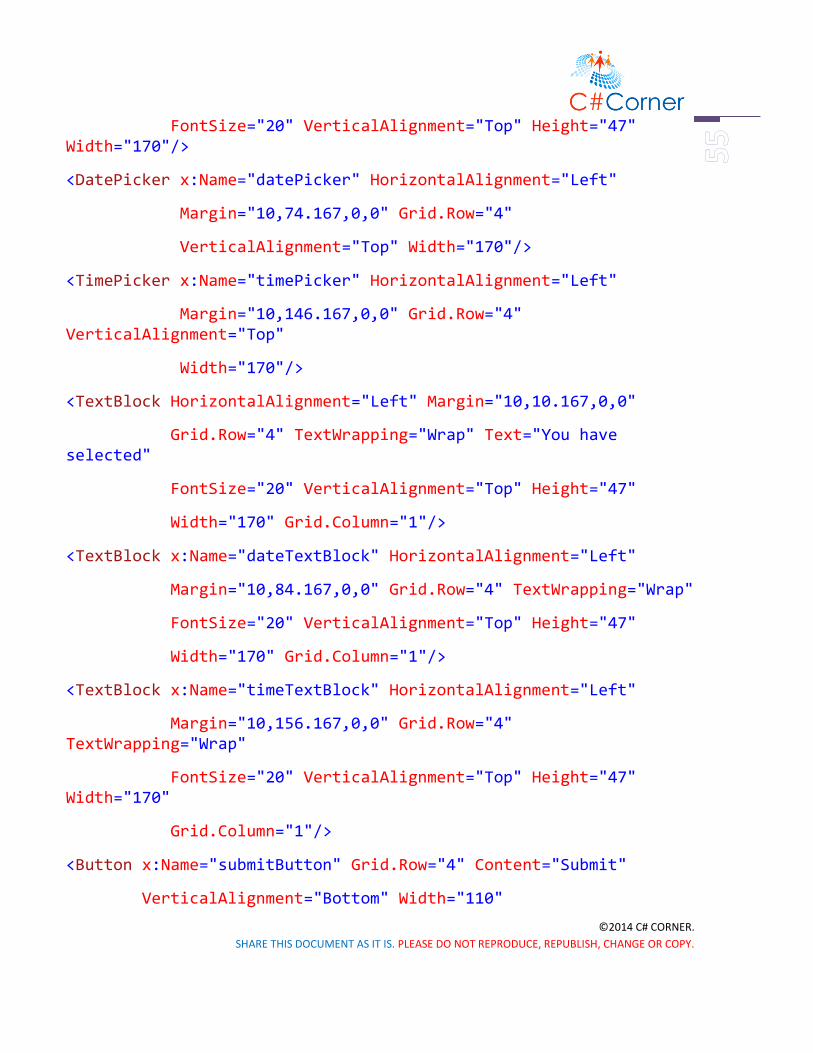
©2014 C# CORNER.
SHARE THIS DOCUMENT AS IT IS. PLEASE DO NOT REPRODUCE, REPUBLISH, CHANGE OR COPY.
FontSize="20" VerticalAlignment="Top" Height="47" Width="170"/>
<DatePicker x:Name="datePicker" HorizontalAlignment="Left"
Margin="10,74.167,0,0" Grid.Row="4"
VerticalAlignment="Top" Width="170"/>
<TimePicker x:Name="timePicker" HorizontalAlignment="Left"
Margin="10,146.167,0,0" Grid.Row="4" VerticalAlignment="Top"
Width="170"/>
<TextBlock HorizontalAlignment="Left" Margin="10,10.167,0,0"
Grid.Row="4" TextWrapping="Wrap" Text="You have selected"
FontSize="20" VerticalAlignment="Top" Height="47"
Width="170" Grid.Column="1"/>
<TextBlock x:Name="dateTextBlock" HorizontalAlignment="Left"
Margin="10,84.167,0,0" Grid.Row="4" TextWrapping="Wrap"
FontSize="20" VerticalAlignment="Top" Height="47"
Width="170" Grid.Column="1"/>
<TextBlock x:Name="timeTextBlock" HorizontalAlignment="Left"
Margin="10,156.167,0,0" Grid.Row="4" TextWrapping="Wrap"
FontSize="20" VerticalAlignment="Top" Height="47" Width="170"
Grid.Column="1"/>
<Button x:Name="submitButton" Grid.Row="4" Content="Submit"
VerticalAlignment="Bottom" Width="110"

©2014 C# CORNER.
SHARE THIS DOCUMENT AS IT IS. PLEASE DO NOT REPRODUCE, REPUBLISH, CHANGE OR COPY.
Click="submitButton_Click" Margin="10,0,0,1" />
Listing 3
And in the code behind, the C# code will be like this. Some codes are commented out
here.
private void submitButton_Click(object sender, RoutedEventArgs e)
{
//dateTextBlock.Text = datePicker.Date.Day + " /" + datePicker.Date.Month + " /" + datePicker.Date.Year;
dateTextBlock.Text = datePicker.Date.ToString("D");
//timeTextBlock.Text = timePicker.Time.Hours + ":" + timePicker.Time.Minutes;
//timePicker.ClockIdentifier = Windows.Globalization.ClockIdentifiers.TwelveHour;
timeTextBlock.Text = timePicker.Time.ToString("T");
}
Listing 4
Here, in the Button event handler, we’ve used some methods to show date and time. Best
and easy option is given here for both date and time. Others are commented out, you can
try these if you want.
After, you’ve set all these, your design will look like this,

©2014 C# CORNER.
SHARE THIS DOCUMENT AS IT IS. PLEASE DO NOT REPRODUCE, REPUBLISH, CHANGE OR COPY.
Figure 3
And if you run the application, it’ll work just like this.
Figure 4
Summary

©2014 C# CORNER.
SHARE THIS DOCUMENT AS IT IS. PLEASE DO NOT REPRODUCE, REPUBLISH, CHANGE OR COPY.
Hope, you’ve understand each of the controls. In next chapter we’ll learn about Image
control and its uses.

©2014 C# CORNER.
SHARE THIS DOCUMENT AS IT IS. PLEASE DO NOT REPRODUCE, REPUBLISH, CHANGE OR COPY.
WP Control Part 3
Windows Phone Controls – Part 3
Introduction
It’s our last part of Windows Phone Controls. In this chapter we’ll talk about Image
control in Windows Phone. It’s really awesome and you’ll definitely like it. So let’s get
crack in, Windows Phone Image Control.
Working with Image Control
You can take an Image control from Toolbox or just write a simple code like that, and you
have to take four RadioButtons.
Figure 1
We’ve talked about RadioButton in our first part of this controls section Windows Phone
Controls – Part 1. If you don’t familiar with RadioButton take a look of it. So, our design
looks like this picture below.

©2014 C# CORNER.
SHARE THIS DOCUMENT AS IT IS. PLEASE DO NOT REPRODUCE, REPUBLISH, CHANGE OR COPY.
Figure 2
Adding an Image to Our Project
Now we’ve to do a little bit of work before to go. We need to add an image to our project.
Just right click in the Solution Explorer and go to Add >> New Folder.

©2014 C# CORNER.
SHARE THIS DOCUMENT AS IT IS. PLEASE DO NOT REPRODUCE, REPUBLISH, CHANGE OR COPY.
Figure 3
Give it a name “Images”.
Figure 4
Now, right click on the “Images” folder and go to Add >> Existing Item.
Figure 5

©2014 C# CORNER.
SHARE THIS DOCUMENT AS IT IS. PLEASE DO NOT REPRODUCE, REPUBLISH, CHANGE OR COPY.
Now, go to your destination directory to select your desire image. Select and add it.
Figure 6
Designing UI and Code Behind
Now, in the XAML code show the path of the image you’ve added in the Source property
of Image control. XAML code is given below.
<Grid>
<Image x:Name="Image1"
HorizontalAlignment="Left"
Height="473"
VerticalAlignment="Top"
Width="380"
Source="Images/sample.jpg"
Stretch="None"
Margin="10,10,0,0"/>
<RadioButton x:Name="NoneButton" Content="None"

©2014 C# CORNER.
SHARE THIS DOCUMENT AS IT IS. PLEASE DO NOT REPRODUCE, REPUBLISH, CHANGE OR COPY.
HorizontalAlignment="Left"
VerticalAlignment="Top"
Checked="StretchModeButton_Checked"
Margin="10,488,0,0"/>
<RadioButton x:Name="FillButton" Content="Fill"
HorizontalAlignment="Left"
VerticalAlignment="Top"
Checked="StretchModeButton_Checked"
Margin="222,488,0,0"/>
<RadioButton x:Name="UniformButton" Content="Uniform"
HorizontalAlignment="Left"
VerticalAlignment="Top"
Checked="StretchModeButton_Checked"
Margin="10,555,0,0"/>
<RadioButton x:Name="UniformToFillButton"
Content="UniformToFill"
HorizontalAlignment="Left"
VerticalAlignment="Top"
Checked="StretchModeButton_Checked"
Margin="222,555,0,0"/></Grid>
Listing 1

©2014 C# CORNER.
SHARE THIS DOCUMENT AS IT IS. PLEASE DO NOT REPRODUCE, REPUBLISH, CHANGE OR COPY.
Here, we’ve shown the path full path of our image in line number seven. We will mainly
show the four image Zooming property e.g., Fill, Uniform, Uniform to Fill and Normal
(None). Our four RadioButton will handle this operation. C# code is given here.
private void StretchModeButton_Checked(object sender, RoutedEventArgs e)
{ RadioButton button = sender as RadioButton;
if (Image1 != null)
{
switch (button.Name)
{
case "FillButton":
Image1.Stretch =Windows.UI.Xaml.Media.Stretch.Fill;
break;
case "NoneButton":
Image1.Stretch =Windows.UI.Xaml.Media.Stretch.None;
break;
case "UniformButton":
Image1.Stretch = Windows.UI.Xaml.Media.Stretch.Uniform;
break;
case "UniformToFillButton":
Image1.Stretch = Windows.UI.Xaml.Media.Stretch.UniformToFill;
break;

©2014 C# CORNER.
SHARE THIS DOCUMENT AS IT IS. PLEASE DO NOT REPRODUCE, REPUBLISH, CHANGE OR COPY.
default:
break;
}
}
}
Listing 2
Here, we’ve applied a very simple logic, like Switch Case operation. We just called every
RadioButton by their names like in line number eight, eleven, fourteen and seventeen, and
call Windows Media Class. “Image1” is our Image controls name. It’s really small lines of
codes but really helpful.
Running the Application
If you run the application it’ll look exactly like this.
Figure 7.1 Figure 7.2

©2014 C# CORNER.
SHARE THIS DOCUMENT AS IT IS. PLEASE DO NOT REPRODUCE, REPUBLISH, CHANGE OR COPY.
Figure 7.3 Figure 7.8
Summary
Hope you can do this with me. This is the end of Windows Phone 8.1 controls, we’ll move
to our next chapter with XAML Styling.
©2014 C# CORNER.
SHARE THIS DOCUMENT AS IT IS. PLEASE DO NOT REPRODUCE, REPUBLISH, CHANGE OR COPY.
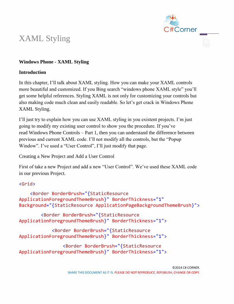
XAML Styling
Windows Phone - XAML Styling
Introduction
In this chapter, I’ll talk about XAML styling. How you can make your XAML controls
more beautiful and customized. If you Bing search “windows phone XAML style” you’ll
get some helpful references. Styling XAML is not only for customizing your controls but
also making code much clean and easily readable. So let’s get crack in Windows Phone
XAML Styling.
I’ll just try to explain how you can use XAML styling in you existent projects. I’m just
going to modify my existing user control to show you the procedure. If you’ve
read Windows Phone Controls – Part 1, then you can understand the difference between
previous and current XAML code. I’ll not modify all the controls, but the “Popup
Window”. I’ve used a “User Control”, I’ll just modify that page.
Creating a New Project and Add a User Control
First of take a new Project and add a new “User Control”. We’ve used these XAML code
in our previous Project.
<Grid>
<Border BorderBrush="{StaticResource ApplicationForegroundThemeBrush}" BorderThickness="1" Background="{StaticResource ApplicationPageBackgroundThemeBrush}">
<Border BorderBrush="{StaticResource ApplicationForegroundThemeBrush}" BorderThickness="1">
<Border BorderBrush="{StaticResource ApplicationForegroundThemeBrush}" BorderThickness="1">
<Border BorderBrush="{StaticResource ApplicationForegroundThemeBrush}" BorderThickness="1">

©2014 C# CORNER.
SHARE THIS DOCUMENT AS IT IS. PLEASE DO NOT REPRODUCE, REPUBLISH, CHANGE OR COPY.
<StackPanel Orientation="Vertical" Height="200" Width="200" VerticalAlignment="Center">
<TextBlock Text="This is a Popup!" VerticalAlignment="Center" HorizontalAlignment="Center" Margin="0,60,0,0"/>
<TextBlock Text="Hit the button again to hide me" VerticalAlignment="Center" HorizontalAlignment="Center" Margin="0,10,0,0" TextWrapping="Wrap" TextAlignment="Center"/>
<Button HorizontalAlignment="Center" Content="Close Popup" Click="ClosePopup" />
</StackPanel>
</Border>
</Border>
</Border>
</Border>
</Grid>
Listing 1
And the design is look like this.

©2014 C# CORNER.
SHARE THIS DOCUMENT AS IT IS. PLEASE DO NOT REPRODUCE, REPUBLISH, CHANGE OR COPY.
Figure 1
Now, we’ll use XAML styling in the same XAML code and make it much clean and
customized as well. To do so, you’ve to put resources as shown below.
<UserControl
... d:DesignWidth="400">
<UserControl.Resources>
...
</UserControl.Resources>
<Grid>
...
</Grid>
</UserControl>
Listing 2

©2014 C# CORNER.
SHARE THIS DOCUMENT AS IT IS. PLEASE DO NOT REPRODUCE, REPUBLISH, CHANGE OR COPY.
Creating Styles
All you’ve to do, is put all your style properties inside the Resources tag. First of all we’ll
create a “Border Style” for our “Border” control.
<UserControl.Resources>
<Style x:Key="BorderStyle" TargetType="Border">
<Setter Property="BorderThickness" Value="2"/>
<Setter Property="CornerRadius" Value="0,10,0,10"/>
</Style>
</UserControl.Resources>
Listing 3
Note: If you’re using this in Blank of Basic pages, the code will be like this.
<Page.Resources>
<Style x:Key="BorderStyle" TargetType="Border">
<Setter Property="BorderThickness" Value="2"/>
<Setter Property="CornerRadius" Value="0,10,0,10"/>
</Style>
</Page.Resources>
Listing 4
As we’re using a “User Control”, so we used “UserControl.Resources”.
Here, we’re considering only one “Border” control. If you look above the code, we gave
the style name “BorderStyle” and set target to “Border”. In which control you work,
you’ve to give a unique name and set target of that control. Also, we’ve set a property
name “BorderThickness” and set value to “2”, which will make the thickness of the
border’s outer edges. And we’ve also set “CornerRadious” to “0,10,0,10”, which will
make the upper right and lower left corner edges little bit round.

©2014 C# CORNER.
SHARE THIS DOCUMENT AS IT IS. PLEASE DO NOT REPRODUCE, REPUBLISH, CHANGE OR COPY.
Figure 2
Now, similarly we’ve added “TextBox” and “Button” styles.
<UserControl.Resources>
<Style x:Key="BorderStyle" TargetType="Border">
<Setter Property="BorderThickness" Value="2"/>
<Setter Property="CornerRadius" Value="0,10,0,10"/>
</Style>
<Style x:Key="StackPanelStyle" TargetType="StackPanel">
<Setter Property="Orientation" Value="Vertical"/>
<Setter Property="VerticalAlignment" Value="Center"/>
<Setter Property="Height" Value="200"/>
<Setter Property="Width" Value="200"/>
</Style>

©2014 C# CORNER.
SHARE THIS DOCUMENT AS IT IS. PLEASE DO NOT REPRODUCE, REPUBLISH, CHANGE OR COPY.
<Style x:Key="ButtonStyle" TargetType="Button">
<Setter Property="HorizontalAlignment" Value="Center"/>
<Setter Property="Content" Value="Close Popup"/>
<Setter Property="Background" Value="Green"/>
</Style>
<Style x:Key="TextBlockStyle" TargetType="TextBlock">
<Setter Property="VerticalAlignment" Value="Center"/>
<Setter Property="HorizontalAlignment" Value="Center"/>
<Setter Property="Text" Value="This is a Popup!"/>
<Setter Property="Margin" Value="0,60,0,0"/>
<Setter Property="Foreground" Value="Red"/>
</Style>
<Style x:Key="TextBlockStyle1" TargetType="TextBlock">
<Setter Property="VerticalAlignment" Value="Center"/>
<Setter Property="HorizontalAlignment" Value="Center"/>
<Setter Property="TextAlignment" Value="Center"/>
<Setter Property="TextWrapping" Value="Wrap"/>
<Setter Property="Text" Value="Hit the button again to hide me."/>
<Setter Property="Margin" Value="0,10,0,0"/>
<Setter Property="Foreground" Value="Gray"/>
</Style>
</UserControl.Resources>
Listing 5

©2014 C# CORNER.
SHARE THIS DOCUMENT AS IT IS. PLEASE DO NOT REPRODUCE, REPUBLISH, CHANGE OR COPY.
If you take a look the old XAML code, you can see all the properties are here exactly
same, exception in “Button” click event. You’ve to put this event in the main Grid’s
“Button” control’s code.
<Grid>
<Border BorderBrush="{StaticResource ApplicationForegroundThemeBrush}"
Background="{StaticResource ApplicationPageBackgroundThemeBrush}"
Style="{StaticResource BorderStyle}">
<StackPanel Style="{StaticResource StackPanelStyle}">
<TextBlock Style="{StaticResource TextBlockStyle}"/>
<TextBlock Style="{StaticResource TextBlockStyle1}"/>
<Button Style="{StaticResource ButtonStyle}" Click="ClosePopup" />
</StackPanel>
</Border>
</Grid>
Listing 6
All you need to do is just reference the styles in corresponding controls. Like in “Border”
control we’ve used “Style=”{StaticResource BorderStyle}”.. “. After the “StaticResource”
name the Style name.
Put Your Styles Separate
Another important thing you can do is to separate the XAML styling into different
location. To make much clean XAML. To do so, just open “App.xaml” and put the same
code there, like this.

©2014 C# CORNER.
SHARE THIS DOCUMENT AS IT IS. PLEASE DO NOT REPRODUCE, REPUBLISH, CHANGE OR COPY.
<Application
...
>
<!--Application Resources-->
<Application.Resources>
<Style x:Key="BorderStyle" TargetType="Border">
<Setter Property="BorderThickness" Value="2"/>
<Setter Property="CornerRadius" Value="5"/>
</Style>
<Style x:Key="StackPanelStyle" TargetType="StackPanel">
<Setter Property="Orientation" Value="Vertical"/>
<Setter Property="VerticalAlignment" Value="Center"/>
<Setter Property="Height" Value="200"/>
<Setter Property="Width" Value="200"/>
</Style>
</Application.Resources>
</Application>
Listing 7
Only difference is the tag, here it should be “Application.Resources”, because it’s in
“App.xaml” file. So, the tag structure should like “Type.Resources”. Here type can
“Page”, “Application”, “UserControl” etc.
Now, in “Main Page.xaml” take Button control to show the “Popup Window”.

©2014 C# CORNER.
SHARE THIS DOCUMENT AS IT IS. PLEASE DO NOT REPRODUCE, REPUBLISH, CHANGE OR COPY.
<Page.Resources>
<Style x:Key="ButtonStyle" TargetType="Button">
<Setter Property="Name" Value="PopupButton"/>
<Setter Property="HorizontalAlignment" Value="Left"/>
<Setter Property="VerticalAlignment" Value="Top"/>
<Setter Property="Width" Value="140"/>
<Setter Property="Margin" Value="10,0,0,0"/>
<Setter Property="Content" Value="Show Popup"/>
</Style>
</Page.Resources>
<Grid>
<Button Style="{StaticResource ButtonStyle}" Click="PopupButton_Click"/>
</Grid>
Listing 8
Code Behind
And C# code of this “Button” event handler is given below.
private void PopupButton_Click(object sender, RoutedEventArgs e)
{
if (!popup.IsOpen)
{
popup.Child = new PopupPanel();
popup.VerticalOffset = 250.0;

©2014 C# CORNER.
SHARE THIS DOCUMENT AS IT IS. PLEASE DO NOT REPRODUCE, REPUBLISH, CHANGE OR COPY.
popup.HorizontalOffset = 100.0;
popup.IsOpen = true;
}
}
Popup popup = new Popup();
Listing 9
Running the Application
So, if you run the application it’ll look like this.
Figure 3.1 Figure 3.2
Here, we’ve another sample, which “Popup Window” is round. You can simply do that
just changing this code in “PopupPanel.xaml”

©2014 C# CORNER.
SHARE THIS DOCUMENT AS IT IS. PLEASE DO NOT REPRODUCE, REPUBLISH, CHANGE OR COPY.
<Page.Resources> <Style x:Key="BorderStyle" TargetType="Border"> <Setter Property="BorderThickness" Value="2"/> <Setter Property="CornerRadius" Value="100"/> </Style> </Page.Resources>
Listing 10
Summary
Hope, you’ve understand the basic of XAML styling and how to remake your code to
more clean and efficient. Coding is also an art, make your code more beautiful and
significant to others.

©2014 C# CORNER.
SHARE THIS DOCUMENT AS IT IS. PLEASE DO NOT REPRODUCE, REPUBLISH, CHANGE OR COPY.
Appxmanifest
Windows Phone – Package.appxmanifest
Introduction
In this chapter, I’ll talk about Windows Phone “Package.appxmanifest”. It’s really very
important to make your app fully complete. Because just designing and lots of code don’t
make a good app, the look of the app must be very attractive. Look and feel is very
important to attract a customers. Moreover, not only look but also the capabilities and
dependencies of app are need to set in “Package.appxmanifest”.
Exploring Package.appxmanifest
So, let’s explore the Windows Phone “Package.appxmanifest”. Just open up the
“Package.appxmanifest” from your “Solution Explorer”, and you can see the similar
picture below.
Figure 1
I’ve used my previous example of Windows Phone XAML Styling here. You can use any
of existing application or just create a new one.
Changing Application Title
If you take a look at the picture, “Display name” and “Description” have that same content
“XAMLStyling”. Yes, it’s our app name, we’ve given it before. But does it look good,
when we run the application?

©2014 C# CORNER.
SHARE THIS DOCUMENT AS IT IS. PLEASE DO NOT REPRODUCE, REPUBLISH, CHANGE OR COPY.
Figure 2.1 Figure 2.2
The answer will obviously “No”. So we just need to little bit of work. Just give a space
between “XAML” and “Style”, so it’ll be “XAML Style”.
Figure 3
One more thing we’ve to do is, switch to the “Visual Assets” tab and check the “Check
Box” below “Title”.
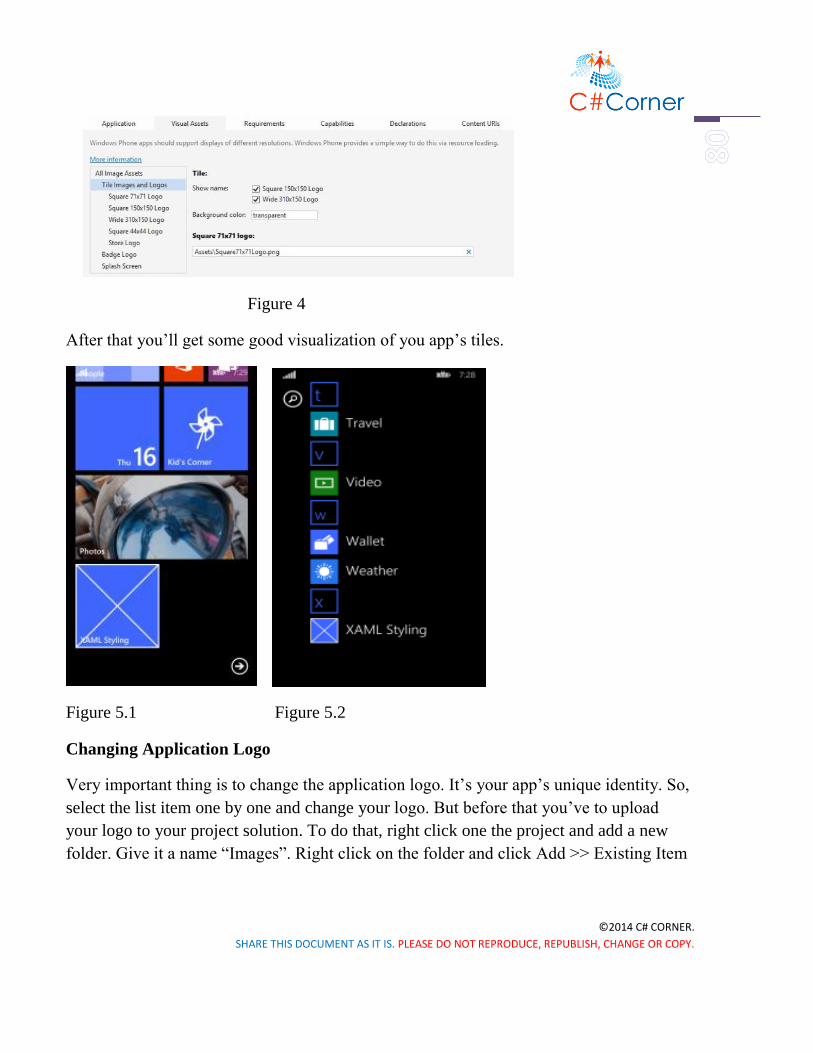
©2014 C# CORNER.
SHARE THIS DOCUMENT AS IT IS. PLEASE DO NOT REPRODUCE, REPUBLISH, CHANGE OR COPY.
Figure 4
After that you’ll get some good visualization of you app’s tiles.
Figure 5.1 Figure 5.2
Changing Application Logo
Very important thing is to change the application logo. It’s your app’s unique identity. So,
select the list item one by one and change your logo. But before that you’ve to upload
your logo to your project solution. To do that, right click one the project and add a new
folder. Give it a name “Images”. Right click on the folder and click Add >> Existing Item

©2014 C# CORNER.
SHARE THIS DOCUMENT AS IT IS. PLEASE DO NOT REPRODUCE, REPUBLISH, CHANGE OR COPY.
Figure 6
Upload all required logos of corresponding resolution.
Figure 7
Now, locate all the logos in “Visual Assets” section

©2014 C# CORNER.
SHARE THIS DOCUMENT AS IT IS. PLEASE DO NOT REPRODUCE, REPUBLISH, CHANGE OR COPY.
Figure 8
Format of Logo
Logo must be in “png” format and if it’s transparent then it’ll be better for visualizing
some information. Locate all these logos one by one. After you’ve changed the logos, save
it. If you run the application, it’ll look like this.
Figure 9.1 Figure 9.2 Figure 9.3
Other Options

©2014 C# CORNER.
SHARE THIS DOCUMENT AS IT IS. PLEASE DO NOT REPRODUCE, REPUBLISH, CHANGE OR COPY.
Well, we’ve done some major modification of our application. There’re some other parts
like “Requirements”.
Figure 10
If you use sensors and camera API then you need to check the option, you’ve used in your
application. One more thing is “Capabilities”.
Figure 11
If you use microphone, location service, internet, proximity or any other things, you need
to check these options as well. Otherwise your application will not work.
There’re some other options like “Declaration”, “Content URls” and “Packaging”. You
can also change these things as well. I’ve shown the common things here.
Summary
So, that’s it. Hope you’ve now understanding about Windows Phone
“package.appxmanifest”. Keep digging with Visual Studio and try to learn new things
every day.

©2014 C# CORNER.
SHARE THIS DOCUMENT AS IT IS. PLEASE DO NOT REPRODUCE, REPUBLISH, CHANGE OR COPY.
Splash Screen
Windows Phone – Extended Splash Screen with Progress Bar
Introduction
In the previous chapter, I’ve talked about Windows Phone Package.appxmanifest. I’ve
shown there, how to add custom application logos with different resolution. It makes your
app much beautiful and attractive.
Adding a Splash Screen
One more important thing to add in your application is “Splash Screen”. This gives you a
nice representation of your app and yourself or your company. So, how you can do that?
It’s really simple to add a “Splash Screen” in Windows Phone 8.1 with Visual Studio 2013
update 2/3. Just go to “Package.appxmanifest” and open “Visual Assets” tab. Then you
can find “Splash Screen” at the bottom.
Figure 1
All you’ve to do, is just upload your “Splash Screen” in your project and locate this file.
This will bring the “Splash Screen” when someone opens the application, but it’ll vanish
in blink of an eye. To make effective, we need to add “Splash Screen” in a different way.
We call it “Extended Splash Screen”.
©2014 C# CORNER.
SHARE THIS DOCUMENT AS IT IS. PLEASE DO NOT REPRODUCE, REPUBLISH, CHANGE OR COPY.
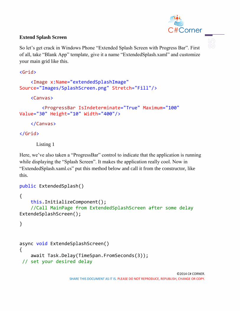
Extend Splash Screen
So let’s get crack in Windows Phone “Extended Splash Screen with Progress Bar”. First
of all, take “Blank App” template, give it a name “ExtendedSplash.xaml” and customize
your main grid like this.
<Grid>
<Image x:Name="extendedSplashImage" Source="Images/SplashScreen.png" Stretch="Fill"/>
<Canvas>
<ProgressBar IsIndeterminate="True" Maximum="100" Value="30" Height="10" Width="400"/>
</Canvas>
</Grid>
Listing 1
Here, we’ve also taken a “ProgressBar” control to indicate that the application is running
while displaying the “Splash Screen”. It makes the application really cool. Now in
“ExtendedSplash.xaml.cs” put this method below and call it from the constructor, like
this.
public ExtendedSplash()
{ this.InitializeComponent(); //Call MainPage from ExtendedSplashScreen after some delay ExtendeSplashScreen();
}
async void ExtendeSplashScreen() { await Task.Delay(TimeSpan.FromSeconds(3)); // set your desired delay

©2014 C# CORNER.
SHARE THIS DOCUMENT AS IT IS. PLEASE DO NOT REPRODUCE, REPUBLISH, CHANGE OR COPY.
Frame.Navigate(typeof(MainPage)); // call MainPage }
Listing 2
Async Operation
Here we’ve used an async method named “ExtendeSplashScreen” and make it delayed till
three seconds. Then it’ll bring the “MainPage.xaml”.
Async and await keywords in C# are intended to help with offloading long IO operations
off the UI thread. The await keyword ensures that nothing happens before the called
asynchronous method is finished. Both keywords - async and await - always work
together. Await without async is not allowed. When using async and await the compiler
generates a state machine in the background. If the “ExtendedSplashScreen()” hasn’t
finished and still running, “ExtendedSplashScreen()” will return to its calling method, thus
the main thread doesn't get blocked. When the delay is done then a thread from the
ThreadPool (can be any thread) will return to “MainPage()” (constructor) at its previous
state and continue execution.
Changing Starting Page to the Splash Screen Page
One more thing to do, is make the startup page to “ExtendedSplash.xaml” otherwise the
splash screen will not work. To do so, go to “App.xaml.cs” and find “OnLaunched”
method, and at the bottom you’ll find “rootFrame.Navigate(typeof(MainPage),
e.Arguments)”, change “MainPage” to “ExtendedSplash” which we’ve named to our
“Splash Screen”.
if (!rootFrame.Navigate(typeof(ExtendedSplash), e.Arguments))
{ throw new Exception("Failed to create initial page"); }
Listing 3
Handling Back Button Press
Now, we’ve set all things to make work our “Splash Screen”. But it’s really important to
understand the Windows Phone page navigation service. We’ve set the starting page to

©2014 C# CORNER.
SHARE THIS DOCUMENT AS IT IS. PLEASE DO NOT REPRODUCE, REPUBLISH, CHANGE OR COPY.
our “Splash Screen” and after three seconds it’ll bring the “Main Page”. But when we
want to go back, it’ll bring the “Splash Screen” again and after three seconds it’ll bring the
“Main Page” again. So it’s just irritating. To avoid this problem we need to add a method
called “HardwareButtons_BackPressed” in “MainPage.xaml.cs”
void HardwareButtons_BackPressed(object sender, Windows.Phone.UI.Input.BackPressedEventArgs e)
{
Frame frame = Window.Current.Content as Frame;
if (frame == null)
{
return;
}
if (frame.CanGoBack)
{
frame.GoBack();
//Indicate the back button press is handled so the app does not exit
e.Handled = true;
}
}
Listing 4
Here, we make Frame object name “frame” and if it’s not null and if we’ve a go back
state, then we make “e.Handled” equal to true, so that app doesn’t exit. If you make it
false, the app will exit when you press the back button. Another problem is, if you have
multiple of pages then it will bring the “Splash Screen” instead of bringing the previous

©2014 C# CORNER.
SHARE THIS DOCUMENT AS IT IS. PLEASE DO NOT REPRODUCE, REPUBLISH, CHANGE OR COPY.
page because of calling the method “GoBack”. We need this for another purpose which
I’m talking later.
Now, we’re handling the “Can go back” task, but our problem still exists. To solve this
problem we need to check the “Back State” situation. If the “Back State” equals to one,
then we’ve only one page remaining and it’s obviously our “Splash Screen”. So, we just
need to remove the “Back State” so that our app can exit. To do so, just put this code
inside the “OnNavigatedTo” method.
// Check if ExtendedSplashscreen.xaml is on the backstack and remove
if (Frame.BackStack.Count() == 1)
{ Frame.BackStack.RemoveAt(Frame.BackStackDepth - 1); }
Listing 5
Now, back to unfinished topic is why we need to use “frame.Goback” method, because if
we don’t use it we’ll get an exception when we’ll navigate through multiple pages and
press back key. To avoid that, we need this method.
Running the Application
Now, run the application and it’ll work just fine.

©2014 C# CORNER.
SHARE THIS DOCUMENT AS IT IS. PLEASE DO NOT REPRODUCE, REPUBLISH, CHANGE OR COPY.
Figure 2
If you look closely, you can see “Progress Bar” top of the “Splash Screen” and it’ll be
displaying for three seconds, then the “MainPage” will load.
Summary
To make a commercial app, you must add Splash Screen that represent the app and give a
different look and feel. So, that’s it. Hope you’ve understand all these things. In the next
chapter you’ll learn more about how to navigate through one page to another.

©2014 C# CORNER.
SHARE THIS DOCUMENT AS IT IS. PLEASE DO NOT REPRODUCE, REPUBLISH, CHANGE OR COPY.
Page Navigation
Windows Phone – Page navigation and pass a complex object to a page
Introduction
In this chapter we’ll talk about Windows Phone page navigation. Previously in Windows
Phone 7 or 8, page navigation technique was quite different. In Windows Phone 8 app, it
could have several pages and when we want to navigate through different pages, it opens a
new window. But in Windows Phone 8.1, there is only one window. When we want to
open a different page, it opens a new frame. So things got changed a little like Windows 8.
So, let’s see how it works in Windows Phone 8.1 page navigation. Let’s get started.
Creating a New Project
Fist open up a new “Blank App (Windows Phone)” project. Then you’ve to delete the
“MainPage.xaml”, because when we navigate between pages, we’d use the Basic Page
template.

©2014 C# CORNER.
SHARE THIS DOCUMENT AS IT IS. PLEASE DO NOT REPRODUCE, REPUBLISH, CHANGE OR COPY.
Figure 1
So, it’s good to work with “Basic Page” template. To add a new “Main Page”, just
right click on the project in Solution Explorer and select Add >> New Item.
Figure 2
Then, select “Basic Page” template and give it an exact same name “MainPage.xaml”.

©2014 C# CORNER.
SHARE THIS DOCUMENT AS IT IS. PLEASE DO NOT REPRODUCE, REPUBLISH, CHANGE OR COPY.
Figure 3
We need another page to navigate from “MainPage” to the second page. So, we need to
add similarly a “Basic Page” template and give it a name “SecondPage.xaml”.
Figure 4

©2014 C# CORNER.
SHARE THIS DOCUMENT AS IT IS. PLEASE DO NOT REPRODUCE, REPUBLISH, CHANGE OR COPY.
Adding a New Class
Now, we’ve to add another class name “Person.cs”. We’ll create two person’s attributes
“Name” and “Blog” which we’ll pass when we navigate through pages,
Figure 5
and the code is given below.
class Person
{
public string Name { get; set; }
public string Blog { get; set; }
}
Listing 1
Here, we’ve created two string variables “Name” and “Blog”. Just type “prop” and double
tab in the key board, it’ll automatically create full code snippet for you, and tab again and
change “int” to “string”, hit tab second time and change “MyProperty” to “Name”.
Change the second code snippet like wise.

©2014 C# CORNER.
SHARE THIS DOCUMENT AS IT IS. PLEASE DO NOT REPRODUCE, REPUBLISH, CHANGE OR COPY.
Figure 6
Adding a Button Control
Now, we’ll work in “MainPage.xaml”. Take a Button control and change content to “Next
Page” and the other property like below.
<Button Content="Next Page"
HorizontalAlignment="Left"
Margin="10,0,0,0"
VerticalAlignment="Top"
Click="NextPage_Click"/>
Listing 1
The C# code of “MainPage.xaml.cs”, mainly the event handler of the Button control is
given here.
private void NextPage_Click(object sender, RoutedEventArgs e)
{
var person = new Person { Name = "Stan Marsh", Blog =
"learnwithbddevs.wordpress.com" }
}
Listing 2
Here, we’ve created a person object of our Person class, we’ve set our “Name” and “Blog”
and pass it through the “Second Page”. As we mentioned before, Navigation Service does
not work in Windows Phone 8.1, it opens up a new frame every time. So, here we call
Frame class which has another Navigate Method, which has some types. Like here we’ve
“Basic Page” template and we’ve passed our person object as parameter.

©2014 C# CORNER.
SHARE THIS DOCUMENT AS IT IS. PLEASE DO NOT REPRODUCE, REPUBLISH, CHANGE OR COPY.
Displaying Data in Second Page
Now, in our “SecondPage.xaml” we’ve taken two TextBlock “tb1″ and “tb2″. The XAML
code is given below,
<TextBlock x:Name="tb1"
HorizontalAlignment="Left"
Margin="10,10,0,0"
TextWrapping="Wrap"
VerticalAlignment="Top"
Height="50"
Width="342"
FontSize="20"/>
<TextBlock x:Name="tb2"
HorizontalAlignment="Left"
Margin="10,65,0,0"
TextWrapping="Wrap"
VerticalAlignment="Top"
Height="50"
Width="342"
FontSize="20"/>
Listing 3
and C# code is given here.
private void NavigationHelper_LoadState(object sender, LoadStateEventArgs e)
{
var person = (Person)e.NavigationParameter;
if (!string.IsNullOrWhiteSpace(person.Name))
{
tb1.Text = "Hello, " + person.Name;
tb2.Text = "Welcome to: " + person.Blog;
}
else
{
tb1.Text = "Name is required. Go back and enter a name.";
}
}
Listing 4

©2014 C# CORNER.
SHARE THIS DOCUMENT AS IT IS. PLEASE DO NOT REPRODUCE, REPUBLISH, CHANGE OR COPY.
We’ve to put all the code in “NavigationHelper_LoadState” method, cause when a new
page loads this code block will work to retrieve data while navigate. This method is built
in, you just need to modify yourself as you like to do.
In our case, we’ve created a person variable object, which we’ve parsed into “Person”
class. We’ve checked whether Person’s name is empty or not, if not empty data will be
displayed otherwise not. It’ll show an error message “Name is required. Go back and enter
a name.”
All of our work is done. If you run the application, it’ll look like this.
Figure 7.1 Figure 7.2
Hit the “Next Page” Button and it’ll navigate to the “Second Page”, and display the
“Name” and “Blog” info on the TextBlocks respectively.
Summary
So, that’s it. Hope it’ll help to understand the basic navigation between pages and passing
complex object like we’ve done.

©2014 C# CORNER.
SHARE THIS DOCUMENT AS IT IS. PLEASE DO NOT REPRODUCE, REPUBLISH, CHANGE OR COPY.
Emulator
Working with Windows Phone Emulator
In this chapter I’ll talk about the Windows Phone 8.1 Emulator. To test and run your
application, Windows Phone Emulator gives you lots of flexibility and cool features. I’ve
seen others development environments but Visual Studio is the best IDE (Integrated
Development Environment) in the Universe. Windows Phone Emulator is a virtual mobile
image inside your PC. It’s really cool to work with it. So let’s get crack in Windows
Phone Emulator.
Running the Emulator
If you open a new project or an existing project, you can run the application from here.
Figure 1
You can see that, there are different types of Emulator Images with different resolutions.
You can choose any of them and test your application to verify whether it works fine or
not.
If you look at the Emulator, it just full featured Windows Phone 8.1 but it doesn’t have
some sensors or you can’t make any call from it. But it gives the real demo of running
your application in your Windows Phone device.

©2014 C# CORNER.
SHARE THIS DOCUMENT AS IT IS. PLEASE DO NOT REPRODUCE, REPUBLISH, CHANGE OR COPY.
Figure 2
Emulator Tools Options
You can see that, there is a menu bar at the right side of the emulator and if you press
back, search and other button it works just as same as your personal Windows Phone.
If you click on the double arrow at the bottom of the menu bar, another window will pop
up.
Figure 3

©2014 C# CORNER.
SHARE THIS DOCUMENT AS IT IS. PLEASE DO NOT REPRODUCE, REPUBLISH, CHANGE OR COPY.
Accelerometer
There’re some tabs in this window, first one is “Accelerometer” tab. If you’re working on
a project which have some functionality of “Accelerator” then, you can test your
application via this tool.
Figure 4
You can change the orientation of the device and see the changes according to the
coordinates.
Let’s do some experiment on this. I’m just showing a simple example of this. Just take a
look the picture below.

©2014 C# CORNER.
SHARE THIS DOCUMENT AS IT IS. PLEASE DO NOT REPRODUCE, REPUBLISH, CHANGE OR COPY.
Figure 6
Just changing the orientation of the “Accelerometer”, the application itself changes its
orientation as well and here the example gives the acceleration data in the Alert Box. I’ve
used a PhoneGap Application. You can find it in PhoneGap (Cordova) Part 2 chapter.
You can also change the Orientation types from the Tools also.
Figure 7

©2014 C# CORNER.
SHARE THIS DOCUMENT AS IT IS. PLEASE DO NOT REPRODUCE, REPUBLISH, CHANGE OR COPY.
You can see that, now the visual state changed in “Portrait Flat” mood.
Location
Second tab is “Location” section. It’s very important and helpful indeed. If you don’t have
any real device or Windows Phone, and you’re working on Geo-locator, Map or any
location based service then you can test your application via this control window. It’s
some features that will blow you mind and I myself find it very helpful while working on
Location Based Project.
Figure 8
You can add a Pushpin from here, and if you run the Map application, it assumes, this is
your current location and if you change it then it’ll update eventually.
You can also save your location from here.

©2014 C# CORNER.
SHARE THIS DOCUMENT AS IT IS. PLEASE DO NOT REPRODUCE, REPUBLISH, CHANGE OR COPY.
Figure 9
And when you need, you can also load your saved location data from the right button of
the “Save Map Points” buttons. It generates a “XML” file that contains the “Latitude” and
“Longitude” of your location.
Figure 10

©2014 C# CORNER.
SHARE THIS DOCUMENT AS IT IS. PLEASE DO NOT REPRODUCE, REPUBLISH, CHANGE OR COPY.
You can save it anywhere of your hard drive, but by default you can find it in Documents
>> Windows Phone Emulator >> Location folder.
You can also test the direction between two points and test it while navigation if you use
navigation service in your application.
Figure 22
Put two Pushpin where you want and then hit the “Play” button and you can see like this.

©2014 C# CORNER.
SHARE THIS DOCUMENT AS IT IS. PLEASE DO NOT REPRODUCE, REPUBLISH, CHANGE OR COPY.
Figure 12
You can notice that a point is moving through the route, you can also set speed limit from
here.
Screen Capture
Another feature is take a “Screen Shot”. It’s really awesome and you must have to use it
while submitting your application in the store. You’ve to take several screen shots to give
proper view of your application to the users.

©2014 C# CORNER.
SHARE THIS DOCUMENT AS IT IS. PLEASE DO NOT REPRODUCE, REPUBLISH, CHANGE OR COPY.
Figure 13
Save the image anywhere you want. By default it’s “png” format image and Windows
Phone Store doesn’t support “jpeg” format. So it’s really helpful.
Network
Last important tab is “Network” section. You can see your network information,
emulator’s physical address and some other information that will help you to configure if
you’re using a wireless network as well cable network.
Other Options
There are some other sections like “SD Cards”, “Notifications”, “Checkpoints” and
“Sensors”. You can surf these section if you want, but above four sections are mostly
important. I recommend you to test your application in your real device if you’re using
any sensors. Because then you can understand the performance of you application.

©2014 C# CORNER.
SHARE THIS DOCUMENT AS IT IS. PLEASE DO NOT REPRODUCE, REPUBLISH, CHANGE OR COPY.
Emulator Tools Names and Functions
These are basic option of the emulator.
Figure 14
You can also fit your Emulator window as your needs.

©2014 C# CORNER.
SHARE THIS DOCUMENT AS IT IS. PLEASE DO NOT REPRODUCE, REPUBLISH, CHANGE OR COPY.
Figure 15
It’ll help you if you’re working on big screen as well small screen.
Device Configuration from Visual Studio
Moreover if you can test the theme of your application like “Dark” or “light” and also
change the Accent Color.

©2014 C# CORNER.
SHARE THIS DOCUMENT AS IT IS. PLEASE DO NOT REPRODUCE, REPUBLISH, CHANGE OR COPY.
Figure 16
You can find this option in left side of the Visual Studio on “Device” tab. You can also
change device resolution and orientation from here.
Summary
So, that’s pretty much about Windows Phone Emulator. Working with emulator and know
its functionality is important as well developing your application. Windows phone
emulator gives a lots of features for testing your application. Hope you can find it helpful.

©2014 C# CORNER.
SHARE THIS DOCUMENT AS IT IS. PLEASE DO NOT REPRODUCE, REPUBLISH, CHANGE OR COPY.
Command Bar
Windows Phone – Command Bar
Introduction
In this chapter I’ll talk about a simple but useful topic “Windows Phone Command Bar”.
If you’ve previous experience about Windows Phone 7 or 8, you could have noticed that,
in Windows Phone 8.1 they made a little bit of change. Previously we’re familiar with
“App Bar” control, now it’s known as “Command Bar”. “CommandBar” is another user
interface element, we can use in the application to provide more options in the form of
icons and menu options to the user than what they see displayed by default. Obviously the
code segment also changed than before. So, let’s get crack in Windows Phone Command
Bar.
Creating a New Project and Add a CommandBar
First of all, open up a new project or you can simply load your previous project. Now, in
your left-side of Visual Studio, you can see a side window named “Document Outline”.
Just right click on the “BottomAppBar” and add a “Command Bar”.
Figure 1
Now, you’ll notice that, it automatically generates a XAML code snippet for you.

©2014 C# CORNER.
SHARE THIS DOCUMENT AS IT IS. PLEASE DO NOT REPRODUCE, REPUBLISH, CHANGE OR COPY.
<Page.BottomAppBar> <CommandBar> <AppBarButton Icon="Accept" Label="appbarbutton"/> <AppBarButton Icon="Cancel" Label="appbarbutton"/> </CommandBar> </Page.BottomAppBar>
Listing 1
Now, again right click on the “SecondaryCommands” and add a new “AppBarButton”.
Figure 2
And you can see it creates another menu button for your “Command Bar”, and your
XAML code will look like this.
<Page.BottomAppBar> <CommandBar> <CommandBar.SecondaryCommands> <AppBarButton Label="about"/> </CommandBar.SecondaryCommands> <AppBarButton Label="accept"> <AppBarButton.Icon> <FontIcon Glyph="A"/> </AppBarButton.Icon> </AppBarButton> <AppBarButton Label="cancel"> <AppBarButton.Icon> <FontIcon Glyph="C"/>

©2014 C# CORNER.
SHARE THIS DOCUMENT AS IT IS. PLEASE DO NOT REPRODUCE, REPUBLISH, CHANGE OR COPY.
</AppBarButton.Icon> </AppBarButton> </CommandBar> </Page.BottomAppBar> Listing 2
We’ve modified the labels of “Accept” and “Cancel” button, it shows the hint about the
“Command Bar” buttons, and changed the label of “AppBarButton” to “about”.
Changing the CommandBar Icons
Now, you can change the icons of your “Command Bar”, as you see in the picture below,
it already set to “Accept” icon. Because we’ve selected the “accept” button in the XAML
code.
Figure 3
Or you can choose a “font icon” as your Icon, like “A”, “B” or anything you want.

©2014 C# CORNER.
SHARE THIS DOCUMENT AS IT IS. PLEASE DO NOT REPRODUCE, REPUBLISH, CHANGE OR COPY.
Figure 4
If you change “Accept” to “A” and “Cancel” to “C”, the code will look like this.
<Page.BottomAppBar> <CommandBar> <CommandBar.SecondaryCommands> <AppBarButton Label="about"/> </CommandBar.SecondaryCommands> <AppBarButton Label="accept"> <AppBarButton.Icon> <FontIcon Glyph="A"/> </AppBarButton.Icon> </AppBarButton> <AppBarButton Label="cancel"> <AppBarButton.Icon> <FontIcon Glyph="C"/> </AppBarButton.Icon> </AppBarButton> </CommandBar> </Page.BottomAppBar>
Listing 3

©2014 C# CORNER.
SHARE THIS DOCUMENT AS IT IS. PLEASE DO NOT REPRODUCE, REPUBLISH, CHANGE OR COPY.
Changing the CommadBar Mode
You can also change the mode of “Command Bar”. For this, all you’ve to do, is just make
some change in your “<CommandBar>” tag like the picture below.
Figure 5
You’ve to select the “Minimal” view of “ClosedDisplayMode”.
<Page.BottomAppBar> <CommandBar ClosedDisplayMode="Minimal"> <CommandBar.SecondaryCommands> <AppBarButton Label="about"/> </CommandBar.SecondaryCommands> <AppBarButton Label="accept"> <AppBarButton.Icon> <FontIcon Glyph="A"/> </AppBarButton.Icon> </AppBarButton> <AppBarButton Label="cancel"> <AppBarButton.Icon> <FontIcon Glyph="C"/> </AppBarButton.Icon> </AppBarButton> </CommandBar> </Page.BottomAppBar>
Listing 4

©2014 C# CORNER.
SHARE THIS DOCUMENT AS IT IS. PLEASE DO NOT REPRODUCE, REPUBLISH, CHANGE OR COPY.
Add an Event Handler
Now let’s go back to previous changes and give an event handler in “about” button. To do
so, in XAML code select the “About AppBarButton” line and under the “Solution
Explorer”, you can see a “Properties” window and select the thunder sign like the picture
below,
and double click on the “Click” section and it automatically generates the code block for
you.
If you take a look at the XAML code, you can see exactly like this.
<Page.BottomAppBar> <CommandBar ClosedDisplayMode="Minimal"> <CommandBar.SecondaryCommands> <AppBarButton Label="about" Click="AppBarButton_Click"/> </CommandBar.SecondaryCommands> <AppBarButton Label="accept" Icon="Accept"/> <AppBarButton Label="cancel" Icon="Cancel"/> </CommandBar> </Page.BottomAppBar>
Listing 5

©2014 C# CORNER.
SHARE THIS DOCUMENT AS IT IS. PLEASE DO NOT REPRODUCE, REPUBLISH, CHANGE OR COPY.
As, we’ve made an event handler for our “about” button, so we have to take another page
named “About.xaml” and we’ll navigate to that page if someone tap on the “about”
button.
So, when you’ve done adding a new page, go to the “MainPage.xaml.cs” or wherever
you’ve done this. In our case, we created our “Command Bar” in “MainPage.xaml”, and
you can see this code block in that page.
Figure 8
When’ve done, the code will look like this.
private void AppBarButton_Click(object sender, RoutedEventArgs e) { Frame.Navigate(typeof(About)); }
Listing 6

©2014 C# CORNER.
SHARE THIS DOCUMENT AS IT IS. PLEASE DO NOT REPRODUCE, REPUBLISH, CHANGE OR COPY.
Running the Application
After all you set, run the application and it will look like this.
Figure 9.1 Figure 9.2 Figure 9.3
When you tap on the “about” button, it navigates to the “About.xaml” page.
Summary
So, that’s it. I think you got the basic idea how to use “Command Bar” in Windows Phone
8.1. It’s really helpful to give other option and settings of you application.

©2014 C# CORNER.
SHARE THIS DOCUMENT AS IT IS. PLEASE DO NOT REPRODUCE, REPUBLISH, CHANGE OR COPY.
Data Binding
Data Binding with INotifyPropertyChanged Interface
Introduction
In this chapter we’ll talk about a little bit advanced topic like Data Binding. It’s really
useful when you’ve massively structured code, and you’ve to handle a lots of data, not
like our typical controls,
e.g., textBox1.Text = “Hello, world!”;
Data Binding is nothing but creating a “ViewModel” class or you can name as you wish,
which actually contains the data. One more important thing, you must follow in Data
Binding control is INotifyPropertyChanged.It actually gives you an alert, when a property
value is changed. Just like - hey there, “I’m changed.” We’ll come back it later.
Different Binding Modes
There are a number of different binding modes, as defined in the BindingMode
enumeration:
TwoWay – changes to the UI or model automatically update the other. This is used for
editable forms or other interactive scenarios.OneWay – updates the UI when the model
changes. This is appropriate for read-only controls populated from data.
OneTime – updates the UI when the application starts or when the data context changes.
This is used when the source data is static/does not change.
OneWayToSource – changes to the UI update the model.
Default – uses the default mode for the particular binding target (UI control). This differs
based on the control.
Objects that take part in OneWay or TwoWay binding must implement the
“INotifyPropertyChanged” interface. Thus interface requires only that the object publishes
the “PropertyChanged” event
public class ItemViewModel : INotifyPropertyChanged { public event PropertyChangedEventHandler PropertyChanged;

©2014 C# CORNER.
SHARE THIS DOCUMENT AS IT IS. PLEASE DO NOT REPRODUCE, REPUBLISH, CHANGE OR COPY.
... }
Listing 1
Object must fire the “PropertyChanged” event whenever the value of one of its public
properties changes.
So, first of all we’d like to implement our “ViewModel” class, which will contain our data
properties.
Adding a “ItemViewModel” class
Add a new class and give it a name “ItemViewModel”.
Now, we’ve to declare our private properties what we want to do, and make public get and
set methods. It’s really a bad idea to declare you variable public. So, we’ve declared
private but work with internally public.
There are two types of “INotifyPropertyChanged” implementation. One is Non-Optimal
and other is Optimal. Let’s see how the Non-Optimal implementation works first.
public class ItemViewModel : INotifyPropertyChanged { // Properties

©2014 C# CORNER.
SHARE THIS DOCUMENT AS IT IS. PLEASE DO NOT REPRODUCE, REPUBLISH, CHANGE OR COPY.
private string _manufacturer; private string _model; private string _color; private int _year; public string manufacturer { get { return _manufacturer; } set { _manufacturer = value; NotifyPropertyChanged("manufacturer"); } } public string model { get { return _model; } set { _model = value; NotifyPropertyChanged("model"); } } public string color { get { return _color; } set { _color = value; NotifyPropertyChanged("color"); } } public int year { get { return _year; }

©2014 C# CORNER.
SHARE THIS DOCUMENT AS IT IS. PLEASE DO NOT REPRODUCE, REPUBLISH, CHANGE OR COPY.
set { _year = value; NotifyPropertyChanged("color"); } } // Property Change Logic public event PropertyChangedEventHandler PropertyChanged; private void NotifyPropertyChanged(string propertyName) { if (PropertyChanged != null) { PropertyChanged(this, new ropertyChangedEventArgs(propertyName)); } } } Listing 2
Here, we’ve declared our four private properties, actually a car’s attributes, and most
importantly in the setter whenever the value changes we call a method called
“NotifyPropertyChanged“ (“manufacturer”), which fires that property changed event. And
gives the name of that property. It’s kind of error-prone because this is what we using is
“Magic Strings”. It’s not actually good to hard coded given new name of your property.
Optimal ViewModel Implementation
Now, let’s see our Optimal ViewModel implementation,
public class ItemViewModel : INotifyPropertyChanged { // Properties private string _manufacturer; private string _model; private string _color; private int _year; public string manufacturer

©2014 C# CORNER.
SHARE THIS DOCUMENT AS IT IS. PLEASE DO NOT REPRODUCE, REPUBLISH, CHANGE OR COPY.
{ get { return _manufacturer; } set { this.SetProperty(ref this._manufacturer, value); } } public string model { get { return _model; } set { this.SetProperty(ref this._model, value); } } public string color { get { return _color; } set { this.SetProperty(ref this._color, value); } } public int year { get { return _year; } set { this.SetProperty(ref this._year, value); } } // Property Change Logic public event PropertyChangedEventHandler PropertyChanged; protected bool SetProperty<T>(ref T storage, T value, CallerMemberName] string propertyName = null) { if (object.Equals(storage, value)) return false; storage = value; this.OnPropertyChaned(propertyName); return true;

©2014 C# CORNER.
SHARE THIS DOCUMENT AS IT IS. PLEASE DO NOT REPRODUCE, REPUBLISH, CHANGE OR COPY.
private void OnPropertyChaned(string propertyName) { var eventHandler = this.PropertyChanged; if (eventHandler != null) eventHandler(this, new PropertyChangedEventArgs(propertyName)); }
}
Listing 3
and you’ve noticed that it’s kind of nice refection tool to change the name of your
property, which will nicely do through all of your app. It works similarly Non-Optimal
“ViewModel” but changes the value of your property automatically and fires the
“PropertyChanged” event whenever the value of one of its public properties changes.
Designing UI
So, our “ViewModel” implementation is okay now. Now, we’ll move to design our app,
which will show four properties of our “ItemViewModel” class. Let’s take four
TextBlocks and a Button. You can design as you wish to do so. Sample XAML UI code is
given below,
<!--TODO: Content should be placed within the following grid-->
<Grid Grid.Row="1" x:Name="ContentRoot" Margin="19,9.5,19,0"> <TextBlock Height="50" HorizontalAlignment="Left" Margin="10,10,0,0" Name="manufacturerBlock" Text="{Binding manufacturer,Mode=TwoWay}" VerticalAlignment="Top" Width="342" FontSize="24"/> <TextBlock Height="50" HorizontalAlignment="Left" Margin="10,65,0,0" Name="modelBlock" Text="{Binding model,Mode=TwoWay}" VerticalAlignment="Top"

©2014 C# CORNER.
SHARE THIS DOCUMENT AS IT IS. PLEASE DO NOT REPRODUCE, REPUBLISH, CHANGE OR COPY.
Width="342" FontSize="24"/> <TextBlock Height="50" HorizontalAlignment="Left" Margin="10,120,0,0" Name="colorBlock" Text="{Binding color,Mode=TwoWay}" VerticalAlignment="Top" Width="342" FontSize="24"/> <TextBlock Height="50" HorizontalAlignment="Left" Margin="10,175,0,0" x:Name="yearBlock" Text="{Binding year, Mode=TwoWay}" VerticalAlignment="Top" Width="342" FontSize="24"/> <Button Content="Update" Height="50" HorizontalAlignment="Left" Margin="202,443,0,0" Name="updateButton" VerticalAlignment="Top" Width="150" Click="updateBtn_Click" /> </Grid>
Listing 4
Here, we’ve used TwoWay mode, because we will update our databound UI elements in
XAML runtime.
Backend C# Code
Now, let’s look inside of our “MainPage.xaml.cs” class.
public sealed partial class MainPage : Page { ItemViewModel _itemViewModel; ... }
Listing 5

©2014 C# CORNER.
SHARE THIS DOCUMENT AS IT IS. PLEASE DO NOT REPRODUCE, REPUBLISH, CHANGE OR COPY.
Put this line of code at the top of our constructor. It creates an object of our
“ItemViewModel” class.
// Constructor public MainPage() { this.InitializeComponent(); Loaded += MainPage_Loaded; ... }
Listing 6
Update the constructor with “MainPage_Loaded” method, because when you run the
application it’ll call the method to display the data.
Now, implement the “MainPage_Loaded” method.
void MainPage_Loaded(object sender, RoutedEventArgs e) { _itemViewModel = new ItemViewModel { manufacturer = "Oldsmobile", model = "Cutlas Supreme", color = "Silver", year = 1988
};
setDataContext(); }
Listing 7
So, we created new “ItemViewModel” object and bound our data in “ItemViewModel”
class, and set data context by calling “setDataContext” method.
private void setDataContext() {

©2014 C# CORNER.
SHARE THIS DOCUMENT AS IT IS. PLEASE DO NOT REPRODUCE, REPUBLISH, CHANGE OR COPY.
ContentRoot.DataContext = _itemViewModel; }
Listing 8
What it does, is setting up our data in the main Grid of our XAML UI. Here,
“ContentRoot” is the name of our main Grid.
// utility method which changes the PhoneModel properties
private void setItemProperties(String manufacturer, String model, String color, int year) { _itemViewModel.manufacturer = manufacturer; _itemViewModel.model = model; _itemViewModel.color = color; _itemViewModel.year = year;
}
Listing 9
It’s kind of nice, that you don’t have to worry about showing your data. Which is string
and which is integer, you don’t have to bother about it. Just make a reference of your data,
that’s it. When we press our Update Button, it’ll do the work for us.
// called when update button is clicked private void updateBtn_Click(object sender, RoutedEventArgs e) { setItemProperties("Ford", "Mustang GT", "Blue", 2010); }
Listing 10
It calls the “setItemProperties” method, and pass the following data to it. Really simple,
isn’t it?
Running the Application
Now, if you run the application, it’ll look exactly like this.

©2014 C# CORNER.
SHARE THIS DOCUMENT AS IT IS. PLEASE DO NOT REPRODUCE, REPUBLISH, CHANGE OR COPY.
Summary
That’s it. Hope you’ve understand the basic of “DataBinding” and
“INotifyPropertyChanged Interface”. So, make your app more awesome with this features.

©2014 C# CORNER.
SHARE THIS DOCUMENT AS IT IS. PLEASE DO NOT REPRODUCE, REPUBLISH, CHANGE OR COPY.
MVVM
MVVM – Simple Way You Can Think
Introduction
In previous chapter we’ve talked about DataBinding. Now, I’ll talk about one the most
important and little bit advanced topic. It’s all about “MVVM”. “MVVM” stands for
“Model-View-ViewModel”. Model basically initialize properties, attributes whatever you
say, and “ViewModel” contains all data of your application. Finally View represents
actual representation of data in your screen. Basically Data Binding works between
“ViewModel” and “View “layer, “View” requests command and “ViewModel” accepts it
and responses to the “View”. I’m not going the whole theoretical knowledge. I tried to
give you the basic idea what “MVVM” is.
Now, let’s get crack in the best practice in this super awesome architectural model.
Creating a New Project
First of all, open up a new project and name it “MVVMEx” or whatever you want. Now,
simply delete your “Mainpage.xaml”. Don’t freak out, it’s kind of modification. Now, add
three folder “Models”, “ViewModels” and “Views” one by one, like this.

©2014 C# CORNER.
SHARE THIS DOCUMENT AS IT IS. PLEASE DO NOT REPRODUCE, REPUBLISH, CHANGE OR COPY.
Figure 1
It should look exactly like below in Figure 2.

©2014 C# CORNER.
SHARE THIS DOCUMENT AS IT IS. PLEASE DO NOT REPRODUCE, REPUBLISH, CHANGE OR COPY.
Figure 2
Adding a New Page
Now, it kind of remake of our Data Binding example from my last article. Now, In
“Views” folder right click and add a new “Basic Page”, give it a name “AutoView”.

©2014 C# CORNER.
SHARE THIS DOCUMENT AS IT IS. PLEASE DO NOT REPRODUCE, REPUBLISH, CHANGE OR COPY.
Changing the Starting Page
Now one more thing we’ve to do, is changing our starting page. For that, you’ve to go
“app.xaml.cs” and change this line of code,
if (!rootFrame.Navigate(typeof(AutoView), e.Arguments)) { throw new Exception("Failed to create initial page"); }
Listing 1
because, we’ve deleted our “MainPage.xaml” and add a new page “AutoView.xaml”.
Adding Classes
Now, similarly right click on the “Model” folder and add a new class named “Auto.cs”.
Again right click on the “ViewModels” folder and add another class named
“AutoViewModel.cs”. After all you setup, your Solution Explorer will look like in Figure
4.

©2014 C# CORNER.
SHARE THIS DOCUMENT AS IT IS. PLEASE DO NOT REPRODUCE, REPUBLISH, CHANGE OR COPY.
Figure 4
Now, as we’ll do similarly as our previous Data Binding example, now we’ll modify our
“AutoView.xaml” as follows.
Modifying “AutoView.xaml” Page
Setting up app title and information.
<!-- Title Panel --> <StackPanel Grid.Row="0" Margin="19,0,0,0"> <TextBlock Text="Learn With BD Devs" Style="{ThemeResource TitleTextBlockStyle}" Margin="0,12,0,0"/> <TextBlock Text="MVVM" Margin="0,-6.5,0,26.5" Style="{ThemeResource HeaderTextBlockStyle}" CharacterSpacing="{ThemeResource PivotHeaderItemCharacterSpacing}"/> </StackPanel>
Listing 2

©2014 C# CORNER.
SHARE THIS DOCUMENT AS IT IS. PLEASE DO NOT REPRODUCE, REPUBLISH, CHANGE OR COPY.
Modifying main grid.
<!--TODO: Content should be placed within the following grid-->
<Grid Grid.Row="1" x:Name="ContentRoot" Margin="19,9.5,19,0"> <TextBlock Height="50" HorizontalAlignment="Left" Margin="10,10,0,0" Name="manufacturerBlock" Text="{Binding manufacturer,Mode=OneWay}" VerticalAlignment="Top" Width="342" FontSize="24"/> <TextBlock Height="50" HorizontalAlignment="Left" Margin="10,65,0,0" Name="modelBlock" Text="{Binding model,Mode=OneWay}" VerticalAlignment="Top" Width="342" FontSize="24"/> <TextBlock Height="50" HorizontalAlignment="Left" Margin="10,120,0,0" Name="colorBlock" Text="{Binding color,Mode=OneWay}" VerticalAlignment="Top" Width="342" FontSize="24"/> <TextBlock Height="50" HorizontalAlignment="Left" Margin="10,175,0,0" x:Name="yearBlock" Text="{Binding year, Mode=OneWay}" VerticalAlignment="Top" Width="342" FontSize="24"/> </Grid>
Listing 3

©2014 C# CORNER.
SHARE THIS DOCUMENT AS IT IS. PLEASE DO NOT REPRODUCE, REPUBLISH, CHANGE OR COPY.
Implementation of “BaseModel.cs” Class
Now, we’ll move to our “Models” folder and initialize auto’s properties, but before that,
we’ve to add another class name “BaseModel.cs” in our “Common” folder.
public class BaseModel : INotifyPropertyChanged { public event PropertyChangedEventHandler PropertyChanged; protected bool SetProperty<T>(ref T storage, T value, CallerMemberName] string propertyName = null) { if (object.Equals(storage, value)) return false; storage = value; this.OnPropertyChaned(propertyName); return true; }
private void OnPropertyChaned(string propertyName) { var eventHandler = this.PropertyChanged; if (eventHandler != null) eventHandler(this, new PropertyChangedEventArgs(propertyName)); } }
Listing 4
It’s our “INotifyPropertyChanged” interface. As, we’ve said in best practice, you’ve make
your code as much clean you can.
Implementation of “Auto.cs” Class
Now, move back to our “Auto.cs” class. The initialized properties are given below.
public class Auto : BaseModel { private string _manufacturer; private string _model; private string _color;

©2014 C# CORNER.
SHARE THIS DOCUMENT AS IT IS. PLEASE DO NOT REPRODUCE, REPUBLISH, CHANGE OR COPY.
private int _year; public string manufacturer { get { return _manufacturer; } set { this.SetProperty(ref this._manufacturer, value); }
}
public string model { get { return _model; } set { this.SetProperty(ref this._model, value); } }
public string color { get { return _color; } set { this.SetProperty(ref this._color, value); } }
public int year { get { return _year; } set { this.SetProperty(ref this._year, value); } } }
Listing 5
Here, we’ve inherited all the public properties of “BaseModel.cs” class, and fire the value
of data in setter. Just simple logic of OOP (Object Oriented Programming).
Setting Up Data in “AutoViewModel.cs” Class
Now, we’ll set the data of our “Auto” properties in “AutoViewModel.cs” class.
public class AutoViewModel : Auto { Auto _auto = new Auto { manufacturer = "Oldsmobile", model = "Cutlas Supreme",

©2014 C# CORNER.
SHARE THIS DOCUMENT AS IT IS. PLEASE DO NOT REPRODUCE, REPUBLISH, CHANGE OR COPY.
color = "Silver", year = 1988 };
public AutoViewModel() { this.manufacturer = _auto.manufacturer; this.model = _auto.model; this.color = _auto.color; this.year = _auto.year; } }
Listing 6
Here, we’ve used Inheritance and inherited “Auto.cs” class like before, so that we can
access all the public properties of “Auto.cs” class.
We created a “_auto” object of “Auto.cs” class and initialize all the values here, and in
constructor “AutoViewModel” we make references of these properties.
Setting Up DataContext in “AutoView.xaml.cs” Class
It’s almost done our work. Now, to visualize the data of our “AutoViewModel.cs” class,
we have to instantiate in our “AutoView.xaml.cs” class. To do so, change these line of
code as follows.
private AutoViewModel defaultViewModel = new AutoViewModel(); public AutoView() { this.InitializeComponent(); ... this.DataContext = defaultViewModel; }
public AutoViewModel DefaultViewModel { get { return this.defaultViewModel; } }

©2014 C# CORNER.
SHARE THIS DOCUMENT AS IT IS. PLEASE DO NOT REPRODUCE, REPUBLISH, CHANGE OR COPY.
Listing 7
Here, we’ve created a “defaultViewModel” object of “AutoViewModel.cs” class and
make it the “DataContext” of our “AutoView.xaml.cs” class in constructor. It actually
retrieve all data from “AutoViewModel” constructor and shows in “ContentRoot” grid of
“AutoView.xaml”.
Running the Application
Now, it’s time to build our project. After you run the application, it should look exactly
like this.
Figure 5
Summary
So, that’s it. Hope you’ve understand the concept of “MVVM” and how to implement in
your project. It’s really helpful when you’ll work in big project and you’ve to handle a lots
of data.

©2014 C# CORNER.
SHARE THIS DOCUMENT AS IT IS. PLEASE DO NOT REPRODUCE, REPUBLISH, CHANGE OR COPY.
Hub App with Json
Windows Phone Hub App – Working with Json Data
Introduction
In this chapter, I’m going to talk about “Handing Data with Json” and we’ll be working in
Windows Phone “Hub App” template. It’s going to be fun to working with this awesome
template and I hope after exploring the “Hub App” and “Json Data”, you’ll be able to do
your own stuff and write a great Windows Phone App. If you’ve followed my previous
articles, as a great Windows Phone developer your journey starts here. We’ll create an
awesome app name “Letters of John Keats”. JK is one of my favorite poets and we’re
going to make this app which will have the letters to his girlfriend “Fanny Brawne”. So
let’s get crack in “Hub App” working with “Json”.
Creating a New Project
First of all take a new project and select the “Hub App” template. Give it a name simply
“HubApp”.
Figure 1
Now, you’ve all these files in your Solution Explorer.

©2014 C# CORNER.
SHARE THIS DOCUMENT AS IT IS. PLEASE DO NOT REPRODUCE, REPUBLISH, CHANGE OR COPY.
Figure 2
Working with Json Data
So, first is first, we’ll replace the “SampleData.json” with our own file. Simple is to erase
all the data in existing file and paste your desire data here. We’ve replaced with our own
data here.
{"Groups":[ { "Title": "Letters of John Keats", "Subtitle": "Selected Love Letters to Fanny Brawne", "Items": [ { "Title": "July 3, 1819", "Subtitle": "Shanklin, Isle of Wight, Thursday", "Content": "My dearest Lady - I am glad I had ... please so."
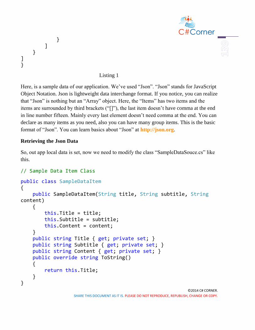
©2014 C# CORNER.
SHARE THIS DOCUMENT AS IT IS. PLEASE DO NOT REPRODUCE, REPUBLISH, CHANGE OR COPY.
} ] } ] }
Listing 1
Here, is a sample data of our application. We’ve used “Json”. “Json” stands for JavaScript
Object Notation. Json is lightweight data interchange format. If you notice, you can realize
that “Json” is nothing but an “Array” object. Here, the “Items” has two items and the
items are surrounded by third brackets (“[]”), the last item doesn’t have comma at the end
in line number fifteen. Mainly every last element doesn’t need comma at the end. You can
declare as many items as you need, also you can have many group items. This is the basic
format of “Json”. You can learn basics about “Json” at http://json.org.
Retrieving the Json Data
So, out app local data is set, now we need to modify the class “SampleDataSouce.cs” like
this.
// Sample Data Item Class
public class SampleDataItem { public SampleDataItem(String title, String subtitle, String content) { this.Title = title; this.Subtitle = subtitle; this.Content = content; } public string Title { get; private set; } public string Subtitle { get; private set; } public string Content { get; private set; } public override string ToString() { return this.Title; } }

©2014 C# CORNER.
SHARE THIS DOCUMENT AS IT IS. PLEASE DO NOT REPRODUCE, REPUBLISH, CHANGE OR COPY.
// Sample Data Group Class
public class SampleDataGroup { public SampleDataGroup(String title, String subtitle) { this.Title = title; this.Subtitle = subtitle; this.Items = new ObservableCollection<SampleDataItem>(); } public string Title { get; private set; } public string Subtitle { get; private set; } public ObservableCollection<SampleDataItem> Items { get; private set; }
public override string ToString() { return this.Title; } }
public sealed class SampleDataSource { private static SampleDataSource _sampleDataSource = new SampleDataSource();
private ObservableCollection<SampleDataGroup> _groups = new ObservableCollection<SampleDataGroup>();
public ObservableCollection<SampleDataGroup> Groups { get { return this._groups; } }
public static async Task<IEnumerable<SampleDataGroup>> GetGroupsAsync() { await _sampleDataSource.GetSampleDataAsync(); return _sampleDataSource.Groups; }

©2014 C# CORNER.
SHARE THIS DOCUMENT AS IT IS. PLEASE DO NOT REPRODUCE, REPUBLISH, CHANGE OR COPY.
public static async Task<SampleDataGroup> GetGroupAsync(string uniqueId) { await _sampleDataSource.GetSampleDataAsync(); // Simple linear search is acceptable for small data sets var matches = _sampleDataSource.Groups.Where((group) => group.Title.Equals(uniqueId)); if (matches.Count() == 1) return matches.First(); return null; }
public static async Task<SampleDataItem> GetItemAsync(string uniqueId) { await _sampleDataSource.GetSampleDataAsync(); // Simple linear search is acceptable for small data sets var matches = _sampleDataSource.Groups.SelectMany(group => group.Items).Where((item) => item.Title.Equals(uniqueId)); if (matches.Count() == 1) return matches.First(); return null; }
private async Task GetSampleDataAsync()| { if (this._groups.Count != 0) return;
Uri dataUri = new Uri("ms-appx:///DataModel/SampleData.json");
StorageFile file = await StorageFile.GetFileFromApplicationUriAsync(dataUri); string jsonText = await FileIO.ReadTextAsync(file); JsonObject jsonObject = JsonObject.Parse(jsonText); JsonArray jsonArray = jsonObject["Groups"].GetArray(); foreach (JsonValue groupValue in jsonArray) { JsonObject groupObject = groupValue.GetObject(); SampleDataGroup group = new
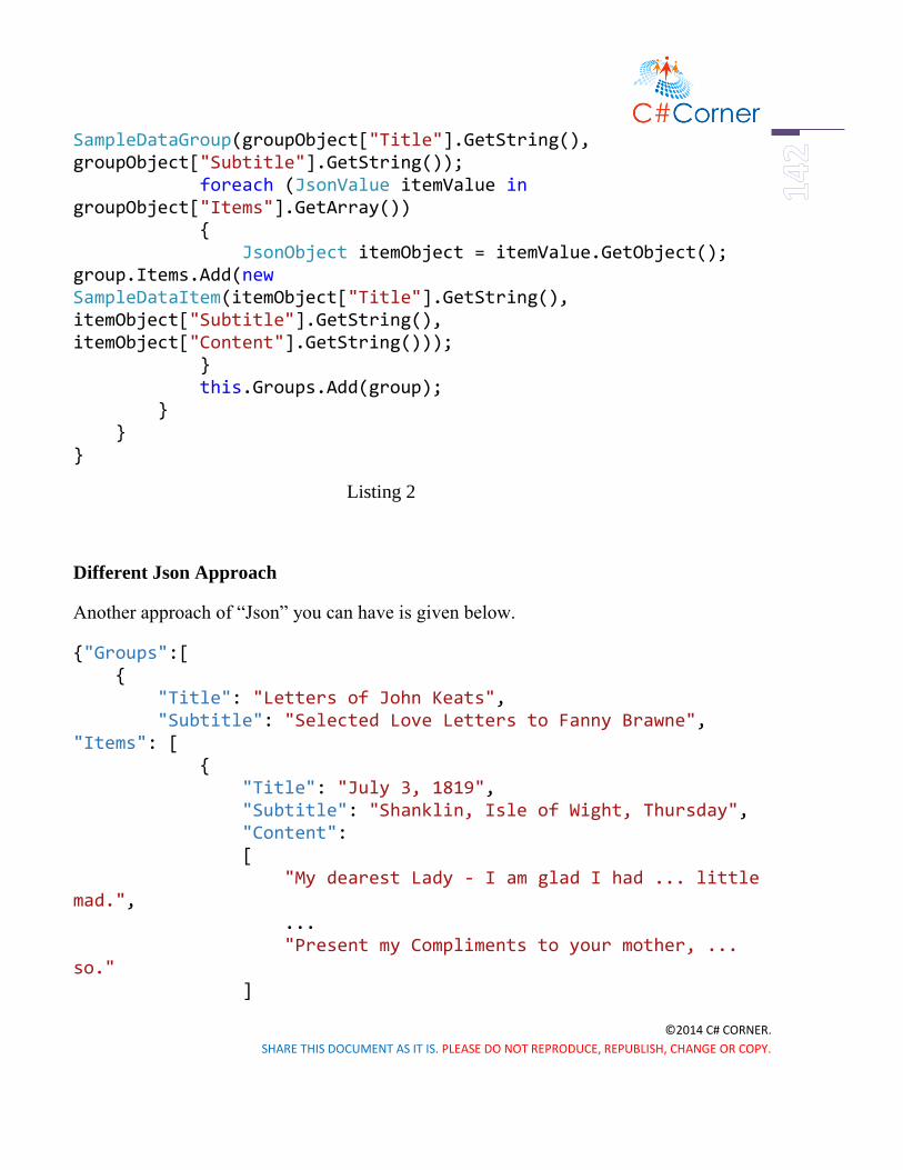
©2014 C# CORNER.
SHARE THIS DOCUMENT AS IT IS. PLEASE DO NOT REPRODUCE, REPUBLISH, CHANGE OR COPY.
SampleDataGroup(groupObject["Title"].GetString(), groupObject["Subtitle"].GetString()); foreach (JsonValue itemValue in groupObject["Items"].GetArray()) { JsonObject itemObject = itemValue.GetObject(); group.Items.Add(new SampleDataItem(itemObject["Title"].GetString(), itemObject["Subtitle"].GetString(), itemObject["Content"].GetString())); } this.Groups.Add(group); } } }
Listing 2
Different Json Approach
Another approach of “Json” you can have is given below.
{"Groups":[ { "Title": "Letters of John Keats", "Subtitle": "Selected Love Letters to Fanny Brawne", "Items": [ { "Title": "July 3, 1819", "Subtitle": "Shanklin, Isle of Wight, Thursday", "Content": [ "My dearest Lady - I am glad I had ... little mad.", ... "Present my Compliments to your mother, ... so." ]

©2014 C# CORNER.
SHARE THIS DOCUMENT AS IT IS. PLEASE DO NOT REPRODUCE, REPUBLISH, CHANGE OR COPY.
} ] } ] }
Listing 3
Then, you have to change this line of code in “SampleDataSouce.cs”
foreach (JsonValue itemValue in groupObject["Items"].GetArray()) { JsonObject itemObject = itemValue.GetObject(); group.Items.Add(new SampleDataItem(itemObject["Title"].GetString(), itemObject["Subtitle"].GetString(), itemObject["Content"].Stringify().Replace("[", "").Replace("]", "").Replace("\",", "\n").Replace("\"", ""))); }
Listing 4
I personally don’t like to do that, because you can’t use double quote and “\n” or “\r” in
this case. Or you may find it helpful in some cases.
Working with “HubPage.xaml”
Now, we’ll modify the “HubPage.xaml” first. We don’t need the other sections of
“HubPage.xaml” for our appliction.
<Page.Resources> <DataTemplate x:Key="HubSectionHeaderTemplate"> <TextBlock Margin="0,0,0,-9.5" Text="{Binding}"/> </DataTemplate> </Page.Resources> <Grid x:Name="LayoutRoot"> <Hub x:Name="Hub" x:Uid="Hub" Header="application name" ackground="{ThemeResource HubBackgroundImageBrush}">
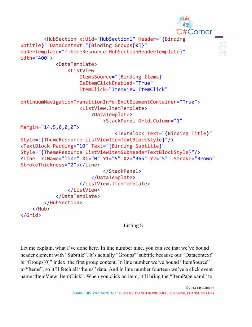
©2014 C# CORNER.
SHARE THIS DOCUMENT AS IT IS. PLEASE DO NOT REPRODUCE, REPUBLISH, CHANGE OR COPY.
<HubSection x:Uid="HubSection1" Header="{Binding ubtitle}" DataContext="{Binding Groups[0]}" eaderTemplate="{ThemeResource HubSectionHeaderTemplate}" idth="400"> <DataTemplate> <ListView ItemsSource="{Binding Items}" IsItemClickEnabled="True" ItemClick="ItemView_ItemClick" ontinuumNavigationTransitionInfo.ExitElementContainer="True"> <ListView.ItemTemplate> <DataTemplate> <StackPanel Grid.Column="1" Margin="14.5,0,0,0"> <TextBlock Text="{Binding Title}" Style="{ThemeResource ListViewItemTextBlockStyle}"/> <TextBlock Padding="10" Text="{Binding Subtitle}" Style="{ThemeResource ListViewItemSubheaderTextBlockStyle}"/> <Line x:Name="line" X1="0" Y1="5" X2="365" Y2="5" Stroke="Brown" StrokeThickness="2"></Line> </StackPanel> </DataTemplate> </ListView.ItemTemplate> </ListView> </DataTemplate> </HubSection> </Hub> </Grid>
Listing 5
Let me explain, what I’ve done here. In line number nine, you can see that we’ve bound
header element with “Subtitle”. It’s actually “Groups'” subtitle because our “Datacontext”
is “Groups[0]” index, the first group content. In line number we’ve bound “ItemSource”
to “Items”, so it’ll fetch all “Items” data. And in line number fourteen we’ve a click event
name “ItemView_ItemClick”. When you click an item, it’ll bring the “ItemPage.xaml” to

©2014 C# CORNER.
SHARE THIS DOCUMENT AS IT IS. PLEASE DO NOT REPRODUCE, REPUBLISH, CHANGE OR COPY.
view the details of Items. In line number nineteen & twenty we’ve bound the value “Title”
& “Subtitle”. In line number twenty one we’ve used a line to separate the items title and
subtitle with different items.
Figure 3
Now if we look at the “HubPage.xaml.cs”, we just modify the “ItemView_ItemClick”
event like this.
private void ItemView_ItemClick(object sender, ItemClickEventArgs e) { // Navigate to the appropriate destination page, configuring the new page // by passing required information as a navigation parameter var itemTitle = ((SampleDataItem)e.ClickedItem).Title; if (!Frame.Navigate(typeof(ItemPage), itemTitle)) { throw new Exception(this.resourceLoader.GetString("NavigationFailedException

©2014 C# CORNER.
SHARE THIS DOCUMENT AS IT IS. PLEASE DO NOT REPRODUCE, REPUBLISH, CHANGE OR COPY.
Message")); } }
Listing 6
Here in line number five, we declare a variable “itemTitle” and set it to the title of
“Items”, and pass it through the “Frame.Navigation()” as a parameter in line number six.
We don’t need the “GroupSection_ItemClick” event because we aren’t using
“SectionPage.xaml” in our application. So we’re working only two different pages, first is
“HubPage.xaml” and second is “ItemPage.xaml”. So, you can understand that you got
some real power to to present a lots of data simply in two pages. So DataBinding and Json
give us lots of flexibility to make our apps much faster and efficient.
Working with “ItemPage.xaml”
Now, were going to modify our “ItemPage.xaml”, just put these three lines of code.
<ScrollViewer> <StackPanel Grid.Column="1" Margin="14.5,0,0,0"> <TextBlock Text="{Binding Title}" Style="{ThemeResource istViewItemTextBlockStyle}"/> <TextBlock Padding="10,0,0,20" Text="{Binding Subtitle}" Style="{ThemeResource ListViewItemSubheaderTextBlockStyle}"/>
<TextBlock Padding="0,0,0,10" TextWrapping="Wrap" Text="{Binding Content}" FontSize="20" Style="{ThemeResource ListViewItemSubheaderTextBlockStyle}"/> </StackPanel> </ScrollViewer>
Listing 7
Here, the we’ve three TextBlocks, and first one is showing the items “Title”, second one is
“Subtitle” and third one is “Content” which contains the letter body. We surround the
TextBlocks with a StackPanel and ScrollViewer so that, you can see long text with
scrolling option. One important thing is in line number five we’ve used TextWrapping to
“Wrap” so that, the texts fit in the window size.
Working with “Sectionpage.xaml”

©2014 C# CORNER.
SHARE THIS DOCUMENT AS IT IS. PLEASE DO NOT REPRODUCE, REPUBLISH, CHANGE OR COPY.
One more extra thing you can do, is to modify your “SectionPage.xaml”. Though I’m not
using this page, just showing if you want to use. Modify the “SectionPage.xaml” like this,
here is only “ListView”.
<ListView x:Name="itemListView" AutomationProperties.AutomationId="ItemListView" AutomationProperties.Name="Items In Group" TabIndex="1" Grid.Row="1" ItemsSource="{Binding Items}" IsItemClickEnabled="True" ItemClick="ItemView_ItemClick" SelectionMode="None" IsSwipeEnabled="false" Margin="19,0,0,0"> <ListView.ItemTemplate> <DataTemplate> <Grid> <Grid.ColumnDefinitions> <ColumnDefinition Width="Auto"/> <ColumnDefinition Width="*"/> </Grid.ColumnDefinitions> <StackPanel Grid.Column="1" erticalAlignment="Top" Margin="10,0,0,0"> <TextBlock Text="{Binding Title}" Style="{ThemeResource ListViewItemTextBlockStyle}"/> <TextBlock Text="{Binding Subtitle}" Style="{ThemeResource ListViewItemSubheaderTextBlockStyle}"/> </StackPanel> </Grid> </DataTemplate>
</ListView.ItemTemplate> </ListView>
Listing 8
We just used the “Title” & “Subtitle” section. Also the “ItemView_ItemClick” event in
“SectionPage.xaml.cs” like this.

©2014 C# CORNER.
SHARE THIS DOCUMENT AS IT IS. PLEASE DO NOT REPRODUCE, REPUBLISH, CHANGE OR COPY.
private void ItemView_ItemClick(object sender, ItemClickEventArgs e) { var itemTitle = ((SampleDataItem)e.ClickedItem).Title; if (!Frame.Navigate(typeof(ItemPage), itemTitle)) { var resourceLoader = ResourceLoader.GetForCurrentView("Resources"); throw new Exception(resourceLoader.GetString("NavigationFailedExceptionMessage")); } } Listing 9
We’ve declared a variable “itemTitle” and pass it through navigation. That’s it.
Working with Phone Resources
Now change the “Header.Text” & “Hub.Header” in “Strings>>en-US>>Resources.resw”
like this.
Figure 4
Working with “App.xaml”
Also, we want to change the background of our app, so that it looks more beautiful and
readable. Go to “App.xaml” and change the background like below.
<Application.Resources> <ResourceDictionary>

©2014 C# CORNER.
SHARE THIS DOCUMENT AS IT IS. PLEASE DO NOT REPRODUCE, REPUBLISH, CHANGE OR COPY.
<ResourceDictionary.ThemeDictionaries> <ResourceDictionary x:Key="Default"> <ImageBrush x:Key="HubBackgroundImageBrush" ImageSource="Assets/HubBackground.theme-light.png" Opacity="0.3"/> </ResourceDictionary> <ResourceDictionary x:Key="HighContrast"> <ImageBrush x:Key="HubBackgroundImageBrush" ImageSource="{x:Null}"/> </ResourceDictionary> </ResourceDictionary.ThemeDictionaries> </ResourceDictionary> </Application.Resources>
Listing 10
Here, we changed the background of the app, just by changing the picture. You’ll find it in
the “Assets” folder or you can upload your own choose picture. Also we changed the
opacity to “0.3” so the background becomes darker than as it is.
Now your design should look like this.
Figure 5
Running the Application
Now we’re all set. If we, run the application, it looks just awesome like this.

©2014 C# CORNER.
SHARE THIS DOCUMENT AS IT IS. PLEASE DO NOT REPRODUCE, REPUBLISH, CHANGE OR COPY.
Figure 6.1 Figure 6.2
Summary
So, we just made a rich “Json Data Hub App” doing few modification of “Hub App”
template. I personally make an app about my favorite poet John Keats’ letters to his
girlfriend Fanny Brawne and you can make your own data bound app like this.

©2014 C# CORNER.
SHARE THIS DOCUMENT AS IT IS. PLEASE DO NOT REPRODUCE, REPUBLISH, CHANGE OR COPY.
Map
Windows Phone 8.1 – Map Control
Introduction
Hopefully you’re doing great with Windows Phone 8.1. I really love to share new features
of Windows Phone 8.1. In this chapter I’ll talk about Windows Phone Map Control and
obviously it’s Bing Map. In new update of Windows Phone, there’re significant APIs
changed from previous Windows Phone 8.0. A lots of great features added like
Geofencing. So let’s get crack in a whole new Windows Phone 8.1 Map Control.
Creating a New Project and Add a Map Control
Take a new project and give it a name simply “Map” or whatever you want. Now, we’ll
add our map control from the “Toolbox”. Drag the “MapContol” tool from the “Toolbox”
and place it in the main Grid.
Making Grids
Now, we’ll modify our main Grid to re-size the “MapControl” and to show some other
stuffs. First of all, we’ll make some rows to put other controls.
<Grid HorizontalAlignment="Stretch"
Margin="8,8,8,8" VerticalAlignment="Stretch">
<Grid.RowDefinitions>
<RowDefinition Height="10"/>
<RowDefinition Height="50"/>
<RowDefinition Height="*"/>

©2014 C# CORNER.
SHARE THIS DOCUMENT AS IT IS. PLEASE DO NOT REPRODUCE, REPUBLISH, CHANGE OR COPY.
<RowDefinition Height="40"/>
</Grid.RowDefinitions>
...
</Grid>
Listing 1
Here, in line number four, five, six and seven we’ve declared four “RowDefinitions”. First
one is 10px in height, second 50px, third one is “*” which will cover the rest of the grid
space and last one is 40px.
Adding Controls
Here are the controls we’ve used in our “MainPage.xaml”.
<Canvas>
<ProgressBar x:Name="progressBar" Grid.Row="0"
IsIndeterminate="True"
Maximum="100" Value="30"
Height="10"
Width="400"/>
</Canvas>
<TextBlock TextWrapping="NoWrap" Grid.Row="1"
Text="Map control"
FontSize="36"
Margin="8,0,0,16" />
<Maps:MapControl x:Name="MyMap" Grid.Row="2"
HorizontalAlignment="Left"

©2014 C# CORNER.
SHARE THIS DOCUMENT AS IT IS. PLEASE DO NOT REPRODUCE, REPUBLISH, CHANGE OR COPY.
VerticalAlignment="Top"
Height="500"
Width="385"
MapTapped="MyMap_MapTapped" />
<Slider x:Name="mySlider" Grid.Row="3"
Maximum="20"
Minimum="10"
ValueChanged="Slider_ValueChanged" />
Listing 2
We’ve used a “ProgressBar” control, to indicate while Map is loading, a “TextBlock” to
show the title, a “MapControl” to show the Bing Map and a “Slider” to zoom in and zoom
out.
Adding AppBar
We’ve also used a “BottomAppBar” to locate your current position.
<Page.BottomAppBar>
<CommandBar ClosedDisplayMode="Minimal" Opacity="0.5">
<AppBarButton Label="locate me" Icon="Target" Click="LocateMe_Click" />
</CommandBar>
</Page.BottomAppBar>
Listing 3
I’m not going through the details of adding controls and how they work, if you don’t
know please feel free to take a look my previous articles.
So, finally our design will look like this.

©2014 C# CORNER.
SHARE THIS DOCUMENT AS IT IS. PLEASE DO NOT REPRODUCE, REPUBLISH, CHANGE OR COPY.
Figure 2
Code Behind
Now, time to code behind in C#. Let’s open “MainPage.xaml.cs” and find
“OnNavigatedTo” method. Modify it like below.
public sealed partial class MainPage : Page
{
Geolocator geolocator;
protected async override void OnNavigatedTo(NavigationEventArgs e)
{
// Map Token for testing purpose,
// otherwise you'll get an alart message in Map Control
MyMap.MapServiceToken = "abcdef-abcdefghijklmno";

©2014 C# CORNER.
SHARE THIS DOCUMENT AS IT IS. PLEASE DO NOT REPRODUCE, REPUBLISH, CHANGE OR COPY.
geolocator = new Geolocator();
geolocator.DesiredAccuracyInMeters = 50;
try
{
// Getting Current Location
Geoposition geoposition = await geolocator.GetGeopositionAsync(
maximumAge: TimeSpan.FromMinutes(5),
timeout: TimeSpan.FromSeconds(10));
MapIcon mapIcon = new MapIcon();
// Locate your MapIcon
mapIcon.Image = RandomAccessStreamReference.CreateFromUri(new Uri("ms-appx:///Assets/my-position.png"));
// Show above the MapIcon
mapIcon.Title = "Current Location";
// Setting up MapIcon location
mapIcon.Location = new Geopoint(new BasicGeoposition()
{
//Latitude = geoposition.Coordinate.Latitude, [Don't use]
//Longitude = geoposition.Coordinate.Longitude [Don't use]

©2014 C# CORNER.
SHARE THIS DOCUMENT AS IT IS. PLEASE DO NOT REPRODUCE, REPUBLISH, CHANGE OR COPY.
Latitude = geoposition.Coordinate.Point.Position.Latitude,
Longitude = geoposition.Coordinate.Point.Position.Longitude
});
// Positon of the MapIcon
mapIcon.NormalizedAnchorPoint = new Point(0.5, 0.5);
MyMap.MapElements.Add(mapIcon);
// Showing in the Map
await MyMap.TrySetViewAsync(mapIcon.Location, 18D, 0, 0, MapAnimationKind.Bow);
// Disable the ProgreesBar
progressBar.Visibility = Windows.UI.Xaml.Visibility.Collapsed;
// Set the Zoom Level of the Slider Control
mySlider.Value = MyMap.ZoomLevel;
}
catch (UnauthorizedAccessException)
{
MessageBox("Location service is turned off!");
}
base.OnNavigatedTo(e);
}
...

©2014 C# CORNER.
SHARE THIS DOCUMENT AS IT IS. PLEASE DO NOT REPRODUCE, REPUBLISH, CHANGE OR COPY.
}
Listing 4
Our main work is done, now we’ve to write the other methods to work it perfectly.
// Slider Control
private void Slider_ValueChanged(object sender, RangeBaseValueChangedEventArgs e)
{
if (MyMap != null)
MyMap.ZoomLevel = e.NewValue;
}
// Locate Me Bottom App Bar
private async void LocateMe_Click(object sender, RoutedEventArgs e)
{
progressBar.Visibility = Windows.UI.Xaml.Visibility.Visible;
geolocator = new Geolocator();
geolocator.DesiredAccuracyInMeters = 50;
try
{
Geoposition geoposition = await geolocator.GetGeopositionAsync(

©2014 C# CORNER.
SHARE THIS DOCUMENT AS IT IS. PLEASE DO NOT REPRODUCE, REPUBLISH, CHANGE OR COPY.
maximumAge: TimeSpan.FromMinutes(5),
timeout: TimeSpan.FromSeconds(10));
await MyMap.TrySetViewAsync(geoposition.Coordinate.Point, 18D);
mySlider.Value = MyMap.ZoomLevel;
progressBar.Visibility = Windows.UI.Xaml.Visibility.Collapsed;
}
catch (UnauthorizedAccessException)
{
MessageBox("Location service is turned off!");
}
}
// Custom Message Dialog Box
private async void MessageBox(string message)
{
var dialog = new MessageDialog(message.ToString());
await Dispatcher.RunAsync(CoreDispatcherPriority.Normal, async () => await dialog.ShowAsync());
}
Listing 5
Adding Tap Event

©2014 C# CORNER.
SHARE THIS DOCUMENT AS IT IS. PLEASE DO NOT REPRODUCE, REPUBLISH, CHANGE OR COPY.
One more thing, I’d like to add is Map Tapped functionality, we’ll add another method
which will give us a cool feature when we tap somewhere and in the Map Icon. It’ll show
the location details in the Message Dialog Box.
To add this method, go to “MainPage.xaml”, select “MapControl” in the main grid. If you
don’t see “Properties” tab, then hit F4 and you’ll find it on the left side of the Visual
Studio.
Now double click on the “MapTapped” section and it’ll automatically generate the method
stub for you.
Figure 3
Now, complete the “MyMap_MapTapped” method in the “MainPage.xaml.cs”
private async void MyMap_MapTapped(MapControl sender, MapInputEventArgs args)
{
Geopoint pointToReverseGeocode = new Geopoint(args.Location.Position);
// Reverse geocode the specified geographic location.
MapLocationFinderResult result =

©2014 C# CORNER.
SHARE THIS DOCUMENT AS IT IS. PLEASE DO NOT REPRODUCE, REPUBLISH, CHANGE OR COPY.
await MapLocationFinder.FindLocationsAtAsync(pointToReverseGeocode);
var resultText = new StringBuilder();
if (result.Status == MapLocationFinderStatus.Success)
{
resultText.AppendLine(result.Locations[0].Address.District + ", " + result.Locations[0].Address.Town + ", " + result.Locations[0].Address.Country);
}
MessageBox(resultText.ToString());
}
Listing 6
Adding Location Capability
Now, our work is done, but if you run the application in your device or emulator, you’ll
get an error definitely. Because we’ve given permission to track our current position to
our application. To do this, go to “Package.appxmanifest” and find “Capabilities” section
and tick the “Location” service and save it.

©2014 C# CORNER.
SHARE THIS DOCUMENT AS IT IS. PLEASE DO NOT REPRODUCE, REPUBLISH, CHANGE OR COPY.
Running the Application
Now if you run the application it’ll look exactly like this.
Figure 5.1 Figure 5.2 Figure 5.3
If you tap on the “MapIcon” it’ll show the location details on the Message Dialog Box.
Using Polygon as Pushpin
Another thing, if don’t want to use external image as a “MapIcon”, you can use custom
“Pushpin” like “Polygon” control. Then you’ve to modify the “OnNavigatedTo” method
like this,
protected async override void OnNavigatedTo(NavigationEventArgs e)
{
// Map Token for testing purpose, // otherwise you'll get an alart message in Map Control MyMap.MapServiceToken = "abcdef-abcdefghijklmno";

©2014 C# CORNER.
SHARE THIS DOCUMENT AS IT IS. PLEASE DO NOT REPRODUCE, REPUBLISH, CHANGE OR COPY.
geolocator = new Geolocator(); geolocator.DesiredAccuracyInMeters = 50; try { // Getting Current Location Geoposition geoposition = await geolocator.GetGeopositionAsync( maximumAge: TimeSpan.FromMinutes(5), timeout: TimeSpan.FromSeconds(10));
// Create a New Pushpin var pushpin = CreatePushPin(); MyMap.Children.Add(pushpin); // Setting up Pushpin location var location = new Geopoint(new BasicGeoposition() { Latitude = geoposition.Coordinate.Latitude, Longitude = geoposition.Coordinate.Longitude }); MapControl.SetLocation(pushpin, location); // Position of the Pushpin MapControl.SetNormalizedAnchorPoint(pushpin, new Point(0.0, 1.0)); // Showing in the Map await MyMap.TrySetViewAsync(location, 18D, 0, 0, apAnimationKind.Bow);
// Disable the ProgressBar progressBar.Visibility = Windows.UI.Xaml.Visibility.Collapsed; // Set the Zoom Level of the Slider Control mySlider.Value = MyMap.ZoomLevel; } catch (UnauthorizedAccessException) { MessageBox("Location service is turned off!"); } base.OnNavigatedTo(e); }

©2014 C# CORNER.
SHARE THIS DOCUMENT AS IT IS. PLEASE DO NOT REPRODUCE, REPUBLISH, CHANGE OR COPY.
Listing 7
and “CreatePushPin” method is given below.
private DependencyObject CreatePushPin() { // Creating a Polygon Marker
Polygon polygon = new Polygon();
polygon.Points.Add(new Point(0, 0));
polygon.Points.Add(new Point(0, 50));
polygon.Points.Add(new Point(25, 0));
polygon.Fill = new SolidColorBrush(Colors.Red);
// Return the Polygon Marker
return polygon;
}
Listing 8
Running the Application
Now, if you run the application, the marker will look like this.

©2014 C# CORNER.
SHARE THIS DOCUMENT AS IT IS. PLEASE DO NOT REPRODUCE, REPUBLISH, CHANGE OR COPY.
Figure 6
Map Overlaying
It’s really cool and awesome using custom Pushpin in Windows Phone 8.1. One more
thing I’d like to add is overlaying tiled images on a map. If you want to overlay third-party
or custom tiled images on the map, and make it customized then, you’ve to put simply
these line of codes in the “OnNavigatedTo” method at the top.
protected async override void OnNavigatedTo(NavigationEventArgs e) { var httpsource = new HttpMapTileDataSource("http://a.tile.openstreetmap.org/{zoomlevel}/{x}/{y}.png"); var ts = new MapTileSource(httpsource); MyMap.TileSources.Add(ts);... base.OnNavigatedTo(e); }
Listing 9
And if your run the application, it will give you much graphical view than before with
some details.

©2014 C# CORNER.
SHARE THIS DOCUMENT AS IT IS. PLEASE DO NOT REPRODUCE, REPUBLISH, CHANGE OR COPY.
Figure 7
Summary
And that’s it! Hope you’ve understand, how to use “MapControl” in Windows Phone 8.1.
Have fun with Map Control and make some cool applications with it. Read more about
Maps and directions (XAML) at – http://bit.ly/X7S7ei.

©2014 C# CORNER.
SHARE THIS DOCUMENT AS IT IS. PLEASE DO NOT REPRODUCE, REPUBLISH, CHANGE OR COPY.
PhoneGap Part 1
Windows Phone 8 app development using PhoneGap (Cordova) Part: 1
Introduction
PhoneGap is an open source framework for quickly building cross-platform mobile apps
using HTML5, Javascript and CSS
PhoneGap is an application container technology that allows you to create natively-
installed applications for mobile devices using HTML, CSS, and JavaScript. The core
engine for PhoneGap is also 100% open source, under the Apache Cordova project.
The UI layer of a PhoneGap application is a web browser view that takes up 100% of the
device width and 100% of the device height.
PhoneGap provides an application programming interface (API) that enables you to access
native operating system functionality using JavaScript. You build your application logic
using JavaScript, and the PhoneGap API handles communication with the native operating
system.
PhoneGap currently supports
1. iOS
2. Android
3. Wndows Phone 7
4. Windows Phone 8
5. BlackBerry
6. WebOS
7. Symbian
8. Bada
Did you see that PhoneGap supports 7 different platforms and interestingly Windows
Phone 8 is the 7th (newest) one to be included?

©2014 C# CORNER.
SHARE THIS DOCUMENT AS IT IS. PLEASE DO NOT REPRODUCE, REPUBLISH, CHANGE OR COPY.
As per the PhoneGap website, the following features are supported in PhoneGap for
Windows Phone 8.
Accelerometer
Camera
Compass
Contacts
File
Geolocation
Media
Network
Notification (Alert)
Notification (Sound)
Notification (Vibration)
Storage
Setting up PhoneGap
If you are Windows Phone Developer and wish to develop Apps using HTML5, CSS and
JavaScript, then can make use of the PhoneGap and develop Windows Phone Apps
Data Source: http://phonegap.com/2012/05/02/phonegap-explained-visually/
At first you need to download PhoneGap project from this link. I have used PhoneGap
2.8.0 in this tutorial,
http://phonegap.com/install/
Now Unzip the downloaded PhoneGap package, then open lib folder and then open
windows-phone-8 folder. Now, you will see a zip file named CordovaWP8_2_8_0.
Figure 1

©2014 C# CORNER.
SHARE THIS DOCUMENT AS IT IS. PLEASE DO NOT REPRODUCE, REPUBLISH, CHANGE OR COPY.
Copy this file and then go to, My Documents \ Visual Studio 2013 \ Templates \
ProjectTemplates folder
And paste CordovaWP8_2_8_0 here in this folder.
Figure 2
Creating a Project
Now, open your visual studio ide and click on New Project.
In the New Project panel, you will see, CordoWP8_2_8_0 template and then create a
project with your desired name.
Figure 3

©2014 C# CORNER.
SHARE THIS DOCUMENT AS IT IS. PLEASE DO NOT REPRODUCE, REPUBLISH, CHANGE OR COPY.
Now In the Solution Explorer, you will see a WWW folder. Click on this folder and then
you will see, CSS folder, img folder, JS folder and index.html page. You will keep your
CSS, JS pages and images in these CSS, JS, img folders.
Now click on the index.html page and then you will see a design like this.
Now if you can directly run this cross platform app on your windows phone 8 devices. If
you deploy it on real device then you will see a screen like this, it means, your project is
now ready.
Cheers!!!
Figure 5

©2014 C# CORNER.
SHARE THIS DOCUMENT AS IT IS. PLEASE DO NOT REPRODUCE, REPUBLISH, CHANGE OR COPY.
Now select index.html and right click on the file then select view code.
This is the code of the index.html file and this is what we see when we run this project on
emulator or real device.
Then I did some minor modification on the code. I have deleted the image and texts and
added a h1 tag and wrote, Hello Windows Phone Developers. Now see what happen,
<html> <head> <meta http-equiv="Content-Type" content="text/html; charset=UTF-8" /> <meta name="format-detection" content="telephone=no" /> <meta name="viewport" content="user-scalable=no, initial-scale=1, maximum-scale=1, minimum-scale=1, width=device-width, height=device-height, target-densitydpi=device-dpi" /> <title>Hello World</title> </head> <body> <h1>Hello Windows Phone Developers</h1> <script type="text/javascript" src="cordova.js"></script> <script type="text/javascript" src="js/index.js"></script> <script type="text/javascript"> app.initialize(); </script> </body> </html>
Listing 1

©2014 C# CORNER.
SHARE THIS DOCUMENT AS IT IS. PLEASE DO NOT REPRODUCE, REPUBLISH, CHANGE OR COPY.
Figure 6
Now, we can see the Hello Windows Phone Developers text in our project main screen.
JQuery Mobile Theme
JQuery Mobile Theme for Windows Phone 8
Now we will add JQuery Mobile Theme in our windows phone 8 project.
We can add JQuery mobile theme in two ways,
One, we can install JQMThemeForWindowsPhone8 Package using Package Manager
Console (PMC)
Two, we can directly add necessary references in our html file.
To use Package Manager Console, at first we need to click Tools then Library Package
Manager and then Package Manager Console.
Package Manager Console will appear at the bottom of visual studio.
Then we will write,
Install-Package JQMThemeForWindowsPhone8 -version 0.0.1
In the Package Manager Console and press Enter button.

©2014 C# CORNER.
SHARE THIS DOCUMENT AS IT IS. PLEASE DO NOT REPRODUCE, REPUBLISH, CHANGE OR COPY.
Then PCM will install JQM Theme for Windows Phone 8 Successfully and we will see
lots of javascript files, css files and pages has been added in our project (look at solution
explorer at right).
Now if we rename our index.html file to any other name and rename themeStartPage.html
file into index.html file and run this project then we will see stunning look of JQuery
Mobile Theme in our windows phone 8 project. Here, you will see different Jquery mobile
controls, background and transitions. I have selected Dark theme and below you can see
some screen shots of Dark Theme.
Figure 8
Way, two, directly add references of JQuery Mobile theme in your index.html file.
<link rel="stylesheet" href="http://code.jquery.com/mobile/1.4.4/jquery.mobile-

©2014 C# CORNER.
SHARE THIS DOCUMENT AS IT IS. PLEASE DO NOT REPRODUCE, REPUBLISH, CHANGE OR COPY.
1.4.4.min.css"> <script src="http://code.jquery.com/jquery-1.11.1.min.js"></script> <script src="http://code.jquery.com/mobile/1.4.4/jquery.mobile-1.4.4.min.js"></script>
Listing 2
Using a ListView Control
Now, I have added a list view control code in my index.html file and you can see how it
looks like now in below images. Here, I have used JQuery Mobile light theme.
Figure 9
Full Code of Index.html file is given below,
<!DOCTYPE html> <html> <head> <meta http-equiv="Content-Type" content="text/html; charset=UTF-8" /> <meta name="format-detection" content="telephone=no" /> <meta name="viewport" content="user-scalable=no, initial-scale=1, maximum-scale=1, minimum-scale=1, width=device-width, height=device-height, target-densitydpi=device-dpi" /> <title>Functions</title>
<link rel="stylesheet" href="http://code.jquery.com/mobile/1.4.4/jquery.mobile-1.4.4.min.css">

©2014 C# CORNER.
SHARE THIS DOCUMENT AS IT IS. PLEASE DO NOT REPRODUCE, REPUBLISH, CHANGE OR COPY.
<script src="http://code.jquery.com/jquery-1.11.1.min.js"></script> <script src="http://code.jquery.com/mobile/1.4.4/jquery.mobile-1.4.4.min.js"></script> <script type="text/javascript" charset="utf-8"> function checkLanguage() { navigator.globalization.getPreferredLanguage( function (language) { alert('language: ' + language.value + '\n'); }, function () { alert('Error getting anguage\n'); } ); }
</script> </head> <body> <div data-role="page" id="pageone"> <div data-role="header"> <h1>List</h1> </div> <div data-role="main" class="ui-content"> <ul data-role="listview" data-autodividers="true" data-inset="true"> <li><a href="#pagetwo" data-transition="flip">Adele</a></li> <li><a href="#">Agnes</a></li> <li><a href="#">Albert</a></li> <li><a href="#">Billy</a></li> <li><a href="#">Bob</a></li> <li><a href="#">Calvin</a></li> <li><a href="#">Cameron</a></li> <li><a href="#">Chloe</a></li> <li><a href="#">Christina</a></li> <li><a href="#">Diana</a></li> <li><a href="#">Gabriel</a></li> <li><a href="#">Glen</a></li>
<li><a href="#">Ralph</a></li> <li><a href="#">Valarie</a></li> </ul>

©2014 C# CORNER.
SHARE THIS DOCUMENT AS IT IS. PLEASE DO NOT REPRODUCE, REPUBLISH, CHANGE OR COPY.
<p>The data-autodividers="true" attribute creates dividers where it is appropriate with uppercased first letters of the item's text.</p> </div> <div data-role="footer"> <h1>Footer Text</h1> </div> </div> <div data-role="page" id="pagetwo"> <div data-role="header"> <h1>Welcome To My Homepage</h1> </div> <div data-role="main" class="ui-content"> <p>Click on the link to go back. <b>Note</b>: fade is default.</p> <a href="#pageone">Go back to Page One</a> </div> <div data-role="footer"> <h1>Footer Text</h1> </div> </div> <script type="text/javascript" src="cordova.js"></script> <script type="text/javascript" src="js/index.js"></script> <script type="text/javascript"> app.initialize(); </script> </body> </html>
Listing 3
Summary
Hope you’ve understand how to getting started with PhoneGap and creating hybrid apps.
Hope to see you soon. Happy coding.
Source of this JQuery Mobile List View code:
http://www.w3schools.com/jquerymobile/jquerymobile_list_views.asp

©2014 C# CORNER.
SHARE THIS DOCUMENT AS IT IS. PLEASE DO NOT REPRODUCE, REPUBLISH, CHANGE OR COPY.
PhoneGap Part 2
Windows Phone 8 app development using PhoneGap (Cordova) Part: 2
Introduction
This is the second chapter of windows phone 8 app development using PhoneGap
(Cordova).
In last chapter we talked about the PhoneGap (Cordova) installation process in visual
studio 2013 and how we can create our first “Hello world” windows phone project using
visual studio and PhoneGap (Cordova).
At the end we saw two different ways of integrating JQuery mobile with our visual studio
project to make our project more beautiful and professional.
Topics will be covered
Here in this article, we will see, different APIs of PhoneGap and codes to use different
sensor or capabilities of windows phone device.
In this article, we will cover topics like,
1. Popup Window
2. Vibrate
3. Connection Type
4. Device Info
5. Camera Capture
6. Back Button
7. Accelerometer
8. Compass
9. Geo-location
10. Battery Status
11. Collapsible Control
12. Panel Control

©2014 C# CORNER.
SHARE THIS DOCUMENT AS IT IS. PLEASE DO NOT REPRODUCE, REPUBLISH, CHANGE OR COPY.
Interface of the Application
Below images are the screen shots of long list selector through which we will select
different functionalities and action.
Figure 1.1 Figure 1.2
Here, in the above image we can see a long list selector. Through this long list selector, we
will see different actions of different available functionalities of PhoneGap in windows
phone.
Code Behind
The code of this long list selector is given below. Each section is described separately and
briefly.
JQuery Mobile Reference
As we are using JQuery Mobile UI, we added these three lines of reference code first. This
is the reference code of JQuery Mobile Theme.
<link rel="stylesheet" href="http://code.jquery.com/mobile/1.4.4/jquery.mobile-1.4.4.min.css"> <script src="http://code.jquery.com/jquery-1.11.1.min.js"></script>

©2014 C# CORNER.
SHARE THIS DOCUMENT AS IT IS. PLEASE DO NOT REPRODUCE, REPUBLISH, CHANGE OR COPY.
<script src="http://code.jquery.com/mobile/1.4.4/jquery.mobile-
1.4.4.min.js"></script>
Listing 1
Using Long List Selector
Html code of this long list selector is given below,
<div data-role="page" id="pageone"> <div data-role="header"> <h1>Phonegap</h1> </div> <ul data-role="listview" data-inset="true"> <li><a href="#pagetwo">Show Pop Up</a></li> <li><a href="#pagethree">Vibrate</a></li> <li><a href="#pagefour">Connection Type</a></li> <li><a href="#pagefive">Device Info</a></li> <li><a href="#pagesix">Camera Capture</a></li> <li><a href="#pageseven">Back Button</a></li> <li><a href="#pageeight">Accelerometer</a></li> <li><a href="#pagenine">Compass</a></li> <li><a href="#pageten">GeoLocation</a></li> <li><a href="#pagetwelve">Battery Status</a></li> <li><a href="#pageeleven">collapsible Control</a></li> <li><a href="#pagethirteen">Panel Control</a></li>
</ul> <div data-role="footer"> <h1>APIs</h1> </div> </div>... </div>
Listing 2
Popup Control
Now if we select the first option in the long list selector which is Pop Up then we will see
a screen like the below page. Then if we click on the Click Me button then a Pop Up menu
will appear with the text of Button Clicked.

©2014 C# CORNER.
SHARE THIS DOCUMENT AS IT IS. PLEASE DO NOT REPRODUCE, REPUBLISH, CHANGE OR COPY.
Figure 2.1 Figure 2.2
Html and JavaScript code of Pop Up menu.
<div data-role="page" id="pagetwo"> <div data-role="header"> <h1>Welcome To My Homepage</h1> </div> <div data-role="main" class="ui-content"> <a href="#" onclick="btn_click()" class="ui-btn">Click Me</a> <a href="#pageone">Go back to Home page</a> </div> <div data-role="footer"> <h1>Footer Text</h1> </div> </div> function btn_click() { navigator.notification.alert("Button Clicked",null,"Pop Up",""); }

©2014 C# CORNER.
SHARE THIS DOCUMENT AS IT IS. PLEASE DO NOT REPRODUCE, REPUBLISH, CHANGE OR COPY.
Listing 3
Using Vibrate
Now we will look at the mobile device Vibrate API. Below is the screen shot of the
“vibrate me” page.
Figure 3
We can vibrate our mobile device by calling the below JavaScript vibrate function. Single
line of JavaScript code is initializing the vibration in the device and here the duration of
vibration is 1 second (1000 mili second)
function vibrate() { navigator.notification.vibrate(1000) }
Listing 4

©2014 C# CORNER.
SHARE THIS DOCUMENT AS IT IS. PLEASE DO NOT REPRODUCE, REPUBLISH, CHANGE OR COPY.
Connection Type
Figure 4
Now we will see connection type of our mobile device. We can the connection type of the
device by calling the below JavaScript Connection_Type function. Here we are declaring
a variable named networkState and then assigning the connection type value to this
variable by calling the navigation.network.connection.type code. Then we can see the
network status through an alert message.
f var networkState = navigator.network.connection.type; navigator.notification.alert(networkState); }
Listing 5
unction Connection_Type() {

©2014 C# CORNER.
SHARE THIS DOCUMENT AS IT IS. PLEASE DO NOT REPRODUCE, REPUBLISH, CHANGE OR COPY.
Device Information
Figure 5
Here we can see Device info of our mobile device by calling the JavaScript Device_Info
function. Here, JavaScript APIs like, device.name, device.platform, device.uuid,
device.version is showing us the Device Name, platform, Unique ID and Version of the
mobile device. Then, an alert message is showing us device info.
function Device_Info() { var DeviceName = device.name; var Platform = device.platform; var UniqueID = device.uuid; var Version = device.version; navigator.notification.alert('Device Name : ' + DeviceName + '\n Platform : ' + Platform + '\n UUID : ' + UniqueID + '\n Version : ' + Version); }
Listing 6

©2014 C# CORNER.
SHARE THIS DOCUMENT AS IT IS. PLEASE DO NOT REPRODUCE, REPUBLISH, CHANGE OR COPY.
Camera Capture
Figure 6
We can take picture, save it and preview it in windows phone using JavaScript API. Here,
we are calling Camera Capture function and this function is invoking camera and then we
can take picture. We are using camera.getPicture and if our application successfully
invoke camera and take the picture then it will move to onSuccess function and then take
an image control and show recently taken photo on that image control by setting its
source.
function Camera_Capture() { navigator.camera.getPicture(onSuccess, onFail, { sourceType: Camera.PictureSourceType.CAMERA }); } function onSuccess(data) { var imageControl = document.getElementById('image'); imageControl.src = "data:image/jpeg;base64," + data; } function onFail(message) { alert('Error taking picture'); }
Listing 7
Back Button

©2014 C# CORNER.
SHARE THIS DOCUMENT AS IT IS. PLEASE DO NOT REPRODUCE, REPUBLISH, CHANGE OR COPY.
Figure 7
You can simply use “Back Button” control by adding a single line of code. Declare
the data-rel="back", in the Button property. Here is the code given below.
<div data-role="page" id="pageseven"> <div data-role="header"> <h1>Welcome To My Homepage</h1> </div> <div data-role="main" class="ui-content"> <a href="#" class="ui-btn" data-rel="back">Go Back</a> <a href="#pageone">Go back to Home page</a>
</div> <div data-role="footer"> <h1>Footer Text</h1> </div> </div>
Listing 8
Accelerometer

©2014 C# CORNER.
SHARE THIS DOCUMENT AS IT IS. PLEASE DO NOT REPRODUCE, REPUBLISH, CHANGE OR COPY.
Figure 8
Here we can see Acceleration on X, Y, Z axis and timestamp using Accelerometer sensor
of windows phone device. Here, JavaScript APIs like, acceleration.x, acceleration.y,
acceleration.z and acceleration.timestamp is showing us the X, Y, Z acceleration and
timestamp of the mobile device. Then, an alert message is showing us acceleration info.
function Dev_Ready() { navigator.accelerometer.getCurrentAcceleration(onSuccess, Error); } function onSuccess(acceleration) { alert('Acceleration X: ' + acceleration.x + '\n' + 'Acceleration Y: ' + acceleration.y + '\n' + 'Acceleration Z: ' + acceleration.z + '\n' + 'Timestamp: ' + acceleration.timestamp + '\n'); } function Error() { alert('onError!'); }
Listing 9
Compass

©2014 C# CORNER.
SHARE THIS DOCUMENT AS IT IS. PLEASE DO NOT REPRODUCE, REPUBLISH, CHANGE OR COPY.
Figure 9
Here we are calling compass.getCurrentHeading to get the Compass heading of the
mobile device then if our application successfully call the getCurrentHeading then then
application will show current heading value using heading.magneticHeading through a
message box.
function Compass() { navigator.compass.getCurrentHeading(Success, Errror); } function Success(heading) { alert('Heading: ' + heading.magneticHeading); } function Errror(compassError) { alert('Compass Error: ' + compassError.code); }
Listing 10
Geolocation

©2014 C# CORNER.
SHARE THIS DOCUMENT AS IT IS. PLEASE DO NOT REPRODUCE, REPUBLISH, CHANGE OR COPY.
Figure 10
Below is the JavaScript code to get the current location of the mobile device. At first we
are calling geolocation.getCurrentPosition and if it is successfully called then will call
GeoSuccess function and pass the data of position that we get from getCurrentPosition.
Then, by using position.coords.lattitude and position.coords.longitude we will get the
longitude and latitude value of current location and show it on through a message box.
‘
function Geo_Location() { navigator.geolocation.getCurrentPosition(GeoSuccess, GeoError); } function GeoSuccess(position) { var element = document.getElementById('geolocation'); alert('Latitude: ' + position.coords.latitude + '\n' +
'Longitude: ' + position.coords.longitude + '\n' + 'Altitude: ' + position.coords.altitude + '\n' + 'Accuracy: ' + position.coords.accuracy + '\n' + 'Altitude Accuracy: ' + position.coords.altitudeAccuracy + '\n' + 'Heading: ' + position.coords.heading + '\n' + 'Speed: ' + position.coords.speed + '\n' +

©2014 C# CORNER.
SHARE THIS DOCUMENT AS IT IS. PLEASE DO NOT REPRODUCE, REPUBLISH, CHANGE OR COPY.
'Timestamp: ' + position.timestamp); } function GeoError(error) { alert('code: ' + error.code + '\n' + 'message: ' + error.message + '\n'); }
Listing 11
Battery Status
Below is the code to get the battery status of the device. We can see the battery status if,
the current battery level increase or decrease. If the current battery level is same then the
message will not show. We can see battery status only if the status changes.
window.addEventListener("batterystatus", onBatteryStatus, false); function onBatteryStatus(info) { // Handle the online event
//console.log("Level: " + info.level + " isPlugged: " + info.isPlugged); alert("Level: " + info.level + "%, isPlugged: " + info.isPlugged); }
Listing 12
Collapsible Control

©2014 C# CORNER.
SHARE THIS DOCUMENT AS IT IS. PLEASE DO NOT REPRODUCE, REPUBLISH, CHANGE OR COPY.
Figure 11.1 Figure 11.2
Below is the code of collapsible control in JQuery mobile.
<div data-role="page" id="pageeleven"> <div data-role="header"> <h1>Insert Page Title Here</h1> </div> <div data-role="main" class="ui-content">
<div data-role="collapsible" data-theme="b" data-content-theme="b"> <h1>Click me - I'm collapsible!</h1> <p>I'm the expanded content.</p> </div> </div> <div data-role="footer"> <h1>Insert Footer Text Here</h1> </div> </div>
Listing 13

©2014 C# CORNER.
SHARE THIS DOCUMENT AS IT IS. PLEASE DO NOT REPRODUCE, REPUBLISH, CHANGE OR COPY.
Panel Control
Figure 12.1 Figure 12.2
This is the code of opening a panel in a page. If we click on the button then a different
panel will appear from the right side of the application
<div data-role="page" id="pagethirteen"> <div data-role="panel" id="myPanel" data-theme="b"> <h2>Panel Header</h2> <p>I am a themed panel!</p> <p> You can close me by clicking outside of me, pressing the Esc key or by swiping.</p> </div> <div data-role="header"> <h1>Page Header</h1> </div> <div data-role="main" class="ui-content"> <p>Click on the button below to open the themed Panel.</p> <a href="#myPanel" class="ui-btn ui-btn-b ui-btn-inline ui-corner-all ui-shadow">Open Panel</a> </div> <div data-role="footer">

©2014 C# CORNER.
SHARE THIS DOCUMENT AS IT IS. PLEASE DO NOT REPRODUCE, REPUBLISH, CHANGE OR COPY.
<h1>Page Footer</h1> </div> </div>
Listing 14
Summary
Hope you’ve understand how to use these controls in PhoneGap. For further reading just
visit the following links.
PhoneGap Documentation of Windows phone APIs:
http://docs.PhoneGap.com/en/2.3.0/guide_getting-started_windows-phone-
8_index.md.html
JQuery Mobile Control Codes:
http://www.w3schools.com/jquerymobile/default.asp

©2014 C# CORNER.
SHARE THIS DOCUMENT AS IT IS. PLEASE DO NOT REPRODUCE, REPUBLISH, CHANGE OR COPY.
App Studio
Getting Started with Windows App Studio
Introduction
App Studio is a Windows and Windows Phone developing platform of Microsoft. Point-
and-click, web-based development. No coding required, very useful for information and
Promotion type apps targets Windows and Windows Phone exclusively use/share your
app immediately on any phone, laptop, or PC running Windows 8 or take your publish
package to the Store. It enables you to extend or enhance your app with code. It’s still
Beta version. Visit appstudio.windows.com.
Sample apps from App Studio
These beautiful apps are created with App Studio.

©2014 C# CORNER.
SHARE THIS DOCUMENT AS IT IS. PLEASE DO NOT REPRODUCE, REPUBLISH, CHANGE OR COPY.
Figure 1.1, 1.2, 1.3, 1.4
Creating an app with App Studio
Figure 2
Demo: Creating an App
Sign in to App Studio with your Microsoft account.

©2014 C# CORNER.
SHARE THIS DOCUMENT AS IT IS. PLEASE DO NOT REPRODUCE, REPUBLISH, CHANGE OR COPY.
Figure 3
Choose Your Template
Once signed in you should create a new project by clicking the “Start new project” button.
You will then have to choose a template for your app. When you select a template a popup
window appears that describes and previews the template.
There are two choices for creating an app:
Start with a blank template. You’ll need to create all the menus, sections, and data sources
yourself. This gives the greatest flexibility, but involves more work.
Select an existing template. The app will already contain a set of menus, sections, and data
sources you can use as they are or customize to your own requirements. You can also add
new resources to the ones provided by the template.
When you’ve selected a template you’re happy with you click the Create button to create
your app.
Figure 4

©2014 C# CORNER.
SHARE THIS DOCUMENT AS IT IS. PLEASE DO NOT REPRODUCE, REPUBLISH, CHANGE OR COPY.
Here we’re going to work with “Empty App” template. Select the “Empty App” template
and you can see the window below.
Figure 5
Click the “Confirm” button and you can see the working environment like below.
Getting Started
Figure 6

©2014 C# CORNER.
SHARE THIS DOCUMENT AS IT IS. PLEASE DO NOT REPRODUCE, REPUBLISH, CHANGE OR COPY.
You can choose any item from the “Basic Section” menu. You can choose highest six
items. We’ll go through all the items one by one, how to add and modify them as we want
to. To make an app in App Studio, no code is need to write.
Rss Feed
First of all we’ll take “Rss” item. Rss enables you to include all feeds that a website
provides. You can visualize your app with the important news of a website.
Paste your website’s Rss URL and hit the “Confirm” button. Here we’ve used Windows
Phone Central’s Rss feed. You can also change the Section name to anything you want.
YouTube
After that, we’ll add Windows Phone YouTube Channel. The channel’s name is
“windowsphone”.
Figure 8

©2014 C# CORNER.
SHARE THIS DOCUMENT AS IT IS. PLEASE DO NOT REPRODUCE, REPUBLISH, CHANGE OR COPY.
So, we put the channel’s name and made the Data Configuration as User. Also if you want
to just search item, you can do so. You can also change the Section Name from here.
Flicker
Now we’ll add a Flicker item. Flickr offers web-based photo sharing and photo
organizing. App Studio enables you to include galleries from Flickr in your app.
Figure 9
After adding this item, you can also change the view of the images that are retrieved from
Flicker as follows. Click the edit option and you can edit from here.
Figure 10
There’re some types of layouts, choose your favorite one.
Bing Search

©2014 C# CORNER.
SHARE THIS DOCUMENT AS IT IS. PLEASE DO NOT REPRODUCE, REPUBLISH, CHANGE OR COPY.
You can also implement Bing search in you app. We search “windows phone 8.1” in our
search content. We want to see the news about Windows Phone 8.1, if we search in Bing
Search Engine.
Figure 11
It will show the list of results in the window.
Facebook Page
You can also set your favorite Facebook page. Even you can make your own Facebook
Page app. That cool, anyone can promote their page, just making a simple app in App
Studio. Moreover, it’s universal. It runs both Windows and Windows Phone platform.
Figure 12
Here we’ve added Windows Phone Facebook page.

©2014 C# CORNER.
SHARE THIS DOCUMENT AS IT IS. PLEASE DO NOT REPRODUCE, REPUBLISH, CHANGE OR COPY.
Instagram allows photo sharing with friends. App Studio enables you to include photos
from Instagram in your app.
Figure 13
We put the tag “windowsphone”, no need to give hash sign here. One problem is nothing
will show in design view, but when you run it will show several images which have
“windowsphone” hash tag, like below.
Figure 14
So, you can tag whatever you want to see. Lots of features are built in App Studio. Just
drag and drop an item and that’s it. It’s one kind of magic. Microsoft gives you lots of
flexibility to make an app if you’re a non-programmer.
HTML Content
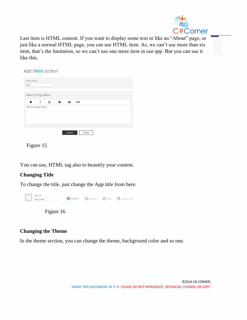
©2014 C# CORNER.
SHARE THIS DOCUMENT AS IT IS. PLEASE DO NOT REPRODUCE, REPUBLISH, CHANGE OR COPY.
Last item is HTML content. If you want to display some text or like an “About” page, or
just like a normal HTML page, you can use HTML item. As, we can’t use more than six
item, that’s the limitation, so we can’t use one more item in our app. But you can use it
like this.
Figure 15
You can use, HTML tag also to beautify your content.
Changing Title
To change the title, just change the App title from here.
Figure 16
Changing the Theme
In the theme section, you can change the theme, background color and so one.

©2014 C# CORNER.
SHARE THIS DOCUMENT AS IT IS. PLEASE DO NOT REPRODUCE, REPUBLISH, CHANGE OR COPY.
Figure 17
Also you can upload your external background from your local drive.
Tiles and Splash Screen
To change the title image and Splash screen, just go to the “Tile” section, and change it
from here.
Figure 18

©2014 C# CORNER.
SHARE THIS DOCUMENT AS IT IS. PLEASE DO NOT REPRODUCE, REPUBLISH, CHANGE OR COPY.
Remember, when you move one section to another, always save you changes, otherwise
that will be lost and you’ve to do the same thing again.
Publish Info
Now go to the “Publish Info” section and you can also change App title, description from
here. To associate you app with Store, there is an option here. Also you can give the
privacy statement url here, but we’re not doing these here. We’ll do it later from Visual
Studio in our next chapter.
Now hit the “Finish” button and you can see the window below.
Figure 19
Hit the “Generate” button, then a popup window will open.

©2014 C# CORNER.
SHARE THIS DOCUMENT AS IT IS. PLEASE DO NOT REPRODUCE, REPUBLISH, CHANGE OR COPY.
Generate the Source Code
Figure 20
Click the “Generate” button, and it’ll generate source code for both Windows and
Windows Phone.
Download the Source Code

©2014 C# CORNER.
SHARE THIS DOCUMENT AS IT IS. PLEASE DO NOT REPRODUCE, REPUBLISH, CHANGE OR COPY.
Figure 21
Download it from here.
Figure 22
Hit “Download” and after downloading, open it with Visual Studio 2013.
Summary
It’s all done, you can make your favorite app only in an hour. In the next chapter we’ll
discuss how to submit your app in Windows Phone Store from scratch.

©2014 C# CORNER.
SHARE THIS DOCUMENT AS IT IS. PLEASE DO NOT REPRODUCE, REPUBLISH, CHANGE OR COPY.
Submitting App
Submitting App in Windows Phone Store from Scratch
To submit your Windows Phone App in your Store Account, you have to do some
prerequisites. First of all, if you have downloaded the source code of your Universal App
of Windows App Studio, just go to this download directory and open the Solution file in
Visual Studio 2013 with Update 3. If you don’t have Update 3, it’s fine but you need at
least Update 2 to run Universal Apps. In our last chapter we’ve downloaded our source
code from App Studio. Open it in your Visual Studio.
After loading your project in Visual Studio 2013, follow some simple steps that must be
done before submit your apps in Windows Phone Store.
Step 1: Right click on the Windows Phone Project in Solution Explorer, and make it
StartUp Project.

©2014 C# CORNER.
SHARE THIS DOCUMENT AS IT IS. PLEASE DO NOT REPRODUCE, REPUBLISH, CHANGE OR COPY.
Figure 1
Step 2: Again right click on the Windows Phone Project in Solution Explorer, go to Store
and click Associate App with the Store.

©2014 C# CORNER.
SHARE THIS DOCUMENT AS IT IS. PLEASE DO NOT REPRODUCE, REPUBLISH, CHANGE OR COPY.
Figure 2
Then you can see the figure below, and click next.
Figure 3

©2014 C# CORNER.
SHARE THIS DOCUMENT AS IT IS. PLEASE DO NOT REPRODUCE, REPUBLISH, CHANGE OR COPY.
After that you will be asked to sing in with your Store Account, so sign in.
Verify with your phone number.
Figure 5

©2014 C# CORNER.
SHARE THIS DOCUMENT AS IT IS. PLEASE DO NOT REPRODUCE, REPUBLISH, CHANGE OR COPY.
Insert the security code that you have received, and click submit.
Figure 6
Now, we have reserved an app name in our last blog. Today we will just select the
reserved app name and click next.

©2014 C# CORNER.
SHARE THIS DOCUMENT AS IT IS. PLEASE DO NOT REPRODUCE, REPUBLISH, CHANGE OR COPY.
Figure 7
Here, I’ve used another app as an example to submit in my store. Click Associate.
Figure 8
Step 3: Now we have to create an App Package for our app. So right click on Windows
Phone Project in Solution Explorer, go to Store and select Create App Package.

©2014 C# CORNER.
SHARE THIS DOCUMENT AS IT IS. PLEASE DO NOT REPRODUCE, REPUBLISH, CHANGE OR COPY.
Figure 9
After that you will see the figure below and hit next.
Figure 10

©2014 C# CORNER.
SHARE THIS DOCUMENT AS IT IS. PLEASE DO NOT REPRODUCE, REPUBLISH, CHANGE OR COPY.
Hit next again.
Figure 11
Then select the reserved app name and click next.

©2014 C# CORNER.
SHARE THIS DOCUMENT AS IT IS. PLEASE DO NOT REPRODUCE, REPUBLISH, CHANGE OR COPY.
Figure 12
And lastly hit Create and Close.
Figure 13

©2014 C# CORNER.
SHARE THIS DOCUMENT AS IT IS. PLEASE DO NOT REPRODUCE, REPUBLISH, CHANGE OR COPY.
Step 4: You will find your created package in your destination folder.
Step 5: One last thing before go to our Store, we have to take some snap shots of our
application. Just run the project in Visual Studio and after the Emulator start, click the
double greater than sign and another window will pop up. Just see the figure, it’s simply
easy.
Figure 15
Step 6: Now it’s time to sing in, in our Windows Phone Dev Center Account. After
singing in, go to the Dashboard and click Submit App.

©2014 C# CORNER.
SHARE THIS DOCUMENT AS IT IS. PLEASE DO NOT REPRODUCE, REPUBLISH, CHANGE OR COPY.
Figure 16
Then click App info.
Figure 17
And fill these forms, just write down the reserved app name and click Associate and give
the selected category of your app, in our case it’s “music + video”, and save it.

©2014 C# CORNER.
SHARE THIS DOCUMENT AS IT IS. PLEASE DO NOT REPRODUCE, REPUBLISH, CHANGE OR COPY.
Figure 18
Step 7: Now click Upload and describe your package(s) and upload the APPXUPLOAD
File you have created.
Figure 19
And give description of your app and upload the snap shots you have taken. It should be
768*1280 pixel.

©2014 C# CORNER.
SHARE THIS DOCUMENT AS IT IS. PLEASE DO NOT REPRODUCE, REPUBLISH, CHANGE OR COPY.
Figure 20
Save all. Now it’s all done. What you have to do, just click Review and Submit button and
wait for your Congratulation mail of your hard work.

©2014 C# CORNER.
SHARE THIS DOCUMENT AS IT IS. PLEASE DO NOT REPRODUCE, REPUBLISH, CHANGE OR COPY.
Figure 21
After couple of hours, you will get a confirmation mail. Back then, it took seven working
hour to validate your app, now it takes just some hours. So why you will sit idle! Start
building your very first own Windows Phone App.
Happy Coding!

©2014 C# CORNER.
SHARE THIS DOCUMENT AS IT IS. PLEASE DO NOT REPRODUCE, REPUBLISH, CHANGE OR COPY.
Appendix
All the chapters are blogged in our blog site. If you find any difficulties and have any
question, you can ask there.
http://learnwithbddevs.wordpress.com/
You can read articles of this book from this site,
http://www.c-sharpcorner.com/Authors/020f8f/Articles/
All the chapters’ source code can be found here,
http://1drv.ms/1EeZYHG