Why Web Forms Stink and What You Can Do About It Darlene Fichter fichter/ Data Library Coordinator,...
53
WWW: Wri ting for Why Web Forms Stink and What You Can Do About It Darlene Fichter http:// library.usask.ca/~fichter / Data Library Coordinator, U of S Library
-
date post
21-Dec-2015 -
Category
Documents
-
view
220 -
download
1
Transcript of Why Web Forms Stink and What You Can Do About It Darlene Fichter fichter/ Data Library Coordinator,...
WWW: Writing for the Wired World
Why Web Forms Stink and
What You Can Do About It
Darlene Fichter
http://library.usask.ca/~fichter/
Data Library Coordinator, U of S Library
Overview
What is usability?Why test?Usability techniques
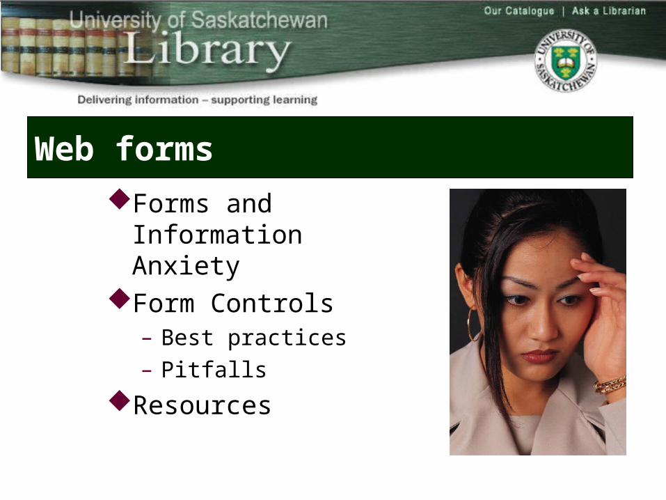
Web forms
Forms and Information Anxiety
Form Controls– Best practices– Pitfalls
Resources
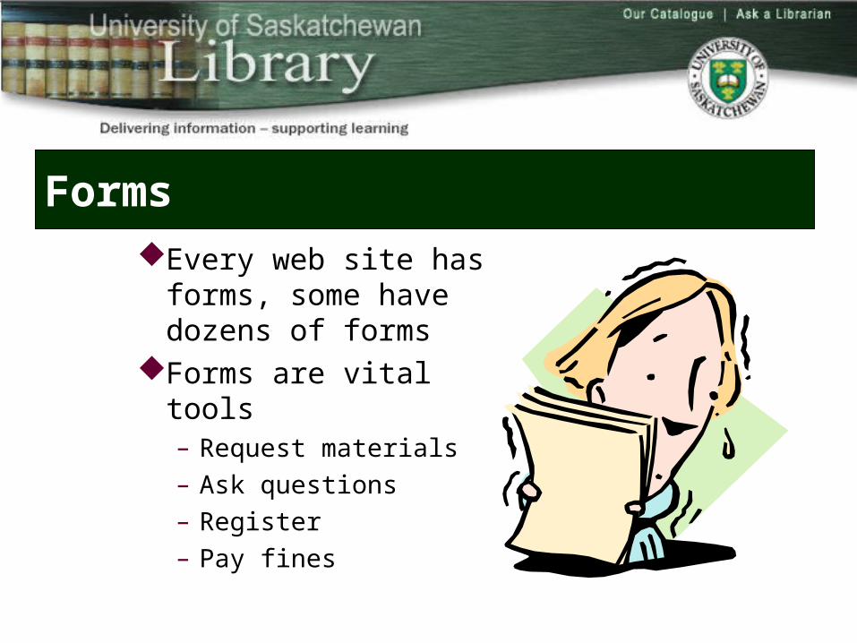
Forms
Every web site has forms, some have dozens of forms
Forms are vital tools– Request materials– Ask questions– Register– Pay fines
User’s mindset
Filling in forms is a necessary evil– Paying bills– Your tax return– Job applications– Your tax return– …
Our job is make the experience as “pain free” as possible
Remember when
Filled out along form only to be told you entered something incorrectly but no clear feedback about “what”
Then you hit back only to find that the details you had entered were not preserved, and you have to fill the whole */£$%^*£ thing over again
Your information doesn’t fit – won’t accept your address or your order
Designing usable forms
Tune into what the users want to accomplish with the form
Organize the information in a natural way – arrange the requests for like-information together– all of the address information can be collected at
once and in a conventional order street, city, state, and zip code.
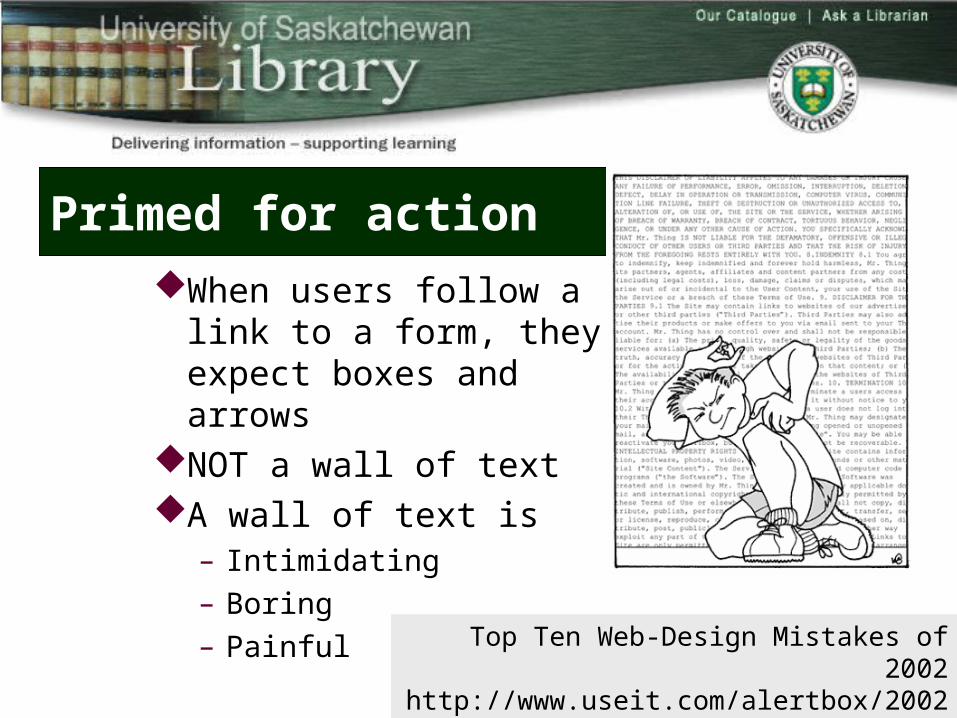
Primed for action
When users follow a link to a form, they expect boxes and arrows
NOT a wall of textA wall of text is
– Intimidating– Boring– Painful Top Ten Web-Design Mistakes of 2002
http://www.useit.com/alertbox/20021223.html
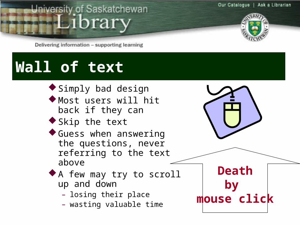
Wall of textSimply bad designMost users will hit back if they canSkip the text Guess when answering the
questions, never referring to the text above
A few may try to scroll up and down– losing their place– wasting valuable time
Deathby
mouse click
Common complaints
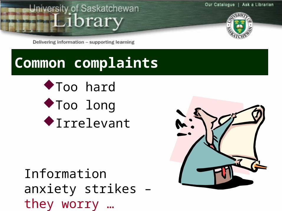
Too hardToo long Irrelevant
Information anxiety strikes – they worry …
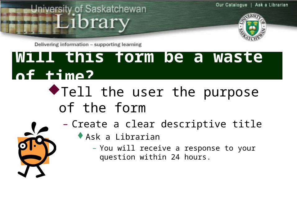
Will this form be a waste of time?Tell the user the purpose of the form
– Create a clear descriptive titleAsk a Librarian
– You will receive a response to your question within 24 hours.
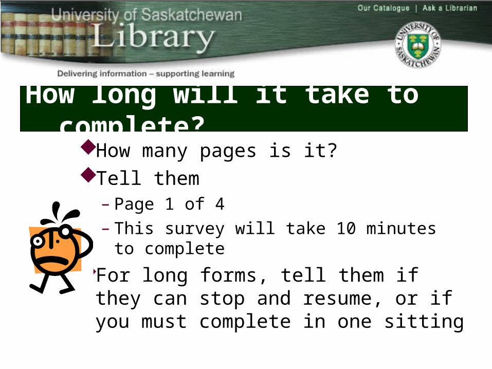
How long will it take to complete?How many pages is it? Tell them
– Page 1 of 4– This survey will take 10 minutes to complete
For long forms, tell them if they can stop and resume, or if you must complete in one sitting
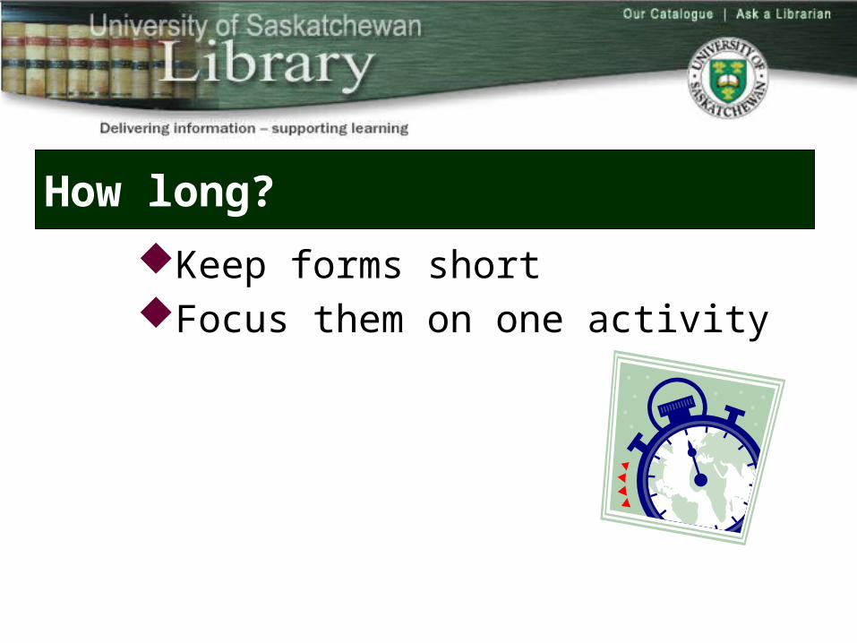
How long?
Keep forms shortFocus them on one activity
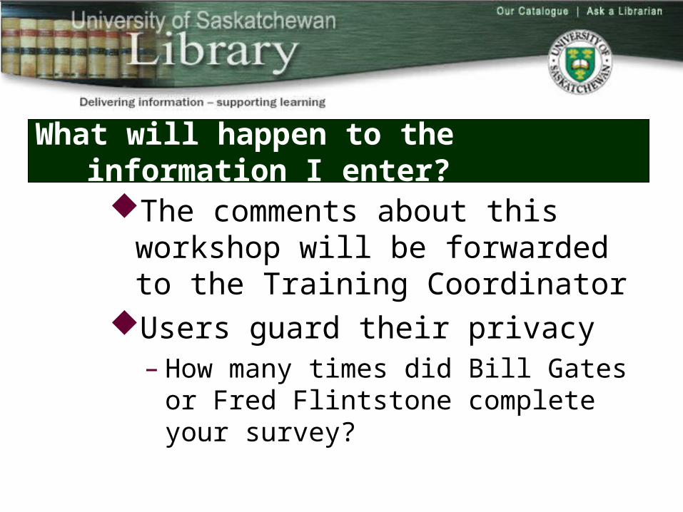
What will happen to the information I enter?
The comments about this workshop will be forwarded to the Training Coordinator
Users guard their privacy– How many times did Bill Gates or Fred Flintstone
complete your survey?
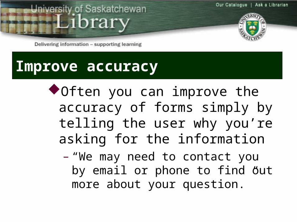
Improve accuracy
Often you can improve the accuracy of forms simply by telling the user why you’re asking for the information– “We may need to contact you by email or phone
to find out more about your question.”
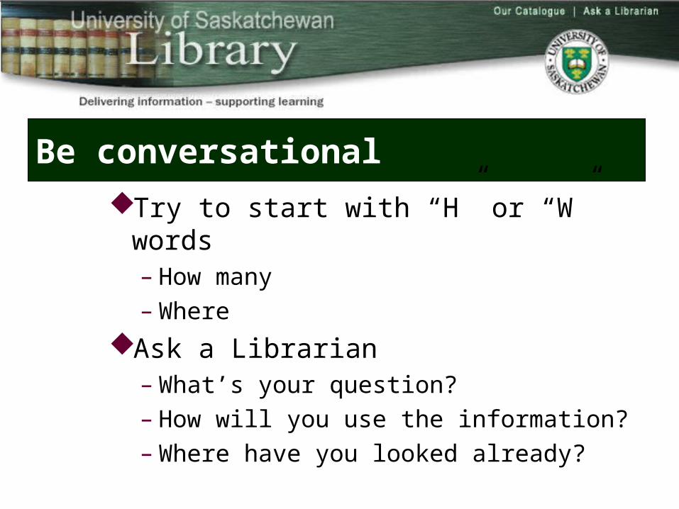
Be conversational
Try to start with “H” or “W” words– How many– Where
Ask a Librarian– What’s your question?– How will you use the information?– Where have you looked already?
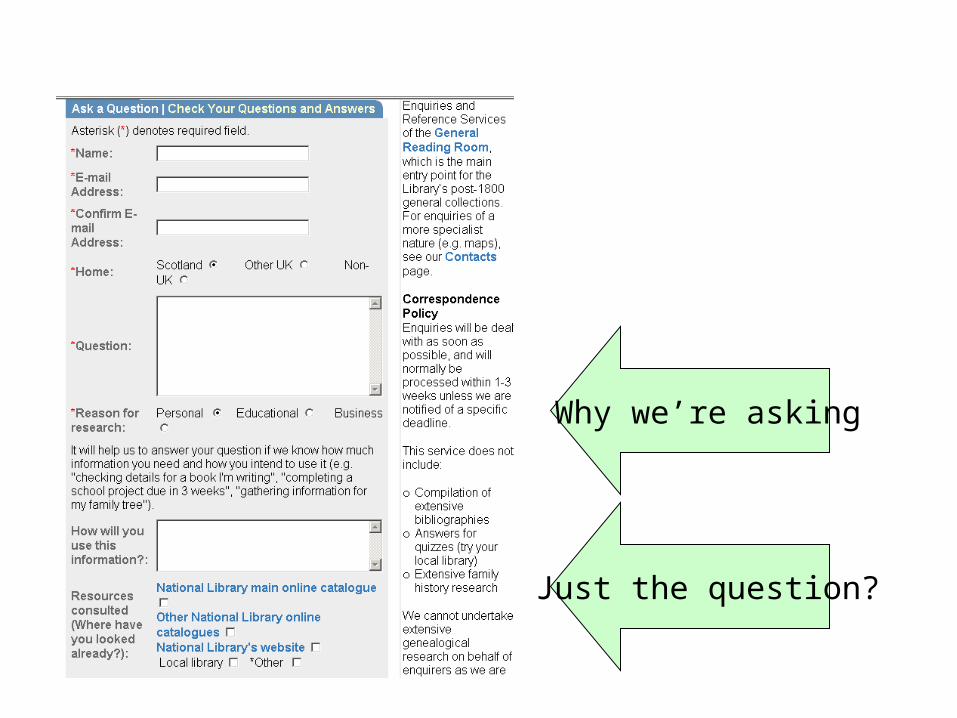
Why we’re asking
Just the question?
What if I make a mistake?
Make sure your questions are clear and unambiguous
The selection options are appropriate Form validation
– Check the data to see if matches– Numeric or character– Fixed length - 11 digit library bar code
Will this form ask irrelevant questions?
What does the office fax number have to do with ordering pizza?
Users hate compulsory questions, especially when they cannot see the relationship to the task at hand
Questions don’t match your experience
You’re forced to answer, in order to proceedLimit the use of required fields and the
number of “closed” ended questions Allow user control and freedom.
– Please select from the choices – Other: _____________
Leverage “real world”
Expectations about the sequence of information and grouping of information– Library card application
Like many applicationsStart with:
– Name, address …
Let users be your guide
Change your mindsetRather than insisting that users must complete all
survey questions, the form validation process could send a polite message: – “You have not completed questions 3, 6 or 7. Would you
like to complete these questions, or simply submit the form as is?”
– Then let the users choose, and then accept their answer.
Form controls
Lots to choose from– Text boxes– Checkboxes– Radio buttons– Drop down lists– Multiple select drop down lists
Text boxes
Great for entering short tidbits of unique information such as a person’s name
Faster to type the city than scroll through along list
+ User has lots of freedom- Data errors
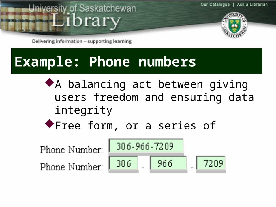
Example: Phone numbers
A balancing act between giving users freedom and ensuring data integrity
Free form, or a series of preformatted text boxes
Considerations
International phone numbers– Free form is better
Accessibility– screen readers will only see the label for the first text box
3 boxes are slower3 boxes give clarity about what data is wanted
Decision time
Err on the side of being inclusive Back end scripting can parse out
miscellaneous punctuation and improve data integrity
Text field pitfalls
Size of the text box matters – It tells the user how many characters you expect
For example, a postal code or zip code box should be quite short; but a street address box should be considerably longer
– No label– So short the user can’t see (and prevent errors) n
their typingTeeny, tiny search boxes
Text areas
Great for free form answers when the user is asked to provide a long answer
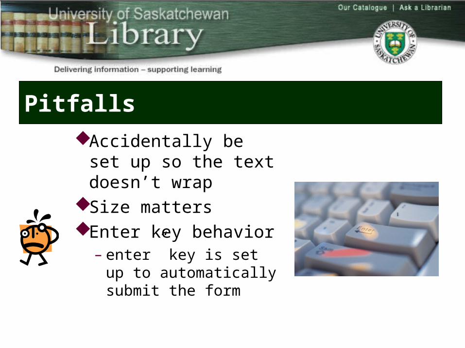
Pitfalls
Accidentally be set up so the text doesn’t wrap
Size matters Enter key behavior
– enter” key is set up to automatically submit the form
Check boxes
Select one or more options from a listShort lists with 5 to 7 options work bestSave time over a drop down list; see it right
up front
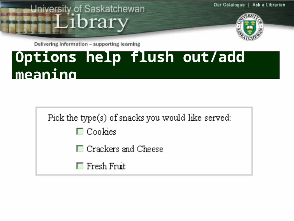
Options help flush out/add meaning
Pitfalls
Dozens of checkboxesPoor labeling
– users aren’t sure whether to “pick one” or “pick many”
Failure to predict the options that users would like to see in the list and not providing an open-ended, “Other: ” option
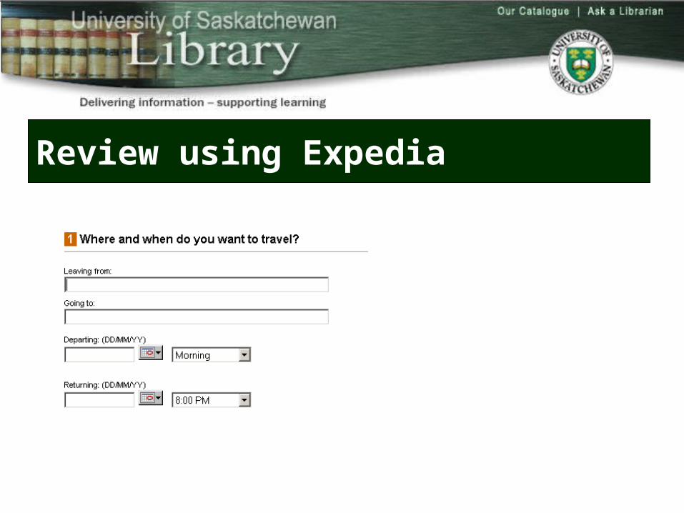
Review using Expedia
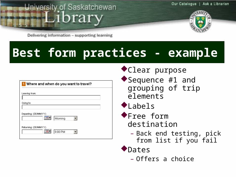
Best form practices - exampleClear purposeSequence #1 and grouping
of trip elementsLabelsFree form destination
– Back end testing, pick from list if you fail
Dates – Offers a choice
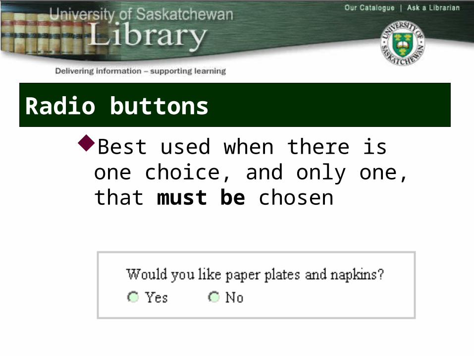
Radio buttons
Best used when there is one choice, and only one, that must be chosen
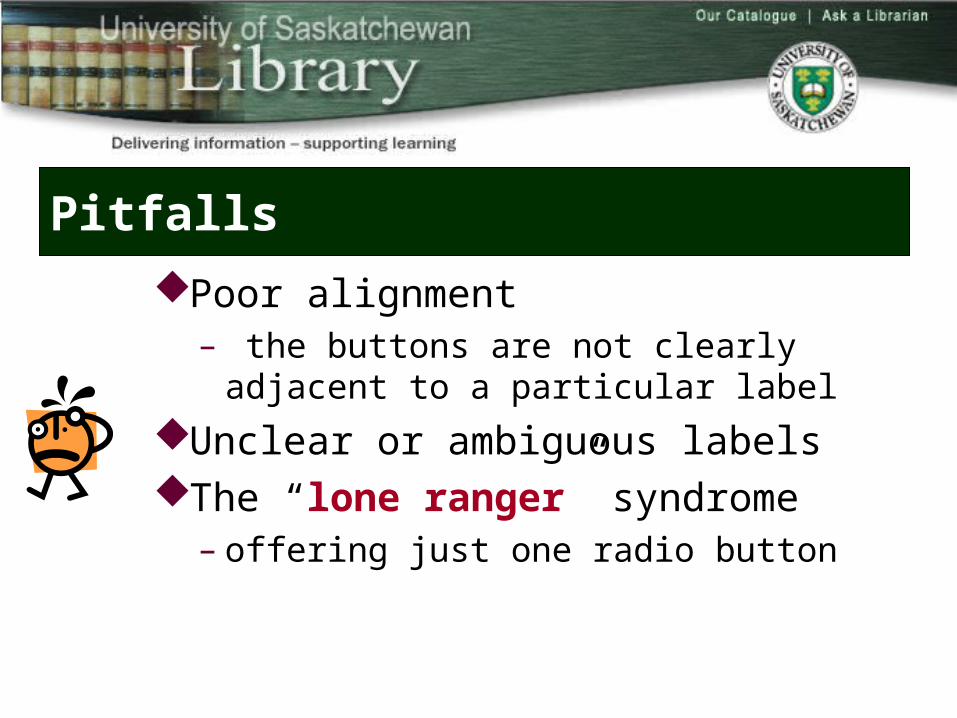
Pitfalls
Poor alignment – the buttons are not clearly adjacent to a
particular labelUnclear or ambiguous labelsThe “lone ranger” syndrome
– offering just one radio button
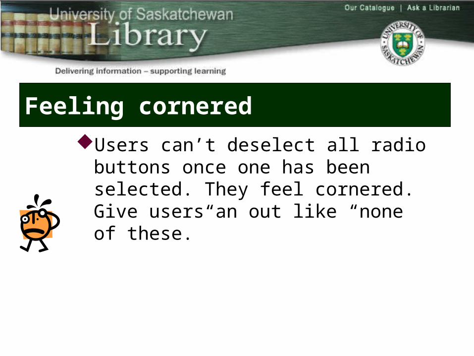
Feeling cornered
Users can’t deselect all radio buttons once one has been selected. They feel cornered. Give users an out like “none of these.”
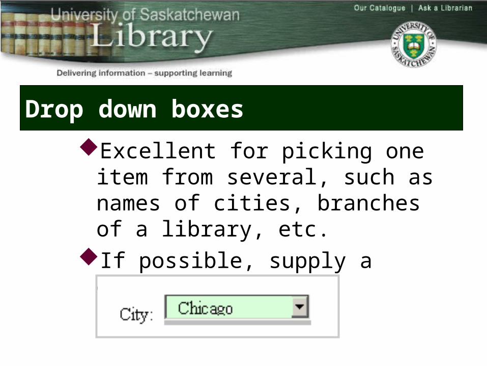
Drop down boxes
Excellent for picking one item from several, such as names of cities, branches of a library, etc.
If possible, supply a default
PitfallsOveruse; everything on the form is a drop
down boxItems in the drop down list are not in a logical
order to the usersThe label is part of the drop down list rather
than being adjacent to it
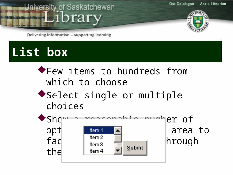
List box
Few items to hundreds from which to chooseSelect single or multiple choicesShow a reasonable number of options in the display
area to facilitate scrolling through the list
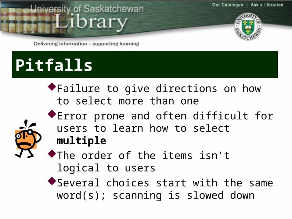
PitfallsFailure to give directions on how to select more than
oneError prone and often difficult for users to learn how
to select multipleThe order of the items isn’t logical to usersSeveral choices start with the same word(s);
scanning is slowed down
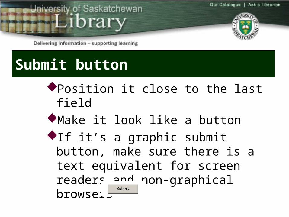
Submit button
Position it close to the last fieldMake it look like a buttonIf it’s a graphic submit button, make sure
there is a text equivalent for screen readers and non-graphical browsers
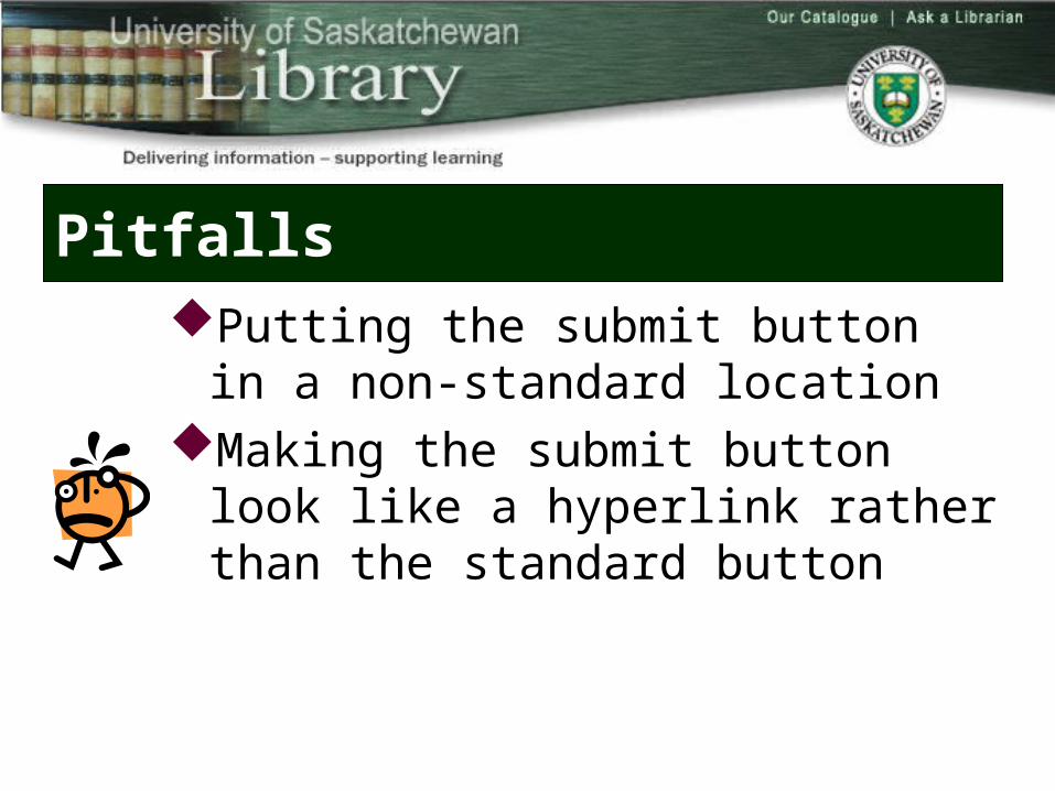
PitfallsPutting the submit button in a non-standard
locationMaking the submit button look like a hyperlink
rather than the standard button
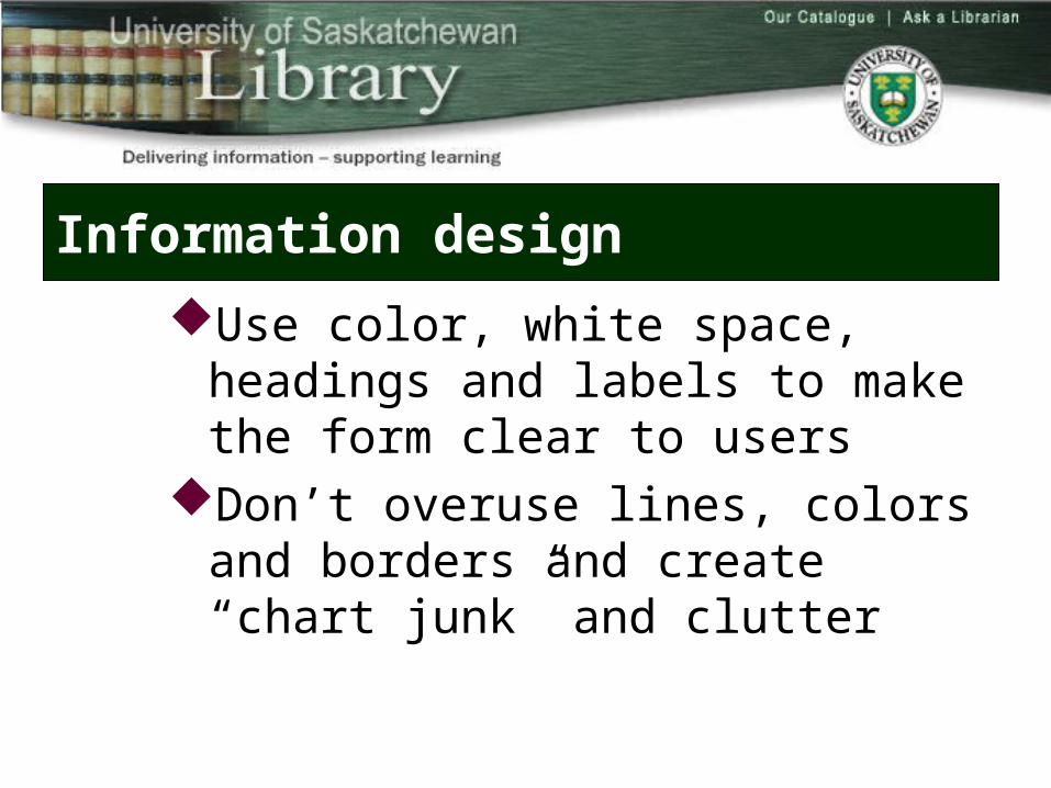
Information design
Use color, white space, headings and labels to make the form clear to users
Don’t overuse lines, colors and borders and create “chart junk” and clutter
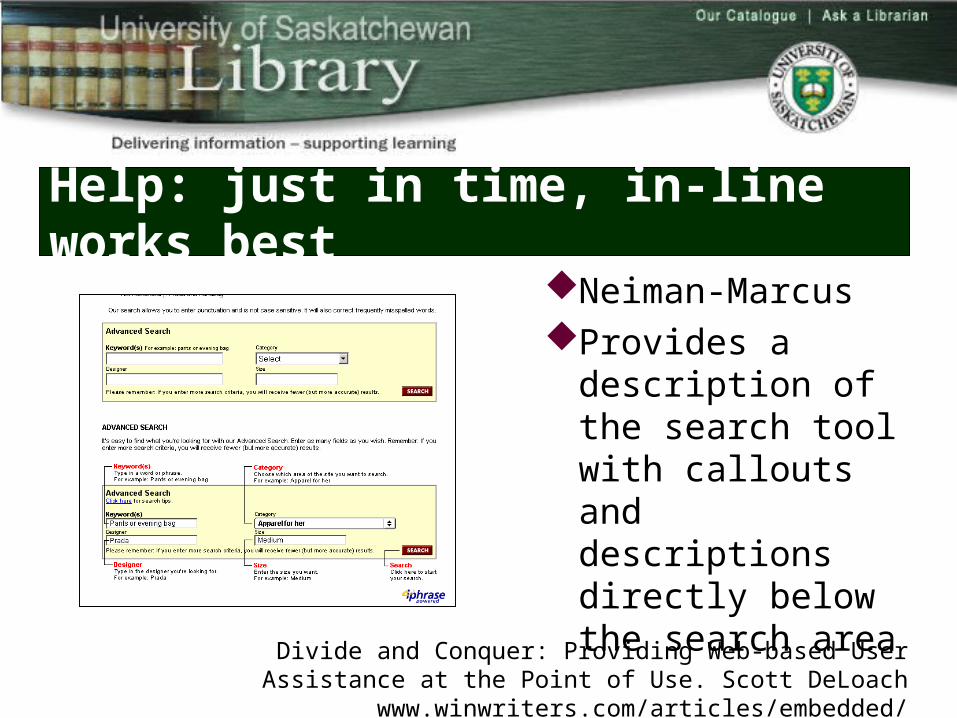
Help: just in time, in-line works best
Neiman-MarcusProvides a description
of the search tool with callouts and descriptions directly below the search area
Divide and Conquer: Providing Web-based User Assistance at the Point of Use. Scott DeLoach www.winwriters.com/articles/embedded/
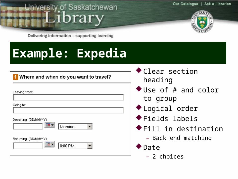
Example: ExpediaClear section headingUse of # and color to groupLogical orderFields labelsFill in destination
– Back end matchingDate
– 2 choices
Examples: What could be better?
Interlibrary loan formRoom booking
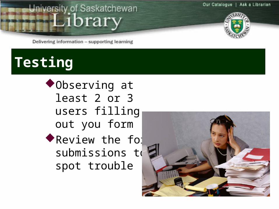
Testing
Observing at least 2 or 3 users filling out you form
Review the form submissions to spot trouble
Forms
With some conscious effort, we can make web forms much better
Keep in the mind, as developers we must:Ben Schneidermann
– "Design test design test design test."
Edward Tufte– "Design think design think design think."
Thank you
Questions?
Darlene Fichter University of Saskatchewan Libraries
library.usask.ca/~fichter/