Competitor analysis
6
Social Message Campaigns- Competitor Analysis Nathan West
-
Upload
nathanwest08 -
Category
Education
-
view
104 -
download
0
Transcript of Competitor analysis
Social Message Campaigns- Competitor Analysis
Nathan West
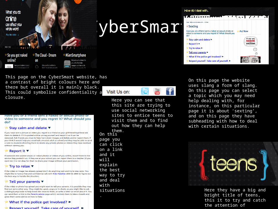
CyberSmart
This page on the CyberSmart website, has a contrast of bright colours here and there but overall it is mainly black. This could symbolize confidentiality and closure.
On this page the website uses slang a form of slang. On this page you can select a topic which you may need help dealing with, for instance, on this particular page it is about ‘sexting’, and on this page they have subheading with how to deal with certain situations.
On this page you can click on a link and it will explain the best way to try and deal with situations.
Here they have a big and bright title of teens, this it to try and catch the attention of teenagers.
Here you can see that this site are trying to use social networking sites to entice teens to visit them and to find out how they can help them.
Internet Safety Tips for Kids and Teens
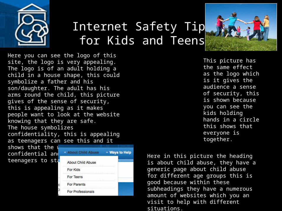
Here you can see the logo of this site, the logo is very appealing. The logo is of an adult holding a child in a house shape, this could symbolize a father and his son/daughter. The adult has his arms round the child, this picture gives of the sense of security, this is appealing as it makes people want to look at the website knowing that they are safe.The house symbolizes confidentiality, this is appealing as teenagers can see this and it shows that the website are confidential and will try and help teenagers to stay safe.
This picture has the same effect as the logo which is it gives the audience a sense of security, this is shown because you can see the kids holding hands in a circle this shows that everyone is together.
Here in this picture the heading is about child abuse, they have a generic page about child abuse for different age groups this is good because within these subheadings they have a numerous amount of websites which you an visit to help with different situations.
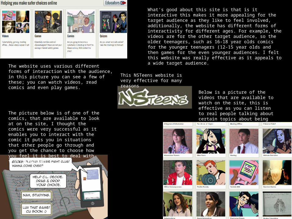
This NSTeens website is very effective for many reasons
The website uses various different forms of interaction with the audience, in this picture you can see a few of these; you can watch videos, read comics and even play games.
The picture below is of one of the comics, that are available to look at on the site, I thought the comics were very successful as it enables you to interact with the comic it puts you in situations that other people go through and you get the chance to choose how you feel it is best to deal with that situation.
Below is a picture of the videos that are available to watch on the site, this is effective as you can listen to real people talking about certain topics about being safe online.
What's good about this site is that is it interactive this makes it more appealing for the target audience as they like to feel involved, additionally, the website has different forms of interactivity for different ages. For example, the videos are for the other target audience, so the older teenagers, such as 16-18 year olds comics for the younger teenagers (12-15 year olds and then games for the even younger audiences. I felt this website was really effective as it appeals to a wide target audience.
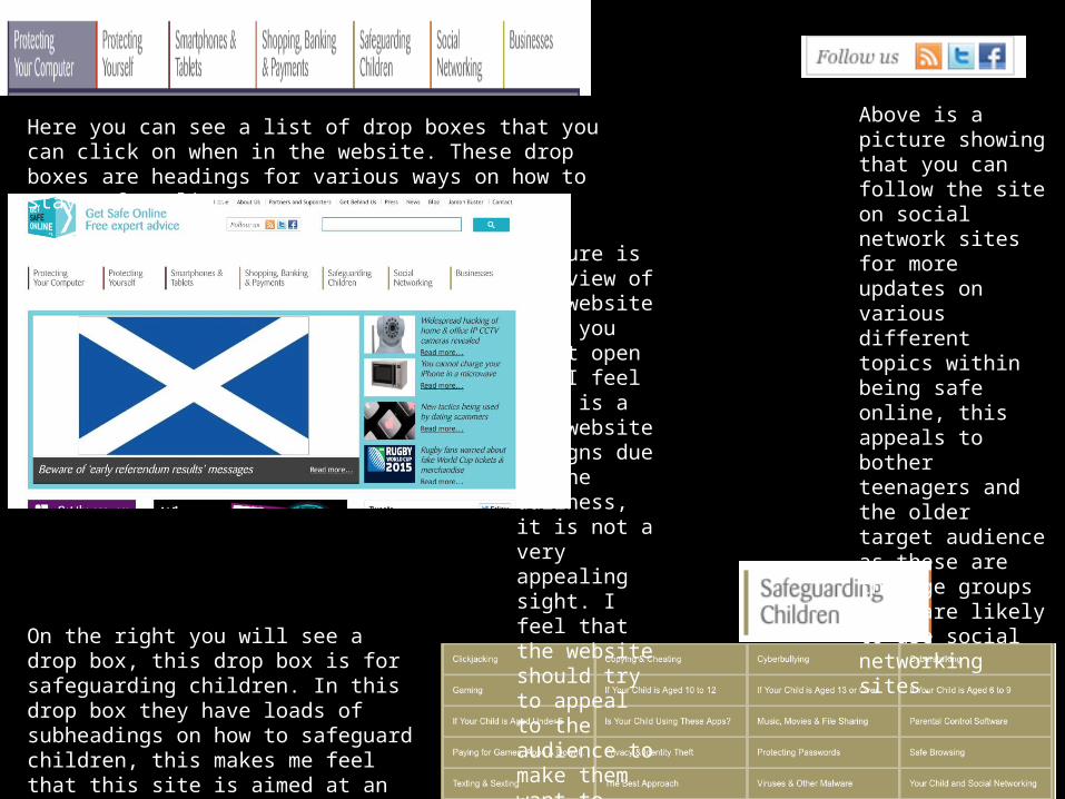
This picture is the view of the website when you first open it. I feel this is a bad website designs due to the dullness, it is not a very appealing sight. I feel that the website should try to appeal to the audience to make them want to read it
On the right you will see a drop box, this drop box is for safeguarding children. In this drop box they have loads of subheadings on how to safeguard children, this makes me feel that this site is aimed at an older target audience.
Above is a picture showing that you can follow the site on social network sites for more updates on various different topics within being safe online, this appeals to bother teenagers and the older target audience as these are the age groups that are likely to use social networking sites.
Here you can see a list of drop boxes that you can click on when in the website. These drop boxes are headings for various ways on how to stay safe online.
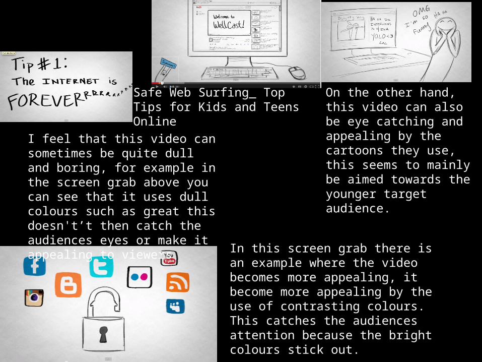
Safe Web Surfing_ Top Tips for Kids and Teens Online
I feel that this video can sometimes be quite dull and boring, for example in the screen grab above you can see that it uses dull colours such as great this doesn't’t then catch the audiences eyes or make it appealing to viewers
On the other hand, this video can also be eye catching and appealing by the cartoons they use, this seems to mainly be aimed towards the younger target audience.
In this screen grab there is an example where the video becomes more appealing, it become more appealing by the use of contrasting colours. This catches the audiences attention because the bright colours stick out.