Digipak powerpoint
9
Digipak Research
-
Upload
daisysadeh -
Category
Education
-
view
228 -
download
0
Transcript of Digipak powerpoint

Digipak Research


This is the front cover for the Beatles Yellow Submarine digipak. It has various features that are stereotypically found on a digipak, including a picture of the band members, which in this case are cartoon drawn. This digipak has lots of colours, which could suggest a happy nature to the album, as all the colours are bright, connoting happiness. Furthermore, the connotation of happiness could like to the up-tempo rock music on the album and possibly that the lyrics to the songs have happy subject meanings. Also on this digipak are cartoon objects and characters in bright colours, which could again connote happiness but could also represent the childish nature of the band, as children often drawn cartoons in bright colours. The title of the album and the band name are written in the same 3D style yellow font. This font is unusual, suggesting the band is unusual too. Also the font can be hard to read, similar to how children’s handwriting can be hard to read, suggesting a childish nature again. There is a yellow submarine on the digipak, linking to the name of the album, which is ‘Yellow Submarine’. This is a sign, which reinforces the name of the album and visualises it for people.
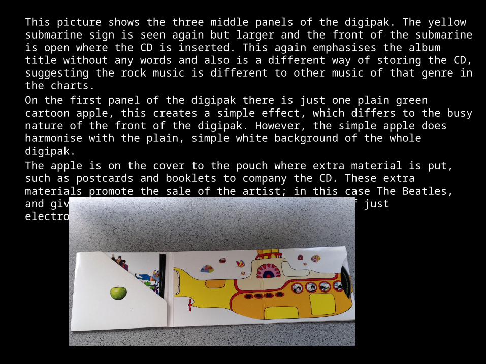
This picture shows the three middle panels of the digipak. The yellow submarine sign is seen again but larger and the front of the submarine is open where the CD is inserted. This again emphasises the album title without any words and also is a different way of storing the CD, suggesting the rock music is different to other music of that genre in the charts. On the first panel of the digipak there is just one plain green cartoon apple, this creates a simple effect, which differs to the busy nature of the front of the digipak. However, the simple apple does harmonise with the plain, simple white background of the whole digipak. The apple is on the cover to the pouch where extra material is put, such as postcards and booklets to company the CD. These extra materials promote the sale of the artist; in this case The Beatles, and give people an incentive to by the CD instead of just electronically downloading the album.
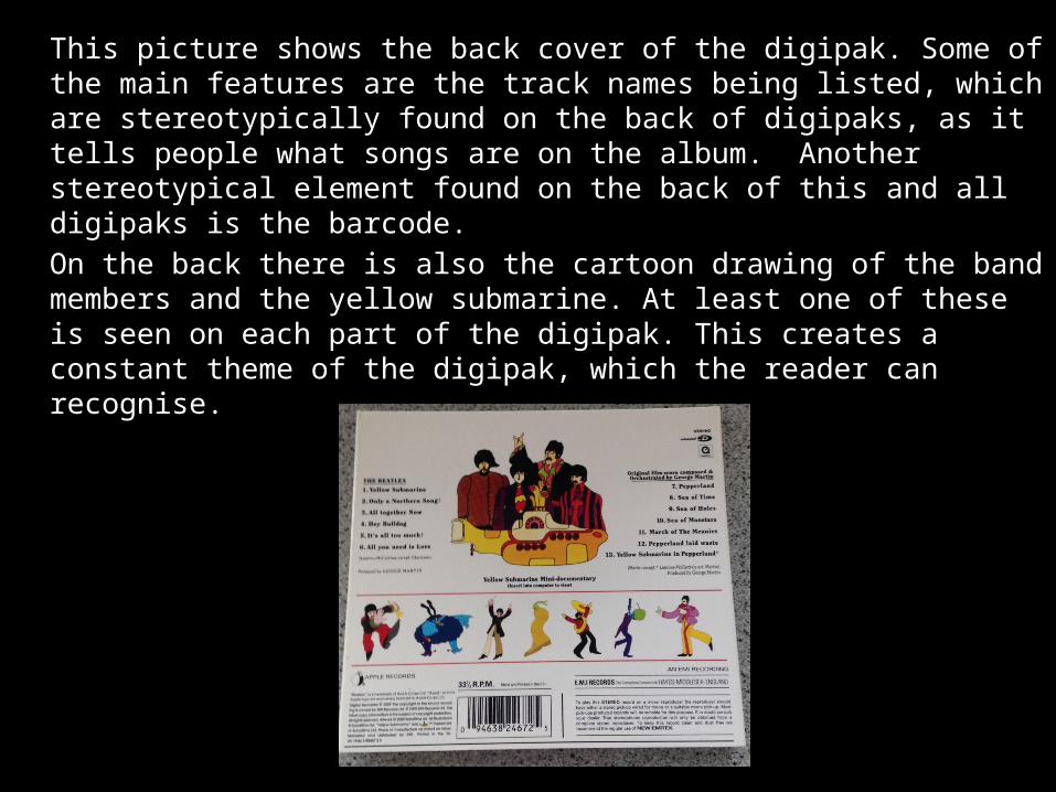
This picture shows the back cover of the digipak. Some of the main features are the track names being listed, which are stereotypically found on the back of digipaks, as it tells people what songs are on the album. Another stereotypical element found on the back of this and all digipaks is the barcode.On the back there is also the cartoon drawing of the band members and the yellow submarine. At least one of these is seen on each part of the digipak. This creates a constant theme of the digipak, which the reader can recognise.


This is the front cover of the Oasis digipak for the single ‘Stand by me’, which is from there album ‘Be Here Now’. The name of the band (Oasis) is in their conventional white font with the black box. This allows the reader to automatically recognise the band.There are two people, most likely a couple, on the front of the digipak. They are smiling and warm colours are used, this suggests the song has a happy nature.

These are the two middle panels of the 4-panel digipak. On the CD, which is in a holder on the left, there is same picture of the couple along with the conventional Oasis band name and box. This creates continuity for the reader, a stereotypical part of digipaks.On the other panel of the digipak there is again the band name in the same font but the colours are swapped round, creating a twist of the continuity. There is also multiple bride and grooms on this panel of the digipak, this connotes happiness, as your wedding day is a happy day of your life.
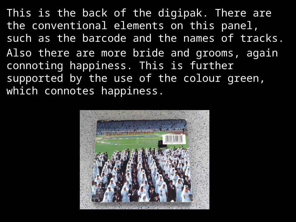
This is the back of the digipak. There are the conventional elements on this panel, such as the barcode and the names of tracks.Also there are more bride and grooms, again connoting happiness. This is further supported by the use of the colour green, which connotes happiness.