Digipak ideas - initial (album art)
9
-
Upload
nathanbeardlcm1415 -
Category
Education
-
view
199 -
download
0
Transcript of Digipak ideas - initial (album art)


Digipak Inspiration // 1I like this digipak cover design. I feel that it draws in attention due to i t s m in ima l i s t i c nature, this I believe draws papers by to look to find out more. This I believe will work well with the genre we are operating in, as it is about looking into things and ‘finding’ them. I feel that the minimalistic theme is also something I want to pursue with my own digipak as it is fitting with the direction we are establishing for the b a n d ( s i m p l e b u t memorable).
I also like how the colours used represent reflections of them main triangle in the middle, this gives a consistency to the design that is a 3D type layout. I also like the detail at the top with the colour scheme in three lines. A p o t e n t i a l disadvantage is that passers by might not realise what it is and might not be interested in looking at it, this is partially resolved by the clear and easy to read text.
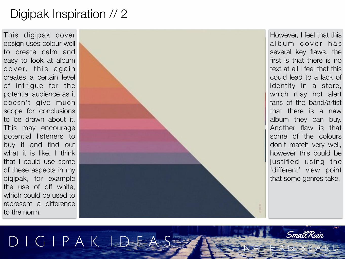
Digipak Inspiration // 2This dig ipak cover design uses colour well to create calm and easy to look at album c o v e r, t h i s a g a i n creates a certain level of int r igue for the potential audience as it doesn't give much scope for conclusions to be drawn about it. This may encourage potential listeners to buy it and find out what it is like. I think that I could use some of these aspects in my digipak, for example the use of off white, which could be used to represent a difference to the norm.
However, I feel that this a l b u m c o v e r h a s several key flaws, the first is that there is no text at all I feel that this could lead to a lack of identity in a store, which may not alert fans of the band/artist that there is a new album they can buy. Another flaw is that some of the colours don't match very well, however this could be jus t i fied us ing the ‘different’ view point that some genres take.

Digipak Inspiration // 3This a lbum design features lots of detail which can be used to draw attention to itself amongst the other digipaks on sale in the shop. People may be interested (like I was when I scrolled past it on google images) and look at it, this could get them interested and lead to a sale. It also u s e s a g r a y s c a l e colour scheme which would arguably make it stand out as most other album covers f e a t u r e c o l o u r (sometimes heavily). This is an aspect that I would look into using.
The use of a shadow to give the design a ‘multi layered’ look, is also something that I have been heav i l y considering as it allows for more depth, here it isn't used to its full potential as there is nothing present behind it, I would perhaps have an image behind it, that represent the band and would be identifiable with the fans of the band. However, leaving it blank could be good as it follows the values I have set (simple and minimalistic).

Digipak Inspiration // 4This digipak doesn't use any colour, it is all greyscale, this I think works well, especially with the texture that they are using for the actual cover, I think that it would stand out in a store as people would be draw to the texture (even if it was done via a graphic b a c k g r o u n d a s apposed to an actual material, I could use th i s e f fec t fo r my digipak, especially if I used the multi layer design, putting this as the background and putting a picture on top.
A further aspect that I like is that the text is written in a distinctive font that could be instantly recognised from other marketing methods, for example p o s t e r s o r w e b adverts. This instantly connects the album to a specific band/artist and wi l l provide a consistency. I also think that there is potential for the text to be glossy, especially on top of the matte rough surface. It could also be made to work with a bright glossy colour for the text, and would be an interesting effect.

Digipak Inspiration // 5This digipak uses an a b s t r a c t t r i a n g l e design, however ist is completely black, this makes it stand out as most of these designs are colourful, this could single this album out as different and new. This is the type of direction I want my digipak to be angled as the music is indie. This makes it ‘alternative’ by nature. However in contrast to a lot of indie type albums it has some mainstream appeal and is therefore likely to appeal to a wider audience.
I think that there are s o m e p o t e n t i a l improvements that could be made to the design, some of the t r iang les cou ld be glossy. This would give the cove r a more pronounced look, and w o u l d b e t t e r t h e ‘abstract’ effect. The font that is used would not be my first choice and looks a little mis-matched to the rest of the cover. Overall I think that some colder could be added to further increase the appeal of the album cover.

Digipak Inspiration // 6I like this album cover, as I think that the title is bold and clear and will a t t r a c t p o t e n t i a l customers’ attention. This is backed up by the successful use of a filter, the one that is used is a sort of sepia-esc type filter. It is very difficult to get these right on album covers and other such items as it can look cheap and lazy as filters are so common due to social networks like insagram incorporating them. The p ic tu re choice is also very good as it gives people something to look at.
T h e u s e o f transparencies on this album cover is also successful as the large ‘X’ in the centre has the correct level of transparency, so that it gives a sense of place whilst still having a bold impact on what the a u d i e n c e s e e s . A negative for this album cover is that it maybe a little overly mainstream and this results in it looking a little bit no descript. Overall I feel that it is a good album cover and incorporates many ideas I aim to u s e s u c h a s a landscape type picture.
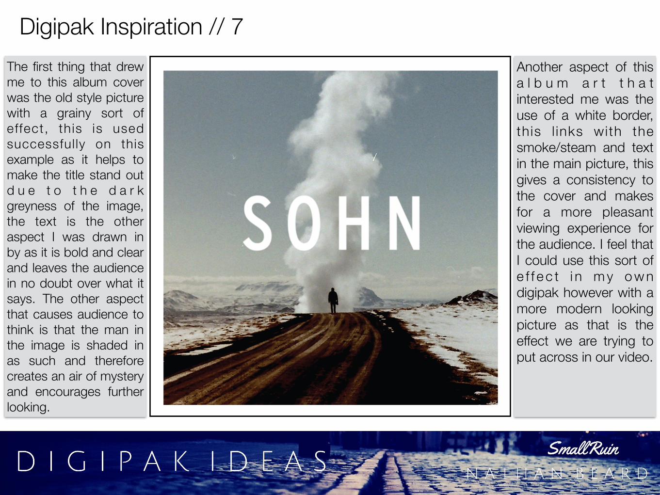
Digipak Inspiration // 7The first thing that drew me to this album cover was the old style picture with a grainy sort of effect, th is is used successful ly on this example as it helps to make the title stand out d u e t o t h e d a r k greyness of the image, the text is the other aspect I was drawn in by as it is bold and clear and leaves the audience in no doubt over what it says. The other aspect that causes audience to think is that the man in the image is shaded in as such and therefore creates an air of mystery and encourages further looking.
Another aspect of this a l b u m a r t t h a t interested me was the use of a white border, th is l inks with the smoke/steam and text in the main picture, this gives a consistency to the cover and makes for a more pleasant viewing experience for the audience. I feel that I could use this sort of e f f e c t i n m y o w n digipak however with a more modern looking picture as that is the effect we are trying to put across in our video.