Media Album digipak Deconstruction
7
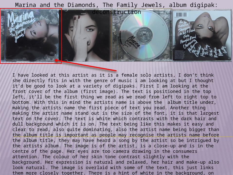
Marina and the Diamonds, The Family Jewels, album digipak: deconstruction I have looked at this artist as it is a female solo artists, I don’t think she directly fits in with the genre of music i am looking at but I thought it’d be good to look at a variety of digipaks. First I am looking at the front cover of the album (first image). The text is positioned in the top left, it’ll be the first thing we read as we read from left to right top to bottom. With this in mind the artists name is above the album title under, making the artists name the first piece of text you read. Another thing making the artist name stand out is the size of the font, it is that largest text on the cover. The text is white which contrasts with the dark hair and dull background which it is on. The text being like this makes it easy and clear to read, also quite dominating, also the artist name being bigger than the album title is important as people may recognise the artists name before the album title, they may have heard a song by the artist so be intrigued by the artists album. The image is of the artist, is a close-up and is in the centre of the page. Her eyes are too camera drawing in the consumers attention. The colour of her skin tone contrast slightly with the background. Her expression is natural and relaxed, her hair and make-up also look natural. The image is overlaid with some of the text, this just links them more closely together. There is a hint of white in the background, on
-
Upload
fionaa2media -
Category
Education
-
view
146 -
download
2
Transcript of Media Album digipak Deconstruction
Marina and the Diamonds, The Family Jewels, album digipak: deconstruction
I have looked at this artist as it is a female solo artists, I don’t think she directly fits in with the genre of music i am looking at but I thought it’d be good to look at a variety of digipaks. First I am looking at the front cover of the album (first image). The text is positioned in the top left, it’ll be the first thing we read as we read from left to right top to bottom. With this in mind the artists name is above the album title under, making the artists name the first piece of text you read. Another thing making the artist name stand out is the size of the font, it is that largest text on the cover. The text is white which contrasts with the dark hair and dull background which it is on. The text being like this makes it easy and clear to read, also quite dominating, also the artist name being bigger than the album title is important as people may recognise the artists name before the album title, they may have heard a song by the artist so be intrigued by the artists album. The image is of the artist, is a close-up and is in the centre of the page. Her eyes are too camera drawing in the consumers attention. The colour of her skin tone contrast slightly with the background. Her expression is natural and relaxed, her hair and make-up also look natural. The image is overlaid with some of the text, this just links them more closely together. There is a hint of white in the background, on the image and the text is white this creates a flow through all aspects of the cover. The background is dull making the image and text stand out more. I would say the style of this cover is quirky because of a lot of different points, one being the fact the background is patterned not just plain or natural setting type background. The text font is quite unusual, and the text is on a diagonal not straight , it kind of follows the edge of the image. The image itself is at a strange angle. There aren’t many bright colours to help it stand out, yet they styling of it makes it stand out.
Marina and the Diamonds, The Family Jewels, album digipak: deconstruction
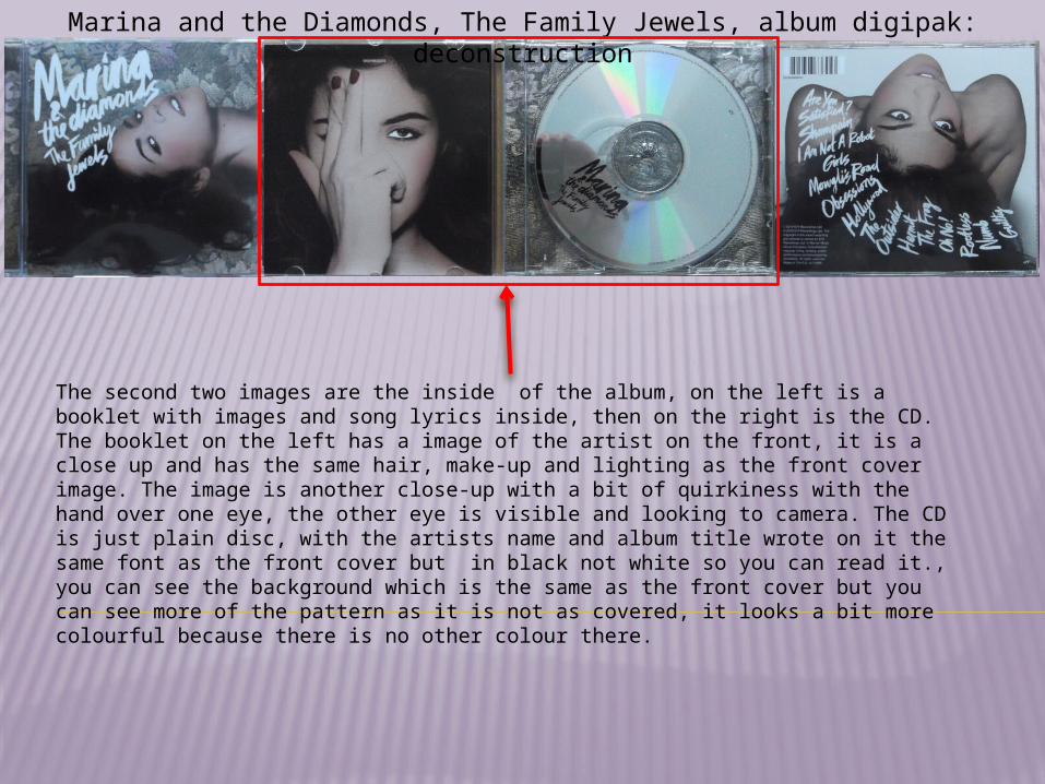
The second two images are the inside of the album, on the left is a booklet with images and song lyrics inside, then on the right is the CD. The booklet on the left has a image of the artist on the front, it is a close up and has the same hair, make-up and lighting as the front cover image. The image is another close-up with a bit of quirkiness with the hand over one eye, the other eye is visible and looking to camera. The CD is just plain disc, with the artists name and album title wrote on it the same font as the front cover but in black not white so you can read it., you can see the background which is the same as the front cover but you can see more of the pattern as it is not as covered, it looks a bit more colourful because there is no other colour there.

Marina and the Diamonds, The Family Jewels, album digipak: deconstruction
The final image is of the back of the album, this has a track list, image, barcode and copyright information. The copy right information is in the bottom left corner , it is in a different font to the track list and very small, this shows it is not as important as the other text on the page, it is white contrasting with the dark hair which it is on . In the top left corner is the barcode, not very big and doesn’t stand out as important. The background here is quite plain with is different to the other background, but in the little booklet there were images with plain backgrounds so it still fits in with the album. The image is the same lighting, hair and make-up, also the same quirky style as she is leaning backwards so her face is upside down, also on this image her eyes are not looking at the camera, not as attention grabbing at the front cover image.. The track list is in the same font as the album title and artist name and the same colour (white) all of the track list is the same size, not making one part dominate any others. The writing contrasts with the background it is on, it goes from left to right top to bottom but not conventionally as it is on a curve, again unusual and quirky. This album is very individual to the artist and shows of her style. There is a good flow because of the image, text, and background used.
Ellie Goulding Bright Lights, album digipak: deconstruction
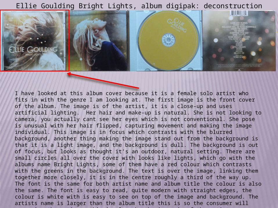
I have looked at this album cover because it is a female solo artist who fits in with the genre I am looking at. The first image is the front cover of the album. The image is of the artist, it is a close-up and uses artificial lighting. Her hair and make-up is natural. She is not looking to camera, you actually cant see her eyes which is not conventional. She pose is unusual with her hair flipped, capturing movement and making the image individual. This image is in focus which contrasts with the blurred background, another thing making the image stand out from the background is that it is a light image, and the background is dull. The background is out of focus, but looks as thought it’s an outdoor, natural setting. There are small circles all over the cover with looks like lights, which go with the albums name Bright Lights, some of them have a red colour which contrasts with the greens in the background. The text is over the image, linking them together more closely, it is in the centre roughly a third of the way up. The font is the same for both artist name and album title the colour is also the same. The font is easy to read, quite modern with straight edges, the colour is white with is easy to see on top of the image and background. The artists name is larger than the album title this is so the consumer will recognise the artists, this is also why the image is of the artist.
Ellie Goulding Bright Lights, album digipak: deconstruction
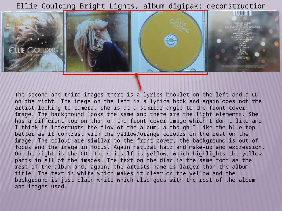
The second and third images there is a lyrics booklet on the left and a CD on the right. The image on the left is a lyrics book and again does not the artist looking to camera, she is at a similar angle to the front cover image. The background looks the same and there are the light elements. She has a different top on than on the front cover image which I don't like and I think it interrupts the flow of the album, although I like the blue top better as it contrast with the yellow/orange colours on the rest on the image. The colour are similar to the front cover, the background is out of focus and the image in focus. Again natural hair and make-up and expression. On the right is the CD. The C itself is yellow, which highlights the yellow parts in all of the images. The text on the disc is the same font as the rest of the album and, again, the artists name is larger than the album title. The text is white which makes it clear on the yellow and the background is just plain white which also goes with the rest of the album and images used.
Ellie Goulding Bright Lights, album digipak: deconstruction
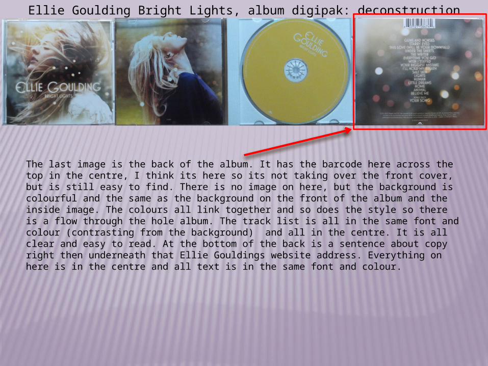
The last image is the back of the album. It has the barcode here across the top in the centre, I think its here so its not taking over the front cover, but is still easy to find. There is no image on here, but the background is colourful and the same as the background on the front of the album and the inside image. The colours all link together and so does the style so there is a flow through the hole album. The track list is all in the same font and colour (contrasting from the background) and all in the centre. It is all clear and easy to read. At the bottom of the back is a sentence about copy right then underneath that Ellie Gouldings website address. Everything on here is in the centre and all text is in the same font and colour.

Ben Howard, Every Kingdom: deconstruction (images from the Ben Howard website)
I have looked at this album as it is in the same genre I am looking at, although it is a male singer, he is still a solo artist. The first image is of the albums cover. This cover is different to the two previous covers I have deconstructed because it is simple compared to them. The background is all one shade of blue, with a small image, which looks like a print/paint, which is a cream colour contrasting with the blue it adds detail without being overpowering and is the main focus of the cover as it is in the middle. The writing is in the same colour as the image, his name is in bold and the album title not so his name stands out slightly more, Though they are the same size and one is not above the other, his name is the first bit you read. The texts is in the centre under the image, clear and easy to read. I like the simplicity of this cover, and the relaxed and not over complicated cover matches the sound of the album, as his songs are very relaxing and his style is laid back.
This image is of the inside of he album, it has two CD’s and a DVD inside. The main point to the inside of this cover is the image which goes across both sides of the inside package. It has blues and light yellow colours which match the cover of the album, it’s an interesting image. The dark silhouette works well for the white text to go on as you can read it clearly and it frames it well, the silhouette is on the right half making it darker than the left which is where Ben Howard is shown. The natural setting and lighting helps in giving the relaxed feel which suits the album as it is a casual photo in the location ,lighting, and composition.