BOOKarts canada - cbbag.ca€¦ · Anniversary Booklet of Paper Samples. REVIEW. Masters: Book...
21
arts arts du livre canada 2011 VOlume 2 number 2 BOOK
Transcript of BOOKarts canada - cbbag.ca€¦ · Anniversary Booklet of Paper Samples. REVIEW. Masters: Book...
arts arts du livrecanada
2011 V
Olum
e 2
num
ber
2
BOOK

KATHY ABBOTT served a four-year apprenticeship in bookbinding and gained a BA (Hons) Bookbinding in London, UK. She is a partner in Benchmark Bindery with Tracey Rowledge and is the author of Bookbinding: A step-by-step guide, published by The Crowood Press in 2010.
JOCELYNE AIRD-BÉLANGER began working in printmaking in 1975 at Atelier de l’Île, Val-David, Québec where she was director and coordinator for more than 20 years. She has had many solo exhibitions of her prints and artist books in Québec and France and exhibited extensively at the national and international level (US, Mexico, Portugal, and Japan).
LINDA M. CUNNINGHAM , book artist and type aficionado, spent ninety unforgettable minutes watching, learning, and laughing in Jim Rimmer’s studio in the fall of 2007. JUDY HURST trained at Saint Martin’s School of Art, London, and Manchester University, and has exhibited since the 1960s. In 2002 she left a fulfilling teaching career to concentrate on her own work. She takes inspiration from the natural world which she experiences year round as a long distance runner.
PETER JONES studied economics at university but has spent most of his working life as a furniture restorer, carpenter and bookbinder. He has taught bookbinding extensively up to degree level and is a Fellow and past President of Designer Bookbinders.
JEN LINDSAY. Trained at Camberwell School of Art and Crafts, she was bookbinding tutor at Roehampton Institute, London from 1983 and later program convener for the BA calligraphy and bookbinding programs at Roehampton. From 2001–05 she was bookbinding tutor at The City Lit, London. Her book, Fine Bookbinding : a technical guide, was published in 2009.
Book Arts
arts du livre Canada
is published semi-annually
by the Canadian Bookbinders
and Book Artists Guild and
is included in CBBAG
membership.
ContriButors
SPECIAL COLLECTIONS Hand Papermaking 25 Anniversary Booklet of Paper Samples
REVIEWMasters: Book Arts by Shelagh Smith
Making Faces: Metal Type in the 21st Century by Linda M. Cunningham
The Gilded Page: The History and Technique of Manuscript Gilding by Cathryn Miller
BOOK ARTS WORLD Illumination: A Canticle of Creaturesby Judy Hurst
MATERIALS, TOOLS & TYPEOdette Drapeau : à la recherche des textiles intelligents et des fibres du futur by Jocelyne Aird-Bélanger
EDUCATIONSingle Quire Bindingby Susan Mills
CBBAG news 36
features departments2
PROFILEMichael Wilcox by Christine McNair
HISTORY OF THE BOOKTomorrow’s Pastby Jen Lindsay
GALLERYValises Numériques/ Valijas Digitalesby Jocelyne Aird-Bélanger
Made with Meaningby Maureen Piggins
21
25
26
28
ON THE COVERDetail from Michael Wilcox’s binding of The Holy Bible II. (See page 2.)
Facing page:
Michael Wilcox with Christine McNair. PHOTO | ROb mClENNaN
En el mundo de la utopia y la alucinación by Ronald Guilén Campos for the exhibit Valises Numériques/Valijas Digitales. (See page 21.)
Detail of Judy Hurst’s Redwing Rising. (See page 28.) Background: Kyoseishi Natural from the Japanese Paper Place is a relatively thick pure kozo sheet, coated with konnyaku starch to give it strength, and repeatedly crumpled to give it softness and drape. It can be used for book covers after backing with a thin kozo sheet to preserve the distinctive texture when pasted out.
2011 VOlumE 2 NumbER 2
CHRISTINE McNAIR works as a book conservator in Ottawa. She studied book conservation at West Dean College (UK) and design binding with Mark Cockram at Studio Five in London, UK.
CATHRYN MILLER is a book artist, graphic designer, writer, copy editor, and proofreader. Her artists’ books have won awards and are in public and private collections around the world. She lives and works near Saskatoon.
SUSAN MILLS is an artist and bookbinder. She is on the faculty of NSCaD University in Halifax and is a 2011 visiting instructor at Pratt Institute in Brooklyn, New York. She founded Full Tilt Bookbinding and hosts Bookbinding Now bi-weekly audio podcasts (www.bookbindingnow.com).
MAUREEN PIGGINS is a Toronto artist and graphic designer with work in international collections including mOma, New York and the Bruce Peel Special Collections Library. Her books range from accordions to more experimental pieces, while her poems have been published by gallery and online publications. She holds a bFa from OCaD University.
TRACEY ROWLEDGE gained a BA (Hons) Fine Art degree from Goldsmiths’ College, UK, and a Diploma in Fine Bookbinding and Conservation from Guildford College. Tracey is a partner in Benchmark Bindery.
SHELAGH SMITH was founding president of the Canadian Bookbinders and Book Artists Guild. She was managing director from 1991–2007, serving as education chair running workshops, writing the Home Study manuals, and was co-chair of exhibitions among other responsibilities. She is a professional bookbinder, book restorer and paper marbler.
10
31
25
22
35
27

PROF ilE
The drive from Ottawa was long. My part-
ner and I ravelled and then unravelled
down pretty highway 7, looping out-
wards to the Kawarthas, a picturesque
swath of lakes northwest of
Peterborough.
We were welcomed and
given a tour of the studio.
My partner was interest-
ed in all the bookbinding
equipment and Michael
patiently explained each
piece, answered ques-
tions, gestured, and dem-
onstrated. He noted that
every piece of equipment
in his studio had a story behind it, including the shed.
“I found an old shed; it was empty. We arrived at
this house in the fall of ’69, and I worked on the place
all winter long. There was no heating. By the spring
I had rough benches, and had managed to pick up
more equipment. I bought a UK lying press and was
concerned about the dryness here, but was told it
would be okay. Of course, it fell apart with the first
winter. So I bought an American one.”
Michael Wilcox is one of Canada’s most revered
bookbinders, producing design bindings of an inter-
national calibre. He was honoured with the Saidye
Bronfman Award in 1985, and in 2008 he was pre-
sented with the Guild of Bookworkers Lifetime
Achievement Award. His work is keenly sought after
by collectors worldwide.
His meticulous attention to detail is evident in
each piece. More importantly, his work reflects an
intellectual curiosity about the whole book, the book
as an idea. He says it is important for him to “get it
right” when he designs the binding, and that the
design chosen reflect the character and purpose
of the text. His design bindings can be considered a
form of ekphrasis (responding to art with art), subtly
digging into the core of the experience described and
reacting to that emotional core/idea within his work.
Wendy Withrow noted in a recent Guild of Bookworkers Newsletter that “Wilcox’s work has a
The Holy Bible (two volumes). Published and printed by The Arion Press, San Francisco, 2000. Limited to 400 numbered copies. This copy is one of 150 embellished by Thomas Ingmire. Bindings: 46.8 cm x 32.8 cm. Full red goatskin, with traditional and back-pared onlays. Tooled in gold. Bound in 2005.
A Humanistic Approach to Design Binding
by Christine McNair
Book Arts arts du livre CAnAdA 2011 vol.2 no.2 32 Book Arts arts du livre CAnAdA 2011 vol.2 no.2
Michael Wilcox

Book Arts arts du livre CAnAdA 2011 vol.2 no.2 54 Book Arts arts du livre CAnAdA 2011 vol.2 no.2
Alice in Wonderland. Lewis Carroll. Engravings by Alicia Scavino. Published by Ediciones Dos Amigos, Buenos Aires, 2006. Edition limited to 25 numbered copies. Binding: 33.5 x 26.5 cm. Scarf-joined chocolate, blue, and black goatskin. Back-pared and traditional onlays in coloured leathers. Gold tooling. Eight finishing tools cut specially for this binding. Bound in 2008. The dedication in this book reads: “In memory of Alicia Scavino. The premature death of the artist has deprived us of her wonderful engravings in the last two chapters.” The binding design was intended to be a memorial tribute to Scavino.
freshness to it that is a result, in part, of creating
tools specifically for a binding rather than design-
ing a binding with the tools available.” At the 2008
GBw Standards Seminar in Toronto, Michael demon-
strated his method of making custom finishing tools.
I attended his sessions and remember being struck by
the humanistic line work. On my visit, he often men-
tioned an interest in drawing, and I think it is reflected
in his tool design. Each individual tool is hand crafted,
but the lines themselves carry a certain ele gance,
revealing a distinctly personal artistic vision.
For the past thirty years, he has worked almost
entirely on commissions for design bindings. It is only
within the last twelve months that he has switched
his focus to doing speculative work. Rather than
taking on commissions, he is binding books for later
sale. In his studio there was a Folio Society edition of
William Shakespeare: Sonnets and Poems, in the early
stages of binding. “This is a letterpress copy without
illustrations, printed in a limited edition. It came
with a copy of Colin Burrow’s annotated edition,
published by Oxford. I read through all the poems
and I read all the little notes. I made some of my
own notes, and then I read another Folio book,
Shakespeare’s Life and World, as well as other things.
Other people wouldn’t do it, but I do it in desperation
because I’m afraid I’m going to miss something.”
I asked about his process when he is working through a design. “I think about these things, and you
begin to get feelings about what for you is important,
what impresses you. I start doodling and something
emerges, but it’s usually pretty rough at that stage.
And then you get a feeling about something or other,
you add more to it, you go back and read some more,
and confirm that you’ve got the right ideas. You just
keep working away at it.”
The speculative work has allowed Michael to
develop his design over a longer time frame without
the pressure of a specific deadline. “So, the thing is
becoming more and more elaborate, but I don’t care.
I don’t have someone waiting and I don’t have to wor-
ry about the money quite as much. I do worry about
the money, but I can put it off for a year, whereas in
other times I could not. The moment everything was
dry, I’d take my photos, type my notes and send it off
immediately; that was always my way.”
When he first got interested in bookbinding he
knew little about the trade. “I knew nothing about
bookbinding but there were people in my family who
had connections to printing, and they suggested it.
My dad was a building inspector and my brother was
a plumber. The natural way would’ve been to go into
the building trades. Although I was never a good
reader, I did read a lot. I always liked books, even the
feel of books. That’s why I accepted their sugges-
tion.”
However, his first job at Everard’s in the city of
Bristol, Southwestern England, turned out to be work-
ing with books meant to be written in, not read. The
pre-Raphaelite façade of the Edward Everard Print
6 Book Arts arts du livre CAnAdA 2011 vol.2 no.2 Book Arts arts du livre CAnAdA 2011 vol.2 no.2 7
Works can still be seen in Bristol, boldly announcing
the company’s early optimism and idealism. The in-
fluence of the Arts & Crafts Movement is clearly vis-
ible in the lettering and the stylized figures of William
Morris and Gutenberg. Michael was impressed by the
beauty of the façade, but by the time he started his
apprenticeship that “ . . . ideology had faded. Once
inside they’d forgotten all that. They were trying to
survive and make money, to move with the times.”
On his first day, he went up to the clocking-in
machine, where he was told by a compositor, “Book-
binding? Ha, that’s a thing of the past.” Michael notes
that while bookbinding may not be prosperous, it has
the advantage of being able to continue and survive,
over some of the other traditional book arts. The
printing works itself closed in 1967 and the building
was demolished in 1970, except for the façade.
Michael was set to work on the ruling machine and
other machines, but was unhappy with the mecha-
nized work he had been given. In 1960 he transferred
to George Bayntun’s in Bath. Upon his arrival, the
overseer scratched his head and placed him with the
forwarders instead of the finishers. Although he was
disappointed at the time, he’s now glad that he was
placed with the forwarders. The finishers were glam-
ourised but their specialization could be limiting.
Michael Wilcox emigrated to Canada in 1962, and
he took on a mixture of temporary bookbinding jobs,
including six months of working with Robert Muma.
He also worked as a technician in the Department
of Mammology at the Royal Ontario Museum be-
fore moving to the Kawarthas in 1967 to become a
storekeeper. It wasn’t until 1970 that he established
his one-man workshop to bind books for antiquar-
ian book dealers, collectors, and libraries. A five-year
project with the Thomas Fisher Rare Book Library
followed, during which he restored a collection of
science and medical books.
Upon the completion of this contract, he began
working exclusively on commissions for design bind-
ings. “I really got into design binding because people
gave me work. The money wasn’t any better, but at
least there was one big problem solved: trying to do
all the period bindings without the tools. I had been
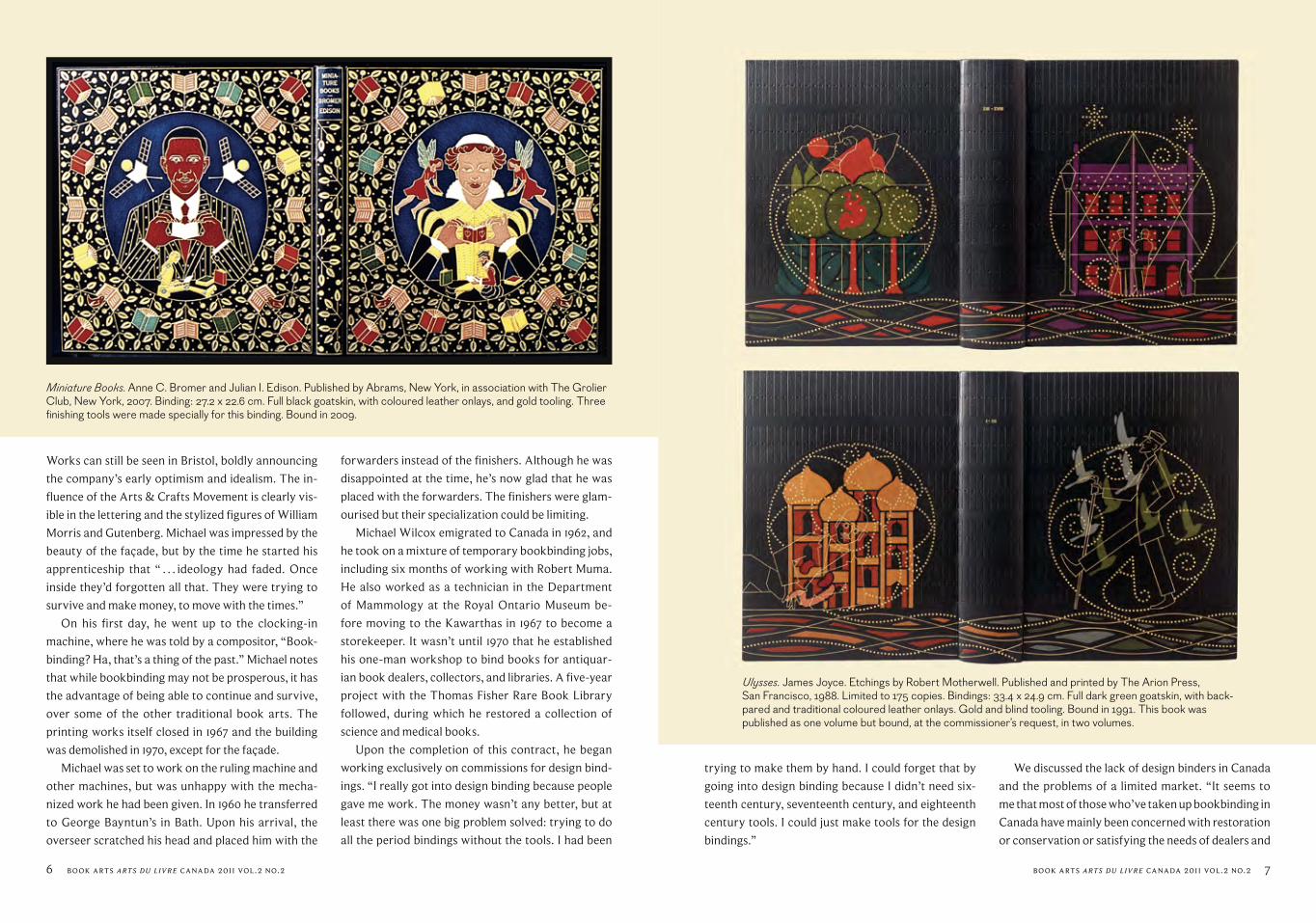
Miniature Books. Anne C. Bromer and Julian I. Edison. Published by Abrams, New York, in association with The Grolier Club, New York, 2007. Binding: 27.2 x 22.6 cm. Full black goatskin, with coloured leather onlays, and gold tooling. Three finishing tools were made specially for this binding. Bound in 2009.
trying to make them by hand. I could forget that by
going into design binding because I didn’t need six-
teenth century, seventeenth century, and eighteenth
century tools. I could just make tools for the design
bindings.”
We discussed the lack of design binders in Canada
and the problems of a limited market. “It seems to
me that most of those who’ve taken up bookbinding in
Canada have mainly been concerned with restoration
or conservation or satisfying the needs of dealers and
Ulysses. James Joyce. Etchings by Robert Motherwell. Published and printed by The Arion Press, San Francisco, 1988. Limited to 175 copies. Bindings: 33.4 x 24.9 cm. Full dark green goatskin, with back- pared and traditional coloured leather onlays. Gold and blind tooling. Bound in 1991. This book was published as one volume but bound, at the commissioner’s request, in two volumes.

Book Arts arts du livre CAnAdA 2011 vol.2 no.2 9
collectors. There hasn’t been that strong an interest
in fine bindings or design bindings. I’ve always found
that if you’re talking about a design binding with
Canadians, they’re very hesitant, and wondering
about the cost. In the States, it’s a completely different
attitude; they’re very aware of their huge market.”
Michael doesn’t feel that his work is influenced
very much by other contemporary design binders. “I
found that I was more influenced by the traditional
fine bindings of the nineteenth and early twentieth
century. I was impressed by the skill and techniques. I
liked gold leaf; whereas in the eighties a lot of the de-
sign binders were turning away from it. I remember
around 1985 thinking to myself: dare I push forward
with this? Should I follow Edgar Mansfield or Philip
Smith? I admired those people but I thought: I don’t
care. I’ll do it my own sort of new traditional way.
And it turned out. I cannot describe myself as being
success ful but at least I’ve survived.”
“I really do heavily depend on the text. Perhaps
I’ve been occasionally guilty of being a little too in-
dependent in my thinking with the design, I’ve made
mistakes perhaps, but generally I clutch at every bit
of information I can get. If I’m binding something like
James Joyce’s Ulysses, which I’ve bound only twice –
once for a rare edition, which was absolutely plain,
and a very elaborate two-volume one – I build my
design based upon what they say, what they’re think-
ing. I don’t give just a pictorial effect of what they
have said, but rather what they have said to stimulate
me and influence my own thinking.”
Bumbooziana. Written and illustrated by Donald Friend. Published by Richard Griffin for Gryphon Books, Australia, September 1979. Facsimile of original manuscript. Edition limited to 150 signed copies. Binding: 56.7 x 40.8 cm. Full black goatskin, with coloured leather onlays, and gold tooling. Covering done in three pieces. Five finishing tools were cut specially for this binding. Bound in 2007.
Finishing pressesSewing frames
Pressing boardsLying pressesPloughs•Tubs
Illtyd PerkIns WoodWorkIng
Wooden BookBIndIng equIPmentTradiTional CrafTsmanship • www.illTydperkinswoodworking.Ca
Special orders welcome
Salt Spring Island, BC 250•653•9392
Dodin's Marbling
Hand Marbled Paper& Marbling Supplies.
eBay user ID: newlinux, Top-rated sellerhttp://stores.ebay.com/Handmade-Marbled-PaperEtsy user ID: HandMarbledPaperhttp://HandMarbledPaper.etsy.comEmail: [email protected]
When asked how many speculative bindings he
ideally would like to make per year, he laughs and
says, “Twenty or thirty. Realistically, one or two. I
need a certain amount of money to keep going here.
Because I don’t have any money from a business or
a pension, I don’t have money saved up.” He’s hop-
ing as well to privately publish a book on techniques
learned early in his apprenticeship. “There are so few
that remember now,” he explains.
His beautiful retrospective in 1998 at the Thomas
Fisher Rare Book Library in Toronto pulled to-
gether bindings from different periods and included
his own description of each binding’s creation. I
asked if it was strange to see his work all in one
place, to see the development from different peri-
ods of his career. “As a matter of fact, it was better
than I thought. I was afraid that I would look at them
and . . . when you finish a binding, all you can see is the
one thing that you did wrong. But when I got these
books back I’d forgotten those things, and I was less
critical. They were not as bad as I thought they would
be.”
Michael Wilcox’s determination to get it right and
to visually interpret the meaning of the text gives his
bindings a remarkably humanistic resonance. Tradit-
ional techniques are meshed with a fine attention to
meaning. His work shines beyond its technical bril-
liance because it incorporates such a sympathetic un-
derstanding of the book as a whole. Compassionate
and reflective, his bindings demonstrate his balanced
attention to meaning, design, and craft. •
Twenty three simple tools were needed to produce all the tooling shown in the above detail. Three of the tools were made specially for Bumbooziana, and two of the tools had been made previously for other bindings.
the Derôme binders generally preferred in these locations, but I have tried to make the dancers fit into the period by ornamenting them with some of the same finishing tools and patterns that were used on the borders.
8 Book Arts arts du livre CAnAdA 2011 vol.2 no.2
Wilcox described his design to the commissioner of the binding: Although this binding represents a great deal of work, there isn’ t much – certainly nothing profound – to say about the designs I made for it. Many of Donald Friend’s illustrations for his Bumbooziana are very cleverly done in the styles of a variety of famous artists or pictorial idioms from the past. His use of this interesting method suggested to me that I should attempt a similar retrospective approach, in the hope that I might also achieve something like the carnival look of Friend’s work. The manner of arranging the decoration on the spine and around the borders of the covers is derived from styles used by the eighteenth-century Derôme family of well-known French binders, particularly Jacques-Antoine and Nicolas-Denis. Instead of their usual patterns strictly suggestive of vegetation, I have made a good number of my shapes in a way that I think better relate to those objects which feature so prominently within the book. The two bawdy entertainers at the centres of the covers are a considerable departure from the flowers and parrots that

Book Arts arts du livre CAnAdA 2011 vol.2 no.2 1110 Book Arts arts du livre CAnAdA 2011 vol.2 no.2
H iSTORy OF THE bOOk
Tomorrow’s Past
In 1877 William Morris, Philip Webb, J. J. Stevenson (and others) in England founded
the Society for the Protection of Ancient Buildings, a movement to protect historic
buildings from what they saw as inappropriate and insensitive renovation. Morris
wrote a manifesto for SPAB1 in which he said that his own era had failed to develop
distinctive aesthetic values of its own and had become obsessed with what he called “a
strange and most fatal idea,” the “Restoration” of ancient buildings: returning buildings to
what was perceived to be their original state either by unnecessary replacement of worn
features or by conjectural reconstruction of missing parts.2 He continued:
“In early times this kind of forgery was impossible, because knowledge failed the build-
ers, or perhaps because instinct held them back. If repairs were needed . . . that change was
of necessity wrought in the unmistakable fashion of the time; a church of the eleventh
century might be added to or altered in the twelfth, thirteenth, fourteenth, fifteenth, six-
teenth, or even the seventeenth and eighteenth centuries; but every change, whatever
history it destroyed, left history in the gap, and was alive with the spirit of the deeds
done midst its fashioning. The result of all this was often a building in which the many
changes . . . were, by their very contrast, interesting and instructive and could by no pos-
sibility mislead. But those who make the changes wrought in our day under the name of
Restoration, whilst professing to bring back a building to the best of its history . . . destroy
something and supply the gap by imagining what the earlier builders should or might have
done . . . a feeble and lifeless forgery is the final result of all the wasted labour.”
Morris’s manifesto is as applicable to books as it is to buildings. His principles – to re-
pair not restore, to complement not parody, to “put Protection in the place of Restoration”
– now seem obvious and lie at the heart of all modern conservation work.3
Morris also insisted that where new work is necessary it should be frank: it should be
obviously new (“wrought in the unmistakable fashion of the time”) and honest (“show no
pretence of other art”). Being fearlessly frank himself, he said that the worst Restoration
is “where the partly-perished work of the ancient craftsmaster has been made neat and
smooth by the tricky hand of some unoriginal and thoughtless hack of today.” Where nec-
essary, he said, it is better “raise another building rather than alter or enlarge the old one.”
This last stricture is, of course, not as easy or straightforward as it sounds, particularly
as far as books are concerned: a new building can rise alongside the old building (or its
ruins, or its foundations) leaving the old intact. When the condition of a book is untenable
to the extent that it needs a new building (binding), that new building perforce replaces the
old one. The site is effectively cleared by careful removal of the old stones (the remnants
of the old binding, sewing thread, etc.) leaving the text block as the foundation block on
which the new binding is built – the new building rises on the foundation of the old.
Even though the old stones may have been carefully removed, retained and preserved,
nevertheless what remained of the life of the original has been destroyed. This is of course
the classic ethical dilemma encountered by all those who work with the conservation of
art and artefacts.
On the rare occasion that rebuilding a book is necessary, there seem to be three main,
or familiar, responses – one is to make a faithful facsimile of what is perceived (presumed)
was the book’s original, historical state or, as is often demanded by the antiquarian book
trade, that books are bound “to style”, that is, in the perceived bookbinding “style” of a
particular period. This is easily dismissed as indefensible: making historical facsimiles can
be useful as part of an evolving learning process, but not for much else.
Another response is adherence to narrow book conservation protocols, often prac-
tised in large institutions, to produce a purely protective, aesthetically neutral cover for
the book, rendering its age and character indiscernible and indeterminable. This is ad-
mirably well-intentioned and certainly preferable to some other treatments, but it is nev-
ertheless dishonest: it is an unnatural interruption of history.4 In Morris’s words, “ . . . our
descendants will find them useless for study and chilling to enthusiasm.” The institutions
of the world will be filled with box upon box of these bland books. Future book historians
will open them and think: “Did these people have no soul? What were they frightened of?”
The third response is the stylized, imitation bindings promulgated mainly by the anti-
quarian book trade. These are the familiar books with five raised bands on the spine, smooth
gilt edges, gold-tooled spine and, usually, quarter-bound in leather with marbled sides
and endpapers. These bindings are not actually imitations of anything, but are a strange
hybrid of some sort of vaguely perceived historical “style” established by the late nine-
teenth- and early twentieth-century (British) bookbinding trade. Just as those bindings
were a pastiche, modern bookbinders making these types of books now are making com-
pound pastiche. Even when superbly executed this kind of work is technically and aesthet-
ically unjustifiable: modern knowledge and understanding has progressed beyond all that.
In reaction to this unthinking imitation of period style,5 and to the poor quality of some
of the work, a small group of like-minded bookbinders was brought together in 2003, or-
ganized by Tracey Rowledge, Kathy Abbott and myself, to exhibit modern conservation
bindings on antiquarian books.6 Exhibiting under the name Tomorrow’s Past,7 we pro-
posed an alternative response: we should use modern technical, structural and aesthetic
language in the treatment of antiquarian books.
Just as the seventeenth-century bookbinder didn’t hesitate to bind his books in the dec-
orative manner of his own era, why shouldn’t we do the same? It seemed to us perfectly
possible to have a modern, decorative, even beautiful, conservation binding: they don’t
have to be neutral and they don’t have to imitate. They can reflect modern aesthetic val-
ues as well as being a thoughtful and skilful response to the specific needs of a book. We
by Jen Lindsay

Book Arts arts du livre CAnAdA 2011 vol.2 no.2 13
The physical appearance of
this book had an immedi-
ate initial appeal: a small, brick-
shaped object with a flattened
deckle forming wavy lines along
the edges of the text block,
accentuated and softened by
an accumulation of dirt which
indicated much use rather than
neglect. The text block was oth-
erwise in reasonably good shape
with sound original sewing; the
boards had served their purpose
in protecting the text block but
were now tired, and the thin cloth
spine was disintegrating. A rebind
was in order.
The initial concept was to
mim ic the appearance of the
deckle and to continue it on to
the spine so that all edges became
indistinguishable from each
other – a visual tease. However,
practical consideration as to how
this might be achieved, and in
particular how it would affect the
opening of the book meant that it
was soon, regretfully, abandoned.
Conflicts of interest, require-
ments and intentions are not,
of course, uncommon in book-
bind ing and are best resolved
by returning to the original
intent driving a particular piece
of work: in this case, a good and
proper open ing of the text block
was para mount, over any
Virgil (translated by Dryden). London. 1808. 14.7 cm x 8.4 cm x 4.2 cm. Binder: Peter Jones.
A selection of Tomorrow’s Past work can be found at Carmencho Arregui’s website www. outofbinding. com where you will also find very good instructions and diagrams on how to make various simple books.
1 Crushed deckle edges.2 Original binding.3 Book taken down for washing and minor repairs4 Re-sewing on Pliester tapes.5 Preparing to attach spine leather to outer folds of paper covers.
by Peter Jones
1 2 3
4 5
are more concerned with seeking to do the best for the book, speaking to the truth of its
condition, than adhering to the habits of artifice and convention.
The number of bookbinders8 involved with Tomorrow’s Past has remained fairly con-
stant – between ten and twelve binders from UK, Italy, France, the Netherlands and others
as invited.9 All of them work professionally as bookbinders, some as teachers, and most
handle work of many different types and periods in their everyday work. This fusion of
experience and historical awareness with modern conservation materials, techniques and
skill has produced work which is radical in its simplicity, ingenuity and truth to materials.
We are not claiming to be unique in this approach. There is much thoughtful conserva-
tion work quietly going on, but there is still a huge rump of standard practice where this
does not happen. Many bookbinders feel constrained to “give the customer what they
want”, or simply do not have the experience to know that anything else is possible, and
by complying, they perpetuate the problem. Tomorrow’s Past simply wants to demonstrate
that other things are possible and, indeed, necessary. •
_______________
1 The full text of Morris’s manifesto is available online from the Society for the Protection of Ancient Buildings, http://www.spab.org.uk/what-is-spab-/the-manifesto.
2 “Restoration: the action or process of restoring something to an unimpaired or perfect condition; the process of carrying out alterations and repairs with the idea of restoring a building, work of art, etc., to something like its original form.” (Oxford English Dictionary)
3 Despite Morris’s prescience (and some early groundwork by Douglas Cockerell, Sandy Cockerell and Roger Powell), it was not until the catastrophic flood in Florence, Italy in November 1966 that bookbinders were forced to devise protocols for dealing with damaged books and to adopt principles which developed into an ethos: what is generally now called “book conservation”.
4 My thanks to my friend and colleague Carmencho Arregui for making this percipient observation – I had not thought of things in those terms until she thought it.
5 The original seed was planted by an article written by the Hungarian/French bookbinder, Sün Evrard: “Les pages bien gardées: Some Words About an Exhibition That Did Not Take Place” in New Bookbinder 19 (1999): 39–47, (issn 0261-5363). In this article Sün talked about an exhibition she had tried to organize in Paris to bring together the skills of conservation binding and modern fine bookbinding in the rebinding of antiquarian books: “ . . . for rebinding old books we do not need to copy or imitate. Contemporary bookbinding has enough technical and aesthetic resources of its own.”
6 For Tomorrow’s Past purposes we use the term to mean books printed before 1800, which date represents the end of the hand-press (letterpress) period and the beginning of the machine-press period and, a little later, the gradual predominance of machine-made paper. Papermaking machines were introduced in the first quarter of the nineteenth century, and gradually the production of machine-made paper exceeded that of handmade paper.
7 “Surely it is better to create tomorrow’s past than to repeat today’s.” Edgar Mansfield (1907–1996), bookbinder and sculptor.
From 2003 to 2008 Tomorrow’s Past exhibited at the Antiquarian Booksellers Association annual international book fair at Olympia in London. More recently, exhibitions have been presented at a similar international antiquarian book fair (Salon International du Livre Ancien) at the Grand Palais in Paris (2007 to 2011), at the Society of Bookbinders biennial conference at Warwick University (UK) (2009 and 2011), and West Dean College (UK). New venues and opportunities are always being sought.
Substantial articles about Tomorrow’s Past include: The Private Library, 6th ser., 2, no. 1 (Spring 2009), (issn 0032-8898): the whole issue is given to Tomorrow’s Past, with essays illustrated with b/w and colour reproductions of bindings. Copies are available from Tomorrow’s Past, 12 Chippenham Mews, London w9 2Aw for $10.00 per copy, inclusive of post and packaging. The Bonefolder: an e-journal for the bookbinder and book artist, 7 (2011), http://www.philobiblon.com/bonefolder, features an illustrated essay by Charles Gledhill describing the principles and the work of Tomorrow’s Past. The Scribe: Journal of the Society of Scribes and Illuminators, no. 90 (Summer 2011), (issn 0265-6221) features an illustrated essay by Jen Lindsay.
8 I am using the word “bookbinder” as a generic term, as it seems to me that we are all involved in the same enterprise, whatever we call ourselves. In order to describe oneself as a “book conservator” one has first to be a bookbinder, i.e., someone with good knowledge of how books are made and with the technical skill to apply that knowledge.
9 The most regular core of binders has been: Kathy Abbott (UK); Carmencho Arregui (Italy); Emma Coll (France); Cristina Balbiano d’Aramengo (Italy); Sün Evrard (France); Charles Gledhill (UK); Peter Jones (UK); Katinka Keus (Netherlands); Jen Lindsay (UK); Tracey Rowledge (UK); Eva Szily (France).
12 Book Arts arts du livre CAnAdA 2011 vol.2 no.2

Book Arts arts du livre CAnAdA 2011 vol.2 no.2 1514 Book Arts arts du livre CAnAdA 2011 vol.2 no.2
The Country Wife by William Wycherley. 1731. 17 cm x 10.3 cm x 1.4 cm. Binder: Jen Lindsay.
consideration of decorative
treatment.
Having rejected the initial
concept the search commenced
for ideas and materials which
would achieve a similar soft,
slightly rough, unfinished appear-
ance to complement the deckle
edges while functioning as
required by the physical at-
tributes of the text block. The
materials finally selected were a
rough, soft, thick, but relatively
lightweight, handmade paper
which could be folded to allow it
to be sewn on to form the boards
and a soft, alum-tawed skin with
an imperfect surface which I felt
would soon take on sufficient
patina to tone with the (now
washed but still discoloured)
deckle edges of the text.
The text block is small, 14.7 ×
8.4 × 4.2 cm, with proportions
potentially liable to hinder the
opening of the book. It is thick,
with pages which have little depth
(fore edge to spine), weight, or
flexibility to allow them to flow
with the opening of the book;
therefore, the spine has to do all
the work to achieve a good open-
ing. It must be very flexible in
itself and unrestricted by the
further processes or coverings
of the binding. In the original
binding this had been achieved by
using a lightweight cloth which
had failed over time, cracked,
and begun to fall away. The more
durable but heavier-weight tawed
skin could be attached to the
spine as a tight back but would,
I judged, hamper the opening.
A “free flying”, unattached cover-
ing would be more suited to the
requirements of the text block, but
the decision remained as to how
to attach it so that flexing of the
cover was minimized while free-
dom of opening was maximized.
The theory of the “quarter joint
attachment” for a rigid flat spine
was adopted, where the cover-
ing material attaches forward of
the spine edge of the board by a
distance equivalent to a quarter
of the width of the spine. Practical
experiments to confirm ease of
opening with minimal flexing of
the covering material, and how
6 The finished binding with slip case.7 Freedom of opening.
the book might feel in the hands,
proved that optimal opening
could indeed be achieved with
the covering material attached
forward of the spine edge of the
board.
Finally, having found that I
had shied away from a current
personal trend to be bolder with
colour and juxtaposition, as a tilt
in that direction and to pick up on
the lines of the deckle, meander-
ing lines were tooled on the paper
sides into which fine lines of
orange calf were inlaid. •
1 Book in its original state.2 Title page, having been infilled and cut to size.3 Text-block being sewn onto goatskin thongs.
by Jen Lindsay
6
7
1 2 3
The Country Wife is a bawdy
comedy of manners, written
by the English playwright William
Wycherley and first performed
at the Theatre Royal, Drury Lane,
London, in 1675.
In its own time, The Country Wife was regarded as being
outrageously sexually explicit,
and is typical of the decadent
naughtiness that was loosed
when, following the auster-
ity of Oliver Cromwell’s puritan
Commonwealth (i.e., republic)
from 1649 to 1660, monarchy was
restored and Charles II became
King of England, Scotland, and
Ireland in 1660.
This particular edition was
printed in London in 1731 but the
book no longer had a binding: it
was wrapped in a piece of orange
card, on which the title had been
written in ballpoint pen. It seems
the book had at some point been
removed from its binding or cut
out of a volume of collected works.
The play itself is not one to
which I am drawn; however, as
with so many older, printed
books, it had its own very
particular character and
sensuality – paper, impression,
typography, typographical
ornament – which drew me to it.
The kind of work I usually do
cannot be described as “decora-
tive”, but that is what I felt this
book needed, to reflect the bois-
terous colour of the Restoration
period, as well as the “floral”
naïveté of the country wife of the
title (who, once in London, did
not long remain naïve!). That
was the association of ideas, but
translating a mental concept or
image into tangible structure is of
course what any kind of making
is all about, as is transmitting the
appropriate feeling and sensation.
One of the things that happen
as you get more experienced as a
maker is you begin to recognize,
or understand, your own work-
ing process; that is, the necessary
ritual that leads, eventually, to a
resolution. For me, this involves
a lot of “procrastination”, which
is real procrastination combined
with thinking and visualization,
accompanied by short forays in
the workshop to stare hard at
various materials, realize that that
idea won’t work, then going away
to think again. It is simply a proc-
ess of attrition: a process of elimi-
nation and reduction to achieve
simplicity and clarity.
The book is small and light (17
× 10.3 × 1.4 cm and 90 g, in its new
binding), and it needed to be kept
“light” – materially light and light
in spirit. In thinking about what to
do, I imagined something flexible,
rather than in stiff boards, so the
book would be not only light but
also pliable: I wanted to convey a
quality of delight.

Book Arts arts du livre CAnAdA 2011 vol.2 no.2 1716 Book Arts arts du livre CAnAdA 2011 vol.2 no.2
4 Decorated spine piece after being laced-on to sewn text-block.5 Inside of binding showing lacing on of cover.6 Inside of front cover, showing structure.7 Finished book.
Q. Horatii Flacci Carmina Expurgata by Josepho Juvencio. 1784. 17.3 cm x 9.7 cm x 4.6 cm. Binder: Kathy Abbott.
by Kathy Abbott The book before any conservation:
1 A tear at the spine and front joint area.2 The text-block broken in several places.3 The book showing the broken sewing.
4 5 6
7
2 3
However, before anything
else could happen the text block
needed some foundation work.
The first and last leaves (title page
and epilogue) had been cut out
of the original book, cut down
to a size smaller than the page
size and pasted to a poor quality
machine-made paper. These had
to be floated off and inlaid in a
neutral, toned handmade paper
with matching chain lines (this
same paper was used for end-
papers). The new, inlaid leaves
were trimmed and attached to
the text block so that the imposi-
tion of the printed areas matched.
All the sections were of course
repaired (guarded) along the
spine edge, with specific repair
to enlarged sewing holes as nec-
essary. With all the foundation
work done, building could begin.
(I leave it to the accompanying
images to describe stages in the
making process.)
After much going round in ever
decreasing circles, I eventually
found an offcut of hand-printed
decorated paper which had just
the prettiness I had in mind: a
trellis of blue foliage and pink
quatrefoils on a base colour of
neutral white/cream.1 There was
not enough of this and it was too
uneven a shape to make, for ex-
ample, a paper binding of some
sort (an idea which, in any case, I
had already dismissed). But this
sort of constraint, of finding ways
round or through it, concentrates
the mind and can be the impetus
for productive, lateral thinking
(although it is also important to
recognize when it’s clearly a
dead end).
The solution presented itself
when I got out a piece of natural
leather which some years ago I
had pared for another purpose,
but never used. The natural tone
blended perfectly with the deco-
rated paper and the pared leather
was of the right size and
substance to laminate to the
decorated paper to make book
“boards”, with the grain of the
leather oriented horizontally.
This may seem like happy
coincidence, as does the fact that
there was just enough paper and
just enough leather; but it proves
Pasteur’s adage that “chance
favours only the prepared
mind”. •
_______________
1 The paper was printed by Jane and John Jeffrey, England, UK.
In its day, this Italian carta rus-tica (rough paper) binding of
1784 would not have been special
in any way, rather like a paper-
back today. To me though, it is
such a beautiful thing: simple,
understated and wonderfully
tactile. I have had this book for
many years (a student of mine
kindly gave it to me) and it had
just been waiting to be repaired
in some way. The sewing was
broken in several places; the joint
area at the head of the spine was
torn; a piece of the spine was
missing, and the whole cover was
coming away from the binding. I
loved the binding the way it was –
I didn’t want to change its nature
in any way by overly repairing
it – but it just didn’t function as
a book and was becoming more
and more fragile each time I
opened it.
The 2011 Tomorrow’s Past exhibition in Paris was approach-
ing and I had to select a book to
bind. Despite having several to
choose from, I kept thinking about
my lovely carta rustica binding
and wondering if there might be
anything I could do to both
conserve, and to celebrate, it.
A very good friend of mine
lives in Japan and was trained
by a master in the art of urushi: Japanese wood-lacquer technique,
and also kin-tsugi: porcelain and
pottery repair in the Japanese tra-
dition. Basically, the latter entails
infilling chips, missing areas or
cracks in the porcelain or pottery
with lacquer resin and real gold
or silver powder. This gives the
piece a new lease on life and often
renders it more beautiful after the
“restoration”.
With the ethos of kin-tsugi restoration in mind I wondered
if I could do something similar
with my book. Despite the book’s
fragility, the components were in
quite good order. The text block
was fairly sound; the text paper
and the backs of the sections were
in good condition, needing no
guarding or paper repairs. The
cover paper was still strong; it was
only the joints and spine in the
head region that were weak and
broken. Other than that, the
whole book was just a little grub-
by. The original thongs were hold-
ing but were weak, and the only
element that had really degraded
was the sewing thread, which had
broken in several places.
Removing the text block was
easy (as there had never been any
adhesive on the spine) so it was
just a case of snipping the original
sewing threads. I had hoped to
reuse the thongs but they were
very weak, and new ones were
cut from a skin of alum-tawed
pigskin. The whiteness of the
new thongs was at odds with the
original cover. Rather than “dirty-
ing” them, I decided to dye them
1

Book Arts arts du livre CAnAdA 2011 vol.2 no.2 1918 Book Arts arts du livre CAnAdA 2011 vol.2 no.2
I was attracted to this book from
the first moment I saw it. I liked
its physicality: its size and propor-
tions. I lived with this book for a
while before I began the process
of rebinding it, allowing me the
necessary time to accumulate my
thinking, in terms of how I want-
ed to respond to the structural
needs of the book, whilst pursu-
ing what I might want this binding
to communicate to the reader
or viewer. There are always a
number of elements I want to
explore when binding any given
book. For this binding I wanted
to draw together the way I ap-
proach fine binding with the more
immediately recognizable book
conservation side of my practice.
My fine bindings are conser-
vation bindings underneath the
gold-tooled leather covers, but
the decisions and adaptations
of processes which I’ve made
The Odyssey of Homer and The Battle of The Frogs and Mice by-Homer (translated by Alexander Pope). 1807. 7.8 cm x 12.7 cm x 2.9 cm. Binder: Tracey Rowledge.
will go largely unnoticed, as they
are unseen and indiscernible to
the person handling the book. I
really wanted to construct a hand-
decorated bookbinding that fit the
structural needs of this book
whilst allowing me to express in
some way the meaning of the book.
I created a binding that I had a
sense of from the outset. Even be-
fore I knew what structure I would
devise for this book, I had a sense
it would be bound in paper. I really
like the feel of a paper cover that is
mainly un-adhered, when it feels
strong and protective of the text
block and yet flexible at the same
time. There’s a beauty in this
1 Book prior to rebinding.2 Text block after it has been pulled, guarded, and resewn.
The conservation:
4 Gilding handmade paper with Italian gold leaf, for the spine repair.5 The text-block re-sewn in the original style but on new, hand dyed, alum-tawed thongs.6 The completed book conservation The new, gilded spine lining is visible at the head and also at the thong area.
by Tracey Rowledge
4 5
1
2
dark brown (with Sellaset dyes) to
the same colour as the ink on the
spine of the cover, so that they
would sit neutrally with the rest
of the binding.
As the joints of the original
cover were torn and weak, I knew
that there was every likelihood
that lacing-in the new thongs
would damage the cover further.
I decided to make a new spine
piece from handmade paper for
the thongs to lace into. This I
gilded on one side with Italian
gold leaf, which would highlight
the missing areas on the spine in
the spirit of kin-tsugi restoration.
The most challenging part of
the restoration was how to insert
the gilded paper underneath the
pastedowns and turn-ins, when
the endpapers (pastedowns
and flyleaves) were also hooked
around the first and last sections,
and sewn through.
Firstly, the pastedowns were
lifted slightly from the covers.
This was quite easy as they were
only lightly tacked down. The
text block was then sewn around
the new thongs using the same
sewing holes and two-up sewing
as the original. A centimetre of
the new gilded spine piece was
then inserted underneath the rear
pastedown and the thongs were
laced through the gilded paper
and the cover. The thongs were
then laid underneath the paste-
down and the gilded paper, and
the rear pastedown was pasted
down again, using methylcellu lose
to minimize moisture. All fine thus
far. The tricky bit came next: how
to sew the final front section when
the endpaper was hooked around
it and, at the same time, lace the
thongs through the gilded paper
and the cover, and then insert the
thongs underneath the endpaper,
which needed to be pasted down
again? With extreme difficulty,
I found.
Holes were punched into the
joint area of the gilded paper to
take the thongs, which were then
laced through both the gilded
paper and the cover and then back
in and underneath the pastedown.
This was then pasted down once
more, again using methylcellulose.
The last section and the hook
of the endpaper were then sewn
around the thongs using a hand-
curved needle and fine pointed
tweezers. This proved to be risky,
as the cover could be pierced at
any moment and I was, in effect,
working blind.
All loose parts of the spine of
the original cover were lightly
past ed to the gilded paper, again
using methylcellulose. No adhesive
was used on any part of the text
block. The book opens well and
functions exactly as it would have
when it was originally bound.
I have had to undertake
complicated techniques such as
this in my work as a book conser-
vator; trying to stabilize what are
for practical purposes perfectly
sound bindings, but which might
simply have broken sewing or
thongs. Often, one has to work
on books like this as would a
surgeon, in very restricted posi-
tions. Without past experience, I
could never have undertaken this
repair to my book. To me this is
what Tomorrow’s Past is all about:
bringing all of my knowledge and
skill from conserving old or anti-
quarian books and combining this
knowledge and skill with a simple,
modern aesthetic to give dilapidat-
ed books a new lease of life. I find
that extremely satisfying. •
6

Book Arts arts du livre CAnAdA 2011 vol.2 no.2 2120 Book Arts arts du livre CAnAdA 2011 vol.2 no.2
3 The lacing-on of the text block to the inner and outer components of the cover.4 The inner cover prior to having turn-ins folded back on them- selves and attached to underside of the outer cover.5 The inner cover after turn-ins have been folded back on them- selves and attached to underside of the outer cover.6 The doubled back part of the inner and outer covers, prior to the turn-ins of the inner cover having been turned in and over the outer cover. 7 The inner cover turn-ins having been turned over the outer cover, prior to them being adhered on all three turn-in edges to the facing the outer cover.8 The binding completed with fore-edge ties.
gallERy
Valises Numériques/Valijas Digitales est un projet itinérant de
livres d’artistes réalisé en 2009–2010 qui réunit sept artistes
de Holguín à Cuba et 20 artistes de l’Atelier de l’Île de Val-
David au Québec. Centré sur « L’Art et les nouvelles technologies
de communications » (ordinateurs, Internet, iPhone, MP3, etc.), ce
projet d’échange cherche à rapprocher des artistes aux antipodes du
développement techno logique et à comprendre le rôle de ces tech-
nologies nouvelles pour les artistes d’ici et d’ailleurs. Le projet est né
lors d’une résidence à l’Atelier, de deux artistes cubains intéressés à
collaborer avec des artistes nord-américains.
Valises Numériques/Vlijas Digitales, (Digital Valises) is a travell ing
project of artists’ books created in 2009–2010 grouping seven art-
ists from Holguín, Cuba and 20 from Atelier de l’Île of Val-David,
Quebec. Exploring “Art and the new technologies of communica-
tions” (computers, Internet, iPhone, MP3, etc.), our project attempts
to establish a connection between artists from the opposite poles of
technological development, and to under stand the role of these new
technologies for artists in different parts of the world. This exchange
project began during the residency at the Atelier of two Cuban art-
ists interested in collaborating with North American artists. •
Valises Numériques/Valijas Digitales
ExHibiTiON SCHEDulE
Centre d’exposition du Vieux Presbytère de St-BrunoSaint-Bruno de Montarville, QuébecOctober 9–30, 2011
Holguín, Cuba, April 2012
CaTalOguE
Valises numériques/Valijas digitales(French, Spanish, English) $20 [email protected] 819.322.6359
aTEliER DE l’ ÎlE
Located in Val-David, 100 km north of Montréal, Atelier de L’Île is an artists’ centre founded 35 years ago with the mission of research, creation and production of contemporary print and book arts. Every year, residencies are offered to young aspiring artists, mid-career, and mature artists. Atelier de l’Île promotes exchanges at the local, national, and international levels. Since 2003, studio members have been exploring projects concerning art and the environment and, more recently, art and new technology.
www.atelier.qc.ca
by Jocelyne Aird-Bélanger
(Left) France Bélisle/Mary Montana. Communication Interrompue. 9.5 x 9 x 1.5 cm. (Right) Rubén Hechavarria Salvia. Rin-Rin. 22 x 22.5 x 2 cm.
3 5
6 7 8
combination, both in look and
feel, and it all comes through how
the book handles when it’s opened
and read. It was this “feel” that I
carried with me in all the decisions
that I made about the structure,
until I reached the point when the
structure did all that I had in mind.
This “feel” isn’t a tangible thing,
and it’s something that slowly
emerged through experimentation
with materials and different struc-
tural ideas. It was a long process
of trial and error, making a
sample binding first and trying
out different ways of constructing
the binding before I eventually
got it right.
All that remained of the
original binding was one detached
board, the text block was in sound
condition but the sewing thread
had deteriorated. I first pulled,
guarded, and resewed the book,
using the original sewing stations.
The text block is laced on to a
double wrapper structure, using
two different weights of paper
with a series of folds and turn-ins
that double back on themselves;
the front and rear covers then
become heavy enough for the
depth of the text block.
The colour scheme for the
decorated cover paper derives
from the colours and tones of the
staining and discolouration within
the text block and on its edges.
The decoration to the cover is a
multi-layered image, which draws
on my own imagery from The Odyssey, but also importantly,
draws on the history of decorated
papers, so as not to jar with a re-
bound antiquarian book. •
4

gallERy
From top left: Dementia – back side of the strips.
The Mica Hypothesis, hand bound, unique book, five hand-split mica panels, inkjet on mica paper, original painted central panel (acrylic). 10.16 cm high x 7.62 cm wide x 1.27 cm deep (closed).
Echo, hand bound, 64 pages, double-sided French fold accordion, gicleé on Hahnemuhle paper. 12.7 cm high x 10.8 cm wide x 3.8 cm deep (closed), 275 cm long (extended). Archival quality, open edition.
(Above) Dementia (centre), Doverodde Book Arts Festival, 2011. Hand bound giclée on archival paper, Japanese paper, waxed string, metal loops and eyelets, 53 cm high x 30.5 cm wide. Original poetry and art. PHOTO | limFjORDSCENTRET
Content and Structure in the Book Arts Made with Meaning
Content has always been a driving force for
me in bookmaking, whether derived from
existing personal work in other media or in
response to curated themes. When I began making
artist books in 2009, it was to consolidate work I had
done concerning my mother’s death from breast
cancer – drawing, painting and writing that collec-
tively found form in a 64-page, double-sided accor-
dion book. Entitled Echo, the book could be displayed
three ways, each representing a different aspect of
grieving. It was this structure infused with meaning
that led me to fall in love with the genre and continue
to explore book arts more fully. I now draw upon a
multi-media approach which usually incorporates
some form of drawing, painting and writing with a
more experimental view to format and structure.
What remains integral, however, is that every ele-
ment be related to content.
Both Dementia and The Mica Hypothesis were
created in response to themed artist calls from the
Doverodde Book Arts Festival in Doverodde, Hurup
Thy, Denmark. The annual festival, held every
spring at the permanent Book Arts Center of the
Limfjordscentret, features an exhibition, guided
nature walks, and a chance to meet book artists
through talks and artist stalls.
Dementia responded to the 2011 Doverodde topic
“In the air” and combines existing work with new
writing in a format conceived specifically for the
theme. I tend to draw upon existing work when cre-
ating artist books, and find that I naturally interpret
themes through this lens. I had been developing draw-
ings of my father at the time and found that the theme
resonated with one piece in particular. My father
suffered from vascular dementia, and in the last
years of his life I grieved for what had been lost while
also trying to accept the “new” person my father had
become. Now, after his death, I was attempting to
capture his likeness but was struggling to achieve
this. The subject matter was intangible, as was the
process: I waffled between depicting him before and
during illness, and succeeded only when I stopped
trying to illustrate either one. When I look at the
piece now, I can see my father – not quite the old dad
I knew, but with the same familiarity that had been
mostly lost to illness.
I chose the format of a hanging blind as a symbol
for both the debilitating effects of dementia on per-
sonality and memory, and as my attempt to “see”
my father behind this condition – a fragmented
picture of what was hidden by illness. The blind it-
self is formed by eight double-sided strips, one side
featuring the drawing of my father, while each strip
on the other side contains one line of a poem, each
beginning with one of the letters in the word demen-
tia. The poem begins, “Dementia, a blind through
which I see pieces of you . . .”
Beside each line is a portion of another painted
portrait, cut into pieces and arranged vertically at
the end of each strip. The large drawing was repro-
duced as an archival giclée, cut into eight strips and
mounted on thicker Japanese paper which was then
punched, grommetted and threaded. This act of de-
constructing, reassembling and rearranging also
evokes the effects of the disease. A prominent early
by Maureen Piggins
22 Book Arts arts du livre CAnAdA 2011 vol.2 no.2 Book Arts arts du livre CAnAdA 2011 vol.2 no.2 23
Book Arts arts du livre CAnAdA 2011 vol.2 no.2 25
Columbia Finishing Mills has been supplying book binding and cover materials from Cornwall, Ontario, Canada, since 1965.
Columbia Finishing Mills, Inc. www.columbiafinishingmills.com [email protected] Visit our website for our product listing.
We offer a wide variety of stock items in small quantities.cover stocks
B and F Grade cloths,
leather, bonded
leather, polyurethane
cover and more.
bindery suppl ies
Spine reinforcements,
boards and adhesives.
feature of my dad’s condition was the capacity to
retain social etiquette and conversation, while so
many other things were lost to him; some aspects of
his personality were exaggerated, while others were
submerged. Identity, memory, grief and time were
uncertain; they were “in the air”.
The Mica Hypothesis was created solely in response
to the 2009 Doverodde theme, “Island”, and was not
based on pre-existing work. For this topic, I drew
upon a personal interest in evolution and used mica
to explore an origin of life theory by National Science
Foundation scientist Helen Hansma. This also in-
volved research about Akilia Island, Greenland (the
largest island, thought to hold evidence of the ear-
liest life on Earth) as well as a study into the nature
of mica and biochemistry. For this piece, unlike my
other work, I began by choosing a material and then
discovered content that related to the theme.
One of the things I appreciate about the
Dove rodde calls is that the basic themes are very
by Shelagh Smith REV iEw
Masters: Book ArtsEileen WallaceLark Crafts, Asheville,
North Carolina. 2011.
330 pages. Paperback.
isBn 978 1 60059 497 7
Masters: Book Arts, Major Works by Leading Artists is one of Lark
Crafts’ Masters series of which
there are over 35 providing an
overview of different crafts, with
informative text and over 400
gorgeous images in each. The
publisher’s purpose in the series is
to show divergent approaches by
both established names in the
field and up and coming artists.
Like most Lark Books it is a
great bargain and widely
available, in cluding from
their website: www.larkcrafts.
com/bookstore/?isbn=
9781600594977.
This volume covers the many
aspects of the book arts: private
press, artists’ books, bookbinding,
boxmaking, and paper decorating
and illustration techniques.
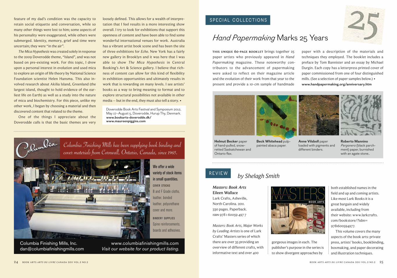
This unique 60-page bOOkleT brings together 25
paper artists who previously appeared in Hand Papermaking magazine. These noteworthy con-
tributors to the advancement of paper making
were asked to reflect on their magazine article
and the evolution of their work from that year to the
present and provide a 10-cm sample of handmade
paper with a des cription of the materials and
techniques they employed. The booklet includes a
preface by Tom Bannister and an essay by Michael
Durgin. Each copy has a letter press printed cover of
paper commissioned from one of four distinguished
mills. (See a selection of paper samples below.) • www.handpapermaking.org/anniversary.htm
Hand Papermaking Marks 25 Years
SPECial COllECT iONS
Anne Vilsboll paper loaded with pigments and different binders.
Roberto Mannino Perganera (black parch-ment) paper, burnished with an agate stone..
Helmut Becker paper of hand-pulled, snow-retted Saskatchewan and Ontario flax.
Beck Whitehead pulp-painted abaca paper.
loosely defined. This allows for a wealth of interpre-
tation that I feel results in a more interesting show
overall. I try to look for exhibitions that support this
openness of content and have been able to find some
wonderful international venues for work. Australia
has a vibrant artist book scene and has been the site
of three exhibitions for Echo. New York has a fairly
new gallery in Brooklyn and it was here that I was
able to show The Mica Hypothesis in Central
Booking’s Art & Science gallery. I believe that rich-
ness of content can allow for this kind of flexibility
in exhibition opportunities and ultimately results in
work that is rewarding on many levels. I see artists’
books as a way to bring meaning to format and to
explore structural possibilities not available in other
media – but in the end, they must also tell a story. •
Doverodde Book Arts Festival and Symposium 2012,May 17–August 5, Doverodde, Hurup Thy, Denmark.www.bookarts-doverodde.dk/www.maureenpiggins.com
24 Book Arts arts du livre CAnAdA 2011 vol.2 no.2

Book Arts arts du livre CAnAdA 2011 vol.2 no.2 2726 Book Arts arts du livre CAnAdA 2011 vol.2 no.2
REV iEw
The Gilded Page: The History and Technique of Manuscript GildingKathleen P. WhitleyOak Knoll Press and The British
Library. 2010.
238 pages. Paperback.
isBn 9 78 1 58456 241 2
The Gilded Page is a remarkable
undertaking: part history, part
recipe book, part instruction
manual. Kathleen Whitley has
taken on the history of the hu-
man attraction to shiny things
and made some sense of it.
The book begins with the
earliest recorded applications of
gold: the archaeological records
of the human fascination with
all that glitters. Whitley takes us
through the processes of gilding
architecture, papyrus scrolls, and
the painted panels that eventually
lead both to the codex as a book-
form and the illuminated works
that we now treasure.
In the second part of the book,
Making Faces: Metal Type in the 21st CenturyA film by Richard KeglerDocumenting the work process of
Jim Rimmer on the almost lost art
of pantographic type making.
http://p22.com/products/
makingfaces.html
It’s not an exaggeration to say
that the band rusH is to Canadian
music what the late (1934–2010)
Jim Rimmer was to Canadian
type design: iconicity, lasting
creativity, and cult status.
This production takes the
by Linda M. Cunningham REV iEw
be found in the bonus features,
where the outtakes of some of
the more complex processes are
left in their entirety.
Also included is a silent
film from the 1930s, showing
American type designer Frederic
Goudy, originator of the expres-
sion “a man who would
letterspace lower case would
steal sheep”, using the same
Whitley is a sensible instructor:
warning against some of the
more lethal ingredients used
historically, she provides
instructions and recipes using
both old and new materials.
Whitley’s recipes for the mor-
dants used for the application of
gold (or other metals) to parch-
ment or paper are clear and
coherent. Her concern for the
finished product is obvious.
The book is Smyth sewn,
which is a good thing, but the
production values of the book left
me disappointed. Oak Knoll has
done the author of this book a
major disservice.
This is a second edition, and
although many people may find
the typos a minor annoyance, I
think they show major disrespect
to the author. Some one should
have proofread this book.
There are colour illustrations
in one inset signature: they illus-
trate some of the glory that is
gold. The rest of the illustrations
are printed in black and white on
a paper that, while moderately
good for text, is less than help-
ful for images. Figure 5.2 on page
138 leaves me mystified: various
degrees of gilding on various mor-
dants are barely distinguishable
since most of them appear black.
Despite the poor production
of the book, I would recommend
The Gilded Page to anyone who
is interested in illumination and
gilding. After all, if I am still
dream ing about sticking gold
onto everything, it must have
left a positive impression. •
Curator Eileen Wallace who
identified and invited the artists
selected, and determined which
images were to be featured,
ultimately chose 43 artists from
the 250 she considered: no small
feat. Almost all of the artists are
from the US (none from Canada
alas), plus Sarah Bodman from
England, Daniella Deeg, Ines von
Ketelhodt, and Peter Malutzki
from Germany, Adele Outteridge
from Australia, and Veronika
Schapers from Japan.
The curator “shaped the tone
and focus of the book”. In this
series they are looking for a bal-
ance of technique, subject matter,
and style. All of the artists are,
as is to be expected, very strong
technically. There is a very wide
divergence in approach, concept
and techniques used.
While this volume is great fun
to browse, it is well worth more
extensive perusal. What I parti-
cu larly appreciated is that each
artist is represented by from seven
to thirteen of their works and in
some cases more than one view of
the work is included. This hardly
ever happens in publications. It is
extremely valuable to be able to
see a body of work for each art-
ist. It enables the reader to see the
dev elopment of an artist’s work
over time, or to have a deeper
under standing of the techniques
they employ, or to experience the
different aspects of society or cul-
ture to which they are committed.
A number of the great
figures in the field are included
in the volume and are marvellous
to encounter again: Julie Chen,
Ken Botnick, Timothy Ely, Karen
Hanmer, Daniel Kelm, Karen
Kunc, Hedi Kyle, Keith Smith,
Bonnie Stahlecker, Claire Van
Vliet, and others. I found the book
equally interesting in introducing
me to works by extraordinary art-
ists who were previously unknown
to me: Brian Dettmer’s fabulous
altered books which he describes
as a communion with the exist-
ing material and its past creators;
Shanna Leino’s miniature Coptic
books in carved bone or brass;
Adele Outteridge’s single see-
through leaves of acrylic or ac-
etate sewn together; Daniel Essig’s
works with found objects; Beatrice
Coron’s silhouettes; Laura Wait’s
many media, and others. You need
to see them all, though it will only
whet your appetite.
This book is well worth
adding to your library. •
process, to design and cast type.
The other small addition to
the packaging is one piece of cast
metal type, the lower case “k”
that the documentary follows
from original sketch through to
casting: truly a unique souvenir
of the process. Although the
reviewed dvd only has subtitles
in English, there are currently
typographers around the world,
translating it into other languages
for future release.
If letterpress type, and typ-
ography design in general, excite
you, you’ll find yourself repeat-
edly watching both the documen-
tary and the added features. •
Note: the Jim Rimmer archive is at Simon Fraser University Special Collections: www.lib.sfu.ca/sites/default/files/8910/RimmerJ.pdf
word “documentary” literally: Jim
Rimmer talks onscreen, Richard
Kegler (president of P22 Type
Foundry of Buffalo, NY) prompts
from behind the camera, and the
raw cinéma verité style is reminis-
cent of an old 1950s French film.
This might put off some
people, but if what you’re inter-
ested in is a bug’s eye view of the
pantograph process of making
type, you’ll be riveted to your
chair, even with multiple viewings.
But as much fun as the 45-
minute widescreen documentary
is, the real riches of the dvd are to
by Cathryn Miller

bOOk aRTS wORlD
mounting cords to the frame; symbolic of the fact
that the message in the vellum would not exist with-
out the strength of the frame to support it.
The legends of Saint Cuthbert’s affinity with na-
ture are well known in Northern England; therefore
I have drawn inspiration from those animals, insects,
and birds which I love, and which were in Northern
England all those centuries ago. Apart from the
dancing woodcocks in the lower part of the vellum,
the medallions on the circumference portray some
of “the unsung creatures” such as bees, crickets, and
butterflies.
Triptych ideas have fascinated me from childhood;
I have seen the pattern of “three” as both a sym-
bol, and a part of life, for many years. For example:
The Unsung Creatures, Durham Cathedral. 2011. 178 cm high x 120 cm wide. Full vellum calf skin, oil paint, 24 ct. gold leaf. Inset photo shows oak frame with inlays of exotic woods, silver and gold. Base supports of marble and limestone.
Born and bred in Durham in Northern England, the expression of the
spiritual world of Celtic stories and beliefs through pattern and the
symbolic use of colour is central to my life and work, as is Norman
history and the architecture of Durham Cathedral.
I often work on vellum, as it gives a luminescence to colour that, for me,
is one of the most powerful qualities of my work. Precious metals, including
gold leaf and hallmarked gold and silver, and exotic wood are also important
components of these pieces. I have had the opportunity to use discarded off-
cuts and fragments of medieval oak from Durham Cathedral belfry renova-
tions, and Frosterly marble, a local black lime stone with fossils, from a quar-
ry used in medieval times, for elements of cathedral construction. Com bined
with my illuminated work on vellum, the result incorporates all that I hold
precious – especially our spiritual inheritance from our Celtic predecessors.
The pectoral Cross is the central focus for The Unsung Creatures, from
which radiating “power” lines stretch from the painted surface through the
morning, noon and night; birth, life and death; and
within the Christian religion – Father, Son, and Holy
Ghost.
The centre panel of Meeting the Cross (page 30)
shows two redwings (members of the thrush fam-
ily) flying towards the cross, based on the pectoral
cross of Saint Cuthbert. The circular framework de-
sign is reminiscent of the rose window in Durham
Cathedral, and intertwines with all aspects of the
painting, stretching out to the side panels to make
them an integral part of the design.
If one looks carefully at the details of this work,
butterflies, plants, and other images of the Cross can
be discovered. The enamel colours on the frame echo
those of the panels and are secured with gold pins to
Illumination: A Canticle of Creatures by Judy Hurst
Red
win
g R
ising
Book Arts arts du livre CAnAdA 2011 vol.2 no.2 2928 Book Arts arts du livre CAnAdA 2011 vol.2 no.2

Book Arts arts du livre CAnAdA 2011 vol.2 no.2 31
the wood, and gold leaf accentuates what I consider
to be important structural elements of the whole.
The reverse sides of the panels are covered with
24 ct. gold leaf, pounced with a design relating to the
“hound’s tooth” pattern seen in many of Durham
Cathedral’s stone arches. The work was worthwhile
and important to the concept as this surface is visible
when the triptych is closed. A somewhat demanding
process, it took three days, and I was most relieved
when it was complete!
The respect and appreciation for nature held by
the Celtic Christians under the direction of Saint
Cuthbert, and the visual expressions of their faith
have been part of my life since my schooldays, and are
a great inspiration to me. It is a natural progression
to recognise the mathematical patterns inherent in
the natural and spiritual world, and increasingly I need
to explore these patterns which I see everywhere and
which create the fabric of existence, spiritually and
physically. More and more my work consists of min-
ute detail: the viewer must search closely for the tiny
patterns which define the whole structure of the
composition. If a person looks at my work, recogniz-
es and enjoys the patterns, then I believe that I have
made an important, almost spirit ual connection, and
this gives me great pleasure. •www.judyhurst.co.uk/index.php
Triptych Meeting the Cross. 60 cm high x 40 cm wide (closed), 80 cm wide (open). Gesso board, oil paint, 24 ct. gold leaf. Oak frames inlaid with ebony, enamelled sterling silver.
OdeTTe drapeau esT, depuis plus de quarante ans,
une artiste de la reliure constamment à la recherche
de nouvelles manières de faire évoluer son métier et
son art. Elle a toujours cherché à repousser les limites
que s’imposent les relieurs et à être résolument en
accord avec son époque. Au cours de sa démarche d’exploration de nou-
velles formes de reliure et de nouveaux matériaux,
elle a déjà consacré plusieurs années de sa pratique
à la reliure en cuir marin. À son retour d’Europe en
1981, elle rencontrait Madame Claudette Garnier à sa
tannerie de Bonaventure en Gaspésie. Elle a choisi de
travailler avec ce matériau à cause de l’extrême ré-
sistance et de la durabilité de ces cuirs qu’elle utilise
Odette Drapeauà la recherche des textiles intelligents et des fibres du futur
depuis plus de trente ans. « Les Cuirs fins de la Mer »,
l’atelier de madame Garnier, a fermé ses portes depuis
quelques années mais on trouve maintenant des
tanneurs de cuir marin à Vancouver, en France, en
Australie et en Indonésie.
Le Conseil des arts du Canada lui accordait récem-
ment une bourse de « Recherche et Création » pour
explorer l’usage des fibres et des textiles ainsi que les
nouveaux matériaux dits «intelligents» pour la réali-
sation de reliures d’art et de création.
Elle voudrait ainsi donner aux livres, une forme et
une dimension nouvelles et encourager les relieurs
à penser différemment. À l’heure du livre électro-
nique et au moment où l’industrie de la reliure est à
par Jocelyne Aird-Bélanger
30 Book Arts arts du livre CAnAdA 2011 vol.2 no.2
maTER ialS, TOOlS & T yPE
À gauche: Un coup de dé n’abolira jamais le hasard – Mallarmé. Reliure textile – soie et organza. Reliure intégrant des diodes électroluminescentes/textile binding – silk and organza with integrated lED lights. À droite: Au Bonheur des Dames – Émile Zola. Reliure textile en camaïeu du noir au gris/textile binding – black to gray camaïeu or monochrome.
PHO
TOS
| yVO
N bE
auDi
N

Book Arts arts du livre CAnAdA 2011 vol.2 no.2 3332 Book Arts arts du livre CAnAdA 2011 vol.2 no.2
la fine pointe de la technologie, elle croit qu’il faut
revitaliser le monde de la reliure d’art en innovant
avec les nouveaux matériaux et les nouvelles tech-
nologies. Son projet de recherche devrait permettre
d’actualiser la pratique de la reliure d’art rappelant
par le fait même que la reliure demeure une pratique
éminemment contemporaine.
Dans le cadre de sa recherche sur les «textiles in-
telligents», Odette a déjà exploré le milieu tant au
Canada qu’à l’étranger. En avril dernier, elle assis-
tait à un cours à l’Université de Gand en Belgique sur
les « Smart Textiles ». Elle découvre que l’industrie
du secteur textile est résolument entrée dans le
XXie siècle en s’alliant à la chimie, à la physique ou à
l’électronique. Ce secteur investit des domaines in-
soupçonnés et les textiles nouveaux peuvent être
techniques ou fonctionnels, c’est-à-dire faits de fibres
de haute technologie, offrant des fonctions nouvelles
tels des tenues ignifuges des pompiers, de l’isolation
des bâtiments, des airbags, des vêtements antibacté-
riens, des couettes anti acariens, etc. Les textiles in-
teractifs ou «intelligents» sont une sous-catégorie des
textiles techniques. Ils interagissent avec la personne
qui les porte ou avec l’environnement en s’illuminant,
ou en s’adaptant, par exemple à la température
ambiante.
Au département de textiles de l’Université
Concordia à Montréal, le Studio subTela et l’institut
Hexagram dirigé par Madame Barbara Layne effec-
tuent des recherches d’un intérêt capital pour Odette
Drapeau. Ces recherches sont spécialement orientées
vers l’art, la création et l’installation.
Dans ce studio, des matériaux naturels sont tis-
sés en combinaison avec des micro-ordinateurs et
des senseurs afin de créer des surfaces qui reçoivent
et répondent aux stimuli extérieurs. Des zones con-
trôlables de led (diodes électroluminescentes) créent
des motifs et des textes mobiles à travers la structure
du matériel. Afin de permettre la communication
en temps réel, des systèmes de transmission sans fil
ont aussi été développés. On cherche à produire des
textiles expressifs et intelligents en y introduisant
des dispositifs électroniques à l’étape du tissage ce
qui permet d’obtenir un circuit électronique flex-
ible. Avec des senseurs miniatures et des systèmes de
communications sans fil incrustés dans les fibres, on
arrive à réaliser des interactions à distance.
Le Ctt (Centre de transfert technologique en
textiles), associé au CeGeP de Saint-Hyacinthe,
détient une expertise professionnelle et tech-
nique précieuse pour approfondir ses recherches.
Madame Aldjia Bégriche, membre de l’équipe Ctt, lui
apportera son concours pour les réalisations
techniques.
Odette accumule informations, visites, expéri-
ences, rencontres et effectue nombre d’essais pour
voir les liens possibles avec la reliure. On peut penser
à des livres qui s’illumineraient au toucher ou encore,
à des reliures sonores ou musicales, etc. Les possi-
bilités sont innombrables et stimulantes. En plus de la
cinquantaine de reliures expérimentales qu’elle s’est
engagée à réaliser, elle tient un Journal de bord de sa
recherche avec photos, notes, résultats d’expériences
et démarches. Cela s’avérera assurément utile lors
de la rédaction de son rapport de bourse au Conseil
des arts du Canada et rendra possible l’info lettre à ce
ODETTE DRAPEAU EXPLORES SMART TEXTILES AND FIBRES OF THE FUTURE
(Translated by Jocelyne Aird-Bélanger with the assistance of Lynn Gauthier)
sujet qu’elle se propose d’ajouter éventuellement sur
son site web (www.odettedrapeau.com).
Si, en plus des techniques traditionnelles éprou-
vées et maîtrisées, la reliure met l’accent sur l’aspect
créatif du métier et encourage l’invention et la
création, Odette est persuadée qu’elle survivra au
sein de la communauté des artistes en arts visuels.
La reliure est une technique mais elle doit servir la
création et permettre au relieur de s’exprimer dans
son œuvre.
À quand l’exposition des premières reliures d’art
intelligentes? •
FOr mOre Than FOrTy years, Odette Drapeau has
been a bookbinder and artist constantly in search
of new ways to develop her trade and art, and to ex-
pand the limits that bookbinders self-impose.
In her exploration of new forms and new mate-
rials, Odette has already dedicated several years of
her practice to marine leather binding. She chose to
work with this material because of its extreme du-
rability. In 1981, she met Madame Claudette Garnier
at her tannery in Bonaventure, Gaspé. Odette used
Madame Garnier’s fish leathers for more than thirty
years and is convinced they do not deteriorate with
time. Garnier’s tannery closed some years ago, but
marine tanners can be found today in Vancouver,
France, Australia and Indonesia.
The Canada Council for the Arts has now awarded
Odette a Research and Creation grant to explore the
usage of new fibres and “smart” textiles in creative
and artistic bookbindings.
Her aim is to encourage bookbinders to think in
new ways and remind us that bookbinding is a con-
temporary art. With the adoption of the electronic
Lettre à une Musicienne – Rainer Maria Rilke. Reliure en cuir marin (Galuchat, peau de raie)/fish skin binding (sharkskin, ray skin).PHOTO | yVON bEauDiN
The Word was Sung – Veljo Tormis. Reliure en cuir marin (peau d’anguille noire et turquoise). Fish skin bind-ing (black and turquoise eel skin).PHOTO | yVON bEauDiN
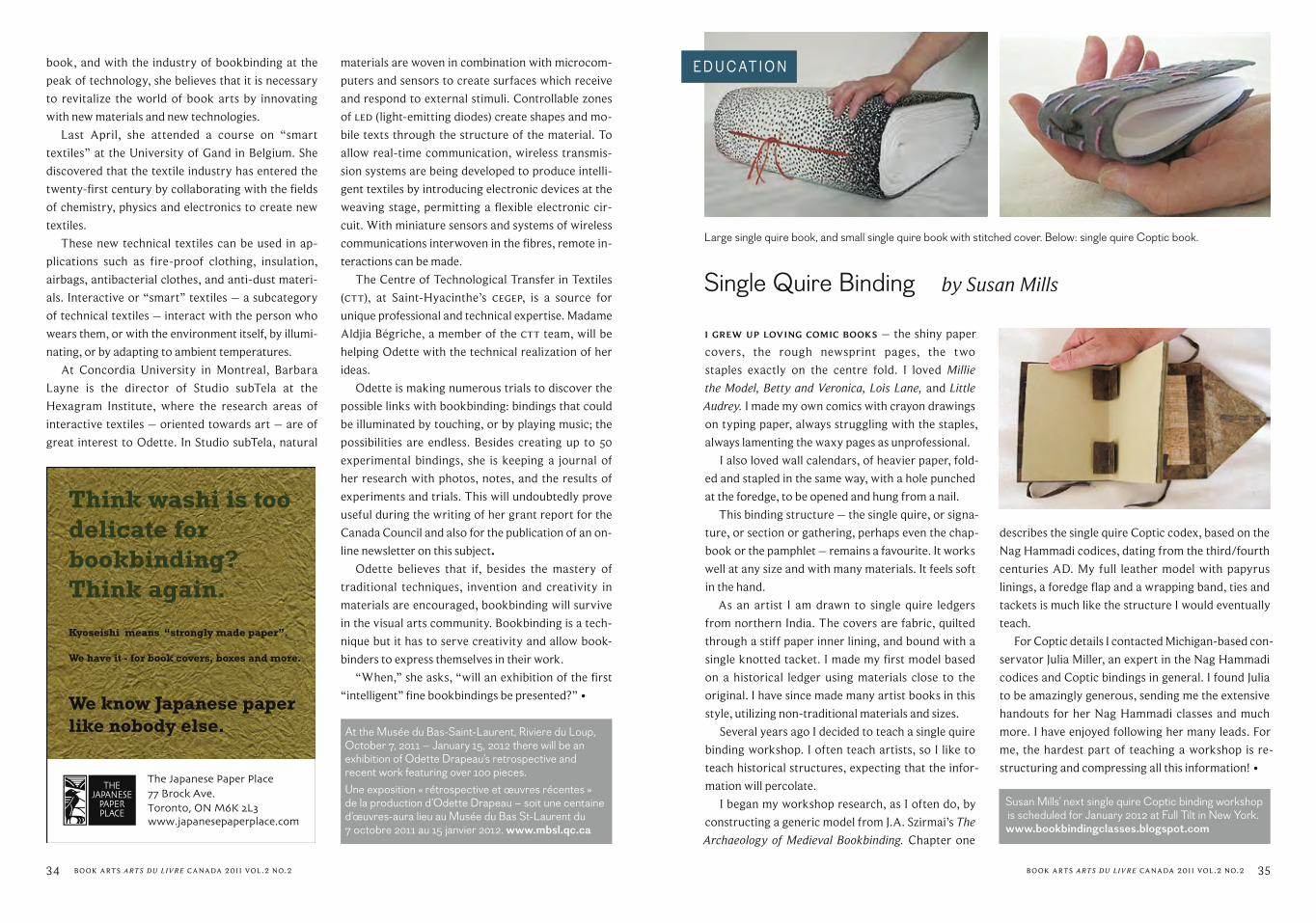
34 Book Arts arts du livre CAnAdA 2011 vol.2 no.2 Book Arts arts du livre CAnAdA 2011 vol.2 no.2 35
Single Quire Binding by Susan Mills
i grew up lOVing cOmic bOOks – the shiny paper
covers, the rough newsprint pages, the two
staples exactly on the centre fold. I loved Millie the Model, Betty and Veronica, Lois Lane, and Little Audrey. I made my own comics with crayon drawings
on typing paper, always struggling with the staples,
always lamenting the waxy pages as unprofessional.
I also loved wall calendars, of heavier paper, fold-
ed and stapled in the same way, with a hole punched
at the foredge, to be opened and hung from a nail.
This binding structure – the single quire, or signa-
ture, or section or gathering, perhaps even the chap-
book or the pamphlet – remains a favourite. It works
well at any size and with many materials. It feels soft
in the hand.
As an artist I am drawn to single quire ledgers
from northern India. The covers are fabric, quilted
through a stiff paper inner lining, and bound with a
single knotted tacket. I made my first model based
on a historical ledger using materials close to the
original. I have since made many artist books in this
style, utilizing non-traditional materials and sizes.
Several years ago I decided to teach a single quire
binding workshop. I often teach artists, so I like to
teach historical structures, expecting that the infor-
mation will percolate.
I began my workshop research, as I often do, by
constructing a generic model from J.A. Szirmai’s The Archaeology of Medieval Bookbinding. Chapter one
Large single quire book, and small single quire book with stitched cover. Below: single quire Coptic book.
EDuCaT iON book, and with the industry of bookbinding at the
peak of technology, she believes that it is necessary
to revitalize the world of book arts by innovating
with new materials and new technologies.
Last April, she attended a course on “smart
textiles” at the University of Gand in Belgium. She
discovered that the textile industry has entered the
twenty-first century by collaborating with the fields
of chemistry, physics and electronics to create new
textiles.
These new technical textiles can be used in ap-
plications such as fire-proof clothing, insulation,
airbags, antibacterial clothes, and anti-dust materi-
als. Interactive or “smart” textiles – a subcategory
of technical textiles – interact with the person who
wears them, or with the environment itself, by illumi-
nating, or by adapting to ambient temperatures.
At Concordia University in Montreal, Barbara
Layne is the director of Studio subTela at the
Hexagram Institute, where the research areas of
inter active textiles – oriented towards art – are of
great interest to Odette. In Studio subTela, natural
materials are woven in combination with microcom-
puters and sensors to create surfaces which receive
and respond to external stimuli. Controllable zones
of led (light-emitting diodes) create shapes and mo-
bile texts through the structure of the material. To
allow real-time communication, wireless transmis-
sion systems are being developed to produce intelli-
gent textiles by introducing electronic devices at the
weaving stage, permitting a flexible electronic cir-
cuit. With miniature sensors and systems of wireless
communications interwoven in the fibres, remote in-
teractions can be made.
The Centre of Technological Transfer in Textiles
(Ctt), at Saint-Hyacinthe’s CeGeP, is a source for
unique professional and technical expertise. Madame
Aldjia Bégriche, a member of the Ctt team, will be
helping Odette with the technical realization of her
ideas.
Odette is making numerous trials to discover the
possible links with bookbinding: bindings that could
be illuminated by touching, or by playing music; the
possibilities are endless. Besides creating up to 50
experimental bindings, she is keeping a journal of
her research with photos, notes, and the results of
experiments and trials. This will undoubtedly prove
useful during the writing of her grant report for the
Canada Council and also for the publication of an on-
line newsletter on this subject.
Odette believes that if, besides the mastery of
traditional techniques, invention and creativity in
materials are encouraged, bookbinding will survive
in the visual arts community. Bookbinding is a tech-
nique but it has to serve creativity and allow book-
binders to express themselves in their work.
“When,” she asks, “will an exhibition of the first
“intelligent” fine bookbindings be presented?” •
describes the single quire Coptic codex, based on the
Nag Hammadi codices, dating from the third/fourth
centuries AD. My full leather model with papyrus
linings, a foredge flap and a wrapping band, ties and
tackets is much like the structure I would eventually
teach.
For Coptic details I contacted Michigan-based con-
servator Julia Miller, an expert in the Nag Hammadi
codices and Coptic bindings in general. I found Julia
to be amazingly generous, sending me the extensive
handouts for her Nag Hammadi classes and much
more. I have enjoyed following her many leads. For
me, the hardest part of teaching a workshop is re-
structuring and compressing all this information! •
Susan Mills’ next single quire Coptic binding workshop is scheduled for January 2012 at Full Tilt in New York. www.bookbindingclasses.blogspot.com
At the Musée du Bas-Saint-Laurent, Riviere du Loup, October 7, 2011 – January 15, 2012 there will be an exhibition of Odette Drapeau’s retrospective and recent work featuring over 100 pieces. Une exposition « rétrospective et œuvres récentes » de la production d’Odette Drapeau – soit une centaine d’œuvres-aura lieu au Musée du Bas St-Laurent du 7 octobre 2011 au 15 janvier 2012. www.mbsl.qc.ca

Book Arts arts du livre CAnAdA 2011 vol.2 no.2 37
www.cbbag.ca
PRESIDENT’S MESSAGEHello, all. I hope that you enjoyed
a pleasant summer, and that the
jump back into the fall routine
has not been too much of a shock
to the system.
I’d like to take this opportunity
to update you on a few things
happening at the Board/national
level.
First, a quick report on the
AGM that was held in Toronto on
June 14. Scott Duncan, in his final
act as Co-President, hosted the
business meeting and reported
on the accomplishments over
the past year. James Spyker gave
his final Treasurer’s report, then
followed the voting to approve
the Board slate for the upcom-
ing year. Business taken care
of, the meeting turned to the
presentation of certificates. Two
Certificates of Completion for the
CBBAG foundation courses were
presented this year, to Joan Links and to James MacCallum, both
of Toronto. Congratulations
to Joan and James on this
achievement. Two awards were
also presented to CBBAG volun-
teers. Elsie Blauwhoff was the
recipient of the Volunteer of the
Year Award, and Ann Douglas
was presented with the Lifetime
Achievement Award. Thank you,
ladies, for all of your tireless work
on behalf of CBBAG; it is appreci-
ated. After the business meet-
ing and presentation of awards,
attendees were treated to an
inspiring talk from Tini Miura,
entitled “My World of Bibliophile
Bindings”, accompanied by an
extensive slide show of Tini’s
work. Thanks go out to the
Greater Toronto Area Chapter
for bringing in Ms. Miura to
teach a week-long course and
give this presentation at the
AGM, as well as to the Ryerson
University School of Graphic
Communications Management
for hosting the evening again
this year.
In speaking of the Board slate
for the upcoming year, I would
like to take this opportunity to
introduce you to three new
members of the Board of
Directors. Carmelina Karas
is taking over the
Treasurer’s position
from James Spyker.
Carmelina lives
in the Toronto
area, and
graduated recently from
the School of Graphic
Communications Management at
Ryerson. She was recommended
to us by Board member Art Seto
(Events). Carmelina has experience
working with not-for-profit organ-
izations, as well as working with
pricing and budgeting in her cur-
rent position as an estimator. Dave Allen runs Beddall Bookbinding
Conservation and Restoration
in Victoria. Dave spent years
working in the high-tech
industry, but has now returned
to his passion for binding and
repairing books, for which he
studied at Sheridan College with
Yehuda Miklaf in the 1970s. You
may already be familiar with Dave
as a regular participant on the
Book Arts List. Dave is taking a
position as Director-at-Large
as he learns more about the
organization. Finally, Gabriele Lundeen has worked with CBBAG
as Volunteer Coordinator for
several years. We are pleased
that Gabriele has now joined the
Board of Directors in this capacity.
Thank you all for your desire to
work with CBBAG.
I’d also like to take a moment
and thank all the Board members
and committee volunteers for their
efforts over the past year. This
structure of a “working board”
Gabriele Lundeen (left) presents Ann Douglas with the Cbbag Lifetime Achievement Award. Joan Links and James MacCallum with their Certificates of Completion. PHOTOS | RaNDy HElaNDER
with committees has become
quite productive, helped to
streamline responsibilities, and
ensures that more CBBAG mem-
bers are getting involved with the
significantly reduce the cost of
conference calls.
Happy fall, everyone. Enjoy
this issue of the magazine.
Mary McIntyre
Betsy Palmer Eldridge (left) and Tini Miura at Miura’s finishing workshop at the Toronto bindery. PHOTO | baRb HElaNDER
workings of the organization.
In closing, I am happy to
report that the Board is now
having its monthly meetings over
the Internet via Skype, which will
CBBAG NEWS
It’s coming! Art of the Book 2013 The Canadian Bookbinders and Book Artists Guild (CBBAG) is thrilled to announce it is in the planning stages of Art of the Book 2013, a juried exhibition of members’ work.
It is not too early to begin planning your entry! Submissions are welcomed from the traditional to cutting edge design. The categories will be: Fine Binding; Papermaking; Paper Decorating; Calligraphy; Box Making; Fine Printing; and Artists’ Books.
The exhibit will open in Calgary, Alberta, in July 2013. This is CBBAG’s first ever opening outside Toronto! There will also be an associated conference and workshops. A full-colour printed catalogue will be produced by CBBAG and will depict selected works, plus binding descriptions and biographical statements by each artist. The show will be available to travel from January 2013 through 2014.
Up to three works per member may be submitted. The entry fee for one to three works will be $30, and work must have been completed after January 1, 2010. (Non-members who wish to enter will have the price of a year membership added to their entry fee.)
• Full details and the Intent to Enter Form will be available online soon. • To become a member of Cbbag, join online at: www.cbbag.ca/membership.html • Questions or comments? Please contact: [email protected]
Sincerely, Art of the Book 2013 Committee

Canadian Bookbinders and Book Artists Guild (Cbbag) is an organization devoted to the book arts. Membership is open to any interested individual, institution, or organization.
Book Arts arts du livre Canada2011 voluMe 2 nuMBer 2
contactSubmissions and advertising [email protected] 2012: March 1Fall 2012: September 1Publications teamManaging Editor Frances HunterVivienne Bruce Linda M. Cunningham Barb Galeski Louise Hamilton Sue Hobson Christine McNair Jennifer Marston Cathryn Miller Art Seto Susan Smereka Jan Van Fleet Jill WillmottDistribution Co-ordinatorEdna Hajnal
All rights reserved. Articles do not necessarily express the views of the Cbbag board.
Authors of articles and other contributors of work included in Cbbag publications grant Cbbag permission to publish their work in both print and electronic form, to reprint as needed, and to archive and make it permanently retrievable electronically. Authors retain copyright on the work and may republish their work in any way they wish.
Copyright © 2011Canadian Bookbinders and Book Artists Guild
iSSN 1923-1776
coloPhonThis magazine is typeset in Brown Gothic, Beaufort and Figgins fonts, courtesy of Canadian type designer Nick Shinn (www.shinntype.com). Printed in Canada by Astley Gilbert, Toronto on Chorus Art Silk Text, 55% recycled paper (30% post consumer), processed chlorine free.
Canadian Bookbinders and Book Artists Guild60 Atlantic Avenue, Suite 112Toronto, Ontario M6k 1X9416.581.1071
www.cbbag.ca
Cbbag gratefully acknowledges the ongoing support of the Ontario Arts Council for its programs. The Ontario Arts Council is an agency of the Government of Ontario.
cbbaG60 Atlantic Avenue Suite 112, Toronto ON m6k 1x9Websitewww.cbbag.catelePhone416.581.1071email addressesGeneral Enquiries [email protected] [email protected]@cbbag.caWorkshop [email protected]
PresidentMary McIntyrePast PresidentScott DuncantreasurerCarmelina KarassecretaryWendy Caindirectors at larGeJocelyne Aird-Bélanger Dave Allen Sue Hobson Frances Hunter Lisa Isley Joe LandryGabriele Lundeen Art Seto Barbara Trott Jan Van Fleet