


Languages
Pages
Legal

A C R Y L I C P A I N T I N G
Cheat SheetsAUTHOR BOB DAVIES
C o l o u r M i x i n g C h e a t s h e e t s f o r a C r Y l i C s2
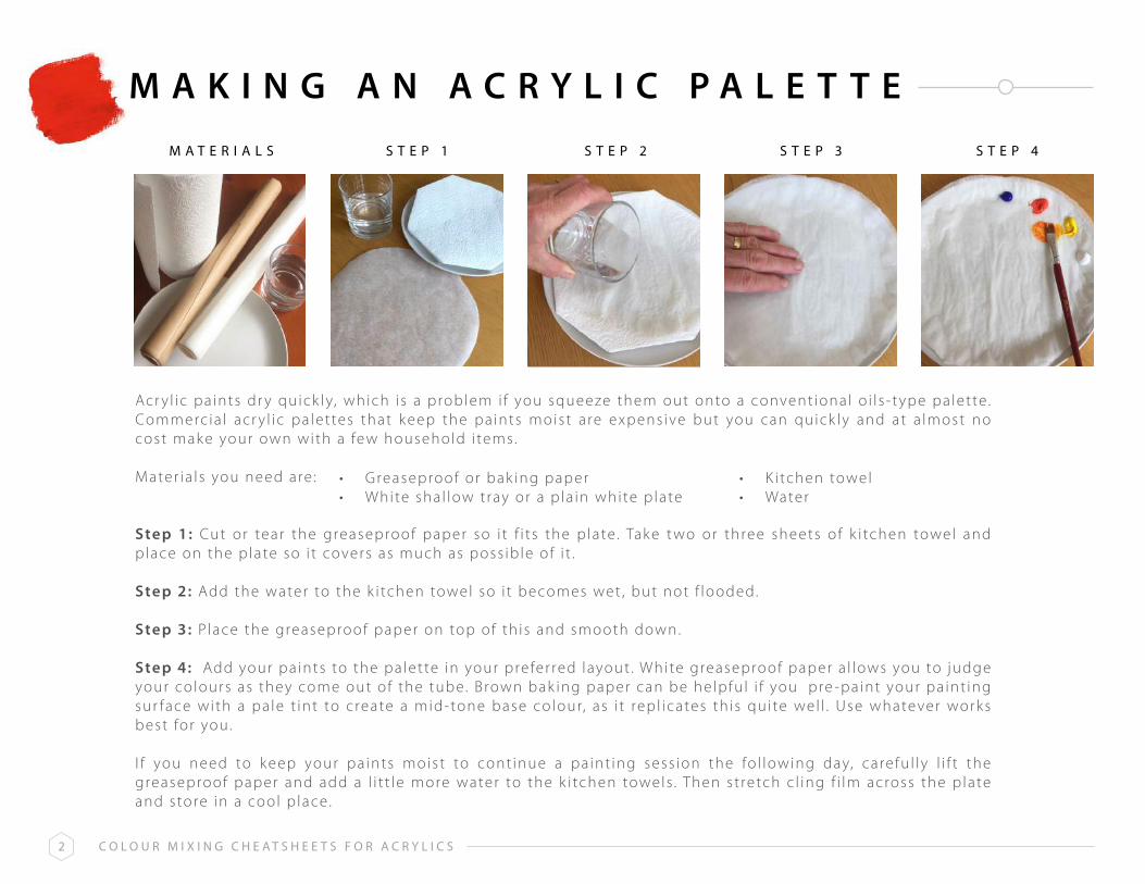
M A K I N G A N A C R Y L I C P A L E T T E
s t e P 1 s t e P 2 s t e P 3 s t e P 4M a t e r i a l s
Acr y l ic pa ints dr y quick ly, which i s a problem i f you squeeze them out onto a convent ional o i l s - t ype pa lette . Commerc ia l acr y l ic pa let tes that k eep the pa ints moist a re expens ive but you can quick ly and at a lmost no cost mak e your own with a few household i tems.
Mater ia l s you need are :
Step 1: Cut or tear the greaseproof paper so i t f i t s the p late . Tak e t wo or three sheets of k i tchen towel and place on the p late so i t covers as much as poss ib le of i t .
Step 2: Add the water to the k i tchen towel so i t becomes wet , but not f looded.
Step 3: P lace the greaseproof paper on top of th is and smooth down.
Step 4: Add your pa ints to the pa lette in your prefer red layout . White greaseproof paper a l lows you to judge your co lours as they come out of the tube. Brown bak ing paper can be helpfu l i f you pre -pa int your pa int ing sur face with a pa le t int to create a mid-tone base colour, as i t repl icates th is qui te wel l . Use whatever works best for you.
I f you need to k eep your pa ints moist to cont inue a pa int ing sess ion the fo l lowing day, carefu l ly l i f t the greaseproof paper and add a l i t t le more water to the k i tchen towels . Then st retch c l ing f i lm across the p late and store in a cool p lace.
• Greaseproof or bak ing paper • White sha l low t ray or a p la in white p late
• K i tchen towel• Water
C o l o u r M i x i n g C h e a t s h e e t s f o r a C r Y l i C s3
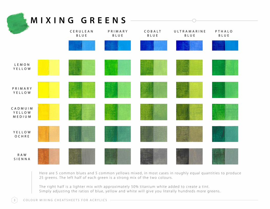
M I x I N G G R E E N SC e r u l e a n
b l u eP r i M a r Y
b l u eC o b a l t
b l u eu l t r a M a r i n e
b l u eP t h a l o
b l u e
l e M o nY e l l o W
P r i M a r YY e l l o W
C a D M u i MY e l l o WM e D i u M
Y e l l o Wo C h r e
r a Ws i e n n a
Here are 5 common blues and 5 common ye l lows mixed, in most cases in roughly equal quant i t ies to produce 25 greens. The le f t ha l f o f each green i s a s t rong mix of the t wo colours .
The r ight ha l f i s a l ighter mix with approx imate ly 50% t i tan ium white added to create a t int .S imply adjust ing the rat ios of b lue, ye l low and white wi l l g ive you l i tera l ly hundreds more greens.

C o l o u r M i x i n g C h e a t s h e e t s f o r a C r Y l i C s4
M I x I N G G R E Y SC e r u l e a n
b l u eC o b a l t
b l u eP r i M a r Y
b l u eu l t r a M a r i n e
b l u eP t h a l o
b l u e
C a D M i u Mr e D
l i g h t
b u r n ts i e n n a
b u r n tu M b e r
r a Wu M b e r
r e Do x i D e
Here are 5 b lues and 5 common reds/browns mixed in roughly equal quant i t ies to produce 25 greys . The le f t ha l f o f each grey i s a s t rong mix of the t wo colours . The r ight ha l f i s a l ighter mix with approx imate ly 50% t i tan ium white added to create a t int . Adjust ing the rat ios of b lue, reds/browns and white wi l l g ive you l i tera l ly hundreds more greys .
C o l o u r M i x i n g C h e a t s h e e t s f o r a C r Y l i C s5
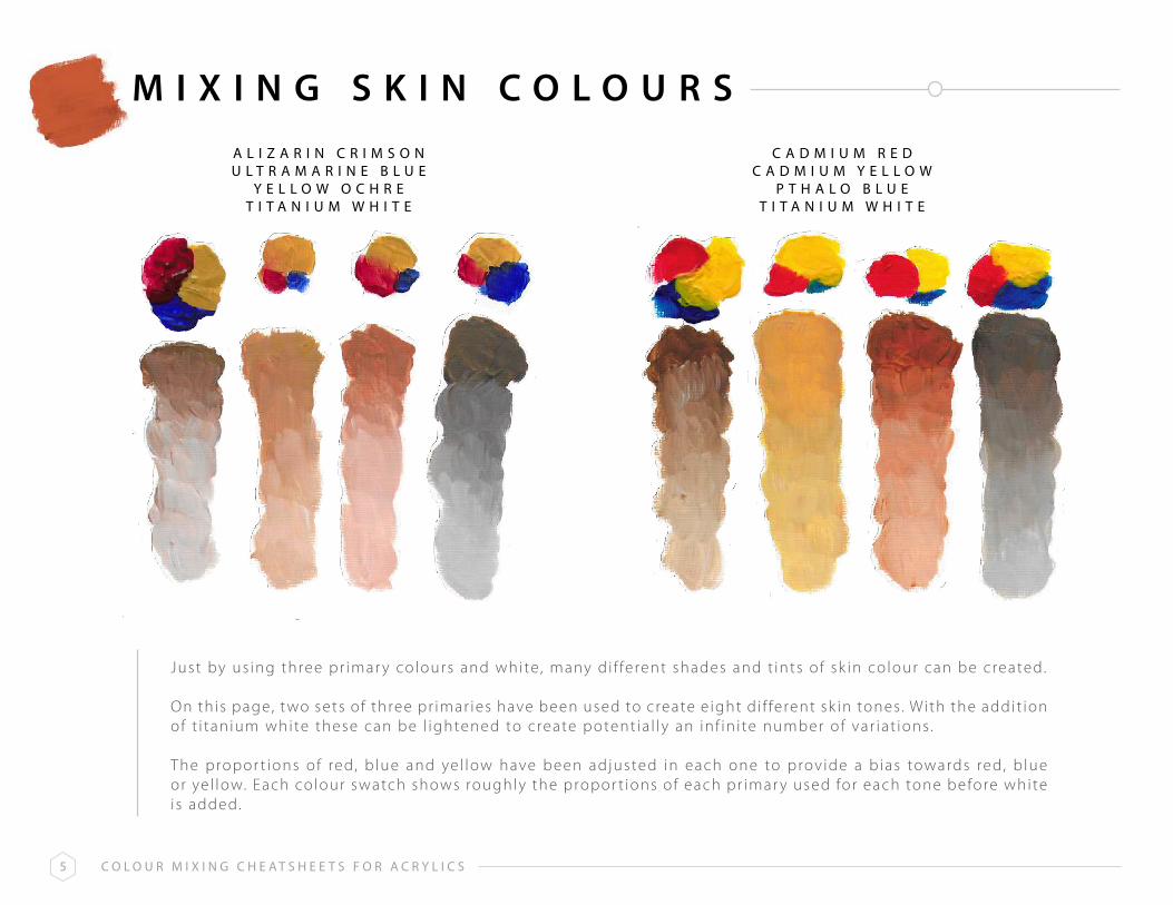
M I x I N G S K I N C O L O U R S
Just by us ing three pr imar y colours and white , many d i f ferent shades and t ints of sk in colour can be created.
On th is page, t wo sets of three pr imar ies have been used to create e ight d i f ferent sk in tones. With the addit ion of t i tan ium white these can be l ightened to create potent ia l ly an in f in i te number of var iat ions.
The propor t ions of red, b lue and ye l low have been adjusted in each one to prov ide a b ias towards red, b lue or ye l low. Each colour swatch shows roughly the propor t ions of each pr imar y used for each tone before white i s added.
a l i z a r i n C r i M s o nu l t r a M a r i n e b l u e
Y e l l o W o C h r et i t a n i u M W h i t e
C a D M i u M r e DC a D M i u M Y e l l o W
P t h a l o b l u et i t a n i u M W h i t e

C o l o u r M i x i n g C h e a t s h e e t s f o r a C r Y l i C s6
M I x I N G S K I N C O L O U R S
Here are some fur ther var iat ions us ing common colours and are used by many top por t ra i t pa inters .These 6 mixes , p lus the ones on the prev ious page, can create the vast major i t y of sk in tones you’ l l ever need.
r a Ws i e n n a
+b u r n t
s i e n n a
u l t r a M a r i n eb l u e
+b u r n tu M b e r
r a Ws i e n n a
+u l t r a M a r i n e
b l u e+
b u r n ts i e n n a
C a D M i u Mr e D
+C e r u l e a n
b l u e
a l i z a r i nC r i M s o n
+u l t r a M a r i n e
b l u e+
b u r n ts i e n n a
b u r n ts i e n n a
+Y e l l o Wo C h r e

C o l o u r M i x i n g C h e a t s h e e t s f o r a C r Y l i C s7
C O L O R B I A S O F P R I M A R I E S
Al l pr imar y colour pa ints ( reds , b lues and ye l lows) have a ‘ leaning’ or ‘b ias’towards one of the other t wo pr imar ies . For example, A l i zar in Cr imson i s a redwith a b lue b ias , whereas Cadmium Red i s a red with a ye l low bias .
K nowing the b ias of the colours in your pa let te wi l l he lp you mix the secondar yand ter t ia r y co lours you want . I t wi l l a l so help you avoid mix ing muddy and dul l co lours
I f you want a v ibrant purple for example, mix a red with a b lue b ias and bluewith a red b ias . That way you are only mix ing t wo of the pr imar ies ( red and blue) .
I f you want a dul l purple , then mix a red with a b lue b ias and a b lue with a ye l lowbias . Now you are mix ing a l l three pr imar ies ( red + b lue + ye l low) . M ix ing a l lthree pr imar ies resul ts in a more neutra l tone.
N B : T h e l i s t s h e r e t h o u g h e x t e n s i v e , a r e n o t e x h a u s t i v e , a s m a n u f a c t u r e r s i n t r o d u c e o r d e l e t e c o l o u r s o n a c o n t i n u o u s b a s i s .
B L U E S W I T H AR E D B I A S
Y E L L O W S W I T H AR E D B I A S
R E D S W I T H AB L U E B I A S
R E D S W I T H AY E L L O W B I A S
B L U E S W I T H AY E L L O W B I A S
Y E L L O W S W I T H A B L U E B I A S
C o b a l tC y a n i n e
f r e n c h u l t r a m a r i n eu l t r a m a r i n e
P a y n e ’ s g r e yi n d a n t h r e n e , i n d i g o
C a d m i u m Y e l l o w M e d i u mC a d m i u m Y e l l o w D e e p
C h r o m ei n d i a nn a p l e s
n e w g a m b o g er a w s i e n n a
Y e l l o w o c h r eP e r m a n e n t Y e l l o w M e d i u m
M a r sQ u i n a c r i d o n e g o l d
P e r m a n e n t r o s ea l i z a r i n C r i m s o n
M a g e n t aQ u i n a c r i d o n e r o s e
r o s e M a d d e rC r i m s o n l a k e
o p e r a r o s es c a r l e t l a k e
C a r m i n e
C a d m i u mW i n s o r
V e r m i l l i o nP e r e l y n e
P e r m a n e n tl i g h t
i n d i a nV e n e t i a n
P y r r o l ee n g l i s h r e d o x i d e
C e r u l e a nP t h a l o
a n t w e r pi n t e n s e , M o n a s t i a l
M a n g a n e s et u r q u o i s e
C y a nr e m b r a n d t
P t h a l oP r u s s i a n
P a r i sP e a c o c k
h a n s a Y e l l o w l i g h ta u r e o l e
a z ol e m o n
C a d m i u m l e m o nC a d m i u m Y e l l o w P a l e
h a n s a Y e l l o w l i g h tt r a n s p a r e n t
b i s m u t h

C o l o u r M i x i n g C h e a t s h e e t s f o r a C r Y l i C s8
T R A N S P A R E N T & O P A Q U E C O L O U R S
Al l pa int co lours , regardless of the medium used, have var y ing degrees of t ransparenc y. K nowing how t ransparent or opaque a colour i s can help you when paint ing layers or g lazes .
Bear in mind though that some colours may be c lassed as t ransparent by one manufac turer and semi- opaque by another and you can check th is on the s ide of the pa int tube.
The l i s ts here are colours that are genera l ly cons idered t ransparent , semi t ransparent , opaque or semi opaque across the major i t y of brands.
R E D S
K E Y
Y E L L O W SB L U E S
a l i z a r i n C r i m s o nl i g h t r e dC a d m i u m r e dr o s e M a d d e rb r i g h t r e dP e r y l e n e r e do p e r a r o s eV e n e t i a n r e dP y r r o l r e dP e r m a n e n t r o s eQ u i n a c r i d o n e r e di n d i a n r e dP e r m a n e n t M a g e n t aP e r m a n e n t r o s ef r e n c h V e r m i l l i o n
t = t r a n s p a r e n t
s t = s e m i - t r a n s p a r e n t
s = s e m i - o p a q u e
o = o p a q u e
Y e l l o w o c h r er a w s i e n n ag o l d o c h r eQ u i n a c r i d o n e g o l d n e w g a m b o g eb i s m u t h Y e l l o wa u r e o l i nC a d m i u m Y e l l o wC a d m i u m Y e l l o w P a l el e m o n Y e l l o wn a p l e s Y e l l o wi n d i a n Y e l l o wh a n s a Y e l l o w l i g h t
C o b a l t b l u eC e r u l e a nf r e n c h u l t r a m a r i n e i n d i g oP r u s s i a n b l u ei n d a n t h r o n e b l u eP t h a l o b l u e ( g r n s h d e )
r o y a l b l u ea n t w e r p b l u eM a n g a n e s e b l u ea n t h r a q u i n o n e b l u e
t o o t
s o s t t o
s t t t o t t o
s ot o t t o t o o t o tt
s to t t t t t o t t
s o

C o l o u r M i x i n g C h e a t s h e e t s f o r a C r Y l i C s9
C O L O U R T R A N S P A R E N C Y C H A R T
The t ransparenc y of a co lour can eas i ly be tested by creat ing a char t such as th is .
On white paper, canvas or board, pa int a b lack s t r ipe down the centre , about 1/2” (1cm) wide. The prec ise width i sn’ t c r i t ica l . I f you don’t have b lack , you can create one with a s t rong mix of a b lue and a brown. Let the s t r ipe dr y, then pa int a s t reak of each of your co lours across the s t r ipe as shown. Use the pa int s t ra ight out of the tube, undi luted.
Once the pa int has dr ied, those that are t ransparent wi l l be bare ly v i s ib le on the b lack s t r ipe, such as here with u l t ramar ine b lue and a l i zar in cr imson. O thers l i k e ye l low ochre and ceru lean b lue wi l l a lmost obl i terate the b lack s t r ipe, indicat ing they are much more opaque.
r e Do x i D e
r a Ws i e n n a
t i t a n i u MW h i t e
b u r n ts i e n n a
( 1 )
l e M o nY e l l o W
b u r n ts i e n n a
( 2 )
C a D M i u MY e l l o W
C a D M i u Mr e D( 1 )
Y e l l o Wo C h r e
C a D M i u Mr e D( 2 )
C a D M i u Mr e D
l i g h t
a l i z a r i nC r i M s o n
C e r u l e a nb l u e
u l t r a M a r i n eb l u e
P t h a l ob l u e

C o l o u r M i x i n g C h e a t s h e e t s f o r a C r Y l i C s1 0
H O w T O M A K E A P E R S O N A L I S E dC O L O U R C H A R T
Too many le isure ar t i s ts wor r y about hav ing the ‘r ight ’ co lours , or the same ones they see being used by Ar tTutor inst ruc tors .
I t ’s fa r better (and cheaper ! ) to use the one’s you have a l ready - at least for now. This way you wi l l learn to explo i t the colours at your d isposa l and i t wi l l a l low you to go out and se lec t new colours only i f i t becomes rea l ly obvious that you need them.
For th is exerc ise you are going to gather a l l o f your ex is t ing colours and mix any t wo of them. The resul ts of some mixes may surpr i se you and open up your eyes to poss ib i l i t ies you d idn’t rea l i se were there. I t ’s a ver y therapeut ic exerc ise as wel l .
C a D M i u MY e l l o W
C e r u l e a nb l u e
C o b a l tb l u e
P t h a l ob l u e
P r i M a r Yb l u e
u l t r a M a r i n eb l u e
C a D M i u Mr e D
a l i z a r i nC r i M s o n
r e Do x i D e
b u r n ts i e n n a
P e r M a n e n tM a g e n t a
Y e l l o Wo C h r e
r a Ws i e n n a
l e M o nY e l l o W
r a Wu M b e r
b u r n tu M b e r
D i o x a z i n eP u r P l e
h o o k e r sg r e e n
V i r i D i a n
i V o r Yb l a C k

C o l o u r M i x i n g C h e a t s h e e t s f o r a C r Y l i C s1 1
S T E P 1
I n the char t on the prev ious page I ’ve used 20 colours I had at my d isposa l . You may have less and d i f ferent ones and that ’s f ine. Gather them together now.
This char t was produced on a sheet of acr y l ic paper about 22” x 16” (40cm x 28cm or A2 s ize) . The f i r s t th ing to do i s to draw a ser ies of boxes in penci l about 2cm x 1cm. The ac tua l s ize s in’ t c r i t ica l as long as a l l the boxes f i t on the sheet !
Because I used 20 colours , I drew 10 boxes a long the top and 10 boxes down the s ide. I f you have 15 colours , you could do 8 a long the top and 7 down the s ide, for example. Once you have your boxes drawn, pa int a co lour in the top row and in le f t hand column as I have done here. Th is char t i s reproduced at a b igger s ize than the one prev ious ly, so only the f i r s t f ive boxes across the top and f ive f rom top to bottom are in v iew. I t doesn’t matter which colours go where, just p lace a unique colour in each box .
I f i l led in ha l f o f each box with pure colour and the other ha l f mixed with roughly 50% t i tan ium white , to create a t int .

C o l o u r M i x i n g C h e a t s h e e t s f o r a C r Y l i C s1 2
S T E P 2
I n the top le f t hand empt y box , mix the colour d i rec t ly above i t and to the le f t o f i t . M ix them in roughly equal quant i t ies . You can see that I ’ ve a l ready f i l led in severa l boxes with cadmium red mixed with ye l low ochre, burnt s ienna and u l t ramar ine b lue, in th is case.
Pa int the le f t hand s ide of the box a s t rong colour and add about 50% white to your mix to create a t int on the r ight hand s ide. Th is wi l l show you how the colour changes across d i f ferent s t rengths, which can change i t qui te a lot .
Repeat th is for each of the boxes.

C o l o u r M i x i n g C h e a t s h e e t s f o r a C r Y l i C s1 3
L I M I T E d P A L E T T E S U G G E S T I O N S
L imit ing your pa let te can rea l ly improve your acr y l ic pa int ing. Not only does help to improve colour harmony i t a l so mak es thedecis ion mak ing process eas ier - and that he lps you stay in the f low.
These t wo palettes are n ice ly ba lanced with a combinat ion of cool and warm pr imar ies . You can mix a lmost any colour you wantf rom these l imited se lec t ions and i t wi l l save you a lot of money on exot ic pa ints that your rare ly use a f ter you’ve bought them.
L I m I T E Dp A L E T T E 1
L I m I T E Dp A L E T T E 2
u l t r a m a r i n e b l u e ( w a r m )
P t h a l o b l u e ( c o o l )
C a d m i u m r e d ( w a r m )
a l i z a r i n C r i m s o n ( c o o l )
Y e l l o w o c h r e ( w a r m )
l e m o n Y e l l o w ( c o o l )
P l u s ( o p t i o n a l ) :
b u r n t s i e n n a o rl i g h t r e d
P a y n e s g r e y o ri n d i g o
C e r u l e a n b l u e
n e w g a m b o g e o rC a d m i u m Y e l l o w
P t h a l o b l u e
C o b a l t b l u e
P e r m a n e n t r o s e
l i g h t r e d
h a n s a Y e l l o w
r a w s i e n n a
P l u s ( o p t i o n a l ) :
b u r n t u m b e r
u l t r a m a r i n e b l u e
r a w u m b e r
V i r i d i a n

C o l o u r M i x i n g C h e a t s h e e t s f o r a C r Y l i C s1 4
B R U S H / K N I F EM A R K S
R O U n D B R U S H
For many years acr y l ic a r t i s ts have used br i s t le brushes s imi lar to those used by o i l pa inters . However, over the past few years a number of excel lent synthet ic a l ternat ives have been developed - sof ter than hogshai r but f i rmer than the natura l ha i r and synthet ic brushes used for watercolour. Th is a l lows the ar t i s t to move the pa int around, but a lso pa int with re lat ive ly smooth layers , or to use the coarser proper t ies of hogshai r to leave bush marks in the pa int . Compare the brush marks of the t wo t ypes of f i lber t brush here.
I n addi t ion , pa int ing k nives give the ar t i s t in both acr y l ics and o i l s the abi l i t y to spread pa int th ick ly in an impasto s t y le and many pa int ings have been created us ing only a ser ies of k n ives . They can be obta ined with meta l or p last ic b lades and in a var iet y of shapes to a l low many d i f ferent s t rok es to be achieved.
The photos on th is and the fo l lowing page h ighl ight just some of the brush/k ni fe s t rok es that can be cra f ted by the ar t i s t . You can see f rom the doodles that some of the brushes (e .g. the round and the f i lber t ) mak e qui te s imi lar marks . I n some cases colours have been appl ied over a dr ied layer such as the snow- capped mounta ins us ing the k ni fe , or one colour has been appl ied on one s ide of a f i lber t and a d i f ferent co lour on the other s ide. When the brush st rok e i s made, a sat i s fy ing natura l b lend of the t wo colours tak es p lace.
F I L B E R TB R U S H

C o l o u r M i x i n g C h e a t s h e e t s f o r a C r Y l i C s1 5
L I M I T E d B R U S H& K N I F E S E T
1 / 2 ” S Y n T H . F L A T
1 ” S Y n T H . F L A T
3 / 8 ” H O G F L A T
3 / 8 ” W I D E S Y n T H . F I L B E R T
3 / 8 ” W I D E H O G F I L B E R T
5 / 8 ” L O n G S Y n T H . R O U n D
1 ” W I D E H O G F A n
n O . 1 S Y n T H . R I G G E R
O R L I n E Rp A I n T I n G K n I F E p E A R
D R O p 3 / 4 ” L O n G
This i s a ver y bas ic s tar ter set , which can eas i ly be adjusted, depending upon whether you prefer addi t ional horsehai r brushes or more of the synthet ic var iet y.
NB : Don’t re ly exc lus ive ly on the number ing of brushes as an indicat ion of s ize as each manufac turer wi l l apply d i f ferent s tandards . So a No. 8 Round in one range could be the same as a No.5 Round in another.
Wherever poss ib le , check s izes yourse l f in an ar t s tore or, where th is i sn’ t poss ib le , see i f the webs i te prov ides in format ion as to the ac tua l s ize of the brush head; e .g. . 1/2” across the meta l fer ru le or 3/4” f rom the end of the fer ru le to the t ip of the brush , etc . The above have a l l been given a genera l indicat ion of s ize for th is reason, rather than the number being quoted.

C o l o u r M i x i n g C h e a t s h e e t s f o r a C r Y l i C s1 6
L I M I T E d B R U S H& K N I F E S E T
I n th is group, I ’ ve e l iminated the Hog brushes for an even more bas ic s tar ter set . The Hog brushes could be added later or you may prefer to s tar t wi th the Hog equiva lents of the Synthet ics I ’ ve l i s ted.
I ’ l l leave you to choose your brushes and enjoy f inding out what e f fec ts you can achieve. But do have a doodle ! Th is i s never t ime wasted. I t a l lows you to understand how your brushes per form and what marks can be achieved, before you spend money on new ones and set to on your nex t minor masterp iece.
1 / 2 ” S Y n T H . F L A T
1 ” S Y n T H . F L A T
3 / 8 ” W I D E S Y n T H . F I L B E R T
5 / 8 ” L O n G S Y n T H . R O U n D
n O . 1 S Y n T H . R I G G E R
O R L I n E Rp A I n T I n G K n I F E p E A R
D R O p 3 / 4 ” L O n G

C o l o u r M i x i n g C h e a t s h e e t s f o r a C r Y l i C s1 7
M E d I U M S
There are a la rge number of mediums ava i lable to mak e acr y l ic pa int th ick er, th inner, more t rans lucent or for spec ia l e f fec ts such as crack le or pear lescent . We’ve concentrated on just three to help you get s tar ted.
G E S S O
Acr y l ic pa int i s a versat i le medium that wi l l adhere to many sur faces , inc luding paper, canvas , other c loth sur faces , var ious boards and most other porous and semi-porous sur faces . I t ’s impor tant that the sur face i s f i r s t pr imed with a cover ing of gesso, which i s e f fec t ive ly a ver y p igment- r ich th ick , (usual ly ) white acr y l ic pa int .
R E T A R D E R G E L
Acr y l ic pa int dr ies fast so you can progress quick ly through your pa int ing without wai t ing for hours or even days , as with o i l s , for layers to dr y. However, th is mak es i t more d i f f icu l t to b lend smoothly on the pa int sur face. Var ious addi t ives are ava i lable , such as Flow I mprover or Retarder Gel , which k eep the pa int ‘open’ and work able for longer.
G L A z I n G m E D I U m
Glaz ing Medium is e f fec t ive ly co lour less acr y l ic pa int and a l lows t rans lucent g lazes to be created us ing with just a smal l amount of the des i red colour added, to create mood and atmosphere, such as an evening g low. Avoid s imply th inning the pa int with water to create a g laze, as more than about 25%/30% added to the pa int mak es i t lose i t s adhes ive proper t ies and i t wi l l dr y a lmost instant ly, mak ing i t d i f f icu l t to avoid t ide -marks .
These photos show the ef fec t of apply ing, (A) a raw s ienna g laze over an u l t ramar ine b lue back ground and (B) c reat ing smok e, s team or c louds us ing increas ing amounts of the g laze -to -pa int rat io.
A . B .

C o l o u r M i x i n g C h e a t s h e e t s f o r a C r Y l i C s1 8
P A I N T S U R F A C E G U I d E
Tradi t ional ly, acr y l ics i s pa inted on pre -pr imed acr y l ic paper, canvas panels or s t retched canvas , as ment ioned on the prev ious page.
However most wooden boards such as hardboard (masonite) , MDF, p lywood and chipboard can be used, preferably pr imed with gesso as descr ibed on the prev ious page. Apar t f rom canvas , other c loth too can be used and even wrapping paper or newspaper, i f i t ’s f i r s t pr imed.

C o l o u r M i x i n g C h e a t s h e e t s f o r a C r Y l i C s1 9
C O L O U R M I x I N G T E R M S
p R I m A R Yc O L O U R S
S E c O n D A R Yc O L O U R S
T E R T I A R Yc O L O U R S
c O m p L E m E n T A R Yc O L O U R S
H U E
T I n T
S H A D E
T O n E
V A L U E
There are three pr imar y colours which cannot be created by mix ing other co lours .They are : red, b lue and ye l low
Secondar y colours are mixed f rom t wo of the pr imar ies .They are green (b lue + ye l low) , orange ( red + ye l low) , purple ( red + b lue)
The s ix co lours created by mix ing a pr imar y with a secondar y i .e . b lue + green to create a b lue - green or turquoise
Colours oppos i te each other on the colour wheel . For example, orange i s oppos i te b lue on the colour wheel and so become each others’ complementar y colour. Complementar y colours are sa id to enhance each other when placed nex t to each other. When mixed with each other they have the oppos i te e f fec t , c reat ing a dul l , neutra l tone.
Complementar y colours inc lude : Orange and blue, Ye l low and purple , Green and red
This i s the br ightest , most v iv id vers ion of a pr imar y, secondar y or ter t ia r y co lour. So red for example, wi th no other co lour mix with i t and undi luted i s a hue. Pa int ing only with hues would resul t in a ver y br ight and gar i sh pa int ing.
Adding white to a co lour to l ighten i t , c reates a t int of that co lour.
Adding black to a co lour to dark en i t , c reates a shade of that co lour. I n acr y l ic pa int ing, adding a colour ’s complementar y to i t has a s imi lar e f fec t ( i .e . adding purple to ye l low has a s imi lar e f fec t as adding b lack to the ye l low) . You could a lso mix a b lack colour by mix ing the three pr imar y colours together and then add that b lack mix to another co lour ( spar ingly ) to create a shade.
Adding back and white to a co lour, c reates a tone of that co lour. Obvious ly b lack and white mak e grey and so a tone i s greyer vers ion of a co lour. These are a lso re fer red to as paste l co lours , or neutra l co lours . You’ l l use tones a lot in your pa int ings because the bulk of any subjec t matter i s made f rom them. You can then use shades for shadow areas , t ints for h ighl ight areas and a touch of br ight hues where you rea l ly want the colour to z ing.
Th is i s the l ightness or dark ness of a co lour. Whi le i t might seem obvious that b lue has a dark er va lue than ye l low, a ver y l ight b lue might be l ighter than a dark ye l low. The best way to judge the va lues in a photograph or pa int ing i s to mak e i t back and white . Th is wi l l mak e i t obvious which colours are dark er and l ighter than others .
Top Related