Self promo Chay Heyden
40
SELF PROMOTION SELF PROMOTION BY CHAY HEYDEN
-
Upload
design-graphics-gloscol -
Category
Documents
-
view
224 -
download
2
description
Distinction example PDF
Transcript of Self promo Chay Heyden

SELF PROMOTION
CHAY HEYDEN
CHAY HEYDEN
SELF PROMOTIONBY CHAY HEYDEN
SELF PROMOTION
CHAY HEYDEN
CREATIVE BRIEF This brief is concentrating on expanding our knowledge of the professional practices that take place withing the design industry.
We will also be using a SWOT analysis so we can identify ourselves as designers and our place in the design industry.
I will be creating a corporate identity for myself. I will be making a CV, business card, logo and a portfolio with my updated work. I will also be arranging and then promoting myself in a mock interview for a job within the industry.
I will then make researches into the origins of corporate identity and express my own opinions on the commercial and historical contexts in which corporate identity has evolved and where it is today.
My back up work will include investigations made into corporate identity, SWOT analysis and also my career goals. I will also be job searching, looking at job titles I may be interested in and the responsibilities and roles that come with them. I will be looking into copyright and legislation issues in the industry. I will also be creating a CV to a professional standard, an up to date portfolio and a covering letter for the mock job I will be applying for.
Once I have attended this mock job interview, I will then assess my performance
SELF PROMOTION
CHAY HEYDEN
SWOT ANALYSISA SWOT analysis is an incredibly helpful analysis tool to use. I will be using it to look in depth at what may benefit or drawback my application.
I am able to use a range of different techniques and styles that can be used when I am working. I think ex-perimenting with different techniques and styles has also proven to be beneficial to my work.
STRENGTHSSKILLS
SOFTWARE KNOWLEDGEPrior and during my HND course, I have taught myself as well as being taught how to use Adobe Creative Suite programs. I have recently been teaching myself basic HTML and CSS coding. I feel these will allow
me to gain an advantage on other designers as companies swift towards online marketing.
MOTIVATIONAs I have a passion for Graphic Design, I think motivation becomes a natural thing. This motivation and passion will give me an edge when applying for a job.
TIME MANAGEMENT
As a motivated designer, my punctuality is clearly a strength as seen in my attendance to college. I think basic time keeping shows a great level of motivation, passion and respect.
WEAKNESSES
I think I am a quietly confident person. I am confident in the work that I produce and confident and as a designer. However, I think
CONFIDENCE
sometimes I feel uncomfortable talking in front of a group of strang-ers. As someone who wants to work towards a career in creative directory, I think I need to come out my shell a bit more.
OPPORTUNITIESLIVE BRIEFSDuring the course, we will be given the opportunity to work on live briefs. These briefs allow us to work with real clients. I have been given the opportunity to work on an animation with a group of peers. This will give us experience when working with clients and show us the importance of working closely with the client.
PORTFOLIOThis course will allow me to extend my portfolio. I’m am constant-ly producing work which gives me opportunity to create a professional portfolio.
SELF PROMOTION
CHAY HEYDEN
CONTACTSWorking with clients and meeting new people, I will be essentially creating new contacts which will be of great importance when working in this industry.
THREATS
BROADENING SKILLSDuring the course, we will be working on projects that involve a wide range of skills that can be deployed in the workplace. We have recently been working on things such as photography, animation and packaging design. This will give me an edge on the competition.
COMPETITIONOne of the main threats to a designer is his/hers competition. As a growing industry, there are many existing and emerging talented designers.
FUNDINGI think another major threat would be funding. Especially in my current financial situation I think doing to university or pursuing a job will prove to be tough.
SELF PROMOTION
CHAY HEYDEN
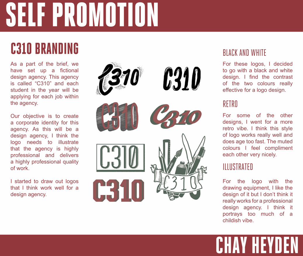
C310 BRANDINGAs a part of the brief, we have set up a fictional design agency. This agency is called “C310” and each student in the year will be applying for each job within the agency.
Our objective is to create a corporate identity for this agency. As this will be a design agency, I think the logo needs to illustrate that the agency is highly professional and delivers a highly professional quality of work.
I started to draw out logos that I think work well for a design agency.
For these logos, I decided to go with a black and white design. I find the contrast of the two colours really effective for a logo design.
BLACK AND WHITE
RETROFor some of the other designs, I went for a more retro vibe. I think this style of logo works really well and does age too fast. The muted colours I feel compliment each other very nicely.
ILLUSTRATED
For the logo with the drawing equipment, I like the design of it but I don’t think it really works for a professional design agency. I think it portrays too much of a childish vibe.
SELF PROMOTION
CHAY HEYDEN
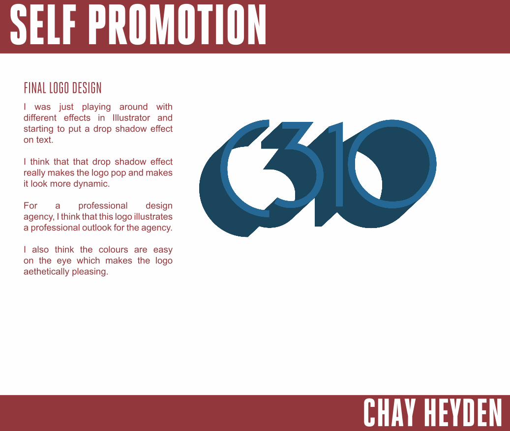
I was just playing around with different effects in Illustrator and starting to put a drop shadow effect on text.
I think that that drop shadow effect really makes the logo pop and makes it look more dynamic.
For a professional design agency, I think that this logo illustrates a professional outlook for the agency.
I also think the colours are easy on the eye which makes the logo aethetically pleasing.
FINAL LOGO DESIGN
SELF PROMOTION
CHAY HEYDEN
BRANDING A COMPANYA company’s corporate identity is a very important element. The logo should represent the company as a whole. Sometimes logos are literal icons of what the company’s services provide. An exam-ple is the Costa Coffee logo. I chose this logo as it shows coffee beans within the emblem. This is an obvious item to include in the logo as this is what they provide.
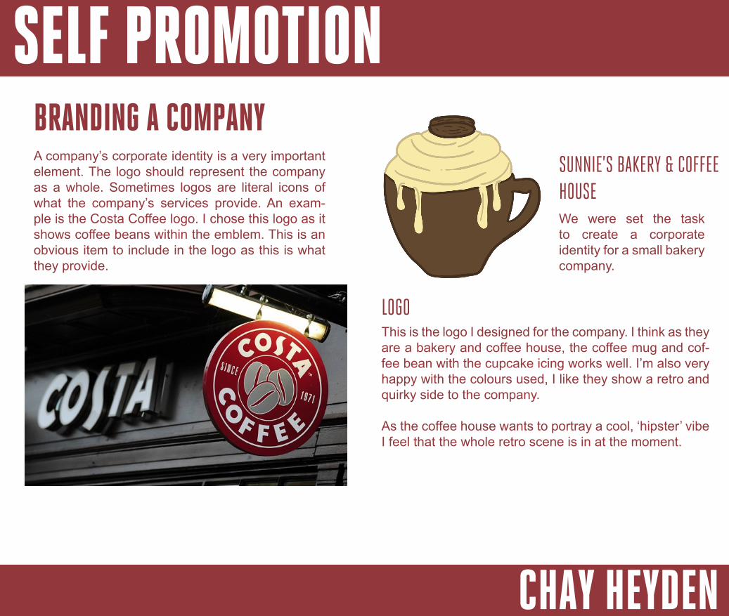
We were set the task to create a corporate identity for a small bakery company.
SUNNIE’S BAKERY & COFFEE HOUSE
This is the logo I designed for the company. I think as they are a bakery and coffee house, the coffee mug and cof-fee bean with the cupcake icing works well. I’m also very happy with the colours used, I like they show a retro and quirky side to the company.
As the coffee house wants to portray a cool, ‘hipster’ vibe I feel that the whole retro scene is in at the moment.
LOGO
SELF PROMOTION
CHAY HEYDEN
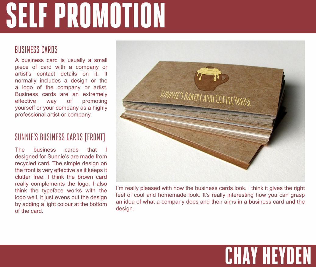
BUSINESS CARDSA business card is usually a small piece of card with a company or artist’s contact details on it. It normally includes a design or the a logo of the company or artist. Business cards are an extremely effective way of promoting yourself or your company as a highly professional artist or company.
SUNNIE’S BUSINESS CARDS [FRONT]The business cards that I designed for Sunnie’s are made from recycled card. The simple design on the front is very effective as it keeps it clutter free. I think the brown card really complements the logo. I also think the typeface works with the logo well, it just evens out the design by adding a light colour at the bottom of the card.
I’m really pleased with how the business cards look. I think it gives the right feel of cool and homemade look. It’s really interesting how you can grasp an idea of what a company does and their aims in a business card and the design.
SELF PROMOTION
CHAY HEYDEN
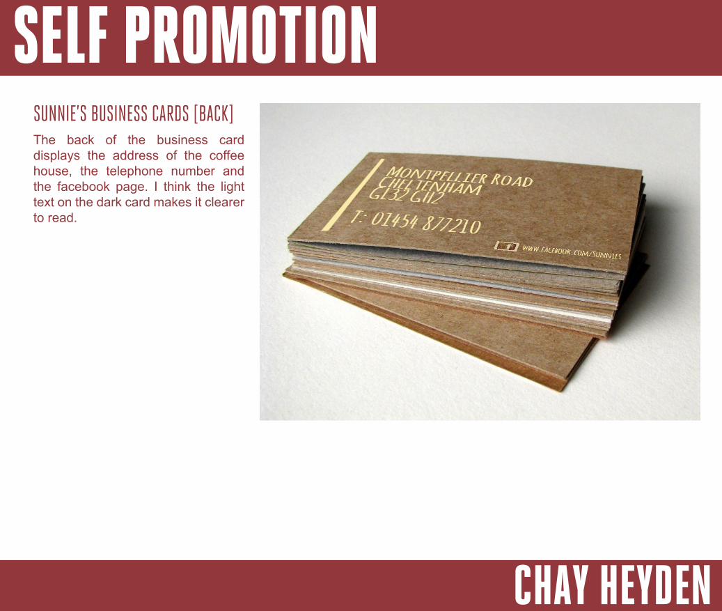
SUNNIE’S BUSINESS CARDS [BACK]The back of the business card displays the address of the coffee house, the telephone number and the facebook page. I think the light text on the dark card makes it clearer to read.
SELF PROMOTION
CHAY HEYDEN
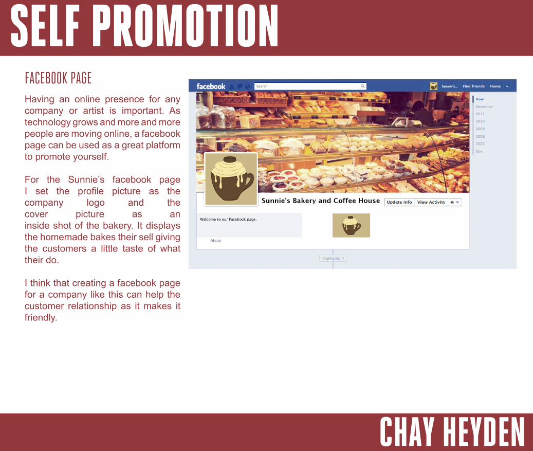
FACEBOOK PAGEHaving an online presence for any company or artist is important. As technology grows and more and more people are moving online, a facebook page can be used as a great platform to promote yourself.
For the Sunnie’s facebook page I set the profile picture as the company logo and the cover picture as an inside shot of the bakery. It displays the homemade bakes their sell giving the customers a little taste of what their do.
I think that creating a facebook page for a company like this can help the customer relationship as it makes it friendly.
SELF PROMOTION
CHAY HEYDEN
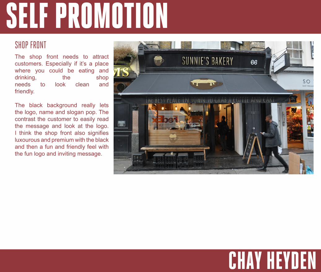
SHOP FRONTThe shop front needs to attract customers. Especially if it’s a place where you could be eating and drinking, the shop needs to look clean and friendly.
The black background really lets the logo, name and slogan pop. The contrast the customer to easily read the message and look at the logo. I think the shop front also signifies luxourous and premium with the black and then a fun and friendly feel with the fun logo and inviting message.
SELF PROMOTION
CHAY HEYDEN
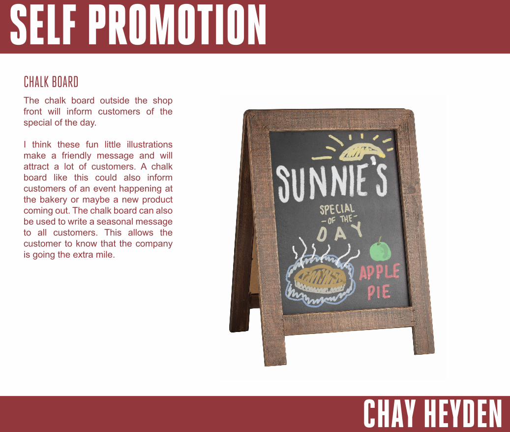
CHALK BOARDThe chalk board outside the shop front will inform customers of the special of the day.
I think these fun little illustrations make a friendly message and will attract a lot of customers. A chalk board like this could also inform customers of an event happening at the bakery or maybe a new product coming out. The chalk board can also be used to write a seasonal message to all customers. This allows the customer to know that the company is going the extra mile.
SELF PROMOTION
CHAY HEYDEN
Corporate identity is the image of a company. The corporate identity is shown through a corporate design such as a logo. This should clearly illustrate the ethos of the company.
CORPORATE IDENTITYWHAT IS CI
THE EARLIEST SIGNS OF CIThe earliest signs of corporate identity can be seen in pictograms where a lot of cultures symbolised an object, concept, location or event through this type of illustration.
These pictograms can be tracked back to 9,000 BC by the Mesopotamia. This is suggested by many historians. These pictograms produced were used to label farm produce. This can be seen as the first sign of labeling goods.
Another early sign of CI can be sen 7,000 years ago back to
Transylvanian potters’ work. These potters used to mark their pots with a mark. The marks differed with regards to the quality of the pot. If the mark was more detailed, it would signify that the pot was of good quality.
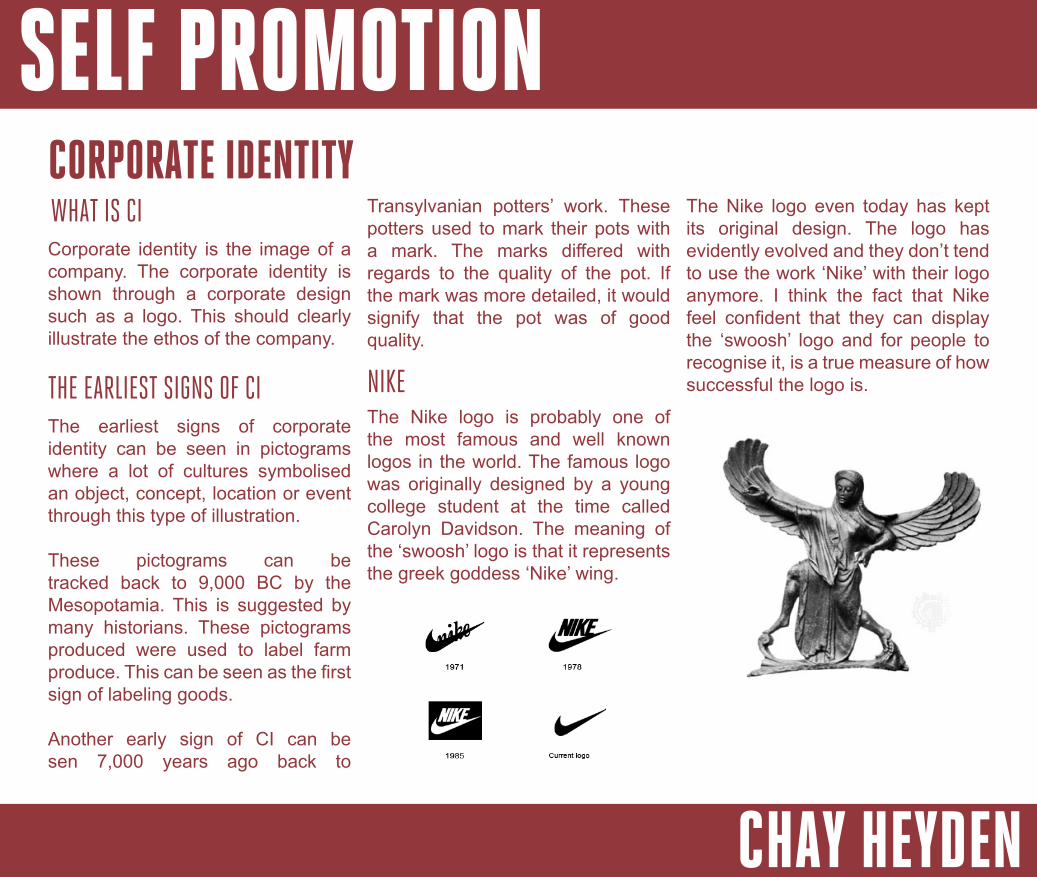
NIKEThe Nike logo is probably one of the most famous and well known logos in the world. The famous logo was originally designed by a young college student at the time called Carolyn Davidson. The meaning of the ‘swoosh’ logo is that it represents the greek goddess ‘Nike’ wing.
The Nike logo even today has kept its original design. The logo has evidently evolved and they don’t tend to use the work ‘Nike’ with their logo anymore. I think the fact that Nike feel confident that they can display the ‘swoosh’ logo and for people to recognise it, is a true measure of how successful the logo is.
SELF PROMOTION
CHAY HEYDEN
CI TODAYWhen you’re looking at corporate identity from the earliest stages to the present day, not much has changed. The way in which corporate identity is used has actually stayed the same. From when these potters’ were marking their pots to how nike put their logo onto their products. These marks or logos are used to make a name for the company or person.
Even though the use of CI hasn’t changed, the logos have. Logos have transformed into a message or illustration of what represents the company best. This message illustrates the company’s ethos and values.
The way that logos have become a representation of the company could be put down to today’s advertisement. As social media grows, company’s are using these platforms to promote themselves. Having a strong corporate message
is a critical piece of advertising. This message will catch the eye of the public and give you more exposure.
If we look at current logos of older companies, we see that these more recent logos are updated versions of the original logos. The use in updating the logo is to make it look more current rather than a dated logo. Having a more up to date logo will attract more people to your company. The updated logo should be simple and memorable.
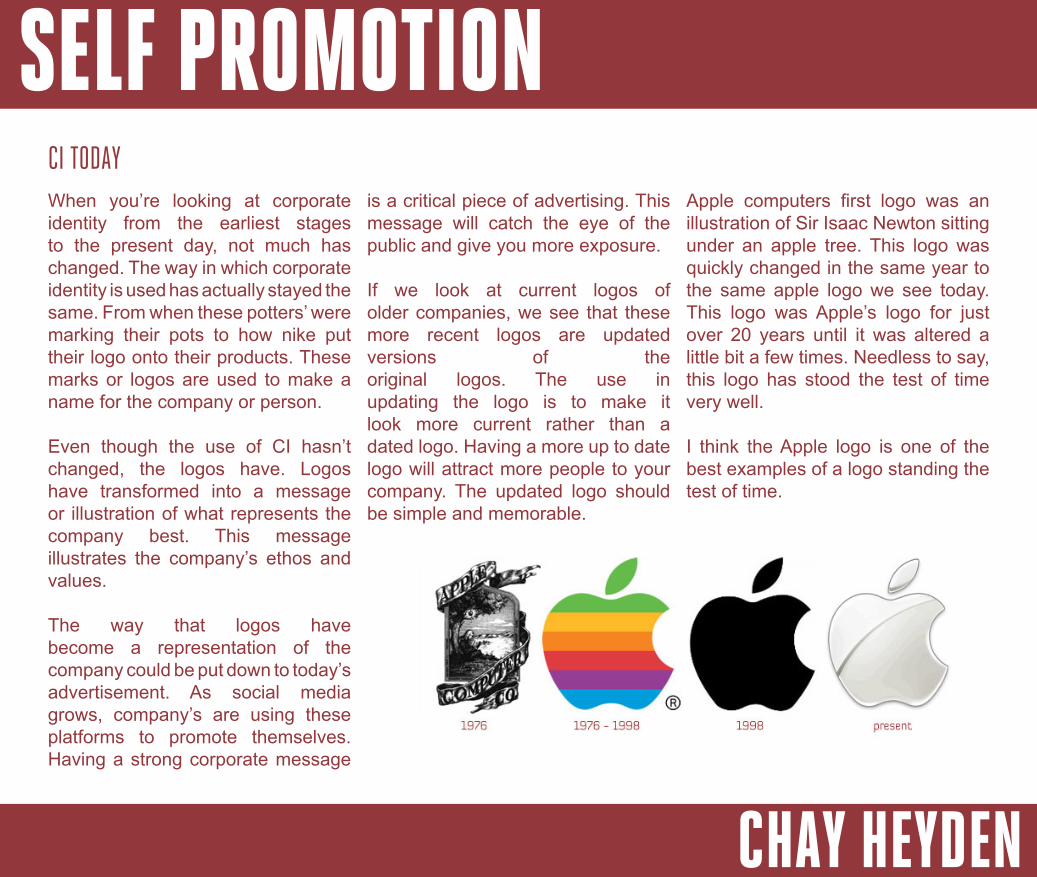
Apple computers first logo was an illustration of Sir Isaac Newton sitting under an apple tree. This logo was quickly changed in the same year to the same apple logo we see today. This logo was Apple’s logo for just over 20 years until it was altered a little bit a few times. Needless to say, this logo has stood the test of time very well.
I think the Apple logo is one of the best examples of a logo standing the test of time.
SELF PROMOTION
CHAY HEYDEN
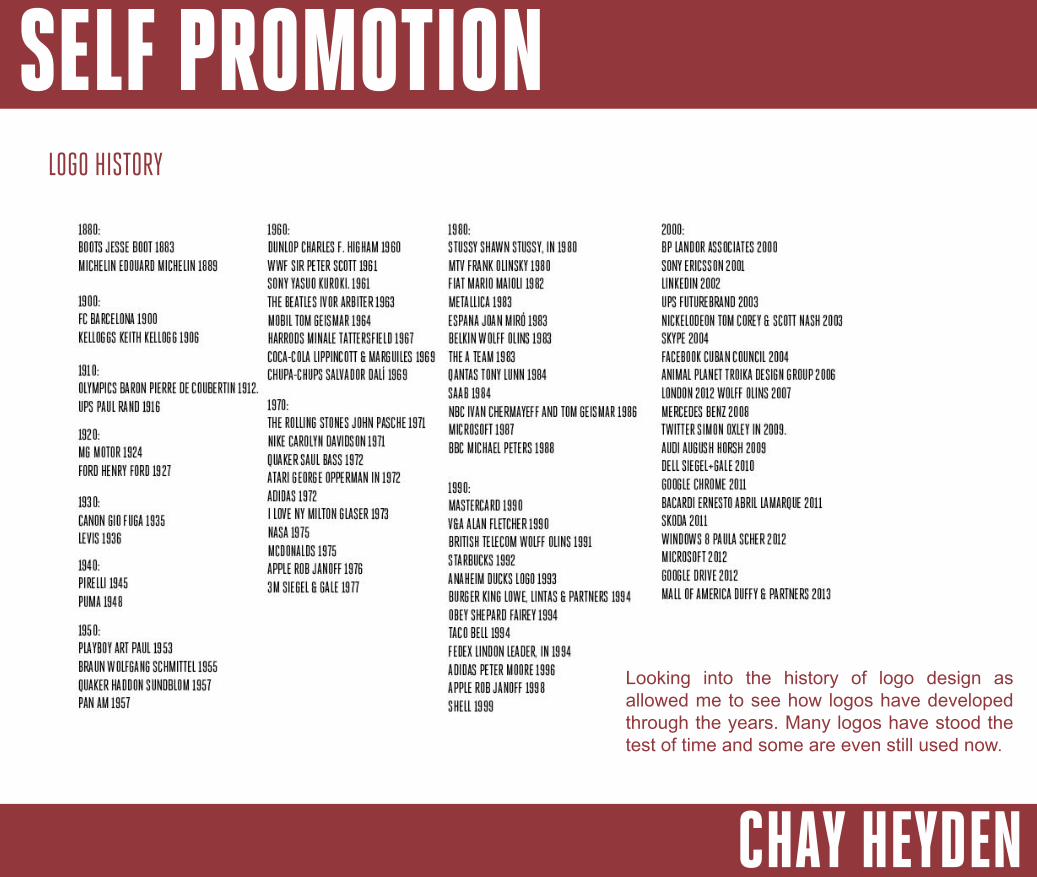
LOGO HISTORY
Looking into the history of logo design as allowed me to see how logos have developed through the years. Many logos have stood the test of time and some are even still used now.

SELF PROMOTION
CHAY HEYDEN
JOB SEARCHINGI will be looking for a job within Graphic Design on a series of websites online. This will help me become aware of what to expect when looking for a job once I have finished my education. I really don’t mind moving out of Cheltenham so I will be looking at jobs around the UK at this moment in time.
The websites I am using mainly consists of www.indeed.co.uk and www.creativepool.com as well as a few others. I will be looking at both internships and jobs. I feel an internship will provide valuable experience in the industry with the possibility of getting a job.
When searching, I will look into the salary, location, job prospects and career development.
I will include evidence of my findings on further pages.
SELF PROMOTION
CHAY HEYDEN
SELF PROMOTION
CHAY HEYDEN
I will be looking into the different roles and jobs within the graphic design industry. This will be useful research when applying for a job in this creative industry. I will be looking into a range of jobs. I think looking into a range of jobs will allow me to see what I can aspire to become and what jobs I will need to go into in order to achieve this job. I will look into each job and what it entails.
JOB TITLES
JUNIOR DESIGNERWithin any industry, there has to be a starting point. The junior graphic designer role is the best starting point within this industry. This role is for the recent graduates and younger designers who have little experience.
The Junior designer will be taking on tasks such as designing logo, redesigning logos, laying out pages and basically any other tasks that the middleweight and senior
designer don’t want to do. The junior will be working as a part of a team. The junior designer will be earning from £12,000 to £22,000 per year. The sala-ry will depend on the location and experience of the designer.
The usual time of being a junior designer can be up to 2 years.
MIDDLEWEIGHT DESIGNERThe middleweight designer is the next step on from being a junior designer. A middleweight designer will have a professional portfolio and will have at least 2 years of experience. A middle designer will be looking at a salary of £26,000 to £36,000 per year. The middleweight designer will be working on better briefs at this stage.
SENIOR DESIGNERA senior designer will have 2 years or more professional experience. They will have started as a junior
designer and would have needed to work their way up to this role. The senior designer will be taking on tasks such as a meeting the clients and tackle campaigns such as advertisement for a company or brand.
A senior designer will be looking at earning £38,000 to £48,000 a year.
ART DIRECTORAn Art director will be coming up with concepts of how a campaign or art piece should look like. If the art director didn’t like a logo or page layout, they would suggest new ideas in how it could be done. The art director will be working closely with the senior director and creative director.
The average salary will be between £40,000 and £50,000.
SELF PROMOTION
CHAY HEYDEN
CREATIVE DIRECTOR
NEWLY QUALIFIED....
The creative director will be tasked to meet clients regularly as they need to fully understand what the clients needs. The creative director will also be working closely with the art director and senior designers. The creative director looks at how to campaign or artwork is run so that it meets the clients needs. They also look after the marketing of a brief.
The average salary for a creative director will be from £75,000 to £150,000.
I think reflecting on what you want to do as a job is an important process for any designer.
Working out your aspirations and goals will give you the drive to reach these.
Looking at where you stand in this industry is another important thing to understand.
MY JOB GOALS
When newly qualified, I hope to get a job working as a junior graphic designer or maybe freelance for a few years. I want to ultimately work towards freelancing rather than working for an agency.
5 YEARS FROM NOW...5 years from now, I hope to continue working freelance if that is where I’m at. For a back up job, I will work as a middleweight designer in an agency.
When I’m an experienced designer, I hope to still be illustrating / designer. I have also looked into becoming a creative designer when experienced.
Looking at these possible jobs has given me a brief insight to how I want career to plan out.
EXPERIENCED...
SELF PROMOTION
CHAY HEYDEN
INTERVIEW TECHNIQUESI think looking into interview techniques will help me will my mock interview but also any interview I have when applying for a job.
I will be looking into body language, eye contact and other important elements that creates a successful interview.
BODY LANGUAGEBody language plays a huge role in an interview. It conveys your confidence, comfortability, passion and enthusiasm. Whether your standing or sitting, if you cross your arms and close yourself off then this signals that you are uncomfortable and lack confidence.
Amy Cuddy studies body language in depth and how it conveys different messages. She says that if you go
into a power pose for two minutes a day and before a stressful situation, your confidence will be altered. In her TEDtalk, she also explains that if you lack confidence then you should fake confidence until you become confident. She explains that this has worked for many people.
DRESS CODEIt is important that you look presentable when in a interview. This shows the interviewer that you take pride in how you look and that you are professional. It is sometimes a good idea to contact the interviewer and ask if there is a dress code that the company follows or if they expect you to dress casual or formally. This is important, if you dress casual to a formally dressed company, this may be something their mark against you.
PREPARING FOR QUESTIONSIt is always good practice to practice with a friend or family member before an interview. If you just get them you ask you a range of interview questions, you will feel more confident answering questions in the interview.
PORTFOLIOEspecially in the creative industry, it is important that you have a professional portfolio to present to the interviewer. You need to have an edge of competitors as it is such a competitive industry. Having a broad range of work is very important. This shows the interviewer that you have a broad range of skills.
SELF PROMOTION
CHAY HEYDEN
INTERVIEW FEEDBACKI arranged and attended a mock interview with Dan Lewis from Five Fifty. The company’s main services are web design and graphic design.
The feedback I received after my interview was very positive. Dan said that I have a good eye for composition and am a very talented illustrator. In addition, he also said he feels I am well positioned to pursue a job within the design industry.
I feel the interview went excellent and I think looking at the inter techniques helped boost my confident and comfortability.
Dan explained that he could use my illustration skills for some logo designs. With this, he offered me work experience during the summer.
SELF PROMOTION
CHAY HEYDEN
ARTIST RESEARCHI think artist research is an important piece of designing. Looking for inspiration can be difficult. I will be looking at some of my favourite artists and tattoo artists to find this inspiration.
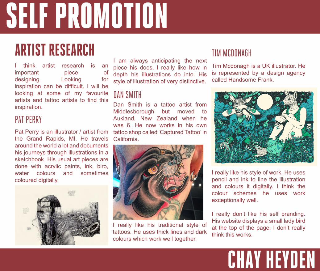
PAT PERRYPat Perry is an illustrator / artist from the Grand Rapids, MI. He travels around the world a lot and documents his journeys through illustrations in a sketchbook. His usual art pieces are done with acrylic paints, ink, biro, water colours and sometimes coloured digitally.
I am always anticipating the next piece his does. I really like how in depth his illustrations do into. His style of illustration of very distinctive.
DAN SMITHDan Smith is a tattoo artist from Middlesborough but moved to Aukland, New Zealand when he was 6. He now works in his own tattoo shop called ‘Captured Tattoo’ in California.
I really like his traditional style of tattoos. He uses thick lines and dark colours which work well together.
TIM MCDONAGHTim Mcdonagh is a UK illustrator. He is represented by a design agency called Handsome Frank.
I really like his style of work. He uses pencil and ink to line the illustration and colours it digitally. I think the colour schemes he uses work exceptionally well.
I really don’t like his self branding. His website displays a small lady bird at the top of the page. I don’t really think this works.
SELF PROMOTION
CHAY HEYDEN
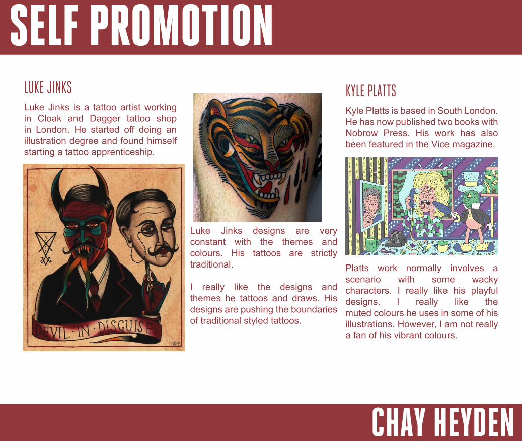
LUKE JINKSLuke Jinks is a tattoo artist working in Cloak and Dagger tattoo shop in London. He started off doing an illustration degree and found himself starting a tattoo apprenticeship.
Luke Jinks designs are very constant with the themes and colours. His tattoos are strictly traditional.
I really like the designs and themes he tattoos and draws. His designs are pushing the boundaries of traditional styled tattoos.
KYLE PLATTSKyle Platts is based in South London. He has now published two books with Nobrow Press. His work has also been featured in the Vice magazine.
Platts work normally involves a scenario with some wacky characters. I really like his playful designs. I really like the muted colours he uses in some of his illustrations. However, I am not really a fan of his vibrant colours.
SELF PROMOTION
CHAY HEYDEN
LOGO DESIGN PROCESS
1 - BRIEF
This is the design process that designers will undertake to design a logo. The process will allow the designer to undertake the brief and the client needs.
Understanding the brief if a vital element when it comes to designing a logo. You need to undertake what the company does and what they want. Understanding the client needs will enable you to produce a logo that perfectly suits the company.
2 - RESEARCHThe next step to take is to research into what services the company provides. This can give you a concept or idea you can bare in mind when designing the logo. You should also keep in mind competitors. I will
be constantly looking at how other designers brand themselves so I can see what I’m potentially up against.
3 - VISUAL RESEARCH
4 - CONCEPTS
6 - FINAL IDEAS
7 - EVALUATION
5 - REFLECTION
Researching into different styles of logos will allow you choose how you want your logo to look. This will also enable you to figure out what logos look good and which ones look like an amateur produced it.
Now you know what style you roughly want your logo to look like, it’s now time to put these ideas onto paper. You will then develop these ideas further.
Once you have 1 to 3 designs you like, time you started to create it in it’s final glory. It may be a good option to produce all your final ideas in case you find your back ups designs fit better.
Now that you have your final logo, you now need to evaluate what you’ve done. This will ultimately improve your skills as a designer as you can identify what areas you were weak in.
These are the steps I will be taking to produce my own logo.
At this point, you need to look at what ideas you have and give the ideas a few days. This will allow you to
choose which ideas stand out from the rest.
SELF PROMOTION
CHAY HEYDEN
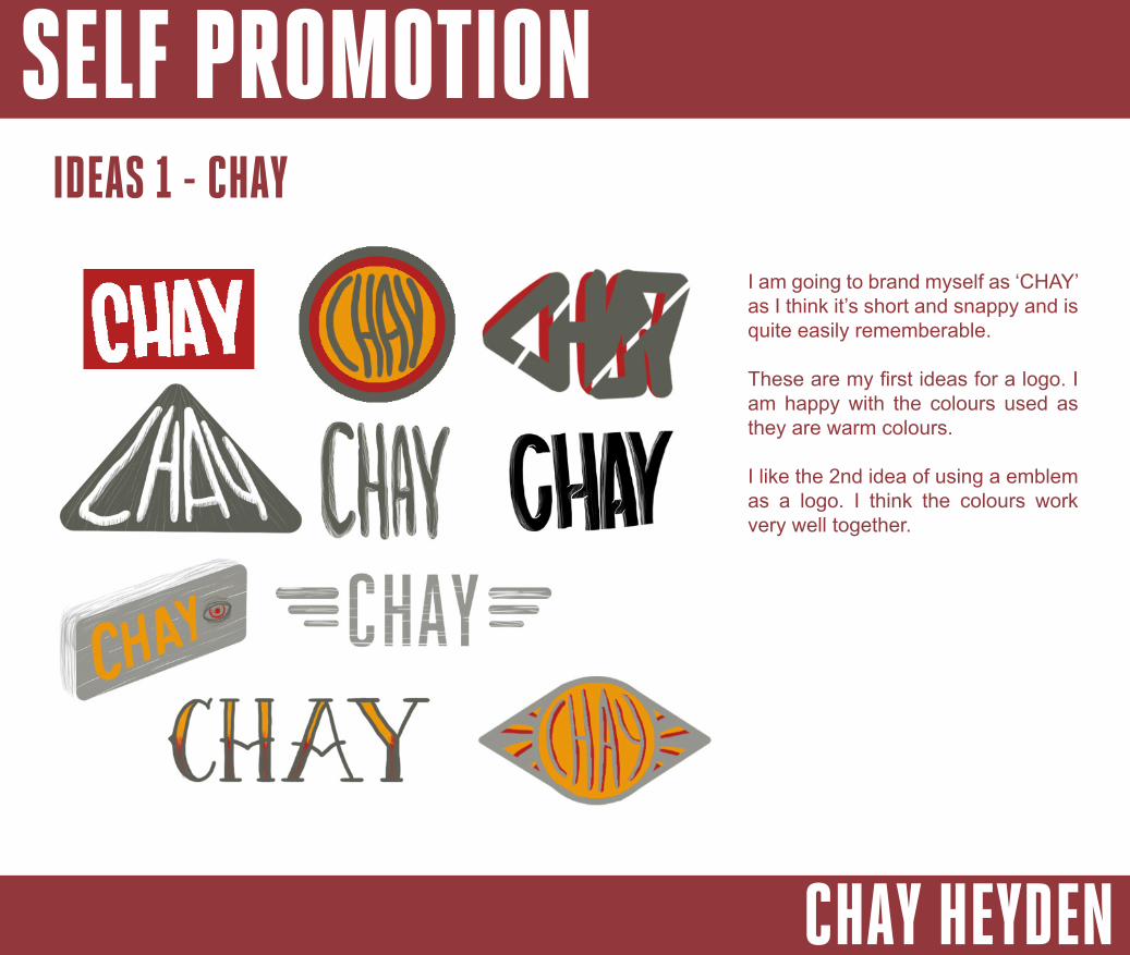
IDEAS 1 - CHAY
I am going to brand myself as ‘CHAY’ as I think it’s short and snappy and is quite easily rememberable.
These are my first ideas for a logo. I am happy with the colours used as they are warm colours.
I like the 2nd idea of using a emblem as a logo. I think the colours work very well together.
SELF PROMOTION
CHAY HEYDEN
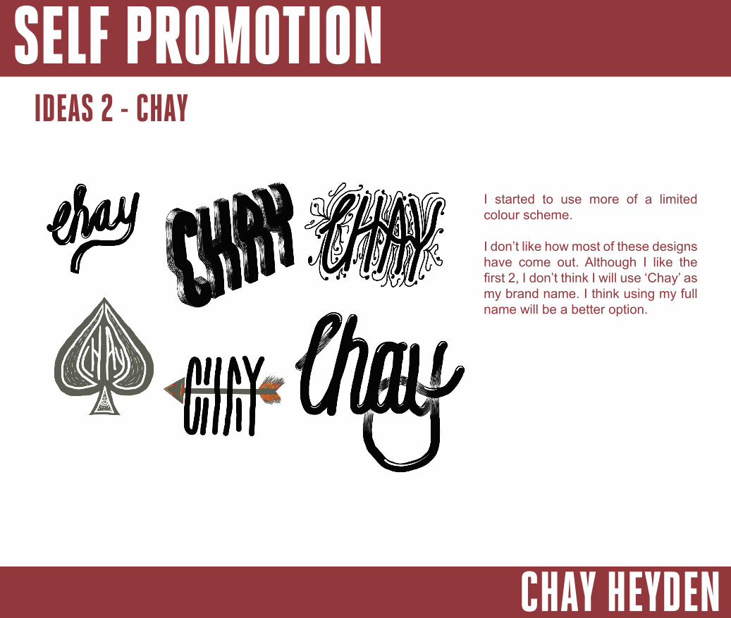
I started to use more of a limited colour scheme.
I don’t like how most of these designs have come out. Although I like the first 2, I don’t think I will use ‘Chay’ as my brand name. I think using my full name will be a better option.
IDEAS 2 - CHAY
SELF PROMOTION
CHAY HEYDEN
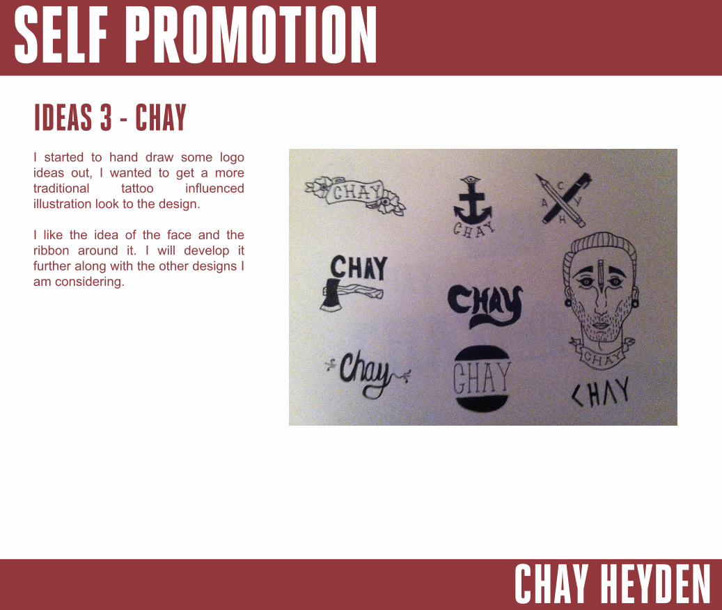
IDEAS 3 - CHAYI started to hand draw some logo ideas out, I wanted to get a more traditional tattoo influenced illustration look to the design.
I like the idea of the face and the ribbon around it. I will develop it further along with the other designs I am considering.
SELF PROMOTION
CHAY HEYDEN
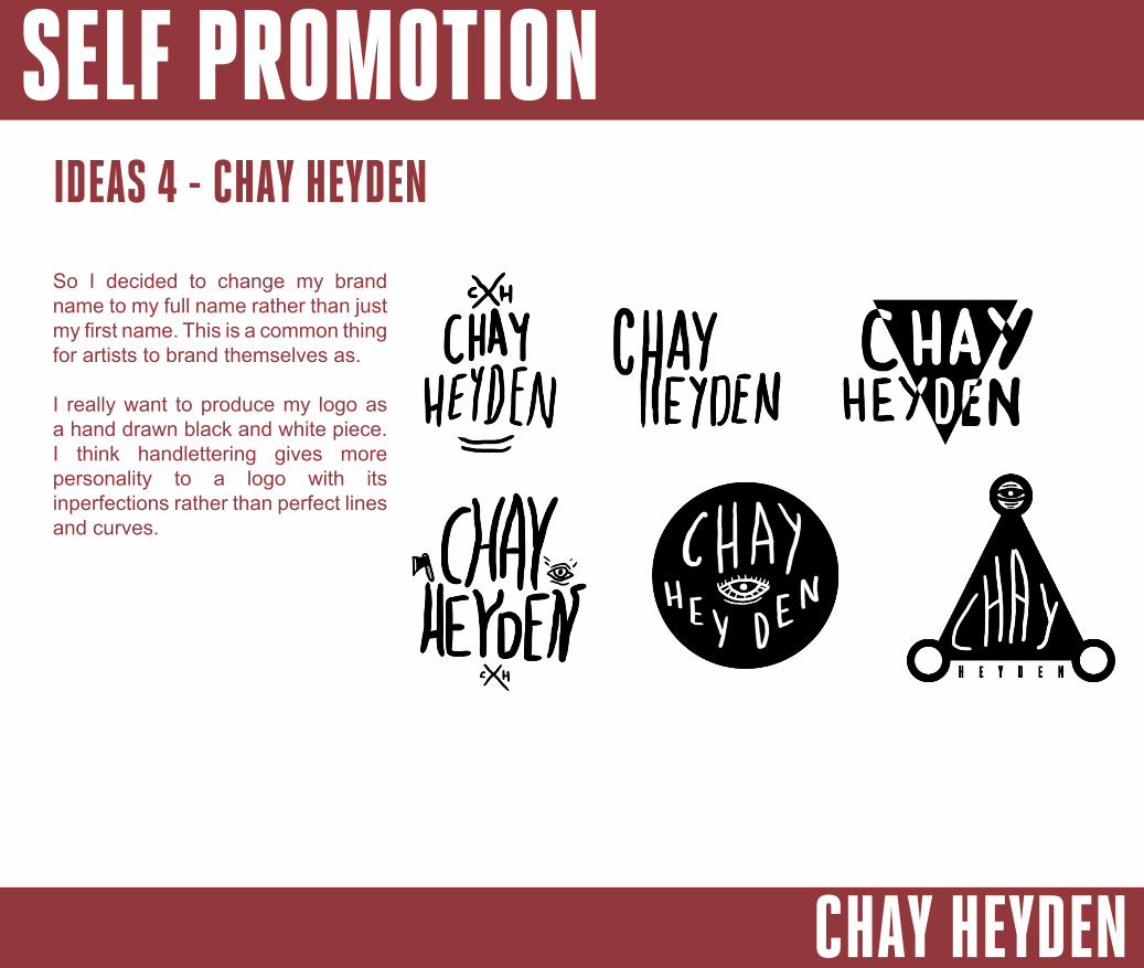
So I decided to change my brand name to my full name rather than just my first name. This is a common thing for artists to brand themselves as.
I really want to produce my logo as a hand drawn black and white piece. I think handlettering gives more personality to a logo with its inperfections rather than perfect lines and curves.
IDEAS 4 - CHAY HEYDEN
SELF PROMOTION
CHAY HEYDEN
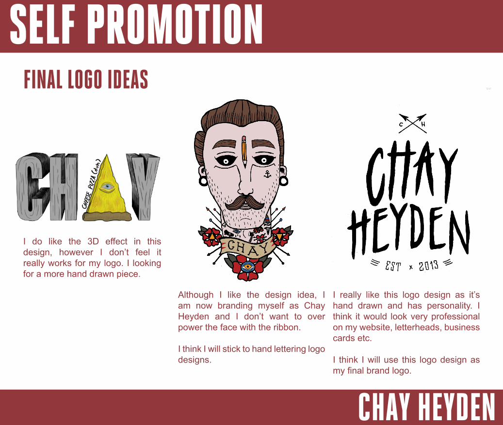
FINAL LOGO IDEAS
I really like this logo design as it’s hand drawn and has personality. I think it would look very professional on my website, letterheads, business cards etc.
I think I will use this logo design as my final brand logo.
Although I like the design idea, I am now branding myself as Chay Heyden and I don’t want to over power the face with the ribbon.
I think I will stick to hand lettering logo designs.
I do like the 3D effect in this design, however I don’t feel it really works for my logo. I looking for a more hand drawn piece.
SELF PROMOTION
CHAY HEYDEN
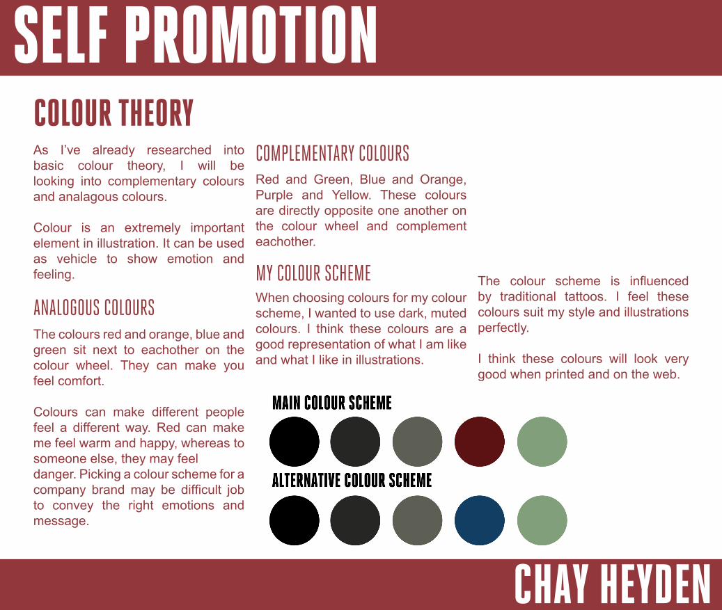
COLOUR THEORYAs I’ve already researched into basic colour theory, I will be looking into complementary colours and analagous colours.
Colour is an extremely important element in illustration. It can be used as vehicle to show emotion and feeling.
ANALOGOUS COLOURSThe colours red and orange, blue and green sit next to eachother on the colour wheel. They can make you feel comfort.
Colours can make different people feel a different way. Red can make me feel warm and happy, whereas to someone else, they may feel danger. Picking a colour scheme for a company brand may be difficult job to convey the right emotions and message.
COMPLEMENTARY COLOURSRed and Green, Blue and Orange, Purple and Yellow. These colours are directly opposite one another on the colour wheel and complement eachother.
MY COLOUR SCHEMEWhen choosing colours for my colour scheme, I wanted to use dark, muted colours. I think these colours are a good representation of what I am like and what I like in illustrations.
The colour scheme is influenced by traditional tattoos. I feel these colours suit my style and illustrations perfectly.
I think these colours will look very good when printed and on the web.
SELF PROMOTION
CHAY HEYDEN
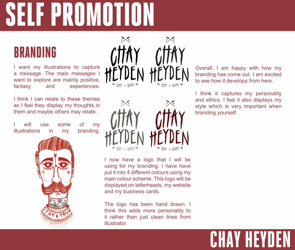
BRANDING
I now have a logo that I will be using for my branding. I have have put it into 4 different colours using my main colour scheme. This logo will be displayed on letterheads, my website and my business cards.
The logo has been hand drawn. I think this adds more personality to it rather than just clean lines from illustrator.
I want my illustrations to capture a message. The main messages I want to explore are mainly positive, fantasy and experiences.
I think I can relate to these themes as I feel they display my thoughts in them and maybe others may relate.
I will use some of my illustrations in my branding.
Overall, I am happy with how my branding has come out. I am excited to see how it develops from here.
I think it captures my personality and ethics. I feel it also displays my style which is very important when branding yourself.
SELF PROMOTION
CHAY HEYDEN
PRINTINGBusiness cards are an important element for self promotion for designers. You can hand over business cards to potential clients or employers. It’s important that the business card has an edge on competitors.
I will be looking into different printing companies that can provide a printing service for business cards.
MOO.COMMoo are a strong competitor with regards to business card printing. They offer a range of business cards types from gloss card to luxe. With they range of card types they also offer competitive prices. With £28.79 for 50 cards, this allows an afforable service. The prices mentioned are for the Luxe cards, this is the type of card I prefer out of their range.
AWESOME MERCHANISEAwesome Merchandise provide a very unique service. From folded business cards to laminated cards they have a definant edge on other companies.
Their prices are very good at £30.00 for 50 recycled cards. These are the type of business card I was looking at getting printed.
I think I will definitely consider getting business cards printed from Awesome Merch.
VISTA PRINTVista print have a massive range of cards with different types of print. Their range consists of raise print cards to spot gloss. I think these products are very unique.
I think roughly £8 for 100 recycled
matte business cards speaks for itself. The offers they produce are extremely good.
I think their services and prices are excellent and will definitely consider getting my business cards printed there.
Overall, I think all services all amazing. I will be getting my business cards printed by Awesome Merchanise. I really like their finishes on the brown recycled card.
SELF PROMOTION
CHAY HEYDEN
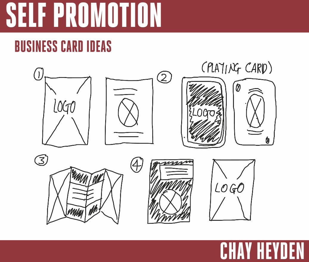
BUSINESS CARD IDEAS

SELF PROMOTION
CHAY HEYDEN
BUSINESS CARD - FINAL
This is my first final idea for a business card. I will use this business to promote myself as an Illustrator / Graphic Designer.
I’ve used black and white for the design as I think these two colours have the best contrast. I will be getting these printed on brown recycled card.
IDEA 1
IDEA 2This is my second business card idea. I’ve used the same typeface and illustrations on both.
I do like this business card but I feel the first idea capture my personality a bit more.
SELF PROMOTION
CHAY HEYDEN
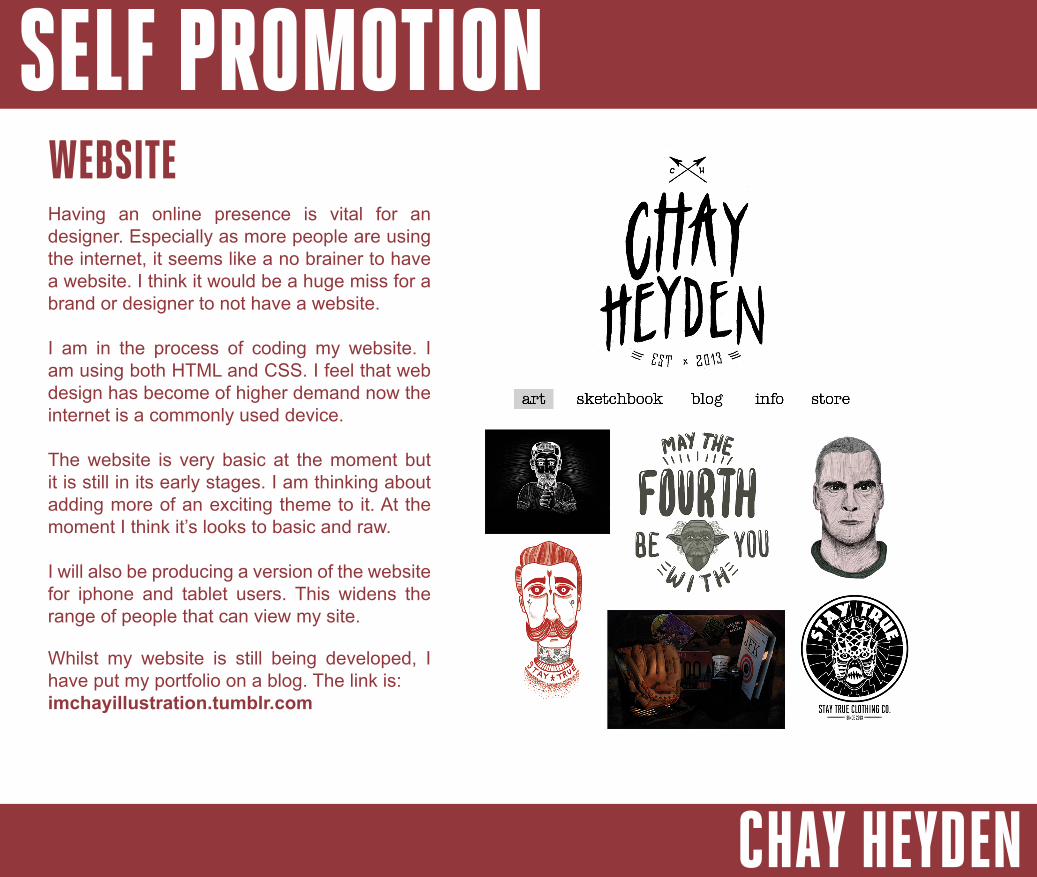
WEBSITEHaving an online presence is vital for an designer. Especially as more people are using the internet, it seems like a no brainer to have a website. I think it would be a huge miss for a brand or designer to not have a website.
I am in the process of coding my website. I am using both HTML and CSS. I feel that web design has become of higher demand now the internet is a commonly used device.
The website is very basic at the moment but it is still in its early stages. I am thinking about adding more of an exciting theme to it. At the moment I think it’s looks to basic and raw.
I will also be producing a version of the website for iphone and tablet users. This widens the range of people that can view my site.
Whilst my website is still being developed, I have put my portfolio on a blog. The link is:imchayillustration.tumblr.com

SELF PROMOTION
CHAY HEYDEN
CV & COVERING LETTER
Dear Sir/ Madam,
I am applying for the role of Creative Artworker at C310. I have enclosed my CV so you can look at it.
I am a very hardworking person with a passion for Graphic Design and Illustration. I work very well both independently and within a team and work well with people on all levels. During my HND I have had experience with different clients and have worked on a variety of briefs, this has shown me a bunch of valuable lessons.
Above all I am a well organised, creative individual with a real drive and desire to progress and learn.
Thank you for your consideration and time in reviewing my C.V.
Yours Sincerely,
Chay Heyden
18 MOSELLE DRIVECHURCHDOWN
GLOUCESTERSHIREGL3 2RY
SELF PROMOTION
CHAY HEYDEN
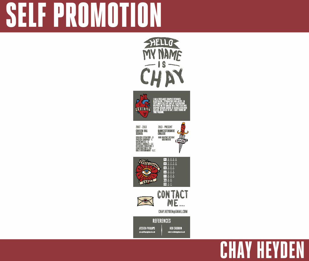
I AM A FREELANCE GRAPHIC DESIGNER, ILLUSTRATOR, TYPOGRAPHER AND ARTIST. IN SEPTEMBER 2013 MY LOVE OF ILLUSTRATION INSPIRED ME TO EMBARK ON A TWO YEAR HND GRAPHIC DESIGN COURSE AT GLOUCESTERSHIRE COLLEGE. NEEDLESS TO SAY, I HAVE FOUND MY TRUE PASSION.TRUE PASSION.
ENGLISH LITERATURE - BENGLISH LANGUAGE - CMATHEMATICS - CSCIENCE [DOUBLE] - C,CRELIGIOUS EDUCATION, CCONSTRUCTION & THEBUILT ENVIRONMENT - B, CBUILT ENVIRONMENT - B, C
2007 - 2013 2013 - PRESENTCHOSEN HILL SCHOOL
GLOUCESTERSHIRECOLLEGEHND GRAPHIC DESIGN/
MULTIMEDIA
REFERENCESJESSICA PHILLIPS ROB [email protected] [email protected]
SELF PROMOTION
CHAY HEYDEN
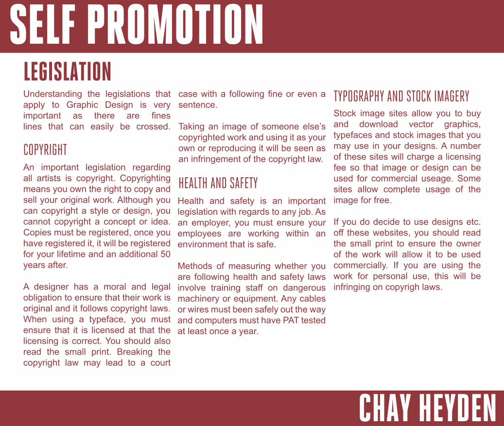
LEGISLATIONUnderstanding the legislations that apply to Graphic Design is very important as there are fines lines that can easily be crossed.
COPYRIGHTAn important legislation regarding all artists is copyright. Copyrighting means you own the right to copy and sell your original work. Although you can copyright a style or design, you cannot copyright a concept or idea. Copies must be registered, once you have registered it, it will be registered for your lifetime and an additional 50 years after.
A designer has a moral and legal obligation to ensure that their work is original and it follows copyright laws. When using a typeface, you must ensure that it is licensed at that the licensing is correct. You should also read the small print. Breaking the copyright law may lead to a court
case with a following fine or even a sentence.
Taking an image of someone else’s copyrighted work and using it as your own or reproducing it will be seen as an infringement of the copyright law.
Health and safety is an important legislation with regards to any job. As an employer, you must ensure your employees are working within an environment that is safe.
Methods of measuring whether you are following health and safety laws involve training staff on dangerous machinery or equipment. Any cables or wires must been safely out the way and computers must have PAT tested at least once a year.
HEALTH AND SAFETY
TYPOGRAPHY AND STOCK IMAGERYStock image sites allow you to buy and download vector graphics, typefaces and stock images that you may use in your designs. A number of these sites will charge a licensing fee so that image or design can be used for commercial useage. Some sites allow complete usage of the image for free.
If you do decide to use designs etc. off these websites, you should read the small print to ensure the owner of the work will allow it to be used commercially. If you are using the work for personal use, this will be infringing on copyrigh laws.
SELF PROMOTION
CHAY HEYDEN
FIRE SAFETY Employers must follow fire safety regulations. This will involve carrying out a risk assessment for when you are work based. In additional, you will also need to put in place fire precaution measures. These precautions could be fire alarms, clear fire safety routes and assembly points and fire extinguishers.
Employers must follow the employment legislation laws. The main regulations that you will need to look over and follow are as follows:
- The National Minimum Wage Act- The Working Time Regulations - The Employment Rights Act
EMPLOYMENT LEGISLATIONS
SELF PROMOTION
CHAY HEYDEN
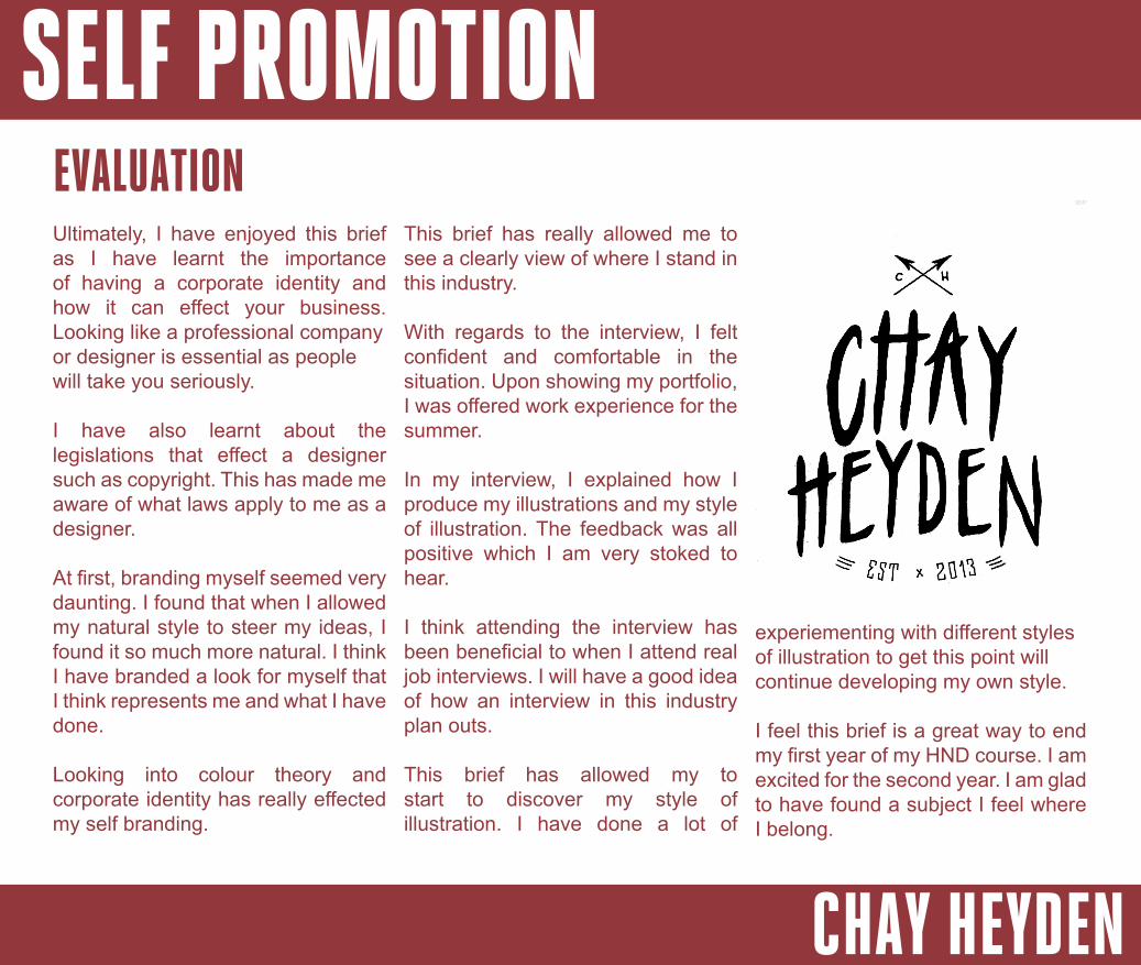
EVALUATIONUltimately, I have enjoyed this brief as I have learnt the importance of having a corporate identity and how it can effect your business. Looking like a professional company or designer is essential as people will take you seriously.
I have also learnt about the legislations that effect a designer such as copyright. This has made me aware of what laws apply to me as a designer.
At first, branding myself seemed very daunting. I found that when I allowed my natural style to steer my ideas, I found it so much more natural. I think I have branded a look for myself that I think represents me and what I have done.
Looking into colour theory and corporate identity has really effected my self branding.
This brief has really allowed me to see a clearly view of where I stand in this industry.
With regards to the interview, I felt confident and comfortable in the situation. Upon showing my portfolio, I was offered work experience for the summer.
In my interview, I explained how I produce my illustrations and my style of illustration. The feedback was all positive which I am very stoked to hear.
I think attending the interview has been beneficial to when I attend real job interviews. I will have a good idea of how an interview in this industry plan outs.
This brief has allowed my to start to discover my style of illustration. I have done a lot of
experiementing with different styles of illustration to get this point will continue developing my own style.
I feel this brief is a great way to end my first year of my HND course. I am excited for the second year. I am glad to have found a subject I feel where I belong.