of the videos that are Required!!! - SPRING 2018 · Saul Bass, logo for The Man with the Golden...
16
4/2/16 1 ARTH 4573 HISTORY OF GRAPHIC DESIGN Section 10a – new york school (inc. paul rand) }Watch ALL of the videos that are Required!!! } Review } European and American Modernism } International Typographic (Swiss) Style } American Modernism cont. } Paul Rand } New York School Modernism “Postmodernism” American (& European) Modernism } Review } European and American Modernism } International Typographic (Swiss) Style } American Modernism cont. } Paul Rand } New York School
Transcript of of the videos that are Required!!! - SPRING 2018 · Saul Bass, logo for The Man with the Golden...

4/2/16
1
ARTH 4573 HISTORY OF GRAPHIC DESIGN
Section 10a – new york school (inc. paul rand)
} Watch ALL of the videos that are Required!!!
} Review } European and American Modernism } International Typographic (Swiss) Style
} American Modernism cont. } Paul Rand } New York School
Modernism
“Postmodernism”
American (& European) Modernism
} Review } European and American Modernism } International Typographic (Swiss) Style
} American Modernism cont. } Paul Rand } New York School

4/2/16
2
} Review } European and American Modernism } International Typographic (Swiss) Style
} American Modernism cont. } Paul Rand } New York School
Pioneers of the New York School } Paul Rand } Alvin Lustig } Bradbury Thompson } Saul Bass } Otto Storch } Herb Lubalin
} George Lois
PAUL RAND (1914-1996)
http://www.paul-rand.com/; Steven Heller, Paul Rand (London, England: Phaidon Press Limited, 1999. All artwork by Paul Rand unless otherwise cited.
“Every art director and graphic designer in the world should kiss his ass.”
- George Lois, describing Paul Rand while he was alive and again at his funeral
Filmed in 1996
WHY?
} Filtered European Modernism into the American MEDIA landscape } Not a direct copy } NOT Socialist, but Capitalist.
} European Modernism
} Developed early 1900s
} Often theoretical and highly structured
} More socialist
} Paris
} American Modernism
} Developed1930s-40s
} Pragmatic, intuitive, less formal approach to organizing space
} Democratic, capitalist
} New York City

4/2/16
3
WHY?
} Filtered European Modernism into the American MEDIA landscape } Not a direct copy } NOT Socialist, but Capitalist. } Be aware of timeline
WHY?
} Direct influence on the Creative Revolution in advertising } The Big Idea } Soft Sell } BRANDING } Art Director/Copywriter team
(influenced Bill Bernbach)
WHY?
} Advertising } Magazine Layout } Trademarks } Branding Standards } Collateral } Posters } Book Covers } Childrens’ Books
} “Paul Rand lived from 1914 to 1996, and had a career that ran the gamut of design. He was in advertising, book jacket design, magazine layout, art direction, and logo design. In fact, he practically pioneered the idea of branding. The godfather of logotypes, the lord of the brand, grand master of modernism... it's hard to imagine the world would be the same place if Paul Rand had never come along.”
http://everything2.com/title/Paul+Rand
WHY?
} Vocal in his opposition to Postmodern design
4/2/16
4
Paul Rand, Book Cover, Prejudices: A Selection by H.L. Mencken. 1958
WHY? } “Looking to European Moderns for inspiration, he
developed a fresh and individual approach to visual communications…[wedding] functional simplicity to abstract complexity…
} [His designs] did not cater to the common denominator. Devoid of ornament, they were conceptually sharp and visually smart…
} Every detail was strategically placed to attract the eye and convey a message. Yet nothing was formulaic…
} Rand’s work was so…radically counter to the accepted norms yet progressive in ways that acutely tested the limits of print design.”
} Heller
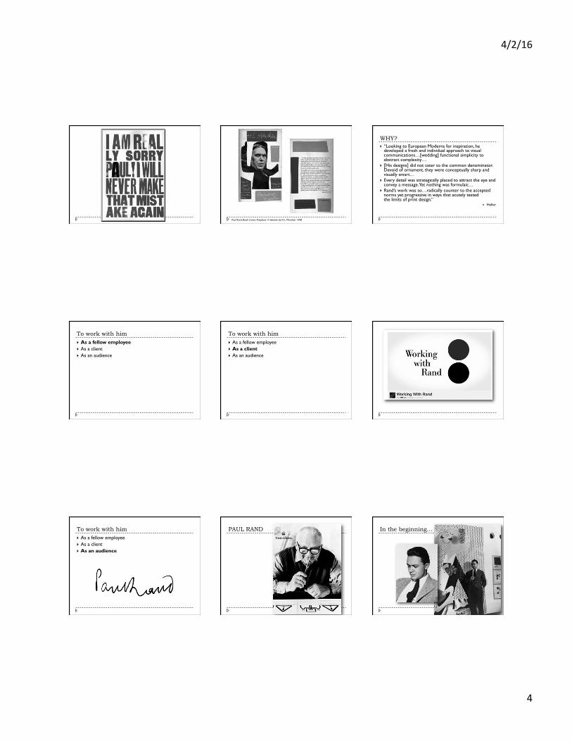
To work with him } As a fellow employee } As a client } As an audience
To work with him } As a fellow employee } As a client } As an audience
To work with him } As a fellow employee } As a client } As an audience
PAUL RAND In the beginning…

4/2/16
5
In the beginning… } Born on August 15, 1914 in Brooklyn
} Peretz Rosenbaum } Orthodox Jewish upbringing
In the beginning… } Post-Depression New York
} Peretz Rosenbaum } Orthodox Jewish upbringing
} Pratt Institute, Parsons School of Design, and the Art Students League, BUT…
} Design education in America at this time: } Modernist ideologies and aesthetics were not considered
academically viable. Yet. } Graphic design as a fine art was still too radical to be
accepted and taught
In the beginning… } Chance encounter with publications
from the other side of the ocean… } Gebrauchsgrafik (Germany) } Commercial Art (Britain)
Heinz Schwabe, cover artwork for German design magazine Gebrauchsgraphik, 1953
Experience } New York’s Publishing Houses
Rand’s covers for Direction magazine; March 1939 (left), December 1940 (right)
Rand’s covers for Direction magazine; March 1939 (left), December 1940 (right)
Experience } New York’s Publishing Houses
} Pro-bono, but Rand had a motive: “In a country that was used to decorative work, the common sense way to have what I was doing accepted was to do it for free.”
Rand’s cover for Direction magazine
Rand’s cover for Direction magazine, December 1940 (right)
Experience } New York’s Publishing Houses } Advertising } Modernist CLEAN style
} Liberal white space } Clean sans serif (and his own handwritten)
4/2/16
6
Paul Rand, advertisements NOTE: ITS and Rand’s work had the same influences
Advertising and Paul Rand } Style } Modern CLEAN style
} Liberal white space } Clean sans serif (and his own handwritten!)
} SOFT sell } Talk to the audience, relate to them } Usually via subtle visual wit
} ART DIRECTOR } Commercial artist
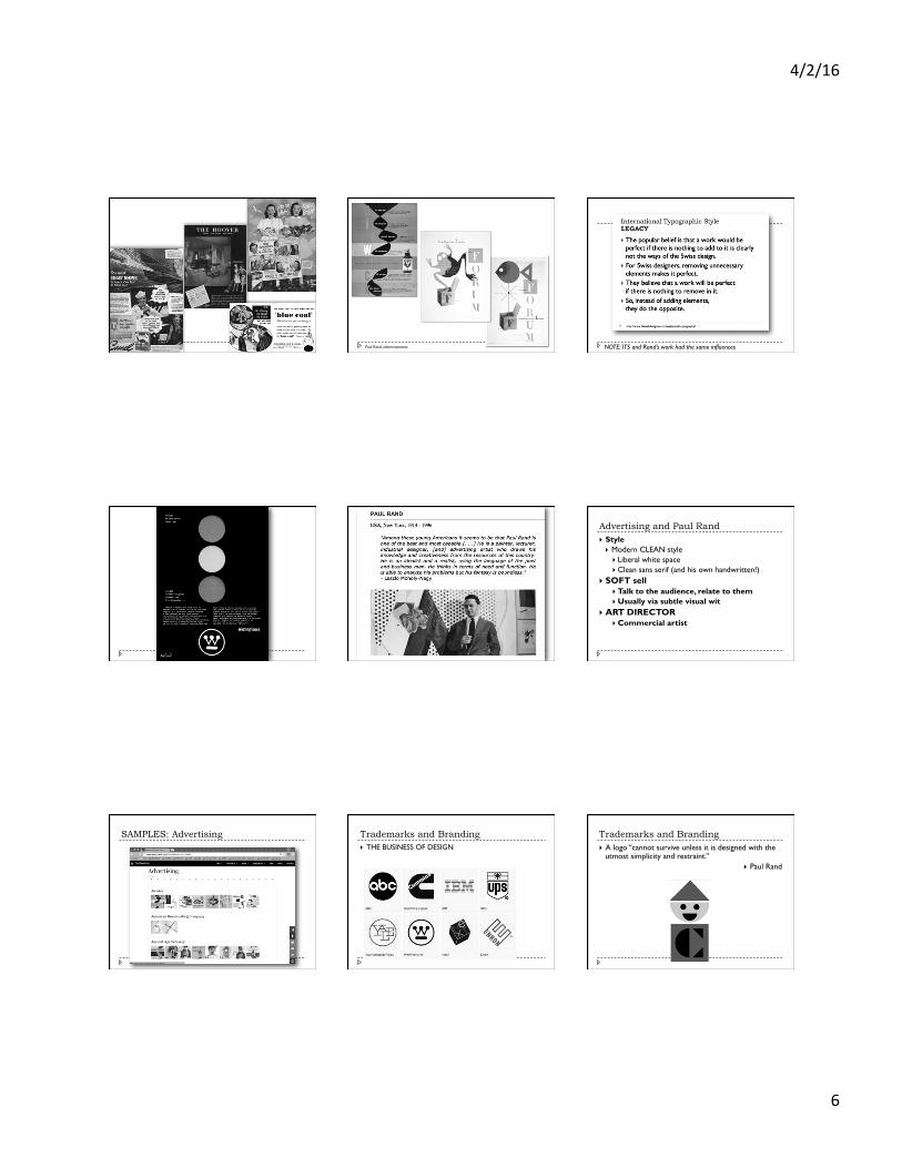
SAMPLES: Advertising Trademarks and Branding } THE BUSINESS OF DESIGN
Trademarks and Branding } A logo “cannot survive unless it is designed with the
utmost simplicity and restraint.” } Paul Rand

4/2/16
7
SAMPLES: “Identity” (Trademarks and Branding) SAMPLES: Brands SAMPLES: Collateral

4/2/16
8
Book Design } Book covers } Entire children’s books
SAMPLES: Book Design SAMPLES: Posters
Articles (and books) by and about Rand

4/2/16
9
WHY? } “Though I had a bad taste for his work’s traditional
feel, I now accept [Rand’s] influential genius. Rand’s work taught my graphic design instructors. His work taught my field of advertising. Rand defines my design background…If I could speak with the man now, I would simply listen.”
} Nikki Arnell
Pioneers of the New York School } Paul Rand } Alvin Lustig } Bradbury Thompson } Saul Bass } Otto Storch } Herb Lubalin
} George Lois
Alvin Lustig
Alvin Lustig, cover for Arthur Rimbaud’s A Season in Hell, 1945 Alvin Lustig, Look Magazine Cover, 1944

4/2/16
10
Alvin Lustig, Look Magazine Cover, 1944 Alvin Lustig, album cover for Vivaldi’s Gloria, 1951 Alvin Lustig, cover for Fortune Magazine, 1952
Alvin Lustig, cover for Perspectives No. 1, 1952 Alvin Lustig, cover for Tennessee William’s 27 Wagons Full of Cotton, 1949
Pioneers of the New York School } Paul Rand } Alvin Lustig } Bradbury Thompson } Saul Bass } Otto Storch } Herb Lubalin
} George Lois
Bradbury Thompson
Bradbury Thompson, pages from Westvaco Inspirations, 210, 1958 Bradbury Thompson, pages from Westvaco Inspirations, 210, 1958

4/2/16
11
Bradbury Thompson, spread from Westvaco Inspirations
Pioneers of the New York School } Paul Rand } Alvin Lustig } Bradbury Thompson } Saul Bass } Otto Storch } Herb Lubalin
} George Lois
Saul Bass
Saul Bass, logo for The Man with the Golden Arm, 1955 Saul Bass, film titles for The Man with the Golden Arm, 1955
Saul Bass, poster for Saint Joan (dir. Otto Preminger), 1957 Saul Bass, poster for Bonjour Tristesse (dir. Otto Preminger), 1958

4/2/16
12
Saul Bass, poster for Vertigo (dir. Alfred Hitchcock), 1958 Saul Bass, posters for Anatomy of a Murder (dir. Otto Preminger), 1959 Saul Bass, poster for Exodus (dir. Otto Preminger) , 1960
Saul Bass, poster for Schindler’s List (dir. Steven Spielberg) , 1993 Saul Bass, logos
Saul Bass
Saul Bass Pioneers of the New York School } Paul Rand } Alvin Lustig } Bradbury Thompson } Saul Bass } Otto Storch } Herb Lubalin
} George Lois
Otto Storch (art director) and Allen Arbus (photographer), pages from McCall’s, 1959

4/2/16
13
Otto Storch (art director) and Dan Wynn (photographer), pages from McCall’s, 1961
Pioneers of the New York School } Paul Rand } Alvin Lustig } Bradbury Thompson } Saul Bass } Otto Storch } Herb Lubalin
} George Lois
Herb Lubalin } “Typography is the key. It is where you
start with Lubalin and what you eventually come back to. However, “typography” is not a word Lubalin thought should be applied to his work. ‘What I do is not really typography, which I think of as an essentially mechanical means of putting characters down on a page. It's designing with letters. Aaron Burns called it, 'typographics,' and since you've got to put a name on things to make them memorable, 'typographics' is as good a name for what I do as any.’” – AIGA, 1981
From “Lubalin Now” exhibition, Cooper Union, New York, 2009 Herb Lubalin, ad for Avant Garde’s anti-war poster competition, 1967, and the typeface Avant Garde
Herb Lubalin, ad for Avant Garde’s anti-war poster competition, 1967, and the typeface Avant Garde Herb Lubalin, proposed magazine logos, late 1960s Herb Lubalin, PBS logo, used 1971-1984

4/2/16
14
Herb Lubalin, book cover art reprint, 1976
} “The father of conceptual typography, Lubalin helped build a bridge between the modern and late-modern schools. Letters were not merely vessels of form, they were objects of meaning. He made words emote. He came of age, fortuitously, in an epoch of technological change. Poised at the edge of typographic uncertainty, he was a pioneer of phototypography, one of its first users -- or abusers, say some critics. But rules, he realized, were meant to be turned upside down. He liberated white space from the orthodox moderns, refusing to follow the edict that ‘less is more’.” – Imprint
American Modernism } Meggs (about Lubalin’s designs)
} “This typographic play engages the reader and requires participation.”
} Lubalin } “Sometimes you have to compromise legibility
to achieve impact.”
American Modernism > Postmodernism } Meggs (about Lubalin’s designs)
} “This typographic play engages the reader and requires participation.”
} Lubalin } “Sometimes you have to compromise legibility
to achieve impact.”
} Carson (1980s-90s Deconstruction) } “Don’t mistake legibility with communication.”
Herb Lubalin, pages from Eros, 1962
Pioneers of the New York School } Paul Rand } Alvin Lustig } Bradbury Thompson } Saul Bass } Otto Storch } Herb Lubalin
} George Lois } Late 1960s
} Influence of TV on magazine ad revenue } TV took over book/magazine traditional entertainment role
The New Advertising Pioneers of the New York School } Paul Rand } Alvin Lustig } Bradbury Thompson } Saul Bass } Otto Storch } Herb Lubalin
} George Lois

4/2/16
15
George Lois
George Lois (designer) and Carl Fischer (photographer), Esquire cover, April 1968
George Lois (designer) and Carl Fischer (photographer), Esquire cover, May 1969 George Lois (designer) and Carl Fischer (photographer), Esquire cover, May 1968 George Lois (designer), Esquire cover, September 1965
George Lois (designer), Esquire cover, December 1963 George Lois (designer), Esquire cover, March 1965

4/2/16
16


![Storyboarding [including Saul Bass Psycho]](https://static.fdocuments.net/doc/165x107/55911b601a28ab74758b4777/storyboarding-including-saul-bass-psycho.jpg)