My ancillary
5
Ancillary Analysis’ Kirsty Mitchell
-
Upload
kirstymitchelll -
Category
Education
-
view
61 -
download
0
Transcript of My ancillary
Ancillary Analysis’Kirsty Mitchell
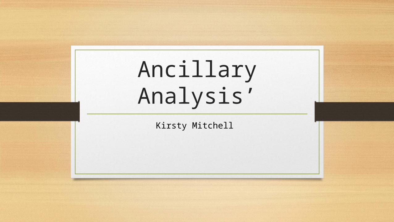
Radio times Double Page Spread
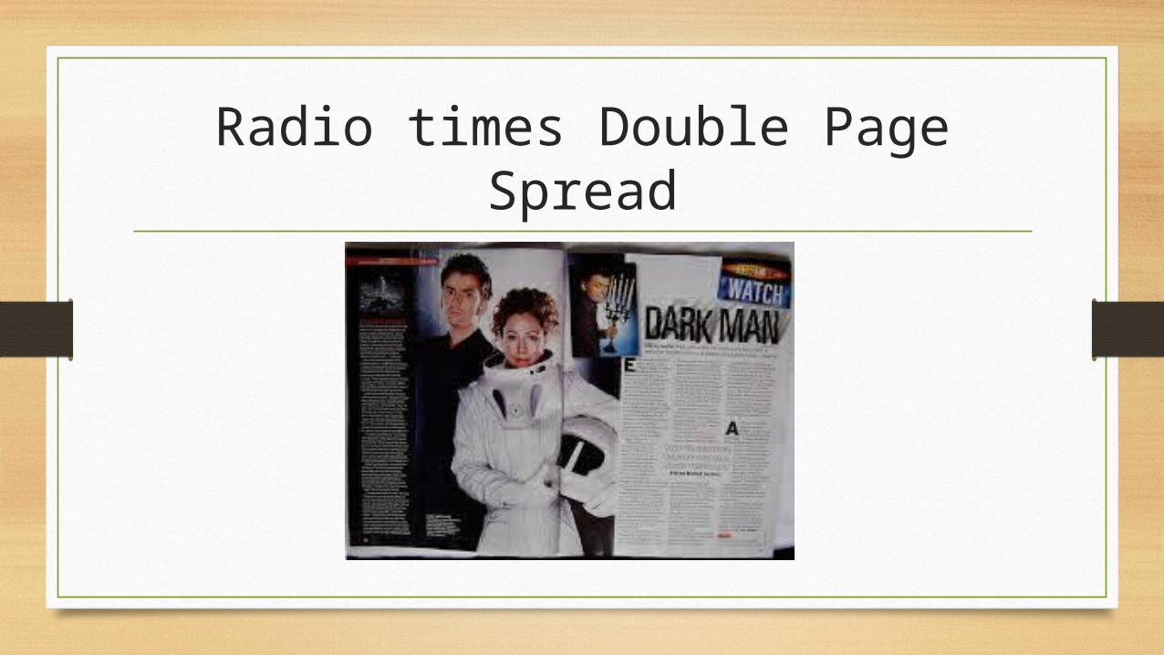
ImageAs you can see the main image covers the majority of the page. The image grabs the audience’s attention and gives of a clue to the content of the show. For example the women is dressed in an astronaut suit so given of an impression that she is going to the moon. This gets the audience asking questions. Having these characters in the main image suggest they are the main actors and this attracts the audience especially if they are a well liked actor. It also hints at the genre of the programme.
The smaller images are to show the audience clips of what are in the programme. Having more than one image will also interest the audience instead of just having loads of text.

Font and ColoursThe font used in the main title links in with the image and the genre. The font suggests a sci-fi with elements of horror. Also the font looks like rocks which relates to the surface of the moon and in the main image the women is dressed as though she is going to the moo, these both link with each other.
As you can see there is not a great amount of colours used on this double page spread. Only dark and light colours and white have been used. This could suggest good and bad character as one is dress in black and the other is dressed in white, this is called binary opposites. It could also represent the dark side of the moon.

Layout
This is a caption. These are used to explain the image.
Drop-caps are used to break up the paragraphs.
Pull quotes are used to give a clue about the content of the story. This impacts the audience because it makes them curious and will pull the audience in.
A side bar is usually used to show a similar related story to what is on the double page spread.