Microsoft Excel Part 2 Kin 260 Adapted from Daniel Frankl, Ph.D. Revised by Jackie Kiwata 10/07.
31
Microsoft Excel Part 2 Microsoft Excel Part 2 Kin 260 Kin 260 Adapted from Daniel Frankl, Ph.D. Adapted from Daniel Frankl, Ph.D. Revised by Jackie Kiwata 10/07 Revised by Jackie Kiwata 10/07
Transcript of Microsoft Excel Part 2 Kin 260 Adapted from Daniel Frankl, Ph.D. Revised by Jackie Kiwata 10/07.

Microsoft Excel Part 2Microsoft Excel Part 2
Kin 260Kin 260
Adapted from Daniel Frankl, Ph.D.Adapted from Daniel Frankl, Ph.D.
Revised by Jackie Kiwata 10/07Revised by Jackie Kiwata 10/07

• Reviewo Argumentso Functions
• Graphso Pie Chartso Scatter Plots
OverviewOverview

Review - Numeric DataReview - Numeric Data

Review - Excel FunctionsReview - Excel Functions
The many hundreds The many hundreds of Excel functions of Excel functions may be activated by may be activated by typing the sign “=“ typing the sign “=“ in the “in the “FxFx” window ” window followed by the followed by the function NAME and function NAME and one or more one or more ARGUMENTS.ARGUMENTS. The function named “SUM” instructs ExcelThe function named “SUM” instructs Excel
to perform the “Argument” of addingto perform the “Argument” of adding all values in cells B2 through B12.all values in cells B2 through B12.

Review - Nameless Function per CellReview - Nameless Function per Cell
=B3/C3^2=B3/C3^2The above argument instructs Excel to divide The above argument instructs Excel to divide
the value in cell B3 by the value in cell C3 the value in cell B3 by the value in cell C3 squared. The result is displayed in cell D3squared. The result is displayed in cell D3

Nameless Functions, con’t.Nameless Functions, con’t.
=B3/C3^2=B3/C3^2Is the formula for D3Is the formula for D3
BMI = Weight/(Height*Height)BMI = Weight/(Height*Height)Is the general formula for Column DIs the general formula for Column D

Function Dialog BoxFunction Dialog Box
• Once a function is selected, Excel displays the Function Dialog Box thus prompting the user to either enter or select the appropriate argument.

• As with functions, there are many different types of graphs and charts to choose from in Excel
• We will focus on the graphs you may most commonly use as a Kin major
– Pie Charts
– Scatter Plots
Graphs Graphs

Pie Charts• Summarizes a set of categorical data or percentage
distribution• Usually represented as a circle divided into segments
Primary Sports Played by Kin Majors
Track & Field34%
Soccer10%
Baseball12%
Water polo4%
Martial Arts5%
Basketball19%
Other2%
Dance2%
Volleyball12%
Track & Field
Basketball
Soccer
Baseball
Volleyball
Water polo
Martial Arts
Dance
Other

Step 1 – Select Data
• Select data on worksheet
• Click on Chart Wizard

Step 2 – Choose Type

Step 3 – Data Range• Includes header titles, row labels and data• Range is given in terms of cell numbers

Step 4 – Series Name = Series name. Necessary if graphing multiple data series
Values = Data values (%) [B3:B11]
Category labels = Row Titles [A3:A11]

Step 5 – Display• Changes the display of labels on graph

Step 6 – Location• Choose where to place chart
– New worksheet– Inside current worksheet

Scatter Plots• A scatter plot is a visual description of a
correlation.– Each subject’s scores are plotted on both
the x and y axis.
* *
**
*
*
*
*Best Fit Line
Body Mass
Triple Jump
Adapted from Dr. Lee, Kin 503 Ch. 7Adapted from Dr. Lee, Kin 503 Ch. 7

Review - Correlation
• Correlation indicates the extent to which two variables are related.– The technique used to measure this is Pearson’s
correlation coefficient, r
• The coefficient (or number) that represents the correlation will always be between +1.00 and -1.00– Positive correlation (education and income)– Negative correlation (long jump and running)– The closer r is to 1, the stronger the relationship
Adapted from Dr. Lee, Kin 503 Ch. 7Adapted from Dr. Lee, Kin 503 Ch. 7

Evaluating the Correlation Coefficient
• Absolute r values can tell us the strength of the relationship between two variables
• Used for predictive purposes
.9 or greater strong
.8 - .9 moderately strong
.7 - .8 moderate
.5 - .7 low< .5 no relationship
Adapted from Dr. Lee, Kin 503 Ch. 7Adapted from Dr. Lee, Kin 503 Ch. 7

When to use correlation?
The research question is often phrased:• Is X a predictor for Y?• Does X predict Y?• Can Y be predicted from X?where X is the independent variable, and Y is
the dependent variable
Examples• Is body mass a predictor for sprint time?• Can power be predicted from sprint time?

Creating Scatter Plots• Similar to
creating pie charts
• Biggest difference: have X and Y data
Body Mass vs. Measured VO2max
r = 0.78n=28
1.0
1.5
2.0
2.5
3.0
3.5
4.0
4.5
5.0
5.5
6.0
40.0 50.0 60.0 70.0 80.0 90.0
Body mass (kg)
Mea
sure
d V
O2m
ax (
L/m
in)
Males & Females
Linear (Males & Females)

Step 1 – Select Data
• Select data on worksheet
• Click on Chart Wizard

Step 2 – Choose Type

Step 3 – Data Range• Includes header titles, row labels and data• Range is given in terms of cell numbers

Step 4 – SeriesX Values: Independent
variable, e.g. Height
Y Values: Dependent variable, e.g. Vertical Jump
Name: Series name. Necessary if graphing multiple series on one graph.

Step 5 – Display Options

• Titles: Changes title of graph and X, Y labels
• Axes: Turn X, Y axes on and off• Gridlines: Turn X, Y major and minor
gridlines on and off• Legend: Show or change placement of
legend box• Data labels: Show labels next to data
points
Display Options con’t.

• Select area on graph you wish to edit, and right click
• Can edit anything encountered in the Chart Wizard, plus:– Chart Area: edit border and fill– Plot Area: edit border and fill– Axes: edit scale, tick marks and
font
Editing an Existing Graph

• Change the scale of the graph to zoom in or out
• Can also – Change font– Display/remove tick marks– Change type of number (i.e.
scientific to accounting)
Formatting Axes
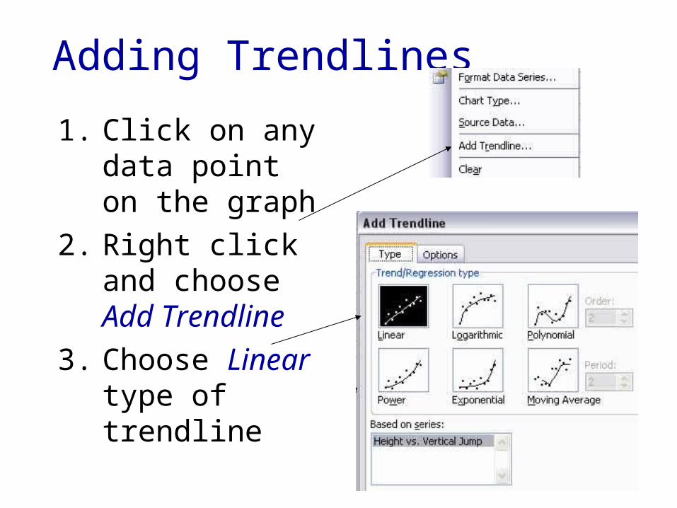
1. Click on any data point on the graph
2. Right click and choose Add Trendline
3. Choose Linear type of trendline
Adding Trendlines

4. Check the Display R-squared value on chart box
Adding Trendlines, con’t.

• But r2 is not Pearson’s correlation coefficient– Need to take square root √r2
– Change the text box to display r value
• Also, we commonly list the n value (total number of subjects) on graph
• The title should be stated: X data vs. Y data
Finishing Touches
Height vs. Vertical Jump Height
r = 0.64n = 12
0
5
10
15
20
25
58 60 62 64 66 68 70 72
Height (in)
Ve
rtic
al J
um
p H
eig
ht
(in
)