lectii indesign.docx
20
Margins And Bleeds If you are preparing a document for print, keep your margins and bleeds in mind from the beginning. Your printer will give you the measurements for the bleed, but generally 1/8 inch or 3 mm should suffice. Approximately the same area within the document should be kept free of text and important graphic elements (such as the logo). Set up your document for bleed in InDesign as you create it by selecting the correct settings in the document set- up box. Master Pages When you have a multiple-page document, such as a brochure or catalog, using master pages will save you
Transcript of lectii indesign.docx

Margins And BleedsIf you are preparing a document for print, keep your margins and
bleeds in mind from the beginning. Your printer will give you the
measurements for the bleed, but generally 1/8 inch or 3 mm should
suffice. Approximately the same area within the document should
be kept free of text and important graphic elements (such as the
logo). Set up your document for bleed in InDesign as you create it
by selecting the correct settings in the document set-up box.
Master PagesWhen you have a multiple-page document, such as a brochure or
catalog, using master pages will save you time. Master pages are
used to automatically insert layout elements on various pages. All
elements of the master page are placed onto any page you choose,

and these are by default not selectable, which allows you to further
develop the page without worrying about
accidentally modifying the pre-defined elements (such as page
numbers, grids and guides, and graphic elements).
To set them up, bring up the Pages palette and double-click on “A-
Master.”
Add all of the elements that are repeated throughout most of your
document: guides, page numbers, a running text box, image frames,
graphic elements, etc. You can have more than one set of master
pages in a document, which is particularly useful for brochures,
whose content often varies (for example, with a mostly textual
introduction followed by image-heavy pages).
To apply your master page to new pages, simply drag it from the
Master Pages pane onto the Pages pane in the palette. If you’ve
already started working on layout elements but forgot to make a
master page, you can turn any page into a master page. Just drag it
from the Pages pane to the Master Pages pane.
And yes, you can modify master page elements on a particular page
if you need to. Triple-click on the element — that is, click on it while

holding down Shift +Command (on a Mac) or Shift + Control (Windows).
Now you can select and edit it on the page you are working on while
leaving it unchanged on all other pages.
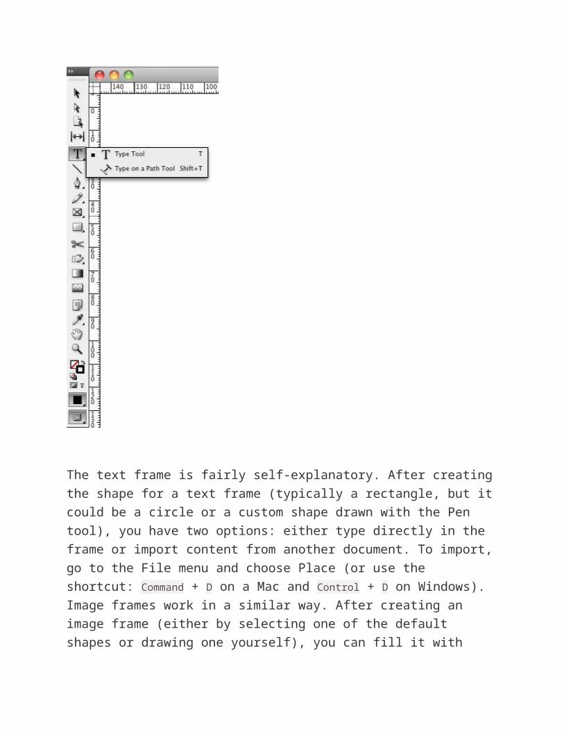
FramesInDesign places your content in frames. This goes for both text and
images as well as databases and interactive content.
There are two types of frames: text and image.
The text frame is fairly self-explanatory. After creating the shape for
a text frame (typically a rectangle, but it could be a circle or a
custom shape drawn with the Pen tool), you have two options: either
type directly in the frame or import content from another document.
To import, go to the File menu and choose Place (or use the
shortcut: Command + D on a Mac and Control + D on Windows).
Image frames work in a similar way. After creating an image frame
(either by selecting one of the default shapes or drawing one
yourself), you can fill it with color or place an image from your
computer inside it. Again, this is done by going to File → Place (or
using the shortcut).
Another way to import images and text is to simply drag them onto
the document (from Mac’s Finder or Windows Explorer). This will
automatically create an image or text frame, import the content and
create a link to that file. If you drag content on top of an existing
frame, it will replace the existing content but leave the size and
cropping intact.
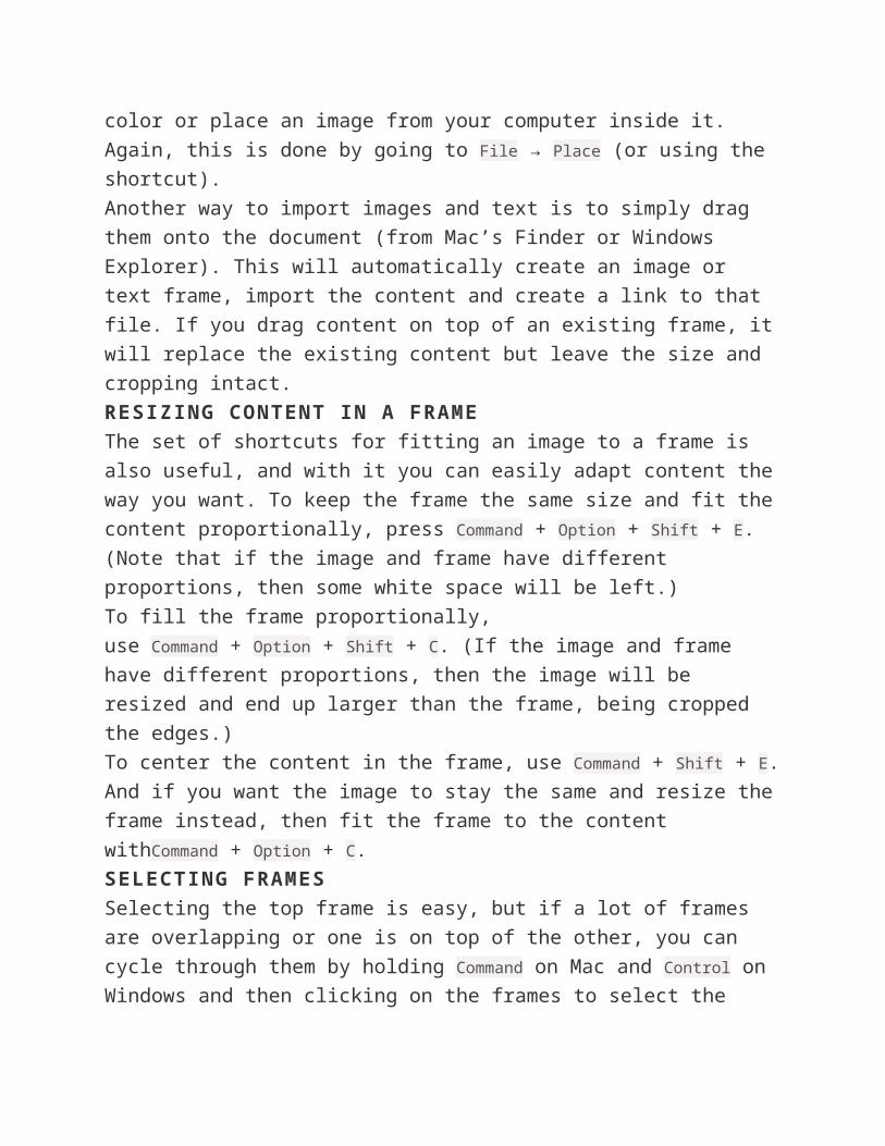
RESIZING CONTENT IN A FRAME
The set of shortcuts for fitting an image to a frame is also useful,
and with it you can easily adapt content the way you want. To keep
the frame the same size and fit the content proportionally,
press Command + Option + Shift + E. (Note that if the image and frame
have different proportions, then some white space will be left.)
To fill the frame proportionally, use Command + Option + Shift + C. (If
the image and frame have different proportions, then the image will
be resized and end up larger than the frame, being cropped the
edges.)
To center the content in the frame, use Command + Shift + E. And if
you want the image to stay the same and resize the frame instead,
then fit the frame to the content withCommand + Option + C.
SELECTING FRAMES
Selecting the top frame is easy, but if a lot of frames are
overlapping or one is on top of the other, you can cycle through
them by holding Command on Mac and Control on Windows and then
clicking on the frames to select the lower one. Keep clicking to cycle
through them if you have several frames.
Image FormatsInDesign can import many image formats (including JPEG, PNG, EPS,
PICT, PDF, PSD and TIFF). If you are preparing a file for print, make
sure the images are in an acceptable format. If you’re using a file
format that allows for low-resolution settings, such as JPEG, check
that the images have a resolution of 300 pixels per inch (PPI) and
are saved in CMYK color mode.
Place images at no higher than 100% of their size. That is, if your
original image is 3 × 5 inches, don’t blow it up to 12 × 20, because
the results would be obviously pixelated.
To be on the safe side, avoid JPEG altogether, and stick with formats
that are intended for print, such as EPS and TIFF.
IMPORTING PSD FILES
The PSD image format deserves special mention. Being able to
import PSD files into InDesign is extremely useful when working with
elaborate graphics that have transparent or semi-transparent
elements, especially if they are to be placed over colored
backgrounds or textures. Another useful feature is the ability to turn
the layers in a PSD file on and off directly in InDesign (i.e. without
having to open Photoshop).
PSDs take up significant memory, which can sometime cause
problems when exporting as PDF. I would recommend avoiding PSD
files for simple images that could just as easily be flattened when
saved as TIFF or EPS. But in cases where using a PSD file really
solves a problem, make sure it is 300 PPI and in CMYK color mode,
and keep it at its actual size. And when exporting to PDF, double-
check that the transparency flattening is set to high.

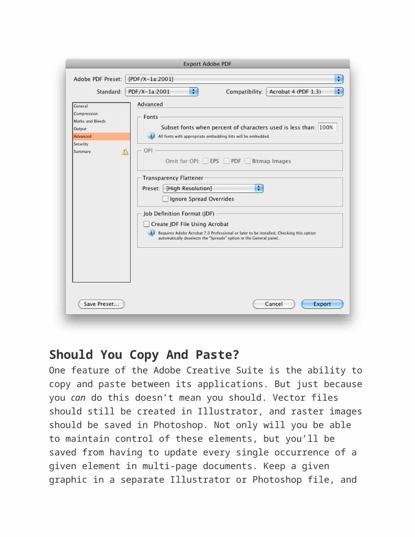
TRANSPARENCY FLATTENING PRESETS
You can create custom transparency settings by going
to Edit → Transparency Flattener Presets:
In most cases, the “High Resolution” setting will suffice. You can make sure this preset is used when exporting to PDF by going to File → Export, selecting PDF and then clicking on the “Advanced” tab. You can now set the “Transparency Flattener” option to “High Resolution” by default.

Should You Copy And Paste?One feature of the Adobe Creative Suite is the ability to copy and
paste between its applications. But just because you can do this
doesn’t mean you should. Vector files should still be created in
Illustrator, and raster images should be saved in Photoshop. Not
only will you be able to maintain control of these elements, but
you’ll be saved from having to update every single occurrence of a
given element in multi-page documents. Keep a given graphic in a
separate Illustrator or Photoshop file, and you’ll be able to update all
occurrences of it with one click.
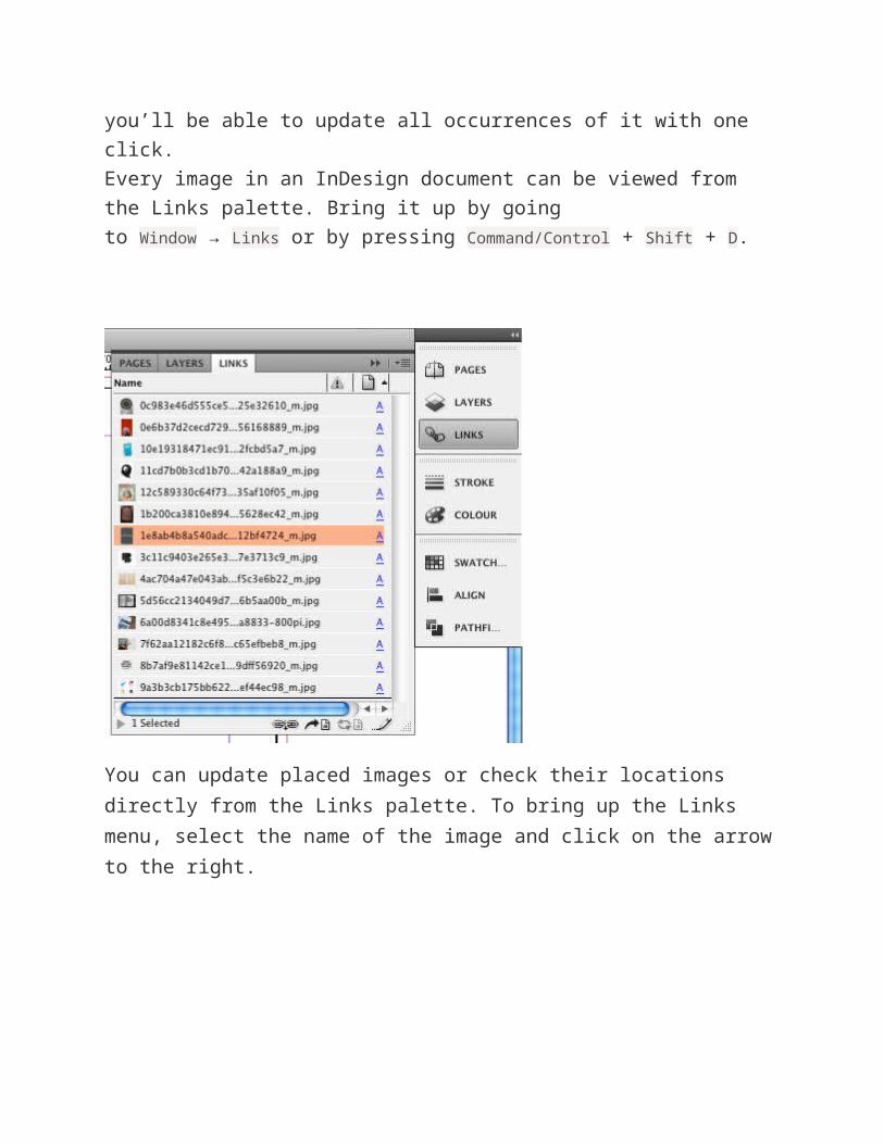
Every image in an InDesign document can be viewed from the Links
palette. Bring it up by going to Window → Links or by
pressing Command/Control + Shift + D.
You can update placed images or check their locations directly from the Links palette. To bring up the Links menu, select the name of the image and click on the arrow to the right.
Working With ColorInDesign is set up exactly like Illustrator in terms of using colors. You
have the option of working with color sliders directly, and in either
RGB or CMYK mode (remember to use CMYK if creating a document
for print!). Press F5 to bring up the Color palette, and adjust the
CMYK values in the sliders to change the color of the fill or stroke.

You could also select a color from the Swatches palette or add a new swatch. Bring up the Swatches palette by pressing F6. Saving a color as a swatch makes sense if you use it frequently. Alternatively, you could import swatches that you’ve already created in Illustrator or Photoshop.
You can also select spot colors from existing libraries, such as
Pantone’s. But keep this in mind: if the document will be printed in
CMYK only, without using Pantone colors, then you’re better off
converting the colors to CMYK so that you get an accurate preview
of the result.

Use The Right BlackThere seems to be some confusion about the use of rich black,
which is made up of all CMYK colors (for example, 40, 40, 30, 100).
Rich black is excellent for large areas of black, such as logos and
black backgrounds. It prevents fading (to a dull gray), which is
especially useful for outdoor posters and flyers.
However, body text should always be in process black (i.e. 100% K)
to avoid trapping problems. For the same reason, registration black
(which is composed of 100% CMYK) should never be used for body
text or thin lines.
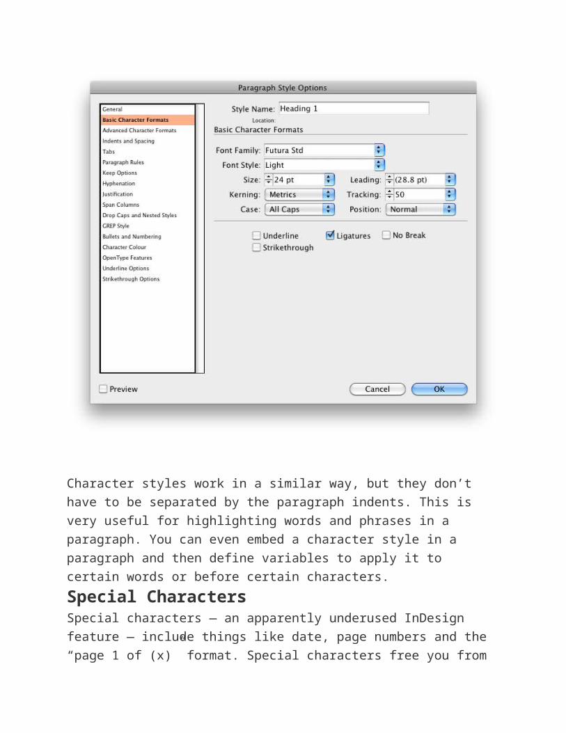
Paragraph and Character StylesThe ability to create custom paragraph and character styles is an
excellent time-saving feature. This pane is visible in the work area
by default, and if you’ve hidden it for some reason, you can bring it
up by pressing Command/Control + F11. You can create styles exactly to
your liking using many options; and then you can apply them to a
portion of text with just one click.

Character styles work in a similar way, but they don’t have to be
separated by the paragraph indents. This is very useful for
highlighting words and phrases in a paragraph. You can even embed
a character style in a paragraph and then define variables to apply it
to certain words or before certain characters.
Special CharactersSpecial characters — an apparently underused InDesign feature —
include things like date, page numbers and the “page 1 of (x)”
format. Special characters free you from having to insert this data
by hand (or having to modify it by hand whenever significant
changes are in order).
In small documents, minor changes are not a major undertaking, but
imagine working on a 164-page catalog or a 200-page book.
Manually changing all of the page numbers would be a big hassle
(trust me: I know from personal experience). To insert special
characters, go to the Edit menu.
Alternatively, simply right-click on active text to bring up the menu.
Explore the options; you can insert a variety of symbols, dashes,
spaces and indents through this menu, including the very useful
“Indent to here.”

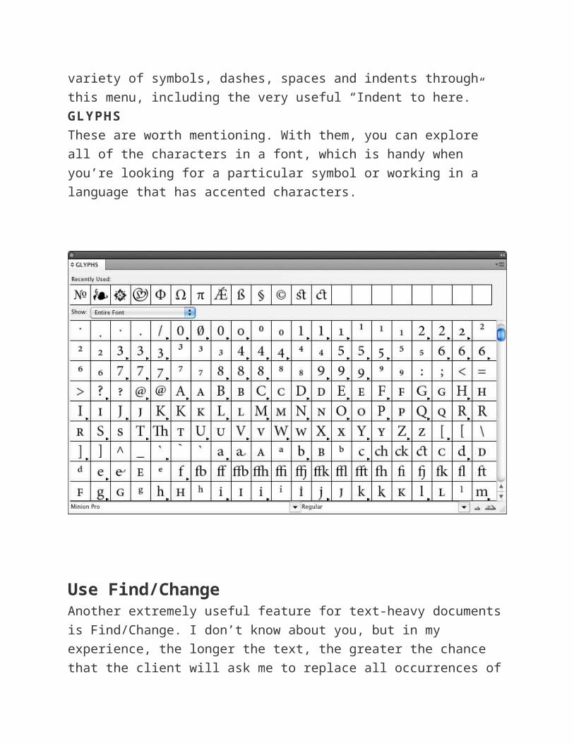
GLYPHS
These are worth mentioning. With them, you can explore all of the
characters in a font, which is handy when you’re looking for a
particular symbol or working in a language that has accented
characters.
Use Find/ChangeAnother extremely useful feature for text-heavy documents is
Find/Change. I don’t know about you, but in my experience, the
longer the text, the greater the chance that the client will ask me to
replace all occurrences of a certain phrase or title. When you have a
fully laid-out 192-page book with footnotes, glossary and index, the
task of manually replacing phrases is rather daunting.
In such cases, smart use of Find/Change comes to the rescue. You
can find it under the Edit menu or press Command/Control + F. If it’s an
unusual phrase or title, this is fairly easy: type the original phrase
and the new one, and hit “Replace all.” There are advanced options
to replace hyphens, em dashes and quotation marks as well.
If it’s something complex, such as a word that has to be changed
only in titles, you can use the advanced options to isolate some
distinguishing feature. For example, if the titles are in a different

font than the body text, you can use that. Use the font options in the
“Find format” box.
You could include things like empty spaces and paragraph breaks in
your search if you know, for example, that the word that has to
change is followed by a space. Insert these special characters by
clicking the “@” arrow to the right of the Find box, or search for a
particular glyph by going to the Glyph tab. Replacing glyphs one by
one might be best, so that you can monitor your work and progress.
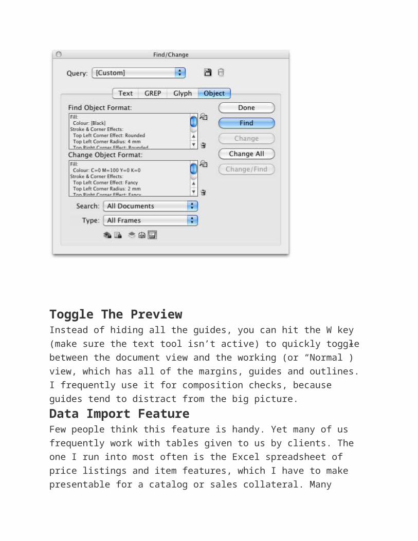
You can even search for objects by using specific formatting options.
For example, if all of your frames have a black stroke, and would like
to remove the stroke, you can do so by selecting the appropriate
options in the Object tab of the Find/Change box.
Of course, if you use Object Styles, which work like Paragraph
Styles, then you don’t need this feature. Still, it’s the fastest way to
do it if you’ve forgotten to save the style, or if you’re working on a
document created by someone else or if you want to change one
detail that’s common to several different saved styles.

Toggle The PreviewInstead of hiding all the guides, you can hit the W key (make sure
the text tool isn’t active) to quickly toggle between the document
view and the working (or “Normal”) view, which has all of the
margins, guides and outlines. I frequently use it for composition
checks, because guides tend to distract from the big picture.
Data Import FeatureFew people think this feature is handy. Yet many of us frequently
work with tables given to us by clients. The one I run into most often
is the Excel spreadsheet of price listings and item features, which I
have to make presentable for a catalog or sales collateral. Many
designers recreate these tables from scratch to make them clean
and attractive, but this can be time-consuming, especially with large
tables.
There is a better way. InDesign has an “Import table” feature. You
can import the client’s table from Excel and style it however you
want. Use the “Place file” option in the File menu
(or Command/Control + D), select “Show import options,” and you’ll be
able to define the cells to import on the next screen and then style
them as a group.
Learn By DoingTheory is great, and articles like this one can give you quick useful
tips, but the best way to learn is by practice. If you are new to
InDesign, try this: use an existing layout as a guide (anything you
want: a page from a magazine, a poster or a business card), and try
to recreate it from scratch. Familiarize yourself with the tools,
menus and options. If you get stuck, you can always search for tips
and tutorials or ask a friend.
Adobe InDesign is a versatile application, and there is always
something new to learn. Have fun exploring it!
WANT TO KNOW MORE?

Here are a few articles that go into more detail on some of the
topics we just covered:
Find and Change Objects and Attributes in InDesign CS3,
InDesignSecrets;
Understanding spot and process colors, Adobe InDesign CS4;
Add Style and Save Time With Paragraph Style Sheets,
Designorati;
InDesign Default Keyboard Shortcuts, Adobe InDesign CS4;
The InDesignSecrets’ Guide to Special Characters in Adobe
InDesign (PDF), InDesign Secrets.
(al)