KSB Online-Styleguide KSB Online Style Guide · KSB Online-Styleguide ... 3.1 Download search...
62
KSB Online Style Guide Version August 2014
Transcript of KSB Online-Styleguide KSB Online Style Guide · KSB Online-Styleguide ... 3.1 Download search...

KSB Online-StyleguideStand November 2013
KSB Online Style GuideVersion August 2014

© K
SB A
ktie
ng
esel
lsch
aft
/ V
ersi
on
Au
gu
st 2
014
2
In addition to print media, KSB also has an online presence. This style guide documents the main design elements of the KSB website as well as specific aspects relating to display on mobile devices such as tablets and smartphones. As web applications can vary in their objectives and functionality, the design elements cannot be adopted in their entirty. Nevertheless, this style guide gives you valuable tips regarding the design of your web application.
Design guidelines for online presence

© K
SB A
ktie
ng
esel
lsch
aft
/ V
ersi
on
Au
gu
st 2
014
3
KSB website style guide | Table of contents
I KSB website
1. Design basics1.1 Fonts ............................................................................................................................................................................................................................................................51.2 Colours ......................................................................................................................................................................................................................................................81.3 Trademark/Logo .............................................................................................................................................................................................................................91.4 Brand claim ...................................................................................................................................................................................................................................... 101.5 Wave ....................................................................................................................................................................................................................................................... 11
2. Structure and page types2.1 Basic grid ............................................................................................................................................................................................................................................ 122.2 Home page layout ................................................................................................................................................................................................................... 132.3 Content layout ............................................................................................................................................................................................................................. 142.4 Search results page layout .............................................................................................................................................................................................. 152.5 Country sites home page ................................................................................................................................................................................................. 16
3. Navigation elements3.1 Main navigator ............................................................................................................................................................................................................................ 173.2 Fly-out menu for country selection ...................................................................................................................................................................... 183.3 Meta navigator ........................................................................................................................................................................................................................... 193.4 Footer .................................................................................................................................................................................................................................................... 193.5 Page navigator ............................................................................................................................................................................................................................ 203.6 Content navigator ................................................................................................................................................................................................................... 21 3.6.1 Process display .............................................................................................................................................................................................................. 21 3.6.2 Tab navigator ................................................................................................................................................................................................................. 22
4. Content elements4.1 Table elements ............................................................................................................................................................................................................................. 234.2 Product configurator ............................................................................................................................................................................................................ 244.3 Image gallery ................................................................................................................................................................................................................................. 25 4.3.1 Image gallery lightbox ........................................................................................................................................................................................ 264.4 Video player ................................................................................................................................................................................................................................... 274.5 List elements .................................................................................................................................................................................................................................. 284.6 Forms ...................................................................................................................................................................................................................................................... 294.7 Search .................................................................................................................................................................................................................................................... 304.8 Downloads ....................................................................................................................................................................................................................................... 314.9 Contact finder .............................................................................................................................................................................................................................. 324.10 Margin column teaser ...................................................................................................................................................................................................... 334.11 Overview page teaser ....................................................................................................................................................................................................... 34
5. Interactive elements5.1 Text links ............................................................................................................................................................................................................................................. 355.2 Buttons ................................................................................................................................................................................................................................................. 365.3 Icons ......................................................................................................................................................................................................................................................... 37
6. Image formats6.1 Teaser images ................................................................................................................................................................................................................................ 396.2 Images in text ............................................................................................................................................................................................................................... 406.3 Miscellaneous ................................................................................................................................................................................................................................ 42

© K
SB A
ktie
ng
esel
lsch
aft
/ V
ersi
on
Au
gu
st 2
014
4
KSB website style guide | Table of contents
II Mobile applications
1. Structure and page types1.1 Basic grid ............................................................................................................................................................................................................................................ 451.2 Home page layout ................................................................................................................................................................................................................... 461.3 Content layout ............................................................................................................................................................................................................................. 471.4 Search results page layout .............................................................................................................................................................................................. 48
2. Navigation elements2.1 Main navigator .......................................................................................................................................................................................................................... 492.2 Footer .................................................................................................................................................................................................................................................... 502.3 Content navigator ................................................................................................................................................................................................................... 51
3. Content elements3.1 Download search module ............................................................................................................................................................................................... 523.2 Download search results module ............................................................................................................................................................................ 533.3 Contact search module ....................................................................................................................................................................................................... 543.4 Contact results module ...................................................................................................................................................................................................... 553.5 Selection elements .................................................................................................................................................................................................................. 57
4. Interactive elements4.1 Text links ............................................................................................................................................................................................................................................. 584.2 Interactive list element ....................................................................................................................................................................................................... 584.3 Buttons ................................................................................................................................................................................................................................................. 594.4 Icons ......................................................................................................................................................................................................................................................... 60
5. Image formats5.1 Teaser images ................................................................................................................................................................................................................................ 615.2 Images in text ............................................................................................................................................................................................................................... 615.3 Miscellaneous ................................................................................................................................................................................................................................ 62

© K
SB A
ktie
ng
esel
lsch
aft
/ V
ersi
on
Au
gu
st 2
014
5
CartoGothic Pro
Arial
Helvetica
a b c d e f g h i j k l m n o p q r s t u v w x y zA B C D E F G H I J K L M N O P Q R S T U V W X Y Z1 2 3 4 5 6 7 8 9 0 (.:,;%&?!€@äöüÄÖÜ)
a b c d e f g h i j k l m n o p q r s t u v w x y zA B C D E F G H I J K L M N O P Q R S T U V W X Y Z1 2 3 4 5 6 7 8 9 0 (.:,;%&?!€@äöüÄÖÜ)
a b c d e f g h i j k l m n o p q r s t u v w x y zA B C D E F G H I J K L M N O P Q R S T U V W X Y Z1 2 3 4 5 6 7 8 9 0 (.:,;%&?!€@äöüÄÖÜ)
KSB website style guide | 1. Design basics
CartoGothic Pro should be used as the standard web font on the website. The user does
not need to have this installed in advance. It is an online alternative to the Frutiger font
that is used offline. CartoGothic Pro is to be predominantly used for headlines.
Arial, the system font, should be used for body copy, navigation elements and interactive
modules. Arial also serves as a fallback font for CartoGothic Pro.
Helvetica is used as a fallback font for Arial.
If neither of the system fonts Arial or Helvetica are installed on the user’s machine,
another sans serif font that is installed on the user’s machine is used.
1.1 Fonts

© K
SB A
ktie
ng
esel
lsch
aft
/ V
ersi
on
Au
gu
st 2
014
6
1
3
4
6
10 11
13
5
9
12
15
16
14
7
8
2
1
3
5
9 16
4
8 15
10
12
13
14
11
6
7
2
Arial, 14 px
#717171
Arial Bold, 12 px
#333333
Arial Bold, 13 px
#336699
Arial Bold, 14 px
#336699
CartoGothic Pro, 14 px
#FFFFFF
Arial Bold, 13 px
#CCCCCC
CartoGothic Pro Bold, 14 px
#000000
CartoGothic Pro Bold, 12 px
#9EA1A2
CartoGothic Pro, 12 px
#B1B1B1
Arial Bold, 18 px
#434343
Arial, 12 px
#434343
Arial, 12 px
#336699
CartoGothic Pro, 24 px
#000000
Arial Bold, 12 px
#FFFFFF
Arial Bold, 14 px
#FFFFFF
CartoGothic Pro, 14 px
#AEAEAE
Fonts to be used on the home page
KSB website style guide | 1. Design basics

© K
SB A
ktie
ng
esel
lsch
aft
/ V
ersi
on
Au
gu
st 2
014
7
2 3
6
9
10
4
7
1
5
8
1
3
5
7
4
6
8
10
9
2
Arial Bold, 12 px
#444651
Arial, 16 px
#666666
Arial Bold, 14 px
#000000
Arial, 14 px
#000000
CartoGothic Pro Book, 26 px
#2A2A2A
Arial, 13 px
#FFFFFF
Arial, 18 px
#336699
Arial, 14 px
#393939
Arial, 14 px
#828282
Arial Bold, 16 px
#666666
Fonts to be used on content pages
KSB website style guide | 1. Design basics

© K
SB A
ktie
ng
esel
lsch
aft
/ V
ersi
on
Au
gu
st 2
014
8
KSB blue is the primary colour to be used on the website. This provides a high recogni-
tion factor and a compelling look and feel that is in line with the rest of KSB’s online
presence.
Buttons that lead to items such as newsletter registrations and KSB microsites (“call-to-
action” buttons) should be coloured orange (emphasis colour), along with the naviga-
tion arrows that appear on the home page platform when the mouse cursor is placed
over an item.
Various shades of grey and other colour gradients are also available.
1.2 Colours
KSB website style guide | 1. Design basics
Primary colours Emphasis colour
Secondary colours
KSB blue
#336699
Orange
#FF571F
White
#FFFFFF
Grey 02
#393939
Grey 04
#666666
Blue
#4E81B3
Grey 01
#2A2A2A
Black
#000000
Grey 03
#555555
Background website gradient
#FFFFFF – #CDDBEA – #49688E
Grey gradient
Configurator
#363636 – #404040
Grey gradient
Meta navigator
#FDFDFD – #ECECEC

© K
SB A
ktie
ng
esel
lsch
aft
/ V
ersi
on
Au
gu
st 2
014
9
107 23
26
48
20
The KSB logo is located in the top-left section of the website, indicating the sender. Its
specified dimensions are 107 x 48 pixels.
The KSB logo has been internationally registered as a trademark and cannot be changed.
It consists of the letters “KSB” in this sequence and the circulation symbol which com-
bine to form the company logo.
1.3 Trademark/Logo
Not permitted
KSB website style guide | 1. Design basics
Dimensions in pixels

© K
SB A
ktie
ng
esel
lsch
aft
/ V
ersi
on
Au
gu
st 2
014
10
190
26
21
42
The brand claim and the line summarising the range of products and services (Pumps,
Valves, Service) is always located in the top-right section and always appears in conjunc-
tion with the KSB logo. The specified size of the claim in English is 190 x 26 pixels.
The brand claim may not be alienated. The brand claim and the line summarising the
range of products and services (Pumps, Valves, Service) may not be displayed separately
from one another. The brand claim appears on all web applications, such as websites,
microsites and pump lexicon.
The brand claim is not included on websites of KSB subsidiaries with independent
corporate brands.
1.4 Brand claim plus products and services
KSB website style guide | 1. Design basics
Dimensions in pixels
Not permitted
Position of KSB logo and brand claim
KSB brand claim normal
KSB barnd claim negative Our technology. Your success.
Pumps Valves Service
Pumps n Valves n Service
Our technology. Your success.
Pumps n Valves n Service
Our technology. Your success.
© K
SB A
ktie
ng
esel
lsch
aft
/ V
ersi
on
Au
gu
st 2
014
11
130
1024
53
68
12112
12
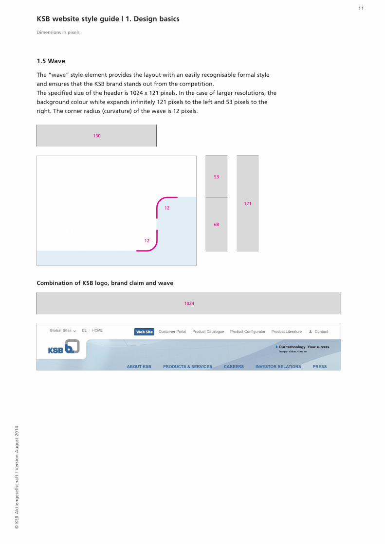
The “wave” style element provides the layout with an easily recognisable formal style
and ensures that the KSB brand stands out from the competition.
The specified size of the header is 1024 x 121 pixels. In the case of larger resolutions, the
background colour white expands infinitely 121 pixels to the left and 53 pixels to the
right. The corner radius (curvature) of the wave is 12 pixels.
1.5 Wave
KSB website style guide | 1. Design basics
Combination of KSB logo, brand claim and wave
Dimensions in pixels
© K
SB A
ktie
ng
esel
lsch
aft
/ V
ersi
on
Au
gu
st 2
014
12
KSB website style guide | 2. Structure and page types
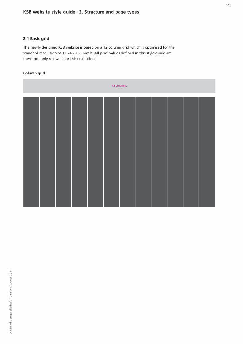
The newly designed KSB website is based on a 12-column grid which is optimised for the
standard resolution of 1,024 x 768 pixels. All pixel values defined in this style guide are
therefore only relevant for this resolution.
2.1 Basic grid
Column grid
12 columns

© K
SB A
ktie
ng
esel
lsch
aft
/ V
ersi
on
Au
gu
st 2
014
13
960 x 55
960 x 68
960 x 26
640 x 462
960 x 342
960 x 342
960 x 132
320 x 462
13
16
2260
30
30
30
The home page layout is divided into the areas of navigation, platform, navigator, two
teaser areas and footer.
The background image has a specified width of 1,806 pixels. The height is flexible, but
should be at least 754 pixels.
2.2 Home page layout
Header
Navigation
Platform and navigator
Teaser area
Teaser area
Footer
KSB website style guide | 2. Structure and page types
Dimensions in pixels

© K
SB A
ktie
ng
esel
lsch
aft
/ V
ersi
on
Au
gu
st 2
014
14
960 x 55
960 x 68
240
430207
700
60
30
20
960 x 347
960 x 2613
16
22
The content layout highlights the content of the corresponding page.
Beside this, there is a column displaying the navigation, providing a quick overview of
the site as well as access to all relevant information. There may be room for content teas-
ers and the navigator in the margin column.
2.3 Content layout
KSB website style guide | 2. Structure and page types
Dimensions in pixels

© K
SB A
ktie
ng
esel
lsch
aft
/ V
ersi
on
Au
gu
st 2
014
15
960 x 55
960 x 68
700 240
960 x 347
30
32960 x 26
13
20
The search results page layout does not feature the navigation column for the content
page. This allows more space for search results. The search results page layout is a typical
single-column layout, as is also used on the contact page, for instance.
2.4 Search results page layout
KSB website style guide | 2. Structure and page types
Dimensions in pixels

© K
SB A
ktie
ng
esel
lsch
aft
/ V
ersi
on
Au
gu
st 2
014
16
960 x 55
960 x 68
640 x 460
960 x 342
960 x 342
960 x 347
320 x 460
60
960 x 2613
16
22
30
30
30
The layout for the individual country sites is structured in a similar manner to the .com
home page. The main difference is the closed platform. This is designed to make mainte-
nance with new images easier for in-country designers. The site’s background is enriched
through the use of a colour gradient.
2.5 Country sites home page
KSB website style guide | 2. Structure and page types
Dimensions in pixels

© K
SB A
ktie
ng
esel
lsch
aft
/ V
ersi
on
Au
gu
st 2
014
17
45
20 20
13
KSB website style guide | 3. Navigation elements
The horizontal main navigator is located within the header area and consists of up to
five navigation items. The navigator has a width of 760 pixels. Two rows of navigation
items are not envisaged here.
3.1 Main navigator
Rollover
Normal
Dimensions in pixels

© K
SB A
ktie
ng
esel
lsch
aft
/ V
ersi
on
Au
gu
st 2
014
18
The fly-out menu for country selection is located in the header area within the meta nav-
igator. It brings together all of the national sites and provides quick and clear access.
3.2 Fly-out menu for country selection
Rollover
KSB website style guide | 3. Navigation elements
Normal

© K
SB A
ktie
ng
esel
lsch
aft
/ V
ersi
on
Au
gu
st 2
014
19
22
In addition to quick access to the country sites, the meta navigator also allows visitors to
directly access various website tools. The menu is an all-encompassing navigator for the
site.
The footer is included on each page and is also displayed by default on the home page.
It enables visitors to access further relevant information. Visitors can also subscribe to the
KSB newsletter via the footer.
3.4 Footer
KSB website style guide | 3. Navigation elements
Dimensions in pixels
Closed
Country site footer
Normal
3.3 Meta navigator

© K
SB A
ktie
ng
esel
lsch
aft
/ V
ersi
on
Au
gu
st 2
014
20
The page navigator is located in the left-hand column of the content pages. The various
statuses are shown in the illustrations below. Active items and rollovers are shown in full.
3.5 Page navigator
KSB website style guide | 3. Navigation elements
Level 1 rollover Level 2 rollover Level 2 active

© K
SB A
ktie
ng
esel
lsch
aft
/ V
ersi
on
Au
gu
st 2
014
21
Various modules are available for navigation in the content area. These enable individu-
al guidance of users tailored to the specific content.
The process display divides a given process into multiple steps; it is illustrated below via
the application process, by way of example. The user’s current step is highlighted and is
thus very clear to them. This enables a clear presentation of a given process.
3.6 Content navigation
KSB website style guide | 3. Navigation elements
Highlighting of current step
Completed step
3.6.1 Process display

Current Tab
Rollover
Two-stage tab module
© K
SB A
ktie
ng
esel
lsch
aft
/ V
ersi
on
Au
gu
st 2
014
22
The tab navigator enables navigation within content.
In this way, content can be grouped together and displayed in a compact manner.
KSB website style guide | 3. Navigation elements
3.6.2 Tab navigator

© K
SB A
ktie
ng
esel
lsch
aft
/ V
ersi
on
Au
gu
st 2
014
23
430
KSB website style guide | 4. Content elements
The table element is flexible in terms of the number of rows and columns.
The width of the columns depends on the content and is thus variable.
4.1 Table elements
Dimensions in pixels

Product Catalogue Customer Portal Service & Spare Parts
© K
SB A
ktie
ng
esel
lsch
aft
/ V
ersi
on
Au
gu
st 2
014
24
320
460
The navigator groups various page functions into a single module. It contains access to
the navigator, product catalogue, customer portal, service and replacement parts. It is
used on the home page as well as in the margin column on content pages. It has a width
of 240 pixels when displayed in the margin column. Its height is based on the content.
4.2 Navigator
Navigator Rollover
KSB website style guide | 4. Content elements
Dimensions in pixels

© K
SB A
ktie
ng
esel
lsch
aft
/ V
ersi
on
Au
gu
st 2
014
25
430
350
The image gallery groups image content relating to a specific topic into a single module.
Users also have the option to view the images in enlarged form in the lightbox.
4.3 Image gallery
Image gallery content
Image gallery content hover tool
KSB website style guide | 4. Content elements
Dimensions in pixels

© K
SB A
ktie
ng
esel
lsch
aft
/ V
ersi
on
Au
gu
st 2
014
26
650
418
75
The lightbox presents enlarged versions of images from the image gallery. When
opened, the image gallery behind the enlarged picture is darkened, thus providing
a clearer view of the particular image.
4.3.1 Image gallery lightbox
Image gallery lightbox
KSB website style guide | 4. Content elements
Dimensions in pixels

© K
SB A
ktie
ng
esel
lsch
aft
/ V
ersi
on
Au
gu
st 2
014
27
430
242
The video player is used to play a range of videos on the content pages. It has a control
menu and also allows users to play videos in full-screen mode.
4.4 Video player
Video player content
Video player content hover tool
KSB website style guide | 4. Content elements
Dimensions in pixels

© K
SB A
ktie
ng
esel
lsch
aft
/ V
ersi
on
Au
gu
st 2
014
28
The list element is designed to clearly display facts within the body copy.
4.5 List elements
KSB website style guide | 4. Content elements

© K
SB A
ktie
ng
esel
lsch
aft
/ V
ersi
on
Au
gu
st 2
014
29
Forms can be made up of various input fields.
Alerts generated when a field has not been filled out are highlighted in red (#CC0000).
4.6 Forms
Alerts
KSB website style guide | 4. Content elements

© K
SB A
ktie
ng
esel
lsch
aft
/ V
ersi
on
Au
gu
st 2
014
30
1
1 Results filter option
KSB website style guide | 4. Content elements
The search page lists all search results. If more than six results are generated, there is
a pager option enabling navigation between the results. A filter, located in the margin
column, can be used to refine the results shown.
4.7 Search

© K
SB A
ktie
ng
esel
lsch
aft
/ V
ersi
on
Au
gu
st 2
014
31
All downloads located on the KSB site can be found in the downloads area.
A filter can be used to refine the search, allowing the user to obtain the desired results.
4.8 Downloads
KSB website style guide | 4. Content elements

© K
SB A
ktie
ng
esel
lsch
aft
/ V
ersi
on
Au
gu
st 2
014
32
Various contacts and points of contact can be located using the contact finder. The
search function allows users to find specific contacts.
4.9 Contact finder
KSB website style guide | 4. Content elements
© K
SB A
ktie
ng
esel
lsch
aft
/ V
ersi
on
Au
gu
st 2
014
33
240
1
11
1
1
1
1
1
1
1
240
240
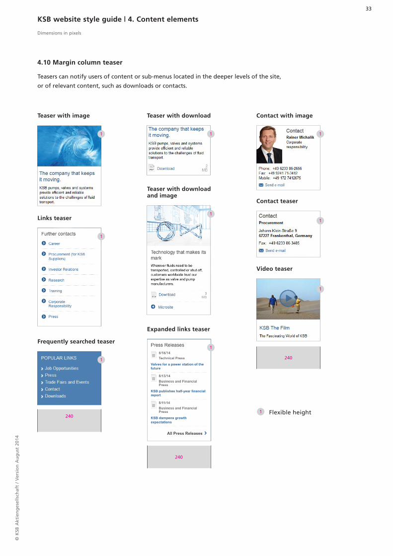
Teasers can notify users of content or sub-menus located in the deeper levels of the site,
or of relevant content, such as downloads or contacts.
4.10 Margin column teaser
Teaser with image Contact with image
Contact teaser
Video teaser
Links teaser
Frequently searched teaser
Teaser with download
Teaser with download and image
Expanded links teaser
Flexible height
KSB website style guide | 4. Content elements
Dimensions in pixels

© K
SB A
ktie
ng
esel
lsch
aft
/ V
ersi
on
Au
gu
st 2
014
34
430
1
1 1
210
Overview page teasers refer users to specific content in the various areas. If there is
an even number of teasers, they are displayed in a single column beside one another.
If there is an odd number of teasers, they are displayed in two columns beneath one
another.
4.11 Overview page teaser
Single-column teaser Two-column teaser
Flexible height
KSB website style guide | 4. Content elements
Dimensions in pixels

Send e-mail
extern Link
Corporate Responsibility
All Press Releases
Send e-mail
cooling water for Qatar
More
cooling water for Qatar
More
extern Link
Corporate Responsibility
All Press Releases
© K
SB A
ktie
ng
esel
lsch
aft
/ V
ersi
on
Au
gu
st 2
014
35
KSB website style guide | 5. Interactive elements
5.1 Text links
Link Hover tool
Arial Bold, 15 px
Colour: #434343
Hover tool: #717070
Arial, 14 px
Colour: #336699
Hover tool: #737373
Arial, 13 px
Colour: #336699
Hover tool: Underline
Arial, 14 px
Colour: #336699
Hover tool: #0737373
Arial Bold, 13 px
Colour: #336699
Hover tool: Underline
Arial, 13 px
Colour: #336699
Hover tool: #737373

PRoduCt ConfiguRAtoR PRoduCt ConfiguRAtoR
Send
GO TO PRODUCT CATALOGUE
MoRe MoRe
GO TO PRODUCT CATALOGUE
SeARCH SeARCH
BACK BACK
SeARCH SeARCH
Send
SHoW SHoW
© K
SB A
ktie
ng
esel
lsch
aft
/ V
ersi
on
Au
gu
st 2
014
36
5.2 Buttons
Arial Bold, 12 px
Text colour: #336699
Colour: #DADCE0
Arial Bold, 12 px
Text colour: #333333
Gradient: #F4F5F7 – #E4E8EB
Button
Call-to-Action buttons
KSB website style guide | 5. Interactive elements
Arial Bold, 12 px
Text colour: #FFFFFF
Colour: #316293
Hover tool: #224466
Arial Bold, 13 px
Colour: #FF571F
Hover tool:
#F36B3B
Arial Bold, 12 px
Text colour: #444444
Colour: #EAEDEF
Hover tool: #336699
Arial Bold, 11 px
Colour: #336699
Hover tool: #224466
Arial Bold, 11 px
Colour: #999999
Hover tool: #3F3F3F
Arial, 12 px
Colour: #336699
Hover tool: #224466
Hover tool
Arial Bold, 11 px
Colour: #333333
Hover tool: #E1E5E8
Hover tool: #DADCEO

© K
SB A
ktie
ng
esel
lsch
aft
/ V
ersi
on
Au
gu
st 2
014
37
5.3 Icons
Documents
Social media
Configurator numbers
Private customers
Footer
Energy, industry, water,
wastewater
Calendar
PhotoTraining/Education
General
News items
Facebook LinkedIn YouTube Google+Twitter
Vacancies
AudioVideo
KSB website style guide | 5. Interactive elements
Private households and
facilities engineering

© K
SB A
ktie
ng
esel
lsch
aft
/ V
ersi
on
Au
gu
st 2
014
38
Additional icons
KSB website style guide | 5. Interactive elements
The icon sprites file can be downloaded in the established KSB online style.

130 x 83210 x 134
240 x 153
© K
SB A
ktie
ng
esel
lsch
aft
/ V
ersi
on
Au
gu
st 2
014
39
98 x 140
280 x 150
6.1 Teaser images
Margin column
Content area
Homepage
KSB website style guide | 6. Image formats
Dimensions in pixels

© K
SB A
ktie
ng
esel
lsch
aft
/ V
ersi
on
Au
gu
st 2
014
40
98 x 140 130 x 83
408 x 261 282 x 180 110 x 70
6.2 Images in text
Teasers in list and search results
Header image
KSB website style guide | 6. Image formats
Dimensions in pixels
660 x 240Corner radius: 6 px

© K
SB A
ktie
ng
esel
lsch
aft
/ V
ersi
on
Au
gu
st 2
014
41
275 x 392 155 x 220 98 x 140
430 x 275 250 x 160 130 x 83
KSB website style guide | 6. Image formats
Dimensions in pixels

© K
SB A
ktie
ng
esel
lsch
aft
/ V
ersi
on
Au
gu
st 2
014
42
193 x 275
650 x 416 292 x 416
6.3 Miscellaneous
in the mega-drop-down menu
Image gallery
Lightbox
168 x 80 Corner radius: 6 px
430 x 275 Thumbnail: 85 x 54
KSB website style guide | 6. Image formats
Dimensions in pixels

© K
SB A
ktie
ng
esel
lsch
aft
/ V
ersi
on
Au
gu
st 2
014
43
580 x 300
430 x 242
Platform module background
Video player: Splash image
KSB website style guide | 6. Image formats
Dimensions in pixels

© K
SB A
ktie
ng
esel
lsch
aft
/ V
ersi
on
Au
gu
st 2
014
44
Design guidelines for mobile applications
The previous pages outline the design of the KSB website for display on a desktop PC. With the mobile version, users can also view the KSB website on their smartphone. In its design, the mobile version has to accommodate for smaller screen sizes compared to desktop PCs, as well as lower potential data transmissions and a different mode of operation (“swiping”). The subsequent new design elements are displayed on the following pages and their functionality is described.
Style guide for mobile applications
© K
SB A
ktie
ng
esel
lsch
aft
/ V
ersi
on
Au
gu
st 2
014
45
135 135
1010 10
320
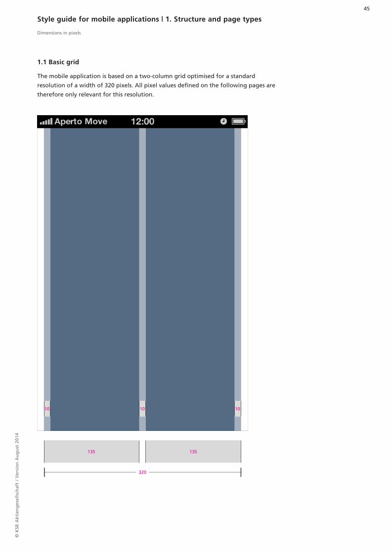
1.1 Basic grid
The mobile application is based on a two-column grid optimised for a standard
resolution of a width of 320 pixels. All pixel values defined on the following pages are
therefore only relevant for this resolution.
Style guide for mobile applications | 1. Structure and page types
Dimensions in pixels

© K
SB A
ktie
ng
esel
lsch
aft
/ V
ersi
on
Au
gu
st 2
014
46
2
1
300 x 216
300 x 77
300 x 40
15
10
10
10
12
8
8
300 x 102
320 x 102
1
2
1.2 Home page layout
Header
Download search modulePrecise module description in Content elements area
Contact search modulePrecise module description in Interactive elements area
Content
Content teaserPrecise module description in Navigation elements area
Teaser platform
CartoGothic Pro Bold
13 px, # 000000
CartoGothic Pro Book
16 px, # 000000
The main elements of the home page layout are the teaser platform and the
Download search module. The interactive list element allows the user to access
the contact search. Content teasers can optionally be added. The footer is the
final part.
Style guide for mobile applications | 1. Structure and page types
Dimensions in pixels
FooterPrecise module description in Footer 2.2 area

© K
SB A
ktie
ng
esel
lsch
aft
/ V
ersi
on
Au
gu
st 2
014
47
2
31
300 x 109
300 x 35
25
320 x 102
15
10
15
10
2
3
1
Header (main navigator)
Body text
Pull-down
Article image
Content HL
CartoGothic Pro Bold
16 px, #434343
Body text 01
Arial Regular
15 px, #666666
Body text 02
Arial Regular
14 px, #434343
The content layout contains the headline and body text. The body text can be
displayed in two different font sizes. An image can also be added to the article. If
necessary, other elements can also be added (list elements, form elements, etc.).
1.3 Content layout
Style guide for mobile applications | 1. Structure and page types
Dimensions in pixels

© K
SB A
ktie
ng
esel
lsch
aft
/ V
ersi
on
Au
gu
st 2
014
48
2
1
300 x 109
300 x heightdepends on text
320 x 102
20
15
1010
10
10
10
10
10
10
15
2
2
1
The search page lists all search results. If more than six results are generated, there
is a pager option enabling navigation between the results.
1.4 Search results layout
Style guide for mobile applications | 1. Structure and page types
Dimensions in pixels
Header (main navigator)
Download search module (expanded)Precise module description in Content elements area
Download search results modulePrecise module description in Content elements area
Additional results
Arial Bold
12 px, #666666
Dividing line
1 px, #EAEAEA
Pager modulePrecise module description in Interactive elements area

© K
SB A
ktie
ng
esel
lsch
aft
/ V
ersi
on
Au
gu
st 2
014
49
107210 1010 164 17 20 17
The horizontal main navigator consists of the KSB logo and a Home button. Both elements
link back to the home page.
2.1 Main navigator
KSB logo Home button
Dimensions in pixels
Style guide for mobile applications | 2. Navigation elements

© K
SB A
ktie
ng
esel
lsch
aft
/ V
ersi
on
Au
gu
st 2
014
50
2
3
1
10
10
10 150
110
138
110
22
-
320
98
35
12435
52150 x30
17x17 17x1717x17 19x16 17x17
14
14
2
3
3
3
1
Dimensions in pixels
The footer is included on every page. It enables visitors to access further relevant infor-
mation. It provides access to the desktop version or to KSB pages on social networks, for
example.
Arial Bold (uppercase)
11 px, #CCCCCC
Module colour
#3F3F3F
Lines
1 px, #4A4A4A
Style guide for mobile applications | 2. Navigation elements
2.2 Footer

© K
SB A
ktie
ng
esel
lsch
aft
/ V
ersi
on
Au
gu
st 2
014
51
1
2
3
4
5
960 x 347
10 1015
107 x 82 102
8
8
10
101
3
2
4
5
2.3 Content navigator (Content teaser module)
Dimensions in pixels
The content teaser on the home page allows the user to access additional content pages.
Teasers are separated by a line.
There should be no upper edge for the first teaser.
CartoGothic Pro Bold
(uppercase)
13 px, #666666
Module colour
#FFFFFF
Dividing line
1 px, #D1D1D1
Arial Bold
14 px, #434343
Line
1 px, #EAEAEA
Teaser dividing line
Style guide for mobile applications | 2. Navigation elements

© K
SB A
ktie
ng
esel
lsch
aft
/ V
ersi
on
Au
gu
st 2
014
52
1
77
10
15
10
10
10
10
10
10 1010
300
10 10
300
35
35
35
1
1
2
3
1
2
3
3.1 Download search module
The user can enter a search term using the quick search function on the home page.
This brings them to an extended download search where they can set and view addition-
al parameters.
CartoGothic Pro Bold
(uppercase)
13 px, #666666
Input inactive
Arial Regular
13 px, #A9A9A9
Input
Arial Regular
13 px, #000000
Module colour
#FFFFFF
Download search (extended)
Style guide for mobile applications | 3. Content elements
Input fields and pull-downs are described in the Interactive elements area.
Dimensions in pixels

© K
SB A
ktie
ng
esel
lsch
aft
/ V
ersi
on
Au
gu
st 2
014
53
1
2
3
4
5
10
10
10
10
10
10
20
1
2
3
4
5
Dimensions in pixels
The search results are displayed in a list. The individual results are separated from one
another by a line.
CartoGothic Pro Bold
12 px, #666666
Arial Bold
14 px, #336699
Arial Bold
12 px, #434343
Line
1 px, #EAEAEA
Module colour
#FFFFFF
Pager modulePrecise module description in Interactive elements area
Style guide for mobile applications | 3. Content elements
3.2 Download search results module

© K
SB A
ktie
ng
esel
lsch
aft
/ V
ersi
on
Au
gu
st 2
014
54
10
10
10
10
10
Dimensions in pixels
3.3 Contact search module
Contact search input module
An interactive list element on the home page brings the user to the Contact search mod-
ule.
Interactive list elementPrecise module description in Interactive elements area
Input fields and pull-downs are described in the Interactive elements area.
Style guide for mobile applications | 3. Content elements

© K
SB A
ktie
ng
esel
lsch
aft
/ V
ersi
on
Au
gu
st 2
014
55
1
2
3
4
1
1
2
2
3
3
4
Dimensions in pixels
Results 01
Results 02 (press)
CartoGothic Pro Bold
(uppercase)
12 px, #666666
Arial Bold (uppercase)
12 px, #666666
Arial Bold
13 px, #434343
Arial Regular
13 px, #434343
Style guide for mobile applications | 3. Content elements
3.4 Contact search results module

© K
SB A
ktie
ng
esel
lsch
aft
/ V
ersi
on
Au
gu
st 2
014
56
2
1 3
4
1
2
3
4
Dimensions in pixels
Results 03 (investors)
CartoGothic Pro Bold
(uppercase)
12 px, #666666
Arial Bold (uppercase)
12 px, #666666
Arial Bold
13 px, #434343
Arial Regular
13 px, #434343
Style guide for mobile applications | 3. Content elements

© K
SB A
ktie
ng
esel
lsch
aft
/ V
ersi
on
Au
gu
st 2
014
57
1 2
11
11
10
10
10
41
280
280
Pump
Pump11
11
1
1
2
2
Input field
Drop-down
Contour
1 px, #CFD3D6
Shadow facing inwards
40%, #000000
Input
Arial Regular
13 px, #000000
Input inactive
Arial Regular
13 px, #336699
Dimensions in pixels
Style guide for mobile applications | 3. Content elements
3.5 Selection elements

© K
SB A
ktie
ng
esel
lsch
aft
/ V
ersi
on
Au
gu
st 2
014
58
Corporate ResponsibilityCorporate Responsibility
CONTACT
15
15
10 10
409x13
300
4.1 Text links
4.2 Interactive list element
Individual words or sections within a text may be highlighted and linked.
Link
Link
Tap
Tap
Arial, 14 px
#336699
Tap: #737373
CartoGothic Pro Bold
(uppercase)
15 px, #666666
CartoGothic Pro Bold
(uppercase)
15 px, #336699
Style guide for mobile applications | 4. Interactive elements
Dimensions in pixels

© K
SB A
ktie
ng
esel
lsch
aft
/ V
ersi
on
Au
gu
st 2
014
59
1
2
280
135
87
10
10
10
10
10 10 10
10
10
8 8
1 2
4.3 Buttons
Dimensions in pixels
Tap
Tap
Arial Bold, 14 px
Text colour: #FFFFFF
#295387 – #3D7AAD
Tap: #3D7AAD – #295387
Text/Icon colour
#444444
Arial Bold, 14 px
Gradient (Opacity 50%)
#04080C – #FFFFFF
Tap: #FFFFFF – #04080C
Contour
1 px, #D4D6D8 – #EAEDEF
Same values as
Standard button
Same values as
Standard button
Button
Standard button (with text or icon)
Back button
Other control elements
Style guide for mobile applications | 4. Interactive elements
Pager
Same values as
buttons
Same values as
Standard button

© K
SB A
ktie
ng
esel
lsch
aft
/ V
ersi
on
Au
gu
st 2
014
60
Social networks
Dimensions in pixels
Style guide for mobile applications | 4. Interactive elements
4.4 Icons
The icon sprites file can be downloaded in the KSB’s Online Corporate Design Manual.
LinkedIn YouTube Twitter Facebook Google+

© K
SB A
ktie
ng
esel
lsch
aft
/ V
ersi
on
Au
gu
st 2
014
61
5.2 Images in text
280 x 179
5.1 Teaser images
Teaser platform, 300 x 216
Home page
Content teaser, 107 x 82Contour line facing inwards, 1px #d0d0d0
Header, 300 x 109
Dimensions in pixels
Style guide for mobile applications| 5. Image formats

© K
SB A
ktie
ng
esel
lsch
aft
/ V
ersi
on
Au
gu
st 2
014
62
98 x 140
Dimensions in pixels
Style guide for mobile applications| 5. Image formats
Investor point of contact
5.3 Miscellaneous