JustinMcFarlane_UXDIJALA_Project2
25
A Redesign Walkthrough UXDI Project 2 Justin McFarlane
-
Upload
justin-mcfarlane -
Category
Documents
-
view
9 -
download
0
Transcript of JustinMcFarlane_UXDIJALA_Project2
A Redesign Walkthrough UXDI Project 2 Justin McFarlane

What’s the Problem? … Well...Too many choices, the internet is overwhelming. All clients aren’t tech savvy. Assuming that, is, the problem.
Solution! How can we innovate ease and simplicity?
Deliberation

Book Culture.com
Book Court.com
McNally Jackson.com
Businesses carve out space by being rare and available in a shrinking market.
Competitive Research Summary
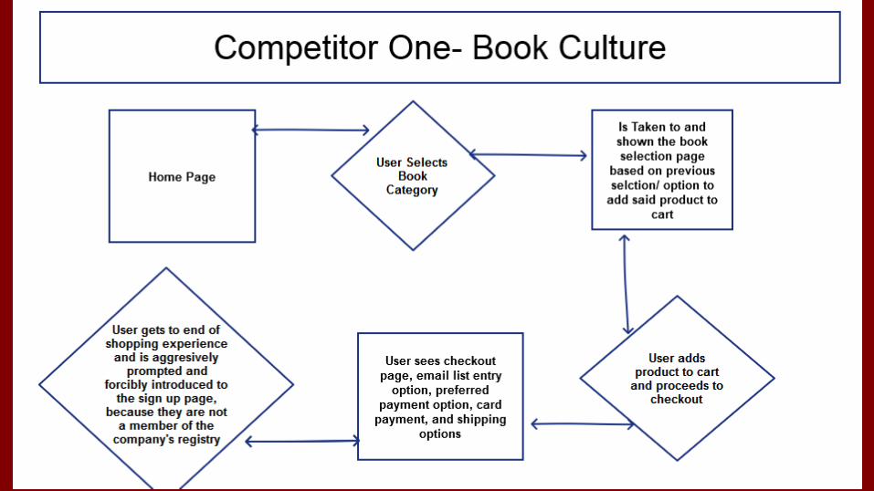
Competitor 1 Book Culture
WIthin 5 clicks, user’s checking out. We can get that down to 3.
They care about wide array of diverse assortment; so do we.
They carved out a niche for themselves in a shrinking market; so did we.

Competitor 1 Book Culture
Within 5 clicks, user’s checking out. We can get that down to 3.
They care about wide array of diverse assortment; so do we.
They carved out a niche for themselves in a shrinking market; so did we.

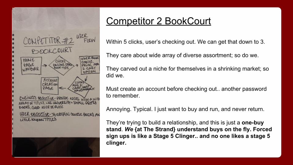
Competitor 2 BookCourt
WIthin 5 clicks, user’s checking out. We can get that down to 3.
They care about wide array of diverse assortment; so do we.
They carved out a niche for themselves in a shrinking market; so did we.
Must create an account before checking out.. another password to remember.
Annoying. Typical. I just want to buy and run, and never return.
They’re trying to build a relationship, and this is just a one-buy stand. We understand buys on the fly.
Competitor 2 BookCourt
Within 5 clicks, user’s checking out. We can get that down to 3.
They care about wide array of diverse assortment; so do we.
They carved out a niche for themselves in a shrinking market; so did we.
Must create an account before checking out.. another password to remember.
Annoying. Typical. I just want to buy and run, and never return.
They’re trying to build a relationship, and this is just a one-buy stand. We {at The Strand} understand buys on the fly. Forced sign ups is like a Stage 5 Clinger.. and no one likes a stage 5 clinger.

Competitor 3 McNally Jackson
WIthin 5 clicks, user’s checking out. We can get that down to 3.
They care about wide array of diverse assortment; so do we.
They carved out a niche for themselves in a shrinking market; so did we.
Must provide email to checkout at least, or have an account already. Easier, but it halts the process a bit.
Annoying. Typical. I just want to buy and run, and never return.

Competitor 3 McNally Jackson
Within 5 clicks, user’s checking out. We can get that down to 3.
They care about wide array of diverse assortment; so do we.
They carved out a niche for themselves in a shrinking market; so did we.
Must provide email to checkout at least, or have an account already. Easier, but it halts the process a bit.
Annoying. Typical. I just want to buy and run, and never return.

Browsing our brand…
now becomes browsing all brands
No more: “What’s it called again?” …
Social Media shows the way
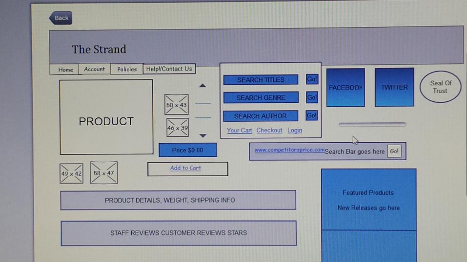
Business Overview

Edda’s User Needs-----> Solutions
Simple navbar
Fair price, shipping options
Transaction records,User based offers
Product details, and age demo signifiers
Simple navbar /dropdowns
Free shipping/ discounts,on sale/ clearance
Taboola “smart” user
Products sorted by maturity+ product bios

Edda’s Pain Points -----> Solutions
too much choice, vague product bios
recalling payment details
lonely
“magic tricks w/ unfamiliarnames”
sort result amount, thorough back stories
email confirmation
similar users aware of each other
Real name vs. industry jargon descriptor
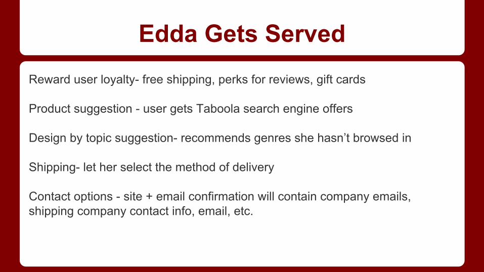
Reward user loyalty- free shipping, perks for reviews, gift cards
Product suggestion - user gets Taboola search engine offers
Design by topic suggestion- recommends genres she hasn’t browsed in
Shipping- let her select the method of delivery
Contact options - site + email confirmation will contain company emails, shipping company contact info, email, etc.
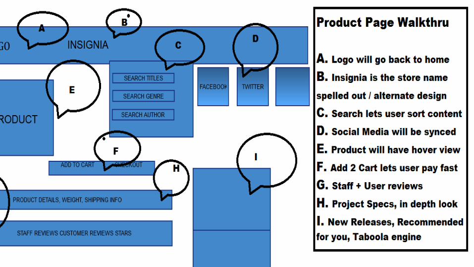
Edda Gets Served

Info Architecture + Card Sorting + Contextual Inquiry = Testing!
Usability testing allowed me to figure out how the layout of my page would make sense to several different users.
Open sort was hectic, yet gave some trajectory into potential patterns.
The closed sort was revealing, and lucid.
Knew how to categorize content more intuitively after the closed sort.

Next Steps
● Go further in depth with the Global Nav
● Expedient return policy
●
Next Steps
● Go further in depth with the Global Nav
● Expedient return policy
●
Next Steps
● Go further in depth with the Global Nav
● Expedient return policy
●

Next Steps

Strand's Awesome New User Flow
Edda loves Strand..I love Edda..
and we BOTH love The Strand!
Strand’s Prototype Proposal
Next Steps
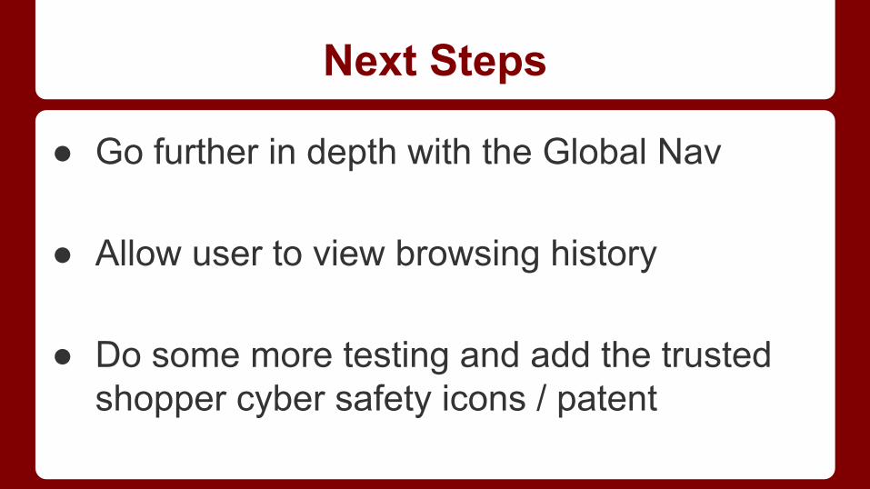
● Go further in depth with the Global Nav
● Allow user to view browsing history
● Do some more testing and add the trusted shopper cyber safety icons / patent

John’s User Needs-----> Solutions
Quick and lots of access to options
What’s new? What brands?
What’s cool? Wants customer loyalty
Simple navbar /dropdowns
Sort by brands and novelty + updates
Points towards purchase for reviews

John’s Pain Points-----> Solutions
Lack of product reviews
lack of navbar ease of use
Costly shipping ,return policy
unfamiliar seller distrust
Staff, readers, authors describe
Simple navbar- no breadcrumbs
Checkout denotes retailer w/ seller history, ratings, reviews

Trust + Love is set - logs on to a greeting, updates, personal review list, earns points for reviewing
New in the know - gets access to new releases early for reserving
Shipping made easy- 90 days w/ receipt, mail it back
Who likes it? Who hates it? - reviews link users to each other’s profiles
John Gets Served

Dexter’s User Needs-----> Solutions
Mobile purchase option; write reviews
Regular new product updates
Fast shipping
Knowledge of product inventory and authority
Can rate service, and satisfaction w/ thumbs +/-
Recommended for you list
Expedited shipping