How to make Presentation??
51
HOW TO MAKE PRESENTATIONS? Presented by: • AASHISH SINGH • ASHISH HIRAWAT • AKASH PATIL • ABHISHEK PANJA • AKASH SHUKLA
-
Upload
akash-patil -
Category
Self Improvement
-
view
101 -
download
0
Transcript of How to make Presentation??

HOW TO MAKE PRESENTATIONS?
Presented by:• AASHISH SINGH• ASHISH HIRAWAT• AKASH PATIL• ABHISHEK PANJA• AKASH SHUKLA

Tell A Story
Frames
Font
Colours
Showcase Data

Web Help
Noteandpoint.com
Slideshare.com/popular
Sliderocket.com/gallery
Slidesnack.com
Prezi.com/explore
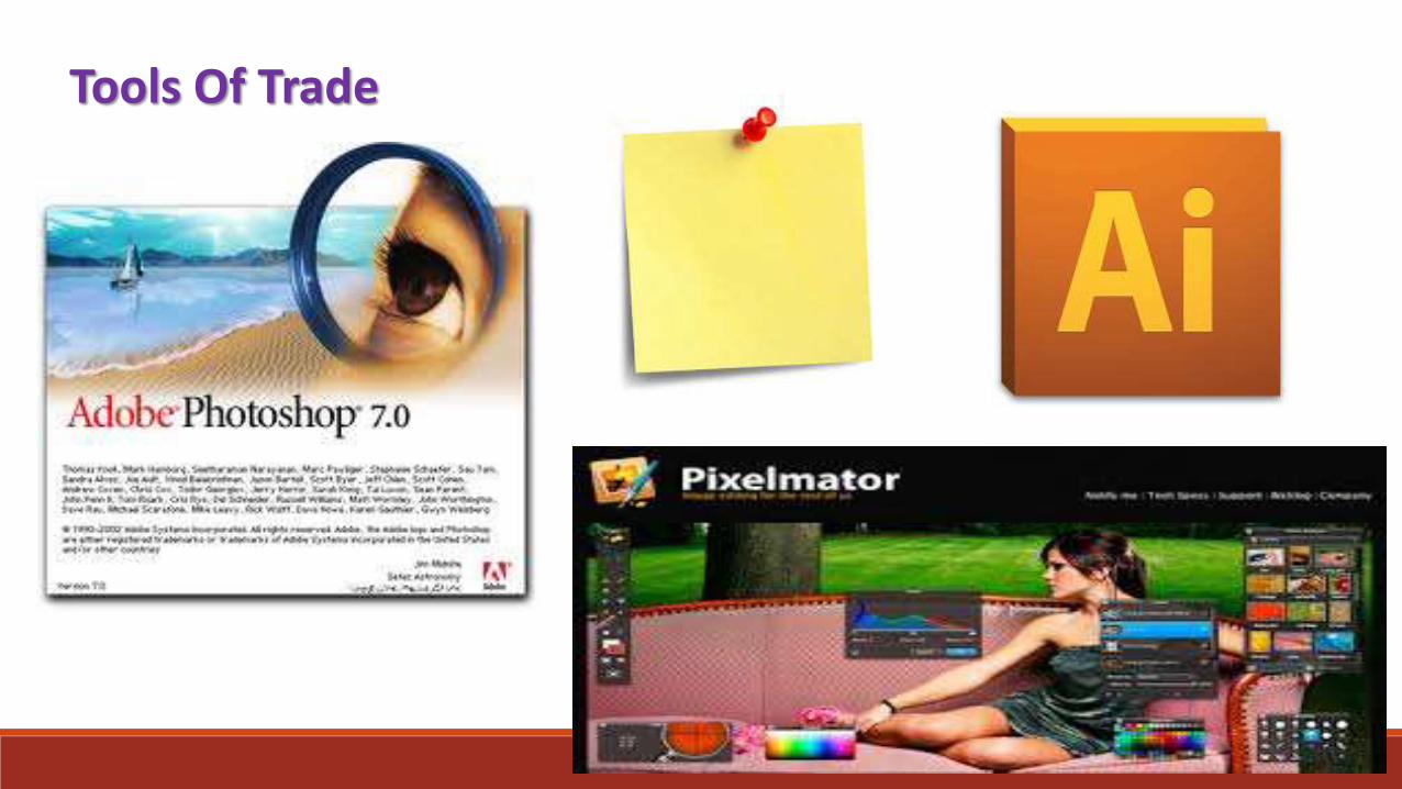
Tools Of Trade

Which do I Choose?
Budget
Comfort Level
Time to Invest

Work Flow
Design Elements
(AI/Photoshop)
Text
(PPT)
Publish
(PDF)

Setting Up The Deck
Projector/Screen
Audience Location
Subject Matter

What To Do?
Big Typography
Big Pictures
1 or 2 Keywords per slideyour Template

Building your PPT

Creating a “Story” Board
Why do this?
Visualize the structure
Determine the Storyline
Visually Map out the slides

How?
Use “SIMPLE” basic tools:-(keeps the mind focused on what you doing )
-Whiteboards
-Notebook /paper
-Tablet apps


Proposed workflow ??
Using the basic tools MS Powerpoint / Keynote final document
Find what works for you!!
Save your story boards!!—helps you rundown fast and review every context

6 Best Business Presentation Software Alternatives To PowerPoint
Prezi- visual treat
GoAnimate- Animate anything& everything
GoogleDocs- easy to share
SlideRocket- High end (themes , fonts etc)
ZohoShow- Cloudbased
Slidesnack – (presentation+ voice)

Choosing a Design application
What you have?
Tutorial needed for photoshop & illustrator)
--If not then stick with easier apps (keynote & powerpoint)
What you are comfortable at? Use what you are comfortable at !
Adobe
PreziMS ppt
What you have?
Illustrator

PROS & CONS

Template Board(a tray of your choice)Why? When?
Once you have selected your design application , now its time to put in your Theme into the app
acts as a reference .. save them..later
usage

Working with images:
•Optimize your image before incorporating it in the PPT
•How? By any image editing application
•Convert the images in Jpeg – high quality

The Most popular way !!Big bold background images into your slide ..
Analysethe image
Find the blank
spaces
Make your text flow around it

Example slide:
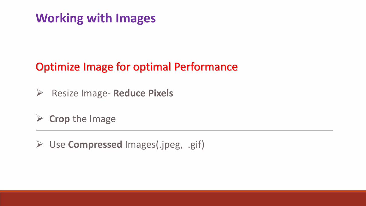
Working with Images
Optimize Image for optimal Performance
Resize Image- Reduce Pixels
Crop the Image
Use Compressed Images(.jpeg, .gif)

Let Your Images Tell The Story

DON’T USE BACKGROUND IMAGE LIKE THIS

USE BACKGROUND IMAGE LIKE THIS

Working with Text
Arial
Times New Roman
Courier
Impact
• Use Basic Fonts

WHY?

Less is more

Use a minimum of 30pt font
This is Size 14
This is Size 18
This is Size 20
This is Size 24
This is Size 28
This is Size 30
This is Size 32

Maximum 5 Bullet points
Bullet 1
Bullet 2
Bullet 3
Bullet 4
Bullet 5

Line Spacing: 1.0
This is the example of proper Line spacing.
This is the example of
proper Line spacing.

Contrast

COMMON GOAL OF PRESENTATION
Data Visualization
Design follows data
Think about what makes the infolook good
Pie \Bar chart are for the weak
Be Creative

Story Telling With Numbers


Relationships In Data
Can you relate data points over time?
Can you compare two groups of data?
If so, visualize in that manner
Cite your sources(sources should be reliable)
Appeal to your audience

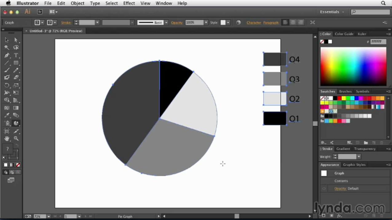
HOW TO MAKE CHARTS IN PRESENTATION


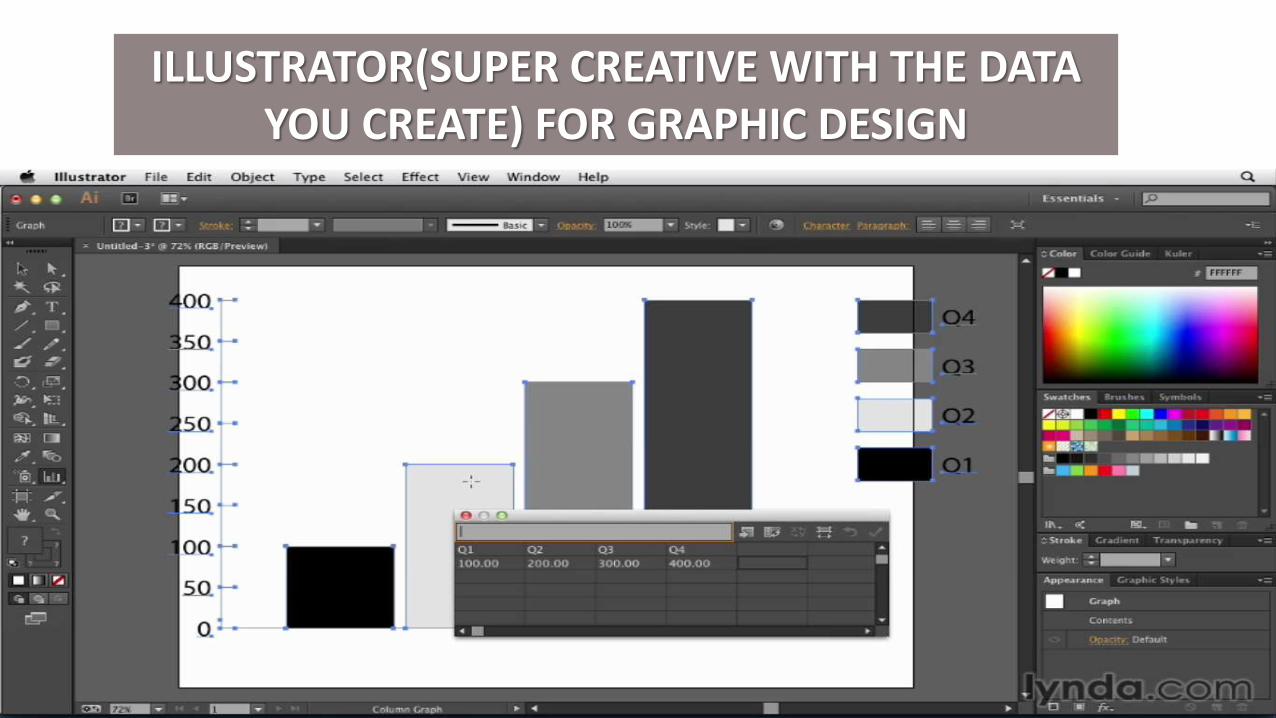
ILLUSTRATOR(SUPER CREATIVE WITH THE DATA YOU CREATE) FOR GRAPHIC DESIGN

Controlling The Focal Points
Draw the audience in
Make the audience focus on a specific word
Have a purpose behind them
Bring meaning to slides

Show Pointing Mechanism
Pointing should be done to make it appealing to audience and if you want to highlight some important data

Image Focal Points
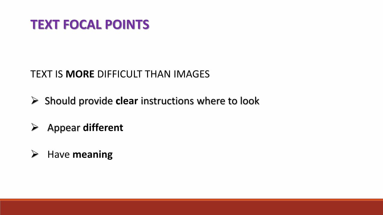
TEXT FOCAL POINTS
TEXT IS MORE DIFFICULT THAN IMAGES
Should provide clear instructions where to look
Appear different
Have meaning

MOTION ON SLIDES
HOW MUCH IS TOO MUCH ?
Things to consider….
Focus should be on the content
Your not being innovative
Cheapens the look

EFFECTIVE MOTIONDetermine the order of informationDistinguish one point from anotherComplement the look and feel of a slide
Motion should not Distract the audienceConfuse the audience
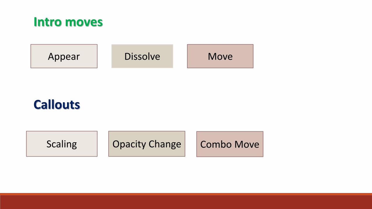
Intro moves
Appear Dissolve Move
Callouts
Scaling Opacity Change Combo Move

SLIDE TRANSITION
Denote a clear end/beginning
Provide visual break between segments
Complement the look and feel of the slide
Transition Should not
Disrupt the order of information
Cause audience confusion

EXAMPLESGOOD
• Simple dissolve
• Colour fade
• Reveal
• Subtle 3D
BAD
• Mosiac
• Sparkles
• Barn Door
• Page Curl
Transitions rules
Are the same as the motion rules

More About Presentations
Powerpoint 2013 essential training with Jess Stratton
Powerpoint for mac 2011 essential training with David Rivers
Up and Running with Prezi with Lisa Larson Kelly
Duarte design,presentation design studio with Navy Duarte
Creating infographics with Illustrator with Mordy Golding

THANK YOU!