How effective is the combination of your product and ancillary texts?

How effective is the combination of your main product and ancillary texts?
I feel keeping a house style and combination of the products is one of the most important aspects of any
music video, advertising campaign and digipack. Viewers may only take a glance at the products, therefore
repeating images or having products that relate to each other would improve interest and sales.
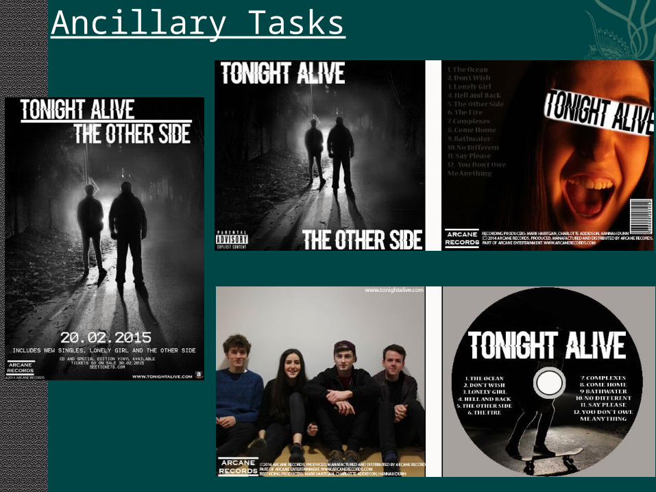
Ancillary Tasks

Music Video Stills

I feel the main way in which I have shown a combination between my music video and ancillary tasks, is the silhouetted image shown on the CD cover and the magazine advert. As I found out from my research many pop punk bands generally use the same image in both, as this is a simple yet easy way for viewers to make a link and have a greater chance at remembering the band. This type of back lit image is also shown within the video.
I also think these aspects combine well as they represent a meaning. The outer glow of the silhouette represents a form of resilience which is a common trait through the pop punk and rock genre. This is shown by many bands such as Blink 182 as they needed resilience to get to the stage they are at, starting at low levels for many years before breaking through as not many record labels support the genre. I also feel this idea of a meaning is more apparent in the pop punk genre rather then pop as the lyrics produce a story or represent some period within their life, be it good or bad. So I feel the combination here enhances the meaning and therefore the viewer can relate and interact with the music video.
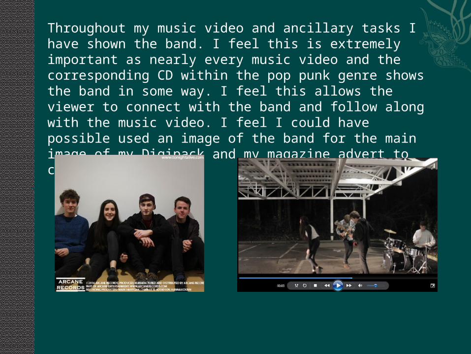
Throughout my music video and ancillary tasks I have shown the band. I feel this is extremely important as nearly every music video and the corresponding CD within the pop punk genre shows the band in some way. I feel this allows the viewer to connect with the band and follow along with the music video. I feel I could have possible used an image of the band for the main image of my Digipack and my magazine advert to confirm the genre.

I have combined my tasks and products to enhance the feeling of unity. I feel this is key within this genre as the pop punk scene has its own community, distinguishing them from the large pop scene for example. I have done this by using the band throughout the video playing the song, and then at the end of the narrative, constantly showing them together. The use of the band at the end of the narrative emphasises the strength of music and the idea of ‘music is life’ which is a common phrase in this genre. The ancillary tasks work well with the video as again they reinforce the unity, with the inside cover showing the band. The meanings that I have displayed throughout the tasks, both unity and resilience are both a convention of the genre. However within the digipack I could have included more instruments instead of the silhouetted images, this is again a convention of the genre. I feel this is an aspect where my digipack, advert and production could be improved upon and combined to fit the genre.

I have also used the same text throughout the tasks I feel this combination gives the products a brand identity, which enhance the chance of the viewer being able to remember the ‘brand’. Pop punk bands generally use bold yet simple text, so therefore I have replicated this to keep to genre conventions. An example of this text is Neck Deep a small pop punk band, their name logo is below.

To make my production as a whole a professional suit I paid attention to the small print that is used on digipacks and adverts. I found every genre had small print at the bottom involving the producer, record label and copyright notices, as I felt this would not only stick to the genre conventions but enhance the professional credibility of the tasks.

The lack of bright colours used throughout are very much a convention of the pop punk genre. This is because black has connotations of power and authority, which fits with the powerful music. Also brighter colours are generally used in pop videos and the pop punk genre tries to distinguish itself from that. I could have used more deep reds as this would connotation passion, something which is strong in this genre.