foloio
42
-
Upload
alhady-ali -
Category
Documents
-
view
215 -
download
1
description
what where
Transcript of foloio
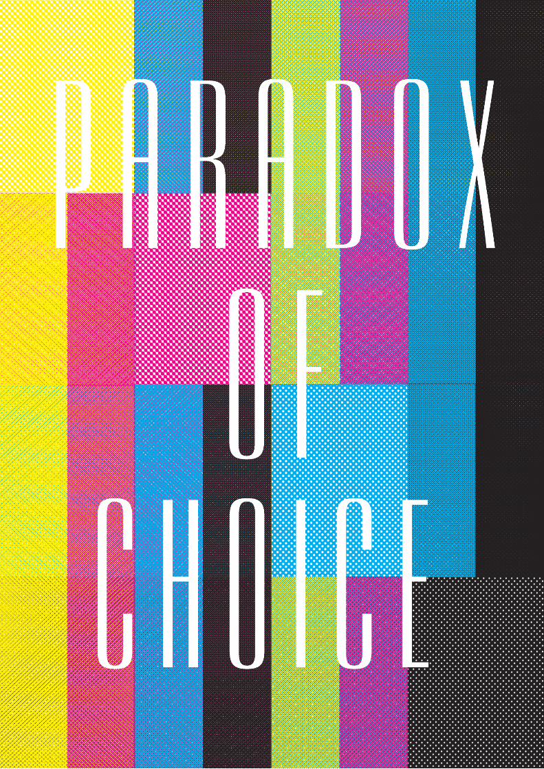
The whole concept of my initial fmp was to showcase mental health conditions in a new and interesting way. Giving more character to leaflets, posters and books. Grabbing the at-tention of general public, as the conditions I decided to look into are very common:Adhd, synesthesia, tourettes, bipolar, schizo-phrenia, telogen effluvium, dyslexia and finally ocd. As people are totally oblivious to most things in general, until they or someone close to them come cross it. My intention are to create an graphic style which grabs the at-tention of a passerby.
Here are some selected few which were influenced by South American art. The use of vibrant colours really is some what asthe-thetically pleasing colour combination which catches attention and also the fact you don’t know what it is. But when it comes down to it I think people engage to illustrations over type such as the dull pamphlets at hospitals.The technique which I used to create these was printing the background image initially, followed by the foreground type. Which was great, as it gives another dimension to the work. But the decision to abandon this, is due to he fact there isn’t really an idea behind it, but the start of the developing of a unique process and style.

Initailly I started to develop a colour pallete for the series of books I was developing, giving a new twist on mental health.
The technique I was developing in terms of process was due to reducing how much time I had. The technical procedure I took was the background was originally a screen printed page, where I then took into photoshop, and the abiltiy to adjust the hue allowed a stronger ashtetic feel and look. Then for the type I map out the typefaces which phonetically suited the conditions, I probably should related what the condition are. Taking a the approach of Micheal Gillette, James Bond books and using the same concept to follow onto my books. But asthetically I changed it to what look pleasing. The type was then screening printed over the digtal with two lay-ers with the whole words and then screen on top for the second layer for the drop shadow.
At the time I felt it work well but looking back it works well for developing texture and tactile element to it. But whereas the screen printed aspect to it is almost taken away and ripped apart from the digital printing side of things, this is a technique I won’t won’t be taking any further for this reason.
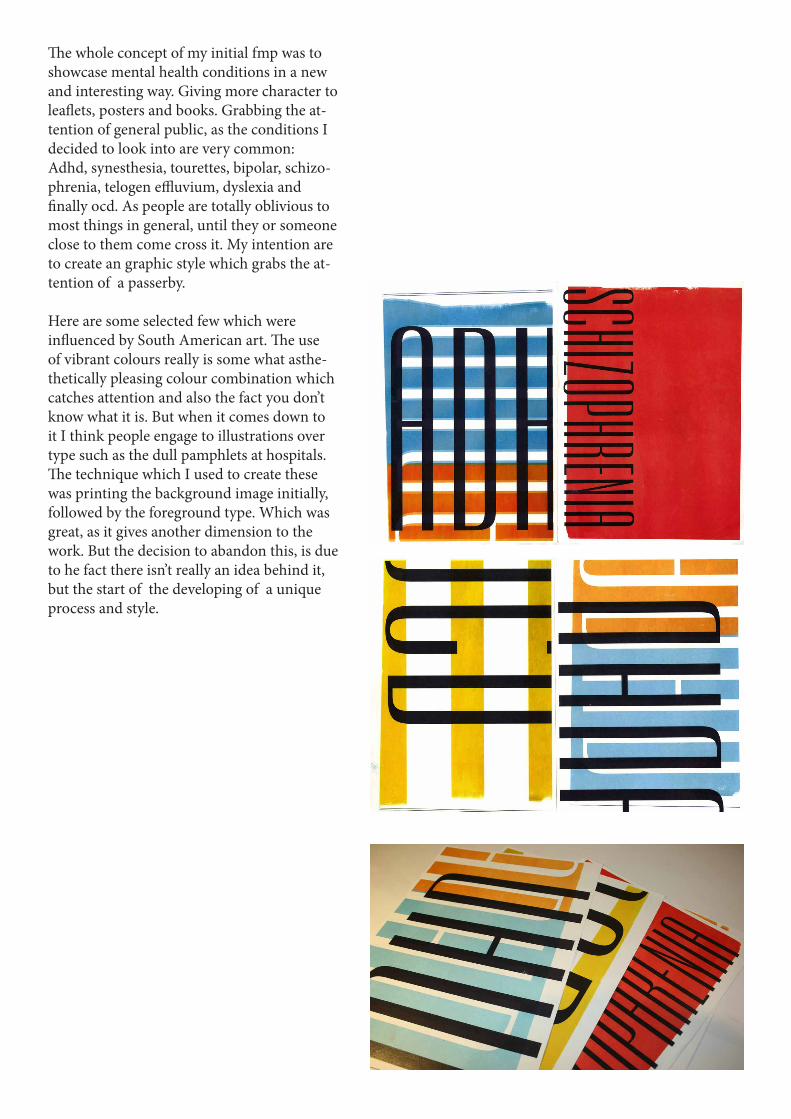
The idea here was to really get a shock factor, through my research from my trip to the local hospital and the Ebbisham center, was the fright-ening numbers who have these mentla health issues. This was the start of a series of posters which sum ups the condition. Helping ever has a chance to read it, understand the condition and gain the knowledge to help those in need.
Honestly asthetiaclly this looks dull as leaflets, but this had help me to move on and explore how I might develop the concept. When printing this poster, I decided to put through cartridge papar which created texture, which gives a nice affect, but doesn’t really go with the asthetic look of the poster.

This was an idea which was to gain an interest of those who maybe curious about mental health, promoting the awareness. This is the development of the campaign a raising the awareness with direct mail. Which would have been sent out to the doorstep awak-ening the general public about the mental health awakening 7 day mailer campaign aimed at awakening people to what is on their doorstep.
The concept is to grab the attention with a interesting format and a catchy range, ‘common people’ then revealing the truth about real people.
I aesthetically there has been a slight development with the format, but at the early stage, I don’t think there was a strong concept behind for the cam-paign, but deciding on developing a stronger concept. Instead of jumping into designing something what’s not visually pleasing.

This is a follow up on the series of conditions, the concept was to show something which you amy tend to find in a pamplet, but in a more visual sense. My intention is give what the people what they want, after a quick questionaire, the most interested aspect people are more willing to take in are real life stories. The more stories you have, the person is more looked upon being an interest-ing character.
The ashtetic look and feel of the book resembles the same as the book in the previuos unit, to fit well in a series. Being the format that A6 the Lokta paper works well, and tends to be treated with care.
The technical difficulties I came across were print-ing at some occasions the paper didn’t properly feed through but eventually printed out fine, I did try using other paper but ashtethis element to the book.
Conceptually the idea was a bit touch and go, where the message I was trying to give, was oc-cassionally being misread and seemed that I may have been taking the fun out of the people I was developing a book. So for order the book to work I would had to revisted the previous book and have a think about how to show the serious matter of what these people go through.

This is the start of new project, I just felt that with the mental health project, I wasn’t really getting anywhere, and I came up with anything that it may seem that I was sending out the wrong message.
So I changed the topic to consumerism. My initial thought was the whole idea that we have too much information thrown at us, at every given opportunity. So I decided to do the obvious and start off with the background knowledge and reading articles on consumerism and see what comes out from the subject.
The idea was to develop a manifesto which deals with the topic. Using screen printng as a method I was able to get a number of various results, using the techniques of Alan Kitchin and Anthony Burrill method of screen printing. This is the start of the beginning of what the manifesto may of look like.
Here I used a single, yellow to overlay the type, to get the sense of what consumerism is, while also thinking about the composition and how its being read. The screen printing gives more of an tactile aesthetic quality to the print rather than just a digital print. The more interesting with how the type responds to each other when the layer is printed.
This is where I tried to get a gradient of various different colours, I really like areas of the print but, unfortunately manual problems I had were in some cases during screen printing the letters may have not printed due to the lack of ink or the dry ink blocking the mesh.

Creating a smooth gradient turned out to be fairly difficult, a tech-nique I won’t carry on with.
This was the ideas of using vari-ous different colours, overlaying the type, which shows the idea of choice , with the use of colour.
This is just an experimentation to represent all the rubbish in the world. The technique I used was directly splashing the paint onto the screen and printing the nor-mal way.

Around this stage, screen printing was heav-ily apart of the direction I was heading, as deadline was approaching fast and not really having a strong concept the time screen print-ing takes it wasn’t a great method of process which I could of followed on with.
Aesthetically the ‘overload’ screen prints look very engaging, I think people would be drawn to them, whereas time is of the essence. So developing a process was a key factor.

The idea is to send the message of too much information, will cause us the to breakdown of people and evi-dently lead to depression. Through the use of the word ‘overload’.
This is a four colour process overlay-ing the each colour, offsetting each colour by centimetre, to create cohe-sion of the word overload.
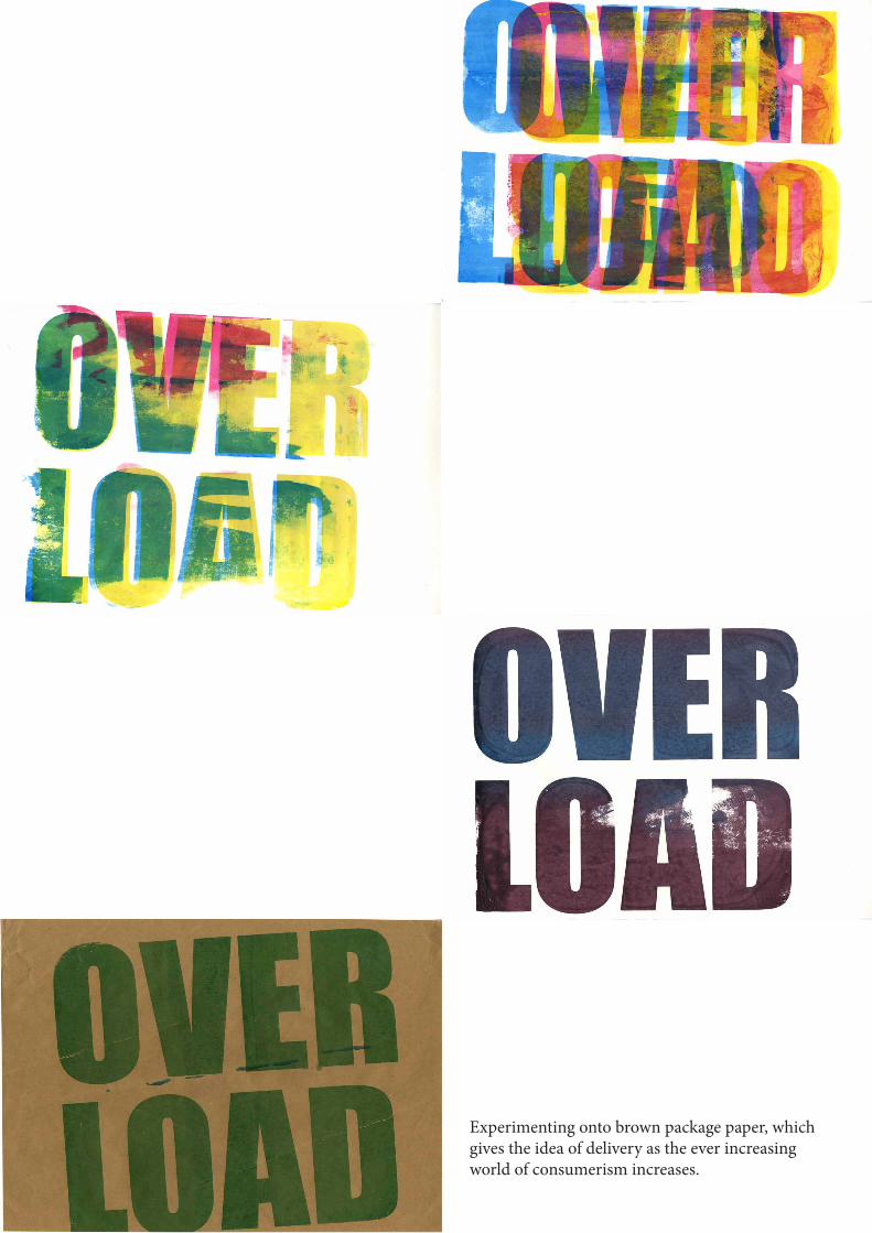
Experimenting onto brown package paper, which gives the idea of delivery as the ever increasing world of consumerism increases.
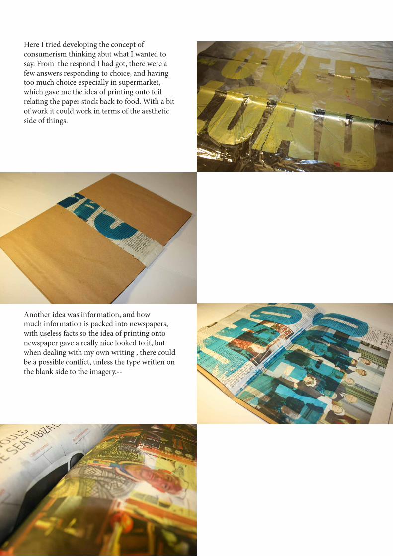
Here I tried developing the concept of consumerism thinking abut what I wanted to say. From the respond I had got, there were a few answers responding to choice, and having too much choice especially in supermarket, which gave me the idea of printing onto foil relating the paper stock back to food. With a bit of work it could work in terms of the aesthetic side of things.
Another idea was information, and how much information is packed into newspapers, with useless facts so the idea of printing onto newspaper gave a really nice looked to it, but when dealing with my own writing , there could be a possible conflict, unless the type written on the blank side to the imagery.--
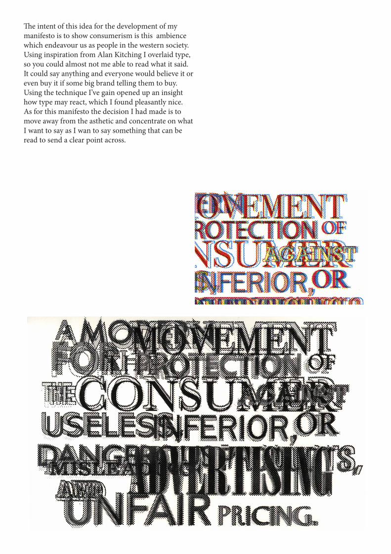
The intent of this idea for the development of my manifesto is to show consumerism is this ambience which endeavour us as people in the western society. Using inspiration from Alan Kitching I overlaid type, so you could almost not me able to read what it said. It could say anything and everyone would believe it or even buy it if some big brand telling them to buy.Using the technique I’ve gain opened up an insight how type may react, which I found pleasantly nice. As for this manifesto the decision I had made is to move away from the asthetic and concentrate on what I want to say as I wan to say something that can be read to send a clear point across.
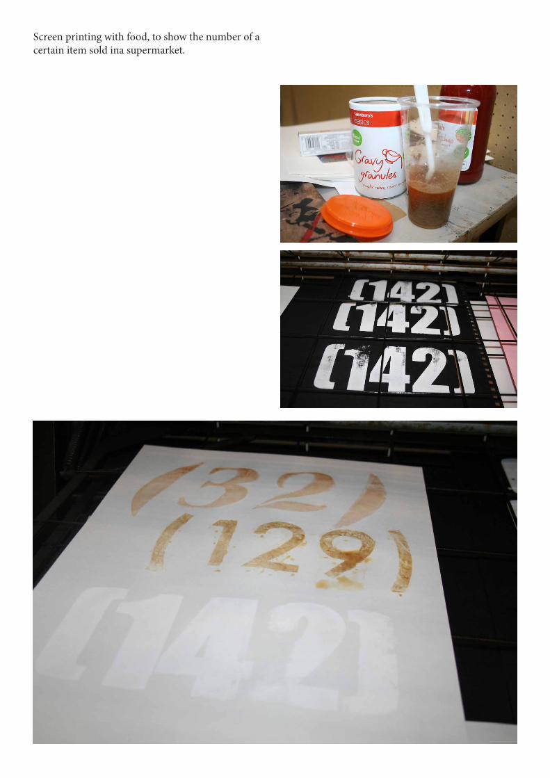
Screen printing with food, to show the number of a certain item sold ina supermarket.
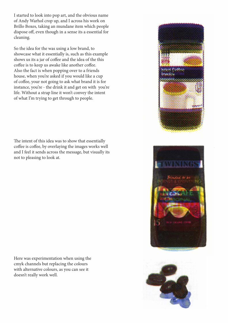
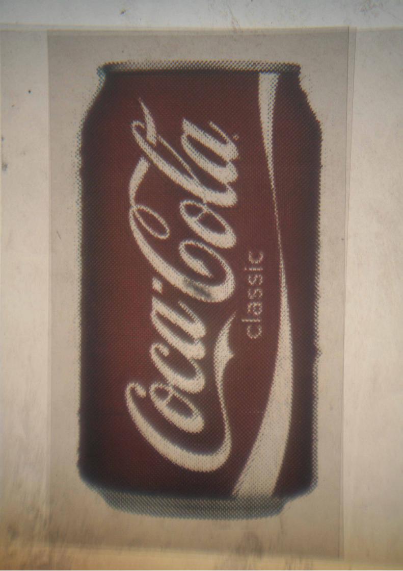
I started to look into pop art, and the obvious name of Andy Warhol crop up, and I across his work on Brillo Boxes, taking an mundane item which people dispose off, even though in a sense its a essential for cleaning.
So the idea for the was using a low brand, to showcase what it essentially is, such as this example shows us its a jar of coffee and the idea of the this coffee is to keep us awake like another coffee.Also the fact is when popping over to a friends house, when you’re asked if you would like a cup of coffee, your not going to ask what brand it is for instance, you’re - the drink it and get on with you’re life. Without a strap line it won’t convey the intent of what I’m trying to get through to people.
The intent of this idea was to show that essentially coffee is coffee, by overlaying the images works well and I feel it sends across the message, but visually its not to pleasing to look at.
Here was experimentation when using the cmyk channels but replacing the colours with alternative colours, as you can see it doesn’t really work well.
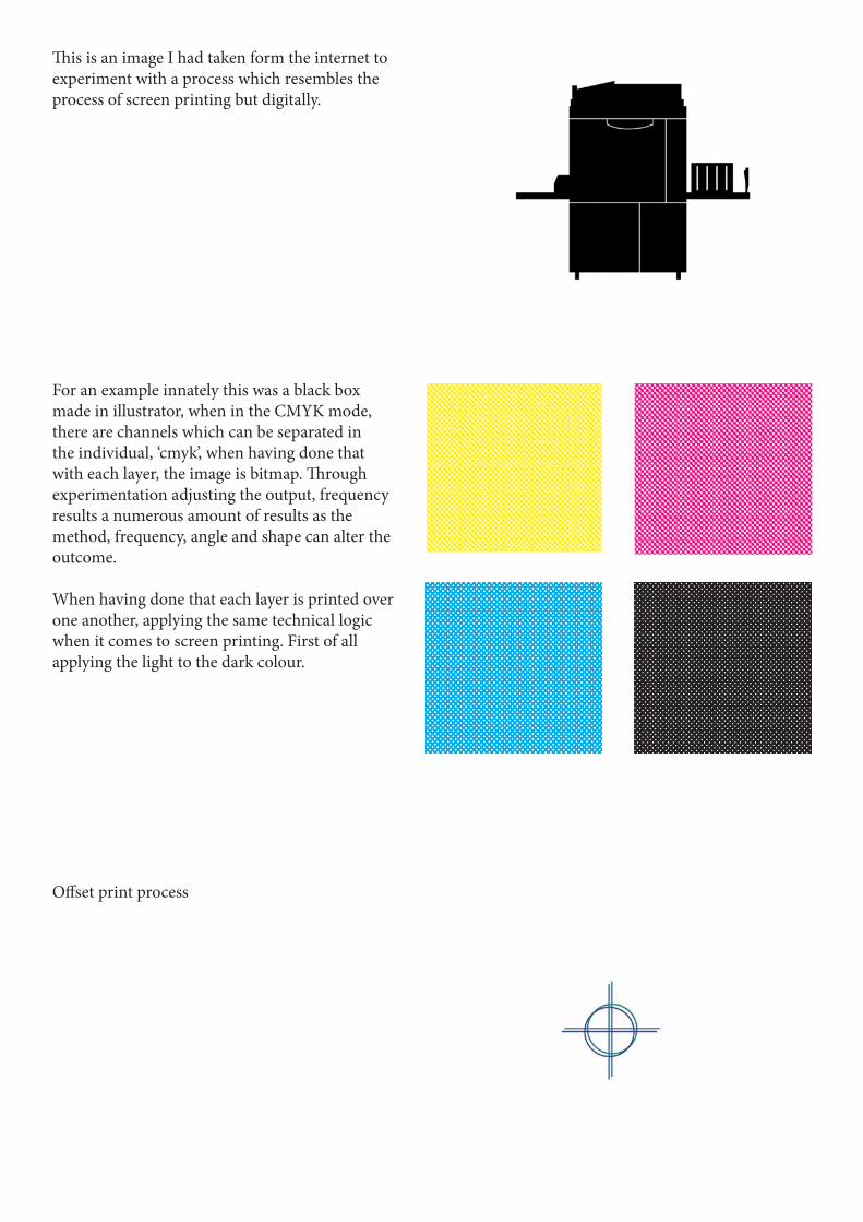
This is an image I had taken form the internet to experiment with a process which resembles the process of screen printing but digitally.
For an example innately this was a black box made in illustrator, when in the CMYK mode, there are channels which can be separated in the individual, ‘cmyk’, when having done that with each layer, the image is bitmap. Through experimentation adjusting the output, frequency results a numerous amount of results as the method, frequency, angle and shape can alter the outcome.
When having done that each layer is printed over one another, applying the same technical logic when it comes to screen printing. First of all applying the light to the dark colour.
Offset print process

When it comes to bitmapping imagery, their were key experimentation I discovered as I was doing them, for instance when dealing with small images I came across using low frequency meant that the when it came to printing the images were hardly recognisable. There increasing the frequency on the smaller images resulted in as much clearer illustration due to pixels being much closer to one another.
So developing the understanding of the level of output and frequency was essential when coming to put my books together.

Original photograph
Using the method caused an technical predicment, when re-entering the paper back into the printer, due to the slight movement of the paper, has an affect to the final illustration, which look astheticailly pleasing due to every print is unique to the next.
While experimenting this process does take a fair bit of time , but a lot quicker than screen printing, the quality I liked about this method is the combinations you can get by feeding the paper or choosing to use one colour before using another. Also without the black help to brighten up the illustration, which I feel works better.
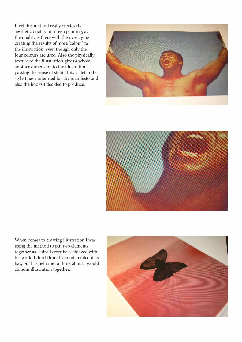
I feel this method really creates the aesthetic quality to screen printing, as the quality is there with the overlaying creating the results of more ‘colour’ to the illustration, even though only the four colours are used. Also the physically texture to the illustration gives a whole another dimension to the illustration, passing the sense of sight. This is defiantly a style I have inherited for the manifesto and also the books I decided to produce.
When comes to creating illustration I was using the method to put two elements together as Isidro Ferrer has achieved with his work. I don’t think I’ve quite nailed it as has, but has help me to think about I would conjoin illustration together.

For the front of the manifesto I started to get obsessed about ways to create different showing the options created by CMYK.
I think conceptually this works well with the number of choice created ironically by four colours. I think this illustrates the core empathise of the subject choice. Aesthetically the way it looks and how its been printed gives a unique element to the manifesto.
The image on the right shows each four corner of the paper and below showing the order of print a to d. The way I manage to kept the type keeping it as a fixed image.
1 2
3 4
a b
c d

The results the number of colours gained through all four going through the printer.

This was an interesting approaching reducing the opacity from the full 100% to 25% gave a great variation of more lighter colours, which gave a more pleasant look to the harsher vibrant colours from the manifesto above.
a b c d

I tried out various different paper to distinguish what work well, ranging from 150gsm cartridge paper to newsprint, as you can see the thick cartridge jammed the printer. The paper itself doesn’t hold the ink too well, but gives a nice texture to the image. Where the newsprint had the same problem work well up to a point, and also jammed the printer but the finish was really great. As for the look of the design doesn’t appeal to me, due to the white type clashing with the white diagonal lines.
This was experimentation to give me the idea of what colours I could expect form overlaying the each colour, seeing how blend together, fro further experimentation.a
PAPER STOCK

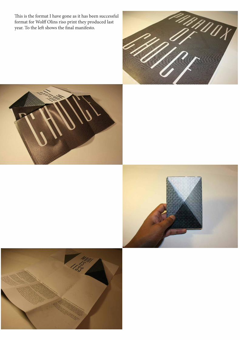
This is the format I have gone as it has been successful format for Wolff Olins riso print they produced last year. To the left shows the final manifesto.
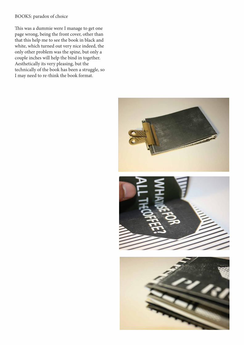
This was a dummie were I manage to get one page wrong, being the front cover, other than that this help me to see the book in black and white, which turned out very nice indeed, the only other problem was the spine, but only a couple inches will help the bind in together. Aesthetically its very pleasing, but the technically of the book has been a struggle, so I may need to re-think the book format.
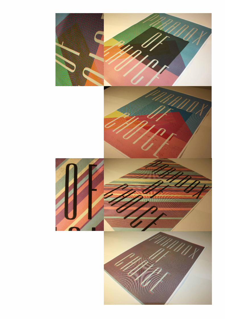
BOOKS: paradox of choice
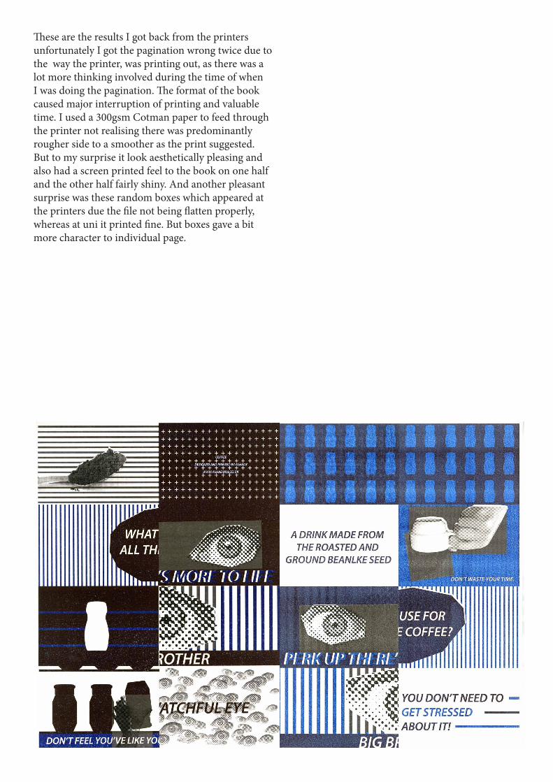
These are the results I got back from the printers unfortunately I got the pagination wrong twice due to the way the printer, was printing out, as there was a lot more thinking involved during the time of when I was doing the pagination. The format of the book caused major interruption of printing and valuable time. I used a 300gsm Cotman paper to feed through the printer not realising there was predominantly rougher side to a smoother as the print suggested. But to my surprise it look aesthetically pleasing and also had a screen printed feel to the book on one half and the other half fairly shiny. And another pleasant surprise was these random boxes which appeared at the printers due the file not being flatten properly, whereas at uni it printed fine. But boxes gave a bit more character to individual page.

This pagination was slightly different the toothpaste, and guess it still wasn’t correct.

This was the first inital run on normal paper to see if the type inbetween the double page spread read correctly. As it slightly gets lost when getting into the middle.
This gloss finish 250gsm paper printed out very well but I didn’t really like the glossy outcome to the book, as a matte outcome works better as it was more pleasing from suggestion gathered around a group of friends.

This was the first issue on paper which work well despite the pagination as both book were work on at the same time, pleased with the visual, as the books are meant to be against choice and showing the implication when choice is an option. As greater choice is provided more and more time is lost due to choosing. People leave with less satisfaction thinking that the choice they have made is the wrong one. The visual language correlates to

With my naivety when coming to print my books at uni, in the space of 5-10 minutes I accidently printed on the same side as the page before, which pleasantly looked quite attractive. But wouldn’t work as a book, as there any of the pages wouldn’t read correctly.


This is similar to ‘coffee’ even though the pagination on this looks correct but actually I occur a few problems dealing the gate fold and the cover. But again the aesthetic look to the whole looks very pleasing, technical aspects to the printing has been a major downfall but eventually getting there. The concept is to start to get people getting things they need rather than what they want. There’s more to life than luxuries, as those people are scared of not being able to afford those items when they can’t so they buy items according to there naivety.

FINAL OUTCOME: COFFEEThis is one of two books created not for the sake of coffee. It’s more, its choice in general, as people think that more choice gives more satisfaction, but there wrong as more gives too much options to think about. Which leads to stress and even depression, as the person may inherit paralysis. With the book coffee I used my manifesto on choice to base the book on, and visually communicate what is on the manifesto. I feel that conceptually they both support each other, whereas one speaks quite clearly whereas one tells a stories in a more abstract way. To the right shows the order of the book, imagine if your reading a book form left to right then following on to the line below.

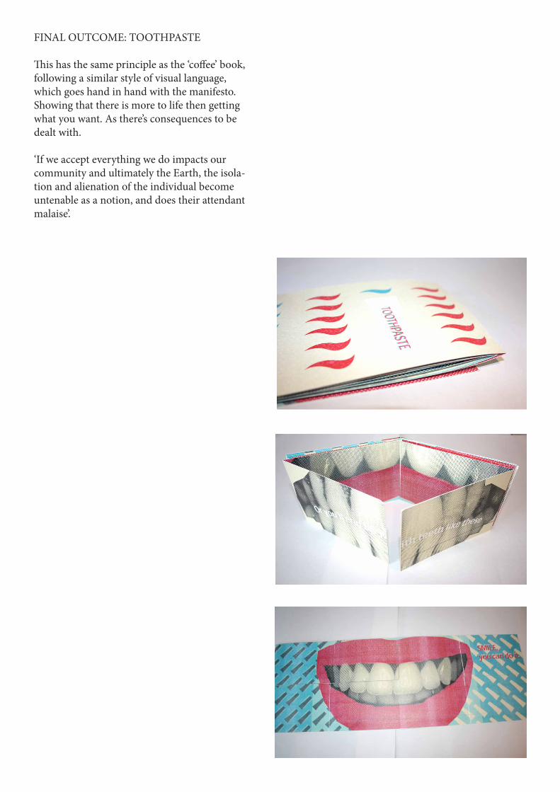
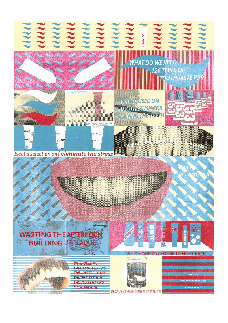
FINAL OUTCOME: TOOTHPASTE
This has the same principle as the ‘coffee’ book, following a similar style of visual language, which goes hand in hand with the manifesto. Showing that there is more to life then getting what you want. As there’s consequences to be dealt with.
‘If we accept everything we do impacts our community and ultimately the Earth, the isola-tion and alienation of the individual become untenable as a notion, and does their attendant malaise’.

At the beginning of the fmp, I was dead certain on creating a series of books on mental health, certain that with he time we had to gather my own research to then develop into a series. Also the shear amount of condi-tions I was looking it was way to much, as you guys your better off doing one thing well then doing a lot badly.
This really quite fits into this concept of choice, as I had so many choice I got stressed out and procrastinated a lot. I found that getting a the right concept down first allows you to push forward, and experiment in many different ways.
This project was definitely a challenge which I was try-ing to come up with the perfect project. I very much enjoyed working on project finally changing my idea, and see myself producing work like this in the future.
I’m very pleased about how the books have turned out, but a bit gutted not making a third book to really give the set a some cohesion, but possibly changing the angle on what it say’s, for instance the types of milk there are in the supermarket. Aesthetically the quality of the book being printed on the paper giving a matte effect on one side slight shiny effect gave a real lift to the books. Also how the manifesto had been printed and the concept of limiting the colour palette to cymk, shows an ironic achievement.
Most importantly this has gave me the opportunity to stop people make them think of there action and ques-tion what they need rather then what they need. It has been a successful project if I could change the percep-tion of a person, I think the job is done.
EVALUATION

BIBLIOGRAPHY
The Paradox of Choice: Barry Schwartz
No Log: Naomi Klein
Consumer Culture and Modernity: Don Slater
Barnbrook Bible: Jonathan Barnbrook
Adbusters Magazine
ctrl, alt del magazines
Guardian: consumerism
Telegraph: consumerism