Evaluation - Question 2
14
Evaluation Question 1 In what ways does your media product use, develop or challenge forms and conventions of real media products?
Transcript of Evaluation - Question 2

Evaluation Question 1
In what ways does your media product use, develop or challenge forms and
conventions of real media products?
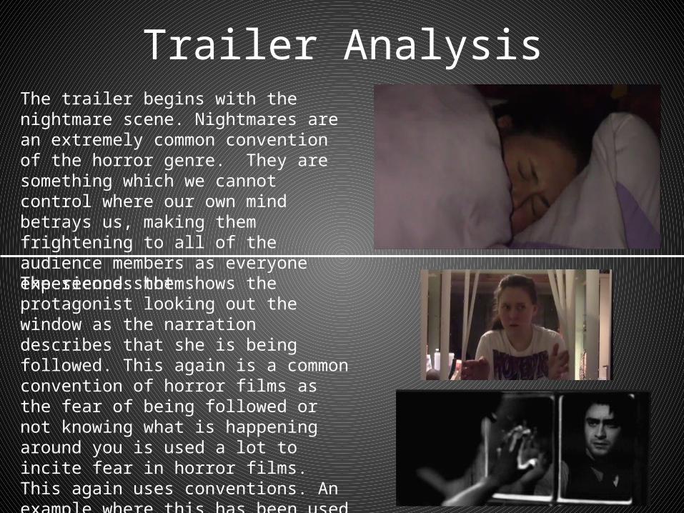
Trailer AnalysisThe trailer begins with the nightmare scene. Nightmares are an extremely common convention of the horror genre. They are something which we cannot control where our own mind betrays us, making them frightening to all of the audience members as everyone experiences them.
The second shot shows the protagonist looking out the window as the narration describes that she is being followed. This again is a common convention of horror films as the fear of being followed or not knowing what is happening around you is used a lot to incite fear in horror films. This again uses conventions. An example where this has been used before is in the film “The Woman In Black” where the protagonist is being followed and looks out of the window worriedly.

The next important shot is the scream. Following a blank screen this shot is intended to be a jump scare as the loud sound of the scream catches the audience off guard. I decided to use a scream as it connotes fear and danger from the protagonist. This has been a convention since it was used in the film “Psycho” in 1960. It distresses the audience and makes them fear what is endangering the character.
Next is the production and distribution company logos. These are placed around the beginning of the trailer where they do not look out of place. This also helps to set the tone for the trailer as the production company here shows the genre before the rest of the trailer has been seen.

Next is the news report. This has been a feature of countless horror films as it helps to establish a backstory of past events in a serious and believable manner. This uses conventions as it is widely used and recognisable to the audience as a technique used in horror films to describe the events leading up to where the film takes off.
Following on from the production company logo is the introduction of the director. This is usually accompanied by some examples of successful films in order to attract more audience members. I used this technique in hope that it will have this effect. Here is an example of this being used in the trailer for “Sinister 2”. This is a technique used across all genres of film, not just horror.

Research into the evil antagonist is a widely used convention of horror films, with most trailers featuring a computer or book with information about the character inside. Here I have chosen a computer as it is more up to date with modern technology. An example of a film where this has been used was in “Sinister”. The protagonist used a computer to research the antagonist uncovering information and forums about it.
The use of the dark shadowy underpass setting is used in films such as “Let Me In” as they display all the features of a conventional horror film set. Dark, grey and claustrophobic it is a very common setting for the meeting of the antagonist and the victim and it is sheltered so there are no passers by.

Being chased through the woods. Another example of where I have used a convention. Seen here is an example from “Evil Dead” where the protagonist is being chased through the forest. The secluded atmosphere puts the audience on edge as it makes them feel venerable as the character is trapped even though she is in an open space. There is a lot of open space in the shot creating tension as an attack could come from any direction.
This shot helps to build the tension towards the end of the trailer. Having the frantic movements and loud screaming really panics the audience and makes them realise that the protagonist is in great danger, meaning that the antagonist should be feared. This is a conventional technique to create a fear for the antagonist without showing them directly and ruining any of the plot.

Showing blood connotes danger and effects the audience as it creates tension. The blood shows that the battle between the good and the evil characters will not be pretty, creating more of a cliff hanger and attracting the audience to go and see the film, as my target audience want to see the extreme. The blood is conventional as it goes with the genre extremely well as one of the main elements of horror is death and injury, which is shown best by dripping blood as it shows a lot without being too graphic.
The last shot shows the protagonist wielding a weapon. This is often added into trailers to leave them on a cliff-hanger. Will the evil villain catch the protagonist or will she be strong enough to fight back? This is conventional as it is a great advertising technique. It makes the audience wonder how the film will end, tempting them into going o see the film. This is why I ended my trailer with this shot. It acts as a great cliff-hanger, ending just as the tension has risen to it’s peak.
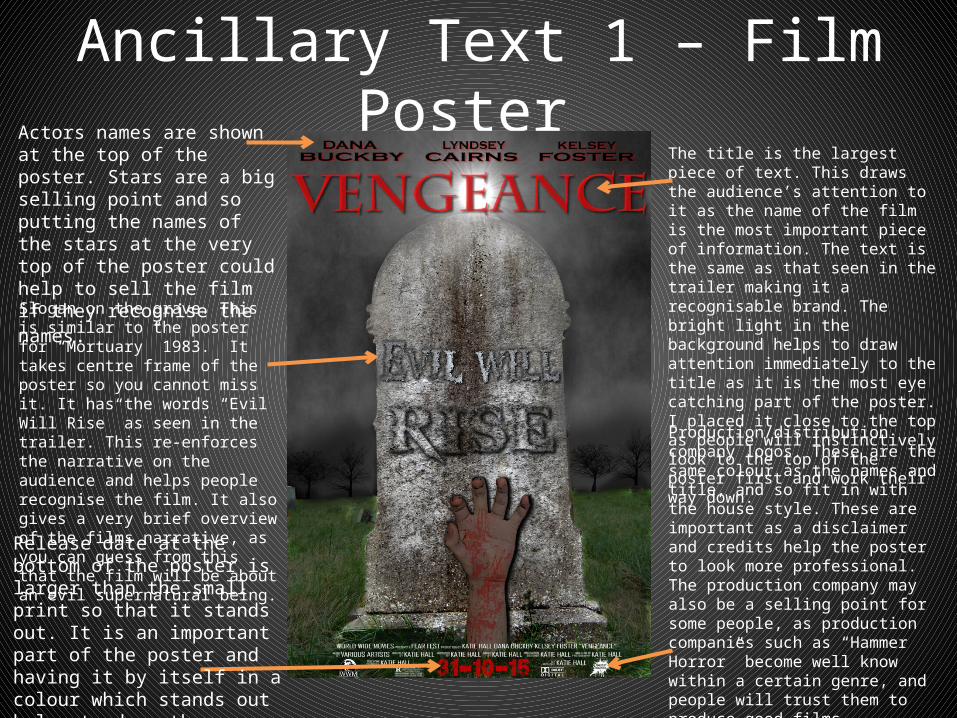
Ancillary Text 1 – Film Poster Actors names are shown at the top of the poster. Stars are a big selling point and so putting the names of the stars at the very top of the poster could help to sell the film if they recognise the names.
Slogan on the grave. This is similar to the poster for “Mortuary” 1983. It takes centre frame of the poster so you cannot miss it. It has the words “Evil Will Rise” as seen in the trailer. This re-enforces the narrative on the audience and helps people recognise the film. It also gives a very brief overview of the films narrative, as you can guess from this that the film will be about an evil supernatural being.
The title is the largest piece of text. This draws the audience’s attention to it as the name of the film is the most important piece of information. The text is the same as that seen in the trailer making it a recognisable brand. The bright light in the background helps to draw attention immediately to the title as it is the most eye catching part of the poster. I placed it close to the top as people will instinctively look to the top of the poster first and work their way down.
Release date at the bottom of the poster is larger than the small print so that it stands out. It is an important part of the poster and having it by itself in a colour which stands out helps to draw the audience’s attention to it.
Production/distribution company logos. These are the same colour as the names and title, and so fit in with the house style. These are important as a disclaimer and credits help the poster to look more professional. The production company may also be a selling point for some people, as production companies such as “Hammer Horror” become well know within a certain genre, and people will trust them to produce good films, therefore convincing more people to go and see it.

Existing Posters - Layout
The layout of my poster follows the conventions of both the medium and the genre. Here I have found 2 posters which look similar to my poster. As you can see I have used a conventional layout by starting at the top of the page with names of stars. I have then challenged the conventions by putting the title at the top. Most horror films out the title at the bottom, but I thought that putting it at the top would mean that people would see this before anything else as it stands out and most people read a page from top to bottom, so it would be one of the first things the audience sees. Under the title is the main image which takes up most of the space on the poster. This contains a quote which as you can see in the examples is usually above or below the main image, and I have challenged the layout convention by having it as part of my main image. I felt that this was an effective way to get the message of the film across to the audience. At the bottom of the page there is the small print and the release date along with the relevant company names. This is conventional as people will read the bottom of the page last and so they will not be reading the small print until last. They will also read the date last so that it will stay in their minds.
Release date
Stars Title
Quote
Credits
Main image

Existing Posters On horror posters, hands are everywhere! Whilst doing my research it was prominent that hands were used A LOT. This made it obvious that I had to in cooperate one into my poster, as they show a threatening part of a person without showing any of the rest of the being and giving too much away about the character. My poster uses conventions in the sense that a grave stone is used – mirroring the common theme of death in horror films. It also uses dark grey colours which as you can see here is extremely common. I have also used the colour red for my title which reflects blood and danger and is a common convention of media products of a horror genre. You can also see that the colours have a low contrast and are very dull. I have tried to use this convention in my poster by using the colour tool to adjust the contrast and make the brighter colours more dull. This also helps the title to stand out. I have used the grey colours for the sky in my poster, so that it is conventional in the fact that the most dominant colour in the poster is grey, reflecting the dark themes.

Ancillary Text 2 – Magazine CoverMasthead at the top of the page is a different font to the rest of the page so it stands out as a recognisable brand name for the magazine.
Magazine website so that readers can get more information
Plug with a USP stands out due to the unique shape of the background which conforms to the genre of the film featured.
Barcode with price lets the audience know the cost of the magazine. The barcode is in an obvious place making it easier to scan.
Skyline has an overview of what is included in this issue of the magazine, which lets the audience decide weather to purchase the magazine without having to read through it. It may also attract some people who do not normally buy the magazine to purchase it.
Taglines are used to give readers an insight into what is included in the magazine, hopefully making them want to purchase a copy as the taglines are interesting and inviting.
Cover line/headline is used to entice the reader into reading the magazine. This is usually the most interesting story of the issue and so it has to be appealing in order to attract the largest audience.
Quote from the headline which attracts the reader to see what the rest of the article says.
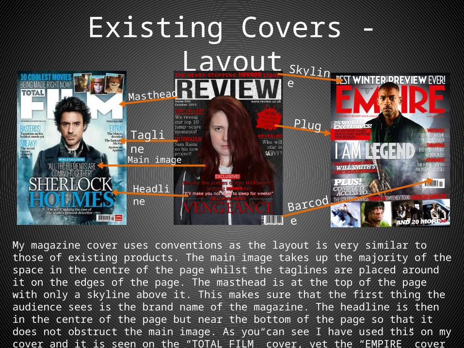
Existing Covers - LayoutSkyline
Masthead
PlugTagline
Headline
Barcode
My magazine cover uses conventions as the layout is very similar to those of existing products. The main image takes up the majority of the space in the centre of the page whilst the taglines are placed around it on the edges of the page. The masthead is at the top of the page with only a skyline above it. This makes sure that the first thing the audience sees is the brand name of the magazine. The headline is then in the centre of the page but near the bottom of the page so that it does not obstruct the main image. As you can see I have used this on my cover and it is seen on the “TOTAL FILM” cover, yet the “EMPIRE” cover has placed the headline in the middle of the page, so it could be said that I have maybe challenged this convention.
Main image
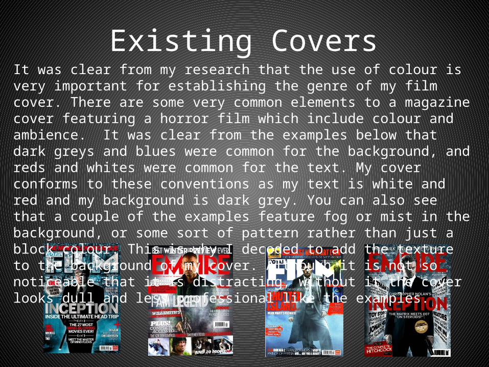
Existing CoversIt was clear from my research that the use of colour is very important for establishing the genre of my film cover. There are some very common elements to a magazine cover featuring a horror film which include colour and ambience. It was clear from the examples below that dark greys and blues were common for the background, and reds and whites were common for the text. My cover conforms to these conventions as my text is white and red and my background is dark grey. You can also see that a couple of the examples feature fog or mist in the background, or some sort of pattern rather than just a block colour. This is why I decoded to add the texture to the background of my cover. Although it is not so noticeable that it is distracting, without it the cover looks dull and less professional like the examples.

ConclusionMy trailer mostly uses conventions of existing media products. There are a few parts where the conventions are challenged, however I mostly used conventions from existing products of the same genre. I think this makes the film more appealing to the audience, especially as it is a horror film and the intention is to scare the audience. If you stray too far from the conventions then you risk confusing the genre and therefore creating a film that the audience cannot relate to, as they genre is unclear. Adding elements such as humour or romance would dilute the story and make it more difficult for the audience to take the film seriously, and this is why I mostly didn’t challenge the forms or conventions. I made small challenges to elements such as the layout, but not so much as to make it unrecognisable to the genre. All of my products stay firmly to the conventions of horror.