Creating the ancillary products
10
CREATING THE ANCILLARY PRODUCTS Emma Collins, COWA
-
Upload
emma-collins -
Category
Education
-
view
46 -
download
2
Transcript of Creating the ancillary products

CREATING THE ANCILLARY PRODUCTS
Emma Collins, COWA

Creating the poster- Main
image Before Adobe Lightroom.
After Lightroom. After Photoshop.
I wanted to use this image for my poster, however I didn’t like the lighting in this shot, instead of re-shooting I decided I could fix the problem via Lightroom.
I changed the exposure and contrast to help make the photo darker and added a vignette to create the sense of darkness. I also brightened the light from the candle and made the colour red stand out on the image.
Even though the image was much darker after Lightroom I wanted to remove the light reflection on the image, and create a bigger vignette to change the composition of the Image so the focus would be towards the middle. I also wanted to make the blood come from the eye, and stand out even more.

Final draftFirst draft
The date is clear, and stands out to the
audience.
a visible title, it stands out from the main
image and links to the other use of red on the
poster.
These images show my first draft (left) and my final draft (right) . I have added a few improvements to help keep
my posters conventional and more visually appealing to
my target demographic. My final poster demonstrates a conventional horror poster.
I’ve included company logos to make the poster conventional and
authentic.
The tag & incentive line’s font has been changed. It doesn’t stand out as much and fits in better with the poster.
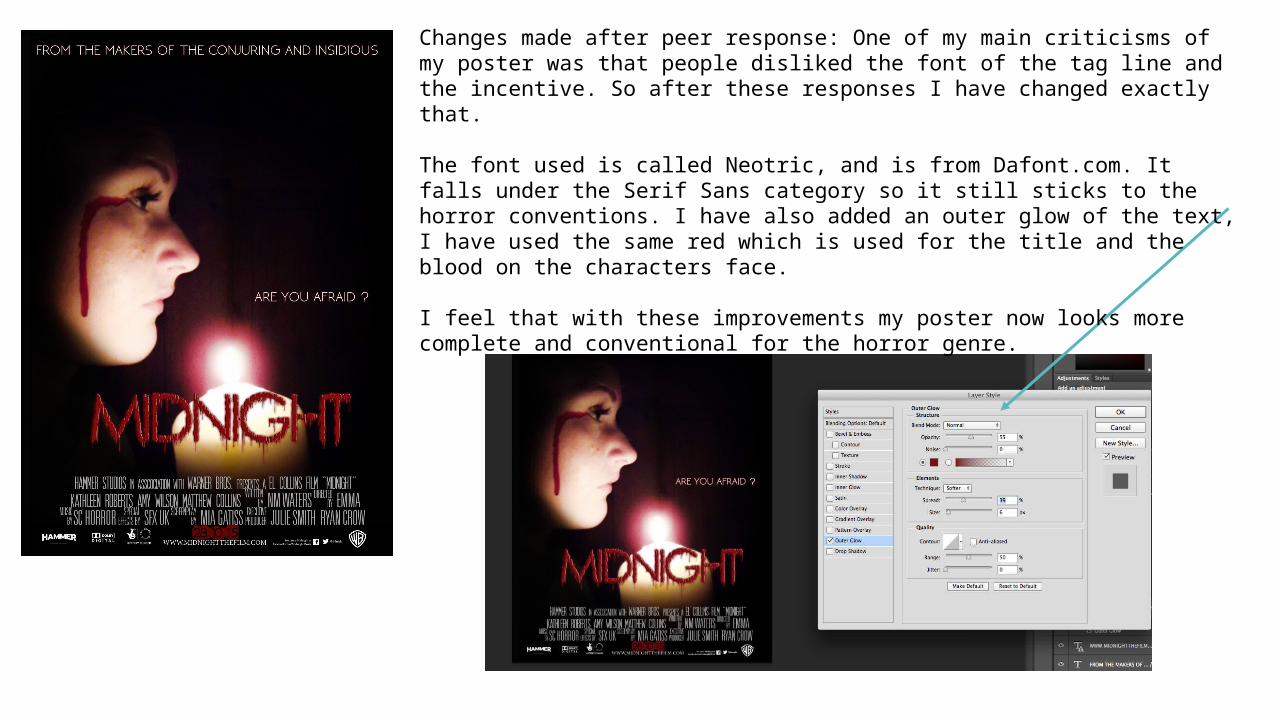
Changes made after peer response: One of my main criticisms of my poster was that people disliked the font of the tag line and the incentive. So after these responses I have changed exactly that.
The font used is called Neotric, and is from Dafont.com. It falls under the Serif Sans category so it still sticks to the horror conventions. I have also added an outer glow of the text, I have used the same red which is used for the title and the blood on the characters face.
I feel that with these improvements my poster now looks more complete and conventional for the horror genre.

Fonts and colour- Keeping to conventions:
The ‘MIDNIGHT’ title is in the font RainyDayVandal from Dafont.com, the typography looks as if the font is dripping blood, which links with the use of blood on the face in the image. This font works well on the poster as it stands out, however it doesn’t take away too much attention from the other pieces of text on the poster. I have also used red for the title as it again links to the redness od the blood and it stands out compared to the white text on the poster. Making the title stand out is conventional to any movie poster, not just the horror genre. The tag line and the incentive line use the font Neoteric (Dafont.com), this font is conventional for the horror genre. It is a simple but bold font, and doesn’t take the attention away from the title. The use of white is to ensure that it stand out from the dark background. The blocking bill uses two fonts from Dafont.com SFMoviePoster and UniversalAccreditation, these helps to make the poster seem authentic and professional. I have used a grey colour as the blocking bill is the least important piece of information on the poster, however it is conventional for theatrical posters.

I have made a few changes whilst making my final poster, these changes occurred when making the poster. The font for the main title ‘MIDNIGHT’ was changed as when making the poster I didn’t like the effect the font made, I instead found a more effective font from Dafont.com. I also changed the positioned the tag line for the film as I knew I wanted the font to be white, however it wouldn’t contrast well in front of the candle light, the positioning of the tag line allows the audience to be drawn in and give focus to the main image.
Changes-

Making the Magazine cover- The main image
Before lightroom-The image needs darkening and her skin needs to appear whiter as she is ‘possessed’.
After Lightroom-I have darkened the image, and her skin is paler. I have also highlighted the red mark on her face, to make it stand out. I wanted to make her look possessed and colder.
After Photoshop- In Photoshop I made the vignette around the image darker, isolating her. I also made her eyes seem darker and created the effect of blood on the knife.

Masthead- Is longer and sits in the top left,
which allows it to stand out more to viewers.
Plug/sell line- the horror special has been
corrected and the font has been changed to stand out more from
masthead.
Sell Lines- removed the blood effect,
and allows the fonts to stand out more.
Anchorage title/text: changed the amount of text and changed the font of the text to link
with the other fonts used on the magazine. The
title uses the same font from the poster so it is easily identifiable to
viewers. Main image- I have also brightened the image used just to make the magazine cover stand out more, instead of looking dull.
First draft - Final Magazine cover-

Fonts and Colour- Keeping to conventions The masthead font is in Neoteric (stretched) from Dafont.com. It is conventional as it is bold and stands out straight away, it is also in red which is a conventionally bright and bold colour, which is used for most magazine mastheads, it is also conventional for the horror genre. The ‘horror special’ is in Neoteric regular, and has a bevel and outer glow placed on it through effects. The sell lines titles are in Bebas Neue, conventionally bold for magazine covers , the sell line information is in times new roman italic, it is also conventionally as it is small and doesn’t take too much attention away from the rest of the magazine cover. The other fonts used are Rainy day verndal for the ‘Midnight’ font conventional for the film magazine genre as it links to the font on the poster and trailer. The colours used are red, black, yellow and white. The red is used only on the masthead and the anchorage title of the film, this is to draw attention to them against the black background. The white is used for the least important pieces of text and the yellow is used to make the sell lines stand out and to make the magazine cover stand out.

Changes- I have made a lot of changes from the original poster design, to the finished piece. Firstly the biggest change is the Magazine’s masthead. I changed it to ‘INVIEW’ as it is conventional to have the masthead starting in the top left, for the viewers route-of-eye. So ‘View’ was too short for my magazine. I have also changed the amount of sell lines I have on the left of the magazine. This was to use up more space to make the magazine look more ‘busy’ and appealing. I have made a few changes in regards to the wording of the anchorage text and skyline. However my final magazine has stuck quiet closely to the original design.