
Create Custom Reporting Using Excel and System · PDF fileEGYSKY 1 Using Excel to create SCSM...
12
Create Custom Reporting Using Excel and System Center Service Manager 2012 OLAB Cubes. 2013 IBRAHIM HAMDY NILE.COM | www.nilecom.com.eg
Transcript of Create Custom Reporting Using Excel and System · PDF fileEGYSKY 1 Using Excel to create SCSM...

Create Custom Reporting Using Excel and System Center Service
Manager 2012 OLAB Cubes.
2013
IBRAHIM HAMDY
NILE.COM | www.nilecom.com.eg

EGYSKY
1
Using Excel to create SCSM Reports
In this guide we will see how to create custom reporting using excel and system center service manager 2012
OLAB Cubes.
Online Analytical Processing (OLAP) cubes are a new feature in SCSM 2012 that leverages the Service
Manager Data Warehouse infrastructure to provide self-service Business Intelligence capabilities to the end user. 1
An OLAP Cube is a data structure that overcomes limitations of relational databases by providing rapid analysis
of data. Cubes can display and sum up large amounts of data while also providing users access to the most
granular of data. These cubes are stored in SQL Server Analysis Services databases. Self-service BI tools such
as Excel and SQL Server Reporting Services can target these cubes and allow the user to analyze the data from
multiple perspectives.
PivotTables can help you quickly and easily create useful reports. PivotTables that appear in Service
Manager Data cubes include many predefined KPI categories, called measure groups or dimensions.
These groups are the highest level of categorization, and they help you examine the data and focus your
analysis. In turn, most measure groups have many additional levels of subcategories and individual fields.
All the categories, subcategories, and fields are contained in the PivotTable Field List. For example, you
can create a straightforward report using the following steps:
1. Using the PivotTable Field List, select a category and add it as a row.
2. Select a second category and add it as a column.
3. Select a category or subcategory to add values.
After you have created your report, you can add any level of additional complexity by sorting, filtering,
formatting, and adding calculations and charts. You can also go in and out of categories as you continue
your analysis.
Prerequisites:
Installed a Service Manager Data Warehouse Management Server 2
Register Data warehouse Management Serve with the Service Manager Management server.
Ensure that the initial synchronization of the Management Packs is complete and the ETL jobs have run.
Ensure that the cubes that are defined in the Management packs have been created and fully processed.
As example, we are going to create a report in Microsoft Excel which displays total number of opened incidents by classification,
Start From here…
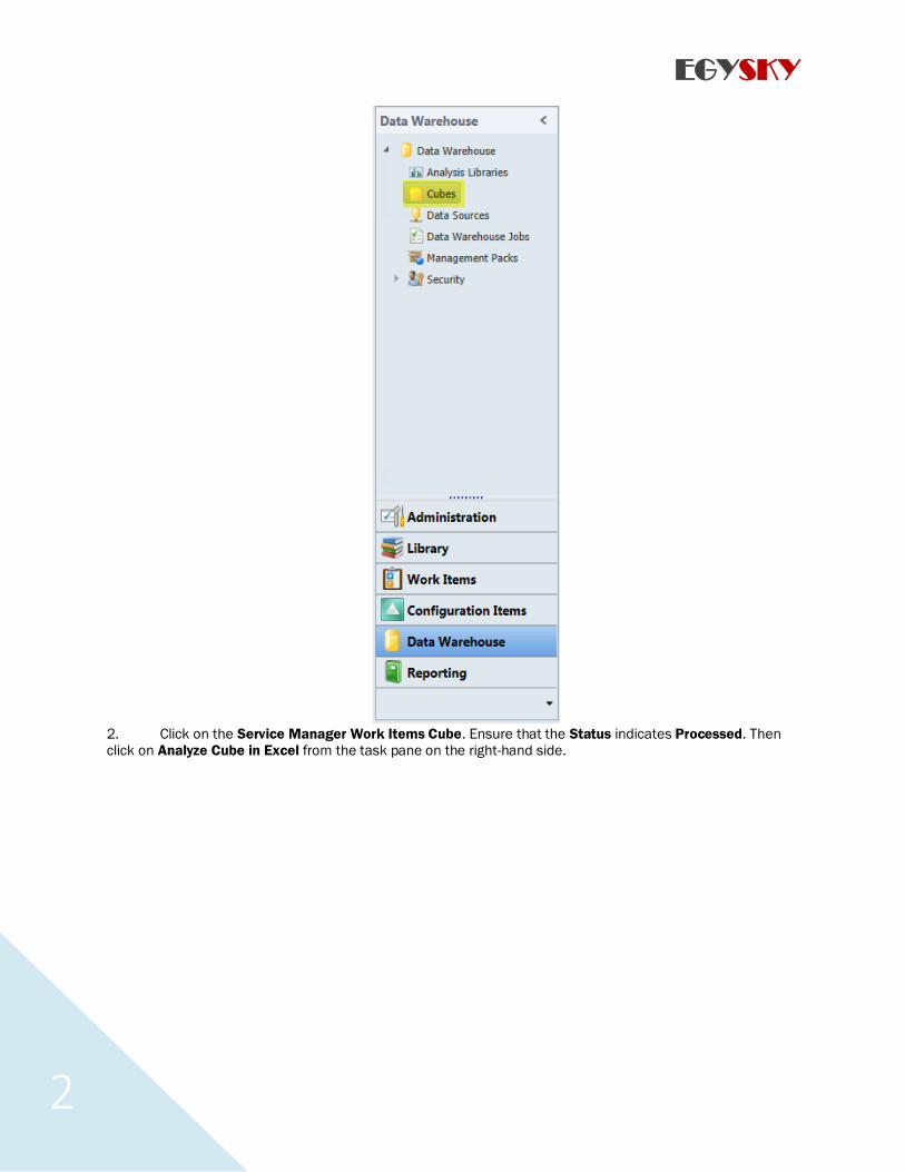
1. Open the Service Manager console and navigate to Cubes in the Data Warehouse section.
1 Understanding OLAP Cubes 2 How to Install the Service Manager Data Warehouse
EGYSKY
2
2. Click on the Service Manager Work Items Cube. Ensure that the Status indicates Processed. Then click on Analyze Cube in Excel from the task pane on the right-hand side.
EGYSKY
3
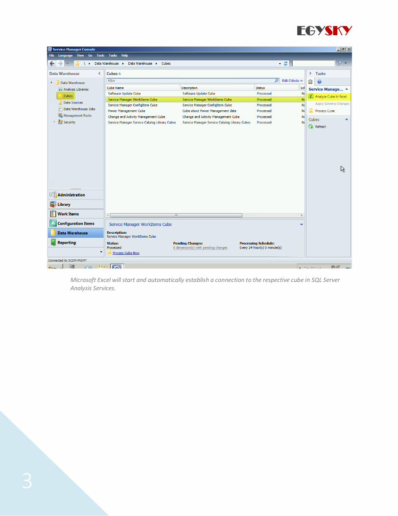
Microsoft Excel will start and automatically establish a connection to the respective cube in SQL Server
Analysis Services.

EGYSKY
4
3. The list of measures and dimensions in the PivotTable Field List can be overwhelming. Simple select
the measure group IncidentDim from the Show Fields related to dropdown.

EGYSKY
5
a) Check ‘Open Incidents
b) Scroll down to IncidentDim_IncidentClassification, expand ‘More Fields and check
‘IncidentClassificationValue’:

EGYSKY
6
c) Click on the Data ribbon and then click the properties button. Ensure ‘Refresh data when
opening the file’is selected.
d) Click on the Pivot Table and then in the Ribbon click PivotTable Tools>ANALYZE and
the PivotChartbutton
e) Choose a bar type chart.

EGYSKY
7
You can now use regular Microsoft Excel features to further customize your report. In order to refresh the data in
your report, simply right-click anywhere in the PivotTable and click on Refresh.
Excel comes with many more features for reporting than we could cover in this book. Next, we are going to
show you one example of using Slicers to filter your data.
Using Slicers to filter data
Slicers are easy-to-use filtering components that allow you to filter the data in the PivotTable with a set of buttons. For instance, you can create a slicer for filtering the PivotTable we created earlier by the status of the
incident.
1. With the PivotTable report in Microsoft Excel still open, click anywhere in the PivotTable area, then
switch to the PivotTable Tools | Options ribbon, and click on Insert Slicer.
2. Select the IncidentDim_IncidentStatus\More fields\IncidentDim_IncidentStatus.
IncidentStatusValue field and click on OK. The Slicer appears in Excel.

EGYSKY
8
3. Now you can click on the buttons to filter data. For instance, click on the Active button to show only resolved incidents in the PivotTable.
4. You can right click on graph and change chart type to pie chart.

EGYSKY
9
Using same steps above you can create a wide variety of reports and attractive one.
Like …

EGYSKY
10

EGYSKY
11


