145931622 Proyeckto de Produccion Yogurt de Sanky Docente Nely

Brioso™ Pro
a®

a
ab c d e f g h i j k l m n o p q r s t

a
Brioso Pro umanistic Composition aily
© Adobe Systems Incorporated. Al rights reserved.
An Adobe® Original
ab c d e f g h i j k l m n o p q r s t

For more information about OpenType please refer to Adobe’s web site at www.adobe.com/type/opentype.is document was designed to be viewed on-screen or printed duplex and assemled as a booklet.
uv wxyz
Adobe Originals
Adobe Systems Incorporated introduces Brioso Pro, a new font soware package in the growing library of Adobe Originals typefaces, designed ecicaly for today’s digital technology. Since the inception of the Adobe Originals program in , Adobe Originals typefaces have been consistently recognized for their quality, originality, and praicality. They combine the power of PostScript® lanuage soware and the most sophisticated electronic design tools with the spirit of crasmanship that has inspired type designers since Gutenberg. Comprising both new designs and revivals of classic typefaces, Adobe Originals font soware has set a standard for typographic excelence.
What is OpenType?
Developed jointly by Adobe and Microso, OpenType is a highly versatile new font le format that represents a signicant advance in type functionality on Windows® and Mac OS computers. Perhaps most exciting for designers and typographers is that OpenType fonts offer extended layout features that bring unprecedented control and sophistication to contemporary typography. Because OpenType can incorporate al glyphs for a ecic style and weight into a single font, the need for separate expert, alternate, swash, non-Latin, and related glyph sets is eliminated. In aplications which suport OpenType layout features, such as Adobe’s InDesign® soware, glyphs are grouped according to their use. Activating these features enales typographic renements such as ligatures, smal capitals, and oldstyle ures, streamlining the process of seing and ne-tuning text. In adition, al glyphs in an OpenType font can be accessed in InDesign, whether or not they are covered by a layout feature. OpenType fonts, coupled with the enhanced typographic control offered by a program such as InDesign, let type-users take advantage of advanced justication, optical margin alignment, hang-ing punctuation, and opticaly sized masters (for fonts with two or more optical masters). OpenType fonts from Adobe are some of the most sophisticated and easy to use typefaces ever offered, alowing designers and typographers to more effectively take advantage of the power of the computer for digital design and typeseing.

aigrahy is freean
A B C D E F Gn ich the freeo
H I J K L M Ns so reconcied with ode
O P Q R S T Uhat te understanding ey
V WXY Zs pleased to contelate i.
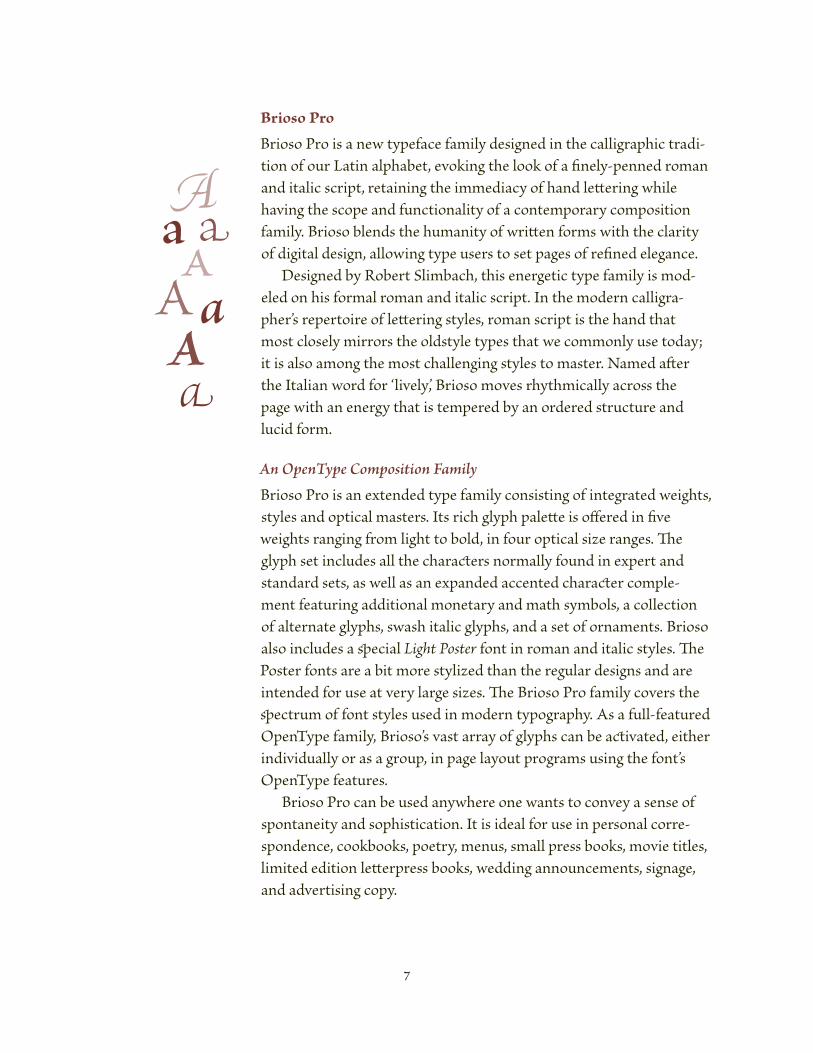
Brioso Pro
Brioso Pro is a new typeface family designed in the caligraphic tradi-tion of our Latin alphabet, evoking the look of a nely-penned roman and italic script, retaining the immediacy of hand leering while having the scope and functionality of a contemporary composition family. Brioso lends the humanity of wrien forms with the clarity of digital design, alowing type users to set pages of rened elegance. Designed by Robert Slimbach, this energetic type family is mod-eled on his formal roman and italic script. In the modern caligra-pher’s repertoire of leering styles, roman script is the hand that most closely mirors the oldstyle types that we commonly use today; it is also among the most chalenging styles to master. Named aer the Italian word for ‘lively’, Brioso moves rhythmicaly across the page with an energy that is tempered by an ordered structure and lucid form. An OpenType Composition FailyBrioso Pro is an extended type family consisting of integrated weights, styles and optical masters. Its rich glyph palee is offered in ve weights ranging from light to bold, in four optical size ranges. e glyph set includes al the charaers normaly found in expert and standard sets, as wel as an expanded accented charaer comple-ment featuring aditional monetary and math symbols, a colection of alternate glyphs, swash italic glyphs, and a set of ornaments. Brioso also includes a ecial Light Poste font in roman and italic styles. e Poster fonts are a bit more stylized than the reular designs and are intended for use at very large sizes. e Brioso Pro family covers the ectrum of font styles used in modern typography. As a ful-featured OpenType family, Brioso’s vast aray of glyphs can be aivated, either individualy or as a group, in page layout programs using the font’s OpenType features. Brioso Pro can be used anywhere one wants to convey a sense of spontaneity and sophistication. It is ideal for use in personal core-spondence, cookbooks, poetry, menus, smal press books, movie titles, limited edition leerpress books, weding announcements, signage, and advertising copy.
A
a
A
a

Designing Brioso by Robert Slimbac“Soon aer I became interested in type design in the early s, I began to study the humanist caligraphy of the Italian renaissance as a means of beer understanding the roots of oldstyle text types. ese praical handwriting styles, which evolved out of the Carolingian writing disciplines of the th–th centuries, were commonly used for the transcription of books. e rst designers of roman typefaces used these Italian manuscript hands as the primary model for their new types. By also incorporating features from the inscriptional capitals of ancient Rome, early type designers created typefaces of exceptional beauty and praicality. As a testament to their durability, oldstyle roman typefaces have changed lile over the last years, being as relevant today as in the past. “Because the principled strokes of the broad-edged quil and brush dene the very shape of our Latin alphabet, I am continualy drawn to the caligraphic heritage as a source of inspiration in my own type design work. Al of my typeface designs, even the more utilitarian ones like Utopia,® Minion,® Kepler,® and Cronos,® have subtle caligraphic overtones, which ad warmth and depth to otherwise less organic designs. “e concept of making a roman book face with an overtly hand-wrien apearance has been a preoccupation of mine for as long as I’ve been designing type. Over the years I’ve designed many praice alphabets with the intent of merging the essence of my personal hand leering style with the praical requirements of the modern composition family. ese ongoing exercises have been a great learning experience, providing a means of reconciling the division between the purely organic form of wrien leers and the more methodicaly constructed form of a digital text type. With Brioso, I wanted to aply what I’ve learned about the design of digital composition families, caligraphy, and the history of leerforms to a single, very personal design. e result is a typeface that retains the basic form and detailing of my hand leering, but in a more rened and idealized form. Alignments, spacing, and charaer shapes were fashioned with the praical requirements of composition in mind.
Utopia Utopia Italic
Minion Minion Italic
Kepler Kepler Italic
Cronos Cronos Italic
Humanist minuscules (th century), Jenson’s
Venetian roman of .

“Much of the form of Brioso is derived from the eed in which I pen Roman script, where passages of text are wrien in a careful but expeditious manner. For the efficient progression of my text, I use an economy of strokes to form leers; stems, serifs, and bowl shapes are made using a series of individual pen strokes, minimizing built-up shapes. By modulating pen pressure and angle, straight strokes are oen bowed and the serifs are wedge-shaped. In the creation of manuscript pages today, as in the past, the scribe’s goal is to balance vitality with precision to create araive and legile text.
“Brioso Roman has much in common with the Venetian roman types of the late eenth century in that they share a common caligraphic foundation, Jenson’s roman type being a prime example. Venetian types, however, also show a marked engraved quality as a result of the type cuing process and the punchcuer’s personal design style. With Brioso, I wanted the design to possess a pure caligraphic basis with a high degree of delity. e italic fonts of Brioso form an energetic counterpoint to the roman and are reminiscent of the chancery italic scripts of the eenth and sixteenth centuries. Chancery script originated as a slanted and more anular variation of the upright humanist hands of the same period. Although chancery italic was usualy used on its
(below) Slimbach’s formal roman script .
Sample leers from Adobe Jenson Pro and Brioso Pro.
VelocityVelocity

own for corespondence and official documents among the artistic and educated elite, it would later become the model for the rst italic types and eventualy lead to the pairing of roman and italic fonts in the same typeface family, around the mid-sixteenth century.
Brioso Pro Weights
As an extended type family, Brioso Pro includes ve weights: Light, Reula, Medium, Seibold, and Bold – for each of the four optical size ranges: Caption, Text, Suhea, and Display – giving designers a highly functional palee of fonts to choose from. e various weights and optical sizes can be compared to the caligrapher’s use of different-width pen nib widths to produce leers of varied weight and size. e reular roman text font is the core typeface for seing composition, so its weight and proportions have been tailored for the utilitarian and æsthetic requirements of legibility. e aditional weights and optical masters serve to complement the reular text design according to principles of hierarchy in typography. e medium serves as a slightly heavier alternate to the standard text weight. e semibold and bold
LightReular
MediumSemibold
Bold
(below) Various samples of Slimbach’s humanistic
hanleering.

text designs are used primarily to accentuate words and passages within reular text. e semibold offers a subtle weight difference from the reular design which can be quite elegant when aplied in spacious seings. e bold is designed to make a more emphatic statement; its weight, however, is not so heavy as to disrupt the color of the page.
Brioso Pro Optical Masters
Beginning in the sixteenth century, type designers oen cut a series of point sizes for a particular type style in order to form a cohesive range of type sizes. For every size that was hand-sculpted in metal, subtle adjustments were made to leer proportion, weight, contrast, and spacing so that the type would be comfortale to read. With the advent of photo and digital type technologies, most type manufacturers abandoned the design of optical masters, because it was economicaly more viale to produce a single master which was then scaled photographicaly or algorithmicaly to each point size. Unfortunately, typefaces generated from a single master usualy have a limited range at which they look their best. For example, a type-face that performs wel at text sizes may apear light and cramped at smaler sizes, while larger sizes may apear heavy and ungraceful.
Light PosterLight talic oste
Light CaptionLight Italic CaptionCaptionItalic CaptionMedium CaptionMedium Italic CaptionSemibold CaptionSeibold Italic Caption Bold CaptionBold Italic Caption
LightLight ItalicReularItalicMediumMedium ItalicSemiboldSeibold ItalicBoldBold Italic
Light SuheadLight Italic SuheaSuhead Italic SuheaMedium SuheadMedium It. SuheaSemibold SuheadSeibold It. Suhea Bold SuheadBold Italic Suhea
Light DisplayLight Italic DisplayDisplay Italic DisplayMedium DisplayMedium Italic DisplaySemibold DisplaySeibold Italic Display Bold DisplayBold Italic Display
Reular

POSTER
G nimate Specializedecorati
In Brioso Pro, the four optical ranges for each of the four weights provide greatly enhanced æsthetic apeal and readability for al point sizes, from text sizes that are clear and easy to read, to display sizes that are rened and elegant. Brioso Pro’s four optical ranges are intended to cover the ful ec-trum of usage in modern typography. e sturdy non-idiosyncratic forms of the caption fonts are designed for maximum legibility and work best for - to -point type. e text fonts are the cornerstone of Brioso Pro and are intended for - to -point type. eir weights and proportions have been care-fuly balanced for reading comfort at the most commonly-used point sizes for seing extended text. e suhead fonts are best for seing phrases in - to -point type and are wel suited for use as a complement to body text. e suhead fonts represent a midle ground between text and display type, maintaining the praical concerns of readability, while displaying a greater degree of delicacy relative to body text. e display masters are designed to showcase the elegance of the leerforms and to complement the smaler size ranges as a lighter and more rened version of the typeface. e display masters are designed with subtle and oen stylized detailing, elegant proportions, and increased stroke contrast to help give larger sizes enhanced visual apeal. e display fonts are intended for type sizes above -point. In adition to the system of fonts that form the basic composition family, Brioso also includes a Light Poster design in both roman and italic styles. ese fonts are lighter and more stylized than the light display designs and are designed for use at very large sizes.
Contextual Alternates
e contextual glyphs in Brioso work in conjunction with OpenType font technology to beer emulate the natural apearance of sponta-neous hand leering. In aplications that suport OpenType layout features, the contextual and stylistic alternate glyphs and ligatures are substituted automaticaly according to a set of embeded rules dened by the type designer – improving leert and ading variety of form to text. As leers are typed, the font program continualy up-dates the text with the proper leer and ligature variations. Because
A comparison of the caption, text, suhead, and display
reular optical masters scaled to the same point size.
HmfgHmfgHmfgHmfg
Caption
Text
Suhead
Display

Brioso is, foremost, a composition family, the contextual alternates are intended for subtle aesthetic effect and, therefore, their design features are rather restrained.
ese alternates prevent awkwad coisions caused by the lowecase f and t, and the upecase T.
b ese alternates provide aiation hen sae-lee pairs occu within text. e lee designs are slightly different and the projectors are offset.
st st e caigraphe may occasionay ad more personalized lee aiations fo aesthetic effect. In Bioso, these stylistic aiants are tastefuy distibuted within text to ad furthe aiety of for and to convey the wite’s sense of balance and taste.
eodore esian LILE Boicei aer
epe saden ree falen bega saphire
roceste aion espa estate bracish ate

1 2 3 4 5 6 7 8 9 0 &1 2 3 4 5 6 7 8 9 0 &
Brioso Pro Glyphs
Brioso Pro’s large glyph complement was designed to further meet the exaing requirements of professional typographers and designers throughout the world. Its diverse glyph complement includes such typographic niceties as swash capitals, smal capitals, oldstyle ures, ornaments, alternate forms, international monetary symbols, and an expanded set of mathematical symbols.
ese ures are designed with ascenders and descenders and have features and proportions compatile with the lowercase charaers of the typeface. Oldstyle ures, also known as hanging ures, are typicaly used for text seing because they lend in wel with the lowercase. In Brioso Pro they are availale in both ed and tabular versions.
ese ures are designed to be compatile with the capital leers. ey are usualy capital height or slightly smaler and are typicaly designed with identical widths. e reular ures are also commonly used in tabular seings such as in nancial reports. e Brioso Pro reular ures are availale in both ed and tabular versions.
ese leerforms are smaler versions of the normal capitals and are designed to be visualy compatile with the lowercase charaers of the typeface. ey can be used to introduce the rst few words at the beginning of a story, or to highlight key words within text. Brioso Pro includes smal capitals in al the roman weights for the Latin fonts.

Swash capitals, which originated in the italic handwriting of the Italian Renaissance, were adapted as typeforms during the early sixteenth century. Since then, swash leers have evolved along with new handwriting and typeface styles. Brioso Pro contains a complete set of Latin swash capitals for al the italic weights and optical sizes. Swash capitals can be used effectively for expressive passages of text, or for titles and signage when an elegant accent is caled for.
ese charaers have longer and more decorative projectors than the normal lowercase and are used primarily with the swash capitals.
- Al Brioso Pro fonts contain a ful set of f-ligatures. ese glyphs are designed to corect awkward combinations where leers may colide. ese ligatures are automaticaly implemented in aplications which suport OpenType layout features.
roughout typographic history type designers have created ornaments to accompany their typefaces. ese devices ad a personal signature to the type family and can be used as title page decoration, paragraph markers, dividers for locks of text, or as repeated bands and borders. Brioso Pro contains thirty-eight orna-ments, including owers, leaves, bulets, brackets, and contemporary graphic decorations.
ff ffi ffl ff ffi ffl
a c e i m n o r s t u v w x z

Al Brioso Pro fonts include nine of the most com-monly used fraions; they are easier to use than constructed fraions, which are made from numerator and denominator ures.
Superior leers are used in mathematics and in English, French and Spanish for abreviating words, such as second, ⁿ, Madame, M, compagnie, C, and seundo, .
ese glyphs have a beginning ourish and are used at the beginning of a word or phrase as a design embelishment. ey work best in text copy that is center-justied, with the beginning charaers used at the beginning of the line and the ending glyphs at the end.
ese glyphs usualy have an end-ing ourish and are used at the end of a word or phrase as a design embelishment. Because of their decorative quality, they are best used in moderation.
ese glyphs serve either to corect awkward leer combinations or as aesthetic enhancements within text. ey are implemented automaticaly according to a set of pre-determined contextual rules.
ⁿ ⁿ
1⁄8 3⁄8 5⁄8 7⁄8 1⁄3 2⁄3 1⁄4 3⁄4 1⁄21⁄8 3⁄8 5⁄8 7⁄8 1⁄3 2⁄3 1⁄4 3⁄4 1⁄2
æ œ st Æ Œ
æ œ st b
Æ Œ

ese include the symbols for cent ¢, dolar $, euro €, colon ₡, orin ƒ, franc ₣, lira ₤, peseta ₧, sterling £, yen ¥, curency ¤, and rupiah . Also included are oldstyle versions of most of the monetary symbols, which are designed to be compatile with the oldstyle ures.
ese alternate forms were designed to give words and phrases a slightly more animated and informal apearance. ey can be implemented individualy using programs like InDesign.
e large number of accented glyphs in Brioso Pro suport a broad range of Latin-based lanuages around the world. e accents are availale in upercase, lowercase, and smal capital versions.
, , , e numerator and denominator ures can be used with the fraion bar to construct aditional fraions. e superior and inferior ures are used for footnote references and as mathematical exponents – for example, E = mc².
Brioso Pro contains an expanded set of math sym-bols designed eecialy for the family. is set contains some of the more common symbols used in mathematics.
¢ $ € ₡ ƒ £ ₤ ¥ ₣ ₧ No # ¤ No ¤
Á Ă Â Ä À Ā Ą Å Ã á ă â ä à ā ã ą å
Á Ă Â Ä À Ā Ą Å Ã á ă â ä à ā ã ą å
∂ ℓ ∆ Ω ∏ ∑ µ π ∫ √ ◊ ^ = ÷ × + ¬ ± < > ~ ≈ ≠ ≤ ≥ ∞
∂ ℓ ∆ Ω ∏ ∑ µ π ∫ √ ◊ ^ = ÷ × + ¬ ± < > ~ ≈ ≠ ≤ ≥ ∞

Roman Glyphs in Brioso Pro
ABCDEFGHIJKLMNOPQRSTUVWXYZabcdefghijklmnopqrstuvwxyz&1234567890
ÆŒÐØŁÞæœðøłþstßffffifflſ[$¢ƒ£₤€₡¥₣₧No#¤%‰°] ⁽⁾₍₎¹²³⁴⁵⁶⁷⁸⁹⁰₁₂₃₄₅₆₇₈₉₀(1⁄41⁄23⁄41⁄83⁄85⁄87⁄81⁄32⁄3 ⁄ ) ⁿ!?¡¿ℓ∂∆Ω∏∑µπ√∞∫^=÷×+¬±<>~≈≠≤≥◊§†‡¶*•·«»‹›-−—‒_\/|¦@©®™.,:;’‘”“‚„…‥․
áăâäàąåāãćçčđéêěëėèēęíîïìīįļńňņñóôöòőōõŕřŗśšşťţúûüùűųůūýÿźžż`´ˆˇ˜¯˘˙¨˚˝
ÁĂÂÄÀĀĄÅÃĆÇČĎÉÊĚËĖÈĒĘĐĞĢÍÎÏİÌĪĮĶĹĽĻŁŃŇŅÑÓÔÖÒŐŌÕØŔŘŖŚŠŞŤŢÚÛÜÙŰŪŲŮÝŸŹŽŻ
Basic Latin Glyphs
Aditional Glyphs
Accented Glyphs

Italic Glyphs in Brioso Pro
ABCDEFGHIJKLMNOPQRSTUVWXYZabcdefghijklnopqrstuvwxyz&1234567890
ÆŒÐØŁÞæœðøłþstßffffifflſ[$¢ƒ£₤€₡¥₣₧No#¤%‰°] #%‰ ⁽⁾₍₎¹²³⁴⁵⁶⁷⁸⁹⁰₁₂₃₄₅₆₇₈₉₀(1⁄41⁄23⁄41⁄83⁄85⁄87⁄81⁄32⁄3 ⁄ ) ⁿ!?¡¿ℓ∂∆Ω∏∑µπ√∞∫^=÷×+¬±<>~≈≠≤≥◊§†‡¶*•·«»‹›-−—‒_\/|¦@©®™.,:;’‘”“‚„…‥․
aceilnorstuvwxz&1234567890
áăâäàāąåãćçčďđéěêëėèēęíîïìīįĺľļłļńňņñóôöòőōõøŕřŗśşţúûüùűūųůýÿźžż `´ˆˇ˜¯˘˙¨˚˝
ÁĂÂÄÀĀĄÅÃĆÇČĎÉÊĚËĖÈĒĘĐĞĢÍÎÏİÌĪĮĶĹĽĻŁŃŇŅÑÓÔÖÒŐŌÕØŔŘŖŚŠŞŤŢÚÛÜÙŰŪŲŮÝŸŹŽŻ ˙¨˚˝¸˛
Basic Latin Glyphs
Aditional Glyphs
Swash Italic Glyphs
Accented Glyphs

Brioso Pro Basic TypefacesABCDEFGHIJKLMNOPQRSTUVWXYZ1234567890abcdefghijklmnopqrstuvwxyz&
ABCDEFGHIJKLMNOPQRSTUVWXYZ1234567890abcdefghijklnopqrstuvwxyz&
ABCDEFGHIJKLMNOPQRSTUVWXYZ1234567890abcdefghijklmnopqrstuvwxyz&
ABCDEFGHIJKLMNOPQRSTUVWXYZ1234567890abcdefghijklnopqrstuvwxyz&
ABCDEFGHIJKLMNOPQRSTUVWXYZ1234567890abcdefghijklmnopqrstuvwxyz&
ABCDEFGHIJKLMNOPQRSTUVWXYZ1234567890abcdefghijklnopqrstuvwxyz&
ABCDEFGHIJKLMNOPQRSTUVWXYZ1234567890abcdefghijklmnopqrstuvwxyz&
ABCDEFGHIJKLMNOPQRSTUVWXYZ1234567890abcdefghijklnopqrstuvwxyz&
ABCDEFGHIJKLMNOPQRSTUVWXYZ1234567890abcdefghijklmnopqrstuvwxyz&
ABCDEFGHIJKLMNOPQRSTUVWXYZ1234567890abcdefghijklnopqrstuvwxyz&
ABCDEFGHIJKLMNOPQRSTUVWXYZ1234567890abcdefghijklmnopqrstuvwxyz&
ABCDEFGHIJKLMNOPQRSTUVWXYZ1234567890abcdefghijklnopqrstuvwxyz&
Light
Light Italic
Reula
Reula Italic
Medium
Medium Italic
Seibold
Seibold Italic
Bold
Bold Italic
Poste
Poste Italic

Text Seings
ab c d e fgh i j k lmn o p q

/ For , years, man has communicated through wrien symbols. e evolution of handwriting, from the earliestpictograms to our curent alphabet, has been driven by a quest for simplicity and efficiency. For centuries, wrien lanuage has been the primary means of documenting human endeavor, affording us a window to the past. e alphabet we know today was estalished during the Italian Renaissance. e elegant and praical scripts of this time evolved from earlie witing systes and deied thei carac-te from the broa-edged qui. ese scipts, in a thei fors, ha a sweeing inuence on society and led to the creation of
/ F , , communicated through wrien sym-bols. e evolution of handwriting, from the earliest pictograms to our curent alphabet, has been driven by a quest for simplicity and efficiency. For centuries, wrien lanuage has been the primary means of documenting human endeavor, affording us a window to the past. e alphabet we know today was estalished during the Italian Renaissance. e elegant and praical scripts of this time evolved from earlier writing systems and derived their charaer from the broad-edged quil. ese scripts, in al their forms, had a sweeing inuence on society and led to the creation of the roman and italic leerfors that e use toay. In the early th century, with the avent of coperplate engraing as a means of reroucing let-
/ F , , communicated through wrien symbols. e evolution of handwriting, from the earliest pictograms to our cur-rent alphabet, has been driven by a quest for simplicity and efficiency. For centuries, wrien lanuage has been the primary means of docu-menting human endeavor, affording us a window to the past. e alpha-bet we know today was estalished during the Italian Renaissance. e elegant and praical scripts of this time evolved from earlier writing systems and derived their charaer from the broad-edged quil. ese scripts, in al their forms, had a sweeping inuence on society and led to the creation of the roman and italic leerfors that e use toay. In the early th century, with the avent of coperplate engraing as a means of reroucing leerfors and iustrations, italic handwiting evolved to
/ For , years, man has communicated through wrien symbols. e evolution of handwriting, from the earliest pictograms to our curent alphabet, has been driven by a quest for simplicity and efficiency. For centuries, wrien lanuage has been the primary means of documenting human endeavor, affording us a window to the past. e alphabet we know today was estalished during the Italian Renaissance. e elegant and praical scripts of this time evolved from earlie witing systes and deied thei carae from the broa-edged qui. ese scipts, in a thei fors, ha a sweeing inuence on society and led to the creation of the
/ For , years, man has communicated through wrien symbols. e evolution of handwriting, from the earliest pictograms to our curent alphabet, has been driven by a quest for simplicity and efficiency. For centuries, wrien lanuage has been the primary means of documenting human endeavor, affording us a window to the past. e alphabet we know today was estalished during the Italian Renaissance. e elegant and praical scripts of this time evolved from earlier writing systems and derived their charaer from the broad-edged quil. ese scripts, in al their forms, had a sweeping inuence on society and led to the creation of the roman and italic leerfors that e use toay. In the early th century, with the avent of coperplate engraing as a means of rero-ducing leerfors and iustrations, italic handwiting evolved to eulate
/ For , years, man has communicated through wrien symbols. e evolution of handwriting, from the earliest pic-tograms to our curent alphabet, has been driven by a quest for simplicity and efficiency. For centuries, wrien lanuage has been the primary means of documenting human endeavor, affording us a window to the past. e alphabet we know today was estalished during the Italian Renaissance. e elegant and praical scripts of this time evolved from earlier writing systes and deied thei carae from the broa-edged qui. ese scipts, in a thei fors, ha a sweeing inuence on society and led to the creation of the roman and italic leerfors that e
/ For , years, man has communicated through wrien symbols. e evolution of handwriting, from the earliest pic-tograms to our curent alphabet, has been driven by a quest for simplicity and efficiency. For centuries, wrien lanuage has been the primary means of documenting human endeavor, affording us a window to the past. e alphabet we know today was estalished during the Italian Renaissance. e elegant and praical scripts of this time evolved from earlier writ-ing systes and deied thei carae from the broa-edged qui. ese scipts, in a thei fors, ha a sweeing inuence on society and led to the creation of the roman and italic leerfors that e
/ For , years, man has communicated through wrien symbols. e evolution of handwriting, from the earliest pictograms to our curent alphabet, has been driven by a quest for simplicity and efficiency. For centuries, wrien lanuage has been the primary means of document-ing human endeavor, affording us a window to the past. e alphabet we know today was estalished during the Italian Renaissance. e elegant and praical scripts of this time evolved from earlier writing systems and derived their charaer from the broad-edged quil. ese scripts, in al their forms, had a sweeping inuence on society and led to the creation of the roman and italic leerfors that e use toay. In the early th century, with the avent of coperplate engraing as a means of reroucing leerfors and iustrations, italic handwiting evolved to
/ F , , communicated through wrien sym-bols. e evolution of handwriting, from the earliest pictograms to our curent alphabet, has been driven by a quest for simplicity and efficiency. For centuries, wrien lanuage has been the primary means of documenting human endeavor, affording us a window to the past. e alphabet we know today was estalished during the Italian Renais-sance. e elegant and praical scripts of this time evolved from earlier writing systems and derived their charaer from the broad-edged quil. ese scripts, in al their forms, had a sweeping inuence on society and led to the creation of the roman and italic leerfors that e use toay. In the early th century, with the avent of coperplate engraing as a means of reroucing leerfors and iustrations, italic handwiting evolved to eu-
/ For , years, man has communicated through wrien symbols. e evolution of handwriting, from the earliest pictograms to our curent alphabet, has been driven by a quest for simplicity and efficiency. For centuries, wrien lanuage has been the primary means of documenting human endeavor, affording us a window to the past. e alphabet we know today was estalished during the Italian Renaissance. e elegant and praical scripts of this time evolved from earlie witing systes and deied thei carae from the broa-edged qui. ese scipts, in a thei fors, ha a sweeing inuence on society and led to the creation of the roman and italic

/
For , years, man has communicated through writ-ten symbols. e evolution of handwriting, from the earliest pictograms to our curent alphabet, has been driven by a quest for simplicity and efficiency. For cen-turies, wrien lanuage has been the primary means of documenting human endeavor, affording us a window to the past. e alphabet e know toay as estalished duing the Italian Renaisance. e elegant and praical scipts of this time evolved from earlie witing systes and
/
For , years, man has communicated through wrien symbols. e evolution of handwriting, from the earliest pictograms to our curent alphabet, has been driven by a quest for simplicity and efficiency. For centuries, writ-ten lanuage has been the primary means of documenting human endeavor, affording us a window to the past. e alphabet we know today was estalished during the Italian Renaisance. e elegant and praical scipts of this time evolved from earlie witing systes and deied thei carae from the broa-edged qui. ese scipts, in a thei fors,
/
For , years, man has communicated through wrien sym-bols. e evolution of handwriting, from the earliest picto-grams to our curent alphabet, has been driven by a quest for simplicity and efficiency. For centuries, wrien lanuage has been the primary means of documenting human en-deavor, affording us a window to the past. e alphabet we know today was estalished during the Italian Renaissance.e elegant and praical scipts of this time evolved from ea-lie witing systes and deied thei carae from the broa-edged qui. ese scipts, in a thei fors, ha a sweeing
/
For , years, man has communicated through writ-ten symbols. e evolution of handwriting, from the earliest pictograms to our curent alphabet, has been driven by a quest for simplicity and efficiency. For cen-turies, wrien lanuage has been the primary means of documenting human endeavor, affording us a window to the past. e alphabet e know toay as estalished du-ing the Italian Renaisance. e elegant and praical scipts of this time evolved from earlie witing systes and deied
/
For , years, man has communicated through wrien symbols. e evolution of handwriting, from the earliest pictograms to our curent alphabet, has been driven by a quest for simplicity and efficiency. For centuries, wrien lanuage has been the primary means of documenting human endeavor, affording us a window to the past. e alphabet e know toay as estalished duing the Italian Renaisance. e elegant and praical scipts of this time evolved from earlie witing systes and deied thei carae
/
For , years, man has communicated through wrien symbols. e evolution of handwriting, from the earliest pic-tograms to our curent alphabet, has been driven by a quest for simplicity and efficiency. For centuries, wrien lanuage has been the primary means of documenting human endeavor, affording us a window to the past. e alphabet we know today was estalished during the Italian Renaissance. e elegant and praical scipts of this time evolved from earlie witing systes and deied thei carae from the broa-edged qui. ese scipts, in a thei fors, ha a sweeing inuence on society and
/
For , years, man has communicated through wrien symbols. e evolution of handwriting, from the earliest pictograms to our curent alphabet, has been driven by a quest for simplicity and efficiency. For centuries, wrien lanuage has been the primary means of documenting human endeavor, affording us a window to the past. e alphabet e know toay as estalished duing the Italian Renaisance. e elegant and praical scipts of this time evolved from earlie witing systes and deied thei carae
/
For , years, man has communicated through writ-ten symbols. e evolution of handwriting, from the earliest pictograms to our curent alphabet, has been driven by a quest for simplicity and efficiency. For cen-turies, wrien lanuage has been the primary means of documenting human endeavor, affording us a window to the past. e alphabet e know toay as estalished duing the Italian Renaisance. e elegant and praical scipts of this time evolved from earlie witing systes and
/
For , years, man has communicated through wrien symbols. e evolution of handwriting, from the earliest pic-tograms to our curent alphabet, has been driven by a quest for simplicity and efficiency. For centuries, wrien lanuage has been the primary means of documenting human endeavor, affording us a window to the past. e alphabet we know today was estalished during the Italian Renaissance. e elegant andpraical scipts of this time evolved from earlie witing systes and deied thei carae from the broa-edged qui. ese scipts, in a thei fors, ha a sweeing inuence on society and

/
For , years, man has communicated through wrien symbols. e evolution of handwriting, from the earliest pictograms to our curent alphabet, has been driven by a quest for simplicity and efficiency. For centuries, wrien lanuage has been the primary means of documenting human endeavor, affording us a win-dow to the past. e alphabet we know today was estalished during the Italian Renaisance. e elegant and praical scipts of this time evolved from earlie witing systes and deied thei carae from the broa-edged qui. ese scipts, in a thei fors, ha a sweeing inuence on society and led to the creation of the roman and italic
/
For , years, man has communicated through wrien symbols. e evo-lution of handwriting, from the earliest pictograms to our curent alphabet,has been driven by a quest for simplicity and efficiency. For centuries, writ-ten lanuage has been the primary means of documenting human endeavor, affording us a window to the past. e alphabet we know today was estalishedduing the Italian Renaisance. e elegant and praical scipts of this time evolved from earlie witing systes and deied thei carae from the broa-edged qui. ese scipts, in a thei fors, ha a sweeing inuence on society and led to the
/
For , years, man has communicated through wrien symbols. e evo-lution of handwriting, from the earliest pictograms to our curent alphabet, has been driven by a quest for simplicity and efficiency. For centuries, writ-ten lanuage has been the primary means of documenting human endeavor, affording us a window to the past. e alphabet we know today was estab-lished duing the Italian Renaisance. e elegant and praical scipts of this time evolved from earlie witing systes and deied thei carae from the broa-edged qui. ese scipts, in a thei fors, ha a sweeing inuence on society
/
For , years, man has communicated through wrien symbols. e evo-lution of handwriting, from the earliest pictograms to our curent alphabet, has been driven by a quest for simplicity and efficiency. For centuries, writ-ten lanuage has been the primary means of documenting human endeavor, affording us a window to the past. e alphabet we know today was estalished duing the Italian Renaisance. e elegant and praical scipts of this time evolved from earlie witing systes and deied thei carae from the broa-edged qui. ese scipts, in a thei fors, ha a sweeing inuence on society
/
For , years, man has communicated through wrien symbols. e evo-lution of handwriting, from the earliest pictograms to our curent alphabet, has been driven by a quest for simplicity and efficiency. For centuries, writ-ten lanuage has been the primary means of documenting human endeavor, affording us a window to the past. e alphabet we know today was estab-lished duing the Italian Renaisance. e elegant and praical scipts of this time evolved from earlie witing systes and deied thei carae from the broa-edged qui. ese scipts, in a thei fors, ha a sweeing inuence on society and

/
For , years, man has communicated through wrien symbols. e evolution of handwriting, from the earliest pictograms to our curent alphabet, has been driven by a quest for simplicity and efficiency. For centuries, wrien lanuage has been the primary means of document-ing human endeavor, affording us a window to the past. e alphabet e know toay as estalished duing the Italian Renaisance. e elegant and praical scipts of this time evolved from earlie witing systes and
/
For , years, man has communicated through wrien symbols. e evolution of handwriting, from the earliest pictograms to our curent alphabet, has been driven by a quest for simplicity and effi-ciency. For centuries, wrien lanuage has been the primary means of documenting human endeavor, affording us a window to the past.e alphabet e know toay as estalished duing the Italian Renais-sance. e elegant and praical scipts of this time evolved from earlie
/
For , years, man has communicated through wrien symbols. e evolution of handwriting, from the earliest pictograms to our curent alphabet, has been driven by a quest for simplicity and efficiency. For centuries, wrien lanuage has been the primary means of document-ing human endeavor, affording us a window to the past. e alphabet we know toay as estalished duing the Italian Renaisance. e elegant and praical scipts of this time evolved from earlie witing systes and deied

/
For , years, man has communicated through wrien symbols. e evolution of handwriting, from the earliest pictograms to our curent alphabet, has been driven by a quest for simplicity and efficiency. For centuries, wrien lanuage has been the primary means of documenting human endeavor, affording us a window to the past. e alphabet we know today was estalished during the Italian Renais-sance. e elegant and praical scipts of this time evolved from earlie witing systes and deied thei carae from the broa-edged qui. ese scipts, in a thei fors,
/
For , years, man has communicated through wrien symbols. e evolu-tion of handwriting, from the earliest pictograms to our curent alphabet, has been driven by a quest for simplicity and efficiency. For centuries, wrien lan-uage has been the primary means of documenting human endeavor, afford-ing us a window to the past. e alphabet we know today was estalished during the Italian Renaisance. e elegant and praical scipts of this time evolved from earlie witing systes and deied thei carae from the broa-
/
For , years, man has communicated through wrien symbols. e evo-lution of handwriting, from the earliest pictograms to our curent alphabet, has been driven by a quest for simplicity and efficiency. For centuries, writ-ten lanuage has been the primary means of documenting human endeavor, affording us a window to the past. e alphabet we know today was estalishedduing the Italian Renaisance. e elegant and praical scipts of this time evolved from earlie witing systes and deied thei carae from the broa-edged qui.

/
For , years, man has communicated through wrien symbols. e evo-lution of handwriting, from the earliest pictograms to our curent alphabet, has been driven by a quest for simplicity and efficiency. For centuries, writ-ten lanuage has been the primary means of documenting human endeavor, affoding us a window to the past. e alphabet e know toay as estalished duing the Italian Renaisance. e elegant and praical scipts of this time evolved
/
For , years, man has communicated through wrien symbols. e evolution of handwriting, from the earliest pictograms to our curent alphabet, has been driven by a quest for simplicity and efficiency. For centuries, wrien lanuage has been the primary means of document-ing human endeao, affoding us a window to the past. e alphabet e know toay as estalished duing the Italian Renaisance. e elegant and prai-
/
For , years, man has communicated through wrien symbols. e evolution of handwriting, from the earliest pictograms to our curent alphabet, has been driven by a quest for simplicity and efficiency. For centuries, wrien lanuage has been the primary means of documenting human endeao, affoding us a window to the past. e alphabet e knowtoay as estalished duing the Italian Renaisance. e elegant and prac-
/
For , years, man has communicated through wrien symbols. e evolution of handwriting, from the earliest pictograms to our curent alphabet, has been driven by a quest for simplicity and efficiency. For centuries, wrien lanuage has been the primary means of document-ing human endeao, affoding us a window to the past. e alphabet e know toay as estalished duing the Italian Renaisance. e elegant and
/
For , years, man has communicated through wrien symbols. e evo-lution of handwriting, from the earliest pictograms to our curent alphabet, has been driven by a quest for simplicity and efficiency. For centuries, writ-ten lanuage has been the primary means of documenting human endeavor,affoding us a window to the past. e alphabet e know toay as estalished duing the Italian Renaisance. e elegant and praical scipts of this time

/
For , years, man has communicated through wrien symbols. e evolution of handwriting, from the earliest pictograms to our curent alphabet, has been driven by a quest for simplicity and efficiency. For centuries, wrien lanuage has been the primary means of document-ing human endeavor, affording us a window to the past. e alphabet we know toay as estalished duing the Italian Renaisance. e elegant and
/
For , years, man has communicated through wrien symbols. e evolution of handwriting, from the earliest pictograms to our curent alphabet, has been driven by a quest for simplicity and efficiency. For centuries, wrien lanuage has been the primary means of document-ing human endeavor, affording us a window to the past. e alphabet weknow toay as estalished duing the Italian Renaisance. e elegant and
/
For , years, man has communicated through wrien symbols. e evolution of handwriting, from the earliest pictograms to our curent alphabet, has been driven by a quest for simplicity and efficiency. For centuries, wrien lanuage has been the primary means of document-ing human endeavor, affording us a window to the past. e alphabet e know toay as estalished duing the Italian Renaisance. e elegant
/
For , years, man has communicated through wrien symbols. e evolution of handwriting, from the earliest pictograms to our curent alphabet, has been driven by a quest for simplicity and effi-ciency. For centuries, wrien lanuage has been the primary means of documenting human endeavor, affording us a window to the past. e alphabet e know toay as estalished duing the Italian Renais-
/
For , years, man has communicated through wrien sym-bols. e evolution of handwriting, from the earliest pictograms to our curent alphabet, has been driven by a quest for simplicity and efficiency. For centuries, wrien lanuage has been the primary means of documenting human endeavor, affording us a window to the past. e alphabet e know toay as estalished duing the Italian

/
For , years, man has communicated through wrien symbols. e evo-lution of handwriting, from the earliest pictograms to our curent alpha-bet, has been driven by a quest for simplicity and efficiency. For centuries, wrien lanuage has been the primary means of documenting human endeao, affoding us a window to the past. e alphabet e know toay as
/
For , years, man has communicated through wrien symbols. e evolution of handwriting, from the earliest pictograms to our curent alphabet, has been driven by a quest for simplicity and efficiency. For centuries, wrien lanuage has been the primary means of documentinghuman endeao, affoding us a window to the past. e alphabet e know to-
/
For , years, man has communicated through wrien symbols. e evolution of handwriting, from the earliest pictograms to our curent alphabet, has been driven by a quest for simplicity and efficiency. For centuries, wrien lanuage has been the primary means of document-ing human endeao, affoding us a window to the past. e alphabet e
/
For , years, man has communicated through wrien symbols. e evolution of handwriting, from the earliest pictograms to our curent alphabet, has been driven by a quest for simplicity and effi-ciency. For centuries, wrien lanuage has been the primary means of documenting human endeao, affoding us a window to the past. e
/
For , years, man has communicated through wrien symbols. e evolution of handwriting, from the earliest pictograms to our curent alphabet, has been driven by a quest for simplicity and efficiency. For centuries, wrien lanuage has been the primary means of document-ing human endeao, affoding us a window to the past. e alphabet e know

ine anwitin is a ra ort o miration
e evoution o anwitin, rom te eariest ictoras to ou cuent aaet
Cancearsca Forata
Simplicity and Efficiency
Charmed Combination
e Mystery of the Creative Process & Typographic Protocol
ien in a traitiona o unconventiona manne
Oldstyle roman typefaces of the Italian Renaissance

ia raesues
umanistic oo ans
Formal and Freestyle Scripts
Professionals and Amateurs
Vernacular of their Time
Tools of the TraeA VARIETY OF INSTRUMENTS
Window to the Past

/ , , ,
aron iana Colby akota arlene elice ain oy ndigo eet arena ogan iranda
elson desa ey uinn acel imone aylo rsula alentina ile iomara vonne acary
aron iana Colby akota arlene elice ain oy ndigo eet arena ogan iranda
elson desa ey uinn acel imone aylo rsula alentina ile iomara vonne acary
aron iana Colby akota arlene elice ain oy ndigo eet arena ogan iranda
elson desa ey uinn acel imone aylo rsula alentina ile iomara vonne acary
aron iana Colby akota arlene elice ain oy ndigo eet arena ogan iranĮa
elson desa ey uinn acel imone aylo rsula alentina ile iomara vonne acary
aron iana Colby akota arlene elice ain oy ndigo eet arena ogan iranda
elson desa ey uinn acel imone aylo rsula alentina ile iomara vonne acary
/ , , ,
aron iana Conno akota arlene elice ain oy ndigo eet arena ogan iranda elson desa ey uinn acel imone aylo rsula alentina ile iomara vonne acary
aron iana Conne akota arlene elice ain oy ndigo eet arena ogan iranda elson desa ey uinn acel imone aylo rsula alentina ile iomara vonne acary
aron iana Conne akota arlene elice ain oy ndigo eet arena ogan iranda elson desa ey uinn acel imone aylo rsula alentina ile iomara vonne acary
aron iana Conne akota arlene elice ain oy ndigo eet arena ogan iranda elson desa ey uinn acel imone aylo rsula alentina ile iomara vonne acary
aron iana Conne akota arlene elice ain oy ndigo eet arena ogan iranda elson desa ey uinn acel imone aylo rsula alentina ile iomara vonne acary

/ , , ,
nne iana olby an ma elice eorgianna oy ndigo eel arena ogan iranda elson desa atic uinlan acel usan aylo rsulaera ile iomara vonne ac
/ , , ,
aron iana olby akota arl elice ain oy ndigo eel arena ogan iranda
elson desa ey uinn acel ue aylo rsula ia ile iomara vonne acary
aron iana olby akota arl elice ain oy ndigo eet arena ogan iranda
elson desa ey uinn acel ue aylo rsula ia ile iomara vonne acary
aron iana olby akota arl elice ain oy ndigo eet arena ogan iranda

POSTERools of the raeShaping oughtsaiet o nstrumentsNumerous OvertonesPraical Scriptsariest ictograse Creative Process


r stuv wxyz

Saple Art

Carla SandovalDirector Museo NacionalBanco CentraleBogotá, Columbia
Dear Ms. Sandoval,
On a recent trip I had the pleasure of ending several hours looking at your ne colection of pre-Columbian gold work. My company develops and sels electronic equipment for the archaeological profession, and, although I am not an expert on pre-Columbian gold work, I have absorbed quite a bit of knowledge and have been ale to colect a number of pieces. While in the south wing, I noticed a doule bat-head ure pendant, dated th to th century, from central Panama (no. --). I am familiar with its style because in I purchased a single bat-head pendant (slide enclosed) that looks like it was made by the same craerson. e overal design, texture, quality of nish, and color of the gold aloy bear an uncanny resemlance to the piece I own. I am very aached to this piece, however, I feel it is my responsibility to offer it as a gi to the museum. Your colection is so beautifuly displayed, while my piece sits in a dusky vault; it’s almost a sin. I wil be in South America at the end of February and would like the oportunity to meet and show you the piece. If you are interested, please write or cal at --. I look forward to hearing from you.
Sincerely,
Charles Brand
A Fih Street San Diego,

Jean Sibeliusoola’s aughte • e wan of uonel apiola • n aga • alse tist
West Coast Phiharmonic • Herbert eo Price Gravitas Music Works - Stereo -
E L eirre imer

Zueignung
IHR nat euc wiee, scwankende Gestalten, ie früh sic einst de trübe lic gezeigt. ersuc’ ic wohl, euc diesmal festzuhalten? ühl’ ic mein Herz noc jene an geneigt? Ih drängt euc zu! nun ut, so mögt ih alten, ie ih aus Dunst und Nebel um mic steigt; ein Busen fühlt sic jugenlic erscüert om Zauberhauc, de euren ug umwiert.Ih bingt mit euc die Bilde frohe Tage, Und mance liebe Scaen steigen auf; Gleic eine alten, halbverkungnen Sag omt erst Lieb’ und reundsca mit herauf; De Scmerz wid neu, es widerholt die Klag es Lebens labyinthisc ien Lauf, Und nennt die uten, ie, um scöne Stunden om Glüc getäusct, o mi hinwegescwunden.Sie hören nict die folgenden Gesänge, ie Seelen, denen ic die ersen sang; Zerstoben ist das freunlice Gedränge, erklungen, ac! de erst Widerklang. Mein Lie ertönt de unekannten enge, h Beifa selbst mact meine erzen ban, Und as sic sonst an meine Lied erfreuet, enn es noc lebt, it in de Welt zerstreue.
.

enaisanc anwitin Manuscripts from the J. B. Harvard Collection Leda James Memorial Library July through September ,
Sponsored by the Arts Council of Silicon Valley
uovico ei ii iovannantonio aientennaino ataneo easiano miare

Iluminated AnatomyPhotographs from the Beyer Institute
Walter Hedreen
with esays byJudith R. LyonsStuart Clifford
Seager Galey, Seale

omeie’s Seleion, ines By the las
Con-Vintage rut, eimsA complex nose of aple, citrus, and caramel folowed by crisp ful avors with a slightly spicy nish. .
S Bapa Fruit avors and good mouth feel, complex, crisp and balanced. Medium body with anise, citrus, and pineaple avors. .
Cusian Rie, Sonoma A ful-body and ripe wine with aromas of pear, aple, and caramel. Creamy avor with hints of toast and tropical fruit. .
P NRusian ie, Sonoma Elegant, medium body and light oak. Aromas of chery and cinnamon, avors of raspbery, cranbery, tea, and spicy notes. .
C SNapa Vaey Balanced, rich, and ripe. Aromas of cassis and cedar with avors of plum, vanila, coffee and spice. .
C Ciserva, uscany Beautiful ruby red, intense bouquet. Complex with spicy, roasted, and resinous avors. Wel structured and harmonious. .

Peter Van DarganArchitect
--
Aldo Dion Bionics
1256 Glaiola StreetCupertino, California
: 408 229 6008: 408 229 6002

Type Development at Adobe
Type is developed at Adobe by a ful-time staff of type design pro-fessionals. Each member of this group has ecialized skils in type design and the use of tools needed to develop digital type. e Adobe type staff has a working relationship with many outside pro-fessionals, whose expertise represents a broad ectrum of historical, scholarly, and praical knowledge of typography and the graphic arts.
Robert Slimbach, who joined Adobe in , began working seriously on type and caligraphy four years earlier in the type drawing depart-ment of Autologic in Newbury Park, California. Since then, Slimbach has concentrated primarily on designing digital text faces, drawing inspiration from classical sources while utilizing state-of-the-art typeface technology. He has designed typefaces for the International Typeface Corporation, as wel as Adobe Originals typeface families including Adobe Garamond®, Adobe Jenson®, Kepler®, Cronos®, Caisch Script®, Minion®, Minion Pro, Poetica®, Sanvito®, Utopia®, Warnock® Pro, and Myriad® (co-designed with Carol Twomly).

Further Reading
Atkins, Kathryn A. Masters of the Italic Lee. Boston: David R. Godine, .Blumenthal, Joseph. Art of the Pinted Book -. Boston: David R. Godine, Pub- lisher in association with e Pierpont Morgan Library, .Fairbank, Alfred and Wolpe, Bertold. Renaisance Handwiting, An Anthology of Italic Scipts. London: Faber and Faber Limited, . Morison, Stanley and Day, Kenneth. e Typographic Book -. London: e University of Chicago Press, .Mediavila, Claude. Caigraphy, From Caigraphy to Abstract Painting. Wommelgem, Belgium. Scirpus Pulications, .Updike, Daniel Berkeley. Pinting Types, ei History, Fors, and Use. New York: Dover Pulications, Inc. .
Acknowledgements
Specimen book design and production by Robert Slimbach.Aditional production by Fred Brady and Christopher Slye.Text wrien by Fred Brady and Robert Slimbach.
Sample art designed by:Fred Brady, pages , .Robert Slimbach, pages , , , and .Min Wang, page .
Special thanks to David Parsons, Christopher Slye, and Jim Wasco for their assistance with the nal production of the Brioso Pro typeface family. anks also to Kely Davis, Kat Gatzke, Harold Grey, Donna Kolnes, David Lemon, Ernie March, Jim Mildrew, and omas Phinney for their helpful comments.
Aditional Information
is ecimen book was produced using InDesign™, Ilustrator®, and Photoshop®, so-ware from Adobe. e typeface is Brioso Pro, designed by Robert Slimbach.PDF created on June , .
Brioso Pro, patent pending.
Adobe, the Adobe logo, the Adobe Originals logo, Ilustrator, InDesign, Photoshop, PostScript, Caisch Script, Adobe Garamond, Adobe Jenson, Kepler, Minion, Myriad, Poetica, Sanvito, Utopia, Warnock, and Brioso are either registered trademarks or trademarks of Adobe Systems Incorporated in the United States and/or other countries. Mac OS is a trademark of Aple Computer, registered in the United States and other countries. OpenType and Windows are either registered trademarks or trademarks of Microso Corporation in the United States and/or other countries. Al other trademarks are the property of their reective owners.
bcAdobe Systems Incorporated Park AvenueSan Jose, CA -


![TESIS_PADRES_E_HIJOS(2)[1] NELY 2016.doc](https://static.fdocuments.net/doc/165x107/577c7b791a28abe05497d751/tesispadresehijos21-nely-2016doc.jpg)