brand identity prism
23
COMPARITIVE STUDY OF TWO FASHION BRANDS Submitted to: Mr. Annaji Sharma Submitted by: Aditi Jindal Date: 22 February 2013 Subject: Fashion Brand Management
-
Upload
aditi-jindal -
Category
Documents
-
view
50 -
download
0
description
lacoste vs stockholm morris
Transcript of brand identity prism

C O M P A R I T I V E S T U D Y O F T W O F A S H I O N B R A N D S
Submitted to: Mr. Annaji SharmaSubmitted by: Aditi JindalDate: 22 February 2013Subject: Fashion Brand Management
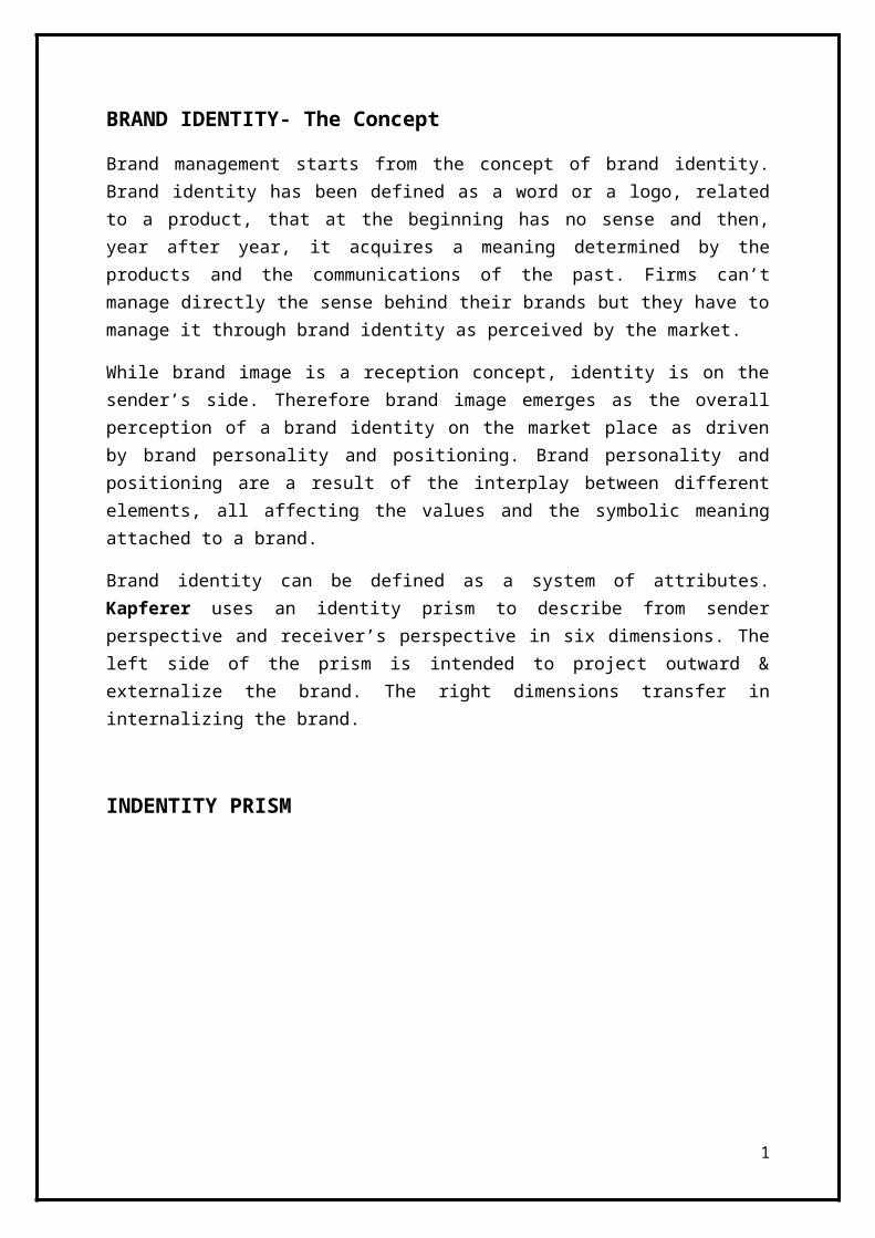
BRAND IDENTITY- The Concept
Brand management starts from the concept of brand identity. Brand identity has been defined as a word or a logo, related to a product, that at the beginning has no sense and then, year after year, it acquires a meaning determined by the products and the communications of the past. Firms can’t manage directly the sense behind their brands but they have to manage it through brand identity as perceived by the market.
While brand image is a reception concept, identity is on the sender’s side. Therefore brand image emerges as the overall perception of a brand identity on the market place as driven by brand personality and positioning. Brand personality and positioning are a result of the interplay between different elements, all affecting the values and the symbolic meaning attached to a brand.
Brand identity can be defined as a system of attributes. Kapferer uses an identity prism to describe from sender perspective and receiver’s perspective in six dimensions. The left side of the prism is intended to project outward & externalize the brand. The right dimensions transfer in internalizing the brand.
INDENTITY PRISM
1
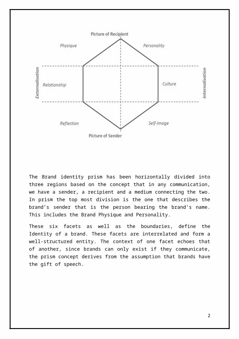
The Brand identity prism has been horizontally divided into three regions based on the concept that in any communication, we have a sender, a recipient and a medium connecting the two. In prism the top most division is the one that describes the brand’s sender that is the person bearing the brand’s name. This includes the Brand Physique and Personality.
These six facets as well as the boundaries, define the Identity of a brand. These facets are interrelated and form a well-structured entity. The context of one facet echoes that of another, since brands can only exist if they communicate, the prism concept derives from the assumption that brands have the gift of speech.
For symbol intensive firms particular importance is assumed by three kinds of brand attributes: corporate and brand history and core competencies, product and stylistic identity and visual identity.
2

3
LACOSTE
IdentityKapferer (2001 and 2008) have done extensive studies of Lacoste from a brand identity perspective and I will translate his findings, with the aid of his identity prism, into Aakers model. I have also utilized information from the Lacoste webpage.
Lacoste have a wide assortment in the following categories; Ready to wear, shoes, watches, belts, leather goods, fragrance, glasses and home textiles. The brand has a few product attributes that makes Lacoste unique. The main one is the crocodile logo, present on most of the products. There are also the colors – the sheer number of them and the sometimes bold mixtures. Lacoste has the roots in sportswear. They therefore excel in making quality products that can be used in both very casual situations and more dressed occasions. The main value of the products is their versatility and there is rarely a time and place where a Lacoste shirt does not fit in. Lacoste strives to reinvent themselves and their product to remain in high quality and be both a part of the fashion movement and the classically casual (www.lacoste.com). To underline the versatility, Lacoste is made to be used both on the tennis court in the morning and in the fine dining restaurant on the evening. Truly an everyday product, to complement a relaxed casual sporty lifestyle with elements of dressiness.
The Lacoste customer is a person who wants to be perceived as being casual with style and share the company’s values of casual sporty lifestyle. The consumers buy Lacoste because they want products that are both fashionable and classics, fit for both casual and more dressed situations that are always “right”. Lacoste have its origin in France, with this comes a notion of aristocracy, romance and a relaxed way of life.
The brand as an organization
The organization is modern, with both the owner family and other stakeholders involved in the company (www.lacoste.com). The owners and stakeholders have been in venture with each other for long and this bears the signs of trustworthiness. Lacoste operates on a global market (www.lacoste.com).
The brand persona
At the core of the persona lays relaxed lavishness, a love for sports and leisure, individualism and classicism mixed with modern ideals. Coming from the world of sports, Lacoste have been a provider of sports products and therefore a guide and advisor in relation to the consumer. Kapferer (2001) stresses that Lacoste strives to meet its consumer in his or hers right social environment, to make them feel comfortable. Lacoste also strives to differ themselves from other competitors in their relationship with the consumer, if done properly there are of course good recognition to be gained. Kapferer also discusses the notion of belonging to a club, which is reflected in the relation.
4

The brand as a symbol
The visual image and metaphor of Lacoste is described as elegant yet comfortable leisure. Lacoste has its origin in France and came about as a revolution in sportswear with its soft feel and form. The brand has its roots in sportswear in the upper classes sport segment. With the origin in France also comes the tradition of clothes making infused with lifestyle concepts.
Brand promise
Lacoste is providing updated classics that fit many occasions. The brand and the products have stood the test of trends and times and survived in good health. Consequently the brand provides functional promises such as a guard against fashion fads and fit for most occasions. The consumer feels a part of the casual and premium sporty lifestyle. A part of a club of Lacoste bearers but still individual and classic. The bearer is neither hyper feminine or hyper masculine. The Lacoste consumer look upon him or herself as a leisurely person with both classical and modern values, sophisticated and sporty with signs of aristocracy.
Brand positioning
Lacoste has taken the position of a prime supplier of casual premium sportswear that reflects the leisure class and its lifestyle.
5

Image Analysis - LACOSTE
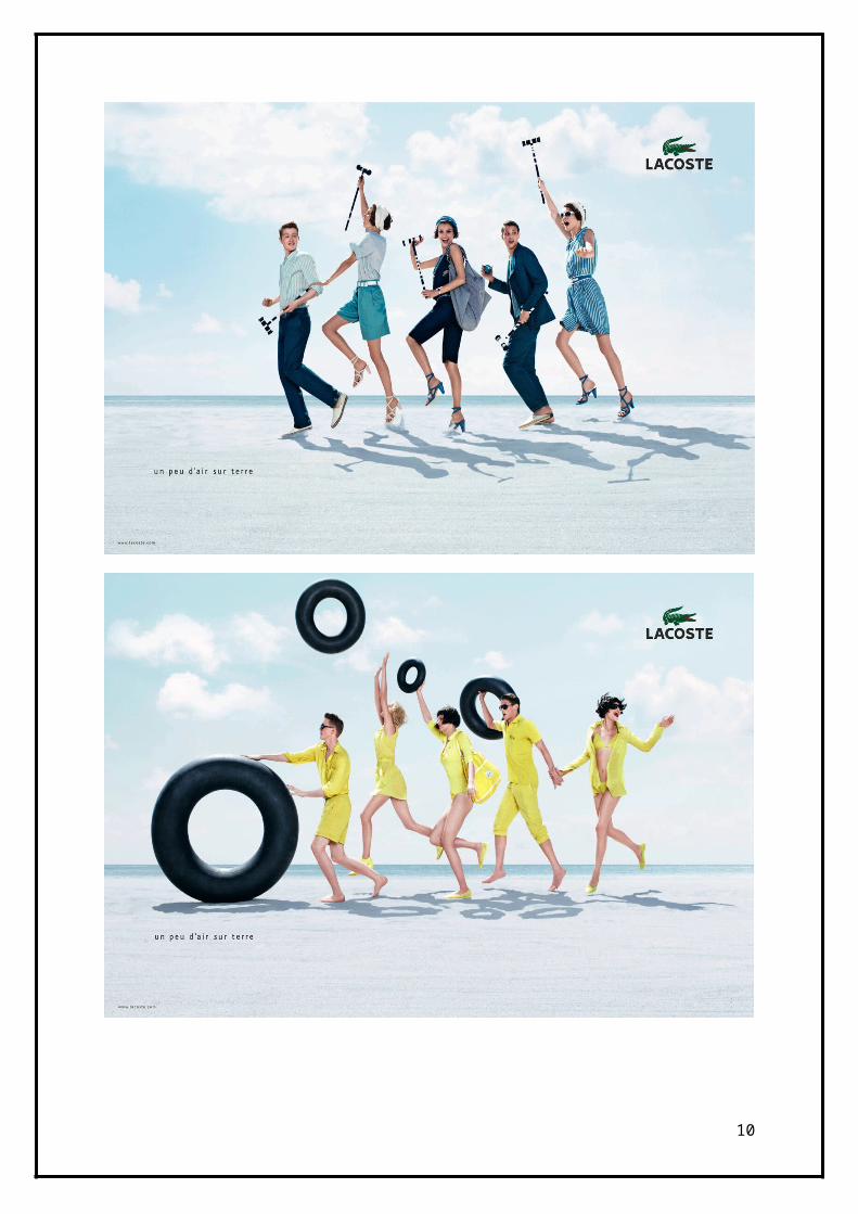
The Lacoste advertisement images are very summerish, with light, almost burned out in the whiteness, beach scenery. There is grayish white sand a pale blue ocean and a partly cloudy sky in that shifts from a summerish white sun haze into light blue. The five models in the images are seemingly having a good time, with most of them smiling, skipping and what seem to be shouting with joy. There are much movement in the images and lots of active leisure activities going on. Basically the images depict people having fun and games on the beach. Image 1 is very classic in its expression. The image conveys a modern take on the classics. Image 2 is on the other hand ultra modern and maybe even a bit experimental in its content and expression. The clear bright yellow clothes and accessories and the swimming rings – that looks both futuristic and classic - makes for a very avant-garde expression with a nod to older ages. The overall feel in the images are light (summerish), active and fun. The lot seems to be on vacation on a beach resort, still they are a bit to dressed for sunbathing so maybe they are passing the beach on their way to another leisure location or they did just enter the beach area.There are very few logos visible, there are signature products like bags, sunglasses and the tennis shirt, but these are not unique for Lacoste. This makes it quite hard to tell who the sender is. In the editions I’ve gotten, there is a pasted logo in the top corner and a tagline in the bottom left, but these I do not take in regard as they are not a part of the image.
What is conveyed about the brand in these images and how does this congregate with the identity? Well, the two pictures are a part of a series that are baptized “un peu d´air sur terre” (eng. A little air for the earth) which according to Lacoste reinforces the authenticity and originality of the brand (www.lacoste.com). This is a little unclear and I’m not sure about this as there are deeper interpretations. The beach, the weather and the clothes as connote leisure. The apparent movement of the models and the props connotes activity, the clothes tell about both classic and modern style. Lacoste seem to want to present themselves as casual, fun, active – with signs of sporty – and comfortable. There is also an overall notion of sophistication, as the models are casually dressed up.
This also communicates the duality of the products as they can be used both in leisure activities and slightly more dressed occasions. Put the aforementioned in relation with the modern elements of the clothes and Lacoste is a brand that regards both the past and the future. This is well in line with the aforementioned identity. It is also refreshing to see a premium brand that pushes the fun in their images, as all the models are smiling and having a seemingly good time. There are small signs of heritage as the bicycles, the swimming ring and the clothes all connote past times. The fact that Lacoste is French is not pushed in these images.
Looking back to the identity, I see that Lacoste are pushing the relaxed sporty lifestyle, the duality of the products (both dressed up and casual in the same product), there is a lack of tangible elements visible, Lacoste puts the force into communicating the softer and intangible sides of the brand.
6
7
8

9
MORRIS
Identity
Morris carries a selection of ready to wear and accessories. Hence, a smaller assortment than Lacoste. For its product attributes Morris utilizes the French lily, with its historical notion, as an iconic element, both as logo and as pattern in linings, on ties and socks et cetera. Cuts are slim in a distinct and updated British fashion. The values of Morris product lie in the combination of modern colors and cuts and the classic garments. The products are updated classics and close to timeless, which in most cases means that they can be used for more than one season. Drawing inspiration from both England and the American east coast, Morris product compliments a preppy expression, which has been a trend for some time. There are roots, however somewhat imaginary, in the classic tailoring and therefore Morris pushes their dressier clothes like suits to be of high quality.
Morris’ broad clothing line makes for that the products can be used on many occasions. From relaxed vacation days to dressed up New Year dinners. Furthermore the typical Morris consumer is a man, young at heart, who are intrigued by the modern preppy style expressions. This typical consumer buys the brand because he wants to be perceived as casual but dressed and be a part of the preppy style movement but still be modern. Morris has its origin in Swedish, but this is indeed kept clandestine in the brand communication.
The brand as an organization
The brands organization is small with only a handful of employees. The organization relies on external aid in production, distribution and marketing. The organization is dependent on the managements experience and contacts and there is potentially a risk for lost momentum when owner Alsén steps down (Andersson and Edberg 2006). As of today Morris operates on the regional Scandinavian market and in Europe. Not local nor global, but regional.
The brand persona
Alsén (Andersson and Edberg 2006) describes the Morris persona as mildly vain, eccentric and playful, confident, relaxed and youthful. Alsén claims that the relation that Morris strives to have with its consumers are caring and appreciative from both directions. Alsén argue that the consumers have a saying in building the brand and though the website Morris encourages consumer interaction.
With only one own outlet (situated in Stockholm) Morris might however have some difficulties getting into contact with the end consumer.
10

The brand as a symbol
The visual image and metaphor of Morris is European classics with a modern twist and with inspirations drawn from the American east coast. Morris originates from Stockholm, Sweden, but has been revived in the old textile industry quarters in Borås, Sweden. One could argue that Morris is the brainchild of Jan Alsén and then hails from his creativity and knowledge of the industry. The imaginary home of Morris would probably be one part at a British boarding school or university, one part in the south of France and one part on an Ivy League college on the American east coast.
Morris offers classic garments with a modern twist, fitted for many occasion. This makes for that the Morris wearer feels dressed but relaxed and that he stands out somewhat. The Morris wearer looks upon himself as fashion or rather style aware with an interest in clothes. He feels individual and not conform and a bit flirty with traditional and aristocratic ideals and lifestyles .
11

Image Analysis – MORRIS
The images for Morris campaign are shot in classic surroundings on the Mediterranean. The environment is probably either Italian or French mainland or some of the islands of their respective coasts. The images takes place at day-time and the weather seem to be nice. The clothing and the greenery surrounding the shoot points to that it is the warmer time of the year. The garden wall on seen on Morris 1 seems to be as crooked and weathered as it is nicely crafted. The elaborate patterns on the bed foot and the bureau points to that these are intricate pieces of craftsmanship and they do look both old and expensive. The wainscot also seems to be of the same era and of the same kind of intricate craftsmanship. The interior and the exterior would point to that the images takes place at an old seaside villa, and these are very sought after and hence commanding a high price and inhabited by European upper class.
The images are somewhat Polaroid-like, the models are posing, yes, but not over doing it at all; they look kind of casual in their poses as if they were just hanging around the old family summer villa. The clothes and especially the combinations are very bold, and Ralph Lauren-like, and surely not for the insecure dresser. The colors are summerish and classic. The one thing that stands out is the black dress on Morris 2, which seems to be a little out of place in its low-key design. The models look the part of young European upper class, although the female model stands out a bit. The love triangle notion is close at hand.
The images suggest that Morris is a brand from southern Europe and it focuses on dressed up leisure wear, the assortment shown is quite diverse and it gives the feeling of that the brand provides a large assortment. Furthermore the images give the feeling of wealth and luxury with the location and the bold but classy clothes. Morris seem to be a natural part of the good life down at the Mediterranean.
This being a S/S campaign, it is a natural location to shoot in for a premium brand operating in the European market, like Morris. The fact that the pictures have signs of amateurish, and are Polaroidlike, suggest that Morris is inviting towards its customers. The feel of the images is like looking through a private photo album.
Morris strive to be a younger alternative to other premium brands in the preppy style segment, and love affairs with more than two people involved might be more common with the younger folks, but still it is borderline tasteless for a preppy brand, even a young and bold such.
The colorful clothes are indeed present in the images, so are the “updated classics”. It is very clear that Morrs is a Preppy brand and there are signs of the products diverse areas of utilization even though this campaign is at the leisure end of the utilization scale. Of the heritage, the Swedish, nothing is shown. If I was to guess heritage I would most likely go with French or Italian. Possibly American. The personality of Morris shines through well, there are elements of vanity, eccentricity, youth and a relaxed life.
12
13
14

CONCLUSION
Lacoste
Lacoste is challenging themselves and their identity by mixing traditional with new elements and have a fresh approach with the movement of the models. Being a leisure brand at the core, Lacoste can only imitate the luxury brands to a certain extent without losing the sporty and active heritage.
They must find their own take on luxury and implement it into their heritage as a leisure and sports brand.The images stand out the most, simply because they dare to be a bit bold with their creative approach. The skipping and smiling group of people, the sleek beach setting and the consistent use of one color makes the images very vibrant. The images together are in my view quite unique as they mix the sporty leisure with classic elements without getting too fabricated. It all looks quite credible. The popular saying that a smile can take you a long way is true. The ever present concept of sexiness is getting old and Lacoste have beautiful sexy people smiling instead of, as with the others, having people that looks like mixture between being slightly bored, angry, and yes, salacious. This look is not very inviting and might pose as a way to unfortunately distance the consumers from the brand, as with Lacoste the looks are more in an inviting manner; refreshing to say the least. The image Lacoste 2 could possibly have been a product of Prada’s Sport line communication department, but held together with the logo visible on the shirt of the back male model and the overall joyfulness, it fits right into the Lacoste expression. In retrospect I must say that this campaign has evolved into my personal favorite.
There are, as previously discussed, several signs of luxury in the Lacoste images. The expression is unique enough not to completely mix the images up with another brand. There are lines of other brands, Prada Sport, Ralph Lauren Blue Label and parts of the Hackett collection.
Morris
The junior operator among the brands is doing a good job in the preppy segment where communication is quite uniform. In the specifics of the style segment which they operate, and of their identity, it is hard not to imitate or draw inspiration from other surrounding brands like Ralph Lauren, Tommy Hilfiger, Gant and Hackett. Realizing the limitation of the field of interest, Morris have tried to find a stringent expression of their own, which is one of the keys to operating a successful fashion brand, and brand in general. This own expression leads to that the consumer and the audience can identify the Morris brand in the commotion of a fashion magazine for example. This expression is shown by putting luxury and leisure elements into bent and worn environments not to give a too nice nod to the large standard players in the segment but go with their own and in my mind utilize a slightly more modern take on the preppy classics.
15

References:
1. Lacoste company history (Electronic) Available:
<http://www.lacoste.com>
2. Morris company information (Electronic) Available:
<http://www.morris.se>
3. Kapferer, Jean-Noël (2008). The New Strategic Brand Management.
16