How did you use conventions of real media texts in your production?
Upload
danielscott132513Category
view
22download
0
Question 1 – In what ways does your media product use, develop or challenge forms and
conventions of real media texts?
Daniel Scott
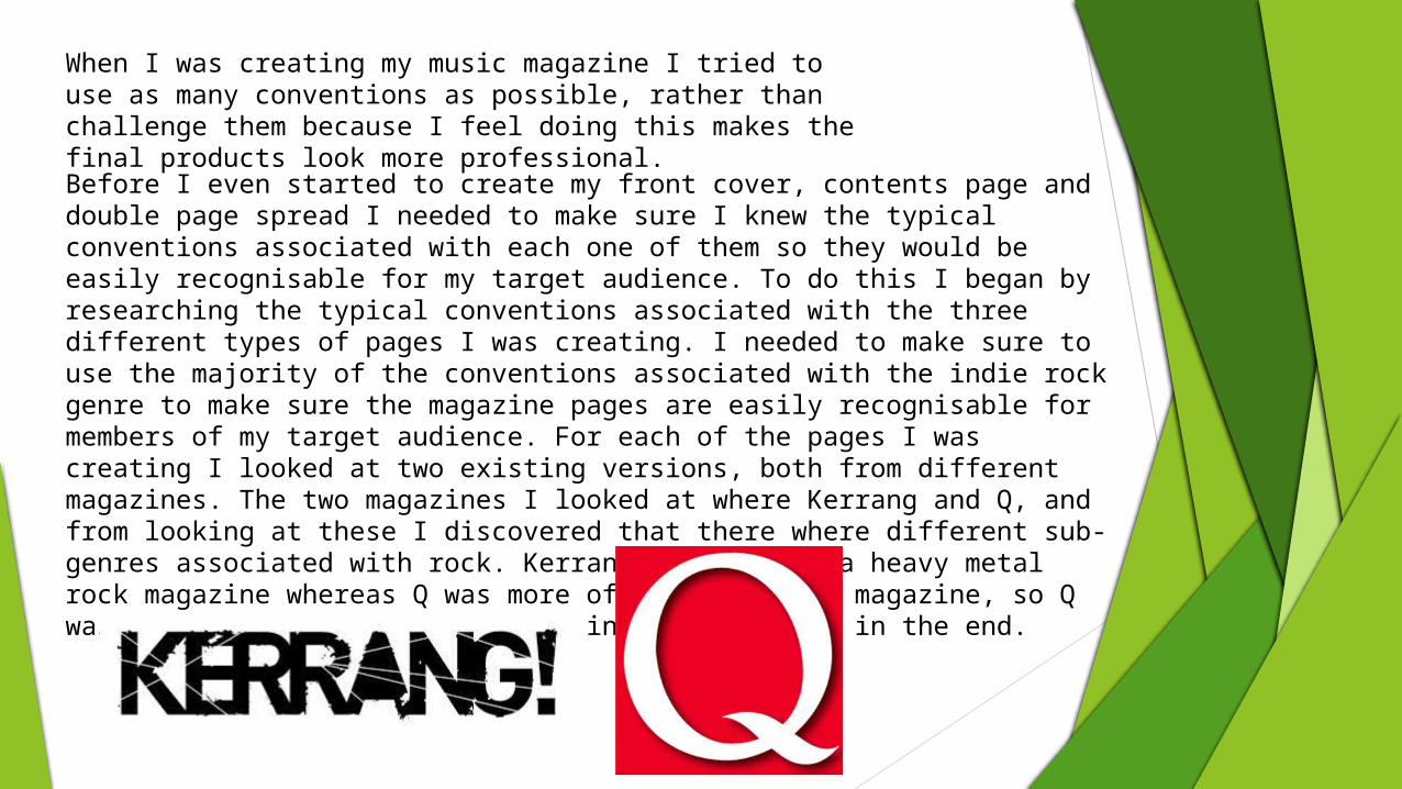
When I was creating my music magazine I tried to use as many conventions as possible, rather than challenge them because I feel doing this makes the final products look more professional. Before I even started to create my front cover, contents page and double page spread I needed to make sure I knew the typical conventions associated with each one of them so they would be easily recognisable for my target audience. To do this I began by researching the typical conventions associated with the three different types of pages I was creating. I needed to make sure to use the majority of the conventions associated with the indie rock genre to make sure the magazine pages are easily recognisable for members of my target audience. For each of the pages I was creating I looked at two existing versions, both from different magazines. The two magazines I looked at where Kerrang and Q, and from looking at these I discovered that there where different sub-genres associated with rock. Kerrang was more of a heavy metal rock magazine whereas Q was more of an indie rock magazine, so Q was the magazine I drew the most inspiration from in the end.
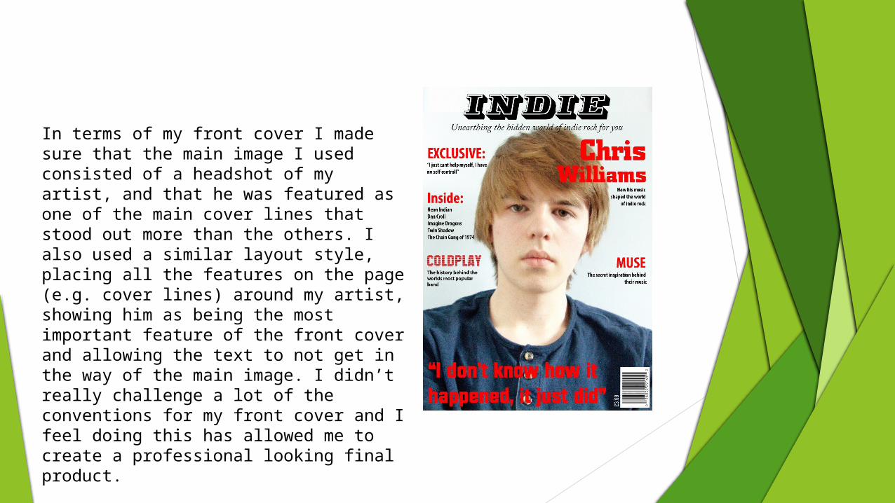
In terms of my front cover I made sure that the main image I used consisted of a headshot of my artist, and that he was featured as one of the main cover lines that stood out more than the others. I also used a similar layout style, placing all the features on the page (e.g. cover lines) around my artist, showing him as being the most important feature of the front cover and allowing the text to not get in the way of the main image. I didn’t really challenge a lot of the conventions for my front cover and I feel doing this has allowed me to create a professional looking final product.
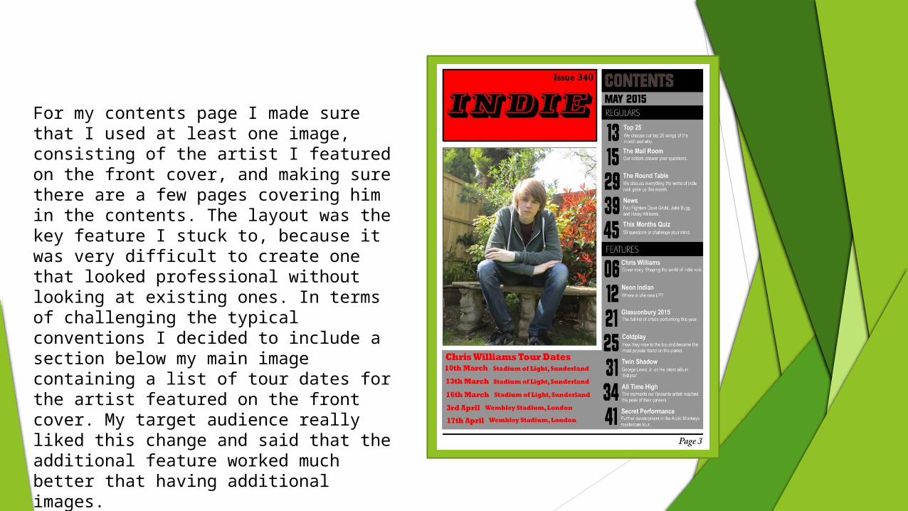
For my contents page I made sure that I used at least one image, consisting of the artist I featured on the front cover, and making sure there are a few pages covering him in the contents. The layout was the key feature I stuck to, because it was very difficult to create one that looked professional without looking at existing ones. In terms of challenging the typical conventions I decided to include a section below my main image containing a list of tour dates for the artist featured on the front cover. My target audience really liked this change and said that the additional feature worked much better that having additional images.
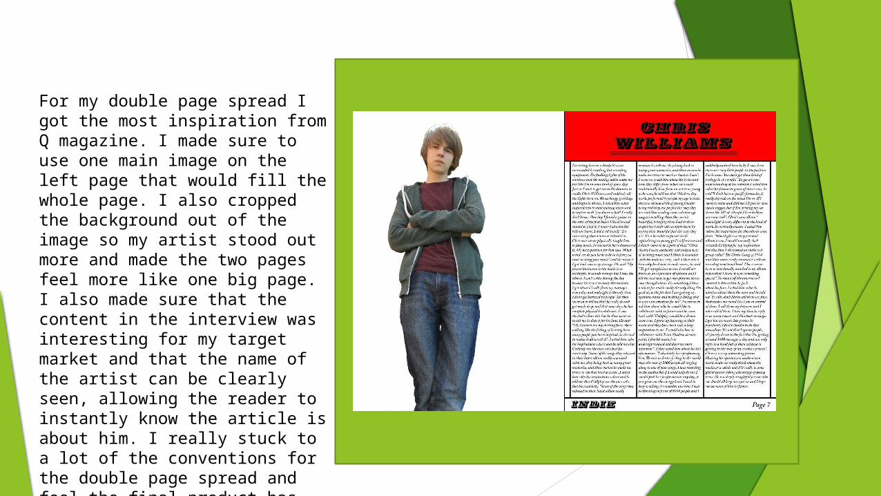
For my double page spread I got the most inspiration from Q magazine. I made sure to use one main image on the left page that would fill the whole page. I also cropped the background out of the image so my artist stood out more and made the two pages feel more like one big page. I also made sure that the content in the interview was interesting for my target market and that the name of the artist can be clearly seen, allowing the reader to instantly know the article is about him. I really stuck to a lot of the conventions for the double page spread and feel the final product has some out as looking professional.