Ancillary texts for job
5
Ancillary texts
Transcript of Ancillary texts for job

Ancillary texts
Our choice of themeWhen thinking of Nickelback you immediately think of rock and a sort of dramatic rock band. For this reason we have put a black and white theme throughout our work as this is the best way to associate with Nickelback. The reason being is because black and white makes our album covers and also the website and other uses of texts very dark and ‘rocky’. It creates a very good image for Nickelback and the image that we wanted for Nickelback and it also keeps the same image that we have portrayed in the music video because it is a very dark song with a very sad narrative therefore we chose the black and white theme because this was the best way of portraying the effects.
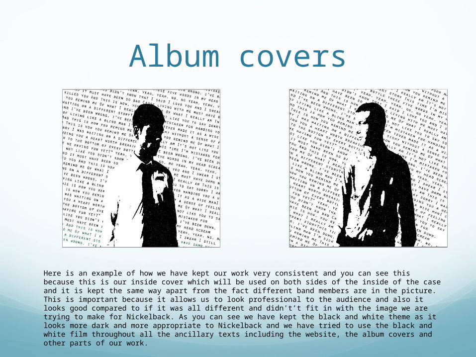
Album covers
Here is an example of how we have kept our work very consistent and you can see this because this is our inside cover which will be used on both sides of the inside of the case and it is kept the same way apart from the fact different band members are in the picture. This is important because it allows us to look professional to the audience and also it looks good compared to if it was all different and didn't’t fit in with the image we are trying to make for Nickelback. As you can see we have kept the black and white theme as it looks more dark and more appropriate to Nickelback and we have tried to use the black and white film throughout all the ancillary texts including the website, the album covers and other parts of our work.
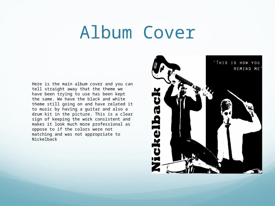
Album Cover
Here is the main album cover and you can tell straight away that the theme we have been trying to use has been kept the same. We have the black and white theme still going on and have related it to music by having a guitar and also a drum kit in the picture. This is a clear sign of keeping the work consistent and makes it look much more professional as oppose to if the colors were not matching and was not appropriate to Nickelback
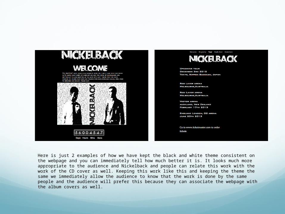
Here is just 2 examples of how we have kept the black and white theme consistent on the webpage and you can immediately tell how much better it is. It looks much more appropriate to the audience and Nickelback and people can relate this work with the work of the CD cover as well. Keeping this work like this and keeping the theme the same we immediately allow the audience to know that the work is done by the same people and the audience will prefer this because they can associate the webpage with the album covers as well.