Photos for ancillary texts
12
Photos for ancillary texts Front cover: Used- Unused- This image was used for the album front cover as it is a medium close up, this allows the audience to see the artist facial expressions clearly, for example the direct eye contact and stern like lip framing represents the song’s lyrics and videos narrative and is directly engaging and communicating with the audience. Also the artist hair as if blowing freely across natural leaves further represents the album such as emotion behind particular song lyrics and videos. The medium close up shot further indicates hints about the artist personality, for example mise en scene such as clothing is visible, a This image was not chosen for the album front cover as it is uses an excess amount of lighting, this effects the image as the artist face is brighter this prevents some detail such as make up and facial expressions from being visible. In addition the shot used does not show the artist clothing or body posture, this makes the image less appealing to the
-
Upload
08bmolla -
Category
Social Media
-
view
61 -
download
0
Transcript of Photos for ancillary texts

Photos for ancillary textsFront cover:
Used-
Unused-
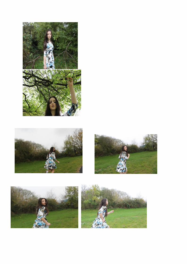
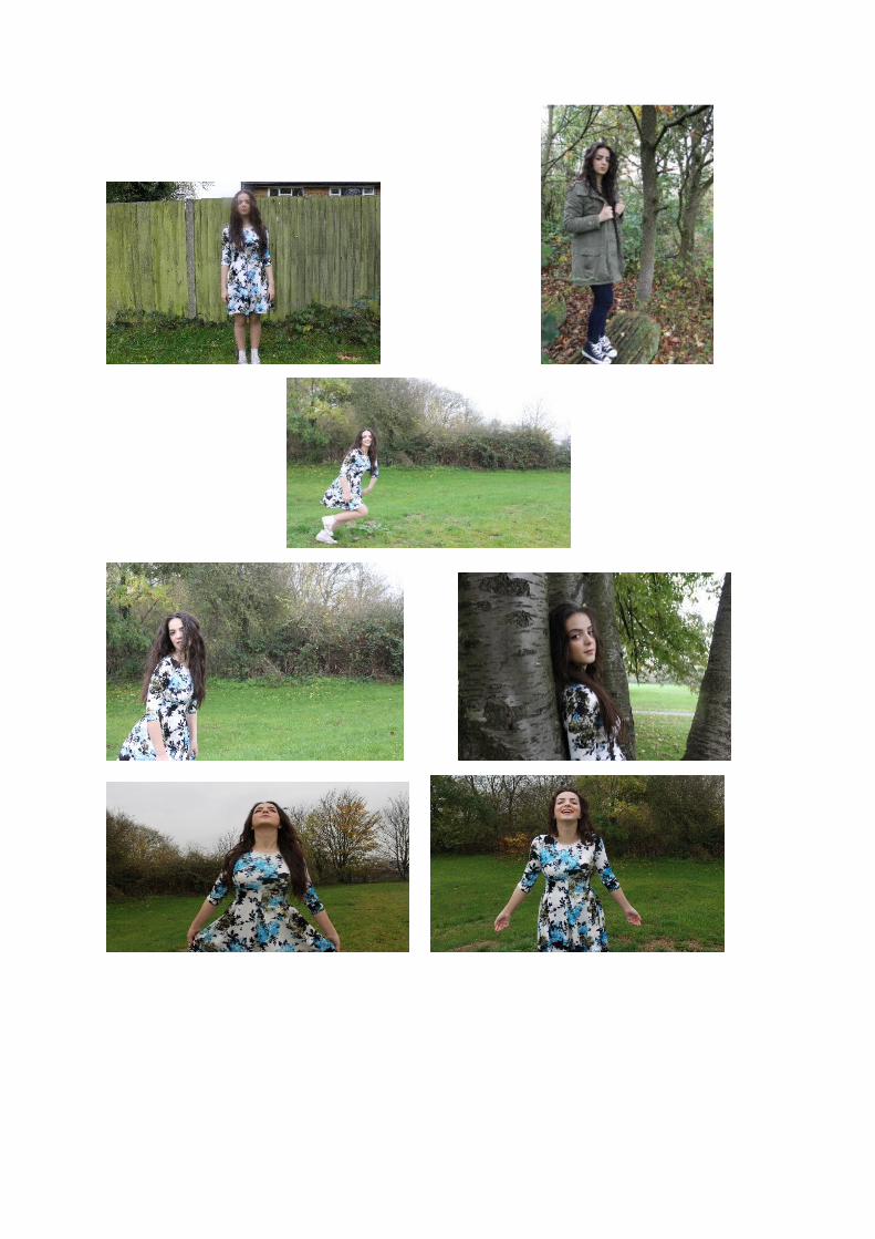
This image was used for the album front cover as it is a medium close up, this allows the audience to see the artist facial expressions clearly, for example the direct eye contact and stern like lip framing represents the song’s lyrics and videos narrative and is directly engaging and communicating with the audience. Also the artist hair as if blowing freely across natural leaves further represents the album such as emotion behind particular song lyrics and videos. The medium close up shot further indicates hints about the artist personality, for example mise en scene such as clothing is visible, a dress suggests the artist to be feminine. The dress enhances the background as it complements nature’s features. Furthermore, the audience are able to see some of her body language such as arms, this image shows a serious, resilient and sturdy posture. This represents songs in the album and the artist’s personality and background.
This image was not chosen for the album front cover as it is uses an excess amount of lighting, this effects the image as the artist face is brighter this prevents some detail such as make up and facial expressions from being visible. In addition the shot used does not show the artist clothing or body posture, this makes the image less appealing to the target audience also the facial expression such as smiling and slightly tilted head position makes the album appear to be less indie and more pop also it appears less professional.
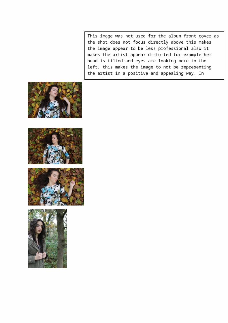
This image was not used for the album front cover as the shot does not focus directly above this makes the image appear to be less professional also it makes the artist appear distorted for example her head is tilted and eyes are looking more to the left, this makes the image to not be representing the artist in a positive and appealing way. In addition the artist body language such as her arm lifted as though she is relaxed in a comfortable and content place appears to be a less sophisticated approach to use on an album front cover, this feature also does not represent the album accurately.
Back cover:
Used-
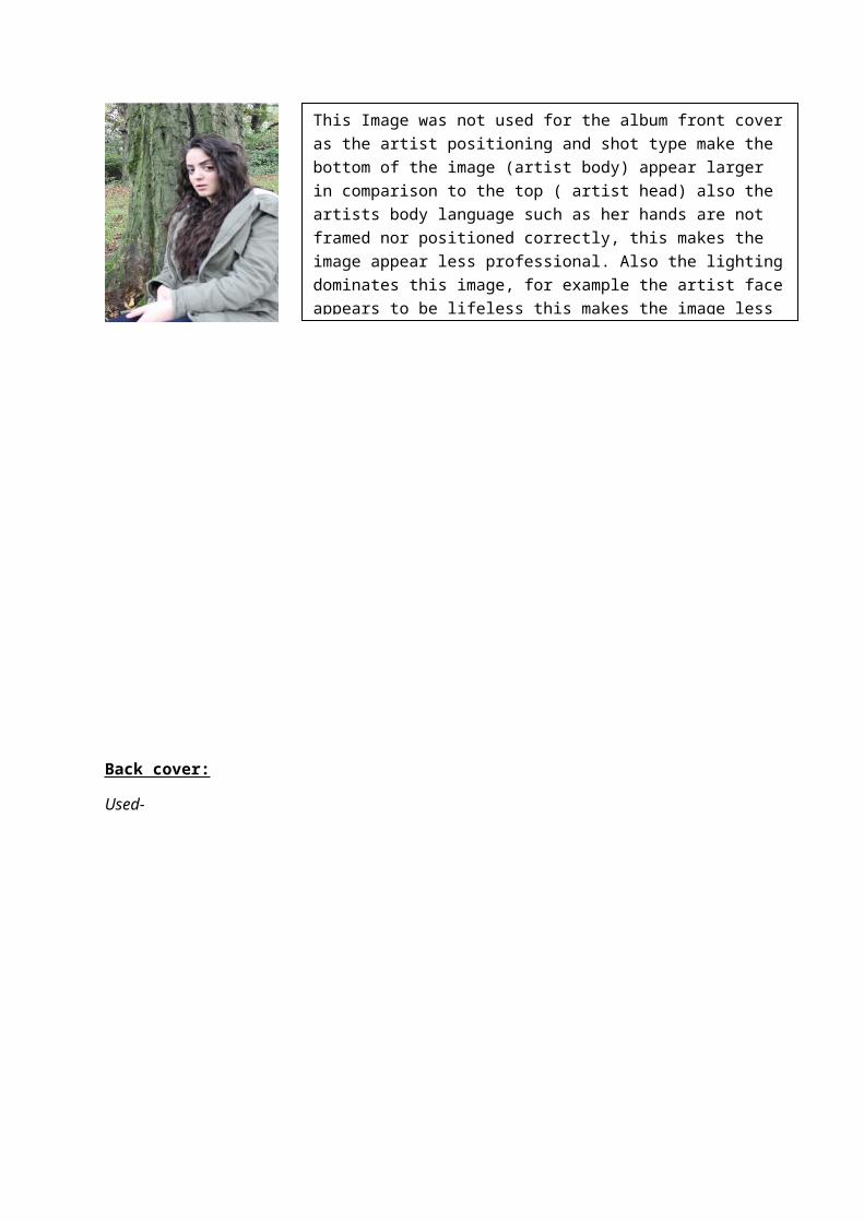
This Image was not used for the album front cover as the artist positioning and shot type make the bottom of the image (artist body) appear larger in comparison to the top ( artist head) also the artists body language such as her hands are not framed nor positioned correctly, this makes the image appear less professional. Also the lighting dominates this image, for example the artist face appears to be lifeless this makes the image less appealing to be a front cover of an album. Furthermore the background consists of unused space this is not necessary in this image.
Unused-
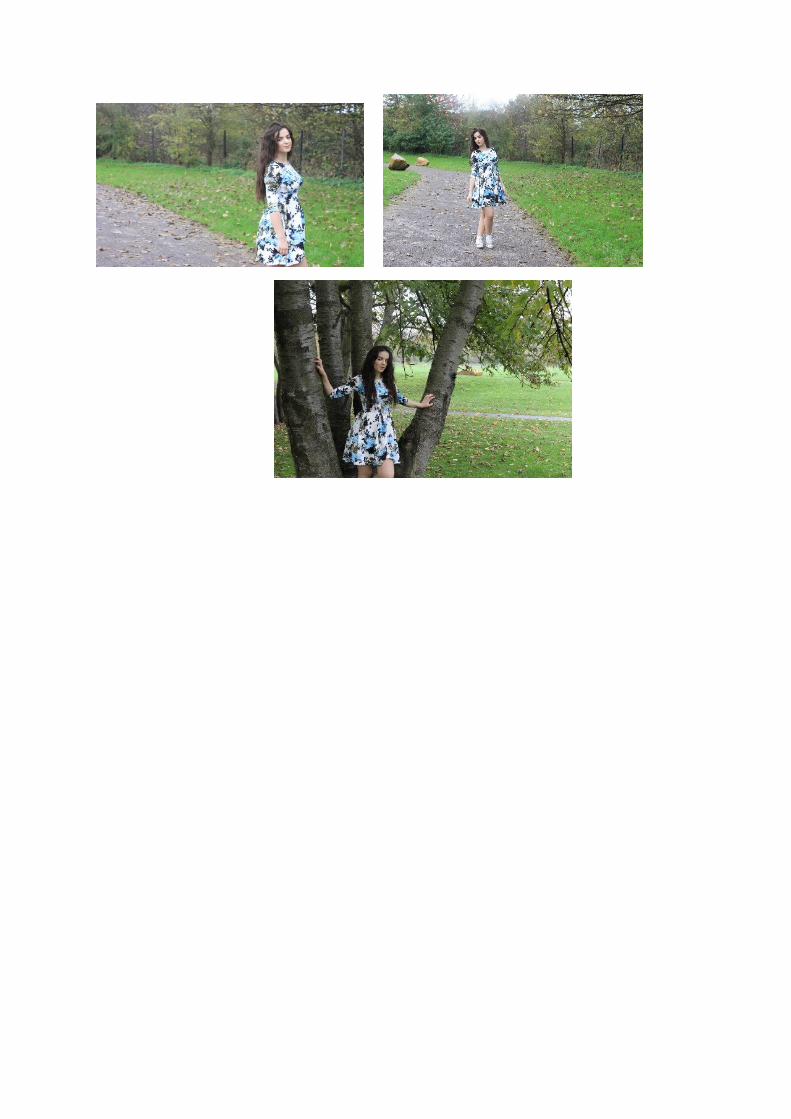
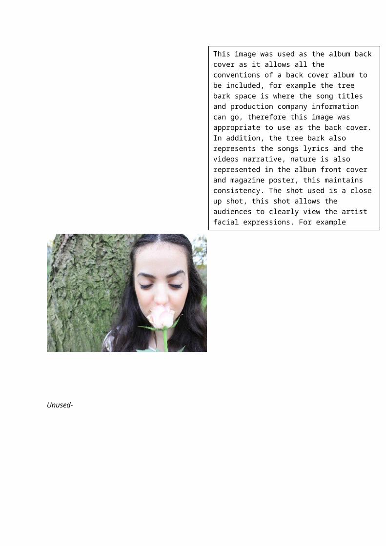
This image was used as the album back cover as it allows all the conventions of a back cover album to be included, for example the tree bark space is where the song titles and production company information can go, therefore this image was appropriate to use as the back cover. In addition, the tree bark also represents the songs lyrics and the videos narrative, nature is also represented in the album front cover and magazine poster, this maintains consistency. The shot used is a close up shot, this shot allows the audiences to clearly view the artist facial expressions. For example closed eyes this could be indicating song’s lyrics emotion and meaning as well as narratives. The artist is shown to be well groomed and takes pride in her appearance, this may be more appealing to the audience. Furthermore, the mise en scene such as the flower (prop) represents the artist and the album through its connotations, its also is a naturistic feature.

This image was not used as the album back cover as the artist is represented to be young and cool this is suggested through her body language such as her positioning. The artist is shown to be outgoing and carefree this is represented through her facial expressions such as looking down and hands in her pockets, this portrays the artist to not be aware of her audience as she is not directly addressing them. These features make this image unusable as this is not the artist personality nor is this attitude and style apart of her lyrics. In addition the background includes other aspects such as a pathway and other trees this makes the artist less significant and would also make it challenging to include other features of a back cover such as texts within this image.
This image was not used as the album back cover as the artist takes up majority of the background with her face an prop (rose), this will prevent the conventions of a back cover to be incorporated, for example the song titles text and production information cannot be inserted in the right place in order for the product to look convincing and appealing. In addition the top of the artist head is not included in the shot, this makes this image less appropriate to use. Also the artist facial expressions such as lips and eyes being half shut does not complement her actions, this makes this image unusable.
This image was not used as the album back cover as it is a vertical image this makes it challenging for an album back cover which is horizontal as the image would need to be stretched and as a result the image will look less original and badly edited. This image would also make it difficult for any typography to be a part of the image as it would not sit well in any position due to the shot type. Also the lighting is dark at the bottom of the image this makes the image appear less professional, In addition the image crops majority of the artist out this makes her less significant, furthermore the artist is represented to be leaning on a tree in sleep mode, and this is not accurate representation of the artist nor the album.

Magazine poster:
Used-
Unused-
This image was used for the magazine poster as it is a medium long shot, this shot enables the audience to see the artist body language for example running. This is representing the album as there is songs that include message of being free and escaping reality, running also connotes music as it allows the artist to express their past experiences and emotions. This shot also shows mise en scene such as the artist dress (clothing), the dress having colours that are earthly such as green leaves and blue flowers, this maintains constancy with the other texts. In addition, this feature allows the audience to construct an opinion on the artist style which would be represented in her music. Furthermore, the background also reinforces nature, the sky shining above forward facing the artist represents the artist to be significant. Also the background offers space required to include magazine poster conventions. This image represents the narrative message by facial posture such as looking back (dream/ revisiting past experience), the free flowing hair which is also similar to front cover. The direct eye contact directly enthuses and connects with the audience.
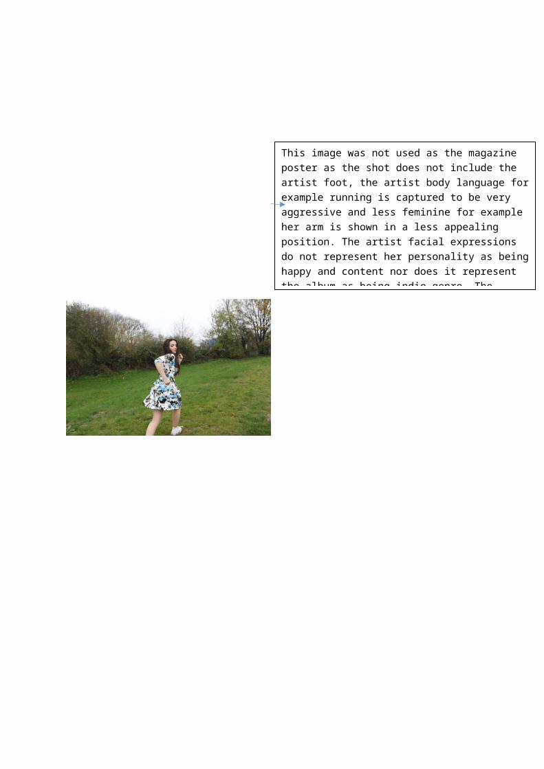
This image was not used as the magazine poster as the shot does not include the artist foot, the artist body language for example running is captured to be very aggressive and less feminine for example her arm is shown in a less appealing position. The artist facial expressions do not represent her personality as being happy and content nor does it represent the album as being indie genre. The background on this image is less focused as it shows multiple trees and a building, this would not appeal to the target audience also it would not be an eye catching and interesting poster to view.
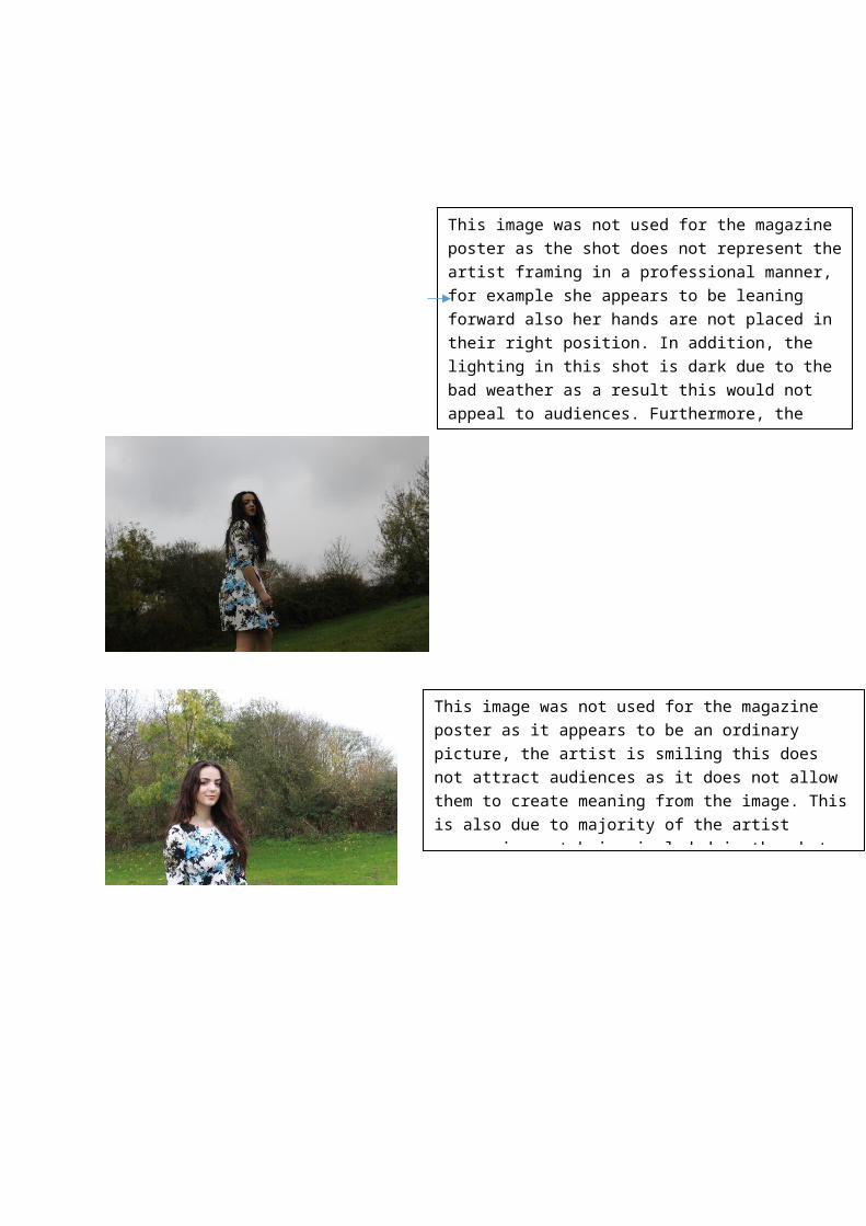
This image was not used for the magazine poster as the shot does not represent the artist framing in a professional manner, for example she appears to be leaning forward also her hands are not placed in their right position. In addition, the lighting in this shot is dark due to the bad weather as a result this would not appeal to audiences. Furthermore, the artist facial expressions do not represent the album, in this shot for example she appears to be superior the artist does not convey this in her album.
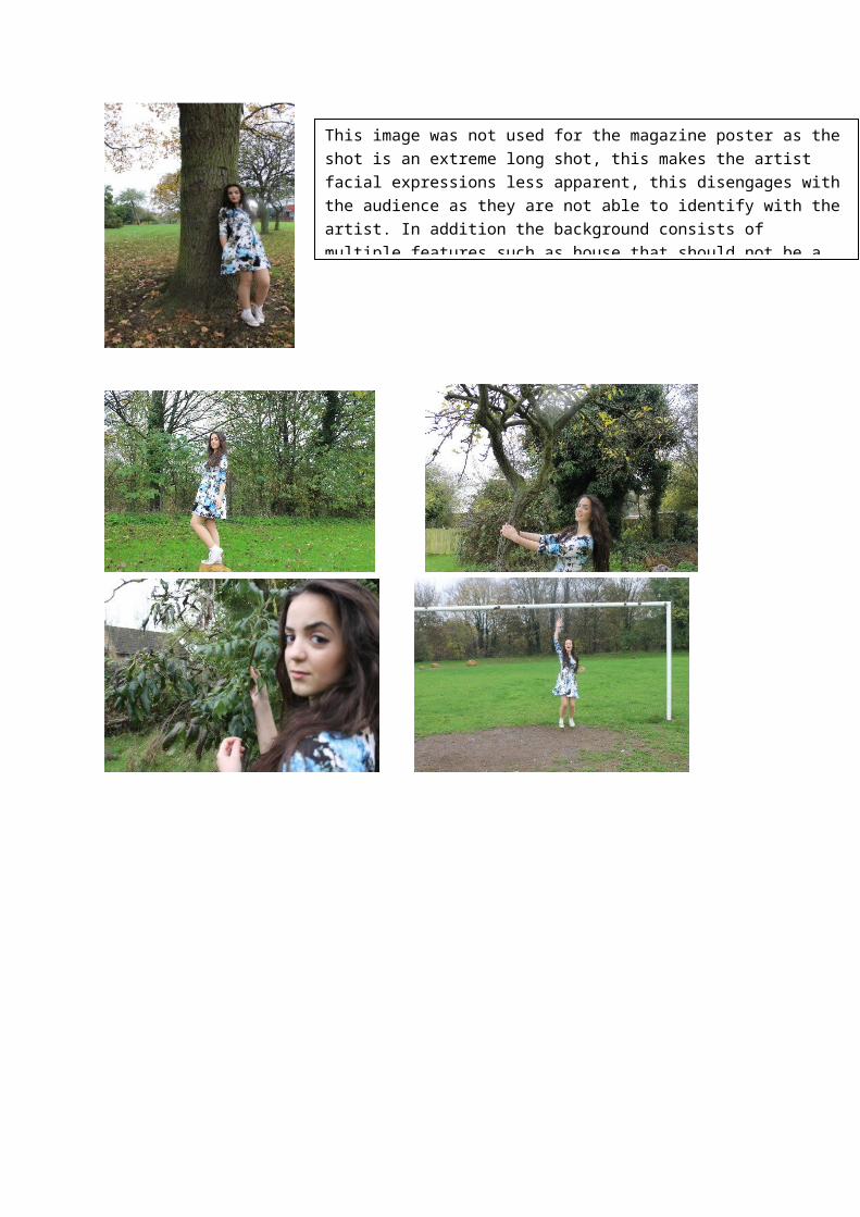
This image was not used for the magazine poster as it appears to be an ordinary picture, the artist is smiling this does not attract audiences as it does not allow them to create meaning from the image. This is also due to majority of the artist expression not being included in the shot, for example her body language.
This image was not used for the magazine poster as the shot is an extreme long shot, this makes the artist facial expressions less apparent, this disengages with the audience as they are not able to identify with the artist. In addition the background consists of multiple features such as house that should not be a part of the shot as it does not link with any of the ideas or representations the image is conveying.