54 Demography, Depopulation, and Devastation: Exploring ...
24
Demography, Depopulation, and Devastation: Exploring the Geography of the Irish Potato Famine Paul S. Ell and Ian N. Gregory I n the latter half of the 1840s, the potato crop in Ireland failed. As a result a progression of circumstances led to a 20 percent decline in population between the censuses of 1841 and 1851. This dramatic decrease in population was a product of death through famine and disease together with heightened rates of emigration. The down-turn in the popu- lation of Ireland continued, albeit at a lesser rate, for the remainder of the nineteenth century and well into the twentieth—this at a time where Europe’s population increased from around 320 million in 1880 to 420 million by the turn of the century. 1 It is not surprising, therefore, that the famine and its aftermath dominate the historiography associated with nine- teenth-century Ireland. This article discusses some of the key spatial patterns associated with the famine. Our analysis is based on a comprehensive database of Irish historical statistics, largely extracted from the printed Irish census returns for 1841, 1851, 1861, and 1871, agricultural returns from 1852 (when they first become reliably available), and a set of maps generated from the data at a range of scales. 2 The first half of this article is concerned with simple but essential visualization of spatial patterns. Using GIS methods not previously applied to the famine, these data are adjusted on to a com- mon set of poor law union or barony administrative boundaries to facili- tate examination over several census years. The latter part of this article uses more complex analytical techniques to explore multivariate patterns over space and time. Here we are able to reconcile and compare data gath- ered for different sets of boundaries using a technique called areal inter- polation. Spatial analysis is then used to explore the changing relation- ships between different datasets. Our work addresses a major lacunae in the literature. Scholars have produced exhaustive studies of the famine at local and national levels. These studies have used either qualitative or quantitative sources, and in Paul S. Ell is Director and Ian N. Gregory is Research Fellow in the Centre for Data Digitisation and Analysis at Queen’s University Belfast in Ireland. Historical Geography Volume 33 (2005): 54-77. ©2005 Geoscience Publications.
Transcript of 54 Demography, Depopulation, and Devastation: Exploring ...
54
Demography, Depopulation,and Devastation:
Exploring the Geographyof the Irish Potato Famine
Paul S. Ell and Ian N. Gregory
In the latter half of the 1840s, the potato crop in Ireland failed. As aresult a progression of circumstances led to a 20 percent declinein population between the censuses of 1841 and 1851. This dramatic
decrease in population was a product of death through famine and diseasetogether with heightened rates of emigration. The down-turn in the popu-lation of Ireland continued, albeit at a lesser rate, for the remainder of thenineteenth century and well into the twentieth—this at a time whereEurope’s population increased from around 320 million in 1880 to 420million by the turn of the century.1 It is not surprising, therefore, that thefamine and its aftermath dominate the historiography associated with nine-teenth-century Ireland.
This article discusses some of the key spatial patterns associated withthe famine. Our analysis is based on a comprehensive database of Irishhistorical statistics, largely extracted from the printed Irish census returnsfor 1841, 1851, 1861, and 1871, agricultural returns from 1852 (whenthey first become reliably available), and a set of maps generated from thedata at a range of scales.2 The first half of this article is concerned withsimple but essential visualization of spatial patterns. Using GIS methodsnot previously applied to the famine, these data are adjusted on to a com-mon set of poor law union or barony administrative boundaries to facili-tate examination over several census years. The latter part of this articleuses more complex analytical techniques to explore multivariate patternsover space and time. Here we are able to reconcile and compare data gath-ered for different sets of boundaries using a technique called areal inter-polation. Spatial analysis is then used to explore the changing relation-ships between different datasets.
Our work addresses a major lacunae in the literature. Scholars haveproduced exhaustive studies of the famine at local and national levels.These studies have used either qualitative or quantitative sources, and in
Paul S. Ell is Director and Ian N. Gregory is Research Fellow in the Centre for Data Digitisation andAnalysis at Queen’s University Belfast in Ireland. Historical Geography Volume 33 (2005): 54-77.©2005 Geoscience Publications.
55
some instances both. But despite the remarkable scope and detail of stud-ies of the famine, its spatial characteristics and geographical impact andimplications have not been adequately addressed. Not only is the geogra-phy of this pivotal event in Irish history poorly understood, but scholarshave drawn broad conclusions about regional differences without anchor-ing them in evidence. Where geographical substantiation has been used,it has almost invariably been limited to the county level. We will arguethat county-level data give a coarse and often misleading picture of thefamine’s spatially variable impact; that in fact mapping famine data at thescale of the county obscures more than it reveals.
It is not our intention to be overly critical of much scholarly work onthe famine period by a large number of historical geographers and histo-rians. Nor is it an aim here to review earlier work in detail. Advancedvisualization, geographical information systems (GIS), geographical in-formation science (GISc), and spatial analysis are techniques that are newto historical scholarship, in part the result of recent technological advancesand in part through increased interdisciplinary work between scholars.These approaches will increase our understanding of the famine. It stillremains remarkable, however, that spatial aspects of the famine have largelybeen ignored by academics, with few maps created, almost all of thoseconcerned with population, and analysis based on counties. There hasbeen even less spatial analysis. A few short examples will serve to illustratethe point.
As we have noted, advanced quantitative analyses of the famine havebeen conducted. Joel Mokyr’s efforts stand out in terms of their scope andauthoritative nature.3 In his most significant work there is not a singlemap. Of more concern is that the quantitative data Mokyr deploys are ata macro level. Thus we find information for Ireland as a whole, for Irelanddivided into six regions (northeast, northwest, central, east, south, andwest), for the four provinces, and occasionally for the 32 counties. Wewill demonstrate in this article that the impact of the famine, and itscauses and consequences, varied over space. This local to regional varia-tion controverts statistics at national or near-national level no matter whatthe complexity of multiple correlations used. Our results indicate thatlocal variations are masked and extremes ignored using macro-statistics.Analysis based on county units or larger areas is virtually aspatial.
Even publications that describe themselves as historical atlases for Ire-land, and contain many maps, fail to deal with the famine comprehen-sively. Although the number of poor law unions in distress in each countyis recorded in Seán Duffy’s Macmillan Atlas of Irish History, it fails to pro-duce time-series demographic data and restricts its examination of thefamine to the county. This in itself is interesting as, unlike baronies, poorlaw unions crossed county boundaries. It is unclear how this “anomaly”was handled. Where there are time-series—as for emigration between 1851and 1911—the unit of analysis is the county. 4
Demography, Depopulation, and Devastation

56
It is concerning that more statistical choropleth maps have not beencreated for the famine period. With the exception of Kennedy, et al.’sMapping the Great Irish Famine, there has been no attempt to systemati-cally map the progress and impact of the famine.5 The sumptuously pro-duced Atlas of the Irish Rural Landscape contains some statistical maps forthe famine period, and indeed a few of these plot barony and poor lawunion data.6 What is lacking, however, are maps showing change overtime. The Atlas of the Irish Rural Landscape offers the reader tantalizingsnapshots but does no more.
We suggest in this article that a significant, if not overwhelming, breakon the development of time-series data is the impact of boundary changefor smaller spatial units. In fact, some fifty years on, the work of T.W.Freeman still stands out as some of the most sophisticated visualizationwork done on the geography of the famine. In the 1940s and 1950s, heproduced detailed maps of population density for a limited number offixed points in time. His maps, based on parish boundaries with manualby-sight adjustment to identify heavily populated areas, wasgroundbreaking if imprecise.7 GIS allows us to visualize population databased on a variety of algorithms that address the problems associated withchoropleth maps that Freeman identified—that a variable is unlikely tobe evenly distributed over a polygon. It is remarkable that, as GIS hasdeveloped, the Freeman maps remain key and have not been exposed toGIS. Further, Freeman generally avoids map series showing change overtime, presumably due to the problems of intercensual boundary change.Where time series are produced, there is little indication of how boundarychanges were addressed.8 Again, GIS can help to resolve these issues. Not-withstanding methodological developments, Freeman’s maps are widelyreproduced, not least in the Atlas of the Irish Rural Landscape, published in1997.9 It is time to move on.
It is worth noting that scholars undertaking historical-geographicalstudies in Ireland do not face particularly difficult methodological orsource-related problems compared to other countries. Indeed Ireland hasan unrivaled range of advantages in contrast to many other states. Theouter boundary of the state remained constant for centuries. Nor havethere been dramatic changes in administrative geographies. Townlandshave formed the building-blocks of all other administrative units sincethe sixteenth century. A historical geographical information system beingdeveloped in Belfast is making use of these units to construct all otheradministrative boundaries.10
Key Geographies of the Famine
During the 100 years preceding the famine, Ireland’s population grewat a rate equal to or in excess of that found elsewhere in Europe. Forinstance, its growth was more than double that in France.11 By the 1840s,
Ell and Gregory
57
Cork was the fourth largest city in the United Kingdom, and Dublin theeleventh largest city in Europe. Contrary to the European trend of in-creasing urbanization, however, Ireland remained primarily rural, its peopledependent upon agriculture. Only after the famine was this pattern re-versed during a period of continuous population decline from the 1850sto the partition of the state in the 1920s. Beyond this, population growthwas stunted until the last two or three decades of the twentieth century,when a more sustained and steady population increase has been observed.
While rates of population growth and decline convey part of the im-pact of the famine, particularly its long reach beyond the nineteenth cen-tury, the actual population head counts are even more startling. In 1821,the time of the first census, Ireland’s population was 6,801,827.12 Beforethe famine began in earnest in 1845, the population increased by about1.5 million giving a pre-famine population of approximately 8.3 million.The first clear post-famine population count available to us comes fromthe 1851 census, which gives the island’s population as 6,552,385. Inother words, the population had fallen below that of 1821, with a loss of1.75 million people. The 1901 census presents a population of just fewerthan 4.5 million, a figure that remained fairly steady until 1971. Twofactors make this information still more remarkable. First, over this pe-riod, every other European state was gaining in population. Second, popu-lation decline and stagnation had a clear spatial dynamic. It was far worsein some parts of Ireland than in others. It is to the spatial dynamic that wenow turn.
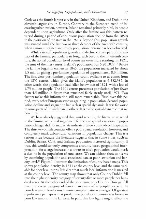
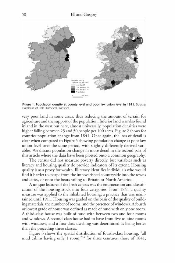
We have already suggested that, until recently, the literature attachedto the famine, while making some references to spatial variation in popu-lation change, did not map it. As indicated, a few county-level maps exist.The thirty-two Irish counties offer a poor spatial resolution, however, andcompletely mask urban-rural variations in population change. This is aserious issue because the literature suggests that in some cities, such asDublin, Belfast, Cork, and Galway, population increased significantly. Iftrue, this would seriously compromise a county-based geographical inter-pretation, for a large increase in a town’s or city’s population would maska decline in the population of rural areas. We can address these concernsby examining population and associated data at poor law union and bar-ony level.13 Figure 1 illustrates the limitation of county-based maps. Thisshows population density in 1841 at the county level and the same vari-able for poor law unions. It is clear that much local information is maskedat the county level. The county map shows that only County Dublin fellinto the highest density category of seventy-five or more people per hun-dred acres. At the other end of the spectrum, only County Donegal fellinto the lowest category of fewer than twenty-five people per acre. Atpoor law union level a much more complex pattern emerges. Of greatestsignificance perhaps is that pre-famine population density was lowest inpoor law unions in the far west. In part, this low figure might reflect the
Demography, Depopulation, and Devastation
58
very poor land in some areas, thus reducing the amount of terrain foragriculture and the support of the population. Inferior land was also foundinland in the west but here, almost universally, population densities werehigher falling between 25 and 50 people per 100 acres. Figure 2 shows forcounties population change from 1841. Once again, the loss of detail isclear when compared to Figure 5 showing population change at poor lawunion level over the same period, with slightly differently derived vari-ables. We discuss population change in more detail in the second part ofthis article where the data have been plotted onto a common geography.
The census did not measure poverty directly, but variables such asliteracy and housing quality do provide indicators of its extent. Housingquality is as a proxy for wealth. Illiteracy identifies individuals who wouldfind it harder to escape from the impoverished countryside into the townsand cities, or onto the boats sailing to Britain or North America.
A unique feature of the Irish census was the enumeration and classifi-cation of the housing stock into four categories. From 1841 a qualitymeasure was applied to the inhabited housing, a practice that was main-tained until 1911. Housing was graded on the basis of the quality of build-ing materials, the number of rooms, and the presence of windows. A fourthor lowest grade of house was defined as made of mud with only one room.A third-class house was built of mud with between two and four roomsand windows. A second-class house had to have from five to nine roomswith windows, and a first-class dwelling was determined as being betterthan the preceding three classes.
Figure 3 shows the spatial distribution of fourth-class housing, “allmud cabins having only 1 room,”14 for three censuses, those of 1841,
Figure 1. Population density at county level and poor law union level in 1841. Source:Database of Irish Historical Statistics.
Ell and Gregory
Population density (people per 100 acres)
Less than 2525 to less than 5050 to less than 7575 and above
0 50 Miles

59
1851, and 1861 based on baronies. Barony-level data were not publishedin the 1871 census. In 1841, more than 50 percent of the housing stockin much of the west was regarded as fourth class, reflecting the large per-centage of housing falling into this category. In some baronies the per-
Figure 2. Population change at county level, 1841-’71. Source: Database of Irish HistoricalStatistics.
Demography, Depopulation, and Devastation
Pop. Loss (%)
20 and above10 to less than 205 to less than 100 to less than 5Gain
0 50 Miles
1841 to1871
1841 to1851
1841 to1861

60
centage was remarkably high. In all but one of the baronies in CountyKerry more than 50 percent of the housing was fourth class, as were allbaronies in west Cork. Many baronies in Counties Mayo and Galway alsohad more than 50 percent of housing in the poorest category. Through-
Figure 3. Fourth-class housing at barony level, 1841-61. Source: Database of Irish HistoricalStatistics.
Ell and Gregory
1841 1851
1861
Fourth class housing (%)
Less than 10
10 to less than 25
25 to less than 50
50 and above
0 50 Miles
Fourth-class housing (%)
Less than 1010 to less than 2525 to less than 5050 and above
0 50 Miles
1841 1851
1861

61
out Ireland as a whole, the vast majority of baronies in 1841 containedmore than 25 percent fourth-class housing. The cities were the excep-tions. In much of County Down, and parts of County Dublin and thebaronies of Newcastle, Upper Cross, and Rathdown, less than 10 percentof housing was fourth class. It should be noted that in the cities the lack offourth-class housing did not necessarily indicate a higher standard of ac-commodation. In Dublin in particular, where a high percentage of first-class houses were found, many families occupied tenements that the cen-sus defined as the best quality housing in terms of the size of the building.Multiple occupancy was not reflected in the housing quality categorizations.
In 1851, the census shows the distribution of fourth-class housing tobe much the same. The major change was a significant decline in thepercentage of the poorest housing. Unlike 1841, no baronies reportedmore than 50 percent fourth-class housing, although in the west, baron-ies with 25 to 49 percent of housing in this category were fairly common,frequently corresponding with the areas which in 1841 had more than 50percent poor housing. In the east, more dramatic changes are evident.Throughout much of the Province of Ulster, and almost all of the coun-ties which today comprise Northern Ireland, less than 10 percent of thehousing was classified as fourth class. The same was true in baronies aroundand to the south of Dublin. In 1861, mapping of the census returns dem-onstrates that the decline in poor housing continued. For much of Irelandless than 10 percent of housing was then classified as fourth class. Therecontinued to be a remarkable continuity in the spatial pattern of fourth-class accommodation. It remained most common in the west but, in per-centage terms, at a far lower level than was the case in either 1851 or1841.
In summary, immediately before the famine the majority of the Irishhousing stock was fourth class or “all mud cabins.” Post-famine, there wasa marked decline by 1851. As is the case for many socioeconomic statis-tics in Ireland, the trends established during and immediately after thefamine continued for decades. Thus we see a further fall in fourth-classhousing in 1861, a decline that continued to the end of the century.
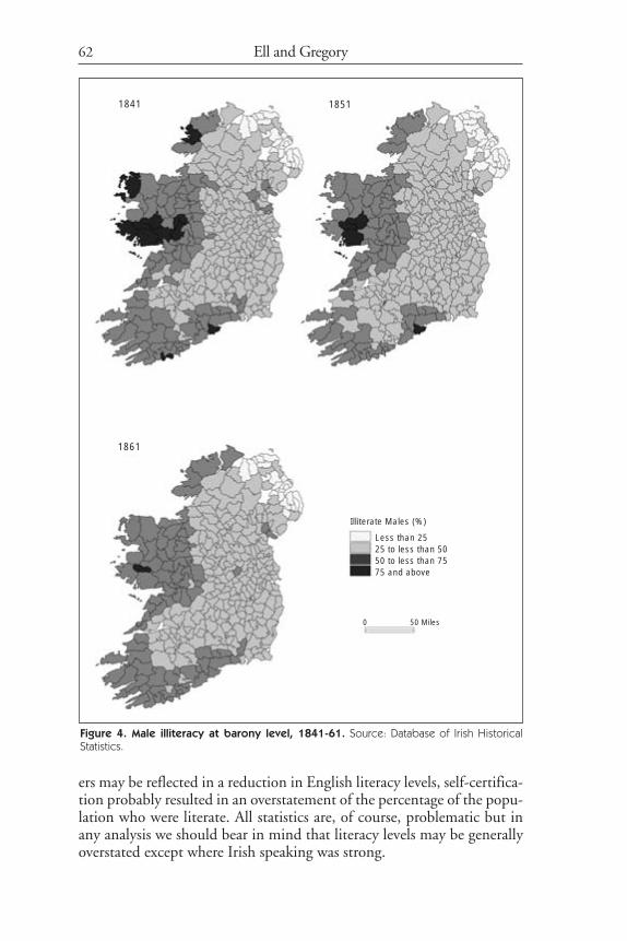
From 1841, the Irish census contains information on literacy. Thecensus enumerated the population by both age and sex into three catego-ries—those who could read and write, those who could read but not write,and those who were illiterate. It is important to realize that these literacyassessments were based on abilities in English. It is conceivable that thosewho were literate in Irish were recorded as being illiterate in English. SinceIrish speakers were far more prevalent in the west, illiteracy levels heremay be overstated. The data are further complicated as literacy was nottested in any way by the census; it relied on a statement by the head ofhousehold, although if the householder was illiterate, the form wouldhave been completed by the enumerator to a degree acting as a control forerroneous claims of being literate. Whereas the prevalence of Irish speak-
Demography, Depopulation, and Devastation
62
ers may be reflected in a reduction in English literacy levels, self-certifica-tion probably resulted in an overstatement of the percentage of the popu-lation who were literate. All statistics are, of course, problematic but inany analysis we should bear in mind that literacy levels may be generallyoverstated except where Irish speaking was strong.
Figure 4. Male illiteracy at barony level, 1841-61. Source: Database of Irish HistoricalStatistics.
Ell and Gregory
1841 1851
1861
Illiterate Males (%)
Less than 2525 to less than 5050 to less than 7575 and above
0 50 Miles

63
Levels of illiteracy varied significantly between males and females.Typically, literacy levels amongst females were significantly below the levelfor males but the geographical patterns were much the same. Hence werestrict discussion here to the data for males. Figure 4 shows the percent-age of illiterate males at barony level for 1841, 1851, and 1861. In 1841,only twelve baronies recorded male illiteracy above 75 percent, with adecline to four baronies in 1851 and just one, Ross in County Galway, in1861. During this thirty-year period levels of literacy amongst enumer-ated males increased steadily with high illiterate levels increasingly foundonly in the west and subsequently the far west. Interesting very high levelsof illiteracy were also found in County Waterford on the southern coastand along the isolated Carlingford peninsula in the barony of DundalkLower and the nearby barony of Farney.
It is clear from data relating to population, housing, and literacy thatthe period of 1841 to 1871 was one of significant changes in Irish society,and that these changes had a profound spatial dynamic. Change was greatestduring the famine years of the late 1840s but continued well beyond theimmediate crisis. The same is true for a range of other maps that can bederived from Irish census data. We are well served by the census in thisperiod because it acted as a social survey rather than a simple count ofpopulation. We could therefore have included maps on the Irish language,on occupations, on changes in agriculture, or on diet. While the ranges ofmaps that can be generated are extensive, and more complex multivariatemaps might be created, there is considerable scope to move beyond thesimple creation of visualizations to a spatial analysis of the famine. Thesematters are considered in the next section of the article.
Spatio-temporal Analysis
A significant difficulty with using the census and other longitudinalsources to analyze change over time in quantitative terms is that data werepublished for incompatible spatial units and the boundaries of these unitsvary temporally. Even straightforward examinations of geographies by sightare made more complex by boundary change. To deal with this, we plot-ted the visualizations in the first part of this article onto a common set ofadministrative units, something not previously attempted at sub-countylevel in a systematic way.15 Quantitative analysis of change over time isseriously compromised by the changing boundaries of the administrativeunits used to publish the data. The result of this in Ireland is the lack ofany substantive spatial analysis for units smaller than counties. As countyboundaries did not change significantly, work at this level is possible but,as discussed above, findings at this coarse granularity are inherently lim-ited and flawed.
In mid-nineteenth-century Ireland most demographic data were pub-lished at barony level, of which there were around 320 depending on
Demography, Depopulation, and Devastation

64
date, while agricultural data, also available from the census were pub-lished for around 160 poor law unions whose boundaries rarely coincidedwith barony boundaries. This has been a major limitation on our abilityto perform quantitative statistical analyses with these data. Using GISand a spatial statistical technique known as “areal interpolation” we canwork around this problem. With areal interpolation it is possible to takedata published using one set of units and estimate its values for anotherset. This allows us to interpolate all of our data onto a single set of admin-istrative units, such as 1851 poor law unions, to allow direct comparisons.At the core of this is a GIS “overlay” operation that calculates the degreeof overlap between every source unit and every target. Once we have this,the easiest way of estimating the values for the target district is to assumethat the original data are evenly distributed across the source units andallocate data accordingly.16 Obviously this assumption of even populationdistribution is unrealistic but strategies can be developed to overcome theproblem.17 In this article we use a technique based on the EM-algorithm18
to interpolate a range of data from the censuses between 1841 and 1871onto 1851 poor law unions to allow us to examine change over timethrough spatial analysis.
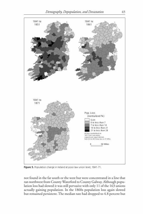
Our concern in this work is what factors influenced population lossin Ireland in the period from 1841 to 1871 and how this varied over spaceand time. To answer this, we measure population change as a normalizedpercentage but, as almost all population change was population loss wesubtract the change from zero to give a measure of loss rather than themore conventional population gain. This gives a value between 100.0,complete depopulation of a previously populated area, and –100.0, popu-lation moving into a previously unpopulated area.19 This differs from aconventional rate in that it is a symmetrical measure, thus a loss of 20percent is the direct opposite of increase of 20 percent. With a conven-tional rate, where population change is only divided by the start popula-tion, this is not the case.20 We find broadly similar population distribu-tions to those noted earlier in the article although here we concentrate onchange between each census rather than over several decades.
Figure 5 shows population loss in each of the decades from 1841 to1871 while Table 1 shows summary statistics for these figures. In bothcases, the fact that we are using standardized areas means that we canmake direct comparisons over time. Clearly there was a pattern of spec-tacular but declining population loss. In the 1840s the median popula-tion loss was 12.9 percent. Only five unions gained population, threearound Dublin, and Belfast and Cork. Population loss was most limitedin the north and east of the country with high rates being found in thesouth, especially in the vicinity of Skibbereen, and in the midlands andthe west. In the 1850s, although decline had slowed, it was still high witha median rate of 7.45 percent. There was a clear split to the pattern withareas in and around Ulster having the lower rates. The highest rates were
Ell and Gregory
65
not found in the far south or the west but were concentrated in a line thatran northwest from County Waterford to County Galway. Although popu-lation loss had slowed it was still pervasive with only 11 of the 163 unionsactually gaining population. In the 1860s population loss again slowedbut remained persistent. The median rate had dropped to 4.8 percent but
Figure 5. Population change in Ireland at poor law union level, 1841-71.
Demography, Depopulation, and Devastation
Gain0 to less than 77 to less than 1414 to less than 2121 to less than 28
0 50 Miles
1841 to1871
1841 to1851
1841 to1861
Pop. Loss (normalized %)
All data standardized on1851 Poor Law unions.Legend uses equal intervalsfrom 0.0 to 28.0 (max loss is 27.59%).
66
the highest rates were now located consistently in the midlands, particu-larly Counties Offaly and Tipperary. Ten unions gained population in the1860s but their pattern was very different from the previous decade butinterestingly while Belfast and Rathdown, just south of Dublin, were twoof them. Of the remaining eight, four were in the south and another fourin the west. If we look at the ten unions that lost the most population ineach of these three decades only two, Borrisokane and Roscrea, both inthe north County Tipperary area, appear twice—in the 1840s and thenthe 1860s. The pattern of gain (or very limited loss) was a little moreconsistent with Belfast and Rathdown appearing in the top ten in all threedecades while Ballymena, Dublin South, and Swineford appeared twice,Ballymena and Dublin South in the 1840s and ‘50s and Swineford in the1850s and ‘60s. Belfast, Ballymena, Rathdown, and Dublin South are allpredictably in or near major cities, however, Swineford is in County Mayo,a county commonly perceived to have been among the worst affected bydepopulation.
Having established the geographical pattern of population decline,the next stage is to explore how this relates to variables such as fourth classhousing and illiteracy, indicators of poverty discussed earlier. Figure 6shows the changing patterns of literacy and of housing type over the thirty-year period through histograms. The graphs show clearly that over theperiod the majority of population loss was concentrated amongst the illit-erate and that the proportion of housing that was fourth class declinedmassively in the 1840s and continued to decline in the 1850s. Unfortu-nately, housing classes were not published at barony level in the 1871census so geographical analysis of these data into the 1860s is not pos-sible. Data on literacy was still available in 1871 and this shows that in the1860s the number of people who were illiterate remained constant while
Table 1. Five figure summaries of population loss and number of unionsgaining population for poor law unions in Ireland, 1841-71.
Five figure summaries are the minimum, lower quartile, median, upper quartile, and maximum. The“Gaining pop.” row refers to the number of unions that gained population in the decade (out of atotal of 163).
1841-51 1851-61 1861-71
Min. -11.00 -6.95 -16.77
L.Q. 9.10 3.55 2.72
Median 12.88 7.45 4.82
U.Q. 17.43 11.24 6.41
Max. 27.59 17.00 10.75
Gaining pop. 5 11 10
Ell and Gregory

67
the number of literates and those who could only read declined. If weassume that, in general, lower standards of literacy were found amongstthe poorly housed then these data imply that during and after the faminethe poor, who lived in fourth-class houses and were illiterate, were thehardest hit, while the rich, living in first-class housing and who were fullyliterate, were barely affected. By the 1860s, however, it seems as if popula-tion loss may have moved through the social scale into the more affluentsectors of society.
If this were the case, it would be expected that areas with high levelsof illiteracy and fourth-class housing at the start of each decade would bethe ones that suffered the highest levels of population loss over the ensu-ing decade. Comparing map patterns would be one way to investigatethis along the lines of some of the maps in Section 1. However, we suggestthere are better approaches that are not susceptible to variations in per-ception of the individual reader. One option is to use a statistical tech-nique such as regression. A major problem with this is that most statisticalmethods, including standard regression, are “whole map,” in other words,crucially they assume that a relationship remains constant across the wholestudy area. This is unhelpful and effectively denies that relationships mayvary over space. While using regression in this article we also make use of“local” analysis techniques where the results are able to vary over spacethus stressing diversity rather than similarity.21 Specifically, we use geo-graphically weighted regression (GWR) that allows us to explore the rela-tionships between multiple variables both globally and locally.22 Conven-tional (or global) regression tests whether there is a relationship betweenone variable, termed the dependent variable, and one or more other vari-ables thought to influence it, termed the independent variables. It is able
Figure 6. Population decline by: a. literacy, and b. housing type. Source: Database of IrishHistorical Statistics.
Demography, Depopulation, and Devastation
1841 1851 1861 1871 1841 1851 1861
Illiterate Read Only Read and Write Fourth Third Second First

68
to state whether or not a statistically significant relationship exists using t-values, and to quantify the steepness of the relationship using the regres-sion coefficients. GWR enhances this by permitting the relationships tovary through the use of a distance decay model that allows the parametersto fluctuate over space. In this way, different coefficients and t-values canbe calculated for every location on the study area.
A regression analysis was carried out for each of the three decadesfrom the 1840s to the 1860s. In each case, population change over thedecade was the dependent variable being predicted by the percentage ofthe population who were illiterate and the percentage of the populationwho lived in fourth-class housing at the start of the decade. As urbancenters also seem to influence population loss, two measures of these arealso included as dummy variables: “large towns” flags whether a unioncontained a town that was enumerated in the 1841 census as having apopulation of over 50,000.23 This gives us six unions: Belfast, DublinNorth, Dublin South, Cork, Limerick, and Waterford. Small towns in-clude all unions that contained a town with over 5,000 but less that 50,000in 1841. There were thirty-two of these.
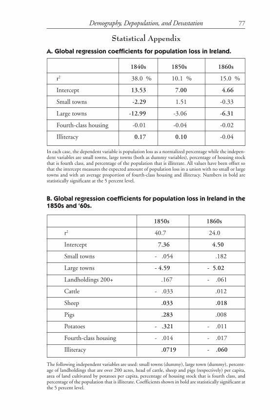
Full results from the global regression are presented in statistical Ap-pendix A. The analysis shows that in the 1840s, a union with an averageamount of fourth-class housing and illiteracy lost 13.53 percent of itspopulation but that this was reduced by 2.29 percentage points and 12.99percentage points if the union contained a small or a large town respec-tively. The coefficient for illiteracy shows its population loss would in-crease by 0.17 percentage points for every percentage point above averageilliteracy or decrease by the same below average illiteracy. It also showsthat once towns and illiteracy are taken into account, fourth-class hous-ing does not have a statistically significant impact on population loss. Ther2 value of 38.0 percent shows the amount of the total variation in popu-lation loss that can be predicted from the model. This is a very high valuewith data that are this crude. This therefore suggests that population lossin the famine decade was strongly related to rural poverty. The negativevalues for urban areas suggest either that towns were less affected by thefamine, or that out-migration and death from towns was more than com-pensated for by in-migration from rural areas.
The patterns for the 1850s and 1860s are less convincing but remaininteresting. In the 1850s, illiteracy remained statistically significant but ata lower level than in the 1840s while towns were no longer significantsuggesting that population loss was unaffected by whether an area wasrural or urban, although the coefficient for large towns remained high. Bythe 1860s, large towns were having a significant impact on reducing de-cline but none of the other variables were statistically significant.
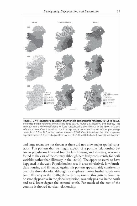
Using GWR demonstrates that the relationship described above de-rived from straightforward regression, is highly simplistic. Figure 7 showsthe GWR results for the same analysis although the coefficients for small
Ell and Gregory
69
and large towns are not shown as these did not show major spatial varia-tions. The pattern that we might expect, of a positive relationship be-tween population loss and fourth-class housing and illiteracy, was onlyfound to the east of the country although here fairly consistently for bothvariables (other than illiteracy in the 1840s). The opposite seems to havehappened in the west. Population loss rose in areas of relatively low fourth-class housing and illiteracy. Again, this pattern appears fairly consistentlyover the three decades although its emphasis moves further south overtime. Illiteracy in the 1840s, the only exception to this pattern, found tobe strongly positive in the global regression, was only positive in the northand to a lesser degree the extreme south. For much of the rest of thecountry it showed no clear relationship.
Figure 7. GWR results for population change with demographic variables, 1840s to 1860s.The independent variables are small and large towns, fourth-class housing, and illiteracy. Theintercept term and the coefficients for fourth-class housing and illiteracy for the 1840s, ‘50s, and‘60s are shown. Class intervals on the intercept maps use equal intervals of four percentagepoints from 0.0 to 24.0 as the maximum value is 22.02. Class intervals on the other maps useequal intervals of 0.2 spreading out from a class of –0.09 to 0.09 which shows little relationship.
Demography, Depopulation, and Devastation
1840s
4th class housing Illiteracy
For illiteracy
and 4th class housing:
Coefficients
0.1 to less than 0.3
0.3 and above
-0.3 and below
-0.3 to less than -0.1
-0.1 to less than 0.1
Bold outlines: Significant at 5% lev
1850s
1860s
Intercept
0 to less than 4
4 to less than 8
8 to less than 12
12 to less than 16
16 to less than 20
20 to less than 24
For intercept:
Coefficient
0 50 Miles
Intercept IlliteracyFourth-class housing
1840s
1850s
1860s
For InterceptCoefficient
0 to less than 4
4 to less than 8
8 to less than 12
12 to less than 16
16 to less than 20
20 to less than 24
-0.3 and below
-0.3 to less than -0.1
-0.1 to less than 0.1
0.1 to less than 0.3
0.3 and above
For Illiteracy and fourth-class housing:Coefficients
Bold outlines: Significant at 5% level
0 50 Miles

70
The intercept terms also show interesting variations. These map theaverage rates of population loss predicted in an area with average amountsof fourth-class housing and illiteracy and no towns. In 1841 there was aclear band of high rates stretching from Counties Waterford to Mayo, anarea that almost mirrored the area of highest population loss in the fol-lowing decade. In the 1850s and 1860s the pattern changed to have highvalues concentrated around Limerick although in the 1860s this was notapparent from Figure 4 due to the low values compared to earlier years. In allthree decades the lowest intercepts were found in the north of the country.
Clearly we need to develop a more sophisticated model based on ad-ditional variables. Unfortunately, for the 1840s there is a lack of other
Figure 8. GWR results for three variables from the population change with demographicand agricultural variables, 1850s and 1860s. For reasons of space only, the most interestingvariables—large farms, pigs per capita, and potatoes per capita—are shown. The full list ofindependent variables is small and large towns, percentage of landholdings that are over 200acres (large farms), cattle per capita, sheep per capita, pigs per capita, acres under potatoesper capita, fourth-class housing, and illiteracy. Class intervals use equal intervals of 0.2, spread-ing out from a class of –0.09 to 0.09, which shows little relationship.
Ell and Gregory
Large farms Pigs p.c. Potatoes p.c.
Coefficients
Bold outlines: Significant at 5% level
1850s
1860s
0.1 to less than 0.3
0.3 and above
-0.3 and below
-0.3 to less than -0.1
-0.1 to less than 0.10 50 Miles
1850s
1860s
Coefficients-0.3 and below
-0.3 to less than -0.1
-0.1 to less than 0.1
0.1 to less than 0.3
0.3 and aboveBold outlines: Significant at 5% level
0 50 Miles
Large farms Pigs p.c. Potatoes p.c.

71
possible explanatory values to add to the model but for 1851 and 1861 alarge amount of agricultural information exists at poor law union level.We have interpolated this onto 1851 poor law unions to allow it to becompared with the demographic information. Specifically the followingvariables were used: the percentage of landholdings that were over 200acres representing large farms; the numbers of cattle, sheep, and pigs, re-spectively, per head of population in the union; and the acreage of eachunion under cultivation with potatoes also per head of population.
The global regression results for this analysis are presented in full instatistical Appendix B. In summary, the coefficients for both large townsand illiteracy became statistically significant for both decades; in the 1850s,farm size and head of cattle per capita do not appear to have been signifi-cant but sheep and pigs were both positively related to population lossand potatoes were negatively significant. In the 1860s, the only changeswere that both pigs and potatoes ceased to be significant. This suggeststhat in the 1850s, particularly, livestock farming was pushing people offthe land or taking advantage of the availability of land to expand, whilepotato farming was encouraging them to stay.
Figure 8 shows the GWR results for some of these variables, for rea-sons of space the full set cannot be shown. We present the most interest-ing variables here which were large farms, pigs per capita, and potatoesper capita. The patterns found complement the results revealed in Figure7 that showed illiteracy and, to a lesser extent, fourth-class housing beingpositively related to population loss (as might be expected) but only in theeast. In the west and south there was often a negative relationship thatseemed counter-intuitive. The inclusion of agricultural variables suggeststhat in the 1850s large-scale agriculture was actually a prime driving forcebehind much of Ireland’s population loss particularly north of Munster.This was particularly true of pig farming and sheep farming that wereboth strongly positively related to population loss. If an additional set ofdata values are added to the model that combine the values each of thesevariables with the percentage of large farms, the two seem to be actingtogether to increase population loss. The presence of potatoes and, to alesser extent, cattle is negatively related to population loss.
A tentative explanation for this might be that in this period the ex-pansion of large agricultural estates over much of Ireland drove manypeople from these parts. In the east the poor in particular were affectedwhile in other areas all of the population were involved with the slightlybetter off being perhaps more able to move in response to this expansion.This explanation is, however, currently speculative as it is based on lim-ited models of crude data and is guilty of ecological fallacy where conclu-sions about the behavior of individuals is derived from patterns in aggre-gate data.24
The pattern changed again in the 1860s when the role of agriculturein explaining population loss seems to become far less important. Pigs in
Demography, Depopulation, and Devastation

72
particular fell from a global coefficient of 0.283 with a t-value of 7.18 andGWR significance over most of the country to a global coefficient of 0.008and a (not statistically significant) t-value of 0.38 with not a single GWRresult that is either significant or has a coefficient of over 0.1. Potatoesshowed a similar if slightly less dramatic pattern. Large farms still wererelated to population loss in much of the center of the country but nowseemed to be reducing loss in the north and south. Speculatively, usingthe information on literacy in Figure 6, this may be because populationloss in the 1860s for much of the country had moved up the social scaleand was no longer concentrated in the poor.
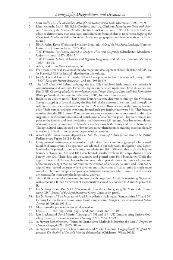
It cannot be overstated that studies of this sort are fundamentallydriven by the data available and that this will inevitably affect the results.This is why we are able to make comments on the impact of agricultureafter but not during the famine as accurate data are not available for thatperiod. Interpretation of some variables can be complex. For example, thepresence of livestock may be positive as it provides alternative foodstuffsand income for the poor, or may be negative as it is being farmed for theexport market and is thus removing fertile land from the local popula-tion. It is tempting to stress areas where the models work well and ignoreareas where models do not work well. One interesting feature of GWR isthat it is able to quantify the degree to which the model works eitherthrough local r2 values, that give the amount of variation in the depen-dent variable predicted by the independent variables and the coefficients,or through the use of local t-values that measure whether the result in oneplace can be considered statistically significant.25
Figure 9 explores the degree to which the data available “explained”the pattern of population loss in the 1850s and ‘60s where both the agri-cultural data and the demographic data are used. On the left, local r2
values are mapped, while on the right, the number of statistically signifi-cant t-values is shown out of a possible nine if there was a significantresult for all variables. A clear spatial pattern emerges in the 1850s, spe-cifically that the available data do a poor job of “explaining” populationloss in the south of the country where frequently no variables or only theurban variables were statistically significant. This suggests that some addi-tional factor or factors were important in explaining population lossthrough the 1850s and that the crude agricultural variables available dolittle to help our understanding of population loss in this region. This isparticularly important as many case studies of Ireland around the famineperiod have focused on southern areas such as Skibbereen. Our work sug-gests that assuming that these studies have relevance to the whole of Ire-land is flawed as different processes seem to be occurring in the souththan elsewhere. The pattern is less clear cut in the 1860s, but it appearsthat the south is better explained in this decade and that weaknesses aremore prevalent in the centre of the country.
Ell and Gregory
73Demography, Depopulation, and Devastation
Figure 9. Explanatory power of GWR models for 1850s and 1860s. The maps on the leftshow local r2 values as calculated in GWR using equal interval-class intervals of 7 percentagepoints starting at 65.0 percent (the minimum value is 66.7 percent). The maps on the right showthe number of independent variables that are statistically significant at the 5 percent level out ofa possible nine: small towns, large towns, percentage of landholdings over 200 acres, cattle percapita, pigs per capita, sheep per capita, potatoes per capita, percentage of housing that isfourth class, and percentage of population that is illiterate.
Number ofsignificant values
012
3
4567
Local r (%)65 to less than 7272 to less than 79 79 to less than 86
86 to less than 93
93 to less than 100
2
Local t-valuesLocal r
1850s
1860s
2
0 50 Miles
Local r2 Local t-values
Local r2 (%)
65 to less than 7272 to less than 7979 to less than 8686 to less than 9393 to less than 100
Number ofsignificant values
0123
4567
0 50 Miles
1850s
1860s
t
74
Conclusions
This article reflects work in progress, but work that has already pushedour understanding of the famine beyond its current boundaries. We haveshown that at a local level the famine and its aftermath had a significantand dramatic geography. Using straightforward visualization over timewith common boundaries, we find geographies that challenge the existingliterature, which has been limited by problems of comparing time-seriesinformation for differing boundaries. In poor law unions containing largertowns population, decline was limited and population densities tended tobe lower in the far west. The impact of the famine in terms of populationloss was not focused only in the west. In fact, many baronies in that re-gion suffered less than those in the midlands. We find a radical change inthe quality of housing in which the population were living. In 1841, manyareas in the west had more than 50 percent of housing was fourth class.By 1861, such housing was rare. In our analysis, most notably using GWR,we show that the interplay of social and economic conditions led to varia-tions in the severity of population loss at sub-county level. In the east wefind a strong relationship between illiteracy, poor housing, and popula-tion decline. In the west the situation is reversed, with areas with higherlevels of literacy and better housing losing population more rapidly. Thisis an important new finding, and there are others that will lead to a rein-terpretation of elements of the development and impact of the famine. Aswe move to create a full historical GIS for Ireland, linking and relatingdisparate qualitative and quantitative sources in space and time, the re-search opportunities will multiply.26
Acknowledgements
This research was assisted by funding from the Economic and SocialResearch Council’s (ESRC) Research Methods program grantH333250016. Thanks to Ciaran Higgins and Elaine Yeates (Centre forData Digitisation and Analysis, Queen’s University Belfast) for their helpwith this article. The GWR analysis was performed using GWR 2.0 soft-ware provided by Martin Charlton, Stewart Fotheringham, and ChrisBrunsdon (Department of Geography, University of Newcastle).
Notes
1. See M.M. Postan and H.J. Habakkuk, The Cambridge Economic History of Europe, Vol.6:1, TheIndustrial Revolutions and After: Incomes, Population and Technological Change (Cambridge: Cam-bridge University Press, 1966): 61.
2. The Database of Irish Historical Statistics was developed at the Queen’s University of Belfastwith funding from the Economic and Social Research Council and Queen’s University. Thedatasets are deposited with AHDS History at the University of Essex.
3. Joel Mokyr, Why Ireland Starved: A Quantitative and Analytical History of the Irish Economy,1800-1850 (London: Allen & Unwin, 1983).
Ell and Gregory
75
4. Seán Duffy, ed., The Macmillan Atlas of Irish History (New York: Macmillan, 1997): 90-93.5. Líam Kennedy, Paul S. Ell, E.M. Crawford, and L.A. Clarkson, Mapping the Great Irish Fam-
ine: A Survey of the Famine Decades (Dublin: Four Courts Press, 1999). Our article builds onadjusted datasets, new map coverages, and comments from scholars in response to Mapping theGreat Irish Famine to define far more clearly key geographies and base analysis on a firmerfooting.
6. F.H.A. Aalan, Kevin Whelan, and Matthew Stout, eds., Atlas of the Irish Rural Landscape (Toronto:University of Toronto Press, 1997): 85-9.
7. T.W. Freeman, Pre-Famine Ireland: A Study in Historical Geography (Manchester: ManchesterUniversity Press, 1957): 316-17.
8. T.W. Freeman, Ireland: A General and Regional Geography, 2nd ed., rev. (London: Methuen,1960): 118-34.
9. Aalan, et al., Irish Rural Landscape, 86.10. For a more detailed discussion of the advantages and development of an Irish historical GIS, see
“A Historical GIS for Ireland” elsewhere in this volume.11. Joel Mokyr and Cormac Ó Gráda, “New Developments in Irish Population History, 1700-
1850,” Economic History Review 24, 2nd ser. (1984): 475.12. The 1821 Census of Ireland, although the first fully completed Irish census, was remarkably
comprehensive and accurate. Hence this figure can be relied upon. See David A. Gatley andPaul S. Ell, Counting Heads: An Introduction to the Census, Poor Law Data and Vital Registration(Bishop’s Stortford: Statistics for Education, 2000) for more information.
13. Baronies are ancient units. Their precise boundaries were determined through the OrdnanceSurvey’s mapping of Ireland during the first half of the nineteenth century, and through thecollection of statistics at barony level in the 1821 census. Baronies nest within county bound-aries. Their number changes over time. Immediately pre-famine there were 313. They becameobsolete after the 1891 census. Poor law unions were more recent units concerned, as the namesuggests, with the administration and distribution of relief for the poor. They were created justprior to the famine, and over the famine itself there were 131 unions. Poor law unions do notnest within other administrative boundaries—they cross both county and parish boundaries.The agricultural censuses used poor law unions rather than baronies meaning that traditionallyit was very difficult to compare to the population censuses.
14. Report of the Commissioners Appointed to Take the Census of Ireland for the Year 1841, BritishParliamentary Papers 24 (1843): xiv.
15. Using manual techniques, it is possible to plot data onto a common geography for a smallnumber of census years. This approach was adopted in our early work. In Figures 3 and 4, post-famine data is plotted to a set of barony boundaries for 1841. We were able to do this becauseboundary changes in 1851 and 1861 were limited, usually involving the simple division of onebarony into two. These data can be summed and plotted onto 1841 boundaries. While thisapproach is suitable for simple visualization over a short period of time, it cannot take accountof boundary changes that do not result in the creation of a new spatial unit, and it cannot beapplied over several censuses where division and subdivision of spatial units is much morecomplex. The more complex and precise redistricting techniques referred to later in this articleare essential for more complex longitudinal analysis.
16. Thus, if 80 percent of a source unit intersects with target unit A and the remaining 20 percentwith target unit B then 80 percent of its population should be allocated to A and 20 percent toB.
17. Ian N. Gregory and Paul S. Ell, “Breaking the Boundaries: Integrating 200 Years of the Censususing GIS,” Journal of the Royal Statistical Society, Series A (in press).
18. Ian N. Gregory, “The Accuracy of Areal Interpolation Techniques: Standardising 19th and 20th
Century Census Data to Allow Long-Term Comparisons,” Computers Environment and UrbanSystems 26 (2002): 293-314.
19. More formally, population loss is calculated as:Loss = (0 – [(end_pop – start_pop) / (end_pop + start_pop)]) _ 100.
20. Iain Bracken and David Martin, “Linkage of 1981 and 1991 UK Censuses using Surface Mod-elling Concepts,” Environment and Planning A 27 (1995): 379-90.
21. A. Stewart Fotheringham, “Trends in Quantitative Methods I: Stressing the Local,” Progress inHuman Geography 21 (1997): 88-96.
22. A. Stewart Fotheringham, Chris Brunsdon, and Martin Charlton, Geographically Weighted Re-gression: The Analysis of Spatially Varying Relationships (Chichester: Wiley, 2002).
Demography, Depopulation, and Devastation

76
23. Dummy variables have a value of either one, to indicate that a feature is present, or zero toindicate that it is absent.
24. Neil Wrigley, “Revisiting the Modifiable Areal Unit Problem and the Ecological Fallacy,” inAndrew D. Cliff, Peter R. Gould, Anthony G. Hoare, and Nigel J. Thrift, eds., Diffusing Geog-raphy, Essays for Peter Haggett (Oxford: Blackwell, 1995): 49-71.
25. Note that local t-values must be used with caution due to problems with multiple significancetesting.
26. Work with the Great Britain Historical GIS has taken place recently to make it more accessibleand link qualitative information to the statistical data that are more generally associated withGIS. Descriptions of places at various points in time, historical and modern maps and travel-lers’ tales are all linked to the underlying geo-statistical resource (see www.visionofbritain.org.uk).At present this work has been aimed at making information available to the public. We aredeveloping the GIS to make it a resource for scholars.
Ell and Gregory
77
Statistical Appendix
A. Global regression coefficients for population loss in Ireland.
1840s 1850s 1860s
r2 38.0 % 10.1 % 15.0 %
Intercept 13.53 7.00 4.66
Small towns -2.29 1.51 -0.33
Large towns -12.99 -3.06 -6.31
Fourth-class housing -0.01 -0.04 -0.02
Illiteracy 0.17 0.10 -0.04
In each case, the dependent variable is population loss as a normalized percentage while the indepen-dent variables are small towns, large towns (both as dummy variables), percentage of housing stockthat is fourth class, and percentage of the population that is illiterate. All values have been offset sothat the intercept measures the expected amount of population loss in a union with no small or largetowns and with an average proportion of fourth-class housing and illiteracy. Numbers in bold arestatistically significant at the 5 percent level.
B. Global regression coefficients for population loss in Ireland in the1850s and ‘60s.
1850s 1860s
r2 40.7 24.0
Intercept 7.36 4.50
Small towns - .054 .182
Large towns - 4.59 - 5.02
Landholdings 200+ .167 - .061
Cattle - .033 .012
Sheep .033 .018
Pigs .283 .008
Potatoes - .321 - .011
Fourth-class housing - .014 - .017
Illiteracy .0719 - .060
The following independent variables are used: small towns (dummy), large town (dummy), percent-age of landholdings that are over 200 acres, head of cattle, sheep and pigs (respectively) per capita,area of land cultivated by potatoes per capita, percentage of housing stock that is fourth class, andpercentage of the population that is illiterate. Coefficients shown in bold are statistically significant atthe 5 percent level.
Demography, Depopulation, and Devastation