What is Bodoni?
16
? ? What is Bodoni?
-
Upload
steph-waldo -
Category
Documents
-
view
246 -
download
4
description
A short introduction to the typeface Bodoni.
Transcript of What is Bodoni?
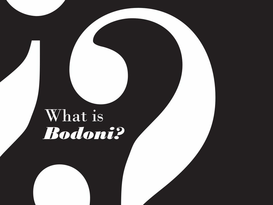
??What is
Bodoni?

??&NIRVANA
L A D Y G A G A
TypographyVOGUECOLUMBIA RECORDS
MAMMA MIA!
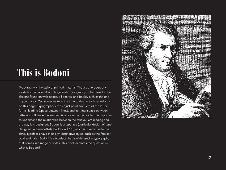
??Typography is the style of printed material. The art of typography
exists both on a small and large scale. Typography is the basis for the
designs found on web pages, billboards, and books, such as the one
in your hands. Yes, someone took the time to design each letterforms
on this page. Typographers can adjust point size (size of the letter-
forms, leading (space between lines), and kerning (space between
letters) to influence the way text is received by the reader. It is important
to understand the relationship between the text you are reading and
the way it is designed. Bodoni is a typeface (particular design of type)
designed by Giambattista Bodoni in 1798, which is in wide use to this
date. Typefaces have their own distinctive styles, such as the familiar
bold and italic. Bodoni is a typeface that is wide used in typography
that comes in a range of styles. This book explores the question—
what is Bodoni?
This is Bodoni
3
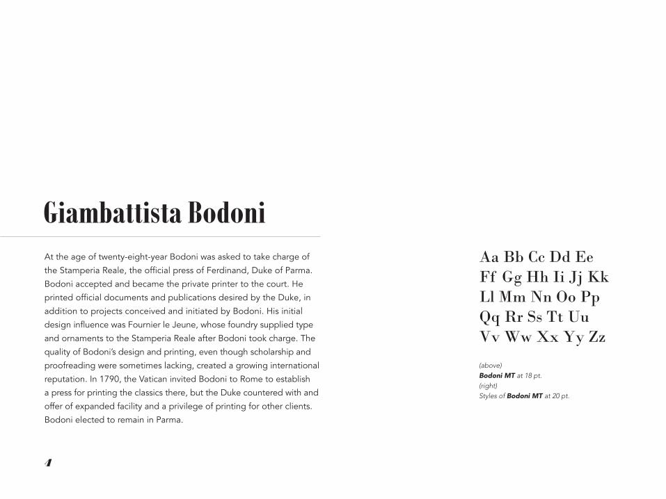
At the age of twenty-eight-year Bodoni was asked to take charge of
the Stamperia Reale, the official press of Ferdinand, Duke of Parma.
Bodoni accepted and became the private printer to the court. He
printed official documents and publications desired by the Duke, in
addition to projects conceived and initiated by Bodoni. His initial
design influence was Fournier le Jeune, whose foundry supplied type
and ornaments to the Stamperia Reale after Bodoni took charge. The
quality of Bodoni’s design and printing, even though scholarship and
proofreading were sometimes lacking, created a growing international
reputation. In 1790, the Vatican invited Bodoni to Rome to establish
a press for printing the classics there, but the Duke countered with and
offer of expanded facility and a privilege of printing for other clients.
Bodoni elected to remain in Parma.
Giambattista BodoniAa Bb Cc Dd Ee Ff Gg Hh Ii Jj Kk Ll Mm Nn Oo Pp Qq Rr Ss Tt Uu Vv Ww Xx Yy Zz
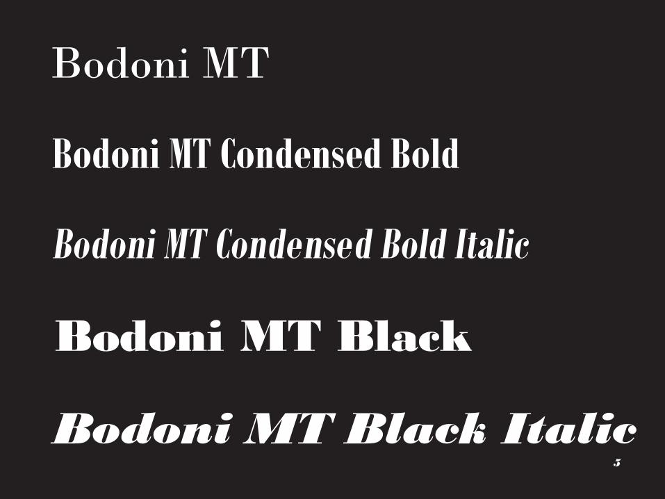
(above) Bodoni MT at 18 pt. (right) Styles of Bodoni MT at 20 pt.
4
Bodoni MT Black Italic
(above) Bodoni MT at 18 pt. (right) Styles of Bodoni MT at 20 pt.
5
Bodoni MT
Bodoni MT Condensed Bold
Bodoni MT Black
Bodoni MT Condensed Bold Italic

Origins of the TypefaceBodoni was no revolutionary. The modern roman style, which is attri-
buted to him, did not, as many would believe, spring forth as if by
magic. While the letters he cut and the books he printed were more
refined and of exceptionally higher quality than most of the work
originating before or during his lifetime, it would be difficult to classify
any of Bodoni’s efforts as fundamentally new. When he was young,
the work of John Baskerville served as his ideal; when he opened his
first printing office for the Duke of Parma, Bodoni did so with type
from Fournier. In later years, the work of his great Parisian competitor,
Francois Didot, influenced him dramatically. Bodoni was always, in
some manner, dependent on the work of other, bolder contemporaries.
Baskerville
Bodoni
Didot
(above) Bodoni, Baskerville, and Didot at 14pt. One will find these typefaces are bad for long bodies of text because of their ornamental nature.
(right page) A counter is the shape formed by the inside of a letterform’s bowl. A terminal is the end of an indivudual stroke on a letterform.
4

aa aYet despite these influences, he was not a copyist. A comparison of
Bodoni’s type to Didot’s two designs that on the surface may appear
virtually identical is a perfect example. There are distinct similarities
in their work, and Bodoni surely studied Didot’s designs very carefully,
but a close examination reveals that Bodoni’s weight transitions are
more gradual and his serifs still maintain a slight degree of bracketing.
There is even hint of “old style” in Bodoni’s work. He followed Didot’s
lead, carefully evaluating the designs of his great competitor, con-
sciously remaining, however, always just slightly behind the radical
modernism of his contemporary. Perhaps this explains to some degree
the longevity of Bodoni’s type designs. They were radical enough to
be considered new and different (to establish for Bodoni an import-
ant and influential place in current typographic circles), but not so
different that they became the 18th-century versions of fad designs.
There have been countless revivals of Bodoni since it’s initial design
in 1798. This book primarily concerns itself with Bodoni MT, although
other variations are still common. Other digital versions include Bodoni
Antiqua, Bodoni Old Face, ITC Bodoni Seventy Two, ITC Bodoni Six,
ITC Bodoni Twelve, LTC Bodoni 175, WTC Our Bodoni, Bodoni EF,
Bodoni Classico, and TC Bodoni. A recent revival of Bodoni is Filosofia
(designed by Zuzana Licko).
Bodoni has a ball terminal Baskerville is less curved Didot is elongated
a a aBodoni has a smaller counter Baskerville has a larger counter Didot has a tear shaped counter
5

rWait, a what?terminal
vertical axis
6
Before considering Bodoni as a typeface, a common language should
be established to discuss it’s characteristics. Typography has it’s own
language to describe letterforms. A typeface can have a different
style, one aspect is if it is serif or sans serif. Serifs are extensions of the
letter at the end of its strokes. There are three kinds of serifs, a brack-
eted serif, hairline serif, and slab serif. The shapes of the letters are
influenced by their modulation. Modulation refers to the predictable
thick to thin contrast between strokes. This comes from a designers
original drawing with a brush or flat reed pen. A letter has posture,
just like a person. Some typefaces are slanted like handwriting. Letters
that are 90º to the baseline are considered roman. Letters with a slant
are called italic. The white space enclosed by a letterform is called
a counter, this is often formed in the form’s bowl. Under standing the
anatomy of typography is key to appreciating it.
stem
H H Hbracketed serif hairline serif slab serif
rslanted axis
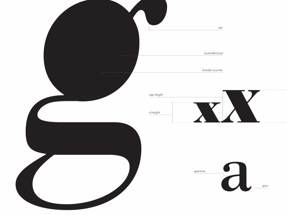
g (outside) bowl
ear
xXx-height
(inside) counter
cap height
aperture a spur
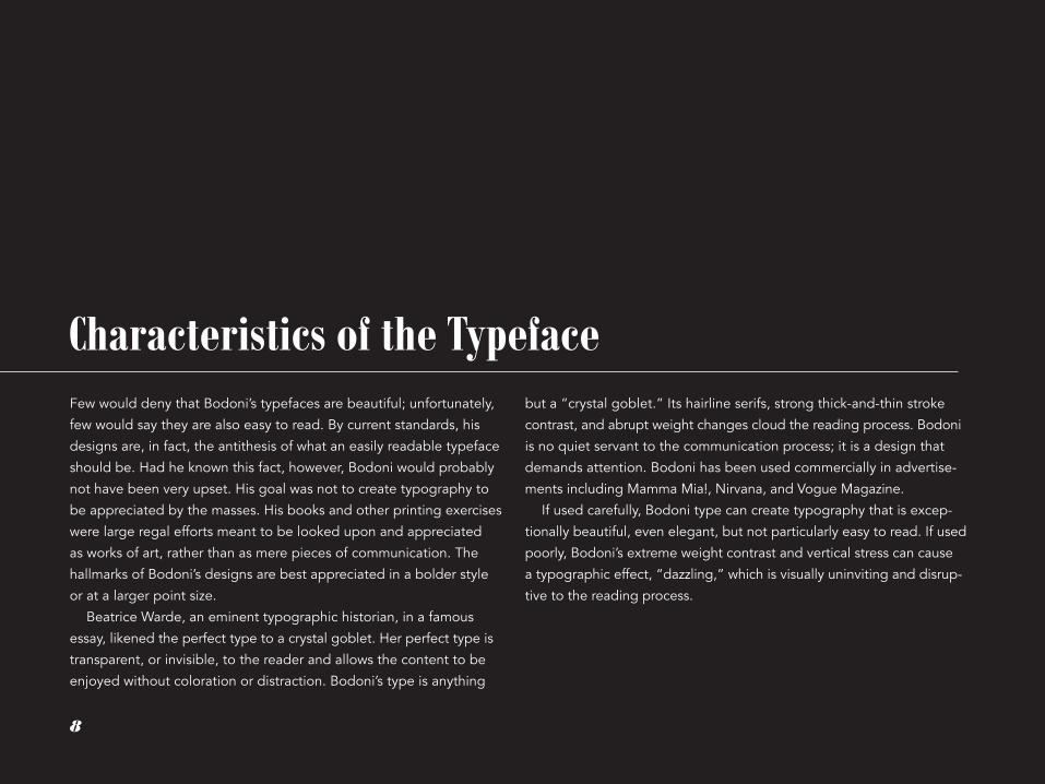
Characteristics of the TypefaceFew would deny that Bodoni’s typefaces are beautiful; unfortunately,
few would say they are also easy to read. By current standards, his
designs are, in fact, the antithesis of what an easily readable typeface
should be. Had he known this fact, however, Bodoni would probably
not have been very upset. His goal was not to create typography to
be appreciated by the masses. His books and other printing exercises
were large regal efforts meant to be looked upon and appreciated
as works of art, rather than as mere pieces of communication. The
hallmarks of Bodoni’s designs are best appreciated in a bolder style
or at a larger point size.
Beatrice Warde, an eminent typographic historian, in a famous
essay, likened the perfect type to a crystal goblet. Her perfect type is
transparent, or invisible, to the reader and allows the content to be
enjoyed without coloration or distraction. Bodoni’s type is anything
but a “crystal goblet.” Its hairline serifs, strong thick-and-thin stroke
contrast, and abrupt weight changes cloud the reading process. Bodoni
is no quiet servant to the communication process; it is a design that
demands attention. Bodoni has been used commercially in advertise-
ments including Mamma Mia!, Nirvana, and Vogue Magazine.
If used carefully, Bodoni type can create typography that is excep-
tionally beautiful, even elegant, but not particularly easy to read. If used
poorly, Bodoni’s extreme weight contrast and vertical stress can cause
a typographic effect, “dazzling,” which is visually uninviting and disrup-
tive to the reading process.
8
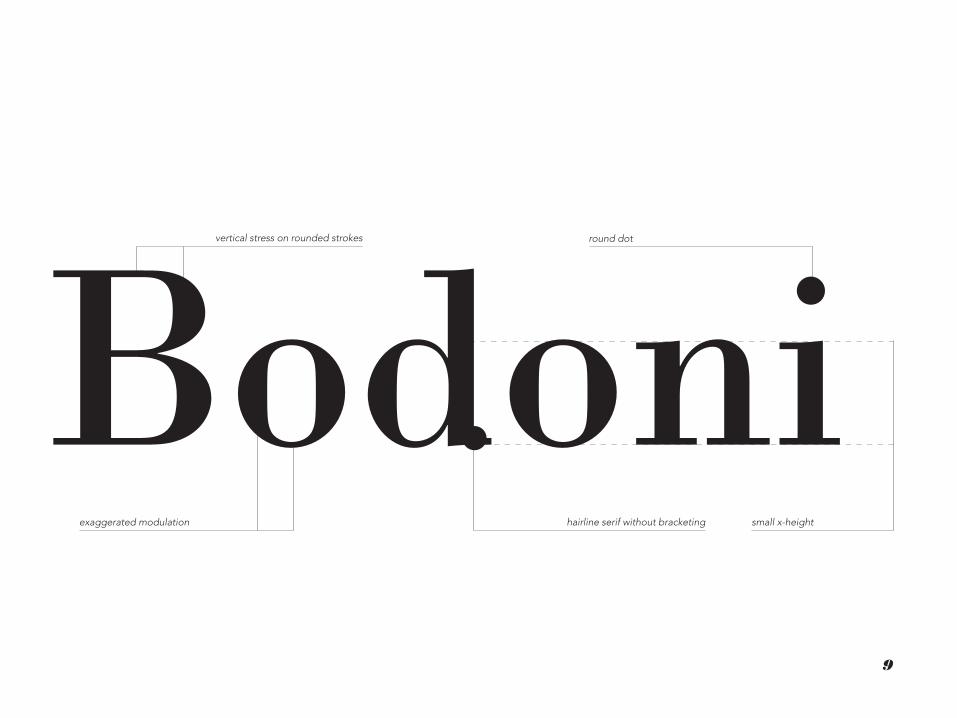
Bodonihairline serif without bracketingexaggerated modulation
vertical stress on rounded strokes round dot
small x-height
9
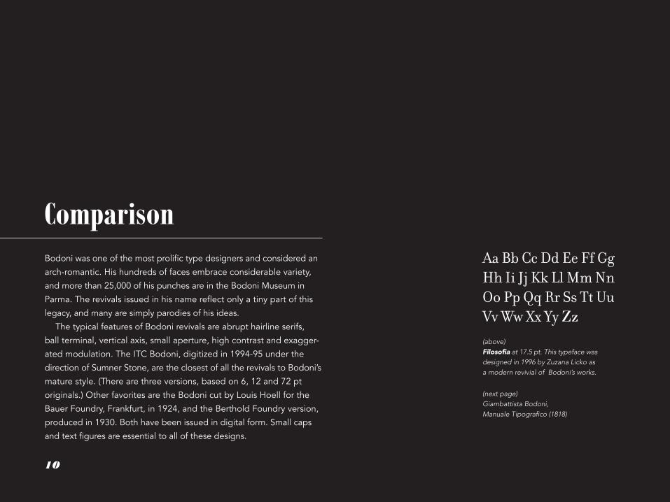
Comparison Bodoni was one of the most prolific type designers and considered an
arch-romantic. His hundreds of faces embrace considerable variety,
and more than 25,000 of his punches are in the Bodoni Museum in
Parma. The revivals issued in his name reflect only a tiny part of this
legacy, and many are simply parodies of his ideas.
The typical features of Bodoni revivals are abrupt hairline serifs,
ball terminal, vertical axis, small aperture, high contrast and exagger-
ated modulation. The ITC Bodoni, digitized in 1994-95 under the
direction of Sumner Stone, are the closest of all the revivals to Bodoni’s
mature style. (There are three versions, based on 6, 12 and 72 pt
originals.) Other favorites are the Bodoni cut by Louis Hoell for the
Bauer Foundry, Frankfurt, in 1924, and the Berthold Foundry version,
produced in 1930. Both have been issued in digital form. Small caps
and text figures are essential to all of these designs.
(above) Filosofia at 17.5 pt. This typeface was designed in 1996 by Zuzana Licko as a modern revivial of Bodoni’s works.
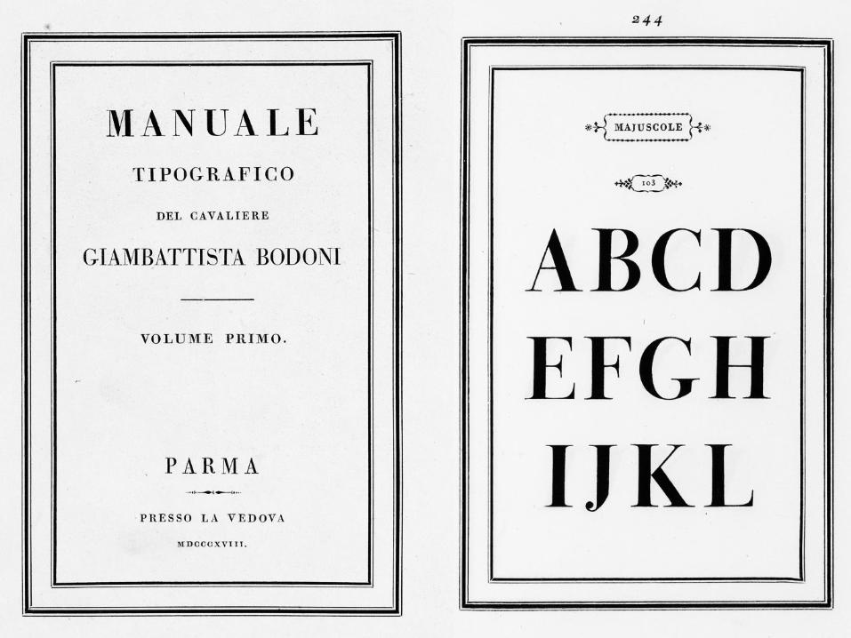
(next page) Giambattista Bodoni, Manuale Tipografico (1818)
Aa Bb Cc Dd Ee Ff Gg Hh Ii Jj Kk Ll Mm Nn Oo Pp Qq Rr Ss Tt Uu Vv Ww Xx Yy Zz
10

??BibliographyReferences
Philip B. Meggs, A History of Graphic Design (New York: Van Nostrand Reinhold, 1992), 124.
Alexander S. Lawson, Anatomy of a Typeface (Boston: D.R. Godine, 1990), 46, 48.
Alexander S. Lawson, Anatomy of a Typeface (Boston: D.R. Godine, 1990), 46, 49, 50.
Robert Bringhurst, The Elements of Typographic Style (Point Roberts, WA: Hartley & Marks, 1992), 217, 218.
Haley, Allan. Typographic Milestones. New York: Van Nostrand Reinhold, 1992. (SC: Z250 A2 H18 1992 4o)
Lawson, Alexander S. Anatomy of a Typeface. Boston: D.R. Godine, 1990. (SC: Z250 L34 1990)
Bringhurst, Robert. The Elements of Typographic Style. Vancouver: Hartley and Marks,1997. (A&A: Z246 B745 1996 and Vault)
Jaspert, W. Pincus. The Encyclopaedia of Typefaces. Poole, Dorset: Blandford Press; New York: Distributed in the U.S. by Sterling, 1983. (SC: Z250 J36 1983)
Cleland, T. M. Giambattista Bodoni of Parma. Boston: Society of Printers, 1916. (SC: Z232 B66 C5)
Revival of the Fittest: Digital Versions of Classic Typefaces, essays by Carolyn Annand ... [et al.]; edited by Philip B. Meggs and Roy McKelvey, New York: RC Publications, 2000.(A&A: Z250.R45 2000)
Bodoni, Giambattista. Manuale Tipografico, 1788. Facsimile a cura de Giovanni Mardersteig, Verona: Editiones Officinae Bodoni, 1968. (SC: Z232 B66 1788a 4o)
Bodoni, Giambattista. Preface to the Manuale Tipografico of 1818, translated by H. V. Marrot, London: Lion & Unicorn Press, 1953. (SC: Z232 B66 1953)
http://www.linotype.com
http://www.fonts.com
Text set in Avenir, 9.5pt with 14.7 pt leading. The body text was not set in Bodoni for its illegibility at smaller point sizes. Headers set in Bodoni MT 42 pt and 21 pt. This book was created, designed, and bound by Steph Waldo in April 2014.
Colophon
12
1
2
3
4
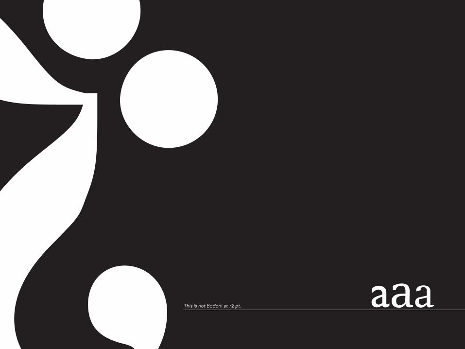
??This is not Bodoni at 72 pt. aaa
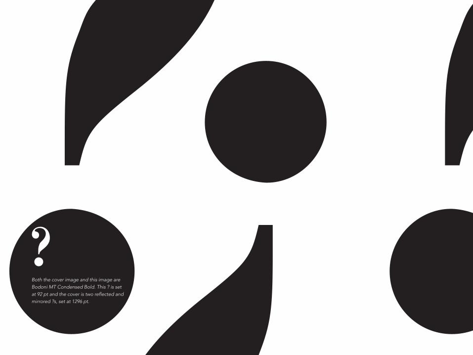
? ??Both the cover image and this image are Bodoni MT Condensed Bold. This ? is set at 92 pt and the cover is two reflected and mirrored ?s, set at 1296 pt. ?