User Tests Group: Aleksandar Kolev, Anastasiq Petrova, Alex Petrova, Irina Dzhogolova, Teodora...
22
User Tests User Tests Group: Aleksandar Kolev, Anastasiq Petrova, Alex Petrova, Irina Dzhogolova, Teodora Kacharova
-
Upload
june-alexander -
Category
Documents
-
view
226 -
download
0
Transcript of User Tests Group: Aleksandar Kolev, Anastasiq Petrova, Alex Petrova, Irina Dzhogolova, Teodora...
User TestsUser Tests
Group: Aleksandar Kolev, Anastasiq Petrova, Alex Petrova, Irina Dzhogolova, Teodora Kacharova
Gangster TestGangster Test
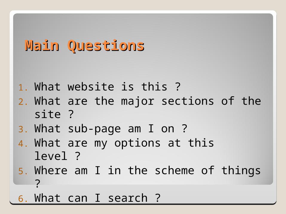
Main QuestionsMain Questions
1. What website is this ?2. What are the major sections of the site ?3. What sub-page am I on ?4. What are my options at this level ?5. Where am I in the scheme of things ?6. What can I search ?
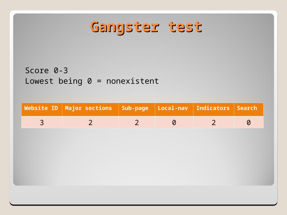
Gangster testGangster test
Score 0-3Lowest being 0 = nonexistent
Website ID Major sections Sub-page Local-nav Indicators Search
3 2 2 0 2 0
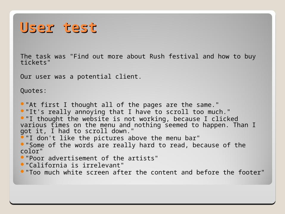
User testUser test
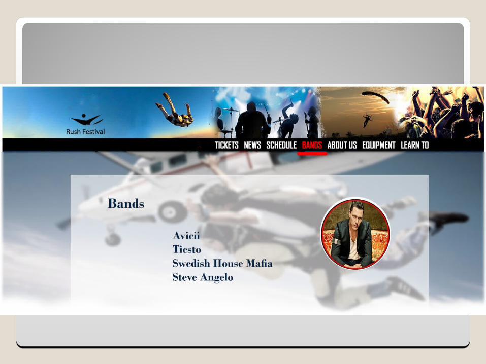
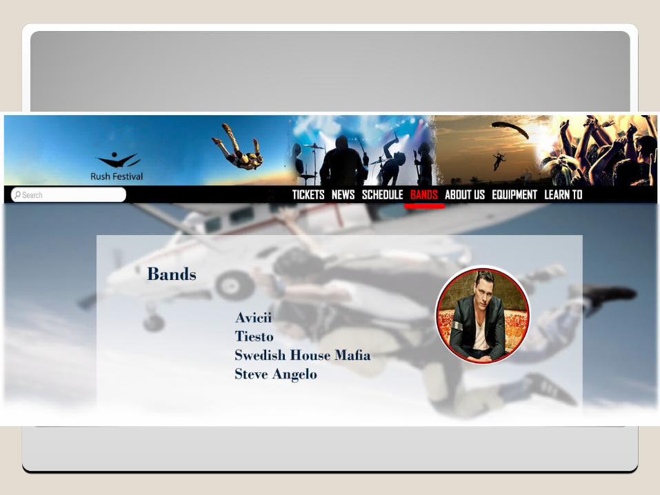
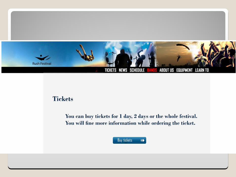
The task was "Find out more about Rush festival and how to buy tickets"
Our user was a potential client.
Quotes:
"At first I thought all of the pages are the same.""It's really annoying that I have to scroll too much.""I thought the website is not working, because I clicked various times on the menu and nothing seemed to happen. Than I got it, I had to scroll down.""I don't like the pictures above the menu bar""Some of the words are really hard to read, because of the color""Poor advertisement of the artists""California is irrelevant""Too much white screen after the content and before the footer"

Expert reviewExpert review
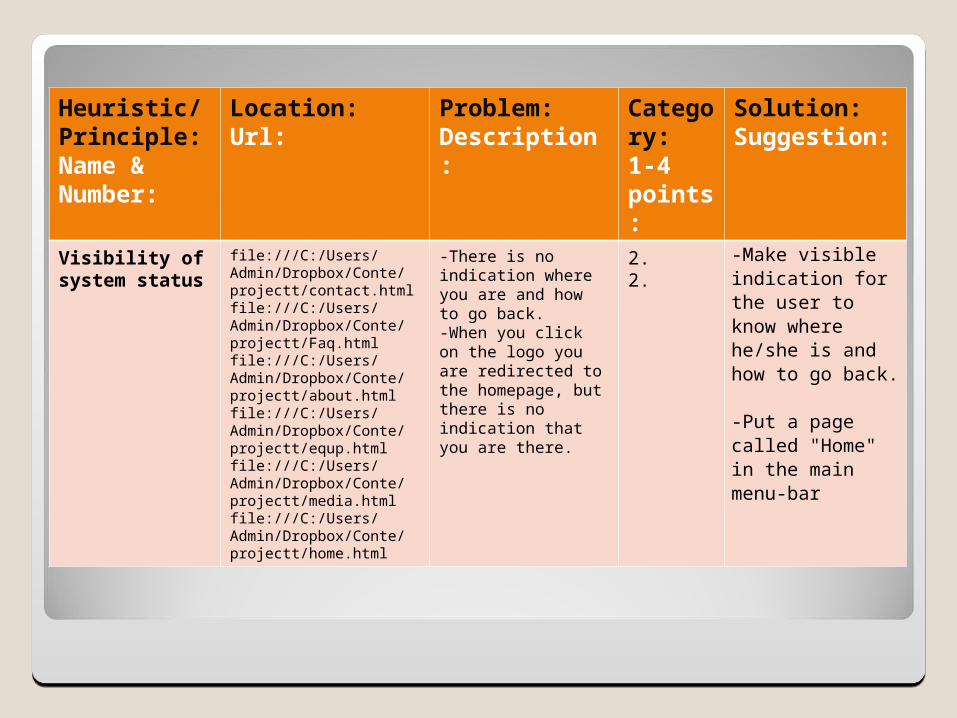
Heuristic/Principle:Name & Number:
Location:Url:
Problem:Description:
Category:1-4 points:
Solution:Suggestion:
Visibility of system status
file:///C:/Users/Admin/Dropbox/Conte/projectt/contact.htmlfile:///C:/Users/Admin/Dropbox/Conte/projectt/Faq.htmlfile:///C:/Users/Admin/Dropbox/Conte/projectt/about.htmlfile:///C:/Users/Admin/Dropbox/Conte/projectt/equp.htmlfile:///C:/Users/Admin/Dropbox/Conte/projectt/media.htmlfile:///C:/Users/Admin/Dropbox/Conte/projectt/home.html
-There is no indication where you are and how to go back.-When you click on the logo you are redirected to the homepage, but there is no indication that you are there.
2.2.
-Make visible indication for the user to know where he/she is and how to go back. -Put a page called "Home" in the main menu-bar
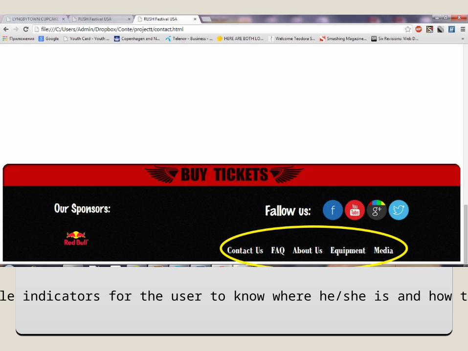
Make visible indicators for the user to know where he/she is and how to go back.

Missing page “HOME”
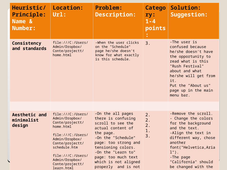
Heuristic/Principle:Name & Number:
Location:Url:
Problem:Description:
Category:1-4 points:
Solution:Suggestion:
Consistency and standards
file:///C:/Users/Admin/Dropbox/Conte/projectt/home.html
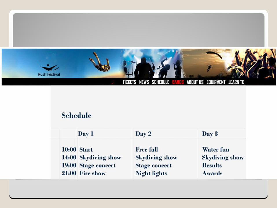
-When the user clicks on the "Schedule" page he/she doesn't know for what exactly is this schedule.
3. -The user is confused because he/she doesn't have the opportunity to read what is this "Rush Festival" about and what he/she will get from it. Put the "About us" page up in the main menu bar.
Aesthetic and minimalist design
file:///C:/Users/Admin/Dropbox/Conte/projectt/home.html file:///C:/Users/Admin/Dropbox/Conte/projectt/schedule.htm file:///C:/Users/Admin/Dropbox/Conte/projectt/learn.html
-On the all pages there is confusing scroll to see the actual content of the page.-On the "Schedule" page: too strong and tensioning colors.-On the "Learn to" page: too much text which is not aligned properly and is not readable.-Un-useful page "California"-Bad quality of the banner in the "Tickets" and "Media" page.
2.2.2.1.3.
-Remove the scroll.- Change the colors for the background and the text.-Align the text in different way, chose another font("Helvetica,Arial").-The page "California" should be changed with the page "Equipment" .-probably redo the all offline materials.
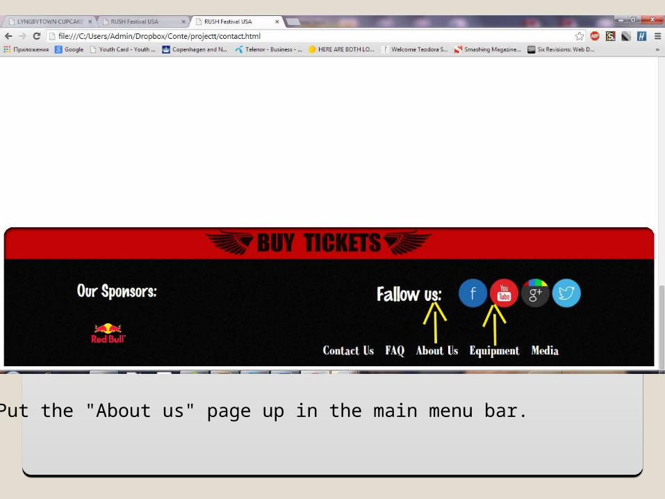
Put the "About us" page up in the main menu bar.
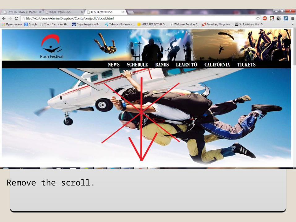
Remove the scroll.
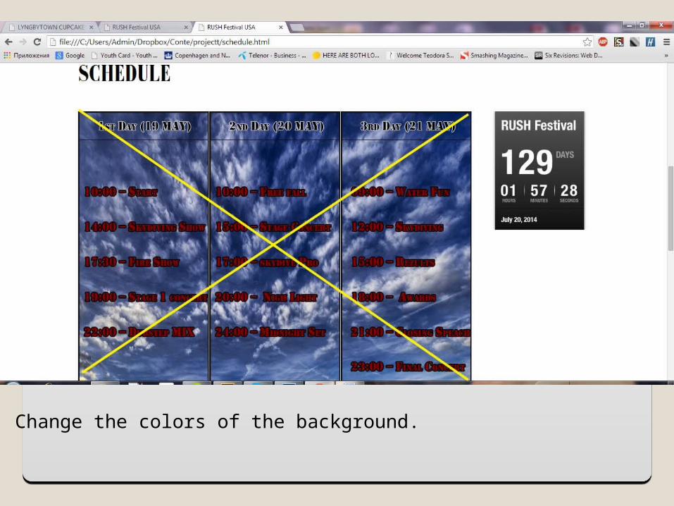
Change the colors of the background.
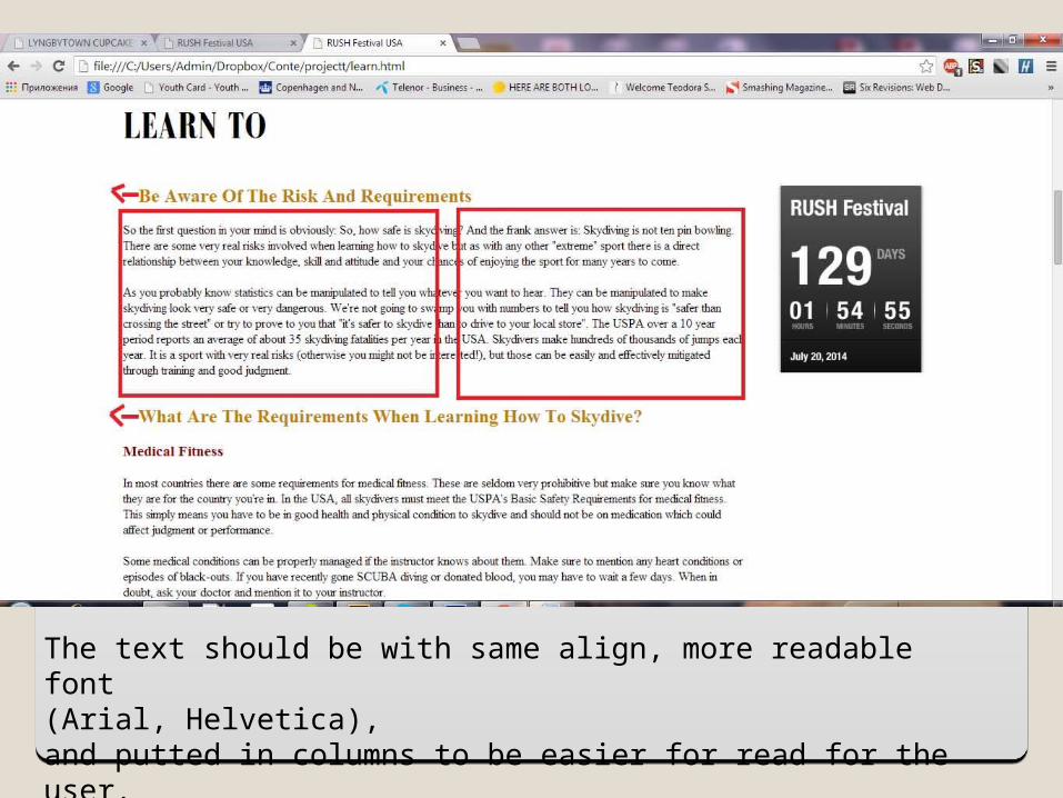
The text should be with same align, more readable font(Arial, Helvetica),and putted in columns to be easier for read for the user.
Logo testLogo test
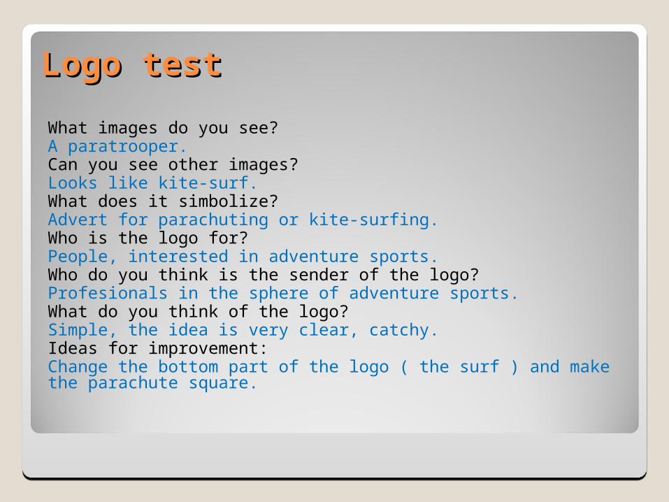
What images do you see?A paratrooper.Can you see other images?Looks like kite-surf.What does it simbolize?Advert for parachuting or kite-surfing.Who is the logo for?People, interested in adventure sports.Who do you think is the sender of the logo?Profesionals in the sphere of adventure sports.What do you think of the logo?Simple, the idea is very clear, catchy.Ideas for improvement:Change the bottom part of the logo ( the surf ) and make the parachute square.
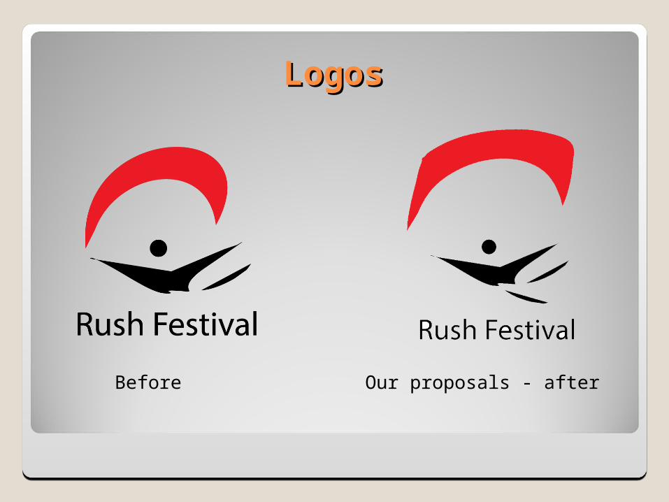
Logos Logos
Before Our proposals - after