The Color of Safety - WHA
18
The Color of Safety Standardization and Implementation Manual
Transcript of The Color of Safety - WHA

The Color of SafetyStandardization and Implementation Manual

The Color Of Safety Standardization & Implementation Manual
Wisconsin Hospital Association “Patient safety is a top priority.” - i -
TABLE OF CONTENTS
Executive Summary and Resolution .......................................................................... 1
Implementation Strategies ............................................................................................ 2Recommendations ...................................................................................................... 3-6
Staff Education
Who Should be Trained ................................................................................................. 7Talking Points ........................................................................................................... 8-11
Acknowledgements and Contact Information ..................................................... 12
AppendixA – Alternative Methods for Communicating Alerts .................................................... 13B – Human Factors Considerations ........................................................................ 14-15C – Product Order and Vendor Information ............................................................ 16-17
Supporting Materials (Microsoft Word and PowerPoint Documents)Staff Brochure (PowerPoint) .................................................................... Included on CDPatient/Family Brochure (PowerPoint) .................................................... Included on CDSample Staff Competency Checklist (Word) ............................................ Included on CDSample Alert Policy and Procedure (Word) .............................................. Included on CDSample Project Implementation Plan (Word)........................................... Included on CDPowerPoint Presentation (PowerPoint) .................................................... Included on CD

The Color Of Safety Standardization & Implementation Manual
Wisconsin Hospital Association “Patient safety is a top priority.” - 1 -
EXECUTIVE SUMMARY
Patient safety is a top priority in Wisconsin. We accomplish this in several ways, one of which will now be Wisconsin hospitals using the same colors for patient identification and three color-coded alerts. The choice of color to designate alerts should not be limited to wristbands. For example, if stickers or placards are used in lieu of a wristband, they should be consistent with the standardized colors. The goal is that all Wisconsin hospitals that currently use colors to communicate an alert will voluntarily adopt the same colors.
The issue of alert colors was first raised by the Pennsylvania Patient Safety Authority after an event in which a clinician nearly failed to rescue a patient who had a cardiopulmonary arrest because the patient had been incorrectly designated as “DNR” (do not resuscitate). The source of confusion was that a nurse had placed a yellow alert on the patient. In this hospital, the color yellow signified that the patient was a DNR. In a nearby hospital in which this nurse also worked, yellow signified “restricted extremity” meaning that this arm is not to be used for drawing blood or obtaining IV access. Fortunately, another clinician identified the mistake, and the patient was resuscitated.
Similar cases have occurred in Wisconsin hospitals, as we currently utilize a wide range of colors to note DNR, Fall Risk, Allergy and other alerts.
For example, Dennis, a young man experiencing serious heart problems was transported from Upland Hills Health in Dodgeville to a Madison hospital for advanced heart care. Upon arrival at the Madison hospital, a nurse commented on his “DNR” wristband. Dennis and his wife were horrified to learn that the patient name-band placed on his wrist at Upland Hills Health in Dodgeville was the same blue color as the Madison hospital’s wristband to indicate a status of DNR. Luckily, this misinterpretation was immediately clarified and the wristband removed before any
life sustaining care was withheld. These “near misses” highlight a potential source of error and an opportunity to improve patient safety by re-evaluating the use of color-coded alerts.
Wisconsin Hospital Association (WHA) ActionsTo proactively address this issue, the WHA commissioned a task force in October of 2007 to evaluate the need for a statewide voluntary standard for color-coded alerts in Wisconsin.
Based on the recommendations of this taskforce, the WHA board approved the following resolution:
Recognizing that current variation in the use of color-coded alerts may cause confusion among caregivers, staff, and patients and that standardization improves patient safety, the Wisconsin Hospital Association Board of Directors approved the following resolution:
The Wisconsin Hospital Association recommends that all hospitals evaluate methods to effectively communicate patient information and risks. In the interim, if an organization uses color coded alerts to communicate patient information or risks, the association encourages Wisconsin hospitals to use the following colors:
White or Clear Patient Identification
Purple DNR
Red Allergy
Yellow Fall Risk
Resolution Approved by WHA Board

The Color Of Safety Standardization & Implementation Manual
Wisconsin Hospital Association “Patient safety is a top priority.” - 2 -
IMPLEMENTATION STRATEGIES
1. Use alerts that are pre-preprinted with text that clearly identifies the alert.• Pre-printed text reinforces the color-coding
system for new clinicians, helps caregivers interpret the meaning of the alert in dim light, and assists those who are color blind.
• Pre-printed text eliminates the chance of confusing colors with alert messages.
2. Remove any “social cause” colored wristbands (i.e. Live Strong, Cancer, etc.).• If a patient refuses to remove social cause or
other potentially conflicting wristbands: � Cover the band with tape, and � Explain potential risks to the patient.
• Ensure that hospital policy is amended to reflect this recommendation.
3. Remove alerts that have been applied from another facility.• This should be done at the time of
admission to your healthcare facility. Alert standardization and implementation is voluntary in Wisconsin. Therefore, some hospitals may not have adopted the recommendations for alert standardization.
• Ensure that hospital policy is amended to reflect this recommendation.
4. Initiate color-coded alerts upon admission, when medical condition(s) change, or when information is received during the course of the hospital stay.
5. Educate staff to verify patient color-coded alerts upon assessment, hand-off of care, during shift change and facility transfers.
6. Educate patients and family members on the purpose and meaning of the alerts.• Including the family in this process is a
safeguard for you and the patient.• Remind patients and family members that
color-coding is another way to prevent errors.
• Use the Patient/Family Education Brochure located in the tool kit.
7. Coordinate documents and signage with the same color-coding.
8. Educate staff on the State of Wisconsin DNR wristband• The state DNR wristband applies to
community and emergency services only.• DNR status must be evaluated upon
admission to the hospital.• Cover the state DNR wristband with tape,
but do not remove it.
9. New state-wide multiple victim identification (ID) band • Gray wristbands with bar coding are used
to track patients over the course of their treatment.
• Bands are applied by EMS providers when 5 or more casualties are involved in a single incident.
• Do not remove unless required to do so for medical purposes.
10. The use of additional alerts is at the discretion of the hospital. • Limit color alerts to only those needed.• Select primary and secondary colors; avoid
shades of colors.

The Color Of Safety Standardization & Implementation Manual
Wisconsin Hospital Association “Patient safety is a top priority.” - 3 -
PURPLE - DO NOT RESUSCITATE
FAQS
Q. Should we use wristbands for DNR designation?
A. While there is much discussion regarding the issue of “to band or not to band,” a literature review to date has not conclusively identified a better intervention in an emergency situation. One may say, “In the good old days we just looked at the chart and didn’t band patients at all.” However, those days consisted of a work-force that was largely employed by the hospital. Today, an increasing number of healthcare providers working in hospitals are not hospital-based staff or work for more than one facility. Travel staff may not be as familiar with how to access information (as in the use of computerized medical records) or may not be familiar with where to find information in the medical record. When seconds count, as in a code situation, having a wristband on the patient is one way to improve communication and reduce the risk of an error.
Q. Why not use Blue?
A. At first, blue was considered a great color choice. However, many hospitals utilize “Code Blue” to summon the resuscitation team. By also having blue as the DNR alert color, there is the potential to create confusion. “Does blue mean we code or do not code?” To avoid creating any second guesses in this critical moment, we opted to not use blue.
It is recommended that hospitals adopt the color of PURPLE for the Do Not Resuscitate designation with the letters “DNR” embossed/printed on the alert.
Recommendation
The Color Of Safety Standardization & Implementation Manual
Wisconsin Hospital Association “Patient safety is a top priority.” - 4 -
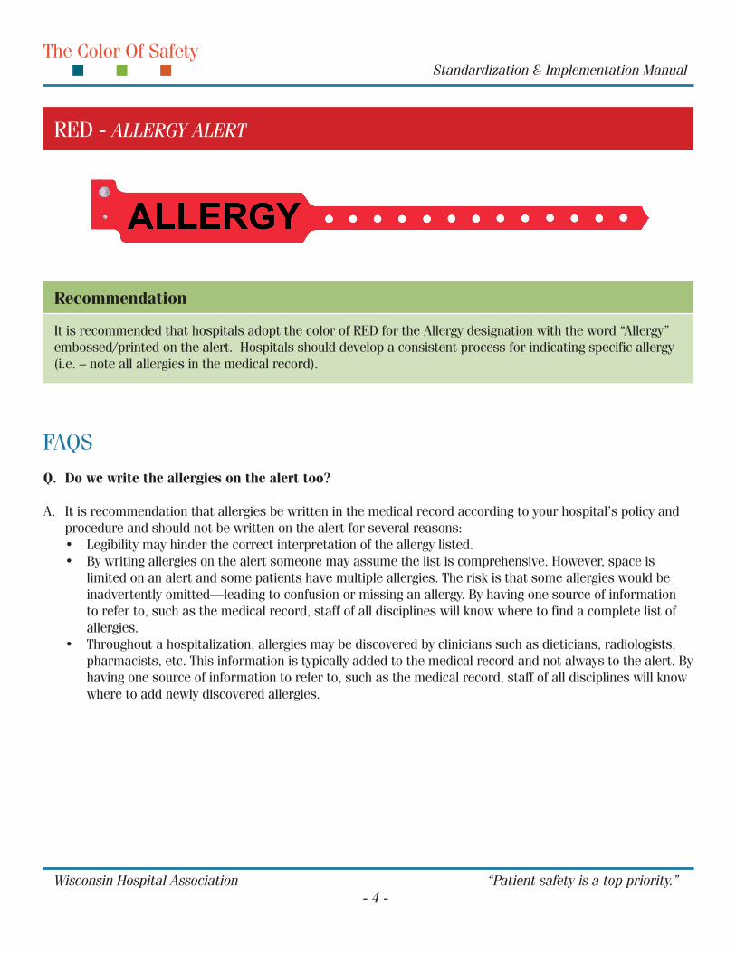
RED - ALLERGY ALERT
FAQS
Q. Do we write the allergies on the alert too?
A. It is recommendation that allergies be written in the medical record according to your hospital’s policy and procedure and should not be written on the alert for several reasons:• Legibility may hinder the correct interpretation of the allergy listed.• By writing allergies on the alert someone may assume the list is comprehensive. However, space is
limited on an alert and some patients have multiple allergies. The risk is that some allergies would be inadvertently omitted—leading to confusion or missing an allergy. By having one source of information to refer to, such as the medical record, staff of all disciplines will know where to find a complete list of allergies.
• Throughout a hospitalization, allergies may be discovered by clinicians such as dieticians, radiologists, pharmacists, etc. This information is typically added to the medical record and not always to the alert. By having one source of information to refer to, such as the medical record, staff of all disciplines will know where to add newly discovered allergies.
It is recommended that hospitals adopt the color of RED for the Allergy designation with the word “Allergy” embossed/printed on the alert. Hospitals should develop a consistent process for indicating specific allergy (i.e. – note all allergies in the medical record).
Recommendation

Falls account for more
than 70% of the total
injury-related health
cost among people 60
years of age or older.
The Color Of Safety Standardization & Implementation Manual
Wisconsin Hospital Association “Patient safety is a top priority.” - 5 -
YELLOW - FALL RISK
FAQS
Q. Why did you select Yellow?
A. Research of other industries tells us that yellow has an association that implies “Caution!” Think of traffic lights: yellow lights mean proceed with caution or stop altogether. The American National Standards Institute (ANSI) has designated certain colors with very specific warnings. ANSI uses yellow to communicate “Tripping or Falling hazards.” This fits well in healthcare when associated with a Fall Risk. Caregivers want to know to be on alert and use caution with a person who has history of previous falls, dizziness or balance problems, fatigability, or confusion about their current surroundings.
Q. Why even use an alert for Fall Risk?
A. According to the Centers for Disease Control and Prevention (CDC), falls are an area of great concern in the aging population.• More than a third of adults age 65 years or older fall
each year.• Older adults are hospitalized for fall-related injuries
five times more often than they are for injuries from other causes.
• Of those who fall, 20% to 30% suffer moderate to severe injuries that reduce mobility and independence, and increase the risk of premature death.
It is recommended that hospitals adopt the color of YELLOW for the Fall Risk designation with the words “Fall Risk” embossed/written on the alert.
Recommendation

The Color Of Safety Standardization & Implementation Manual
Wisconsin Hospital Association “Patient safety is a top priority.” - 6 -
GRAY - MULTIPLE VICTIM IDENTIFICATION BAND
FAQS
Q. Who applies the multiple victim ID band?
A. The gray multiple victim wristband will be applied by EMS in the field when there is a multiple victim incident. The gray multiple victim wristband may also be applied to the patient by the hospital if the patient presents and the hospital is able to identify that the person was involved in a multiple victim incident.
Q. What should we do if we need to remove the multiple victim ID band during the hospitalization?
A. The hospital may remove the gray multiple victim wristband if there is a medical or treatment reason to do so. However, the Patient Tracking policy requests that the wristband remain on the patient until admission to a secondary hospital, i.e. secondary is the second hospital to which the patient may be transferred.
Wisconsin is implementing a Patient Tracking system that will allow hospitals and other authorized persons to determine the hospital(s) to which a person, involved in a multiple victim incident (defined as five or more patients being transferred to one or more hospitals), has been transported. This will assist hospitals with family reunification.
Patient Tracking System

Photo compliments of Motion Computing
The Color Of Safety Standardization & Implementation Manual
Wisconsin Hospital Association “Patient safety is a top priority.” - 7 -
1. While nurses are the staff members who usually apply color alerts, unit clerks are also generally involved in the process. Include them in the training so that they can better assist the nurses with this information.
2. Consider the housekeeping staff. They are often present in a patient room when a patient is trying to get up or walking to the bathroom. If the housekeeping staff knows a yellow alert means “Fall Risk,” and they see a patient trying to get up, they can call the nursing staff to alert them and potentially prevent a fall.
3. Include your dietary staff. A red alert means there is an allergy—and not just to medicines. Maybe it is a food allergy and the red alert will inform them to check the medical record and note it in their departmental profile.
STAFF EDUCATION: WHO SHOULD BE TRAINED?
4. Don’t make assumptions about the medical staff getting the information. Attendings, intensivists, residents and interns need to know what these colors mean. Pull them into the process to promote safe healthcare by all clinicians.
5. Who else? Take some time to quietly observe the activities of the day at one of the nurses’ stations. Just a 30-minute observation and you will probably “see” and “hear” things that make you remember another stakeholder. Include them in the education plan. Once done, you can begin training.

The Color Of Safety Standardization & Implementation Manual
Wisconsin Hospital Association “Patient safety is a top priority.” - 8 -
STAFF EDUCATION: TALKING POINTS
Getting StartedMany hospitals will use this brochure as their main teaching material. It contains most of the pertinent information staff needs to know for this initiative. We suggest that you do not give out the brochure until the end of your training, as people may start reading the brochure instead of listening to you. Pass it out at the end of the meeting, but tell them up front that there is a brochure with all of the information you are presenting and you will pass it out later.
Here are the main points you want to make during your training session:
1. Start With a Story – adults want to know “why” they should do something; simply telling them they need to start doing this “because they do” is not sufficient information to get high levels of compliance. Besides, isn’t that what you would want to know, too? A story gives them information that makes the request relevant—so they want to comply.
The story below is true. One panel of the brochure tells the story where a patient may not have been resuscitated due to a mix up in the alerts. The error was caught, but by telling this story most staff will understand how this error could happen to anyone—and they will be on board with this plan.
Dennis, a young man experiencing serious heart problems was transported from Upland Hills Health in Dodgeville to a Madison hospital for advanced heart care. Upon arrival at the Madison hospital, a nurse commented on his Do Not Resuscitate (DNR) wristband. Dennis and his wife were horrified to learn that the patient name-band placed on his wrist at Upland Hills Health in Dodgeville was the same blue color as the Madison hospital’s wristband to indicate a DNR status. Luckily, this misinterpretation was immediately clarified and the wristband removed before any life sustaining care was withheld. What was meant to be a patient safety communication could have had fatal consequences.
We want to thank and acknowledge Upland Hills Health, Dodgeville, for their transparency and disclosure of this event. It could have happened anywhere.
Start With a Story

The Color Of Safety Standardization & Implementation Manual
Wisconsin Hospital Association “Patient safety is a top priority.” - 9 -
2. Introduce the Colors – Many Wisconsin hospitals are moving to a voluntarily statewide standard for the patient identification wristband plus three color-coded alerts.
White or Clear Patient Identification
Purple DNR
Red Allergy
Yellow Fall Risk
You should also be aware that Wisconsin has two other state-wide wristbands:
Gray Multiple Victim Identification
WhiteState of Wisconsin DNR Wristband
3. Other Risk Reduction Strategies – In addition to the standardization of alert colors, other risk reduction strategies may be initiated. These are suggested as a result of sentinel events that have occurred, near-miss events and common sense. This information is also in the staff brochure and can be cut out as a Quick Reference Guide and laminated, if you desire. Review these with staff now:
1. Use alerts that are pre-printed with the alert message (such as “DNR”).
2. Remove “social cause” wristbands.3. Remove alerts that have been applied from
another facility.4. Initiate the alert upon admission, changes in
condition, or when information is received during the hospital stay.
5. Staff should verify color-coded alerts upon assessment, at hand-off of care and facility transfers
6. Educate patients and family members on the purpose and meaning of the alerts.
7. Coordinate wristbands, stickers and signage with the same color coding.
8. Do not honor or remove a WI DNR wristband.9. Do not remove a multiple victim identification
wrist band unless required for medical purposes.
Color-Coded Alert/ Risk Reduction Strategies: Quick Reference Card

The Color Of Safety Standardization & Implementation Manual
Wisconsin Hospital Association “Patient safety is a top priority.” - 10 -
4. Teaching Patients - The Patient Education Brochure is a companion document to the Staff Brochure. We know that how we say something is just as important as what we say. Patients and their loved ones are scared, vulnerable and unfamiliar with hospital ways. We need to communicate to them in a respectful and simple way without being condescending. The following text was written to serve as a “script” for staff so everyone is delivering the same information to patients and families. By having a consistent message, we reinforce the information—this helps patients and families retain the information. Another benefit of having a consistent message is patients and families experience a sense of confidence in the healthcare system since we are all echoing each other. The text box below is taken directly from the staff brochure. This is the time to mention to staff there is a Patient/Family Brochure that can be handed out (if your unit intends to do that). Tell staff you will hand out the brochure to them so they can see what the patients will have when you are done presenting the material.
What is a color-coded alert?Color-coded alerts are used in hospitals to quickly communicate a special healthcare condition or a safety risk that a patient may have. This is done so every staff member can provide the best care possible.
What do the colors mean?There are three different color-coded alerts that we are going to discuss.
PURPLE means Do Not Resuscitate (DNR) – Some patients have expressed an end-of-life wish and we want to honor that request.
RED means ALLERGY – If you have an allergy to anything – food, medicine, dust, grass, pet hair, ANYTHING – tell us. It may not seem important to you, but it could be very important to your care.
Yellow means FALL RISK – We want to prevent falls at all times. Nurses review patients to determine if you need help when getting up or walking. Sometimes, a patient may become weak or confused during their illness. When you have this color-coded alert, all staff will know that you need help to prevent a fall.
Who is participating in the color-coded alerts standard?Not all hospitals use color-coded alerts to communicate patient risks. Because our hospital does use color coded alerts, we are participating in a voluntarily state wide standard that many Wisconsin hospitals have adopted.
Script for any staff person talking to a patient or family

The Color Of Safety Standardization & Implementation Manual
Wisconsin Hospital Association “Patient safety is a top priority.” - 11 -
5. And Finally... review with staff the points listed below. These are the items that are listed on the staff competency checklist so it is important to clarify that they have a good understanding of these items. You should emphasize, “This is what would impact your tasks every day...” and review those points. This is a good time to hand out your organization’s policy and procedure. Be sure your policy covers the areas listed below as they are also a part of the staff competency checklist. If your policy does not address any of the items on the staff competency checklist, then you should remove it from the form.
• Color code – what do the three color alerts mean?• Who can apply the alert to the patient?• When does the application of the color-coded alert(s) occur?• Policy on patients not allowed to wear the social cause wristbands• Patient education and how to communicate (script) the information with patients/families• Need for re-application of alert(s)• Communication regarding alerts during transfers and other reports• Patient refusal to comply with policy• Discharge instructions for home and/or facility transfer
Review These Points With Staff
The Color Of Safety Standardization & Implementation Manual
Wisconsin Hospital Association “Patient safety is a top priority.” - 12 -
ACKNOWLEDGEMENTS
WHA wishes to thank the members of the Wristband Standardization Task Force for their contributions and support of this project. Organizations represented on the task force include:
Hospital & Health System Representatives Jim Mugan, RN, MPA - Agnesian HealthCare Kathy Leonhardt, MD, MPH - Aurora Health Care Cindy Suplinski RN, MSN - Bellin Health Rosi Seffens, RN, BS, C.N.A.- BC, Luther Midelfort Oakridge, Mayo Health System Ginger Selle, VP of Patient Care - Affinity Health System: Mercy Medical Center Jill Spieckerman, RN - Ministry Healthcare: Sacred Heart-Saint Mary’s Hospital Kris Kelm RN, MS - ProHealth Care: Oconomowoc Memorial Hospital Pam Felland, RN - St Clare Hospital and Health Services; a Member of SSM Health Care Michele Oostdyk, RN, BSN, MS - Hospital Sisters Health System: St. Nicholas Hospital Judy Straus, MT(ASCP) - Upland Hills Health Lynn Hebgen, RN – Upland Hills Health Judi Nelson, ARM, CPHRM - Howard Young Health Care, Inc. Kathie Lensen, RN, CPHQ – St. Nicholas Hospital Noel Deep, MD - Langlade Memorial Hospital, Aspirus Clinics
Other Organizational Representatives Melanie G. Ramey JD, MSW – The HOPE of Wisconsin Kendra Jacobsen, MS - Madison Patient Safety Collaborative Rosemarie Forster, MSOLQ, RHIA, EMT-P - Milwaukee County Emergency Medical Services Kathy Leonhardt, MD, MPH - Milwaukee Patient Safety Collaborative Eric Streicher, MD - Safe Care Wisconsin: MetaStar Dennis Tomcyzk – State of Wisconsin: Division of Public Health Nancy Brueggeman, MSN, RN - Wisconsin Association of Homes and Services for the Aging Noel Deep, MD - Wisconsin Medical Society Judi Nelson, ARM, CPHRM - Wisconsin Society for Healthcare Risk Management Kathie Lensen, RN, CPHQ – Wisconsin Society for Healthcare Risk Management Dana Richardson, RN, MHA – Wisconsin Hospital Association Charles Shabino, MD - Wisconsin Hospital Association
WHA also wishes to acknowledge the Pennsylvania Color of Safety Task Force, which developed the initial policy that is the basis for this document and the Arizona Hospital and Healthcare Association for their work to develop the initial implementation toolkit, which has been modified for use in Wisconsin.
For more information, contact:Kelly Court, Chief Quality OfficerWisconsin Hospital AssociationP.O. Box 259038, Madison, WI 53725Phone: 608-274-1820; Fax: 608-274-8554; email: [email protected]

The Color Of Safety Standardization & Implementation Manual
Wisconsin Hospital Association “Patient safety is a top priority.” - 13 -
Signage – If signage is used, the color schema should be consistent with recommended colors: white or clear for Patient Identification, purple for DNR, red for Allergy and yellow for Fall Risk.
Hand-off Communication – According to The Joint Commission, ineffective communication is the most frequently cited category for root causes of sentinel events. Effective communication, which is timely, accurate, complete, unambiguous, and understood by the recipient, reduces error and results in improved patient safety. Implementing a standardized approach to “hand-off” communications is one of The Joint Commission’s National Patient Safety Goals. The primary objective of a “hand-off” is to provide accurate information about a patient’s care, treatment and services, current condition, and any recent or anticipated changes. This would include communication alerts.
Situation-Background-Assessment-Recommendation (SBAR) – is one technique to address hand-off communication. The main purpose of the SBAR technique is to improve the effectiveness of communication through standardization of the communication process. Nurses often take more of a narrative and descriptive approach to explaining a situation, while physicians usually want to hear only the key points of a situation. The SBAR technique closes the gap between these two approaches, allowing communicators to understand each other better. Michael Leonard, M.D., physician coordinator of Clinical Informatics, along with colleagues Doug Bonacum and Suzanne Graham at Kaiser Permanente of Colorado in Evergreen, Colorado, developed the (SBAR) technique.
APPENDIX A - ALTERNATIVE METHODS FOR COMMUNICATING ALERTS
More information on hand-off communication and SBAR can be found at http://www.jcipatientsafety.org/15274/ and http://www.jcipatientsafety.org/15398/.
Stickers – Placing a sticker on the patient’s chart is an alternative method to communicate alerts. If stickers are used, the color schema should be consistent with recommended colors: purple for DNR, red for Allergy and yellow for Fall Risk.
Technology – Bar coding: The FDA issued a final rule in 2004 that requires a bar code including the National Drug Code (NDC) on most prescription drugs and on certain over-the counter drugs. Bar codes on drugs would help prevent medication errors when used with a bar code scanning system and computerized database. The FDA estimates that the bar code will result in more than 500,000 fewer adverse events over the next 20 years. More information on bar coding can be found at http://www.fda.gov/oc/initiatives/barcode-sadr/fs-barcode.html.
Computer Practitioner Order Entry (CPOE) – With CPOE, practitioners enter orders into a computer rather than on paper. Orders are integrated with patient information, including laboratory and prescription data. The order is then automatically checked for potential errors or problems. Specific benefits of CPOE include prompts that warn against the possibility of drug interaction or allergy. More information on CPOE can be found at http://www.leapfroggroup.org/media/file/Leapfrog-Computer_Physician_Order_Entry_Fact_ Sheet.pdf.

The Color Of Safety Standardization & Implementation Manual
Wisconsin Hospital Association “Patient safety is a top priority.” - 14 -
Within healthcare, the science of human factors addresses human performance within medical systems, particularly as it relates to processes of care, error management, and patient safety. Error management indicates not only decreasing errors themselves, but also decreasing the opportunity for error-causing situations to arise, by designing safe systems that take a human’s capabilities and limitations into account throughout the design process. This is of primary importance when addressing the design of alerts, a tool used daily in healthcare by every provider.
To fully integrate human factors into alert design, there are a few key points to emphasize:
• Human error most frequently arises from stressful, busy, uncommon situations. Because of the dynamic nature of healthcare, it is important to create our systems to help staff do their work. By standardizing alerts across the state, staff no longer needs to remember symbols or colors specific to hospitals; they are able to learn a single set of rules for every hospital.
• The text information contained on the alert should not wrap around the entire wrist. This decreases the chance that information will be missed because it is on the other side of the band and was not seen.
• The MINIMAL amount of information that is required should be displayed on the alert. Key data should be placed where it is seen first.
• Alerts should be designed so that they highlight specific, pertinent information. Too much information can be difficult to distinguish and can get misread or misinterpreted, especially when in a hurry. Visual cues, such as highlighting, can be used to make the information ‘pop out.’ However, the cue should be used consistently. Also, the style and placement of information
APPENDIX B - HUMAN FACTORS CONSIDERATIONS
should remain consistent for every alert. Again, only the absolute minimal amount of information should be placed on the alert. Limit abbreviations.
• Icons can facilitate visual search for information: HOWEVER, the icon must make sense to the user. In other words, if choosing to use an icon, use something the majority of users recognize as representative of the information trying to be conveyed.
• Numbers can be read more quickly if they are in a column than in a row. However, remember that information should not wrap around the entire wrist.
• If using any extended text, font should never be smaller than 8 pt. Spacing between lines is very important. This is called “white space.” Lines should always be at least single spaced. For short, factual information, a table with lines is helpful to keep information separate.
Smith, Joseph Birth date: 09-05-47Male
• The study of human capabilities and limitations � How we think � How we act / What we do � What we use to do it
• The application of those principles to the design of tools, systems, tasks, jobs and environments
• For comfortable, effective, and safe human use
Human Factors
The Color Of Safety Standardization & Implementation Manual
Wisconsin Hospital Association “Patient safety is a top priority.” - 15 -
• If using text on the alert, be sure to use large letters that are NOT italicized. Italics are more difficult for the eyes to quickly read and interpret.
• The text should always be in a color that contrasts the color of the bracelet. For example: blue print on a black background or vice versa is difficult to read. But black print on a yellow bracelet is very easy to read
• Reading improves with an increase in text size, but only up to a critical point, at which it levels off. That critical point is dependent on task. Therefore, it would be beneficial to observe the task and determine how readable the text on the bracelets needs to be to allow for optimal performance.
In closing, taking human factors – human capabilities and limitations – into account will allow for a safer and more intuitive system. As a rule of thumb, SIMPLER is ALWAYS better. The recommendations here are based on a broad spectrum of possible bracelet designs, highly dependent on the amount of text and the length of text. The recommendations here are based on scientific research into human abilities to see, read, and perceive and interpret information.
Helping clinicians to find data and avoid delays. The Lancet, Volume 352, Issue 9138, Pages 1462-1466, E. Nygren, J. Wyatt, P. Wright.
How to limit clinical errors in interpretation of data. The Lancet, Volume 352, Issue 9139, Pages 1539-1543, P. Wright, C. Jansen, J. Wyatt.
Human Factors Resources

The Color Of Safety Standardization & Implementation Manual
Wisconsin Hospital Association “Patient safety is a top priority.” - 16 -
Product Order Information
Wristband Type Color Specification Text Specification Font Style and Size
DNR Wristband Purple-PMS 254 “DNR” in WhiteArial Bold,
48 pt. All Caps
Allergy Wristband Red-PMS 1788 “ALLERGY” in BlackArial Bold,
48 pt. All Caps
Fall Risk Wristband Yellow-PMS 102 “FALL RISK” in BlackArial Bold,
48 pt. All Caps
APPENDIX C – PRODUCT ORDER AND VENDOR INFORMATION