task six for media
15
-
Upload
kayleywx -
Category
Art & Photos
-
view
61 -
download
0
Transcript of task six for media


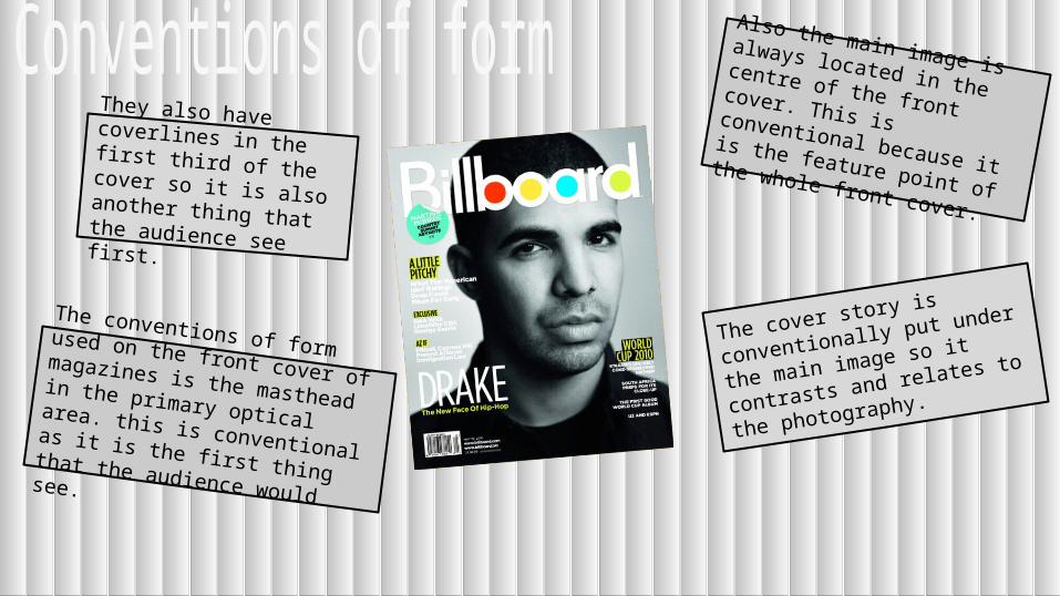
The conventions of form used on the front cover of magazines is the masthead in the primary optical area. this is conventional as it is the first thing that the audience would see.
Also the main image is always located in the centre of the front cover. This is conventional because it is the feature point of the whole front cover.
The cover story is conventionally
put under the main image so it
contrasts and relates to the
photography.
They also have coverlines in the first third of the cover so it is also another thing that the audience see first.

Most front covers fit in with
the genre of the magazine
so it appeals to the target
audience more encouraging
them to buy it.
For example billboard fits
its genre of popular music
as it has well-known celebrities such as chris
brown featuring on it.
The use of the serif and san
serif contrasts fits in with the
genre as it portrays the idea
of the modern music it
situates around.
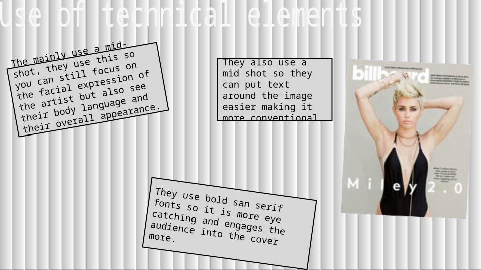
The mainly use a mid-shot, they
use this so you can still focus on
the facial expression of the artist
but also see their body language
and their overall appearance.
They use bold san serif fonts so it is more eye catching and engages the audience into the cover more.
They also use a mid shot so they can put text around the image easier making it more conventional.

Artists and bands are
normally represented as
fashionable through the use
of their outfits to make them
interesting towards the
audience.
There also represented as quite confident which is portrayed through striking poses and body language they use
They are also portrayed in a positive and cheerful way, so this vibe rubs off on the audience.
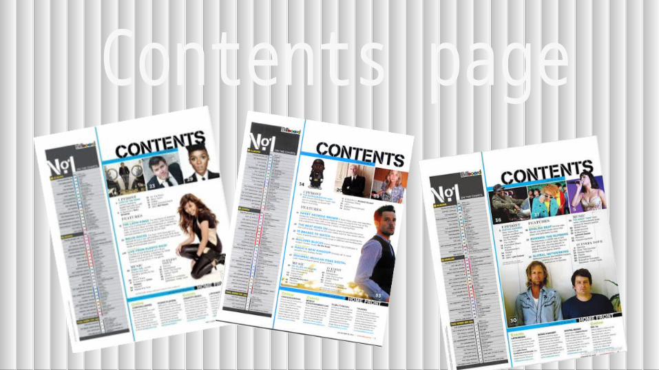

The title “contents” is situated at the top of the page so people know this is the page where they can find out more information
There are featured images on
the contents page located
around the text so to make it
more visual and to catch the
audiences attention.
They also have the text separated into chunks of writing and columns to make it more conventional of a contents page.
The text is the main focus point of the magazine in different categories so it makes it easier for the audience to find what they’re looking for.

The different features on the contents page such as the font, layout, pictures are presented in a contemporary way. This portrays that the magazine is based around the modern contemporary genre.
Also the images have a modern and stylish which creates an impression that it is a stylish and up to date magazine.

They are represented on the contents page is mainly as wealthy, this is portrayed through the use of the high class clothing they wear.
They are also represented as sophisticated; this is portrayed through the use of the black and white contrast used throughout the contents page.
Also they are represented as important; this is because they are featuring on the contents page displaying that the article on them is one of the main parts of the magazine


They have a main image filling a big part of the double page spread mainly the left hand side of the double page.
The title of the article is situated at the top of the page so it is the first thing they see.
There is a pullquote next to the image so it relates to the article encouraging the audience to read the article.
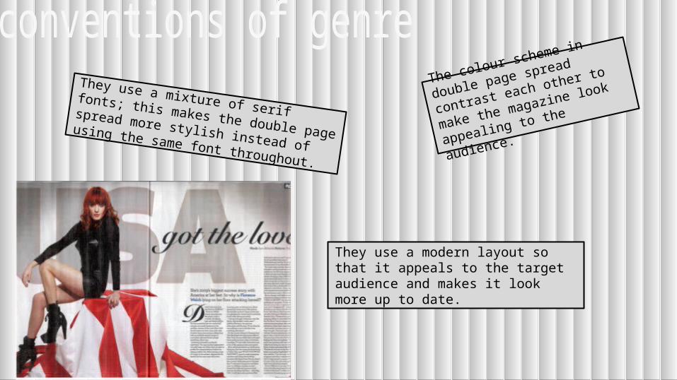
They use a mixture of serif fonts; this makes
the double page spread more stylish instead
of using the same font throughout.
They use a modern layout so that it appeals to the target audience and makes it look more up to date.
The colour scheme in double
page spread contrast each other
to make the magazine look
appealing to the audience.
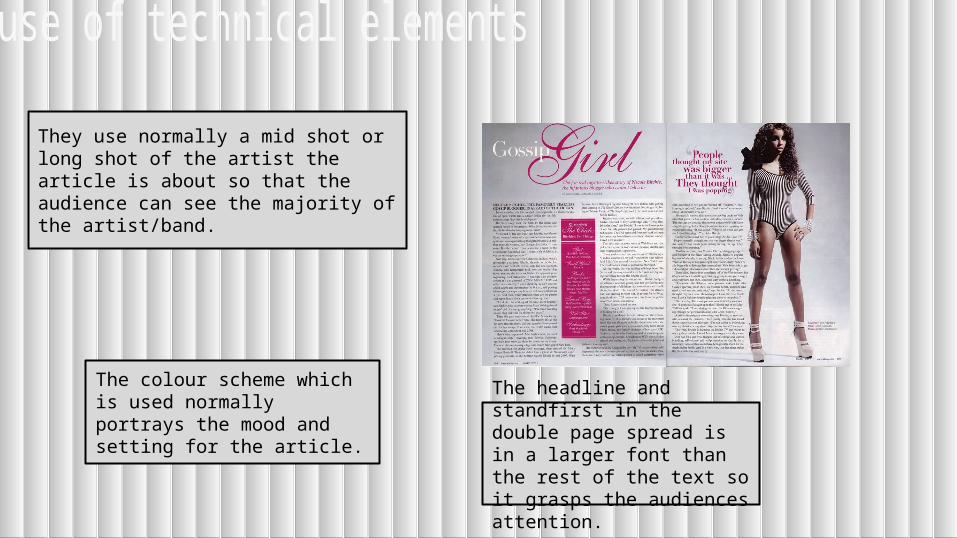
They use normally a mid shot or long shot of the artist the article is about so that the audience can see the majority of the artist/band.
The colour scheme which is used normally portrays the mood and setting for the article.
The headline and standfirst in the double page spread is in a larger font than the rest of the text so it grasps the audiences attention.

They represent the artists as unique to themselves so it can show the audience their personality.
They connote the portrayal of the artist through the use of colour,costume,font types and shot types.