Sweetspot Process
36
-
Upload
catrine-gyllensten-grafisk-design -
Category
Documents
-
view
220 -
download
0
description
Â
Transcript of Sweetspot Process


ART450 - FA13 M/WCatrine Gyllensten Project No:2

ThanksFirst off I want to thank Adam Smith for teaching me how to surf, and explaining the importance of the Sweetspot! And also for giving me the inspiration for the perfect name for this surf kit.
Second I want to thank the amazing all knowing Adam Barber who helped me with all the tips and tricks, the local surf spots and information for this kit!


ContentBackground & Assignment 6Design Brief 8Research 10Look And Feel 12Logo Explorations 14Font Study 15Logo Refinements 16Color Study 17Final Logo 18Typography 20Graphic Elements 22Colors 23Packaging Structure 24Final Packaging 26Kit Contents 28Outer Packaging 30Evaluation 32Taking It Further 33

Background & Assignment

Social, cultural or environmental kit to be sold at the San Diego library storeYour kit will need to contain 3 products/elements. The relationship in which they are packaged together is very important. They should be perceived as a family of elements. Your packaging will also be required to house a pamphlet/booklet/brochure with information, explanations, instructions and helpful tips, or resources that provide value to your kit and make it useful. You will need to explore life-cycle analysis with your packaging, potentially incorporating re-purposed, recycled, or even reusable components to your package design. Since the “sponsor” of this kit is San Diego Public Library, the kit should have the tone of their branding system.
Design should be modern and the kit needs to represents San Diego. No food or beverages.
Environmentally responsible packaging options should be given priority. The kit needs to be light, easy (and affordable) to produce, yet attractive for the intended user. It should be educational. It should speak the language of the intended user and provide them with key information and components to successfully educate or solve your chosen topic.
8

Design Brief

1. What is the purpose of the design?The purpose of the design is to attract people of all ages who wants to buy a beautiful yet urban, fun and playful gift for someone who lives in the San Diego area and who wants to start surfing.
2. What is the audience? Demographics?The audience is very broad, but the intended end-consumer is a urban, outgoing and active person. A male or female who enjoys, or wants to enjoy, the various beaches that San Diego has to offer and wants to be a part of the surf culture of this city. The indented end-consumer has little or no precious experience of surfing but a desire to learn. This kit is intended to be a start-up kit and to be used as a gift and an inspiration to go out and start learning.
4. What is the competition and marketplace? How does the kit compare?As far as the research can tell there are no similar products – a kit with beginners surf attire – in the market. There is – in the gift shop – only a book about a California Surfing trip. However this product is competing with all other gifts and gift-kits in the San Diego Public Library Gift Store.
5. What are the unique factors compare to the competitions?This product does not only inspire an activity that is fun, social and good for your health, it also teaches the end-consumer about the various beaches of San Diego and inspires the exploring of the city and its beaches. It also gives you an introduction to the basics of surfing, what to think about when you want to start learning and how to get the adequate information and help to move on to becoming a skilled surfer.
6. In what voice? What kind of personality is appropriate for your product and packaging?The voice should be fun and active but not childish. This is a product that targets grown ups and young adults and should have a cool, beach-life feeling to it. The packaging should be bold but yes clean, loud but yet sophisticated.
7. What kind of response is desired from the audience? The desire is for this to be an appreciated gift for a newcomer to San Diego’s surf culture, a much used guide to the different beaches in the area and of course, items that are used and worn with pride. The desire is also that this product engages the end-consumer in discovering the various beaches and in that way gain more knowledge about the San Diego area and even more appreci-ation for this lovely city.
10

Research

12

Look and Feel

14

Logo Explorations

Font Study
16

Logo Refinements
SweetSpot

Color Study
18

Final Logo

Typography
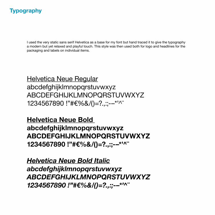
I used the very static sans serif Helvetica as a base for my font but hand traced it to give the typography a modern but yet relaxed and playful touch. This style was then used both for logo and headlines for the packaging and labels on individual items.
Helvetica Neue Regular abcdefghijklmnopqrstuvwxyz ABCDEFGHIJKLMNOPQRSTUVWXYZ1234567890 !”#€%&/()=?.,:;-–*’̂ ¨
Helvetica Neue Bold abcdefghijklmnopqrstuvwxyz ABCDEFGHIJKLMNOPQRSTUVWXYZ1234567890 !”#€%&/()=?.,:;-–*’̂ ¨
Helvetica Neue Bold Italicabcdefghijklmnopqrstuvwxyz ABCDEFGHIJKLMNOPQRSTUVWXYZ1234567890 !”#€%&/()=?.,:;-–*’ ¨̂

Typeface
Hand rendered
22

Graphic Elements

Colors
C 100 100%M 10Y 25K 0
C 100 55%M 10Y 25K 0
24

Packaging Structure
INSERT
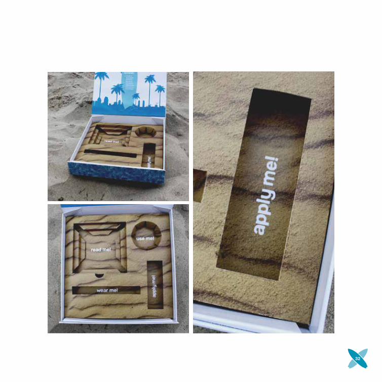
The San Diego Surf Kit will give you the basic stuff you need, and the all the information to start exploring surfing and the amazing beaches that San Diego county has to offer! It won’t necessarily make you a Bhodi right away but it will give you a kick start in getting there we assure you that you will see some awesome beaches on the way! Map
Boardwax Shades Sunscreen Guide
goes to someof the heros that keep thebeaches clean!
BELLYBAND FRONT BELLYBAND BACK
NO
T VI
SIBL
E
LEFT RIGHT
The packaging consists of a rigid but collapsible box that closes with magnets, it has an insert that has custom made holes for each item and a belly-band around the box.

Steps to sucess:
Get this kit
Apply sunscreenPut on shades
Bring boardwaxFind sweetspot
Study pamfletLook at mapPick a beach
INSIDE TOP FLAP
INSIDE BACK FLAP
NOT VISIBLE
NOT VISIBLE
INSIDE LID
INSIDE BOTTOM
INSI
DE L
EFT
FLAP
INSI
DE R
IGH
T FL
AP
OUTSIDE BOTTOM
OUTSIDE BACK
OUTSIDE HIDDEN FRONT
VISIBLE INSIDE FRONT FLAP
OUTSIDE FRONT
OUTSIDE TOP
OU
TSID
E LE
FT F
LAP
OU
TSID
E RI
GH
T FL
AP
26

Final Packaging


Kit Contents

30

Outer Packaging
32

I really feel that this has been a great project to work on! From the start I knew what kind of kit I wanted to do and designing something that can be intended as a gift for either yourself or a friend who’s knew to San Diego was absolutely something I could relate to being new here myself.
I found the box I wanted to use straight on and it really fit all the objects that I wanted to include in the kit perfect which gave me more time to focus on the design itself.
The pattern and colors of the kit and brand came early in the process giving me time to do color studies to find the perfect blue color. I did struggled with the logo in making it fun and interesting at the same time as I wanted it to be contemporary and not too childish. After keeping it to simple and then taking it a bit to far I’m really happy with how it turned out.
Evaluation

I can totally see how this could work as an interactive map and guide in an App on your phone. There are also so many things you could include in this kit, or making a whole brand that sells surf attire.
The sky, or rather the horizon, is the limit.
Taking It Further
34