Step By Step Advert
4
Step By Step Advert
-
Upload
paigerowell -
Category
Art & Photos
-
view
185 -
download
0
Transcript of Step By Step Advert

Step By Step Advert

To start my digipak advert the first thing I did was to find a place for the band name and the album name. The top of the page Is where you can find the name of most adverts, so following generic features of an advert I decided to do the same. I found that the name of the band was more important for the audience to see than the name of the album, so that they become aware who’s product is being advertised. ‘Bat The Lashes’ Is a brand new album which indicates that if the piece of text with the album name were to catch the audiences eye before the band name, they might not necessarily know what or who’s album it is.I decided on the font of the text because I wanted a bold, striking don’t font that stood out and represented traits of the bands personality; loud and active.Using the number 7 to replace the letter ‘t’ in the band name was an idea I created due to having the word ‘Seventh in the band name. I thought this would give the name a more unique and individual style.
Next I added the date of the album release so that the audience are aware when they are able to purchase the product. I had to ensure that the date was a Friday because the UK’s album release date is always on a Friday. I chose this date in particular because its not too close but not too far away either and It would give the audience something to look forward to and leave them In suspense.The placement of the date was purposely placed about 3 quarter down the page so that it wont cover any important parts of the photograph when It is placed on the advert. I made the size of the text just a bit smaller so that it was able to fit across the page and placed in the middle. Also, this piece of text isn't as important as the name of the band and album so making it smaller ensued that no attention was taken away from them.

Just under the date I placed extra information about what the album includes such as exclusive songs and footage to ensure that I hold onto the audiences attention. I remembered to include straits of an advert that are popular within existing album adverts such as informing the audience about featuring, and extra tracks that are on the album. By adding that the CD includes an extra DVD with exclusive footage, will again attract the audiences attention when they become aware that they are being offered more for their money.I placed this text further down the page so it again doesn’t cover any important features of the photograph such as the artists face. I didn't want to add any text in the ,middle o the page to ensure that from the wait up on the photograph was free and easily visible. I chose to make this piece of text smaller so that the attention wasn’t taken away from the main things on the advert such as the band and album name and the photograph. Also, these features were added for a better effect, they didn’t necessarily have to be there explaining why they are in smaller size.
Next, I added the logo of the bands recording label and the websites.I chose Capitol Records because they are well known for contracting indie/ alternative bands such as Lily Allen and Coldplay. When I had found the labels logo I added it into the bottom right corner; making it big enough to still see and recognise but small enough to not get in the way of any the advert features. The positioning of the logo is out of the way which was easy to place as I had extra space at the bottom of the age ensuring nothing was crammed together, creating a messy look. After, I added the band and the album website. Adding these allows the audience to find out more abut the band such as tour dates, song lyrics and backstage footage. also, the websites highlight a place where the bands album can be pre-ordered, purchased and downloaded. Again I made sure the less important text was in a smaller, less bold font which is still visible but not as outstanding.
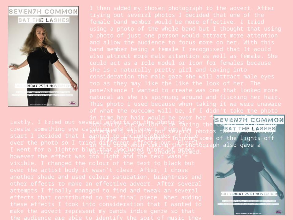
I then added my chosen photograph to the advert. After trying out several photos I decided that one of the female band member would be more effective. I tried using a photo of the whole band but I thought that using a photo of just one person would attract more attention and allow the audience to focus more on her. With this band member being a female I recognised that It would also attract more male attention as well as female. She could act as a role model or icon for females because she is a naturally pretty girl and taking into consideration the male gaze she will attract male eyes too as they may like the like the look of her. The pose/stance I wanted to create was one that looked more natural as she is spinning around and flicking her hair. This photo I used because when taking it we were unaware of what the outcome will be, if I didn’t take the photo in time her hair would be over her face and if I took it too early she wouldn’t be facing the camera. After many attempts I finally got several photos that were worthy of being on the advert. Turning some of the lights off in the room when taking the photograph also gave a batter effect as a shadow formed.
Lastly, I tried out several effects on the photo to create something eye catching and different. From the start I decided that I wanted to include shades of blue over the photo so I tried different effects out. Firstly I went for a lighter blue that included hints of green however the effect was too light and the text wasn’t visible. I changed the colour of the text to black but over the artist body it wasn’t clear. After, I chose another shade and used colour saturation, brightness and other effects to make an effective advert. After several attempts I finally managed to find and tweak an several effects that contributed to the final piece. When adding these effects I took into consideration that I wanted to make the advert represent my bands indie genre so that the audience are able to identify the sort of music they will be listening too. The colours I finally chose work really well and compliment the white text as it allows it to stand out due to the darker colours. The shadows and darker shades also give the band an ambiguous look.