
STATS SPRING 2006 FINAL - CAUSEweb
32
STATS STATS STATS STATS STATS THE MAGAZINE FOR STUDENTS OF STATISTICS SPRING 2006 • ISSUE # 45 Non Profit Org- U.S. Postage PAID Permit No. 361 Alexandria,VA STATS Mine Mine Mine Mine Other Other Mine = Z Other = z/2 or 2z Other The Dilemma: Should You Keep the Envelope You Have or Switch to the Other Envelope? A Look at the Two-envelope Paradox How Much Confidence Should You Have in Binomial Confidence Intervals? Stock Car Racing Put to the Statistical Test STATS SPRING 2006 FINAL.indd A STATS SPRING 2006 FINAL.indd A 3/20/06 4:40:07 PM 3/20/06 4:40:07 PM
Transcript of STATS SPRING 2006 FINAL - CAUSEweb

STA
TS S
TATS
STA
TS S
TATS
STA
TS
T H E M A G A Z I N E F O R S T U D E N T S O F S T A T I S T I C S
SPRING 2006 • ISSUE # 45
Non Profit Org- U.S. Postage
PAIDPermit No. 361Alexandria,VA
STA
TS Mine
MineMine
Mine
Other
Other
Mine = Z
Other = z/2 or 2z
Other
The Dilemma: Should You Keep the Envelope You Have or Switch to the Other Envelope?
A Look at the Two-envelope Paradox
How Much Confidence Should You Have in Binomial Confidence Intervals?
Stock Car Racing Put to the Statistical Test
STATS SPRING 2006 FINAL.indd ASTATS SPRING 2006 FINAL.indd A 3/20/06 4:40:07 PM3/20/06 4:40:07 PM

Sponsor your students’ ASA MEMBERSHIP!For only each of your students gets one year of ASA membership!$10New Students Rec eive: A subscription to Amstat News and STATS: The Magazine for Students of Statistics; discounts on all ASA publications, journals, meetings, and products; access to job listings, career advice, online access to the Current Index to Statistics (CIS), and networking opportunities to increase their knowledge and start planning for their future in statistics
Students can become members of the American Statistical Association at the special rate of $10 for one year or $20 for two years of membership and only $25 per year thereafter.
MAIL: American Statistical Association, Dept. 79081, Baltimore, MD 21279-0081FAX: (703) 684-2037 CALL: 1 (888) 231-3473
SPONSOR INFORMATION Member ID__________________________
Organization/Department_____________________________________________________________________________________________
First Name_______________________________________________ Last Name_________________________________________________
Address____________________________________________________________________________________________________________
City______________________________________________________ State/Province___________________________________________
Zip/Postal Code___________________________________________ Country_________________________________________________
Phone____________________________________________________ Email___________________________________________________
STUDENT MEMBERS (Attach additional pages if necessary or email student contact information to [email protected])
Name__________________________________________________ Name__________________________________________________
Address_________________________________________________ Address_________________________________________________
City____________________________________________________ City____________________________________________________
State/Province___________________________________________ State/Province___________________________________________
Country____________________Zip/Postal Code_______________ Country____________________Zip/Postal Code_______________
Phone_____________________Email_________________________ Phone_____________________Email________________________
PAYMENT INFORMATION: Total: $10/1 yr. x _____ (# of students) and/or $20/2 yrs. x _____ (# of students) = $______________
❏ Check/money order (payable to American Statistical Association in U.S. dollars drawn on U.S. bank)Credit Card ❏ VISA ❏ Mastercard ❏ American Express
Name on Card_____________________________________________________________________________________________________
Card Number______________________________________________________________________________ Exp. Date______/_______
Signature of Cardholder______________________________________________________________________________________________
STATS
STATS SPRING 2006 FINAL.indd BSTATS SPRING 2006 FINAL.indd B 3/20/06 4:40:30 PM3/20/06 4:40:30 PM

STATS The Magazine for S tudents of S ta t i s t icsSPRING 2006 • Number 45
EditorPaul J. Fields Department of Statisticsemail: Brigham Young [email protected] Provo, UT 84602
Editorial BoardPeter Flanagan-Hyde Mathematics Departmentemail: Phoenix Country Day [email protected] Paradise Valley, AZ 85253
Schuyler W. Huck Department of Educational email: Psychology and [email protected] University of Tennessee Knoxville, TN 37996
Jackie Miller Department of Statisticsemail: The Ohio State [email protected] Columbus, OH 43210
Chris Olsen Department of Mathematicsemail: George Washington High [email protected] Cedar Rapids, IA 53403
Bruce Trumbo Department of Statisticsemail: California State University, East [email protected] Hayward, CA 94542
Production
Megan Murphy American Statistical Associationemail: 1429 Duke [email protected] Alexandria, VA 22314-3415
Valerie Snider American Statistical Associationemail: 1429 Duke [email protected] Alexandria, VA 22314-3415
STATS: The Magazine for Students of Statistics (ISSN 1053-8607) is published three times a year, in the winter, spring, and fall, by the American Statistical Association, 1429 Duke Street, Alexan-dria, VA 22314-3415 USA; (703) 684-1221; Web site www.amstat.org. STATS is published for beginning statisticians, including high school, undergraduate, and graduate students who have a special interest in statistics, and is provided to all student members of the ASA at no additional cost. Subscription rates for others: $15.00 a year for ASA members; $20.00 a year for nonmembers; $25.00 Library subscription. Ideas for feature articles and material for departments should be sent to the Editor; at the address listed above. Material must be sent as a Microsoft Word document. Accompanying artwork will be accepted in graphics format only (.jpg, etc.), minimum 300 dpi. No material inWordPerfect will be accepted. Requests for membership information, advertising rates anddeadlines, subscriptions, and general correspondence should be addressed directly to the ASA offi ce. Copyright (c) 2006 American Statistical Association.
Features
3 How Much Confidence Should You Have in Binomial Confidence Intervals
Eric A. Suess, Daniel Sultana, Gary Gongwer
9 Stock Car Racing Put to the Statistical Test
Tracy D. Rishel, C. Barry Pfitzner
14 A Look at the Two-envelope Paradox
Federico J. O’Reilly
Departments2 Editor’s Column
8 STATS PuzzlerThe Tale of the Missing TailSchuyler W. Huck
13 Statistical SnapshotSometimes Two Tests are Not Better Than One
18 AP StatisticsThe Least-squares Regression Line Is Not a
Trend LinePeter Flanagan-Hyde
21 R U Simulating?Computing Normal Tables and a Slice of π
Bruce Trumbo
25 Ask STATS Hey Professor Cuff... Jackie Miller
27 Statistical µ –sings Spring Cometh! Will Extreme Measures
Be Necessary? Chris Olsen
STATS SPRING 2006 FINAL.indd 1STATS SPRING 2006 FINAL.indd 1 3/20/06 4:41:29 PM3/20/06 4:41:29 PM

inference when analyzing the paradox. Armed with his analysis, you might consider being a contestant on “Deal or No Deal.”
In “AP Statistics,” Peter Flanagan-Hyde discusses the confusion between a regression line and a trend line. He poses an interesting question: “When you look at the dots in a scatterplot, do your eyes trace out a regression line or a trend line?” To answer this question he has conducted a simple experiment with some interesting results. Get some friends together and try it yourself to see if you get the same results. It could be a real ‘eye opener’.
Have you ever wondered how those values in the standard normal tables are calculated? In Bruce Trumbo’s “R U Simulating?” article, he shows how to do the calculations using numerical integration and how to calculate the value of pi (π) to whatever level of precision is needed. Try your numerical analysis skills on his challenges.
If you’ve been thinking about a career teaching statistics, you might have wondered about the difference between teaching at a small liberal arts college and a big university. In “Ask STATS,” Jackie Miller says, “Hey Professor ...” and asks Carolyn Cuff of Westminster College to share her personal story.
Chris Olsen is going to extremes in this issue. In Statistical “µ-sings,” he notes that sometimes what happens on average is not what we should be worried about. How do we model extreme events such as the record-breaking hurricanes and floods of 2005? Statistical analysis can be “extremely” important in science, engineering, and our daily lives.
If you have a great idea for a STATS article, send it to me at [email protected]. Statistics is everywhere!
In our lead article of this issue of STATS, Eric Suess, Daniel Sultana, and Gary Gongwer discuss how to be confident when using binomial confidence intervals.
They point out the dangers of being complacent in our statements of confidence because sometimes 95% is not really 95%. Look at their graphs showing the coverage probabilities of traditional confidence intervals. You might be surprised. They show how problematic it can be to use the normal distribution (continuous) to approximate the binomial distribution (discrete). Then, the authors explain a simple modification to the calculations that can help us be more confident in our confidence.
Speaking of the binomial distribution, check out the STATS Puzzler’s “Tale of the Missing Tail.” See if you can solve his puzzle.
In NASCAR, race car drivers always are looking for the winning edge. Tracy Rishel and Barry Pfitzner use a simple statistical test to look for the existence of a team effect in stock car racing. They want to know, “Is there evidence
that multiple-car teams do better than single-car teams by finishing more often in the top 10 places?” Rev up your statistics engine and see if you can do the analysis.
We have several new features in this issue of STATS. The first is “Statistical Snapshot.” It might seem intuitively obvious that two statistical tests should be better than one. But if you think so, this “Statistical Snapshot” will give you new statistical insight.
Also new in this issue is an international feature that presents articles by statisticians from around the world. Our international feature, which is also our cover feature, is from Mexico. Federico O’Reilly from the Universidad Nacional Autónoma de México looks at the classic “Two-envelope Exchange Paradox.” He shows how to use the statistical concepts of expectation, likelihood, and
2 STATS 45 ■ SPRING 2006
Paul J. Fields
EDITOR’S COLUMN
Paul J. Fields
STATS SPRING 2006 FINAL.indd 2STATS SPRING 2006 FINAL.indd 2 3/20/06 4:41:31 PM3/20/06 4:41:31 PM

3STATS 45 ■ SPRING 2006
Eric A. Suess
Eric A. Suess, [email protected], is associate professor of statistics at California State University, East Bay. His particular interest is in computational statistics.
Daniel Sultana, [email protected], is a master’s student in statistics at California State University, East Bay, and a statistician at the California Environmental Protection Agency in the area of cancer prevention.
Gary Gongwer, [email protected] is a master’s student in statistics at California State University, East Bay, and a mathematics teacher at Moreau Catholic High School in Hayward, California.
Daniel Sultana Gary Gongwer
Among 18-year-old students, what percentage has clear career goals? Suppose you ask a random sample of n = 25 such students from your
school and find that x = 8 have specific careers in mind. So their proportion in your sample is p^=x/n= 8/25 = 0.32. From this information, you might guess the population proportion, p, for your school is somewhere around 1/3. However, the number of Yes answers, X, is a random variable. Specifically, X is a binomial random variable with n = 25 trials and p = probability of a success = P (Yes). How close to p^ might the true value of p lie? The formula for the traditional 95% confidence interval (CI) shown in many elementary statistics books is:
In our case, this gives 0.32 ± 0.183. Here, 0.32 is the point estimate of p and 0.183 is the margin of error for the estimate. Notice that both 0.32 and 0.183 are computed from X. According to this formula, we would be 95% confident that the interval 0.137 and 0.503 captures the true value of p. That’s a pretty long confidence interval, but with so little data, we can’t expect great precision. Of course, if we interviewed more people, we would get a shorter CI.
Now we consider whether our 95% confidence in such intervals is justified. The traditional formula displayed above is based on two assumptions. The argument goes like this:
First: The binomial distribution of X is approximately normal for large n. So the distribution of p^= X/ n is approximately normal with mean
p, and variance σ2 = p (1 – p )/n, and (p^ – p)/σis approximately standard normal. Thus,
P { –1.96 ≤ (p^ – p)/ σ ≤ 1.96 } = 0.95.
Manipulating the inequality in this expression, we find there is 95% probability that p lies in the interval p^ ± 1.96 σ. But, this expression is useless just as it stands. We cannot use it to calculate a CI because p is unknown and so σ is also unknown.
Second: In order to get a CI, we also assume that σ2
is well approximated by p^ (1 – p^)/n. So, under the square root in the displayed formula for the traditional CI, we assume it is okay to use the estimate p^ instead of the true value of p.
Especially for small values of n, there are good theoretical reasons to be skeptical of both these assumptions. The normal distribution is continuous and symmetrical. The binomial distribution that it is supposed to approximate is discrete and may be skewed when p differs from 1/2. Perhaps more importantly, one has to wonder how much error in the length of the CI arises from using p^ as an estimate of p to get the margin of error. If the CI is longer or shorter than it should be, that would affect the chance it covers the true value of p.
Moreover, there is a serious practical problem with the traditional CI. If p^= 0 or 1, then the estimated margin of error becomes 0 and we have a CI of 0 length. For example, if we sampled 25 cattle at random from the United States and found none of them had mad cow disease, an alleged 99.99% CI would ‘guarantee’ that the entire United States is free of the disease. How wonderful it would be if life were so simple!
In this article, we will see two things: (1) For small n, the true coverage probability of the traditional CI is
How Much Confidence Should You Have in Binomial Confidence Intervals?
nppp )ˆ1(ˆ
96. .1ˆ−±
STATS SPRING 2006 FINAL.indd 3STATS SPRING 2006 FINAL.indd 3 3/20/06 4:41:40 PM3/20/06 4:41:40 PM
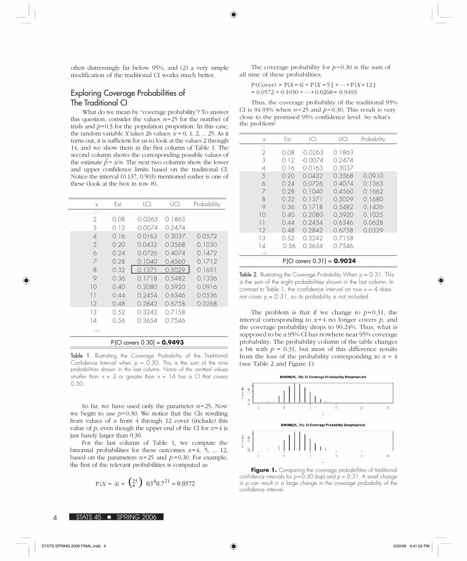
The coverage probability for p = 0.30 is the sum of all nine of these probabilities:
P (Cover) = P{X = 4} + P {X = 5 } + ... + P {X = 12 } = 0.0572 + 0.1030 + ... + 0.0268 = 0.9493.
Thus, the coverage probability of the traditional 95% CI is 94.93% when n = 25 and p = 0.30. This result is very close to the promised 95% confidence level. So what’s the problem?
x Est. LCL UCL Probability ... 2 0.08 -0.0263 0.1863 3 0.12 -0.0074 0.2474 4 0.16 0.0163 0.3037 5 0.20 0.0432 0.3568 0.0910 6 0.24 0.0726 0.4074 0.1363 7 0.28 0.1040 0.4560 0.1662 8 0.32 0.1371 0.5029 0.1680 9 0.36 0.1718 0.5482 0.1426 10 0.40 0.2080 0.5920 0.1025 11 0.44 0.2454 0.6346 0.0628 12 0.48 0.2842 0.6758 0.0329 13 0.52 0.3242 0.7158 14 0.56 0.3654 0.7546 ...
P {CI covers 0.31} = 0.9024
The problem is that if we change to p = 0.31, the interval corresponding to x = 4 no longer covers p, and the coverage probability drops to 90.24%. Thus, what is supposed to be a 95% CI has nowhere near 95% coverage probability. The probability column of the table changes a bit with p = 0.31, but most of this difference results from the loss of the probability corresponding to x = 4 (see Table 2 and Figure 1).
often distressingly far below 95%, and (2) a very simple modification of the traditional CI works much better.
Exploring Coverage Probabilities of The Traditional CI
What do we mean by “coverage probability”? To answer this question, consider the values n = 25 for the number of trials and p = 0.3 for the population proportion. In this case, the random variable X takes 26 values: x = 0, 1, 2, ... 25. As it turns out, it is sufficient for us to look at the values 2 through 14, and we show them in the first column of Table 1. The second column shows the corresponding possible values of the estimate p^ = x/n. The next two columns show the lower and upper confidence limits based on the traditional CI. Notice the interval (0.137, 0.503) mentioned earlier is one of these (look at the box in row 8).
x Est. LCL UCL Probability ... 2 0.08 -0.0263 0.1863 3 0.12 -0.0074 0.2474 4 0.16 0.0163 0.3037 0.0572 5 0.20 0.0432 0.3568 0.1030 6 0.24 0.0726 0.4074 0.1472 7 0.28 0.1040 0.4560 0.1712 8 0.32 0.1371 0.5029 0.1651 9 0.36 0.1718 0.5482 0.1336 10 0.40 0.2080 0.5920 0.0916 11 0.44 0.2454 0.6346 0.0536 12 0.48 0.2842 0.6758 0.0268 13 0.52 0.3242 0.7158 14 0.56 0.3654 0.7546 ...
So far, we have used only the parameter n = 25. Now we begin to use p = 0.30. We notice that the CIs resulting from values of x from 4 through 12 cover (include) this value of p, even though the upper end of the CI for x = 4 is just barely larger than 0.30.
For the last column of Table 1, we compute the binomial probabilities for these outcomes x = 4, 5, ... 12, based on the parameters n = 25 and p = 0.30. For example, the first of the relevant probabilities is computed as
P {X = 4} =
Table 1. Illustrating the Coverage Probability of the Traditional Confidence Interval when p = 0.30. This is the sum of the nine probabilities shown in the last column. None of the omitted values smaller than x = 2 or greater than x = 14 has a CI that covers 0.30.
( ) 0572.07.03.021425
4 =
Table 2. Illustrating the Coverage Probability When p = 0.31. This is the sum of the eight probabilities shown in the last column. In contrast to Table 1, the confidence interval on row x = 4 does not cover p = 0.31, so its probability is not included.
Figure 1. Comparing the coverage probabilities of traditional confidence intervals for p = 0.30 (top) and p = 0.31. A small change in p can result in a large change in the coverage probability of the confidence interval.
4 STATS 45 ■ SPRING 2006
P {CI covers 0.30} = 0.9493
STATS SPRING 2006 FINAL.indd 4STATS SPRING 2006 FINAL.indd 4 3/20/06 4:41:52 PM3/20/06 4:41:52 PM

compute the modified CI, simply use p^ + and n+ in place
of p^ and n, respectively. This kind of modified CI is called the Agresti-Coull CI or the “plus-four” CI. For our poll with eight Yes answers out of 25, the adjusted results are shown in Table 3, along with our earlier results using the traditional CI.
We can see that there are “lucky” values of p, such as 0.30, with coverage probabilities close to 95% and “unlucky” ones, such as 0.31, with much smaller coverage probabilities. Unfortunately, it turns out the traditional CI has many more unlucky values of p than lucky ones.
To get a more comprehensive view of the generally bad performance of the traditional 95% CI, we can use the R software package to step through 2,000 values of p ranging from near 0 to near 1 and plot the coverage probability for each of these values of p. The results are shown in Figure 2. It is clear that, for most values of p, the coverage probability is below 95%—often very much below. The two heavy dots in this figure show the coverage probabilities for p=0.30 and 0.31 illustrated in Tables 1 and 2.
Because n = 25 is a very small number of subjects, it makes sense to see what happens to coverage probabilities for larger values of n. If we look at graphs similar to Figure 2, but with n = 50 and n = 100, they unfortunately show very little improvement—and then mainly for values of p near 1/2 (see Figure 3, where n = 100). The fundamental problem remains: The coverage probability falls far below 95% for many values of p. It seems many unlucky combinations of n and p persist, even for surprisingly large values of n. The traditional 95% CI for binomial proportions simply cannot be relied upon to provide the promised level of confidence.
Figure 3. Even for a sample as large as 100, traditional “95% confidence” intervals have coverage probabilities far below 95% for many values of p.
Figure 2. Coverage probabilities for traditional confidence intervals are mostly below 95%. As p changes continuously, the discreteness of the binomial distribution causes some abrupt changes in the coverage probability. Two heavy dots show the coverage probabilities at p = 0.30 and 0.31, which were computed in Tables 1 and 2.
Modified Confidence IntervalsMany proposals have been made to improve the
coverage probabilities of CIs for the binomial proportion. Perhaps the simplest of these is the rule to “add two successes and two failures” to the data. This means that X is adjusted to X+ = X + 2 and n is adjusted to n+ = n + 4. Then, the modified point estimate is p^+= X+/n+=(X + 2)/(n + 4). The effect is to “shrink” the distance between the point estimate and 1/2. In order to
Type of C I P o i n t Est.
Margin of Error
C I Length
Traditional .320 .183 (.137,.503) .366
Plus-Four .345 .173 (.172,.518) .346
Table 3. Comparison of Traditional and Plus-four Confidence Intervals Based on 8 Yes Answers out of 25 Subjects.
Figure 4. Confidence intervals based on the rule “add two Successes and two Failures.” Two heavy dots show the coverage probabilities at p = 0.30 and 0.31 for this type of confidence interval. Coverage probabilities here are generally much closer to 95% than those in Figure 2.
Coverage probabilities of 95% plus-four CIs for n = 25 are shown in Figure 4. While coverage probabilities for these CIs are seldom exactly 95%, they are mainly much closer to 95% than for the traditional intervals. Also,
5STATS 45 ■ SPRING 2006
STATS SPRING 2006 FINAL.indd 5STATS SPRING 2006 FINAL.indd 5 3/20/06 4:41:54 PM3/20/06 4:41:54 PM

6 STATS 45 ■ SPRING 2006
coverage probabilities exceed 95% for many values of p and fall below 95% for relatively few values of p.
In particular, returning to our earlier examples, for samples of size 25, the coverage probability of the plus-four CI is 94.68% for p = 0.30 and 95.06% for p = 0.31. Both probabilities are remarkably close to 95% (see the heavy dots in Figure 4). Many values of p in the vicinity of 0.3 have larger coverage probabilities, and some have smaller coverage probabilities.
Lengths of Confidence Intervals Of course, one can always improve coverage by
making confidence intervals longer. At an absurd extreme, an all-purpose 100% CI for p—and a totally useless one—would be the interval (0, 1). So it is reasonable to ask how the average lengths of the plus-four CIs compare with the average lengths of the traditional ones. Has the increased coverage of the plus-four CIs come at the cost of an undue increase in their average length?
To show how the expected (or average) lengths are computed for a particular type of CI, we consider traditional CIs based on n = 25 subjects. Because the expected length depends on the value of p, we use p = 0.30 for an example, as we did in Table 1. Each value of x = 0, 1, ..., 25 yields its own CI, so we must view the length of a CI as a random variable L and compute E(L).
Table 4, abbreviated to show only a few values of x, illustrates how to do this. The lower and upper confidence limits (LCL and UCL, respectively) are found, as in Table 1, for each value of x. If LCL falls below 0 or UCL falls above 1, then it is replaced by 0 or 1, respectively. Next, the length L is found by subtraction. Finally, the possible values of L are multiplied by their corresponding probabilities, and the 26 products are summed to give the
expected length. For p = 0.30, the traditional CI has expected length 0.3498.
For values of p in (0,1) and n=25, Figure 5 shows the average lengths of traditional and plus-four CIs. Our computation in Table 4 corresponds to one point on the curve for the traditional CIs.
What can we conclude from Figure 5? For extreme values of p, the plus-four CIs tend to be longer because the adjusted point estimates p^+ are nearer 1/2 than are corresponding estimates p^. Recall that the maximum value of p (1–p) occurs at p =1/2. For values of p^ near 1/2, the adjustment does not make much change in the point estimates, but it does have the effect of increasing n by 4, and so it decreases the margin of error and shortens the average CI a little. The plus-four adjustment appears to lengthen the CIs for values of p near 0 or 1 as necessary to achieve roughly 95% coverage and shorten them for values of p near 1/2 in a way that does no harm. Overall, it seems the adjustment used to make the 95% plus-four CIs has resulted in a reasonable tradeoff between coverage probability and length.
x UCL LCL Length Prob. Product
0 0.0000 0.0000 0.0000 0.0001 0.0000 1 0.1168 0.0000 0.1168 0.0014 0.0002 2 0.1863 0.0000 0.1863 0.0074 0.0014 3 0.2474 0.0000 0.2474 0.0243 0.0060 4 0.3037 0.0163 0.2874 0.0572 0.0164 5 0.3568 0.0432 0.3136 0.1030 0.0323 6 0.4074 0.0726 0.3348 0.1472 0.0493 7 0.4560 0.1040 0.3520 0.1712 0.0603 8 0.5029 0.1371 0.3657 0.1651 0.0604 9 0.5482 0.1718 0.3763 0.1336 0.0503 10 0.5920 0.2080 0.3841 0.0916 0.0352 ...
25 1.0000 1.0000 0.0000 0.0000 0.0000
Sum of 26 products = E (Length) = 0.3498
Figure 5. Comparing average lengths of traditional and plus-four confidence intervals. For p near 0 and 1, the plus-four intervals are longer and therefore have coverage probabilities nearer 95%. The heavy dot shows the average length of the traditional confidence interval for p = 0.30, as computed in Table 4.
Table 4. Illustrating the Computation of the Average Length of a Traditional Confidence Interval for n = 25, p = 0.30.
STATS SPRING 2006 FINAL.indd 6STATS SPRING 2006 FINAL.indd 6 3/20/06 4:41:55 PM3/20/06 4:41:55 PM

7STATS 45 ■ SPRING 2006
Better, but Not PerfectThe papers by Agresti and Coull and by Brown, Cai,
and Dasgupta have called widespread attention among professional statisticians to the bad behavior of the traditional CI for a small or moderate number of trials. These papers suggest a number of alternatives to the traditional CI, of which the plus-four CI is recommended as the simplest to explain and the easiest to compute. However, the plus-four adjustment is not a magical cure for every situation. One possible difficulty is at the 99% confidence level: When p starts to get near 0 or 1, plus-four CIs are surprisingly conservative, having very high coverage probabilities and unnecessarily long intervals. For example, see Figure 6, where n = 50. A general program in R for plotting coverage probabilities against p is available at www.amstat.org/publications/stats/data.html for those who wish to experiment with variations (types of CIs, values of n, or confidence levels) of the graphs shown in this article.
carry a message that is instantly recognizable and almost impossible to ignore. These graphs require hundreds of thousands of computations. They would not have been made without modern statistical software or the imagination of those who figured out how to use such software to such striking effect. ■
This article originated as a student project in a seminar class at California State University, East Bay, and is largely based on class notes and the first three references.
References
Agresti, A. and Coull, B.A. (1998). “Approximate Is Better than ‘Exact’ for Interval Estimation of Binomial Proportions.” The American Statistician, 52:2, 119-126.
Brown, L.D., Cai, T.T., and Dasgupta, A.(2001). “Interval Estimation for a Binomial Proportion.” Statistical Science, 16:2, 101-133.
Suess, E.A. and Trumbo, B.E. (in press). Chapter One. Simulation and Estimation. New York: Springer.
Moore, D.S. (2004). The Basic Practice of Statistics (3rd Ed.). New York: W.H. Freeman.
Devore, J. (2004). Probability and Statistics for Engineering and the Sciences (6th Ed.). New York: Duxbury.
Technical note: The purpose of this note is to indicate a theoretical rationale for plus-four CIs. In the expression
P {–1.96 � (p^ – p)/σ � 1.96} = 0.95,
one can express σ in terms of p, square all three members of the inequality, and solve a quadratic equation to isolate p, obtaining a CI for p that depends on the normal approximation but does not approximate p by p^ to get the margin of error. The resulting point estimate of p is
(X + κ2/2)/(n + κ2)
and the margin of error is
[κ/(n +κ2)] [n p^ (1 – p^) + κ2/4]1/2,
where κ = 1.96 for a 95% CI and is the value that cuts 1– α/2 from the upper tail of a standard normal distribution when an interval with confidence 1– α2 is sought. This often is called the Wilson CI. The Wilson CI, with 2 instead of 1.96, is approximately the 95% plus-four CI. Accordingly, the plus-four adjustment works best for 95% CIs.
If the number of trials is several hundred or several thousand, as in many public opinion polls, the plus-four adjustment makes less difference. However, at the 95% level, it seems safe and easy just to use the plus-four interval, regardless of sample size. Recently, authors of some elementary texts (Moore and Devore, for example) have discussed and recommended plus-four CIs, especially when the number of trials is small.
There have been suspicions for some time that the traditional confidence interval for the binomial proportion might not perform well. So why has it taken until recently for statisticians to realize how bad it really is and seriously investigate alternatives? One can only speculate. However, graphs such as our Figures 2 and 3
Figure 6. Illustrating the very conservative behavior of 99% plus-four confidence intervals for extreme values of p.
STATS SPRING 2006 FINAL.indd 7STATS SPRING 2006 FINAL.indd 7 3/20/06 4:41:56 PM3/20/06 4:41:56 PM

8 STATS 45 ■ SPRING 2006
STATS PUZZLER
Schuyler W. Huck ([email protected]) teaches applied statistics at the University of Tennessee. He is the author of Reading Statistics and Research, a book that explains how to read, understand, and critically evaluate statistical information. His books and articles focus on statistical education, particularly the use of puzzles for increasing interest in and knowledge of statistical principles.
Schuyler W. Huck
About two-thirds of the way through Sue’s statistics course (Stats 101), everyone’s attention turned to the concepts, procedures and logic of hypothesis
testing. In this portion of the course, students learned about such things as the null and alternative hypotheses, levels of significance, and Type I and II errors. They also learned about one-tailed and two-tailed tests.
To help students understand how hypothesis testing actually works, Sue’s professor asked each student to go out and collect some dichotomous data (only two possible outcomes) and then subject those data to an exact binomial test. It was up to each student to make decisions regarding the hypotheses, level of significance (α) and sample size (n).
To fulfill this assignment, Sue first identified a ran-dom sample of 10 students who had taken the same statistics course during the previous academic term. Then, she asked each person in her sample to respond “yes” or “no” to a single little question: “Is Stats 101 a good course?” She decided to test the notion that 75 percent of the students in the relevant population would say “yes”.
Sue wanted to subject her data to a binomial test with the level of significance set equal to .05. If she chose to conduct the test with a directional alternative hypoth-esis, the binomial test would be one-tailed in nature. However, Sue’s actual alternative hypothesis was non-directional, thus calling for a two-tailed test.
To Sue’s amazement, when she graphed the binomial distribution for her test, the rejection region was posi-tioned entirely in one tail even though her full intent was to conduct a two-tailed test. What could possibly account for the missing tail?
After you have your answer, turn to page 12 to see the STATS Puzzler’s solution.
The TALE of the MISSING Tail
STATS SPRING 2006 FINAL.indd 8STATS SPRING 2006 FINAL.indd 8 3/20/06 4:41:57 PM3/20/06 4:41:57 PM

Theoretical BackgroundWhat possible advantages are likely for multicar teams
over single-car teams? The apparent dominance of multicar teams can be explained at least in part by economics.
First, the marginal cost of increasing the speed of a car likely is to be sharply upward sloping. This is due in part to NASCAR rules regarding car shape, size, aerodynamics, weight, and engine characteristics. While these rules are in place to equalize competition, the existence of this degree of uniformity makes it difficult and expensive to gain an advantage within the rules. As Bill Elliott, a driver and former owner observes, “It may cost you $5 million to get to the track, but it may cost you an additional $3 million for a few tenths [of a second] better lap time…” Teams with more cars can attract greater sponsorship resources and are more likely to be able to engage in expensive research.
It may cost you $5 million to get to the track, but it may cost you an additional $3 million for a few tenths [of a second] better lap time…
9STATS 45 ■ SPRING 2006
C. Barry PfitznerTracy D. Rishel
Stock Car Racing
NASCAR (National Association for Stock Car Racing) claims the NASCAR Nextel Cup Series is the most widely attended spectator sport in the United
States. It generally is observed by NASCAR fans that multicar teams have significant advantages over single-car teams in stock car racing. However, it is important to back up casual observation with data and statistical analysis so that such observations are verified. NASCAR racing data are available online, and the statistical analysis is simple and revealing. Let’s analyze the possible team effect on the number of times teams finished in the “top 10” over two recent NASCAR seasons. Of course, other measures of success could be chosen, but such a general indication of success lends itself to simple statistical analysis.
Tracy D. Rishel, [email protected], teaches operations management, supply chain management, and statistics at North Carolina A&T State University. Her research interests include statistical, educational, and supply chain analyses of the motor sports industry as well as a variety of issues related to enterprise resource planning.
C. Barry Pfitzner, [email protected], Edward Seese Professor of Economics, teaches economics, including statistics and econometrics, at Randolph-Macon College. His research interests vary from statistical analyses of golf and NASCAR to international inflation interrelationships. He is also coeditor of the Virginia Economic Journal.
TESTPut to the Statistical
“ “
Second, a team with more cars racing can apply any newly discovered advantages to each of its cars. The result is better performance for all cars on the team and hence greater probability of at least one car winning.
Third, teams with more sponsorship income are able to offer greater compensation to crewmembers, hire more experienced and specialized team members (such as aerodynamicists), and reap performance benefits from their expertise.
Fourth, substantial barriers to success for single-car teams also may exist because of scale economies. Larger teams can spread the fixed cost of advanced technology for making racing parts over more cars and reduce their long-run average costs.
STATS SPRING 2006 FINAL.indd 9STATS SPRING 2006 FINAL.indd 9 3/20/06 4:42:04 PM3/20/06 4:42:04 PM

10 STATS 45 ■ SPRING 2006
Other advantages also might accrue for multicar teams. Operationally, multicar teams have more test dates available to them at Nextel Cup tracks. Hence, more data can be collected and shared among team members when it comes to setting up the cars for races at those tracks. Multicar teams also have built-in drafting partners, although the NASCAR literature suggests each driver is on his or her own at the end of the race. Even so, they have greater opportunity to learn from the race results and look for ways to improve the performance of the team’s cars.
The DataLet’s look at data for the 2002 and 2003 NASCAR
seasons by classifying the teams by number of team members and their number of finishes in the top 10 finishes or not in the top 10 to assess the effect of team size on this particular measure of success. Table 1 contains the data from 2002 and Table 2 contains the data from the 2003 season. In 2002, there were single-car teams and multicar teams with two, three, and four cars. In 2003, in addition to the one-, two-, three- and four-car teams, one five-car team was formed. Looking at Table 1, we can see two-car teams had the largest number of starts (525) and the largest number of top 10 finishes (153). In 2003 (Table 2), single-car teams had the largest number of starts, but two-car teams again had the most top 10 finishes with 114.
To assess graphically the teams’ top 10 finishes, consider the bar charts in Figures 1 and 2. The graphs give visual presentations of the numerical data in the tables. In both years, the single-car teams had the least number of top 10 finishes. Note that three-car teams seemed to
perform much better in terms of top 10 finishes in 2003.Another obvious way to look at these data is to
consider the proportion (or percentage) of top 10 finishes by team size. Considering only graphical evidence, we offer Figures 3 and 4.
Visual examination suggests clearly that multicar teams have performed better than single-car teams by the top 10 finishes measure of success. It is further interesting that three-car teams did not perform as well as either two- or four-car teams. Of course, this effect is likely caused by variables other than team size. We only know that for these years at least, the three-car teams were not as competitive in producing top 10 finishes. We do not believe that three is just an unlucky number!
Although the visual examination leaves little doubt that team size matters in top 10 finishes, it is useful to test statistically for this effect. What we want to do is test to see if the proportion (percentage) of top 10 finishes
Table 1: Team Size and Number of Top 10 Finishes in 2002
Team Members 1 2 3 4 Totals
Finished in Top 10 31 153 51 123 358
Did Not Finish in Top 10 326 372 277 162 1137
Total Starts 357 525 328 285 1495
Table 2: Team Size and Number of Top 10 Finishes in 2003
Team Members 1 2 3 4 5 TotalsFinished in Top 10 32 114 89 55 66 356
Did Not Finish in Top 10 386 246 306 89 113 1140
Total Starts 418 360 395 144 179 1496
Top Ten Finishes and Teams for 2002
0
50
100
150
200
1 2 3 4
Number of Team Members
Top
10
Fin
ish
es
Top Ten Finishes and Teams for 2003
020406080
100120
1 2 3 4 5
Number of Team Members
Top
10 F
inis
hes
Figure 1. Top 10 Finishes by Team Size in 2002.
Figure 2. Top 10 Finishes by Team Size in 2003.
STATS SPRING 2006 FINAL.indd 10STATS SPRING 2006 FINAL.indd 10 3/20/06 4:42:05 PM3/20/06 4:42:05 PM

11STATS 45 ■ SPRING 2006
If finishing in the top 10 is independent of the number of team members, then each of the categories of team size would finish in the top 10 in 24% of the starts and not in the top 10 in 76% of the starts. We construct Table 3 by multiplying the total starts for each team size by 0.2395 to generate the expected frequencies for top 10 finishes. For example, the cell that represents expected top 10 finishes for single-car teams is computed as 0.2395*357 = 85.49. That is, we would expect single-car teams with 357 starts to generate 85 top 10 finishes if the proportion of top 10 finishes is the same across all team sizes. That would leave, of course, 272 finishes out of the top 10.
The chi-square statistic compares the observed frequencies (Table 1) to the expected frequencies (Table 3) by the following formula:
, where
k = the number of cells (here, 8)Oi = the observed frequencies (from Table 1)Ei = the expected frequencies (from Table 3)
The intuitive interpretation of the chi-square formula is that χ2 will be larger, the greater the departures of the observed frequencies from the expected frequencies. If the frequencies were identical, the sum would equal zero. If the calculated value of χ2 exceeds the critical value at a specified level of significance, the null hypothesis of independence of team size and top 10 finishes would be rejected.
The chi-square degrees of freedom = (number of rows - 1) (number of columns - 1). Here, degrees of freedom = (2 - 1) (4 - 1) = 3. If we specify that the significance level for our test is .01, the computed χ2 value of 123.9 far exceeds the table critical value of 11.34. This means the observed and expected distributions are statistically different. The common sense explanation of this result is that the number of top 10 finishes does depend on team size.
While this result may have been anticipated given the earlier evidence, we now have strong statistical support for the general observation that team size is important for this measure of success in NASCAR. The χ2 test for the
Top Ten Percentage by Team Members for 2002
8.7%
29.1%
15.5%
43.2%
0.0%
10.0%
20.0%
30.0%
40.0%
50.0%
1 2 3 4Number of Team Members
Perc
enta
ge
Figure 3. Percentage of Top 10 Finishes by Team Size in 2002
Top Ten Percentage by Team Members for 2003
7.7%
31.7%
22.5%
38.2%36.9%
0.0%5.0%
10.0%15.0%20.0%25.0%30.0%35.0%40.0%45.0%
1 2 3 4 5Number of Team Members
Perc
enta
ge
Figure 4. Percentage of Top 10 Finishes by Team Size in 2003
differs with respect to the number of team members. There is a relatively simple test that has intuitive appeal for these types of data. We apply the chi-square (χ2) test of independence. What we want to do is calculate theoretical (expected) frequencies based on the null hypothesis that the proportion of top 10 finishes is not dependent on team size and then compare the expected frequencies to the observed frequencies in Tables 1 and 2.
We use Table 1 as the example. Note from the totals column that there were 358 top 10 finishes from a total of 1,495 starts in 2002. That’s a proportion of 0.2395 or approximately 24%. This approximate proportion is to be expected, as there are almost always 43 cars in a race and, of course, only 10 cars or 23.3% (10/43*100) can finish in the top 10.
Table 3: Team Size and Expected Number of Top 10 Finishes in 2002
Team Members 1 2 3 4 TotalsTop 10s 85.49 125.72 78.54 68.25 358.00
Not Top 10s 271.51 399.28 249.46 216.75 1137.00
Total Starts 357.00 525.00 328.00 285.00 1495.00
∑= ⎥
⎥⎦
⎤
⎢⎢⎣
⎡ −=k
i iEiEiO
1
2)(2χ
STATS SPRING 2006 FINAL.indd 11STATS SPRING 2006 FINAL.indd 11 3/20/06 4:42:06 PM3/20/06 4:42:06 PM
12 STATS 45 ■ SPRING 2006
2003 season also is consistent with this result.Because the result of this test could hinge on the
relatively poor performance of single-car teams, it might be wise to test for independence among teams with multiple cars, eliminating single-car teams from the data. Try it!
As the chi-square test does not include the ordinal nature of the team size data, a more advanced analysis could be conducted using logistic regression or an ordinal test of categorical data. Consider using the PROC FREQ procedure in SAS, for example, to test for a linear trend.
For other analyses of NASCAR statistics, see “Do Reliable Predictors Exist for the Outcomes of NASCAR Races?” by Pfitzner and Rishel in The Sport Journal (2005).
Helping Make DecisionsUsing data from the 2002 and 2003 NASCAR seasons,
we find that team size is an important determinant of success as measured by top 10 finishes. Single-car team owners might consider this finding to determine if they would like to add another car to their teams. Hence, this type of statistical analysis can be used to help managers make decisions. ■
ReferencesCotter, T. (1999). “Say Goodbye to the Single-car Team.”
Road & Track. 50(8), 142-143.Dolack, C. (2003). “One Is the Loneliest Number.” Auto
Racing Digest. 31(6), 66.Hinton, E. (1997). “Strength in Numbers.” Sports
Illustrated. 87(16), 86-87. Middleton, A. (2000). “Racing’s Biggest Obstacle.” Stock
Car Racing, February 34-37.Pearce, A. (1996). “Fair and Square.” AutoWeek, 46(50),
40-41.Pearce, A. (2003), “Going it alone,” AutoWeek, 53(14),
57-58.Pfitzner, C.B. and Rishel, T.D. (2005). “Do Reliable
Predictors Exist for the Outcomes of NASCAR Races?”
The Sport Journal. Summer, 8:2 and www.thesportjournal.org/2005Journal/Vol8-No2/c-barry-piftzner.asp.
von Allmen, P. (2001). “Is the Reward System in NASCAR Efficient?” Journal of Sports Economics. 2(1), 62-79.
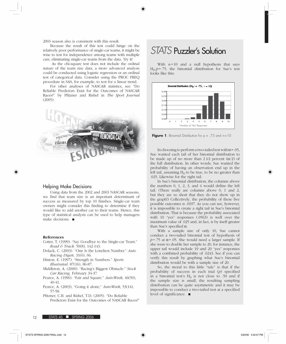
STATS Puzzler’s SolutionWith n = 10 and a null hypothesis that says
H0: p = .75, the binomial distribution for Sue’s test looks like this:
In choosing to perform a two-tailed test with α = .05, Sue wanted each tail of her binomial distribution to be made up of no more than 2 1⁄2 percent (α/2) of the full distribution. In other words, Sue wanted the probability of having an observation end up in the left tail, assuming H0 to be true, to be no greater than .025. Likewise for the right tail.
In Sue’s binomial distribution, the columns above the numbers 0, 1, 2, 3, and 4 would define the left tail. (There really are columns above 0, 1 and 2, but they are so short that they do not show up in the graph!) Collectively, the probability of these five possible outcomes is .0197. As you can see, however, it is impossible to create a right tail in Sue’s binomial distribution. That is because the probability associated with 10 “yes” responses (.0563) is well over the maximum value of .025 and, in fact, is by itself greater than Sue’s specified α.
With a sample size of only 10, Sue cannot conduct a two-tailed binomial test of hypothesis of p = .75 at α = .05. She would need a larger sample. If she were to double her sample to 20, for instance, the upper tail would include 19 and 20 “yes” responses with a combined probability of .0243. See if you can verify this result by graphing what Sue’s binomial distribution would be with a sample size of 20.
So, the moral to this little “tale” is that if the probability of success in each trial (p) specified in a binomial test’s H0 is not close to .50 and if the sample size is small, the resulting sampling distribution can be quite asymmetric and it may be impossible to conduct a two-tailed test at a specified level of significance. ■
Binomial DistributionBinomial Distribution (H (H : =: = . .75, 75, n = 10)= 10)
0.00
0.05
0.10
0.15
0.20
0.25
0.30
0 1 2 3 4 5 6 7 8 9 10
Number of "Yes" Responses
00
Figure 1. Binomial Distribution for p = .75 and n = 10
STATS SPRING 2006 FINAL.indd 12STATS SPRING 2006 FINAL.indd 12 3/20/06 4:42:07 PM3/20/06 4:42:07 PM

13STATS 45 ■ SPRING 2006
Suppose we have n = 13 observations X1, X2, ..., X13, and we want to test at significance level α = 5%, hoping to find that they came from a population
centered above µ0. Therefore, we test H0: µ = µ0 against HA: µ > µ0. Not sure whether the population is normal, but reasonably sure it is symmetrical, we decide to try both the one-sample t-test and the sign test.
The one-sample t-test rejects at the 5% level when the statistic
exceeds 1.782 (based of 12 degrees of freedom).The sign test that rejects when 10 or more of the
observations exceed µ0 has level α = 4.6%. Because of discreteness, this is as close to 5% as possible. Let B be the number of “big” observations—ones for which the sign of Xi – µ0 is positive. If the symmetrical popula-tion has its mean (and hence also its median) at µ0, then B ~ Binomial (13, 1/2) and P{B ≥ 10} = 0.0461.
Now suppose it turns out that one of these tests (narrowly) rejects H0 and the other does not reject. Eager for a significant result, we convince ourselves to use both tests and to claim significance if either test rejects H0. Subsequently we write a report claiming the results are significant. As evidence, we state the value of the test statistic (T or B) and the α-level (5% or 6.4%) of the test that rejected H0, but we omit any mention of the test that failed to reject. Bad idea!
Our combined procedure amounts to rejecting H0 when either the sign test or the t-test rejects. If the null hypothesis is true, the probability that this combined procedure rejects is not 5%. For normal data, the actual significance level of this “either/or” procedure is about 7%, a value that can be obtained by simulation.
The figure below shows the results for 10,000 simu-lated samples of size 13, each from a normal distribution centered at µ0 = 0. It plots the number B of positive observations against the T statistic:
Sometimes Two
nS
XT
/
0µ−=
4The t-test rejected H0: µ0 = 0 for the dots (samples) to the right of the broken vertical line at t= 1.782 (about 5% of the 10,000 simulated samples).
4The sign test rejected for the dots above the broken horizontal line at b = 9.5 (about 4.6% of them). In the figure, the vertical positions of the dots have been “jit-tered” (randomly displaced) up or down by as much as 0.4 to help spread them apart for easier viewing.
4The combined test rejected for the dots anywhere outside the large rectangle. (About 93% of the dots are inside this rectangle and about 7% outside.)
Tests Are NOT Better Than One
Figure 1. Rejection region for a combined t-test and sign test (b) test based on 10,000 simulated samples. The combined test would reject H0 if the calculated value of t is to the right of the vertical dotted line or if the calculated value of b is above the horizontal dotted line.
This example illustrates an important general prin-ciple. Anytime you do multiple tests on a dataset, you must be aware that error probabilities can accumulate. It is not necessarily wrong to do multiple tests. However if you do, then honest statistical practice requires you to mention the tests that failed to reject as well as the ones that rejected. ■
STATISTICAL SNA
PSHO
T
STATS SPRING 2006 FINAL.indd 13STATS SPRING 2006 FINAL.indd 13 3/20/06 4:42:08 PM3/20/06 4:42:08 PM

Mine
MineMine
Mine Other
Other
Mine = Z
Other = z/2 or 2z
Other
A Look at the
STATS SPRING 2006 FINAL.indd 14STATS SPRING 2006 FINAL.indd 14 3/20/06 4:42:09 PM3/20/06 4:42:09 PM

Two-envelope Paradox
15
The Dilemma: Should you keep the envelope you have, or switch to the other
envelope?
by Federico J. O’Reilly
The two-envelope paradox, also referred to as the exchange paradox or the problem of the two
wallets, is as follows:
A benefactor places a quantity of money, Z, in one envelope and places twice that quantity, 2Z, in
another envelope. The quantity Z and the identity of the envelope with the larger quantity are unknown to
you. Then, the benefactor randomly selects with equal probability one envelope and hands it to you. The money
is yours to keep.
The mental reasoning to get the paradoxical result is as follows:
If Z is inside your envelope, then even before opening it, you might reason the contents of the other envelope—call it W—will be either
Z/2 or 2Z, which, due to the random selection of your envelope, yields the following “expected value” for the contents of the other envelope: E [
W ] = ( 1/2 ) ( Z / 2 ) + ( 1/2 ) ( 2 Z ) = ( 5/4 ) Z. Therefore, it would appear you should switch envelopes, if given the
opportunity to do so, because the expected value of trading your envelope for the other, which you calculated to be 5/4 Z, is larger than Z.
However, the dilemma is that the same reasoning would apply when you are handed the other envelope! So, something is definitely wrong
with this thinking because, after switching, it would be beneficial to switch again ad infinitum—an absurd outcome.
STATS SPRING 2006 FINAL.indd 15STATS SPRING 2006 FINAL.indd 15 3/20/06 4:42:10 PM3/20/06 4:42:10 PM

16 STATS 45 ■ SPRING 2006
Mine Other
Other = z/2 or 2zMine = Z
This is the famous two-envelope paradox that many authors have discussed. Looking at the web, there are more than 750 sites related to the problem. A few references to the immense amount of material on the subject are listed at the end of this article. An example of a thoughtful analysis is given by E. Schwitzgebel and J. Dever at their web site, which also is listed in the references.
Apples and Oranges In our analysis, let’s denote by θ the actual, but
unknown, smaller quantity of money the benefactor placed in one of the envelopes. This is to stress it plays the role of a parameter and is a fixed amount. Noting that the problem specifies that you are faced with the dilemma after the unknown quantity of money has been fixed, in the frame of reference of the problem, we take that at ‘face value,’ as is said colloquially.
So, if you have Z in your closed envelope and you suppose the other envelope has Z/2 inside, since θ is fixed, this means your Z = 2θ because the benefactor already has decided the amount 3θ was to be split in proportions of 1:2 in the envelopes. In contrast, if you suppose the other envelope has 2Z, then you have Z=θ in your envelope without any ambiguity.
Observe that the value of Z is not the same in these two cases. However, in either case, the expected value for the contents of the envelope you were given, Z, depends on the fixed amount decided by the benefactor, θ, and is:
Ε ( Ζ | θ) = (1/2) θ + (1/2) 2θ = ( 3/2 ) θ. If we consider carefully the “pseudo-expected
value,” 5/4 Z, we realize it was computed incorrectly. The mistake is “adding apples and oranges,” as mentioned by Schwitzgebel and Dever in their explanation. To add “apples and apples,” we must remember the smallest value for Z is θ and the sum of the contents in both envelopes is constant; that is Z + W = 3θ. Therefore, if Z = θ, then W = 2θ, or if Z = 2θ, then W = θ. Either way, with θ fixed, the expected value of Z is equal to the expected value of W,
E [ Z |θ ]= E [ W|θ ] = (3/2 ) θ.
Because the expected value is the same whether you keep the envelope or switch, you should be indifferent to switching.
This is an intuitively satisfying conclusion as, after θ is fixed and knowing only the rules of the game without any other information, how could you prefer one envelope over the other?
An Inferential Point of ViewNow let’s consider the problem from an inferential
point of view. If you open the envelope and find that Z = z, it is true that logically there are two possibilities for W in the other envelope in terms of z. The value z observed, certainly implies that θ—an unknown positive parameter—is now known to belong to the set { z/2, z }, but that is all we know about it, except that the likelihood of θ is equal at both points of the set and zero outside. See the likelihood function in Figure 1.
So you should reason, from an inferential point of view, that z is a realization of Z that has exactly the same distribution as W. Also, knowledge of Z = z, even though intriguing, is useless as to which value of W might be more likely. No information about W is obtained after observing that Z = z other than the fact that now θ is pinned down to two equally likely values and that both Z and W materialize with θ fixed. Furthermore, because they have exactly the same distribution, the quantity W is not preferable over Z, observed or not. Knowing that Z = z leaves you as ignorant as before opening the envelope in terms of the odds (1:1) of having being handed the envelope with the larger or smaller quantity. Therefore, there is no reason to assert that, having observed Z = z, you should switch envelopes.
Decisions, Decisions At this point, it is worthwhile to analyze a different,
but closely related problem. This different problem has been dealt with mistakenly by some authors as if it is equivalent to the original two-envelope problem. In this problem, the benefactor places an amount Z in an envelope, hands it to you, and you look inside to find Z = z. Then, the benefactor places either twice that amount or half that amount in a second envelope, with probability 1⁄2 for each. In this case, the expected value for the contents in the second envelope is 5/4 z, a legitimate expected value for this different problem.
Figure 1. Likelihood Function of θ.
STATS SPRING 2006 FINAL.indd 16STATS SPRING 2006 FINAL.indd 16 3/20/06 4:42:10 PM3/20/06 4:42:10 PM

17STATS 45 ■ SPRING 2006
Federico J. O’Reilly Togno, [email protected], is a professor in the Departamento de Probabilidad y Estadística in the Instituto de Investigaciones en Matemáticas Aplicadas y en Sistemas at the Universidad Nacional Autónoma de México. His primary areas of interest in teaching and research are statistical inference and goodness-of-fit.
So the question then arises of whether you should switch envelopes. You may decide, for example, to switch in this different problem, if allowed to play the game a large number of times, because probabilistic reasoning tells us that in the ‘long run’ you will get a quantity very close to the expected value ‘on average.’ However, this reasoning relies on the repeatability of the game and the possibility of averaging the results. This type of game keeps the casinos making money, and lots of it!
We realize, however, that if faced only once in your lifetime with the dilemma of staying with the known z in your pocket or gambling to either loose half of z or win another z, your decision will certainly depend on z, your income, and perhaps your mood. This is the subjective part of this type of problem.
There is a concept used in economics and in decision theory called “utility,” which attempts to account for a person’s subjective appraisal of an economic gain. The utility of money is perceived differently by different individuals and differently by the same individual, depending in his or her financial circumstances. A utility function generally is viewed as nonlinear and concave, meaning that as the amount of potential gain increases, the relative “utility”—one’s feeling of gained wealth or comfort—increases, but more slowly and at a decreasing rate. A logarithmic utility function can be used to represent a person’s preference for greater economic gain. Figure 2 shows an example of such a logarithmic utility function.
With a little algebra, we can see that in this problem with a logarithmic utility function, the expected utility of the contents of the second envelope is equal to the utility of the first envelope:
E [ Log W ] = ( 1/2 ) Log ( Z/2 ) + ( 1/2 ) Log ( 2Z ) = ( 1/2 ) ( Log Z – Log 2 ) + ( 1/2 ) ( Log 2 + Log Z ) = Log Z
So if you accept the use of a logarithmic function as your measure of utility in this different problem, you would be indifferent to the exchange of envelopes if the choice is to risk z for either z/2 or 2z with equal odds.
Take the Money and RunThe illusion of a paradox was created in the original
problem by computing an incorrect expected value by ignoring that the amount split between both envelopes is fixed. Moreover, knowledge of the contents of the first envelope leaves the odds of having in one’s hands the envelope with the larger amount exactly as before knowing its contents. So, there should be no preference for switching envelopes in the original problem.
In the different problem, the repeatability of the game and one’s utility for money are considerations to take into account. Only if the game can be repeated many times should there be a preference for switching. However, if you have a logarithmic utility function, you should still be indifferent.
As a personal choice, I would keep z if a kind benefactor offered me, say, $1 million (z = $1,000,000). If the rational decision is to be indifferent to the switch, why take the risk of losing z? As a humble statistician, I would keep the million dollars or, in fact, any amount offered. As is said colloquially, “A bird in the hand is worth two in the bush,” and as said colloquially more imperatively, “Take the money and run!” ■
ReferencesBruss, F.T. (1996). “The Fallacy of the Two-envelopes
Problem.” Math Scientist, 21, 112-119.Casella, G. and Berger, R.L. (2002). Statistical Inference
(2nd Ed.). Duxbury Press.Christensen, R. and Utts, J. (1992). “Bayesian Resolution of
the Exchange Paradox.” The American Statistician, 46, 274-276.
Clark, M. and Shackel, N. (2000). “The Two-envelope Paradox.” Mind, 109, 435.
Linzer, E. (1994). “The Two-envelope Paradox.” The American Mathematical Monthly, 101, 417-419.
Ridgeway, T. (1993). “Letter to the Editor about the Exchange Paradox.” The American Statistician, 47, 311.
Schwitzgebel, E. and Dever, J. “The Two-envelope Paradox: a Simple Version of Our Explanation.” www.faculty.ucr.edu/eschwitz/SchwitzAbs/TwoEnvelopeSimple.htm.
Figure 2. Example of a Logarithmic Utility Function.
STATS SPRING 2006 FINAL.indd 17STATS SPRING 2006 FINAL.indd 17 3/20/06 4:42:12 PM3/20/06 4:42:12 PM

18 STATS 45 ■ SPRING 2006
A P S T A T I S T I C S
The Least-squares Regression Line Is Not a Trend Line
Figure 1 shows one version of the scatterplot I used. It presents the values for SAT scores—math and verbal—for a simulated cohort of students. The math scores were generated randomly to reflect the national distribution in terms of mean and standard deviation, and the verbal scores were calculated so the assumptions for inference for regression were met perfectly: At any given math-value, the distribution of verbal-values is normal with uniform spread, centered along a linear relationship with the math scores. I also used a second version with the same data, but plotted with the verbal scores on the x-axis and math scores on the y-axis. Each student was given one of the two graphs at random.
Many teachers, me included, have used the term “trend line” to explain the concept of a line that “best fits” the points in a scatterplot. There is a
sense that students have an innate eye for a line that represents the relationship between the x- and y-values in the scatterplot, and that this line is typically the least-squares regression line. However, it struck me recently that a trend line and the least-squares line are not really the same thing.
The purpose of the least-squares line is to make the best prediction of the y-variable for a given value of the x-variable. The idea of a trend line is more related to the pattern in the points themselves. The least-squares line is predicting one variable from the other, so it does not treat the x- and y-variable symmetrically in the equations—a distinction the trend line would not necessarily make. I wondered if students would draw a line close to the least-squares line if asked to draw a line on a scatterplot that shows the relationship between two variables. I decided to gather some data that might help answer this question.
An ExperimentTo get a better sense of what students actually think
about a line that best fits a scatterplot, I conducted an experiment. I gave a group of precalculus students (high school sophomores, juniors, and seniors) a scatterplot and asked them to draw the line they thought “best represents the relationship between x and y.” I had a notion about what they would draw based on activities done with them in the past. I expected the lines sketched by the students to be steeper than the least-squares line.
Peter Flanagan-Hyde ([email protected]) has been a math teacher for 27 years, the most recent 15 in Phoenix, Arizona. With a BA from Williams College and an MA from Teachers College, Columbia University, he has pursued a variety of professional interests, including geometry, calculus, physics, and the use of technology in education. Flanagan-Hyde has taught AP Statistics since its inception in the 1996-1997 school year.
Peter Flanagan-Hyde
200
300
400
500
600
700
800
200 300 400 500 600 700 800SAT Math
Now, can you imagine a line that best shows the trend relating the verbal and math scores? Go ahead, sketch it on the graph.
Figure 1. Scatterplot of Simulated Math and Verbal SAT Scores that Satisfy the Assumptions for Inference in Regression Analysis
STATS SPRING 2006 FINAL.indd 18STATS SPRING 2006 FINAL.indd 18 3/20/06 4:42:14 PM3/20/06 4:42:14 PM

The Least-squares LineThe goal of the least-squares line is to make the best
prediction for the verbal score from a given math score, so the quantity minimized is the vertical distance between the points in the data and the line that models the data. This produces the familiar least-squares line. One of its properties is that it passes through the centroid of the data, with coordinates (mean math score and mean verbal score), (Math,Verbal).
The slope of the least-squares line is a function of three quantities: the standard deviation of the math scores (Smath a larger spread among the x-values flattens the line), the standard deviation of the y-values (Sverb a larger spread among the y-values tends to make the line steeper), and the correlation coefficient (higher values of r make the line relatively steeper). The formula that summarizes the slope of the linear equation
Verbal = a + b . Math is
b = r
If r = 1, then an individual who is one standard deviation above the mean math score would be predicted to have a verbal score that is also one standard deviation above the mean verbal score. For values of r less than one, the predicted verbal score is closer to the mean verbal score. This is the origin of the term “regression” and the reason why “r” is used for the correlation coefficient.
What I Thought Students Might DrawI have used an activity for a number of years in which
students sketch lines on a scatterplot and calculate the sum of the squares of the residuals. I then have students rate their lines using the least-squares criteria, each summing the squares of the vertical distances from each of the data points to the line he or she drew. I have observed that most students made the line too steep compared to the least-squares line, but it occurred to me that perhaps the rules of the game are rigged against the students—the evaluation criteria is not what one’s eye tends to find as the best line. I thought they might be more inclined to draw a line with slope Sverb /Smath, ignoring the regression effect. This is the slope of a line that in a geometrical sense might better illustrate the trend in the points. With the conditions described above for this scatterplot, the population of points should cluster in an elliptical pattern, and the major axis of the ellipse would have slopeSverb/Smath. The line that minimizes the perpendicular distance from each data point to the line (a line of “orthogonal fit”) has this slope, and this line through the points is independent of which variable is x and which is y.
The scatterplot in Figure 2 adds the ellipse that shows the density of the points, the least-squares line, (SATV = 199.97 + 0.6014 . SATM) and the steeper dotted line of orthogonal fit, (SATV = 115.27 + 0.7737 . SATM).
19 STATS 45 ■ SPRING 2006
What Students DrewTwenty-three of the precalculus students were given
this scatterplot, and the mean slope of the lines they drew was 0.9591. A 95% confidence interval for the slopes they drew is [0.9118, 1.0064]. This is steeper indeed than either the regression line or the line of orthogonal fit. In fact, neither the slope of the least-squares line nor the slope of the line of orthogonal fit falls within the confidence interval for the students’ slopes.
Figure 2. Scatterplot with Least-squares Fit and Orthogonal Fit Lines.
Figure 3. Scatterplot with Line Fit “by Eye.”
In Figure 3, a scatterplot is shown with a line of the mean student slope (bold) that passes through the centroid (Math,Verbal). Interestingly, the student lines typically were close to this point, with the mean vertical difference between the student lines and the centroid less than one unit and standard deviation about 20 units.
So, what was the slope of your line? Was it more like the regression line, the orthogonal fit line, or my students’ lines?
.SverbSmath
STATS SPRING 2006 FINAL.indd 19STATS SPRING 2006 FINAL.indd 19 3/20/06 4:42:15 PM3/20/06 4:42:15 PM

20 STATS 45 ■ SPRING 2006
Switching the AxesAnother group of 24 precalculus students was given
a scatterplot with the data axes switched, so that the math scores were on the y-axis. Whether students received this form or the first form was determined randomly.
The regression equation of the least-squares line for the math scores as the response is (SATM = 53.38 + 0.8741.SATV), and the equation of orthogonal fit is (SATM = - 149.00 + 0.2926 . SATV). The students’ lines had mean slope 1.0429, standard deviation 0.1619, and a 95% confidence interval [0.9746, 1.1113]. As in the previous case, the slope of neither the least-squares line nor the line of orthogonal fit falls in this confidence interval, but this time the slope of the students’ line is between the slopes of the other two. Figure 4 is a scatterplot that shows the least-squares line, the dotted line of orthogonal fit, and the bold line of mean student slope.
Comparing the GraphsTaking a good look at the two graphs above, with the
axes switched, makes for some interesting comparisons. First, note that the line of orthogonal fit in the second graph is the inverse function of the line in the first graph. This must be the case, as it passes through the centroid and its slope is the ratio of the standard deviations. Its path through the points is exactly the same.
More surprising to me is the comparison between the typical lines drawn by the students in each of the two cases. Such as the line of orthogonal fit, these are nearly inverse functions of one another, following roughly the same path through the points. It seems students have some sense of the line that comes from the geometry of the points, rather than which is x or y.
More Research?There are a number of open questions in my mind as a
result of this investigation. First, are my results replicable? I encourage you to try this experiment with your classmates and send me the results. Second, to what extent are these results determined by the particular scatterplot I have chosen to use here, with correlation 0.725. Would a set of points with a higher or lower correlation produce similar results?
The Least-squares Line Is Not a Trend LineIn this experiment, students typically chose slopes for
the line that “best represents the relationship” between two variables that are different from that of the least-squares line. This tendency reinforces my belief that teachers should emphasize the prediction aspect of the least-squares line and avoid the term “trend line.” This distinction may be subtle, but may help students gain a deeper understanding of the idea of a model that predicts one variable from the value of another. ■
Figure 4. Scatterplot with SAT Verbal and SAT Math Interchanged.
statistics in everything from sports to medicine to engineering.“statistics in the news,” discussing current events that involve statistics and statistical analyses.interviews with practicing statisticians working on intriguing and fascinating problems. famous statisticians in history and the classic problems they studied.how to use particular probability distributions in statistical analyses.reviews of books about statistics that are not textbooks. student projects using statistics to answer interesting research questions in creative ways.
STATS: The Magazine for Students of Statistics is interested in publishing articles that illustrate the many uses of statistics to enhance our understanding of the world around us. We are looking for engaging topics that inform, enlighten, and motivate readers, such as:
Think of some great ideas and send a description of your concepts for feature articles that you would write to Dr. Paul J. Fields, Editor, [email protected].
CALL FOR PAPERS
STATS SPRING 2006 FINAL.indd 20STATS SPRING 2006 FINAL.indd 20 3/20/06 4:42:15 PM3/20/06 4:42:15 PM

21STATS 45 ■ SPRING 2006
S E C T I O N
Computing Normal Tables and a Slice of π
The probability that you will wait more than 20 minutes, P{W > 20} = P{20 < W ≤ 30}, is represented by the area of the shaded rectangle with the interval (20, 30] as its base and height 1/30. This area is easy to calculate:
Area = Width × Height = (30–20) (1/30) = 1/3.
Question 2. Next, we look at a problem that can be solved on an ordinary calculator. Suppose a population of electronic components has exponentially distributed lifetimes with a mean of two years. Your company offers a warranty to replace components that fail within the first year. What proportion of these components will be eligible for replacement under the warranty?
Answer. The density function for this exponential distribution is ƒ(t) = (1/2) e¯t/2, for t ≥ 0. (For t < 0, the density function is 0 because it is impossible to have a negative lifetime.) See Figure 2. Whether you’ve seen exponential distributions before or not, the main fact of interest here is that there is a formula for finding probabilities of intervals (areas under the density curve): For a random variable T with this exponential distribution, P{0 < T ≤ t} = P{T ≤ t} = 1 – e¯t/2, where e = 2.71828 is the base of natural logarithms and t ≥ 0.
In many practical applications of statistics and probability, we need to find the probability associated with an interval. Some of these probability computations
are easy and others are quite challenging. And sometimes questions that are easy to ask lead to computations that are not so easy to perform. Here, we explore a variety of useful computational methods, including several based on simulation.
Probabilities of Three IntervalsQuestion 1. We start with a problem so easy you
can do the computation in your head. Suppose, visiting a strange city, you have just arrived at the platform to catch a commuter train. You know trains run every half hour, but do not know the time schedule. What is the probability you will have to wait more than 20 minutes?
Bruce Trumbo ([email protected]) is Professor of Statistics and Mathematics at California State University, East Bay (formerly CSU Hayward). He is a Fellow of ASA and holder of the ASA Founder’s Award.
Bruce Trumbo
R U S I M U L A T I N G
Answer. Your waiting time W (in minutes) can be expressed as a uniform random variable on the interval (0, 30]. Its rectangular density function is shown in Figure 1. As with all density functions, this one includes a total area of 1 and areas correspond to probabilities.
Figure 1. If W has a uniform distribution on the interval (0, 30] then P{W > 20} = 1/3.
Figure 2. If T has an exponetial distrivution with E(T ) = 2 years, then P( T ≤ 1) = 0.3935.
STATS SPRING 2006 FINAL.indd 21STATS SPRING 2006 FINAL.indd 21 3/20/06 4:42:18 PM3/20/06 4:42:18 PM

22 STATS 45 ■ SPRING 2006
So our answer is P{T ≤ 1} = 1 – e¯1/2, = 0.3935. The relevant area, shaded in Figure 2, can be found with a few keystrokes on a calculator or in R with the code 1 – exp(–1/2). (If you are wondering how your calculator or R might compute the exponential function, see the challenge at the end.)
Question 3. Here is a problem that can be solved using tables of the standard normal distribution. Suppose scores on the ABC college admissions test are approximately normally distributed with mean 300 and standard deviation 70. Also suppose that State University accepts students who score higher than 370. According to this policy, what proportion of those who take the ABC test is eligible for admission?
How then are normal probabilities computed? Let’s explore several answers to this question. As our primary example, we will consider how to calculate P {0 < Z ≤ 1}, but the methods we show can be used to find the standard normal area in any finite interval—and they also can be used for problems that do not involve the normal distribution.
Figure 3. The area shown is P{ 0 < Z ≤ 1} = 0.3413. There is no simple formula for finding areas under a normal curve.
Answer. According to the Empirical Rule, for normally distributed data, about 2/3 of the population scores will be within one standard deviation of the mean. So about 1/6 of the scores will be more than one standard deviation above the mean. Thus, a rough answer is 16.7%. But let’s assume the distribution of scores X is exactly NORM (300, 70). Then, P{X > 370} = P { Z > 1} = 0.5 – P { 0 < Z ≤ 1}, where Z is standard normal.
Tables of the normal distribution come in various styles. Some give the probability that a standard normal random variable Z is between 0 and a chosen value z in the margin of the table. In particular, P {0 < Z ≤ 1} = 0.3413, the area illustrated in Figure 3. So the answer to our question is P { X > 370 } = 0.5 – .3413 = 0.1587.
How Are Normal Tables Computed? Normal tables can be found in almost every basic
probability and statistics book. You may have taken them for granted, never thinking about how they are computed. The density function for the standard normal distribution function is ϕ(z) = (2π)¯1/2 exp(–z2/2). But the normal distribution is unlike the uniform and exponential distributions: There is no simple formula for calculating areas under the standard normal density curve.
Approximation by rectangles. Figure 4 shows the standard normal density function ϕ (z) over the interval (0, 1) along with five rectangles whose areas sum to about the same area as that shaded in Figure 3. The dotted lines at the center of each rectangle (that is, at z = .1, .3, .5, .7, and .9) are exactly the same height as the function ϕ (z). The base of each rectangle is 0.2 units wide.
In R, we can designate the list of these grid points by z <- c(.1, .3, .5, .7, .9) Also in R, the standard normal density function ϕ is denoted by dnorm. That is, dnorm(.1) is just a short way to write
(1/sqrt(2*pi))*exp(-.5*(.1)^2)
The sum of the areas of these five rectangles is computed by sum(.2 * dnorm (z)), which returns 0.341749.
We see that approximating P(0 < Z ≤ 1) by the areas of only five rectangles gives two-place accuracy. If we use more and narrower rectangles, we can get any desired degree of accuracy. The brief program in Figure 5 shows how to use m = 1,000 rectangles to get six-place accuracy. Essentially, that’s how normal tables are made.
m <- 1000 # number of grid pointsa <- 0; b <- 1 # interval endpointsw <- (b - a)/m # rectangle widthz <- seq(a+w/2, b-w/2,length=m) # gridh <- dnorm(z)sum(w * h) # sum of rectangle areas
Figure 5. R code that accurately evaluates P { 0 < Z ≤ 1} with 1,000 rectangles.
Figure 4. The combined area of five rectangles is 0.347, roughly approximating P { 0 < Z ≤ 1}.
STATS SPRING 2006 FINAL.indd 22STATS SPRING 2006 FINAL.indd 22 3/20/06 4:42:23 PM3/20/06 4:42:23 PM

23STATS 45 ■ SPRING 2006
Monte Carlo integration. It is surprising that instead of choosing the points z as equally spaced on a grid, as in Figure 4, we can choose them at random in the interval of interest. We can do this by changing the fourth line in Figure 5 to z <- runif (m, a, b).
However, to get reasonable accuracy, we now need to use many more values of z. (And, of course, now w has to be interpreted as the “average” distance between randomly chosen points.) Because this is a random process, we will get a slightly different result each time we run the program, but with a million randomly chosen points, the answers are typically correct to three or four places. On three runs, we obtained 0.3413244, 0.3413972, and 0.3413329.
The term Monte Carlo, after a city in southern Europe famous for its gambling casinos, often is used as a synonym for simulation. Here, the term integration means finding the area under a curve. In problems where one must consider multidimensional random processes, the random values of Monte Carlo integration are easier to program than a grid. And they also can give more accurate answers. Here is an intuitive explanation. In our approximation by rectangles in Figure 4, our grid produced only one “ragged edge” to cause errors; it’s along the top. But in many dimensions, ragged edges and surfaces can proliferate in many directions to become a serious problem. Random points don’t lie on a fixed grid, but they can be programmed to stay precisely inside designated boundaries.
Alternatively, you can use R as a table of the standard normal distribution and get the exact answer with pnorm(1)- pnorm(0), where pnorm (with only one parameter) stands for the standard normal cumulative distribution function Φ(z) = P {Z ≤ z}. But, in the background, the pnorm function is doing something similar to approximation by rectangles to get the answer. Note: When a mean other than 0 and a standard deviation other than 1 are specified as its second and third parameters, respectively, pnorm is the cumulative distribution function of a general normal distribution. Thus, we could have answered Question 3 directly with the R code 1 - pnorm (370, 300, 70).
Now for That Slice of πThe unit circle z2 + h2 = 1 has area π = 3.1416, so
the pie-shaped region of the unit circle where z > 0 and h > 0 (its first quadrant) has area π/4. See Figure 6. Multiply by 4 and we have an approximation of π. The total area of the rectangles is 0.792997, so the resulting estimate of π is 3.171988.
If we substitute the next-to-last line of Figure 5 by h <- sqrt(1 - z^2) using 1,000 rectangles, we can get an approximation of π that’s accurate to four places.
Next, we return to evaluating probabilities in order to illustrate some methods of simulation. Two of the methods we describe in the next section also can be used to get “random approximations” of π .
Three Simulation MethodsConsider again the evaluation of P{0 < Z ≤ 1}. Even
though approximation by rectangles is a better method for solving this simple problem in practice, just for fun we will show how to solve it with three methods of simulation. (Well, to be honest, this is not entirely recreational. Each of these methods is of practical importance in more advanced probability modeling. At the end of this section, we solve a slightly more complicated problem where simulation is necessary.)
Figure 6. Approximation of π/4 with five rectangles.
Figure 7. The proportion of 10,000 random points in the rectangle that fall below the standard normal density curve, the ‘accepted’ points, can be used ot approximate P{0 < Z ≤ 1}.
Acceptance-rejection method. Another simulation method for finding P{0 < Z ≤ 1} is to surround the desired area by a rectangle of area 0.4, put a large number of points at random into this rectangle, and find the fraction of points that falls beneath the density curve—the ‘accepted’ points. For example, Figure 7 shows 8,515 accepted points out of 10,000 random points, so the estimate of the desired probability is 0.4(0.8515) = 0.3406. Three successive runs with a million randomly chosen points gave the estimates 0.3413884, 0.3414704, and 0.3411264. With this large number of random points,
STATS SPRING 2006 FINAL.indd 23STATS SPRING 2006 FINAL.indd 23 3/20/06 4:42:25 PM3/20/06 4:42:25 PM

24 STATS 45 ■ SPRING 2006
the simulated value is 95% sure to lie in the interval 0.34134 ± 0.0003. The acceptance-rejection method is a relatively inefficient way to evaluate simple normal probabilities, but like Monte Carlo integration, it can be useful in more complicated situations.
Approximation by sampling. Sometimes it is possible to simulate a large sample from a population with the desired distribution. For example, the R function rnorm produces values sampled at random from a normal distribution. We could simulate the answer to Question 3 by sampling from the distribution NORM (300, 70) and then asking what percentage of the values are greater than 370. The following R code implements this method.
x <- rnorm(100000,300,70)mean(x > 370)Here, (x > 370) is a list of 100,000 TRUEs and
FALSEs, and the mean function returns the proportion of TRUE results. Three runs gave estimates 0.15945, 0.15886, and 0.15764. Recall that the correct answer is 0.1587, so we are getting about two-place accuracy. Larger samples would give better accuracy.
Question 4. In practice, the sampling method would be poor to use for Question 3, but this method is useful in a situation where we don’t know the density function of the desired random variable. Suppose the total time in microseconds (µs) it takes for a particular computer instruction to be completed is the sum S of three independent waiting times: U distributed uniformly on the interval (0, 70), V distributed exponentially with mean 10 (rate 1/10), and W distributed normally with mean 20 and standard deviation 2. What proportion of such instructions takes longer than 100 µs to complete?
1. Computing π. Use 10,000 rectangles to approximate π. In R, the code pi is reserved for the constant π. Type pi to compare your approximation with the result. To how many places is your approximation accurate?
2. Simulating π. On our web site, we show our code for using Monte Carlo integration and the acceptance-rejection method to evaluate P{0 < Z ≤ 1}. Modify these programs so you can use each of these methods to simulate π.
3. Simulating √2. Suppose you do not know the value of √2. Can you use probabilities and the sampling method to find it? One possibility: Let U have a uniform distribution on (0, 1) and X = U2. Then, simulate a million values of X and use the fact that 2P{ 0 < X ≤ 1/2 } = 2P{ 0 < U ≤ 1/√2 } = 2/√2 = √2. Compare with sqrt(2) (With basic probability methods, one could find the density function of X. But it involves √2, so density-based methods—such as approximation by rectangles, Monte Carlo integration, and acceptance-rejection—are not applicable here.)
4. Computing the exponential function. You might wonder how a calculator (or R) calculates exponential functions. One method is based on the “series expansion”
ex = exp(x) = x0/0! + x/1! + x2/2! + x3/3! + ... .
In theory, the sum on the right-hand side continues forever, but, in practice, the terms get small fast because the factorials in the denominators get large fast. So it is often enough to sum only the first few terms of the series. For example, in calculating e –1/2 = 0.6065, we can get four-place accuracy with only the first six terms.
e–1/2 ≈ S6(–1⁄2) = 1 – 1⁄2 + (1⁄2)
2/2 – (1⁄2)
3/6 + (1⁄2)
4/24 – (1⁄2)
5/120.
In R, S6(–1⁄2) can be computed as:
n <- 0:5; sum((-1/2)^n/factorial(n))[1] 0.6065104
How many terms are needed for five-place accuracy? That is, find the smallest n for which |Sn(-1⁄2) – e–1/2|<0.000005.
Another method: As n increases to infinity, the limit of Bn(x) = (1 + x/n)n is ex. For values of n that R computes easily, Bn(x) can provide useful approximations for some values of x. With this method, about how large does n need to be in order to get four-place accuracy for e –1/2 ?
Formulas for methods based on Sn(x) and Bn(x), among other approximations, have been programmed into the exponential functions in calculators and statistical software.
Answer. Of the methods we have discussed here, the only one that works for this question is to simulate a sample. The required R code ism <- 100000; u <- runif(m, 0, 70) v <- rexp(m, 1/10); w <- rnorm(m, 20, 2)s <- u + v + w; mean(s > 100)
Figure 8 shows a histogram of the simulated distribution of the total waiting time S. The answer is that about 5.3% of the instructions take longer than 100 µs to process. While it is not feasible to do a direct analytic computation of P{S > 100}, basic probability rules show that
E(S) = E(U) + E(V) + E(W) = 35 + 10 + 20 = 65.
Figure 8. Distribution of processing times simulated by the sampling method.
Acknowledgments and ReferencesThanks to my colleagues Eric Suess and Julia Norton
and to my student Alain Valois for helpful comments. Some parts of this column are similar to examples to be included in a forthcoming book by Suess and me on simulation and estimation.
Challenges: Exploring on Your Own As usual for this column, the full R code for our
computations and simulations is shown at www.amstat.org/publications/stats/pdfs/stats44.pdf.
We hope you will follow through what we have done on your own—and then try the challenges below.
So the additional code mean(s) provides a ‘reality check’ for our simulation: Typical answers are in the interval 65.00 ± 0.15
STATS SPRING 2006 FINAL.indd 24STATS SPRING 2006 FINAL.indd 24 3/20/06 4:42:26 PM3/20/06 4:42:26 PM

25STATS 45 ■ SPRING 2006
ASK STATS
Question: I have been thinking about a career teaching statistics. Why should I consider teaching at a small liberal arts college rather than a big state school?
Jackie Miller ([email protected]) is a Statistics Education Specialist and auxiliary faculty member in the Department of Statistics at The Ohio State University. She earned both a BA and BS in mathematics and statistics at Miami University, along with an MS in statistics and a PhD in statistics education from The Ohio State University. She is very involved in the statistics education community. When not at school, Miller enjoys a regular life (despite what her students might think), including keeping up with her many dogs!
Hey Professor Cuff...
Carolyn K. Cuff (left) teaches statistics and mathematics at Westminster College in New Wilmington, Pennsylvania.
One of the more memorable dissertation presentations I have seen was in the area of graph theory. The doctoral candidate drew a complicated
graph with lots of connections and weights on the edges indicating distance. “This graph represents the path my work has taken. The final edge connecting the first node with the last is actually not that far from where I started. I just visited many other nodes along the way.”
Imagine such a graph with its numerous branches and even an occasional dead end and you could be mapping out my career path. My current title is Professor of Mathematics at Westminster College, a small liberal arts
Jackie Miller
college—the same college I went to years (and nodes and jobs) ago. My main area of teaching responsibility is statistics, and my graduate degrees are in operations research. If you are considering a career teaching at a liberal arts college, let me give you an idea of the path I have taken, the role that statistics has played in what I have done, and why I have stayed at this job.
As a student, I went to a liberal arts college because my parents and their parents had gone to liberal arts colleges. Once there, I had a great time studying mathematics, computer science (which was in its infancy at the time), religion, and art. I majored in mathematics, had a minor in computer science, and almost finished a major in religion. I took enough art history courses to capably bore my children in major art galleries in the United States and Europe. I traveled to France to become more fluent in French and the U.S. Virgin Islands to study ecology.
When I finished my undergraduate degree, I worked for three years as an accountant for one of the largest Fortune 500 companies. The plant I worked in manufactured specialty items; most of the rest of that portion of the company mass produced products. As a result, it had different inventory problems than other plants. One of the more memorable projects sought to determine approximately how much—measured in dollars rather than units of inventory—some of our smaller suppliers provided us during the course of a year. Paper records in a large file drawer indicated units and
STATS SPRING 2006 FINAL.indd 25STATS SPRING 2006 FINAL.indd 25 3/20/06 4:42:27 PM3/20/06 4:42:27 PM
26 STATS 45 ■ SPRING 2006
total dollar amount. My boss did not like my idea of a stratified sample; he wanted a complete census. From undergraduate statistics, I knew the census was going to be tedious and not give us a better approximation than my sampling would. A week later, at the end of the project, I had an okay approximation, a headache, and the decision to move on.
I decided to go back to graduate school in operations research at Case Western Reserve because I was married and already living in Cleveland. The coursework for the degrees included lots of statistics and, of course, lots of modeling courses. The graduate program was small enough that the transition from a small school to graduate school was easy. I struggled more than my fellow students with the early courses, as they often had similar courses in their previous graduate work. Once I finished the first year, the mathematical rigor increased and I not only caught up with my fellow students, they were coming to me with questions.
I was fortunate enough to have an internship at another major company while working on coursework for the degrees. The internship included costing of copper mining and refining, scheduling oil tankers, and designing elevator systems. The mathematics of the projects always included mathematical programming and statistical analysis of the results.
I had my first child before I finished the dissertation and left the internship to teach MBA quantitative analysis. (I think I was probably awful the first two years. Maybe some of my students learned some statistics, though.) I was hired at the Katz School of Business at the University of Pittsburgh, where I did research in vehicle routing (my dissertation area) and taught for three years. I realized early on that I was enjoying teaching much more than I was enjoying research. And that’s not to say I was not enjoying the pure research—my heart just was not into it. So, I began to rethink my goals and values and realized teaching was more important. Westminster needed an applied mathematician and asked me to interview. Aside from the finances of the position, they made me an offer I could not refuse. I did not. Then, the professor teaching statistics at the college suddenly retired and I found myself teaching statistics.
As a statistician at a liberal arts college, I have been called on to help students in the natural sciences design statistically better experiments, professors in the education department analyze national qualifying exam results for their pre-service teachers, professors in the communications department explain “curious” lottery results, and colleagues design a better statistics and mathematics curriculum. So you can see that professors at liberal arts colleges interact with a range of students, other professors, and ideas. We are expected to continue learning and to instill the joy of learning in our students. In the past month, I have cultivated this love of learning by attending lectures on new techniques in green chemistry, international trade law, financial development in post-communist Hungary, and the chemistry of enzyme production.
A student graduating in statistics who wants to be respected immediately as a statistician will get that opportunity at a small college. The support system extends nationwide. Phones and email have made staying in contact and making new contacts easy. If you are a student of statistics who is interested in teaching at a liberal arts college, learn to demonstrate your interest in a variety of problems. If you are in a graduate statistics program, ask to work on at least one project that requires in-depth data analysis or application of basic statistics in an unfamiliar field, such as exposure of local children to lead or tracking of calls at a crisis intervention center. Make an effort to learn all you can about that field. Later, it will be good interview material and provide classroom stories.
On the other hand, if you are an undergraduate majoring in something besides statistics, consider taking additional courses beyond your required statistics course. Rarely does a first course in statistics provide the depth and extent of possible connections between a particular major and the use of statistics. Ask your statistics professor to direct you to articles showing applications in your major and surf the data and story library, lib.stat.cmu.edu/DASL, or Chance News, at www.dartmouth.edu/~chance/chance_news/news.html, for interesting statistics uses.
As the information age marches ahead, understanding statistics and the analysis possible with statistical techniques will continue to become more important to everyone—the social scientist, the historian, the accountant, the chemist, the human rights worker. I have never heard any of my colleagues in other departments say, “Those professors who told me statistics would be important were wrong... Now that I know more about my discipline, I am sure statistics is not important for my work.... Gee, I wish I would have taken less statistics.”
Perhaps the financial rewards are not as great here as somewhere else, but the personal rewards of teaching at a liberal arts college have made it all worthwhile. ■
Carolyn K. Cuff is a professor of mathematics and chair of the Department of Mathematics and Computer Science at Westminster College. Her web site is located at www.westminster.edu/staff/ccuff.
As the information age marches ahead, understanding statistics and the analysis possible with statistical techniques will continue to become more important to everyone—
“ “
STATS SPRING 2006 FINAL.indd 26STATS SPRING 2006 FINAL.indd 26 3/20/06 4:42:37 PM3/20/06 4:42:37 PM

27STATS 45 ■ SPRING 2006
Chris Olsen ([email protected]) teaches mathe-matics and statistics at George Washington High School in Cedar Rapids, Iowa. He has been teaching statistics in high school for 25 years and has taught AP statistics since its inception.
S T A T I S T I C A L – S I N G Sµ
Spring Cometh! Will Extreme Measures Be Necessary?
Chris Olsen
Ah, yes, impending spring! Mother Nature once again keeps her annual promise of consistently positive Celsius values. Post Valentine’s Day young ladies’
thoughts turn to spring fashions, young gentlemen once again consider the possibility of the Cubs winning the World Series, and all over the animal kingdom mates are thinking of mating. What a slam-dunk wonderful time of year!
However, as I repose here with my computer, spring is only remotely impending and, frankly, except for that presumed Celsius upswing, things do not look all that good. Impending doom seems more like it. Let’s consider the evidence. The hurricane season, after rampaging all over the Deep South, is about to go into the Greek alphabet; levees are failing in New Orleans; a tsunami recently reared its ugly head in the Western Pacific; and rocks are moving ominously on Mt. St. Helens in the Western United States. I am waiting for somebody to announce his or her new movie “Apocalypse Soon.”
Oh, sure, I can hear the statisticians now, throwing around that probability lingo: “Well,” you say, “these events are outliers in the great data stream of life. Every once in awhile, there is a purely accidental conjunction of events, like Mars and Venus lining up. Doesn’t mean a
thing, nothing to worry about.” Uh-huh. Right. Remember Jurassic Park? Remember those ominous thumps? Water shaking in the glass, tremors in the ground, and the next thing you know, there is a T. Rex in your rear-view mirror.
Where was I? Oh, yes—impending spring. Now, I happen to live in Iowa, named after the Ioway Indians, 17th-century inhabitants. “Iowa,” for the uninitiated, is an
Ioway word meaning “trapped between the two biggest rivers in North America and, now that you mention
it, not all that far from the New Madrid seismic zone.” (The Ioway could really pack a lot of information into their words.) So it is natural that my thoughts might turn to spring...flooding.
Let’s consider the recent hydrologic history. A monster of a flood occurred in 1927. The Mississippi started rising in August 1926, reached flood stage at
Cairo, Illinois on New Year’s Day, 1927, and remained at flood level for more than
153 consecutive days. It shattered levees from Illinois to the Gulf of Mexico and inundated 27,000
square miles of land. Then, in 1993, came another huge flood. According to NOAA (an Ioway word meaning “National Oceanic and Atmospheric Administration”), from May through September of 1993, major and/or record flooding occurred across the Dakotas, Nebraska, Kansas, Minnesota, IOWA, Missouri, Wisconsin, and Illinois. Hundreds of levees failed along the Mississippi and Missouri Rivers.
So you can see why a contemplation of spring is a bit worrisome. But rather than curse the darkness, maybe a better strategy would be to light a candle of statistical hope. Perhaps I could estimate the probability of rare flood events and get a seriously small number? Thus reassured, I could have sleep-filled, pre-spring nights. But how does
STATS SPRING 2006 FINAL.indd 27STATS SPRING 2006 FINAL.indd 27 3/20/06 4:42:38 PM3/20/06 4:42:38 PM

28 STATS 45 ■ SPRING 2006
problem. Instead of waiting in fear, I am busily quantifying my risk. It has, by the
way, occurred to me that the garden variety thoughtful analyst would probably like a place to work that isn’t in danger of being overrun by dolphins, so I checked around for a place to retreat to—just in case. I typed the phrase “places where it never even thinks of flooding” into my browser and came up with
quite a few sites in the southwestern United States.
Not wanting to be too far from cornfields, I rejected desert areas and I
pretty much settled on some lakefront property in California. I’m not really familiar with California, but what I’ve found is a little place near San Francisco right off Interstate 280 with what the web site claims is “beautiful scenery and inexpensive land.” When spring comes and my fellow Iowans are worrying about rising water to the east and west, I will be swaying in my hammock, thanking Mr. Gumbel, and living without worry one! So, dear reader, if as you read this, your newspapers are filled with stories of flooding in the Midwest, join me in living free of fear! I will be having my mail sent to General Delivery, San Andreas Lake, California. Gosh, I should have thought of this a long time ago! ■
ReferencesCastillo, E. et al. (2005). Extreme Values and Related
Models with Applications in Engineering and Science. John Wiley & Sons: Hoboken, NJ.
Figure 1. Gumbel Distribution.
one analyze flood data? I suspect that 1927 and 1993 are renegade data points, outliers in the stream of life (as it were), a couple of those troublesome points that cloud one’s confidence in estimating the mean flood stage level. Hmm, now that I mention it, I am not actually worried about the “average” amount of flooding—my concern is about the worst-case scenario, the “how bad could it be?” question. I am interested not in the mean cubic feet per second, but the maximum cubic feet per second in, say, a random half-millennium (i.e., the “500-year flood”). Are there any statistics that can be used here?
Well, as it turns out, the answer is yes. In my efforts to reduce my worries about spring, I stumbled upon something called “extreme value statistics.” Engineers apparently use these statistics—backed up with a fair amount of theory—when they design buildings, bridges, etc. Offshore oil rigs need to withstand the largest waves, tall commercial buildings need to withstand the fastest winds, and levees and dams need to stand up to the largest floods. Aha! Just what I’m looking for.
Initial scratching at the surface of this topic led to tossing out the mean as a measure of interest—and
with it my good friend the Central Limit Theorem. With further scratching and consultation with Enrique Castillo’s Extreme Values and Related Models with Applications in Engineering and Science, I found some new statistical friends—ones that inhabit the, shall we say, more extreme regions of statistics. They seem friendly enough, even though they use statistics that have distributions with strange density functions and names such as Gumbel, Frechet, and Weibull. As nearly as I can tell, on which of these distributions you choose to hang your analytical hat depends on whether your disaster du jour comes in packages of small numbers (e.g., weakest link in a chain) or large (e.g., maximum highway traffic intensity). If you were estimating minimal values, you might use the Weibull distribution; if maximal values are more to your taste, the Frechet distribution might be used. In my newfound position as a budding disaster analyst of events of the more hydrological variety, I grabbed onto the Gumbel distribution immediately—it was applied originally to estimating flood levels!
It was at this point that I began to think I was really onto something good, and my spirits lifted considerably. So rather than hiding under my bed waiting for the spring deluge, I am considering a fresh approach to this
STATS SPRING 2006 FINAL.indd 28STATS SPRING 2006 FINAL.indd 28 3/20/06 4:42:39 PM3/20/06 4:42:39 PM

(703) 684-1221 • [email protected] • www.amstat.org
Subscribe to JABES Today! The Journal of Agricultural, Biological, and Environmental Statistics A journal of applied statistics. Published by the American Statistical Association and the International Biometric Society. ISSN: 1085-7117
The purpose of the Journal of Agricultural, Biological, and Environmental Statistics (JABES) is to contribute to the development and use of statistical methods in the agricultural, biological (including biotechnology), and environmental sciences (including those dealing with natural resources). Articles emphasize applied statistical methods for real people working with real biological data in today’s world. Readers will keep abreast of applications of new and important statistical methods they can use in their work. Expository, interdisciplinary, review, and survey articles all benefi t the readers of JABES.
YES! I would like to subscribe to JABES. ASA or IBS Member ID# Name
Organization
Address
City State/Province ZIP/Postal Code Country
Phone Email
❑ Check/money order payable to the American Statistical Association (in U.S. dollars drawn on a U.S. bank)
Credit Card: ❑ VISA ❑ MasterCard ❑ American Express Amount Due $
Card Number Exp. Date
Name of Cardholder
Authorizing Signature
www.amstat.org/publications/jabes
ASA or IBS Member $ 50ASA or IBS Student Member $ 10Non Member $ 90Library -- Print & Electronic $ 225Library -- Online Only $ 155Member Developing Country $ 30Library Developing Country $ 126
JABES RATESReturn form with payment to:ASA SubscriptionsDepartment 79081Baltimore, MD 21279-0081 USA
or fax to: (703) 684-2037
STATS SPRING 2006 FINAL.indd eSTATS SPRING 2006 FINAL.indd e 3/20/06 4:42:40 PM3/20/06 4:42:40 PM

STATS
$10
Are You a Student Majoring in Statistics?First-time Student Members Pay
Become a student member of the American Statistical Association! For a special rate of $10 for each of your fi rst two years and only $25 per year thereafter, you can join the premier statistical organization in the United States. With your membership you will receive member discounts on all meetings and publications, as well as access to job listings, career advice, and online access to the Current Index to Statistics (CIS). You will also enjoy networking opportunities to increase your knowledge and start planning for your future in statistics.
To request a membership guide and an application, call 1 (888) 231-3473 or join online now at
www.amstat.org/join.html.
/year
Join NOW!
STATS SPRING 2006 FINAL.indd fSTATS SPRING 2006 FINAL.indd f 3/20/06 4:42:43 PM3/20/06 4:42:43 PM