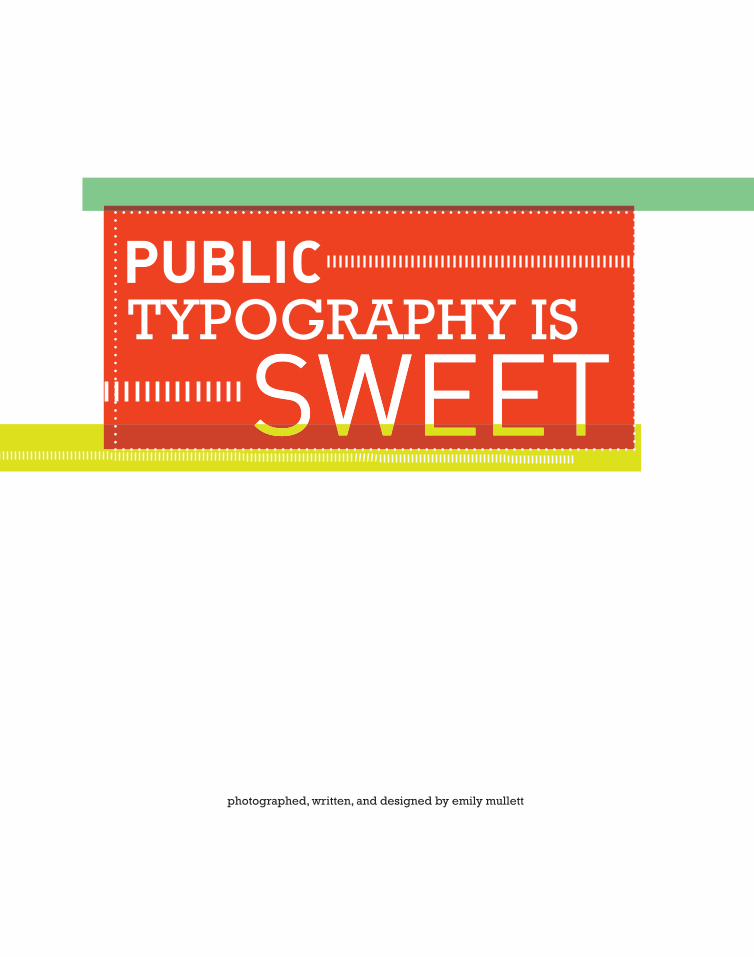
Public Typography is Sweet
42
TYPOGRAPHY IS photographed, written, and designed by emily mullett
-
Upload
emily-mullett -
Category
Documents
-
view
216 -
download
1
description
As graphic designers we spend much of our time working with typographic application for a variety of two-dimensional surfaces from magazines to computer screens. There is however, a world of rich typographic experience both formal and informal in signs, graffiti, and other forms of lettering that inhabit our everyday environment. For this project I chose to focus on public typography on candy packages. I photographed, wrote and designed the book that encases how I view beautiful typography on candy wrappers.
Transcript of Public Typography is Sweet
TYPOGRAPHY IS
photographed, written, and designed by emily mullett
Typography is everywhere. It is found in places where people do
not expect it to be and it is often overlooked, impacting people in
ways they are unaware of. Type is often used to draw attention
to particular advertisements and products, combined with an
efficient use of color, shapes, and images. Typography can
infl uence small decisions like what cereal will be purchased or
where consumers shop, and are often strongly associated with
brands. In general, typography on packaging is not outstanding.
It is often monotonous and boring; designers get limited space
and tons of text to add, but when the typography is done well, it is
quite astonishing. Candy wrappers are no different; they come
in a variety of styles and can display beautiful typography. The
typography on the candy found at World Market, Target, and
The Merc varied greatly from store to store.
2


WORLD MARKET is a store that brings the
beauty and excitement of global bazaars to the
customer. Cost Plus World Market was started
by a businessman in 1958, and the company
continues to carry great housewares, jewelry,
wines, and food from all over the world.

The packaging for Glee Gum is retro and
fantastic. The use of bold color and type-
faces makes this packaging strong.
ackaging, from its label to its texture and aesthetic appeal,
has always played a part in distinguishing one product from
another, and it serves as a functional connection between
consumer and product. Packaging plays a role in whether it
will be purchased or not; the consumer likes to connect and
respond to the wrappers. Stafford Cliff, author of 50 Trade
Secrets of Great Design Packaging said “part of the joy of
packaging is touching it, seeing how it catches the light, how
its three-dimensional character trigger responses.”

Sugar was expensive in the
Middle Ages and it was a
product that was available only
to the wealthy.
bet’cha didn’t know:
“Good packaging design is a key part of retail success.”
[CONWAY LLOYD MORGAN]PACKAGING DESIGN
7
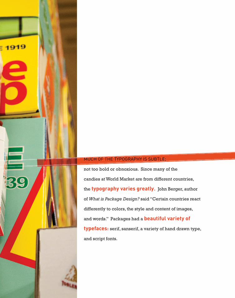
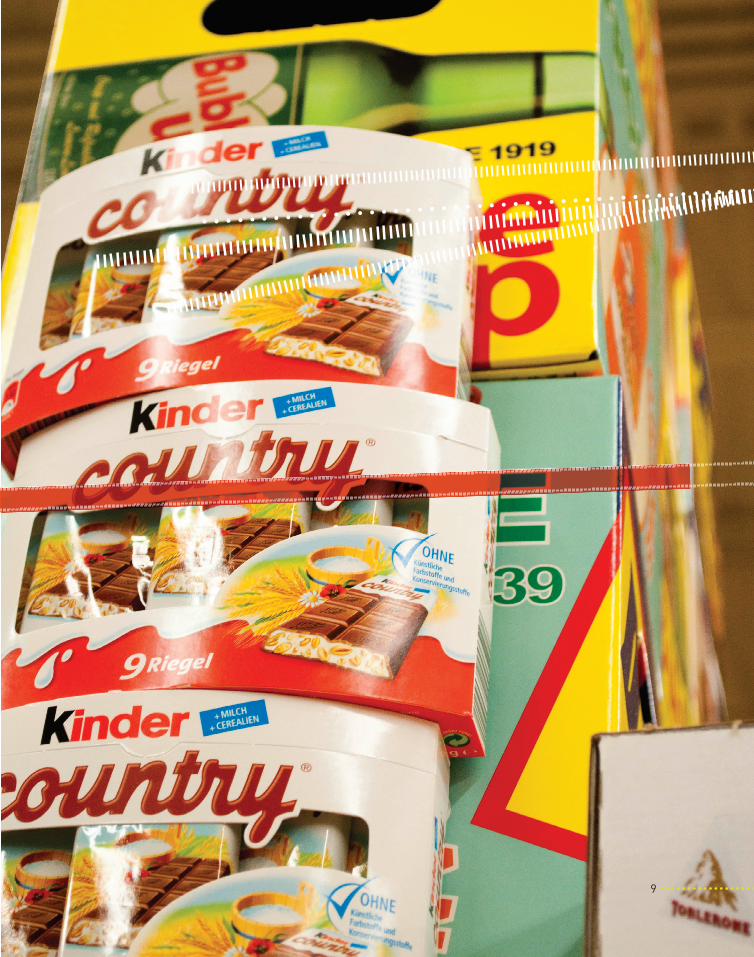
MUCH OF THE TYPOGRAPHY IS SUBTLE;
not too bold or obnoxious. Since many of the
candies at World Market are from different countries,
the typography varies greatly. John Berger, author
of What is Package Design? said “Certain countries react
differently to colors, the style and content of images,
and words.” Packages had a beautiful variety of
typefaces : serif, sanserif, a variety of hand drawn type,
and script fonts.
MUCH OF THE TYPOGRAPHY IS SUBTLE;
9

Milk chocolate was made by
Switzerland’s David Peter who
added milk and created the
fi rst milk chocolate in 1876.
bet’cha didn’t know:

The packages for Chimes
Gourmet Ginger Chews
candy are beautifully
designed with hand
lettering and illustrations.
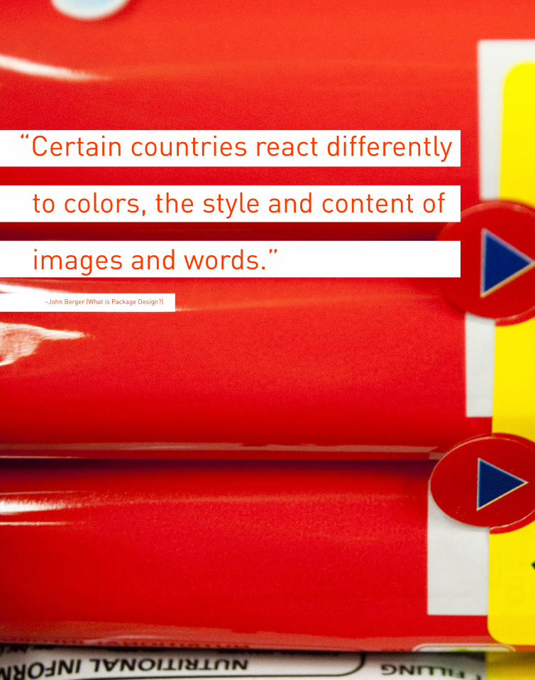
“Certain countries react differently
to colors, the style and content of
images and words.”–John Berger (What is Package Design?)

>> duplo is a candy created by the Italian candy company Ferrero.
>> Chocolove candy bars are come in a variety of exotic fl avors and their wrappers are boldly colored.
>>The typeface on these Brix chocolate bars was one of the few serif typefaces in the store.
14
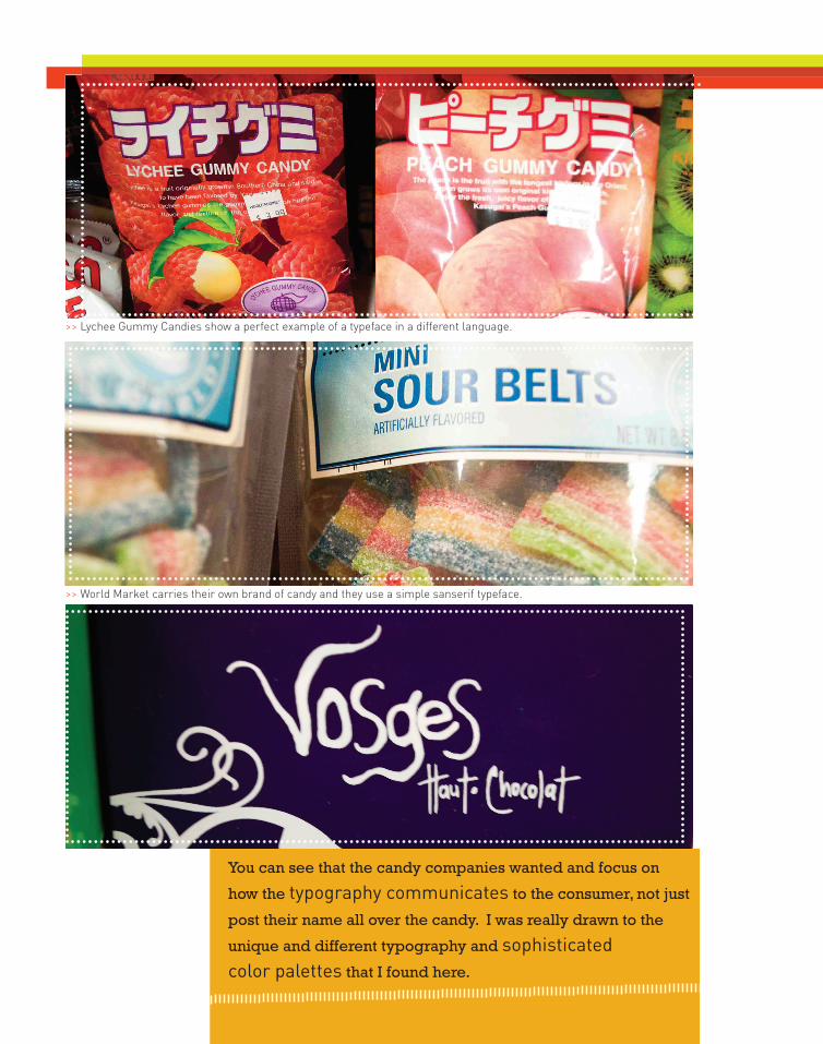
>> Lychee Gummy Candies show a perfect example of a typeface in a different language.
>> World Market carries their own brand of candy and they use a simple sanserif typeface.
You can see that the candy companies wanted and focus on
how the typography communicates to the consumer, not just
post their name all over the candy. I was really drawn to the
unique and different typography and sophisticated color palettes that I found here.
`
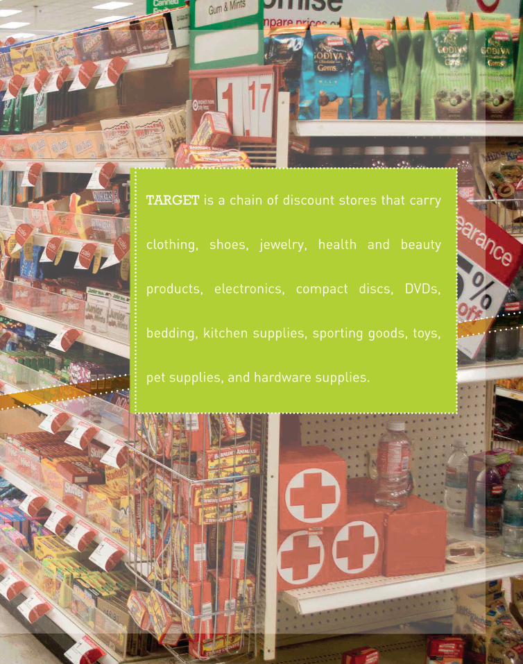
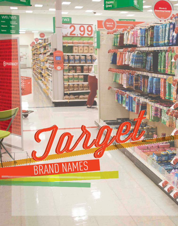
TARGET is a chain of discount stores that carry
clothing, shoes, jewelry, health and beauty
products, electronics, compact discs, DVDs,
bedding, kitchen supplies, sporting goods, toys,
pet supplies, and hardware supplies.
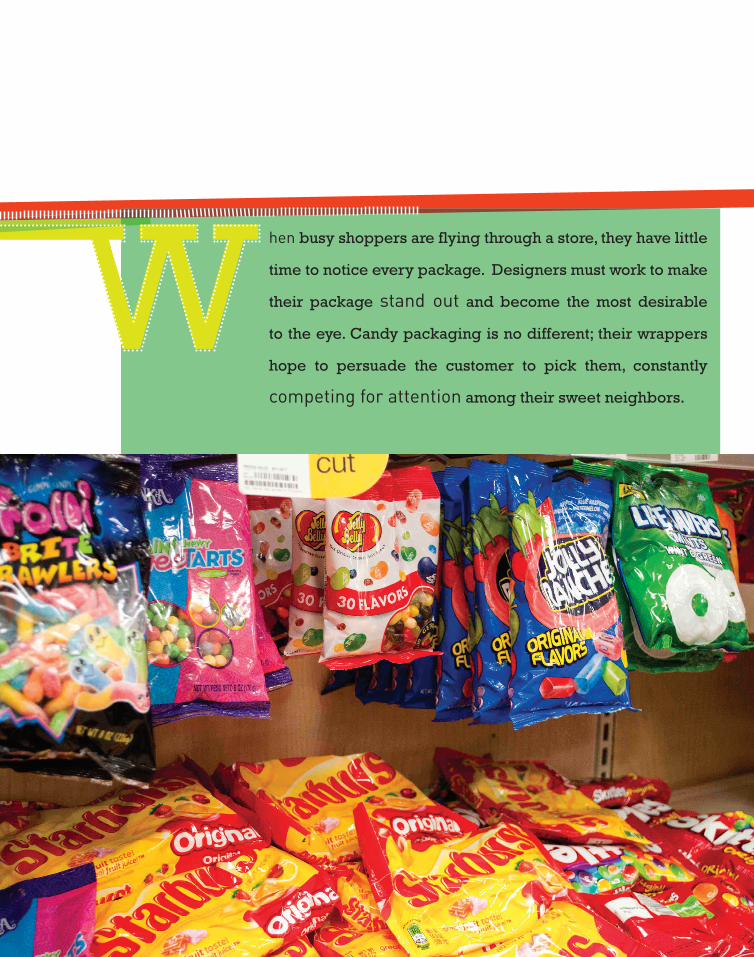
hen busy shoppers are flying through a store, they have little
time to notice every package. Designers must work to make
their package stand out and become the most desirable
to the eye. Candy packaging is no different; their wrappers
hope to persuade the customer to pick them, constantly
competing for attention among their sweet neighbors.

Over 35 million pounds of
candy corn are made each year.
bet’cha didn’t know:
19

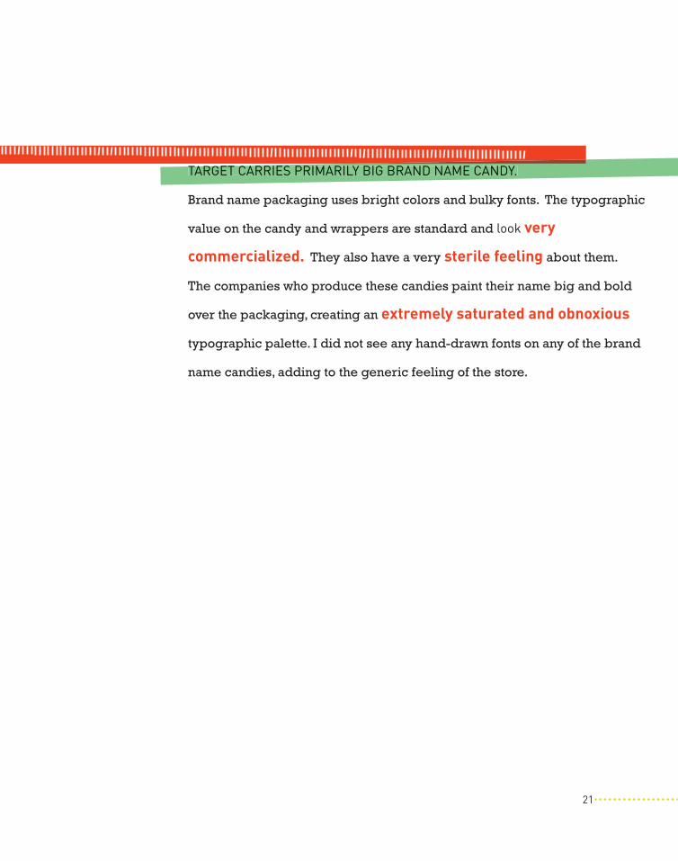
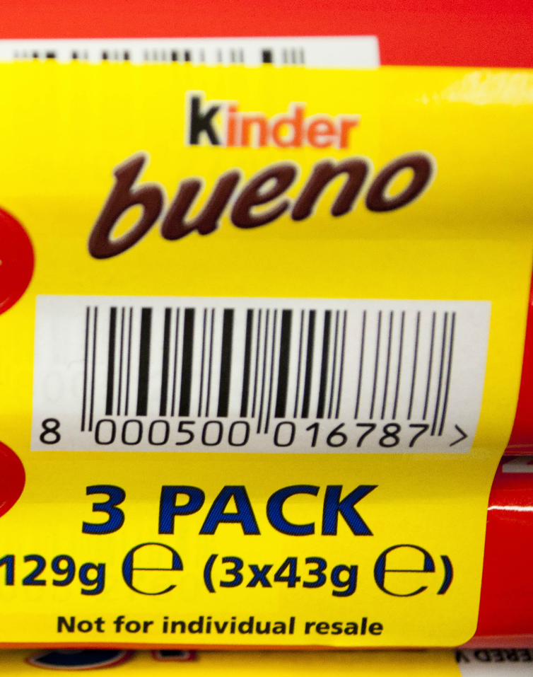
TARGET CARRIES PRIMARILY BIG BRAND NAME CANDY.
Brand name packaging uses bright colors and bulky fonts. The typographic
value on the candy and wrappers are standard and look very
commercialized. They also have a very sterile feeling about them.
The companies who produce these candies paint their name big and bold
over the packaging, creating an extremely saturated and obnoxious
typographic palette. I did not see any hand-drawn fonts on any of the brand
name candies, adding to the generic feeling of the store.
TARGET CARRIES PRIMARILY BIG BRAND NAME CANDY.
21


“Typographic selection is
important when considering
a brand’s personality.” –John Berger (What is Package Design?)
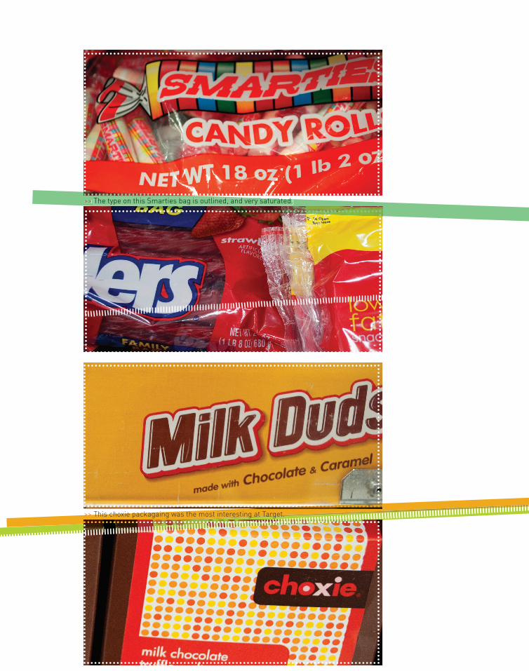
>> The type on this Smarties bag is outlined, and very saturated.
>> This choxie packagaing was the most interesting at Target.
>> The type on this Smarties bag is outlined, and very saturated.

The typography found at target is very standard. Some text is
outlined to add emphasis, as found on the Twizzler and Milk
Duds packaging. Bright, saturated colors were found every-
where, not allowing the consumer’s eye to rest anywhere.
>> The type on this Smarties bag is outlined, and very saturated.
>> The isle markers found in Target are bright too. >> This choxie packagaing was the most interesting at Target.
25

Seven billion pounds of candy
and chocolate are made in the
United States every year.
bet’cha didn’t know:
26
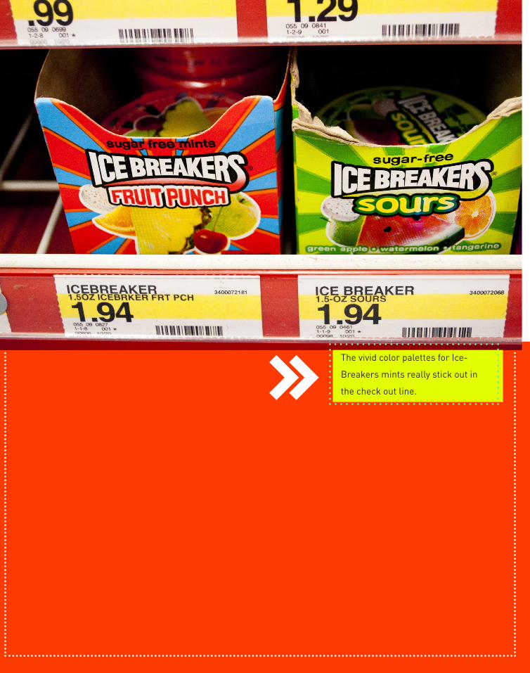
The vivid color palettes for Ice-
Breakers mints really stick out in
the check out line.


THE MERC is a thriving Lawrence, Kansas co-
operative grocery store. They provide a variety
of products that are organic, fair-trade, and
local. The Merc is an organization that exem-
plifies environmental, economic, and social
sustainability, as well as encourages a sense
of connection to others.
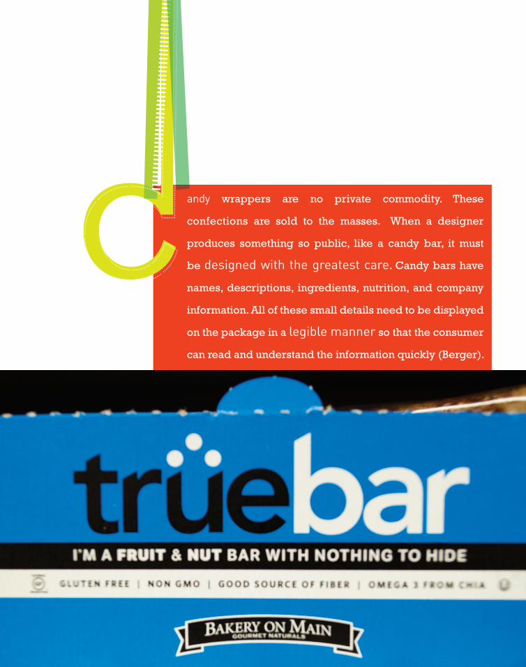
andy wrappers are no private commodity. These
confections are sold to the masses. When a designer
produces something so public, like a candy bar, it must
be designed with the greatest care. Candy bars have
names, descriptions, ingredients, nutrition, and company
information. All of these small details need to be displayed
on the package in a legible manner so that the consumer
can read and understand the information quickly (Berger).

All of the candy at The Merc had great color on
the packaging, and the typography was really
strong; each package was unique.
31
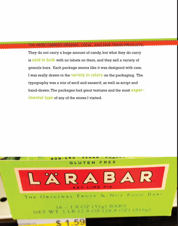
THE MERC CARRIES ORGANIC, LOCAL, AND FAIR TRADE PRODUCTS.
They do not carry a huge amount of candy, but what they do carry
is sold in bulk with no labels on them, and they sell a variety of
granola bars. Each package seems like it was designed with care.
I was really drawn to the variety in colors on the packaging. The
typography was a mix of serif and sanserif, as well as script and
hand-drawn. The packages had great textures and the most exper-
imental type of any of the stores I visited.
THE MERC CARRIES ORGANIC, LOCAL, AND FAIR TRADE PRODUCTS.
33


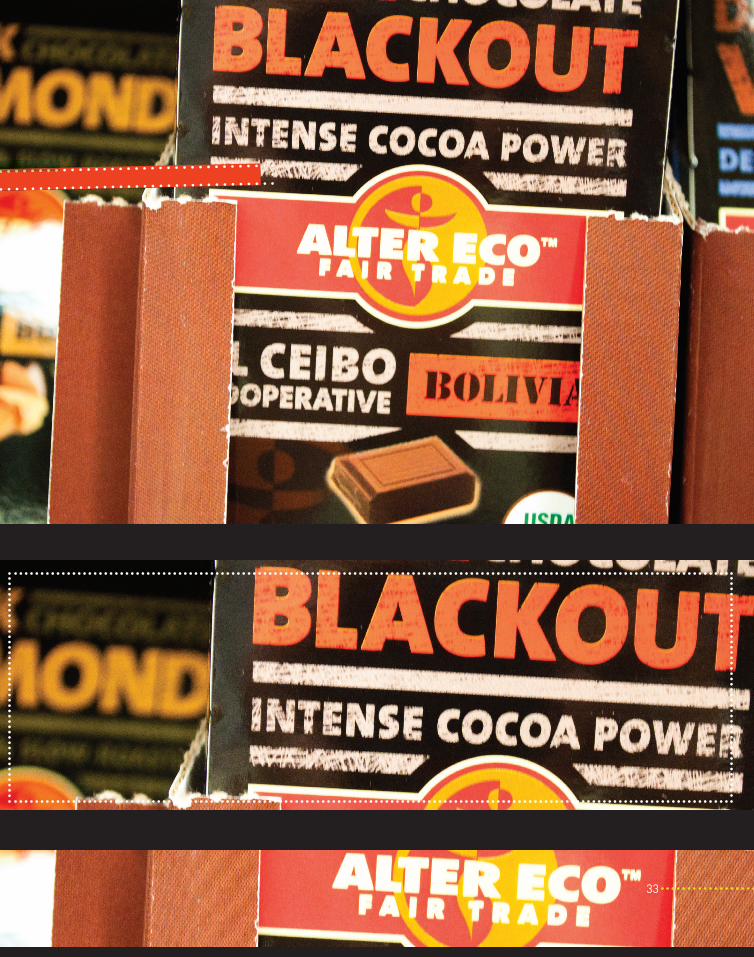
The hand-drawn typography on the packag-
es seen here is pleasing to the eye and draws
the customer’s attention to the product.
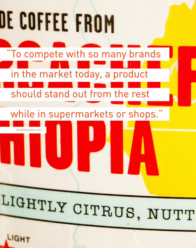
“ To compete with so many brands
in the market today, a product
should stand out from the rest
while in supermarkets or shops.”bestdesignoptions.com


World Market, Target, and The Merc all carry candy that
visually varies from each other. Many products and brands,
including candy, are closely tied to the typography on their
wrappers. While some candy packaging is very generic
and plain, some typography is beautifully done, and leaves
the customer ashtonished at the type in front of them. In
a world that is visually dominated by the typography that
surrounds us, typography is constantly impacting the world
in a variety of ways we do not expect.
41

thanks to these sources:• designer-daily.com
• countrycandydelights.com
• bestdesignoptions.com
• What is Package Design? By
John Berger
• 50 Trade Secrets of Great Design
Packaging By Stafford Cliff
•Packaging Design By Conway
Lloyd Morgan
typefaces:DIN [Regular, Bold]
Rockwell [Regular, Bold]
Wisdom Script
camera:nikon d5000
Emily Mullett
Designer as Author
Patrick Dooley
University of Kansas
Fall 2011