Probability and Statistics (Basic) - CK-12...
156
Transcript of Probability and Statistics (Basic) - CK-12...
Probability and Statistics (Basic)
CK-12 Foundation

CK-12 Foundation is a non-profit organization with a mission to reduce the cost of textbookmaterials for the K-12 market both in the U.S. and worldwide. Using an open-content, web-based collaborative model termed the “FlexBook,” CK-12 intends to pioneer the generationand distribution of high-quality educational content that will serve both as core text as wellas provide an adaptive environment for learning.
Except as otherwise noted, all CK-12 Content (including CK-12 Curriculum Material)is made available to Users in accordance with the Creative Commons Attribution/Non-Commercial/Share Alike 3.0 Unported (CC-by-NC-SA) License (http://creativecommons.org/licenses/by-nc-sa/3.0/), as amended and updated by Creative Commons from timeto time (the “CC License”), which is incorporated herein by this reference. Specific detailscan be found at http://about.ck12.org/terms.
Copyright © 2009 CK-12 Foundation, www.ck12.org

iii
Author
Brenda Meery
Supported by CK-12 Foundation

iv
v
Contents
1 An Introduction to Independent Events
1.1 Independent Events
2 An Introduction to Conditional Probability
2.1 Conditional Probability
3 Discrete Random Variables
3.1 Discrete Random Variables
4 Standard Distributions
4.1 Standard Distributions
5 The Shape, Center and Spread of a Normal Distribution
5.1 Estimating the Mean and Standard Deviation of a Normal Distribution
5.2 Calculating the Standard Deviation
5.3 Connecting the Standard Deviation and Normal Distribution
6 Measures of Central Tendency
6.1 The Mean
6.2 The Median
6.3 The Mode
7 Organizing and Displaying Data
7.1 Line Graphs and Scatter Plots
7.2 Bar Graphs, Histograms, and Stem-and-Leaf Plots
7.3 Box-and-Whisker Plots

vi

1
Chapter 1
An Introduction to Independent Events
1.1 Independent Events
Learning Objectives
Know the definition of the notion of independent events.
Use the rules for addition, multiplication, and complementation to solve for probabilities
of particular events in finite sample spaces.
What is Probability?
The simplest definition of probability is the likelihood of an event. If, for example, you were
asked what the probability is that the sun will rise in the east, your likely response would be
100%. We all know that the sun rises in the east and sets in the west. Therefore, the likelihood
that the sun will rise in the east is 100% (or all the time). If, however, you were asked the
likelihood that you were going to eat carrots for lunch, the probability of this happening is not as
easy to answer.
Sometimes probabilities can be calculated or even logically deduced. For example, if you were to
flip a coin, you have a 50/50 chance of landing on heads so the probability of getting heads is
50%. The likelihood of landing on heads (rather than tails) is 50% or ½. This is easily figured out
more so than the probability of eating carrots at lunch.
Probability and Weather Forecasting
Meteorologists use probability to determine the weather. In Manhattan on a day in February, the
probability of precipitation (P.O.P.) was projected to be 0.30 or 30%. When meteorologists say
the P.O.P. is 0.30 or 30%, they are saying that there is a 30% chance that somewhere in your area
there will be snow (in cold weather) or rain (in warm weather) or a mixture of both. If you were
planning on going to the beach and the P.O.P. was 0.75, would you go? Would you go if the
P.O.P. was 0.25?

2
However, probability isn‟t just used for weather forecasting. We use it everywhere. When you
roll a die you can calculate the probability of rolling a six (or a three), when you draw a card
from a deck of cards, you can calculate the probability of drawing a spade (or a face card), when
you play the lottery, when you read market studies they quote probabilities. Yes, probabilities
affect us in many ways.
Bias and Probability
A. Eric Hawkins is taking science, math, and English, this semester. There are 30 people in each
of his classes. Of these 30 people, 25 passed the science mid-semester test, 24 passed the
mid-semester math test, and 28 passed the mid-semester English test. He found out that 4
students passed both math and science tests. Eric found out he passed all three tests.
(a) Draw a VENN DIAGRAM to represent the students who passed and failed each test.
(b) If a student‟s chance of passing math is 70%, and passing science is 60%, and passing
both is 40%, what is the probability that a student, chosen at random, will pass math or
science.
At the end of the lesson, you should be able to answer this question. Let‟s begin.
Probability and Odds
The probability of something occurring is not the same as the odds of an event occurring. Look
at the two formulas below.
Probability ( )number of ways to get success
successtotal number of possible outcomes
Odds ( )number of ways to get success
successnumber of ways to not get success
What do you see as the difference between the two formulas? Let‟s look at an example.
3
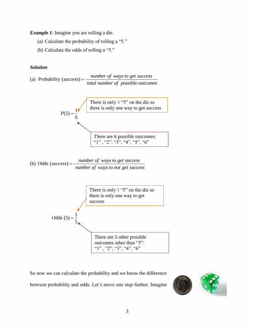
Example 1: Imagine you are rolling a die.
(a) Calculate the probability of rolling a “5.”
(b) Calculate the odds of rolling a “5.”
Solution
(a) Probability ( )number of ways to get success
successtotal number of possible outcomes
1(5)
6P
(b) Odds ( )number of ways to get success
successnumber of ways to not get success
1
Odds (5)5
So now we can calculate the probability and we know the difference
between probability and odds. Let‟s move one step further. Imagine
There are 6 possible outcomes:
“1” , “2”, “3”, “4”, “5”, “6”
There is only 1 “5” on the die so
there is only one way to get
success
There are 5 other possible
outcomes other than “5”:
“1” , “2”, “3”, “4”, “6”
There is only 1 “5” on the die so
there is only one way to get success

4
now you were rolling a die and tossing a coin. What is the probability of rolling a 5 and flipping
the coin to get heads?
Solution
Probability ( )number of ways to get success
successtotal number of possible outcomes
Die: 6
1)5( P
Coin: 1
( )2
P H
Die and Coin: 2
1
6
1)5( HANDP
12
1)5( HANDP
The previous question is an example of an INDEPENDENT EVENT. When two events occur
in such a way that the probability of one is independent of the probability of the other, the two
are said to be independent. Can you think of some examples of independent events?
Roll two dice. If one die roll was a six (6), does this mean the other die rolled
cannot be a six? Of course not! The two dies are independent. Rolling one die is
independent of the roll of the second die. The same is true if you choose a red candy from a
candy dish and flip a coin to get heads. The probability of these two events occurring is also
independent.

5
We often represent an independent event in a VENN DIAGRAM. Look at the diagrams below.
A and B are two events in a sample space.
For independent events, the VENN DIAGRAM will show that all the events belong to sets A
AND B.
A AND B
A ∩ B
Example 2: Two cards are chosen from a deck of cards. What is the probability that they both
will be face cards?
Solution
Let A = 1st Face card chosen
Let B = 2nd
Face card chosen
A B
A B

6
A little note about a deck of cards
A deck of cards = 52 cards
Each deck has four parts (suits) with 13 cards in them.
Each suit has 3 face cards.
Therefore, the total number of face cards in the deck = 4 3 = 12
12( )
52P A
11( )
51P B
12 11( )
52 51P A AND B or
12 11 33( )
52 51 663P A B
221
11)( BAP
Example 3: You have different pairs of gloves of the following colors: blue, brown, red, white
and black. Each pair is folded together in matching pairs and put away in your closet. You reach
into the closet and choose a pair of gloves. The first pair you pull out is blue. You replace this
pair and choose another pair. What is the probability that you will choose the blue pair of gloves
twice?
52 cards = 1 deck
13 spades 13 hearts 13 clubs 13 diamonds
♠ ♥ ♣ ♦
4 suits 3 face cards per suit

7
Solution:
Probabilities: P(blue) = 5
1
P(blue and blue) = P(blue ∩ blue) = P(blue) P(blue)
= 5
1
5
1
= 25
1
What if you were to choose a blue pair of gloves or a red pair of gloves? How would this change
the probability? The word OR changes our view of probability. We have, up until now worked
with the word AND. Going back to our VENN DIAGRAM, we can see that the sample space
increases for A or B.
A OR B
A ∪ B
5 pairs of gloves
A B
A B
8
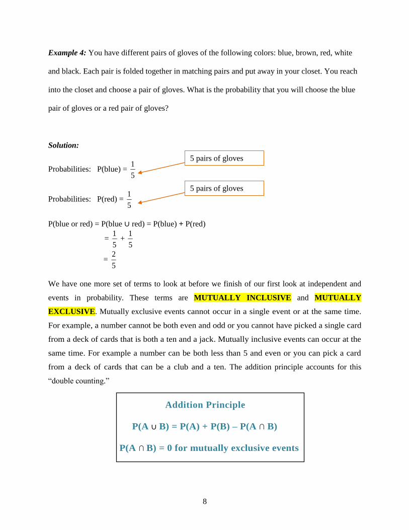
Example 4: You have different pairs of gloves of the following colors: blue, brown, red, white
and black. Each pair is folded together in matching pairs and put away in your closet. You reach
into the closet and choose a pair of gloves. What is the probability that you will choose the blue
pair of gloves or a red pair of gloves?
Solution:
Probabilities: P(blue) = 5
1
Probabilities: P(red) = 5
1
P(blue or red) = P(blue ∪ red) = P(blue) + P(red)
= 5
1 +
5
1
= 5
2
We have one more set of terms to look at before we finish of our first look at independent and
events in probability. These terms are MUTUALLY INCLUSIVE and MUTUALLY
EXCLUSIVE. Mutually exclusive events cannot occur in a single event or at the same time.
For example, a number cannot be both even and odd or you cannot have picked a single card
from a deck of cards that is both a ten and a jack. Mutually inclusive events can occur at the
same time. For example a number can be both less than 5 and even or you can pick a card
from a deck of cards that can be a club and a ten. The addition principle accounts for this
“double counting.”
Addition Principle
P(A ∪ B) = P(A) + P(B) – P(A ∩ B)
P(A ∩ B) = 0 for mutually exclusive events
5 pairs of gloves
5 pairs of gloves

9
Example 5: Two cards are drawn from a deck of cards. A: 1
s t ca rd is a c lub
B: 1s t
ca rd i s a 7
C: 2n d
ca rd is a hea r t
Find the following probabilities:
(a) P(A or B)
(b) P (B or A)
(c) P (A and C)
Solution:
(a) 52
1
52
4
52
13)( BorAP
52
16)( BorAP
13
4)( BorAP
(b) 52
1
52
13
52
4)( AorBP
52
16)( AorBP
13
4)( AorBP
(c) 52
13
52
13)( CandAP
2704
169)( CandAP
16
1)( CandAP
10
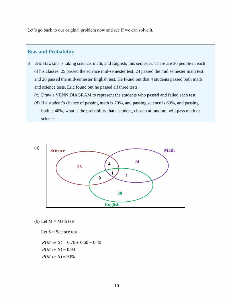
Let‟s go back to our original problem now and see if we can solve it.
Bias and Probability
B. Eric Hawkins is taking science, math, and English, this semester. There are 30 people in each
of his classes. 25 passed the science mid-semester test, 24 passed the mid semester math test,
and 28 passed the mid-semester English test. He found out that 4 students passed both math
and science tests. Eric found out he passed all three tests.
(c) Draw a VENN DIAGRAM to represent the students who passed and failed each test.
(d) If a student‟s chance of passing math is 70%, and passing science is 60%, and passing
both is 40%, what is the probability that a student, chosen at random, will pass math or
science.
(a)
(b) Let M = Math test
Let S = Science test
40.060.070.0)( SorMP
90.0)( SorMP
( ) 90%P M or S
Science Math
English
28
24 25
4
1 1
0
11
Lesson Summary
Probability and odds are two important terms that must be identified and kept clear in our minds.
The fact remains that probability affects almost every part of our lives. In order to determine
probability mathematically, we need to consider other definitions such as the difference between
independent and dependent events, as well as the difference between a mutually exclusive event
and a mutually inclusive event. The calculations involved in probability are dependent on the
distinction between these (no pun intended!). For mutually inclusive events, it is important to
remember the addition rule so that we do not double count in our calculations.
Points to Consider
Why is the term probability more useful than the term odds?
Are VENN DIAGRAMS a useful tool for visualizing probability events?
Vocabulary
Dependent Events – Two or more events whose outcomes affect each other. The probability of
occurrence of one event depends on the occurrence of the other.
Independent Events – Two or more events whose outcomes do not affect each other.
Mutually Exclusive Events – Two outcomes or events are mutually exclusive when they cannot
both occur simultaneously.
Mutually Inclusive Events – Two outcomes or events are mutually exclusive when they can
both occur simultaneously.
Outcome – A possible result of one trial of a probability experiment.
Probability – The chance that something will happen.
Random Sample – A sample in which everyone in a population has an equal chance of being
selected; not only is each person or thing equally likely, but all groups of
persons or things are also equally likely.
12
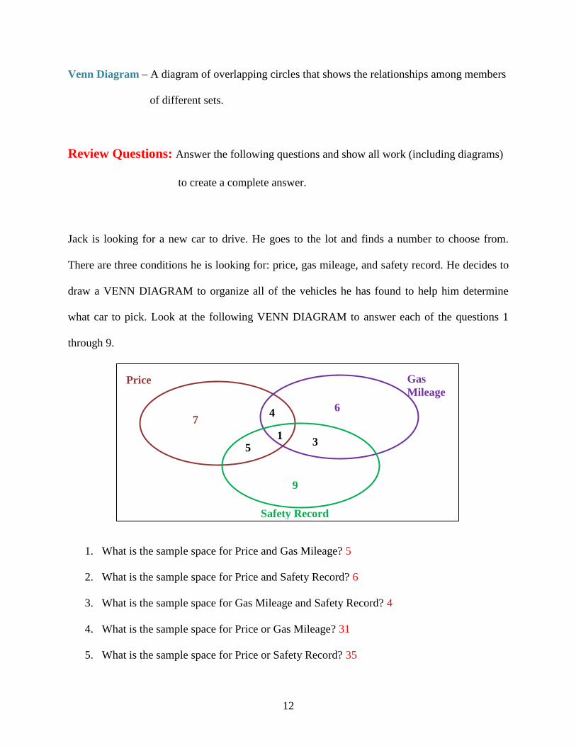
Venn Diagram – A diagram of overlapping circles that shows the relationships among members
of different sets.
Review Questions: Answer the following questions and show all work (including diagrams)
to create a complete answer.
Jack is looking for a new car to drive. He goes to the lot and finds a number to choose from.
There are three conditions he is looking for: price, gas mileage, and safety record. He decides to
draw a VENN DIAGRAM to organize all of the vehicles he has found to help him determine
what car to pick. Look at the following VENN DIAGRAM to answer each of the questions 1
through 9.
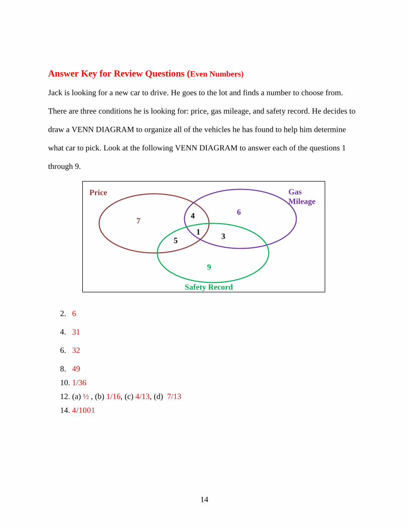
1. What is the sample space for Price and Gas Mileage? 5
2. What is the sample space for Price and Safety Record? 6
3. What is the sample space for Gas Mileage and Safety Record? 4
4. What is the sample space for Price or Gas Mileage? 31
5. What is the sample space for Price or Safety Record? 35
Price Gas
Mileage
Safety Record
9
6 7
4
1 3
5
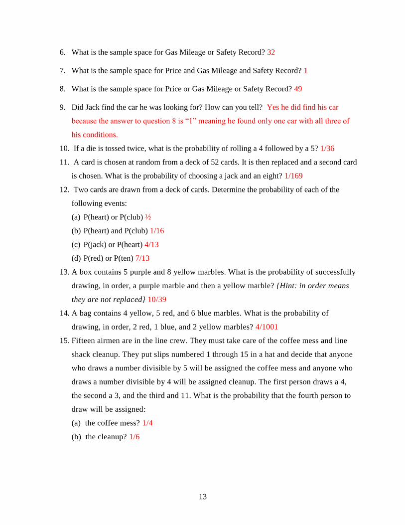
13
6. What is the sample space for Gas Mileage or Safety Record? 32
7. What is the sample space for Price and Gas Mileage and Safety Record? 1
8. What is the sample space for Price or Gas Mileage or Safety Record? 49
9. Did Jack find the car he was looking for? How can you tell? Yes he did find his car
because the answer to question 8 is “1” meaning he found only one car with all three of
his conditions. 10. If a die is tossed twice, what is the probability of rolling a 4 followed by a 5? 1/36
11. A card is chosen at random from a deck of 52 cards. It is then replaced and a second card
is chosen. What is the probability of choosing a jack and an eight? 1/169
12. Two cards are drawn from a deck of cards. Determine the probability of each of the
following events:
(a) P(heart) or P(club) ½
(b) P(heart) and P(club) 1/16
(c) P(jack) or P(heart) 4/13
(d) P(red) or P(ten) 7/13
13. A box contains 5 purple and 8 yellow marbles. What is the probability of successfully
drawing, in order, a purple marble and then a yellow marble? {Hint: in order means
they are not replaced} 10/39
14. A bag contains 4 yellow, 5 red, and 6 blue marbles. What is the probability of
drawing, in order, 2 red, 1 blue, and 2 yellow marbles? 4/1001
15. Fifteen airmen are in the line crew. They must take care of the coffee mess and line
shack cleanup. They put slips numbered 1 through 15 in a hat and decide that anyone
who draws a number divisible by 5 will be assigned the coffee mess and anyone who
draws a number divisible by 4 will be assigned cleanup. The first person draws a 4,
the second a 3, and the third and 11. What is the probability that the fourth person to
draw will be assigned:
(a) the coffee mess? 1/4
(b) the cleanup? 1/6
14
Answer Key for Review Questions (Even Numbers)
Jack is looking for a new car to drive. He goes to the lot and finds a number to choose from.
There are three conditions he is looking for: price, gas mileage, and safety record. He decides to
draw a VENN DIAGRAM to organize all of the vehicles he has found to help him determine
what car to pick. Look at the following VENN DIAGRAM to answer each of the questions 1
through 9.
2. 6
4. 31
6. 32
8. 49 10. 1/36
12. (a) ½ , (b) 1/16, (c) 4/13, (d) 7/13
14. 4/1001
Price Gas
Mileage
Safety Record
9
6 7
4
1 3
5

15
INDEPENDENT EVENTS – Outcomes of events are
not affected by other events (in other words – random
events).
DEPENDENT EVENTS – The outcome of one event
is affected by another event.
MUTUALLY EXCLUSIVE EVENTS – When two
events cannot occur at the same time (in a single roll,
rolling a 3 on a die and rolling an even number on a
die are mutually exclusive).
MUTUALLY INCLUSIVE EVENTS – When two
events can occur at the same time (in a single roll,
rolling a 3 on a die and rolling an odd number on a
die are mutually exclusive).
Chapter 2
An Introduction to Conditional Probability
2.1 Conditional Probability
Learning Objectives
Know the definition of conditional probability.
Use conditional probability to solve for probabilities in finite sample spaces.
In the previous section we looked at
probability in terms of events that
are independent and dependent,
mutually inclusive and mutually
exclusive. Take a look in the box to
your left just to recall the definitions
of these terms.
The next type of event probability is called CONDITIONAL PROBABILITY. With
conditional probability, the probability of the second event DEPENDS ON the probability of
the first event.

16
)(
)()(
AP
BAPABP
( )( )
( )
P first choice and second choiceP second first
P first choice
Conditional Probability
P(A ∩ B) = P (A) × P (B│A)
Another way to look at the conditional probability formula is:
ABC High School students are required to write an entrance test to the statistics course before
beginning the course. The following table represents the data collected regarding this year‟s
group. The numbers represent the number of students in each group.
Studied Not Studied
Passed 17 3
Not Passed 2 23
Questions
1. Discover the following probabilities:
a. P(pass and studied)
b. P(studied) and
c. P(pass/studied)
Remember when you have completed this unit you will be see this problem again to solve it.
Let‟s work through a few examples of conditional probability to see how the formula works.
17
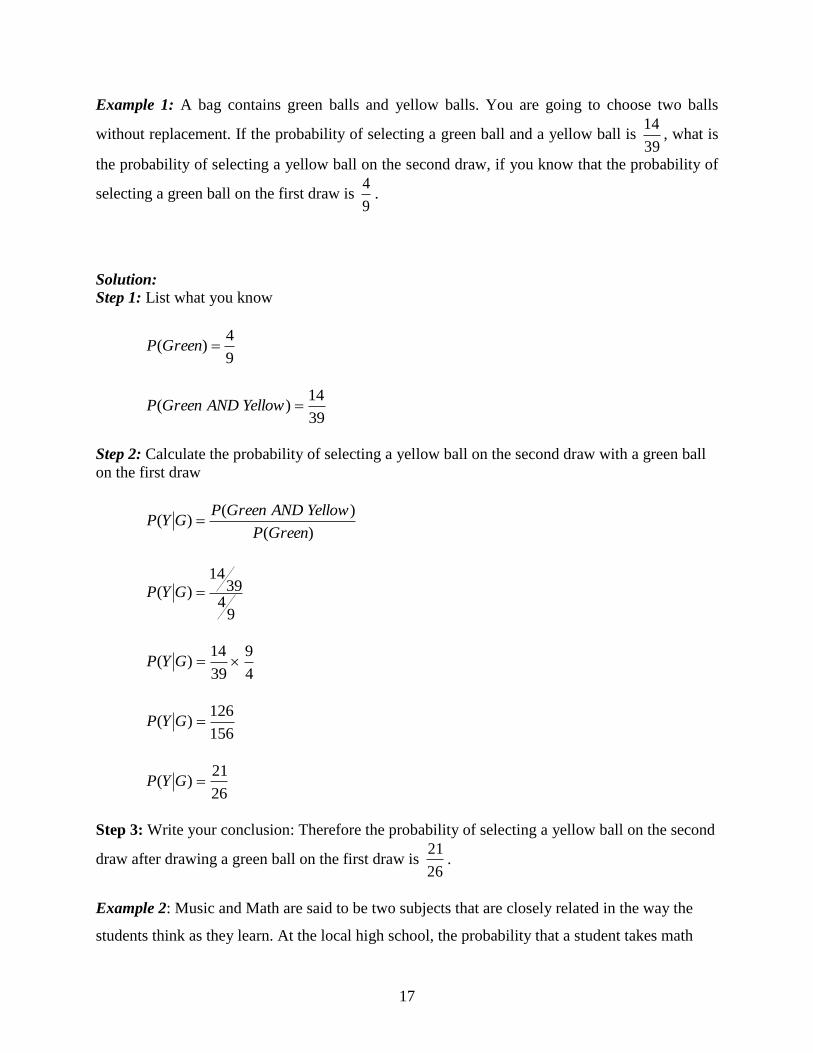
Example 1: A bag contains green balls and yellow balls. You are going to choose two balls
without replacement. If the probability of selecting a green ball and a yellow ball is 39
14, what is
the probability of selecting a yellow ball on the second draw, if you know that the probability of
selecting a green ball on the first draw is 9
4.
Solution: Step 1: List what you know
9
4)( GreenP
39
14)( YellowANDGreenP
Step 2: Calculate the probability of selecting a yellow ball on the second draw with a green ball
on the first draw
)(
)()(
GreenP
YellowANDGreenPGYP
94
3914
)( GYP
4
9
39
14)( GYP
156
126)( GYP
26
21)( GYP
Step 3: Write your conclusion: Therefore the probability of selecting a yellow ball on the second
draw after drawing a green ball on the first draw is 26
21.
Example 2: Music and Math are said to be two subjects that are closely related in the way the
students think as they learn. At the local high school, the probability that a student takes math

18
and music is 0.25. The probability that a student is taking math is 0.85. What is the probability
that a student that is in music is also choosing math?
Solution: Step 1: List what you know
85.0)( MathP
25.0)( MusicANDMathP
Step 2: Calculate the probability of choosing music as a second course when math is chosen as a
first course.
)(
)()(
MathP
MusicANDMathPMathMusicP
85.0
25.0)( MathMusicP
29.0)( MathMusicP
%29)( MathMusicP
Step 3: Write your conclusion: Therefore, the probability of selecting music as a second course
when math is chosen as a first course is 29%.
Example 3: The probability that it is Friday and that a student is absent is 0.05. Since there are 5
school days in a week, the probability that it is Friday is 5
1or 0.2. What is the probability that a
student is absent given that today is Friday?
Solution: Step 1: List what you know
20.0)( FridayP
05.0)( AbsentANDFridayP

19
Step 2: Calculate the probability of being absent from school as a second choice when Friday is
chosen as a first choice.
)(
)()(
FridayP
AbsentANDFridayPFridayAbsentP
20.0
05.0)( FridayAbsentP
25.0)( FridayAbsentP
%25)( FridayAbsentP
Step 3: Write your conclusion: Therefore the probability of being absent from school as a second
choice when the day, Friday, is chosen as a first choice is 25%.
Example 4: Students were asked to use computer simulations to help them in their studying of
mathematics. After a trial period, the students were surveyed to see if the technology helped
them study or did not. A control group was not allowed to use technology. They used a textbook
only. The following table represents the data collected regarding this group. The numbers
represent the number of students in each group.
Technology Textbooks
Improved studying 25 2
Did not improve studying 3 30
Discover the following probabilities:
a. P(Improved studying and used technology)
b. P(Improved studying and
c. P(Improved studying/used technology)
Solution: Total students = 25 + 2 + 3 + 30 = 60
a. P(Improved studying and used technology) = 60
25
P(Improved studying and used technology) = 60
25
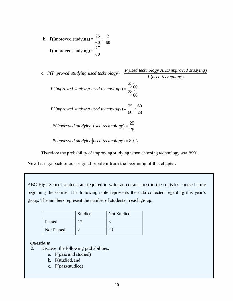
20
b. P(Improved studying) = 60
2
60
25
P(Improved studying) = 60
27
c. ( )
( )( )
P used technology AND improved studyingP Improved studying used technology
P used technology
2560( )
2860
P Improved studying used technology
25 60
( )60 28
P Improved studying used technology
25
( )28
P Improved studying used technology
( ) 89%P Improved studying used technology
Therefore the probability of improving studying when choosing technology was 89%.
Now let‟s go back to our original problem from the beginning of this chapter.
ABC High School students are required to write an entrance test to the statistics course before
beginning the course. The following table represents the data collected regarding this year‟s
group. The numbers represent the number of students in each group.
Studied Not Studied
Passed 17 3
Not Passed 2 23
Questions
2. Discover the following probabilities:
a. P(pass and studied)
b. P(studied, and
c. P(pass/studied)
21
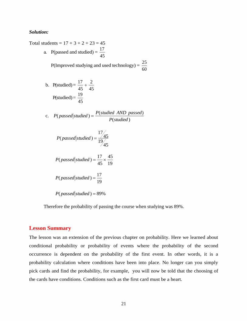
Solution:
Total students = 17 + 3 + 2 + 23 = 45
a. P(passed and studied) = 45
17
P(Improved studying and used technology) = 60
25
b. P(studied) = 45
2
45
17
P(studied) = 45
19
c. )(
)()(
studiedP
passedANDstudiedPstudiedpassedP
4519
4517
)( studiedpassedP
19
45
45
17)( studiedpassedP
19
17)( studiedpassedP
%89)( studiedpassedP
Therefore the probability of passing the course when studying was 89%.
Lesson Summary
The lesson was an extension of the previous chapter on probability. Here we learned about
conditional probability or probability of events where the probability of the second
occurrence is dependent on the probability of the first event. In other words, it is a
probability calculation where conditions have been into place. No longer can you simply
pick cards and find the probability, for example, you will now be told that the choosing of
the cards have conditions. Conditions such as the first card must be a heart.
22
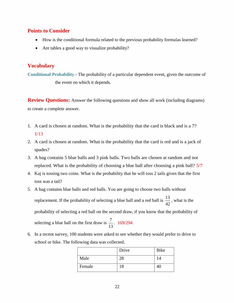
Points to Consider
How is the conditional formula related to the previous probability formulas learned?
Are tables a good way to visualize probability?
Vocabulary
Conditional Probability - The probability of a particular dependent event, given the outcome of
the event on which it depends.
Review Questions: Answer the following questions and show all work (including diagrams)
to create a complete answer.
1. A card is chosen at random. What is the probability that the card is black and is a 7?
1/13
2. A card is chosen at random. What is the probability that the card is red and is a jack of
spades?
3. A bag contains 5 blue balls and 3 pink balls. Two balls are chosen at random and not
replaced. What is the probability of choosing a blue ball after choosing a pink ball? 5/7
4. Kaj is tossing two coins. What is the probability that he will toss 2 tails given that the first
toss was a tail?
5. A bag contains blue balls and red balls. You are going to choose two balls without
replacement. If the probability of selecting a blue ball and a red ball is 42
13, what is the
probability of selecting a red ball on the second draw, if you know that the probability of
selecting a blue ball on the first draw is 13
7. 169/294
6. In a recent survey, 100 students were asked to see whether they would prefer to drive to
school or bike. The following data was collected.
Drive Bike
Male 28 14
Female 18 40

23
a. Find the probability that the person surveyed would want to drive, given that they are
female.
b. Find the probability that the person surveyed would be male, given that they would
want to bike to school.
7. The little league baseball team is open to both boys and girls. The probability that a person
joining the little league team and being a girl is 0.265. Of the 386 possible youth in the town
to play little league ball, only 157 are girls, or 40.7%. What is the probability that a youth
joining the league will be a girl? 265/407
Answer Key for Review Questions (even numbers)
2. 0
4. 1/3
6. a. 9/29
b. 7/27

24

25
Chapter 3
Discrete Random Variables
3.1 Discrete Random Variables
Learning Objectives
Demonstrate an understanding of the notion of discrete random variables by using them
to solve for the probabilities of outcomes, such as the probability of the occurrence of
five heads in 14 coin tosses.
You are in statistics class. Your teacher asks what the probability is of obtaining five heads if
you were to toss 14 coins.
(a) Determine the theoretical probability for the teacher.
(b) Use the TI calculator to determine the actual probability for a trial experiment for 20
trials.
Work through Chapter 3 and then revisit this problem to find the solution.
Whenever you run and experiment, flip a coin, roll a die, pick a card, you assign a number to
represent the value to the outcome that you get. This number that you assign is called a random
variable. For example, if you were to roll two dice and asked what the sum of the two dice
might be, you would design the following table of numerical values.
+ 1 2 3 4 5 6
1 2 3 4 5 6 7
2 3 4 5 6 7 8
3 4 5 6 7 8 9
4 5 6 7 8 9 10
5 6 7 8 9 10 11
6 7 8 9 10 11 12

26
These numerical values represent the possible outcomes of the rolling of two dice and summing
of the result. In other words, rolling one die and seeing a 6 while rolling a second die and seeing
a 4. Adding these values gives you a ten.
+ 1 2 3 4 5 6
1 2 3 4 5 6 7
2 3 4 5 6 7 8
3 4 5 6 7 8 9
4 5 6 7 8 9 10
5 6 7 8 9 10 11
6 7 8 9 10 11 12
The rolling of a die is interesting because there are only a certain number of possible outcomes
that you can get when you roll a typical die. In other words, a typical die has the numbers 1, 2, 3,
4, 5, and 6 on it and nothing else. A discrete random variable can only have a specific (or
finite) number of numerical values.
A random variable is simply the rule that assigns the number to the outcome. For our example
above, there are 36 possible combinations of the two dice being rolled. The discrete random
variables (or values) in our sample are 2, 3, 4, 5, 6, 7, 8, 9, 10, 11, and 12, as you can see in the
table below.
+ 1 2 3 4 5 6
1 2 3 4 5 6 7
2 3 4 5 6 7 8
3 4 5 6 7 8 9
4 5 6 7 8 9 10
5 6 7 8 9 10 11
6 7 8 9 10 11 12
We can have infinite discrete random variables if we think about things that we know have an
estimated number. Think about the number of stars in the universe. We know that there are not a
specific number that we have a way to count so this is an example of an infinite discrete random
variable. Another example would be with investments. If you were to invest $1000 at the start of
this year, you could only estimate the amount you would have at the end of this year.
Well, how does this relate to probability?

27
Example 1: Looking at the previous table, what is the probability that the sum of the two dice
rolled would be 4?
Solution:
+ 1 2 3 4 5 6
1 2 3 4 5 6 7
2 3 4 5 6 7 8
3 4 5 6 7 8 9
4 5 6 7 8 9 10
5 6 7 8 9 10 11
6 7 8 9 10 11 12
P(4) = 36
3
P(4) = 12
1
Example 2: A coin is tossed 3 times. What are the possible outcomes? What is the probability of
getting one head?
Solution:
T
H
H
T
H
T
H
Toss 1 Toss 2 Toss 3
T
T
H
H
T
H
T
Toss 1 Toss 2 Toss 3
If our first toss were a heads… If our first toss were a tails…

28
Therefore the possible outcomes are:
HHH, HHT, HTH, HTT, THH, THT, TTH, TTT
P(1 head) = 8
3
Alternate Solution:
We have one coin and want to find the probability of getting one head in three tosses. We need to
calculate two parts to solve the probability problem.
Numerator (Top)
In our example, we want to have 1 H and 2Ts. Our favorable outcomes would be any
combination of HTT. The number of favorable choices would be:
!!
!##
YletterXletter
ncombinatioinletterspossiblechoicesfavorableof
!2!1
!3#
tailshead
letterschoicesfavorableof
)12(1
123#
choicesfavorableof
2
6# choicesfavorableof = 3
Denominator (Bottom)
The number of possible outcomes = 2 × 2 × 2 = 8
We now want to find the number of possible times we
could get one head when we do these three tosses. We call
these favorable outcomes. Why? Because these are the
outcomes that we want to happen, therefore they
are favorable.
Now we just divide the numerator by the denominator.
8
3)1( headP
Remember:
Possible outcomes = 2n where n =
number of tosses.
Here we have 3 tosses. Therefore,
Possible outcomes = 2n
Possible outcomes = 23
Possible outcomes = 2 × 2 × 2
Possible outcomes = 8

29
Note: The factorial function (symbol: !) just means to multiply a series of descending natural
numbers.
Examples:
4! = 4 × 3 × 2 × 1 = 24
7! = 7 × 6 × 5 × 4 × 3 × 2 × 1 = 5040
1! = 1
Note: It is generally agreed that 0! = 1. It may seem funny that multiplying no numbers together
gets you 1, but it helps simplify a lot of equations.
Example 3: A coin is tossed 4 times. What are the possible outcomes? What is the probability of
getting one head?
Solution:
If our first toss were a tails…
H
T
H
T
H
T
H
T
T
T
H
H
T
H
T
Toss 1 Toss 2 Toss 3 Toss 4
If our first toss were a heads…
T
H
H
T
H
T
H
H
T
H
T
H
T
H
T
Toss 1 Toss 2 Toss 3 Toss 4
30
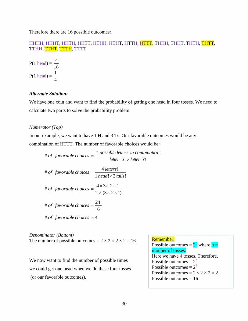
Therefore there are 16 possible outcomes:
HHHH, HHHT, HHTH, HHTT, HTHH, HTHT, HTTH, HTTT, THHH, THHT, THTH, THTT,
TTHH, TTHT, TTTH, TTTT
P(1 head) = 16
4
P(1 head) = 4
1
Alternate Solution:
We have one coin and want to find the probability of getting one head in four tosses. We need to
calculate two parts to solve the probability problem.
Numerator (Top)
In our example, we want to have 1 H and 3 Ts. Our favorable outcomes would be any
combination of HTTT. The number of favorable choices would be:
!!
!##
YletterXletter
ncombinatioinletterspossiblechoicesfavorableof
!3!1
!4#
tailshead
letterschoicesfavorableof
)123(1
1234#
choicesfavorableof
6
24# choicesfavorableof
4# choicesfavorableof
Denominator (Bottom)
The number of possible outcomes = 2 × 2 × 2 × 2 = 16
We now want to find the number of possible times
we could get one head when we do these four tosses
(or our favorable outcomes).
Remember:
Possible outcomes = 2n where n =
number of tosses.
Here we have 4 tosses. Therefore,
Possible outcomes = 2n
Possible outcomes = 24
Possible outcomes = 2 × 2 × 2 × 2
Possible outcomes = 16

31
Now we just divide the numerator by the denominator.
16
4)1( headP
4
1)1( headP
Technology Note:
Let‟s take a look at how we can do this using the TI-84 calculators. There is an application on
the TI calculators called the coin toss. Among others (including the dice roll, spinners, and
picking random numbers), the coin toss is an excellent application for when you what to find the
probabilities for a coin tossed more than 4 times or more than one coin being tossed multiple
times.
Let‟s say you want to see one coin being tossed one time. Here is what the calculator will show
and the key strokes to get to this toss.
Let‟s say you want to see one coin being tossed ten times. Here is what the calculator will show
and the key strokes to get to this sequence. Try it on your own.

32
We can actually see how many heads and tails occurred in the tossing of the 10 coins. If you
click on the right arrow (>) the frequency label will show you how many of the tosses came up
heads.
We could also use randBin to simulate the tossing of a coin. Follow the keystrokes below.
This list contains the count of heads resulting from each set of 10 coin tosses. If you use the right
arrow (>) you can see how many times from the 20 trials you actually had 4 heads.
10 tosses of
the coin Picked 20 trials
(could be given
another number)
Probability of
getting heads is
50% or 0.5

33
Now let‟s go back to our original chapter problem and see if we have gained enough knowledge
to answer it.
You are in statistics class. Your teacher asks what the probability is of obtaining five heads if
you were to toss 14 coins.
(a) Determine the theoretical probability for the teacher.
(b) Use the TI calculator to determine the actual probability for a trial experiment for 20
trials.
Solution
(a) Let‟s calculate the theoretical probability of getting 5 heads for the 14 tosses.
Numerator (Top)
In our example, we want to have 5 H and 9 Ts. Our favorable outcomes would be any
combination of HHHHHTTTTTTTTT. The number of favorable choices would be:
!!
!##
YletterXletter
ncombinatioinletterspossiblechoicesfavorableof
!9!5
!14#
tailshead
letterschoicesfavorableof
)123456789()12345(
1234567891011121314#
choicesfavorableof
)362880()120(
1072.8#
10
xchoicesfavorableof
)43545600(
1072.8#
10xchoicesfavorableof
2002# choicesfavorableof

34
Denominator (Bottom)
The number of possible outcomes = 214
The number of possible outcomes = 16384
Now we just divide the numerator by the denominator.
16384
2002)5( headsP
1222.0)5( headsP
The probability would be 12% of the tosses would have 5 heads.
b)
Looking at the data that resulted in this trial, there were 4 times of 20 that 5 heads appeared.
P(5 heads) = 4/20 or 20%.
Lesson Summary
Probability in this chapter focused on experiments with random variables or the numbers that
you assign to the probability of events. If we have a discrete random variable, then there are
only a specific number of variables we can choose from. For example, tossing a fair coin has a
probability of success for heads = probability of success for tails = 0.50. Using tree diagrams or

35
the formula outcomesoftotal
outcomesfavorableofP
#
# , we can calculate the probabilities of these events.
Using the formula requires the use of the factorial function where numbers are multiplied in
descending order.
Points to Consider
How is the calculator a useful tool for calculating probability in discrete random variable
experiments?
Are TREE Diagrams useful in interpreting the probability of simple events?
Vocabulary
Discrete Random Variables - Only have a specific (or finite) number of numerical values.
Random Variable – A variable that takes on numerical values governed by a chance
experiment.
Factorial Function (symbol: !) – The function of multiplying a series of descending natural
numbers.
Theoretical Probability – A probability calculated by analyzing a situation, rather than
performing an experiment, given by the ratio of the number of different ways an event can occur
to the total number of equally likely outcomes possible. The numerical measure of the likelihood
that an event, E, will happen.
P(E) = number of favorableoutcomes
total number of possibleoutcomes
Tree Diagram – A branching diagram used to list all the possible outcomes of a compound
event.
Review Questions: Answer the following questions and show all work (including diagrams)
to create a complete answer.
1. Define and give three examples of discrete random variables. Answers will vary
2. Draw a tree diagram to represent the tossing of two coins and determine the probability of
getting at least one head.

36
3. Draw a tree diagram to represent the tossing of one coin three times and determine the
probability of getting at least one head.
P(at least I H) = TTTTTH, THT, THH, HTT, HTH, HHT, HHH,
TTH THT, THH, HTT, HTH, HHT, HHH,
P(at least I H) = 8
7
4. Draw a tree diagram to represent the drawing two marbles from a bag containing blue, green,
and red marbles and determine the probability of getting at least one red.
T
H
H
T
H
T
H
Toss 1 Toss 2 Toss 3
T
T
H
H
T
H
T
Toss 1 Toss 2 Toss 3

37
5. Draw a tree diagram to represent the drawing two marbles from a bag containing blue, green,
and red marbles and determine the probability of getting at two blue marbles.
6. Draw a diagram to represent the rolling two dice and determine the probability of getting at
least one 5.
7. Draw a diagram to represent the rolling two dice and determine the probability of getting two
5s.
1 2 3 4 5 6
1 1,1 2,1 3,1 4,1 5,1 6,1
2 1,2 2,2 3,2 4,2 5,2 6,2
3 1,3 2,3 3,3 4,3 5,3 6,3
4 1,4 2,4 3,4 4,4 5,4 6,4
5 1,5 2,5 3,5 4,5 5,5 6,5
6 1,6 2,6 3,6 4,6 5,6 6,6
P(two 5‟s) = 36
1
8. Use randBin to simulate the 6 tosses of a coin 20 times to determine the probability of
getting two tails.
Pick 1
Pick 2
B
G
R
R
G
B
R
G
B
R
G
B
Possible Outcomes:
BB, BG, BR, GB, GG, GR, RB, RG, RR
P(two blue marbles) = 9
1
38
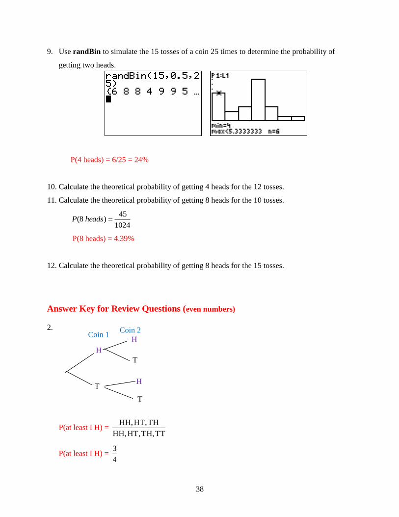
9. Use randBin to simulate the 15 tosses of a coin 25 times to determine the probability of
getting two heads.
P(4 heads) = 6/25 = 24%
10. Calculate the theoretical probability of getting 4 heads for the 12 tosses.
11. Calculate the theoretical probability of getting 8 heads for the 10 tosses.
1024
45)8( headsP
P(8 heads) = 4.39%
12. Calculate the theoretical probability of getting 8 heads for the 15 tosses.
Answer Key for Review Questions (even numbers)
2.
P(at least I H) = TT TH, HT, HH,
TH HT, HH,
P(at least I H) = 4
3
T
H
H
T H
T
Coin 1 Coin 2

39
4.
6.
1 2 3 4 5 6
1 1,1 2,1 3,1 4,1 5,1 6,1
2 1,2 2,2 3,2 4,2 5,2 6,2
3 1,3 2,3 3,3 4,3 5,3 6,3
4 1,4 2,4 3,4 4,4 5,4 6,4
5 1,5 2,5 3,5 4,5 5,5 6,5
6 1,6 2,6 3,6 4,6 5,6 6,6
P(at least one 5) = 36
11
8.
P(2 heads) = 4/20 = 20%
Pick 1
Pick 2
B
G
R
R
G
B
R
G
B
R
G
B
Possible Outcomes:
BB, BG, BR, GB, GG, GR, RB, RG, RR
P(at least one red) = 9
3
P(at least one red) = 3
1
40
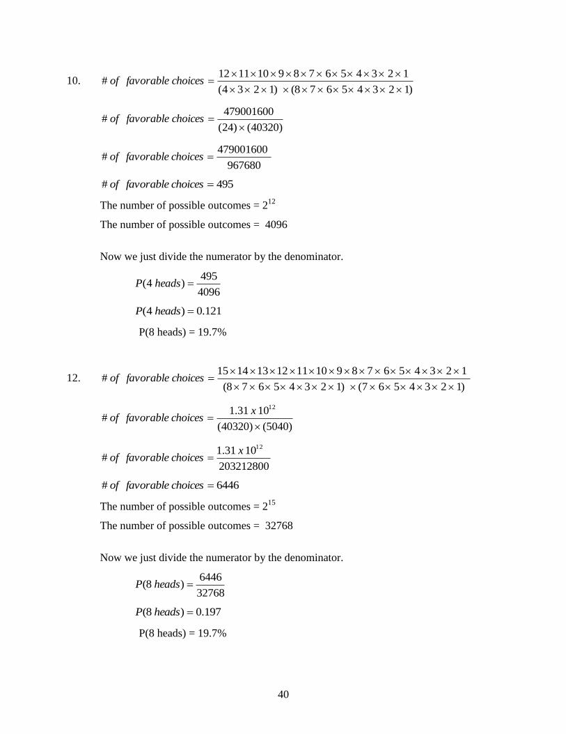
10. )12345678()1234(
123456789101112#
choicesfavorableof
)40320()24(
479001600#
choicesfavorableof
967680
479001600# choicesfavorableof
495# choicesfavorableof
The number of possible outcomes = 212
The number of possible outcomes = 4096
Now we just divide the numerator by the denominator.
4096
495)4( headsP
121.0)4( headsP
P(8 heads) = 19.7%
12. )1234567()12345678(
123456789101112131415#
choicesfavorableof
)5040()40320(
1031.1#
12
xchoicesfavorableof
203212800
1031.1#
12xchoicesfavorableof
6446# choicesfavorableof
The number of possible outcomes = 215
The number of possible outcomes = 32768
Now we just divide the numerator by the denominator.
32768
6446)8( headsP
197.0)8( headsP
P(8 heads) = 19.7%

41
Chapter 4
Standard Distributions
4.1 Standard Distributions
Learning Objectives
Be familiar with the standard distributions (normal, binomial, and exponential).
Use standard distributions to solve for events in problems in which the distribution
belongs to those families.
Say you were buying a new bicycle for going back and forth to school. You want to buy
something that lasts a long time and something with parts that will also last a long time. You
research on the internet and find one brand “Buy Me Bike” that shows the following graph with
all of its advertising.
(a) What type of probability distribution is being represented by this graph?
(b) Is the data represented continuous or discrete? How can you tell?
(c) Does the data in the graph indicate that the company produces bicycles that have a
respectable life span? Explain.
Work through the lesson and then revisit this problem to determine the solution.

42
Now that we know a little about probability and variables, let‟s move into the concept of
distribution. A distribution is simply the description of the possible values of the random
variables and the possible occurrences of these. For our discussions, we will say it is the
probability of the occurrences. The main form of probability distribution is standard distribution.
Standard distribution is a normal distribution and often people refer to it as a bell curve.
If you were to toss a fair coin 100 times, you would expect the coin to land on tails close to 50
times and heads 50 times. However, tails may not appear as expected. Look at the histograms
below.
Notice that when we actually flipped the 100 coins in our experiment, we saw that tails come up
70 times and heads only 30 times. The theoretical probability is what we would expect to
happen. In a regular fair coin toss, we have an equal chance of getting a head or a tail. Therefore,
if we flip a coin 100 times we would expect to see 50 heads and 50 tails. When we actually flip
100 coins, we actually saw 70 tails and 30 heads. If we were to repeat this experiment, we might
see 60 tails and 40 heads.
If we were to keep doing this flipping experiment, say 500 times, we may see the values get
closer to the theoretical probability (the histogram on the left). As the number of data values
increase, the graph of the results starts to look a bell-shaped curve. This type of distribution of

43
data is normal or standard distribution. The distribution of the data values is shown in this
curve. The more data points, the more we see the bell shape.
Between the two red lines represents 68% of the data. Between the two purple lines represents
95% of the data. Between the two blue lines represents 99.7 % of the data. You will learn more
about the normal distribution in Chapter 5.
What is interesting about our flipping coin example is that it is a binomial experiment. What is
meant by this is that it does not have a standard distribution but a binomial distribution. Why?
This is because binomial experiments only have two outcomes. Think about it. If we flip a coin,
choose between true or false, choose between a Mac or a PC computer, or even asked for tea or
coffee at a restaurant, these are all options that involve either one choice or another. These are all
experiments that are designed where the possible outcomes are either one or the other. Binomial
experiments are experiments that involve only two choices and their distributions involve a
discrete number of trials of these two possible outcomes. Therefore a binomial distribution is a
probability distribution of the successful trials of the binomial experiments.
Technology Note
Let‟s try the following on the graphing calculator. We are going to flip a coin 15 times and count
the number of heads. Now, remember, the probability of getting a head is 50%. We are then
going to repeat this experiment 25 times. On the graphing calculator, press the following:
68%
95%
99.7%
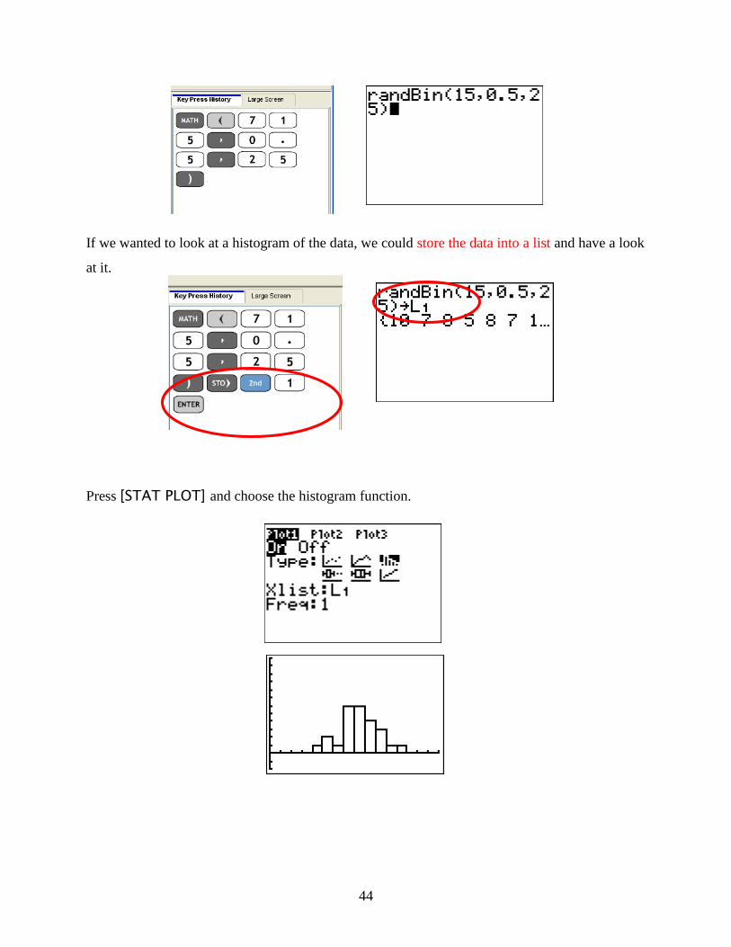
44
If we wanted to look at a histogram of the data, we could store the data into a list and have a look
at it.
Press [STAT PLOT] and choose the histogram function.

45
But what about if we were talking about 50 repetitions? Now we would type in:
But what about if we were talking about 500 repetitions? Now we would type in:
Notice as we increase the number of repetitions, we are getting closer and closer to the normal
distribution from the beginning of this chapter. For data that is actually normal distributed, the
sample size can be any size. So, for example, you could collect the marks from a class of
students (n = 30) and find that these are normally distributed. For binomial distributions, the
sample size tends to be much larger.
Another type of distribution is called exponential distribution. If you remember, both normal
distribution and binomial distribution dealt with discrete data. Discrete variables are
individualized data points such as heads or tails, marks on a test, a baby being a boy or a girl,
rolls on a die, etc. Essentially, these are set numbers being an either-or choice. With exponential
distributions, however, the data are considered continuous. Continuous variables have an infinite
number of groupings depending on what kind of scale you use. Say, for example, you surveyed
your class and asked them how long it took them to walk to school. Your scale could be in
minutes, in minutes and seconds, in minutes, seconds, and fractions of a second (which may
seem unreasonable if you are not an Olympic Athlete). Regardless, the time measurement itself
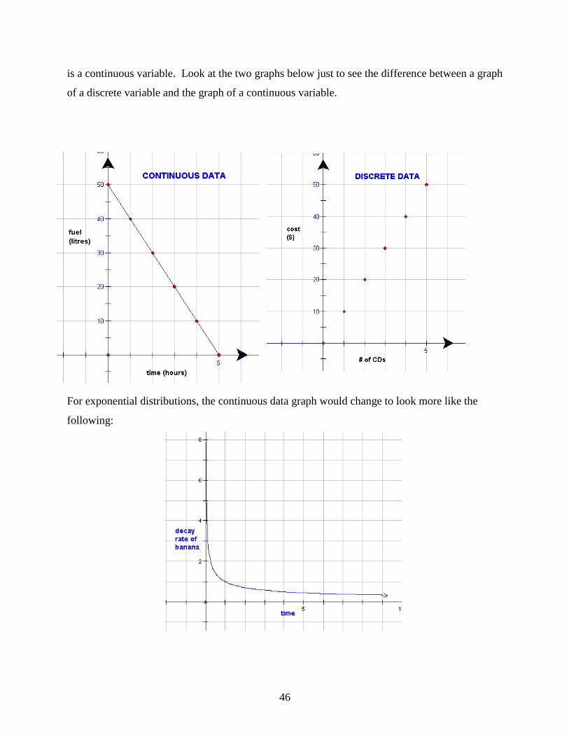
46
is a continuous variable. Look at the two graphs below just to see the difference between a graph
of a discrete variable and the graph of a continuous variable.
For exponential distributions, the continuous data graph would change to look more like the
following:

47
Notice, the exponential distribution curve is also showing continuous data but the graph is
curved and not straight. Therefore, an exponential distribution is a probability distribution
showing the relation in the form y = ax where a is any positive number.
Let‟s look at our example from the start of the chapter.
Say you were buying a new bicycle for going back and forth to school. You want to buy
something that lasts a long time and something with parts that will also last a long time. You
research on the internet and find one brand “Buy Me Bike” that shows the following graph with
all of its advertising.
(a) What type of probability distribution is being represented by this graph?
(b) Is the data represented continuous or discrete? How can you tell?
(c) Does the data in the graph indicate that the company produces bicycles that have a
respectable life span? Explain.
Solution
(a) The distribution in this graph is exponential because it is a curved plot of data.
(b) The data is continuous because the data points are joined together. Discrete data points
would not be joined together.
48
(c) In the graph, the parts will last for many years before breaking down. At 20 years, for
example, the age of the parts is still equals 0.15 years.
Lesson Overview
The standard normal distribution is a normal distribution where the area under each curve is the
same. When a sample is examined, and the frequency distribution is seen as normal, the resulting
data displayed in a histogram often approximates a bell curve. Binomial experiments are
probability experiments that would satisfy the following four requirements:
1. Each trial can have only two outcomes or outcomes that can be reduced to two outcomes.
These outcomes can be considered as either success or failure.
2. There must be a fixed number of trials.
3. The outcomes of each trial must be independent of each other.
4. The probability of a success must remain the same for each trial.
The distribution curves for binomial distribution experiments appear to be normal only when the
sample size increases. An exponential distribution occurs when data is continuous and in the
form of y = ax. The resulting graphs that form are exponential curves rather than in the form of a
histogram or a normal distribution curve.
Points to Consider
How large a sample size is necessary for a binomial distribution to appear normal?
When is exponential distribution an important distribution to use?
Vocabulary
Standard Distribution - A normal distribution and often people refer to it as a bell curve.
Normal Distribution Curve - A symmetrical curve that shows that the highest frequency in
the center (i.e., at the mean of the values in the distribution) with an equal curve
on either side of that center.
Normal Distribution - A family of distributions that have the same general shape (curve).
Binomial Experiments - Experiments that involve only two choices and their distributions
involve a discrete number of trials of these two possible outcomes.

49
Binomial Distribution - A probability distribution of the successful trials of the binomial
experiments.
Continuous Data – An infinite number of values exist between any two other values in the table
of values or on the graph. Data points are joined.
Discrete Data – A finite number of data points exist between any two other values. Data points
are not joined.
Exponential Distribution – A probability distribution showing the relation in the form y = ax
where a is any positive number.
Review Questions: Answer the following questions and show all work (including diagrams)
to create a complete answer.
1. Is the following graph representing a normal distribution, and exponential distribution, or a
binomial distribution? How can you tell?
This is binomial since the data shows discrete frequencies and is not in the shape of a normal
curve.
2. Is the following graph representing a normal distribution, and exponential distribution, or a
binomial distribution? How can you tell?
50
3. Is the following graph representing a normal distribution, and exponential distribution, or a
binomial distribution? How can you tell?
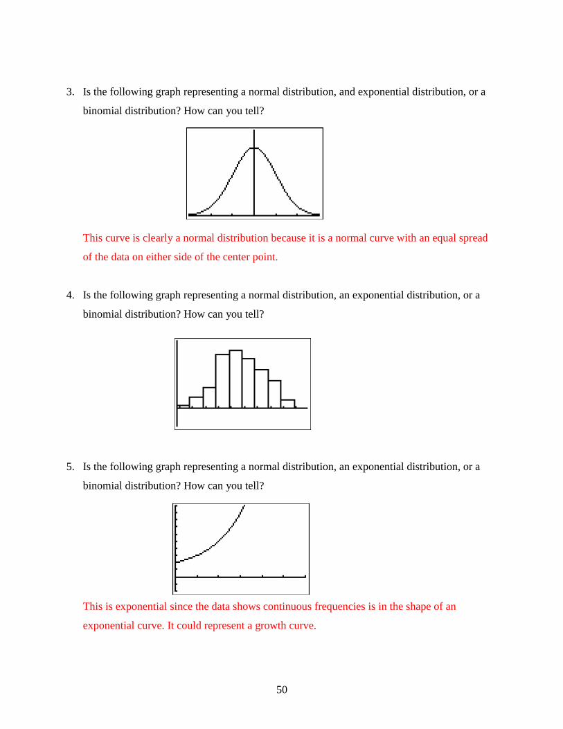
This curve is clearly a normal distribution because it is a normal curve with an equal spread
of the data on either side of the center point.
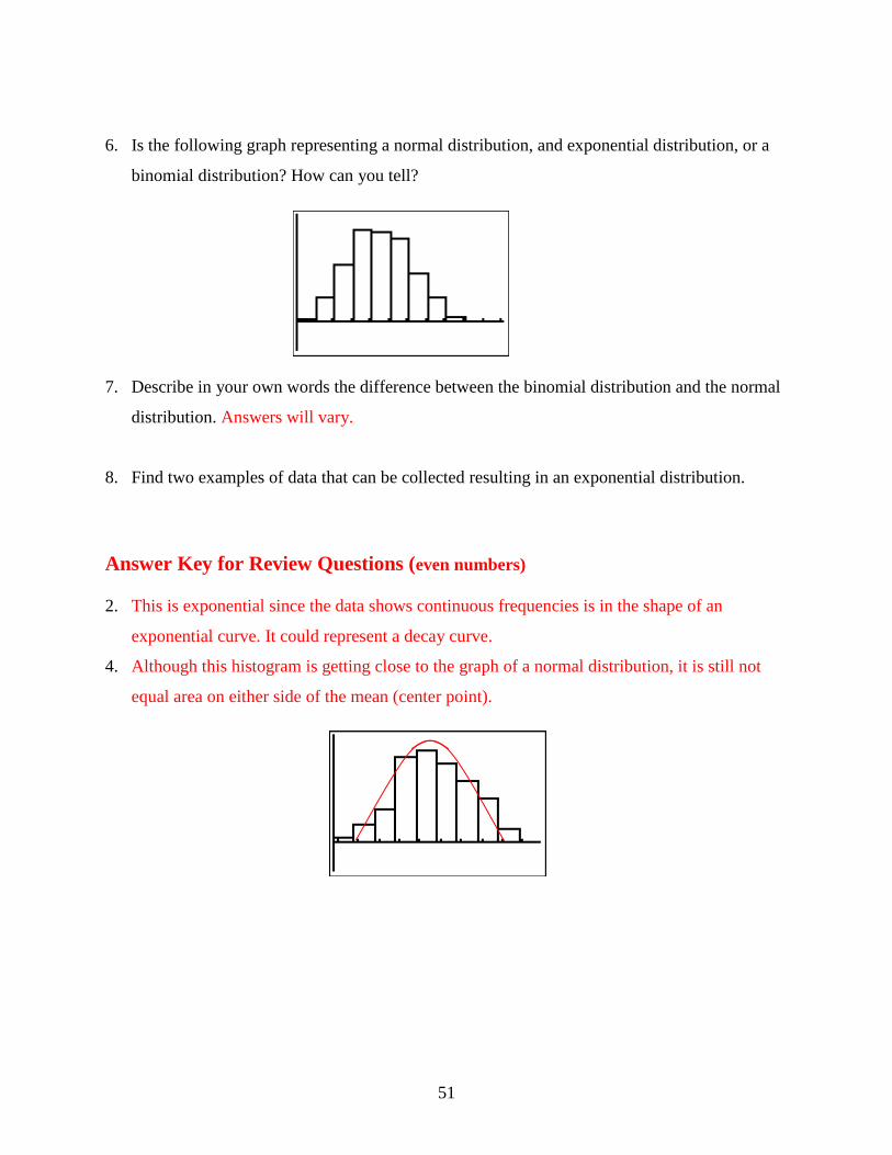
4. Is the following graph representing a normal distribution, an exponential distribution, or a
binomial distribution? How can you tell?
5. Is the following graph representing a normal distribution, an exponential distribution, or a
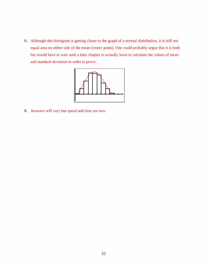
binomial distribution? How can you tell?
This is exponential since the data shows continuous frequencies is in the shape of an
exponential curve. It could represent a growth curve.
51
6. Is the following graph representing a normal distribution, and exponential distribution, or a
binomial distribution? How can you tell?
7. Describe in your own words the difference between the binomial distribution and the normal
distribution. Answers will vary.
8. Find two examples of data that can be collected resulting in an exponential distribution.
Answer Key for Review Questions (even numbers)
2. This is exponential since the data shows continuous frequencies is in the shape of an
exponential curve. It could represent a decay curve.
4. Although this histogram is getting close to the graph of a normal distribution, it is still not
equal area on either side of the mean (center point).
52
6. Although this histogram is getting closer to the graph of a normal distribution, it is still not
equal area on either side of the mean (center point). One could probably argue that it is both
but would have to wait until a later chapter to actually learn to calculate the values of mean
and standard deviation in order to prove.
8. Answers will vary but speed and time are two.

53
Diameter
Chapter 5
The Shape, Center and Spread of a Normal
Distribution
5.1 Estimating the Mean and Standard Deviation of a Normal Distribution
Learning Objectives
Understand the meaning of normal distribution and bell-shape.
Estimate the mean and the standard deviation of a normal distribution.
Introduction
The diameter of a circle is the length of the line through the center and touching two points on
the circumference of the circle.
If you had a ruler, you could easily measure the length of this line. However, if your teacher gave
you a golf ball and asked you to use a ruler to measure its diameter, you would have to create
your own method of measuring its diameter.

54
Using your ruler and the method that you have created, make two measurements of the diameter
of the golf ball (to the nearest tenth of an inch). Your teacher will prepare a chart for the class to
create a dot plot of all the measurements. Can you describe the shape of the plot? Do the dots
seem to be clustered around one spot (value) on the chart? Do some dots seem to be far away
from the clustered dots? After you have answered these questions, pick two numbers from the
chart to complete this statement:
“The typical measurement of the diameter is approximately______inches, give or take
______inches.” We will complete this statement later in the lesson.
Normal Distribution
The shape below should be similar to the shape that has been created with the dot plot.
Diameter of Golf Ball (in.)
You have probably noticed that the measurements of the diameter of the golf ball were not all the
same. In spite of the different measurements, you should have seen that the majority of the
measurements clustered around the value of 1.6 inches, with a few measurements to the right of
this value and a few measurements to the left of this value. The resulting shape looks like a bell
and is the shape that represents the normal distribution of the data.
In the real world, no examples match this smooth curve perfectly, but many data plots, like the
one you made, are approximately normal. For this reason, it is often said that normal distribution
is „assumed.‟ When normal distribution is assumed, the resulting bell-shaped curve is symmetric
- the right side is a mirror image of the left side. If the blue line is the mirror (the line of

55
symmetry) you can see that the green section is the mirror image of the yellow section. The line
of symmetry also goes through the x-axis.
If you took all of the measurements for the diameter of the golf ball, added them and divided the
total by the number of measurements, you would know the mean (average) of the measurements.
It is at the mean that the line of symmetry intersects the x-axis. For this reason, the mean is used
to describe the center of a normal distribution.
You can see that the two colors spread out from the line of symmetry and seem to flatten out the
further left and right they go. This tells you that the data spreads out, in both directions, away
from the mean. This spread of the data is called the standard deviation and it describes exactly
how the data moves away from the mean. In a normal distribution, on either side of the line of
symmetry, the curve appears to change its shape from being concave down (looking like an
upside-down bowl) to being concave up (looking like a right side up bowl). Where this happens
is called the inflection point of the curve. If a vertical line is drawn from the inflection point to
the x-axis, the difference between where the line of symmetry goes through the x-axis and where
this line goes through the x-axis represents the amount of the spread of the data away from the
mean.
Approximately 68% of all the data is located between these inflection points.

56
For now, that is all you have to know about standard deviation. It is the spread of the data away
from the mean. In the next lesson, you will learn more about this topic.
Now you should be able to complete the statement that was given in the introduction.
“The typical measurement of the diameter is approximately 1.6 inches, give or take
0.4 inches.”
Example 1
For each of the following graphs, complete the statement “The typical measurement is
approximately______ give or take______.”
a)
“The typical measurement is approximately 400 houses built give or take 100.”
b)
“The typical measurement is approximately 8 games won give or take 3.”
Lesson Summary
In this lesson you learned what was meant by the bell curve and how data is displayed on this
shape. You also learned that when data is plotted on the bell curve, you can estimate the mean of
the data with a give or take statement.

57
Points to Consider
Is there a way to determine actual values for the give or take statements?
Can the give or take statement go beyond a single give or take?
Can all the actual values be represented on a bell curve?

58
5.2 Calculating the Standard Deviation
Learning Objectives
Understand the meaning of standard deviation.
Understanding the percents associated with standard deviation.
Calculate the standard deviation for a normally distributed random variable.
Introduction
You have recently received your mark from a recent Math test that you had written. Your mark is
71 and you are curious to find out how your grade compares to that of the rest of the class. Your
teacher has decided to let you figure this out for yourself. She tells you that the marks were
normally distributed and provides you with a list of the marks. These marks are in no particular
order – they are random.
32 88 44 40 92 72 36 48 76
92 44 48 96 80 72 36 64 64
60 56 48 52 56 60 64 68 68
64 60 56 52 56 60 60 64 68
We will discover how your grade compares to the others in your class later in the lesson.
Standard Deviation
In the previous lesson you learned that standard deviation was the spread of the data away from
the mean of a set of data. You also learned that 68% of the data lies within the two inflection
points. In other words, 68% of the data is within one step to the right and one step to the left of
the mean of the data. What does it mean if your mark is not within one step? Let‟s investigate
this further. Below is a picture that represents the mean of the data and six steps – three to the
left and three to the right.

59
MEAN
Step 3 Step 2 Step 1 Step 1 Step 2 Step 3
Decreasing Increasing
These rectangles represent tiles on a floor and you are standing on the middle tile – the blue one.
You are then asked to move off your tile and onto the next tile. You could move to the green tile
on the left or to the green tile on the right. Whichever way you move, you have to take one step.
The same would occur if you were asked to move to the second tile. You would have to take two
steps to the right or two steps to the left to stand on the red tile. Finally, to stand on the purple tile
would require you to take three steps to the right or three steps to the left.
If this process is applied to standard deviation, then one step to the right or one step to the left is
considered one standard deviation away from the mean. Two steps to the left or two steps to the
right are considered two standard deviations away from the mean. Likewise, three steps to the
left or three steps to the right are considered three standard deviations from the mean. There is a
value for the standard deviation that tells you how big your steps must be to move from one tile
to the other. This value can be calculated for a given set of data and it is added three times to the
mean for moving to the right and subtracted three times from the mean for moving to the left. If
the mean of the tiles was 65 and the standard deviation was 4, then you could put numbers on all
the tiles.
65
53 57 61 MEAN 69 73 77
Step 3 Step 2 Step 1 Step 1 Step 2 Step 3
Decreasing Increasing

60
For normal distribution, 68% of the data would be located between 61 and 69. This is within one
standard deviation of the mean. Within two standard deviations of the mean, 95% of the data
would be located between 57 and 73. Finally, within three standard deviations of the mean,
99.7% of the data would be located between 53 and 77. Now let‟s see what this entire
explanation means on a normal distribution curve.
Now it is time to actually calculate the standard deviation of a set of numbers. To make the
process more organized, it is best to use a table to record your work. The table will consist of
three columns. The first column will contain the data and will be labeled x. The second column
will contain the differences between the data value of the mean of the data. This column will be
labelled ( )x x . The final column will contain the square of each of the values in the second
column. 2
x x .
To find the standard deviation you subtract the mean from each data score to determine how
much the data varies from the mean. This will result in positive values when the data point is
greater than the mean and in negative values when the data point is less than the mean.
If we continue now, what would happen is that when we sum the variations (Data – Mean
( )x x column both negative and positive variations would give a total of zero. The sum of zero
implies that there is no variation in the data and the mean. In other words, if we were conducting
a survey of the number of hours that students watch television in one day, and we relied upon the
sum of the variations to give us some pertinent information, the only thing that we would learn is
that all students watch television for the exact same number of hours each day. We know that

61
this is not true because we did not receive the same answer from every student. In order to ensure
that these variations will not lose their significance when added, the variation values are squared
prior to adding them together.
What we need for this normal distribution is a measure of spread that is proportional to the
scatter of the data, independent of the number of values in the data set and independent of the
mean. The spread will be small when the data values are close but large when the data values are
scattered. Increasing the number of values in a data set will increase the values of both the
variance and the standard deviation even if the spread of the values is not increasing. These
values should be independent of the mean because we are not interested in this measure of
central tendency but rather with the spread of the data. For a normal distribution, both the
variance and the standard deviation fit the above profile and both values can be calculated for the
set of data.
To calculate the variance ( 2 ) for a set of normally distributed data:
1. To determine the measure of each value from the mean, subtract the mean of the data
from each value in the data set. ( )x x
2. Square each of these differences and add the positive, squared results.
3. Divide this sum by the number of values in the data set.
These steps for calculating the variance of a data set can be summarized in the following
formula:
2
2x x
n
where:
x represents the data value; x represents the mean of the data set; n represents the number of
data values. Remember that the symbol stands for summation.
62
Example 1
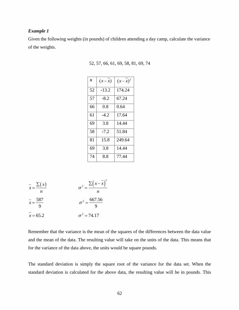
Given the following weights (in pounds) of children attending a day camp, calculate the variance
of the weights.
52, 57, 66, 61, 69, 58, 81, 69, 74
x ( )x x 2( )x x
52 -13.2 174.24
57 -8.2 67.24
66 0.8 0.64
61 -4.2 17.64
69 3.8 14.44
58 -7.2 51.84
81 15.8 249.64
69 3.8 14.44
74 8.8 77.44
xx
n
2
2x x
n
587
9x 2 667.56
9
65.2x 2 74.17
Remember that the variance is the mean of the squares of the differences between the data value
and the mean of the data. The resulting value will take on the units of the data. This means that
for the variance of the data above, the units would be square pounds.
The standard deviation is simply the square root of the variance for the data set. When the
standard deviation is calculated for the above data, the resulting value will be in pounds. This
63
table could be extended to include a frequency column for values that are repeated adding three
additional columns to the table. This often leads to errors in calculations. Since simple is often
best, values that are repeated can just be written in the table as many times as they appear in the
data.
Example 2
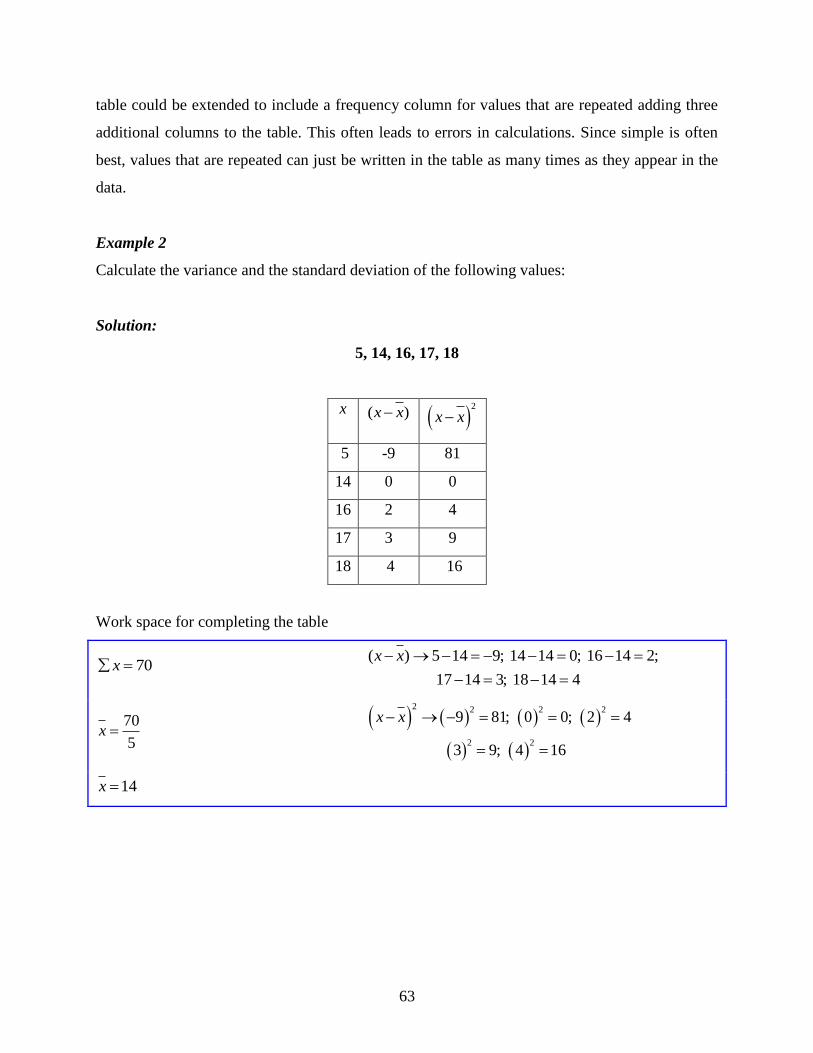
Calculate the variance and the standard deviation of the following values:
Solution:
5, 14, 16, 17, 18
x ( )x x 2
x x
5 -9 81
14 0 0
16 2 4
17 3 9
18 4 16
Work space for completing the table
70x ( ) 5 14 9; 14 14 0; 16 14 2;
17 14 3; 18 14 4
x x
70
5x
2 2 2 2
2 2
9 81; 0 0; 2 4
3 9; 4 16
x x
14x

64
Variance: 2
110x x
2
2x x
n
2 110
5
2 22
Standard Deviation: 2
110x x
110
5x
22x
22SD
4.7SD
The symbol ( ) is used to represent standard deviation. Using this symbol and the steps that
were followed to calculate the standard deviation, we can write the following formula:
2
x x
n
HINT: If you are wondering if your calculations are correct, a quick way to check
is to add the values in the ( )x x column. The total is always zero.
Example 3
Calculate the standard deviation of the following numbers:
1, 5, 3, 5, 4, 2, 1, 1, 6, 2

65
Solution:
30x
2
x x
n
30
10x
32
10
3x 3.2
1.8
Now that you know how to calculate the variance and the standard deviation of a set of data, let‟s
apply this to normal distribution, by determining how your Math mark compared to the marks
achieved by your classmates. This time technology will be used to determine both the variance
and the standard deviation of the data.
x ( )x x 2
x x
1 -2 4
5 2 4
3 0 0
5 2 4
4 1 1
2 -1 1
1 -2 4
1 -2 4
6 3 9
2 -1 1

66
Solution:
Stat Enter Stat Calc
Enter Enter
From the list, you can see that the mean of the marks is 61 and the standard deviation is 15.6.
To use technology to calculate the variance involves naming the lists according to the operations
that you need to do to determine the correct values. As well, you can use the 2nd
catalogue
function of the calculator to determine the sum of the squared variations. All of the same steps
used to calculate the standard deviation of the data are applied to give the mean of the data set.
You could use the 2nd
catalogue function to find the mean of the data, but since you are now
familiar with 1-Var Stats, you may as well use this method.
Stat Enter Stat Calc
Enter Enter
The mean of the data is 61. L2 will now be renamed L1- 61 to compute the values for ( )x x .
Likewise, L3 will be renamed ( L2)2.

67
Stat Enter Enter
Stat Enter Enter
2nd
0 ( Catalogue) Ln ( S) and scroll down to sum( Enter
Here we type in 2nd
3 L3 Enter
The sum of the third list divided by the number of data (36) is the variance of the marks.
Lesson Summary
In this lesson you learned that the standard deviation of a set of data was a value that represented
the spread of the data from the mean of the data. You also learned that the variance of the data
from the mean is the squared value of these differences since the sum of the differences was
zero. Calculating the standard deviation manually and by using technology was an additional
topic you learned in this lesson.
Points to Consider
Does the value of standard deviation stand alone or can it be displayed with a normal
distribution?
Are there defined increments for how the data spreads away from the mean?
Can the standard deviation of a set of data be applied to real world problems?
68
5.3 Connecting the Standard Deviation and Normal Distribution
Learning Objectives
Represent the standard deviation of a normal distribution on the bell curve.
Use the percentages associated with normal distribution to solve problems.
Introduction
In the problem presented in lesson one, regarding your test mark, your teacher told you that the
class marks were normally distributed. In the previous lesson you calculated the standard
deviation of the marks by using the TI83 calculator. Later in this lesson, you will be able to
represent the value of the standard deviation as it relates to a normal distribution curve.
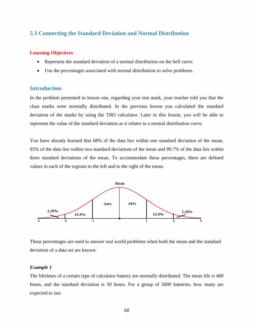
You have already learned that 68% of the data lies within one standard deviation of the mean,
95% of the data lies within two standard deviations of the mean and 99.7% of the data lies within
three standard deviations of the mean. To accommodate these percentages, there are defined
values in each of the regions to the left and to the right of the mean.
These percentages are used to answer real world problems when both the mean and the standard
deviation of a data set are known.
Example 1
The lifetimes of a certain type of calculator battery are normally distributed. The mean life is 400
hours, and the standard deviation is 50 hours. For a group of 5000 batteries, how many are
expected to last

69
a) between 350 hours and 450 hours?
b) more than 300 hours?
c) less than 300 hours?
Solution:
a) 68% of the batteries lasted between 350 hours and 450 hours. This means that
5000 .68 3400 3400 batteries are expected to last between 350 and 450
hours.
b) 95% + 2.35% = 97.35% of the batteries are expected to last more than 300 hours.
This means that 5000 .9735 4867.5 4868 4868 of the batteries will last
longer than 300 hours.
c) Only 2.35% of the batteries are expected to last less than 300 hours. This means
that 5000 .0235 117.5 118 118 of the batteries will last less than 300 hours.
Example 2
A bag of chips has a mean mass of 70 g with a standard deviation of 3 g. Assuming normal
distribution; create a normal curve, including all necessary values.
a) If 1250 bags are processed each day, how many bags will have a mass between 67g and
73g?
b) What percentage of chips will have a mass greater than 64g?

70
Solution:
a) Between 67g and 73g, lies 68% of the data. If 1250 bags of chips are processed,
850 bags will have a mass between 67 and 73 grams.
b) 97.35% of the bags of chips will have a mass greater than 64 grams.
Now you can represent the data that your teacher gave to you for your recent Math test on a
normal distribution curve. The mean mark was 61 and the standard deviation was 15.6.
From the normal distribution curve, you can say that your mark of 71 is within one standard
deviation of the mean. You can also say that your mark is within 68% of the data. You did very
well on your test.
71
Lesson Summary
In this chapter you have learned what is meant by a set of data being normally distributed and the
significance of standard deviation. You are now able to represent data on the bell-curve and to
interpret a given normal distribution curve. In addition, you can calculate the standard deviation
of a given data set both manually and by using technology. All of this knowledge can be applied
to real world problems which you are now able to answer.
Points to Consider
Is the normal distribution curve the only way to represent data?
The normal distribution curve shows the spread of the data but does not show the actual
data values. Do other representations of data show the actual data values?
Review Questions: Answer the following questions and show all work (including
diagrams) to create a complete answer.
1. Without using technology, calculate the variance and the standard deviation of each of the
following sets of numbers.
a) 2, 4, 6, 8, 10, 12, 14, 16, 18, 20 2 33 5.74
b) 18, 23, 23, 25, 29, 33, 35, 35 2 35.24 5.94
c) 123, 134, 134, 139, 145, 147, 151, 155, 157 2 111.28 10.55
d) 58, 58, 65, 66, 69, 70, 70, 76, 79, 80, 83 2 64.96 8.06
2. Ninety-five percent of all cultivated strawberry plants grow to a mean height of 11.4 cm with
a standard deviation of 0.25 cm.
a) If the growth of the strawberry plant is a normal distribution, draw a normal curve
showing all the values.
b) If 225 plants in the greenhouse have a height between 11.15 cm and 11.65 cm, how many
plants were in the greenhouse?
c) How many plants in the greenhouse would we expect to be shorter than 10.9 cm?

72
10
112
2.11
35.3
2( )x x
n
3. The coach of the high school basketball team asked the players to submit their heights.
The following results were recorded.
175 cm 179 cm 179 cm 181 cm 183 cm
183 cm 184 cm 184 cm 185 cm 187 cm
Without using technology, calculate the standard deviation of this set of data.
Answer
x x x 2
x x
175 -7 49
179 -3 9
179 -3 9
181 -1 1
183 1 1
183 1 1
184 2 4
184 2 4
185 3 9
187 5 25
Sum = 1820 112
1820
10x
182x

73
4. A survey was conducted at a local high school to determine the number of hours that a
student studied for the final Math 10 exam. To achieve a normal distribution, 325
students were surveyed. The results showed that the mean number of hours spent
studying was 4.6 hours with a standard deviation of 1.2 hours.
a. Draw a normal curve showing all the values.
b. How many students studied between 2.2 hours and 7 hours?
c. What percentage of the students studied for more than 5.8 hours?
d. Harry noticed that he scored a mark of 60 on the Math 10 exam but had studied
for ½ hour. Is Harry a typical student? Explain.
5. A group of grade 10 students at one high school were asked to record the number of
hours they watched television per week, the results are recorded in the table shown
below.
2.5 3 4.5 4.5 5 5 5.5 6 6 7
8 9 9.5 10 10.5 11 13 16 26 28
Using Technology (TI83), calculate the variance and the standard deviation of this data.
Answer:
The standard deviation of the data is approximately 6.72 and the variance is approximately
45.18. This large variation in the data is described by the larger standard deviation.
6. The average life expectancy for a dog is 10 years 2 months with a standard deviation of
9 months.

74
a) If a dog‟s life expectancy is a normal distribution, draw a normal curve showing all
values.
b) What would be the lifespan of almost all dogs? (99.7%)
c) In a sample of 825 dogs, how many dogs would have life expectancy between 9
years 5 months and 10 years 11 months?
d) How many dogs, from the sample, would we expect to live beyond 10 years 11 months?
7. Ninety-five percent of all Marigold flowers have a height between 10.9 cm and
119.0 cm and their height is normally distributed.
a) What is the mean height of the Marigolds? (11.4 cm.)
b) What is the standard deviation of the height of the Marigolds? (0.25)
c) Draw a normal curve showing all values for the heights of the Marigolds.
d) If 208 flowers have a height between 11.15 cm and 11.65 cm, how many flowers
were in our sample?
e) How many flowers in our sample would we expect to be shorter than
10.9 cm?
Normal Distribution Curve
c.
d) There are 306 flowers in the sample.
e) Seven flowers would be shorter than 10.9 cm.
13.5% 2.35%
2.35%
68%
13.5%
11.4
11.65
11.9
12.15 11.15
10.9
10.65

75
8. A group of physically active women were asked to record the number
of hours they spent at the gym each week. The results are shown below.
8 8 9 9 9 9.5 9.5 9.5 9.5 9.5
9.5 9.5 9.5 9.5 9.5 10 10 10 11 11
Calculate the standard deviation.
9. A normal distribution curve shows a mean x and a standard deviation .
Approximately what percentage of the data would lie in the intervals with the limits
shown?
a) 2 , 2x x (95%)
b) , 2x x (47.5%)
c) ,x x (68%)
d) ,x x (34%)
e) , 2x x (81.5%)
10. Use the 68-95-99.7 rule on a normal distribution of data with a mean of 185 and a
standard deviation of 10, to answer the following questions. What percentage of the
data would measure
a) between 175 and 195?
b) between 195 and 205?
c) between 155 and 215?
d) between 165 and 185?
e) between 185 and 215?
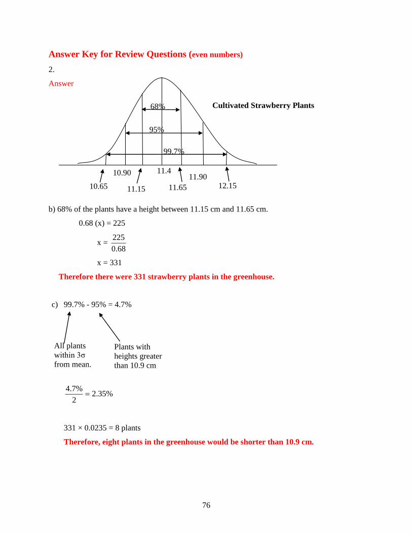
76
Answer Key for Review Questions (even numbers)
2.
Answer
b) 68% of the plants have a height between 11.15 cm and 11.65 cm.
0.68 (x) = 225
x = 68.0
225
x = 331
Therefore there were 331 strawberry plants in the greenhouse.
c) 99.7% - 95% = 4.7%
%35.22
%7.4
331 × 0.0235 = 8 plants
Therefore, eight plants in the greenhouse would be shorter than 10.9 cm.
68%
95%
99.7%
11.4
11.65
11.90 12.15 11.15
10.90
10.65
Plants with
heights greater
than 10.9 cm
All plants
within 3σ
from mean.
Cultivated Strawberry Plants

77
4. Answer
a.
b) 95% of students = 0.95 × 325 students = 308 students
Therefore 308 students studied between 2.2 and 7 hours.
c) ½ (99.7 % - 68 %) = ½ (31.7 %)
= 15.85 %
15.85 % of the students studied longer than 5.8 hours.
d) Harry is not a typical student. The mean is 4.6 hours; therefore the majority of students
studied more than 4 hours more than Harry did for the exam. Harry is lucky to have received
a 60% on the exam.
6 a).Answer
68%
95%
99.7%
4.6
5.8
7.0
8.2 3.4
2.2
1.0
13.5% 2.35%
2.35%
68%
13.5%
10 years
2 months 10 years
11 months
11 years
8 months 12 years
5 months 9 years
5 months
8 years
8 months 7 years
11 months

78
b) Almost all dogs have a life span of 7 years 11 months to 12 years 5 months.
c) 34% 34% 68%
0.68 825 561
In a sample of 825 dogs, 561 would have a life expectancy between 9 years
5 months to 10 years 11 months.
d) 13.5% 2.35% 15.85%
0.1585 × 825 = 130.76
In a sample of 825 dogs, 130 would have a life expectancy of more than
10 years 11 months.
8. Answer
Data x Mean( x ) (Data – Mean)
x x
(Data – Mean)2
2
x x
8 9.5 -1.5 2.25
8 9.5 -1.5 2.25
9 9.5 -0.5 0.25
9 9.5 -0.5 0.25
9 9.5 -0.5 0.25
9.5 9.5 0 0
9.5 9.5 0 0
9.5 9.5 0 0
9.5 9.5 0 0
9.5 9.5 0 0
9.5 9.5 0 0
9.5 9.5 0 0
9.5 9.5 0 0
9.5 9.5 0 0
9.5 9.5 0 0
10 9.5 0.5 0.25
10 9.5 0.5 0.25
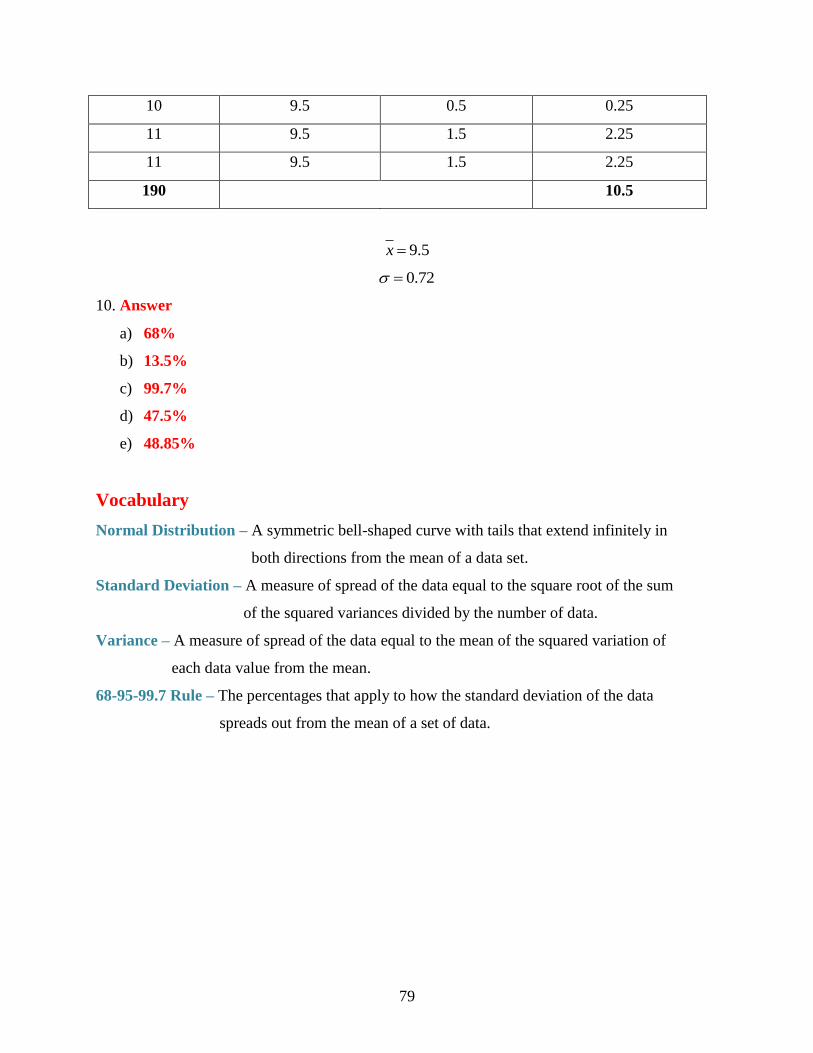
79
10 9.5 0.5 0.25
11 9.5 1.5 2.25
11 9.5 1.5 2.25
190 10.5
9.5x
0.72
10. Answer
a) 68%
b) 13.5%
c) 99.7%
d) 47.5%
e) 48.85%
Vocabulary
Normal Distribution – A symmetric bell-shaped curve with tails that extend infinitely in
both directions from the mean of a data set.
Standard Deviation – A measure of spread of the data equal to the square root of the sum
of the squared variances divided by the number of data.
Variance – A measure of spread of the data equal to the mean of the squared variation of
each data value from the mean.
68-95-99.7 Rule – The percentages that apply to how the standard deviation of the data
spreads out from the mean of a set of data.

80

81
Chapter 6
Measures of Central Tendency
6.1 The Mean
Learning Objectives
Understand the mean of a set of numerical data.
Compute the mean of a given set of data.
Understand the mean of a set of data as it applies to real world situations.
Introduction
You are getting ready to begin a unit in Math that deals with measurement. Your teacher wants
you to use benchmarks to measure the length of some objects in your classroom. A benchmark is
simply a standard by which something can be measured. One of the benchmarks that you can all
use is your hand span. Every student in the class must spread their hand out as far as possible and
places it on top of a ruler or measuring tape. The distance from the tip of your thumb to the tip of
your pinky is your hand span. Your teacher will record all of the measurements. The following
results were recorded by a class of thirty-five students:
Hand span (inches) Frequency
16
2
1
1
74
3
17
2
8
37
4
10
18
4
7
18
2
4
19
4
2

82
Later in this lesson, we will compute the mean or average hand span for the class.
The term “central tendency” refers to the middle value or a typical value of the set of data which
is most commonly measured by using the three m‟s – mean, median and mode. In this lesson we
will explore the mean and then move onto the median and the mode in the following lessons.
The mean, often called the „average‟ of a numerical set of data, is simply the sum of the data
numbers divided by the number of numbers. This value is referred to as an arithmetic mean. The
mean is the balance point of a distribution.
Example 1: In a recent hockey tournament, the number of goals scored by your school
team during the eight games of the tournament were 4,5,7,2,1,3,6,4. What is
the mean of the goals scored by your team?
Solution: You are really trying to find out how many goals the team scored each game.
The first step is to add the number of goals scored during the tournament.
4 5 7 2 1 3 6 4 32 (The sum of the goals is 32)
The second step is to divide the sum by the number of games played.
32 8 4
From the calculations, you can say that the team scored a mean of 4 goals per game.
Example 2: The following numbers represent the number of days that 12 students bought
lunch in the school cafeteria over the past two months. What is the mean
number of times that each student bought lunch at the cafeteria during the
past two months?
22, 23, 23, 23, 24, 24, 25, 25, 26, 26, 29, 30

83
Solution: The mean is 22 23 23 23 24 24 25 25 26 26 29 30
12
The mean is 300
12
The mean is 25
Each student bought lunch an average of 25 times over the past two months.
If we let x represent the data numbers and n represent the number of numbers, we can write a
formula that can be used to calculate the mean x of the data. The symbol means „the sum of‟
and can be used when we write a formula for calculating the mean.
1 2 3 ... nx x x xx
n
If we are given a large number of values and if some of them appear more than once, the data is
often presented in a frequency table. This table will consist of two columns. One column will
contain the data and the second column will indicate the how often the data appears. Although
the data given in the above problem is not large, some of the values do appear more than once.
Let‟s set up a table of values and their respective frequencies as follows:
Number of
Lunches Bought
Number of
Students
22 1
23 3
24 2
25 2
26 2
29 1
30 1
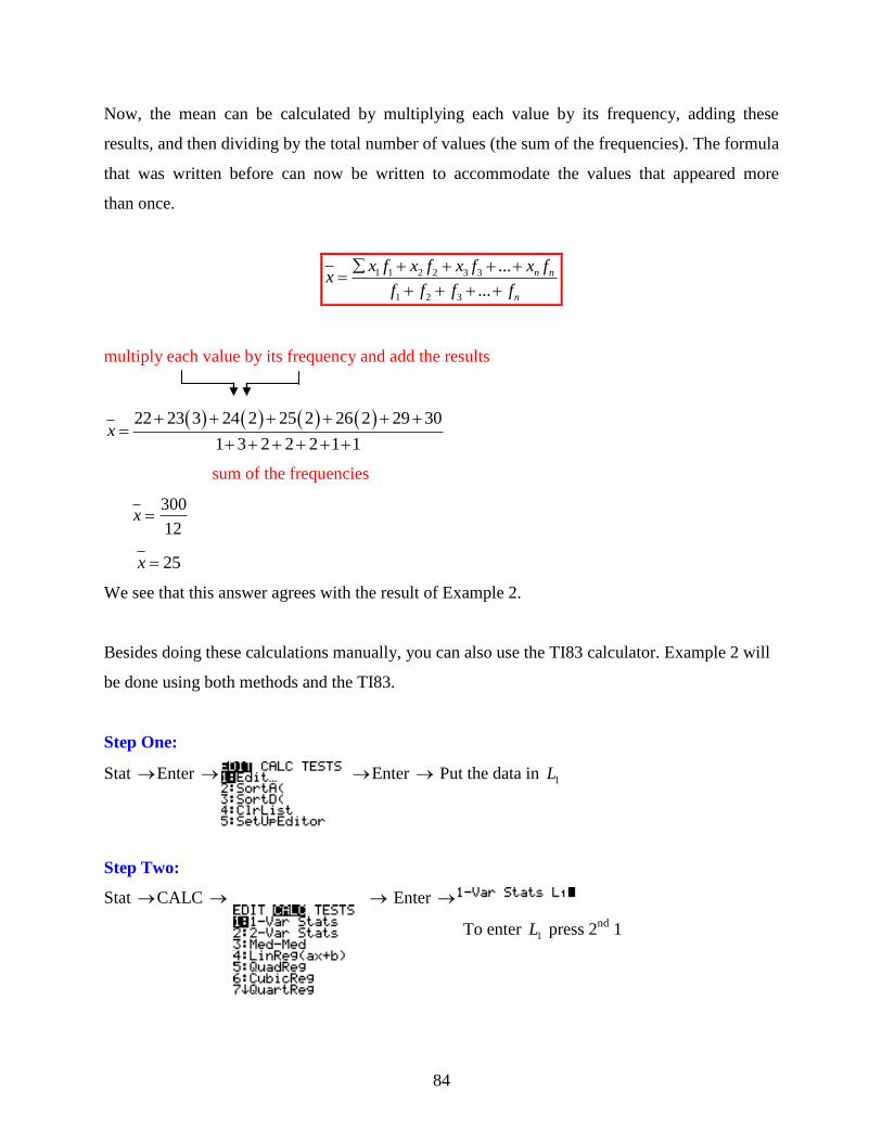
84
Now, the mean can be calculated by multiplying each value by its frequency, adding these
results, and then dividing by the total number of values (the sum of the frequencies). The formula
that was written before can now be written to accommodate the values that appeared more
than once.
1 1 2 2 3 3
1 2 3
...
...
n n
n
x f x f x f x fx
f f f f
multiply each value by its frequency and add the results
22 23 3 24 2 25 2 26 2 29 30
1 3 2 2 2 1 1x
sum of the frequencies
x 300
12
25x
We see that this answer agrees with the result of Example 2.
Besides doing these calculations manually, you can also use the TI83 calculator. Example 2 will
be done using both methods and the TI83.
Step One:
Stat Enter Enter Put the data in 1L
Step Two:
Stat CALC Enter
To enter 1L press 2nd
1

85
Enter
Notice the sum of the data x = 300
Notice the number of data 12n
Notice the mean of the data 25x
Example 2 was done using the TI83 calculator by using List One only. Now we will do Example
2 again but this time we will utilize the TI83 as a frequency table.
Step One:
Stat Enter Enter Put the data in 1L but enter each number
only once.
Step Two:
Stat Enter Enter Put the frequency in 2L
Step Three:
Stat Enter Enter
Step Four:
Press 2nd
0 to obtain the CATALOGUE function of the calculator. Scroll down to sum( and
enter 3L

86
You can repeat this step to determine the sum of 2L
30025
12x
A frequency table can also be drawn to include a tally column. To calculate the mean of a set of
data, the values do not have to be arranged in ascending (or descending order). Therefore, the
tally column acts as a speedy method of determining the frequency of each value.
Example 3: A survey of 30 students with cell phones was conducted by teachers to
determine the mean number of hours a student spends each week on their
cell phone.
Following are the estimated times:
12, 15, 20, 8, 25, 11, 8, 11, 15, 14, 14, 20, 18, 13, 8, 28, 12, 12, 13, 20, 5, 8, 13, 11, 5,
18, 24, 16, 14, 18
Time
(Hours)
Tally Number of
Students
12 ∕∕∕ 3
15 ∕∕ 2
20 ∕∕∕ 3
8 ∕∕∕∕ 4
25 ∕∕ 1
11 ∕∕∕ 3
14 ∕∕∕ 3
18 ∕∕∕ 3
13 ∕∕∕ 3
28 ∕ 1
5 ∕∕ 2
24 ∕ 1
16 ∕ 1
Now that the frequency for each value has been determined the mean can now be calculated:

87
Solution:
1 1 2 2 3 3
1 2 3
...
...
n n
n
x f x f x f x fx
f f f f
12 3 15 2 20 3 8 4 25 11 3 14 3 18 3 13 3 28 5 2 24 16
3 2 3 4 1 3 3 3 3 1 2 1 1x
429
30x
14.3x
The mean amount of time that each student spends using a cell phone is 14.3 hours.
Now we will return to the problem that was posed at the beginning of the lesson – the one that
dealt with hand spans.
Hand span (inches) Frequency
16
2
1
1
74
3
17
2
8
37
4
10
18
4
7
18
2
4
19
4
2
Solution:
1 1 2 2 3 3
1 2 3
...
...
n n
n
x f x f x f x fx
f f f f
1 1 1 3 1 1 1
6 7 3 7 8 7 10 8 7 8 4 9 22 4 2 4 4 2 4
1 3 8 10 7 4 2x

88
276
35x
317 7.89
35x
The mean hand span for the 35 students is approximately 7.89 inches.
Lesson Summary
You have learned the significance of the mean as it applies to a set of numerical data. You have
also learned how to calculate the mean when the data is presented as a list of numbers as well as
when it is represented in a frequency table. To facilitate the process of calculating the mean, you
have also learned to apply the formulas necessary to do the calculations.
Points to Consider
Is the mean only important as a measure of central tendency?
If data is represented in another way, is it possible to either calculate or
estimate the mean from this other representation?
Review Questions: Show all work necessary to answer each question. Be sure to include any
formulas that are needed.
1. Find the mean of each of the following sets of numbers:
a) 3, 5, 5, 7, 4, 8, 6, 2, 5, 9 (5.4)
b) 8, 3, 2, 0, 4, 3, 4, 6, 7, 9, 5 (4.64)
c) 3, 8, 4, 1, 8, 7, 5, 6, 3, 7, 2, 9 (5.25)
d) 18, 28, 27, 27, 23, 22, 25, 21, 1 (21.33)
89
2. The number of days it rained during four months were:
April – 11 days
May – 8 days
June – 13 days
July – 24 days
Find the mean number of rainy days per month.
3. Busy Bobby earned the following amounts of money over a four week period:
Week One - $106.64
Week Two - $120.42
Week Three - $110.54
Week Four - $122.16
Find the mean weekly wage. ($114.94)
4. Mary Hop must ride to her workplace on the bus. She found that the number of
minutes she spent riding on the bus each day was different. |Following are the
number of minutes she recorded for the five work days last week:
Monday – 43 minutes
Tuesday – 50 minutes
Wednesday – 47 minutes
Thursday – 49 minutes
Friday – 41 minutes
How many minutes are there in the mean trip?
5. The number of fans that attended the last six games of the local baseball team
during the cup competition were:
5200, 8130, 11 250, 13 208, 18 750, 24 060
What was the mean attendance for each game? (13433 fans)
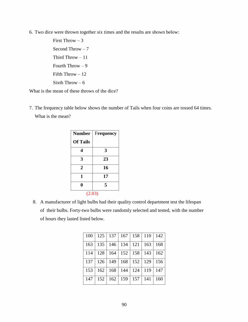
90
6. Two dice were thrown together six times and the results are shown below:
First Throw – 3
Second Throw – 7
Third Throw – 11
Fourth Throw – 9
Fifth Throw – 12
Sixth Throw – 6
What is the mean of these throws of the dice?
7. The frequency table below shows the number of Tails when four coins are tossed 64 times.
What is the mean?
Number
Of Tails
Frequency
4 3
3 23
2 16
1 17
0 5
(2.03)
8. A manufacturer of light bulbs had their quality control department test the lifespan
of their bulbs. Forty-two bulbs were randomly selected and tested, with the number
of hours they lasted listed below.
100 125 137 167 158 110 142
163 135 146 134 121 163 168
114 128 164 152 158 143 162
137 126 149 168 152 129 156
153 162 168 144 124 119 147
147 152 162 159 157 141 160

91
If the manufacturer wants to offer a warranty with the light bulbs, what is the mean
number of hours that the bulbs lasted?
9. The following data represents the height in centimeters of 32 Grade 10 students.
What is the mean height of the students?
158 169 156 174 180 163 162 159
167 179 181 167 170 164 172 175
161 174 176 182 173 168 160 183
157 165 174 169 180 176 168 180
(169.97 cm.)
10. Miss Smith gave her class a surprise quiz and gave it a value of 15 points. The
following frequency table shows the results:
What was the mean mark scored by the class?
Quiz Mark Number of
Students
0 0
1 0
2 0
3 0
4 1
5 2
6 2
7 4
8 5
9 6
10 3
11 4
12 1
13 0
14 1
15 0

92
11. A traveling salesman buys gasoline for his car every day. The table below shows the
number of gallons of gasoline he bought each day over a span of 42 days.
Find the mean number of gallons of gasoline he bought each day. (4.21 gallons daily)
12. When four dice were thrown together a total of 200 times, the number of threes
scored per throw is shown in the table. Calculate the mean number of threes scored
each throw.
13. The table below shows the number of touchdowns scored by a football team during
each of 50 games. Determine the number of touchdowns the team scored each game.
Number of Touchdowns 6 5 4 3 2 1 0
Number of Games 1 2 4 8 10 12 13
(1.76 touchdowns)
14. My Grade 11 Math class has thirty-two students. The following table shows the
frequency of attendance over a period of 30 days. Find the mean daily attendance.
Number of
Students Present
Number
of Days
25 1
26 1
27 1
28 2
29 8
30 7
31 6
32 4
Number of Gallons 2 3 4 5 6
Number of Days 6 9 5 14 8
Number of 3’s 4 3 2 1 0
Number of Throws 1 2 13 34 150
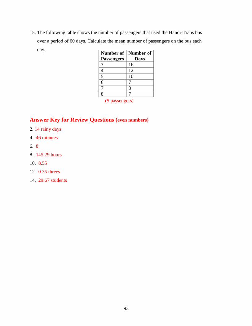
93
15. The following table shows the number of passengers that used the Handi-Trans bus
over a period of 60 days. Calculate the mean number of passengers on the bus each
day.
(5 passengers)
Answer Key for Review Questions (even numbers)
2. 14 rainy days
4. 46 minutes
6. 8
8. 145.29 hours
10. 8.55
12. 0.35 threes
14. 29.67 students
Number of
Passengers
Number of
Days
3 16
4 12
5 10
6 7
7 8
8 7

94
6.2 The Median
Learning Objectives
Understand the median of a set of numerical data.
Compute the median of a given set of data.
Understand the mean of a set of data as it applies to real world situations.
Introduction
Young players from the minor hockey league have decided to order team wind suits. They must
have their measurements taken to ensure a proper fit. The waist measurement for each of the
boys was taken and following are the results:
Andy –27in. Barry – 27in. Juan – 23in. Miguel – 27.5 in. Nick – 28in.
Robert – 22in. Sheldon – 24in. Trevor – 25in. Walter – 26.5in.
What is the median of these waist measurements?
You will be able to answer this question once you understand what is meant by the median of the
waist measurements.
The test scores for five students were 31, 62, 66, 71 and 73. The mean mark is 60.6 which is
lower than all but one of the student‟s marks. The mean has been lowered by the one very low
mark. A better measure of the average performance of the five students would be the middle
mark of 66. The median is the middle number, that number for which there are as many above it
as below it in a set of organized data. Organized data is simply the numbers arranged from
smallest to largest or from largest to smallest. The median, for an odd number of data, is the
value that divides the data into two halves. If n represents the number of data and n is an odd
number, then the median will be found in position1
2
n .

95
If n represents the number of data and n is even, then the median will be the mean of the two
values found before and after the 1
2
n position.
Example 1: Find the median of:
a) 10, 2, 14, 6, 8, 12, 4
b) 3, 9, 2, 5, 7, 1, 6, 4, 2, 5
Solution:
a) The first stem is to organize the data – arrange the numbers from smallest to largest.
10, 2, 14, 6, 8, 12, 4 2, 4, 6, 8, 10, 12, 14
The number of data is an odd number so the median will be found in the 1
2
n position.
1 7 1 84
2 2 2
n
The median is the value that is found in the 4th
position.
2, 4, 6, 8 , 10, 12, 14
The median is 8.
b) The first stem is to organize the data – arrange the numbers from smallest to largest.
3, 9, 2, 5, 7, 1, 6, 4, 2, 5 1, 2, 2, 3, 4, 5, 5, 6, 7, 9
The number of data is an even number so the median will be the mean of the number found
before and the number found after the 1
2
n position.

96
1 10 1 115.5
2 2 2
n
The number found before the 5.5 position is 4 and the number found after is 5.
1, 2, 2, 3, 4, 5 , 5, 6, 7, 9
Therefore the median is 4 5 9
4.52 2
Example 2: The weekly earnings for workers at a local factory are as follows:
$450 $550 $425 $600 $375 $475 $550 $500 $425
$400 $500 $475 $525 $450 $575
What is the median of the earnings?
Solution:
$375 $400 $425 $425 $450 $450 $475 $475 $500
$500 $525 $550 $550 $575 $600
There is an odd number of data so the median will be the value in the 8th
position.
The median of the earnings is $475.
Often a survey will result in a large number of data and organizing the data to determine the
median can take a great deal of time. To help with this task, you can use the TI83 calculator.
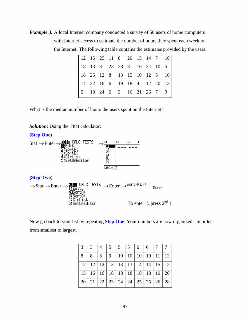
97
Example 3: A local Internet company conducted a survey of 50 users of home computers
with Internet access to estimate the number of hours they spent each week on
the Internet. The following table contains the estimates provided by the users:
12 15 25 11 8 20 15 14 7 10
18 13 8 23 28 3 16 24 10 5
18 25 12 8 13 15 10 12 5 10
14 22 16 6 19 18 4 12 20 13
5 18 24 6 3 16 21 26 7 9
What is the median number of hours the users spent on the Internet?
Solution: Using the TI83 calculator:
(Step One)
Stat Enter
(Step Two)
Stat Enter Enter
To enter 1L press 2nd
1
Now go back to your list by repeating Step One. Your numbers are now organized - in order
from smallest to largest.
3 3 4 5 5 5 6 6 7 7
8 8 8 9 10 10 10 10 11 12
12 12 12 13 13 13 14 14 15 15
15 16 16 16 18 18 18 18 19 20
20 21 22 23 24 24 25 25 26 28

98
There is an even number of data so the median will be the mean of the number above and the
number below the 1 50 1
25.52 2
n position. The number below is 13 and the number above
is 13.
This result can be confirmed by using the TI83 calculator. You already have the data entered and
sorted.
Stat CALC Enter
Scroll down to Med
Therefore the median number of hours the users spent on the Internet was 13. Now you should
be able to answer the question that was posed at the beginning of the lesson. The boys had their
waist measurements taken so they could order team wind suits.
The results were:
Andy –27in. Barry – 27in. Juan – 23in. Miguel – 27.5 in. Nick – 28in.
Robert – 22in. Sheldon – 24in. Trevor – 25in. Walter – 26.5in.
Solution:
22, 23, 24, 25, 26.5, 27, 27, 27.5, 28
1 9 15
2 2
n The median is the number in the 5
th position.
22, 23, 24, 25, 26.5 , 27, 27, 27.5, 28
The median of the waist measurements is 26.5 inches.

99
Lesson Summary
The median is one of the other measures of Central Tendency and is often used in statistics. You
know how to compute the median of a given set of data when there is an even number of data
and when there is an odd number of data. On addition, you have also learned how to use the TI83
calculator to organize large number of data.
Points to Consider
Is the median of a set of data useful in any other aspect of statistics?
Is only the median of the entire set of data a useful value?
Review Questions: Show all work necessary to answer the following questions.
1. Find the median of each of the following sets of numbers:
a) 25, 33, 38, 64, 56, 38, 35, 55, 48 (38)
b) 10, 20, 17, 12, 23, 22, 18, 25, 12, 21 (19)
c) 34, 45, 52, 37, 58, 49, 30, 29, 56, 41, 55, 38 (43)
d) 114, 101, 123, 112, 108, 128, 106, 118, 121 (114)
2. The attendance of students in a Mathematics 10 class during one week was
31, 29, 28, 32, 33. What is the median attendance?
3. The number of carrots needed to fill a ten pound bag were 169, 184, 176, 173, 171
and 181. What is the median number of carrots? (174.5)
4. The temperature at noon time was recorded for one week in May. The daily
noon time temperatures recorded were 820F, 80
0F, 70
0F, 68
0F, 76
0F, 74
0F, 64
0F.
What was the median temperature?

100
5. A waitress received the following tips over a two-week period:
$35.00 $28.00 $33.00 $41.00 $27.00 $46.00 $39.00
$25.00 $31.00 $36.00 $28.00 $43.00 $48.00 $36.00
What is the median of the tips she received? ($35.50)
6. Two dice were thrown together fifteen times and the results are shown below:
Total
Roll
Frequency
2 2
5 1
4 3
11 2
6 1
10 1
12 2
9 2
8 1
What is the median score?
7. The price per pound of Granny Smith apples at various supermarkets was
$1.79, $1.49, $1.55, $1.68, $1.75, $1.45, $1.59, $1.85, $1.70, $1.65
What is the median price of the apples? ($1.665 $1.67)
8. A local running club hosted a 200-m race. The times of 9 of the runners were
recorded as:
24.2s, 22.9s, 23.1s, 25.6s, 22.5s, 24.0s, 23.3s, 22.3s, 24.6s
What is the median time of the runners?
9. The weights in kilograms of eight young boys were 41, 37, 34, 37, 46, 38, 41, and
44. What is the median weight? (39.5 kilograms)
10. A student recorded the following marks on 10 Science quizzes:
66, 51, 74, 69, 71, 58, 79, 82, 64, 77
What was the median mark?

101
11. The times in minutes taken by a girl walking to improve her lifestyle were 35, 36,
40, 39, 37, 42, and 30. What is the median time? (37 minutes)
12. A member of the Over 60 bowling team recorded the following scores during a
weekend tournament:
88, 109, 85, 97, 89, 111, 94, 121, 99, 88, 102, 81
What was the median score?
13. A nurse who works relief at the local hospital has been recording her wages for
the past eleven weeks. Her wages during this period were:
$600 $420 $725 $560 $400 $850 $675
$590 $390 $700 $740
What was her median wage? ($600)
14. A Boys and Girls Police Club has members from 11 years of age to 16 years of
age. The ages of the fifty members are shown in the following table:
Age of
Members(yrs)
Number of
Members
11 5
12 9
13 3
14 11
15 10
16 12
Use the TI83 calculator to determine the median age of the members.
15. Bonus: A set of four numbers that begins with the number 5 is arranged from
smallest to largest. If the median is 7, what is a possible set of numbers?
(5, 6, 8, 9)
102
Answer Key for Review Questions (even numbers)
2. 31 students
4. 74°
F
6. 8
8. 23.3 seconds
10. 70 points
12. 95.5 points
14. 14 years

103
6.3 The Mode
Learning Objectives
Understand the concept of the mode.
Identify the mode of a set of given data.
Identify the mode of a set of data given in different representations.
Introduction
Do you remember the problem presented in the lesson on mean that dealt with the hand spans of
students in a classroom? If you were making gloves for the winter Olympics, what measurement
would be of interest to you?
The mode of a set of data is simply the number that appears most frequently in the set. If two or
more values appear with the same greatest frequency, each is a mode. When no value is repeated,
there is no mode. The word „modal‟ is often used when referring to the mode of a data set. An
example would be the response to the question “What is the mode of the numbers?” The
response may be writes as “The modal number is 4.” Observation, rather than calculation, is
necessary when determining the mode of a data set.
Example 1: What is the mode of the numbers?
a) 1, 2, 2, 4, 5, 5, 5, 7, 8?
b) 1, 3, 5, 6, 7, 8, 9
Solution:
a) The modes of the above numbers are 2 and 5, since both numbers appear twice and no
other number is repeated.
b) There is no mode for these values since none of the values is repeated.
Example 2: The life of a new type of battery was measured (in hours) for a sample of 24
batteries with the following results:
34, 28, 36, 30, 33, 32, 35, 31, 28, 29, 30, 27
31, 25, 32, 30, 32, 30, 29, 34, 31, 33, 35, 29
What is the modal number of hours for the tested batteries?
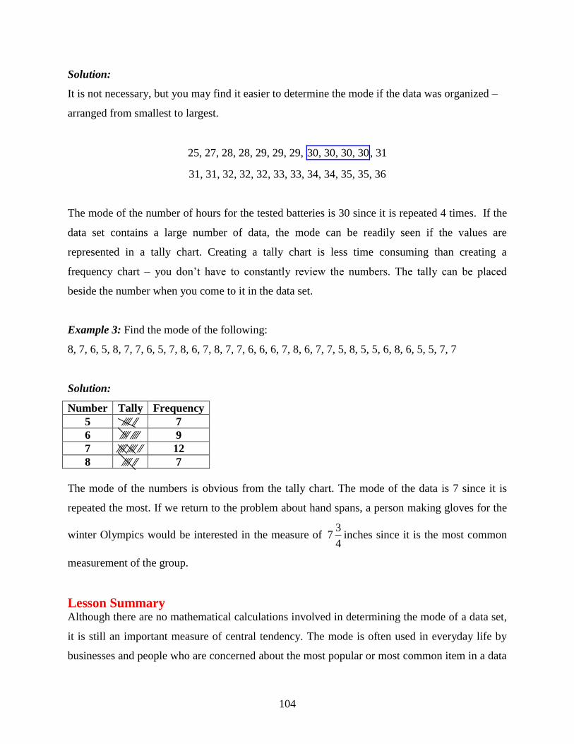
104
Solution:
It is not necessary, but you may find it easier to determine the mode if the data was organized –
arranged from smallest to largest.
25, 27, 28, 28, 29, 29, 29, 30, 30, 30, 30, 31
31, 31, 32, 32, 32, 33, 33, 34, 34, 35, 35, 36
The mode of the number of hours for the tested batteries is 30 since it is repeated 4 times. If the
data set contains a large number of data, the mode can be readily seen if the values are
represented in a tally chart. Creating a tally chart is less time consuming than creating a
frequency chart – you don‟t have to constantly review the numbers. The tally can be placed
beside the number when you come to it in the data set.
Example 3: Find the mode of the following:
8, 7, 6, 5, 8, 7, 7, 6, 5, 7, 8, 6, 7, 8, 7, 7, 6, 6, 6, 7, 8, 6, 7, 7, 5, 8, 5, 5, 6, 8, 6, 5, 5, 7, 7
Solution:
Number Tally Frequency
5 ∕∕∕∕ ∕∕ 7
6 ∕∕∕∕ ∕∕∕∕ 9
7 ∕∕∕∕ ∕∕∕∕ ∕∕ 12
8 ∕∕∕∕ ∕∕ 7
The mode of the numbers is obvious from the tally chart. The mode of the data is 7 since it is
repeated the most. If we return to the problem about hand spans, a person making gloves for the
winter Olympics would be interested in the measure of 3
74
inches since it is the most common
measurement of the group.
Lesson Summary Although there are no mathematical calculations involved in determining the mode of a data set,
it is still an important measure of central tendency. The mode is often used in everyday life by
businesses and people who are concerned about the most popular or most common item in a data
105
set. If you are operating a deli and you offer ten different sandwiches, you will make sure that
you have all the ingredients for the one that you sell the most. Clothing stores also operate their
business to include the most popular apparel. The mode helps many people in many walks of life
to be successful – all based on the one that appears the most often.
Points to Consider
Is the mode referred to in any other area of statistics?
Review Questions: Show all work that you applied to determine the mode – organizing data,
tally charts, frequency tables, etc.
1. A class of students recorded their shoe sizes and the results are as follows:
8, 5, 8, 5, 7, 6, 7, 7, 5, 7, 5, 5, 6, 6, 9, 8, 9, 7, 9, 9, 6, 8, 6, 6, 7, 8, 7, 9, 5, 6
What size represents the mode? There are two modes (6 and 7).
2. In a local hockey league, the goals scored by all the teams during a weekend
tournament were:
4, 1, 0, 7, 6, 3, 2, 2, 1, 7, 4, 0, 2, 5, 6, 6, 0, 3, 6, 5, 2, 7, 5, 3, 2, 3, 6, 6
What is the mode for the goals scored during the tournament?
3. Two dice are thrown together 20 times and the results are shown below:
Score of
The Roll
Frequency
2 1
3 1
4 3
5 1
6 3
7 3
8 4
9 1
10 1
11 1
12 1
What is the modal score? (8)

106
4. The time (in minutes) taken by a man riding his bicycle to work were
54, 57, 55, 58, 55, 57, 57, 56, 58, 54, 58, 54, 54, 53, 56, 58, 57, 53, 55, 57
What is the mode of his times?
5. The number of students attending class was recorded for thirty consecutive days.
The recorded attendance was:
30, 32, 28, 28, 29, 30, 31, 28, 27, 27, 31, 28, 32, 28, 27
28, 30, 30, 29, 32, 32, 28, 29, 30, 31, 30, 32, 31, 29, 29
What is the modal attendance? (28)
6. The Vince Ryan Hockey Tournament attracts teams from Canada and the United
States. The host team has recorded their results over the past fifteen years of the
tournament and has published the results in the local newspaper.
Year Wins
(2Points)
Ties
(1Point)
Loses
(0 Point)
1995 3 4 3
1996 4 0 6
1997 7 0 3
1998 3 2 5
1999 8 0 2
2000 5 0 5
2001 6 2 2
2002 7 2 1
2003 4 2 4
2004 5 1 4
2005 6 2 2
2006 5 4 1
2007 6 2 4
2008 6 0 4
2009 2 4 4
What is the mode for the host team‟s points?
7. Two-color counters are often used when teaching students how to add and subtract
integers. These counters are red on one side and yellow on the other. Three counters
are tossed simultaneously 20 times. Each counter either landed Red (R) or
Yellow(Y). The results of the tosses are shown below:

107
Counter 1 Counter2 Counter3 Counter1 Counter2 Counter3
R R Y Y R Y
R Y Y Y Y R
Y Y R R Y R
R Y Y R R R
Y R Y Y R Y
Y Y Y Y Y Y
R R R Y Y Y
R Y Y Y R R
R Y R Y R Y
R R Y R Y R
Which set of results is the mode 3 Reds
3 Yellows
2 Reds and 1 Yellow
or 1 Red and 2 Yellows? (1 Red and 2 Yellows)
8. The temperature in 0F on 20 days during the winter was:
400F, 36
0F, 36
0F, 34
0F, 30
0F, 30
0F, 32
0F, 34
0F, 38
0F, 40
0F
340F, 34
0F, 38
0F, 36
0F, 38
0F, 36
0F, 34
0F, 38
0F, 40
0F, 36
0F
What was the modal temperature?
Answer Key for Review Questions (even numbers)
2. 6 goals
4. 57 minutes
6. 14 points
8. 340F
Vocabulary
Frequency Table – A table that shows how often each data value, or group of data values,
occurs.
Mean – A number that is typical of a set of data. The mean is calculated by adding all the
data values and dividing the sum by the number of values.

108
Median –The value of a data set that occupies the middle position. For an odd- number
set of data, it is the value such that there is an equal number of data before and
after this middle value. For an even-number of data, the median is the average
of the two values in the middle position.
Mode – The value or values that occur the most often in a set of data.
109
Chapter 7
Organizing and Displaying Distributions of Data
7.1 Line Graphs and Scatter Plots
Learning Objectives
Represent data that has a linear pattern on a graph.
Represent data using a broken-line graph and represent two sets of data using a double
line graph.
Understand the difference between continuous data and discrete data as it applies to a line
graph.
Represent data that has no definite pattern as a scatter plot.
Draw a line of best fit on a scatter plot.
Use technology to create both line graphs and scatter plots.
Introduction Each year the school has a fund raising event to collect money to support the school sport teams.
This year the committee has decided that each class will make friendship bracelets and sell them
for $2.00 each. To buy the necessary supplies to make the bracelets, each class is given $40.00 as
a start up fee. Create a table of values and draw a graph to represent the sale of 10 bracelets. If
the class sells ten bracelets, how much profit will be made?
We will revisit this problem later in the lesson.
When data is collected from surveys or experiments, it can be displayed in different ways; tables
of values, graphs, and box-and-whisker plots. The most common graphs that are used in statistics
are line graphs, scatter plots, bar graphs, histograms, frequency polygons. Graphs are the most
common way of displaying data because they are visual and allow you to get a quick impression
of the data and determine if there are any trends in the data. You have probably noticed that
graphs of different types are found regularly in newspapers, on websites, and in many textbooks.
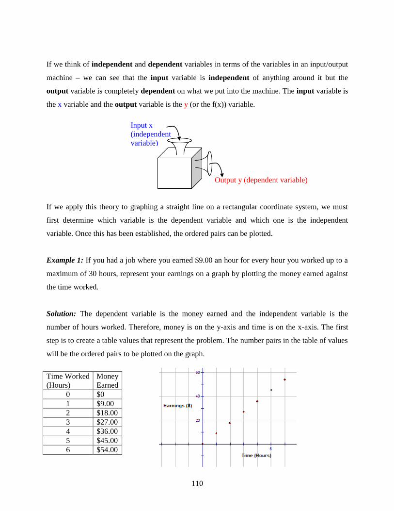
110
If we think of independent and dependent variables in terms of the variables in an input/output
machine – we can see that the input variable is independent of anything around it but the
output variable is completely dependent on what we put into the machine. The input variable is
the x variable and the output variable is the y (or the f(x)) variable.
Output y (dependent variable)
If we apply this theory to graphing a straight line on a rectangular coordinate system, we must
first determine which variable is the dependent variable and which one is the independent
variable. Once this has been established, the ordered pairs can be plotted.
Example 1: If you had a job where you earned $9.00 an hour for every hour you worked up to a
maximum of 30 hours, represent your earnings on a graph by plotting the money earned against
the time worked.
Solution: The dependent variable is the money earned and the independent variable is the
number of hours worked. Therefore, money is on the y-axis and time is on the x-axis. The first
step is to create a table values that represent the problem. The number pairs in the table of values
will be the ordered pairs to be plotted on the graph.
Time Worked
(Hours)
Money
Earned
0 $0
1 $9.00
2 $18.00
3 $27.00
4 $36.00
5 $45.00
6 $54.00
Input x
(independent
variable)

111
Now that the points have been plotted, the decision has to be made as to whether or not to join
them. Between every two points plotted on the graph are an infinite number of values. If these
values are meaningful to the problem, then the plotted points can be joined. This data is called
continuous data. If the values between the two plotted points are not meaningful to the problem,
then the points should not be joined. This data is called discrete data. In the above problem, it is
possible to earn $4.50 for working one-half hour and this value is meaningful for our problem.
Therefore the data is continuous and the points should be joined.
Now you know how to graph a straight line from a table of values. It is just as important to be
able to graph a straight line from a linear function that models a problem. The equation of a
straight line can be written in the form y mx b , where m is the slope of the line and b is the y-
intercept.
Example 2: Draw a graph to model the linear function 2 5y x
Solution:
The slope of the
line is
change in x
change in y.
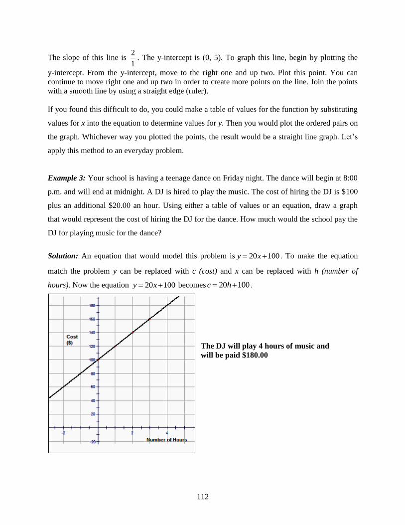
112
The slope of this line is 2
1. The y-intercept is (0, 5). To graph this line, begin by plotting the
y-intercept. From the y-intercept, move to the right one and up two. Plot this point. You can
continue to move right one and up two in order to create more points on the line. Join the points
with a smooth line by using a straight edge (ruler).
If you found this difficult to do, you could make a table of values for the function by substituting
values for x into the equation to determine values for y. Then you would plot the ordered pairs on
the graph. Whichever way you plotted the points, the result would be a straight line graph. Let‟s
apply this method to an everyday problem.
Example 3: Your school is having a teenage dance on Friday night. The dance will begin at 8:00
p.m. and will end at midnight. A DJ is hired to play the music. The cost of hiring the DJ is $100
plus an additional $20.00 an hour. Using either a table of values or an equation, draw a graph
that would represent the cost of hiring the DJ for the dance. How much would the school pay the
DJ for playing music for the dance?
Solution: An equation that would model this problem is 20 100y x . To make the equation
match the problem y can be replaced with c (cost) and x can be replaced with h (number of
hours). Now the equation 20 100y x becomes 20 100c h .
The DJ will play 4 hours of music and
will be paid $180.00

113
Example 4: The total cost to lease a car is mostly dependent on the number of months you have
the lease. The table of values below shows the cost and number of months for ten months of a
lease. Plot the data points on a properly labeled x-y axis. Draw the line all the way to the y-axis
so that you can find the y-intercept. What could the y-intercept represent in this problem?
x (months) 2 4 6 8 10
y ($) 2100 2700 3300 3900 4500
The slope is 300 and the y-intercept is 1500
The equation is 300 1500y x
The y-intercept could be the down payment for
leasing the vehicle.
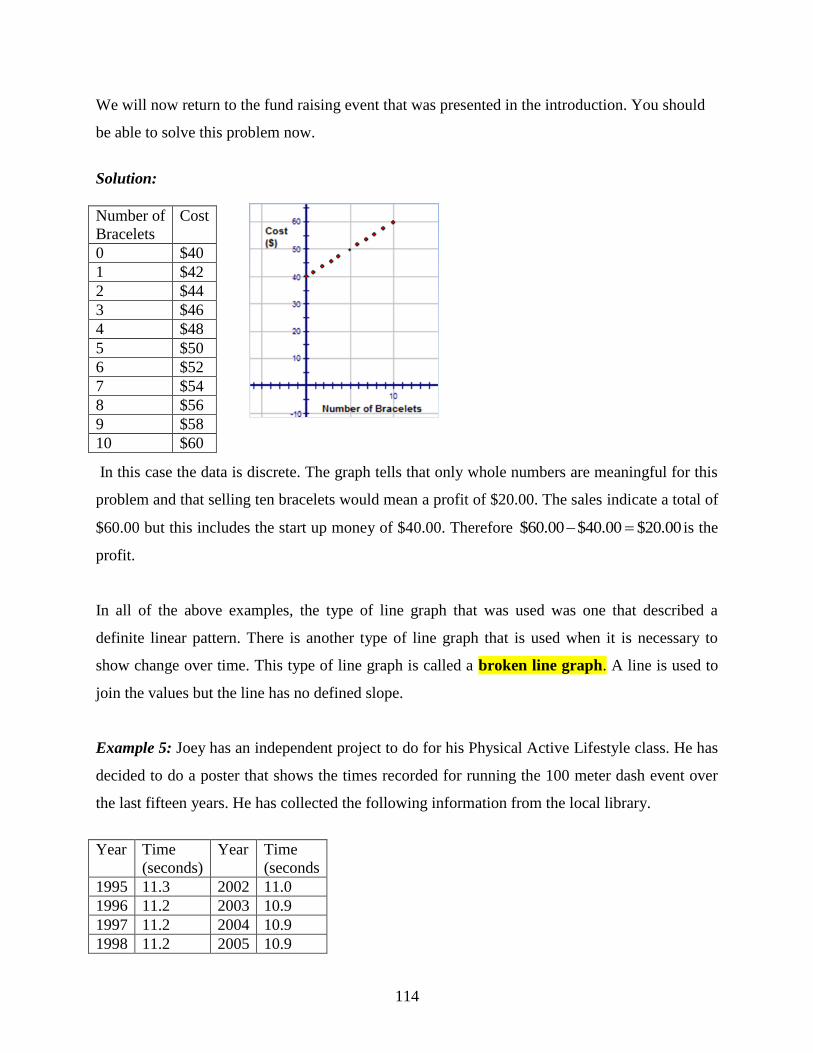
114
We will now return to the fund raising event that was presented in the introduction. You should
be able to solve this problem now.
Solution:
In this case the data is discrete. The graph tells that only whole numbers are meaningful for this
problem and that selling ten bracelets would mean a profit of $20.00. The sales indicate a total of
$60.00 but this includes the start up money of $40.00. Therefore $60.00 $40.00 $20.00 is the
profit.
In all of the above examples, the type of line graph that was used was one that described a
definite linear pattern. There is another type of line graph that is used when it is necessary to
show change over time. This type of line graph is called a broken line graph. A line is used to
join the values but the line has no defined slope.
Example 5: Joey has an independent project to do for his Physical Active Lifestyle class. He has
decided to do a poster that shows the times recorded for running the 100 meter dash event over
the last fifteen years. He has collected the following information from the local library.
Year Time
(seconds)
Year Time
(seconds
1995 11.3 2002 11.0
1996 11.2 2003 10.9
1997 11.2 2004 10.9
1998 11.2 2005 10.9
Number of
Bracelets
Cost
0 $40
1 $42
2 $44
3 $46
4 $48
5 $50
6 $52
7 $54
8 $56
9 $58
10 $60

115
1999 11.2 2006 10.8
2000 11.2 2007 10.7
2001 11.2 2008 10.7
2009 10.5
Display the information that Joey has collected on a graph that he might use on his poster.
Solution:
Time for 100m Dash
From this graph, you can answer many of the following questions:
1. What was the fastest time for the 100m dash in the year 2000? 11.2 seconds
2. Between what two years was there the greatest decrease in the fastest time to complete the
100m dash? Between 2001 and 2002; Between 2008 and 2009
3. As the years pass, why do think runners are completing the race in a faster time? The
runners are living a healthier and more active life style.
A broken line graph can be extended to include two broken lines. This type of a line graph is
very useful when you have two sets of data that relate to the same topic but are from two
different sources. For example the deaths in a small town over the past ten years can be graphed
on a broken line graph. To extend this data, natural deaths could be plotted along with the deaths
that were the result of traffic accidents. With both lines on the same graph, comparing them
would be made easier.

116
Example 6: Jane has operated an ice-cream parlor for many years. She has decided to retire and
is anxious to sell her business. In order to show interested buyers the ice cream sales for the past
two years, she has decided to show these sales on a double line graph. She will use the graph to
show buyers what month had the highest sales, when the greatest change in sales occurs and to
show them when an unexpected increase in sales occurs. Following is the information that Jane
has recorded for the monthly sales during the years 2008 and 2009. Can you help Jane by using
the double line graph to answer the questions?
Solution:
The month of August had the highest sales for both years. Between the months and August and
September there is a great decrease in the ice cream sales. However, the month of December
shows an unexpected increase in sales. This could be due to the holiday season.
Scatter Plots
Often, when real-world data is plotted, the result is a linear pattern. The general direction of the
data can be seen, but the data points do not all fall on a line. This type of graph is a scatter plot.
A scatter plot is often used to investigate the relationship (if one exists) between two sets of
data. The data is plotted on a graph such that one quantity is plotted on the x-axis and one
quantity is plotted on the y-axis. If the relationship does exist between the two sets of data, it will
be visible when the data is plotted.
117
Example 1: The following graph represents the relationship between the price per pound of
lobster and the number of lobsters sold. Although the points cannot be joined to form a straight
line, the graph does suggest a linear pattern. What is the relationship between the cost per pound
and the number of lobsters sold?
Solution:
From the graph, it is obvious that a relationship does exist between the cost per pound and the
number of lobsters sold. When the cost per pound was low, the number of lobsters sold was high.
Example 2: The following scatter plot represents the sale of lottery tickets and the temperature.
Is there a relationship between the number of lottery tickets sold and the temperature?

118
Solution:
From the graph, it is clearly seen that there is no relationship between the number of lottery
tickets sold and the temperature of the surrounding environment.
Example 3: The table below represents the height of ten children in inches and their shoe size.
Height(in) 51 53 61 59 63 47 53 66 55 49
Shoe Size 2 4 6 5 7 1 3 9 4 2
The information from the table can be displayed on a scatter plot.
Solution:
Yes, there is a relationship between the shoe size and the height of the child. Children who are
short wear small-sized shoes and those who are taller wear larger shoes.
In this case, there is a direct relationship (correlation) between the shoe size and the height of the
children. Correlation refers to the relationship or connection between two sets of data. The
correlation between two sets of data can be weak, strong, negative, or positive, or in some cases
there can be no correlation. The characteristics of the correlation between two sets of data can be
readily seen from the scatter plot.
The scatter plot of the shoe sizes and the heights of the children show a strong, positive
correlation. The scatter plot of the lottery tickets and the temperature showed no correlation.
If there is a correlation between the two sets of data on a scatter plot, then a straight line can be
drawn so that the plotted points are either on the line or very close to it. This line is called the

119
line of best fit. A line of best fit is drawn on a scatter plot so that it joins as many points as
possible and shows the general direction of the data. When constructing the line of best fit, it is
also important to keep, approximately, an equal number of points above and below the line. To
determine where the line of best fit should be drawn, a piece of spaghetti can easily be rolled
across the graph with the plotted points still being visible.
Returning to the scatter plot that shows the relationship between shoe sizes and the height of
children, a line of best fit can be drawn to define this relationship.
In a later lesson, we will determine the equation of this line manually and by using technology.
Lesson Summary
In this lesson you learned how to represent data by graphing three types of line graphs-a straight
line of the form y mx b , a broken-line graph and a double line graph. You also learned about
scatter plots and the meaning of correlation as it applies to a scatter plot. In addition, you saw the
result of drawing a line of best fit on a scatter plot.
Points to Consider
Is a double line graph the only representation used to compare two sets of data?
Does the line of best fit have an equation that would model the data?
Is there another representation that could be used instead of a broken line graph?
Review Questions: Show all work necessary to answer each question. Be sure to label all
graphs.

120
1. On the following graph circle the independent and dependent variables. Write a sentence to
describe how the independent (input) variable is related to the dependent (output) variable in
each graph.
(a)
Answer
The dependent variable (distance) is increasing as the independent variable (time) is increasing.
2. Ten people were interviewed for a job at the local grocery store. Mr. Neal and Mrs.
Green awarded each of the ten people, points as shown in the following table:
Mr.
Neal
30 22 25 17 17 39 33 38 27 33
Mrs.
Green
25 20 21 15 16 35 30 32 23 22
Draw a scatter plot to represent the above data. (You may use technology to do this).
Dis
tan
ce
Time
Dep
enden
t
Independent

121
3. The following data represents the fuel consumption of cars with the same size engine,
when driven at various speeds.
Speed (km/h) 48 99 64 128 112 88 120 106
Fuel Consumption (km/L) 7 14 9 18 16 13 17 15
a) Plot the data values.
b) Draw in the line of best fit.
c) Estimate the fuel consumption of a car travelling at a speed of 72 km/h.
d) Estimate the speed of a car that has a fuel consumption of 12 km/L.
Answer:
a) and b)
c) The fuel consumption of a car travelling at a speed of 72 km/h is approximately
10 L.
d) The speed of a car that has a fuel consumption of 12 km/L is approximately
85 km/h

122
4. Answer the questions by using the following graph that represents the temperature in 0F for
the first 20 days in July.
a) What was the coldest day?
b) What was the temperature on the hottest day? (Approximately)
c) What days appeared to have no change in temperature?
4. Answer the questions by using the following graph that represents the temperature in 0F for
the first 20 days in July in New York and in Seattle.
a) Which City has the warmest temperatures in July? Seattle
b) Which of the two cities seems to have temperatures that appear to be rising as the
month progresses? Both cities appear to have rising temperature as the month
progresses, but Seattle seems to have more hot days and on the 20th
, the temperature
is still rising. The temperature in New York seemed to rise on the 19th
but on the 20th
the temperature appears to drop off.

123
c) Approximately, what is the difference in the daily temperatures between the two
cities? There appears to be a difference of approximately 10 degrees between the
temperatures of the cities.
5. The following graphs represent continuous and discrete data. Are the graphs labeled correctly
with respect to these types of data? Justify your answer.
7. A car rental agency is advertising March Break specials. The company will
rent a car for $10 a day plus a down payment of $65. Create a table of values for
this problem and plot the points on a graph. Using the graph, what would be the
cost of renting the car for one week?
Answer:
Number of Days 1 2 3 4 5
Cost ($) $75 $85 $95 $105 $115

124
The cost of renting the car for one week (7 days) would be $135.00. This is indicated on the
graph by the horizontal line that is drawn from the 7th
day to the cost axis.
8. What type of graph would you use to display each of the following types of data?
a) The number of hours you spend doing Math homework each week for the first
semester.
b) The marks you received in all your home assignments in English this year and
the marks you received in all your home assignments in English last year
c) The cost of riding in a taxi cab that charges a base rate if $5.00 plus $0.25 for
every mile you go.
d) The time in minutes that it takes you to walk to work each day for 10 days.
Answer Key for Review Questions (even numbers)
2. Stat Enter
2nd
y = Enter Graph
Using the TRACE function will give the
coordinates of the points

125
4. a) The coldest day was July 7th
.
b) The hottest day was July 19th
.
c) There does not appear to be a change in temperature on July 1st and 2
nd,
July 10th
and 11th
, July 17th
and 18th
.
6. The first graph is labeled correctly as being continuous data.
The amount of fuel remaining in your gas tank is plotted for each hour you drive.
However, the amount of fuel in your gas tank decreases every minute/second you
drive. All values on the graph are meaningful and therefore can be joined. This is
continuous data.
The second graph is also labeled correctly as being discrete data.
The cost of CDs is plotted for each CD you purchase. The cost
to you changes only when another CD is purchased. The values
between the plotted points are not meaningful and therefore are
not joined. This is discrete data.
8. a) A scatter plot
b) A double line graph
c) A line graph
d) A broken-line graph

126
7.2 Bar Graphs, Histograms and Stem-and-Leaf Plots
Learning Objectives
Construct a stem-and leaf plot.
Understand the importance of a stem-and-leaf plot in statistics.
Construct and interpret a bar graph.
Create a frequency distribution chart.
Construct and interpret a histogram.
Use technology to create graphical representations of data.
Introduction
Suppose you have a younger sister or brother and it is your job to entertain him or her every
Saturday morning. You decide to take the youngster to the community pool to swim. Since
swimming is a new thing to do, your little buddy isn‟t too sure about the water and is a bit scared
of the new adventure. You decide to keep a record of the length of time they stay in the water
each morning. You recorded the following times
(in minutes):
12, 13, 21, 27, 33, 34, 35, 37, 40, 40, 41
Your brother or sister is too young to understand the meaning of the times that you‟ve recorded
so you decide that you have to draw a picture of these numbers to show to the child. How are
you going to represent these numbers?
By the end of this lesson you will have several ideas of how to represent these numbers and you
can choose the one that you think your little buddy will understand the best.
Bar Graphs
A bar chart or bar graph is often used for data that can be described by categories (months,
colors, activities…) which is referred to as qualitative data. A bar graph can also be used to
represent numerical data (quantitative data) if the number of data is not too large. A bar graph
plots the number of times a category or value occurs in the data set. The height of the bar
127
represents the number of times the value or the observation appeared in the data set. The y – axis
most often records the frequency and the x – axis records the category or value interval. The axes
must be labeled to indicate what each one represents and a title should be placed on the graph.
When a bar graph is used to display qualitative data, the data is grouped in bins or intervals.
These bins and the frequency of the data that is located in each bin can be shown in a frequency
distribution table. For a bar graph, there is a break between the bins because the data is not
continuous. The bins for a set of data could be grouped with a bin size of 10 and be written
as10 19; 20 29 and 30 31 .
Example 1: Sara is doing a project on winter weather for her Science project. She has decided to
research the amount of snowfall (in inches) that fell last year for cities in Canada. Here is the
information that she has collected:
She is going to represent this qualitative data in a bar graph.
City Snowfall
Vancouver 22
Edmonton 54.2
Regina 43
Toronto 54
Ottawa 88.6
Montreal 123.8
Moncton 104.6
128
Sara has created a very colorful bar graph which includes a title, the category (City) on the x -
axis and the frequency (Snowfall in.) on the y-axis. There is an equal space between each of the
bars and each of the bars is the same width.
Example 2: The School Board for your district has to submit a report to the state that tells what
percent of their casual employees work in the transportation department and the ages of these
employees. The Board decides to create a frequency distribution table and then to display this
information on a quantitative bar graph.
This bar graph contains the information that the Board wanted to send to the state but the actual
data has been lost. The ages of the employees have been put into bins that have groups of ages.
As a result, you know that 22% of the employees are between the ages of 20 to 29 but you do not
know the age of the employees. It is possible that 3 people are 20, 2 people are 25 and 3 people
are 28. There are numerous combinations that could belong in this age group but that is
something that you do not know from this graph. The only information that can be learned from
this graph is the percentage of the employees that fit in each age group.
Bin
(Age in yr.)
Percent
(20-29) 22
(30-39) 31
(40-49) 38
(50-59) 5
AGE GROUP
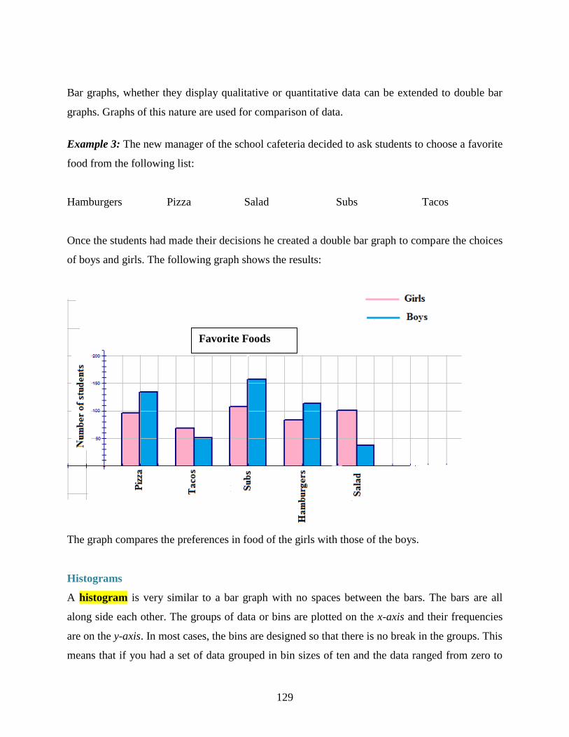
129
Bar graphs, whether they display qualitative or quantitative data can be extended to double bar
graphs. Graphs of this nature are used for comparison of data.
Example 3: The new manager of the school cafeteria decided to ask students to choose a favorite
food from the following list:
Hamburgers Pizza Salad Subs Tacos
Once the students had made their decisions he created a double bar graph to compare the choices
of boys and girls. The following graph shows the results:
The graph compares the preferences in food of the girls with those of the boys.
Histograms
A histogram is very similar to a bar graph with no spaces between the bars. The bars are all
along side each other. The groups of data or bins are plotted on the x-axis and their frequencies
are on the y-axis. In most cases, the bins are designed so that there is no break in the groups. This
means that if you had a set of data grouped in bin sizes of ten and the data ranged from zero to
Favorite Foods

130
fifty, the bins would be represented as [0-10); [10-20); [20-30); [30-40); [40-50) and [50-60). If
you count the number of numbers in each bin, you see that it is 11. You are supposed to have a
bin size of 10. The notation [,) means that the first number in each bin is after the square bracket
[but the last number) actually counts in the next group. Although the bins are written in this
manner, the bin really extends 0 to 9, 10 to 19 etc. when the data is grouped. Histograms are
usually drawn with the data from a frequency distribution table – often called a frequency table.
Like a bar graph, a histogram requires a title and properly labeled x and y axes.
Example 1: Studies (and logic) show that the more homework you do the better your grade in a
course. In a study conducted at a local school, students in grade 10 were asked to check off what
box represented the average amount of time they spent on homework each night. The following
results were recorded:
This data will now be represented by drawing a histogram.
As with the bar graph, the actual data values are not plotted because the data has been grouped in
bins.

131
An extension of the histogram is a frequency polygon graph. A frequency polygon simply joins
the midpoints (the center of the tops of the bars) of the histogram class intervals with straight
lines and then extends these to the horizontal axis. The distribution is extended one unit before
the smallest recorded data and one unit beyond the largest recorded data. Looking at the
histogram below, we can draw the frequency polygon on top of the histogram. The area under
the frequency polygon is the same as the area under the histogram and is therefore equal to the
frequency values in the table. The frequency polygon also the shape of the distribution of the
data and in this case it resembles the bell curve.
Stem-and-Leaf Plots
A stem and leaf plot is an organization of numerical data into categories based on place value.
The stem-and-leaf plot is a graph that is similar to a histogram but it displays more information.
Also, the data values are kept in a stem-and-leaf plot and are used to describe the shape of the
distribution of the data. . For a stem-and-leaf plot, each number will be divided into two parts
using place value. The stem is the left-hand column and will contain the digits in the largest
place. The right-hand column will be the leaf and it will contain the digits in the smallest place.
For example the number 65 would be separated such that the 6 would be the stem (tens place)
and 5 would be the leaf (digits place).

132
Example 1: In a recent study of male students at a local high school, students were asked how
much money they spend socially on Prom night. The following numbers represent the amount of
dollars of a random selection of 40 students.
25 60 120 64 65 28 110 60
70 34 35 70 58 100 55 95
55 95 93 50 75 35 40 75
90 40 50 80 85 50 80 47
50 80 90 42 49 84 35 70
The above data values are not arranged in any order. For purposes of observing and analyzing
data, the values can be distributed into smaller groups using a stem-and-leaf plot. The stems will
be arranged vertically in ascending order (smallest to largest) and each leaf will be written to the
right of its stem horizontally in order from least to greatest.
Dollars Spent by Males on Prom Night
Stem Leaf
2 5, 8
3 4, 5, 5, 5
4 0, 0, 2, 7, 9
5 0, 0, 0, 0, 5, 5, 8
6 0, 0, 4, 5
7 0, 0, 0, 5, 5
8 0, 0, 0, 4, 5
9 0, 0, 3, 5, 5
10 0
11 0
12 0

133
The stem-and-leaf plot can be interpreted very easily. By very quickly looking at stem 6, you see
that 4 males spent 60 „some dollars‟ on Prom night. By counting the number of leaves, you know
that 40 males responded to the question concerning how much money they spent on prom night.
The smallest and largest data values are known by looking and the first and last stem-and-leaf.
The stem-and-leaf is „quick look‟ chart that can quickly provide information from the data. This
also serves as an easy method for sorting numbers manually.
Example 2: The women from the senior citizen‟s complex bowl everyday of the month. Lizzie
had never bowled before and was enjoying this new found pastime. She decided to keep track of
her best score of the day for the month of September. Here are the scores that she recorded:
77 80 82 68 65 59 61
57 50 62 61 70 69 64
67 70 62 65 65 73 76
87 80 82 83 79 79 77
80 71
In order for Lizzie to see how well she is doing, create a stem-and-leaf plot of her scores.
Lizzie’s Bowling Scores
Stem Leaf
5 0,7,9,
6 1, 1, 2, 2, 4, 5, 5, 5, 7, 8, 9
7 0, 0, 1, 3, 6, 7, 7, 9, 9
8 0, 0, 0, 2, 2, 3, 7
Let‟s return to the problem that was posed at the beginning of the lesson. You are supposed to
display the amount of time your young brother or sister stayed in the water each time you went
swimming. Let‟s look at some options.
Solution:
Minutes in Water Histogram
Stem Leaf
1 2, 3
2 1, 7
3 3, 4, 5, 7,
4 0, 0, 1
Frequency Distribution Table
Little Buddy Swim Time

134
Minutes in Water
Bin Frequency
[10-20) 2
[20-30) 2
[30-40) 4
[40-50) 3
Lesson Summary
In this lesson you learned how to display data that was both qualitative and quantitative. You
created bar graphs that were both single and double. The double bar graphs are very good for
comparing two sets of data quickly. The histogram was another way of representing data. It is
similar to a bar graph – without the spaces. You also learned that both of these graphs lose the
actual data when they are plotted. The data itself remains in bins or categories. Using a stem-and-
leaf plot allows the actual data to be saved and it is really an „at a glance‟ graph. Although it is
quicker and less time consuming to manually create a stem-and-leaf than it is a bar graph or a
histogram, the appearance of the latter two graphs is much more appealing to the eye.
Points to Consider:
Is there any other way to display data that is useful when comparing the values of two
data sets?
Other than sorting the data into categories or bins, there were no mathematical
calculations that had to be done to create these graphs. Are calculations necessary to
represent data on another type of graph?
Review Questions: Show all work necessary to answer each question. Include all necessary
tables. Be sure to label all graphs and to include a title where necessary.

135
1. For the following graph answer the questions below:
a) What is displayed on the vertical axis? The snowfall amount in inches.
b) What scale is used on the vertical axis? The scale is each block = 20 inches.
c) What is displayed on the horizontal axis? The name of the city.
d) Which city had the least amount of snow in 2008? Vancouver
e) Which city had the most snow in 2008? Moncton
f) Which two cities showed little difference in the amount of snow they received?
Edmonton and Toronto
2. Do some research in your area and create a bar graph similar to that in question one,
concerning weather for cities in your country.
3. For the following graph, answer the questions below.

136
a) What is the total percent of people that work in the transportation department? 96%
b) Why do you think this total is not 100%? Some casual workers work in other
departments
c) Which age group has the most people that work in the transportation department? 40-49
d) Which age group has the fewest number of people who work in the transportation
department? 50-59
4. For each of the following examples, describe why you would likely use a bar graph or
a histogram.
(a) Frequency of the favorite drinks for the first 100 people to enter the school
dance.
(b) Frequency of the average time it takes the people in your class to finish a math
assignment.
(c) Frequency of the average distance people park their cars away from the mall in
order to walk a little more.
5. Prepare a histogram using the following scores from a recent science test. When
done, use a different colour pencil and draw a frequency polygon on your graph. Does
the area under your frequency polygon look equal to the area colored in your
histogram?
Age Group
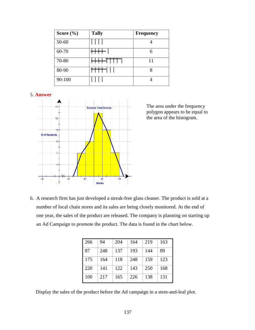
137
Score (%) Tally Frequency
50-60 4
60-70 6
70-80 11
80-90 8
90-100 4
5. Answer
The area under the frequency
polygon appears to be equal to
the area of the histogram.
6. A research firm has just developed a streak-free glass cleaner. The product is sold at a
number of local chain stores and its sales are being closely monitored. At the end of
one year, the sales of the product are released. The company is planning on starting up
an Ad Campaign to promote the product. The data is found in the chart below.
266 94 204 164 219 163
87 248 137 193 144 89
175 164 118 248 159 123
220 141 122 143 250 168
100 217 165 226 138 131
Display the sales of the product before the Ad campaign in a stem-and-leaf plot.

138
7. Answer the following questions with respect to the above stem-and-leaf plot.
(a) How many chain stores were involved in selling the streak-free glass cleaner? 30
stores
(b) In stem 1, what does the number 11 represent? What does the number 8 represent?
118 bottles of streak free cleaner sold by 1 store
(c) What percentage of stores sold less than 175 bottles of streak-free glass cleaner?
63.3%
Answer Key for Review Questions (even numbers)
2. Answers will vary
4. a) The responses for the question “What is your favorite beverage?” would be specific names.
There is no range in the data. Therefore a bar graph would be used. The beverage would be on
the x-axis and the number of students would be on the y-axis. A Bar Graph would be used.
b) The results would have to be grouped in intervals since each result represents a
specific time. The time intervals would be on the x-axis and the number of students would be on
the y-axis. A Histogram would be used.
c) Once again a histogram would be used since the results would have to be grouped in
intervals since each result represents a specific distance. The distance intervals would be on the
x-axis and the number of people would be on the y-axis.
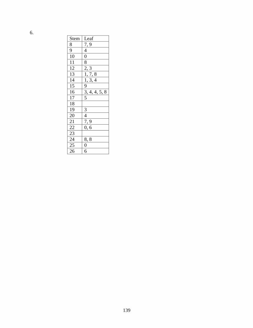
139
6.
Stem Leaf
8 7, 9
9 4
10 0
11 8
12 2, 3
13 1, 7, 8
14 1, 3, 4
15 9
16 3, 4, 4, 5, 8
17 5
18
19 3
20 4
21 7, 9
22 0, 6
23
24 8, 8
25 0
26 6

140
7.3 Box-and-Whisker Plots
Learning Objectives
Construct a box-and-whisker plot.
Construct and interpret a box-and-whisker plot.
Construct box-and-whisker plots for comparison.
Use technology to create box-and-whisker plots.
Introduction
An oil company claims that its premium grade gasoline contains an additive that significantly
increases gas mileage. To prove their claim the selected 15 drivers and first filled each of their
cars with 45L of regular gasoline and asked them to record their mileage. Then they filled each
of the cars with 45L of premium gasoline and again asked them to record their mileage. The
results below show the number of kilometers each car traveled.
Regular Gasoline Premium Gasoline
640 570 660 580 610 659 619 639 629 664
540 555 588 615 570 635 709 637 633 618
550 590 585 587 591 694 638 689 589 500
Display each set of data to explain whether or not the claim made by the oil company is true or
false.
We will revisit this problem later in the lesson to determine whether or not the oil company did
place an additive in its premium gasoline that improved gas mileage.
Box-and-Whisker Plot
A box-and-whisker plot is another type of graph used to display data. It shows how the data are
dispersed around a median, but does not show specific values in the data. It does not show a
distribution in as much detail as does a stem-and-leaf plot or a histogram, but it clearly shows
where the data is located. This type of graph is often used when the number of data values is

141
large or when two or more data sets are being compared. The center of the distribution, its spread
and the range of the data are very obvious form the graph. The box-and-whisker plot (often
called a box plot), divides the data into quarters by use of the medians of these quarters.
As we construct a box-and-whisker plot for a given set of data, you will understand how this type
of graph is very useful in statistics.
Example 1:
You have a summer job working at Paddy‟s Pond which is a recreational fishing spot where
children can go to catch salmon which have been raised in a nearby fish hatchery and then
transferred into the pond. The cost of fishing depends upon the length of the fish caught ($0.75
per inch). Your job is to transfer 15 fish into the pond three times a day. Before the fish are
transferred, you must measure the length of each one and record the results. Below are the
lengths (in inches) of the first 15 fish you transferred to the pond:
Length of Fish (in.)
13 14 6 9 10
21 17 15 15 7
10 13 13 8 11
Since the box-and-whisker plot is based on medians, the first step is to organize the data in order
from smallest to largest.
6 7 8 9 10
10 11 13 13 13
14 15 15 17 21
6, 7, 8, 9, 10, 10, 11, 13, 13, 13, 14, 15, 15, 17, 21
This is an odd number of data, so the median of all the data is the value in the middle position
which is 13. There are 7 numbers before and 7 numbers after 13. The next step is the find the
median of the first half of the data – the 7 numbers before the median. This is called the lower
quartile since it is the first quarter of the data. On the graphing calculator this value is referred to
as Q1.

142
6, 7, 8, 9, 10, 10, 11
The median of the lower quartile is 9.
This step must be repeated for the second half of the data – the 7 numbers below the median of
13. This is called the upper quartile since it is the third quarter of the data. On the graphing
calculator this value is referred to as Q3.
13, 13, 14, 15, 15, 17, 21
Now that the medians have all been determined, it is time to construct the actual graph. The
graph is drawn above a number line that includes all the values in the data set (graph paper works
very well since the numbers can be placed evenly using the lines of the graph paper). Represent
the following values by using small vertical lines above their corresponding values on the
number line:
Smallest Number – 6 Median of the Lower Quartile – 9 Median – 13
Median of the Upper Quartile – 15 Largest Number – 21
The five data values listed above are often called the five-number summary for the data set and
are used to graph every box-and-whisker plot.
Join the tops and bottoms of the vertical lines that were drawn to represent the three median
values. This will complete the box.
The three medians divide the data into four equal parts. In other words:
One-quarter of the data values are located between 6 and 9
One-quarter of the data values are located between 9 and 13
One-quarter of the data values are located between 13 and 15
One-quarter of the data values are located between 15 and 21
From the box-whisker, any outliers (unusual data values that can be either low or high) can be
easily seen on a box plot. An outlier would create a whisker that would be very long.

143
The next diagram will show where these numbers are actually located on the box-and-whisker
plot.
Each whisker contains 25% of the data and the remaining 50% of the data is contained within the
box. It is easy to see the range of the values as well as how these values are distributed around
the middle value. The smaller the box, the more consistent the data values are with the median of
the data.
Example 2
After one month of growing, the heights of 30 parsley seed plants were measured and recorded.
The measurements (in inches) are shown in the table below.
Heights of Parsley (in.)
6 26 23 33 11 26
22 28 30 40 38 18
11 37 12 34 49 17
25 37 46 39 8 27
16 38 18 23 26 14
Construct a box-and-whisker plot to represent the data.
The data organized from smallest to largest is shown in the table below. (You could use your
calculator to quickly sort these values)

144
Heights of Parsley (in.)
6 8 11 11 12 14
16 17 18 18 22 23
23 25 26 26 26 27
28 30 33 34 37 37
38 38 39 40 46 49
There is an even number of data values so the median will be the mean of the two middle values.
26 2626
2Med
. The median of the lower quartile is the number in the 8
th position which
is 17. The median of the upper quartile is also the number in the 8th
position which is 37. The
smallest number is 6 and the largest number is 49.
The TI83 can also be used to create a box-and whisker plot. The five-number summary values
can be determined by using the trace function of the calculator.
StatEnter 1L StatSort (A2nd
1)
2nd
y Enter Graph

145
Box-and-Whisker plots are very useful when two data sets need to be compared. The graphs are
plotted, one above the other, on the same number line. This method can be used to determine
whether or not the additive, which the oil company put in their premium gas, improved gas
mileage.
Regular Gasoline Premium Gasoline
540 550 555 570 570 500 589 618 619 629
580 585 587 588 590 633 635 637 638 639
591 610 615 640 660 659 664 689 694 709
Five-Number Summary
Regular Gasoline Premium Gasoline
Smallest # 540 500
Q1 570 619
Median 587 637
Q3 610 664
Largest # 660 709

146
From the above box-and-whisker plots, where the blue one represents the regular gasoline and
the yellow one the premium gasoline, it is safe to say that the additive in the premium gasoline
definitely increases the mileage. However, the value of 500 seems to be an outlier.
Lesson Summary
In this lesson you learned how the medians of a set of data can be used to represent the values in
a meaningful graph called the box-and-whisker plot. You also learned that two sets of data can
be compared by representing them using box-and-whisker plots graphed on the same number
line. In addition, you also learned the importance of the five-number summary associated with a
data set and how these values can be found on the TI83 when a box-and whisker plot is created
using technology.
Points to Consider
Are there still other ways to represent data graphically?
We have seen how the mean and the median are used for graphical representations of
data. Is the mode ever used to produce a graph?
Review Questions: Show all work necessary to answer each question.
1. Below is the data that represents the amount of money that males spent on prom night,
25 60 120 64 65 28 110 60
70 34 35 70 58 100 55 95
55 95 93 50 75 35 40 75
90 40 50 80 85 50 80 47
50 80 90 42 49 84 35 70
Construct a box-and-whisker graph to represent the data.

147
Answer:
2. Using the following box-and whisker plot, list three things pieces of information that you can
determine from the graph.
3. In a recent survey done at a high school cafeteria, a random selection of males and females
were asked how much money they spent each month on school lunches. The following box-
and-whisker plots compare the responses of males to those of
females. The lower one is the response by males
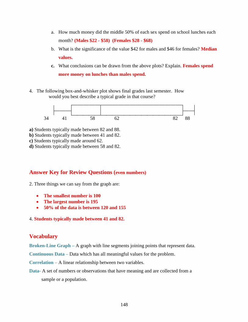
148
a. How much money did the middle 50% of each sex spend on school lunches each
month? (Males $22 - $58) (Females $28 - $68)
b. What is the significance of the value $42 for males and $46 for females? Median
values.
c. What conclusions can be drawn from the above plots? Explain. Females spend
more money on lunches than males spend.
4. The following box-and-whisker plot shows final grades last semester. How
would you best describe a typical grade in that course?
34 41 58 62 82 88
a) Students typically made between 82 and 88.
b) Students typically made between 41 and 82.
c) Students typically made around 62.
d) Students typically made between 58 and 82.
Answer Key for Review Questions (even numbers)
2. Three things we can say from the graph are:
The smallest number is 100
The largest number is 195
50% of the data is between 120 and 155
4. Students typically made between 41 and 82.
Vocabulary
Broken-Line Graph – A graph with line segments joining points that represent data.
Continuous Data – Data which has all meaningful values for the problem.
Correlation – A linear relationship between two variables.
Data- A set of numbers or observations that have meaning and are collected from a
sample or a population.

149
Discrete Data – Data in which the values between the plotted points have no meaning for
the problem.
Double Broken-Line Graph – Two broken-line graphs plotted on the same axis and used
for comparison of data.
Dot Plot – A graph that shows the values of a variable along a number line.
Linear Graph – A graph of a straight line that has an equation in the form y mx b
Line of Best Fit – A line connecting points on a scatter plot that best represents the data.
Scatter Plot – A plot of dots that shows the relationship between two variables.
Bar Graph – Graph that compares data using equally spaced bars to represent the data.
Histogram – A type of bar graph that has no spaces between the bars.
Stem-and-Leaf Plot – A type of graph that is similar to a histogram and the data is
arranged according to place value.