Physician Responses to a Medicaid Price Shock: …...1 Physician Responses to a Medicaid Price...
62
Physician Responses to a Medicaid Price Shock: Evidence from Florida’s Fee Bump Adam Leive, PhD** University of Virginia Michael R Richards, MD PhD MPH Vanderbilt University D Sebastian Tello Trillo, PhD University of Virginia ** Corresponding Author Assistant Professor, Frank Batten School of Leadership & Public Policy University of Virginia L050 Garrett Hall, 235 McCormick Road Charlottesville, VA 22904 Phone: (434) 924-0049 Email: [email protected] JEL Codes: H41; H51; I13; I18; J22; J44; J48 Acknowledgments The authors thank the Florida Agency for Health Care Administration for providing excellent data sources. The AHCA was not responsible for any analyses or interpretations of the data. The authors are also grateful to Daniel Polsky, Ashley Swanson, Matthew Grennan, Scott Harrington, and seminar participants at the University of Pennsylvania and Vanderbilt University for helpful feedback. The authors have no conflicts of interest to disclose, and all remaining errors and opinions belong solely to the authors.
Transcript of Physician Responses to a Medicaid Price Shock: …...1 Physician Responses to a Medicaid Price...

Physician Responses to a Medicaid Price Shock: Evidence from Florida’s Fee Bump
Adam Leive, PhD**
University of Virginia
Michael R Richards, MD PhD MPH Vanderbilt University
D Sebastian Tello Trillo, PhD
University of Virginia
** Corresponding Author Assistant Professor, Frank Batten School of Leadership & Public Policy University of Virginia L050 Garrett Hall, 235 McCormick Road Charlottesville, VA 22904 Phone: (434) 924-0049 Email: [email protected] JEL Codes: H41; H51; I13; I18; J22; J44; J48 Acknowledgments The authors thank the Florida Agency for Health Care Administration for providing excellent data sources. The AHCA was not responsible for any analyses or interpretations of the data. The authors are also grateful to Daniel Polsky, Ashley Swanson, Matthew Grennan, Scott Harrington, and seminar participants at the University of Pennsylvania and Vanderbilt University for helpful feedback. The authors have no conflicts of interest to disclose, and all remaining errors and opinions belong solely to the authors.

1
Physician Responses to a Medicaid Price Shock: Evidence from Florida’s Fee Bump
Abstract
The Affordable Care Act has brought millions more into Medicaid coverage, while
experimenting with related policies—including a temporary “fee bump” for primary care
services. The ultimate effects of a potentially large, but ephemeral, Medicaid price shock
are unclear a priori. Thus, we use detailed physician data from the state of Florida to
empirically document the policy’s impact. Primary care physicians (PCPs) are attracted
to more generous fees, especially those with a hospital-based practice. Doubling payment
rates leads them to increase their acceptance of new Medicaid patients by 10-13% across
the state, but only among those already participating in the program. The incentive does
not draw new PCPs into the Medicaid market. Employers seem to simultaneously induce
greater labor supply from their clinicians to accommodate more Medicaid business.
However, these changes to physician behavior do not reduce Medicaid patients’ reliance
on emergency department care, even for primary care sensitive conditions. While
politically popular in recent years, policies that temporarily adjust physician payments
may be an inefficient use of public resources.

2
INTRODUCTION
Courtesy of the Affordable Care Act (ACA), the Medicaid program has surpassed
Medicare as the largest health insurer in the United States (US), enrolling nearly 73
million individuals by 2016.1 However, Medicaid’s recent growth and current size do not
guarantee enrollee access to care. The program still represents fewer than 20% of all US
health care dollars spent,2 and has a less favorable provider fee schedule when compared
to other payers. The influence of Medicaid pricing on provider participation and patient
access is also well documented in the empirical literature and known to policymakers
(Baker and Royalty 2000; Brunt and Jensen 2014; Coburn, Long, and Marquis 1999;
Cohen and Cunningham 1995; Cunningham and Nichols 2005; Decker 2007, 2012; Han
2013; Mitchell 1991; Perloff, Kletke, and Fossett 1995; Rhodes et al. 2014; Richards and
Polsky 2016; Richards et al. 2016b; Rosenbaum 2014; Showalter 1997; Sloan, Mitchell,
and Cromwell 1978; Sommers, Paradise, and Miller 2011). As a result, the ACA coupled
its federally funded Medicaid expansions with a federally funded boost to Medicaid
payments starting in 2013, with the hope of inducing more providers to accept Medicaid
patients.
The resulting policy¾known as the Medicaid “fee bump” ¾contained three
salient features. First, the more generous payments lasted just two years, expiring
December 31, 2014 unless individual states sustained them using their own funds.
Second, the payment changes were restricted to care administered by primary care
1 Enrollment numbers provided by the Kaiser Family Foundation (www.kff.org) “State Health Facts” data. 2 See CMS spending figures for the 2014 fiscal year, available here: https://www.cms.gov/research-statistics-data-and-systems/statistics-trends-and-reports/nationalhealthexpenddata/nhe-fact-sheet.html

3
providers, leaving most providers and their billable activities untouched.3 And finally, the
temporary reimbursements were benchmarked to Medicare prices (French et al. 2016;
Polsky et al. 2015; Wilk and Jones 2014; Zuckerman, Skopec, and McCormack 2014).
Equalizing state Medicaid payments with nationally set Medicare rates created wide
variation in the magnitude of the price shock due to states’ differing Medicaid generosity
at baseline. Some primary care providers experienced relatively small financial
improvements while their counterparts in other states saw eligible Medicaid
reimbursements double in size (Zuckerman and Goin 2012; Zuckerman et al. 2014).
Yet, even in the presence of large payment increases, the temporary nature and
limited scope of the incentives raises doubt on their potential effectiveness (Ginsburg
2011; Goodson 2010; Wilk and Jones 2014). For instance, primary care physicians
(PCPs) may be unwilling to devote more effort toward a particular market segment at the
expense of serving other patient-payer groups, especially when capacity constrained. Any
returns from adjusting their practice to take advantage of higher payments (e.g.,
increasing labor supply or reducing care delivered to other patients) would be short-lived
and have to be balanced against the costs of doing so; Medicaid is also notorious for
administrative burdens and reimbursement delays, which erodes the appeal of higher fees
(Cunningham and O'Malley 2009; Long 2013). Additionally, a known transient incentive
could be relatively weak within an industry often reliant upon repeat customers (i.e., an
ongoing provider-patient relationship) and accompanying revenue streams. The marginal
Medicaid patient may not be a one-off transaction but instead a permanent fixture in the
provider’s patient panel going forward—making current and future payment levels
3 Primary care providers were determined eligible if they were board certified in family medicine, general internal medicine, or pediatrics or if they demonstrated that at least 60% of their Medicaid delivered services were for primary care.

4
relevant for provider decision-making. For these reasons, how providers would respond
to this specific policy lever is an open empirical question.
To date, only a single published study has assessed the impact of the recent
Medicaid fee bump on primary care access (Polsky et al. 2015). Polsky and colleagues
(2015) use a “secret shopper” methodology across 10 US states and find providers
increase their willingness to see new Medicaid patients after payments increased in
comparison to a pre-policy year.4 Their study additionally demonstrates a dose-response
relationship across states, with larger price shocks corresponding to greater access
improvements. Several important questions on this policy remain, however, including
whether providers accommodating more Medicaid business were already treating
Medicaid patients, how providers adjusted their labor supply, and whether the policy led
to changes in consumer health.
In this paper, we comprehensively study how physicians respond to the Medicaid
fee bump using a rich set of administrative data collected on the universe of Florida
physicians. Importantly, we benefit from measures of Medicaid participation on the
extensive (i.e., program participation) as well as intensive (i.e., size of the Medicaid
panel) margins. We are also able to document heterogeneity in any changes by practice
setting and then investigate mechanisms by which physicians accommodate additional
Medicaid patients (e.g. changes in labor supply and time use patterns). Beyond supply-
side responses, we also examine downstream consequences for patient health by focusing
on Emergency Department (ED) utilization among Medicaid beneficiaries.
4 The “secret shopper” approach relied on trained field staff randomly calling primary care practices posing as prospective patients. Callers did not actually attend visits, but merely asked over the phone if they could be scheduled for one.

5
Using a difference-in-differences research design, we empirically show that PCPs
are responsive to higher Medicaid prices. We document a robust effect across several
specifications and analytic strategies; however, the positive participation change is
modest, especially when juxtaposed to the state’s extensive price shock. Certain PCPs
also drive much of the observed behavior change—namely, those with a hospital or
health system based practice show the largest absolute increase in their willingness to
take on new Medicaid patients. All other PCPs do so to a lesser extent. Irrespective of
practice setting, the policy effects do not widely vary by local Medicaid market size. We
also see suggestive evidence of a simultaneous ramp up of labor supply (in the form of
patient care hours) once the fee bump is in place, which is indicative of at least one
channel for accommodating more Medicaid business without disrupting care to other
patient-payer groups. That said, the incentive appears to only influence PCPs’ intensive
margin; it fails to attract more PCPs into the Medicaid market.
Our results are consistent with the findings from Polsky et al. (2015) as well as a
causal interpretation for the payment initiative’s effects on Medicaid access. Yet, we find
no evidence that Medicaid beneficiaries subsequently lower their reliance on ED-based
care. ED utilization appears unchanged after the fee bump is active, and the same is true
for enrollees suffering from a host of primary care sensitive conditions, for which proper
outpatient chronic disease management would plausibly prevent acute exacerbations and
related emergency care needs. Our findings, in turn, reveal the challenges of optimally
influencing provider behavior through a large, but temporary, Medicaid price mechanism.

6
HEALTH CARE MARKET CONTEXT
Our study’s setting is Florida. Beyond offering data well suited for our empirical tasks,
this specific context provides several analytic advantages. First, Florida’s Medicaid fee
bump was one of the largest in the country. Primary care services enjoyed a more than
100% markup during the ACA payment intervention (Zuckerman and Goin 2012).
Second, the fee bump did not coincide with a Medicaid expansion. The state is one of the
remaining 19 US states to opt out of this component of the ACA following the 2012
Supreme Court ruling.5 This decision is evident in Figure 1. Florida’s Medicaid program
has grown since 2008 but is fairly stable during the period when many other states
experienced dramatic increases in enrollment. Therefore, we can use the Florida
experience to isolate the access effects of a large but temporary payment shock from any
concomitant expansion of the Medicaid market.
Another rationale for examining the experience of a single state is there is often
important heterogeneity across states in other dimensions of Medicaid. For example,
states differ in the penetration of Medicaid managed care, which may independently
influence provider participation. In Florida, roughly three-quarters of Medicaid patients
were enrolled in managed care plans prior to the fee bump. The state also mandated that
the remainder of Medicaid enrollees move into managed care plans during the late spring
and summer of 2014 (Hu and Mortensen 2016).6 Although this additional event took
place during some of the final months of the fee bump, the change was not isolated to
PCPs (i.e., it affected all specialties). Importantly, the fee bump also applied to physicians
5 See the status of all US states, including the District of Columbia, from the Kaiser Family Foundation “Status of State Action on the Medicaid Expansion Decision” KFF State Health Facts, updated January 1, 2017. 6 The Hu and Mortensen (2016) article provides a detailed summary of the managed care change.

7
billing Medicaid fee-for-service as well as those contracting with Medicaid managed care
plans.
DATA
Our empirical analyses are primarily supported by four administrative data sets. The first
is Florida’s registration system for Medicaid providers, which records their participation
in Medicaid tied to the billing system. The second dataset is the Florida Department of
Health Practitioner Profile database, which serves as a denominator for all licensed
physicians. The third is a detailed workforce survey of state’s physicians that includes
information on physician behavior and labor supply outcomes relevant to the payment
policy. The physician-level workforce data allows us to estimate a fee bump effect using
a variety of econometric approaches while capturing important heterogeneity across
physicians. Finally, the fourth data source encompasses the state’s universe of ED
encounters, which can at least partially inform any substitution of care settings as well as
effective chronic disease management after more generous Medicaid fees are made
available.
Medicaid Provider Registration System
All Florida providers¾physicians, nurse practitioners, hospitals and other organizations,
etc. ¾must formally register with the state Medicaid program to submit claims for
reimbursement. We use the resulting Provider Master List of Florida Medicaid to
determine the timing of physicians’ Medicaid participation decisions. Specifically, the
data include each physician’s license number and date of Medicaid enrollment (the date

8
the physician became initially eligible to bill Medicaid). This publicly available dataset is
continually updated as new providers enroll and captures the provider extensive margin
decision of interest (i.e., to participate in Medicaid at all). Via the licensure information
we are also able to classify physicians by specialty (e.g., PCPs versus other specialty
types). One drawback of the registration data is that it is updated frequently and therefore
does not capture physicians who have left the Medicaid program and are consequently
purged form the database; however, we do not expect this to bias our inferences in any
meaningful way. For example, if the fee bump restrains Medicaid market exits, then this
will still be evident in a higher proportion of physicians participating during those years.
Practitioner Profile Database
Florida law requires physicians and other health care practitioners to submit information
regarding license status, geographic location, training experiences, and certifications to
the Division of Medical Quality Assurance. The Department of Health makes this
information publicly available via the Practitioner Profile Database. We use this data to
construct the universe of Florida physicians to then serve as our denominator for
constructing Medicaid program participation rates.
Physician Workforce Survey
We use the Florida Physician Workforce Survey to gather additional information about
individual physicians licensed in Florida from 2009 to 2015. This annual survey is
mandatory for physicians and completed upon initial license granting or license renewal
(occurring every two years). In merging these data with the Practitioner Profile data

9
discussed above, the survey’s match rate exceeds 95%. A given survey is completed in
either January of the corresponding year or in the preceding few months of the prior year
(e.g., respondents to the 2015 survey would have filled out the questionnaire in late 2014
or January 2015). We use all actively practicing (i.e., non-retired) physicians currently
working in the state.
The key survey question for our study is whether the physician is currently
accepting new Medicaid patients. This intensive margin response captures important
information regarding whether the physician’s panel is likely expanding. While physician
access can be measured in a variety of ways (Sommers and Kronick 2016), and we
admittedly do not observe the share of each provider’s payer mix belonging to Medicaid
(Geissler, Lubin, and Marzilli Ericson 2016), this question complements the data from
the Medicaid registration database. The survey also asks a similar question for accepting
new Medicare patients, as well as basic demographic characteristics, the physician’s
medical specialty, the practice setting (e.g., hospital versus non-hospital based), and labor
supply measures pertaining to the practice (e.g., hours allocated to patient care and
administrative matters).7
Table 1 displays the pooled extensive and intensive margin Medicaid
participation rates for select specialty groupings using our two key data sources.8 As
expected, the rates of physicians having some level of Medicaid exposure are far higher
than the rates for currently accepting new Medicaid patients (i.e., expanding their patient
panel). The gap is particularly large for PCPs as well as medicine subspecialties when
7 For both public insurance survey questions, the rate of missing responses is only 8% among those currently licensed and practicing in Florida. This level of completeness is generally as good or better than other survey variables as well and stable over time. 8 These specific specialty groupings will be explicitly used in our analytic strategies described below.

10
looking across columns 1 and 2 in Table 1—roughly 20-percentage point differences for
each. Table 2 briefly summarizes the Florida physician workforce according to specialty
groupings seen in Table 1. Across specialties, the average age is slightly above 50, and
the make-up is predominantly male. Rates of hospital or health system based practice
vary substantially by group, and uniformly, physicians are much more willing to accept
the marginal Medicare patient as opposed to Medicaid.
In certain subsequent analyses, we will further augment our workforce data with
detailed Medicaid enrollment data for the county in which a given physician operates her
primary practice.9 We can then use the size of the local Medicaid market as a proxy for
potential Medicaid exposure.
Emergency Department Discharge Data
Our health care utilization analyses use the universe of discharge data from the State of
Florida’s Agency for Health Care Administration (AHCA). The AHCA directs and serves
the Florida Medicaid program and performs licensing functions for all health care
facilities. It also collects, maintains, and distributes extensive health care utilization data
pertaining to the state.
We use all emergency department discharges in the state at the quarterly level
from the first quarter of 2009 through the third quarter of 2015.10 Emergency department
encounters represent a key source of information on downstream health and medical care
consumption for our context. First, ED visits typically reflect a consumer-initiated pattern
of utilization as opposed to provider-driven use. Second, EDs are considered inefficient
9 The enrollment data are provided by the Decision Resources Group (DRG). 10 We exclude the fourth quarter of 2015, which includes an administrative change to the data (transitioning from ICD9 to ICD10) that necessarily challenges comparability to previous data quarters.

11
settings for the delivery of primary care services but will be the target of patients with
insufficient access to ambulatory-based primary care and/or suffering from poor disease
management (Hoot and Aronsky 2008; Kellerman and Weinick 2012; Laditka, Laditka,
and Probst 2005; Oster and Bindman 2003; Starfield, Shi, and Macinko 2005). Thus,
meaningful improvements in patients’ outpatient care access should spillover onto ED
clinical settings, at least among those with chronic conditions amenable to primary care
intervention. Without any changes in the demand for ED services, actual consumer
welfare effects from the temporary price change are more doubtful.
EMPIRICAL STRATEGIES FOR MEDICAID ACCEPTANCE
Extensive Margin Response
We begin our analyses by examining program participation rates among different
physician specialties. We stratify all Florida physicians into three key specialty
groupings: (1) adult primary care (2) pediatrics and (3) a composite group of all other
physicians (i.e., not adult PCPs or pediatricians). The first two specialties are eligible for
the Medicaid fee bump but are also operating in distinct physician services markets, with
differing payer mixes. Thus, we assess any behavior change among adult PCPs and
pediatricians separately. The third group serves as our control comparison group for our
main empirics, meaning we will benchmark any behavior change among PCPs against
the evolution in outcomes for the average non-PCP. However, we also create three
additional subgroups from the composite group: obstetrics and gynecology (OBGYN),
medicine subspecialists, and surgeons.11
11 Medicine subspecialties include general cardiology, endocrinology, gastroenterology, hematology and oncology, pulmonary medicine, nephrology, sports medicine, and rheumatology.

12
For completeness, and as a robustness check, we leverage the alternative
comparison groups (i.e., the three subgroups previously listed) to ensure our inferences
are not sensitive to our choice of controls. Specifically, OBGYNs can and sometimes do
function as primary care providers, but they were left out of the 2013-2014 payment
incentive.12 This exclusion and subsequent protest by the affected providers suggest that
they may serve as a useful comparator in isolation. Medicine subspecialists completed a
primary care residency before subspecializing through fellowship training. Continuity of
care is also common among these subspecialty fields, just as it is with primary care, and
many of their patients suffer from the same types of chronic conditions (e.g., diabetes,
heart disease, or respiratory disease) that PCPs are accustomed to seeing in their
outpatient practices. Finally, surgical fields and those that select into them are likely to be
quite different from the marginal medical trainee entering primary care. However, if these
differences are fixed, then identification can still hold when using this alternative
comparison group. Importantly, and irrespective of the strengths and weaknesses of any
one particular control group, our goal is to ascertain that our inferences are not dependent
on our choice of comparator.
To construct our analytic data for extensive margin participation, we use the
Medicaid registration data to determine the exact month a given physician becomes an
official part of the state health insurance program and then combine this information with
our complete counts of a given provider type for a given year from the Practitioner
12 Many state Medicaid managed care and primary care case management programs recognize OBGYNs as PCPs. Popular media and trade press reports also reveal strong objections to their fee bump exclusion among OGBYN providers. For example, see the ACOG’s “Medicaid to Medicare: Primary Care Pay Bump”, available here: www.acog.org/About-ACOG/ACOG-Departments/Government-Relations-and-Outreach/Medicaid-To-Medicare

13
Profile Database. The latter serves as a denominator for us to generate rates of program
participation from 2009-2016 for each specialty group.
To formally test this physician behavior margin, we construct a physician-level
(monthly) panel of Medicaid participation spanning this same analytic period. The
outcome is a binary indicator for participation status in particular month (m) and year (t)
for a given physician (i). We are then able to evaluate the policy’s effect in a difference-
in-differences (DD) framework. The estimating equation is straightforward:
Yimt =α + β(Primary)i + γ (FeeBump)mt +ς (AfterBump)mt +δ1(Primary × FeeBump)imt +δ 2 (Primary × AfterBump)imt + ε imt
(1)
Primary is equal to one for our treated adult PCPs (family medicine and internal
medicine), and FeeBump is an indicator for the 2013 and 2014 years. AfterBump is an
indicator for 2015 and 2016. The two delta parameters capture any differential changes in
Medicaid enrollment among PCPs relative to our control specialties. The first parameter
is assessing any fee bump effect, while the second allows for any observed differential to
reverse (or persist) once Medicaid prices have returned to baseline levels. Thus, the sign
and size of (δ 2 ) in comparison to (δ1 ) is informative for attributing any changes in PCP
behavior to the fee bump policy. Our preferred specification uses all other unaffected
physicians (i.e., excluding pediatricians) as the control group, but we also re-estimate the
model using our alternative comparison specialties.
Our second specification is as follows:
Yimt =α + β(Primary)i + γ (FeeBump)mt +ς (AfterBump)mt +δ1(Primary × FeeBump)imt +δ 2 (Primary × AfterBump)imt +ϕXi +τ + ε imt
(2)

14
The model is merely adding some additional physician-level covariates (i.e., year began
practicing and city where current practice is located), along with a linear time trend. The
standard errors for Equations 1 and 2 are clustered at the physician level.
Intensive Margin Response
Our analysis of intensive margin physician behavior leverages both the repeated cross-
sectional and longitudinal elements of the workforce survey to permit a more flexible and
complete empirical approach.13 Doing so enables us to test the robustness of our findings
across specifications and analytic strategies as well as distinguish changes in prevailing
(i.e., market-wide) Medicaid acceptance rates due to behavior changes among incumbent
physicians as opposed to physicians newly entering the market (i.e., establishing their
first practice in Florida).
Difference-in-differences
Our initial and most parsimonious analysis uses the data as a repeated cross-section, plots
the trends in Medicaid acceptance for primary care and non-primary care physicians from
2009 to 2015, and then estimates the corresponding specification:
Yi =α +ϕ(Primary)i +ς (Post)i +δ (Primary × Post)i + ε i (3)
Mirroring our extensive margin empirics, ‘Primary’ is equal to one for physicians in the
specialties of family medicine and internal medicine (i.e., adult PCPs) and is zero for all
other unaffected physician specialties.14 ‘Post’ is set to one for the year 2013, when the
13 As mentioned above, the survey is mandatory for each license renewal, which happens every two years in Florida. Thus, we can track the same physicians over time using survey-provided identifiers. 14 We exclude pediatricians for reasons previously discussed – i.e., their physician service markets and exposure to Medicaid at baseline are typically very different from the average adult primary care physician.

15
fee bump was legislated to become active, and for each subsequent year. We do note that
the 2015 survey information represents an ambiguous case for our setting. As previously
mentioned, 2015 respondents may have completed the survey in late 2014, and all survey
responses had to be completed by January 2015 (i.e., at the very start of the new year
when the fee bump would have just been terminated). For these reasons, we maintain a
qualified interpretation around any changes observed for this specific survey year. The
same issue also holds for the 2013 wave. The blending of late 2012 and January 2013
responses may attenuate the PCP response, or alternatively, reflect some degree of
anticipatory effects. We formally deal with this issue in Section 4.2.2.
The interaction term in Equation 3 represents the DD estimate of interest. A
positive coefficient for the delta parameter would be consistent with the Medicaid fee
bump increasing access to primary care physicians. As a robust check, we estimate a
second model that includes physician demographic information (age, gender) and a linear
time trend. Equation 3 is as follows:
Yi =α + λ(Primary)i + ξ(Post)i +δ (Primary × Post)i +θXi +τ + ε i (4)
We also stratify our physicians by their environmental circumstances related to prevailing
size of the Medicaid market. We divide all Florida counties into above and below the
median for number of Medicaid beneficiaries in the county in 2012 (the year prior to fee
bump implementation) and then re-estimate Equations 3 and 4.
We do display their trends for Medicaid acceptance though for completeness and to bolster our inferences related to adult primary care physicians.

16
Physician fixed effects
As previously mentioned, the approaches in Sections 4.2.1 and 4.2.2 are capturing
market-wide behavior change and inform whether or not the prevailing willingness to
take on additional Medicaid business has differentially changed for PCPs after the fee
bump is initiated. To better understand any aggregate intensive margin changes as well as
assess the robustness of our cross-sectional findings, we exploit the longitudinal element
of our workforce survey and introduce physician fixed effects (FE) into our DD
estimation described above (Equation 4, specifically). The DD parameter is then
reflecting changes in Medicaid acceptance behavior within an individual physician (i.e.,
switching from restricting further Medicaid patient panel growth to accepting new
Medicaid patients after the fee bump).
Event study analysis
Next, we implement an event study style analysis, which allows each individual year to
have an independent, differential effect on PCPs relative to all other unaffected physician
specialists. The model takes the form:
Yi =α + β(Primary)i + λ j yearjj=2010
2015
∑ +δ k (Primary × yeark )k=2010
2015
∑ +θXi +τ + ε i (5)
We also parallel Equation 4 from above and include individual physician covariates and a
linear time trend in this specification. Equation 5 has the advantage of testing for pre-
treatment changes as well as isolating each post-period year, including the 2014 survey
year, which does not share the partly ambiguous timing features belonging to the 2013
and 2015 waves. We can also observe if, and to what degree, the policy effects evolve
over time.

17
Falsification test
To further bolster our inferences, we also re-estimate our main specifications from
Equations 3 and 4 (as well as with physician fixed effects) using acceptance of new
Medicare patients as our outcome variable. These models serve as quasi-placebo tests to
assess any differential PCP behavior not directly linked to the Medicaid fee bump. While
this analytic exercise can help support our interpretations of a fee bump effect, we do
acknowledge that some might argue that there are potential indirect effects if Medicaid
payment policies impose externalities on Medicare patients—e.g., as argued in Brunt and
Jensen (2014). Thus, we view the subsequent findings as a useful but imperfect
falsification test.
For all intensive margin regression models described in Section 4.2, we cluster
our standard errors at the physician level to account for repeated observations over time
and to correct for heteroskedasticity in our binary outcomes of interest. We also found
these to often be more conservative standard error estimates (e.g., compared to higher
level clustering and not clustering at all), and importantly, our inferences are never
sensitive to the choice of standard error estimation in these data.
MEDICAID ACCEPTANCE RESULTS
Extensive Margin Provider Participation
Figure 2 displays our Medicaid enrollment trends by specialty group. The two weakest
participation rates in the years preceding the fee bump belong to adult PCPs and
surgeons. Generally less than 40% of potential providers are enrolled from these

18
specialties in 2009-2012. And although the adult PCPs enter the Medicaid market at an
increasing rate over time, a similar growth trajectory is seen for the other groups as well.
Moreover, there is no obvious uptick in PCP participation once the fee bump is active—
all increases are smoothly sloped—and the trend continues two years after the fee bump
concluded. The plot for adult PCPs generally tracks our comparison groups (e.g. all non-
PCP specialties and OBGYNs) in the pre-treatment period; though, there is some trend
divergence in the year prior to fee bump implementation for medicine subspecialties and
surgeons.
Table 3 provides the DD results for extensive margin participation. The “PCP x
Fee Bump” coefficient is negatively signed in both models (columns 1 and 2) but also
close to zero. This implies that adult PCPs’ Medicaid participation is not obviously
responding to the fee bump policy. The “PCP x After Bump” coefficient corresponding to
the two years after the fee bump ended is similarly small. These findings expectedly map
to the smooth trends evident in Figure 2. Appendix Table A1 shows the results from our
exercises using different control group specialties. Columns 2 and 3 actually demonstrate
strongly negative estimates; however, as previously mentioned, these two specialties
seem to violate the parallel pre-treatment trend requirement for our research design.
When compared to OBGYNs in isolation, our PCPs are 2.6-percentage points more likely
to enroll in the Medicaid program while the fee bump is active. Yet, an equally large
positive differential is present when the fee bump has already expired (column 1 of
Appendix Table A1), which speaks against the payment increase being responsible for
the 2013-2014 change. An appropriately cautious view of our extensive margin findings

19
is that the price shock had little or no effect on adult PCPs propensity to enter the
Medicaid market.15
Intensive Margin Provider Participation
Figures 3 and 3.1 plot the acceptance of new Medicaid patients by year across our treated
and control physician groups for three analytic samples: all Florida markets, markets with
relatively high shares of Medicaid patients, and markets with relatively low shares of
Medicaid patients. For all analytic groups, adult PCPs have lower receptivity to more
Medicaid business at baseline, but there is a clear narrowing of this access gap after the
fee bump is in place. We also see the outcomes for the two groups tracking each other in
parallel during the pre-implementation period—supporting the DD identification
strategy.16
Table 4 presents the difference-in-differences regression models that directly map
to Figure 3 and rely on our estimating Equations 3 and 4. All three specifications reveal a
precisely estimated and positive policy effect on PCP behavior, which comports with our
prior figures and is robust to the addition of physician-level demographics and a linear
time trend as well as physician fixed effects (columns 2 and 3). The findings in column 3
of Table 4 also reveal that we observe switching behavior in the data (i.e., PCPs with
15 Appendix Figure A1 demonstrates pediatricians’ high rates of Medicaid provider enrollment and smooth increase over time, reaching above 80% in recent years. We have also estimated versions of our extensive margin models using physician-level fixed effects; however, because of how the analytic data are constructed, this expectedly does not offer meaningful differences in terms of interpretations. 16 Appendix Figure B1 shows that the alternative control groups’ trends almost perfectly follow each other, and Appendix Figure B2 reveals that pediatricians do not obviously respond to the fee bump. 75-80% of them were accepting new Medicaid patients already, and that largely continues after the fee bump policy. Also, formally testing for a fee bump effect among pediatricians in our DD regression models reinforces this interpretation (results available by request).

20
established practices are moving from not accepting new Medicaid patients in the pre-
period to allowing their panels to expand in the post-period).17
Overall, Florida PCPs in are approximately 4-5-percentage points more likely to
accept new Medicaid patients once the payment policy is in place (Table 4), which is a
10-13% increase over their pre-fee bump level (40% as seen in Figure 3). Appendix
Tables B1-B3 display the results using our alternative control groups. The data patterns
are identical across these additional tables, only with slight changes in the DD coefficient
magnitudes.18 Appendix Table B4 offers results when we stratify Florida counties by the
relative size of their Medicaid population, which corresponds to Figure 3.1. The policy
impact is similar in columns 1-4, though the absolute magnitude of the effect is slightly
larger among Florida counties with a Medicaid market size below the median (columns 3
and 4), but in a triple-differences specification, we cannot reject that the two effects are in
fact the same (results available by request). The relative changes to baseline (pre-fee
bump) Medicaid patient acceptance do differ by Medicaid market size. The overall access
increase is roughly 10% for physicians working in Medicaid-dense areas; however, there
is about an 18% gain in markets where Medicaid is a smaller segment of the payer mix.19
Appendix Table B5 presents the individual treatment-year interaction estimates
from our event study specification (Equation 5). The results reinforce the data patterns
17 Note, the estimate size in column 3 of Table 4 is smaller than the prior columns in part because the FE model is not capturing the willingness of new market entrants to take new Medicaid patients (i.e., it is capturing the behavior of incumbent physician firms). We have run a separate model that only examines the behavior of new market entrants, and there is an increase in the willingness to see new Medicaid patients among adult PCPs entering the market during the fee bump period (results available by request). 18 We have also estimated generalized DD models with full sets of physician specialty and year fixed effects. The policy coefficients are virtually identical to the simpler two group, two period setup seen in Table 4 (results available by request). 19 The average share of the insured population belonging to Medicaid in 2012 is 27% for counties above the median and 18% for counties below the median. Across all Florida counties, the range of Medicaid percentages spans roughly 13% to 40%, so we do not observe counties with extremely large or negligible Medicaid populations.

21
seen in the simpler DD models and corresponding descriptive figures. Of note, in our
descriptive trends and formal regression models, the policy response appears in the 2013
survey year but also sustains itself, if not intensifies, through the 2015 wave – the year
Florida payment rates fell back to pre-policy levels. This pattern could be consistent with
a legacy effect of the Medicaid fee bump whereby providers do not immediately dial
back their Medicaid exposure once the policy expires. However, it is also possible that
the 2015 data point is capturing 2014 behavior (given the timing of the survey—late fall,
through January each year) and/or discrepancies between individual physician reporting
and the behavior of firms (i.e., hospitals and health systems or physician groups) that
employ them. For physicians that are a part of a larger organization, the firm may have
initiated internal policies to reduce its Medicaid exposure immediately after the fee bump
was terminated (e.g., instruct clinic schedulers and managers to limit further Medicaid
entry into their patient panels). However, the patient-facing physicians may not be fully
aware of these changes (by January 2015) since they may not be the residual claimant on
the marginal revenue generated from their patient care duties and/or responsible for
patient scheduling. Across all three specifications in Appendix Table B5, the 2014
interaction has a strongly positive and precise coefficient, which is informative since all
respondents to this survey wave would have been exposed to the fee bump.20
Table 5 parallels the analyses and structure of Table 4, with the exception of the
outcome change (i.e., focusing on new Medicare patient acceptance). Adult PCPs are
again less likely than other physician specialties to be taking on new publicly insured
patients at baseline, but they demonstrate no change in behavior after the fee bump is
20 Additionally, if we drop the 2013 and 2015 survey waves (i.e., only use responses from late 2013 and early 2014 for our post-period), all of our DD findings from the Table 4 specifications still hold, which is also reassuring for our inferences.

22
implemented. Across all three specifications, the DD estimate is close to zero and even
signed in the opposite direction within the physician FE specification (column 3)—
though still small in magnitude. At a minimum, there is no indication of spillover effects
onto the Medicare market from the enhanced Medicaid payments. The results from our
quasi-placebo test further support the interpretation from Table 4 that PCPs are indeed
responding to the targeted reimbursement increase.
Uniformly, the results in 5.2 portray a precise increase in PCP intensive margin
Medicaid participation that seems attributable to the fee bump policy, but the extent of
behavior change is also modest.
EMPLOYMENT HETEROGENEITY, MECHANISMS, AND MEDICAID
PERCEPTIONS
Heterogeneity by Physician Employment Type
We conclude our analyses with the workforce data by implementing some
complementary but also descriptive exercises.
First, other research has shown that physicians catering more toward the Medicaid
market tend to also practice as employees of a hospital or health system (Richards,
Nikpay, and Graves 2016a; Sommers et al. 2011). Since we observe whether a given
physician’s primary practice is based within a hospital or health system in the workforce
data, we conduct some ancillary regression models that partition respondents by practice
setting (i.e., hospital versus non-hospital jobs).
Table 6 displays this additional heterogeneity when using our estimating
Equations 3 and 4. Columns 1 and 2 reveal a DD effect that is more than twice as large

23
for hospital/health system PCPs, which suggests that the policy impact seen in Table 4 is
primarily driven by this subset (and minority) of PCPs. However, when comparing the
DD estimates to the pre-policy average acceptance rates for these subgroups (reported in
the footnote of Table 6), the relative increases are almost identical in magnitude (10%
and 9%, respectively). In this way, PCPs with hospital-based jobs are responsible for
much of the effect’s size, but all adult PCPs in Florida seem to be altering their practice
behavior to a similar degree when taking into account their baseline (and low) levels of
new Medicaid patient acceptance.
Complementary Labor Supply Adjustments
Second, observing any increase in PCP willingness to treat Medicaid patients begs the
question as to how they incorporate more of these patients into their existing panels in the
short-run. For example, a study set in Michigan found some offsetting decreases in the
willingness to see new privately insured patients following the state’s Medicaid
expansion (Tipirneni et al. 2015). While we cannot characterize their service flows to all
patient-payer groups, we can capture their weekly allocation of time to billable effort and
other tasks. In turn, we implement identical regression models (Equations 3 and 4) used
for our primary outcome on two additional measures of labor supply: working more than
50 hours per week in direct patient care and spending more than 5 hours per week
performing administrative duties.21 Spending more time with patients would be consistent
with increasing clinical output supplied to the market in a way that does not disadvantage
21 The survey questions from which these outcomes are drawn from do not readily lend themselves to more fine-grain time use measures. Therefore, we have to rely on these coarser measures. The patient care indicator variable corresponds to roughly the top quintile of the distribution. The administrative work indicator variable corresponds to approximately being above the median in the variable’s distribution.

24
other patient-payer groups. And as previously discussed, the Medicaid program is known
for significant administrative requirements (and sometimes hurdles) for providers; thus,
more paperwork and related activities could follow an increase in Medicaid exposure.
Table 7 presents these ancillary results for physician labor supply and time
allocation. Panel A of Table 7 suggests more time devoted to patient care for PCPs after
the fee bump started, but the overall correlations in columns 1 and 2 are completely
driven by hospital or health system based physicians. The fee bump is associated with a
7-percentage point increase in the likelihood of allocating more than 50 hours per week to
direct patient care for those with a hospital or health system practice setting (Panel A,
columns 3 and 4).22 No similar behavior change is seen for other PCPs (Panel A, columns
5 and 6). However, this latter group only increased their willingness to accept new
Medicaid patients by 3-percentage points, and our measure of patient care hours is unable
to capture finer adjustments in labor supply (which may correspond to the smaller
increase in Medicaid acceptance). We do see that all PCPs (i.e., regardless of practice
setting) seem to be more likely to have a relatively high share of their weekly work time
allocated to administrative tasks after the fee bump (Table 7, Panel B). These associations
could reflect higher processing and billing paperwork burdens related to taking on
additional Medicaid patients, but the patterns could also be coincidental.23
22 We also note that further data probing revealed that these PCPs reporting more weekly clinical hours are the same PCPs that newly reported taking on more Medicaid patients during the policy intervention period. 23 Of note, we have also explored trends in retirement behavior for PCPs relative to all other unaffected specialties. There is little to suggest that the Medicaid fee bump policy altered retirement decisions (e.g., delaying retirement) for PCPs. The trends are quite stable over our study period (results available by request).

25
Reasons for Not Accepting New Medicaid Patients
Finally, in Table 8, we display the breakdown of reasons for not accepting new Medicaid
patients before and after the fee bump. All four reasons provided in the survey are
trending in a similar direction for PCPs and all other physicians. Insufficient
compensation is becoming less of a barrier over time, while capacity issues and
administrative burdens are becoming more influential. That said, the decline in PCPs
justifying their Medicaid refusal due to prevailing reimbursements is larger and from a
slightly lower base (meaning an even larger relative decline) than non-PCPs. Again, this
descriptive finding seems to at least align with the policy’s timing and intent.
EMERGENCY DEPARTMENT UTILIZATION
We conclude our empirics by focusing on the downstream consequences for actual
patient care. Accommodating more Medicaid business means little if it does not generate
improved care delivery and health outcomes for the involved patients. Additionally, even
in the absence of increasing Medicaid output on the intensive margin, one could argue
that higher payments may lead to higher quality visits for existing Medicaid patients (e.g.,
more time spent with these patients and more regular follow-up by PCPs) and related
health benefits. To explore such possibilities, we specifically examine Medicaid
beneficiaries’ reliance on ED-based care.
Using our discharge data, we first construct an overall trend in the number of ED
encounters for Florida Medicaid enrollees at the quarterly level from 2009-2015. Given
that physician behavioral change is only found among adult PCPs, we limit to encounters
where the patient is at least 18 years of age. We also restrict these encounters to episodes

26
where the patient was discharged to home following treatment (i.e., did not require an
inpatient stay or transfer to another care facility). Generally, more than 90% of all ED
encounters in a given quarter conclude in this manner, and we believe such episodes
reflect less severe cases that should be the most sensitive to outpatient disease
management. We then perform an identical exercise for various primary care sensitive
conditions presenting in the ED: cardiac-related chest pain, diabetes-related
complications or glucose control issues, uncontrolled hypertension, and chronic
respiratory disease.24 The resulting time series of ED utilization can then qualitatively
reveal if consumption has changed during the fee bump period.
In an attempt to more formally test for changes in ED use, we implement a DD
analysis that compares Florida residents (treated group) to non-residents (control group)
that happen to seek ED care while within the state. Our outcome of interest is whether a
given ED patient has Medicaid insurance. Florida is well known as a vacation and event
destination, and 5% of all Florida ED utilization during our analytic period is from
patients residing outside of the state. Additionally, 6% of non-resident ED care is paid for
by Medicaid (i.e., a Medicaid program from some other state).25 Medicaid beneficiaries
from other states are unlikely to have an established primary care source within Florida
and would arguably be unlikely to seek one during a transient stay. Therefore, non-
residents are plausibly unable to benefit from a fee bump access effect on Florida’s adult
PCPs, and their ED use is more likely to reflect unavoidable encounters.26 We can then
24 The chronic respiratory encounters are those linked to asthma and chronic obstructive pulmonary disease (COPD) exacerbations. All disease-specific encounters are identified using the primary ICD-9 code listed for each discharge. 25 The range of states spans the entire US (i.e., it is not limited to Medicaid beneficiaries from a particular state). 26 Florida PCPs also would not receive the Florida-specific Medicaid payment bonus for enrollees that are part of a different state’s Medicaid program.

27
benchmark changes in Florida residents’ ED payer mix (i.e., shifts in the share belonging
to Medicaid) against non-residents’ payer mix to identify a fee bump policy effect on ED
consumption. We again do this for the full analytic population and then restricted to those
presenting with a chronic disease exacerbation.
The estimating equation is as follows:
Medicaidi =α +φ(resident)i + γ (bump)i + λ(after)i +δ1(resident × bump)i +δ 2 (resident × after)i +ςXi +τ + ε i
(6)
Medicaid is a binary indicator for having Medicaid insurance, resident is equal to one for
all Florida residents, and bump is equal to one for all encounters from 2013-2014.
Equation 6 also captures any differential changes occurring after the fee bump policy
sunsets. Specifically, after is set to one for all encounters taking place in 2015. The first
delta parameter recovers the policy effect, while the second delta parameter tests for any
symmetrical change once the policy is turned off. Paralleling our prior analyses, we also
estimate Equation 6 with and without patient covariates (X) and a linear time trend (τ );
all standard errors are clustered at the county level in these analyses.
Figure 4 plots the total ED encounters paid for by the Florida Medicaid program
over time and stratified by the relative size of the county-level Medicaid market
(according to the patients’ county of residence). Use of ED-based care by Florida
Medicaid patients follows a linear trajectory from 2009 through 2015 and likewise among
those living in areas with relatively higher and lower Medicaid population densities.
Figure 4.1 offers an identical pattern when we examine those with chronic care needs in
isolation. The total volume of visits is expectedly much lower, but the trajectory matches
what is seen for the full population (Figure 4). Table 9 presents the regression results.
Across all four specifications, the fee bump effect estimate is small (though precise) and

28
signed in the wrong direction. At a minimum, we can rule out any substantive reduction
in ED care consumption by Florida Medicaid patients while the physician pay increase is
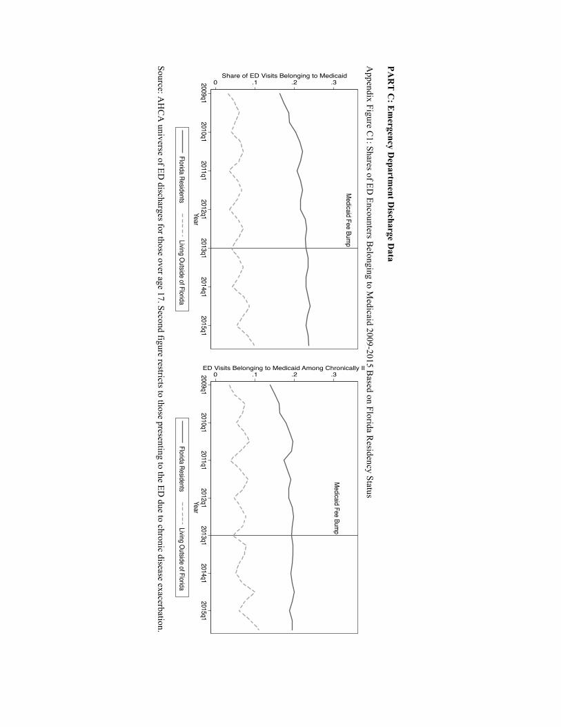
active. Appendix Figure C1 displays the share of ED episodes devoted to Medicaid for
our treatment and control groups over time. There is some predictable seasonality among
non-residents (i.e., peaks during the summer travel months), but non-residents’ reliance
on Medicaid insurance is fairly stable during our analytic period (5-6% cases).
Importantly, the trends across the two groups confirm the inferences from the regression
estimates in Table 9 and validate the DD identification strategy.
Considering the utilization trends from Figures 4 and 4.1 and the DD results in
Table 9, there is no compelling evidence that Medicaid patients rely less on the ED
during a time of heightened primary care payments—including those suffering from
chronic illness. Thus, our universe of Florida ED discharges does not reveal any obvious
disease management benefits or substitution of care settings (i.e., from higher cost EDs to
lower cost primary care clinics) for Medicaid enrollees.
DISCUSSION
Using several administrative data sets in a setting that benefits from a large price shock in
the absence of a Medicaid expansion, we find evidence consistent with the fee bump
policy modestly increasing Medicaid participation among Florida adult PCPs. The
response is concentrated on the intensive margin (i.e., acceptance of new Medicaid
patients), rather than the extensive margin (whether to enroll as a Medicaid provider at
all), and supports the inferences drawn by the only other published study on this specific
policy. In fact, Polsky et al. (2015) show an 18% increase in new Medicaid patient

29
acceptance for New Jersey—a state with a reimbursement jump almost identical to
Florida. Even with a very different data source, we observe a 10-13% increase in Florida
markets, which corresponds reasonably well to their findings.27 Florida’s Medicaid
reimbursements prior to the fee bump were also among the lowest nationally, suggesting
our estimates could be interpreted as upper bounds, and relatedly, the implied intensive
margin labor elasticity is only around 0.1, which further underscores the limited behavior
change the policy was able to elicit.
We also augment our findings by exploring heterogeneity across Medicaid
markets and physician practice attributes. Our intensive margin effect sizes are typically
largest among physicians with hospital or health system based jobs, which maps to a
prior conjecture made by Sommers et al. (2011). During the early days of ACA rollout,
the authors posited that hospital owned primary care practices might have an easier time
absorbing new Medicaid business. Our DD estimates align with this view, and
importantly, we see these same providers devoting more labor supply to direct patient
care when the fee bump is initiated. This complementary finding reveals a mechanism
whereby providers can increase the flow of services to the Medicaid market without
disrupting care delivery to other payer groups. In short, they can either reduce leisure by
working longer hours or substitute away from other non-revenue generating tasks.
Another extension of our work that goes beyond Polsky et al. (2015) is the
inclusion of ED utilization data to capture downstream health consequences for patients.
Some recent research finds access and health benefits from ACA-related expansions
27 Unlike Florida, New Jersey expanded Medicaid during this same period, which may account for some of the difference seen across the two studies. Admittedly, some states in their data show increases that are much higher (e.g., 25% across their two data waves). The average relative change in Medicaid acceptance in their study is 13% over the 10 state sample (see Polsky et al. 2015).

30
(French et al. 2016), including reductions in avoidable hospitalizations following a pre-
ACA Medicaid expansion in Wisconsin (DeLeire et al. 2013). However, we see no
obvious health improvements due to Florida’s fee bump. The use of the ED remains on
an upward climb for Medicaid enrollees, and those suffering from chronic conditions do
not witness drops in their acute exacerbations that subsequently require emergent
intervention. Both patterns suggest persistent suboptimal disease management and/or
access to primary care for Medicaid patients.
There are several potential explanations for the discrepancy between the
physician- and patient-focused elements. First, physicians’ reported increase in their
willingness to see new Medicaid patients may not have translated to more primary care
services actually supplied to Medicaid patients. While we cannot rule out this possibility,
Polsky and colleagues’ (2015) data suggest otherwise since they measured real world
appointment granting to fake patients. This explanation is also at odds with our collage of
evidence (e.g., greater patient care hours during the policy period).28 Alternatively, the
incentives’ targeted nature (i.e., restricted to primary care) may have undermined some of
the potential disease management benefits. If primary care needs to be a conduit to
specialty care for those with extensive health issues, the missing financial incentive for
the latter providers could blunt the policy impact. Others have demonstrated the typically
high barriers to specialty care for Medicaid patients and/or lack of coordination between
primary care and specialty providers, with some state programs seeking innovative ways
to lower these access hurdles (Felland, Lechner, and Sommers 2013; Takach 2011). If
28 That said, this style of incentive program does not explicitly target the demand-side (e.g., encouraging check-ups among enrollees or engaging in patient steering to new providers), which may further dampen any desired access effects since Medicaid patients may not be seeking out new matches to or more frequent encounters with local primary care providers (who are now more willing to see them because of the payment change).

31
joint provider production (i.e., a more team-oriented approach across provider types) is
necessary for optimal management of complex patients, then incentives with a narrow
scope can be less helpful.
More simply, the small changes in Medicaid acceptance may have been
inadequate to engender detectable population health effects for patients newly gaining
PCP access, and a temporary and unconditional transfer for continuing to serve existing
Medicaid patients may do little to benefit patients with established PCP access. Recall,
the enhanced revenue stream was not conditional upon achieving performance metrics or
population health objectives. In fact, PCPs with at least one Medicaid patient in their
panel prior to implementation would receive a positive income shock even if their flow of
services maintained the status quo. They were also not subjected to any financial
penalties if their patients’ health stayed the same or even deteriorated after the fee
increase. Such a design does not properly incentivize better clinical effort overall nor
does it encourage providers to allocate more resources to patients with the largest
potential payoff (e.g., those with poorly managed chronic conditions). Relatedly, for
multi-product firms (e.g., multi-specialty groups or health systems) that offer a wide
range of patient care services, linking payments to volumes may not induce a primary
care member of the firm to manage complex patients in a way that lowers demand for
other (non-primary care) services. In the example of a health system without capitated
contracts, the firm can collect higher payments for primary care services but also retain
any marginal revenue from ED visits and hospitalizations from these same Medicaid
patients, which creates a misaligned incentive structure.

32
In summary, our analyses should help inform any cost-benefit considerations
related to this particular payment policy and expectations around any similarly designed
initiative in the future. While some lament a recent Supreme Court decision barring
providers from seeking legal recourse to avoid Medicaid payment cuts and/or to spur
payment increases (Huberfeld 2015; Rosenbaum 2014), it may be worth considering if
efforts (and additional resources) geared toward fee-for-service provision are in fact
optimal policy levers. Our study highlights some of the challenges for inducing
meaningful changes to physician behavior through sizable but ephemeral price shocks.
Doing so can risk inefficient use of public resources, and if the health benefits from
improved primary care access require longer time durations for more aggressive and
consistent provider intervention, then transient incentives hold little promise, even if they
engender a short-run supply-side response.
REFERENCES
Baker, L. C. and A. B. Royalty. 2000. “Medicaid Policy, Physician Behavior, and Care
for the Low-Income Population.” Journal of Human Resources 35(3): 480-502.
Brunt, C. S. and G. A. Jensen. 2014. “Payment Generosity and Physician Acceptance of
Medicare and Medicaid Patients.” International Journal of Health Care Finance and
Economics 14: 289-310.
Coburn, A. F., S. H. Long, and M. S. Marquis. 1999. “Effects of Changing Medicaid Fees
on Physician Participation and Enrollee Access.” Inquiry 36(3): 265-79.
Cohen, J. W. and P. J. Cunningham. 1995. “Medicaid Physician Fee Levels and
Children's Access to Care.” Health Affairs 14(1): 255-62.

33
Cunningham, P. J. and L. M. Nichols. 2005. “The Effects of Medicaid Reimbursement on
the Access to Care of Medicaid Enrollees: A Community Perspective.” Medical Care
Research and Review 62(6): 676-96.
Cunningham, P. J. and A. S. O'Malley. 2009. “Do Reimbursement Delays Discourage
Medicaid Participation by Physicians?” Health Affairs(Web Exclusive): w17-w28.
Decker, S. L. 2007. “Medicaid Physician Fees and the Quality of Medical Care of
Medicaid Patients in the USA.” Review of Economics of the Household 5: 95-112.
Decker, S. L. 2012. “In 2011 Nearly One-Third of Physicians Said They Would Not
Accept New Medicaid Patients, But Rising Fees May Help.” Health Affairs 31: 1673-79.
DeLeire, T., L. Dague, L. Leininger, K. Voskuil, and D. Friedsam. 2013. “Wisconsin
Experience Indicates That Expanding Public Insurance to Low-Income Childless Adults
Has Health Care Impacts.” Health Affairs 32(6): 1037-45.
Felland, L. E., A. E. Lechner, and A. S. Sommers. 2013. “Improving Access to Specialty
Care for Medicaid Patients: Policy Issues and Options.” C. Fund.
French, M. T., J. Homer, G. Gumus, and L. Hickling. 2016. “Key Provisions of the
Patient Protection and Affordable Care Act (ACA): A Systematic Review and
Presentation of Early Research Findings.” Health Services Research(online ahead of
print): 1-40.
Geissler, K. H., B. Lubin, and K. M. Marzilli Ericson. 2016. “Access Is Not Enough:
Characteristics of Physicians Who Treat Medicaid Patients.” Medical Care 54(4): 350-
58.
Ginsburg, P. B. 2011. “Rapidly Evolving Physician-Payment Policy - More Than the
SGR.” New England Journal of Medicine 364: 172-76.

34
Goodson, J. D. 2010. “Patient Protection and Affordable Care Act: Promise and Peril for
Primary Care.” Annals of Internal Medicine 152(11): 742-44.
Han, Y. 2013. “The Effect of Medicaid Physicain Fees on Take-Up of Public Health
Insurance among Children in Poverty.” Journal of Health Economics 32: 452-62.
Hoot, N. R. and D. Aronsky. 2008. “Systematic Review of Emergency Department
Crowding: Causes, Effects, and Solutions.” Annals of Emergency Medicine 52(2): 126-
36.
Hu, T. and K. Mortensen. 2016. “Mandatory Statewide Medicaid Managed Care in
Florida and Hospitalizations for Ambulatory Care Sensitive Conditions.” Health Services
Research(Early View (online)): 1-19.
Huberfeld, N. 2015. “The Supreme Court Ruling That Blocked Providers from Seeking
Higher Medicaid Payments Also Undercut The Entire Program.” Health Affairs 34(7):
1156-61.
Kellerman, A. L. and R. M. Weinick. 2012. “Emergency Departments, Medicaid Costs,
and Access to Primary Care - Understanding the Link.” New England Journal of
Medicine 366: 2141-43.
Laditka, J. N., S. B. Laditka, and J. C. Probst. 2005. “More May Be Better: Evidence of a
Negative Relationship between Physician Supply and Hospitalizations for Ambulatory
Care Sensitive Conditions.” Health Services Research 40(4): 1148-66.
Long, S. K. 2013. “Physicians May Need More Than Higher Reimbursements to Expand
Medicaid Participation: Findings from Washington State.” Health Affairs 32(9): 1560-67.
Mitchell, J. B. 1991. “Physician Participation in Medicaid Revisited.” Medical Care
29(7).

35
Oster, A. and A. B. Bindman. 2003. “Emergency Department Visits for Ambulatory Care
Sensitive Conditions: Insights into Preventable Hospitalizations.” Medical Care 41(2):
198-207.
Perloff, J. D., P. Kletke, and J. W. Fossett. 1995. “Which Physicians Limit Their
Medicaid Participation and Why.” Health Services Research 30(1): 7-26.
Polsky, D., M. Richards, S. Basseyn, D. Wissoker, G. M. Kenney, S. Zuckerman, and K.
V. Rhodes. 2015. “Appointment Availability after Increases in Medicaid Payments for
Primary Care.” New England Journal of Medicine 372(6): 537-45.
Rhodes, K. V., G. M. Kenney, A. B. Friedman, B. Saloner, C. C. Lawson, D. Chearo, D.
Wissoker, and D. Polsky. 2014. “Primary Care Access for New Patients on the Eve of
Health Care Reform.” JAMA - Internal Medicine 174(6): 861-69.
Richards, M. R., S. S. Nikpay, and J. A. Graves. 2016a. “The Growing Integration of
Physician Practices: With a Medicaid Side Effect.” Medical Care 54(7): 714-18.
Richards, M. R. and D. Polsky. 2016. “Influence of Provider Mix and Regulation on
Primary Care Services Supplied to US Patients.” Health Economics, Policy and Law
11(2): 193-213.
Richards, M. R., B. Saloner, G. M. Kenney, K. V. Rhodes, and D. Polsky. 2016b.
“Availability of New Medicaid Patient Appointments and the Role of Rural Health
Clinics.” Health Services Research 51(2): 570-91.
Rosenbaum, S. 2014. “Medicaid Payments and Access to Care.” New England Journal of
Medicine 371(25): 2345-47.
Showalter, M. H. 1997. “Physicians' Cost Shifting Behavior: Medicaid Versus Other
Patients.” Contemporary Economic Policy 15(2): 74-84.

36
Sloan, F. A., J. Mitchell, and J. Cromwell. 1978. “Physicain Participation in State
Medicaid Programs.” Journal of Human Resources 13: 211-45.
Sommers, A. S., J. Paradise, and C. Miller. 2011. “Physician Willingness and Resources
to Serve More Medicaid Patients: Perspectives from Primary Care Physicians.” Medicare
& Medicaid Research Review 1(2): E1-E18.
Sommers, B. D. and R. Kronick. 2016. “Measuring Medicaid Physician Participation
Rates and Implications for Policy.” Journal of Health Politics, Policy and Law 41(2):
211-24.
Starfield, B., L. Shi, and J. Macinko. 2005. “Contribution of Primary Care to Health
Systems and Health.” Milbank Quarterly 83(3): 457-502.
Takach, M. 2011. “Reinventing Medicaid: State Innovations to Qualify and Pay for
Patient-Centered Medical Homes Show Promising Results.” Health Affairs 30(7): 1325-
34.
Tipirneni, R., K. V. Rhodes, R. A. Hayward, R. L. Lichtenstein, E. N. Reamer, and M.
M. Davis. 2015. “Primary Care Appointment Availability for New Medicaid Patients
Increased after Medicaid Expansion in Michigan.” Health Affairs 34(8): 1-8.
Wilk, A. S. and D. K. Jones. 2014. “To Extend or Not to Extend the Primary Care "Fee
Bump" in Medicaid?” Journal of Health Politics, Policy and Law 39(6): 1263-75.
Zuckerman, S. and D. Goin. 2012. “How Much Will Medicaid Physician Fees for
Primary Care Rise in 2013? Evidence from a 2012 Survey of Medicaid Physician Fees.”
Kaiser Commission on Medicaid and the Uninsured. K. F. Foundation. Washington DC.

37
Zuckerman, S., L. Skopec, and K. McCormack. 2014. “Reversing the Medicaid Fee
Bump: How Much Could Medicaid Physician Fees for Primary Care Fall in 2015?
Evidence from a 2014 Survey of Medicaid Physician Fees.” U. Institute. Washington DC.
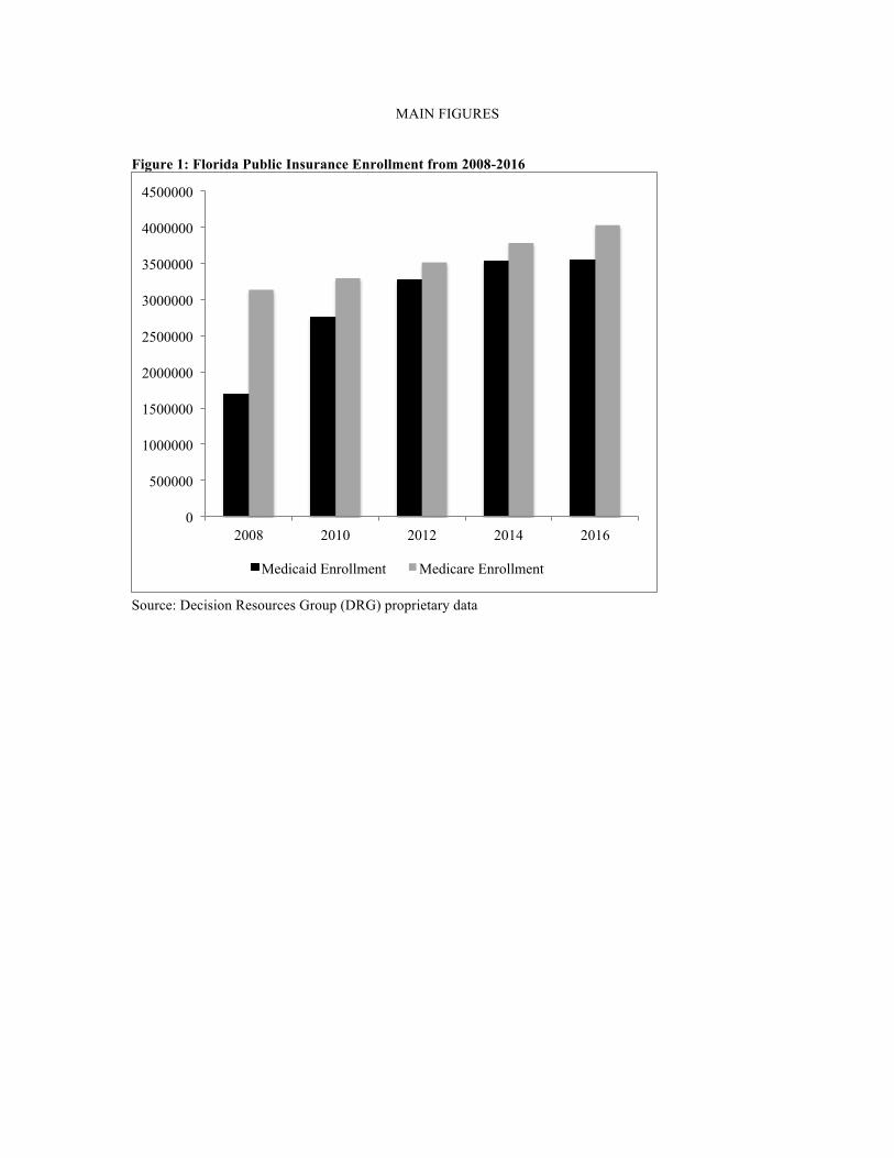
MAIN FIGURES Figure 1: Florida Public Insurance Enrollment from 2008-2016
Source: Decision Resources Group (DRG) proprietary data
0
500000
1000000
1500000
2000000
2500000
3000000
3500000
4000000
4500000
2008 2010 2012 2014 2016
Medicaid Enrollment Medicare Enrollment

Figure 2: Physician Medicaid Program Participation from 2009-2016 by Specialty
Source: Florida Department of Health Practitioner Profile Database (denominator) and the Florida Medicaid Provider Master List (numerator) – updated as of December 2016
Medicaid fee bumpin effect
010
2030
4050
6070
80Pe
rcen
t of p
hysic
ians
enr
olle
d wi
th M
edica
id
-48 -36 -24 -12 0 12 24 36 48Months from Jan 2013
Adult Primary Care Other specialtiesOBGYN Medical subspecialtiesSurgery

Figure 3: Acceptance of New Medicaid Patients from 2009-2015
Source: Florida physician workforce data. “PCP” is family medicine and internal medicine physicians. “All Others” captures any other physician specialty, excluding general pediatrics.
Medicaid Fee Bump
.3
.4
.5
.6
.7Fr
actio
n Ac
cept
ing
New
Med
icaid
Pts
2009 2010 2011 2012 2013 2014 2015Year
PCP All Others

Figure 3.1: Acceptance of N
ew M
edicaid Patients by Relative M
edicaid Market Size in the State of Florida
Source: Florida physician w
orkforce data. “PCP” is fam
ily medicine and internal m
edicine physicians. “All O
thers” captures any other physician specialty, excluding general pediatrics. “H
igh” Medicaid m
arkets are counties with a M
edicaid share of the insured population above the median in 2012, “Low
” reflects counties below
the median
Medicaid Fee Bum
p
.4 .5 .6 .7
Fraction Accepting New Medicaid Pts
20092010
20112012
20132014
2015Year
PCP - High Medicaid Share
All Others - High Medicaid Share
Medicaid Fee Bump
.25 .35 .45 .55 .65
Fraction Accepting New Medicaid Pts
20092010
20112012
20132014
2015Year
PCP - Low Medicaid ShareAll Others - Low Medicaid Share

Figure 4: Total Volume of Medicaid ED Encounters in Florida 2009-2015
Source: AHCA universe of ED discharges, limited to Florida residents over the age of 17. Market size stratification is based on being a Florida county above or below the median share of insured individuals enrolled in Medicaid as of 2012.
Medicaid Fee Bump
010
0000
2000
0030
0000
4000
00To
tal E
D V
isits
Bel
ongi
ng to
Med
icai
d
2009q1 2010q1 2011q1 2012q1 2013q1 2014q1 2015q1Year
Full State Large Medicaid MarketsSmall Medicaid Markets

Figure 4.1: Total Volume of Medicaid ED Encounters for Chronic Disease Exacerbation in Florida 2009-2015
Source: AHCA universe of ED discharges, limited to Florida residents over the age of 17. Market size stratification is based on being a Florida county above or below the median share of insured individuals enrolled in Medicaid as of 2012. Analytic sample restricts to individuals with an ICD9 code linked to a chronic disease for their primary reason for ED presentation. Chronic illnesses include: COPD, asthma, diabetes, hypertension, and cardiac-related chest pain.
Medicaid Fee Bump0
5000
1000
015
000
2000
0ED
Vis
its B
elon
ging
to M
edic
aid
- Chr
onic
ally
Ill
2009q1 2010q1 2011q1 2012q1 2013q1 2014q1 2015q1Year
Full State Large Medicaid MarketsSmall Medicaid Markets

APPENDIX FIGURES
PART A: Health Practitioner Data Appendix Figure A1: Physician Medicaid Program Participation by Specialty
Source: Florida Department of Health Practitioner Profile Database (denominator) and the Florida Medicaid Provider Master List (numerator) – updated as of December 2016
Medicaid fee bumpin effect
010
2030
4050
6070
80Pe
rcen
t of p
hysic
ians
enr
olle
d wi
th M
edica
id
-48 -36 -24 -12 0 12 24 36 48Months from Jan 2013
Pediatrics Other specialtiesOBGYN

PART B: Physician Workforce Data Appendix Figure B1: Medicaid Acceptance Trends for Alternative Control Groups
Appendix Figure B2: Medicaid Acceptance Trends for Alternative Controls and Pediatricians
Medicaid Fee Bump
.4.5
.6.7
.8Fr
actio
n Ac
cept
ing
New
Med
icaid
Pts
2009 2010 2011 2012 2013 2014 2015Year
OBGYN MedSubSurgeons
Medicaid Fee Bump
.4.5
.6.7
.8.9
1Fr
actio
n Ac
cept
ing
New
Med
icaid
Pts
2009 2010 2011 2012 2013 2014 2015Year
Gen Peds OBGYNMedSub Surgeons
PAR
T C
: Em
ergency Departm
ent Discharge D
ata A
ppendix Figure C1: Shares of ED
Encounters Belonging to M
edicaid 2009-2015 Based on Florida R
esidency Status
Source: AH
CA
universe of ED discharges for those over age 17. Second figure restricts to those presenting to the ED
due to chronic disease exacerbation.
Medicaid Fee Bump
0 .1 .2 .3Share of ED Visits Belonging to Medicaid
2009q12010q1
2011q12012q1
2013q12014q1
2015q1Year
Florida ResidentsLiving Outside of Florida
Medicaid Fee Bump
0 .1 .2 .3ED Visits Belonging to Medicaid Among Chronically Ill
2009q12010q1
2011q12012q1
2013q12014q1
2015q1Year
Florida ResidentsLiving Outside of Florida

MAIN TABLES
Table 1: Overall Medicaid Participation Among Florida Physicians 2009-2015
Extensive Margin
Intensive Margin
Enrolled in Medicaid Program*
Accepting New Medicaid Patients**
(%) (%) PCP 64.5 44.8 All Others 73.0 61.6 OBGYN 73.8 59.2 Med Subspec 81.8 59.8 Surgeons 73.8 58.8 Pediatricians 86.3 78.1 * Source: Florida Department of Health Practitioner Profile as of December 2016 ** Source: Florida physician workforce data, pooled 2009-2015 survey waves “PCP” is family medicine and internal medicine physicians. “All Others” captures any other physician specialty, excluding general pediatrics. “OBGYN” is for obstetrics and gynecology fields, and “Med Subspec” is inclusive of general cardiology, endocrinology, gastroenterology, hematology and oncology, pulmonary medicine, nephrology, sports medicine, and rheumatology

T
able 2: Summ
ary Statistics for Physician Specialty Groups in W
orkforce Data, 2009-2015
Main Treatm
ent and Control
Alternative Control G
roups
PC
P
All O
thers O
BG
YN
M
ed Subspec Surgeons
Age
51.6 (11.8)
52.0 (11.3) 52.1 (11.8)
52.5 (10.9) 53.5 (11.6)
(%
) (%
) (%
) (%
) (%
) M
ale 69.1
79.1 61.6
85.7 92.3
New
Medicaid
44.8 61.6
59.2 59.8
58.9 N
ew M
edicare 79.6
84.5 77.7
94.0 91.0
Hospital/H
ealth Sys Based Practice
16.3 30.5
7.2 12.7
26.0 M
ore than 50 Hours Per W
eek Patient C
are 21.0
23.6 27.4
34.8 35.5
More than 5 H
ours Per Week
Adm
inistrative Duties
47.4 41.9
43.7 44.0
51.4
Source: Florida physician workforce data, pooled over entire analytic period (2009-2015). Sam
ple is restricted to non-retired physicians currently w
orking in the state. “New
Medicaid” and “N
ew M
edicare” are binary variables for reporting that the physician is currently accepting new
patients from the specific payer, respectively. “PC
P” is family m
edicine and internal medicine physicians.
“All O
thers” captures any other physician specialty, excluding general pediatrics. “OB
GY
N” is for obstetrics and gynecology fields,
and “Med Subspec” is inclusive of general cardiology, endocrinology, gastroenterology, hem
atology and oncology, pulmonary
medicine, nephrology, sports m
edicine, and rheumatology

Table 3: Medicaid Fee Bump Effect on Extensive Margin Medicaid Participation
Difference-in-Differences
(1) (2) PCP -0.101***
(0.005) -0.111***
(0.005) Fee Bump 0.152***
(0.002) 0.023***
(0.001) After Bump 0.205***
(0.002) -0.009***
(0.002) PCP x Fee Bump -0.005*
(0.003) -0.005* (0.003)
PCP x After Bump 0.008* (0.004)
0.008* (0.004)
Covariates No Yes Observations (physicians x months x years)
4,009,398 4,009,298
* P value at 0.10 ** P value at 0.05 *** P value at 0.01, standard errors in parentheses and clustered at the physician level. “PCP” is equal to one for family medicine and internal medicine physicians and zero otherwise. General pediatricians are excluded from the analytic samples. “Fee Bump Active” is equal to one for all months in 2013 and 2014. “After Fee Bump” is equal to one for all months in 2015 and 2016. The outcome is a binary variable for whether a given physician in a given month-year is currently enrolled in the Medicaid program (and therefore eligible to see Medicaid patients and receive payment from the state program). Column 2 includes the year the physician began practicing, practice city, and a linear time trend.

Table 4: Medicaid Fee Bump Effect on Intensive Margin Medicaid
Participation
Difference-in-Differences
(1) (2) (3) PCP -0.191***
(0.005) -0.194***
(0.005) -0.052***
(0.011) Post Fee Bump 0.055***
(0.002) 0.011***
(0.004) 0.001
(0.003) PCP x Post 0.056***
(0.005) 0.056***
(0.005) 0.039***
(0.005) Covariates No Yes Yes Physician FE No No Yes Observations 133,990 131,373 46,617 * P value at 0.10 ** P value at 0.05 *** P value at 0.01, standard errors in parentheses and clustered at the physician level. “PCP” is equal to one for family medicine and internal medicine physicians and zero otherwise. General pediatricians are excluded from the analytic samples. “Post Fee Bump” is equal to one for all survey years after 2012. The outcome is a binary variable for whether new Medicaid patients are currently being accepted by the physician. Column 2 includes age and sex demographics along with a linear time trend. Column 3 uses a panel data structure, with individual physician fixed effects (FE)

Table 5: Quasi-Placebo Test for Medicaid Fee Bump Effect on Medicare Participation
Difference-in-Differences
(1) (2) (3) PCP -0.051***
(0.004) -0.042***
(0.004) -0.025***
(0.010) Post Fee Bump 0.031***
(0.002) 0.028***
(0.003) 0.020***
(0.003) PCP x Post 0.003
(0.004) -0.0006 (0.004)
-0.006* (0.004)
Covariates No Yes Yes Physician FE No No Yes Observations 134,749 132,118 46,706 * P value at 0.10 ** P value at 0.05 *** P value at 0.01, standard errors in parentheses and clustered at the physician level. “PCP” is equal to one for family medicine and internal medicine physicians and zero otherwise. General pediatricians are excluded from the analytic samples. “Post Fee Bump” is equal to one for all survey years after 2012. The outcome is a binary variable for whether new Medicare patients are currently being accepted by the physician. Column 2 includes age and sex demographics along with a linear time trend. Column 3 uses a panel data structure, with individual physician fixed effects (FE)

Table 6: Medicaid Fee Bump Effect on Intensive Margin Medicaid Participation by Practice Setting
Difference-in-Differences
Hospital / Health System Based
All Others
(1) (2) (3) (4) PCP -0.136***
(0.010) -0.149***
(0.010) -0.128***
(0.005) -0.132***
(0.006) Post Fee Bump 0.068***
(0.004) 0.042***
(0.007) 0.066***
(0.003) 0.016***
(0.005) PCP x Post 0.070***
(0.011) 0.071***
(0.011) 0.030***
(0.006) 0.031***
(0.006) Covariates No Yes No Yes Observations 34,285 33,727 97,781 95,812 * P value at 0.10 ** P value at 0.05 *** P value at 0.01, standard errors in parentheses and clustered at the physician level. “PCP” is family medicine and internal medicine physicians. “Post Fee Bump” is equal to one for all survey years after 2012. The outcome is a binary variable for whether new Medicaid patients are currently being accepted by the physician. Columns 2 and 4 include age and sex demographics along with a linear time trend. Note, 71% of hospital or health system based PCPs were accepting new Medicaid patients prior to the fee bump, compared to 35% among all other PCPs

Table 7: D
escriptive Analyses for C
oncurrent Changes in T
ime U
se During the M
edicaid Fee Bum
p Period
PAN
EL
A
More than 50 Patient C
are Hours Per W
eek
Full Sam
ple H
ospital/Health System
Based
All O
thers
(1)
(2) (3)
(4) (5)
(6) PC
P x Post 0.019***
(0.005) 0.017***
(0.005) 0.067***
(0.013) 0.066***
(0.013) -0.003
(0.005) -0.005
(0.005) C
ovariates N
o Y
es N
o Y
es N
o Y
es O
bservations
137,020 134,228
36,361 35,713
99,109 97,042
PAN
EL
B
More than 5 Adm
inistrative Hours Per W
eek
Full Sam
ple H
ospital/Health System
Based
All O
thers
(1)
(2) (3)
(4) (5)
(6) PC
P x Post 0.030***
(0.006) 0.026***
(0.006) 0.033**
(0.014) 0.031**
(0.014) 0.028***
(0.007) 0.024***
(0.007) C
ovariates N
o Y
es N
o Y
es N
o Y
es O
bservations 123,612
121,114 32,178
31,602 90,101
88,248 * P value at 0.10 ** P value at 0.05 *** P value at 0.01, standard errors in parentheses and clustered at the physician level. “PC
P” is family m
edicine and internal medicine physicians. The labor supply outcom
e measures
in Panels A and B
are binary variables. Colum
ns 2, 4, and 6 include age and sex demographics along w
ith a linear tim
e trend. Only the D
D coefficient is reported for table brevity.

Table 8: Reasons for Not Currently Accepting New Medicaid Patients
PCP
All Others
2010-2012 2013-2015 2010-2012 2013-2015 Compensation 69.9 48.5 75.9 62.5 Hassel 15.9 25.7 13.2 18.9 At Full Capacity 13.0 23.7 9.9 17.2 Fraud Issues 1.3 2.1 1.0 1.3 Restricts to observations the report not currently accepting new Medicaid patients and that provide a justification response within a follow-up survey question. “Hassel” includes complaints regarding billing processes as well as excessive paperwork. Note, this questions was not asked in the 2009 survey.

Table 9: Medicaid Fee Bump Effect on Adult ED Utilization for Florida versus non-Florida Residents
Diff-in-Diff
All Adult ED Encounters Chronic Disease Exacerbation
(1) (2) (3) (4) FL Resident x Bump
0.015*** (0.002)
0.016*** (0.003)
0.009*** (0.003)
0.011*** (0.003)
FL Resident x After Bump
0.003 (0.002)
0.004 (0.003)
-0.009** (0.003)
-0.008** (0.004)
Covariates No Yes No Yes Observations 34,921,596 34,921,596 1,950,406 1,950,406 *** P value at 0.01 ** P value at 0.05 * P value at 0.10, standard errors clustered on patient county. All non-Florida (FL) residents are a single cluster. FL residents are considered the treatment group, while all FL ED visitors that do not permanently reside in FL are the control, comparison group. “Bump” is equal to one in 2013-2014 and zero otherwise. “After Bump” is equal to one for 2015 observations. Only key coefficients reported for brevity. Covariates include patient age, sex, and a dummy for white race as well as a linear time trend (columns 2 and 4). Columns 3 and 4 reduce the analytic sample by restricting to individuals with an ICD9 code linked to a chronic disease for their primary reason for ED presentation. Chronic illnesses include: COPD, asthma, diabetes, hypertension, and cardiac-related chest pain.

APPENDIX TABLES
PART A: Health Practitioner Data
Appendix Table A1: Medicaid Fee Bump Effect on Extensive Margin Medicaid Participation – Using Alternative Control Groups
Difference-in-Differences
Control: OBGYN Control: Med Subspec Control: Surgeons (1) (2) (3) PCP x Active 0.026***
(0.006) -0.025***
(0.005) -0.021***
(0.006) PCP x After 0.029***
(0.008) -0.029***
(0.007) -0.072***
(0.008) Covariates Yes Yes Yes Observations (physicians x months x years)
1,383,511 1,595,844 1,458,492
* P value at 0.10 ** P value at 0.05 *** P value at 0.01, standard errors in parentheses and clustered at the physician level. “PCP” is equal to one for family medicine and internal medicine physicians and zero otherwise. “OBGYN” is for obstetrics and gynecology fields, and “Med Subspec” is inclusive of general cardiology, endocrinology, gastroenterology, hematology and oncology, pulmonary medicine, nephrology, sports medicine, and rheumatology. General pediatricians are excluded from the analytic samples. “Fee Bump Active” is equal to one for all months in 2013 and 2014. “After Fee Bump” is equal to one for all months in 2015 and 2016. The outcome is a binary variable for whether a given physician in a given month-year is currently enrolled in the Medicaid program (and therefore eligible to see Medicaid patients and receive payment from the state program). Covariates include the year the physician began practicing, practice city, and a quadratic for monthly time trend. Only key coefficients reported.

PART B: Physician Workforce Data
Appendix Table B1: Medicaid Fee Bump Effect on Intensive Margin Medicaid
Participation – Control Group: OBGYN
Difference-in-Differences
(1) (2) (3) PCP -0.173***
(0.011) -0.179***
(0.011) -0.043***
(0.016) Post Fee Bump 0.042***
(0.009) -0.020* (0.011)
-0.017** (0.009)
PCP x Post 0.069*** (0.010)
0.070*** (0.010)
0.047*** (0.008)
Covariates No Yes Yes Physician FE No No Yes Observations 43,324 42,418 15,078 * P value at 0.10 ** P value at 0.05 *** P value at 0.01, standard errors in parentheses and clustered at the physician level. “PCP” is equal to one for family medicine and internal medicine physicians and otherwise zero. “Post Fee Bump” is equal to one for all survey years after 2012. The outcome is a binary variable for whether new Medicaid patients are currently being accepted by the physician. Column 2 includes age and sex demographics along with a linear time trend. Column 3 uses a panel data structure, with individual physician fixed effects (FE)

Appendix Table B2: Medicaid Fee Bump Effect on Intensive Margin Medicaid Participation – Control Group: Medicine Subspecialties
Difference-in-Differences
(1) (2) (3) PCP -0.165***
(0.008) -0.169***
(0.008) -0.033**
(0.014) Post Fee Bump 0.074***
(0.006) 0.015* (0.009)
0.003 (0.007)
PCP x Post 0.037*** (0.008)
0.035*** (0.008)
0.024*** (0.007)
Covariates No Yes Yes Physician FE No No Yes Observations 52,290 51,276 17,977 * P value at 0.10 ** P value at 0.05 *** P value at 0.01, standard errors in parentheses and clustered at the physician level. “PCP” is equal to one for family medicine and internal medicine physicians and otherwise zero. Medicine Subspecialties is inclusive of general cardiology, endocrinology, gastroenterology, hematology and oncology, pulmonary medicine, nephrology, sports medicine, and rheumatology. “Post Fee Bump” is equal to one for all survey years after 2012. The outcome is a binary variable for whether new Medicaid patients are currently being accepted by the physician. Column 2 includes age and sex demographics along with a linear time trend. Column 3 uses a panel data structure, with individual physician fixed effects (FE)

Appendix Table B3: Medicaid Fee Bump Effect on Intensive Margin Medicaid Participation – Control Group: Surgeons
Difference-in-Differences
(1) (2) (3) PCP -0.155***
(0.010) -0.170***
(0.011) -0.034**
(0.016) Post Fee Bump 0.072***
(0.009) 0.002
(0.011) -0.012
(0.010) PCP x Post 0.039***
(0.010) 0.041***
(0.010) 0.033***
(0.009) Covariates No Yes Yes Physician FE No No Yes Observations 44,148 43,194 15,404 * P value at 0.10 ** P value at 0.05 *** P value at 0.01, standard errors in parentheses and clustered at the physician level. “PCP” is equal to one for family medicine and internal medicine physicians and otherwise zero. “Post Fee Bump” is equal to one for all survey years after 2012. The outcome is a binary variable for whether new Medicaid patients are currently being accepted by the physician. Column 2 includes age and sex demographics along with a linear time trend. Column 3 uses a panel data structure, with individual physician fixed effects (FE)

Appendix Table B4: Medicaid Fee Bump Effect on Intensive Margin Medicaid Participation
Difference-in-Differences
Large Medicaid Markets
Small Medicaid Markets
(1) (2) (3) (4) PCP -0.143***
(0.008) -0.146***
(0.008) -0.229***
(0.006) -0.232***
(0.007) Post Fee Bump 0.054***
(0.004) 0.002
(0.007) 0.056***
(0.003) 0.020***
(0.006) PCP x Post 0.047***
(0.008) 0.050***
(0.008) 0.065***
(0.007) 0.063***
(0.007) Covariates No Yes No Yes Observations 58,582 57,454 72,024 70,701 * P value at 0.10 ** P value at 0.05 *** P value at 0.01, standard errors in parentheses and clustered at the physician level. “PCP” is family medicine and internal medicine physicians. “Post Fee Bump” is equal to one for all survey years after 2012. The outcome is a binary variable for whether new Medicaid patients are currently being accepted by the physician. Column 2 includes age and sex demographics along with a linear time trend. ‘Large’ Medicaid markets are counties with a Medicaid share of the insured population above the median in 2012, ‘Small’ reflects counties below the median

Appendix Table B5: Event Study Results for Medicaid Fee Bump Effect on Intensive Margin Medicaid Participation
Event Study
Abbreviated Output Overall
Large Medicaid
Markets Small Medicaid
Markets (1) (2) (3) PCP x 2010 -0.017
(0.012) -0.004
(0.019) -0.010
(0.016) PCP x 2011 0.0004
(0.009) 0.018
(0.014) -0.001
(0.013) PCP x 2012 0.009
(0.012) 0.018
(0.018) 0.019
(0.016) PCP x 2013 0.034***
(0.010) 0.038***
(0.015) 0.043***
(0.014) PCP x 2014 0.053***
(0.012) 0.062***
(0.018) 0.063***
(0.016) PCP x 2015 0.076***
(0.010) 0.071***
(0.016) 0.091***
(0.014) Covariates Yes Yes Yes Observations 131,373 57,454 70,701 * P value at 0.10 ** P value at 0.05 *** P value at 0.01, standard errors in parentheses and clustered at the physician level. “PCP” is equal to one for family medicine and internal medicine physicians and otherwise zero. General pediatricians are excluded from the analytic sample. Only key coefficients of interest are reported for table brevity. The outcome is a binary variable for whether new Medicaid patients are currently being accepted by the physician. Covariates include age and sex demographics