
P9 StuartMayo Portfolio
22
Stuart Mayo Design Portfolio
-
Upload
stuart-charles-mayo -
Category
Documents
-
view
223 -
download
0
Transcript of P9 StuartMayo Portfolio

Stuart MayoD e s i g n P o r t f o l i o

About Me
Contact
I am currently a Communications major at Brigham Young University, Idaho, with an emphasis in advertising. I am capable in the realms of the Adobe Suite, particularly in Photoshop, InDesign, and Illustrator. I am also very able in Microsoft Office.
My portfolio offers a glimpse of my abilities in both design and copywriting, but I also recommend a visit to my blog for more samples of my writing.
Email: [email protected]
8354 Skyway, Paradise CA, 95969
Phone: 530-966-8748
facebook.com/stuart.mayo
brandnewmarketer.wordpress.com

Table of ContentsI. Brochure - Choice Communications
II. Business Cards - Event PIano
III. Stationary - Event Piano
IV. Logo Design - Lucky Survival Elevators
V. Event Ad - Save Iceland’s Dragons
VI. Photo Montage Ad - Piano Lessons
VII. Flier - Graduate Leadership Conference
VIII. Photo Imaging - Remember to Breathe
IX. HTML/CSS - Lucky Logo Showcase
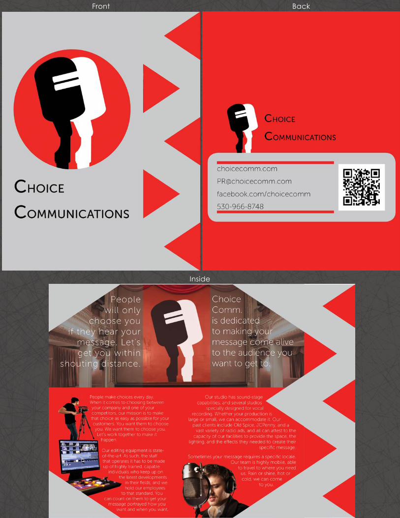
Brochure - Choice Communications
I first studied many different brochure designs. Using elements that I particularly enjoyed, I completely re-did a brochure design I had been working on for my Comm 130 class with Professor Cory Kerr.
The new design is meant to be much more eye-catching, though it is simpler than the previous drafts. I wanted to convey more effectively the message of power and confidence in getting the client’s message out, and in communicating it powerfully to their audience. The intended audience for the brochure itself consists of small to medium business owners who want to start an ad campaign.
Design Tools/Skills Used• Photoshop - Clipping the three images within the body text, and masking the theater image to place the logo onstage.
• Illustrator - Designing a unifying, simplified logo for the company.
• InDesign - Frequent use of translucent and opaque shapes, arranging clipped images for effective text-wrapping,
• Design Principles - The triangles on the off-set lead the flow into the brochure, and effectively break the grid. The logo becomes the internal focal point due to the triangle-led flow. The logo is a unifying and branding element throughout, and the message is clear.
April 1st, 2014 - Comm 130, Professor Cory Kerr
Front Back
Inside
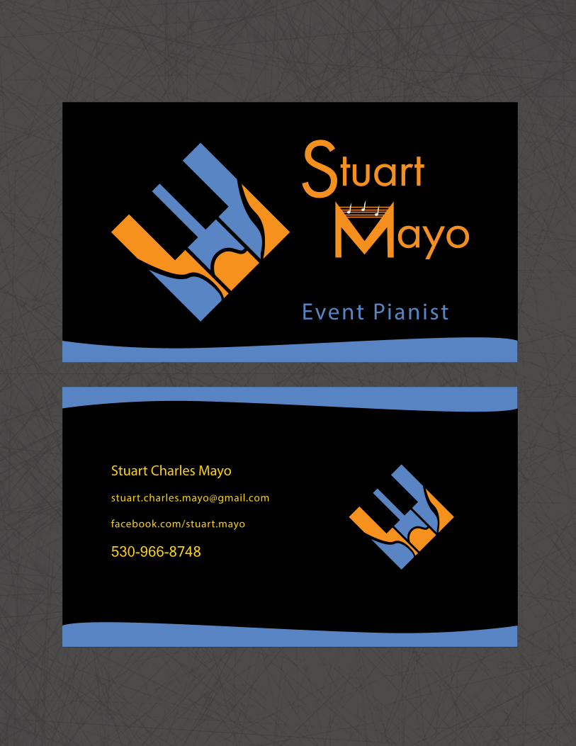
Business Cards - Event Piano
This project was designed to give me a way to quickly distribute my contact information as it relates to playing piano for events. The intended message is that of creativity and pianistic artistry, and I conveyed my musical style in the design. My audience is non-musicians, and event-planners looking for sophistication and high-quality music. As such, I designed the logo to look like stain-glass.
Coming up with a sketch to plan proximity was challenging with so few elements to guide the flow, but the way the text flows around the logo is natural to the eye.
Design Tools/Skills Used• Illustrator - Dividing the original rectangles with the pen tool’s brush-strokes, afterward using the pathfinder pallete to divide the shapes and eliminate the pen paths. The framing elements were created with the pen tool. The main title was created by altering text turned into an object.
• InDesign - Adding the text with the exception of the main title.
• Design Principles - Contrasting the compimentary color scheme with the black background. Using hierarchy in the title text. Alignment with the top, middle, and bottom of the logo.
March 2nd, 2014 - Comm 130, Professor Cory Kerr

Stationary - Event Piano
I created stationary using Illustrator, for myself as an event pianist. The project was intended to practice simplicity and unity in the theme of pieces for a company. Also practiced were good file management techniques between Illustrator and InDesign.
The message was intended to convey the artistry of piano, and also the feel that customers could want in their events. As such, I chose a vibrant, bright color scheme, and went for a more fluid shape with the design.
Design Tools/Skills Used• Illustrator - Creating the logo and keyboard was a similar process, dividing the rectangle shapes using the pen tool and the pathfinder palette, the colors being added to the divided shapes.
• InDesign - Organizing the elements I had created in Illustrator was far easier in InDesign, and I was able to create some of the basic pen-tool shapes at the top of the page.
March 2nd, 2014 - Comm 130, Professor Cory Kerr


Logo Design - Lucky Survival Elevators
The object of this project was to learn techniques for making an effective logo, and to gain an overall understanding of Adobe Illustrator. The project itself consists of three logos created for a fictitious company of my choosing. As is usually the case when I have an imaginary parameter like that, the company invented was a parody, Lucky Survival Elevators, Inc., a company that designs elevators meant to help you survive when the cable breaks and they fall.
Design Tools/Skills Used• Illustrator - I was able to use simple shape tools to make the background and basic shapes. I used the text tools to manipulate the color and stroke of the text. I left a heavy stroke on the text to create a sort of “Empire Elevator” feel.
• As logos are meant to be simple and easy to recognize, I chose to keep the shapes very basic. The clover and color green convey a message of luck, with elevator buttons explaining the rest.
February 21st, 2014 - Comm 130, Professor Cory Kerr

Lucky Survival Elevators Inc.
L U C K Y
S u r v i v a l E l e v a t o r s I n c .
LUCKY
L U C K YS u r v i v a l E l e v a t o r s
Lucky Survival Elevators Inc.
L U C K Y
S u r v i v a l E l e v a t o r s I n c .
LUCKY
L U C K YS u r v i v a l E l e v a t o r s
Lucky Survival Elevators Inc.
L U C K Y
S u r v i v a l E l e v a t o r s I n c .
LUCKY
L U C K YS u r v i v a l E l e v a t o r s
Event Ad - Save Iceland’s Dragons
I wanted to make it seem solid and no-nonsense on the upper section, with almost military colors.
In this case, because I had to find an image to use and the event itself was fictitious, it was much more a process of finding inspiration for both event and advertisement.
I wanted to make it seem solid and no-nonsense on the upper section, with almost military colors, and then have the event details grab the reader’s attention below.
Design Tools/Skills Used• Designing in Microsoft Word was a challenge for this assignment. Thankfully, the Mac version of Word has numerous design features similar in nature to InDesign, and with some slight manipulation, I was able to create and arrange design elements in a relatively easy way.
• I was able to create a dragon design using a combination of basic shapes in the body copy section. The flow of the piece was shaped using the shape of the hiker image combined with the diagonal title bar, which leads the eye to the text below.
February 14th, 2014 - Comm 130, Professor Cory Kerr

!
Backpacking For
Iceland’s Dragons
Save an endangered spec ies . Save the wor ld. Dragons are a big piece of the cultural heritage of our community of Reykjavik. Without them, we could never replenish the community flame ether, and the ice would soon overtake us. Help us save these national treasures. Join the Reykjavik Dragon Preservation Association on a backpacking journey through Kverkfjoll mountain range.
For only $50, join a 3-day hike with all food and travel expenses paid. All proceeds go to the Reykjavik Dragon Preservation Reserve. Bring your own backpacking equipment and flame-retardant gear. Princesses welcome. Save the dragons. Save the world.
Date: Aug. 7, 6:00am Place: Silver Snow Lodge

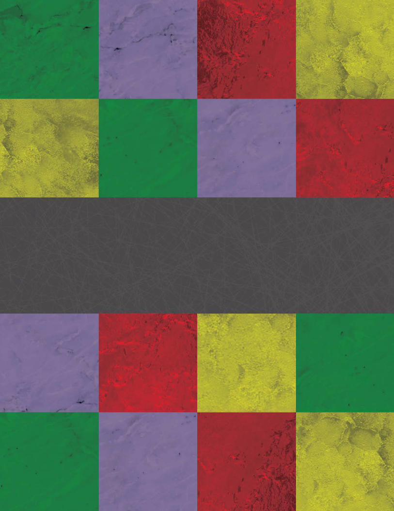
Photo Montage - Piano Lessons
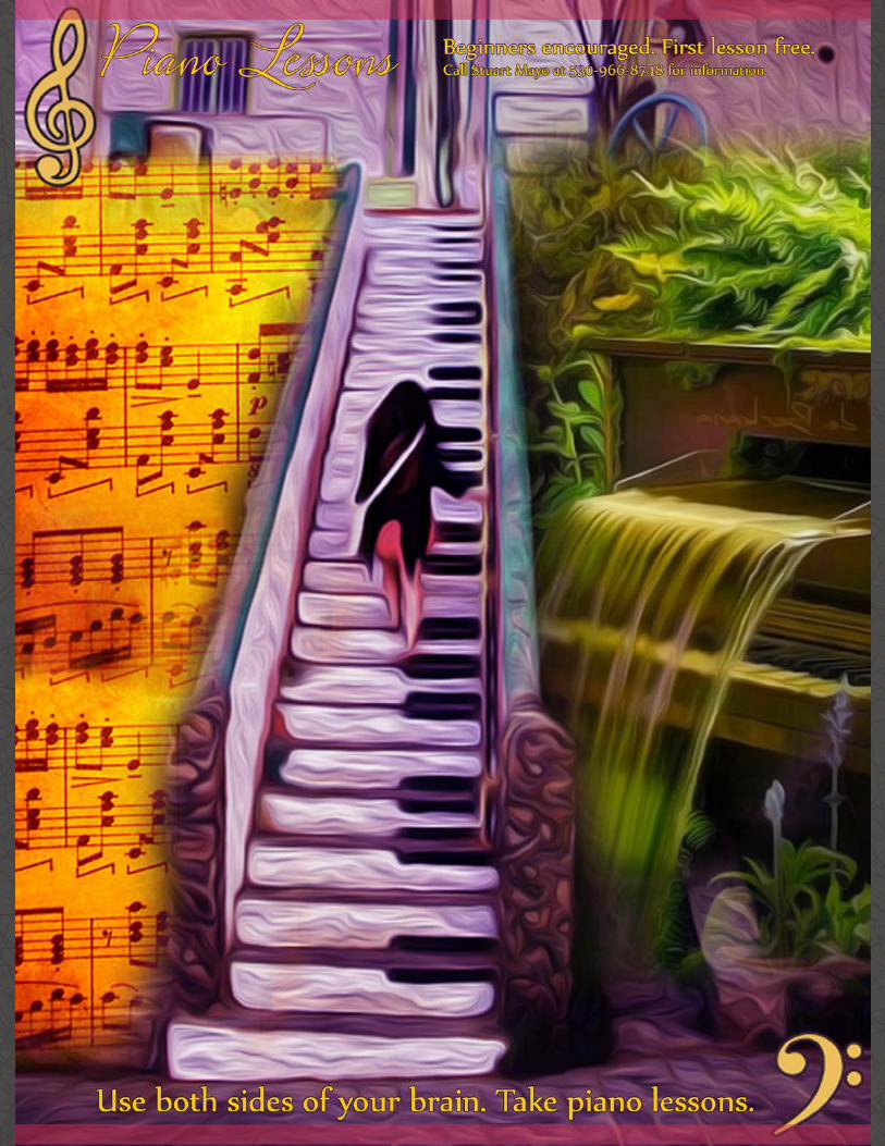
The message with this piece is the communication of an idea that piano requires the use of both the right and the left brain. The right shows the lush, creative, flowing aspect of creating music, while the right shows the mathematical, calculating, and rigid formality of musical theory.
I was experimenting with clipping masks and the brush tool in Photoshop to create this advertisment.
Design Tools/Skills Used• Photoshop - The images all had to be color corrected, using color selection to bring out the desired color scheme, a tetradic blend of red, green, purple, and yellow.
• An oil-painting filter was used to create the special effects on the images.
• Masks were used to combine the images, using the brush tool to create a soft, feathered blend.
February 15th, 2014 - Comm 130, Professor Cory Kerr
Flier - Graduate Leadership Conference
The idea here was to create a B&W professional looking flier to communicate the message of this leadaership conference to young graduating professionals.
This program was created exclusively in InDesign. The shapes and general design was simple, but clear. Proximity, repetition, white space, and contrast in value were all used to aid in communicating the message effectively.
Design Tools/Skills Used• InDesign - The alignment and precision used were products of the alignment features within InDesign.
• This was my first experience with InDesign, and as such I learned valuable skills in text hierarchy and organization. I also learned of how to organize a page and use linked images.
• In this project I learned the value of sketching out ideas beforehand on paper. I was able to use this technique throughout all the projects found in this portfolio. It has since developed into the most valuable starting point I have for any projects I work on.
January 23rd, 2014 - Comm 130, Professor Cory Kerr

G r a d u a t eL e a d e r s h i p C o n f e r e n c eDo you want to have the competit ive edge in business?
C o m e l e a r n h o w a t Vo u a n t ’s a n n u a l G r a d u a t e Le a d e r s h i p C o n f e r e n c e .
Vouant Communications is devoted to helping tomorrow ’s leaders gain essential leadership sk i l ls in the work place.
During this dynamic three day seminar, attendees wil l v is it with top executives of Vouant Communications to discuss breakthrough leadership techniques, while cult ivating attr ibutes of leadership that wil l market to any employer.
October 21st8am-5pmLincoln Convention Center
Co n fe re n ce i s ava i l a b l e to gra d u at i n g s e n i o r s , b u t s p a ce i s l i m i te d. R e gi s t rat i o n a n d m o re i n fo r m at i o n ava i l a b l e at : ht t p : / / w w w. vo u a ntco m m . co m / l e a d e r s

Photo Imaging - Remember to Breathe
I was able to develop some photography skills in this project. I went out and looked for photo opportunities, eventually finding some of them in fellow students involved in activities around campus.
The girls featured in the photo were practicing stretches for modern dance.
I was looking for a relaxing message, to remember to breathe. I created a color scheme to reflect this and contrast enough to feature the message prominently.
Design Tools/Skills Used• I decided to break the grid somewhat with the orange highlighting of the text.
• Photoshop - I was able to color correct the image, and adjust the lighting for maximum clarity. The light source used in the photography was a large nearby bay window, as the photo was taken in a campus skywalk bridge.
• I used the special effects available in Photoshop to blue the edges of the word Breathe, copying the layer first to keep the solidity of the text, but also creating an airy feel to the word.
February 8th, 2014 - Comm 130, Professor Cory Kerr


HTML/CSS - Lucky Logo Showcase
This project was meant to showcase a specific logo design from earlier projects by creating a webpage describing the creative process behind the logo’s design.
The intended message was one of solidarity. The body area is intended to look solid and stable, and the metal texture makes it look even more like an elevator, while providing that solid look.
Design Tools/Skills Used• Basic HTML structuring. A variety of simple HTML5 tags for text and image arrangement, and several more advanced tags to facilitate the use of the the repeating background on both the body and html background.
• CSS structuring. I used this to make consistent changes to the aesthetics of the page.
March 15th, 2014 - Comm 130, Professor Cory Kerr