P.6 Representing Data Graphically - Computing Sciences...
9
P.6 Representing Data Graphically What you should learn Use line plots to order and analyze data. Use histograms to represent frequency distributions. Use bar graphs to represent and analyze data. Use line graphs to represent and analyze data. Why you should learn it Double bar graphs allow you to compare visually two sets of data over time. For example, in Exercises 9 and 10 on page 65, you are asked to estimate the difference in tuition between public and private institutions of higher education. Cindy Charles / PhotoEdit Section P.6 Representing Data Graphically 59 Line Plots Statistics is the branch of mathematics that studies techniques for collecting, organizing, and interpreting data. In this section, you will study several ways to organize data. The first is a line plot, which uses a portion of a real number line to order numbers. Line plots are especially useful for ordering small sets of numbers (about 50 or less) by hand. Many statistical measures can be obtained from a line plot. Two such measures are the frequency and range of the data. The frequency measures the number of times a value occurs in a data set. The range is the difference between the greatest and smallest data values. For example, consider the data values 20, 21, 21, 25, 32. The frequency of 21 in the data set is 2 because 21 occurs twice. The range is 12 because the difference between the greatest and smallest data values is 32 20 12. Example 1 Constructing a Line Plot Use a line plot to organize the following test scores. Which score occurs with the greatest frequency? What is the range of scores? 93, 70, 76, 67, 86, 93, 82, 78, 83, 86, 64, 78, 76, 66, 83 83, 96, 74, 69, 76, 64, 74, 79, 76, 88, 76, 81, 82, 74, 70 Solution Begin by scanning the data to find the smallest and largest numbers. For the data, the smallest number is 64 and the largest is 96. Next, draw a portion of a real number line that includes the interval To create the line plot, start with the first number, 93, and enter an above 93 on the number line. Continue recording ’s for each number in the list until you obtain the line plot shown in Figure P.29. From the line plot, you can see that 76 occurs with the greatest frequency. Because the range is the difference between the greatest and smallest data values, the range of scores is Figure P.29 Now try Exercise 1. 65 70 75 80 85 90 95 100 × × ×× ×× × × × × × × × × × × × ××× × × × × × × × × × × Test scores 96 64 32. 64, 96. Note that methods for representing data graphically also include the scatter plot, already mentioned in Section P.5. 333371_0P06.qxp 12/27/06 9:38 AM Page 59
-
Upload
trinhxuyen -
Category
Documents
-
view
221 -
download
1
Transcript of P.6 Representing Data Graphically - Computing Sciences...

P.6 Representing Data Graphically
What you should learn� Use line plots to order and analyze data.
� Use histograms to represent frequencydistributions.
� Use bar graphs to represent and analyzedata.
� Use line graphs to represent and analyzedata.
Why you should learn itDouble bar graphs allow you to comparevisually two sets of data over time. Forexample, in Exercises 9 and 10 on page 65,you are asked to estimate the difference in tuition between public and private institutions of higher education.
Cindy Charles/PhotoEdit
Section P.6 Representing Data Graphically 59
Line PlotsStatistics is the branch of mathematics that studies techniques for collecting,organizing, and interpreting data. In this section, you will study several ways toorganize data. The first is a line plot, which uses a portion of a real number lineto order numbers. Line plots are especially useful for ordering small sets ofnumbers (about 50 or less) by hand.
Many statistical measures can be obtained from a line plot. Two suchmeasures are the frequency and range of the data. The frequency measures thenumber of times a value occurs in a data set. The range is the difference betweenthe greatest and smallest data values. For example, consider the data values
20, 21, 21, 25, 32.
The frequency of 21 in the data set is 2 because 21 occurs twice. The range is 12because the difference between the greatest and smallest data values is32 � 20 � 12.
Example 1 Constructing a Line Plot
Use a line plot to organize the following test scores. Which score occurs with thegreatest frequency? What is the range of scores?
93, 70, 76, 67, 86, 93, 82, 78, 83, 86, 64, 78, 76, 66, 8383, 96, 74, 69, 76, 64, 74, 79, 76, 88, 76, 81, 82, 74, 70
SolutionBegin by scanning the data to find the smallest and largest numbers. For the data,the smallest number is 64 and the largest is 96. Next, draw a portion of a realnumber line that includes the interval To create the line plot, start withthe first number, 93, and enter an above 93 on the number line. Continuerecording ’s for each number in the list until you obtain the line plot shown inFigure P.29. From the line plot, you can see that 76 occurs with the greatestfrequency. Because the range is the difference between the greatest and smallestdata values, the range of scores is
Figure P.29
Now try Exercise 1.
65 70 75 80 85 90 95 100
××
×× ×××
×××
×××××
××
× ×××
×××
××
× ××
×
Test scores
96 � 64 � 32.
�
�
�64, 96�.
Note that methods for representing datagraphically also include the scatter plot,already mentioned in Section P.5.
333371_0P06.qxp 12/27/06 9:38 AM Page 59

60 Chapter P Prerequisites
Histograms and Frequency DistributionsWhen you want to organize large sets of data, it is useful to group the data into intervals and plot the frequency of the data in each interval. A frequencydistribution can be used to construct a histogram. A histogram uses a portion ofa real number line as its horizontal axis. The bars of a histogram are not separatedby spaces.
Example 2 Constructing a Histogram
The table at the right shows the percent of the resident population of each state andthe District of Columbia that was at least 65 years old in 2004. Construct afrequency distribution and a histogram for the data. (Source: U.S. Census Bureau)
SolutionTo begin constructing a frequency distribution, you must first decide on thenumber of intervals. There are several ways to group the data. However, becausethe smallest number is 6.4 and the largest is 16.8, it seems that six intervals wouldbe appropriate. The first would be the interval the second would be and so on. By tallying the data into the six intervals, you obtain the frequencydistribution shown below. You can construct the histogram by drawing a verticalaxis to represent the number of states and a horizontal axis to represent thepercent of the population 65 and older. Then, for each interval, draw a vertical barwhose height is the total tally, as shown in Figure P.30.
Interval Tally
Figure P.30
Now try Exercise 5.
��16, 18����� ��14, 16�
���� ���������� ���� ���� ���� �12, 14����� ���10, 12������8, 10���6, 8�
�8, 10�,�6, 8�,
AK 6.4AL 13.2AR 13.8AZ 12.7CA 10.7CO 9.8CT 13.5DC 12.1DE 13.1FL 16.8GA 9.6HI 13.6IA 14.7ID 11.4IL 12.0IN 12.4KS 13.0KY 12.5LA 11.7MA 13.3MD 11.4ME 14.4MI 12.3MN 12.1MO 13.3MS 12.2
MT 13.7NC 12.1ND 14.7NE 13.3NH 12.1NJ 12.9NM 12.1NV 11.2NY 13.0OH 13.3OK 13.2OR 12.8PA 15.3RI 13.9SC 12.4SD 14.2TN 12.5TX 9.9UT 8.7VA 11.4VT 13.0WA 11.3WI 13.0WV 15.3WY 12.1
333371_0P06.qxp 12/27/06 9:38 AM Page 60

Section P.6 Representing Data Graphically 61
Bar GraphsA bar graph is similar to a histogram, except that the bars can be eitherhorizontal or vertical and the labels of the bars are not necessarily numbers.Another difference between a bar graph and a histogram is that the bars in a bargraph are usually separated by spaces.
Example 3 Constructing a Histogram
A company has 48 sales representatives who sold the following numbers of unitsduring the first quarter of 2008. Construct a frequency distribution for the data.
107 162 184 170 177 102 145 141
105 193 167 149 195 127 193 191
150 153 164 167 171 163 141 129
109 171 150 138 100 164 147 153
171 163 118 142 107 144 100 132
153 107 124 162 192 134 187 177
SolutionTo begin constructing a frequency distribution, you must first decide on thenumber of intervals. There are several ways to group the data. However, becausethe smallest number is 100 and the largest is 195, it seems that 10 intervals wouldbe appropriate. The first interval would be 100–109, the second would be110–119, and so on. By tallying the data into the 10 intervals, you obtain thedistribution shown at the right above. A histogram for the distribution is shown inFigure P.31.
Now try Exercise 6.
Units sold
Num
ber
of s
ales
repr
esen
tativ
es
100 200160120 180140
12345678
Unit Sales
Figure P.31
Mon
thly
nor
mal
prec
ipita
tion
(in
inch
es)
Month
1
2
3
4
5
6
J M M J S N
Monthly Precipitation
Figure P.32
Interval Tally
100–109110–119120–129130–139140–149150–159160–169170–179180–189190–199 ����
������ ����� ������� ���� ������������� ���
Example 4 Constructing a Bar Graph
The data below show the monthly normal precipitation (in inches) in Houston,Texas. Construct a bar graph for the data. What can you conclude? (Source:National Climatic Data Center)
January 3.7 February 3.0 March 3.4
April 3.6 May 5.2 June 5.4
July 3.2 August 3.8 September 4.3
October 4.5 November 4.2 December 3.7
SolutionTo create a bar graph, begin by drawing a vertical axis to represent the precipita-tion and a horizontal axis to represent the month. The bar graph is shown inFigure P.32. From the graph, you can see that Houston receives a fairly consistentamount of rain throughout the year—the driest month tends to be February andthe wettest month tends to be June.
Now try Exercise 7.
333371_0P06.qxp 12/27/06 9:38 AM Page 61
62 Chapter P Prerequisites
Line GraphsA line graph is similar to a standard coordinate graph. Line graphs are usuallyused to show trends over periods of time.
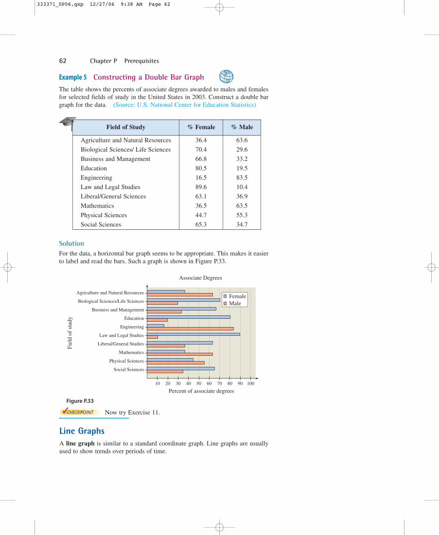
Example 5 Constructing a Double Bar Graph
The table shows the percents of associate degrees awarded to males and femalesfor selected fields of study in the United States in 2003. Construct a double bargraph for the data. (Source: U.S. National Center for Education Statistics)
SolutionFor the data, a horizontal bar graph seems to be appropriate. This makes it easierto label and read the bars. Such a graph is shown in Figure P.33.
Figure P.33
Now try Exercise 11.
Agriculture and Natural Resources
Biological Sciences/Life Sciences
Business and Management
Fiel
d of
stu
dy
Percent of associate degrees
Education
Engineering
Law and Legal Studies
Liberal/General Studies
Mathematics
Physical Sciences
Social Sciences
10 20 30 40 50 60 70 80 90 100
FemaleMale
Associate Degrees
Field of Study % Female % Male
Agriculture and Natural Resources 36.4 63.6
Biological Sciences/ Life Sciences 70.4 29.6
Business and Management 66.8 33.2
Education 80.5 19.5
Engineering 16.5 83.5
Law and Legal Studies 89.6 10.4
Liberal/General Sciences 63.1 36.9
Mathematics 36.5 63.5
Physical Sciences 44.7 55.3
Social Sciences 65.3 34.7
333371_0P06.qxp 12/27/06 9:38 AM Page 62

Section P.6 Representing Data Graphically 63
Example 6 Constructing a Line Graph
The table at the right shows the number of immigrants (in thousands) entering theUnited States for each decade from 1901 to 2000. Construct a line graph for thedata. What can you conclude? (Source: U.S. Immigration and NaturalizationService)
SolutionBegin by drawing a vertical axis to represent the number of immigrants in thou-sands. Then label the horizontal axis with decades and plot the points shown inthe table. Finally, connect the points with line segments, as shown in Figure P.34.From the line graph, you can see that the number of immigrants hit a low pointduring the depression of the 1930s. Since then the number has steadily increased.
Figure P.34
Now try Exercise 17.
You can use a graphing utility to create different typesof graphs, such as line graphs. For instance, the table at the right shows thenumbers N (in thousands) of women on active duty in the United States militaryfor selected years. To use a graphing utility to create a line graph of the data,first enter the data into the graphing utility’s list editor, as shown in FigureP.35. Then use the statistical plotting feature to set up the line graph, as shownin Figure P.36. Finally, display the line graph use a viewing window in which
and , as shown in Figure P.37. (Source: U.S.Department of Defense)
Figure P.35 Figure P.36 Figure P.37
0 ≤ y ≤ 250�1970 ≤ x ≤ 2010�
TECHNOLOGY T I P
1970 2010
250
0
Year Number
1975 971980 1711985 2121990 2271995 1962000 2032005 203
Decade Number
1901–1910 87951911–1920 57361921–1930 41071931–1940 5281941–1950 10351951–1960 25151961–1970 33221971–1980 44931981–1990 73381991–2000 9095
333371_0P06.qxp 12/27/06 9:38 AM Page 63

64 Chapter P Prerequisites
1. Consumer Awareness The line plot shows a sample ofprices of unleaded regular gasoline in 25 different cities.
(a) What price occurred with the greatest frequency?
(b) What is the range of prices?
2. Agriculture The line plot shows the weights (to the nearesthundred pounds) of 30 head of cattle sold by a rancher.
(a) What weight occurred with the greatest frequency?
(b) What is the range of weights?
Quiz and Exam Scores In Exercises 3 and 4, use the following scores from an algebra class of 30 students. Thescores are for one 25-point quiz and one 100-point exam.
Quiz 20, 15, 14, 20, 16, 19, 10, 21, 24, 15, 15, 14, 15, 21, 19,15, 20, 18, 18, 22, 18, 16, 18, 19, 21, 19, 16, 20, 14, 12
Exam 77, 100, 77, 70, 83, 89, 87, 85, 81, 84, 81, 78, 89, 78,88, 85, 90, 92, 75, 81, 85, 100, 98, 81, 78, 75, 85, 89, 82, 75
3. Construct a line plot for the quiz. Which score(s) occurredwith the greatest frequency?
4. Construct a line plot for the exam. Which score(s) occurredwith the greatest frequency?
5. Agriculture The list shows the numbers of farms (in thou-sands) in the 50 states in 2004. Use a frequency distributionand a histogram to organize the data. (Source: U.S.Department of Agriculture)
AK 1 AL 44 AR 48 AZ 10CA 77 CO 31 CT 4 DE 2FL 43 GA 49 HI 6 IA 90ID 25 IL 73 IN 59 KS 65KY 85 LA 27 MA 6 MD 12ME 7 MI 53 MN 80 MO 106MS 42 MT 28 NC 52 ND 30NE 48 NH 3 NJ 10 NM 18NV 3 NY 36 OH 77 OK 84OR 40 PA 58 RI 1 SC 24SD 32 TN 85 TX 229 UT 15VA 48 VT 6 WA 35 WI 77WV 21 WY 9
6. Schools The list shows the numbers of public high schoolgraduates (in thousands) in the 50 states and the District ofColumbia in 2004. Use a frequency distribution and ahistogram to organize the data. (Source: U.S. NationalCenter for Education Statistics)
AK 7.1 AL 37.6 AR 26.9 AZ 57.0CA 342.6 CO 42.9 CT 34.4 DC 3.2DE 6.8 FL 129.0 GA 69.7 HI 10.3IA 33.8 ID 15.5 IL 121.3 IN 57.6KS 30.0 KY 36.2 LA 36.2 MA 57.9MD 53.0 ME 13.4 MI 106.3 MN 59.8MO 57.0 MS 23.6 MT 10.5 NC 71.4ND 7.8 NE 20.0 NH 13.3 NJ 88.3NM 18.1 NV 16.2 NY 150.9 OH 116.3OK 36.7 OR 32.5 PA 121.6 RI 9.3SC 32.1 SD 9.1 TN 43.6 TX 236.7UT 29.9 VA 71.7 VT 7.0 WA 60.4WI 62.3 WV 17.1 WY 5.7
××
×××
××××
×××××××××
××××
××××××
××
600 800 1000 1200 1400
2.449 2.469 2.489 2.509 2.529 2.549 2.569 2.589 2.609 2.629 2.649
× × × ×××
× ××
××××××
××
××
× ××××
×
P.6 Exercises See www.CalcChat.com for worked-out solutions to odd-numbered exercises.
Vocabulary Check
Fill in the blanks.
1. _______ is the branch of mathematics that studies techniques for collecting, organizing, and interpreting data.
2. _______ are useful for ordering small sets of numbers by hand.
3. A _______ uses a portion of a real number line as its horizontal axis, and the bars are not separated by spaces.
4. You use a _______ to construct a histogram.
5. The bars in a _______ can be either vertical or horizontal.
6. _______ show trends over periods of time.
333371_0P06.qxp 12/27/06 9:38 AM Page 64

Section P.6 Representing Data Graphically 65
7. Business The table shows the numbers of Wal-Martstores from 1995 to 2006. Construct a bar graph for thedata. Write a brief statement regarding the number of Wal-Mart stores over time. (Source: Value Line)
8. Business The table shows the revenues (in billions ofdollars) for Costco Wholesale from 1995 to 2006.Construct a bar graph for the data. Write a brief statementregarding the revenue of Costco Wholesale stores overtime. (Source: Value Line)
Tuition In Exercises 9 and 10, the double bar graph showsthe mean tuitions (in dollars) charged by public and privateinstitutions of higher education in the United States from1999 to 2004. (Source: U.S. National Center for EducationStatistics)
9. Approximate the difference in tuition charges for publicand private schools for each year.
10. Approximate the increase or decrease in tuition charges foreach type of institution from year to year.
11. College Enrollment The table shows the total collegeenrollments (in thousands) for women and men in theUnited States from 1997 to 2003. Construct a double bargraph for the data. (Source: U.S. National Center forEducation Statistics)
12. Population The table shows the populations (in millions)in the coastal regions of the United States in 1970 and2003. Construct a double bar graph for the data. (Source:U.S. Census Bureau)
6,000
2,000
4,000
8,000
1999 2000 2001 2002 2003 2004
10,000
12,000
14,000
16,000
18,000 PublicPrivate
Tui
tion
(in
dolla
rs)
Year Number of stores
1995 2943
1996 3054
1997 3406
1998 3599
1999 3985
2000 4189
2001 4414
2002 4688
2003 4906
2004 5289
2005 5650
2006 6050
YearRevenue
(in billions of dollars)
1995 18.247
1996 19.566
1997 21.874
1998 24.270
1999 27.456
2000 32.164
2001 34.797
2002 38.762
2003 42.546
2004 48.107
2005 52.935
2006 58.600
YearWomen
(in thousands)Men
(in thousands)
1997 8106.3 6396.0
1998 8137.7 6369.3
1999 8300.6 6490.6
2000 8590.5 6721.8
2001 8967.2 6960.8
2002 9410.0 7202.0
2003 9652.0 7259.0
Region1970
population(in millions)
2003population
(in millions)
Atlantic 52.1 67.1
Gulf of Mexico 10.0 18.9
Great Lakes 26.0 27.5
Pacific 22.8 39.4
333371_0P06.qxp 12/27/06 9:38 AM Page 65

66 Chapter P Prerequisites
Advertising In Exercises 13 and 14, use the line graph,which shows the costs of a 30-second television spot (inthousands of dollars) during the Super Bowl from 1995 to2005. (Source: The Associated Press)
13. Approximate the percent increase in the cost of a 30-second spot from Super Bowl XXX in 1996 to SuperBowl XXXIX in 2005.
14. Estimate the increase or decrease in the cost of a 30-second spot from (a) Super Bowl XXIX in 1995 toSuper Bowl XXXIII in 1999, and (b) Super Bowl XXXIVin 2000 to Super Bowl XXXIX in 2005.
Retail Price In Exercises 15 and 16, use the line graph,which shows the average retail price (in dollars) of onepound of 100% ground beef in the United States for eachmonth in 2004. (Source: U.S. Bureau of Labor Statistics)
15. What is the highest price of one pound of 100% groundbeef shown in the graph? When did this price occur?
16. What was the difference between the highest price and thelowest price of one pound of 100% ground beef in 2004?
17. Labor The table shows the total numbers of women inthe work force (in thousands) in the United States from1995 to 2004. Construct a line graph for the data. Write abrief statement describing what the graph reveals.(Source: U.S. Bureau of Labor Statistics)
18. SAT Scores The table shows the average ScholasticAptitude Test (SAT) Math Exam scores for college-boundseniors in the United States for selected years from 1970 to2005. Construct a line graph for the data. Write a briefstatement describing what the graph reveals. (Source:The College Entrance Examination Board)
19. Hourly Earnings The table on page 67 shows theaverage hourly earnings (in dollars) of production workersin the United States from 1994 to 2005. Use a graphingutility to construct a line graph for the data. (Source: U.S.Bureau of Labor Statistics)
Ret
ail p
rice
(in
dol
lars
)
MonthJan. Mar. May July Sept. Nov.
2.30
2.40
2.50
2.60
2.70
2.80
Year
1000
1200
1400
1600
1800
2000
2200
2400
Cos
t of
a 30
-sec
ond
TV
spo
t(i
n th
ousa
nds
of d
olla
rs)
1995 1997 1999 2001 2003 2005
Year SAT scores
1970 512
1975 498
1980 492
1985 500
1990 501
1995 506
2000 514
2005 520
YearWomen in the work force
(in thousands)
1995 60,944
1996 61,857
1997 63,036
1998 63,714
1999 64,855
2000 66,303
2001 66,848
2002 67,363
2003 68,272
2004 68,421
333371_0P06.qxp 12/27/06 9:38 AM Page 66

Section P.6 Representing Data Graphically 67
20. Internet Access The list shows the percent of householdsin each of the 50 states and the District of Columbia withInternet access in 2003. Use a graphing utility to organizethe data in the graph of your choice. Explain your choice ofgraph. (Source: U.S. Department of Commerce)
AK 67.6 AL 45.7 AR 42.4 AZ 55.2CA 59.6 CO 63.0 CT 62.9 DC 53.2DE 56.8 FL 55.6 GA 53.5 HI 55.0IA 57.1 ID 56.4 IL 51.1 IN 51.0KS 54.3 KY 49.6 LA 44.1 MA 58.1MD 59.2 ME 57.9 MI 52.0 MN 61.6MO 53.0 MS 38.9 MT 50.4 NC 51.1ND 53.2 NE 55.4 NH 65.2 NJ 60.5NM 44.5 NV 55.2 NY 53.3 OH 52.5OK 48.4 OR 61.0 PA 54.7 RI 55.7SC 45.6 SD 53.6 TN 48.9 TX 51.8UT 62.6 VA 60.3 VT 58.1 WA 62.3WI 57.4 WV 47.6 WY 57.7
Cellular Phones In Exercises 21 and 22, use the table,which shows the average monthly cellular telephone bills (indollars) in the United States from 1999 to 2004. (Source:Telecommunications & Internet Association)
21. Organize the data in an appropriate display. Explain yourchoice of graph.
22. The average monthly bills in 1990 and 1995 were $80.90and $51.00, respectively. How would you explain thetrend(s) in the data?
23. High School Athletes The table shows the numbers ofparticipants (in thousands) in high school athletic programsin the United States from 1995 to 2004. Organize the datain an appropriate display. Explain your choice of graph.(Source: National Federation of State High SchoolAssociations)
Synthesis
24. Writing Describe the differences between a bar graphand a histogram.
25. Think About It How can you decide which type of graphto use when you are organizing data?
26. Graphical Interpretation The graphs shown below rep-resent the same data points. Which of the two graphs ismisleading, and why? Discuss other ways in which graphscan be misleading. Try to find another example of a mis-leading graph in a newspaper or magazine. Why is it mis-leading? Why would it be beneficial for someone to use amisleading graph?
32.0
32.4
32.8
33.2
33.6
34.0
34.4
NSJMMJ
Month
Com
pany
pro
fits
0
10
20
30
40
50
MonthJ M M J S N
Com
pany
pro
fitsYear
Average monthly bill (in dollars)
1999 41.24
2000 45.27
2001 47.37
2002 48.40
2003 49.91
2004 50.64
YearFemale athletes (in thousands)
Male athletes (in thousands)
1995 2240 3536
1996 2368 3634
1997 2474 3706
1998 2570 3763
1999 2653 3832
2000 2676 3862
2001 2784 3921
2002 2807 3961
2003 2856 3989
2004 2865 4038
YearHourly earnings
(in dollars)
1994 11.19
1995 11.47
1996 11.84
1997 12.27
1998 12.77
1999 13.25
2000 13.73
2001 14.27
2002 14.73
2003 15.19
2004 15.48
2005 15.90
Table for 19
333371_0P06.qxp 12/27/06 9:38 AM Page 67