NehaKulkarni_Portfolio_UX
16
UX Design Portfolio Neha Kulkarni
-
Upload
neha-kulkarni -
Category
Documents
-
view
40 -
download
0
Transcript of NehaKulkarni_Portfolio_UX

UX Design PortfolioNeha Kulkarni
• Research
⁃ Competitive Analysis⁃ Comparative Analysis⁃ Data Analysis⁃ Content Inventory⁃ Feature Analysis⁃ Content Blocking⁃ Synthesis
• User Research⁃ Surveys⁃ Interviews⁃ Heuristic evaluation⁃ Card Sorting⁃ User Tasks⁃ Persona⁃ Synthsis
• Wireframes• Prototyping• User Testing• Iteration• Branding
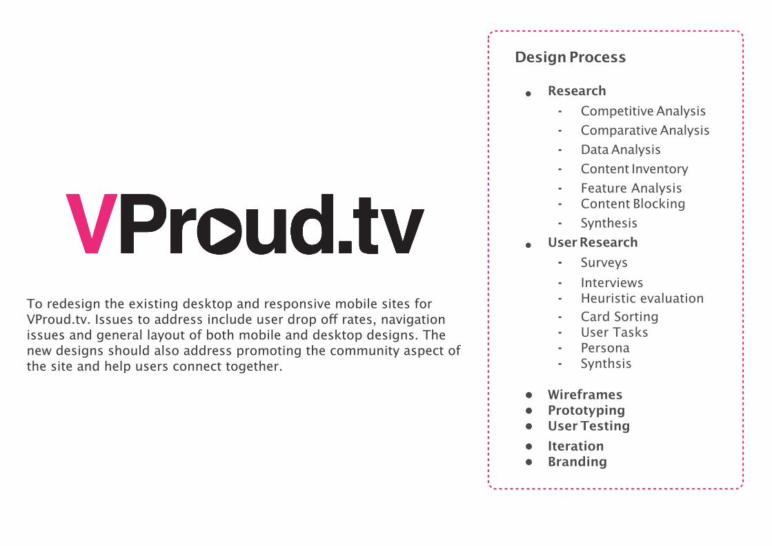
Design Process
To redesign the existing desktop and responsive mobile sites for VProud.tv. Issues to address include user drop off rates, navigation issues and general layout of both mobile and desktop designs. The new designs should also address promoting the community aspect of the site and help users connect together.

Client: VProud is a social networking plus a video blogging site for women. Their target audience is typical American women, whether that be a homemaker, a single mother, working women, a teenager, mother of a special kid, divorcée, women having marriage problems or health problem etc.
Project OverviewRedesigning the current VProud.tv website in order to determine target user personas, improve navigation, prioritize features, improve general usability, and explore a new visual design for the look and feel of the brand. The end result was a refined UI with a clearer, more defined content strategy and an emphasis on a user-friendly experience.
Duration: 3 weeks project.
Team: 2 UX/UI Designer.
My Role: Main point of contact for the client, product research, building survey question, user interviews, persona, user tasks, site map, usability testing, wireframing and prototyping.
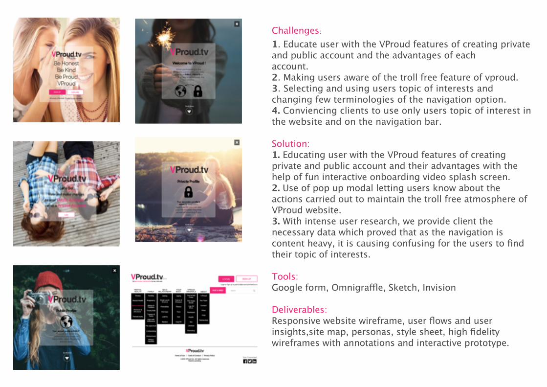
Challenges:1. Educate user with the VProud features of creating private and public account and the advantages of eachaccount. 2. Making users aware of the troll free feature of vproud.3. Selecting and using users topic of interests and changing few terminologies of the navigation option.4. Conviencing clients to use only users topic of interest in the website and on the navigation bar.
Solution:1. Educating user with the VProud features of creating private and public account and their advantages with the help of fun interactive onboarding video splash screen. 2. Use of pop up modal letting users know about the actions carried out to maintain the troll free atmosphere of VProud website.3. With intense user research, we provide client the necessary data which proved that as the navigation is content heavy, it is causing confusing for the users to find their topic of interests.
Tools: Google form, Omnigraffle, Sketch, Invision
Deliverables: Responsive website wireframe, user flows and userinsights,site map, personas, style sheet, high fidelitywireframes with annotations and interactive prototype.

Design Process
My product is Tone glove connected to Tone mobile application which will help users reduce stress with the help of music. The glove helps users track their emotions and moods and based on the readings the app will provide a mood based playlist to reduce stress and anxiety.
• Research
⁃ Competitive Analysis⁃ Comparative Analysis⁃ Feature Analysis⁃ Generative Research⁃ Synthesis
• User Research⁃ Interviews⁃ User Flows⁃ Persona⁃ Synthsis
• Wireframing & Prototyping• User Testing• Iteration
• Branding
• Developing
⁃ HTML/CSS⁃ JQuery⁃ Java Script⁃ PHP
• Product designing⁃ Gloves material⁃ Sensors

Project OverviewThere are several physical fitness wearable tech present in market, but to maintain that physical fitness regime the individual has to be psychologically fit too. Tone is a mobile application which helps users reduce stress with the help of music.
Duration: This was a 1 year project.
Tools: Adobe Illustrator, Adobe Photoshop, Keynote, TextWrangler, My SQL, Eclipse, Arduino, Processing.
Deliverables:Research Data, Users Research Data, App Map, User Flows, Journey Mapping, Persona, Style sheet, Wearable(handglove) Design, Wireframes with annotations, Mobile app code.

Challenges:1. To find out what users like to do in different emotions.2. To find out right sensors which will help capture human emotions.3. To callibarate the values of both the sensors to show right emotions and playlist of music. 4. Connections of the sensors in a glove.
Solution:1. Conducted users interview to find out users needs, pain points, what they do to overcome negative emotions and why.2. Visited hospital to met psychiatrist and therapist to understand advantages music therapy.3. Studied different machines psychiatrist use to track emotions of the patients and how it worked.4. I took help of fashion designer and a mechanical engineer to put those small sensors inside a glove. I had to be careful in selecting the materials of the gloves as it shouldn’t cause any irritation to the users when worn.
Deliverables: Mobile application, Hand gloves, user flows, site map, personas, style sheet, high fidelity wireframes with annotations and interactive prototype.

• Research
⁃ Competitive Analysis⁃ Comparative Analysis⁃ Evaluating Research⁃ Generative Research⁃ Synthesis
• User Research⁃ Surveys⁃ Interviews⁃ User Tasks⁃ Persona⁃ Synthsis
• Wireframing & Prototyping• User Testing• Iteration
Design ProcessKINDLE
Many people enjoy having access to books through the Amazon Kindle app. The app provides a pleasant reading experience, but doesn’t connect them to other readers or other books they might enjoy. People love to discuss what they’re reading! Amazon wants to connect their users to make the Kindle reading experience more social by giving readers ways to share and discuss the books they’re reading.

Goals1. Users should be able to create their Kindle “Network”2. Users Should be able to form book groups and share their thoughts on what they are reading with others. 3. Users should be able to find recommendations based on what others are reading.
Duration: This was a 14 days project.
Tools: Google form, Omnigraffle, Paper prototype, Sketch, Adobe Illustrator, Marvel, Invision.
Deliverables:Research Data, Users Research Data, App Map, User Flows, Persona, Style sheet, Wireframes with annotations and Prototype.

Challenges:1. When we carried out survey and interviewed users to find out if they would like the feature of socializing in their kindle app and why the result were half and half. 2. Notifying users to accept invition of joining Kindle circle created by a friend.3. There were few gestures which the kindle users were also not fimilar about it. Like the hard tape to recommend a book to a friend.
Solution:1. Considering empathy to both the type of users we came up with a functionality of switching to private mode or public mode. Hence users who want to maintain the privacy while using kindle will keep private mode and users who want to a part of online kindle circle will keep public mode. 2. Users can create a kindle circle by adding friends into that circle. They will be notified with the help of imessage or email through kindle app.3. Educating users with different gestures to create a circle or recommend a book.
Deliverables: User flows, App map, Personas, Style Sheet, Low Mid and High fidelity wireframes with annotations and Interactive Prototype.

In this project we have created a mock up of an IOS fitness app and Apple watch for adidas. What make our product diferent from other fitness app is :
1. It is app about HIIT (High intensity interval training) for beginners, intermediate and exerienced users.2. New user to HIIT the app will educate and guide to bring proper form and consistency in their workout to avoid injury.3. Advance users can create and customized their workout routine. and4. It will show live monitoring of Heart Rate which plays a vital role which performing HIIT workout routines.
• Research⁃ Competitive Analysis⁃ Comparative Analysis⁃ Content Inventory⁃ Generative Research⁃ Synthesis
• User Research⁃ Surveys⁃ Interviews⁃ Feature priortization⁃ Synthsis
• Wireframing & Prototyping• User Testing• Iteration• Branding
Design Process
HIGH INTENSIVE INTERVAL TRAINING APP

Goal1. It is app about HIIT (High intensity interval training).2. New user to HIIT the app will educate and guide to bring proper form and consistency in their workout to avoid injury.3. Advance users can create and customized their workout routine. and4. Heart Rate plays a vital role while performing HIIT workout routines, as it refects a person’s level of physical fitness. Showing live monitoring of heart rate and calories burnt will motivate users in achiving perfection in HIIT.
My Role: As the project manager, I designed, organised and oversaw the entire project from research through to high fidelity prototyping. Product Research, User Interviewing and Usability Testing. Wireframing and prototyping.
Client: Adidas AG is a German multinational corporation that designs and manufactures sports shoes, clothing and accessories. It’s tagline is “IMPOSSIBLE IS NOTHING”. Any shape. Any goal. Any day. Any place. It’s time to go beyond fit and find your more. In creating this app at every stage we have considered the three important fitness goals by adidas - TRAIN BETTER, STAY MOTIVATED AND FEEL GREAT . We strongly believes that a solid workout plan is an integral part of any fItness journey.
Duration: This was a 3 weeks client project.
Team: 2 UX Designers
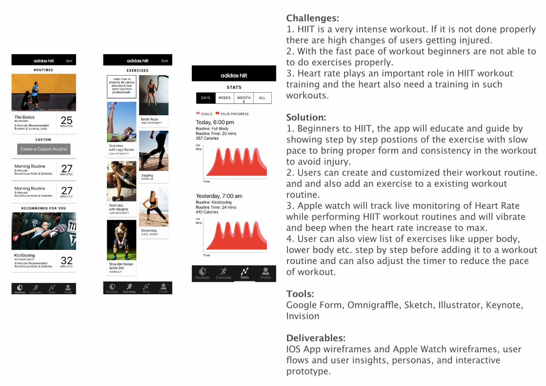
Challenges:1. HIIT is a very intense workout. If it is not done properly there are high changes of users getting injured.2. With the fast pace of workout beginners are not able to to do exercises properly.3. Heart rate plays an important role in HIIT workout training and the heart also need a training in such workouts. Solution:1. Beginners to HIIT, the app will educate and guide by showing step by step postions of the exercise with slow pace to bring proper form and consistency in the workout to avoid injury.2. Users can create and customized their workout routine. and and also add an exercise to a existing workout routine.3. Apple watch will track live monitoring of Heart Rate while performing HIIT workout routines and will vibrate and beep when the heart rate increase to max.4. User can also view list of exercises like upper body, lower body etc. step by step before adding it to a workout routine and can also adjust the timer to reduce the pace of workout.
Tools: Google Form, Omnigraffle, Sketch, Illustrator, Keynote, Invision
Deliverables: IOS App wireframes and Apple Watch wireframes, user flows and user insights, personas, and interactive prototype.

Texas University Colleges of Education faces large information architecture (IA) challenges. It needs to address the needs of a varied audience, and needs to feel connected in some way to the largerUniversity website. A new version of School website within a University website is required.
• Research
⁃ Competitive Analysis⁃ Comparative Analysis⁃ Content Inventory⁃ Content Blocking⁃ Synthesis
• User Research
⁃ Interviews⁃ Synthsis⁃ Task flows⁃ Persona
• Wireframing & Prototyping
• User Testing
⁃ Current Website
⁃ Low Fidelity Wireframes
⁃ Mid Fidelity Wireframes• Iteration
Design Process
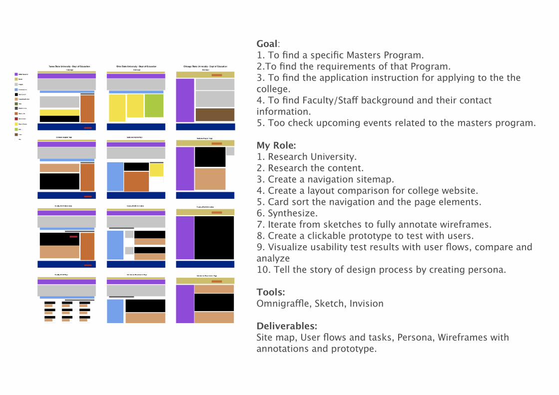
Goal:1. To find a specific Masters Program.2.To find the requirements of that Program.3. To find the application instruction for applying to the the college.4. To find Faculty/Staff background and their contact information.5. Too check upcoming events related to the masters program.
My Role: 1. Research University.2. Research the content.3. Create a navigation sitemap.4. Create a layout comparison for college website.5. Card sort the navigation and the page elements.6. Synthesize.7. Iterate from sketches to fully annotate wireframes.8. Create a clickable prototype to test with users.9. Visualize usability test results with user flows, compare and analyze 10. Tell the story of design process by creating persona.
Tools: Omnigraffle, Sketch, Invision
Deliverables: Site map, User flows and tasks, Persona, Wireframes with annotations and prototype.
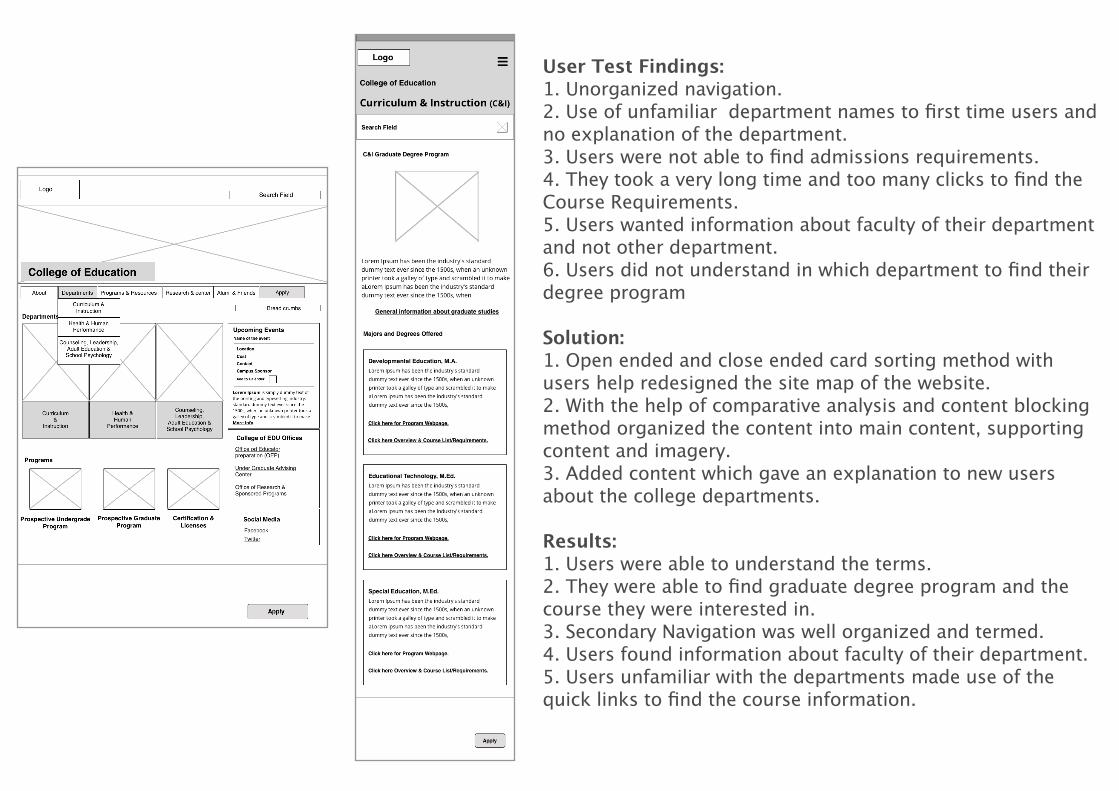
User Test Findings:1. Unorganized navigation.2. Use of unfamiliar department names to first time users and no explanation of the department.3. Users were not able to find admissions requirements.4. They took a very long time and too many clicks to find the Course Requirements.5. Users wanted information about faculty of their department and not other department.6. Users did not understand in which department to find their degree program Solution:1. Open ended and close ended card sorting method with users help redesigned the site map of the website.2. With the help of comparative analysis and content blocking method organized the content into main content, supporting content and imagery.3. Added content which gave an explanation to new users about the college departments.
Results:1. Users were able to understand the terms.2. They were able to find graduate degree program and the course they were interested in.3. Secondary Navigation was well organized and termed.4. Users found information about faculty of their department.5. Users unfamiliar with the departments made use of the quick links to find the course information.