Multimedia Design Adam Huntington ETE 261 1/30/09.
23
Multimedia Design Adam Huntington ETE 261 1/30/09
-
date post
21-Dec-2015 -
Category
Documents
-
view
214 -
download
1
Transcript of Multimedia Design Adam Huntington ETE 261 1/30/09.
Multimedia Design
Adam Huntington
ETE 261
1/30/09

Alignment
Unifies and organizes designs. Can help create: sophisticated look formal look fun look serious look
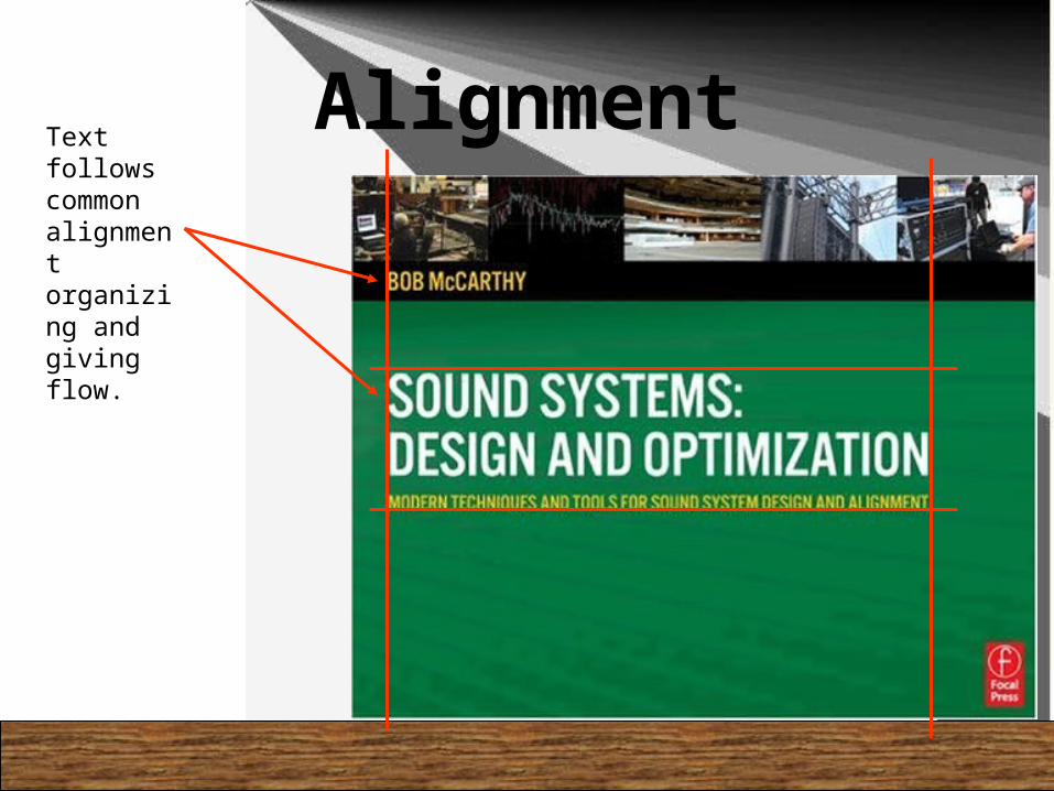
AlignmentText follows common alignment organizing and giving flow.

I
N
N
O
V
A
T
I
O
N
THIS
WAY
Find existing repetitions and strengthen them.
Avoid repeating the element so much that it becomes annoying.
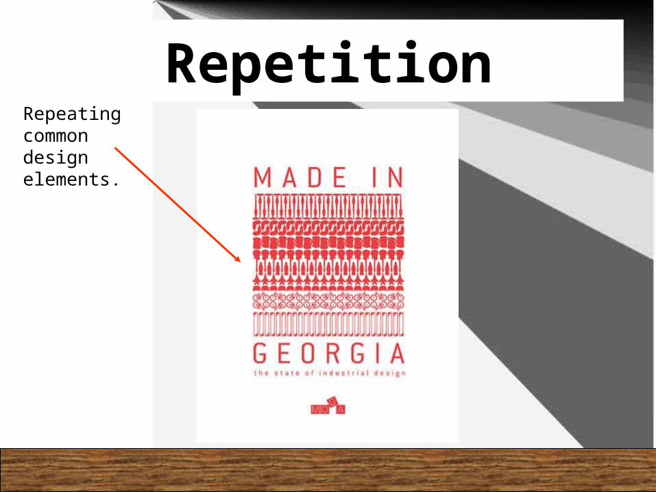
RepetitionRepeating common design elements.

Contrast!
Make it Different!
Purpose Add contrast through typeface choices, thickness, colors, shapes, sizes, space, etc. Don’t be a wimp! Avoid contrasting a sort-of-heavy line with a sort-
of heavier line. Avoid contrasting brown text with black
headlines. Avoid using two or more typefaces that are
similar.
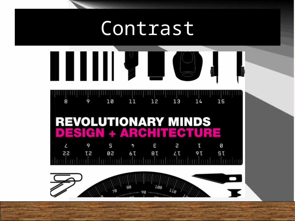
Contrast
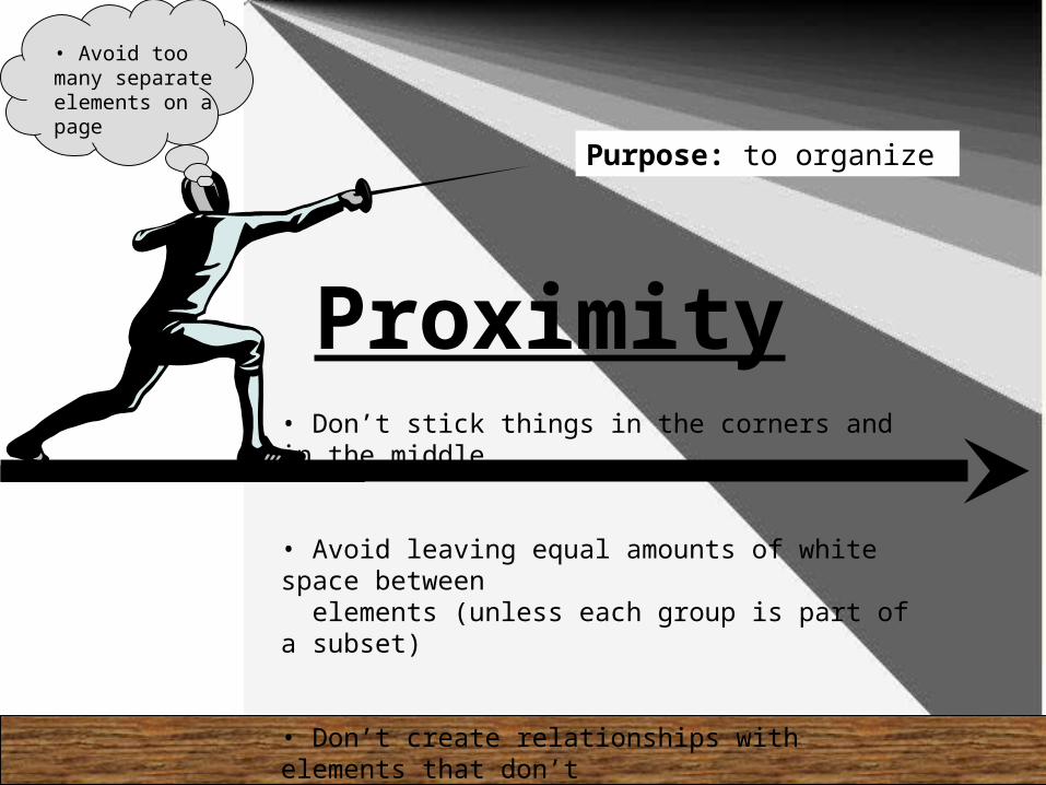
Proximity• Don’t stick things in the corners and in the middle
• Avoid leaving equal amounts of white space between elements (unless each group is part of a subset)
• Don’t create relationships with elements that don’t belong together
Purpose: to organize
• Avoid too many separate elements on a page
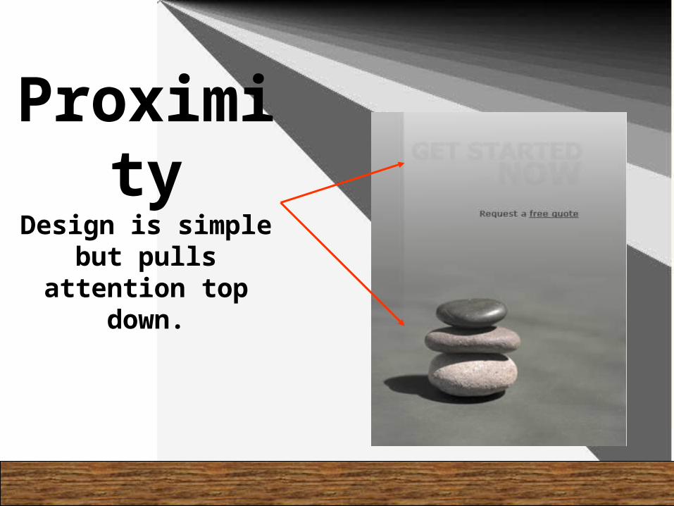
Proximity
Design is simple but pulls attention
top down.

Unity and Variety• Use variety
to create visual interest.
• Unity is the overriding principle that is served by all others
Observe the variety in color in the ad to the left, as well as
the unity developed
through pattern.

Hierarchy and Dominance
• Hierarchy is the established order, importance, and emphasis given to visual elements.
• Dominance is the prevailing influence of one element over another
The face in this design is framed and almost natural looking compared to the odd designs surrounding it. It is thedominant element in this design.

Porportion
Bad Porportions
Much
Better!
•Underlying structure based on:
•Squares
•Vertical rectangles
•Horizontal rectangles
Size Relationships

Balance
• The visual distribution of elements in a composition.
• Two types:– Symmetric – Asymmetric
Mirror line

Scale
• Related to proportion
• Refers to size comparison of the internal parts of a compositionAncient Greeks used proportion to build some of their greatest known structures

Emphasis
• Use of a focal point to stress certain elements or give special attention to an element.
LOOK
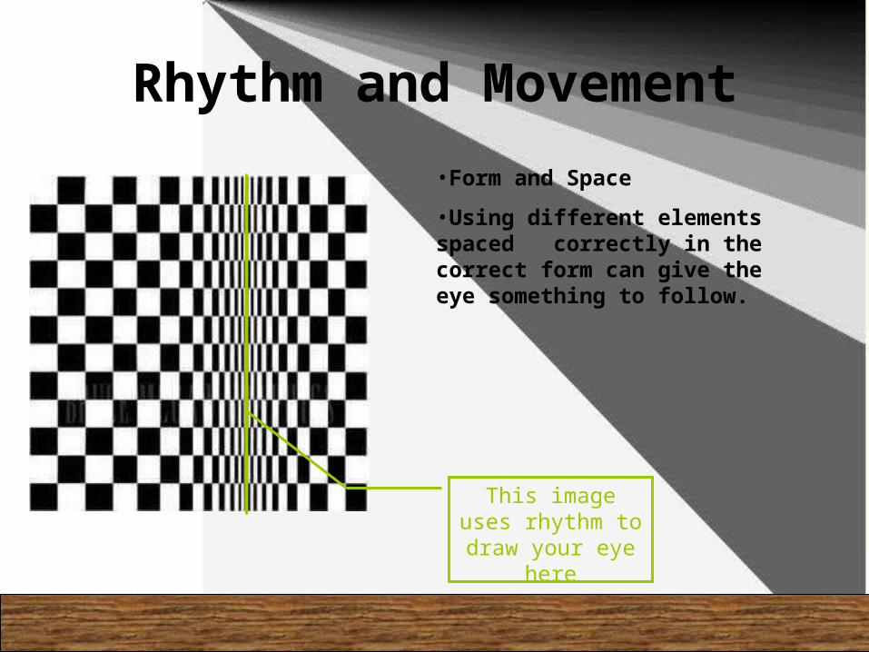
Rhythm and Movement
•Form and Space
•Using different elements spaced correctly in the correct form can give the eye something to follow.
This image uses rhythm to draw your eye here

Proximity and Repetition
•Proximity- Position and space given to the placement of elements in a composition.
•Repeating shapes and patterns
Using placement this design draws the eye to see the “typo” on top.
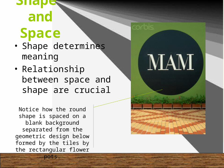
Shape and
Space• Shape determines
meaning• Relationship between
space and shape are crucial
Notice how the round shape is spaced on a
blank background separated from the
geometric design below formed by the tiles by the rectangular flower pots.

Line
• Moving path of a point• Can lead the eye• May function as a division
or as a graphic element.• Some types can imply a symbolic
meaning• Texture or pattern may be
formed by line.
In this design line is used in the text as well as the design pointing the viewer to follow the text down to
the bottom.

Size• Scale and Porportion• Size can help place a product
or design into perspective.
The hand in this picture shows the size of the
iphone. Giving an observer the idea of how portable and
refined the product is.

• Can convey attitude or mood
• Creates emphasis and variety, can support an established hierarchy.
• Can activate shapes and space
Notice the pale blue background,It is offset by the green mint leaves
and lime.Color supports the hierarchy
in this design as well as makes the shapes pop.
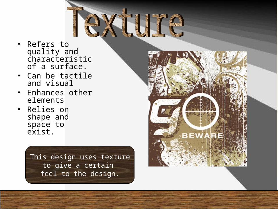
• Refers to quality and characteristic of a surface.
• Can be tactile and visual
• Enhances other elements
• Relies on shape and space to exist.
This design uses textureto give a certain feel to the design.

Typography
• Can function as:– Shape– Texture– Point– Line
• Contain verbal meaning• Word forms must communicate
message as well as function as graphic elements
This particulardesign uses smaller wordsto create a larger set ofwords.