Media task 1 and 2 evaluation
9
Media Task 1 and 2
-
Upload
cassieli -
Category
Art & Photos
-
view
25 -
download
1
Transcript of Media task 1 and 2 evaluation

Media Task 1 and 2

Introduction • When I began to make my magazine I researched different magazines which were
made by companies which are already in the industry. I targeted my research on the companies which made Hip-Hop magazines as this was the genre I wanted to make my magazine in. This research was successful and through it I managed to find a magazine which I wanted to use as a guide for my own.

Front Cover
I also put effects on the picture which meant that it looked similar to the one on the magazine such as making it look darker and changing other small features of the photo.
I began with the front cover and on it they used a mid-shot of drake who looked very serious so I tried to replicate this picture as much as possible.
I have also copied the colour scheme of the magazine which had a full black background with yellow and white text on it. These colours complemented each other very well and made the front cover stand out and look very effective.
The next thing that I needed to make look similar so I fit the codes and conventions of media was the font on my text and I managed to find one which looks similar to the one on the Vibe magazine and this looked very good on my cover as it also helped it to stand out especially on the black background
I tried to ensure that I included all of the details on the front cover as best as I could although I did change a few details. I believe the front cover still looked very effective.
I have also featured a barcode on my magazine
I’ve featured cover lines to fill the space in my magazine.

Contents Page The next thing which I had to complete was my context page. I again had to research different front covers for this and unfortunately I couldn’t find one which was from the same cover. I did manage to find ones that were from different versions of vibe magazines and so I followed the format of this but I used different colour schemes and moved the position of the text.
To follow the codes and conventions of media I tried to make it flow with the front cover as much as possible by using the same colours and font type and this is key when following the codes and conventions.
I also tried to copy the way contents has been placed on the page as this is follows the house style of Vibe magazine and this is the company's magazine I wanted to copy.
I also put my masthead but in a smaller version so people know that it’s all part of the magazine and this is what they do in the industry.
I also placed my picture in the middle as this is what other Vibe magazines do.
I have featured the page numbers along with a small sentence explaining what's on the page.

DPSOn my double page spread I copied this magazine but also changed it to complement my colour scheme. Instead of using the red and grey I used black and yellow. I also used the yellow for the big letter in the middle of the text.
I also placed my image on the left hand side of the picture so the text and picture don’t get in the way of each other and people will be able to read the article without anything getting in the way.
At the start of the paragraphs I've also added large capital letter to follow the house style of vibe magazine.
I've also added some text to fill space which was remaining on the magazine.
I’ve ensured to use a close up image on my double page spread and this feature appears in a lot of magazine double page spreads and especially in the hip hop magazine themed magazine.
I have ensured that the clothes that that featured in the magazine fit in with the cool Hip-Hop look
I have used columns for my text as this follows the codes and conventions of a magazine.

Social Groups • My media products represents Hip-Hop as this was the social group I
was aiming it at. I did this through first of all researching a lot of different hip hop magazines to see what the industry does to portray this genre. This was key as I had no experience in making Hip-Hop magazines before.
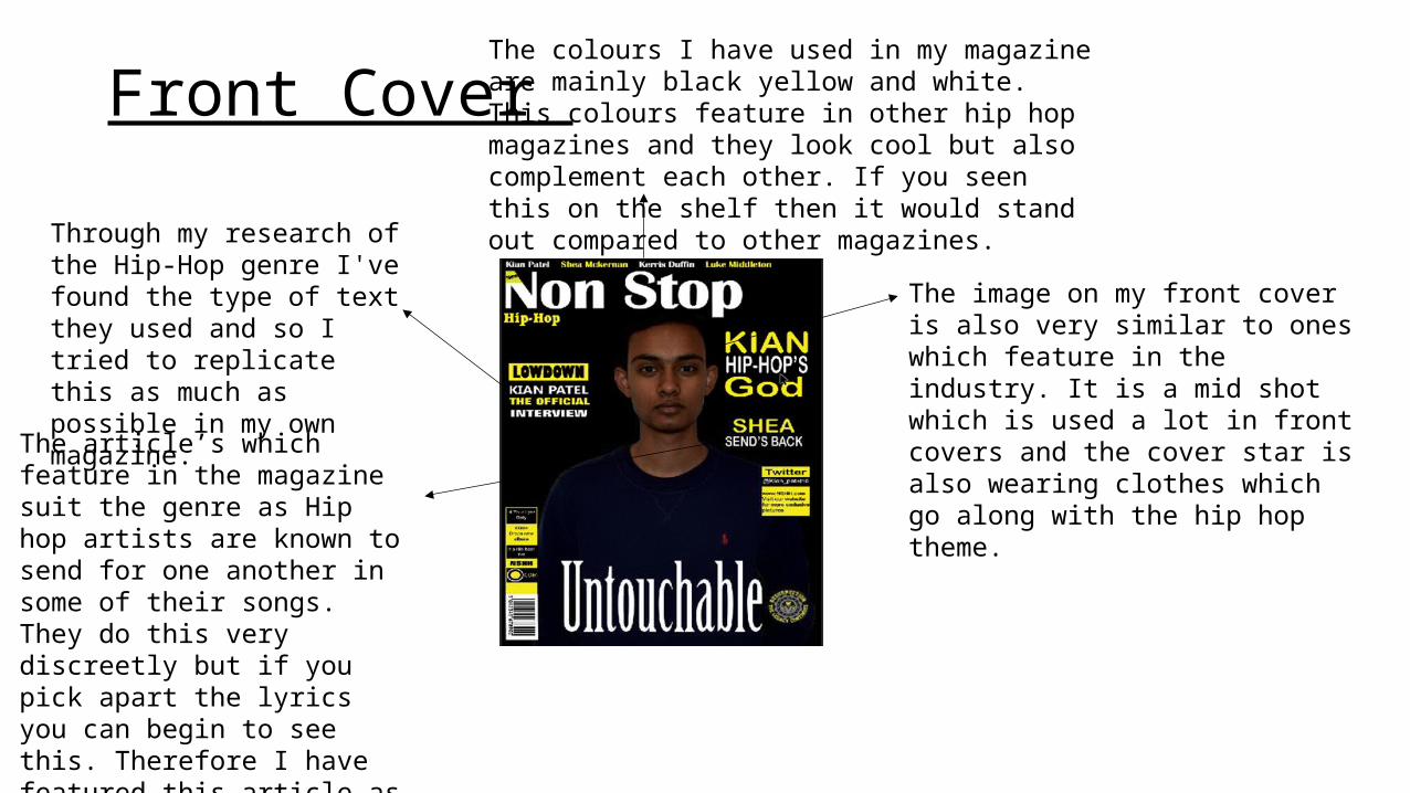
Front Cover Through my research of the Hip-Hop genre I've found the type of text they used and so I tried to replicate this as much as possible in my own magazine.
The colours I have used in my magazine are mainly black yellow and white. This colours feature in other hip hop magazines and they look cool but also complement each other. If you seen this on the shelf then it would stand out compared to other magazines.
The image on my front cover is also very similar to ones which feature in the industry. It is a mid shot which is used a lot in front covers and the cover star is also wearing clothes which go along with the hip hop theme. The article’s which feature in the
magazine suit the genre as Hip hop artists are known to send for one another in some of their songs. They do this very discreetly but if you pick apart the lyrics you can begin to see this. Therefore I have featured this article as its something that people interested in hip hop would like to read about.

Contest page
• The contents page suits the social group in many different ways as well. I have kept the same house style on this page meaning that the colours and fonts are of course the same. I have then included different story lines which you would associate with the social group. They would want to know about new albums which their favourite artist is releasing along with interviews which would discuss the hot topics that are around during that particular time. Again the image I have put on there is similar to ones which feature on other contest pages made from people in the industry.
The way that the word contents is placed is a feature which I seen in a vibe magazine and I liked the way it looked. The type of font also fits in with the Hip Hop genre.

DPS• In the double page spreads I found out this particular social group
tend to put a large image on one side of the page which is usually a close up of the cover star and I have followed this by placing a close up on my artist. I have also used the same colour scheme to ensure that the magazine flows.