Magazine analysationnnn
5
The colour scheme of red and white is a familiar theme for Q magazine readers. The same colours are always used and it appeals to the audiences frame of reference for the magazine. It also makes it easily recognisable to those who don't read it as frequently. House Style The contents page highlights many of the regular articl featured in the magazine that appeal to its regular fan bas The every month section outlines the permanent feature whilst they also have a caption with an overview of what Frame Of Reference Following codes and conventions of other magazine, Q offers a magazine subscription to its readers. Subscrip tion The layout is set out very plainly making it look more minimalistic. The description of the contents are all set out down the left hand column and split neatly into different sections appropriate to the pages content. The simplicity follows codes and conventions of the magazine making it easier for the reader to know what the different pages feature and where to find it. Layout
Transcript of Magazine analysationnnn

The colour scheme of red and white is a familiar theme for Q magazine readers. The same colours are always used and it appeals to the audiences frame of reference for the magazine. It also makes it easily recognisable to those who don't read it as frequently.
House Style
The contents page highlights many of the regular articles featured in the magazine that appeal to its regular fan base. The every month section outlines the permanent features, whilst they also have a caption with an overview of what is being reviewed that week.
Frame Of Reference
Following codes and conventions of other magazine, Q offers a magazine subscription to its readers.
Subscription
The layout is set out very plainly making it look more minimalistic. The description of the contents are all set out down the left hand column and split neatly into different sections appropriate to the pages content. The simplicity follows codes and conventions of the magazine making it easier for the reader to know what the different pages feature and where to find it.
Layout
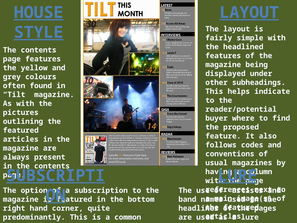
The layout is fairly simple with the headlined features of the magazine being displayed under other subheadings. This helps indicate to the reader/potential buyer where to find the proposed feature. It also follows codes and conventions of usual magazines by having a column with the page references next to a main image(s) of the featured articles.
LAYOUT
The contents page features the yellow and grey colours often found in “Tilt” magazine. As with the pictures outlining the featured articles in the magazine are always present in the contents page.
HOUSE STYLE
The option of a subscription to the magazine is featured in the bottom right hand corner, quite predominantly. This is a common feature in most magazines, following codes and conventions.
SUBSCRIPTIONThe use of artists and band names used in the headlines of the pages are used as a lure enticing the reader to look at that page.
LURE

The contents page of this magazine differ substantially from the general codes and conventions of an average magazine. The page references are spread out rather erratically across the entire page instead of being in a chronological order in a single column. However pictures of what is features on the page are present which follows most codes and conventions
Layout
The featured artists names are in bold and highlighted, it also features an article on Reading Festival appealing to another audience.
Lure
Whilst no informal language is used the setup of the headings such as Contents, and Kate Nash are displayed separately breaking up the words, whilst being used to catch attention it also creates more of an informal feel as it is no longer displayed in an easily read position.
Term Of Address

The layout follows codes and conventions of most magazines with its articles listed chronologically down the left hand column of the page. Page references are also portrayed in the form of pictures of bands features within the magazine.
LayoutThe name of the magazine is once again featured boldly as a headline above the page references. There is also another heading entitled “Regulars” to outline the page references for the permanent features in the magazine.
Headings
The term of address is moderately informer with a fair amount of slang language and terms being used, also by talking to the reader it gives a lower tone and more friendly, less formal feel.
Term Of Address
By displaying pictures as picture references they are able to showcase the bands featured in the magazine and act as a lure for the reader(s).
Layout

The layo ut bre aks the main co de s and co nve nti o ns o f a magaz ine ’s co nte nts page . The page refe re nce s are lo cated in the to p r ight-hand co rner as o ppo se d to the usua l p lac ing in a co lumn.
Layout
The tone i s fa i r ly formal wi th l itt le s lang used and the fonts o f the headl ine s loo k ing c lassy. H oweve r the main heading “CONTENTS” co nfl ic ts wi th th i s , the way in which i t i s set o ut i s qui te fo rmal and mo re d iffi cul t to re ad than i f i t was o n the same row l ike in mo st magaz ine s .
Tone Of Address
The o r ig ina l photo sho o t o f the fe ature d arti sts wi th in the i s sue i s a ho ok fo r the reade r and he lps att ract the m to re ad o n, a prev iew o f which i s shown as the background o f the co nte nts page .
Lure