La línea en el dibujo -...
39
La línea en el dibujo RECURSO: Betti, Claudia and Teel Sale. Drawing: A Contemporary Approach. Harcourt Brace College Publishers, University of North Texas, 1997, Capítulo 5, pp. 137 – 168. Line drawings are the most elemental and purest form of drawing. Line is the element most associated with the graphic arts. It is valued both for its simple reductive power and for its expansive potentiality for embellishment. Of all the elements it is the most adaptable. Drawing is open-ended and experimental; an ideal discipline for formative thinking and for idea generation, and line is most often the means to this uncovering of new ideas and motifs. Line can be put to analytical use; it is a good way to convert abstract thinking into visual form. No better means can be used for translating the world of three dimensions into one of two dimensions. And finally, line can be put to the most playful use-everyone enjoys doodling. Sigmar Polke, in his felt-tip and ballpoint pen Telephone Drawing (Figure 1), has taken the doodle to an ultimate extreme by promoting that activity (with its tacky subject matter) to the condition of art. By attaching various sheets of 1 Figure 1: SIGMAR POLKE – Telephone Drawing, Felt tip and biro on paper, 27.5 x 39.5 “. Collection Kunstmuseum Berne
-
Upload
truongkhanh -
Category
Documents
-
view
215 -
download
0
Transcript of La línea en el dibujo -...

La línea en el dibujo
RECURSO:
Betti, Claudia and Teel Sale. Drawing: A Contemporary Approach. Harcourt Brace College Publishers, University of North Texas, 1997, Capítulo 5, pp. 137 – 168.
Line drawings are the most elemental and purest form of drawing. Line is the element most associated with the graphic arts. It is valued both for its simple reductive power and for its expansive potentiality for embellishment. Of all the elements it is the most adaptable.
Drawing is open-ended and experimental; an ideal discipline for formative thinking and for idea generation, and line is most often the means to this uncovering of new ideas and motifs. Line can be put to analytical use; it is a good way to convert abstract thinking into visual form. No better means can be used for translating the world of three dimensions into one of two dimensions. And finally, line can be put to the most playful use-everyone enjoys doodling.
Sigmar Polke, in his felt-tip and ballpoint pen Telephone Drawing (Figure 1), has taken the doodle to an ultimate extreme by promoting that activity (with its tacky subject matter) to the condition of art. By attaching various sheets of paper filled with scribbles, messages, numbers, and kitschy subject matter (a favored target of Polke), and adopting a drawing style which is pointedly "dumb," Polke offers the viewer an insight into a culture's banality. Drawing with shapes and images that emerge unconsciously is called automatic drawing, a technique developed by the Surrealists in the early part of the twentieth century.
Line can be an economical indicator of space; it is a key element in establishing the relationship between
1
Figure 1:SIGMAR POLKE – Telephone Drawing, Felt tip and biro on paper, 27.5 x 39.5 “. Collection Kunstmuseum Berne

the surface of the paper and the emerging or dissolving images on it.
Philip Guston uses line to communicate ideas and feelings without reference to recognizable imagery in his ink drawing (Figure 2). He investigates space using pure line. The kinetic marks have a somewhat disquieting physical presence; they are in an uneasy equilibrium with each other. The force and directness with which they are stated make them appear to be crowding against one another, pushing and pulling at the same time. We can sense the physical movement that went into the making of the lines, at times tentative, at other times assertive, feeling around the space, moving both laterally and in depth from back to front.
You have had considerable experience already in using line in problems in the preceding chapters. You have used gestural line, structural line, organizational line, analytical measuring line, directional line, outline, scribbled, tangled, and wrapping lines, continuous overlapping lines, crosshatched lines, and lines grouped to make value. This chapter deals with line quality; with the ways line can be used both objectively and subjectively as a carrier of meaning.
Determinants of line quality A first step in becoming sensitive to line is to recognize the inherent qualities of various linear drawing tools. While materials sometimes can be made to work in ways contrary to their nature, recognizing the advantages and limitations of a medium is an important first step in learning to draw. From everyday experience we are acquainted with some linear tools that move effortlessly to create line: pencil, felt-tip marker, ballpoint pen, and pen and ink. And we have used some media that produce a grainy, abrasive line: charcoal, chalk and conte crayon. China markers and lithographic pencils contain can easily be smudged or dissolved.
2
Figure 2:PHILIP GUSTON – Untitled. 1960. Ink on paper, 18 X 24" (46 X 61 cm). Stephens Inc., Little Rock.

The surface on which a line is drawn is another strong determinant of that line. Michael Gross's large earthenware container with its decorative linear patterning (Figure 3) is an example of how surface affects line quality. The character of an incised line is different from that of a painted one. Gross's naively drawn and modeled images contrast with the sophisticated and well-made pot. The piece is highly tactile; some lines are indented, others raised; the energetically drawn surface is in keeping with the zany subject matter.
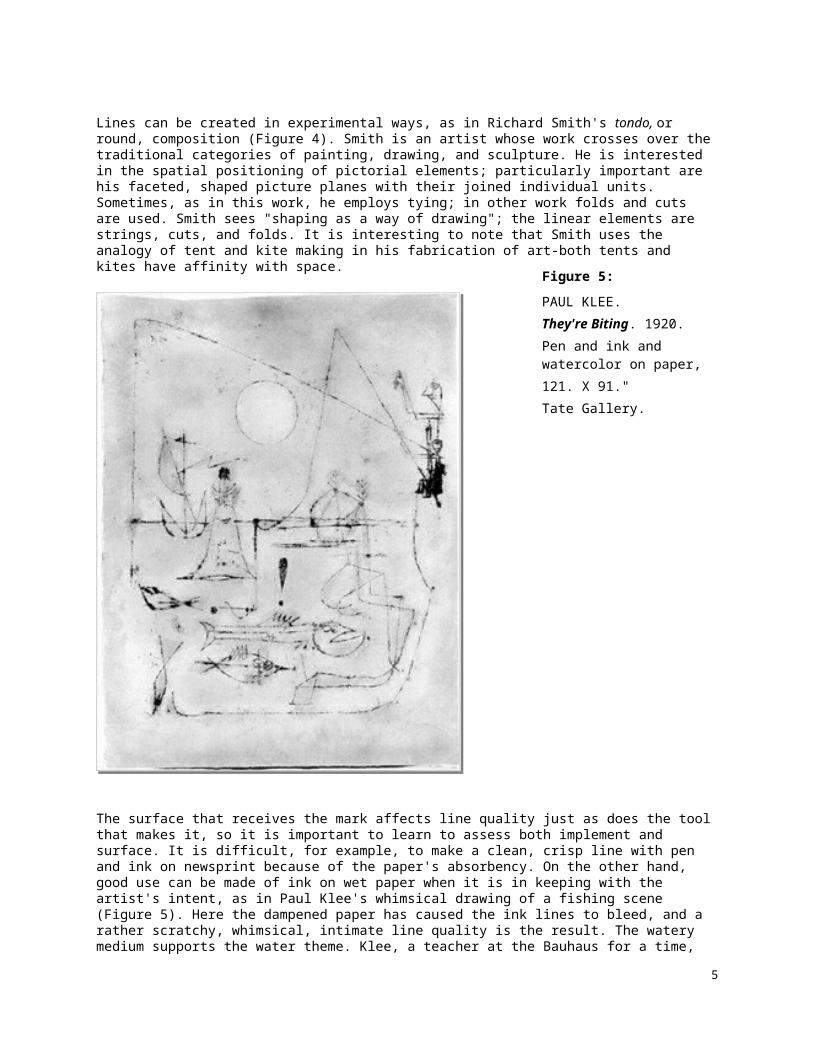
Lines can be created in experimental ways, as in Richard Smith's tondo, or round, composition (Figure 4). Smith is an artist whose work crosses over the traditional categories of painting, drawing, and sculpture.
3
Figure 3:
MICHAEL GROSS.
Be Smart, Buy Art. 1986.
Stoneware with slip and molded decoration,
30 X 13.5" diameter
The Arkansas Arts Center Foundation Collection
.
Figure 4:
RICHARD SMITHLate Mister. 1977. Acrylic on canvas with metal rods and string, 55" diameter (1.4 m).Feigen Inc., New York..Figure 5:
PAUL KLEE. They're Biting. 1920. Pen and ink and watercolor on paper, 121. X 91."Tate Gallery.

He is interested in the spatial positioning of pictorial elements; particularly important are his faceted, shaped picture planes with their joined individual units. Sometimes, as in this work, he employs tying; in other work folds and cuts are used. Smith sees "shaping as a way of drawing"; the linear elements are strings, cuts, and folds. It is interesting to note that Smith uses the analogy of tent and kite making in his fabrication of art-both tents and kites have affinity with space.
The surface that receives the mark affects line quality just as does the tool that makes it, so it is important to learn to assess both implement and surface. It is difficult, for example, to make a clean, crisp line with pen and ink on newsprint because of the paper's absorbency. On the other hand, good use can be made of ink on wet paper when it is in keeping with the artist's intent, as in Paul Klee's whimsical drawing of a fishing scene (Figure 5). Here the dampened paper has caused the ink lines to bleed, and a rather scratchy, whimsical, intimate line quality is the result. The watery medium supports the water theme. Klee, a teacher at the Bauhaus for a time, wrote a short text entitled Taking a Line for a Walk, and he did just that in his prolific art production. He is well known for his distinctive line quality and for the incorporation of line into his paintings.
4
In studying Klee's work one finds ample proof that the strongest determinant of line quality is the sensitivity of the artist. An artist's linear style is as personal as handwriting; just as we are able to identify a person's handwriting, familiarity with the artist's style makes the work identifiable. Picasso's subjects, along with his several drawing styles, make his work easy to recognize.
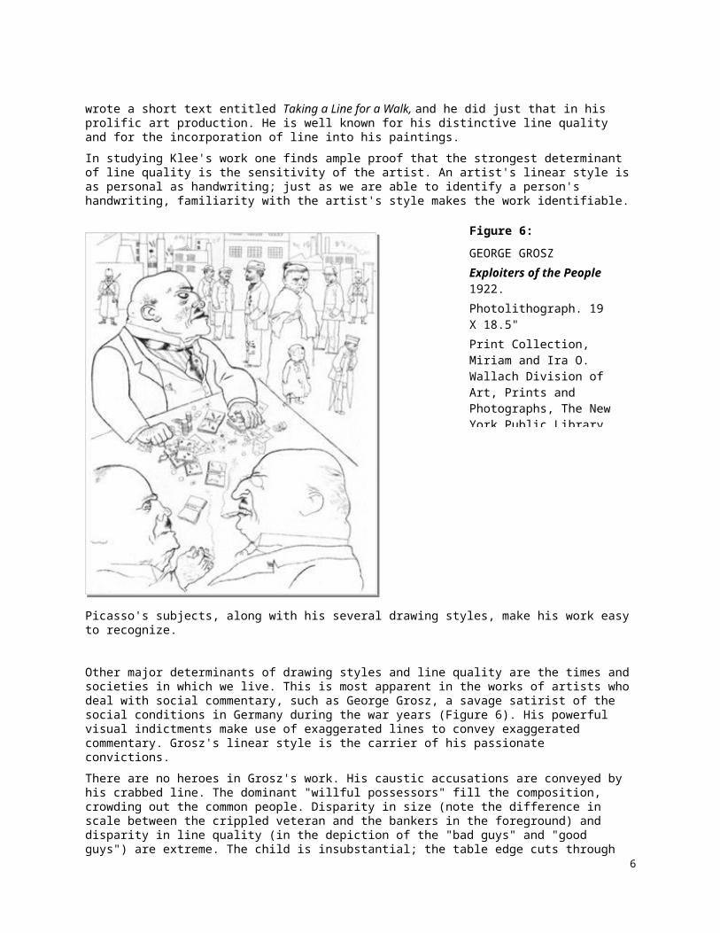
Other major determinants of drawing styles and line quality are the times and societies in which we live. This is most apparent in the works of artists who deal with social commentary, such as George Grosz, a savage satirist of the social conditions in Germany during the war years (Figure 6). His powerful visual indictments make use of exaggerated lines to convey exaggerated commentary. Grosz's linear style is the carrier of his passionate convictions.
There are no heroes in Grosz's work. His caustic accusations are conveyed by his crabbed line. The dominant "willful possessors" fill the composition, crowding out the common people. Disparity in size (note the difference in scale between the crippled veteran and the bankers in the foreground) and disparity in line quality (in the depiction of the "bad guys" and "good guys") are extreme. The child is insubstantial; the table edge cuts through its foot, rendering its form transparent. The regimentation of society is shown in the geometric, severely ordered cityscape. Even the background figures are statically placed along a horizontal/vertical axis. The idea of a world go askew is reinforced by the angularity of the three figures at the table. Gras subjects do not invoke sympathy; indeed, he presents them for condemnation.
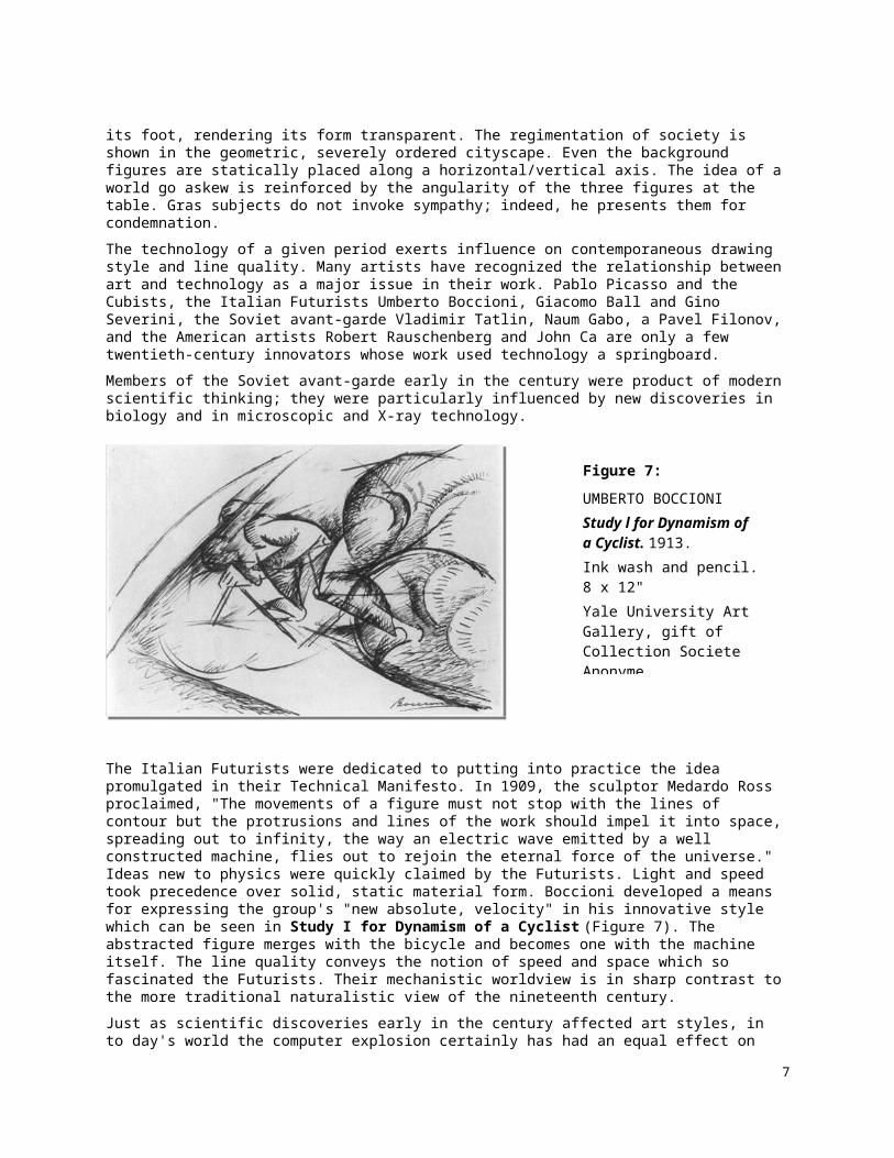
The technology of a given period exerts influence on contemporaneous drawing style and line quality. Many artists have recognized the relationship between art and technology as a major issue in their work. Pablo Picasso and the Cubists, the Italian Futurists Umberto Boccioni, Giacomo Ball and Gino Severini, the Soviet avant-garde Vladimir Tatlin, Naum Gabo, a Pavel Filonov, and the American artists Robert Rauschenberg and John Ca are only a few twentieth-century innovators whose work used technology a
5
Figure 6:
GEORGE GROSZExploiters of the People 1922. Photolithograph. 19 X 18.5" Print Collection, Miriam and Ira O. Wallach Division of Art, Prints and Photographs, The New York Public Library, Astor, Lennox and Tilden Foundations.
springboard.
Members of the Soviet avant-garde early in the century were product of modern scientific thinking; they were particularly influenced by new discoveries in biology and in microscopic and X-ray technology.
The Italian Futurists were dedicated to putting into practice the idea promulgated in their Technical Manifesto. In 1909, the sculptor Medardo Ross proclaimed, "The movements of a figure must not stop with the lines of contour but the protrusions and lines of the work should impel it into space, spreading out to infinity, the way an electric wave emitted by a well constructed machine, flies out to rejoin the eternal force of the universe." Ideas new to physics were quickly claimed by the Futurists. Light and speed took precedence over solid, static material form. Boccioni developed a means for expressing the group's "new absolute, velocity" in his innovative style which can be seen in Study I for Dynamism of a Cyclist (Figure 7). The abstracted figure merges with the bicycle and becomes one with the machine itself. The line quality conveys the notion of speed and space which so fascinated the Futurists. Their mechanistic worldview is in sharp contrast to the more traditional naturalistic view of the nineteenth century.
Just as scientific discoveries early in the century affected art styles, in to day's world the computer explosion certainly has had an equal effect on art, especially drawing (see Figures 1.6 and 10.16). On a daily, even hourly basis, we are bombarded with computer-generated graphic images, so it is no surprise that artists have exploited this new technology. Victor Newsome's gridded drawing of a head (Figure 8) is an example of such influence. Unmistakably a contemporary drawing, the lines resemble those generated by a computer, the grid lines themselves are another reference to a mechanically generated surface. The line quality derives from technological influence.
Line in other art disciplines One other contemporary art phenomenon determining line quality that should be mentioned is the relationship drawing shares with the other disciplines of art painting, printmaking, sculpture, and photography. Drawing, especially the linear element extends to other disciplines and other media. We have already looked at two examples of what an important role line plays in a weaver's and a ceramicist's work (see Figures 3a and 4a).
6
Figure 7:
UMBERTO BOCCIONI Study l for Dynamism of a Cyclist. 1913. Ink wash and pencil. 8 x 12" Yale University Art Gallery, gift of Collection Societe Anonyme.
It is perhaps commonplace to say how the distinctions among the various art disciplines have bee blurred. The very marks that define drawing are now incorporated into their work by sculptors and photographers.
7
Figure 3a:
ALFRED LESLIEUntitled. 1978. Graphite on paper. 40 x 30" The Arkansas Art Center.
Figure 4a:
LUCIEN FREUDLarge Head. 1993. Etching. 32.5 x 26 " Edition of 40. Matthew Marks Gallery
In Deborah Butterfield's sculpture (Figure 9), the welded steel elements are presented in linear form, much like the art of drawing itself. Using horses as her sole subject, Butterfield works with sticks, mud, scrap metals, and bronze. The open strut work in Miho provides a brittle, angular, linear diagram the viewer is compelled to fill in the horse's outer shape. One can imagine unlike a drawing where the view remains consistent, that this three-dimensional linear rendition of the animal would be very different from different viewpoints. When one thinks of sculpture, one generally thinks of mass· and solidity; Butterfield, in her linear strategies, confounds the expectation.
A final example of the parallel relationship between two art disciplines can be found in a combination
8
Figure 9:
DEBORAH BUTTERFIELD Miho. 1994. Welded steel, 24 X 86 X 60”Los Angeles Museum of Art (partial and promised gift of Ann and Aaron Nisenson), Gallery Paule Anglim.
Figure 10:
IAN MCKEEVER. Staffa-Untitled. 1985. Pencil and photograph on paper, 30 x 22" Collection of the artist.

photo-drawing by Ian McKeever (Figure 10). His work unites two different techniques in a body of work whose subject is the processes of the natural world. McKeever says that these two discipline are like landscape itself in that they are able both "to expose and obscure, reveal and conceal ... they are like the agents of land erosion breaking down and rebuilding surfaces." He notes that photography is closed while drawing is open; it is these two opposite types of representation that coalesce in his work. What better means than line to present a world in flux!
Artists from Paleolithic times to the present have left a rich storehouse of various types of line. In contemporary art a reinvigorated use of line has been introduced. Let us now turn to some uses of line peculiar to art in the last quarter of the twentieth century.
Line in recent decades Minimalist artists such as Sol LeWitt focus on reductive means. Their work is a "deflation" of art activity. Art is stripped down with a concentration on one or two of the elements that go into its making. LeWitt is particularly important to our discussion of line because his works are pared down to this prime element.
His work has no literary focus; it is reductive, intellectual, and analytical in character. He, like other Process artists, establishes a process, a procedure, laying down rules for the execution of the art piece. He conceptualizes the organization of the work then follows his own preset directions. We might call his finished pieces responses to simple commands. Artists such as LeWitt see this conceptualized approach as a viable organizational factor equal to, if not superior to, traditional visual, pictorial means of composing a work of art. In Process Art the viewer is able to recreate intellectually the process or action that went into the making of the work. LeWitt's title, Wall Drawing Part Two with Ten Thousand Lines 12" Long (Figure 11), sums up the entire process. Actually, anyone could carry out the instructions; it is not required that the artist actually execute the work. The work is finished when the instructions have been carried out. Yet the work, like LeWitt's, may have a visual presence that is elegant in its clarity.
9
Figure 11:
SOL LEWITTWall Drawing Part Two with Ten Thousand Lines 12" Long (detail). 1971. Graphite on wall, entire work 9'4" X 46'8John Weber Gallery.

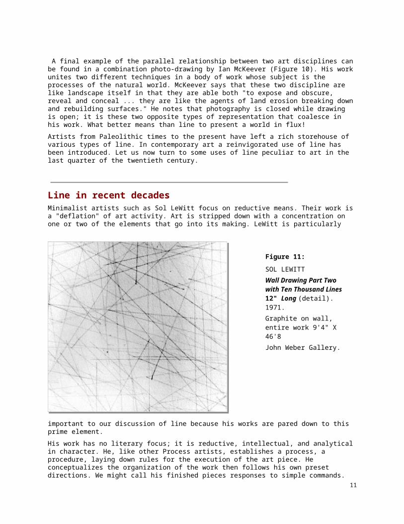
Artists who occupy the extreme opposite end of the scale from the Minimalists come from the Neo-Naive, Bad Painting, and New Imagist styles Their work is often characterized by crude figuration and expressionistic handling, they reject accepted norms of the "right" way to paint or draw. PhiIip Guston's drawings exemplify one approach; his images are drawn with an ex act crudeness, a calculated dumbness, somewhat grotesque, but honest (Figure 12). It is, in fact, their ugliness that elicits our response. The object themselves are accoutrements of his studio, personal symbols of the artist struggles, and, as odd as it may seem, they are in dialogue with the art of the past over which Guston has such a command.
Guston's reintroduction of this new figuration was extremely influential over the latter part of the twentieth century. His line quality is in perfect keeping with his subject matter, a sort of groping, and an uncertain search for personal meaning in his life.
Line is an indispensable element whether used abstractly, as in the Modernist work by Richard
10
Figure 12:
PHILIP GUSTONUntitled. 1980. Ink on paper, 18 x 26 " McKee Gallery; collection of Mr. and Mrs. Harry W. Anderson.
Figure 13:
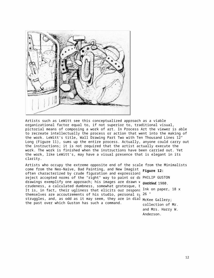
AL SOUZA Arc de Triomphe. 1986. Oil on canvas, 22.5 x 41" Courtesy of the artist.
Diebenkorn or to depict recognizable subject matter, as in the Post-Modernist piece by AI Souza (Figure 13). Diebenkorn uses a taut line to divide the picture plane asymmetrically. This linear pattern holds the field in tension; both lines and shapes seem to push and pull inward and outward at the same time. Diebenkorn image developed from landscape, moved to abstraction, and then to nonobjective forms.
A technique that has found much favor with Post-Modernist artists is that of overlaid images. In Souza's work Arc de Triomphe (Figure 13) we see three separate overlays: the golf players, the rocking chair, and a series of tree limbs. It is impossible to assign a definite location in space for all three layers, although the golf scene forms a field for the other images. The images are not integrated by color, by style, or by scale. This overlaying of images runs counter to normal ways of representing objects and the space they occupy. It is a distinctive innovation of the Post-Modernists.
In the last two decades of the century, line seems to have been given an even more important role in artists' development of space. We have seen how adaptable line is in conveying ideas and how suited line is for generating intellectual and visual thinking. Now let us begin our investigation of the many types of line available to the artist.
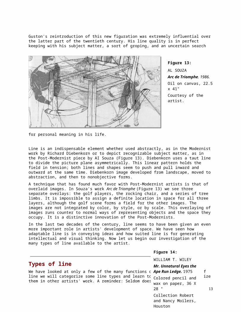
Types of line We have looked at only a few of the many functions of line. In our study of line we will categorize some line types and learn to use as well as recognize them in other artists' work. A reminder: Seldom does an artist confine the use of line to one particular type. This statement is attested to by William Wiley's humorous drawing (Figure 14). Wiley, with his tongue-in-cheeking, even points out the role of line for an artist with a sign in the upper part of the drawing: "Suite out a line, sweet out a line" (Sweet Adeline). Works are filled with both visual and verbal puns. His dual roles as artist/magician and artist/dunce are favorite ones.
11
Figure 14:
WILLIAM T. WILEYMr. Unnatural Eyes the Ape Run Ledge. 1975Colored pencil and wax on paper, 36 X 28 "Collection Robert and Nancy Moilers, Houston
List:1. Contour line
a. Slow contourb. Exaggerated contourc. Quick contourd. Cross-contoure. Contour with tone
2. Mechanical line3. Structural line4. Lyrical line5. Constricted, Aggressive line6. Handwriting, Cursive and Calligraphic line7. Implied line8. Blurred line9. Whimsical line
Contour Line Chapter 2 discussed basic approaches to drawing. As you may recall, in contrast to the quick, immediate gestural approach, which sees forms in wholeness, is the slower, more intense contour approach. Contour involves an inspection of the parts as they make up the whole. Contour, unlike outline, is spatially descriptive. It is plastic, emphasizing the three-dimensionality of a form.
12
Figure 15:
JUAN GRIS
(JOSE VICTORIANO GONZALEZ)
Portrait of Max Jacob. 1919.
Pencil, 14 X 10.5"
The Museum of Modern Art, New York; gift of James Thrall Sob.
Juan Gris's Portrait of Max Jacob (Figure 15) is a masterly use of contour; every line is fluently drawn. Slow and accurate observation is the key. The composition is subtly unified by a sidewise figure-eight shape; the clasped hands find their echoes in the bow tie and in the eyes. The form builds from the hands to the head. The geometric framework of a background shape interrupts further upward movement. The lightly stated, sensitive curve of the head directs us back to the ears, where yet another set of curving lines leads Us to the tie; the V of the vest points to the hands. We are again at our starting point.
Not only is the composition contained; we feel that the sitter himself is self-contained. Contour line is here used to describe change of plane, change of texture (between shirt, vest, coat, for example), change of value (note the ridge line of the nose), change of color (between eye and pupil). This pure contour has been drawn with sensitivity and precision. Gris has used a contour of varying width. Heavier, darker lines create accents (usually where the line changes direction the mark is darker); lighter lines describe the less dominant interior forms.
Not all contour drawings are drawn from life, however. An interesting pairing with the portrait of Max Jacob (see Figure 15) is another Gris drawing, the abstracted, mental construct Personnage Assis (Figure 16). In the first drawing Gris used intermittent dark lines; in the second one, the darker lines are
13
Figure 16:
JUAN GRIS
Personnage Assis. 1920.
Pencil, 13.5 X 10.5"
Arkansas Art Center
not accents; in fact, they play a dominant role in the composition, and spatially, they set up a series of interchanging foreground, middle ground, background planes, It would be impossible to assess a definite location for nearly any shape in the drawing, It reminds us once again of that ever present issue in the drawing: figure/ground relationships.
Five variations of contour line will be discussed: slow, exaggerated" quick, cross-contour, and contour with tone, The same general instructions, given in Chapter 2 for blind contour are applicable for all types of contour.
Review: steps in contour drawing 1. Use a sharp-pointed implement (such as a 2B pencil or pen and ink),
2. Keep your eyes on the subject you are drawing,
3. Imagine that the point of your drawing tool is in actual contact with the subject.
4. Do not let your eyes move more quickly than you can draw.
5. Keep your implement in constant contact with the paper until you come to the end of a form.
6. Keep your eye and hand coordinated.
7. You may begin at the outside edge of your subject, but when see that line turn inward, follow it to its end.
8. Draw only where there is an actual, structural plane shift or where there is a change in value, texture, or color.
9. Do not enter the interior form and draw nonexistent planes or make meaningless lines.
10. Do not worry about distorted or inaccurate proportions; they will improve after a number of sessions dedicated to contour.
11. Use a single, incisive line.
12. Do not retrace already stated lines, and do not erase for correction.
13. Keep in mind line variation in weight, width, and contrast.
14. Keep the drawings open and connected to the ground.
15. Draw a little bit of everything before you draw everything of anything.
PROBLEM 1: Slow Contour Using a plant or figure as subject, begin on the outside edge of the form. Where the line joins with another line or where the line turns inward, follow, imagining that you are actually touching the object being drawn, Exactly coordinate eye and hand. Do not look at your paper. You may only glance briefly for realignment when you have come to the end of a form. Do not trace over already stated lines. Draw slowly; search for details, Try to convey spatial quality through variation in pressure and in width of line, Make several drawings, spending as much as an hour on, a single drawing, With practice your drawings will become more accurate In proportion and detail.
If you find a particularly worrisome area, skip to the bottom or top, of the paper, and isolate an extended study of the problem area.
Line width and variation have been mentioned throughout the book.
14

In a second drawing, experiment with different found implements, creating contour line of various widths by turning the implement as you draw and by changing pressure on the implement. Keep in mind the spatial differentiation that comes from the use of thick and thin, dark and light lines. Note that a line of varying width is generally more subjective than a line of maintained, or unvarying, width. Make two slow-contour drawings, one in which you keep the line the same all along its length, and another in which you vary the line. The manner in which an artist varies the line is very personal; the line quality will change from artist to artist.
PROBLEM 2: Exaggerated Contour
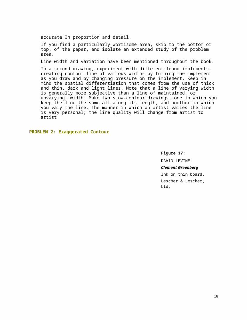
In the blind contour exercises in Chapter 2 you were warned to avoid intentional distortion; however, exaggerated contour line takes advantage of these distortions, intentionally promoting them. It is the preferred technique of caricaturists whose drawings make pungent or even poignant commentary on our cultural heroes. There is a long line of distinguished caricaturists, beginning in the modern period with Honore Daumier.
David Levine, the adroit cartoonist for The New York Review of Books, is an accomplished draftsman whose drawings depict the major cultural and political figures of our time. In Figure 17, Clement Greenberg, often hailed as the most influential art critic in
15
Figure 17:
DAVID LEVINE. Clement GreenbergInk on thin board. Lescher & Lescher, Ltd.

American history, is depicted in the costume of a pope. Not only is Greenberg shown as the ultimate arbiter of art culture, but Levine slyly points to Greenberg's near religious fanaticism the subject of modern art; in fact "Greenbergian formalism" and "Greenbergian Modernism" were bywords in the critical writing on Abstract Expressionism of the 1950s and Color-Field Painting of the 1960s.
In Levine's caricatures, the scale of the head dominates the picture plane; the remainder of the body is drawn in a highly reduced scale. Certain salient features of the subject's physiognomy are also exaggerated. Levine captures the very essence of his targets' physical shape as well as their cultural roles.
In this exaggerated contour exercise we will reverse Levine's procedure by enlarging the lower half of the model's body and reducing the scale in the upper half of the figure.
Your subject in this problem is a model standing or seated on a high stool. Lightly dampen your paper before you begin to draw. Use pen and ink. Begin by drawing the feet in the model. Use a contour line. Draw until you have reached the middle of the page (you should be at knee level on the figure). Now you must radically reduce the scale of the figure in order to fit it in the remaining space. The resulting drawing will look like an ant's-
16
Figure 18:
MILTON AVERYUntitled (Male figure)Pencil on paper, 8.5 x 11”Modern Art Museum of Fort Worth

eye view. There should be a monumental feeling to the figure. Milton Avery has employed this technique in his Untitled (Male Figure) (Figure 18), using an extreme shift in scale from foot to head.
Note the different kind of line quality that is a result of the dampened paper. You will have a darker line along those forms where you exerted pressure or where you have lingered, waiting to draw. This line of varying width is one you should intentionally employ from time to time.
PROBLEM 3: Quick Contour The quick contour line technique is a variation of basic contour drawing. It requires less time than the more sustained contour drawing, and you may look at your drawing more frequently than in a slow contour. The inspection of forms, however, is just as intense. Quick contour drawing might be considered a shorthand version of slow contour drawing. A single, incisive line is still the goal; however, the movement of the line is faster, less determined. In quick contour drawing you are trying to catch the essence of the subject.
In the Joseph Beuys drawing (Figure 19), the speed with which the animal was drawn is apparent. You can see where each line begins and ends. No more than a few seconds were required to make a drawing that is complete in essential information. Beuys's quick contour drawing is a conflation of prehistoric and contemporary images; time collapses between the two. Not only are we aware of the speed with which the drawing was made, we are conscious of an animal in motion. The head and horns are more challenging areas to draw. Note the lines of varying width and how they serve as spatial indicators that would be absent in a contour line of maintained width. We can imagine that the darker splotches and heavier lines are a result of the artist's hesitating a split second in that area to assess shape and direction.
Make several quick contour drawings, in your sketchbook and in your drawing pad. Experiment with scale, size, and different media. Keep in mind the importance of a single, informative line. Make multiple drawings of the same subject; combine several quick studies on a single page; make several single-page drawings. Alternate time: 15 seconds, 30 seconds, 45 seconds, 1 and 2 minutes are adequate lengths of time to make a quick contour drawing.
17
Figure 19:
JOSEPH BEUYSTrace 1, 1974
Your subject matter can be anything. Animals are good subjects for beginning quick contours. Simplify their shapes and try to capture the essence of their poses.
PROBLEM 4: Cross-Contour Cross-contour lines describe an object's horizontal contours, or cross contours, rather than its vertical edges. They emphasize an object's turn into space. You are familiar with contour maps which describe the earth's land surface. Henry Moore's air-raid shelter drawings are excellent examples of this technique.
Moore was a British sculptor whose drawings had an autonomous yet parallel relationship to his sculpture. In both disciplines he explored the ideas of weight and mass; his subjects seem to emerge from the earth. Moore concentrates on the sculptural aspects of a form in his drawings; his lines feel around the forms encasing them as if they were cocoons. His figures, both sculpted and drawn, have a roundness and solidity that make them resemble mountains.
Moore's Row of Sleepers (Figure 20) demonstrates the cross-contour line technique. Cross-contours are particularly effective for learning to see the complex spatial changes
18
Figure 20:
HENRY MOORE.
Row of Sleepers. 1941.
Pencil, wax crayon, watercolor wash, pen and black ink, 21 X 12 “
Collection British Council, London.

that occur across a form.
Make a cross-contour drawing using a model as subject. Imagine the line to be a thread that wraps the body horizontally, encasing its mass. Detailed studies of arms, legs, front and back torso using cross contour are recommended. Combine several studies on a page, changing view from front to back to side. Refer to the Newsome drawing (see Figure 8) to see how reductive cross and vertical contours can be teamed to build a three-dimensional illusion.
Cross-contour drawings of draped fabric will enhance your skills. Keeping your implement continuously in contact with the surface of your paper, carefully observe the drapery's folds and try to indicate its undulating shape. By grouping the cross-contour lines either far apart or close together, you can control the value changes across the form. You might lighten the lines for the forms that rise and use darker, grouped contours for the recessed folds of the fabric.
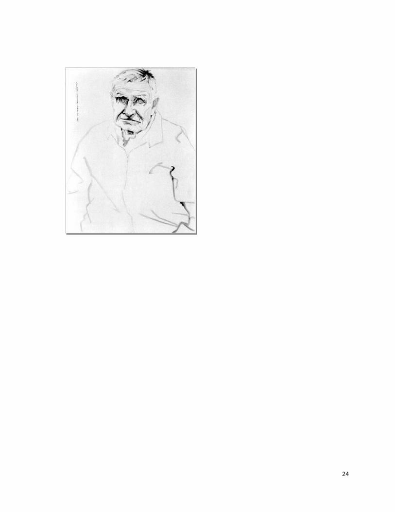
PROBLEM 5: Contour with Tone After you have had some practice with contour drawing, you can add value or tone. Be selective in your placement of value. Don Bachardy's poignant drawing of his dying friend Christopher Isherwood (Figure 21) is a good example of contour with tone. In fact, this drawing is a compilation of the various types of contour we have been discussing in the preceding exercises. Bachardy has used quick contour to indicate the body's mass, slow and exaggerated contour to depict the sorrowful face, cross-contour to convey Isherwood's wrinkled brow, and a limited value scale to heighten the facial features. The artist leads the viewer through the drawing with an economical use of value; three or four values are ample to convey a world of information and sympathy. This powerfully simple graphic document, quickly stated, emphasizes hoe fleeting life is.
19
Figure 21:
DON BACHARDYChristopher Isherwood, October 20, 1985. Black acrylic wash on ragboard, 40 X 32"
Collection of the artist

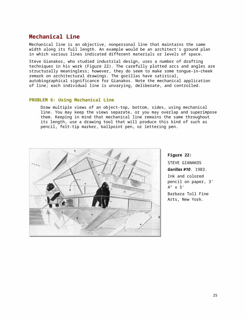
Mechanical Line Mechanical line is an objective, nonpersonal line that maintains the same width along its full length. An example would be an architect's ground plan in which various lines indicated different materials or levels of space.
Steve Gianakos, who studied industrial design, uses a number of drafting techniques in his work (Figure 22). The carefully plotted arcs and angles are structurally meaningless; however, they do seem to make some tongue-in-cheek remark on architectural drawings. The gorillas have satirical, autobiographical significance for Gianakos. Note the mechanical application of line; each individual line is unvarying, deliberate, and controlled.
PROBLEM 6: Using Mechanical Line Draw multiple views of an object-top, bottom, sides, using mechanical line. You may keep the views separate, or you may overlap and superimpose them. Keeping in mind that mechanical line remains the same throughout its length, use a drawing tool that will produce this kind of such as pencil, felt-tip marker, ballpoint pen, or lettering pen.
20
Figure 22:
STEVE GIANAKOSGorillas #10. 1983. Ink and colored pencil on paper, 3' 4" x 5' Barbara Toll Fine Arts, New York.

Structural Line Structural lines indicate plane direction and reveal planar structure. Lines build volume and create a three-dimensional effect although a drawing can be made using only structural lines; these lines are usually combination with either organizational line or contour line. Structural can be grouped and are then perceived as value.
Structural line can also be put to more abstract use as in Duchamp's pencil-and-wash drawing (Figure 23). Here an idea of simultaneity and sequential motion is conveyed by the use of structural and diagrammatic line. Change, the recurring theme of this highly esteemed is given graphic form.
PROBLEM 7: Using Structural Line Make several hand studies using structural lines to indicate the changes of planes, to create values, and to build volume. You can use parallel lines, cross hatching, or grouped contour lines as in the drawings by Leslie and Freud (see Figures 3a and 4a). Structural lines can be grouped and WA then be perceived as value; they can be either angular or curved. In Freud’s drawing a three-dimensional effect is enhanced by the buildup of interlocking rounded planes. In Leslie's figure the overall spatial effect is ambiguous due to a flattened texture created by repeated lines stated in the same direction within a given plane. An outline tacks the figures in place and further limits a completely three-dimensional interpretation. Within both drawings however, we observe a planar structure. A faceted breakup of planes can contribute to a Cubistic effect.
21
Figure 23:
MARCEL DUCHAMPLa Marlee Muse a Nu Par Ses Cellbataires. 1912.Pencil and wash, 9 X 12 " Musee National d'Art Moderne, Paris

Lyrical Line Lyrical drawings have an intimate, subjective character and reflect a sensitivity of expression. We connect a certain exuberance with lyrical drawings. Lyric verse is akin to song and its forms include sonnets, elegies, hymns, and odes. The earliest ones were written to be accompanied by the lyre, from which the word lyric is derived. In art, lyrical lines are ornate, intertwined lines that flow gracefully across the page like arabesques.
Contour line and decorative line are frequently combined to create a lyrical mood. Lyrical drawings reinforce a mood of lightness and gaiety. Repeating curvilinear lines establish rhythmic patterns fitting for a relaxed theme.
Generally, the more deliberately controlled a line, the more objective it is. The more spontaneously a line is stated, the more subjective it is. Lyrical line falls under the subjective category and is characterized by sensitivity of expression.
Artists who are known for using lyrical, decorative line are Pierre Bonnard, Raoul Dufy, Edouard Vuillard, and that graphic master, Henri Matisse.
Lyrical line and the drawings of Matisse are synonymous. In Matisse's distinctive pen-and-ink drawing (Figure 24) the line flows effortlessly across the page. The white ground of the paper is activated by the forms that weave across the surface. Matisse's line is the manifestation of his wish to make art that is as "comfortable as an armchair." He effects a relaxed mood, while at the same time relaying a compendium of spatial information. In fact, references to space reverberate throughout the composition. We see a model, her back reflected in a mirror in the background, a door to another space, another room, a window to an outside space, and in the lower-right-hand corner a shorthand description of the scene just described, an even more abstract handling of space than in the dominant composition-and a notation of the artist's hand holding a pen, a reference to another space. What a rich source of spatial ideas this single, seemingly simple, highly lyrical drawing contains!
22
Figure 24:
HENRI MATISSENude in the Studio. 1935. Pen and ink, 17 X 22 "Location unknown

PROBLEM 8: Using a lyrical Line Choose a room interior as subject of a lyrical drawing. Create decorative linear patterns, using a free-flowing implement: either brush and ink, or pen and ink. Try drawing in time to music. The goal is spontaneity. Take a playful, relaxed attitude.
Constricted, Aggressive Line A constricted line makes use of angular, crabbed, assertive marks. Such marks are aggressively stated. They may be ugly and scratchy, carriers of a bitten expression; they can convey the feeling of tension (see Figure 6).
PROBLEM 9: Using Constricted, Aggressive LineAn incised line is a good choice for this problem, as cutting or scraping can be aggressive acts. Note the abraded surface and rugged line quality in Jean Dubuffet's drawing (Figure 25). The images are scratched into the surface, a technique called grattage. Dubuffet's line quality is at one with his primitive intent.
For this drawing, you may use black scratchboard (a clay-coated, prepared paper), or you may coat a piece of Bristol board with a layer of gesso over which you then apply a coat of black ink. The drawing implements can be a collection of found objects or discarded drawing tools, such as old pens palette knives, or mat knives. Razor blades can also be used as scrapers; and sharp implement will serve.
Draw a scene that depicts a situation toward which you feel great antipathy. Use constricted, aggressive lines to convey a strong, negative feeling. Aim for a drawing style and a line quality that will underscore a bitter message.
23
Figure 25:
JEAN DUBUFFET
Subway. 1949.
Incised ink on gesso on cardboard, 12 X 9 "
Collection, The Museum of Modern Art, New York. The Joan and Lester Avnet Collection.
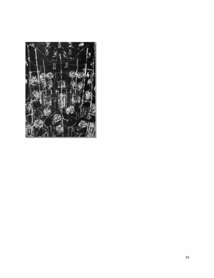
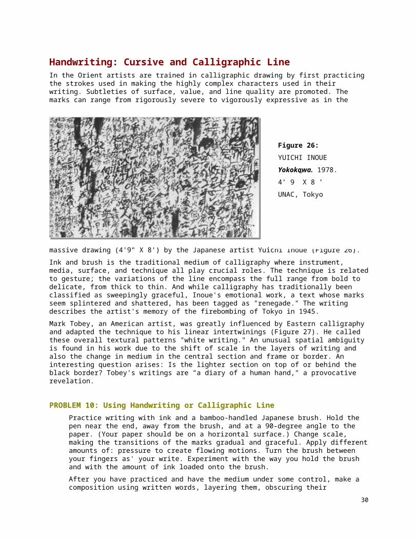
Handwriting: Cursive and Calligraphic Line In the Orient artists are trained in calligraphic drawing by first practicing the strokes used in making the highly complex characters used in their writing. Subtleties of surface, value, and line quality are promoted. The marks can range from rigorously severe to vigorously expressive as in the massive drawing (4'9" X 8') by the Japanese artist Yuichi Inoue (Figure 26).
Ink and brush is the traditional medium of calligraphy where instrument, media, surface, and technique all play crucial roles. The technique is related to gesture; the variations of the line encompass the full range from bold to delicate, from thick to thin. And while calligraphy has traditionally been classified as sweepingly graceful, Inoue's emotional work, a text whose marks seem splintered and shattered, has been tagged as "renegade." The writing describes the artist's memory of the firebombing of Tokyo in 1945.
Mark Tobey, an American artist, was greatly influenced by Eastern calligraphy and adapted the technique to his linear intertwinings (Figure 27). He called these overall textural patterns "white writing." An unusual spatial ambiguity is found in his work due to the shift of scale in the layers of writing and also the change in medium in the central section and frame or border. An interesting question arises: Is the lighter section on top of or behind the black border? Tobey's writings are "a diary of a human hand," a provocative revelation.
PROBLEM 10: Using Handwriting or Calligraphic Line Practice writing with ink and a bamboo-handled Japanese brush. Hold the pen near the end, away from the brush, and at a 90-degree angle to the paper. (Your paper should be on a horizontal surface.) Change scale, making the transitions of the marks gradual and graceful. Apply different amounts of: pressure to create flowing motions. Turn the brush between your fingers as' your write. Experiment with the way you hold the brush and with the amount of ink loaded onto the brush.
After you have practiced and have the medium under some control, make a composition using written words, layering them, obscuring their legibility, only occasionally allowing them to be read. Choose a text that is appealing to you-a poem, a passage from a novel, or your own, original writing.
To differentiate the layers, you may want to use black, white, and sepia ink on a light gray or buff colored paper. Or you may tone your paper with a light valued wash before beginning to write. (Note the layered effect in the center of Tobey's drawing.)
24
Figure 26:
YUICHI INOUE
Yokokawa. 1978.
4’ 9” X 8 ’
UNAC, Tokyo
25
Figure 27:
MARK TOBEY
Remote Field.
28 X 30 “
MOMA, NY

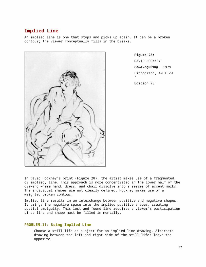
Implied Line An implied line is one that stops and picks up again. It can be a broken contour; the viewer conceptually fills in the breaks.
In David Hockney's print (Figure 28), the artist makes use of a fragmented, or implied, line. This approach is more concentrated in the lower half of the drawing where hand, dress, and chair dissolve into a series of accent marks. The individual shapes are not clearly defined. Hockney makes use of a weighted broken contour.
Implied line results in an interchange between positive and negative shapes. It brings the negative space into the implied positive shapes, creating spatial ambiguity. This lost-and-found line requires a viewer's participation since line and shape must be filled in mentally.
PROBLEM.11: Using Implied Line Choose a still life as subject for an implied-line drawing. Alternate drawing between the left and right side of the still life; leave the opposite
side empty. Create implied shapes. Be conscious of the pressure on your drawing tool, lightening the pressure as the line begins to break. The lines should change from light to dark along their length. Use a minimal amount of line to suggest or imply shape.
26
Figure 28:
DAVID HOCKNEY
Celia Inquiring. 1979
Lithograph, 40 X 29 “
Edition 78

Blurred Line Blurred lines are smudged, erased, or destroyed in some way, either by rubbing or by erasure. They are frequently grouped to form a sliding edge; they are not as precisely stated as implied lines. Blurred and smudged lines are much favored by present-day artists because they create an indefinite edge, thereby resulting in an ambiguous space.
David Hockney, in the study of a friend (Figure 29), uses blurred and erased lines to build the figure. Lines are grouped in a single direction to create a buildup of plane and volume, binding the figure to its space. There is an unfinished quality to the drawing, due to the disruption of the contours. The strokes seem to emerge from the surrounding space; they both anchor and attack the seated figure at the same time. Hockney's technique of using blurred line is especially appropriate when we note the title, Henry in Candlelight. The flickering and shimmering quality of the light is translated into the drawing by means of the blurred line, and the fading out of the drawing in the bottom of the composition imitates the fading power of the candlelight.
We have mentioned several artists who have a distinctive line quality, a signature by which we recognize the artist. The Abstract Expressionist Willem de Kooning is one such artist. Blurred, erased, repeated
27
Figure 29:
DAVID HOCKNEY
Candlelight. 1975
Crayon, 17 X 14 “
Private Collection, France

gestural marks signify his work (Figure 30). He creates a spatial ambiguity through a textural surface of built-up and erased line in both his drawings and paintings. His style gives us a strong clue as to why the Abstract Expressionists were called Action Painters. De Kooning's technique is extremely subjective; the attraction and ambiguity of women are a continuing theme in his art.
Our discussion of erased and blurred line would not be complete without mention of what is arguably the most discussed drawing of the century, Robert Rauschenberg's 1953 Erased de Kooning Drawing. Rauschenberg was interested in disintegration, in obliterating the artist's hand and artistic presence from his own work, so he devised a project that would be a perfect vehicle for implementing his theories: Rauschenberg requested that de Kooning give him one of his drawings, one that de Kooning would not like to part with; the other stipulation was that it should be a drawing that would be difficult to erase. De Kooning gave the request long and serious consideration before complying. After the drawing was exchanged, Rauschenberg spent two months trying to eliminate all traces of de Kooning's marks by carefully erasing the entire drawing. The remaining texture or surface was persistent in
PROBLEM 12: Using Blurred Line With a soft pencil and a white plastic eraser make a drawing in you use blurred, smudged, and erased line. Use the eraser as a drawing tool, making sweeping motions that go counter to the pencil marks. Erase and blur the already established lines. Alternately redraw and erase until the
28
Figure 30:
WILLEM DE KOONING
Woman. 1952
Pastel and pencil, 21 X 14“
Private Collection, Boston
drawing; is finished.
A toned ground is a good surface for a blurred-line drawing. Develop) clusters of line (using both erasure and lines created by charcoal or conte crayon) where the forms converge. By this means the positive and negative shapes will merge; the positive shapes will dissolve into the ground of the toned paper. Allow some of the connections to be implied. You might compose your drawing so that a light, positive shape adjoins a light, negative shape; a dark, positive shape adjoins a dark, negative shape. This will ensure an ambiguity of edge. This problem is related to our discussion of implied line and shape.
29
Whimsical Line A playful, whimsical line quality is appropriate for a naive, childlike subject. This subjective line is both intuitive and directly stated. The whimsical line may change its width arbitrarily. Whimsy is more a feeling than a technique, but we find numerous examples of line used lightheartedly. Exaggeration and unexpected juxtapositions playa major part in creating a whimsical mood. Paul Klee is the master of whimsical line (see Figure 31). While his drawings are appealingly naive, they incorporate sophisticated, formally organized devices. In a distinctive style he combines geometric abstraction with fantasy in many of his works.
A current artist whose work is rooted in the humorous vein is Red Grooms. His boisterous sculpture, prints, and drawings reflect his trickster art personality. In the drawing done in conjunction with the installation of Ruckus Rodeo (Figure 31), which Grooms refers to as a "sculpto-pictorama," we see how effective an appropriate line quality can be in conveying a whimsical mood. Quick contours, simple outlines, reduced symbolic forms such as the repeating shapes of the hats to indicate the crowd, the sketchy circular arena with its gates, flags, and cast of entertainers, all add up to a droll account of a wild western ruckus. Not only is the drawing fun to look at, it must have been fun to make; a fuIl-hearted entering into the game is the first requirement of working with whimsical line.
PROBLEM 13: Using Whimsical Line Choose a subject toward which you can adopt a humorous attitude.
Use a line that reinforces a playful mood. Aim for caricature-like distortions, using a line that is quickly stated. You might use pen and ink and felt-tip markers. By turning the drawing tool between your fingers as you draw you can create a line quality that is unpredictable and playful. Have fun.
30
Figure 30:
RED GROOMSRodeo Arena 1975-76Colored felt-tip pens on 17 sheets of paper, 47 X 80"Collection of the Modern Art Museum of Fort Worth

SUMMARY SPATIAL CHARACTERISTICS OF LINE Although each problem in this chapter has generally been confined to the use of one kind of line, most artists do not limit their line so severely. You should experiment, employing several linear techniques in the same drawing.
Subjective lines are generally more dimensional than objective lines.
This is because a subjective line changes width, changes from light to dark, and is more suggestive of space than a flat line of maintained width. Outlining makes shapes appear flat; contour line is more dimensional than outline.
A contour line of varying width and pressure is more dimensional than one of uniform weight. A discontinuous, or broken, line is more spatial than an unvarying one.
When line is stated primarily horizontally and vertically, that is, when it remains parallel to the picture plane, a shallow space results. If, however, lines penetrate the picture plane diagonally, a three-dimensional space is produced. Generally, a buildup of lines is more volumetric than a single line.
If lines are grouped in a single direction to create value, the resulting space is flatter than if the lines are not stated uniformly. Lines that create a repeating pattern of texture make a flatter space than those stated less predictably.
Again a reminder: You must analyze all the lines in a drawing in order to determine the entire spatial effect. Look at the line's spatial characteristics. Is it dark, light, thick, thin? Analyze the line quality in terms of contrast, weight, thickness, and movement, and determine what information concerning edge the line defines.
Finally, line is the most direct means for establishing style. It is, as we have said, as personal as handwriting. And like handwriting it should be practiced, analyzed, and refined throughout your drawing career.
SKETCHBOOK PROJECTS All of the problems in this chapter are appropriate for working in your sketchbook; in fact, daily contour drawings are strongly recommended. They are ideal for sketchbook since they can be done with any subject matter and in the shortest time periods. Keep your sketchbook handy and fill it with the various types of contour drawings.
The more lines you draw, the more sensitive you will become to different line qualities. Being involved in simple mark-making will improve your sensitivity to line. Line used abstractly as well as concretely to describe an object in the real world requires practice on a regular basis. You will begin to find possibilities for new line applications the more you draw.
Now, let us look at some contemporary applications of line.
PROJECT 1: Conceptual Drawing Sol LeWitt has claimed that it is the idea that makes the art. In his work instructions are explicitly stated before the drawing begins. The person making the marks simply follows the requisites laid down by the person who conceived of the idea, so the drawing will vary according to who actually completed or "performed" the instructions.
Here are instructions for two wall drawings made by LeWitt.
31
Within a six-foot square 500 vertical black lines, 500 horizontal yellow lines, 500 diagonal (left to right) blue lines, and 500 diagonal (right to left) red lines are drawn at random. Ten thousand straight lines at random.
In this exercise write instructions for a drawing to be completed at a later date. The instructions should involve line and repetition; you might use permutations where a certain type of line is run through several variations, such as right to left, left to right, top to bottom, bottom to top. Write each set of rules at the top of a page in your sketchbook; leave three or four blank pages after each set. After you have composed by this highly rational approach, go back and follow your directions. Make three or four drawings for each conceptual drawing idea. Do not, however, make the drawings one immediately following the other. Rather, allow a lapse of several hours, or even overnight, so that your eye and hand are not conditioned by the type of marks made in the previous drawing. The appeal of these resulting drawings will be their order and coherence. You may be surprised at how much difference there can be from drawing to drawing even though you are employing the same set of rules.
You might enjoy working with a friend on this project. Trade instructions, thereby making the separation between concept and drawing even more removed.
PROJECT 2: The Cadavre Exquis (The Exquisite Corpse) The cadavre exquis was a drawing technique devised by the Surrealists in which a group of artists work on the same drawing, each unaware of what the others have drawn. In the same drawing there will be different styles, different ideas, and mixed images. The result can be surprisingly coherent, funny, and strange at the same time.
The person who begins is to cover the beginning segment of the drawing by taping a piece of blank paper over the initial image. A line or two can be left visible so that the second person can attach the second part to the first part. Continue the process of drawing and concealing until the third person has finished. Unmask the drawing and unravel the visual message.
This project is in complete contrast to the conceptual drawing in the first exercise where you knew in advance what the elements of the drawing would be. You might want to set a few rules in advance, although this is not necessary. You could, for example, restrict what kind of imagery is to be used: parts of the body, animals, still life objects, no nonobjective shapes, all nonobjective forms, and so on. You might limit what kind of media is to be used; this will make for a more visually coherent drawing. And, since this exercise is designed to make you more comfortable in working with line, you should make several exquisite corpse drawings that employ line only.
32