Knowing Who Is Proficienct Isn't Always Sufficient
20
HIGHLIGHTS research findings, policy and practice options, and resources | August 2009 Connecting RESEARCH to PRACTICE: Knowing Who Is Proficient Isn’t Always Sufficient Practice Research
Transcript of Knowing Who Is Proficienct Isn't Always Sufficient

HIG
HLI
GH
TS r
esea
rch
find
ing
s, p
olic
y an
d p
ract
ice
op
tio
ns, a
nd r
eso
urce
s |
Aug
ust
2009
Connecting ReSeARCH to
PRACTICe: Knowing Who Is
Proficient Isn’t Always Sufficient
Practice
Research

Contents Page
Introduction . . . . . . . . . . . . . . . . . . . . . . . . . . . . . . . . . . . . . . . . . . . . . . . . . . . . . . . . . . 1
Executive Summary . . . . . . . . . . . . . . . . . . . . . . . . . . . . . . . . . . . . . . . . . . . . . . . . . . . . 3
Misleading Doesn’t Mean Wrong—Just Misleading . . . . . . . . . . . . . . . . . . . . . . . . . . . 5
The Once and Future Measure of School Performance . . . . . . . . . . . . . . . . . . . . . . . . 12
Tool 1: Average (Arithmetic Mean) . . . . . . . . . . . . . . . . . . . . . . . . . . . . . . . . . . . . . 12
Tool 2: Percentiles . . . . . . . . . . . . . . . . . . . . . . . . . . . . . . . . . . . . . . . . . . . . . . . . . 13
Tool 3: Effect Sizes . . . . . . . . . . . . . . . . . . . . . . . . . . . . . . . . . . . . . . . . . . . . . . . . . 14
References . . . . . . . . . . . . . . . . . . . . . . . . . . . . . . . . . . . . . . . . . . . . . . . . . . . . . . . . . . 16
Acknowledgments . . . . . . . . . . . . . . . . . . . . . . . . . . . . . . . . . . . . . . . . . . . . . . . . . . . . 17

- 1 -
IntroductionDuring the past decade, the percentage of proficient students (PPS) has become the
primary indicator of school performance . Educators use the PPS to monitor changes
in performance over time, compare performance across groups, and assess trends
in achievement gaps . The PPS is relatively new, first used with the National Assessment
of Educational Progress in the 1990s . Although the PPS seems to be a straightforward
indicator of student performance, can a single, simple indicator be trusted to provide
essential information about a very complex system? Can the PPS support the inferences
that educators and policymakers want to make from it?
A recent Connecting Research to Practice conference hosted by Regional Educational
Laboratory (REL) Midwest addressed these questions and provided answers . The
conference, titled “Interpreting Test Score Trends and Gaps,” took place in May 2009
in Rosemont, Illinois . In his keynote address, Andrew Ho, Ph .D ., argued that the PPS,
when used as the sole summary statistic for measuring the performance of a school,
district, or state, distorts nearly every important, large-scale, test-driven inference .1
Distortions at these scales may then lead educators and policymakers to misinterpret
gaps, trends, and trends in gaps in populations at all levels of the education system .2
Rather than relying on a single tool for effectively representing school performance
in the future, educators should use a set of complementary statistical procedures, each
of which provides a necessary perspective on the complex school-performance picture .
The Joint Committee on Standards for Educational and Psychological Testing of the
American Educational Research Association, the American Psychological Association,
and the National Council on Measurement in Education (1999) also strongly
recommends the use of multiple measures and discourages the reliance on any
single measure .
1 This presentation was based on Dr. Ho’s earlier article (2008). For additional background, see Holland (2002).2 Visit http://www2.learningpt.org/gaps/#materials to find links to a video of Dr. Ho explaining the components
of his research and his slide presentation from the Connecting Research to Practice event.

- 2 -
This brief presents three components to help educators and policymakers understand
the limitations of relying on a single measurement tool and the value of continually
seeking out multiple perspectives on student performance data . First, the executive
summary provides an overview of the brief’s argument and explains how the multiple
recommended tools are insufficient on their own but robust when used together . The
second section provides a more detailed explanation of the particular limitations of the
PPS that many educators are not even aware of . The final section describes in more
detail how each tool functions, what it does well, and what its limitations are . Each of
these sections will allow educators and policymakers to quickly determine what they
know, what they need to know, and how to more effectively monitor—and thereby
improve—a school’s performance .

- 3 -
executive SummaryThe most important conclusion to take away from this brief is that every measurement
tool offers one perspective on the changes that occur within a student population
but that each perspective alone is incomplete and potentially misleading . Educators
and policymakers need a set of complementary measurement tools to accurately
understand how students are responding to interventions and how schools are
progressing . The following summary outlines the benefits and limitations of a number
of measurement tools and describes how the benefits of one can help compensate
for the limitations of another .
• The percentage of proficient students (PPS) provides a clear, static measure of
the proportion of students who are above a given cut score . The PPS also allows
educators to compare the proportion of students above a cut score across groups .
n Limitations: The PPS depends heavily on the cut score, which can
contribute to misleading inferences about student performance trends
and gaps . The limitations of the PPS are further exacerbated when
student distributions are nonnormal (i .e ., most of the time) .
n What is needed? A tool that accounts for changes in student
performance at all points of a distribution (not just at a cut score)
even under nonnormal conditions .
• The average (arithmetic mean) provides a simple and understandable measure of
distributionwide performance . Educators, therefore, should reinstate the average
as the default tool for measuring distributionwide performance trends and for
trends in gaps between subgroups .
n Limitations: While the average does account for changes throughout
a distribution, it fails to represent changes that cancel each other out .
It also is disproportionately impacted by the presence of outlier scores
(scores that are either much higher or much lower than the majority) .
n What is needed? A tool that allows educators to track a distribution’s
variability . Such a tool would complement what the mean tells educators
about how a distribution is performing overall by indicating how students
at different points in a distribution are performing independently of each
other over time .

- 4 -
• Percentiles provide one simple way to visualize student performance at different
points in a distribution over time . Percentiles allow educators to get a sense of
how their distributions are changing from one year to the next . Disaggregating
a whole distribution by performance level, for example, permits educators to
track and compare the effects of interventions on different performance
subgroups independently of each other . It can answer questions such as the
following: “How have the lowest performing students done relative to the
average students during the past three years? Is the gap getting smaller?”
n Limitations: Allows comparison only between different performance
subgroups (90th percentile versus 50th percentile) and not other kinds
of subgroups, such as ethnicity or socioeconomic status .
n What is needed? A tool that allows educators to compare all types
of subgroups within a school and the gaps between them .
• Effect sizes, although more complex to calculate, provide a way to track and
compare the differences in student performance across grades, subjects, tests,
and other criteria .
n Limitations: Careful attention must be paid to comparisons across criteria
to prevent specious claims . Lay audiences—and, therefore, educators
who communicate with them—may find its calculation challenging .
n What is needed? Additional tools that help educators accurately account
for changes in student performance at all points of a distribution,
allow for detailed subgroup comparisons, and monitor relevant
changes in demographics .
Each of these tools provides partial information about a bigger and more complex
school-performance picture . When used together, these tools form the basis for a
representative and defensible analysis of student performance . Even though this
toolbox provides a solid foundation from which to engage questions of student
performance, educators and policymakers should continually acknowledge that they
need additional perspectives . Every measurement tool has strengths and limitations .
Educators have the responsibility to develop and use a set of measurement tools with
compensating strengths that provide an increasingly comprehensive understanding of
the changes in their students’ performance . It may seem a little more complicated to
do so; but, with so much at stake, it is likely better to be rigorous than wrong .

- 5 -
Misleading Doesn’t Mean Wrong— Just MisleadingIt is important for educators and policymakers to recognize that the limitations of the
PPS do not mean that it is wrong . In fact, the PPS is mathematically and computationally
sound . Consequently, educators and policymakers believe they are using a simple,
accurate, and understandable statistical measure for evaluating student performance
over time . As it turns out, however, the PPS’s simplicity masks significant limitations that
can result in misleading and costly conclusions about how schools are performing .
What does the PPS do? It provides a simple way to answer the question “Do we have
more students proficient this year over last year?” If that is all educators were interested
in, the PPS would be perfectly suitable . But knowing whether student performance
changed is only part of the information educators need . Educators also need to know
by how much student performance changed and how student performance in one
group changed relative to the performance of other groups . Unfortunately, the PPS
turns out to be an unreliable measure of both the magnitude of student performance
change and the changes between groups (i .e ., gaps and trends in gaps) . There are
two reasons why: First, the PPS is heavily dependent on a given cut score; second, the
PPS is insensitive to the ways distributions shift over time .
For any given change in school performance, the percentage of
students who are proficient depends heavily on the location of the
cut score . Even under the simple conditions of a normal (bell curve)
distribution and uniform progress, different cut scores yield dramatically
different calculations of the PPS .3 The key to understanding why is
to know what a cut score is and how it interacts with a given distribution .
A cut score is simply a subjective point on some test scale, above which
students are considered to be proficient and below which they are not
considered to be proficient . The proportion of students above a cut
score is used to evaluate how well a school is performing at one point
3 Uniform progress means all students improving by exactly the same amount, thereby shifting the entire distribution to the right.
The key to
understanding
why is to know
what a cut score
is and how
it interacts
with a given
distribution.

- 6 -
in time . Changes in that proportion are then used to evaluate how a school
progresses from one year to the next . It is here—where educators seek to evaluate
school performance reliably over time—that the risks of relying on the PPS as the sole
measure of performance manifest . Remember that the area under a curve represents
the total number of students who scored on a particular test . Most students will
score somewhere in the middle of a distribution, and fewer will score either very
high or very low .
Figure 1 shows how the PPS measures achievement trends over time . As Figure 1
indicates, the change in the percentage of proficient students depends on how many
students are under the curve near the cut score . Because there is an unequal number
of students at each point under the curve, the closer a cut score moves to the mode
of the distribution (where most students are), the larger the PPS’s change will be .
As a result, the same change in a school’s performance can yield dramatically different
percentages of proficient students with different cut score conditions . Figure 2 shows
how the location of the cut score affects the PPS even under the still simple trend
conditions of uniform progress .

- 7 -
Figure 1. Limited Sensitivity of the PPS
Figure 1 shows the narrow sensitivity of the PPS as a school progresses uniformly from Time 1 to Time 2 (all students improve by the same amount over the same time, causing the whole distribution to shift to the right). In this example, the percentage of proficient students increases by the proportion of students under the curve, directly to the left of the cut score (black line).
Figure 2. More Students Near the Mode of the Distribution
Figure 2 shows the same school from Figure 1 but with one additional cut score near the mode of the distribution. The same shift in distributionwide performance (uniformly to the right) yields a hugely different change to the PPS—either 5 percent or 17 percent. Depending on the location of its cut score (A or B), this school could claim that during the past year, it increased schoolwide performance by 5 percent or by 17 percent. This huge variation is evidence of how unreliable the PPS is for evaluating trends in school performance.
Low
High
Low HighScale Score
Number of Students A B
5% 17%
Low
High
Low HighScale Score
Number of Students A

- 8 -
The PPS’s limitations are further exacerbated by real-world distributions . Unlike
Figure 2, real-world distributions are unlikely to be perfectly normal and are very
unlikely to exhibit uniform progress . The inability to adjust to the unpredictability of
distributions is the second limitation of the PPS . As any teacher will
say, students in a classroom rarely if ever change their performance
in a perfectly equal way—even if the whole class improves on average
over time . Some students will improve now and experience setbacks
later; some will show no improvement for a long time and reach their
learning point (their “ah-ha” moment) in a few months, resulting
in dramatic improvement; and some will be inconsistent in their
progress, for reasons a teacher cannot understand . The chaos of classroom
performance is mirrored at the district, state, and national levels . As a result, the
combination of what happens both inside and outside of the classroom causes student
performance to shift in unexpected ways . It is this natural ebb and flow of student
performance that the PPS is likely to misrepresent .
The tendency for the PPS to ignore changes in a distribution could lead to intense and
unnecessary disagreements about changes in school performance . For example, some
stakeholders could be misled and confused when school performance seems to change
but the PPS remains the same . It is not difficult to imagine how different stakeholders
would respond to a change in school performance such as that shown in Figure 3 .
Feedback from parents and teachers may suggest that a large portion of students
seem to be performing less well while others seem to be doing much better . At the
same time, administrators may insist—given their PPS reports—that there has been no
important change in the school’s performance . Is either one of these conclusions more
correct than the other? No, the PPS correctly identifies 24 percent of students being
above the cut score at each time period . However, the PPS does fail, in this instance,
to represent a significant change in school performance . The disconnect between
the information provided by the PPS and other indicators of performance could have
important decision-making implications that policymakers, educators, parents, and
students should be aware of .
It is this natural ebb
and flow of student
performance that
the PPS is likely
to misrepresent.

- 9 -
Figure 3. Different Distributions, Same PPS
In the real world, distributions are rarely normal. Consider the limitations of relying on the PPS to monitor the change in this admittedly extreme example shown in Figure 3. The red curve represents student scores in a school at Time 1. The blue curve represents student scores at Time 2. At the cut score represented by the black line, both distributions have the same percentage of proficient students (24 percent in the shaded areas). Does this indicate that this school has not changed in any important way? The PPS’s reliance on the cut score means that this school would report the same percentage of proficient students even though it has experienced significant changes in student performance. The PPS suggests that the school is performing exactly the same at Time 1 and Time 2, when in reality it is performing in a very different way. The distribution at Time 2 suggests that this school propelled many students far beyond their previous performance. However, their improvement was offset by a performance decline for a much larger proportion of students, some of whom fell far below the lowest score at Time 1.
The ease with which educators are misled by the PPS is unfortunately not limited simply
to trends in achievement but also includes inferences about changes in the gaps and
trends in gaps between groups . As was the case with achievement trends, conclusions
about the sizes of gaps between subgroups in a school and the trends in those gaps
(whether they are getting smaller or larger) fluctuate dramatically with the choice of cut
score . Figure 4 shows how trends in gaps as measured by the PPS can even exhibit sign
reversal under different cut score conditions (that is, flip from showing a reduction in
the gap to showing an increase in the gap given the same change in performance) .
Educators and policymakers need to be much more aware of the fact that the gaps
and trends in gaps determined through the PPS are often distorted and misrepresented .
Low
High
Low HighScale Score
Number of Students

- 10 -
How can educators create strategies to improve equality when one cut score tells
them achievement gaps are shrinking and another says they are increasing? Analyses
conducted using the PPS do not provide reliable conclusions about an education
system’s progress . In the end, the widespread use of the PPS has limited educators’
ability to effectively answer necessary questions about student performance while
crowding out the use of more capable alternatives .
Figure 4. Misleading Changes in the Gap Between Higher and Lower Performing Groups
Figure 4 shows the distributions of two subgroups—one higher performing (red curve) and one lower performing (blue curve). The figure illustrates the effects of two different cut scores (A and B at time periods 1 and 2) on the trend in the gap between the two groups. The shaded area under the curves at each cut score represents the change in the PPS under conditions of uniform progress by all students in both groups. The blue shading indicates a 10 percent increase in the PPS for the lower performing group (area under the blue curve) and a 3 percent increase in the higher performing group (area under the red curve). With the cut score near the mode of the lower performing group, the gap between the higher performing group and the lower performing group decreases by 7 percent (3%–10%). By contrast, the red shading shows a 10 percent increase for the higher performing group (area under the red curve) and a 4 percent increase for the lower performing group (area under the blue curve). With the cut score near the mode of the higher performing group, the gap between the higher performing group and the lower performing group increases by 6 percent (10%–4%). The PPS gives these two wildly different changes (–7% and +6%) in the gap without there being any true change in the relationship between the groups’ performance. Because they both improve uniformly, there can be no change in the gap between them.
Low
High
Low HighScale Score
Number of Students A1
4%
A2 B1 B2
3%
10% 10%
- 11 -
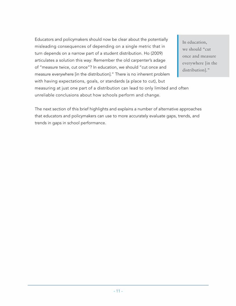
Educators and policymakers should now be clear about the potentially
misleading consequences of depending on a single metric that in
turn depends on a narrow part of a student distribution . Ho (2009)
articulates a solution this way: Remember the old carpenter’s adage
of “measure twice, cut once”? In education, we should “cut once and
measure everywhere [in the distribution] .” There is no inherent problem
with having expectations, goals, or standards (a place to cut), but
measuring at just one part of a distribution can lead to only limited and often
unreliable conclusions about how schools perform and change .
The next section of this brief highlights and explains a number of alternative approaches
that educators and policymakers can use to more accurately evaluate gaps, trends, and
trends in gaps in school performance .
In education,
we should “cut
once and measure
everywhere [in the
distribution].”

- 12 -
The Once and Future Measures of School PerformanceThe pressure to evaluate changes in student performance often leads educators and
policymakers to depend on quick and simple measurement tools . Although these
tools may appear to be straightforward and efficient, they often inadequately
represent the true complexities of school performance . With a little more effort,
however, educators and policymakers can use multiple approaches to better
understand school performance in ways that are more representative, defensible,
and policy relevant .
Multiple tools benefit school improvement efforts by compensating for the potentially
misleading aspects of any single measure . As part of the REL Midwest Connecting
Research to Practice event, Dr . Ho recommended some easy-to-use approaches
to get educators started . As it turns out, the best way to develop a more complete
understanding of school performance in the future is to redeploy performance
measures that educators have always had .4
Tool 1: Average (Arithmetic Mean)
During the REL Midwest Connecting Research to Practice event, Dr . Ho (2009)
reflected nostalgically on the times when “means roamed the earth .” As the concept
of proficiency has become entrenched in educational research and reporting, other
measurement tools, such as the mean, were crowded out and often stopped being
reported entirely . Dr . Ho argued that the exclusion of the mean is detrimental to the
ability of schools and states to evaluate performance effectively . In the transition to
the PPS, one of the easiest and most defensible statistics to evaluate and track student
performance was lost . Dr . Ho argued strongly that the mean should be reinstated
as the default measure for trends and trends in gaps for public education reporting .
4 Learning Point Associates can provide interested educators and policymakers with an Excel spreadsheet that is preformatted to calculate these and other measures using a district’s own data. Technical assistance in interpreting the results is also available.

- 13 -
What makes the mean so useful? The calculation of the mean includes every score
in a distribution . Unlike the PPS, which accounts for performance in only one part of a
distribution, the mean accounts for the performance in every part of a distribution . This
distributionwide perspective makes the mean a more effective measure of total school
performance over time . But although the means provide a more representative measure
of a distribution’s change than the PPS, they, too, have limitations . For example,
changes in student performance at one end of a distribution could negate changes at
the other end, thereby eliminating the mean’s ability to represent the trend . Just as the
means help make up for the limitations of the PPS, percentiles help show what the
means miss .
Tool 2: Percentiles
Although the means successfully incorporate all of the scores across a distribution,
they can fail to represent more detailed information that educators need . One way
to display the potentially hidden variations in performance that the means miss is by
using percentiles .
Percentiles add value in two important ways . First, percentiles provide a way to check
the interpretability of the mean by representing the variability of a distribution . If the
mean fails to show an important change in performance across a population, percentiles
can show it . Second, beyond supporting the mean, percentile bands provide more
detailed representations of the performance of subgroups within a population . For
example, educators can use percentiles to quickly see how their low-performing group
is doing relative to their high-performing group . Are these groups moving closer
together and decreasing the gap between them or moving farther apart and increasing
the gap between them? The percentiles in Figure 5 show how this information could
be presented and what it could show . By representing data in percentiles, educators
can quickly understand their school’s current performance and its trend over time . When
the means show no difference in performance, percentiles allow educators to separate
a school into different performance groups and evaluate those groups independently
of each other .

- 14 -
Figure 5. A More Detailed Representation of School Performance Over Time
Figure 5 shows the performance change of a school over three years disaggregated into five percentile groups. The green highlighted trend lines show a decrease in the gap between the highest and lowest performing groups—the lowest improved while the highest performed less well. Over the next year, the red highlighted trend lines show an increase in the gap between the two groups—the highest improved and the lowest performed less well.
Tool 3: effect Sizes
Although means and percentiles represent changes in distributions over time, they
cannot easily compare students across tests, grades, and subjects . Educators, however,
can calculate and track the differences and changes across these groups of students
with effect sizes . Effect sizes indicate not only that there is a difference between groups
but also how large the differences are . If effect sizes can do that, they also can provide
a measure of how one group progresses relative to another (i .e ., the trend in the
gap between groups) . Effect sizes provide a number of benefits to educators and
policymakers interested in understanding changes across groups, but how are effect
sizes calculated? It turns out that the effect size has many different equations, which
are each meant to be used under different conditions .5 All of the various equations
400
420
480
500
520
540
2006 2008
440
460
2007
90th 75th 50th 25th 10th
5 It is beyond the scope of this brief to explain all of the possible variations of the effect size that a district or government agency may need to use. A good article was written by Coe (2002) and is available online (http://www.leeds.ac.uk/educol/documents/00002182.htm). Learning Point Associates also has experienced statisticians on staff who can help develop research and evaluation approaches that will allow educators to measure and track changes in student and school performance over time.

- 15 -
calculate the effect size using means and standard deviations . By calculating the
effect size with both the mean and standard deviation, data from different distributions
can be translated into a common scale and meaningfully compared .
Ho (2009) acknowledged that the power of effect sizes to
shed light on variations in student performance is balanced by a
requirement of careful research design . Therefore, he recommends that
this tool be used initially for more complex policy and research
questions involving cross-grade, cross-subject, and cross-test
comparisons . As educators and their audiences gain familiarity with
effect sizes, they will be able to use this measurement tool
to inform a wide range of performance-related questions .
As educators and
their audiences
gain familiarity
with effect sizes,
they will be able
to use this
measurement
tool to inform
a wide range
of performance-
related questions.

- 16 -
ReferencesCoe, R . (2002, September) . It’s the effect size, stupid: What effect size is and why
it is important. Paper presented at the annual conference of the British
Educational Research Association, Exeter, England . Retrieved August 1, 2009,
from http://www .leeds .ac .uk/educol/documents/00002182 .htm
Ho, A . D . (2008) . The problem with “proficiency”: Limitations of statistics and policy
under No Child Left Behind . Educational Researcher, 37(6), 351–360 .
Ho, A . D . (2009, May) . Interpreting proficiency rates, trends, gaps, and trends in gaps.
Presentation given at the REL Midwest Connecting Research to Practice event,
Rosemont, IL .
Holland, P . W . (2002) . Two measures of change in the gaps between the CDFs of test-
score distributions . Journal of Educational and Behavioral Statistics, 27(1), 3–17 .
Joint Committee on Standards for Educational and Psychological Testing of the
American Educational Research Association, the American Psychological
Association, and the National Council on Measurement in Education . (1999) .
Standards for educational and psychological testing . Washington, DC: American
Educational Research Association .

- 17 -
AcknowledgmentsThe author would like to thank the Learning Point Associates colleagues who reviewed
and significantly improved this brief, including Yinmei Wan and Chris Condon . Special
thanks go to Arie van der Ploeg for his repeated efforts to improve its value and clarity .

CONNECTING RESEARCH TO PRACTICE:
Knowing Who Is Proficient Isn’t Always Sufficient
Written by
Will Gossin-Wilson, Research Specialist
About Learning Point Associates
Learning Point Associates is a nationally recognized nonprofit consulting
organization with 25 years of experience . In partnership with our clients, we
apply research, evaluation, and direct practice to impact policy and tackle the
most pressing issues in education today .
We move research from the shelf into the everyday practice of educators by
leading and facilitating critical conversations . We are skilled at fostering the
exchange of knowledge across ideologies and roles to ensure that fresh ideas
and the latest research are injected into the national conversation on education .
Our Connecting Research to Practice events bring research to the field, providing
opportunities for practitioners and policymakers to deepen their understanding
of evidence-based research . For more information about connecting research
to practice, please visit http://www .learningpt .org/rel/events .php .
Our Connecting Research to Practice policy briefs are designed to help
educators make informed decisions about investing in programs to improve
student achievement . Highlights of each policy brief include key research
findings, policy and practice options, and resources for practitioners .
3833R_01/10 Copyright © 2009 Learning Point Associates . All rights reserved .