JACK BURRILL, MIRIAM CLIFFORD, JAMES … algebra advanced mathematics modeling with logarithms jack...
98
ADVANCED ALGEBRA ADVANCED MATHEMATICS Modeling with Logarithms JACK BURRILL, MIRIAM CLIFFORD, JAMES LANDWEHR DATA-DRIVEN MATHEMATICS D A L E S E Y M 0 U R P U B L I C A T I 0 N S®
Transcript of JACK BURRILL, MIRIAM CLIFFORD, JAMES … algebra advanced mathematics modeling with logarithms jack...
ADVANCED ALGEBRA ADVANCED MATHEMATICS
Modeling with Logarithms
JACK BURRILL, MIRIAM CLIFFORD, JAMES LANDWEHR
DATA-DRIVEN MATHEMATICS
D A L E S E Y M 0 U R P U B L I C A T I 0 N S®
Modeling with Logarithms
DATA-DRIVEN MATHEMATICS
Jack Burrill, Miriam Clifford, and James M. Landwehr
Dale Seymour Pulllicalians® White Plains, New York
This material was produced as a part of the American Statistical Association's Project "A Data-Driven Curriculum Strand for High School" with funding through the National Science Foundation, Grant #MDR-9054648. Any opinions, findings, conclusions, or recommendations expressed in this publication are those of the authors and do not necessarily reflect the views of the National Science Foundation.
This book is published by Dale Seymour Publications®, an imprint of Addison Wesley Longman, Inc.
Dale Seymour Publications 10 Bank Street White Plains, NY 10602 Customer Service: 800-872-1100
Copyright © 1999 by Addison Wesley Longman, Inc. All rights reserved. No part of this publication may be reproduced in any form or by any means without the prior written permission of the publisher.
Printed in the United States of America.
Order number DS21185
ISBN 1-57232-250-0
1 2 3 4 5 6 7 8 9 10-ML-03 02 01 00 99 98
This Book Is Printed On Recycled Paper
DALE SEYMOUR PUBLICATIONS®
Managing Editor: Alan MacDonell
Senior Mathematics Editor: Nancy R. Anderson
Project Editor: John Sullivan
Production/Manufacturing Director: Janet Yearian
Production/Manufacturing Manager: Karen Edmonds
Production Coordinator: Roxanne Knoll
Design Manager: Jeff Kelly
Cover and Text Design: Christy Butterfield
Cover Photo: Louisa Preston
~hoto, page 3: William Means/Tony Stone Images, Inc.

Authors
.Jack Burrill National Center for Mathematics Sciences Education University of Wisconsin-Madison Madison, Wisconsin
.James M. Landwehr Bell Laboratories Lucent Technologies Murray Hill, New Jersey
Consultants
Patrick Hopfensperger Homestead High School Mequon, Wisconsin
Vince O'Connor Milwaukee Public Schools Milwaukee, Wisconsin
Miriam Clifford Nicolet High School Glendale, Wisconsin
Christine Lucas Whitefish Bay High School Whitefish Bay, Wisconsin
Matthew Parlier Whitnall High School Greenfield, Wisconsin Vincent High School Milwaukee, Wisconsin
Data-Driven Wlarllematics Leadership Team
Gall F. Burrill National Center for Mathematics Sciences Education University of Wisconsin-Madison Madison, Wisconsin
.James M. Landwehr Bell Laboratories Lucent Technologies Murray Hill, New Jersey
Kenneth Sherrick Berlin High School Berlin, Connecticut
Miriam Clifford Nicolet High School Glendale, Wisconsin
Richard Scheaffer University of Florida Gainesville, Florida
Acknowledgments
The authors thank the following people for their assistance during the preparation of this module:
• The many teachers who reviewed drafts and participated in the field tests of the manuscripts
• The members of the Data-Driven Mathematics leadership team, the consultants, and the writers
• Kathryn Rowe and Wayne Jones for their help in organizing the field-test process and the Leadership Workshops
• Barbara Shannon for many hours of word processing and secretarial services
• Jean Moon for her advice on how to improve the fieldtest process
• Kay Williams and Judith O'Fallon for advice and suggestions in the early stages of the writing
• Richard Crowe, Christine Lucas, and Matthew Parlier for their thoughtful and careful review of the early drafts
• The many students and teachers from Nicolet High School and Whitnall High School who helped shape the ideas as they were being developed
Table of Contents
About Data-Driven Mathematics v1
Using This Module vii
Unit I: Patterns and Scale Changes
Lesson 1 : Patterns 3
Lesson 2: Changes in Units on the Axes 8
Assessment: Speed Versus Stopping Distance and Height Versus Weight 14
Unit D: Functions and Transformations
Lesson 3: Functions 19
Lesson 4: Patterns in Graphs 29
Lesson 5: Transforming Data 36
Lesson 6: Exploring Changes on Graphs 43
Assessment: Stopping Distances 49
Unit DI: Mathematical Models from Data
Lesson 7: Transforming Data Using Logarithms 53
Lesson 8: Finding an Equation for Nonlinear Data 58
Lesson 9: Residuals 63
Lesson 10: Correlation: rand ,2 72
Lesson 11 : Developing a Mathematical Model 80
Project: Alligators' Lengths and Weights 86
Assessment: The Growth of Bluegills 87
TABLE OF tONTENTS v
About llata-llriven Malllematics
Historically, the purposes of secondary-school mathematics have been to provide students with opportunities to acquire the mathematical knowledge needed for daily life and effective citizenship, to prepare students for the workforce, and to prepare students for postsecondary education. In order to accomplish these purposes today, students must be able to analyze, interpret, and communicate information from data.
Data-Driven Mathematics is a series of modules meant to complement a mathematics curriculum in the process of reform. The modules offer materials that integrate data analysis with high-school mathematics courses. Using these materials will help teachers motivate, develop, and reinforce concepts taught in current texts. The materials incorporate majQr concepts from data analysis to provide realistic situations for the development of mathematical knowledge and realistic opportunities for practice. The extensive use of real data provides opportunities for students to engage in meaningful mathematics. The use of real-world examples increases student motivation and provides opportunities to apply the mathematics taught in secondary school.
The project, funded by the National Science Foundation, included writing and field testing the modules, and holding conferences for teachers to introduce them to the materials and to seek their input on the form and direction of the modules. The modules are the result of a collaboration between statisticians and teachers who have agreed on statistical concepts most important for students to know and the relationship of these concepts to the secondary mathematics curriculum.
vi ABOUT DATA-DRIVEN MATHEMATICS
Using This Module
There are many patterns in the world that can be described by mathematics. Mathematical modeling is the process of finding, describing, analyzing, and evaluating such patterns using mathematics. The first step in building such a model is to recognize different categories of patterns and to understand the underlying mathematical structure within those categories that can help in the search for an appropriate mathematical model.
In this module, you will explore ways to find a mathematical model for problems involving bivariate data. You will iise data sets such as the federal debt over time, decibel measures from various sounds, and the number of motor vehicles registered in the United States to investigate similarities and differences among patterns. You will study the effects of scale changes and transformations on data plots and on the graphs of various mathematical functions. Logarithms are introduced graphically and numerically in a nontraditional way that emphasizes their role in mathematical modeling. You will use algebra skills and concepts developed in the module to create mathematical models. These models are used to answer questions, summarize results, and make predictions about variables. Correlation is introduced as an assessment of the linear relationship between two variables and as an aid in the modeling process.
Modeling with Logarithms is divided into three units.
Unit I: Patterns and Scale Changes
Mathematicians and statisticians represent and examine data patterns in different forms: numeric, geometric (graphs or pictures), and symbolic (formulas). Each representation yields different information and aids in understanding. The interpretation of a data pattern may also be affected by the scale or units. Changing the units from centimeters to meters in a data set changes the appearance of the number pattern or graph, which can influence the message the data set conveys. Lesson 1 is devoted to the study of patterns in data and their representations. Lesson 2 examines the effects of unit or scale change upon the graphic representation of the data.
USING THIS MODULE vii
Unit II: Functions and Transformations
There are some fundamental functions one should be familiar with in both symbolic and graphic form. Often the graph of a function can be altered in a way that would make the process of mathematical modeling simpler. As you relate the shape of the graph to the equation of a function, you will learn to use functions to transform data that alter the graphic representation. Lesson 3 reviews the relationships among some very useful functions, their symbolic expressions, and their graphs. Lesson 4 examines patterns in graphs and deals with the concepts of increasing, decreasing, linear, and nonlinear functions. Lesson 5 is concerned with the transformation of data to linearize a scatter plot. Lesson 6 investigates the changes in a graph relative to inverse functions.
Unit m: Mathematical Models from Data
Several tools can be used to create a mathematical model and analyze how well a model describes a data set. These include the ideas already studied: looking for patterns in functions, transforming data, and considering scale changes. The mathematical model is the most appropriate equation that fits a data set. In searching for a model, you may find more than one that seem appropriate. It is therefore necessary to develop some skills to help determine which is the best one. Lessons 7-10 address the concepts involved in determining "best fit." In Lesson 11, all the modeling skills must be used in an application.
Each lesson begins with an Investigate section to pique the interest with leading questions to direct your thinking and set the stage for the lesson. The material following the Discussion and Practice heading is designed to help you discover the particular knowledge put forth in the unit and may be done in groups when appropriate or as individuals. It will be necessary, however, for you to participate in whole-class discussions to ensure that you are exposed to all the approaches that were used in the solutions. The lesson ends with a summary and a Practice and Applications section which may add an additional challenge. Note: It is important to do all of the problems in a lesson consecutively to follow the development of the concepts.
viii USING THIS MODULE
Unit I
Patterns and Scale Changes

LESSON 1
Patterns
What information can be learned about a pattern expressed numerically?
What information can be learned about a pattern expressed geometrically with a graph or picture?
What information can be learned about a pattern expressed symbolically?
R ecognition of patterns is an integral part of the work done by mathematicians and statisticians. Patterns are all
around us, and you need to develop an ability to find them in shapes, symbols, and data. This unit will reinforce finding and representing patterns in the world around us.
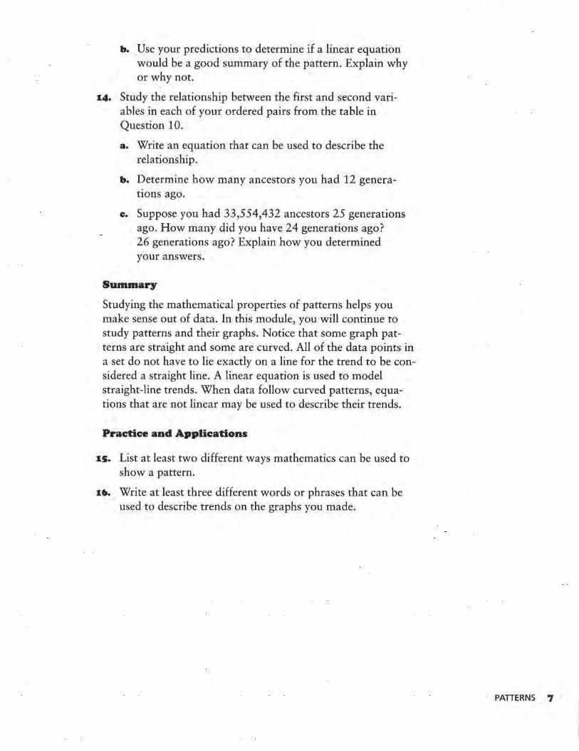
"Spaceship Earth Epcot," by William Means
OBJECTIVE
Understand how ordered pairs, graphs, equations, and tables can be used to describe patterns.
PATIERNS 3
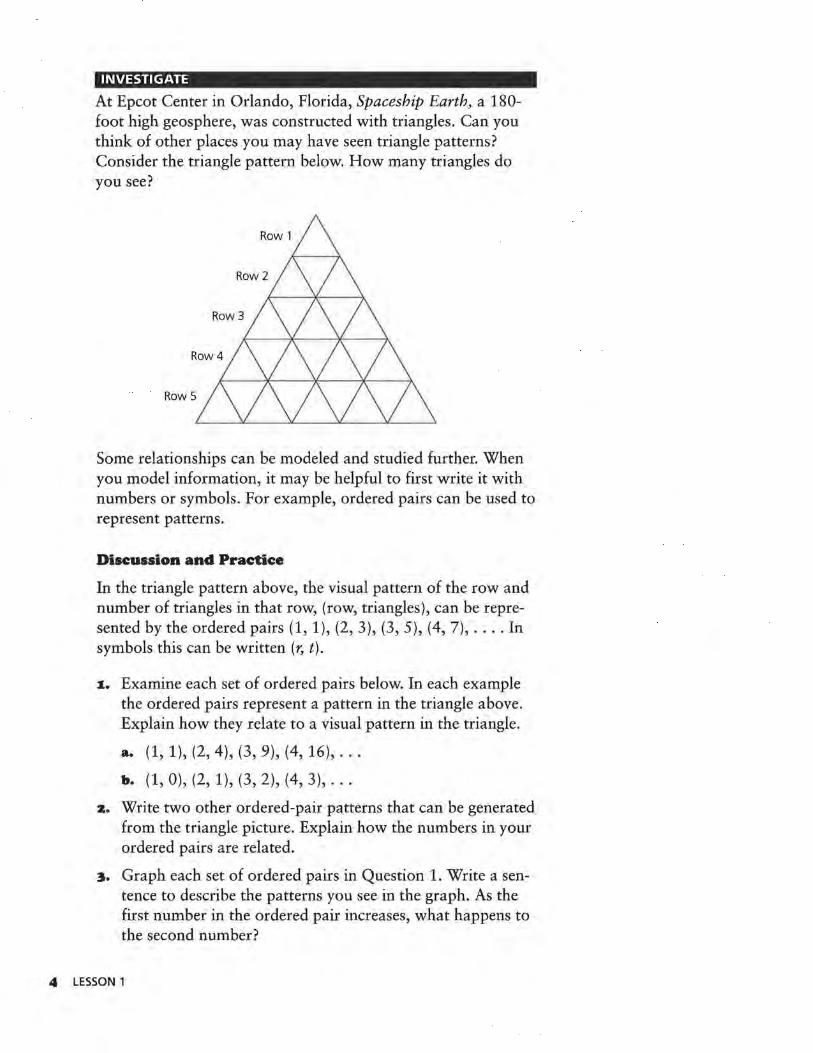
INVESTIGATE
At Epcot Center in Orlando, Florida, Spaceship Earth, a 180-foot high geosphere, was constructed with triangles. Can you think of other places you may have seen triangle patterns? Consider the triangle pattern below. How many triangles do you see?
Some relationships can be modeled and studied further. When you model information, it may be helpful to first write it with numbers or symbols. For example, ordered pairs can be used to represent patterns.
Discussion and Practice
In the triangle pattern above, the visual pattern of the row and number of triangles in that row, (row, triangles), can be represented by the ordered pairs (1, 1), (2, 3), (3, 5), (4, 7), .... In symbols this can be written (r, t).
1. Examine each set of ordered pairs below. In each example the ordered pairs represent a pattern in the triangle above. Explain how they relate to a visual pattern in the triangle.
a. (1, 1), (2, 4), (3, 9), (4, 16), .. .
b. (1, 0), (2, 1), (3, 2), (4, 3), .. .
z. Write two other ordered-pair patterns that can be generated from the triangle picture. Explain how the numbers in your ordered pairs are related.
3. Graph each set of ordered pairs in Question 1. Write a sentence to describe the patterns you see in the graph. As the first number in the ordered pair increases, what happens to the second number?
4 LESSON 1
4. Graph the ordered pairs you found in Question 2. Write a sentence to describe the patterns you see in the graph. As the first number in the ordered pair increases, what happens to the second number?
An equation may be used to describe the relationship between the first and second number in an ordered pair. Recall that for the ordered pairs (r, t) in the triangle pattern on page 4, r = row number and t = number of triangles in that row.
s. How do the ordered pairs (1, 1), (2, 3), (3, 5), (4, 7), ... relate to the equation t = 2r - 1, where r represents the first number in the ordered pair and t represents the second number in the ordered pair?
6. Write an equation to describe the pattern in at least one of the other sets of ordered pairs in Questions 1 and 2.
7. These data relate to common objects that you probably have in your home. They were collected at a department store. Each row in this table can be considered an ordered pair. Plot the following ordered pairs (length, width) and describe the pattern.
Length Width
8 10
5 7
4 6
22 28
3.5 5
8.5 11
11 14
16 20
20 30
24 36
Recall from your previous work that lines such as least squares or median-fit lines are used to show the linear trend of a graph. These lines are often used to determine values between those given on a table and beyond the values given on a table. In most cases, the straight line will not pass through all the points on the graph but is used to summarize the linear relation between the variables, just as mean or median is used to summarize the center of a univariate set of data. Equations of straight lines can be quickly determined from ordered pairs and then be used to make predictions.
PATTERNS S

8. Draw a line on your graph.
a. Use the line drawn to determine three ordered pairs that could have also been in the data.
b. Write an equation for your line.
9. What do you think the data on the table in Question 7 represent? What might be the appropriate units for these data?
E:Jmmple: Ancestor Patterns
In Salt Lake City, Utah, there is a genealogy library that helps people searching for information about their ancestors. Books containing information such as birth, death, and immigration records sometimes make it possible to locate the names of ancestors who lived several hundred years ago. The number of ancestors you have in past generations forms a mathematical pattern. For example, you have 2 parents and 4 grandparents.
10. Write the information for 10 generations in a table like this.
Generations Ago Number of Ancestors
2
2
3
4
5
6
7
8
9
10
11. Make a scatter plot of the ordered pairs.
12. Write a few sentences to describe the patterns on the graph.
13. Draw a straight line through your scatter plot that appears to come closest to all of the data points, and use it to make some predictions.
a. How do this graph and its line compare to the data set and line in Question 8?
6 LESSON 1
b. .Use your predictions to determine if a linear equation would be a good summary of the pattern. Explain why or why not.
I4. Study the relationship between the first and second variables in each of your ordered pairs from the table in Question 10.
a. Write an equation that can be used to describe the relationship.
b. Determine how many ancestors you had 12 generations ago.
c. Suppose you had 33,554,432 ancestors 25 generations ago. How many did you have 24 generations ago? 26 generations ago? Explain how you determined your answers.
Summary
Studying the mathematical properties of patterns helps you make sense out of data. In this module, you will continue to study patterns and their graphs. Notice that some graph patterns are straight and some are curved. All of the data points in a set do not have to lie exactly on a line for the trend to be considered a straight line. A linear equation is used to model straight-line trends. When data follow curved patterns, equations that are not linear may be used to describe their trends.
Practice and Applications
IS. List at least two different ways mathematics can be used to show a pattern.
I•. Write at least three different words or phrases that can be used to describe trends on the graphs you made.
PATTERNS 7
LESSON 2
Changes in Units on the Axes
What effect will the change of unit or scale have on the numeric representation?
What effect will the change of unit or scale have on the geometric representation?
What effect will the change of unit or scale have on the symbolic representation?
INVESTIGATE
Often the effect of changing the units of measure for the items being graphed or being represented in a table is completely overlooked. For instance, if you wanted to conduct a survey to determine about how much loose change people carry in their pockets or purses, what units could you use?
Discussion and Practice
Collect information from students in class to answer the question "How much loose change are you carrying?"
1. Record the information in a table like the one shown on the next page. Show each amount four different ways, expressing answers in decimal form.
8 LESSON 2
OBJECTIVE
Understand how changes in units affect
tables and graphs.
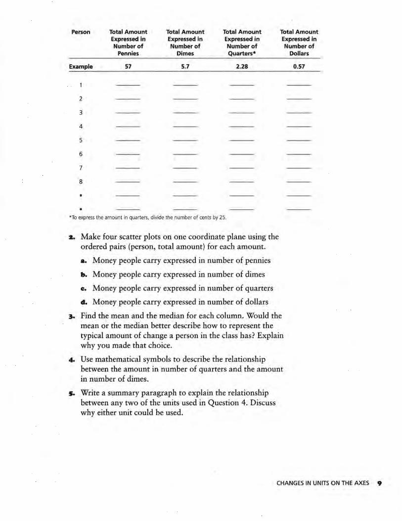
Person Total Amount Total Amount Total Amount Total Amount Expressed in Expressed in Expressed in Expressed in Number of Number of Number of
Pennies Dimes Quarters*
Example 57 5.7 2.28
2
3
4
5
6
7
8
•
• *To express the amount in quarters, divide the number of cents by 25.
s. Make four scatter plots on one coordinate plane using the ordered pairs (person, total amount) for each amount.
a. Money people carry expressed in number of pennies
b. Money people carry expressed in number of dimes
e. Money people carry expressed in number of quarters
d. Money people carry expressed in number of dollars
:1. Find the mean and the median for each column. Would the mean or the median better describe how to represent the typical amount of change a person in the class has? Explain why you made that choice.
4. Use mathematical symbols to describe the relationship between the amount in number of quarters and the amount in number of dimes.
s. Write a summary paragraph to explain the relationship between any two of the units used in Question 4. Discuss why either unit could be used.
Number of Dollars
0.57
CHANGES IN UNITS ON THE AXES 9
The federal debt is the amount of money the federal government owes. Most of it is owed to citizens who lend the government money by buying bonds or treasury bills. The debt increased steadily from 1980-1995 because of deficit spending and increases in interest owed on the debt. Deficit spending occurs when the government spends more in a year than it takes in through taxes and other revenues. The federal deficit is added to the federal debt each year.
6. The federal debt is usually described in trillion dollars, written as $1,000,000,000,000, with $1 as the unit. It is hard to grasp how much one trillion dollars is.
a. A billion seconds is 31. 7 years. How long is a trillion seconds?
b. If a million dollars in $1,000 bills would make a stack four and one-half inches high, how high would a trillion dollars in the same currency stack?
How much is the federal debt increasing each year? Study these data to help you answer the questions.
Year
1980
1981
1982
1983
1984
1985
1986
1987
1988
1989
1990
1991
1992
1993
1994
1995
Federal Debt
0.9091 trillion dollars
0.9949 trillion dollars
1.137 trillion dollars
1.372 trillion dollars
1.565 trillion dollars
1.818 trillion dollars
2.121 trillion dollars
2.346 trillion dollars
2.601 trillion dollars
2.868 trillion dollars
3.207 tri llion dollars
3.598 trillion dollars
4.002 trillion dollars
4.351 trillion dollars
4.644 trillion dollars
4.921 trillion dollars
Source: U.S. Treasury Department
IO LESSON 2
Federal Debt (dollars)
2,346,000,000,000
Federal Debt (billion dollars)
2,346
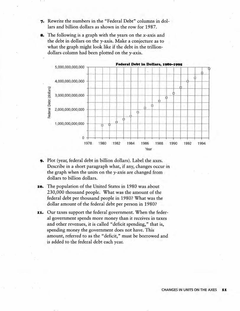
7. Rewrite the numbers in the "Federal Debt" columns in dollars and billion dollars as shown in the row for 1987.
8. The following is a graph with the years on the x-axis and the debt in dollars on the y-axis. Make a conjecture as to what the graph might look like if the debt in the trilliondollars column had been plotted on the y-axis.
5' 000' 000' 000' 000 Federal Debt in Dollars, X980--X995
~ ..i:!!
4,000,000,000,000
~ 3,000,000,000,000
15 QJ 0
~ 2,000,000,000,000 QJ
-0 QJ
LL.
1,000,000,000,000
0
[J [~ IJ
·~ ~
~ I)
IJ ;J
~ ,., I~
I J
~ -1 l
1978 1980 1982 1984 1986 1988 1990 1992 1994
Year
9. Plot (year, federal debt in billion dollars). Label the axes. Describe in a short paragraph what, if any, changes occur in the graph when the units on the y-axis are changed from dollars to billion dollars .
.-o. The population of the United States in 1980 was about 230,000 thousand people. What was the amount of the federal debt per thousand people in 1980? What was the dollar amount of the federal debt per person in 1980?
.-.-. Our taxes support the federal government. When the federal government spends more money than it receives in taxes and other revenues, it is called "deficit spending," that is, spending money the government does not have. This amount, referred to as the "deficit," must be borrowed and is added to the federal debt each year.
1 l
CHANGES IN UNITS ON THE AXES _._.
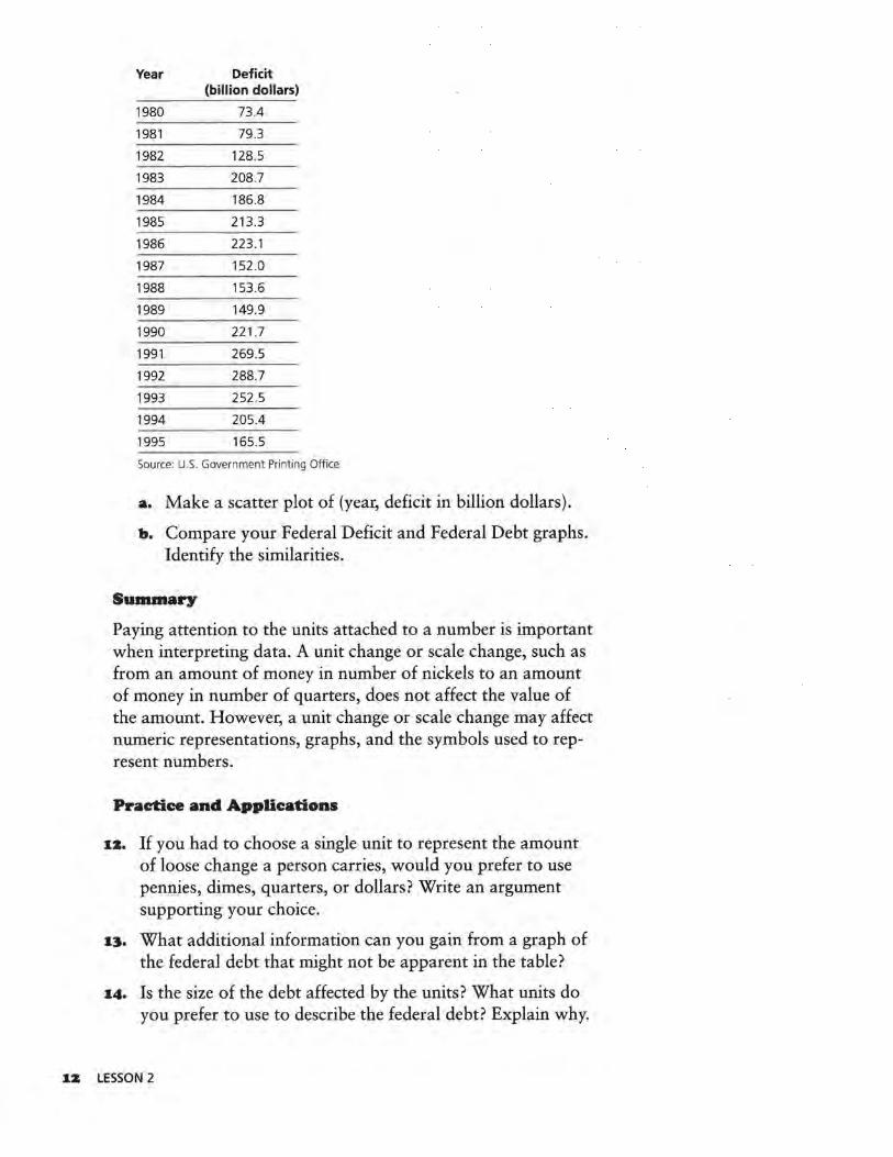
Year Deficit (billion dollars)
1980 73.4
1981 79.3
1982 128.5
1983 208.7
1984 186.8
1985 213.3
1986 223 .1
1987 152.0
1988 153.6
1989 149.9
1990 221.7
1991 269.5
1992 288.7
1993 252.5
1994 205 .4
1995 165.5
Source: U.S. Government Printing Office
a. Make a scatter plot of (year, deficit in billion dollars).
b. Compare your Federal Deficit and Federal Debt graphs. Identify the similarities.
Summary
Paying attention to the units attached to a number is important when interpreting data. A unit change or scale change, such as from an amount of money in number of nickels to an amount of money in number of quarters, does not affect the value of the amount. However, a unit change or scale change may affect numeric representations, graphs, and the symbols used to represent numbers.
Practice and Applications
1z. If you had to choose a single unit to represent the amount of loose change a person carries, would you prefer to use pennies, dimes, quarters, or dollars? Write an argument supporting your choice.
1:1. What additional information can you gain from a graph of the federal debt that might not be apparent in the table?
14. Is the size of the debt affected by the units? What units do you prefer to use to describe the federal debt? Explain why.
1Z LESSON 2
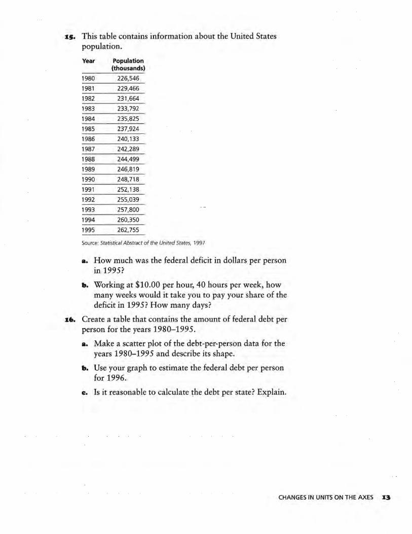
1s. This table contains information about the United States population.
Year Population (thousands)
1980 226,546
1981 229,466
1982 231,664
1983 233,792
1984 235,825
1985 237,924
1986 240, 133
1987 242,289
1988 244,499
1989 246,819
1990 248,718
1991 252, 138
1992 255,039
1993 257,800
1994 260,350
1995 262,755
Source: Statistical Abstract of the United States, 1997
a. How much was the federal deficit in dollars per person in 1995?
b. Working at $10.00 per hour, 40 hours per week, how many weeks would it take you to pay your share of the deficit in 1995? How many days?
16. Create a table that contains the amount of federal debt per person for the years 1980-1995.
a. Make a scatter plot of the debt-per-person data for the years 1980-1995 and describe its shape.
b. Use your graph to estimate the federal debt per person for 1996.
e. Is it reasonable to calculate ~he debt per state? Explain.
CHANGES IN UNITS ON THE AXES 13
ASSESSMENT
Speed Versus Stopping Distance and Height Versus Weight
I n driver-education classes, students are usually taught to allow, under normal driving conditions, one car length for
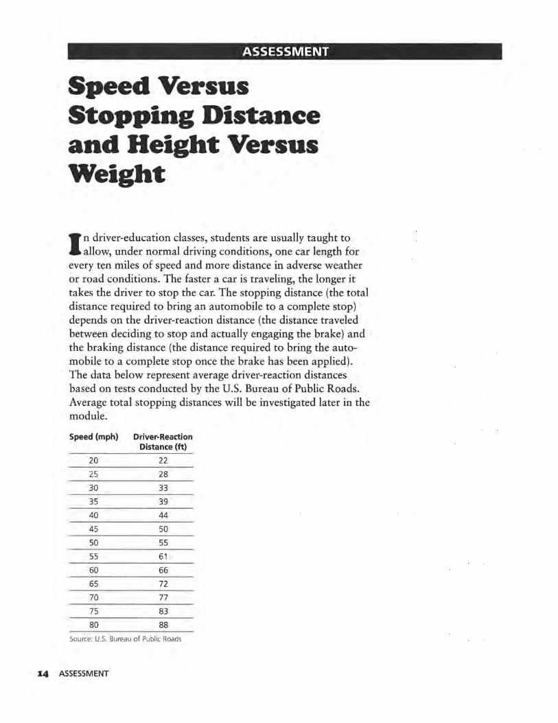
every ten miles of speed and more distance in adverse weather or road conditions. The faster a car is traveling, the longer it takes the driver to stop the car. The stopping distance (the total distance required to bring an automobile to a complete stop) depends on the driver-reaction distance (the distance traveled between deciding to stop and actually engaging the brake) and the braking distance (the distance required to bring the automobile to a complete stop once the brake has been applied). The data below represent average driver-reaction distances based on tests conducted by the U.S. Bureau of Public Roads. Average total stopping distances will be investigated later in the module.
Speed (mph) Driver-Reaction Distance (ft)
20 22
25 28
30 33
35 39
40 44
45 so 50 55
55 61
60 66
65 72
70 77
75 83
80 88
Source: U.S. Bureau of Public Roads
I4 ASSESSMENT
I. Describe any pattern in the data table using the knowledge you gained in this unit.
z. Make a scatter plot of (speed, reaction distance). 'Can a straight line be used to summarize the trend of the graph? Explain. Draw a line and find its equation.
3. Use the equation to make at least 3 predictions for reaction distances at speeds not included in the table. How accurate do you think your predictions are?
The following data sets come from the Mayo Clinic Family Healthbook relating average height to average weight for both males and females.
Women's Height Women's Weight Men's Height Men's Weight (inches) (pounds) (inches) (pounds)
57 117 61 139
58 119 62 142
59 121 63 144
60 123 64 147
61 126 65 150
62 129 66 153
63 133 67 156
64 136 68 159
65 140 69 162
66 143 70 165
67 147 71 169
68 150 72 172
69 153 73 176
70 156 74 180
71 159 75 185
Source: Mayo Clinic Family Healthbook Source: Mayo Clinic Family Healthbook
4. Use the data to graph (women's height, women's weight) or (men's height, men's weight). Draw a straight line that seems to come closest to all the data points on your graph. Find the equation of your line.
s. What does the slope of the line tell you, and how does it relate to the table?
6. The federal deficit per person in 1992 was $1131.98. Write an estimate of this amount with hundred dollars per person as the unit. Write this amount with thousand dollars per person as the unit.
SPEED VERSUS STOPPING DISTANCE AND HEIGHT VERSUS WEIGHT IS

Unit II
Functions and Transformations .

LESSON 3
Functions
What does the graph of each specific function type look like?
What is the relationship between the coefficients of a function's expression in symbolic form and the graph of that function?
I n modeling, statisticians and mathematicians look for patterns that can be used to explain and/or understand a data
set. The process of mathematical modeling consists of examining a data set for patterns and looking for a function whose properties most closely represent the data's properties. This lesson will review the properties and shapes of specific functions so that they may be used in this process. Important terms in the study of mathematics and statistics used in mathematical modeling are response variable, explanatory variable, relations, and functions. When examining data and determining the dependence of one variable upon another, you can identify the dependent variable as the response variable. The other variable is then referred to as the explanatory variable.
Response Variable
10
---+----+-----1-----+--- -+-- Explanatory Variable
-20 -10 0 10 20
-10
OBJECTIVE
Recognize graphs and equations for different
functions.
FUNCTIONS X9
Relations are sets of ordered pairs of the two variables. Within the set of relations is a subset called "functions." Functions are relations in which every instance of the explanatory variable is paired with a single instance of the response variable. These terms will be used throughout the remainder of this module.
INVESTIGATE
There are many specific functions that are useful in mathematical modeling: linear functions, logarithmic functions, exponential functions, power functions, quadratic functions, reciprocal functions, and square-root functions.
It is helpful to know how the appearance of the graph of a function relates to the data it represents. For instance, what will be the appearance of a graph when the function is increasing? decreasing? constant? What information is gained about the graph of a function by knowing it has an asymptote? And how does changing the rate of change affect the appearance of the graph of a function?
Discussion and Practice
It is important for you to be able to recognize functions by their graphs and equations.
Linear Function A general form of the equation of a linear function is y = bx + a or y = b(x - c) + a, where a, b, and c are constants. The graph appears as a straight line. The slope is determined by the numerical value of the constant b in the equation. If b is positive, the line slopes up to the right; and if bis negative, the line slopes down to the right.
20 LESSON 3
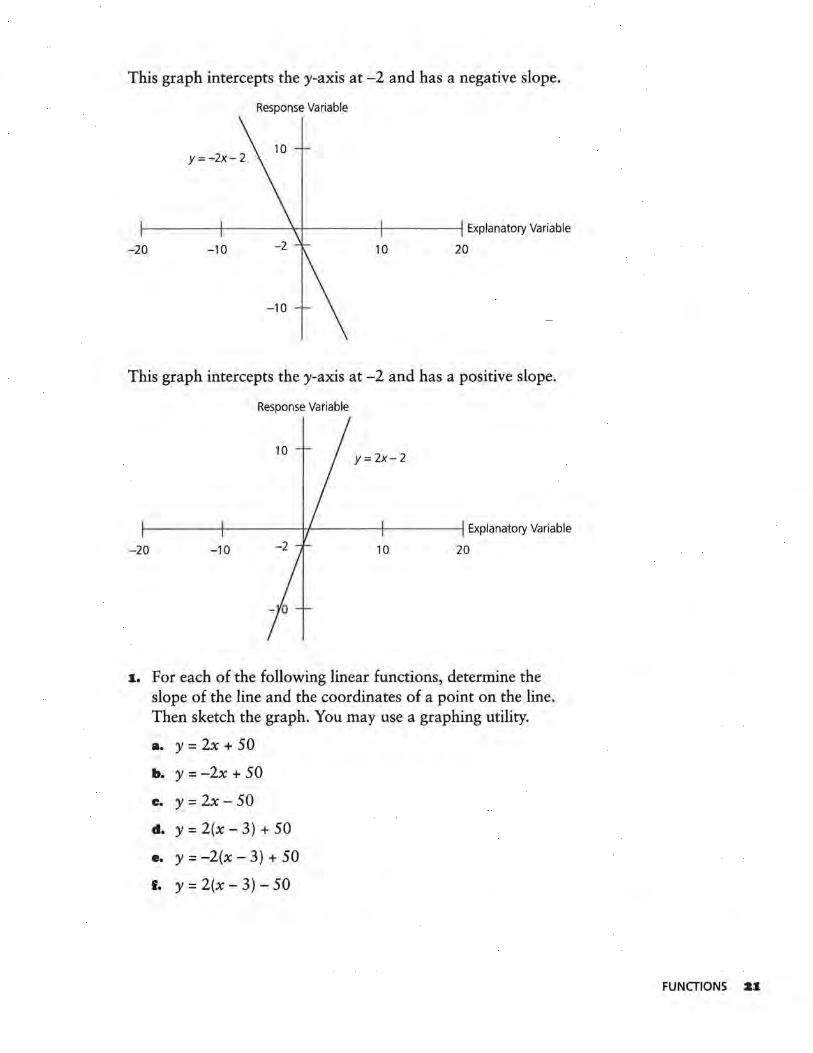
This graph intercepts the y-axis at -2 and has a negative slope.
Response Variable
f------+---- --'<-f----- -1--- - --l Explanatory Variable
-20 -10 10 20
This graph intercepts the y-axis at -2 and has a positive slope.
Response Variable
Y= 2x-2
1------1---- - H-----+-- -----t Explanatory Variable
-20 -10 10 20
1. For each of the following linear functions, determine the slope of the line and the coordinates of a point on the line. Then sketch the graph. You may use a graphing utility.
a. y = 2x + 50
b. y = -2x + 50
c. y = 2x-50
d. y = 2(x - 3) + 50
•• y = -2(x - 3) + 50
f. y = 2(x - 3) - 50
FUNCTIONS Z1
2. Describe the effect each of the constants a, b, and c has on the graph of the equation y = b(x - c) + a.
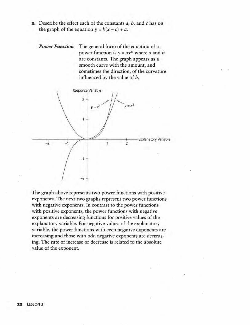
Power Function The general form of the equation of a power function is y = axh where a and b are constants. The graph appears as a smooth curve with the amount, and sometimes the direction, of the curvature influenced by the value of b.
Response Variable
2
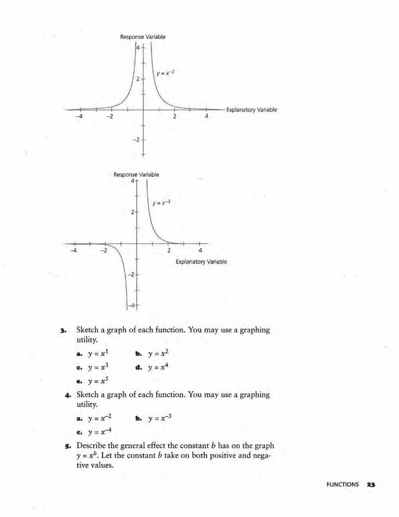
The graph above represents two power functions with positive exponents. The next two graphs represent two power functions with negative exponents. In contrast to the power functions with positive exponents, the power functions with negative exponents are decreasing functions for positive values of the explanatory variable. For negative values of the explanatory variable, the power functions with even negative exponents are increasing and those with odd negative exponents are decreasing. The rate of increase or decrease is related to the absolute value of the exponent.
:U LESSON 3
Response Variable
4
- -=F= ==t====::+---1--+--1---1====1===1--- Explanatory Variable -4 -2
-4 -2
-2
Response Variable 4
y=x-3
2
2
-2
-4
2 4
4
Explanatory Variable
3. Sketch a graph of each function. You may use a graphing utility.
a. y = xl b. y =x2
c. y = x3 d. y = x4
e. y =XS
4. Sketch a graph of each function. You may use a graphing utility.
a. y = x-2
c. y = x-4
b. y = x-3
5. Describe the general effect the constant b has on the graph y = xh. Let the constant b take on both positive and negative values.
FUNCTIONS U
•· Make a conjecture about the effect the constant a has on the graph of y = axh. With your graphing utility, graph the following to test your conjecture.
a. y = 2x2 b. y = 3x2
c. y = -2x2
e. y = Sx2
d. y = -3x2
Exponential Function The general form of the equation of an exponential function is y = abx, where a and b are constants and b > 0 and b -::;:. 1. The graph appears as a smooth curve that increases or decreases and has a horizontal asymptote as the value of the explanatory variable approaches negative infinity.
Response Variable
Explanatory Variable
7. Sketch a graph of each function. You may use a graphing utility.
a. y = 2x
c. y = 4x
Z4 LESSON 3
b. y = 3x
d. y = 5x
8. Describe how the graph of an exponential function changes as the base b changes.
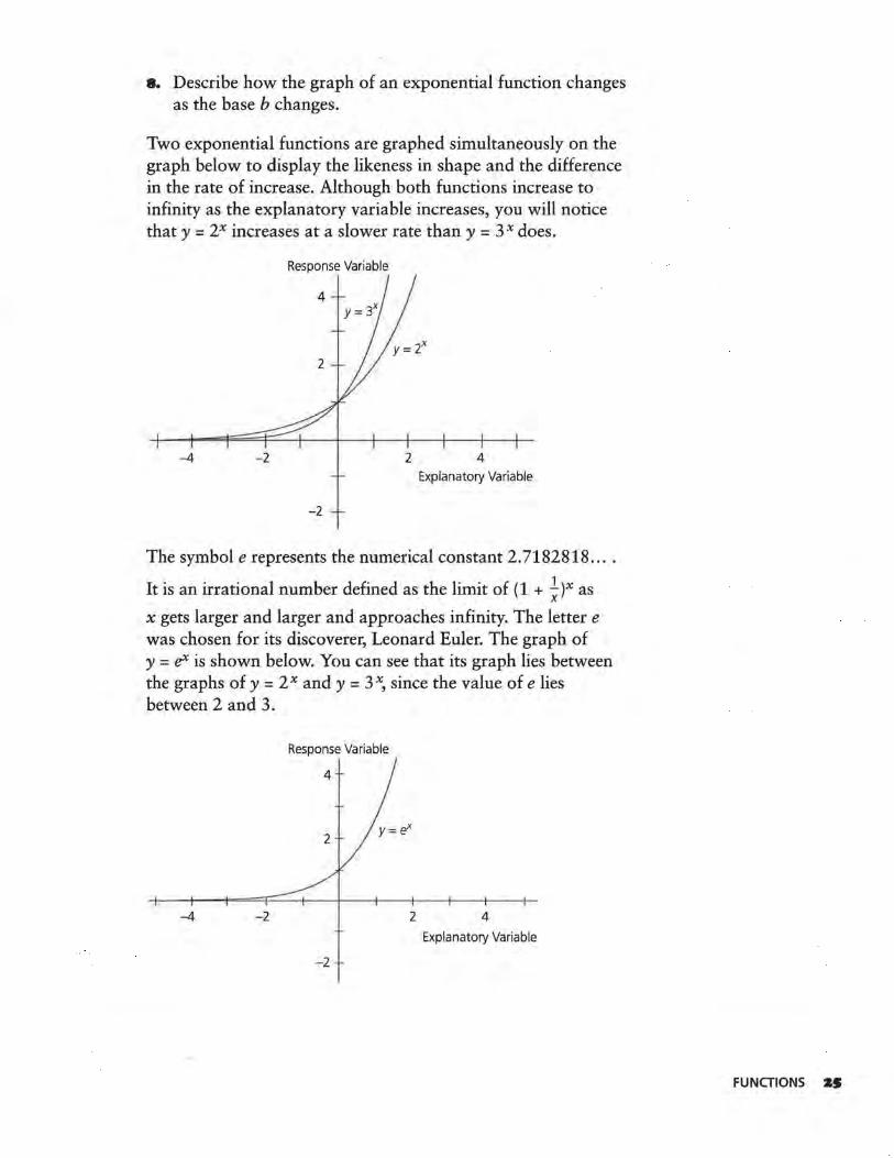
Two exponential functions are graphed simultaneously on the graph below to display the likeness in shape and the difference in the rate of increase. Although both functions increase to infinity as the explanatory variable increases, you will notice that y = 2x increases at a slower rate than y = 3 x does.
Response Variable
-4 -2 2 4 Explanatory Variable
-2
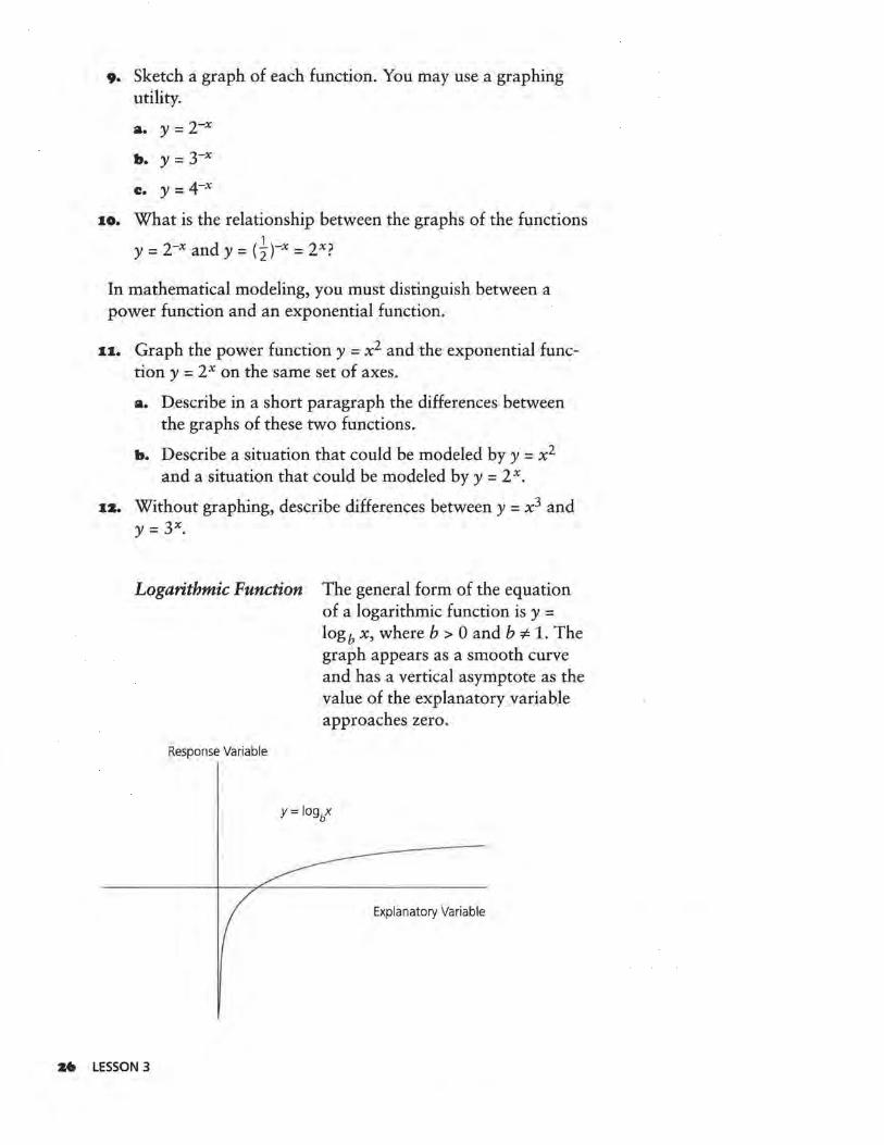
The symbol e represents the numerical constant 2.7182818 ....
It is an irrational number defined as the limit of ( 1 + ~ )x as
x gets larger and larger and approaches infinity. The letter e was chosen for its discoverer, Leonard Euler. The graph of y = eX is shown below. You can see that its graph lies between the graphs of y = 2 x and y = 3 x, since the value of e lies between 2 and 3.
Response Variable
4
2
-4 -2 2 4
Explanatory Variable
-2
FUNCTIONS ZS
9. Sketch a graph of each function. You may use a graphing utility.
a. y = 2-x
b. y = 3-x
c. y = 4-x
10. What is the relationship between the graphs of the functions 1 y = 2-x and y = (2)-x = 2x?
In mathematical modeling, you must distinguish between a power function and an exponential function.
11. Graph the power function y = x2 and the exponential function y = 2 x on the same set of axes.
a. Describe in a short paragraph the differences between the graphs of these two functions.
b. Describe a situation that could be modeled by y = x2
and a situation that could be modeled by y = 2 x.
1a. Without graphing, describe differences between y = x 3 and Y = 3x,
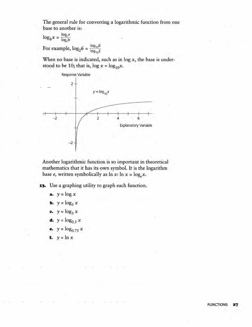
Logarithmic Function The general form of the equation of a logarithmic function is y = logb x, where b > 0 and b ':/:. 1. The graph appears as a smooth curve and has a vertical asymptote as the value of the explanatory variable approaches zero.
Response Variable
Explanatory Variable
:MJ LESSON 3
The general rule for converting a logarithmic function from one base to another is:
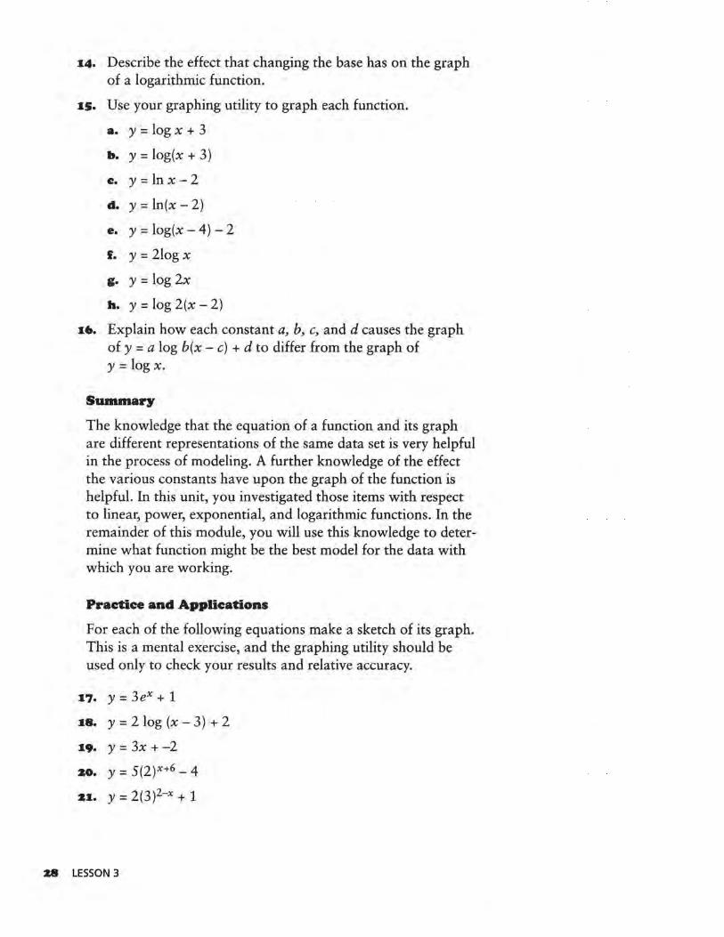
log ex logbx = logc:b
F 1 1 6 log106
or examp e, og2 = log102
When no base is indicated, such as in log x, the base is understood to be 1 O; that is, log x = log10x.
Response Variable
2
- 2 6
Explanatory Variable
-2
Another logarithmic function is so important in theoretical mathematics that it has its own symbol. It is the logarithm base e, written symbolically as ln x: ln x = logex.
13. Use a graphing utility to graph each function.
a. y =log x
b. y = log5 x
c. y = log3 x
d. y = log0.5 x
e. y = log0.75 x
f. y = ln x
FUNCTIONS Z7
:14. Describe the effect that changing the base has on the graph of a logarithmic function.
:is. Use your graphing utility to graph each function.
a. y =log x + 3
b. y = log(x + 3)
c. y=lnx-2
d. y=ln(x-2)
e. y = log(x - 4) - 2
f. y = 2log x
g. y =log 2x
h. y=log2(x-2)
:i•. Explain how each constant a, b, c, and d causes the graph of y =a log b(x - c) + d to differ from the graph of y =log x.
Summary
The knowledge that the equation of a function and its graph are different representations of the same data set is very helpful in the process of modeling. A further knowledge of the effect the various constants have upon the graph of the function is helpful. In this unit, you investigated those items with respect to linear, power, exponential, and logarithmic functions. In the remainder of this module, you will use this knowledge to deter~ mine what function might be the best model for the data with which you are working.
Practice and Applications
For each of the following equations make a sketch of its graph. This is a mental exercise, and the graphing utility should be used only to check your results and relative accuracy.
:17. y = 3ex + 1
:18. y = 2 log (x - 3) + 2
:19. y = 3x + -2
20. Y = 5(2)X+6 - 4
2:1. y = 2(3)2-x + 1
28 LESSON 3

LESSON 4
Patterns in Graphs
Why are mathematical models used to describe data?
Are there any common patterns that appear in graphs of functions?
A mathematical model is an equation used to describe the response variable in terms of the explanatory variable. If
the data set to be modeled has the specific characteristic that a straight line would best describe the pattern formed by its points, it calls for a linear model. If the pattern seemed more curved, the data set would be said to be calling for a nonlinear model. If the data set's response variable increases in value while the explanatory variable increases in value, the model being called for is an increasing model. If the response variable decreases in value while the explanatory variable increases in value, the model called for is a decreasing model.
INVESTIGATE
When you investigated the patterns in the triangle in Lesson 1, you considered (row number, number of triangles). The results looked like the graph on the following page.
OBJECTIVES
Define a mathematical model and explore different data sets.
Identify which data sets can be represented by linear and nonlinear
models.
Make suggestions regarding probable
models.
PATTERNS IN GRAPHS Z9
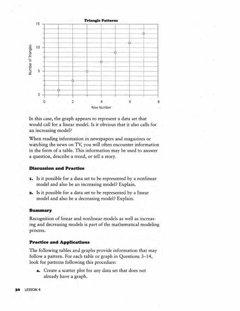
Triangle Patterns 15 -.-~~-.-~~.---~--T~~~~~~~~-.-~~.---~--.
- 11- ---Vl ~ 10 -1-~~-1--~~+--~~~---1-~~-1-~-~-~-+--~~1
c ro
~ 0
Q:; _c
E ::::J z
0 2 4 6
Row Number
In this case, the graph appears to represent a data set that would call for a linear model. Is it obvious that it also calls for an increasing model?
8
When reading information in newspapers and magazines or watching the news on TV, you will often encounter information in the form of a table. This information may be used to answer a question, describe a trend, or tell a story.
Discussion and Practice
1. Is it possible for a data set to be represented by a nonlinear model and also be an increasing model? Explain.
:&. Is it possible for a data set to be represented by a linear model and also be a decreasing model? Explain.
Summary
Recognition of linear and nonlinear models as well as increasing and decreasing models is part of the mathematical modeling process.
Practice and Applications
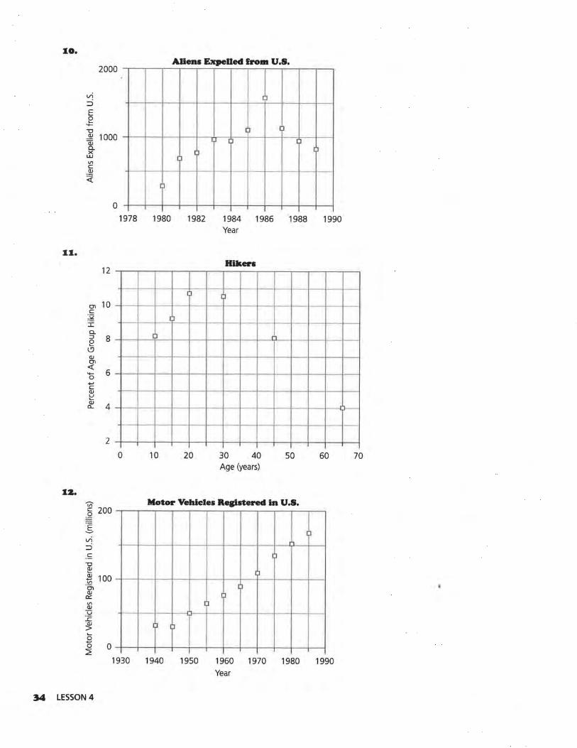
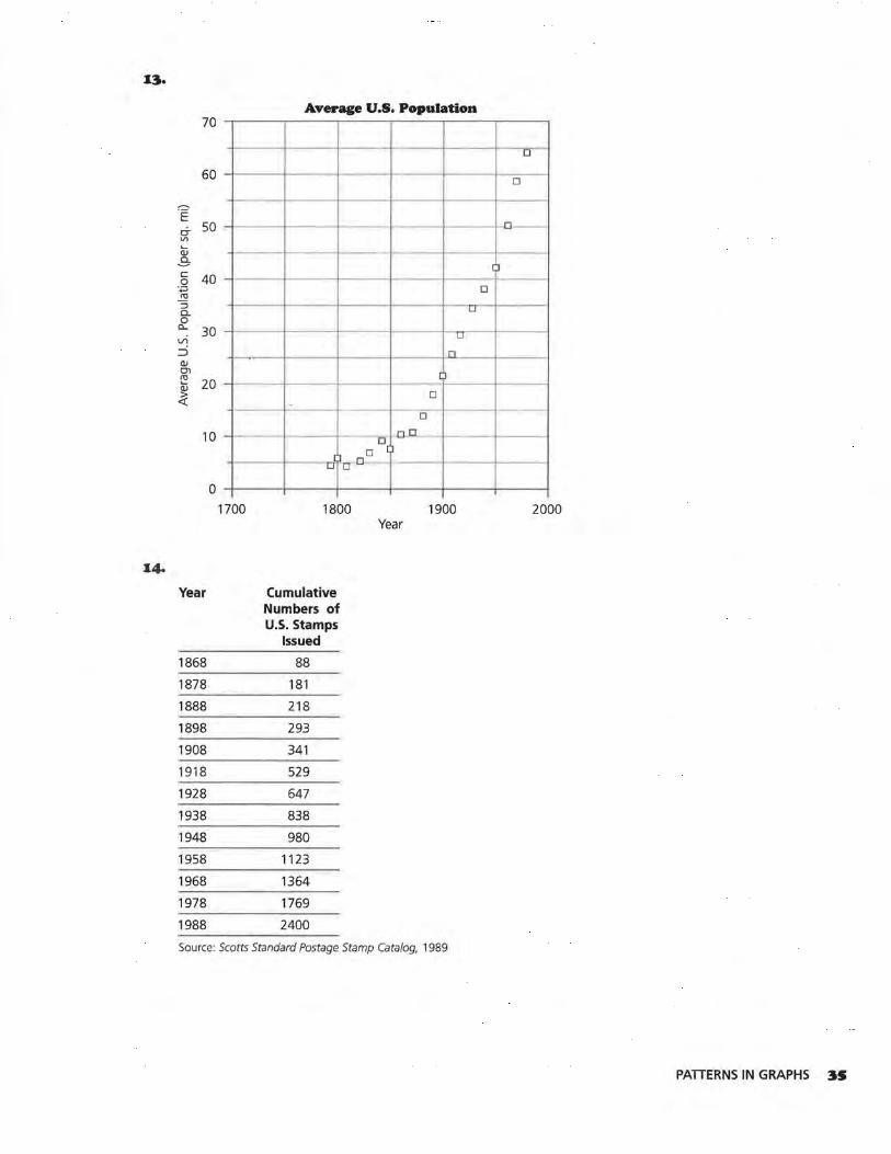
The following tables and graphs provide information that may follow a pattern. For each table or graph in Questions 3-14, look for patterns following this procedure:
a. Create a scatter plot for any data set that does not already have a graph.
:JO LESSON 4
3.
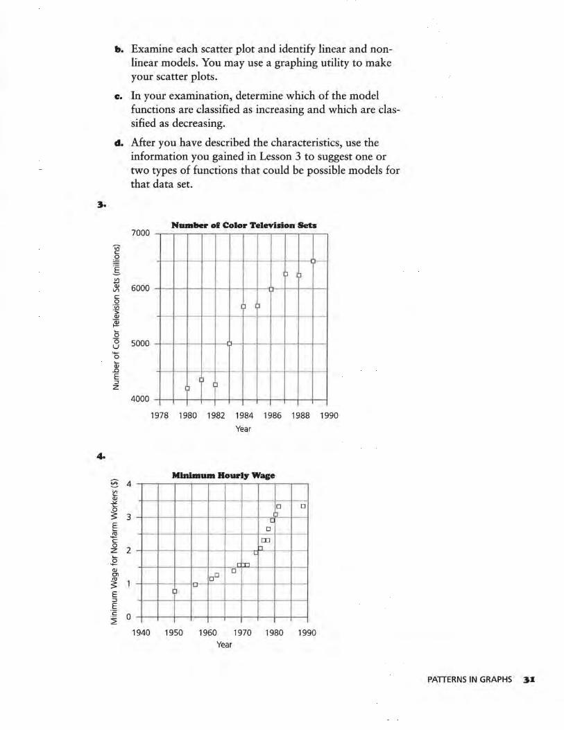
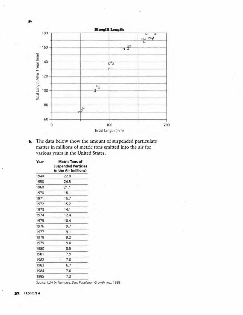
4.
b. Examine each scatter plot and identify linear and nonlinear models. You may use a graphing utility to make your scatter plots.
c. In your examination, determine which of the model functions are classified as increasing and which are classified as decreasing.
d. After you have described the characteristics, use the information you gained in Lesson 3 to suggest one or two types of functions that could be possible models for that data set.
VI c::
.Q ·-.§. Vl ..... Q) Vl
c:: 0 ·v; ·:; Q)
~ ..... 0 0 u ..... 0
cu ..c E :J z
§ ~ Q) ~
~ E ro ..... c:: 0 z 0
'+--Q) O'l
~ E :J E
:~ 2
Number of Color Television Sets 7000
J )
6000
I~ I~
5000
J J I l
4000
4
3
2
0
1978 1980 1982 1984 1986 1988 1990
Year
Minimum Hourly Wage
0 0 "I
I.:
0
OD
- - '--- ri L
rT1
DO 0
~
I J
1940 1950 1960 1970 1980 1990 Year
PATTERNS IN GRAPHS 3I
s.
Bluellll Lencth 180 LJ LJ
LJD o& 0
160 nn D LI
E 5
140 ~
ro -
;J D
~
cu 120 .:i= <! .r:. +-' C) c Eb QJ 100 --'
n co
ro +-'
i9 80
D J
60
0 100 Initial Length (mm)
6. The data below show the amount of suspended particulate matter in millions of metric tons emitted into the air for various years in the United States.
Year Metric Tons of Suspended Particles in the Air (millions)
1940 22.8 1950 24.5
1960 21.1 1970 18.1 1971 16.7 1972 15.2 1973 14.1
1974 12.4 1975 10.4
1976 9.7 1977 9.1 1978 9.2
1979 9.0 1980 8.5
1981 7.9 1982 7.0 1983 6.7 1984 7.0
1985 7.3
Source: USA by Numbers, Zero Population Growth, Inc., 1988
3Z LESSON 4
200
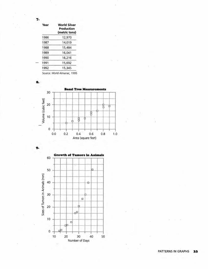
7.
Year World Silver Production
(metric tons)
1986 12,970
1987 14,019
1988 15.484
1989 16,041
1990 16,216
1991 15,692
1992 15,345
Source: World Almanac, 1995
•• Basal Tree Measurements
30
'+J' Q) Q)
'+- 20 u :.a ;i I J ::J ~ Q)
E 10 ::J
~ ~
1;i 1 l -
0 0.0 0.2 0.4 0.6 0.8 1.0
Area (square feet)
9.
Growth of Tumors in Animals 60
50 n
E _§. Vl 40 -m ---~ c -<( c
~ 30
0 E
0
~ '+- 20 0
r1
Vl Q) N -D
Vi
10 0
-h
0 rD
10 20 30 40 50 Number of Days
PATTERNS IN GRAPHS 33
10.
V1
:::> E E
'+-""Cl J!:! Qi c. x
LU vi c:: .~ <i:
11.
cr> c::
32 :I c. :::J E \.9 <lJ C'I
<i:: '+-0 +-' c:: <lJ ~ <lJ
a...
1z. Vl c:: ,g
l vi :::> .s ""Cl ~ <lJ +-' vi
·ai <lJ
Cl<:: Vl <lJ u £ ~ 0 +-' 0 ~
34 LESSON 4
2000
1000
0
12
10
8
6
4
2
200
100
0
Aliens Expelled from U.S.
IJ
, J I ~ I ) I l
~ I )
)
,_ - ._____ - - -J
1978 1980 1982
-I ~
I )
I ~
0 10 20
1984 1986 1988 Year
Hikers
)
.,
30 40 50 Age (years)
Motor Vehicles Registered in U.S.
1 l
'' I J
I J
J I )
)
) )
1990
60
1930 1940 1950 1960 1970 1980 Year
1990
).---
70
x3.
Average U.S. Population 70
LI
60 D
"§
ci- 50 ,_
D -Vl
Q; ..e,. c: 40 0
l ·.;:; D ~ :::J c._ LI
0 a... 30 Vl
LI
::i n QJ O> C1J
20 .....
~ --
D
-D
10 .Q.u_ _ -0
ll D I )
n . O' o
0 1700 1800 1900 2000
Year
I4o
Year Cumulative Numbers of U.S. Stamps
Issued
1868 88
1878 181
1888 218
1898 293
1908 341
1918 529
1928 647
1938 838
1948 980
1958 1123
1968 1364
1978 1769
1988 2400
Source: Scotts Standard Postage Stamp Catalog, 1989
PATTERNS IN GRAPHS 3S
LESSON 5
Transforming Data
What are some things that will affect the shape of a graph?
What effect would transforming data have on the graph of the data?
A s you know, pi (n) is the ratio of the circumference of a circle to its diameter, or 3.14159 .... It is used in formulas
that describe circular figures.
INVESTIGATE
In the Old Testament of the Bible (II Chronicles 4:2), it is stated, "Then he made the molten sea; it was round, ten cubits from brim to brim, and five cubits high, and a line of thirty cubits measured its circumference." The circumference was, therefore, 6 times the radius or 3 times the diameter. The Hebrews used 3 for 7t. The Egyptians used {lo or 3.16. Which value of 7t do you commonly use?
Discussion and Practice
1. Use 7t = 3.14159 to complete the table on page 37 about circles.
3• LESSON 5
OBJECTIVE
Transform specific data sets to make them appear linear when
plotted in a scatter plot.
Diameter (cm) Area (cm2) Circumference (cm)
2
3
4
5
6
7
8
9
10
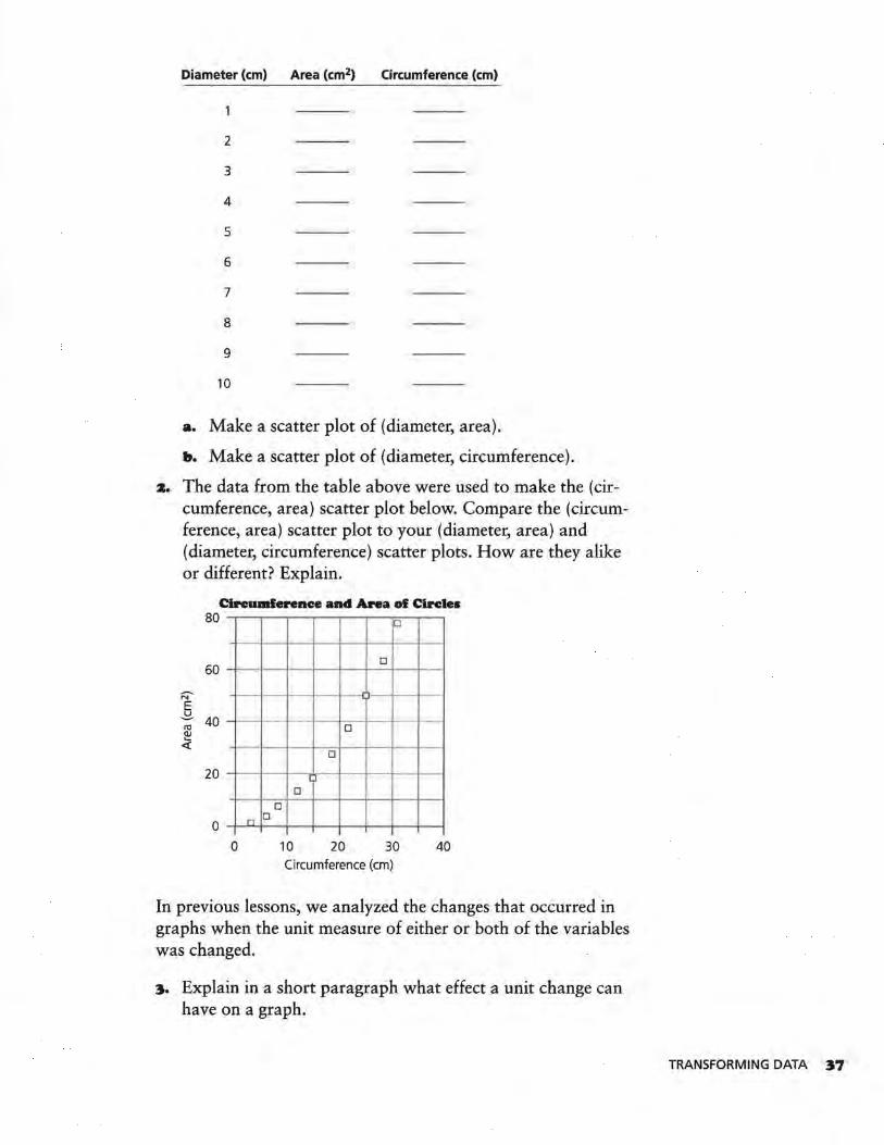
a. Make a scatter plot of (diameter, area).
b. Make a scatter plot of (diameter, circumference).
z. The data from the table above were used to make the (circumference, area) scatter plot below. Compare the (circumference, area) scatter plot to your (diameter, area) and (diameter, circumference) scatter plots. How are they alike or different? Explain.
Circwnferenc:e and Area of Circles
N' E
80
60
~ 40 re !!! <(
20
0
-
n D
0
D
D
D
D
I D
D
10 20 30 40 Circumference (cm)
In previous lessons, we analyzed the changes that occurred in graphs when the unit measure of either or both of the variables was changed.
3. Explain in a short paragraph what effect a unit change can have on a graph.
TRANSFORMING DATA 37
In this lesson, you will analyze the changes on a graph produced by a transformation performed on a variable. A transformation on a variable is accomplished by using a function to change its value. You are familiar with the effect of unit changes on a graph. For example, changing from quarters to dollars or changing from people to thousands of people are examples of unit changes. Such changes can expand or contract a graph, but the distances between tick marks on the scale remain uniform.
Some situations force us to consider other kinds of scale changes. For example, consider the data of the intensity of sound (number of times as loud as the softest sound) in decibels.
Sample Sound Decibels Number of Times as Loud as Softest Sound
Jet airplane 140 decibels 100,000,000,000,000
Air raid siren 130 decibels 10,000,000,000,000
Pneumatic hammer 120 decibels 1,000,000,000,000
Bass drum 11 O decibels 100,000,000,000
Thunderclap 1 00 decibels 10,000,000,000
Niagara Falls 90 decibels 1,000,000,000
Loud radio 80 decibels 100,000,000
Busy street 70 decibels 10,000,000
Hotel lobby 60 decibels 1,000,000
Quiet automobile 50 decibels 100,000
Average residence 40 decibels 10,000
Average whisper 30 decibels 1,000
Faint whisper 20 decibels 100
Rustling leaves or paper 1 O decibels 10
Softest sound heard 0 decibels 1
Source: Definitions of Integrated Circuits, Logic, and Microelectronics Terms
4. Use the data above to make a graph of (number of times as loud as softest sound, decibels). Determine your own scale and label the axes.
s. What problems did you have in choosing the scale for the graph in Question 4?
What suggestions do you have for changing the scale to make the graph easier to read?
To put all of the points on the graph, the graph had to range from 0 to 100,000,000,000,000 on the horizontal axis. This is impractical because of the relative size of the largest and smallest intervals in the x-range. On the first number line on page 39,
38 LESSON 5
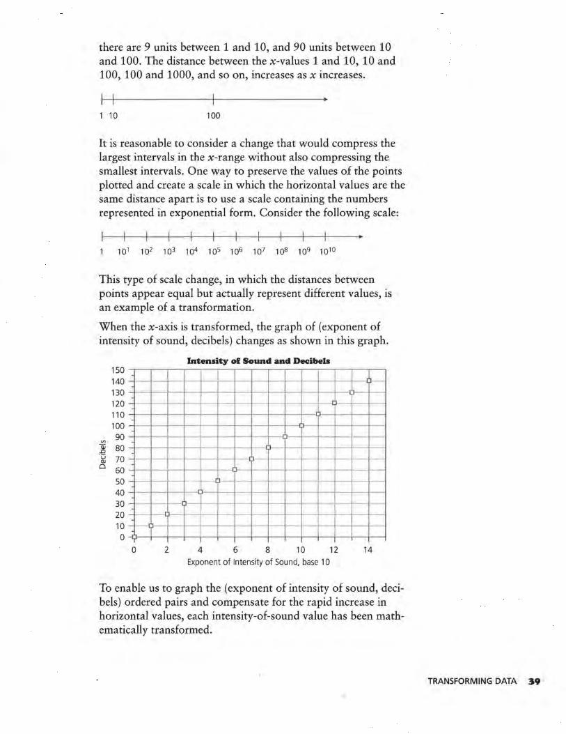
there are 9 units between 1 and 10, and 90 units between 10 and 100. The distance between the x-values 1 and 10, 10 and 100, 100 and 1000, and so on, increases as x increases.
1 10 100
It is reasonable to consider a change that would compress the largest intervals in the x-range without also compressing the smallest intervals. One way to preserve the values of the points plotted and create a scale in which the horizontal values are the same distance apart is to use a scale containing the numbers represented in exponential form. Consider the following scale:
This type of scale change, in which the distances between points appear equal but actually represent different values, is an example of a transformation.
When the x-axis is transformed, the graph of (exponent of intensity of sound, decibels) changes as shown in this graph.
Intensity of Sound and Decibels 150 --.----..-...,....---,.----,,------.----..--.---.----,.----.--..,..--,---,-------,~
140 - -·l--+-----+-
130 -t---+--+--<--+----+----t--f--O--t----+---f--+-~ 1--+-----1
-120 - -----110 --1---1--+--1--1---+---+--1--1--1----+--0l~+---+--1--~
100 -+--~--i--t--t-•l--l--t--l--1--D ---80 - --1--1--i---+---t--70 - -60 ~---t--i--1--11--t--U-+--t--tl-~--+-+--+--tf-I
- - - -·t---t---+--1--50 - --1--0---1- --ll-- -
40 -+--t--1--1--lJ--+--t--+--b-t---+---t-+--+-t---i
30 - --1--1-~1 1--+--+--+--+--•~-+---+-t---t-----+--+-~
20 ~---+-IU--1 --l--+-+--+--tl~-t--+-+---1--t--t--l
10 -t--LJ---t----t--t~-t---t--+--t--1~-t---t
0 -0---+--+--1--1----t--+--+--+-l---+---t-+---+--I--~
0 2 4 6 8 10 12 14
Exponent of Intensity of Sound, base 10
To enable us to graph the (exponent of intensity of sound, decibels) ordered pairs and compensate for the rapid increase in horizontal values, each intensity-of-sound value has been mathematically transformed.
TRANSFORMING DATA ~9
6. Write a paragraph describing the changes you observe.
7. Write an equation to describe decibels in terms of the exponent, base 10, of the intensity of sound.
Straightening a graph through transformation is often an advantage to us, because it is much simpler to create the equation of a straight line than that of a curve. When we are able to linearize a data set by performing a transformation on the units, we can fit a straight line and create the equation of that line. The line or its equation can be used to describe patterns and make predictions about the data set.
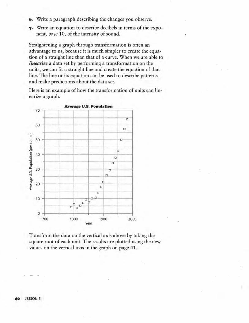
Here is an example of how the transformation of units can linearize a graph.
Average U.S. Population 70
- -D
60 - - - -0
-.E 0- 50 o--"' Q:; .s- I ~ c 40 0
·.::; _!!1
0
::i c. 0 0 a... 30 VI
0
:::::> 0 (lJ CTI ro
20 .... (lJ
~
I J
D
D
10 n L.J -
J 0 0
D 0
0 1700 1800 1900 2000
Year
Transform the data on the vertical axis above by taking the square root of each unit. The results are plotted using the new values on the vertical axis in the graph on page 41.
40 LESSON 5
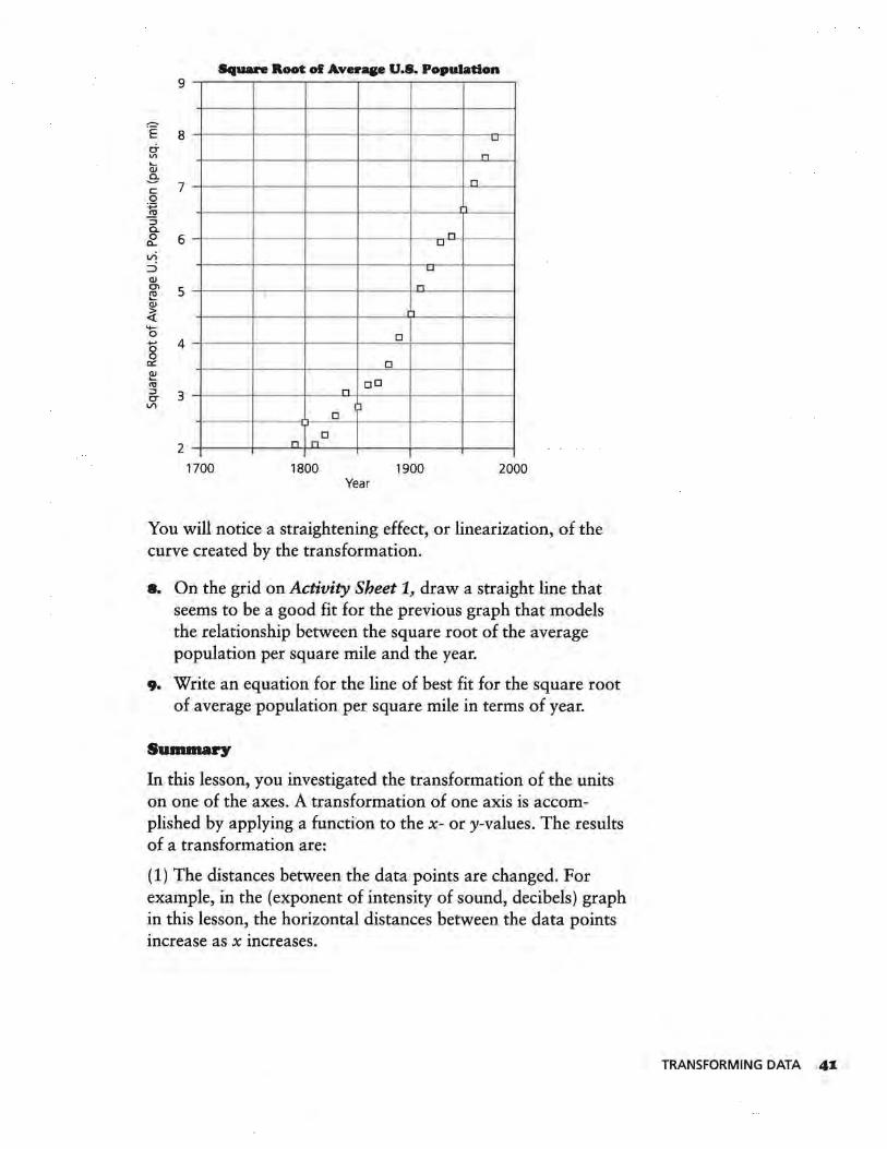
Sfauare Root of Averaae U.S. Population 9
~ .E 8 LI
0-"' n Qj
-3-7 c
n 0 ·.;:::;
.!!1 "' :J c. 0 6 a...
n u
VI
::::> LI
QJ Cl 5 ~
n
QJ
~ ,.,
'+-0 +-' 4 0
D
0 0::: D ~ ttl oD :J 3 CT VI
n
1:i D
D
2 n n
1700 1800 1900 2000 Year
You will notice a straightening effect, or linearization, of the curve created by the transformation.
8. On the grid on Activity Sheet 1, draw a straight line that seems to be a good fit for the previous graph that models the relationship between the square root of the average population per square mile and the year.
9. Write an equation for the line of best fit for the square root of average population per square mile in terms of year.
Summary
In this lesson, you investigated the transformation of the units on one of the axes. A transformation of one axis is accomplished by applying a function to the x- or y-values. The results of a transformation are:
(1) The distances between the data points are changed. For example, in the (exponent of intensity of sound, decibels) graph in this lesson, the horizontal distances between the data points . . mcrease as x mcreases.
TRANSFORMING DATA 4I
(2) A transformation alters the appearance of the graph of the data, often changing its shape.
We will now investigate specific methods of effecting changes in graphs.
Practice and Applica~ons
10. Use the data table at the beginning of this lesson.
a. Make a scatter plot of (circumference, area).
b. Add a new column to the data table for circumference squared.
c. Make a scatter plot of (circumference squared, area).
d. Describe how the graph in part c is different from the graph in part a.
11. Write an equation for area in terms of the circumference squared.
42 LESSON 5
LESSON 6
Exploring Changes on Graphs
What effect does changing the scale on an axis have on the graph of the data?
Is it true that a transformation using a function's inverse will linearize that function's graph?
INVESTIGATE
Soccer balls come in different sizes, which are indicated by numbers.
How do volume and circumference compare?
Size Circumference (cm) Volume (cm3) Age of Player
3 59 3468.2 under 8
4 62 .8 4182 .4 8-11 years
5 67 5078.9 12 years and older
Other sports also have balls with standardized circumferences.
Ball Circumference (cm) Volume (cm3)
Soccer, size 3 59 3468.2
Soccer, size 4 62.8 4182.4
Soccer, size 5 67 5078.9
Softball 33 606.9
Basketball 82.5 9482 .2
Golf Ball 13.5 41.5
Playground Ball 69 5547.5
Racquetball 18 98.5
Tennis Ball 20.2 139.2
Baseball 23.3 213 .6
OBJECTIVE
Recognize and understand how the
shape of a graph changes When a variable
plotted in the graph is transformed.
EXPLORING CHANGES ON GRAPHS 43
Discussion and Practice
Use the data on page 43 to make five scatter plots: (circumference, volume), (circumference squared, volume), (circumference, square root of volume), (circumference cubed, volume), and (circumference, cube root of volume) on the grids provided on Activity Sheets 2-4. Use the graphs to answer the following questions.
I. Compare and then explain how transformations change the appearance of the graph.
z. Which graph(s) are easier to describe algebraically? Explain.
3. Compare the first graph to the fourth graph. How did the transformation of circumference into circumference cubed change that graph? How did the transformation of volume into cube root of volume in the last graph change the . first graph?
4. Make a conjecture about your findings in Question 3.
s. Why do you think cube and cube-root transformations might be preferred over the square and square-root transformations in this example?
•· Classify each of the above graphs as linear or nonlinear and increasing or decreasing.
7. Measure the circumference of a beach ball in centimeters and use one of the graphs to predict the volume.
a. Which graph did you select for this purpose? Why?
b. Compute the volume of the beach ball and determine how close to the actual volume your prediction came.
8. Write an equation to represent each of following relations.
a. The cube root of the volume of a sphere in terms of its circumference
b. The volume of a sphere in terms of its circumference cubed
Summary
The association between a graph's shape and the scale on either axis is another important relationship in the process of modeling. In this unit, you investigated that relationship and became aware of the choice of the inverse of a function to effect the straightening of the curve.
44 LESSON 6
Practice and Applications
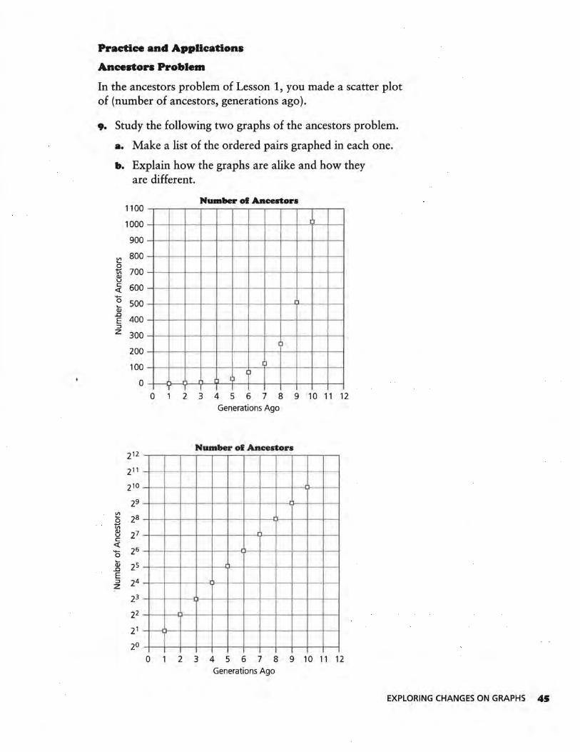
Ancestors Problem
In the ancestors problem of Lesson 1, you made a scatter plot of (number of ancestors, generations ago).
9. Study the following two graphs of the ancestors problem.
a. Make a list of the ordered pairs graphed in each one.
b. Explain how the graphs are alike and how they are different.
Number ol Ancestors 1100
1000 11
900
~ 800
0 +-' 700 "' QI u c 600 <( -
'+-0 500 Cii
11 -..0
400 E ::i z 300
l 200
100 l l
I)
0 ll I)
l
0 2 3 4 5 6 7 8 9 10 11 12 Generations Ago
Number of Ancestors 212
211 -210
29 ~ 2a 0 'ti\ QI 21 u c <(
26 0 Cii 2s ..0 E ::i 24 z ·ll- -
23
22
21
20
0 2 3 4 5 6 7 8 9 10 11 12 Generations Ago
EXPLORING CHANGES ON GRAPHS 4S
IO. Write an equation representing the number of ancestors in terms of the exponent of the generations ago.
-Notice that although the physical distances between the vertical tick marks, 2 1 and 2 2, and 2 2 and 2 3, and so on, appear equal, the numerical distances between them are not equal.
II. Were the x-values or the y-values transformed to create the second graph? Describe the effect of this transformation on the graph.
The decibel data from Lesson 5, repeated here, has been used to create the two graphs on the next page.
Sample Sound Decibels Number of Times as Loud as Softest Sound
Jet airplane 140 decibels 100,000,000,000,000
Air raid siren 130 decibels 10,000,000,000,000
Pneumatic hammer 120 decibels 1,000,000,000,000
Bass drum 110 decibels 100,000,000,000
Thunder clap 100 decibels 10,000,000,000
Niagara Falls 90 decibels 1,000,000,000
Loud radio 80 decibels 100,000,000
Busy street 70 decibels 10,000,000
Hotel lobby 60 decibels 1,000,000
Quiet automobile 50 decibels 100,000
Average residence 40 decibels 10,000
Average whisper 30 decibels 1,000
Faint whisper 20 decibels 100
Rustling leaves or paper 10 decibels 10
Softest sound heard 0 decibels
Source: Definitions of Integrated Circuits, Logic, and Microelectronics Terms
46 LESSON 6
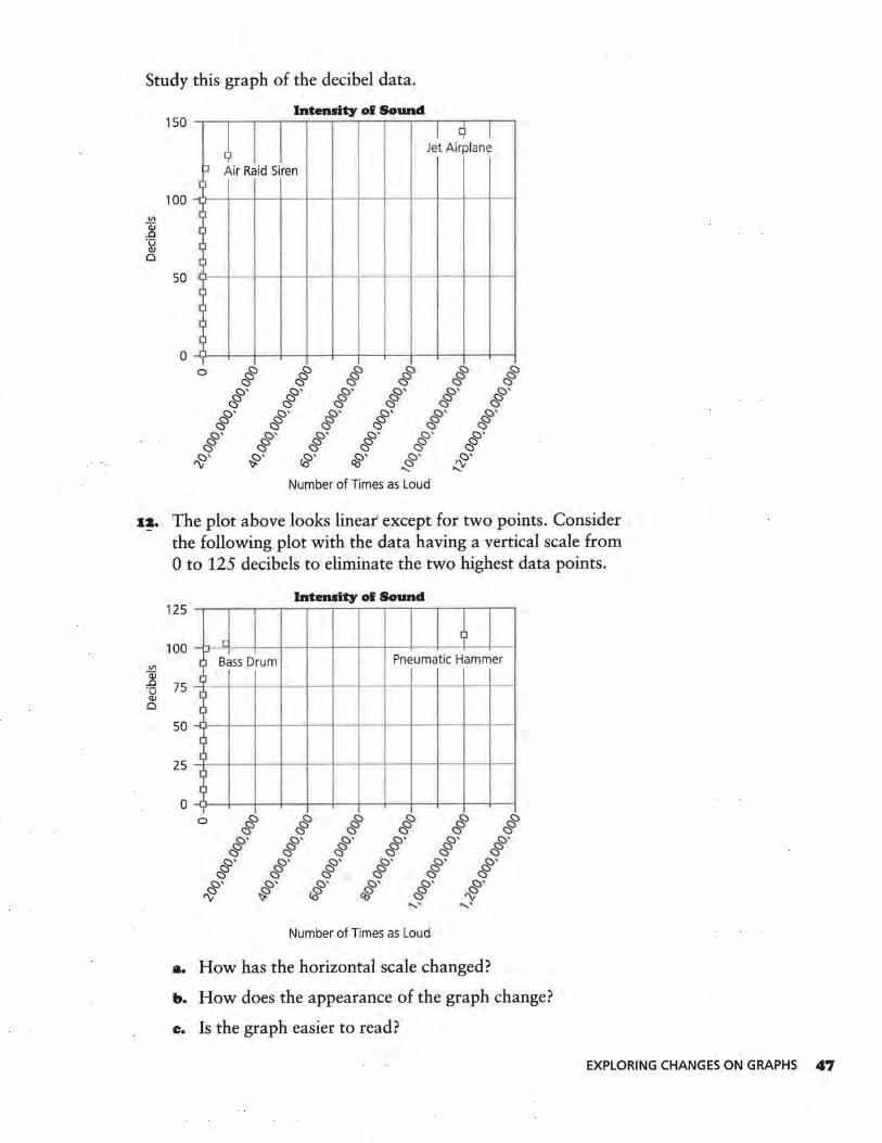
Study this graph of the decibel data.
Vl
Qi ..c ·o
OJ 0
150
100
50
0
Intensity of Sound
I I c) I ~
Jet Airplane
::i Air Raid Siren
r ]
[
r r I I I
T 0 & & & & & &
C5 C5 C5 C5 C5 C5 C'
& C'
& C '
& C'
& C '
& C '
& C '
& C'
& !::>'
& !::)'
& C '
& C '
& c·
& !::>'
& !::)'
& C'
& !::)'
& C'
& (:)'
'V (:)' ~
CY <Ci
o· Clj
C ' ~
0' ::y Number of Times as Loud
1:1. The plot above looks linear' except for two points. Consider the following plot with the data having a vertical scale from 0 to 125 decibels to eliminate the two highest data points.
Intensity of Sound 125
II
100 r - ~ -Vl
(] Bass Drum Pneumatic Hammer Qj ..c 75 ·o OJ ~ -0
50 J ll
25 ll
I l
0 j 1 0 & & & & & &
C5 C5 C5 C5 C5 C5 !::)'
& C '
& !::)'
& C '
& !::)'
& c·
& C'
& c·
& C'
& C'
& c·
& C '
& C'
rt> C' ~
c · ~
C ' c§5
C ' ~
C ' ~ ....... ...... .
Number of Times as Loud
a. How has the horizontal scale changed?
b. How does the appearance of the graph change?
c. Is the graph easier to read?
EXPLORING CHANGES ON GRAPHS 47
I3. Describe what happens when you draw the graph with a vertical scale from 0 to 100 and eliminate two additional points.
I4. Does the following graph accurately describe the data in the decibels tab.le? Justify your answer.
Intensity of Sound 150
-140
130 - --
120
110 -
100 - >-·
90 - I---
-VI Qj 80 ..c
-+--t---1--t--t--t--1--1--I~ - - - - -- -
·o QJ 70 0 -
60 -
50
40
30 -
20 -
10 --
0
0 2 3 4 5 6 7 8 9 10 11 12 13 14 15
Exponent of Number of Times as Loud (with 10 as base)
IS. Use the graph above. For a decibel level of 80, what is the intensity of sound?
48 LESSON 6
ASSESSMENT
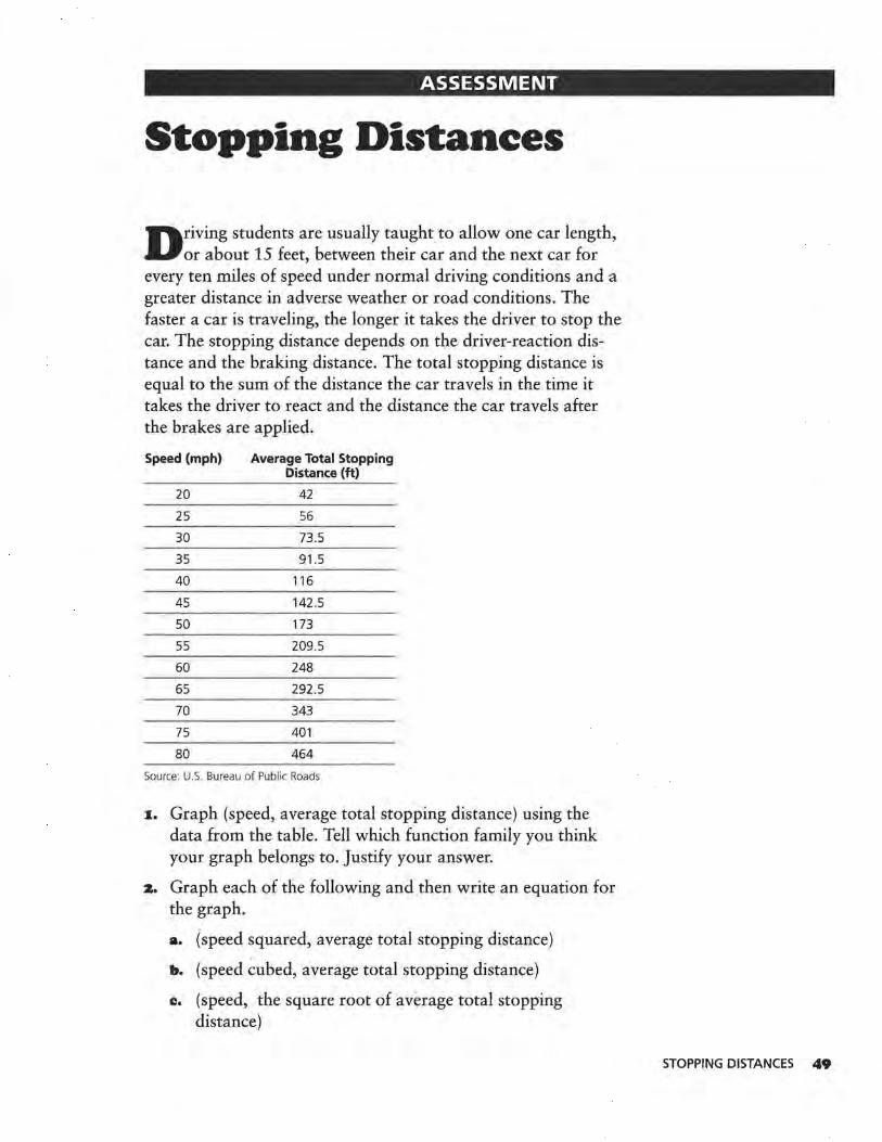
Stopping Distances
D riving students are usually taught to allow one car length, or about 15 feet, between their car and the next car for
every ten miles of speed under normal driving conditions and a greater distance in adverse weather or road conditions. The faster a car is traveling, the longer it takes the driver to stop the car. The stopping distance depends on the driver-reaction distance and the braking distance. The total stopping distance is equal to the sum of the distance the car travels in the time it takes the driver to react and the distance the car travels after the brakes are applied.
Speed (mph) Average Total Stopping Distance (ft)
20 42
25 56
30 73.5
35 91.5
40 116
45 142.5
50 173
55 209.5
60 248
65 292.5
70 343
75 401
80 464
Source: U.S. Bureau of Public Roads
I. Graph (speed, average total stopping distance) using the data from the table. Tell which function family you think your graph belongs to. Justify your answer.
z. Graph each of the following and then write an equation for the graph.
a. (speed squared, average total stopping distance)
b. (speed cubed, average total stopping distance)
c. (speed, the square root of average total stopping distance)
STOPPING DISTANCES 49
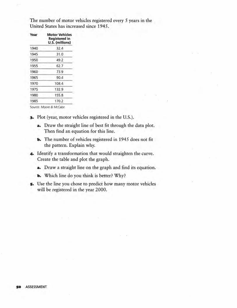
The number of motor vehicles registered every 5 years in the United States has increased since 1945.
Year Motor Vehicles Registered in U.S. (millions}
1940 32.4
1945 31.0
1950 49.2
1955 62 .7
1960 73.9
1965 90.4
1970 108.4
1975 132.9
1980 155.8
1985 170.2
Source: Moore & McCabe
:s. Plot (year, motor vehicles registered in the U.S.).
a. Draw the straight line of best fit through the data plot. Then find an equation for this line.
b. The number of vehicles registered in 1945 does not fit the pattern. Explain why.
4. Identify a transformation that would straighten the curve. Create the table and plot the graph.
a. Draw a straight line on the graph and find its equation.
b. Which line do you think is better? Why?
s. Use the line you chose to predict how many motor vehicles will be registered in the year 2000.
SO ASSESSMENT
Unit Ill
Mathematical Models from
Data

LESSON 7
Transforming Data Using Logarithms
What is a logarithm?
How does a logarithmic transformation change the appearance of a graph?
U nits of measure such as meter, centimeter, foot, and inch increase consistently by ls as they get larger. Therefore, a
board that is 10 feet long is twice as long as a board that is 5 feet long. A meter stick is 10 times as long as a 19-cm ruler.
However, the number of ancestors in each generation does not increase steadily by ls as you consider previous generations. Rather, the number increases by multiples of 2. Two generations ago, you had 4, or 22, grandparents. Three generations ago, you had 8, or 23, great-grandparents. Four generations ago, you had 16, or 24, great-great-grandparents.
INVESTIGATE
When numbers increase or decrease rapidly, it may be convenient to look for patterns in their exponents, or logarithms.
log101,000 = 3
The log of 10 equals 1 because 101 = 10 and the log is the exponent.
The log of 100 equals 2 because 10 2 = 100 and the log is the exponent.
The log of 1,000 equals 3 because 10 3 = 1,000 and the log is the exponent.
OBJECTIVE
Recognize how transforming either scale
of a graph with the logarithmic function
changes the shape of the graph.
TRANSFORMING DATA USING LOGARITHMS 53
Discussion and Practice
1. What is log101,000,000?
z. What is log101? Why?
3. Complete the table.
Number Power of 10 Log 10 (Number)
100,000,000,000,000 1014
10,000,000,000,000
1,000,000,000,000
100,000,000,000
10,000,000,000
1,000,000,000
100,000,000
10,000,000
1,000,000
100,000
10,000
1,000
100
10
4. What is log100.1? Explain how you got your answer.
s. Use the table. Between what two numbers is log 1050?
•· Use the ILOGI button on your calculator to find log 1050.
7. Between what two numbers is log 105? Use log 1050 to find log105.
a. Between what two numbers is log 10500? Use log 1050 to find log 10500.
9. Is it possible for 1on to be a negative number? Is it possible to find the log10 x if x < O? Justify your answer.
M LESSON 7
Other bases may be used for logarithms. For example, in the ancestors problem, it is helpful to use base 2.
log 22 = 1
log 24 = 2
log 28 = 3
The log base 2 of 2 equals 1.
The log base 2 of 4 equals 2.
The log base 2 of 8 equals 3.
Io. What is log 21?
II. What is log 20.5?
IZ. Whatislog 264?
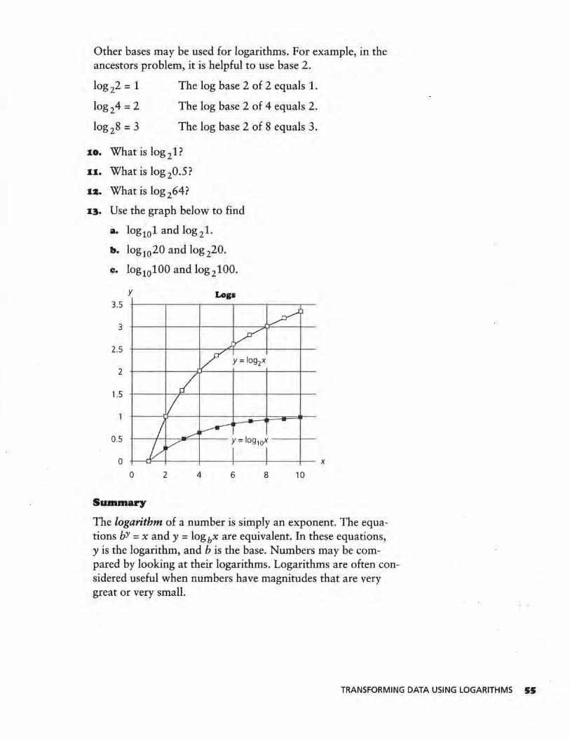
I3. Use the graph below to find
a. log101 and log 21.
b. log1020 and log 220.
c. log10100 and log 2100.
y Logs 3.5
3
2.5
2
1.5
0.5
0
0 2 4 6
Summary
8 10
The logarithm of a number is simply an exponent. The equations bY = x and y = log bx are equivalent. In these equations, y is the logarithm, and bis the base. Numbers may be compared by looking at their logarithms. Logarithms are often considered useful when numbers have magnitudes that are very great or very small.
TRANSFORMING DATA USING LOGARITHMS SS
Practice and Application•
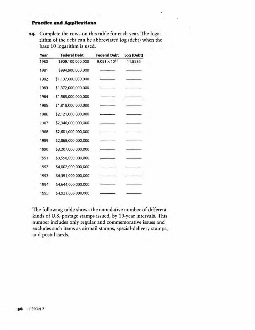
~4. Complete the rows on this table for each year. The loga-rithm of the debt can be abbreviated log (debt) when the base 10 logarithm is used.
Year Federal Debt Federal Debt Log (Debt)
1980 $909, 100,000,000 9.091x10¹¹ 11.9586
1981 $994,900,000,000
1982 $1, 137,000,000,000
1983 $1,372,000,000,000
1984 $1,565,000,000,000
1985 $1,818,000,000,000
1986 $2, 121,000,000,000
1987 $2,346,000,000,000
1988 $2,601,000,000,000
1989 $2,868,000,000,000
1990 $3,207 ,000,000,000
1991 $3,598,000,000,000
1992 $4,002,000,000,000
1993 $4,351,000,000,000
1994 $4,644,000,000,000
1995 $4,921,000,000,000
The following table shows the cumulative number of different kinds of U.S. postage stamps issued, by 10-year intervals. This number includes only regular and commemorative issues and excludes such items as airmail stamps, special-delivery stamps, and postal cards.
S6 LESSON 7
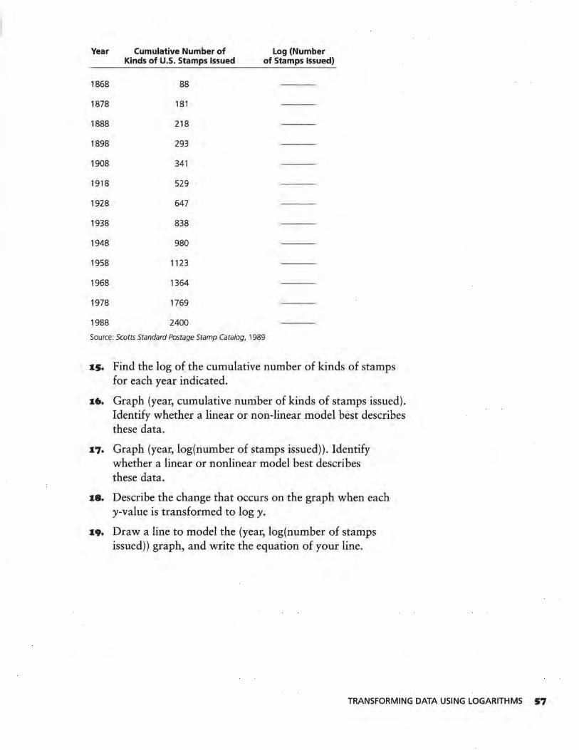
Year Cumulative Number of Log (Number Kinds of U.S. Stamps Issued of Stamps Issued)
1868 88
1878 181
1888 218
1898 293
1908 341
1918 529
1928 647
1938 838
1948 980
1958 1123
1968 1364
1978 1769
1988 2400
Source: Scotts Standard Postage Stamp Catalog, 1989
IS. Find the log of the cumulative number of kinds of stamps for each year indicated.
I6. Graph (year, cumulative number of kinds of stamps issued). Identify whether a linear or non-linear model best describes these data.
•7· Graph (year, log(number of stamps issued)). Identify whether a linear or nonlinear model best describes these data.
I8. Describe the change that occurs on the graph when each y-value is transformed to logy.
x9. Draw a line to model the (year, log(number of stamps issued)) graph, and write the equation of your line.
TRANSFORMING DATA USING LOGARITHMS S7
LESSON 8
Finding an Equation ior Nonlinear Data
How can the application of an inverse function be used to find the model of the original data set?
What physical phenomenon can be modeled using an exponential function?
B alf-life is the amount of time it takes half of a substance to decay. Radioactive materials and other substances are
characterized by their rates of decay, or decrease, and are rated in terms of their half-lives. The half-life of Carbon-14 allows scientists to date fossils. The half-life of a radioactive prescription substance is used to determine how frequently doses should be given.
INVESTIGATE
Half-life can be simulated by the following experiment.
Equipment Needed: cup to shake coins; 100-200 pennies or other coins
Procedure:
S8 LESSON 8
Put the coins into the cup. Shake the coins and pour them out. Remove all coins that land heads up. Record the number of coins removed and the number remaining on a chart like the one on page 59. Repeat this procedure until the number of coins remaining is 3, 2, or 1.
OBJECTIVE
Find the equation of a nonlinear data set using
transformations.
Shake Number
0
2
3
4
5
6
7
8
Number of Coins Removed
0
Discussion and Practice
Number of Coins Remaining
original number
1. The half-life of Carbon-14 is 5730 years. How long would
it take for one gram of Carbon-14 to decay to 116 of a
gram?
z. The volume of a mothball, a small ball of napthalene used as a moth repellent, decreases by about 20% each week. What is the half-life of a mothball?
3. Perform the half-life simulation and record your results.
4. Graph the (shakes, number of coins remaining) ordered pairs from your experiment.
a. Describe the pattern on the graph.
b. Does the graph cross the x-axis? Where? What is the meaning of that point?
s. Approximately what percent of the remaining pennies were removed on each shake? Why? How many shakes represent a half-life for the pennies?
In order to decide what transformation best linearizes a curve, you may have to try more than one transformation.
6. Graph (shakes, square root of number of coins remaining). Draw the straight line that seems to best fit the graph.
FINDING AN EQUATION FOR NONLINEAR DATA S9
7. Graph (shakes, log( number of coins remaining)). Draw a straight line that seems to fit the graph best.
8. Compare the lines you drew for Questions 6 and 7. Which one do you think is better? Why?
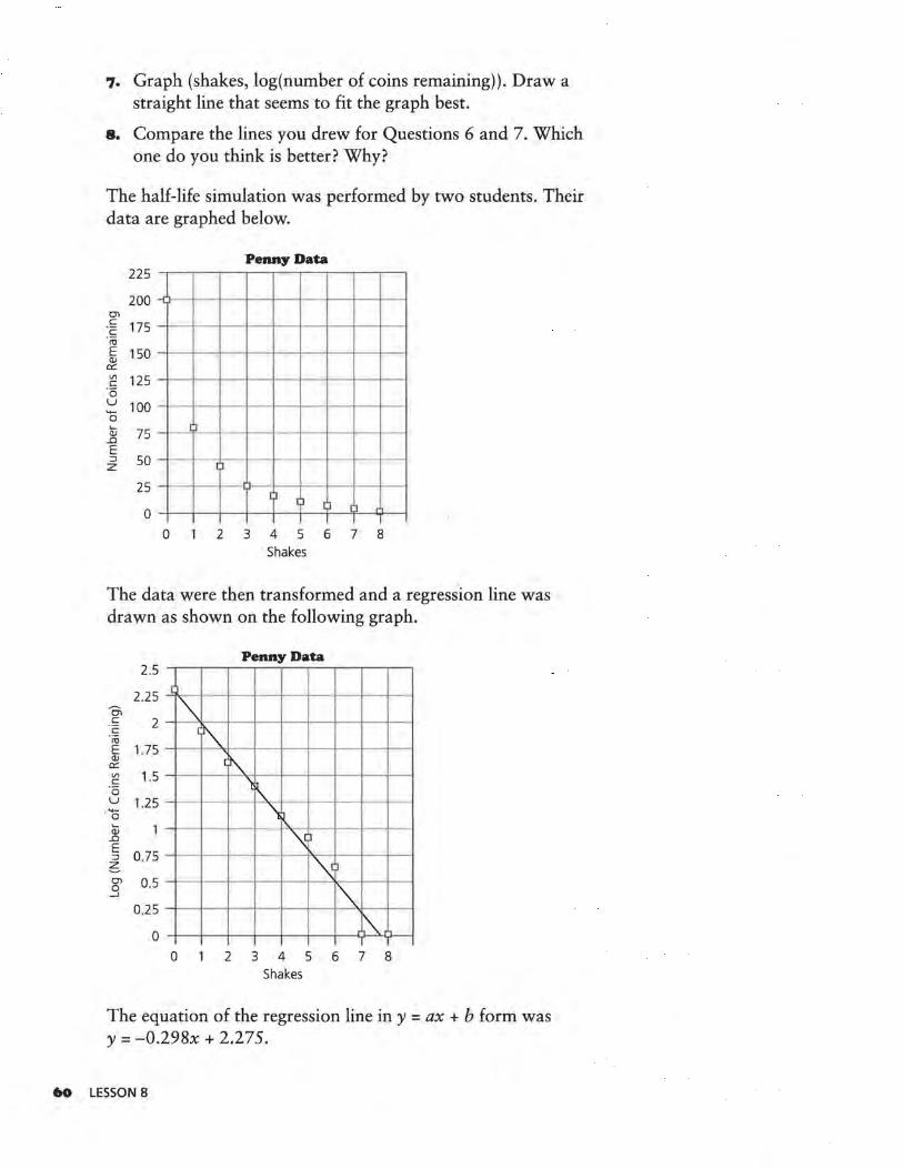
The half-life simulation was performed by two students. Their data are graphed below.
Penny Data 225
200 -O'>
. ~ 175 c:: l1J E 150 QJ er: Vl 125 c::
·5 u 100 '+-0 .....
75 (l) ..Cl
[)
E ::J 50 z 0
25
0 I)
( ] IJ ll
0 2 3 4 5 6 7 8 Shakes
The data were then transformed and a regression line was drawn as shown on the following graph.
Penny Data 2.5
2.25 Oi c:: 2 c:: ·;o E 1.75
[
-~ (~
(l) er: Vl 1.5 c:: ·5 u 1.25 '+-0 Qj
..Cl E 0.75 ::J
6 O'> 0.5 0 --'
0.25
0
- ' 'l' -
\~ ~ )
- - -~)
- - I"' .\. 0 2 3 4 5 6 7 8
Shakes
The equation of the regression line in y = ax + b form was y = -0.298x + 2.275.
60 LESSON 8
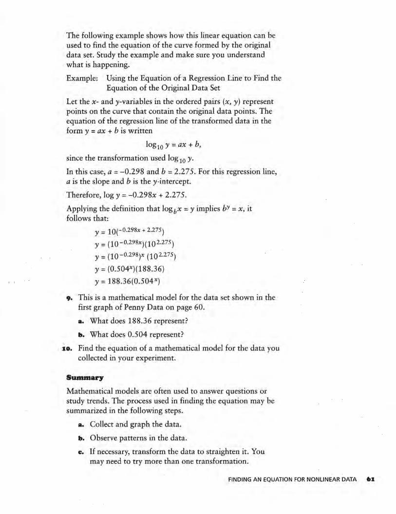
The following example shows how this linear equation can be used to find the equation of the curve formed by the original data set. Study the example and make sure you understand what is happening.
Example: Using the Equation of a Regression Line to Find the Equation of the Original Data Set
Let the x- and y-variables in the ordered pairs (x, y) represent points on the curve that contain the original data points. The equation of the regression line of the transformed data in the form y = ax + b is written
log10 y = ax + b,
since the transformation used log 10 y.
In this case, a= -0.298 and b = 2.275. For this regression line, a is the slope and bis they-intercept.
Therefore, logy= -0.298x + 2.275.
Applying the definition that logbx = y implies bY = x, it follows that:
y = 10(-0.298x + 2.275)
y = (10-0.298x)(102.275)
y = (10-0.298)x (102.275)
Y: (0.504X)(188.36)
Y: 188.36(0.504X)
9. This is a mathematical model for the data set shown in the first graph of Penny Data on page 60.
a. What does 188.36 represent?
b. What does 0.504 represent?
10. Find the equation of a mathematical model for the data you collected in your experiment.
Summary
Mathematical models are often used to answer questions or study trends. The process used in finding the equation may be summarized in the following steps.
a. Collect and graph the data.
b. Observe patterns in the data.
c. If necessary, transform the data to straighten it. You may need to try more than one transformation.
FINDING AN EQUATION FOR NONLINEAR DATA 61
d. Plot the transformed data and draw a linear regression line.
e. Use the equation of the regression line to find an equation of the original data set.
When a logarithmic transformation straightens a function, the function is an exponential function.
Practice and Applications
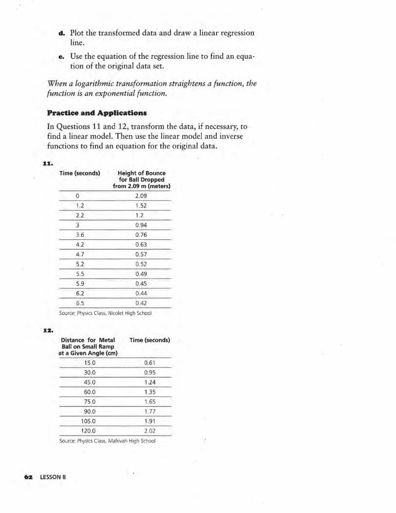
In Questions 11 and 12, transform the data, if necessary, to find a linear model. Then use the linear model and inverse functions to find an equation for the original data.
11.
Time (seconds) Height of Bounce for Ball Dropped
from 2.09 m (meters)
0 2.09
1.2 1.52
2.2 1.2
3 0.94
3.6 0.76
4 .2 0 .63
4.7 0.57
5.2 0.52
5.5 0.49
5.9 0.45
6.2 0.44
6.5 0.42
Source: Physics Class, Nicolet High School
12.
Distance for Metal Time (seconds) Ball on Small Ramp
at a Given Angle (cm)
15.0 0.61
30.0 0.95
45.0 1.24
60.0 1.35
75.0 1.65
90.0 1.77
105.0 1.91
120.0 2.02
Source: Physics Class, Mahivah High School
•2 LESSON 8
LESSON 9
·aesiduals
What are residuals?
What do residuals reveal about the model?
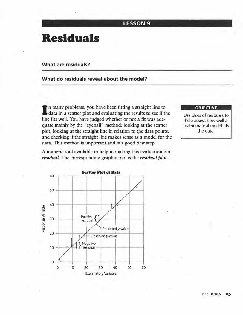
I n many problems, you have been fitting a straight line to data in a scatter plot and evaluating the results to see if the
line fits well. You have judged whether or not a fit was adequate mainly by the "eyeball" method: looking at the scatter plot, looking at the straight line in relation to tpe data points, and checking if the straight line makes sense as a model for the data. This method is important and is a good first step.
A numeric tool available to help in making this evaluation is a residual. The corresponding graphic tool is the residual plot.
Scatter Plot of Data
30 -1---1
Predicted y-value 20 --t-~~+-~-A-~~---~~..._~~~~~-1
Observed y-value
0 10 20 30 40 50 60
Explanatory Variable
OBJECTIVE
Use plots of residuals to help assess how well a
mathematical model fits the data.
RESIDUALS 63
The residual may be calculated for each point in a data set. It is the difference between the actual or observed y-value and the predicted y-value found by using the mathematical model:
residual = observed y-value - predicted y-value from the model
Using symbols, r; = Y; - (a+ bx;)·
INVESTIGATE
A fit, or predicted value, in the form a+ bx; may be described by the symbol Y;, read "y-hat sub i"; Y; =a + bx;:
residual; = res; = Y; - Y; Also, observed data = fit + residual:
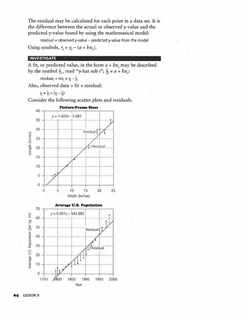
Y; = Y; + (Y; - y;) Consider. the following scatter plots and residuals.
Picture-Frame Sizes 40
I I Y= 1.425x-0.681
35
30
- - 7 ~ Vl OJ
..c
-- -- -RTsidual{ /! / 25 u
c = ..c. +-' 20 Ol
~esidual_ c (JJ -l
15 / fl
10
5
0
/
-7 v 0 5 10 15 20 25
Width (inches)
Average U.S. Population
= y= 0.301x- ~43 . 682 E 60 -1---i----+----1---.. - ---1
.... OJ 50 -l---jf-------3-c .g 40 -l---jl------f---/-1---l ro ::; Q_
~ 30 -1---i----+----+-k
l/)
::i 20 -+---·!----+--,,..., ·l-l"----+----1 OJ Ol ~
~ 10 -1----;
1750
64 LESSON 9
1950 2000
Year

When actual data are collected, a mathematical model generally does not fit them perfectly. It is not expected that the residuals' sum will be exactly zero. The residuals should, however, represent random variation of the data from the fitted model, some above and some below the horizontal line.
While residuals can be observed in an original scatter plot; it is sometimes helpful to make a separate plot of them to see if they form a pattern. You can do this by graphing (x;, Y; - yi) = (x;, res;), which is called a residual plot or plot of residuals . against the explanatory variable x. In a good model, the residuals should exhibit a random pattern.
Consider the residual plots for the previous two graphs.
3
2
V1
~ ::::l
0 " ·v; (])
0:::
- 1
-2
-3
15
10
~ 5 <ti ::::l
" ·v; (])
0::: 0
-5
Residual Plot for Picture-Frame Sizes
0
II
a a 1i
D D
--
D
5 10 15 20 Width (inches)
Residual Plot for Average U.S. Population
D
I)
D D
o n I~
Ca
u OD
II
D DD
D
a
25
a
D
-10
1750 1800 1850 1900 1950 2000 Year
RESIDUALS 6S
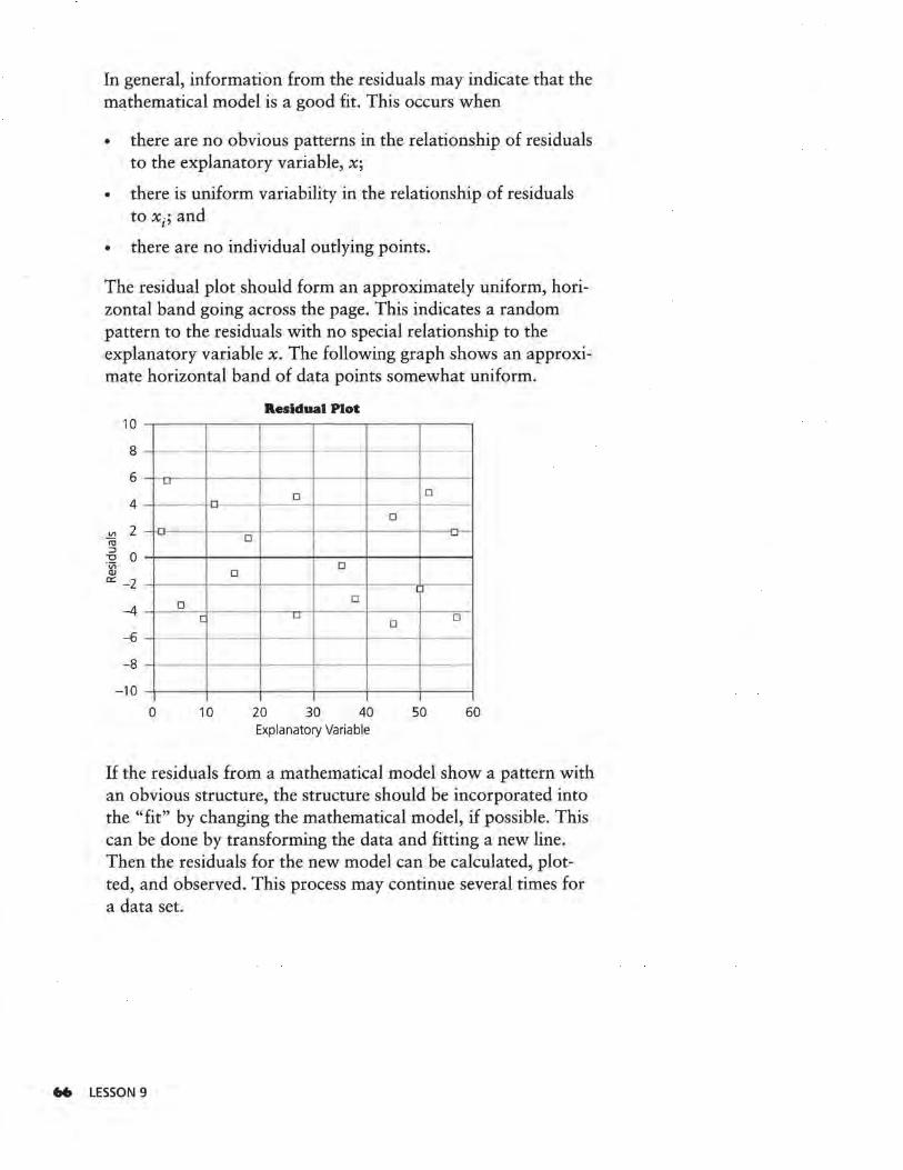
In general, information from the residuals may indicate that the mathematical model is a good fit. This occurs when
• there are no obvious patterns in the relationship of residuals to the explanatory variable, x;
• there is uniform variability in the relationship of residuals to x;; and
• there are no individual outlying points.
The residual plot should form an approximately uniform, horizontal band going across the page. This indicates a random pattern to the residuals with no special relationship to the explanatory variable x. The following graph shows an approximate horizontal band of data points somewhat uniform.
10
8
6
4
~ 2 ru
-6 0 ·v; CIJ c:: -2
-4
-6
-8
-10
-
- LI
.
- ·0-D
D
D [
0 10
Residual Plot
,_ - - -
D D
D -
D
l ) D
LI D D
20 30 40 50 60 Explanatory Variable
If the residuals from a mathematical model show a pattern with an obvious structure, the structure should be incorporated into the "fit" by changing the mathematical model, if possible. This can be done by transforming the data and fitting a new line. Then the residuals for the new model can be calculated, plotted, and observed. This process may continue several times for a data set.
66 LESSON 9
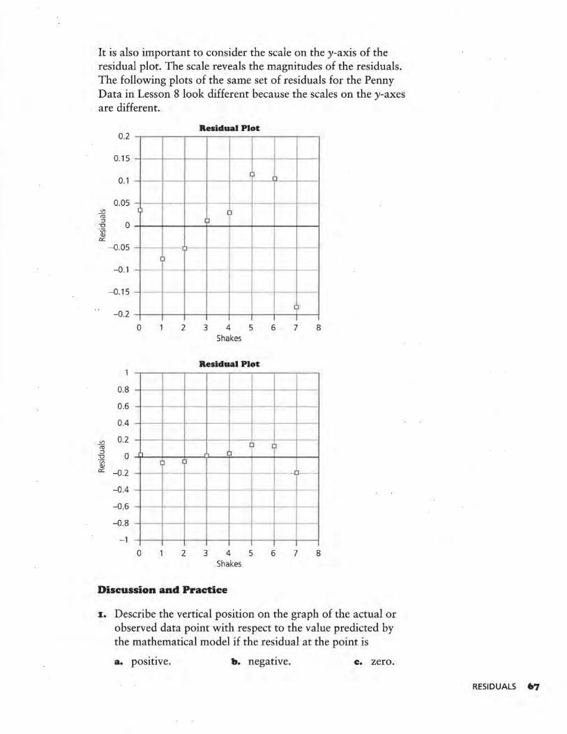
It is also important to consider the scale on the y-axis of the residual plot. The scale reveals the magnitudes of the residuals. The following plots of the same set of residuals for the Penny Data in Lesson 8 look different because the scales on the y-axes are different.
0.2
0.15
0.1
0.05 "' m ~ :::J
0 "O ·v; Q)
er: -0.05
-0.1 - -
-0.15
-0.2
0
0.8
0.6
0.4
"' 0.2 m :::J
0 "O ·v; ,.,
Q) er: -0.2 -
-0.4
-0.6
-0.8
-1
0
J
~
-
2
~ [J
2
Residual Plot
~-
I~
)
Cl
3
--
4 Shakes
5
Residual Plot
3
[)
!'I
--,_
4 Shakes
5
Discussion and Practice
1
ll
6 7 8
~
-·-ll
- -1 l--
6 7 8
~. Describe the vertical position on the graph of the actual or observed data point with respect to the value predicted by the mathematical model if the residual at the point is
a. positive. b. negative. c. zero.
RESIDUALS 67

..
z. Describe at least two mathematical ways you could summarize the residuals for a mathematical model on a data set.
3. What patterns do you observe on the residual plot for Picture-Frame Sizes?
Residual Plot for Picture-Frame Sizes 3
0
2 - - - - - Cl
- --o Vl
-;u D 1 l
:i
" 0 ·v; OJ er. DD
- 1 0
-2 u
0 -3
0 5 10 15 20 25 Width (inches)
4. You have seen several graphs and the residual plot for the Average U.S. Pop~lation. The data set for these plots is given below.
Year Average U.S. Population (per sq. mi)
1790 4.5
1800 6.1
1810 4.3
1820 5.5
1830 7.4
1840 9.8
1850 7.9
1860 10.6
1870 10.9
1880 14.2
1890 17.8
1900 21.5
1910 26.0
1920 29.9
1930 34.7
1940 37.2
1950 42 .6
1960 50.6
1970 57.5
1980 64.0
Source: World Almanac and Book of Facts, 1988
LESSON 9
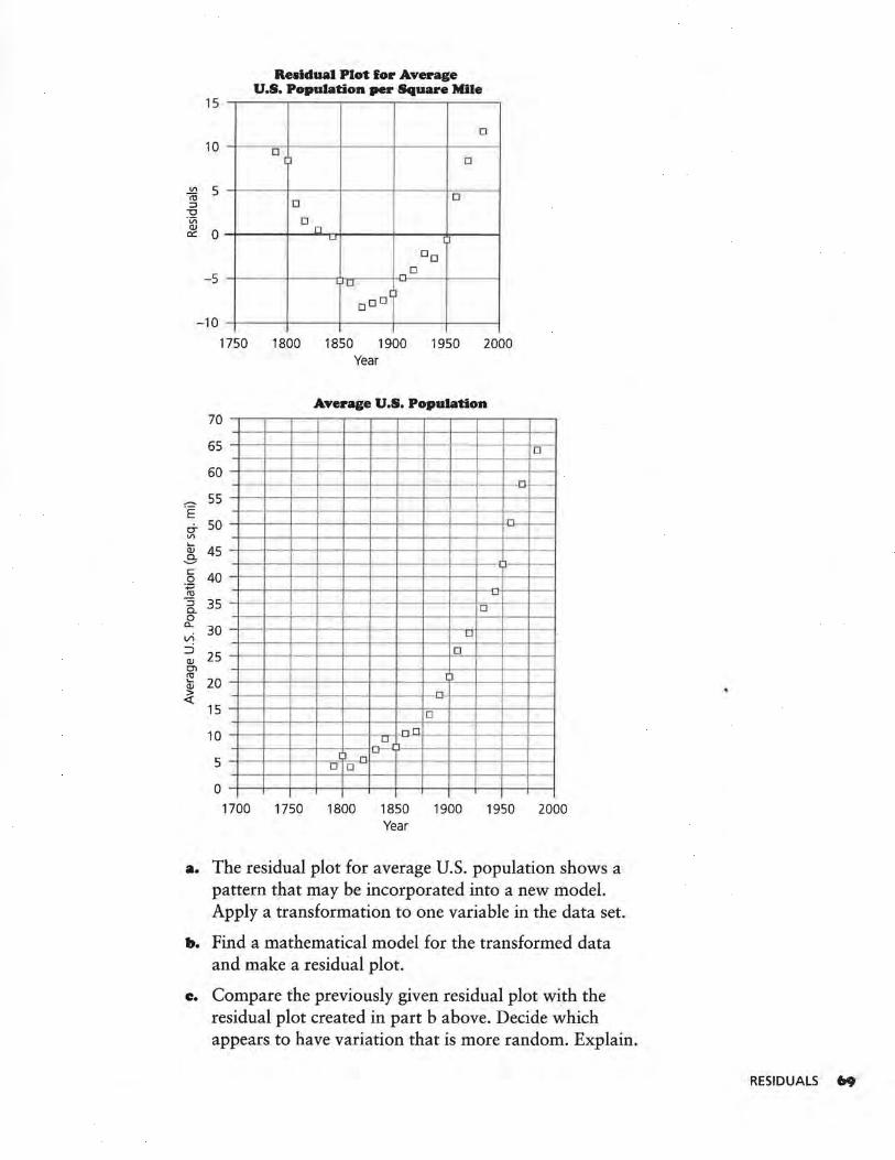
15
10
-5
Residual Plot for Average U.S. Population per Square Mile
D
D J D
a D
D n
LJ I J
DD
D D
a DD J
-10
~
E 0-VI ..... QJ
.3-c 0
·.;::::; ro
::; c. 0
a...
vi ::i QJ Ol ~ QJ
-?i
1750 1800 1850 1900 1950 2000 Year
70
65
60
55
50
45
40
35
30
25
20
15
10
5
0
Average U.S. Population
D -
.n
D - I-
- ,_
0-
D
D
D ,_
I J
-D
nD
~
_o [~ .... ~
- D D
1700 1750 1800 1850 1900 1950 2000 Year
a. The residual plot for average U.S. population shows a pattern that may be incorporated into a new model. Apply a transformation to one variable in the data set.
b. Find a mathematical model for the transformed data and make a residual plot.
c. Compare the previously given residual plot with the residual plot created in part b above. Decide which appears to have variation that is more random. Explain.
RESIDUALS 69
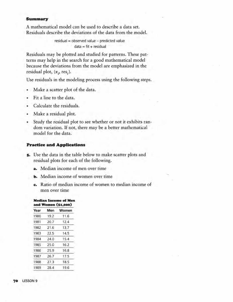
70
Summary
A mathematical model can be used to describe a data set. Residuals describe the deviations of the data from the model.
residual = observed value - predicted value
data = fit + residual
Residuals may be plotted and studied for patterns. These patterns may help in the search for a good mathematical model because the deviations from the model are emphasized in the residual plot, (x;, res;).
Use residuals in the modeling process using the following steps.
• Make a scatter plot of the data.
• Fit a line to the data.
• Calculate the residuals.
• Make a residual piot.
• Study the residual plot to see whether or not it exhibits random variation. If not, there may be a better mathematical model for the data.
Practice and Applications
s. Use the data in the table below to make scatter plots and residual plots for each of the following.
a. Median income of men over time
b. Median income of women over time
e. Ratio of median income of women to median income of men over time
Median lneome ol Men and Women ($1,000)
Year Men Women
1980 19.2 11.6
1981 20.7 12.4
1982 21.6 13.7
1983 22.5 14.5
1984 24.0 15.4
1985 25.0 16.2
1986 25.9 16.8
1987 26.7 17.5
1988 27.3 18.5
1989 28.4 19.6
LESSON 9
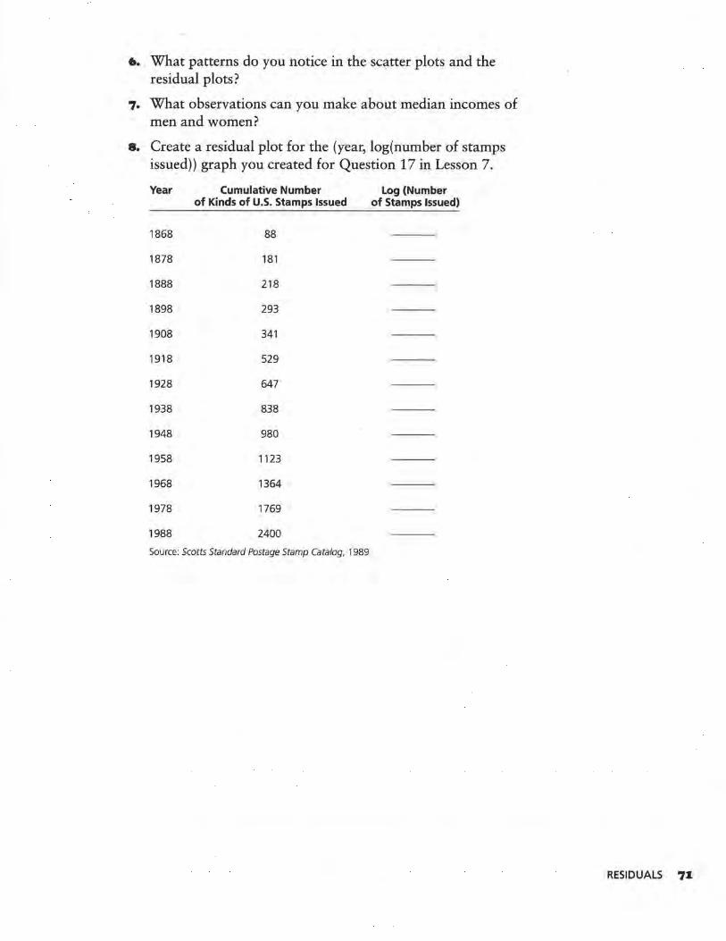
6. What patterns do you notice in the scatter plots and the residual plots?
7. What observations can you make about median incomes of men and women?
8. Create a residual plot for the (year, log(number of stamps issued)) graph you created for Question 17 in Lesson 7.
Year Cumulative Number Log (Number of Kinds of U.S. Stamps Issued of Stamps Issued)
1868 88
1878 181
1888 218
1898 293
1908 341
1918 529
1928 647
1938 838
1948 980
1958 1123
1968 1364
1978 1769
1988 2400
Source: Scotts Standard Postage Stamp Catalog, 1989
RESIDUALS 71
LESSON 10
Correlation: r and r2
What is correlation?
What additional information do rand r2 provide regarding the fit of a model?
A numerical component in the analysis of how models fit data is correlation. Correlation is a measure of the
strength of a linear relationship, or how tightly the points are packed around a straight line. The correlation coefficient is represented by the symbol r. The square of the correlation coefficient, represented by r2, also has a useful interpretation. The correlation coefficient r or its square, r2, is often included in a statistical analysis with a least-squares line for a set of data. The formula for finding r is generally programmed into a graphing calculator, and a calculator can be used to quickly and easily find r for any pair of variables. On the TI-83, for instance, r can be made to appear on the screen when the leastsquares linear regression line is calculated.
The correlation coefficient may be useful in assessing how well a mathematical model fits a set of data. It is important to understand what the correlation coefficient measures, what it does not measure, how it can be interpreted, its properties, and its limitations. These topics will be investigated in this lesson.
Taken together, residual plots and the correlation coefficient can help assess how well a linear mathematical model fits a data set. These two mathematical tools also help in the selection of an appropriate model for a given data set.
7Z LESSON 10
OBJECTIVE
Use the correlation coefficient and the
square of the correlation coefficient along with residual plots to help
assess how well a mathematical model
fits a data set.
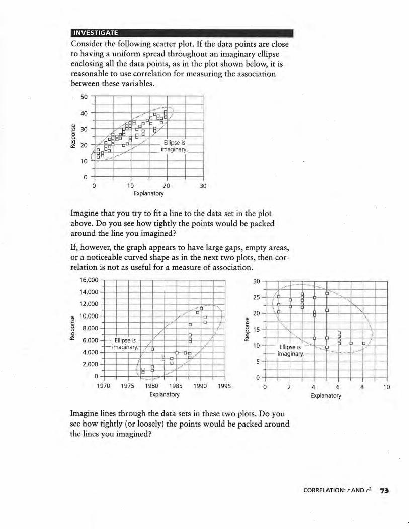
INVESTIGATE
Consider the following scatter plot. If the data points are close to having a uniform spread throughout an imaginary ellipse enclosing all the data points, as in the plot shown below, it is reasonable to use correlation for measuring the association between these variables.
50
...... · ·· · ·~· ... ; 40 __,_ ______ _,,___ . _ ___ _,
.... ····· hoBoE / QJ --~9
0o tJ ~/
[ 30 .· .·o:~~; --B~ .~r-.___,.___, "' / o 0 0 ~c ..... ·· Ellipse is _ _ ~ 20 .:o Elg u_ ... ····· imaginary.
( .l:l 0 .:.· · .. ... · · -····-· -
10
0 -+----+---------+----+---!
0 10 20 30 Explanatory
Imagine that you try to fit a line to the data set in the plot above. Do you see how tightly the points would be packed around the line you imagined?
If, however, the graph appears to have large gaps, empty areas, or a noticeable curved shape as in the next two plots, then correlation is not as useful for a measure of association.
16,000 -r---~~-~---.--....----.--..----r---I----+--•--- - ... - ·~ · .... · · ·· · · ~ ·
.~ · · ······· 14, 000 -l--____,f---l---+--l--1--+----+--+---1-- ····· ··. .·•• 25 -1-_,_.l-'--=
1
!:-- l- ~1--1----o_..,,,-•. 1 I---+----+-
12' 000 -1--____,f---t----i·--!---t--+---+-.--.··+-·:i'=·· ,..,\.,-.. -.. ~·· D
~ 10,000 --+--+--•----•--t---+--t---+-~~ +--+-1 c 0 c_ Vl QJ
0:::
8,000 _ ,____ µ ... r .. ···
.··· , .·· 6,000 - - ·· Ellipse is -l---.l'--1--1--~1--+--. ..,.,. _, _ _
-~ imaginary ... -,...~/.._1 i--------... .__,_ 4, 000 -+-- r--r----+,__+---+-O--D./-t-l---1-
-1--+-·l---.l--l--~r ~ -~L~ .... ~--t--n .-· 2, 000 ....._ ____ _,_.__,.__,_....._......,_.__._-+-__,,_ -+---+-·l-"-1:1.n!:!-D--I ~··-· -+--!--!--\ ·o 7 0 -+---<I---+--'+--+--...--+--+--+---+--< ........... ..
1970 1975 1980 1985 1990 1995 Explanatory
20 - ~·-r.~-1
+----t--1o1~-,__P1--t---t-····~·"t. ,-----1--1
~ \ c ... ~ 15 -1----1-·· · ·~~---i·--+---+-·l---<--+--;-+--1 ~ '··.. IJ
0::: .... . .-·~· ] ::i / 10 - - Ellipse is ····--. ~ ···
-~ imaginary. - -~· =··=····::·c ·;__···_···_,_· _ _,_____,
5 -1---1--1----t--+----+- +---+-+---+--1
O-t---1--1----t--+----+-+---+-+--+----1
0 2 4 6 8 10 Explanatory
Imagine lines through the data sets in these two plots. Do you see how tightly (or loosely) the points would be packed around the lines you imagined?
CORRELATION: r AND r 2 73
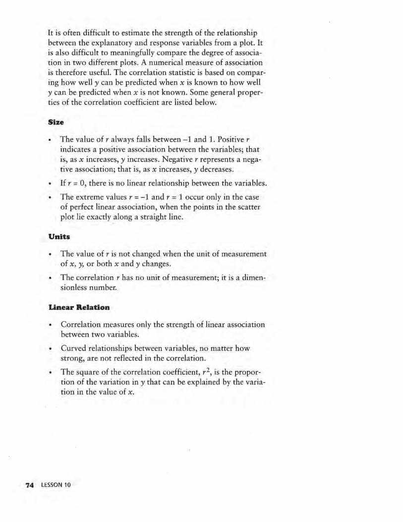
It is often difficult to estimate the strength of the relationship between the explanatory and response variables from a plot. It is also difficult to meaningfully compare the degree of association in two different plots. A numerical measure of association is therefore useful. The correlation statistic is based on comparing how well y can be predicted when x is known to how well y can be predicted when x is not known. Some general properties of the correlation coefficient are listed below.
Size
• The value of r always falls between -1 and 1. Positiver indicates a positive association between the variables; that is, as x increases, y increases. Negative r represents a negative association; that is, as x increases, y decreases.
• If r = 0, there is no linear relationship between the variables.
• The extreme values r = -1 and r = 1 occur only in the case of perfect linear association, when the points in the scatter plot lie exactly along a straight line.
Units
• The value of r is not changed when the unit of measurement of x, y, or both x and y changes.
• The correlation r has no unit of measurement; it is a dimensionless number.
Linear Relation
• Correlation measures only the strength of linear association between two variables.
• Curved relationships between variables, no matter how strong, are not reflected in the correlation.
• The square of the correlation coefficient, r 2, is the proportion of the variation in y that can be explained by the variation in the value of x.
74 LESSON 10
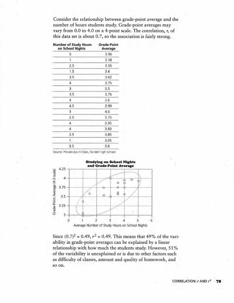
Consider the relationship between grade-point average and the number of hours students study. Grade-point averages may vary from 0.0 to 4.0 on a 4-point scale. The correlation, r, of this data set is about 0. 7, so the association is fairly strong.
Number of Study Hours Grade-Point on School Nights Average
5 3.96
1 3.38
2.5 3.55
1.5 3.6
3.5 3.62
4 3.75
3 3.5
3.5 3.75
4 3.6
4.5 3.99
3 4 .0
2.5 3.75
4 3.95
4 3.83
3.5 3.85
3.05
3.5 3.6
Source: Precalculus H Class, Nicolet High School
Stu~ying on School Nights
~ 4.25 cu
and Grade-Point Average
-~ · · ·········· u Vl
0 4 ± QJ
D ~/ D ; .. --· ·--3.75 O'l
~
.. ~·"' __________ _,___0~~·~·11--->---~1
..... ...-o 0
B :i .......... / QJ
~ 3.5 +-' c ·a a...
3.25 I QJ
-0 cu .._ l!J 3
--<---......... ---o--~-t l·---t--•• -.... · ••• [)
\ ., I) ······
0 2
~·· · . ~ .·· .... ··
3 4 5 Average Number of Study Hours on School Nights
6
Since (0.7)2 = 0.49, r 2 = 0.49. This means that 49% of the variability in grade-point averages can be explained by a linear relationship with how much the students study. However, 51 % of the variability is unexplained or is due to other factors such as difficulty of classes, amount and quality of homework, and so on.
CORRELATION: r AND r 2 7S
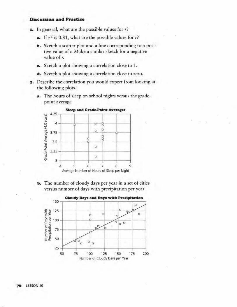
Discussion and Practice
1. In general, what are the possible values for r?
a. If r2 is 0.81, what are the possible values for r?
b. Sketch a scatter plot and a line corresponding to a positive value of r. Make a similar sketch for a negative value of r.
c. Sketch a plot showing a correlation close to 1.
d. Sketch a plot showing a correlation close to zero.
z. Describe the correlation you would expect from looking at the following plots.
a. The hours of sleep on school nights versus the gradepoint average
Sleep and Grade-Point Averages
~ 4.25 co u "' 0 4 ±
I ) LI ~
Q)
O'I 3.75 ~
D I
Q) ~
~ 3.5 +-'
,.J Jo
c "(5 D a...
3.25 I Q)
"O ~ D
\;.'.) 3
4 5 6 7 8 9 Average Number of Hours of Sleep per Night
b. The number of cloudy days per year in a set of cities versus number of days with precipitation per year
76 LESSON 10
Cloudy Days and Days with Precipitation
"' ,__ ~ ~ 100 -l-----l---.Y----1--,..r-.___~f----1 Oc
a·.8 ..... co 75 ~----l---..J-~-..i:=---l-----11---------< Q) .-t=
..Cl Cl. E"Ci ~ ~ 50 -1----.Y"---!-------4---....._-~---I
50 75 100 125 150 175 200 Number of Cloudy Days per Year
Correlation and Cause and Effect
People often confuse correlation with cause and effect. Just because two variables are correlated does not mean that one causes the other.
• They could both be a function of some other cause, • one could cause the other, or • the relationship could be purely coincidental.
Consider the relation between overall grade-point averages and grades in Engli~h. The association is probably strong, but English grades alone do not cause high grade-point averages; other courses contribute also. The association between gradepoint average and hours of study is high, and it is reasonable to assume that the time spent studying is a primary cause of grade-point averages. The correlation between grade-point averages and SAT scores is strong, but neither variable causes the other. A good SAT score does not cause high grade-point averages.
Sometimes the relationship occurs purely by chance. It could happen that the correlation between grade-point averages and the distances students live from school is strong. It seems unlikely that all the good students live the same distance from school. Much more reasonable is the assumption that the connection is coincidental, and there is no real link between distance from school and grade-point average.
There are several different kinds of correlation and different procedures for finding correlation between variables. The correlation coefficient described here is called Pearson's r, and it is the most commonly used type of correlation.
Summary
The linear association between two variables can be measured by a number r called the correlation coefficient. If there is a perfect positive correlation, r = 1; if there is a perfect negative correlation, r= -1. A positive correlation indicates that as one variable increases, the other also tends to increase; while a negative correlation indicates that as one variable increases, the other tends to decrease.
If r is close to zero, then there is no good linear prediction of one variable from the other; that is, knowing the value of one does not help you predict the other using a linear model.
CORRELATION: r AND r 2 77
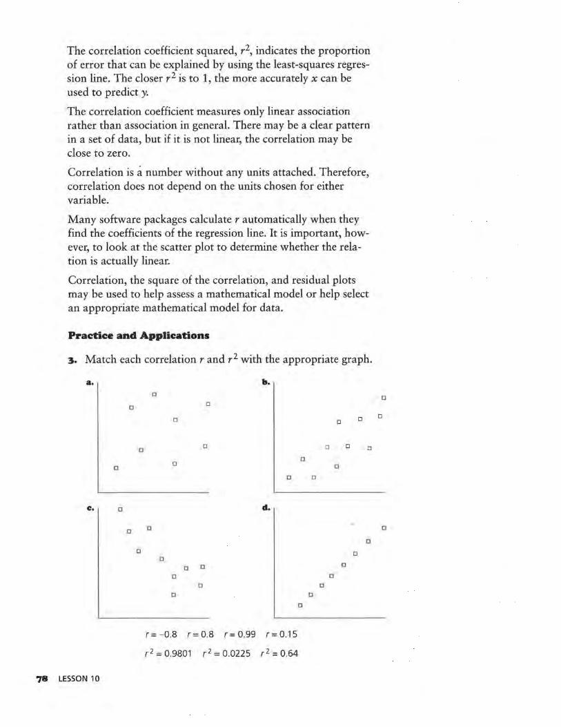
The correlation coefficient squared, r 2, indicates the proportion of error that can be explained by using the least-squares regression line. The closer r2 is to 1, the more accurately x can be used to predict y.
The correlation coefficient measures only linear association rather than association in general. There may be a clear pattern in a set of data, but if it is not linear, the correlation may be close to zero.
Correlation is a number without any units attached. Therefore, correlation does not depend on the units chosen for either variable.
Many software packages calculate r automatically when they find the coefficients of the regression line. It is important, however, to look at the scatter plot to determine whether the relation is actually linear.
Correlation, the square of the correlation, and residual plots may be used to help assess a mathematical model or help select an appropriate mathematical model for data.
Practice and Applications
3. Match each correlation rand r 2 with the appropriate graph.
a.
0
0
D
Clo D
[J
78 LESSON 10
b. 0
D
[J
D
[J
D
d.
D
0
D Cl
Cl
D
D
r = -0.8 r = 0.8 r = 0.99 r = 0. 15
r 2 =0.9801 r 2 =0.0225 r 2 =0.64
D D
D D D
D D
D
D
[J
D
D
0
D
D
0
D
D
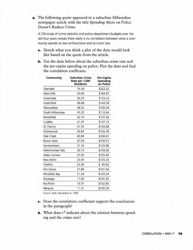
4. The following quote appeared in a suburban Milwaukee newspaper article with the title Spending More on Police Doesn't Reduce Crime.
A CNI study of crime statistics and police department budgets over the
last four years reveals there really is no correlation between what a com-
munity spends on law enforcement and its crime rate.
a. Sketch what you think a plot of the data would look like based on the quote from the article.
b. Use the data below about the suburban crime rate and the per-capita spending on police. Plot the data and find the correlation coefficient.
Community Suburban Crime Per-Capita Rate per 1,000 Spending
Residents on Police
Glendale 74.39 $222 .25
West Allis 50.43 $164.47
Greendale 50.25 $123.43
Greenfield 48.68 $143 .59
Wauwatosa 48.52 $150.34
South Milwaukee 43.20 $110.64
Brookfield 42.16 $131.42
Cudahy 41.47 $137.12
St. Francis 41.32 $144.84
Shorewood 40.84 $156.39
Oak Creek 40.84 $160.41
Brown Deer 37.09 $150.57
Germantown 31.16 $125.86
Menomonee Falls 29.73 $159.28
Hales Corners 27.04 $155 .40
New Berlin 25.45 $125.33
Franklin 23.09 $ 94.92
Elm Grove 21.86 $191 .64
Whitefish Bay 21.28 $120.34
Muskego 17.00 $105 .35
Fox Point 15.07 $132 .. 85
Mequon 11.31 $136.39
Source: Hub, November 4, 1993
c. Does the correlation coefficient support the conclusions in the paragraph?
d. What does r2 indicate about the relation between spend-ing and the crime rate?
CORRELATION: r AND r 2 79
LESSON 11
Developing a Mathematical Model
What is a mathematical model?
What mathematical concepts can be used to determine the best model for a given data set?
T he Tree Growers Association has collected data about the ages of chestnut oak trees and their respective trunk sizes
as measured by diameter. The Association would like to know if there is an optimum time to harvest the trees.
INVESTIGATE
Because of your ability to develop mathematical models, you have been selected to prepare a report to be delivered at the next monthly meeting of the Tree Growers Association. Your task in this lesson includes two assignments.
• Find a mathematical model for the relationship between age and the size of the diameter of chestnut oak tree trunks using the data on page 81.
• Prepare a report that explains how you developed the model.
Your model will be used to help determine an optimum time to harvest the trees.
80 LESSON 11
OBJECTIVE
Use the knowledge of transformations,
logarithms, residuals, and correlation to develop a
mathematical model.
Chestnut Oak Trees
Age (years) Trunk Diameter (inches)
4 0.8
5 0.8
8 1
8 2
8 3
10 2
10 3.5
12 4.9
13 3.5
14 2.5
16 4.5
18 4.6
20 5.5
22 5.8
23 4.7
25 6.5
28 6
29 4.5
30 6
30 7
33 8
34 6.5
35 7
38 5
38 7
40 7.5
42 7.5
Source: Elements of Forest Mensuration, Chapman and Demerritt
Discussion and Practice
I. Identify any patterns you observe when looking at the two columns of data individually. Consider the amount of increase within a column and the range of values.
s. Does the increase in diameter appear to be constant as age increases?
3. What patterns do you notice in the dependence between variables?
DEVELOPING A MATHEMATICAL MODEL 8I
4. The Tree Growers Association reported they had recorded when the oak trees were planted; this fact made the data on their ages available. Determine the explanatory variable and the response variable for the data set. This identification will assist in determining the order in the ordered pairs.
Plot the Data
s. Enter the data into a graphing utility and draw a scatter plot. Write a short paragraph to identify the characteristics of the scatter plot.
6. Does a linear model fit the data?
a. Draw a straight line that fits the scatter plot.
b. Observe whether the line captures the characteristics you identified. Support your claim with a written argument.
Transform the Data to Straighten the Scatter Plot
To help you decide what transformations may straighten the data,
• use your knowledge of graph patterns for different functions, and
• consider what you know about the relationship between the explanatory and response variables.
7. Identify at least two transformations that you think will straighten the scatter plot of the original data set. Write a short paragraph explaining why you chose those transformations and to which variables you would apply them.
8. Make a scatter plot of each set of transformed data you think appears linear when graphed. Label the axes properly.
9. Use appropriate technology to draw the linear regression line on each graph. Then find and record the equation for each regression line and the correlation coefficient.
8Z LESSON 11
xo. Use the lines you chose to predict the diameter of a tree for these specific ages.
a. 33 years
b. 21 years
c. 60 years
Compare One Transformation to Another
In order to determine which transformation is better, it is helpful to consider two different statistical tools: residuals and correlation.
Following are some questions to consider when looking at the plots of residuals. .
• Do the residuals reveal a pattern that can be used to predict the error? If so, the line may not be considered a good fit for the data. It is better to have a random distribution of points.
• Do one or more of the data points have more influence that they should on the regression line? If so, examine the data points again.
• Do the residuals have a narrow vertical spread at one end of the plot and a wider spread at the other end? It is better to have a constant variation in the spread across the values of the explanatory variable (domain).
xx. Use appropriate technology to draw residual plots for two of the scatter plots and lines you drew in Questions 8 and 9. Then discuss the three questions above for your residual plots. ·
xz. Compare the correlation coefficients and the squares of the correlation coefficients for the lines you drew in Questions 8 and 9. Explain what they tell you about the data and the mathematical model.
x3. Use what you learned by looking at residuals and correlation to choose a mathematical model for the oak trees data set.
DEVELOPING A MATHEMATICAL MODEL 83
Find a Model lor the Ori&inal Data Set
I4. Use the model you selected in Question 13. Rewrite each equation replacing the explanatory and response variables with the transformed variables. Remember that this equation is linear.
IS. Use your knowledge of algebra and inverse functions to find a mathematical model for the original data set.
I6. Graph the chestnut oak trees data and your model on the same graph. Describe your observations.
Interpret Results and Write a Summary
I7. Write a summary report. Include the following.
a. A summary of how you determined your model.
b. A model (function) for the original data set.
c. A graph that contains the original data set and the model.
d. Your recommendation for the Tree Growers Association.
Swnmary
Process for Finding a Mathematical Model
• Study the data and identify patterns.
• Make a scatter plot of the data and examine the plot for any patterns.
• Look for functional relationships and try one or more transformations to straighten the scatter plot. Find linear models for the transformed data.
• Use residuals and correlation to assist in determining the best transformation for linearizing the data.
• Use your knowledge of transformations and functions to generate a model of the original data set.
• Interpret the results and write a summary of your findings.
84 LESSON 11
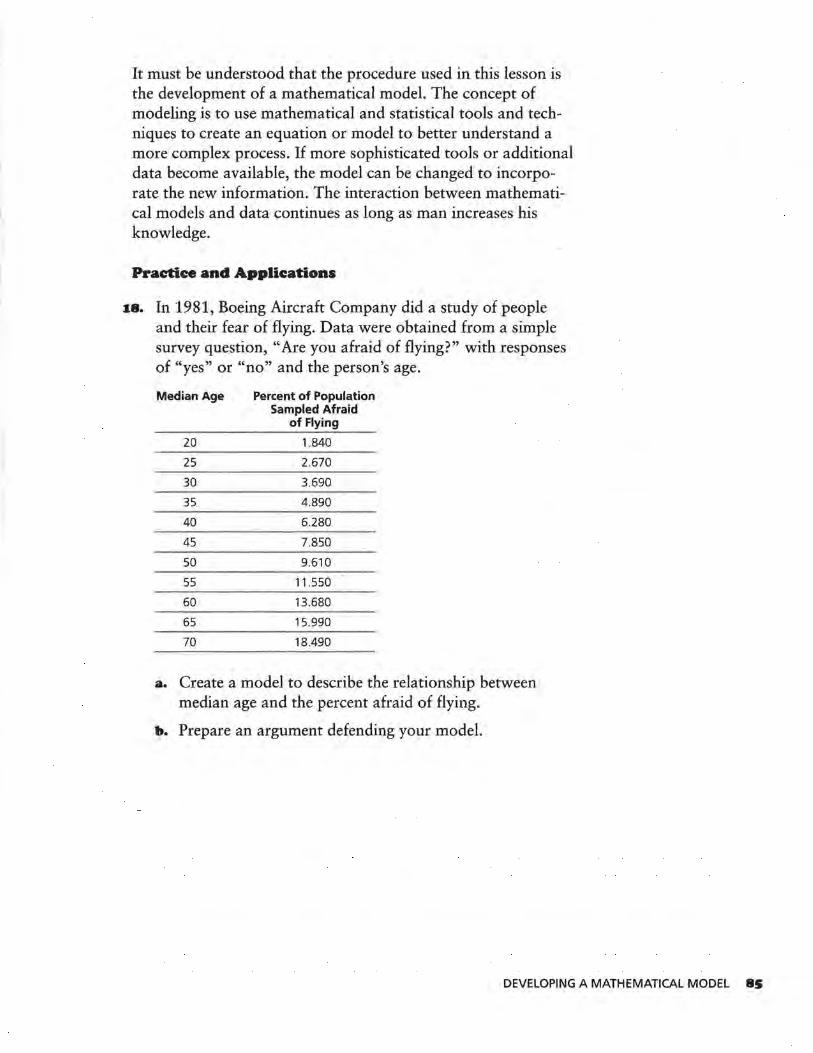
It must be understood that the procedure used in this lesson is the development of a mathematical :model. The concept of modeling is to use mathematical and statistical tools and techniques to create an equation or model to better understand a more complex process. If more sophisticated tools or additional data become available, the model can be changed to incorporate the new information. The interaction between mathematical models and data continues as long as man increases his knowledge.
Practice and Applications
18. In 1981, Boeing Aircraft Company did a study of people and their fear of flying. Data were obtained from a simple survey question, "Are you afraid of flying?" with responses of "yes" or "no" and the person's age.
Median Age Percent of Population Sampled Afraid
of Flying
20 1.840
25 2.670
30 3.690
35 4.890
40 6.280
45 7.850
50 9.610
55 11 .550
60 13.680
65 15.990
70 18.490
a. Create a model to describe the relationship between median age and the percent afraid of flying.
b. Prepare an argument defending your model.
DEVELOPING A MATHEMATICAL MODEL 8S

PROJECT
Alligators' Lengths and Weights
T he following table of data was created by the Florida . Game and Freshwater Fish Commission. Your assignment
is to determine what function could be used to model the relationship between the length and weight of an alligator, or whether such a relationship even exists. Prepare a formal presentation (charts, graphs, and numeric and symbolic arguments), utilizing all the processes you have studied in this module, in defense of your position.
Length (in.) Weight (lb) Length (in.) Weight (lb)
94 130 86 83
74 51 88 70
147 640 72 61
58 28 74 54
86 80 61 44
94 110 90 106
63 33 89 84
86 90 68 39
69 36 76 42
72 38 114 197
128 366 90 102
85 84 78 57
82 80
Your report must include
• scatter plots of original and transformed data with the patterns in those graphs identified in writing,
• residual plots used and an analysis of each plot,
• correlation coefficients and related conclusions, and
• equations of lines, including an equation that can be used with the original data as a predictor equation.
86 PROJECT
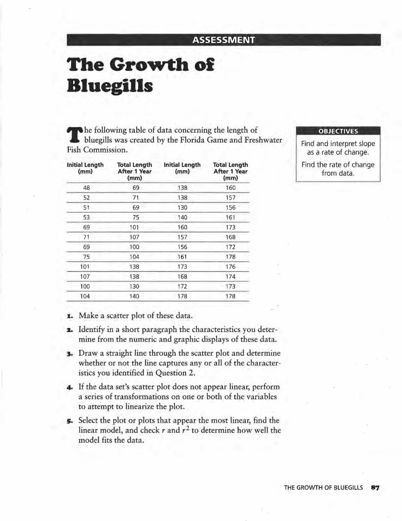
ASSESSMENT
The Growth ol Bluegills
T he following table of data concerning the length of bluegills was created by the Florida Game and Freshwater
Fish Commission.
Initial Length Total Length Initial Length Total Length (mm) After 1 Year (mm) After 1 Year
(mm) (mm)
48 69 138 160
52 71 138 157
51 69 130 156
53 75 140 161
69 101 160 173
71 107 157 168
69 100 156 172
75 104 161 178
101 138 173 176
107 138 168 174
100 130 172 173
104 140 178 178
1. Make a scatter plot of these data.
z. Identify in a short paragraph the characteristics you determine from the numeric and graphic displays of these data.
3. Draw a straight line through the scatter plot and determine whether or not the line captures any or all of the characteristics you identified in Question 2.
4. If the data set's scatter plot does not appear linear, perform a series of transformations on one or both of the variables to attempt to linearize the plot.
s. Select the plot or plots that appear the most linear, find the linear model, and check rand r 2 to determine how well the model fits the data.
OBJECTIVES
Find and interpret slope as a rate of change.
Find the rate of change from data.
THE GROWTH OF BLUEGILLS 87

•· Plot the residuals against x and consider the scale to determine a best line.
7. Use inverses of the transformations used for the equation you chose in Question 5 to create an equation that will be the best predictor equation of the original data set.
.. ASSESSMENT

9 781572 322509
ISBN 1-57232-250-0