Introduction to Graphing of GPS Data - Home | UNAVCO · Questions or comments please contact...
30
Questions or comments please contact education @ unavco.org. Page 1 Teacher version. Version August 2016 Introduction to Graphing of GPS Data Roger Groom, Cate Fox-Lent and Shelley Olds. Revised by Nancy W. West and Kathleen Alexander Topics: graphing, velocity vectors, mapping, plate tectonics, GPS Grade Levels: 6 – 12 Time: 1hr 20min (1 or 2 class periods) *This activity could also be given as homework Summary: While students first learn to graph in about 4 th grade, even high school advanced chemistry, physics, and Earth science students have floundered when asked to graph their lab data by hand. Students can be skilled at using graphing technology—calculators and computers—without understanding the graph. For students who struggle to make or interpret graphs, this activity can guide them to make sense of graphed data from GPS stations used by geoscientists who study crustal deformation and plate tectonics. This can stand alone as an activity on graphing with earth science data, or it can be a prequel for the following UNAVCO activities: • “Measuring plate motion with GPS,” wherein students discover the sundering of Iceland by analyzing GPS data; • “Detecting Cascadia’s changing shape with GPS,” a series of activities built around deformation of Earth’s crust; and • “Episodic tremor and slip,” about unusual seismic activity in the Pacific Northwest. You can choose to assign some or all of this activity, depending on your goals and your students’ needs. Overall, this activity starts with simple graphing of fictional data, builds to graphing real data from GPS stations in Washington and California as they gradually move north or south and east or west, and eventually leads students to create a map from which they can understand and derive GPS velocity vectors Lesson Objectives: Students will be able to: • Make and interpret graphs (of GPS data) • Interpret time series plots (position vs. time) qualitatively and quantitatively • Map north vs. east positions to follow a GPS station’s location through time • Derive and understand velocity vectors from maps Next Generation Science Standards (NGSS): Performance Expectation Students who demonstrate understanding can: MS-ESS3-2 Analyze and interpret data on natural hazards to forecast future catastrophic events and inform the development of technologies to mitigate their effects.
Transcript of Introduction to Graphing of GPS Data - Home | UNAVCO · Questions or comments please contact...

Questions or comments please contact education @ unavco.org. Page 1 Teacher version. Version August 2016
Introduction to Graphing of GPS Data Roger Groom, Cate Fox-Lent and Shelley Olds. Revised by Nancy W. West and Kathleen Alexander
Topics: graphing, velocity vectors, mapping, plate tectonics, GPS
Grade Levels: 6 – 12
Time: 1hr 20min (1 or 2 class periods)
*This activity could also be given as homework
Summary:
While students first learn to graph in about 4th grade, even high school advanced chemistry, physics, and Earth science students have floundered when asked to graph their lab data by hand. Students can be skilled at using graphing technology—calculators and computers—without understanding the graph. For students who struggle to make or interpret graphs, this activity can guide them to make sense of graphed data from GPS stations used by geoscientists who study crustal deformation and plate tectonics.
This can stand alone as an activity on graphing with earth science data, or it can be a prequel for the following UNAVCO activities:
• “Measuring plate motion with GPS,” wherein students discover the sundering of Iceland by analyzing GPS data;
• “Detecting Cascadia’s changing shape with GPS,” a series of activities built around deformation of Earth’s crust; and
• “Episodic tremor and slip,” about unusual seismic activity in the Pacific Northwest.
You can choose to assign some or all of this activity, depending on your goals and your students’ needs. Overall, this activity starts with simple graphing of fictional data, builds to graphing real data from GPS stations in Washington and California as they gradually move north or south and east or west, and eventually leads students to create a map from which they can understand and derive GPS velocity vectors
Lesson Objectives: Students will be able to:
• Make and interpret graphs (of GPS data) • Interpret time series plots (position vs. time) qualitatively and quantitatively • Map north vs. east positions to follow a GPS station’s location through time • Derive and understand velocity vectors from maps
Next Generation Science Standards (NGSS):
Performance Expectation Students who demonstrate understanding can:
MS-ESS3-2 Analyze and interpret data on natural hazards to forecast future catastrophic events and inform the development of technologies to mitigate their effects.
Pure and simple graphing of GPS data
Questions or comments please contact education @ unavco.org. Page 2 Teacher version. Version August 2016
HS-ESS1-5: Evaluate evidence of the past and current movements of continental and oceanic crust and the theory of plate tectonics to explain the ages of crustal rocks.
Common Core State Standards for Mathematics (CCSSM):
Performance Expectation Students who demonstrate understanding can:
Statistics and Probability 6.SP.4 Display numerical data in plots on a number line, including dot plots, histograms, and box plots.
Statistics and Probability 8.SP.1
Construct and interpret scatter plots for bivariate measurement data to investigate patterns of association between two quantities. Describe patterns such as clustering, outliers, positive or negative association, linear association, and nonlinear association.
Statistics and Probability 8.SP.2
Know that straight lines are widely used to model relationships between two quantitative variables. For scatter plots that suggest a linear association, informally fit a straight line, and informally assess the model fit by judging the closeness of the data points to the line.
Interpreting Categorical and Quantitative Data S-ID
Represent data with plots on the real number line (dot plots, histograms, and box plots).
See Appendix A for related Science and Engineering Practices, Crosscutting Concepts, and Disciplinary Core Ideas from A Framework for K-12 Science Education.
Universal Design for Instruction (UDI): Universal Design for Instruction principles have been incorporated in this lesson in order to accommodate for differences in strengths, challenges, and ability among students. Specifically, multiple, accessible instructional methods (visual, auditory & kinesthetic), group work that values different skills and roles, multiple methods of assessment, and frequent transitions provides rich support for learning and reduces barriers to the curriculum.
Essential Questions: • Why and how do scientists, like geologists, use graphs? • What are the main components of a graph? • Why is scale a crucial element in the graphing process?
Lesson Overview: • Students’ level of prior knowledge is assessed in order to determine which components of this
activity are necessary to include. Specifically, students are given a year vs. position data set and asked to 1) draw axes with scales that make sense and 2) plot data.
Pure and simple graphing of GPS data
Questions or comments please contact education @ unavco.org. Page 3 Teacher version. Version August 2016
• Students graph north vs. time and east vs. time using fictional data. • Students graph north vs. time and east vs. time using real data from two of UNAVCO’s GPS
stations. • Students draw a vector to best fit the real data they have graphed and measure the vector’s
orientation and length, thus determining the GSP station’s velocity.
Materials:
• PowerPoint presentation, “Introduction to Graphing of GPS Data” and projector • Student worksheet “Introduction to Graphing of GPS Data” • Pencils and erasers • Rulers (transparent ones are best) • Graph paper? • Protractors (circular ones are best) or directional compass (can be physical or in an app)
Lesson Procedure
• Hand out the student sheet, “Introduction to Graphing of GPS data.” o Differentiation: Some students may simple detest anything suggesting the use of
mathematical skills. In this case, consider assigning a game of Battleship as an introductory activity. Battleship teacher students to work with a systematically designed grid, just like in a scatterplot, and can decrease future math anxiety.
Part 1: Assessment of Prior Knowledge: Determine the Direction of Movement of a bicycle
through a city
As an option, Part 1 can be used as a pre-assessment. For many students, plotting the data for the movement through a grid-style city might be more relevant to their lives and easier to grasp.
Procedure
*Use the following information and the student worksheet with answers located after this section’s conclusion (in the appendix??) to guide your instruction.
• Ask your students, “What type of data do you think a Global Positioning System (GPS) collects?”
• After several responses, call on a volunteer to read the first two paragraphs on the student worksheet aloud. Afterwards, ask your students, “Why do scientist use graphs (Potential
response: Graphs provide a visual that makes information easier and quicker to interpret)?”
Proceed to the
Pure and simple graphing of GPS data
Questions or comments please contact education @ unavco.org. Page 4 Teacher version. Version August 2016
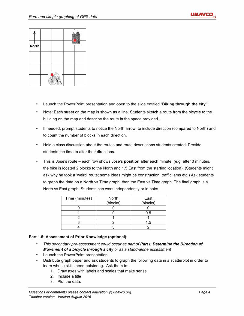
• Launch the PowerPoint presentation and open to the slide entitled “Biking through the city”
• Note: Each street on the map is shown as a line. Students sketch a route from the bicycle to the
building on the map and describe the route in the space provided.
• If needed, prompt students to notice the North arrow, to include direction (compared to North) and
to count the number of blocks in each direction.
• Hold a class discussion about the routes and route descriptions students created. Provide
students the time to alter their directions.
• This is Jose’s route – each row shows Jose’s position after each minute. (e.g. after 3 minutes,
the bike is located 2 blocks to the North and 1.5 East from the starting location). (Students might
ask why he took a ‘weird’ route; some ideas might be construction, traffic jams etc.) Ask students
to graph the data on a North vs Time graph, then the East vs Time graph. The final graph is a
North vs East graph. Students can work independently or in pairs.
Time (minutes) North (blocks)
East (blocks)
0 0 0 1 0 0.5 2 1 1 3 2 1.5 4 3 2
Part 1.5: Assessment of Prior Knowledge (optional):
• This secondary pre-assessment could occur as part of Part I: Determine the Direction of Movement of a bicycle through a city or as a stand-alone assessment
• Launch the PowerPoint presentation. • Distribute graph paper and ask students to graph the following data in a scatterplot in order to
learn whose skills need bolstering. Ask them to: 1. Draw axes with labels and scales that make sense 2. Include a title 3. Plot the data.
Pure and simple graphing of GPS data
Questions or comments please contact education @ unavco.org. Page 5 Teacher version. Version August 2016
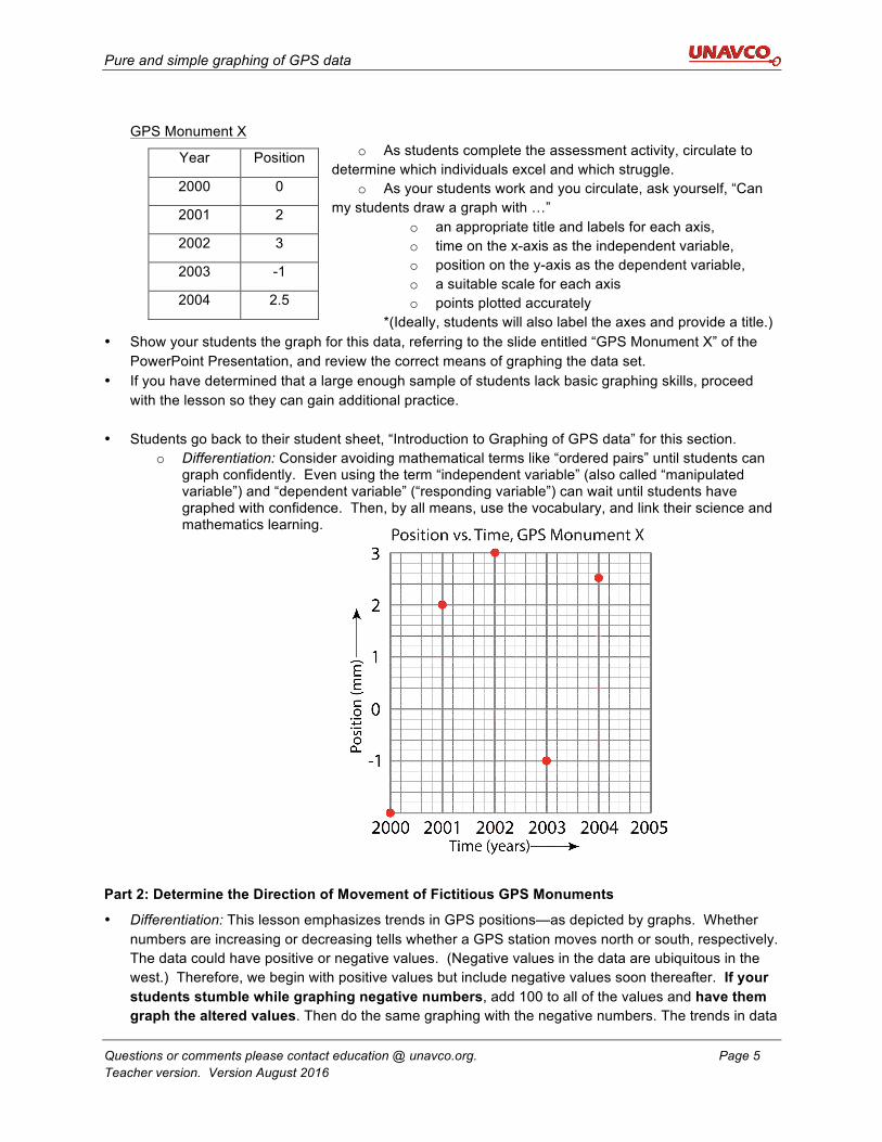
GPS Monument X
o As students complete the assessment activity, circulate to determine which individuals excel and which struggle.
o As your students work and you circulate, ask yourself, “Can my students draw a graph with …”
o an appropriate title and labels for each axis, o time on the x-axis as the independent variable, o position on the y-axis as the dependent variable, o a suitable scale for each axis o points plotted accurately
*(Ideally, students will also label the axes and provide a title.) • Show your students the graph for this data, referring to the slide entitled “GPS Monument X” of the
PowerPoint Presentation, and review the correct means of graphing the data set. • If you have determined that a large enough sample of students lack basic graphing skills, proceed
with the lesson so they can gain additional practice. • Students go back to their student sheet, “Introduction to Graphing of GPS data” for this section.
o Differentiation: Consider avoiding mathematical terms like “ordered pairs” until students can graph confidently. Even using the term “independent variable” (also called “manipulated variable”) and “dependent variable” (“responding variable”) can wait until students have graphed with confidence. Then, by all means, use the vocabulary, and link their science and mathematics learning.
Part 2: Determine the Direction of Movement of Fictitious GPS Monuments
• Differentiation: This lesson emphasizes trends in GPS positions—as depicted by graphs. Whether numbers are increasing or decreasing tells whether a GPS station moves north or south, respectively. The data could have positive or negative values. (Negative values in the data are ubiquitous in the west.) Therefore, we begin with positive values but include negative values soon thereafter. If your students stumble while graphing negative numbers, add 100 to all of the values and have them graph the altered values. Then do the same graphing with the negative numbers. The trends in data
Year Position
2000 0
2001 2
2002 3
2003 -1
2004 2.5
Pure and simple graphing of GPS data
Questions or comments please contact education @ unavco.org. Page 6 Teacher version. Version August 2016
are what count in these graphs. If your students can draw and understand these graphs and their trends, then they can interpret GPS time series plots and a myriad of other graphs.
• Proceed to the first slide titled, “GPS Monument A” and call on another volunteer to read the first paragraph under “Part 2: Determine the Direction of Movement of Fictitious GPS Monuments” on the student worksheet. Point out the last sentence in the paragraph, “Scientists convert the data into four components: north, east, vertical, and time.” Ask your students “Why aren’t south or west one of the four components?” If students are able to answer this question correctly, great! If not, leave this question unanswered as students will be able to rationalize a conclusion after part 1 of the activity.
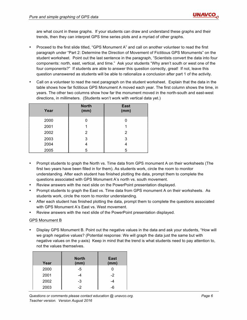
• Call on a volunteer to read the next paragraph on the student worksheet. Explain that the data in the table shows how far fictitious GPS Monument A moved each year. The first column shows the time, in years. The other two columns show how far the monument moved in the north-south and east-west directions, in millimeters. (Students won’t work with vertical data yet.)
Year
North (mm)
East (mm)
2000 0 0 2001 1 1 2002 2 2 2003 3 3 2004 4 4 2005 5 5
• Prompt students to graph the North vs. Time data from GPS monument A on their worksheets (The first two years have been filled in for them). As students work, circle the room to monitor understanding. After each student has finished plotting the data, prompt them to complete the questions associated with GPS Monument A’s north vs. south movement.
• Review answers with the next slide on the PowerPoint presentation displayed. • Prompt students to graph the East vs. Time data from GPS monument A on their worksheets. As
students work, circle the room to monitor understanding. • After each student has finished plotting the data, prompt them to complete the questions associated
with GPS Monument A’s East vs. West movement. • Review answers with the next slide of the PowerPoint presentation displayed.
GPS Monument B
• Display GPS Monument B. Point out the negative values in the data and ask your students, “How will we graph negative values? (Potential response: We will graph the data just the same but with negative values on the y-axis) Keep in mind that the trend is what students need to pay attention to, not the values themselves.
Year North (mm)
East (mm)
2000 -5 0 2001 -4 -2 2002 -3 -4 2003 -2 -6
Pure and simple graphing of GPS data
Questions or comments please contact education @ unavco.org. Page 7 Teacher version. Version August 2016
• Prompt students to graph the North vs. Time data from GPS monument B and to respond to the questions on their worksheets.
As students work, circle the room to monitor understanding. • Differentiation: Consider allowing students to work in pairs for this portion of the activity, pairing
students with varying abilities together. • After each student has finished, display the next slide and review the correct response.
o Differentiation: If students are grasping concepts quickly, you may wish to allow them to complete all of the questions North vs Time, reviewing all answers at once.
• Prompt students to graph the East vs. Time data from GPS monument on the two grids on their worksheets and respond to the associated questions with their partners. As students work, circle the room to ask questions and monitor understanding.
o Differentiation: Consider displaying a timer such as the ones found at http://www.online-stopwatch.com/classroom-timers on the overhead projector for 5-10 minutes to keep students on track.
Closure:
• After each student has finished, display the next slide, ask volunteers to share their answers, and discuss how scale impacts a graph. Some additional questions to prompt higher level thinking may include:
• Why do geologists use graphs? • What are the graphs showing us?
• Display the slide titled, “Independent vs. Dependent Variable” and call on a volunteer to read the
paragraph displayed on their worksheets under the same heading. (A review of independent vs dependent variables is available on MathBench Visualization – A graphing primer.)
• Discuss the difference between an independent and a dependent variable with your students, allow time for questions to clarify any misconceptions.
*This may be an appropriate time to conclude your lesson if you are splitting it over two days.
Part 3: Determine the direction of movement of real GPS monuments
Introduction:
o Activate prior knowledge and encourage critical thinking by asking students the following questions (feel free to ask any additional questions that come to mind!):
a. Why do geologist use graphs (Potential response: To represent data in a way that is easy to interpret)?
b. What are we able to see by plotting time vs. direction on a graph? c. How can this information be used for scientific research? d. Why do you think we worked with fake data before advancing to real data?
o Ask a volunteer to read the introductory paragraph in Part 3 out loud and explain that students will be generating graphs using actual data from GPS stations on the west coast. This will be slightly more difficult than the previous graphing activity.
2004 -1 -8 2005 0 -10
Pure and simple graphing of GPS data
Questions or comments please contact education @ unavco.org. Page 8 Teacher version. Version August 2016
Example 1) GPS Station P430, western Washington
o Display the slide titled, “GPS Station P430.” Allow students to complete all components of the questions for this station in their student worksheets. Students will have to place their points as best they can by rounding the data and interpolating between lines.
e. Differentiation: Consider allowing students to work in pairs for this portion of the activity, pairing students with varying abilities together.
f. Differentiation: Consider displaying a timer such as the ones found at http://www.online-stopwatch.com/classroom-timers on the overhead projector for 5-10 minutes to keep students on track.
o When all students have completed the questions, call on volunteers to share their responses.
o As a means of promoting critical thinking, you may wish to ask your students, “It can be difficult to be accurate when graphing by hand. Do you think this is a large problem? Why or why not?” (Potential response: Accuracy is not incredibly important because we are looking at overall trends in order to determine which direction the GPS station is moving.)
Example 2) GPS Station P157, northern California
o Distribute one piece of graphing paper to each student. g. Differentiation: This is a great opportunity to allow a more hyperactive student an opportunity
to move around.
h. Display the slide titled, “GPS Station P157.” Allow students to complete all components of the questions on their graph paper. See the pages that follow or the PowerPoint presentation for examples of these graphs. Choose a graph paper similar to this for your students. Purchase paper or search online for “graph paper 10 squares per inch.” Differentiation: If students are struggling, you may wish to review student responses after question 6 is complete.
o Circle the classroom to monitor understanding and ensure that students are including all of the following components in their graph:
i. A title j. Time on the x-axis k. Distance on the y-axis l. Labeled axis
o Once all students are finished, allow volunteers to share their responses while displaying the next 2 PowerPoint slides. (If your classroom has a document camera, utilize this technology so students can show each other their graphs.)
o Review the essential components of a graph with your students, asking them to provide you will all elements a graph must include.
Example 3) GPS Station P058, northern California o Display the slide titled, “GPS Station P058.” Like P157, P058 is in northern California. Allow
students to complete question 8a-c on graph paper either independently or with a partner. o Once all students are finished, allow volunteers to share their responses while displaying the next 2
PowerPoint slides. (If your classroom has a document camera, utilize this technology so students can show each other their graphs.)
o Explain that students will now be graphing vertical data, which they have not done yet. As students complete the questions, tell them to pay attention to the trends in the data. How is it different from the north vs. time and east vs. time data?
Pure and simple graphing of GPS data
Questions or comments please contact education @ unavco.org. Page 9 Teacher version. Version August 2016
o Once all students are finished, allow volunteers to share their responses while displaying the last PowerPoint slide titled “GPS station P058.” (If your classroom has a document camera, utilize this technology so students can show each other their graphs.)
Closure:
• After students have finished discussing their responses to question 8d, pose some or all of the following questions to review core concepts and promote critical thinking.
o What are the essential components of a graph? o What can scientist illustrate by graphing GPS data?
Part 4: Plotting North vs. East using authentic GPS data Introduction:
• Display the slide titled, “GPS Monument A.” Ask your students, “We have been plotting North vs. Time and East vs. Time on our graphs. How else do you think we could plot this data (North vs. East)?
• Call on a volunteer to read the two paragraphs under “GPS Monument A” on the student worksheet out loud. Clarify that students will now be plotting North/South movement vs. East/West movement as opposed to direction vs. time. Ask your students, “Why would this information be useful to geologists (To illustrate the overall motion of the GPS station)?”
Procedure: Using fictitious data: GPS Monument A
• Allow students to complete the questions on their worksheets either independently or with a partner.
• Once all students are finished, allow volunteers to share their responses while displaying the next 2 PowerPoint slides. (If your classroom has a document camera, utilize this technology so students can show each other their graphs.)
• Pose the following question: “Your completed graph can now tell you two important pieces of information about Monument A. What do we now know about monument A?”
What does this mean? • Call on a volunteer to read the two paragraphs under the title, “What does this mean?!” and stress
that the graphed arrow (the vector) shows us 1) direction and 2) distance.
• Allow students time to calculate the annual velocity of GPS Monument A and review the answer as a class.
Example of plotting data on a map using real data: GPS Station P430, western Washington
• Now that students have practiced graphing with fictional data, they are ready to move onto real GPS data. Display the next slide titled, “GPS Station P430.”
o If students need more graph paper, pass out graph paper at this time. o Pass out protractors or compasses to each pair at this time.
• Display the next 3 slides and explain how students will be measuring the azimuth.
• Allow students to complete the remaining questions about azimuth with a partner.
• Review the correct responses with students.
• Ask your students, “Why do we measure the azimuth(Measuring the azimuth gives us a more precise description of the monument’s direction than “northeast”)?”
Pure and simple graphing of GPS data
Questions or comments please contact education @ unavco.org. Page 10 Teacher version. Version August 2016
• For additional practice, display the slide titled, “GPS Monument P058” and ask students to complete question 11.
• Review the correct answers with your students. Optional Extension:
• Allow students time to explore the UNAVCO velocity viewer at http://facility.unavco.org/cgi-bin/GPSVelocityViewer/GPSVelocityViewer.html.
Conclusion:
• Display the next slide in the PowerPoint presentation and call on a volunteer to read the paragraph under “Where do geologists get GPS data?” on their student worksheets.
• Display the slide titled “GPS Data” while explaining where geologists get their data.
• Conclude the lesson by holding a final classroom discussion, asking some or all of the following questions:
o What are the essential elements of a graph? o How do geologists pay attention to scale? Why? o Why are graphs a useful tool for geologists? o What are geologists able to determine about a GPS station by graphing velocity vectors?
o What do you think geologists use velocity vectors from GPS stations for? What are they able to discover about the Earth (Geodesy)?
Appendix A: Relevant excerpts from A Framework for K-12 Science Education as cited in the Next Generation Science Standards
3D Alignment:
Science and Engineering Practices
Disciplinary Core Ideas Crosscutting Concepts
Analyzing and Interpreting Data:
Analyze and interpret data to provide evidence for phenomena.
ESS2.A: Earth's Materials and Systems:
The planet's systems interact over scales that range from microscopic to global in size, and they operate over fractions of a second to billions of years. These interactions have shaped Earth's history and will determine its future.
Scale Proportion and Quantity:
Time, space, and energy phenomena can be observed at various scaled using models to study systems that are too large or too small.
Pure and simple graphing of GPS data
Questions or comments please contact education @ unavco.org. Page 11 Teacher version. Version August 2016
Using Mathematics and Conceptual Thinking:
ESS3.B: Natural Hazards
Mapping the history of natural hazards in a region, combined with an understanding of related geologic forces, can help forecast the locations and likelihoods of future events.
Patterns:
Graphs, charts, and images can be used to identify patterns in data.
PS2.A: Forces and Motions
All positions of objects and the directions of forces and motions must be described in an arbitrarily chosen reference frame and arbitrarily chosen units of size. In order to share information with other people, these choices must also be shared. [grade 8]
Stability and Change:
Stability might be disturbed either by sudden events or gradual changes that accumulate over time.
Science & Engineering Practices in the NGSS:
Analyzing and interpreting data; and Using mathematics and computational thinking.
Crosscutting Concepts:
Scale, proportion, and quantity; and stability and change.
Disciplinary Core Ideas:
PS2.A: Forces and Motions: All positions of objects and the directions of forces and motions must be described in an arbitrarily chosen reference frame and arbitrarily chosen units of size. In order to share information with other people, these choices must also be shared. [grade 8]
ESS2.B: Plate Tectonics and Large-Scale System Interactions: Plate tectonics is the unifying theory that explains the past and current movements of the rocks at Earth’s surface and provides a framework for understanding its geologic history. Plate movements are responsible for most continental and ocean-floor features and for the distribution of most rocks and minerals within Earth’s crust. Maps of ancient land and water patterns, based on investigations of rocks and fossils, make clear how Earth’s plates have moved great distances, collided, and spread apart. [grade 8]
ESS3.B: Natural Hazards: Mapping the history of natural hazards in a region, combined with an understanding of related geologic forces can help forecast the locations and likelihoods of future events. [grade 8]
Pure and simple graphing of GPS data
Questions or comments please contact education @ unavco.org. Page 12 Teacher version. Version August 2016
Appendix B: Student Worksheet with Answers:
Introduction:
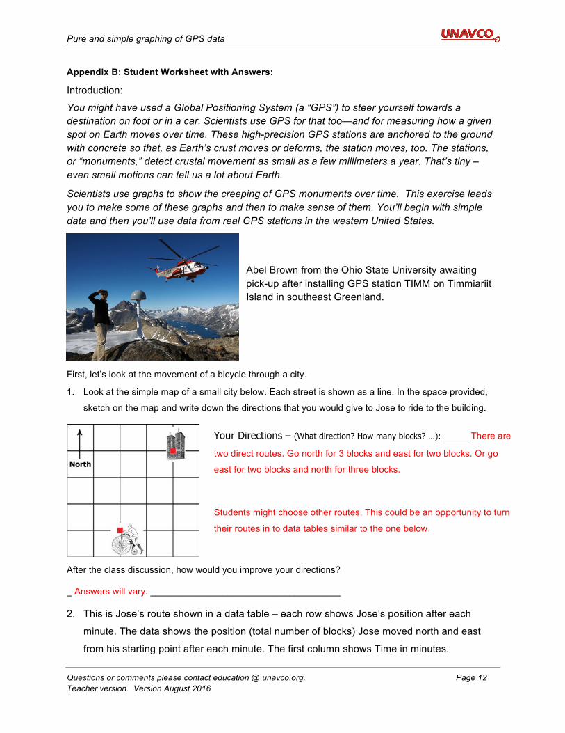
You might have used a Global Positioning System (a “GPS”) to steer yourself towards a destination on foot or in a car. Scientists use GPS for that too—and for measuring how a given spot on Earth moves over time. These high-precision GPS stations are anchored to the ground with concrete so that, as Earth’s crust moves or deforms, the station moves, too. The stations, or “monuments,” detect crustal movement as small as a few millimeters a year. That’s tiny – even small motions can tell us a lot about Earth.
Scientists use graphs to show the creeping of GPS monuments over time. This exercise leads you to make some of these graphs and then to make sense of them. You’ll begin with simple data and then you’ll use data from real GPS stations in the western United States.
Abel Brown from the Ohio State University awaiting pick-up after installing GPS station TIMM on Timmiariit Island in southeast Greenland.
First, let’s look at the movement of a bicycle through a city.
1. Look at the simple map of a small city below. Each street is shown as a line. In the space provided,
sketch on the map and write down the directions that you would give to Jose to ride to the building.
After the class discussion, how would you improve your directions?
_ Answers will vary. _____________________________________
2. This is Jose’s route shown in a data table – each row shows Jose’s position after each
minute. The data shows the position (total number of blocks) Jose moved north and east
from his starting point after each minute. The first column shows Time in minutes.
Your Directions – (What direction? How many blocks? …): _____There are
two direct routes. Go north for 3 blocks and east for two blocks. Or go
east for two blocks and north for three blocks.
Students might choose other routes. This could be an opportunity to turn
their routes in to data tables similar to the one below.
Pure and simple graphing of GPS data
Questions or comments please contact education @ unavco.org. Page 13 Teacher version. Version August 2016
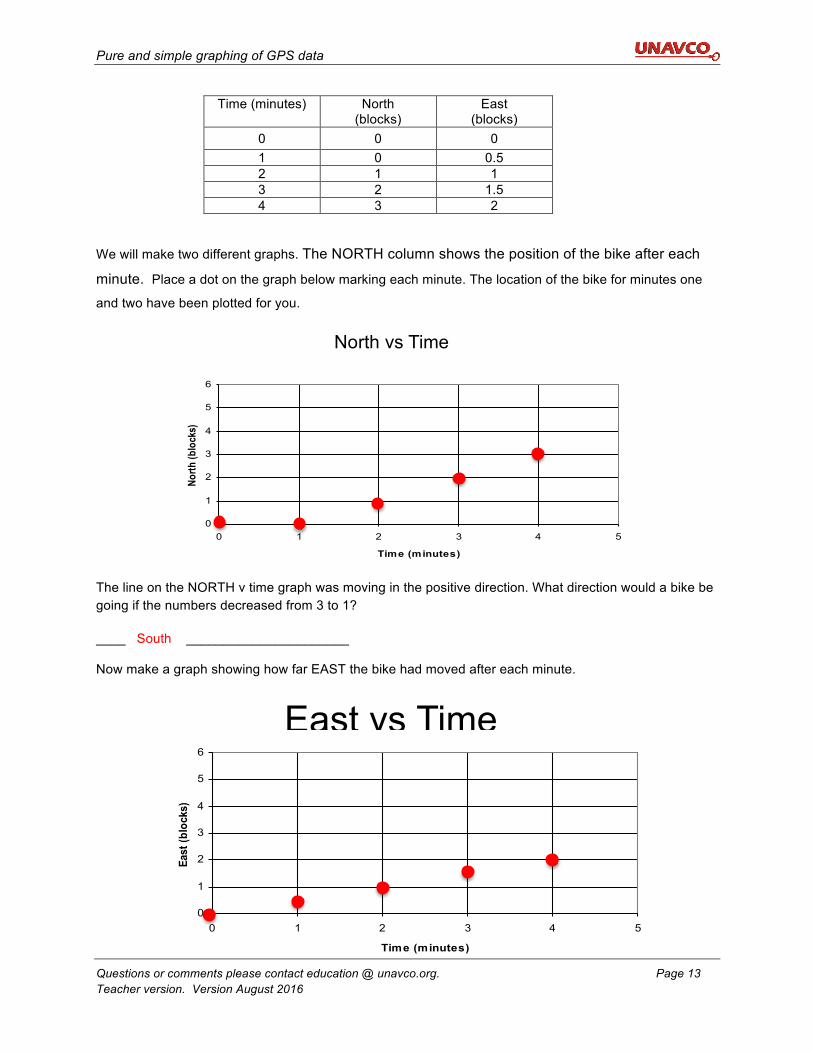
Time (minutes) North (blocks)
East (blocks)
0 0 0 1 0 0.5 2 1 1 3 2 1.5 4 3 2
We will make two different graphs. The NORTH column shows the position of the bike after each
minute. Place a dot on the graph below marking each minute. The location of the bike for minutes one
and two have been plotted for you.
The line on the NORTH v time graph was moving in the positive direction. What direction would a bike be going if the numbers decreased from 3 to 1?
____ South ______________________
Now make a graph showing how far EAST the bike had moved after each minute.
0
1
2
3
4
5
6
0 1 2 3 4 5
Time (minutes)
North
(blo
cks)
North vs Time
0
1
2
3
4
5
6
0 1 2 3 4 5
Time (minutes)
East
(blo
cks)
East vs Time
Pure and simple graphing of GPS data
Questions or comments please contact education @ unavco.org. Page 14 Teacher version. Version August 2016
On the second graph you made, the numbers for the East direction got bigger over time. What direction would a bike be going if the numbers got smaller over time?
___ West ________
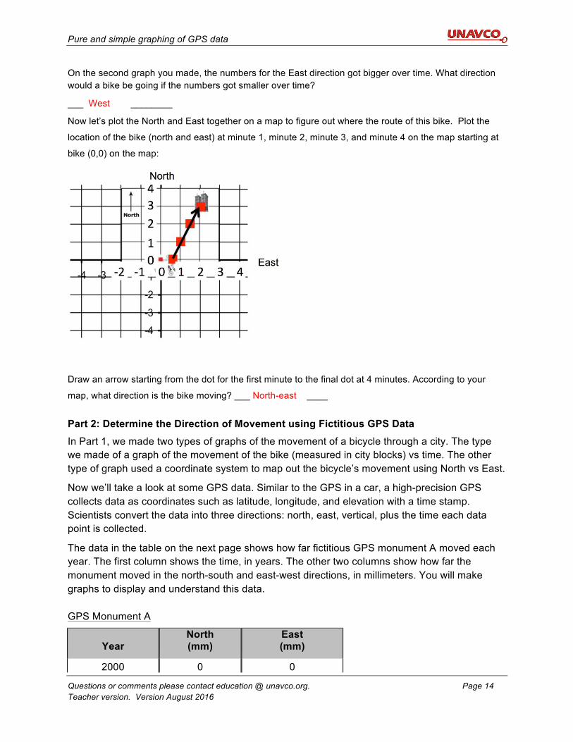
Now let’s plot the North and East together on a map to figure out where the route of this bike. Plot the
location of the bike (north and east) at minute 1, minute 2, minute 3, and minute 4 on the map starting at
bike (0,0) on the map:
Draw an arrow starting from the dot for the first minute to the final dot at 4 minutes. According to your
map, what direction is the bike moving? ___ North-east ____
Part 2: Determine the Direction of Movement using Fictitious GPS Data In Part 1, we made two types of graphs of the movement of a bicycle through a city. The type we made of a graph of the movement of the bike (measured in city blocks) vs time. The other type of graph used a coordinate system to map out the bicycle’s movement using North vs East.
Now we’ll take a look at some GPS data. Similar to the GPS in a car, a high-precision GPS collects data as coordinates such as latitude, longitude, and elevation with a time stamp. Scientists convert the data into three directions: north, east, vertical, plus the time each data point is collected.
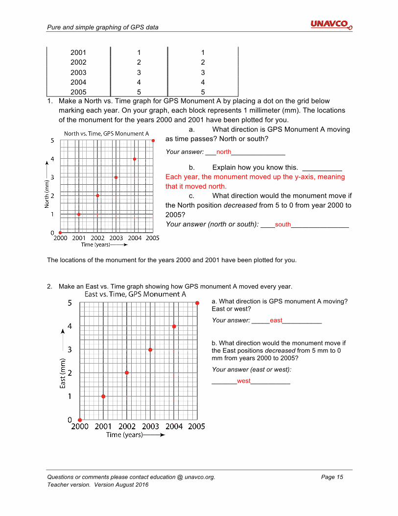
The data in the table on the next page shows how far fictitious GPS monument A moved each year. The first column shows the time, in years. The other two columns show how far the monument moved in the north-south and east-west directions, in millimeters. You will make graphs to display and understand this data. GPS Monument A
Year
North (mm)
East (mm)
2000 0 0
Pure and simple graphing of GPS data
Questions or comments please contact education @ unavco.org. Page 15 Teacher version. Version August 2016
2001 1 1 2002 2 2 2003 3 3 2004 4 4 2005 5 5
1. Make a North vs. Time graph for GPS Monument A by placing a dot on the grid below marking each year. On your graph, each block represents 1 millimeter (mm). The locations of the monument for the years 2000 and 2001 have been plotted for you.
a. What direction is GPS Monument A moving as time passes? North or south?
Your answer: ___north_______________
b. Explain how you know this. __________ Each year, the monument moved up the y-axis, meaning that it moved north.
c. What direction would the monument move if the North position decreased from 5 to 0 from year 2000 to 2005? Your answer (north or south): ____south________________
The locations of the monument for the years 2000 and 2001 have been plotted for you.
2. Make an East vs. Time graph showing how GPS monument A moved every year.
a. What direction is GPS monument A moving? East or west?
Your answer: _____east___________
b. What direction would the monument move if the East positions decreased from 5 mm to 0 mm from years 2000 to 2005?
Your answer (east or west):
_______west___________
Pure and simple graphing of GPS data
Questions or comments please contact education @ unavco.org. Page 16 Teacher version. Version August 2016
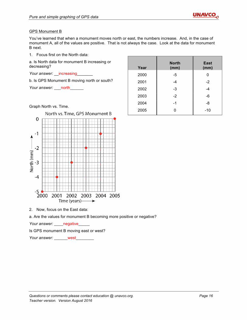
GPS Monument B
You’ve learned that when a monument moves north or east, the numbers increase. And, in the case of monument A, all of the values are positive. That is not always the case. Look at the data for monument B next.
1. Focus first on the North data:
a. Is North data for monument B increasing or decreasing?
Your answer: __increasing_______
b. Is GPS Monument B moving north or south?
Your answer: ___north______
Graph North vs. Time.
2. Now, focus on the East data:
a. Are the values for monument B becoming more positive or negative?
Your answer: ____negative_____
Is GPS monument B moving east or west?
Your answer: ______west________
Year North (mm)
East (mm)
2000 -5 0
2001 -4 -2
2002 -3 -4
2003 -2 -6
2004 -1 -8
2005 0 -10
Pure and simple graphing of GPS data
Questions or comments please contact education @ unavco.org. Page 17 Teacher version. Version August 2016
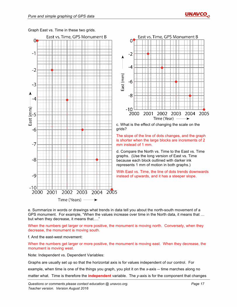
Graph East vs. Time in these two grids.
c. What is the effect of changing the scale on the grids?
The slope of the line of dots changes, and the graph is shorter when the large blocks are increments of 2 mm instead of 1 mm.
d. Compare the North vs. Time to the East vs. Time graphs. (Use the long version of East vs. Time because each block outlined with darker ink represents 1 mm of motion in both graphs.)
With East vs. Time, the line of dots trends downwards instead of upwards, and it has a steeper slope.
e. Summarize in words or drawings what trends in data tell you about the north-south movement of a GPS monument. For example, “When the values increase over time in the North data, it means that … but when they decrease, it means that….”
When the numbers get larger or more positive, the monument is moving north. Conversely, when they decrease, the monument is moving south.
f. And the east-west movement:
When the numbers get larger or more positive, the monument is moving east. When they decrease, the monument is moving west.
Note: Independent vs. Dependent Variables:
Graphs are usually set up so that the horizontal axis is for values independent of our control. For
example, when time is one of the things you graph, you plot it on the x-axis -- time marches along no
matter what. Time is therefore the independent variable. The y-axis is for the component that changes
Pure and simple graphing of GPS data
Questions or comments please contact education @ unavco.org. Page 18 Teacher version. Version August 2016
depending on time. This is called the dependent variable. (A review of independent vs dependent
variables is available on MathBench Visualization – A graphing primer.)
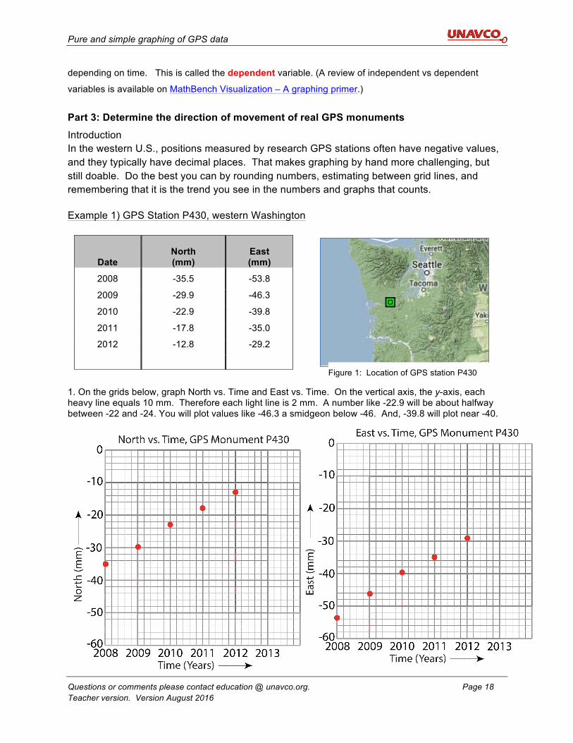
Part 3: Determine the direction of movement of real GPS monuments Introduction In the western U.S., positions measured by research GPS stations often have negative values, and they typically have decimal places. That makes graphing by hand more challenging, but still doable. Do the best you can by rounding numbers, estimating between grid lines, and remembering that it is the trend you see in the numbers and graphs that counts.
Example 1) GPS Station P430, western Washington
1. On the grids below, graph North vs. Time and East vs. Time. On the vertical axis, the y-axis, each heavy line equals 10 mm. Therefore each light line is 2 mm. A number like -22.9 will be about halfway between -22 and -24. You will plot values like -46.3 a smidgeon below -46. And, -39.8 will plot near -40.
Date North (mm)
East (mm)
2008 -35.5 -53.8
2009 -29.9 -46.3
2010 -22.9 -39.8
2011 -17.8 -35.0
2012 -12.8 -29.2
Figure 1: Location of GPS station P430
Pure and simple graphing of GPS data
Questions or comments please contact education @ unavco.org. Page 19 Teacher version. Version August 2016
a. Is station P430 moving north or south? Your answer: ______north_______
b. And east or west? Your answer: ____east__________
Notice that the scale is different than on previous graphs because the spread in data is larger. For the North vs. Time graph, there is a spread of about 23 mm (from -12.8 to -35.5); for East vs. Time, it is about 25 mm (-29.2 to -53.8). The scaling accommodates the range of data.
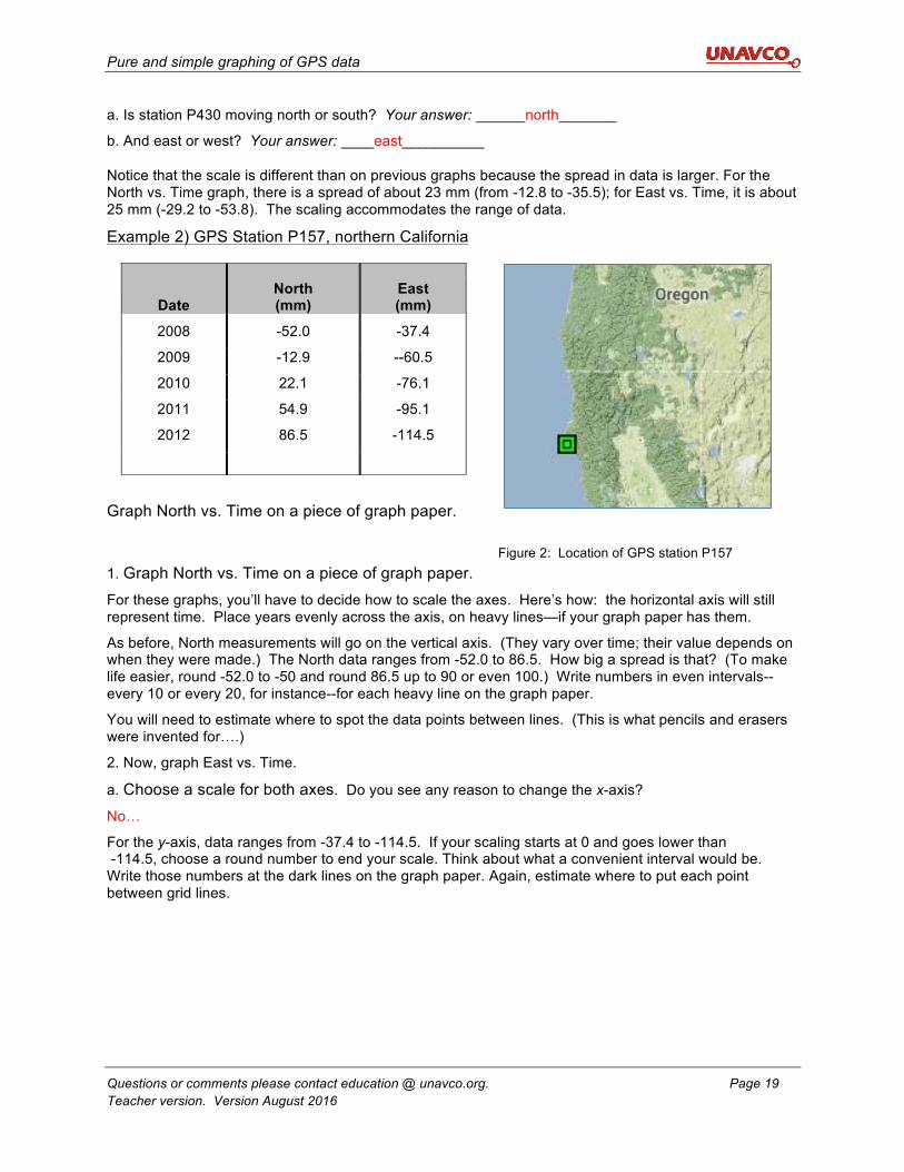
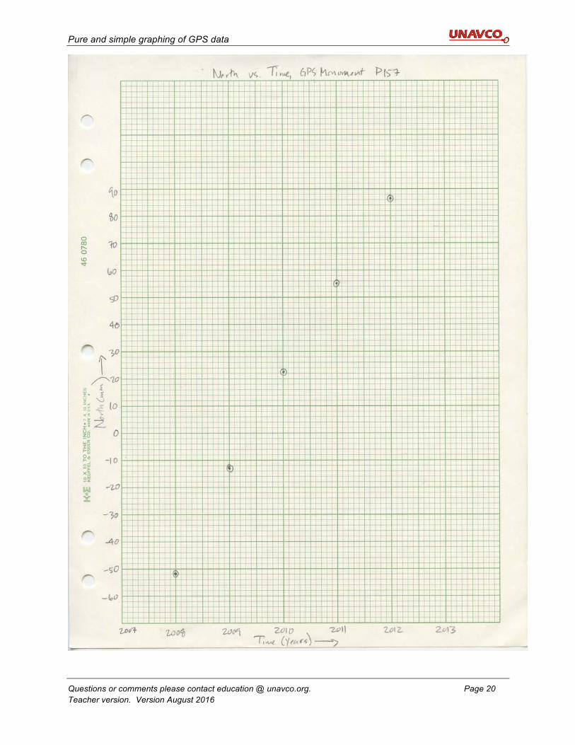
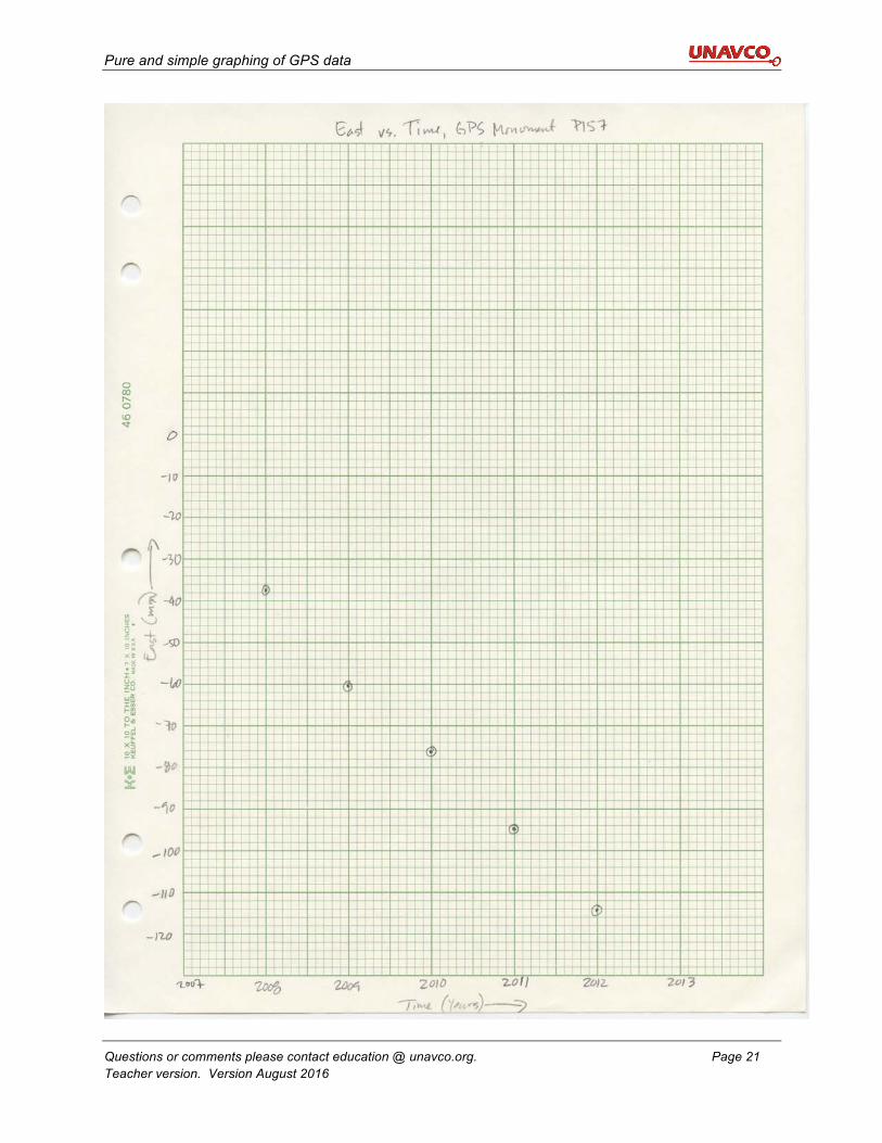
Example 2) GPS Station P157, northern California
Graph North vs. Time on a piece of graph paper.
1. Graph North vs. Time on a piece of graph paper. For these graphs, you’ll have to decide how to scale the axes. Here’s how: the horizontal axis will still represent time. Place years evenly across the axis, on heavy lines—if your graph paper has them.
As before, North measurements will go on the vertical axis. (They vary over time; their value depends on when they were made.) The North data ranges from -52.0 to 86.5. How big a spread is that? (To make life easier, round -52.0 to -50 and round 86.5 up to 90 or even 100.) Write numbers in even intervals--every 10 or every 20, for instance--for each heavy line on the graph paper.
You will need to estimate where to spot the data points between lines. (This is what pencils and erasers were invented for….)
2. Now, graph East vs. Time.
a. Choose a scale for both axes. Do you see any reason to change the x-axis?
No…
For the y-axis, data ranges from -37.4 to -114.5. If your scaling starts at 0 and goes lower than -114.5, choose a round number to end your scale. Think about what a convenient interval would be. Write those numbers at the dark lines on the graph paper. Again, estimate where to put each point between grid lines.
Date North (mm)
East (mm)
2008 -52.0 -37.4
2009 -12.9 --60.5
2010 22.1 -76.1
2011 54.9 -95.1
2012 86.5 -114.5
Figure 2: Location of GPS station P157
Pure and simple graphing of GPS data
Questions or comments please contact education @ unavco.org. Page 20 Teacher version. Version August 2016
Pure and simple graphing of GPS data
Questions or comments please contact education @ unavco.org. Page 21 Teacher version. Version August 2016
Pure and simple graphing of GPS data
Questions or comments please contact education @ unavco.org. Page 22 Teacher version. Version August 2016
b. To be complete, draw a small circle around each plotted points on each graph for P157. It’s called “protecting the point,” like a moat around a castle. You’ll see why soon. Also, label both axes, and add a title at the top.
c. Is station P157 moving north or south? Your answer: ____north_________
d. And east or west? Your answer: __west____________
e. How do the rates of the north-south motion compare to the rate of east-west motion? Before you answer, think about how the scale of the y-axis could trick you.
Because the line of points have a steeper trend on the North vs. Time graph, the monument is moving north faster than it is moving west.
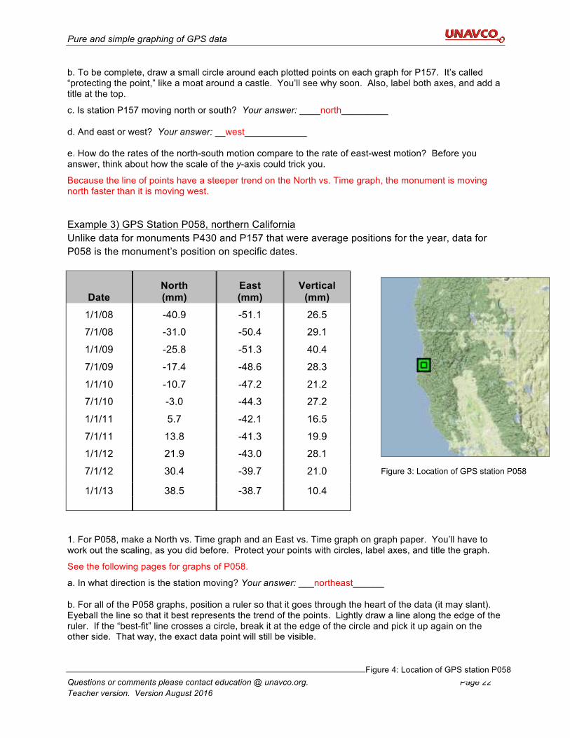
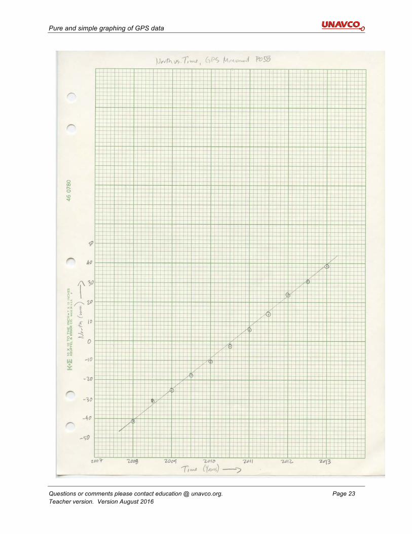
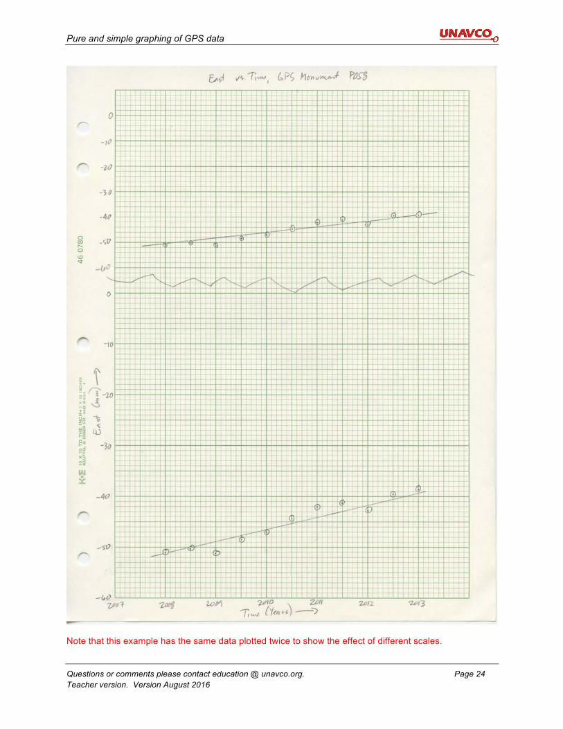
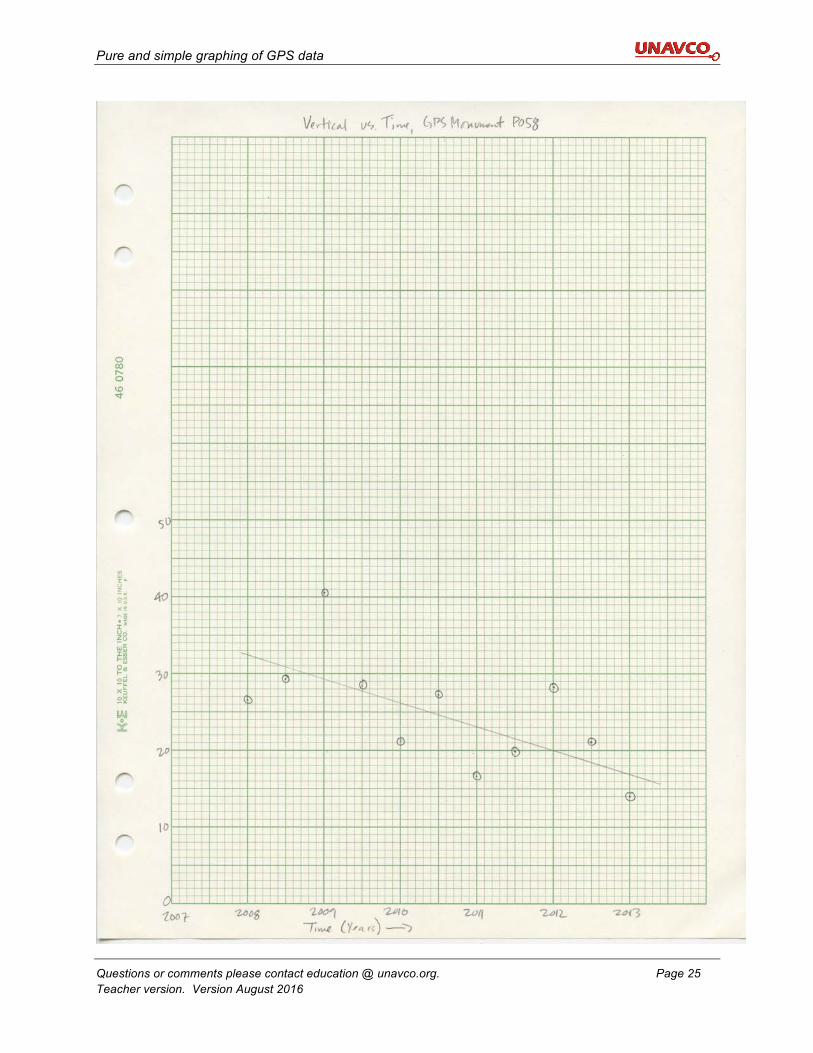
Example 3) GPS Station P058, northern California Unlike data for monuments P430 and P157 that were average positions for the year, data for P058 is the monument’s position on specific dates.
1. For P058, make a North vs. Time graph and an East vs. Time graph on graph paper. You’ll have to work out the scaling, as you did before. Protect your points with circles, label axes, and title the graph.
See the following pages for graphs of P058.
a. In what direction is the station moving? Your answer: ___northeast______
b. For all of the P058 graphs, position a ruler so that it goes through the heart of the data (it may slant). Eyeball the line so that it best represents the trend of the points. Lightly draw a line along the edge of the ruler. If the “best-fit” line crosses a circle, break it at the edge of the circle and pick it up again on the other side. That way, the exact data point will still be visible.
Date North (mm)
East (mm)
Vertical (mm)
1/1/08 -40.9 -51.1 26.5
7/1/08 -31.0 -50.4 29.1
1/1/09 -25.8 -51.3 40.4
7/1/09 -17.4 -48.6 28.3
1/1/10 -10.7 -47.2 21.2
7/1/10 -3.0 -44.3 27.2
1/1/11 5.7 -42.1 16.5
7/1/11 13.8 -41.3 19.9
1/1/12 21.9 -43.0 28.1
7/1/12 30.4 -39.7 21.0
1/1/13 38.5 -38.7 10.4
Figure 4: Location of GPS station P058
Figure 3: Location of GPS station P058
Pure and simple graphing of GPS data
Questions or comments please contact education @ unavco.org. Page 23 Teacher version. Version August 2016
Pure and simple graphing of GPS data
Questions or comments please contact education @ unavco.org. Page 24 Teacher version. Version August 2016
Note that this example has the same data plotted twice to show the effect of different scales.
Pure and simple graphing of GPS data
Questions or comments please contact education @ unavco.org. Page 25 Teacher version. Version August 2016
Pure and simple graphing of GPS data
Questions or comments please contact education @ unavco.org. Page 26 Teacher version. Version August 2016
c. How does its rate of motion compare to that of P157?
P058 isn’t moving north as fast, nor is it moving east as fast as P157 is moving west. The slopes of the lines are shallower.
d. Now, graph the vertical data on graph paper. Until now, you haven’t looked at vertical data. How does its graph compare to the other graphs?
The data is more scattered; although there’s a trend, it’s not as tightly defined.
There are statistical ways calculators or computers draw that line. The process is called “regressing a line” or “linear regression.” The device calculates the equation for the line (in the slope-intercept form y = mx + b) and draws the line for you.
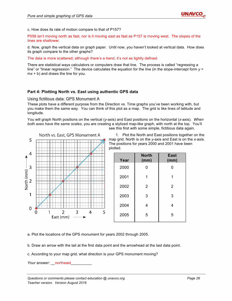
Part 4: Plotting North vs. East using authentic GPS data Using fictitious data: GPS Monument A These plots have a different purpose from the Direction vs. Time graphs you’ve been working with, but you make them the same way. You can think of this plot as a map. The grid is like lines of latitude and longitude.
You will graph North positions on the vertical (y-axis) and East positions on the horizontal (x-axis). When both axes have the same scales, you are creating a stylized map-like graph, with north at the top. You’ll
see this first with some simple, fictitious data again.
1. Plot the North and East positions together on the map grid. North is on the y-axis and East is on the x-axis. The positions for years 2000 and 2001 have been plotted.
a. Plot the locations of the GPS monument for years 2002 through 2005.
b. Draw an arrow with the tail at the first data point and the arrowhead at the last data point. c. According to your map grid, what direction is your GPS monument moving? Your answer: __northeast__________
Year
North (mm)
East (mm)
2000 0 0
2001 1 1
2002 2 2
2003 3 3
2004 4 4
2005 5 5
Pure and simple graphing of GPS data
Questions or comments please contact education @ unavco.org. Page 27 Teacher version. Version August 2016
What does this mean? Your arrow shows the direction the monument moved, and its length shows how far it moved over 5 years. This is a special type of arrow called a vector. If you were to measure the length of the arrow with a ruler, you would know how far it moved in five years. You could then calculate how far it moved in one year in mm/yr. Distance over time is velocity. Velocity vectors from GPS stations in the EarthScope Plate Boundary Observatory and other networks can be observed online at UNAVCO’s Velocity Viewer. (Search for “UNAVCO Velocity Viewer.”)
Measure the length of your vector to determine how far Monument A moved in 5 years.
[7.1 mm/5 yrs or 1.4 mm/yr. A quick way to do this is to mark the length on a piece of scrap paper that you can hold against the scale.]
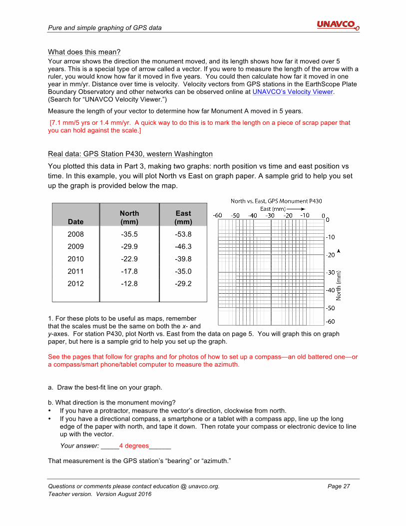
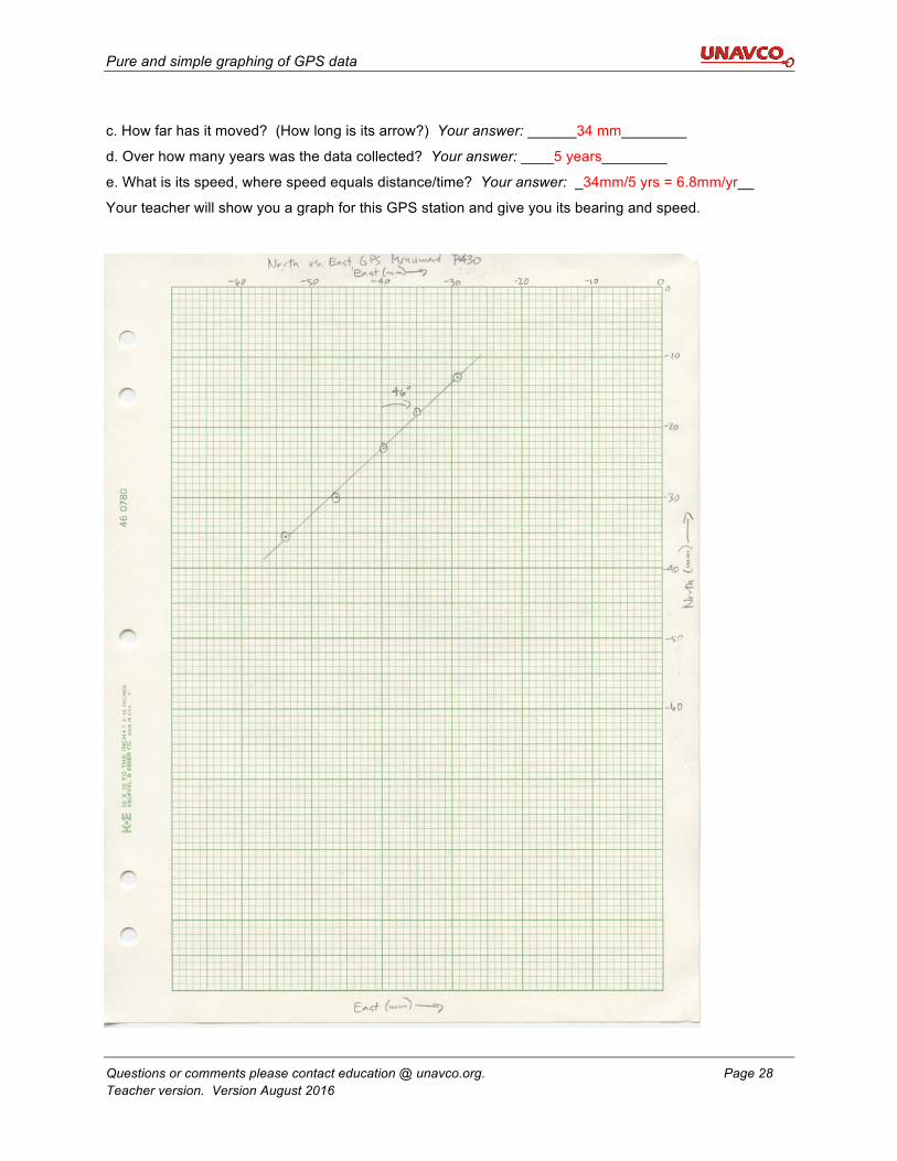
Real data: GPS Station P430, western Washington
You plotted this data in Part 3, making two graphs: north position vs time and east position vs time. In this example, you will plot North vs East on graph paper. A sample grid to help you set up the graph is provided below the map.
1. For these plots to be useful as maps, remember that the scales must be the same on both the x- and y-axes. For station P430, plot North vs. East from the data on page 5. You will graph this on graph paper, but here is a sample grid to help you set up the graph. See the pages that follow for graphs and for photos of how to set up a compass—an old battered one—or a compass/smart phone/tablet computer to measure the azimuth. a. Draw the best-fit line on your graph. b. What direction is the monument moving? • If you have a protractor, measure the vector’s direction, clockwise from north. • If you have a directional compass, a smartphone or a tablet with a compass app, line up the long
edge of the paper with north, and tape it down. Then rotate your compass or electronic device to line up with the vector.
Your answer: _____4 degrees______ That measurement is the GPS station’s “bearing” or “azimuth.”
Date North (mm)
East (mm)
2008 -35.5 -53.8
2009 -29.9 -46.3
2010 -22.9 -39.8
2011 -17.8 -35.0
2012 -12.8 -29.2
Pure and simple graphing of GPS data
Questions or comments please contact education @ unavco.org. Page 28 Teacher version. Version August 2016
c. How far has it moved? (How long is its arrow?) Your answer: ______34 mm________
d. Over how many years was the data collected? Your answer: ____5 years________
e. What is its speed, where speed equals distance/time? Your answer: _34mm/5 yrs = 6.8mm/yr__
Your teacher will show you a graph for this GPS station and give you its bearing and speed.
Pure and simple graphing of GPS data
Questions or comments please contact education @ unavco.org. Page 29 Teacher version. Version August 2016
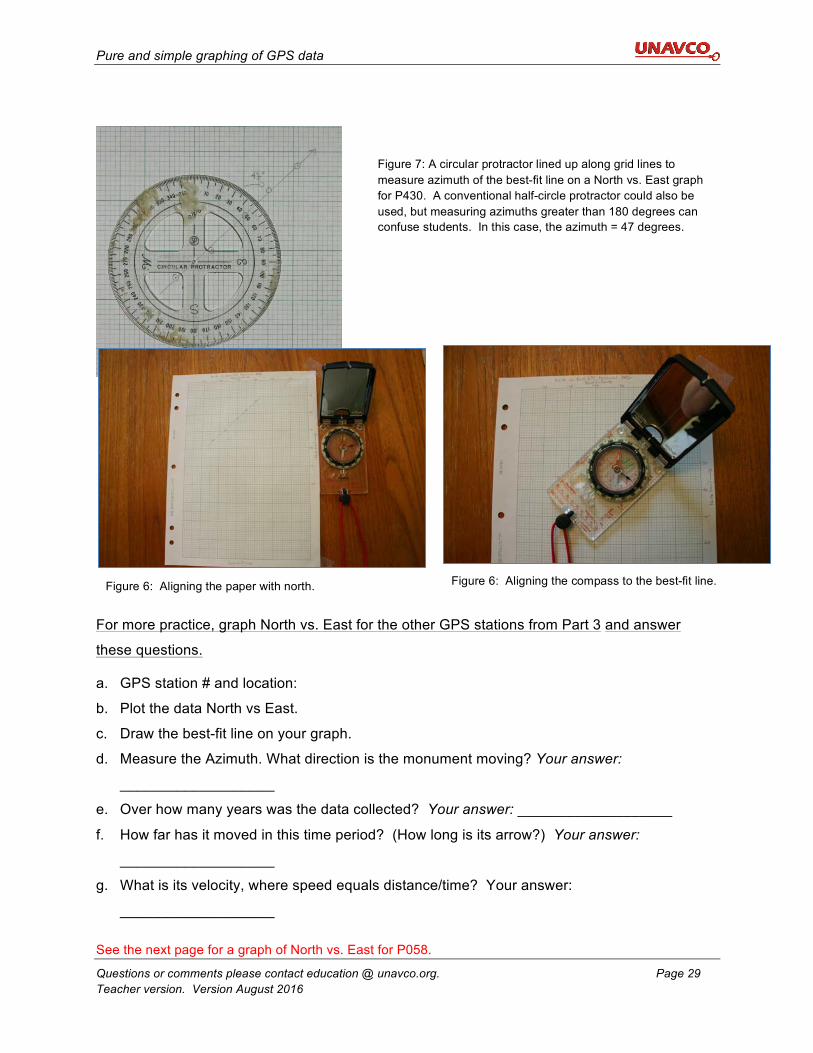
For more practice, graph North vs. East for the other GPS stations from Part 3 and answer
these questions.
a. GPS station # and location:
b. Plot the data North vs East.
c. Draw the best-fit line on your graph.
d. Measure the Azimuth. What direction is the monument moving? Your answer:
___________________
e. Over how many years was the data collected? Your answer: ___________________
f. How far has it moved in this time period? (How long is its arrow?) Your answer:
___________________
g. What is its velocity, where speed equals distance/time? Your answer:
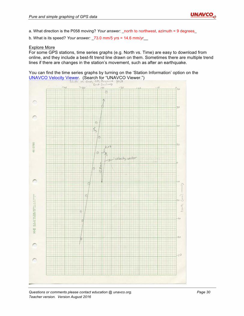
___________________ See the next page for a graph of North vs. East for P058.
Figure 7: A circular protractor lined up along grid lines to measure azimuth of the best-fit line on a North vs. East graph for P430. A conventional half-circle protractor could also be used, but measuring azimuths greater than 180 degrees can confuse students. In this case, the azimuth = 47 degrees.
Figure 6: Aligning the compass to the best-fit line. Figure 6: Aligning the paper with north.
Pure and simple graphing of GPS data
Questions or comments please contact education @ unavco.org. Page 30 Teacher version. Version August 2016
a. What direction is the P058 moving? Your answer: _north to northwest, azimuth = 9 degrees_
b. What is its speed? Your answer: _73.0 mm/5 yrs = 14.6 mm/yr__ Explore More For some GPS stations, time series graphs (e.g. North vs. Time) are easy to download from online, and they include a best-fit trend line drawn on them. Sometimes there are multiple trend lines if there are changes in the station’s movement, such as after an earthquake. You can find the time series graphs by turning on the ‘Station Information’ option on the UNAVCO Velocity Viewer. (Search for “UNAVCO Viewer.”)