Ident Case Study
21
Television Idents Natalie Lynch
-
Upload
natalie-lynch -
Category
Entertainment & Humor
-
view
29 -
download
0
Transcript of Ident Case Study
Television IdentsNatalie Lynch

Learning Outcome 1 - CRITERIADesign & Purpose
Learning Outcome 1 - INTRO
• In this section you will discuss and explain the overall issues regarding the design and purpose of television idents. You are to respond to the questions set in the template. You are encouraged to add extra slides where necessary and add images to illustrate your points.
• You should use your notes to help you formulate your responses, based on the following areas:• Design: density of information; space and time; screen tempo; interaction
with viewers; information-led; entertainment-led
• Purpose: identity; branding; marketing; packaging and re-packaging; scheduling; segmentation within scheduling
Purposes Q1
• Outline the core purposes of television idents [e.g. branding/identity for achannel, conveying the channel’s personality, retaining viewers, informingviewers, segmentation of broadcasting]
• There are a few main purposes of television idents for a channel. One ofthe main ones is to give the specific channel a unique identity / brand.The idents are used in order to represent what genre / type ofprogrammes are shown on the channel so that the viewers are more likelyto be attracted to watch. Idents are also used in order to indicate whatthe channel is about and again, who it is for. Usually, the idents willfeature voiceovers that introduce the programme that’s coming on next,so that the audience is more likely to stay tuned in for longer if they knowin advance what is going to be shown.
Purposes Q2
• Explain some of the developments in broadcasting that have led to type of channel branding and use of idents we see today
• Channel branding is really important recently as competition betweenchannels has grown massively. The use of idents represents thedevelopments and the growth of channels as it keeps up with the moderntechnology. This including more advanced visual effects and quality. It isall used to help a channel stand out and gain and/or retain their viewersas much as possible.
• Previously, original television idents were things such as mechanicalmodels which were filmed beforehand, rather than shown live on thechannel. This is a huge contrast to what we see today, something which isgraphically constructed and can reflect a channel’s own particular genre.
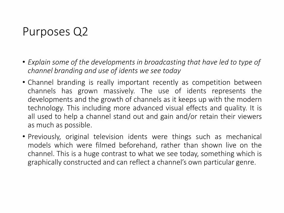
BBC1The current BBC1 idents were created with the idea of showing different groups ofpeople coming together. The word ‘Oneness’ is presented towards the bottom of thescreen, in contrast to the last set of idents which would show the logo in the center, andthen fades into the BBC One logo. The font used is very simple and used over the top ofthe clip, which is good as it’s easy to read and doesn’t add too much distraction from themain focus. The whole idea for this set of idents was to embrace and reflect the diversitythat is in Britain today. The groups from each ident show more of a mature audience butalso include a few younger family members, which therefore indicates and reflects uponthe programmes that are aired on the channel.
The voice over used across all ofthese BBC One idents is basicand soft, which is played overno soundtrack throughout theduration, making it easy tofollow and more slow pacedoverall. These set of identscontrast with those from ITV,who’s idents feature voice overswith a range of various accentsand show just a glimpse ofpeople’s every day lives andtheir activities.
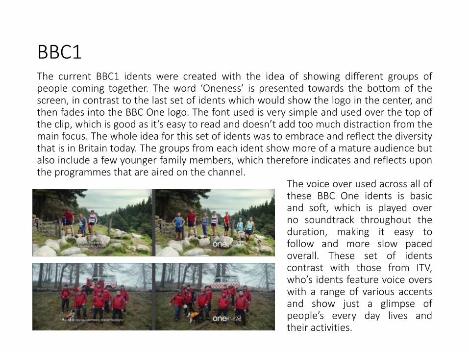
BBC2In BBC 2’s idents, they all featurejust a number ‘2’ that has beendesigned or presented in adifferent way. The use of motiongraphics is present as the ‘2’ isimposed into a normal clip andbrought to life or made to move asif it were an object. Whenaudiences watch this, most willautomatically recognise that it is
there to represent the BBC 2 brand, however the logo for the channel is still presentsomewhere in the screen. Colours used within the idents are all quite mixed, withsome using darker colours and one main brighter colour to create contrast as wellas the same using brighter colours against naturals. This makes the ‘2’ stand out alot more on the screen and draws attention to that. With the programmes aired onthis channel being slightly more progressive than those on BBC 1, the idents needto represent this – the reason why they’re more creative and interesting with a bitmore going on. Comparing to the older BBC 2 idents, these ones incorporate the ’2’within the background, whereas the older ones used the ‘2’ to create a window intoa bigger picture, both ident suites being highly successful.
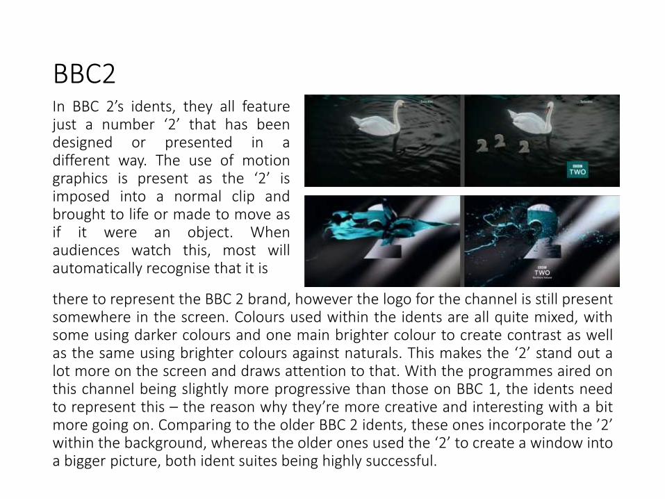
ITVITV’s most recent idents reflect upon what theBritish public do everyday; ranging from jobs /careers to things and activities in and out of thehome. The camera movement is either still orvery slow, giving the overall clip a slower pace.There’s not a specific colour pallet, however thecolours that the ITV logo are shown as alwaysmatch the colours from the shot. This couldpossibly reflect how the programmes shown onthis channel are suited to each particularaudience member. Linking to the audiencerelation within each ident, the voiceovers usedin each one features a different accent whichshows that they have more of a diverseaudience. Each ident is taken in just one longshot which focuses in on a specific thing, thiscould relate to what programmes are aired onthe channel.
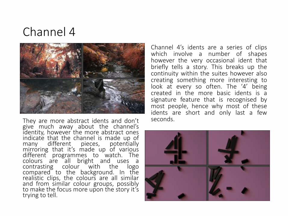
In contrast to ITV’s idents, Channel 4’s idents consist of shapes that form the number ‘4’, whereas ITVincorporates the same colours from the background image within the logo when it appears onscreen. The logo from channel 4 stands out a lot more in contrast to ITV who’s logo blends more withthe background, giving the indication that the idents shown clearly represent the programmes aired.
Channel 4
they reflect
Channel 4’s idents are a series of clipswhich involve a number of shapeshowever the very occasional ident thatbriefly tells a story. This breaks up thecontinuity within the suites however alsocreating something more interesting tolook at every so often. The ‘4’ beingcreated in the more basic idents is asignature feature that is recognised bymost people, hence why most of theseidents are short and only last a fewseconds.They are more abstract idents and don’t
give much away about the channel’sidentity, however the more abstract onesindicate that the channel is made up ofmany different pieces, potentiallymirroring that it’s made up of variousdifferent programmes to watch. Thecolours are all bright and uses acontrasting colour with the logocompared to the background. In therealistic clips, the colours are all similarand from similar colour groups, possiblyto make the focus more upon the story it’strying to tell.

Channel 5Channel 5’s idents all tell some sort ofthe story with the main focus beingrevealed in a group of 5. Being thenewest channel out of the ones shown,it is more creative and aestheticallypleasing when watching the ident back,with the clear theme of objects /people / things in 5’s. The colours are allbright however slightly softened andmuted, which works when creatingcontrast with the ’5’ things on screen.
The channel’s idents are a lot morefamily friendly and appeal to a widerrange of people, conveying that it’smore of an open channel and not justtargeted strictly towards a certaindemographic. The idents are also a lotmemorable and likely to beremembered. The groups of 5 willremind people what the whole idea ofthe ident is, which is to promote andbring people in to watch Channel 5.

Learning Outcome 2 - CRITERIAOpportunities and Limitations
Learning Outcome 2 - INTROOpportunities and Limitations
• This section concerns the opportunities and limitations of onscreen graphic representations. This section should expand on the points you made in section 1.
• You should consider more closely the audience and requirements on the broadcaster to engage with their audience, discussing how they may have successfully/unsuccessfully achieved this.
• Think about the discussions and examples from the lecture [some points to consider will be listed in the PP for the lecture]
• Add slides to expand your points and definitely add illustrative stills, etc!
TASK 2 - Learning Outcome 2
• Select 2 different channels to look at, each of these channels should be aimed at different audiences [for example, E4 and BBC4 or CITV and BBC1, etc].
• You should:• Outline the style and design of each set of idents [include examples]
• Comment on the visual elements, such as colour, font, imagery, motion and composition, for each suite of idents
• Explain how each suite supports it’s intended audience
• Consider the restrictions or challenges in trying to develop a brand/ident package for the selected channel’s audiences
• Compare the sets of idents, what characterstics are similar or different?
Some starting points
• Which channel uses this ident?
• How long is the ident?
• What are the sounds used within the ident?
• What is the content of the ident?
• Was the ident created using animation or live footage?
• Who is the target audience for the ident?
• What are the settings/characters/props used for the ident?
• How does the ident relate to the TV Company?
• How is the TV Company advertised?
• What are the good points about the ident?
• What are the bad points about the ident?
• Is the ident effective? Why?
• Does the ident have a hidden message?
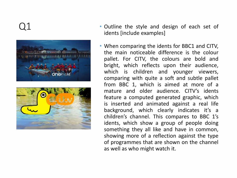
Q1 • Outline the style and design of each set ofidents [include examples]
• When comparing the idents for BBC1 and CITV,the main noticeable difference is the colourpallet. For CITV, the colours are bold andbright, which reflects upon their audience,which is children and younger viewers,comparing with quite a soft and subtle palletfrom BBC 1, which is aimed at more of amature and older audience. CITV’s identsfeature a computed generated graphic, whichis inserted and animated against a real lifebackground, which clearly indicates it’s achildren’s channel. This compares to BBC 1’sidents, which show a group of people doingsomething they all like and have in common,showing more of a reflection against the typeof programmes that are shown on the channelas well as who might watch it.
Q2
• Comment on the visual elements, such as colour, font, imagery, motion andcomposition, for each suite of idents
• In BBC 1’s idents, the composition of the subjects within the shot changesthroughout. Although the background image remains still and no camerapanning takes place, the people within the shot all begin spread out, to theneventually come together and represent the whole ‘Oneness’ suite. The fontused by BBC 1 is formal and flowy which links to the more mature audience, it isalso shown in white, which continues the more muted and calm colour schemesthat are shown. Imagery used for this set of idents includes things that are takenup by people every day, which a lot of people in their audience will be able torelate to.
• For CITV, the font is bulky and incorporates the C from the word within thegraphics shown. This is to emphasise that it is part of the ITV family but forchildren. The font is in the colour every time with generally contrasts with therest of the bright background, making it clear what channel is being watched.Each ident includes a small snippet of sound, making it more interesting and willcatch the attention of the viewer if beginning to lose interest.

Q3
• Explain how each suite supports it’s intended audience
• BBC 1 supports it’s intended audience by featuring different clips of activitiesthat they’re most likely to be attracted to and take part in. The cameramovement is very simple and subtle. All the idents feature the same conceptwhich shows continuity within the channel and the programmes featured.
• CITV’s idents consist of a lot more movement and bold imagery. It attracts theintended audience from the very beginning by using the graphics that clearlystand out from the background. It’s quite artistic and replicates something that achild may draw or come up with themselves, inspiring them to be creative too.

Q4
• Consider the restrictions or challenges in trying to develop a brand/identpackage for the selected channel’s audiences, write them down here:
• The similarity of content between BBC 1 and other channels may causechallenges during development. They will need to ensure they retain their ownpersonal brand during production while still aiming to reach the widestaudiences that they possibly can. For example, BBC 1 have created the‘Oneness’ brand which can be noticed as individual to them and stands out.Another restriction that both BBC 1 and CITV may face is finding the suitablegraphics or music that fits with the audience that they want to connect with butat the same time, one that is also suitable for the content of the channel.
• A restriction that CITV and other children’s channels will face in particular, iskeeping the ideas fresh and up to date so that they still attract the largestaudience possible. Younger viewers get distracted more easily when watchingtelevision, so therefore ensuring that the idents keep them interested is a vitalpart when creating an ident.
Q5
• Compare the sets of idents, what characteristics are similar or different?
• For BBC 1, the logo appears towards the bottom of the screen, slightly offcenter, and remains there for the entirety of the ident sequence. This is differentfrom that of CITV as for their ident suite, the ’C’ is incorporated into the imageon the screen and the ‘ITV’ part of the name travels across the screen in someway in order to emphasise that it’s the children’s section but still remains as partof the ‘ITV’ brand.
• Another difference is the pace of the idents. Both channels seem to have slowerrunning motion, however when the logo is introduced, there is a significantdifference. BBC 1’s logo appears slowly and has more of a smooth look whereasCITV’s logo is a lot more fast paced and links to the image somehow.
• One of the main differences is how BBC 1 uses real life imagery where as CITVuses more computer created graphics.
Q6
• Which set/suite of idents is the most successful in your opinion? Whydo you think this?
• I think both idents are just as successful as each other becausethey’re both aimed different audiences. BBC 1 is very successful withattracting more mature and adult audiences whereas CITV issuccessful with attracting the younger audiences. If comparing CITVfor a channel such as CBBC, then I’d consider CBBC to be morepopular however there is still some slight differences between theaudiences in terms of specific ages. BBC 1 is successful in the fact ishas become one of the most popular channels on TV. It featuresdifferent activities that the adult audience will most likely to beattracted to and it also might encourage them to start somethingnew. CITV is successful at keeping its audience engaged which isgenerally harder to do with younger viewers.
Q7
• What other issues do you think producers need to consider in theirproduction of onscreen graphic representation? This could be to do withduration, for example when continuity announcers are used, appropriatecontent, the issues of viewer generated content, etc?
• The channels will need to take into consideration the content of their identsduring different times of the day. For example, CITV may produce an identfor later on in the day, which will be more relaxing and slow, encouragingmore of a bed time theme. On the other hand, BBC 1 will need to considertheir content of the idents after the watershed time, as the theme ofprogrammes on the channel will change and will be suitable for adults,therefore the idents need to represent this more.
• Both channels will need to have a range of diverse accents and ethnicitiesshown through the continuity announcers, as well as both male and femaleannouncers. This will represent the wide audiences that are the targets forboth channels, not just a very specific demographic.
• Duration of the idents will need to be a suitable length and is very importantto think about during the production process. The ident shouldn't be toolong as people will begin to get bored of them however but they need to belong enough to indicate what kind of thing is broadcast on the channel.

![1 ÎÁÙÈÅ ÑÂÅÄÅÍÈß Î GAP - Dr. Alexander Konovalov2.14 ФУНКЦИИ Формат: function ( [ arg-ident {, arg-ident} ] ) [ local loc-ident {, loc-ident} ; ] statements](https://static.fdocuments.net/doc/165x107/6123a12597bd3f22434f6d2a/1-gap-dr-alexander-konovalov-214-.jpg)