Hybrid Statistics Frequency Distributions and Their...
30
1 | Page Hannah Province – Mathematics Department Southwest Tennessee Community College Hybrid Statistics – Chapter 2 Section 2.1 – Frequency Distributions and Their Graphs Objectives: Construct frequency distributions Construct frequency histograms Frequency polygons Relative frequency histograms Ogives Frequency Distribution A frequency table partitions data into classes or intervals and shows how many data values are in each class. The classes or intervals are constructed so that each data falls into exactly one class. If the frequency is converted into percentage of individuals then we have a relative frequency table. Steps to Constructing a Frequency Distribution 1. Decide on the number of classes. a. Usually between 5 and 20; otherwise, it may be difficult to detect any patterns. The problem will usually tell you how many classes. 2. Find the class width. a. Determine the range of the data. (Highest Obs. – Lowest Obs.) b. Divide the range by the number of classes. c. Round up to the next convenient number. 3. Find the class limits. a. You can use the minimum data entry as the lower limit of the first class. b. Find the remaining lower limits (add the class width to the lower limit of the preceding class). c. Find the upper limit of the first class. Remember that classes cannot overlap. d. Find the remaining upper class limits. 4. Count each data entry in the row of the appropriate class to find the total frequency, f, for each class.
Transcript of Hybrid Statistics Frequency Distributions and Their...

1 | P a g e Hannah Province – Mathematics Department Southwest Tennessee Community College
Hybrid Statistics – Chapter 2
Section 2.1 – Frequency Distributions and Their Graphs
Objectives: Construct frequency distributions
Construct frequency histograms
Frequency polygons
Relative frequency histograms
Ogives
Frequency Distribution
A frequency table partitions data into classes or intervals and shows how many data values are in each
class. The classes or intervals are constructed so that each data falls into exactly one class. If the
frequency is converted into percentage of individuals then we have a relative frequency table.
Steps to Constructing a Frequency Distribution
1. Decide on the number of classes.
a. Usually between 5 and 20; otherwise, it may be difficult to detect any patterns. The
problem will usually tell you how many classes.
2. Find the class width.
a. Determine the range of the data. (Highest Obs. – Lowest Obs.)
b. Divide the range by the number of classes.
c. Round up to the next convenient number.
3. Find the class limits.
a. You can use the minimum data entry as the lower limit of the first class.
b. Find the remaining lower limits (add the class width to the lower limit of the preceding
class).
c. Find the upper limit of the first class. Remember that classes cannot overlap.
d. Find the remaining upper class limits.
4. Count each data entry in the row of the appropriate class to find the total frequency, f, for each
class.

2 | P a g e Hannah Province – Mathematics Department Southwest Tennessee Community College
Determining the Class Limits (Upper and Lower)
Determining the Midpoint (In section 2.3 the Midpoint
will be denoted by the letter x)
Midpoint of a class
Determining the Relative Frequency
Relative Frequency of a class
Portion or percentage of the data that falls
in a particular class.
Determining the Cumulative Frequency
Cumulative frequency of a class
The sum of the frequency for that class and
all previous classes.
(Lower class limit) (Upper class limit)
2
59 11486.5
2
115 170142.5
2
171 226198.5
2
Class width = 56
50.17
30
80.27
30
60.2
30
+
+
6
1
31
9
Lower Class Limit Upper Class Limit

3 | P a g e Hannah Province – Mathematics Department Southwest Tennessee Community College
Example: Constructing a Frequency Distribution
The following sample data set lists the prices )in dollars) of 30 portable global positioning system (GPS)
navigators. Construct a frequency distribution that has seven classes.
90 130 400 200 350 70 325 250 150 250
275 270 150 130 59 200 160 450 300 130
220 100 200 400 200 250 95 180 170 150
Solution:

4 | P a g e Hannah Province – Mathematics Department Southwest Tennessee Community College
Graphs of Frequency Distributions
Frequency Histogram
A bar graph that represents the frequency distribution.
The horizontal scale is quantitative and measures the data values.
The vertical scale measures the frequencies of the classes.
Consecutive bars must touch.
Class boundaries
The numbers that separate classes without forming gaps between them.
The distance from the upper limit of the first class to the lower limit of the second class is
115 – 114 = 1. Half this distance is 0.5.
First class lower boundary = 59 – 0.5 = 58.5
First class upper boundary = 114 + 0.5 = 114.5
Class Boundaries
Class Boundaries
freq
uen
cy

5 | P a g e Hannah Province – Mathematics Department Southwest Tennessee Community College
Frequency Polygon
A line graph that emphasizes the continuous change in
frequencies.
Relative Frequency Histogram
Has the same shape and the same horizontal scale as the
corresponding frequency histogram.
The vertical scale measures the relative frequencies, not frequencies.
Cumulative Frequency Graph or Ogive
A line graph that displays the cumulative frequency of each
class at its upper class boundary.
The upper boundaries are marked on the horizontal axis.
The cumulative frequencies are marked on the vertical axis.
Constructing an Ogive
1. Construct a frequency distribution that includes cumulative frequencies as one
of the columns.
2. Specify the horizontal and vertical scales.
a. The horizontal scale consists of the upper class boundaries.
b. The vertical scale measures cumulative frequencies.
3. Plot points that represent the upper class boundaries and their corresponding
cumulative frequencies
4. Connect the points in order from left to right
5. The graph should start at the lower boundary of the first class (cumulative
frequency is zero) and should end at the upper boundary of the last class
(cumulative frequency is equal to the sample size).
Mid points
values
freq
uen
cy
Class Boundaries
values
rela
tive
freq
uen
cy
Class Boundaries
valuescu
mu
lati
ve
freq
uen
cy

6 | P a g e Hannah Province – Mathematics Department Southwest Tennessee Community College
Example: Frequency Histogram
Construct a frequency histogram for the Global Positioning system (GPS) navigators.
Solution: Frequency Histogram (using Midpoints). The frequencies go on the vertical axis in a nice index.
The class boundaries go on the horizontal axis.
You can see that more than half of the GPS navigators are priced below $226.50.
7 | P a g e Hannah Province – Mathematics Department Southwest Tennessee Community College
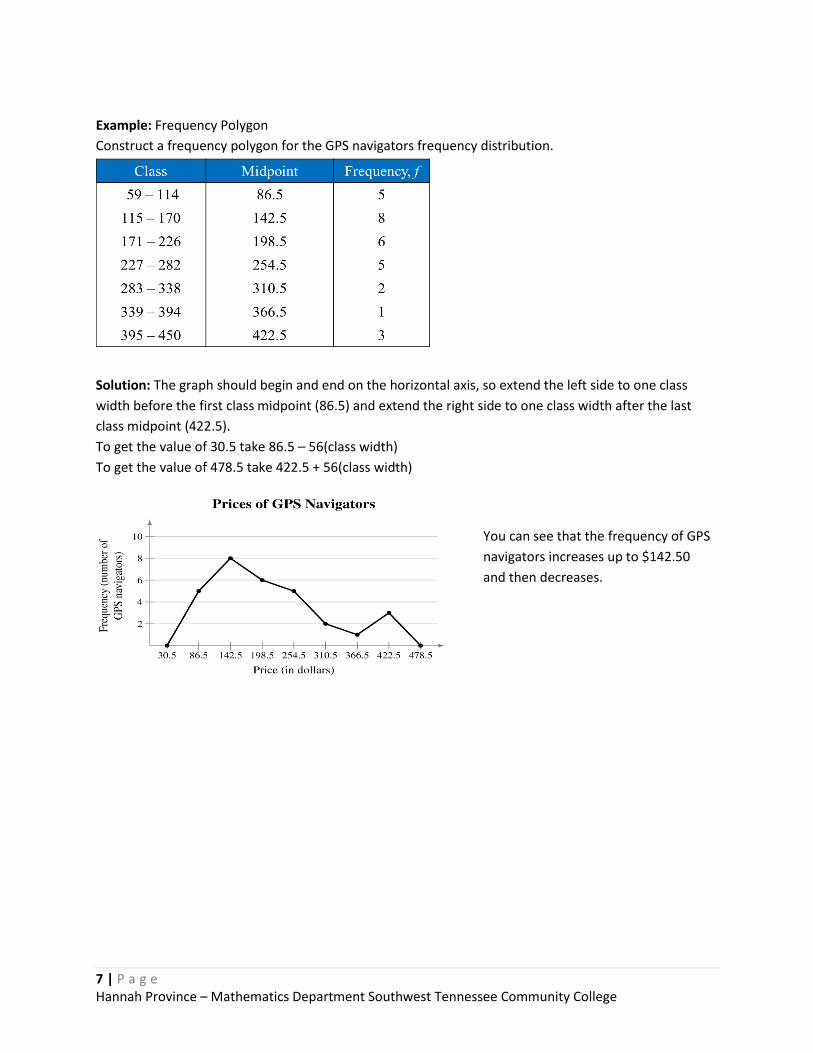
Example: Frequency Polygon
Construct a frequency polygon for the GPS navigators frequency distribution.
Solution: The graph should begin and end on the horizontal axis, so extend the left side to one class
width before the first class midpoint (86.5) and extend the right side to one class width after the last
class midpoint (422.5).
To get the value of 30.5 take 86.5 – 56(class width)
To get the value of 478.5 take 422.5 + 56(class width)
You can see that the frequency of GPS
navigators increases up to $142.50
and then decreases.

8 | P a g e Hannah Province – Mathematics Department Southwest Tennessee Community College
Example: Relative Frequency Histogram
Construct a relative frequency histogram for the GPS navigators frequency distribution
Solution: The relative frequencies go on the vertical axis in a nice index. The class boundaries go on the
horizontal axis.
From this graph you can see that 20%
of GPS navigators are priced between
$114.50 and $170.50.

9 | P a g e Hannah Province – Mathematics Department Southwest Tennessee Community College
Example: Ogive
Construct an ogive for the GPS navigators frequency distribution.
Solution: The cumulative frequencies go on the vertical axis in a nice index. The class boundaries go on
the horizontal axis.
From the ogive, you can see that
about 25 GPS navigators cost $300 or
less. The greatest increase occurs
between $114.50 and $170.50.

10 | P a g e Hannah Province – Mathematics Department Southwest Tennessee Community College
Section 2.2 – More Graphs and Displays
Objectives: Graph quantitative data using stem-and-leaf plots and dot plots
Graph qualitative data using pie charts and Pareto charts
Graph paired data sets using scatter plots and time series charts
Graphing Quantitative Data Sets
Stem-and-leaf plot
Each number is separated into a stem and a leaf.
Similar to a histogram.
Still contains original data values.
Dot plot
Each data entry is plotted, using a point, above a horizontal axis
Pie Chart
A circle is divided into sectors that represent categories.
The area of each sector is proportional to the frequency of each category.
Pareto Chart
A vertical bar graph in which the height of each bar represents frequency or relative frequency.
The bars are positioned in order of decreasing height, with the tallest bar positioned at the left.
Paired Data Sets
Each entry in one data set corresponds to one entry in a second data set.
Graph using a scatter plot.
The ordered pairs are graphed as points in a coordinate plane. Used to show the relationship
between two quantitative variables.
Data: 21, 25, 25, 26, 27, 28, 30, 36, 36, 45
26
20 21 22 23 24 25 26 27 28 29 30 31 32 33 34 35 36 37 38 39 40 41 42 43 44 45
Data: 21, 25, 25, 26, 27, 28, 30, 36, 36, 45
x
y

11 | P a g e Hannah Province – Mathematics Department Southwest Tennessee Community College
Time Series
Data set is composed of quantitative entries taken at regular intervals over a period of time.
e.g., the amount of precipitation measured each day for one month.
Use a time series chart to graph.
Example: Constructing a Stem-and-Leaf Plot
The following are the numbers of text messages sent last month by the cellular phone users on one floor
of a college dormitory. Display the data in a stem-and-leaf plot.
Solution: The data entries go from a low of 78 to a high of 159.
Use the rightmost digit as the leaf. For instance, 78 = 7 | 8 and 159 = 15 | 9
List the stems, 7 to 15, to the left of a vertical line.
For each data entry, list a leaf to the right of its stem. Do not skip numbers!
From the display, you can conclude that more than 50% of the cellular phone users sent between 110
and 130 text messages.
155 159 144 129 105 145 126 116 130 114 122 112 112 142 126 118 108 122 121 109 140 126 119 113 117 118 109 109 119 139 122 78 133 126 123 145 121 134 124 119 132 133 124 129 112 126 148 147
Include a key to
identify the values of
the data.
time
Quanti
tati
ve
dat
a

12 | P a g e Hannah Province – Mathematics Department Southwest Tennessee Community College
Example: Constructing a Dot Plot
Use a dot plot organize the text messaging data.
So that each data entry is included in the dot plot, the horizontal axis should include numbers between
70 and 160.
To represent a data entry, plot a point above the entry's position on the axis.
If an entry is repeated, plot another point above the previous point.
Solution: From the dot plot, you can see that most values cluster between 105 and 148 and the value
that occurs the most is 126. You can also see that 78 is an unusual data value.
155 159 144 129 105 145 126 116 130 114 122 112 112 142 126 118 108 122 121 109 140 126 119 113 117 118 109 109 119 139 122 78 133 126 123 145 121 134 124 119 132 133 124 129 112 126 148 147

13 | P a g e Hannah Province – Mathematics Department Southwest Tennessee Community College
Example: Constructing a Pie Chart
The numbers of earned degrees conferred (in thousands) in 2007 are shown in the table. Use a pie chart
to organize the data. (Source: U.S. National Center for Educational Statistics)
Solution:

14 | P a g e Hannah Province – Mathematics Department Southwest Tennessee Community College
Section 2.3 - Measures of Central Tendency
Objectives
Determine the mean, median, and mode of a population and of a sample
Determine the weighted mean of a data set and the mean of a frequency distribution
Describe the shape of a distribution as symmetric, uniform, or skewed and compare the mean
and median for each
Measure of central tendency
A value that represents a typical, or central, entry of a data set.
Most common measures of central tendency:
Mean
Median
Mode
Mean (average)
The sum of all the data entries divided by the number of entries.
Sigma notation: Σx = add all of the data entries (x) in the data set.
Population mean: Sample mean:
Median
The value that lies in the middle of the data when the data set is ordered.
Measures the center of an ordered data set by dividing it into two equal parts.
If the data set has an odd number of entries: median is the middle data entry. even number
of entries: median is the mean of the two middle data entries.
The median is resistant to outliers
Finding the median:
1). Order the data from smallest to largest.
2). For an odd number of data values:
Median = Middle data value
3). For an even number of data values:
Mode
The data entry that occurs with the greatest frequency.
If no entry is repeated the data set has no mode.
If two entries occur with the same greatest frequency, each entry is a mode (bimodal).
Note: not every data set has a mode
i.e. data: 10 10 10 10 has no mode.
x
N
xx
n
Sum of middle two valuesMedian
2

15 | P a g e Hannah Province – Mathematics Department Southwest Tennessee Community College
Example: Find the mean, median and mode of the following data set.
{3, 8, 5, 4, 8, 4, 10}
Solution:
Comparing the Mean, Median, and Mode
• All three measures describe a typical entry of a data set.
• Advantage of using the mean:
The mean is a reliable measure because it takes into account every entry of a data set.
• Disadvantage of using the mean:
Greatly affected by outliers (a data entry that is far removed from the other entries in
the data set).
Outliers in a data set are data values that are very different from other measurements in the data set.
They many indicate that an error occurred or the data may be an actual data point.
Do you include Outliers in statistical analysis?
It depends, any decision about outliers should include people what are familiar with the field
and the purpose of the study.
Weighted Mean
• The mean of a data set whose entries have varying weights.
• where w is the weight of each entry x
Example: Grades: Given that the exam average is 85, the final exam score was 87, the homework
average was 98. Find the weighted average if the tests are worth 40% and the final was worth 40% and
the homework was 20%.
Solution:
( )x wx
w
How to With your Calculator:
Press STAT ⟶ EDIT
This is where you enter your data

16 | P a g e Hannah Province – Mathematics Department Southwest Tennessee Community College
Mean of a Frequency Distribution
• Approximated by
where x is the midpoints and f is the frequencies of a class, respectively
Finding the Mean of a Frequency Distribution
Example: Find the Mean of a Frequency Distribution – Grouped Data
Use the frequency distribution to approximate the mean number of minutes that a sample of Internet
subscribers spent online during their most recent session.
( )x fx n f
n
In Words In Symbols
( )x fx
n
(lower limit)+(upper limit)
2x
( )x f
n f
1. Find the midpoint of each class.
2. Find the sum of the products of the midpoints and the frequencies.
3. Find the sum of the frequencies.
4. Find the mean of the frequency distribution.
Solution:

17 | P a g e Hannah Province – Mathematics Department Southwest Tennessee Community College
Distribution Shapes
Symmetric Distribution
A vertical line can be drawn through the middle of a graph of the distribution and the resulting halves
are approximately mirror images.
• Mound-shaped symmetrical – mean = median = mode.
Uniform Distribution (rectangular)
All entries or classes in the distribution have equal or approximately equal frequencies.
Uniform-shaped – mean = median. There would be no mode here.

18 | P a g e Hannah Province – Mathematics Department Southwest Tennessee Community College
Skewed Left Distribution (negatively skewed)
The “tail” of the graph elongates more to the left. The mean is to the left of the median.
• Left Skewed shaped – mean < median < mode.
Skewed Right Distribution (positively skewed)
The “tail” of the graph elongates more to the right. The mean is to the right of the median.
• Right Skewed shaped – mean > median > mode.
Coefficient of Variation
A disadvantage of the standard deviation as a comparative measure of variation is that it depends on
the units of measurements. This means that it is difficult to use the standard deviation to compare
measurements from different populations. For this reason we have the coefficient of variation which
expresses the standard deviation as a percentage of the sample or population mean.
For Samples For Populations
Example – Big Blossom Greenhouse was commissioned to develop an extra-large rose for the Rose Bowl
Parade. A random sample of blossoms from Hybrid A bushes yielded the following diameters (in inches)
for mature peak blooms. Find the Coefficient of Variation.
2, 3, 3, 8, 10, 10
Solution:
100x
sCV 100
CV

19 | P a g e Hannah Province – Mathematics Department Southwest Tennessee Community College
Section 2.4 – Measures of Variation
Objectives
• Determine the range of a data set
• Determine the variance and standard deviation of a population and of a sample
• Use the Empirical Rule and Chebychev’s Theorem to interpret standard deviation
• Approximate the sample standard deviation for grouped data
Three measures of variation:
range
variance
standard deviation
Range
• The difference between the maximum and minimum data entries in the set.
• The data must be quantitative.
• Range = (Max. data entry) – (Min. data entry)
Sample Variance and Sample Standard Deviation
Sample Variance – Can be thought of as a kind of average of the values values. However we
divide by (n-1) instead of n for technical reasons.
Sample Standard Deviation – Can be thought of as a measure of variability or risk. Larger values of s
imply greater variability in the data. Why do we take the square root? Because the units before the
square root are so we take the square root to get back to the original units.
The standard deviation is the square root of the variance.
2s s = standard deviation
s has the same dimensions as the original x’s
How to With your Calculator:
Press STAT ⟶ EDIT
This is where you enter your data
To Analyze your Data:
Press STAT⟶CALC⟶1-Var Stats

20 | P a g e Hannah Province – Mathematics Department Southwest Tennessee Community College
Population Variance and Population Standard Deviation
Interpreting Standard Deviation
• Standard deviation is a measure of the typical amount an entry deviates from the mean.
• The more the entries are spread out, the greater the standard deviation.
Population Sample
µ - Population Mean – Sample Mean
σ – Population Standard Deviation s – Sample Standard Deviation
– Population Variance – Sample Variance

21 | P a g e Hannah Province – Mathematics Department Southwest Tennessee Community College
Interpreting Standard Deviation: Empirical Rule (68 – 95 – 99.7 Rule)
For data with a (symmetric) bell-shaped distribution, the standard deviation has the following
characteristics:
• About 68% of the data lie within one standard deviation of the mean.
• About 95% of the data lie within two standard deviations of the mean.
About 99.7% of the data lie within three standard deviations of the mean.
Example: Big Blossom Greenhouse was commissioned to develop an extra-large rose for the Rose Bowl
Parade. A random sample of blossoms from Hybrid A bushes yielded the following diameters (in inches)
for mature peak blooms. Find some descriptive statistics for the given data.
2, 3, 3, 8, 10, 10
Solution:
x s 2x s 3x sx3x s x s2x s
68% within 1 standard deviation
34% 34%
99.7% within 3 standard deviations
2.35% 2.35%
95% within 2 standard deviations
13.5% 13.5%
𝜇 3𝜎
Or
𝜇 2𝜎
Or
𝜇 𝜎
Or
𝜇
Or
𝜇 + 𝜎
Or
𝜇 + 2𝜎
Or
𝜇 + 3𝜎
Or

22 | P a g e Hannah Province – Mathematics Department Southwest Tennessee Community College
Example: Using the Empirical Rule
In a survey conducted by the National Center for Health Statistics, the sample mean height of women in
the United States (ages 20-29) was 64.3 inches, with a sample standard deviation of 2.62 inches.
Estimate the percent of the women whose heights are between 59.06 inches and 64.3 inches.
Solution:
Critical Thinking
• Standard deviation or variance, along with the mean, gives a better picture of the data
distribution than the mean alone.
• Chebyshev’s theorem works for all kinds of data distribution.
• Data values beyond 2.5 standard deviations from the mean may be considered as outliers.

23 | P a g e Hannah Province – Mathematics Department Southwest Tennessee Community College
Example – “Students who care” is a student volunteer program in which college students donate work
time to various community projects. For a random sample of students in the program, the mean number
of hours was 2 hours each semester with a sample standard deviation of hours each
semester. Find an interval to A to B for the number of hours volunteered into which at least 75% of the
students in this program would fall.
Solution: Chevbyshev’s Theorem states that 75 % of the data must fall within 2 standard deviations of
the mean. The mean 2 and the standard deviation the interval is:
2 + 2
2 2 2 + 2
25.7 to 32.5
At least 75% of the students would fall into the group that volunteered from 25.7 to 32.5 hours each
semester.
Standard Deviation for Grouped Data
Sample standard deviation for a frequency distribution
When a frequency distribution has classes, estimate the sample mean and standard deviation by using
the midpoint of each class
2( )
1
x x fs
n
where n= Σf (the number of entries in the data set)

24 | P a g e Hannah Province – Mathematics Department Southwest Tennessee Community College
Example: Finding the Standard Deviation for Grouped Data
You collect a random sample of the number of children per
household in a region. Find the sample mean and the sample
standard deviation of the data set.
\
Solution:
Step1: First construct a frequency distribution.
x x2( )x x 2( )x x f
2( ) 145.40x x f
Step 3: Determine the sum of
squares
Step 2: Find the mean of the frequency distribution
The sample mean is about 1.8 children.
Step 4:
Find the sample standard deviation.
𝑠 𝑥−�� 2𝑓
𝑛−1
145 40
50−1 ≈
The standard deviation is about 1.7
children.

25 | P a g e Hannah Province – Mathematics Department Southwest Tennessee Community College
Percentiles and Quartiles
• For whole numbers P, 1 ≤ P ≤ 99, the Pth percentile of a distribution is a value such that P% of the
data fall below it, and (100-P)% of the data fall at or above it.
• Q1 = 25th Percentile
• Q2 = 50th Percentile = The Median
• Q3 = 75th Percentile
Fractiles Summary Symbols
Quartiles Divide a data set into 4 equal parts Q1, Q2, Q3
Deciles Divide a data set into 10 equal parts D1, D2, D3, …
Percentiles Divide a data set into 100 equal parts P1, P2, P3, …
Quartiles and Interquartile Range (IQR) : 1
Quantiles divide the data into four parts
To find quantiles
(1.) Arrange the data from smallest to largest and find the median.
(2.) First quantile (Q1) is the median of the observations whose position in the ordered list is to the
left of the median.
(3.) Third quantile (Q3) is the median of the observations whose position in the ordered list is to the
right of the median.
A measure of spread based on Quantiles is the Interquantile range = IQR
IQR =Q3 – Q1
The IQR gives the spread of the middle 50% of the data.

26 | P a g e Hannah Province – Mathematics Department Southwest Tennessee Community College
Computing Quartiles
Example – Find the mean ( ) and 1 and the interquartile range (IQR) of the following data.
32 41 59 68 72 78 81 92 95 96
Solution:
Box-and-whisker plot
• Exploratory data analysis tool.
• Highlights important features of a data set.
• Requires (five-number summary):
Minimum entry
First quartile Q1
Median Q2
Third quartile Q3
Maximum entry
Drawing a Box-and-Whisker Plot
1. Find the five-number summary of the data set.
2. Construct a horizontal scale that spans the range of the data.
3. Plot the five numbers above the horizontal scale.
4. Draw a box above the horizontal scale from Q1 to Q3 and draw a vertical line in the box at Q2.
5. Draw whiskers from the box to the minimum and maximum entries.
2( ) 145.40x x f
Whisker Whisker
Maximum entry
Minimum entry
Box
Median, Q2 Q
3 Q
1

27 | P a g e Hannah Province – Mathematics Department Southwest Tennessee Community College
Example - Which of the following box-and-whiskers plots suggests a symmetric data distribution?
Percentiles and Other Fractiles
How to compute percentiles given data:
1. Order the data set in ascending order 2. Use this equation to find the index of the percentile: p/100 * (n + 1) where p is the
percentile you want so if the problem asks for P30 then you want the 30th percentile. 3. If the solution is an integer, say 32, then the pth percentile value is the 32nd data point from the
sample in ascending order. If the solution is not an integer then you find the average value be the two surrounding points. For example, say the solution is 23.7 for the index of the pth percentile. The value reported is the average of the 23rd and 24th data point. This can be either the simple average or a weighted average.
a
.
b
.
c
.
d
.

28 | P a g e Hannah Province – Mathematics Department Southwest Tennessee Community College
Example: Interpreting Percentiles
The ogive represents the cumulative frequency distribution for SAT test scores of college-bound
students in a recent year. What test score represents the 62nd percentile? How should you interpret
this? (Source: College Board)
Standard Score (z-score)
• Represents the number of standard deviations a given value x falls from the mean μ.
Solution: The 62nd percentile corresponds to a test score
of 1600.
This means that 62% of the students had an SAT score of
1600 or less.
value - mean
standard deviation
xz

29 | P a g e Hannah Province – Mathematics Department Southwest Tennessee Community College
If the variable Z (Standard Normal) has a Normal distribution with mean 0 and standard deviation 1 then
we say that
Standardizing Observations and Variables
To find areas under the normal curve we will use the fact that if X is N(µ,σ) then the transformed
variable Z, has a standard normal distribution.
Mean = 0 and Standard deviation 1, this is called the standard normal distribution and −
is called
a standardized variable.
So to compute areas under the curve we will standardize to curve and compute the area
under the curve. So we only need the area under the curve to compute the area under
any Normal curve.
Raw Scores and z Scores
𝑁

30 | P a g e Hannah Province – Mathematics Department Southwest Tennessee Community College
Distribution of z-Scores
Example: Comparing z-Scores from Different Data Sets
In 2009, Heath Ledger won the Oscar for Best Supporting Actor at age 29 for his role in the movie The
Dark Knight. Penelope Cruz won the Oscar for Best Supporting Actress at age 34 for her role in Vicky
Cristina Barcelona. The mean age of all Best Supporting Actor winners is 49.5, with a standard deviation
of 13.8. The mean age of all Best Supporting Actress winners is 39.9, with a standard deviation of 14.0.
Find the z-score that corresponds to the ages of Ledger and Cruz. Then compare your results.
Solution:
• If the original x values are normally distributed, so are the z scores of these x values. – µ = 0 – σ = 1