How to Use Colours to Increase Your Freelance Website Conversions
7
To increase your Freelance Website Conversion HOW TO USE COLOURS WWW.FREELANCERMAP.COM
-
Upload
freelancermap-team -
Category
Business
-
view
49 -
download
1
Transcript of How to Use Colours to Increase Your Freelance Website Conversions
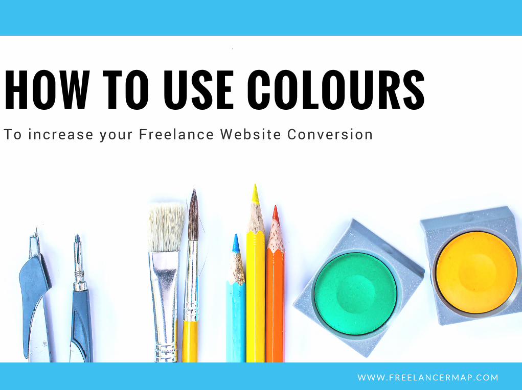
To increase your Freelance Website Conversion
HOW TO USE COLOURS
W W W . F R E E L A N C E R M A P . C O M
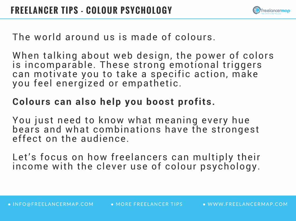
The world around us is made of colours. When talking about web design, the power of colorsis incomparable. These strong emotional tr iggerscan motivate you to take a specif ic action, makeyou feel energized or empathetic.
Colours can also help you boost profits.
You just need to know what meaning every huebears and what combinations have the strongesteffect on the audience.
Let ’s focus on how freelancers can mult iply theirincome with the clever use of colour psychology.
FREELANCER TIPS - COLOUR PSYCHOLOGY
● W W W . F R E E L A N C E R M A P . C O M● I N F O @ F R E E L A N C E R M A P . C O M ● W W W . F R E E L A N C E R M A P . C O M● I N F O @ F R E E L A N C E R M A P . C O M ● M O R E F R E E L A N C E R T I P S

This is the f i rst question that everyfreelancer needs to ask himself whenstart ing an onl ine project. . .
I t ’s no secret that colours have differenteffects on different people.
A female audience is more captivated bywarm colours, whereas males givepreference to cool hues.
01 What Audience Do YouTarget?
● W W W . F R E E L A N C E R M A P . C O M● I N F O @ F R E E L A N C E R M A P . C O M ● W W W . F R E E L A N C E R M A P . C O M● I N F O @ F R E E L A N C E R M A P . C O M ● M O R E F R E E L A N C E R T I P S
FREELANCER TIPS - COLOUR PSYCHOLOGY

In order to boost conversions and attractmore cl ients, your freelance website needsto look trustworthy and rel iable.
Blue is the most frequently used colour onbusiness web projects.
Blue is the most popular hue that you canfind on personal and landing pages.
02 Do You Want to CultivateTrust with Your Site?
● W W W . F R E E L A N C E R M A P . C O M● I N F O @ F R E E L A N C E R M A P . C O M ● W W W . F R E E L A N C E R M A P . C O M● I N F O @ F R E E L A N C E R M A P . C O M ● M O R E F R E E L A N C E R T I P S
FREELANCER TIPS - COLOUR PSYCHOLOGY
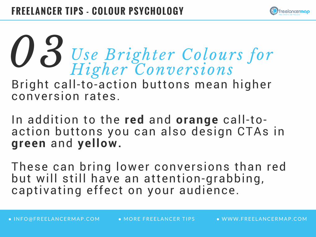
Bright cal l - to-action buttons mean higherconversion rates.
In addit ion to the red and orange cal l - to-action buttons you can also design CTAs ingreen and yel low.
These can br ing lower conversions than redbut wi l l st i l l have an attention-grabbing,captivating effect on your audience.
03 Use Brighter Colours forHigher Conversions
● W W W . F R E E L A N C E R M A P . C O M● I N F O @ F R E E L A N C E R M A P . C O M ● W W W . F R E E L A N C E R M A P . C O M● I N F O @ F R E E L A N C E R M A P . C O M ● M O R E F R E E L A N C E R T I P S
FREELANCER TIPS - COLOUR PSYCHOLOGY

The use of whitespace shouldn’t beneglected in web design.
Whitespace is an indispensable designelement providing for better readabil i ty ofyour site ’s content.
I t makes the layout look more spacious andeasy-to-scan. When surrounded withwhitespace, CTAs become more prominentand attention grabbing.
04 Don’t Forget aboutWhitespace
● W W W . F R E E L A N C E R M A P . C O M● I N F O @ F R E E L A N C E R M A P . C O M ● W W W . F R E E L A N C E R M A P . C O M● I N F O @ F R E E L A N C E R M A P . C O M ● M O R E F R E E L A N C E R T I P S
FREELANCER TIPS - COLOUR PSYCHOLOGY

Natal ia Campaña ValenciaInternational Affairs
Email : [email protected]: +49-911-37750286
Contact detai ls:
Get the latest IT news and freelancer t ips byfol lowing us on:
Find further freelance t ips here: freelancermap blog
● W W W . F R E E L A N C E R M A P . C O M● I N F O @ F R E E L A N C E R M A P . C O M ● W W W . F R E E L A N C E R M A P . C O M● I N F O @ F R E E L A N C E R M A P . C O M ● M O R E F R E E L A N C E R T I P S